

Beige is the quiet workhorse of modern design: warm enough to feel human, neutral enough to let content and imagery lead.
Below are 20+ beige color palette ideas with ready-to-use HEX codes, plus practical tips for pairing and applying them across UI, branding, and print.
In this article
- Why Beige Palettes Work So Well
-
- dune linen
- oatmilk minimal
- sandstone studio
- toasted almond
- desert blush
- birch paper
- cappuccino cream
- coastal shell
- vintage sepia
- clay and sage
- sunlit stucco
- wheatfield morning
- warm marble
- honeyed canvas
- minimal taupe
- rustic burlap
- soft khaki
- antique lace
- prairie dust
- golden biscuit
- museum sand
- cashmere glow
- What Colors Go Well with Beige?
- How to Use a Beige Color Palette in Real Designs
- Create Beige Palette Visuals with AI
Why Beige Palettes Work So Well
Beige sits in a “comfort zone” of color: it reads as warm and approachable, but it rarely steals attention from typography, photography, or product details. That balance makes beige a reliable base for everything from minimalist UI to premium packaging.
Because beige is naturally low-saturation, it supports calm hierarchy and lets you add a single accent color without visual noise. You can push it modern with charcoal and cobalt, or lean artisanal with browns, clay, and paper textures.
It also performs well across mediums: beige backgrounds reduce glare in long-form reading, and in print it can feel tactile and expensive when paired with the right paper stock and ink density.
20+ Beige Color Palette Ideas (with HEX Codes)
1) Dune Linen
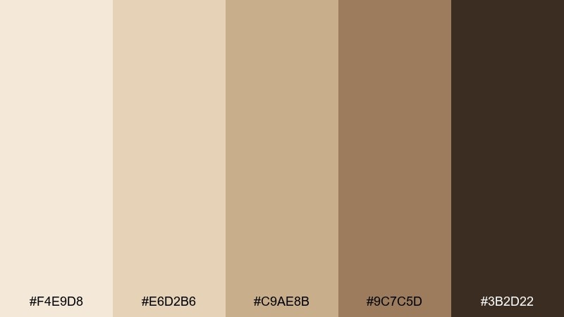
HEX: #F4E9D8 #E6D2B6 #C9AE8B #9C7C5D #3B2D22
Mood: sun-warmed, airy, grounded
Best for: interior mood boards and lifestyle branding
Sun-warmed sand and crisp linen come to mind, with grounded browns that feel calm and lived-in. This beige color palette suits interiors, wellness brands, and editorial lifestyle visuals. Pair it with matte black typography or warm brass accents to keep it modern. Usage tip: let the lightest tone carry backgrounds, then reserve the dark brown for headings and trims.
Image example of dune linen generated using media.io
Media.io is an online AI studio for creating and editing video, image, and audio in your browser.

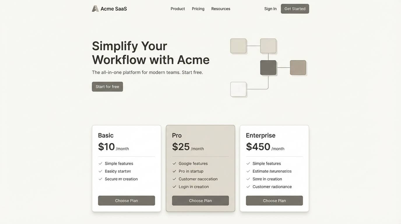
2) Oatmilk Minimal
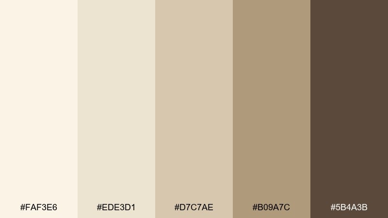
HEX: #FAF3E6 #EDE3D1 #D7C7AE #B09A7C #5B4A3B
Mood: clean, soft, modern
Best for: 2D UI mockups for SaaS and landing pages
Creamy oat and quiet taupe create a clean look that feels friendly but still professional. It works beautifully for minimalist UI, onboarding screens, and product dashboards where contrast must stay gentle. Pair with a single bold accent like cobalt or deep forest for calls to action. Usage tip: keep primary buttons dark and backgrounds off-white to maintain accessible contrast.
Image example of oatmilk minimal generated using media.io
3) Sandstone Studio
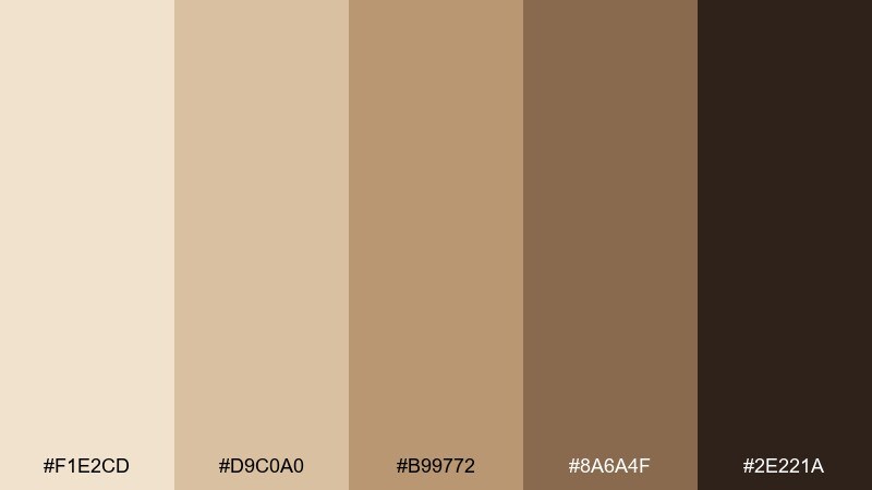
HEX: #F1E2CD #D9C0A0 #B99772 #8A6A4F #2E221A
Mood: artisanal, textured, confident
Best for: creative portfolios and studio branding
Textured sandstone and warm wood tones give a handcrafted, gallery-ready vibe. Use it for a creative studio identity, portfolio site, or packaging that wants to feel tactile and premium. Pair with uncoated paper textures and a simple serif to amplify the artisanal mood. Usage tip: add grain or subtle speckle only on large surfaces, not on body text areas.
Image example of sandstone studio generated using media.io
4) Toasted Almond
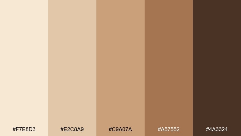
HEX: #F7E8D3 #E2C8A9 #C9A07A #A57552 #4A3324
Mood: cozy, appetizing, warm
Best for: bakery packaging and coffee shop menus
Toasty nut tones and soft cream feel cozy and appetizing, like fresh pastries in a window. These colors shine on café menus, bakery packaging, and food photography overlays. Pair with deep espresso brown for type and a small pop of muted teal for a modern twist. Usage tip: print the mid-tone as the main package color to hide scuffs while staying elegant.
Image example of toasted almond generated using media.io
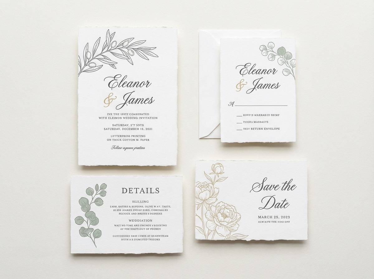
5) Desert Blush
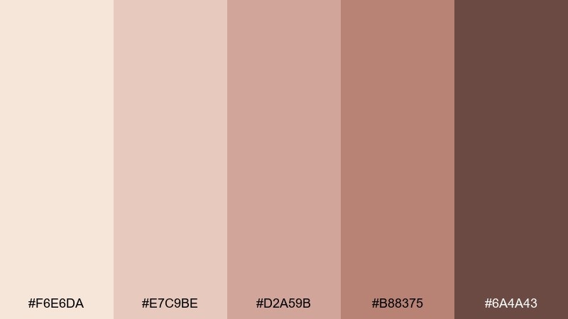
HEX: #F6E6DA #E7C9BE #D2A59B #B88375 #6A4A43
Mood: romantic, sunlit, soft
Best for: wedding invitations and beauty branding
Blushed desert skies and dusty rose dunes create a romantic, sunlit feel. These beige color combinations suit wedding suites, skincare labels, and gentle social templates. Pair with warm gray linework and a touch of copper foil for refinement. Usage tip: keep the pinkest shade to small highlights like monograms, seals, or button hovers.
Image example of desert blush generated using media.io
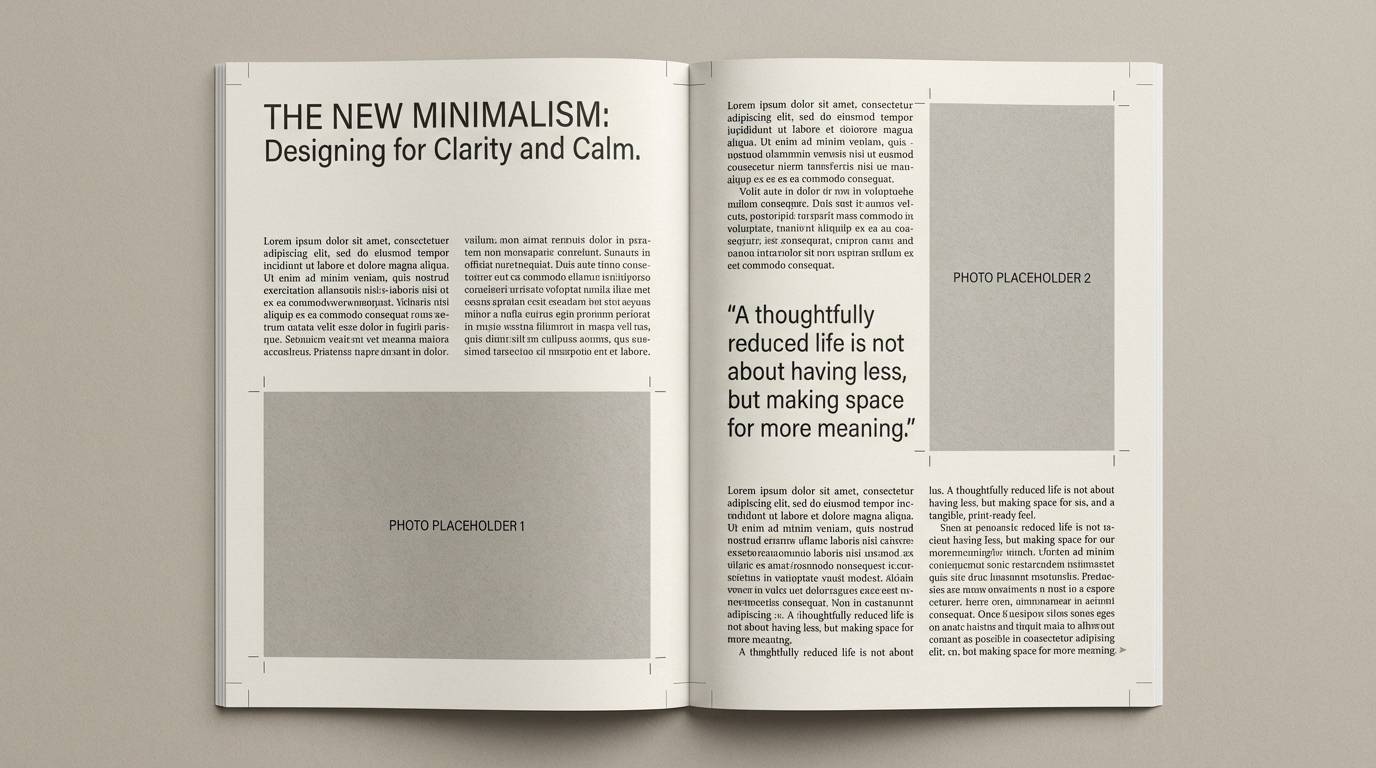
6) Birch Paper
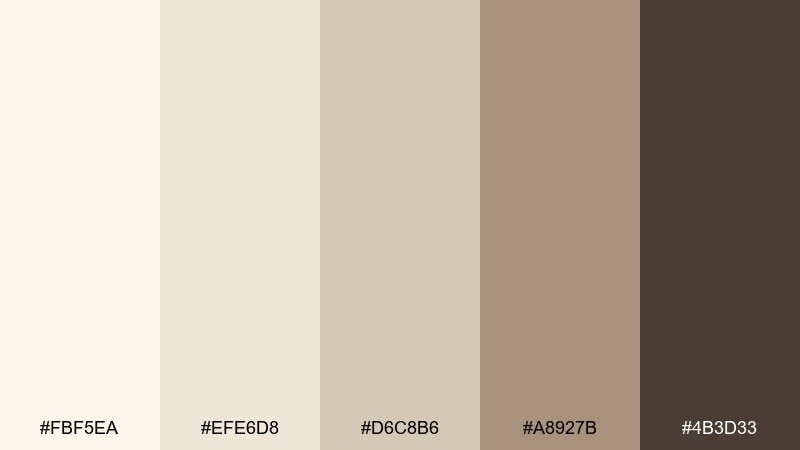
HEX: #FBF5EA #EFE6D8 #D6C8B6 #A8927B #4B3D33
Mood: calm, natural, refined
Best for: editorial layouts and book covers
Birch bark lightness with soft paper tones makes everything feel calm and refined. It fits magazine spreads, book covers, and long-form reading experiences where comfort matters. Pair with charcoal text and one muted green for section markers or pull quotes. Usage tip: maintain generous whitespace so the warm neutrals do the heavy lifting.
Image example of birch paper generated using media.io
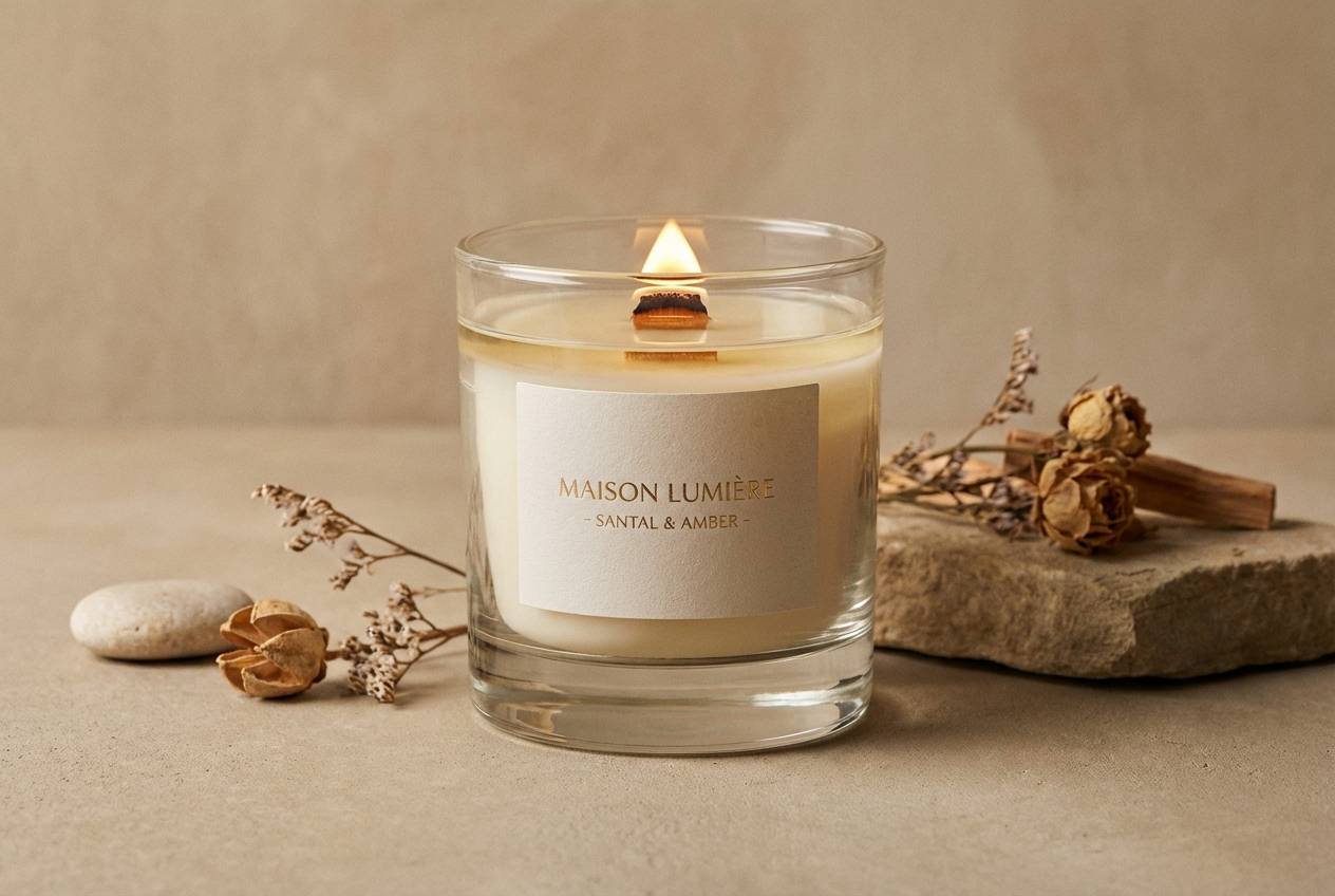
7) Cappuccino Cream
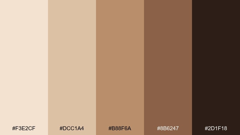
HEX: #F3E2CF #DCC1A4 #B88F6A #8B6247 #2D1F18
Mood: rich, cozy, upscale
Best for: luxury product ads and café promos
Creamy foam and roasted coffee notes make this set feel rich and upscale. It works for luxury candles, café promos, and premium product pages that need warmth without looking rustic. Pair with a crisp off-white and glossy black for sharp hierarchy. Usage tip: use the darkest shade sparingly as a framing color for hero banners and key price points.
Image example of cappuccino cream generated using media.io
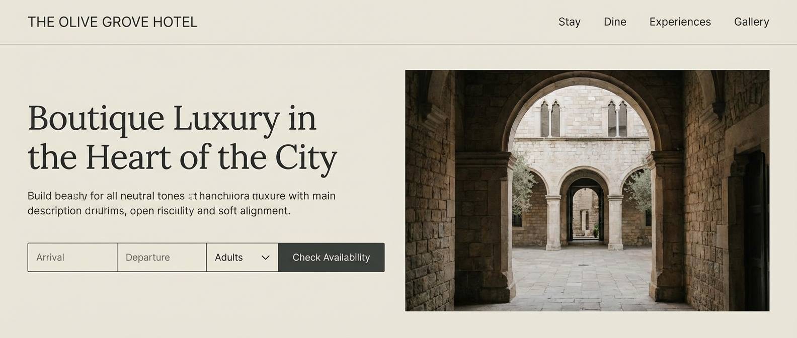
8) Coastal Shell
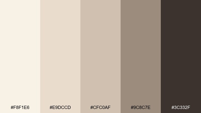
HEX: #F8F1E6 #E9DCCD #CFC0AF #9C8C7E #3C332F
Mood: breezy, relaxed, coastal
Best for: travel blogs and boutique hotel websites
Soft shell tones and driftwood neutrals feel breezy, relaxed, and quietly sophisticated. This beige color palette is ideal for travel blogs, boutique hotel sites, and photo-forward layouts. Pair it with ocean blue accents for links and icons, keeping saturation low. Usage tip: apply the gray-taupe as an overlay at 10 to 20 percent to unify mixed photography.
Image example of coastal shell generated using media.io
9) Vintage Sepia
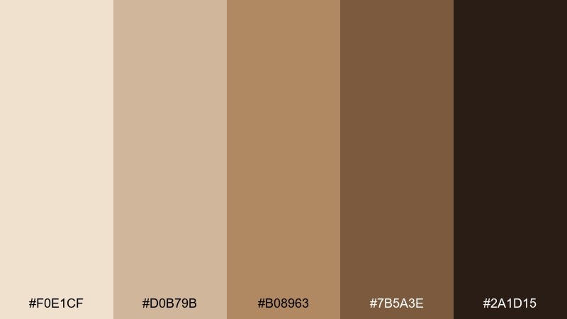
HEX: #F0E1CF #D0B79B #B08963 #7B5A3E #2A1D15
Mood: nostalgic, cinematic, grounded
Best for: photo presets and storytelling posters
Sepia warmth and aged leather browns evoke film stills, libraries, and slow storytelling. It is a strong fit for photo presets, documentary posters, and heritage-style branding. Pair with cream paper textures and deep ink black for type to keep it legible. Usage tip: use the mid-brown for frames and borders to create a vintage matte effect.
Image example of vintage sepia generated using media.io

10) Clay and Sage
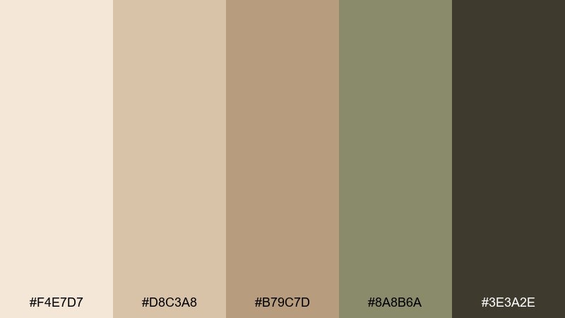
HEX: #F4E7D7 #D8C3A8 #B79C7D #8A8B6A #3E3A2E
Mood: earthy, balanced, restorative
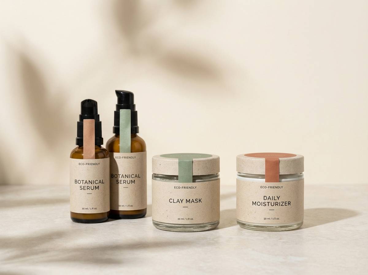
Best for: wellness brands and eco packaging
Earthy clay and quiet sage feel restorative, like a spa with natural ceramics. It works for wellness brands, eco packaging, and calm content templates that need an organic edge. Pair with recycled paper textures and a simple sans-serif to keep it contemporary. Usage tip: let the sage act as the primary accent so the warm neutrals remain soothing.
Image example of clay and sage generated using media.io
11) Sunlit Stucco
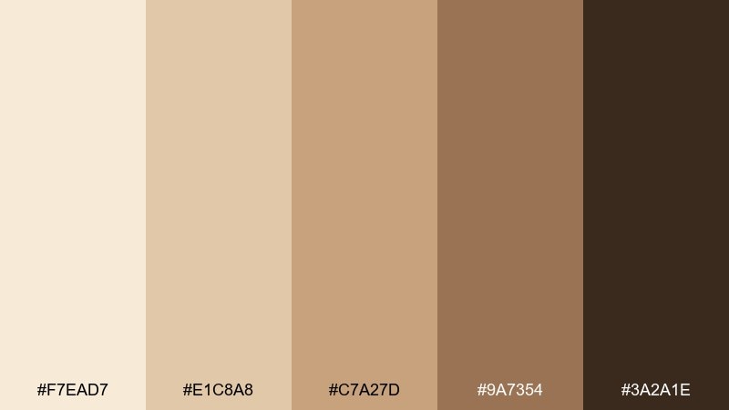
HEX: #F7EAD7 #E1C8A8 #C7A27D #9A7354 #3A2A1E
Mood: Mediterranean, bright, welcoming
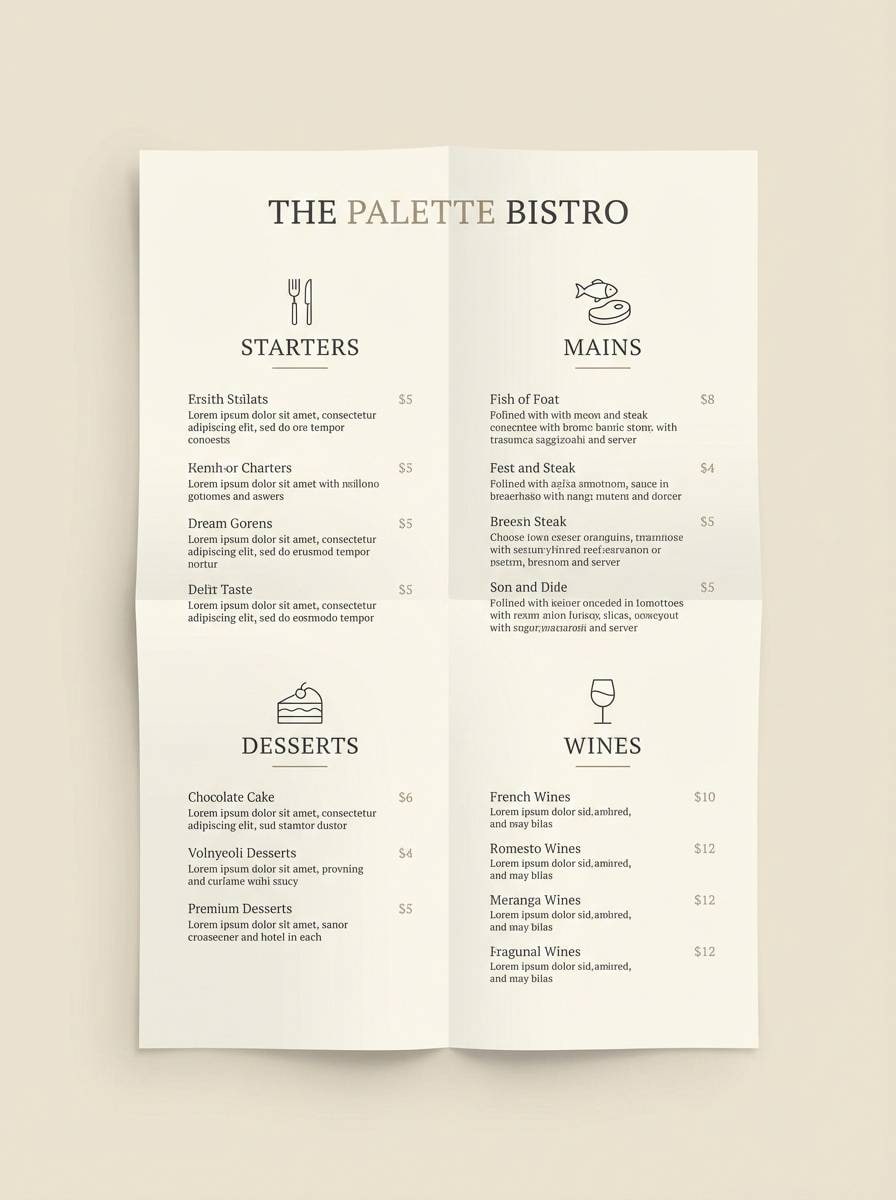
Best for: restaurant branding and menu design
Sunlit stucco and terracotta shadows bring a Mediterranean, welcoming energy. Use it for restaurant branding, menu design, and hospitality visuals where warmth should feel intentional. Pair with olive green or muted navy for contrast and a classic serif for headers. Usage tip: keep body copy on the palest tone to avoid color cast while printing.
Image example of sunlit stucco generated using media.io
12) Wheatfield Morning
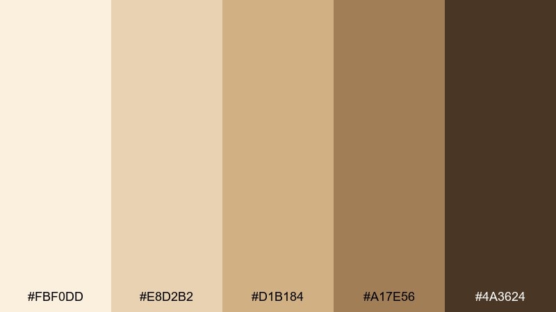
HEX: #FBF0DD #E8D2B2 #D1B184 #A17E56 #4A3624
Mood: optimistic, pastoral, warm
Best for: organic food labels and farm brands
Golden wheat and soft sunrise cream feel optimistic and pastoral. These tones fit organic food labels, farm brands, and rustic-modern packaging that still needs polish. Pair with a leafy green and a clean condensed font to signal freshness. Usage tip: use the golden mid-tone for badges and stamps so they pop without shouting.
Image example of wheatfield morning generated using media.io
13) Warm Marble
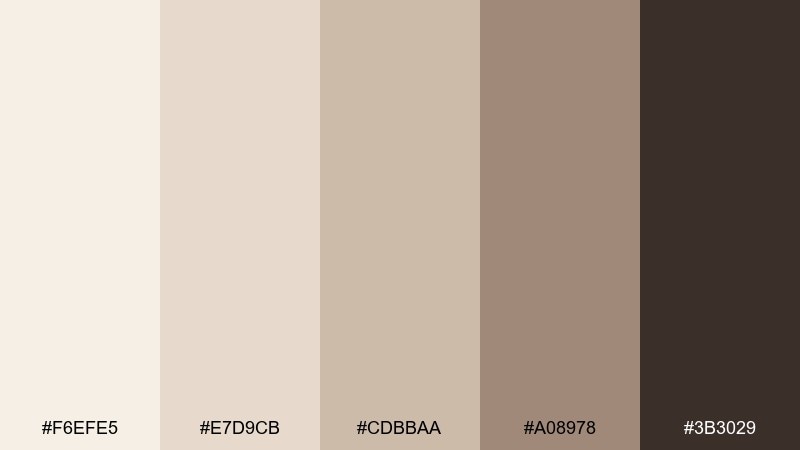
HEX: #F6EFE5 #E7D9CB #CDBBAA #A08978 #3B3029
Mood: polished, quiet luxury, airy
Best for: premium ecommerce and jewelry ads
Warm marble veining and creamy stone neutrals deliver quiet luxury without feeling cold. It is a great match for premium ecommerce, jewelry ads, and high-end lookbooks. Pair with a muted blush or deep emerald accent to elevate the sophistication. Usage tip: add subtle gradients only in large areas to mimic stone depth while keeping UI elements flat.
Image example of warm marble generated using media.io

14) Honeyed Canvas
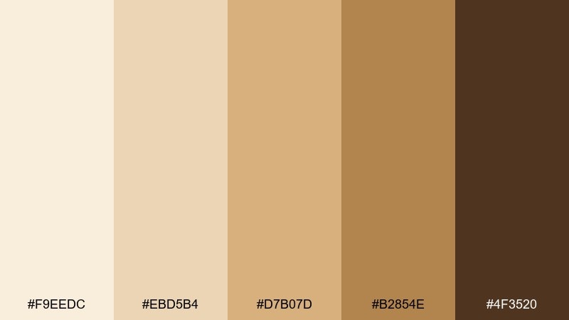
HEX: #F9EEDC #EBD5B4 #D7B07D #B2854E #4F3520
Mood: cheerful, handcrafted, sunny
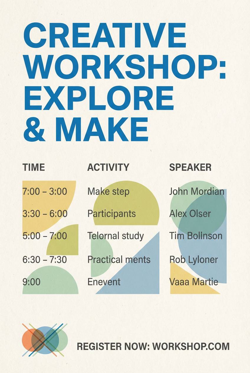
Best for: creative workshops and event flyers
Honeyed canvas tones feel sunny and handcrafted, like paint on textured paper. Use this beige color combination for workshop promos, community events, and cheerful brand graphics. Pair with deep indigo for titles and a small coral accent for highlights. Usage tip: keep the warm gold as a secondary color so it does not overpower long text blocks.
Image example of honeyed canvas generated using media.io
15) Minimal Taupe
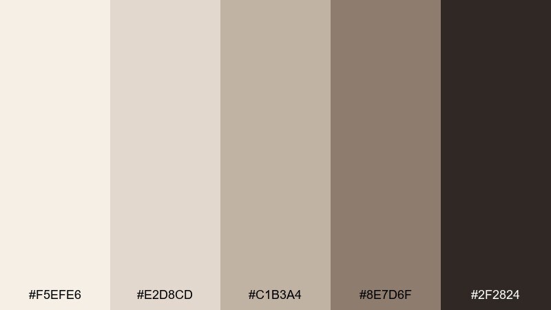
HEX: #F5EFE6 #E2D8CD #C1B3A4 #8E7D6F #2F2824
Mood: sleek, understated, modern
Best for: 2D UI dashboards and fintech apps
Understated taupe and soft stone neutrals feel sleek and modern, with enough depth for clear hierarchy. It works well for dashboards, fintech UI, and analytics screens that need calm focus. Pair with a single bright accent like electric blue for key metrics and CTAs. Usage tip: reserve the darkest tone for navigation and charts to keep contrast consistent.
Image example of minimal taupe generated using media.io

16) Rustic Burlap
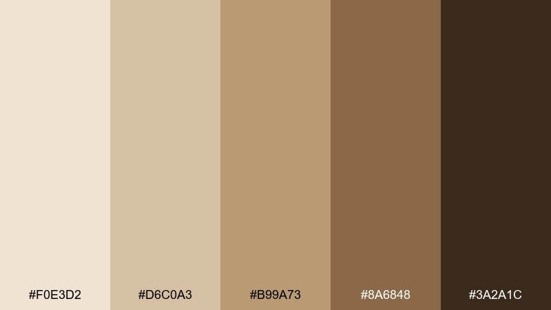
HEX: #F0E3D2 #D6C0A3 #B99A73 #8A6848 #3A2A1C
Mood: rustic, dependable, outdoorsy
Best for: craft packaging and handmade marketplaces
Burlap texture and warm wood shades feel dependable and outdoorsy. These tones fit handmade packaging, craft tags, and marketplace storefronts that lean rustic without looking messy. Pair with cream labels and a forest green accent for a nature-forward look. Usage tip: use the darkest brown for stamps and icons so they stay crisp on textured backgrounds.
Image example of rustic burlap generated using media.io
17) Soft Khaki

HEX: #F6EEDD #E4D5B9 #C8B48F #9C845E #3E3326
Mood: practical, calm, understated
Best for: outdoor apparel branding and catalog layouts
Soft khaki and dusted sand look practical and calm, like well-worn field jackets. It suits outdoor apparel branding, catalogs, and rugged lifestyle campaigns that still want a clean finish. Pair with slate blue and off-white to keep the look crisp. Usage tip: use the khaki mid-tone as a background for product callouts to avoid harsh contrast.
Image example of soft khaki generated using media.io
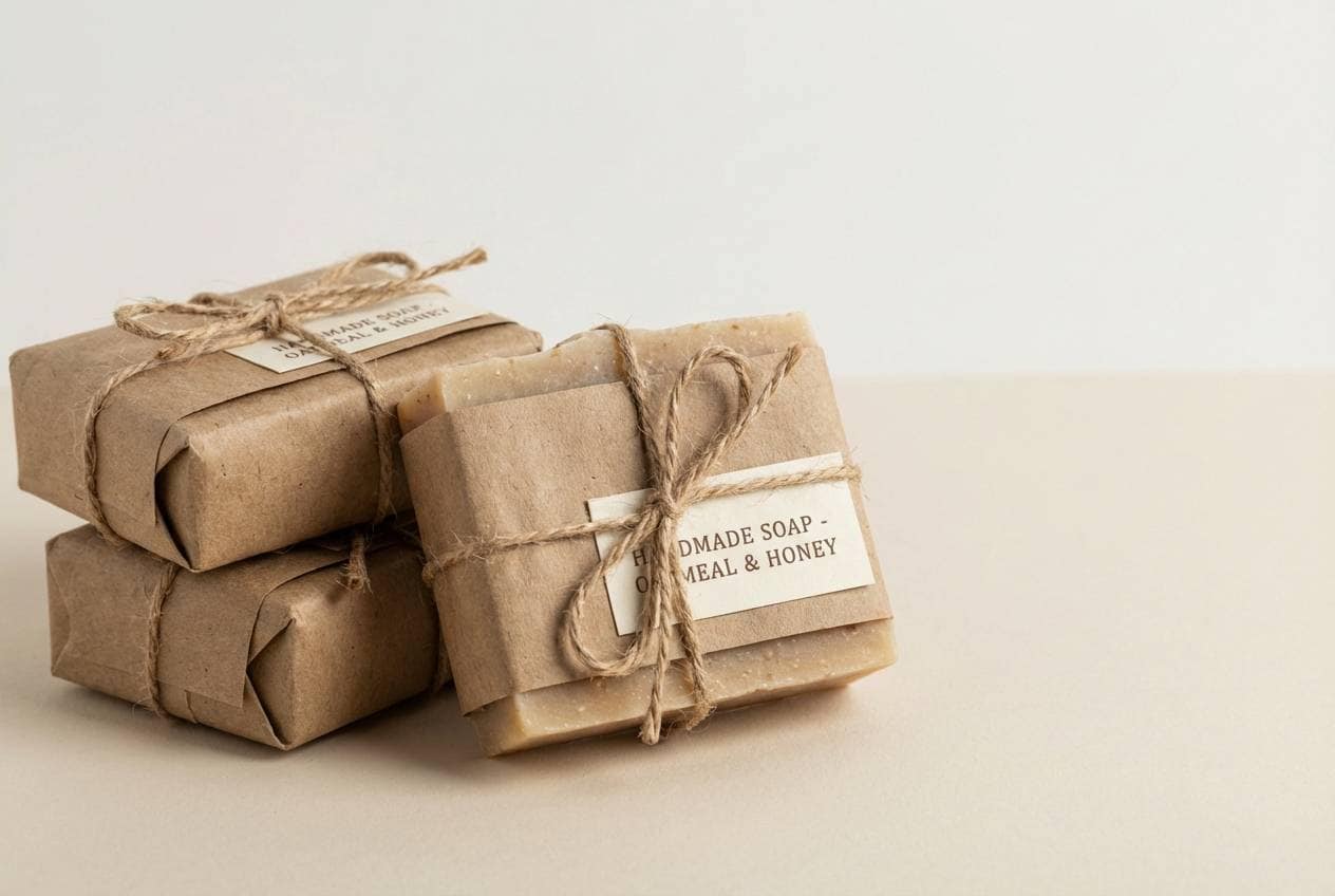
18) Antique Lace
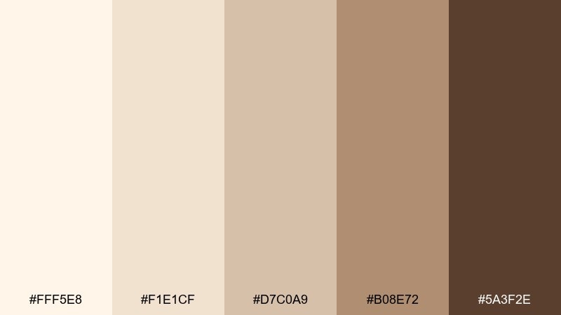
HEX: #FFF5E8 #F1E1CF #D7C0A9 #B08E72 #5A3F2E
Mood: delicate, vintage, elegant
Best for: bridal stationery and classic monograms
Delicate lace cream and antique tan feel elegant, vintage, and soft to the touch. It is perfect for bridal stationery, monograms, and refined personal branding. Pair with muted pearl gray and a thin-line serif for a timeless finish. Usage tip: keep ornamentation minimal and let negative space carry the luxury.
Image example of antique lace generated using media.io
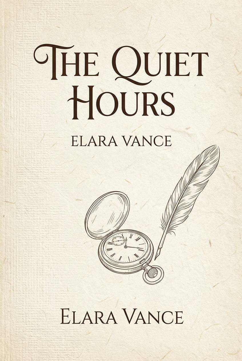
19) Prairie Dust
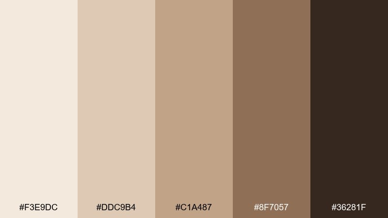
HEX: #F3E9DC #DDC9B4 #C1A487 #8F7057 #36281F
Mood: quiet, nostalgic, grounded
Best for: book covers and heritage branding
Prairie dust neutrals feel quiet and nostalgic, like sunlit pages and old wood floors. This beige color palette works for heritage branding, book covers, and storytelling visuals with a slower pace. Pair with ink blue for titles and a muted rust for small highlights. Usage tip: set typography in near-black rather than pure black to keep the tone soft.
Image example of prairie dust generated using media.io
20) Golden Biscuit
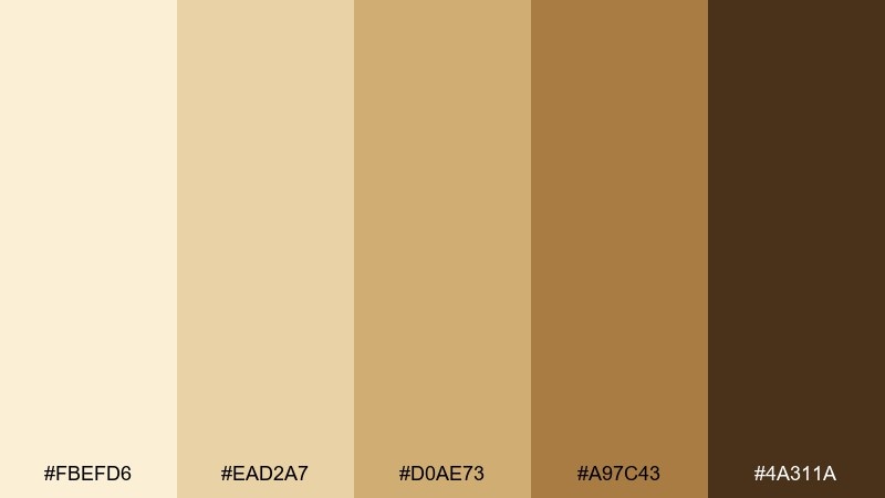
HEX: #FBEFD6 #EAD2A7 #D0AE73 #A97C43 #4A311A
Mood: bright, inviting, optimistic
Best for: startup branding and web hero sections
Golden biscuit warmth feels inviting and optimistic, like afternoon light through a studio window. These beige color combinations are great for startup branding, web hero sections, and friendly marketing pages. Pair with deep navy for strong contrast and a teal accent for buttons and links. Usage tip: keep gradients subtle and use solid fills for key UI components to stay crisp.
Image example of golden biscuit generated using media.io

21) Museum Sand
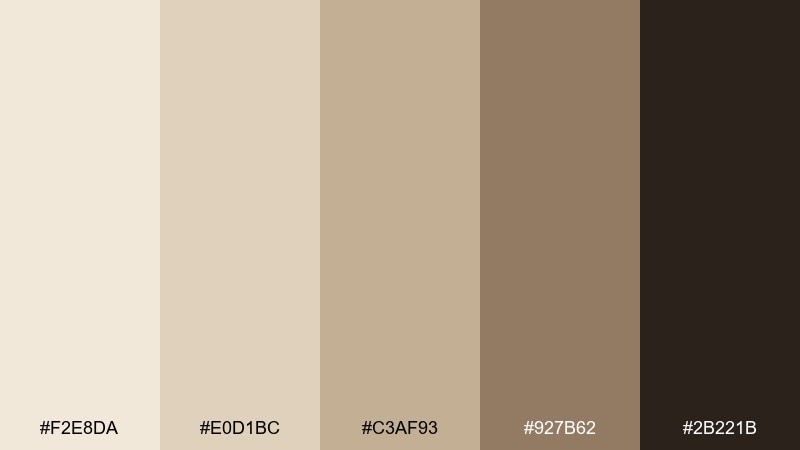
HEX: #F2E8DA #E0D1BC #C3AF93 #927B62 #2B221B
Mood: curated, intelligent, calm
Best for: gallery sites and cultural event posters
Curated sand and muted stone tones feel intelligent and calm, like a quiet museum hall. Use it for gallery websites, cultural event posters, and portfolios that need restraint. Pair with a sharp black and a single muted red for small directional cues. Usage tip: keep imagery framed by generous margins to reinforce the curated vibe.
Image example of museum sand generated using media.io
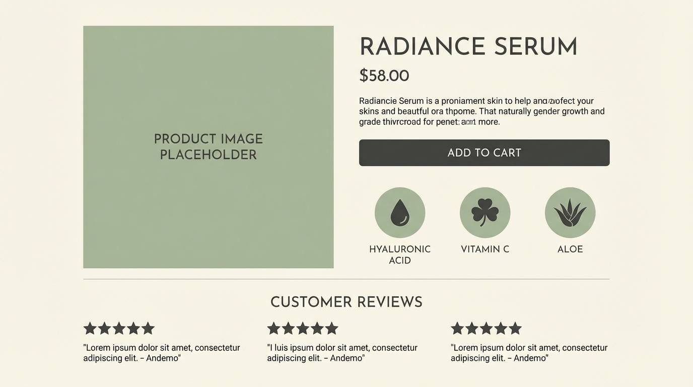
22) Cashmere Glow
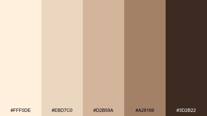
HEX: #FFF0DE #EBD7C0 #D2B59A #A28166 #3D2B22
Mood: soft, polished, comforting
Best for: skincare landing pages and spa brochures
Cashmere-soft creams and warm taupes create a polished, comforting look that feels gentle on the eyes. This beige color palette is a strong choice for skincare landing pages, spa brochures, and calm ecommerce. Pair with pale sage or muted lavender for a clean, modern accent. Usage tip: use the deepest tone for key trust elements like ratings, guarantees, and headings.
Image example of cashmere glow generated using media.io
What Colors Go Well with Beige?
Beige pairs effortlessly with deep neutrals like charcoal, espresso, and near-black for clean contrast—great for typography, navigation, and icon systems. For a softer feel, swap black for warm gray or dark taupe.
For accents, try muted greens (sage, olive) for an organic tone, blues (navy, slate, cobalt) for a modern UI punch, or dusty pinks for a romantic, editorial edge. Metals like brass and copper also elevate beige without adding loud saturation.
If your beige leans yellow, balance it with cooler accents (navy, slate). If it leans pink, stabilize it with stone grays and earthy browns to keep the palette grounded.
How to Use a Beige Color Palette in Real Designs
Start with one light beige as your main background and reserve mid-tones for surfaces (cards, sections, packaging fields). Use the darkest shade for structural elements—headlines, dividers, and key UI controls—so hierarchy stays consistent.
Keep textures strategic: linen, paper grain, or plaster looks best on large areas, not behind body text. In UI, make beige feel modern by pairing it with crisp spacing, strong type choices, and a single high-contrast accent for CTAs.
For print, test on the actual paper stock: beige can shift warmer on uncoated paper. Use proofing to ensure small text remains readable and avoid overly similar mid-tones in critical elements like pricing and labels.
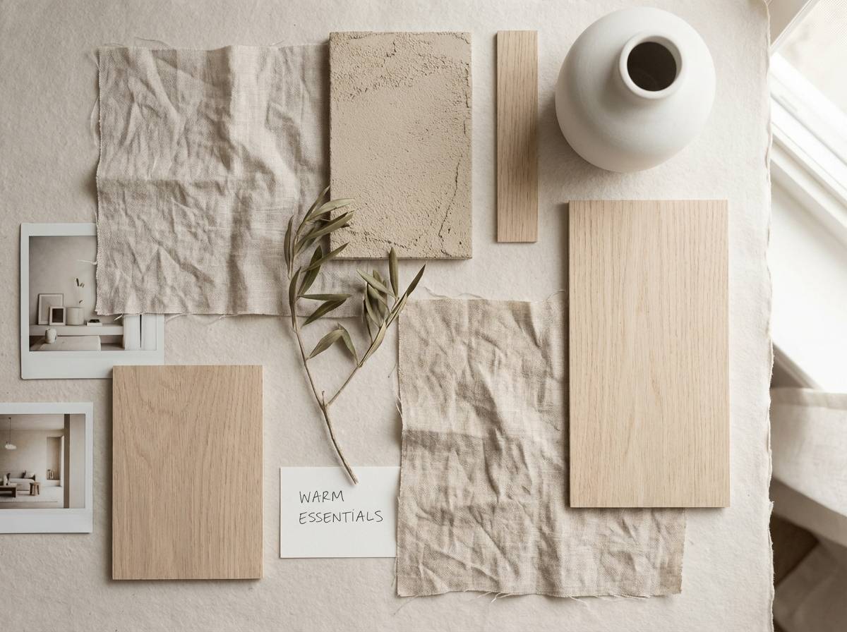
Create Beige Palette Visuals with AI
When you already have HEX codes, the fastest way to explore style directions is to generate matching visuals: mood boards, UI mockups, packaging scenes, and poster layouts. This helps you validate whether your beige palette reads as “cozy,” “premium,” or “modern” in context.
Use clear prompts that mention materials (linen, marble, kraft paper), lighting (soft daylight, studio), and layout type (hero section, stationery flat lay). Then iterate by changing only one variable at a time to keep results consistent.
Beige Color Palette FAQs
-
What is a beige color palette?
A beige color palette is a set of warm neutral shades built around beige, often including cream, tan, taupe, and brown. Designers use it as a calm base for UI, branding, and interiors, then add one or two accent colors for contrast. -
Is beige considered warm or cool?
Most beige shades are warm (yellow, sand, or caramel undertones), but some lean cooler when mixed with gray (taupe/greige). Check the undertone: yellow/red reads warmer, gray/blue reads cooler. -
What accent colors go best with beige?
Beige works well with navy, charcoal, forest green, sage, muted teal, dusty rose, and terracotta. For a modern look, pick one saturated accent (like cobalt) and keep everything else neutral. -
How do I keep beige designs from looking “boring”?
Add contrast and structure: use a dark anchor color for headings/navigation, introduce texture (paper, linen, stone) on large areas, and include a single accent color for CTAs or highlights. Strong typography also makes beige feel intentional. -
Does beige work for websites and apps?
Yes—especially for editorial, wellness, ecommerce, and premium product UI. The key is accessibility: ensure enough contrast between text and backgrounds, and reserve the darkest palette tone for interactive elements and critical labels. -
What’s the difference between beige and tan?
Beige is typically lighter and softer (often closer to cream with warm undertones), while tan is usually deeper and more brown. In palettes, beige often serves as a background, while tan works well for surfaces, borders, and secondary fills. -
How can I generate beige palette mockups quickly?
Use an AI text-to-image tool and prompt for the design context you need (UI mockup, packaging, mood board), then include lighting and material cues like “linen,” “kraft paper,” or “warm marble.” Iterate with the same prompt style to keep a consistent brand look.
Next: Cowboy Color Palette


