

Cream brown color palettes blend warm cream bases with coffee-to-cocoa browns for a look that feels inviting, grounded, and timeless. They’re easy to apply across branding, interiors, and UI because they naturally create soft hierarchy without harsh contrast.
Below are 20+ cream brown color palette ideas with HEX codes, plus practical tips and AI prompts you can reuse to generate matching visuals fast.
In this article
Why Cream Brown Palettes Work So Well
Cream brown palettes feel warm without being loud. The cream tones soften layouts and surfaces, while the browns add structure, depth, and a natural sense of stability.
They’re also flexible across styles—from rustic and handcrafted to minimal and modern—because you can dial the mood by shifting how much dark brown you use and how clean or textured the cream appears.
Most importantly, cream backgrounds are easy on the eyes, making them a strong choice for long-form reading, packaging, and interfaces where comfort and clarity matter.
20+ Cream Brown Color Palette Ideas (with HEX Codes)
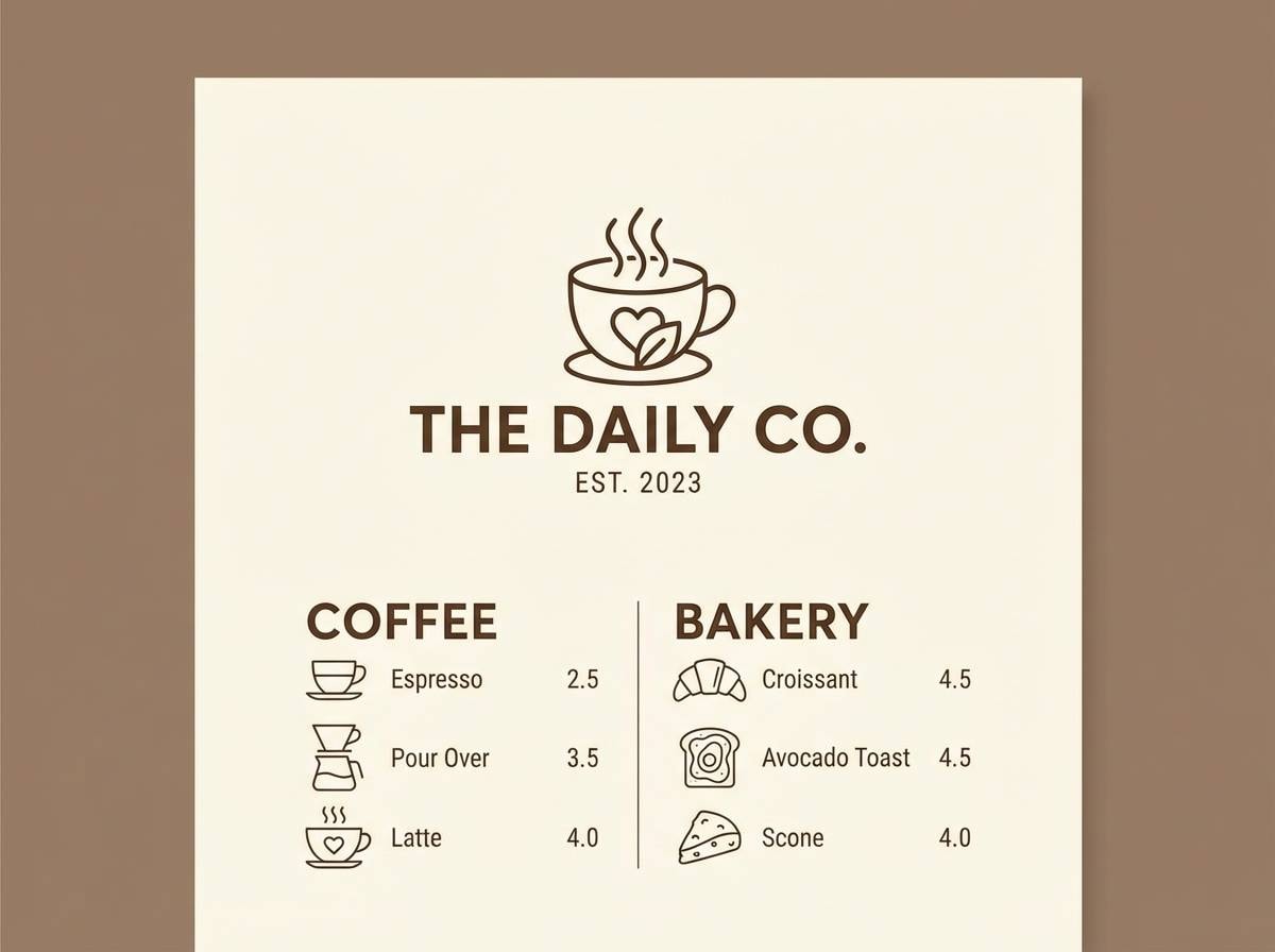
1) Oat Latte
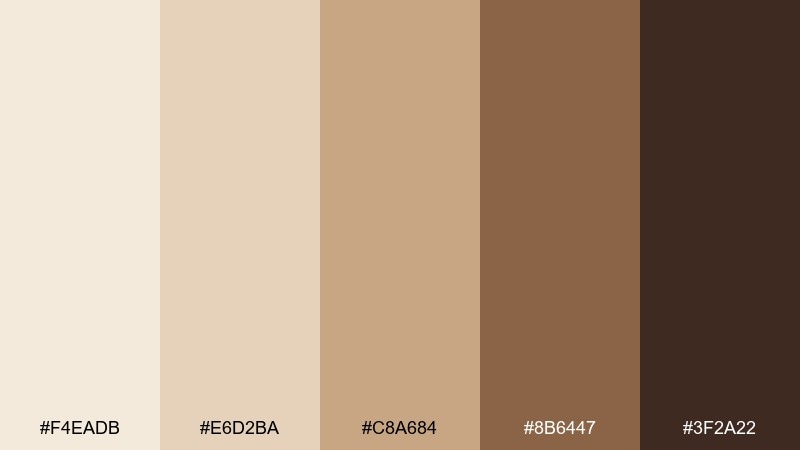
HEX: #f4eadb #e6d2ba #c8a684 #8b6447 #3f2a22
Mood: cozy and approachable
Best for: cafe branding and menu design
Cozy and approachable, these tones feel like steamed milk, fresh pastry, and warm wood counters. Use the light cream as your background, then build hierarchy with caramel and cocoa browns for headlines and dividers. Pair with matte black type or a muted sage accent for a modern twist. Tip: keep the darkest brown for small, high-contrast details like prices and icons.
Image example of oat latte generated using media.io
Media.io is an online AI studio for creating and editing video, image, and audio in your browser.

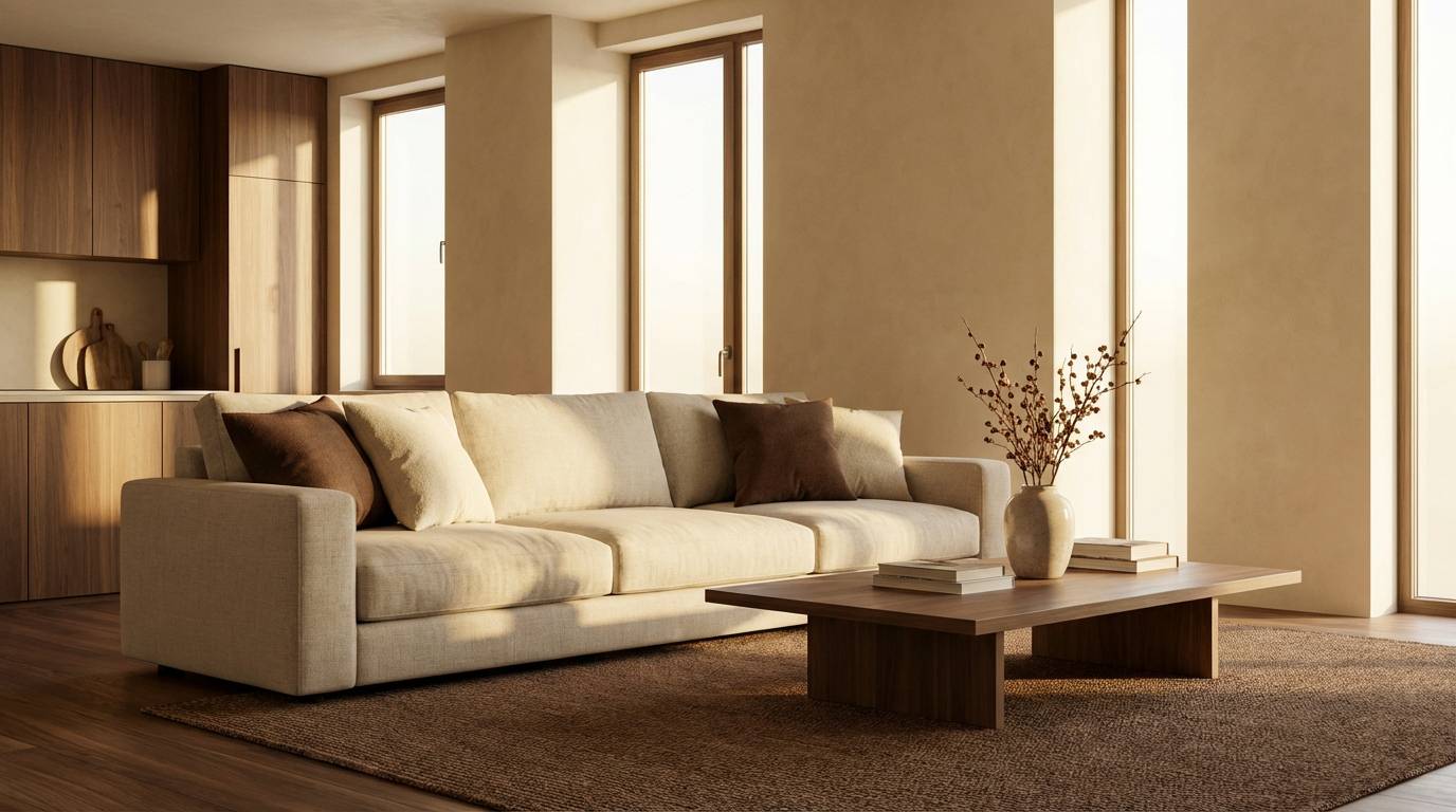
2) Cocoa Linen
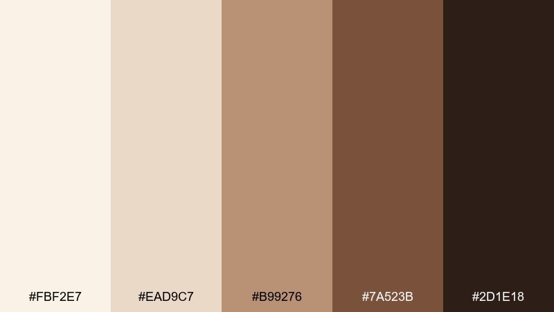
HEX: #fbf2e7 #ead9c7 #b99276 #7a523b #2d1e18
Mood: soft and elevated
Best for: modern living room interiors
Soft and elevated, it brings to mind linen drapes, cocoa powder, and gentle afternoon light. Use the pale cream on walls or large surfaces, then layer mid browns in textiles for depth without heaviness. It pairs beautifully with brass, walnut, and off-white ceramics. Tip: repeat one medium brown in two places (rug and cushions) to make the room feel intentional.
Image example of cocoa linen generated using media.io
3) Sandstone Mocha
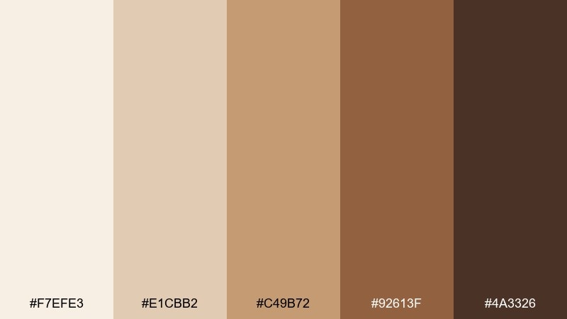
HEX: #f7efe3 #e1cbb2 #c49b72 #92613f #4a3326
Mood: grounded and sunbaked
Best for: architectural presentations and mood boards
Grounded and sunbaked, these colors echo sandstone cliffs and a mocha-toned horizon. A cream brown color palette like this works best with lots of negative space and a few bold blocks of mid-tone tan. Add slate gray or dusty blue materials to keep it from feeling too warm. Tip: use the deepest brown for titles only, and let the lighter tans carry the layout.
Image example of sandstone mocha generated using media.io
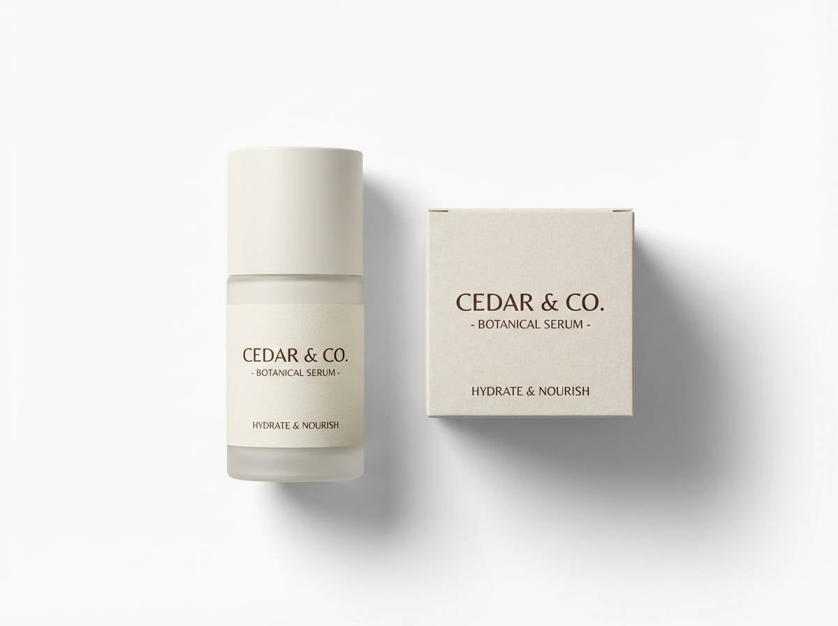
4) Vanilla Cedar
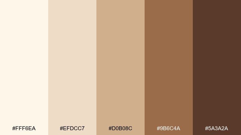
HEX: #fff6ea #efdcc7 #d0b08c #9b6c4a #5a3a2a
Mood: calm and comforting
Best for: skincare packaging and labels
Calm and comforting, it feels like vanilla cream layered over clean cedar shelves. Keep the label background in the lightest shade, then use cedar brown for typography to signal natural quality. It pairs nicely with minimalist line art and a muted olive seal for an organic cue. Tip: choose a warm off-white stock so the cream stays soft rather than stark.
Image example of vanilla cedar generated using media.io
5) Biscuit Bronze
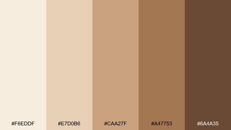
HEX: #f6eddf #e7d0b6 #caa27f #a47753 #6a4a35
Mood: warm and polished
Best for: event flyers for food and wine nights
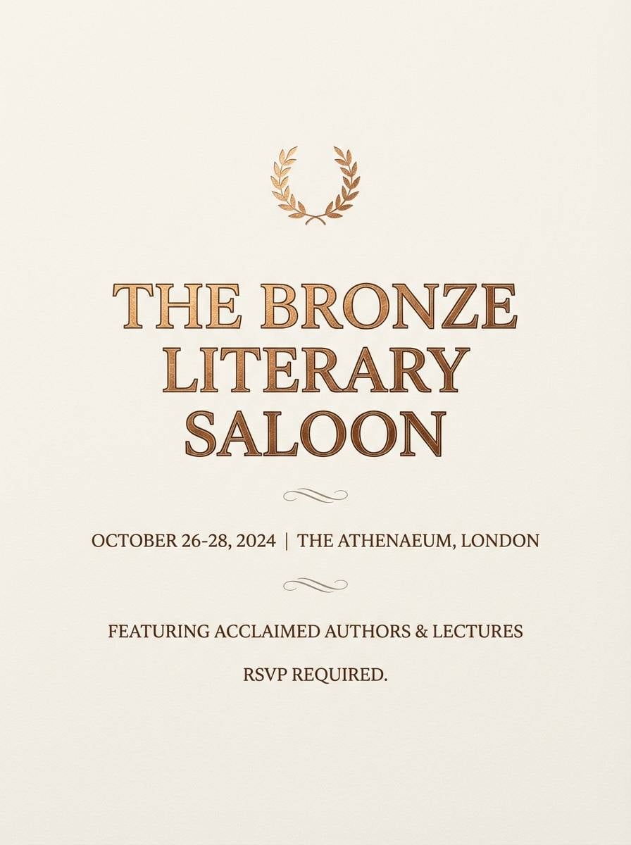
Warm and polished, it reads like buttery biscuits with a subtle bronze glow. Use cream as the poster base, then let the bronze-tan tones frame photos or illustrations with a premium feel. Pair with deep burgundy or forest green for seasonal contrast. Tip: keep body text in the darkest brown for legibility on lighter blocks.
Image example of biscuit bronze generated using media.io
6) Almond Truffle
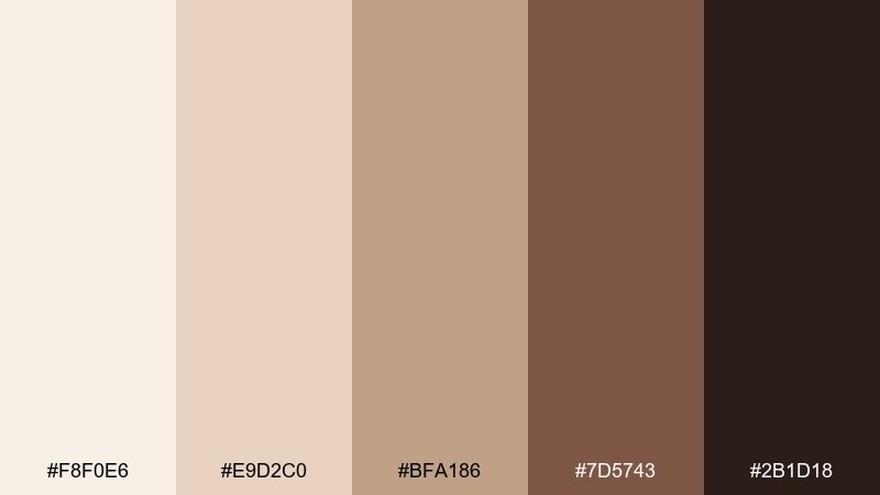
HEX: #f8f0e6 #e9d2c0 #bfa186 #7d5743 #2b1d18
Mood: rich and intimate
Best for: premium chocolate brand identity
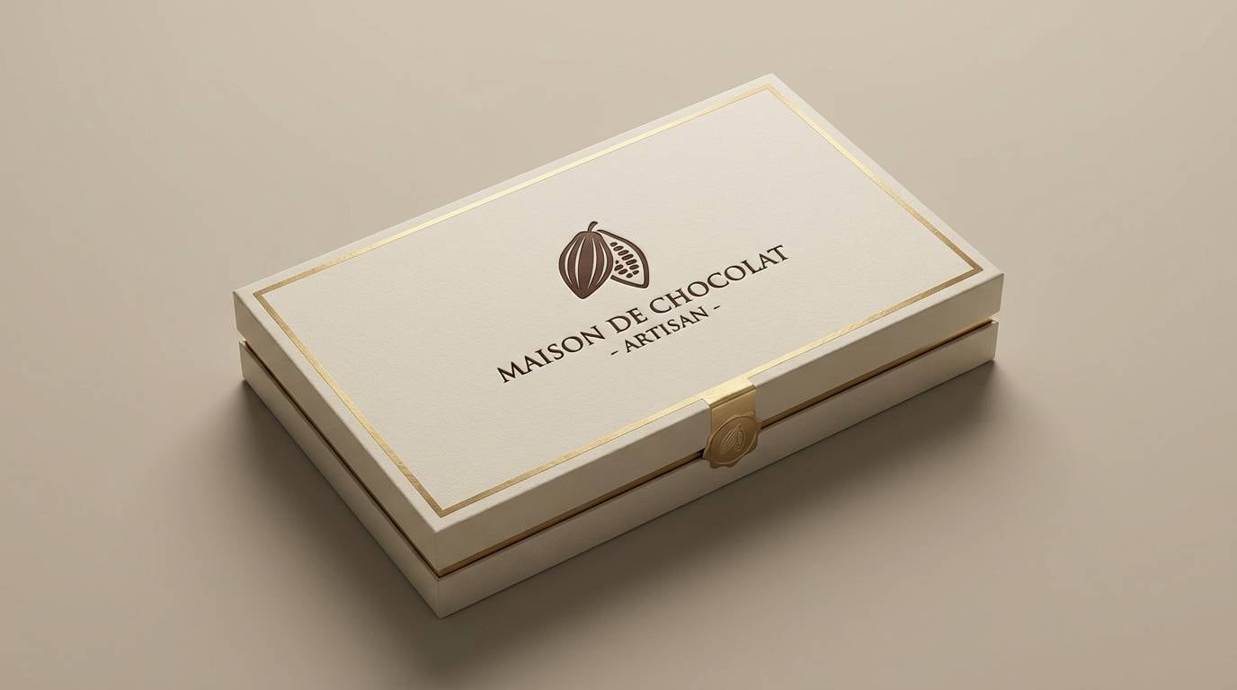
Rich and intimate, these shades evoke almond shells, truffle dust, and dim boutique lighting. For standout cream brown color combinations, keep the light cream on outer packaging and reserve the darkest chocolate for logos and foil-like details. A touch of blush or champagne gold can make the browns feel more luxurious. Tip: limit accents to one small area so the palette stays sophisticated, not busy.
Image example of almond truffle generated using media.io
7) Maple Cream
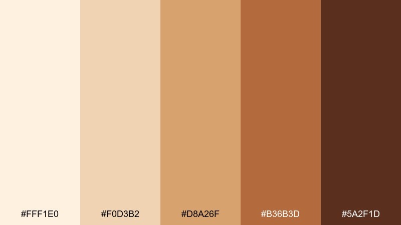
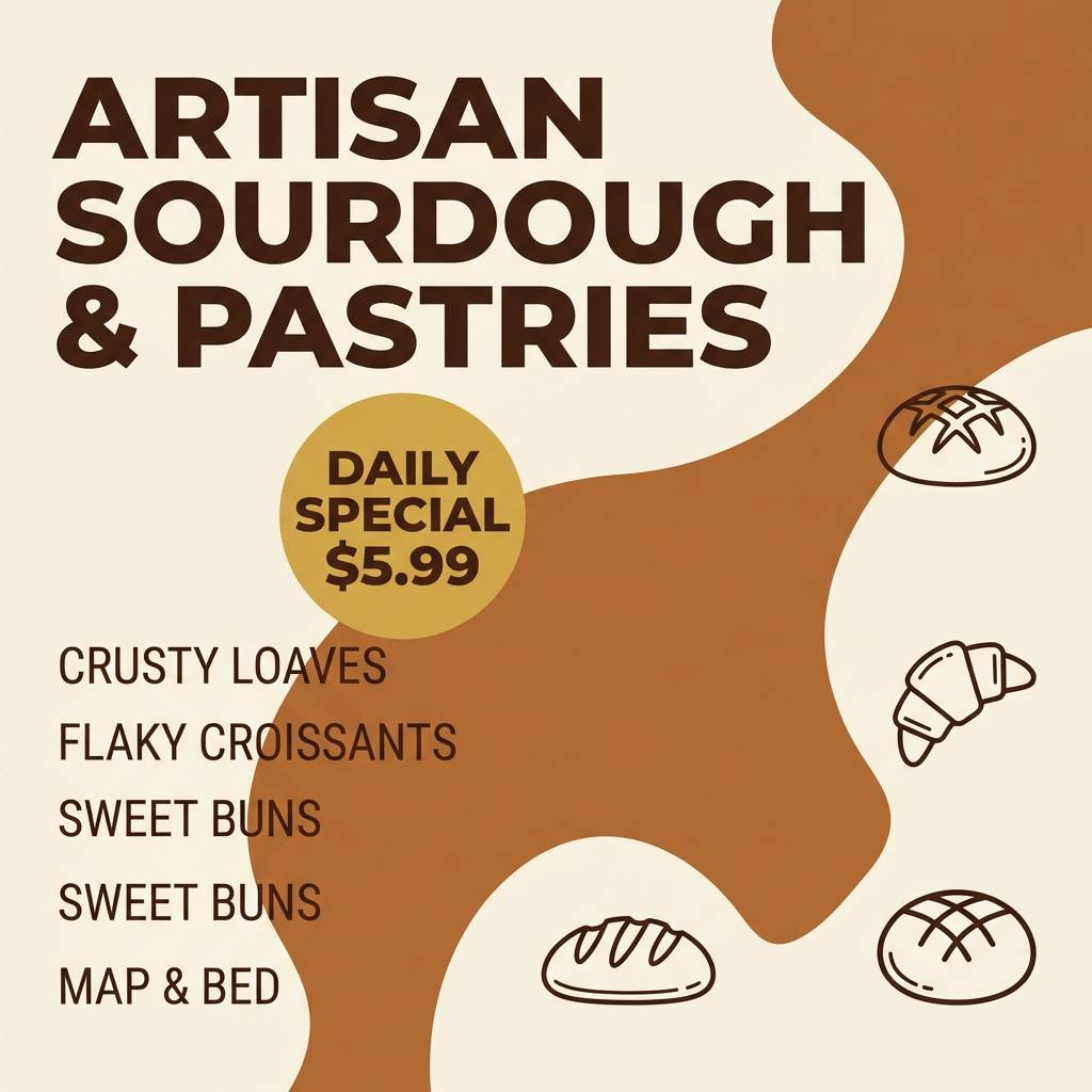
HEX: #fff1e0 #f0d3b2 #d8a26f #b36b3d #5a2f1d
Mood: bright and sweet
Best for: bakery product ads and social posts
Bright and sweet, it feels like maple glaze melting over warm rolls. Use the pale cream for spacious backgrounds, then pop the caramel and maple browns in call-to-action buttons and price tags. Pair with a small punch of teal or cornflower blue to keep it lively on feeds. Tip: add subtle grain or paper texture so the cream looks delicious, not flat.
Image example of maple cream generated using media.io
8) Caramel Canvas
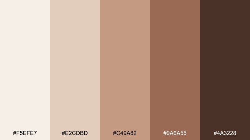
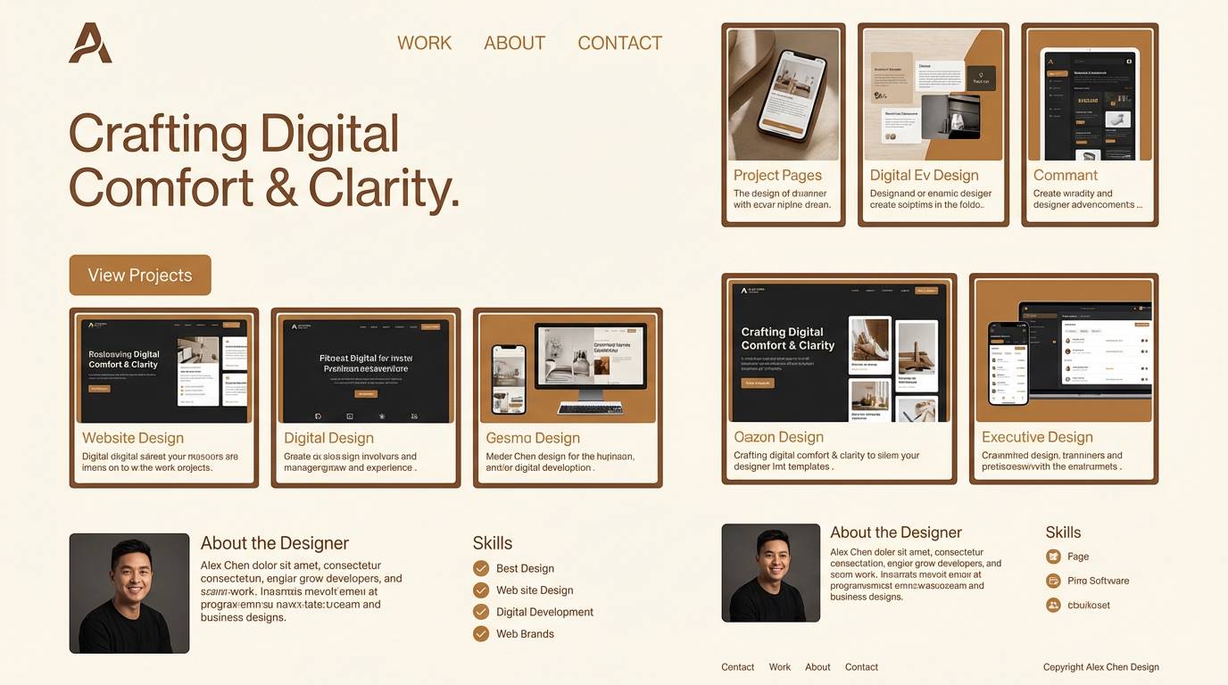
HEX: #f5efe7 #e2cdbd #c49a82 #9a6a55 #4a3228
Mood: balanced and creative
Best for: portfolio websites and case studies
Balanced and creative, it resembles a caramel wash on textured canvas. Use the lightest shades for page backgrounds and cards, while the mid browns anchor section headers and navigation. It pairs well with muted navy links or a dusty terracotta highlight for personality. Tip: set shadows and borders in the warm taupe so the UI feels soft, not stark.
Image example of caramel canvas generated using media.io
9) Hazelnut Haze
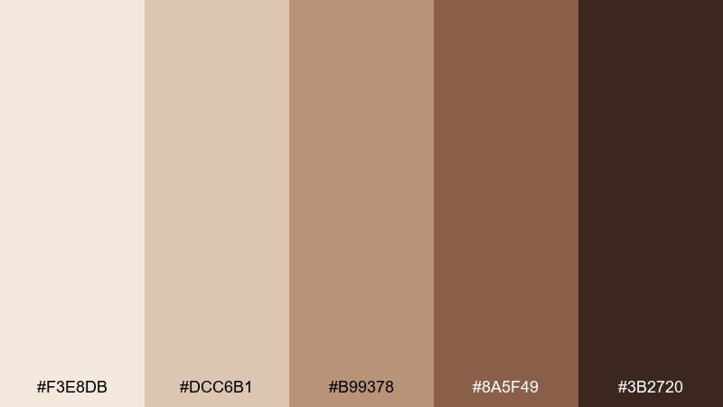
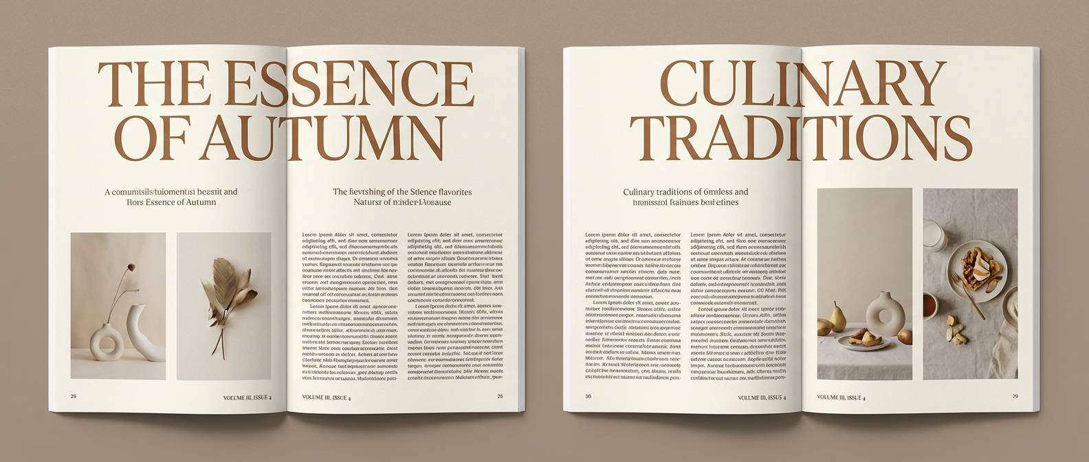
HEX: #f3e8db #dcc6b1 #b99378 #8a5f49 #3b2720
Mood: moody and soft-focus
Best for: editorial magazine layouts
Moody and soft-focus, these hues suggest hazelnut crema and a hazy late-afternoon shoot. Use the cream for margins and negative space, then let the mid browns support pull quotes and section rules. Pair with charcoal ink and a single muted plum accent for editorial drama. Tip: keep body text slightly warm rather than pure black to match the palette.
Image example of hazelnut haze generated using media.io
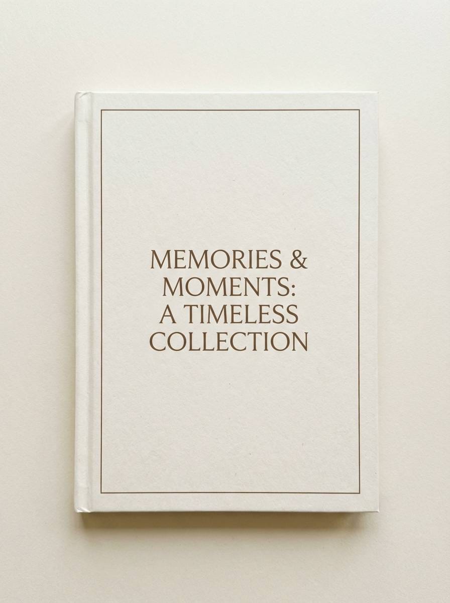
10) Sepia Sugar
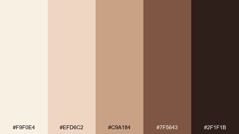
HEX: #f9f0e4 #efd6c2 #c9a184 #7f5643 #2f1f1b
Mood: nostalgic and gentle
Best for: family photo book covers
Nostalgic and gentle, it echoes sepia prints and a dusting of powdered sugar. Put the soft cream behind titles, then use sepia browns for frames and caption styling. It pairs well with vintage off-white borders and a muted sky blue as a small modern lift. Tip: use consistent stroke weights so the design feels curated rather than retro-random.
Image example of sepia sugar generated using media.io
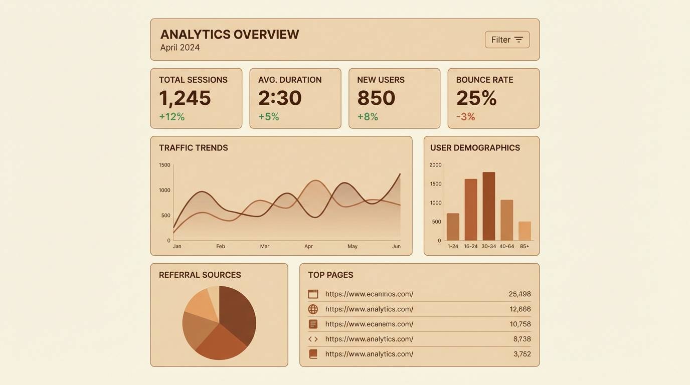
11) Wheat Coffee
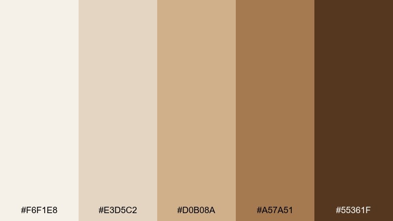
HEX: #f6f1e8 #e3d5c2 #d0b08a #a57a51 #55361f
Mood: fresh and natural
Best for: 2d dashboard UI for finance apps
Fresh and natural, these tones feel like wheat fields and a strong morning brew. Use the light cream for dashboards to keep data readable, then reserve mid browns for charts, tags, and secondary buttons. Pair with a cool slate-blue for interactive states to avoid a monochrome look. Tip: increase contrast for small numbers by using the darkest brown only on key metrics.
Image example of wheat coffee generated using media.io
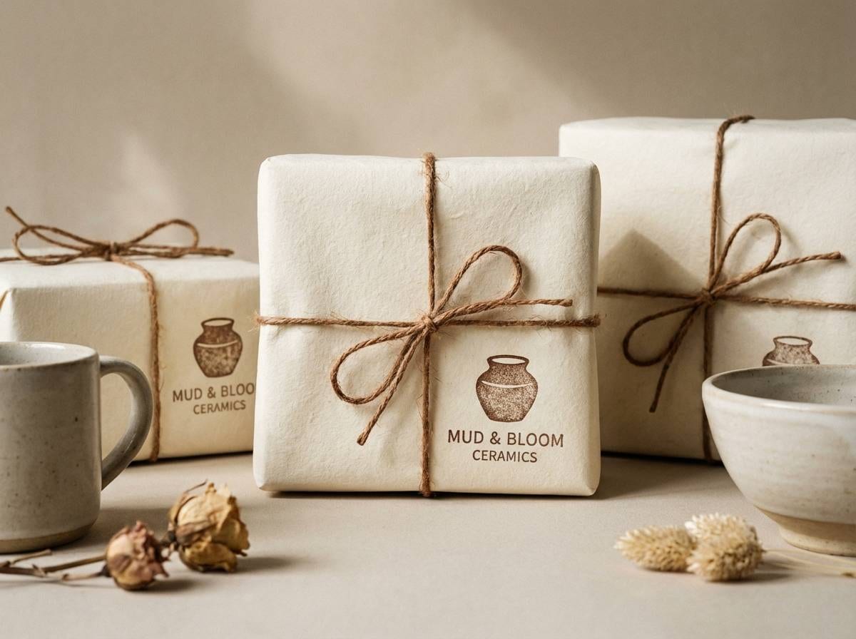
12) Toffee Clay
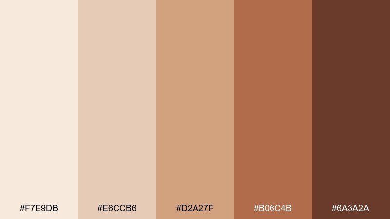
HEX: #f7e9db #e6ccb6 #d2a27f #b06c4b #6a3a2a
Mood: earthy and handcrafted
Best for: ceramics shop packaging
Earthy and handcrafted, it recalls toffee swirls and terracotta clay fresh from the kiln. Use the light cream for labels and tissue paper, then stamp the darker browns for an artisan feel. Pair with deep teal glazing tones or warm gray to echo pottery finishes. Tip: choose uncoated paper and let the ink absorb slightly for a true handmade vibe.
Image example of toffee clay generated using media.io
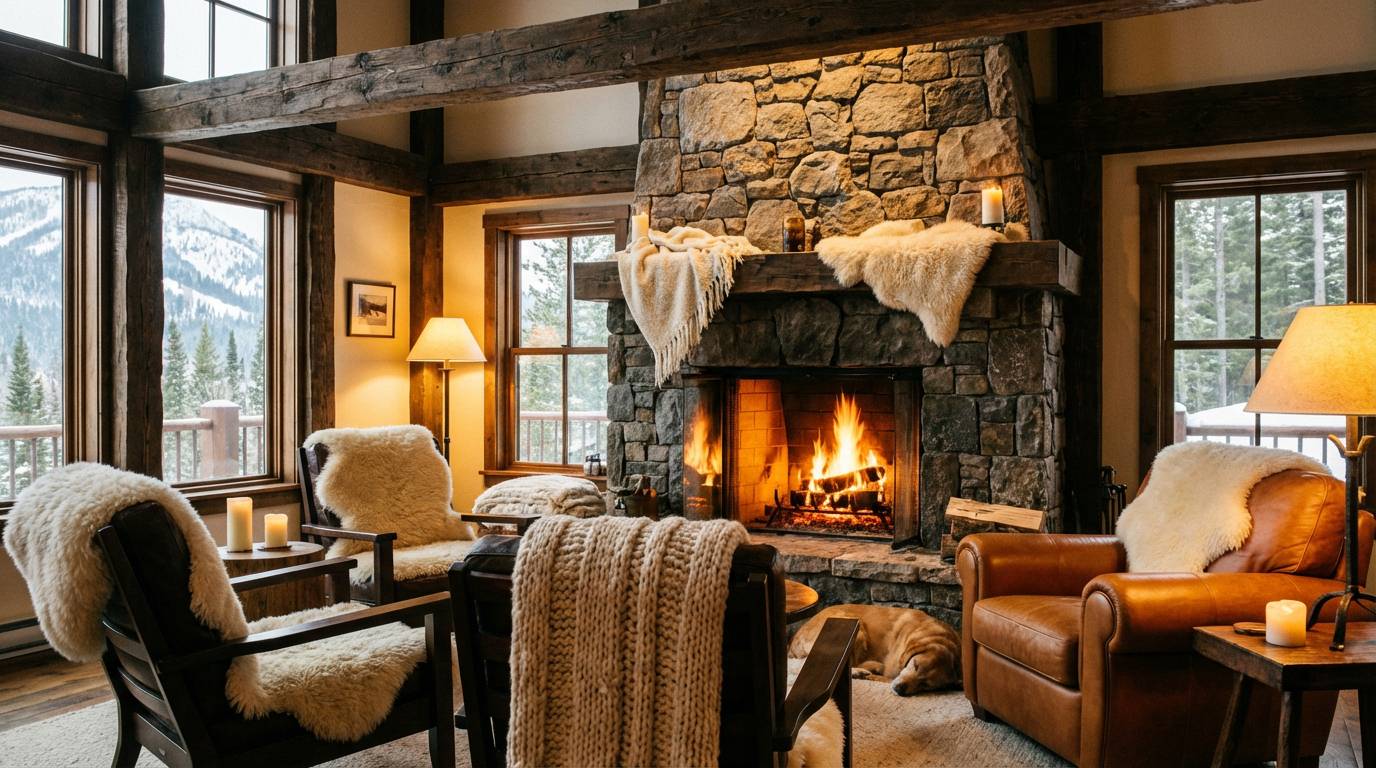
13) Nougat Bark
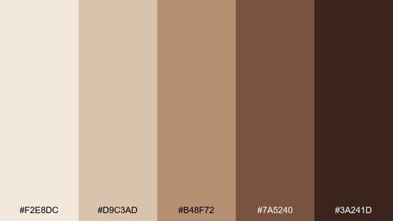
HEX: #f2e8dc #d9c3ad #b48f72 #7a5240 #3a241d
Mood: rustic and steady
Best for: outdoor lodge interiors
Rustic and steady, these shades resemble nougat, tree bark, and a stone hearth. Use cream for ceilings or large textiles to keep the space bright, then bring in bark browns through beams, leather, and frames. It pairs naturally with hunter green and iron black hardware. Tip: add one large cream element (like a rug) to balance heavy wood tones.
Image example of nougat bark generated using media.io
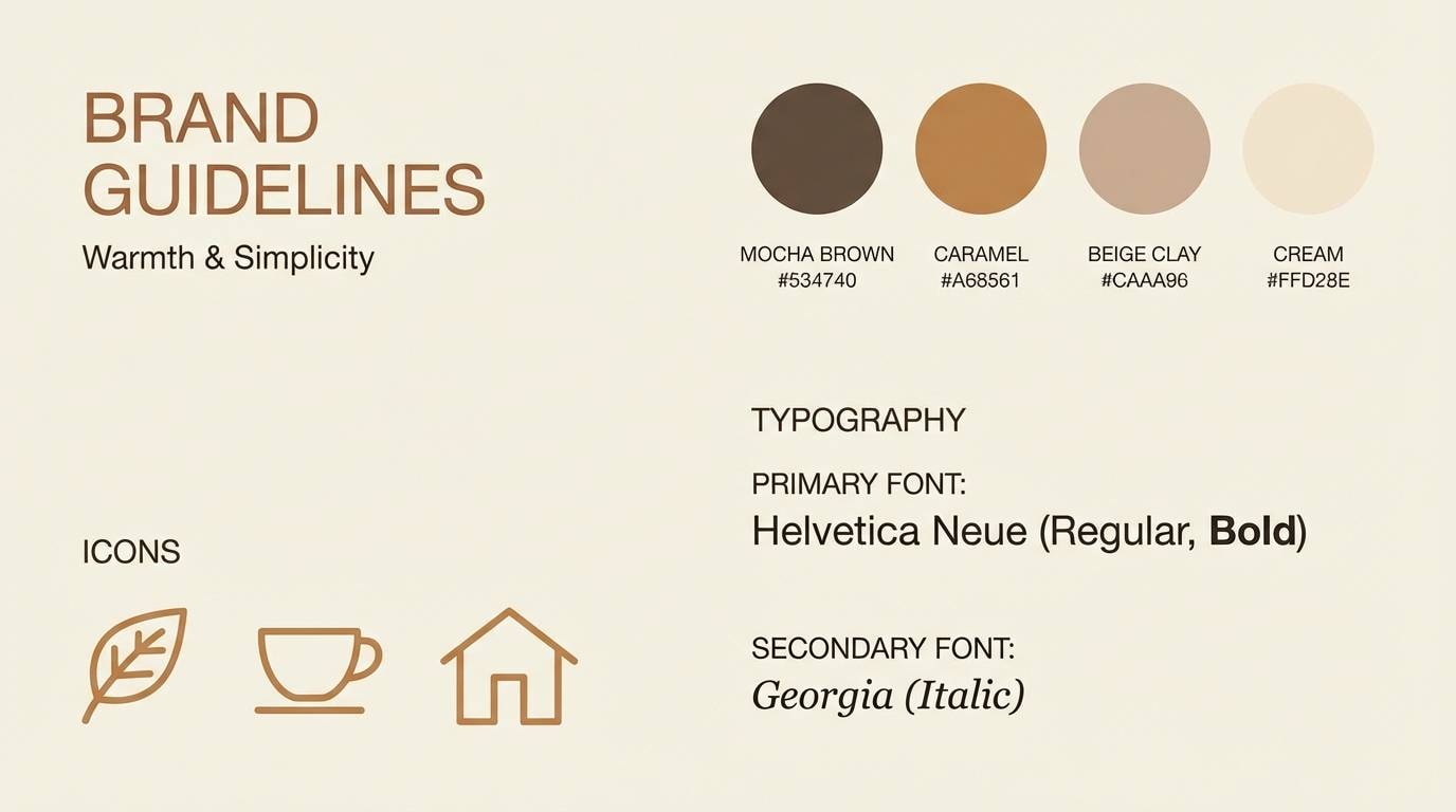
14) Latte Stone
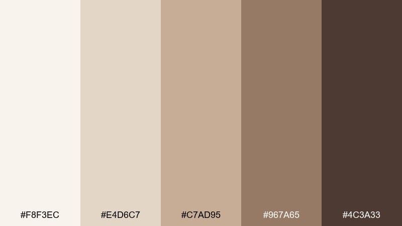
HEX: #f8f3ec #e4d6c7 #c7ad95 #967a65 #4c3a33
Mood: minimal and modern
Best for: brand guidelines and presentations
Minimal and modern, it feels like latte foam against smooth stone. Use the light cream for slides and document pages, then apply the stone-tan mid tones to charts, callouts, and section headers. Pair with crisp black or a cool steel gray for a contemporary edge. Tip: keep accent usage consistent by assigning one shade to one function (links, highlights, or tags).
Image example of latte stone generated using media.io
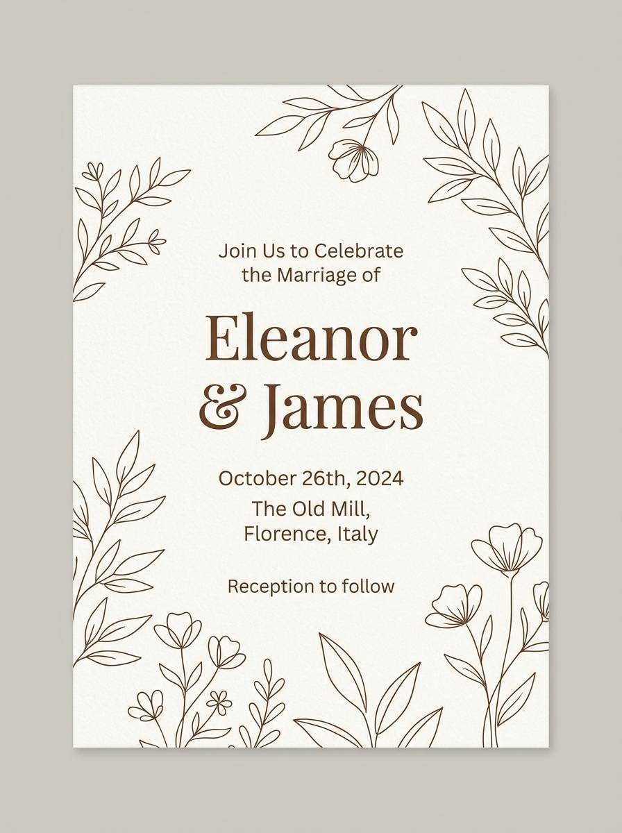
15) Antique Parchment
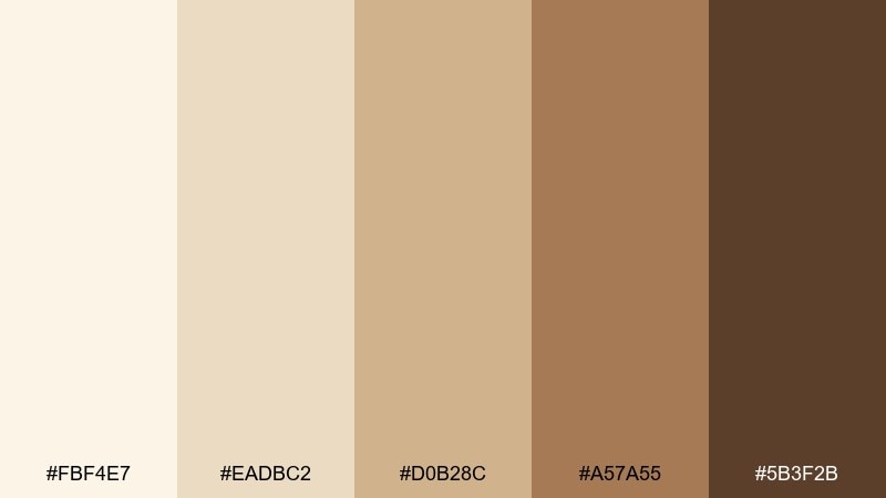
HEX: #fbf4e7 #eadbc2 #d0b28c #a57a55 #5b3f2b
Mood: classic and bookish
Best for: wedding invitations and stationery
Classic and bookish, it evokes antique paper, pressed florals, and soft candlelight. A cream brown color palette like this shines with elegant serif type and delicate line illustrations. Pair it with a dusty rose wax seal or muted sage greenery to keep the look romantic. Tip: print the darkest brown slightly softer than black to preserve the vintage feel.
Image example of antique parchment generated using media.io
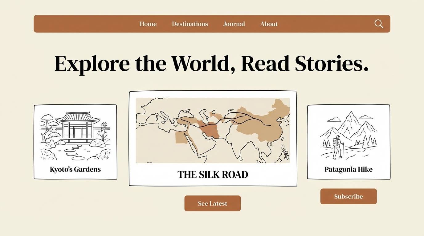
16) Desert Cappuccino
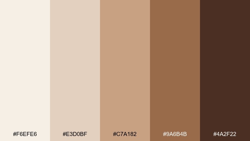
HEX: #f6efe6 #e3d0bf #c7a182 #9a6b4b #4a2f22
Mood: adventurous and warm
Best for: travel blog hero banners
Adventurous and warm, it reads like desert dust meeting cappuccino crema. Use the light cream for airy headers, then bring in the deeper browns for navigation and button states. Pair with a muted turquoise accent to hint at oasis tones without overpowering the neutrals. Tip: keep gradients subtle so the design stays natural, not glossy.
Image example of desert cappuccino generated using media.io
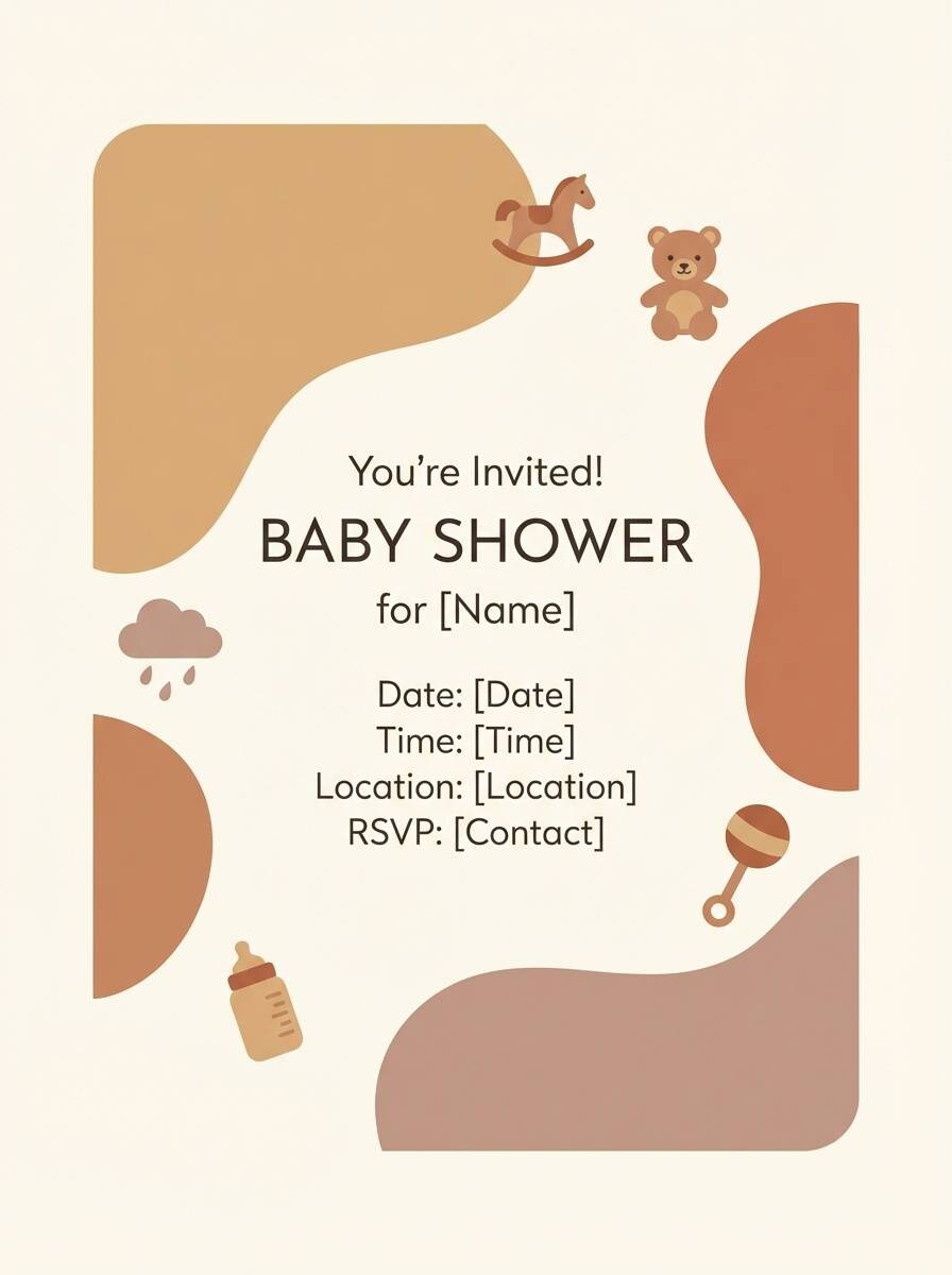
17) Toasted Marshmallow
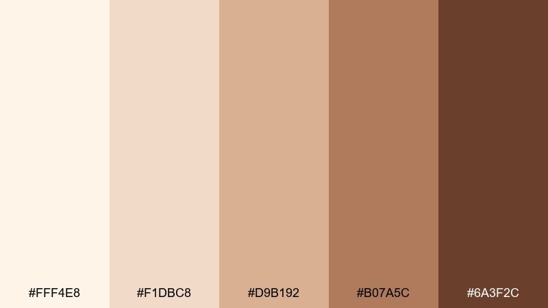
HEX: #fff4e8 #f1dbc8 #d9b192 #b07a5c #6a3f2c
Mood: playful and comforting
Best for: baby shower invites and party printables
Playful and comforting, these colors feel like toasted marshmallows and soft knit blankets. Use the palest cream as the main backdrop, then add rounded shapes in warm tan for headings and stickers. Pair with a gentle pastel blue or lavender to keep it sweet and light. Tip: choose one darker brown for tiny outlines so the design stays readable at small sizes.
Image example of toasted marshmallow generated using media.io
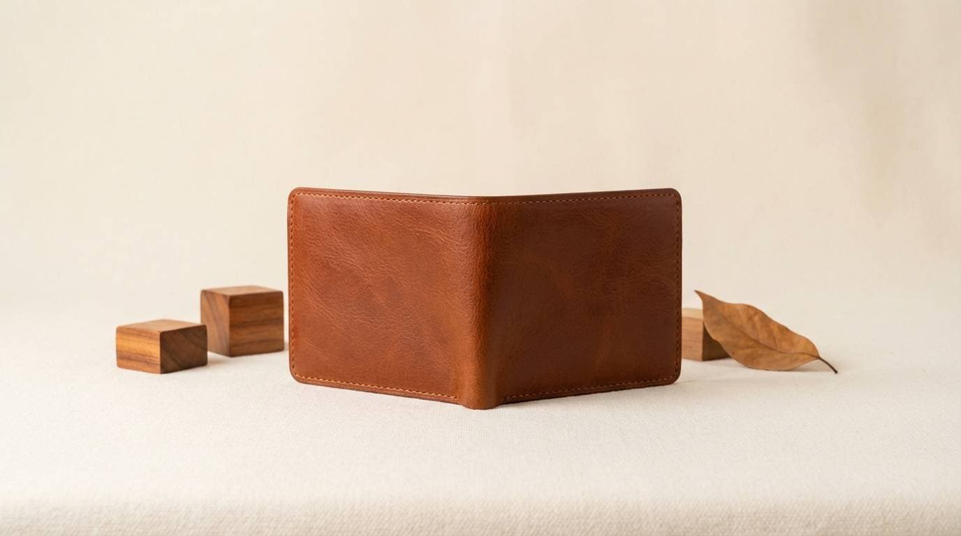
18) Rustic Suede

HEX: #f2e6d8 #dec4ae #b58d72 #7b4f3a #2e1c17
Mood: rugged and premium
Best for: leather goods product ads
Rugged and premium, it brings up images of suede texture, worn-in belts, and workshop tools. Let the cream tone act as clean negative space while the deeper browns frame the product and typography. Pair with a hint of brushed metal gray to echo hardware details. Tip: keep highlights soft and directional so the browns look tactile, not flat.
Image example of rustic suede generated using media.io
19) Warm Pebble
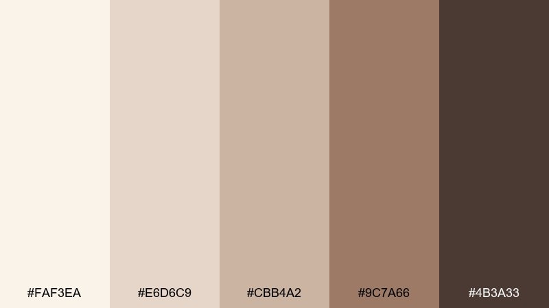
HEX: #faf3ea #e6d6c9 #cbb4a2 #9c7a66 #4b3a33
Mood: quiet and balanced
Best for: minimalist app onboarding screens
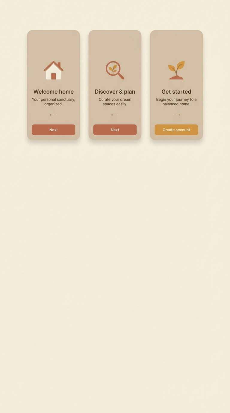
Quiet and balanced, it feels like smooth pebbles on a warm shoreline. Use cream as the screen base, then apply pebble tans for cards, progress steps, and subtle dividers. Pair with a soft blue-gray for links to keep the interface calm and readable. Tip: rely on spacing and type scale more than color blocks to maintain the minimalist mood.
Image example of warm pebble generated using media.io
20) Sable Cream
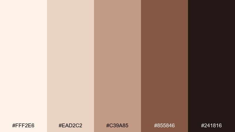
HEX: #fff2e6 #ead2c2 #c39a85 #855846 #241816
Mood: dramatic and refined
Best for: coffee bag packaging and labels
Dramatic and refined, it suggests sable shadows, crema swirls, and a dark-roast aroma. For bold cream brown color combinations, keep the cream areas generous and let the near-black brown carry the brand mark and roast notes. Pair with a tiny copper accent to add a premium, craft feel. Tip: test readability at a distance, since packaging often sits on shelves under warm lighting.
Image example of sable cream generated using media.io
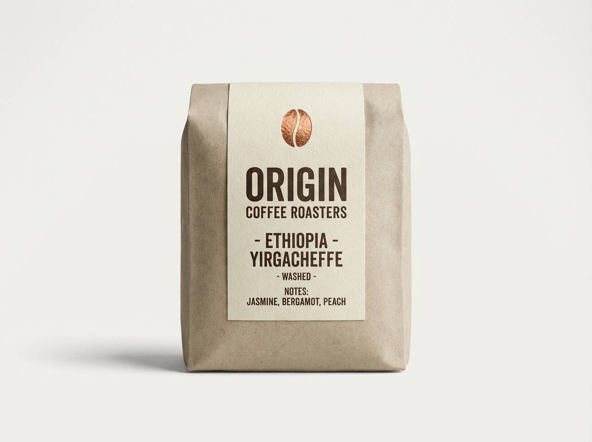
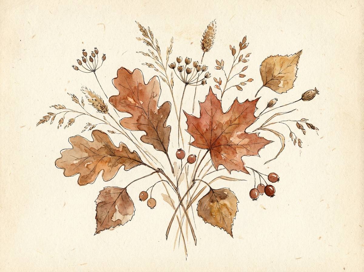
21) Cinnamon Cream Field
HEX: #f9f1e6 #ead4bf #d2a684 #a86b4b #5d3324
Mood: warm and botanical
Best for: autumn botanical illustrations
Warm and botanical, it looks like cinnamon-dusted petals and dried grasses in a sunlit field. Use the cream for paper tone, then paint layered washes of tan and brown to build depth in leaves and stems. Pair with muted olive or dusty ochre for an earthy seasonal accent. Tip: keep outlines light and let value shifts do the work for a softer illustration style.
Image example of cinnamon cream field generated using media.io
What Colors Go Well with Cream Brown?
Cream brown pairs beautifully with muted greens (sage, olive, forest) for an earthy, organic feel. This is a reliable combo for cafés, wellness brands, and home interiors where you want calm warmth.
For contrast that still feels refined, add cool tones like slate blue, dusty blue, or steel gray. These hues balance the warmth and help buttons, links, or key UI states stand out.
If you want a more premium or romantic direction, try small accents of champagne gold, copper, blush, or burgundy. Keep accents limited so the neutrals remain the main character.
How to Use a Cream Brown Color Palette in Real Designs
Start with cream as the base for large areas (backgrounds, walls, packaging fields), then use mid browns for structure—cards, section headers, frames, and dividers. Reserve the deepest brown for the smallest elements that need maximum legibility, like headlines, icons, or price tags.
In UI design, treat warm taupes as border/shadow colors to avoid harsh edges. In print, choose paper stock and finishes carefully—uncoated or warm off-white surfaces often make creams look softer and more premium.
To avoid a flat monochrome look, introduce one cool counterbalance (like slate-blue links) or one warm luxury accent (like copper foil). Use repetition—one supporting brown in multiple places—to make the palette feel intentional.
Create Cream Brown Palette Visuals with AI
If you already have HEX codes, you can turn them into matching visuals by generating posters, brand mockups, UI screens, and packaging concepts with text prompts. This makes it easier to validate a palette before you commit to full production.
Use prompts that mention the mood (cozy, minimal, premium), the surface (paper, linen, studio backdrop), and the design style (flat vector, photorealistic, editorial grid). Then refine by specifying where cream is used (background) and where dark brown appears (type, logos, small details).
With Media.io, you can quickly iterate on multiple directions—warm neutral, rustic, modern—while keeping the same cream brown foundation consistent.
Cream Brown Color Palette FAQs
-
What does a cream brown color palette communicate?
It usually signals warmth, comfort, reliability, and natural quality. Cream softens the look, while brown adds grounded, trustworthy weight—great for food, lifestyle, and craft brands. -
Are cream brown palettes good for websites and UI design?
Yes, especially when you use cream for backgrounds and reserve the darkest brown for key text and critical metrics. Add one cool accent (like slate blue) for links and interactive states to improve clarity. -
How do I keep cream from looking yellow or dirty?
Pair it with clean mid-tone tans and one deep brown for definition, and avoid stacking too many warm filters or orange accents. In print, a warm off-white paper stock often looks better than stark bright white. -
What accent colors work best with cream and brown?
Muted sage/olive, slate-blue, dusty turquoise, blush, burgundy, and metallics like brass or copper all pair well. Pick one accent direction and keep it minimal to avoid visual clutter. -
Which brown should I use for text on cream backgrounds?
Use the darkest brown in the palette for small text and UI labels to maintain readability. For headings, you can use a slightly lighter dark brown if it still passes contrast requirements. -
How many colors should I use from a cream brown palette?
For most designs, 3–5 shades are enough: one cream base, one light tan, one mid brown, one deep brown, plus optionally one accent color. This keeps hierarchy clear and consistent. -
Can I generate cream brown mockups and ads with AI?
Yes. Mention “cream background” and “brown typography” in your prompt, then add the design type (menu, packaging, UI, invitation) and the style (flat vector, photorealistic, editorial) to get consistent results.
Next: Bubble Gum Color Palette


