

Bubble gum colors sit right at the sweet spot between playful and polished. With the right balance of pinks, creams, and fresh accents, they can feel youthful without looking childish.
Below are bubble gum color palette ideas with HEX codes, plus quick tips for using each scheme in branding, UI, packaging, and social graphics.
In this article
- Why Bubble Gum Palettes Work So Well
-
- cotton candy cream
- strawberry milk pop
- pink lemonade mist
- frosted bubblegum mint
- ballet slipper neutrals
- neon chew burst
- rose quartz soda
- marshmallow sky
- raspberry sorbet
- peony punch
- retro diner pastels
- sakura sprinkle
- flamingo frost
- soft pop gradient
- candy shop contrast
- blush and cocoa
- lavender taffy
- melon sugar glow
- coral chew chic
- powder pink editorial
- What Colors Go Well with Bubble Gum?
- How to Use a Bubble Gum Color Palette in Real Designs
- Create Bubble Gum Palette Visuals with AI
Why Bubble Gum Palettes Work So Well
Bubble gum palettes are naturally attention-grabbing because pink sits near the “human” side of color psychology: warmth, friendliness, and approachability. Even small doses can make a layout feel more inviting.
They’re also flexible. Shift the accents toward mint, lilac, or warm cream and the same pink core can move from cute and playful to editorial and premium.
Most importantly, bubble gum schemes layer well. You can build depth using tints (blush, cream, near-white) while keeping one saturated pink for clear hierarchy and CTAs.
20+ Bubble Gum Color Palette Ideas (with HEX Codes)
1) Cotton Candy Cream
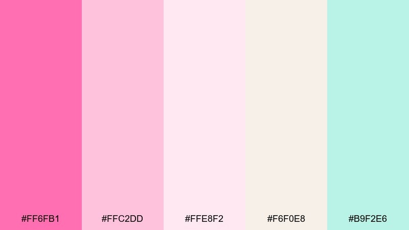
HEX: #FF6FB1 #FFC2DD #FFE8F2 #F6F0E8 #B9F2E6
Mood: airy, sweet, comforting
Best for: skincare branding and pastel packaging
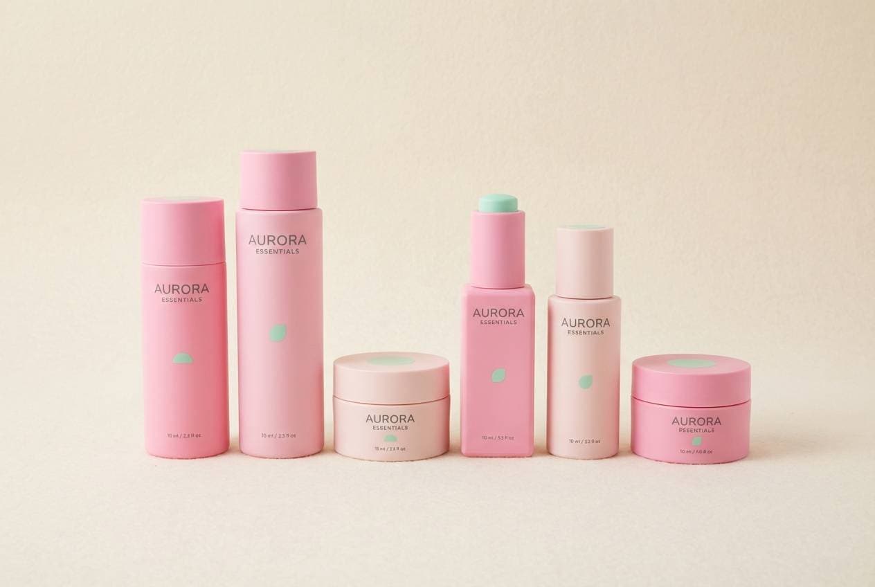
Airy sweetness like spun sugar and whipped cream makes the pinks feel friendly, while mint adds a clean finish. It works beautifully on skincare labels, bath products, and soft-touch packaging where you want a gentle, youthful vibe. Pair it with warm off-white paper stock and minimal black typography to keep everything legible. For a polished look, use the bright pink as the only accent and let cream do most of the heavy lifting in this bubble gum color palette.
Image example of cotton candy cream generated using media.io
Media.io is an online AI studio for creating and editing video, image, and audio in your browser.

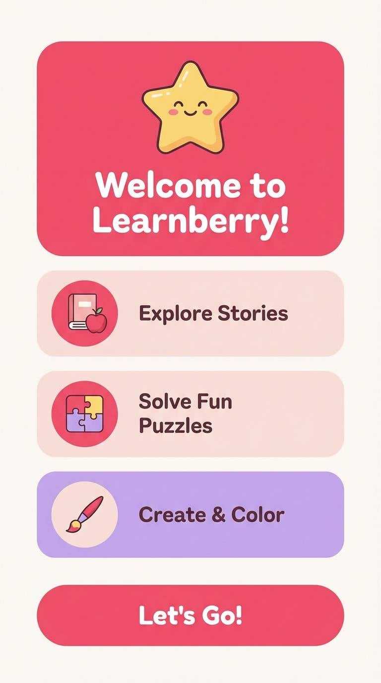
2) Strawberry Milk Pop
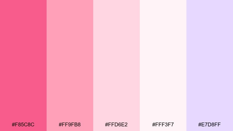
HEX: #F85C8C #FF9FB8 #FFD6E2 #FFF3F7 #E7D8FF
Mood: cute, soft, upbeat
Best for: kids app UI and onboarding screens
Cute strawberry-milk pinks with a lilac tint feel instantly welcoming and lighthearted. These tones are ideal for kid-friendly UI, onboarding screens, and playful micro-illustrations. Keep contrast strong by using the deeper pink for buttons and the palest blush for surfaces. A simple tip: reserve lilac for secondary highlights so the main actions stay clearly pink-led.
Image example of strawberry milk pop generated using media.io
3) Pink Lemonade Mist
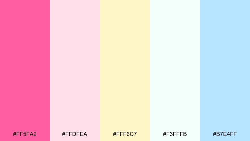
HEX: #FF5FA2 #FFDFEA #FFF6C7 #F3FFFB #B7E4FF
Mood: fresh, sunny, breezy
Best for: spring event flyers and social posts
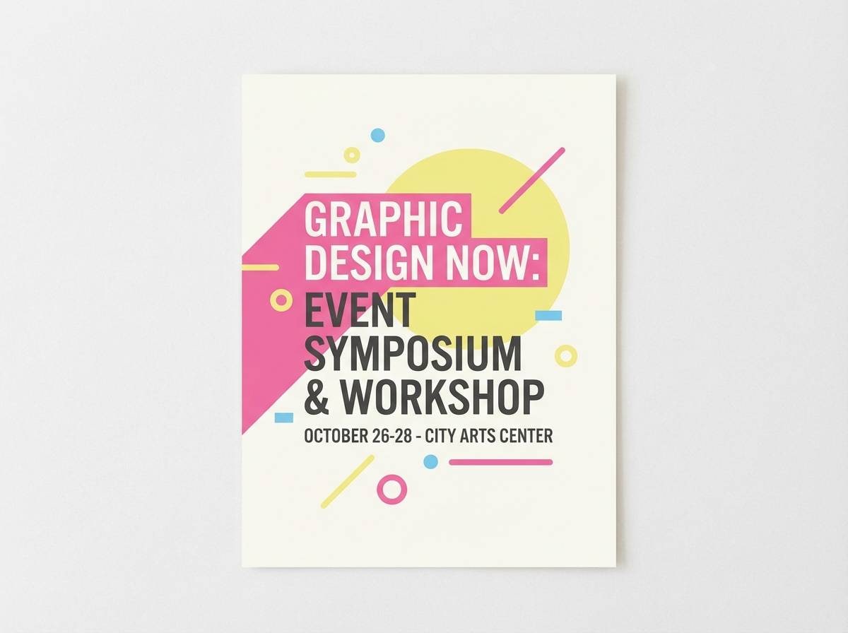
Fresh pink lemonade energy meets airy pastels, giving the whole mix a bright spring breeze. It shines on event flyers and social graphics where you need cheerful color without harsh saturation. Pair it with clean sans-serif type and plenty of whitespace so the pale yellow stays crisp. Tip: use the sky blue only for small icons or dividers to keep the palette feeling warm overall.
Image example of pink lemonade mist generated using media.io
4) Frosted Bubblegum Mint
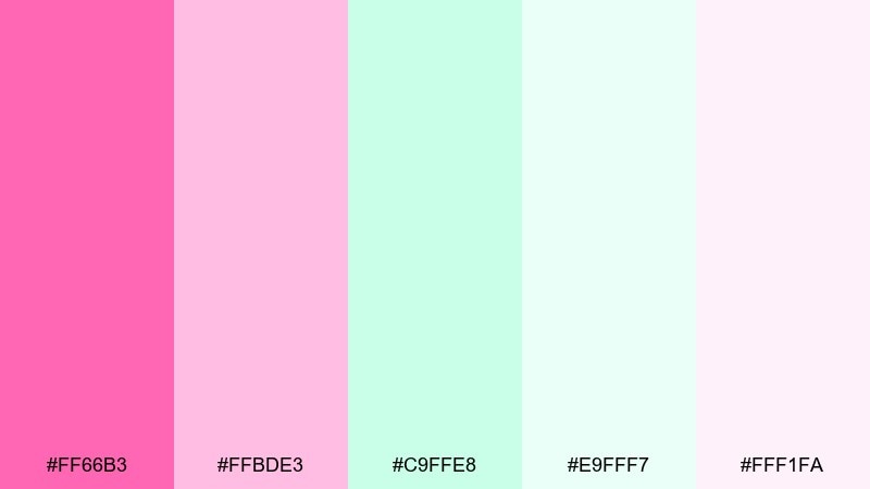
HEX: #FF66B3 #FFBDE3 #C9FFE8 #E9FFF7 #FFF1FA
Mood: clean, glossy, playful
Best for: beauty product ads and hero banners
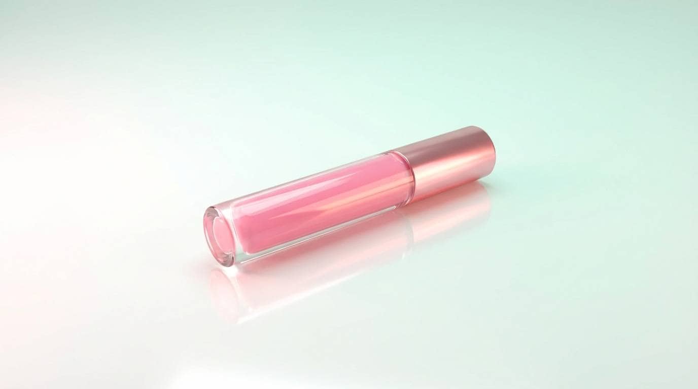
Glossy candy tones with a frosted mint twist feel clean and modern, like a fresh lip gloss swipe. They work well in beauty ads, homepage hero banners, and product launch visuals that need pop without going neon. Pair with crisp white space and a single dark text color for strong contrast. Usage tip: let mint be the background wash and save the hot pink for the call to action.
Image example of frosted bubblegum mint generated using media.io
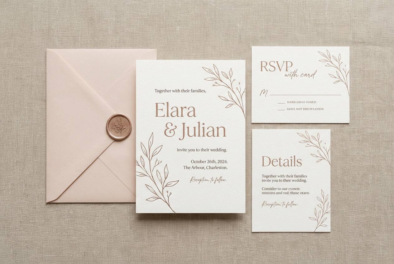
5) Ballet Slipper Neutrals
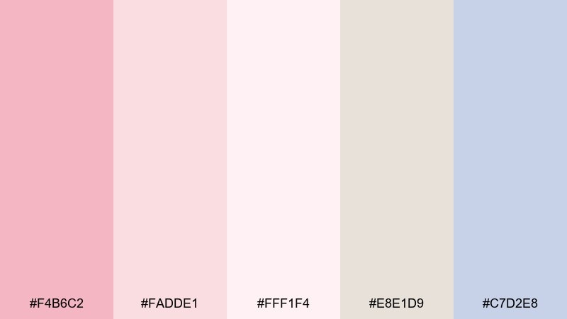
HEX: #F4B6C2 #FADDE1 #FFF1F4 #E8E1D9 #C7D2E8
Mood: delicate, calm, refined
Best for: wedding invitations and stationery sets
Delicate ballet pinks and soft neutrals create a calm, refined tone with a hint of vintage romance. It is a natural fit for wedding invitations, RSVP cards, and minimal stationery where paper texture matters. Pair with charcoal ink, thin serif type, and subtle line art to keep it elegant. Tip: use the cool gray-lilac as a border or monogram accent instead of a full background.
Image example of ballet slipper neutrals generated using media.io
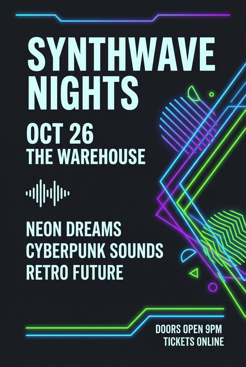
6) Neon Chew Burst
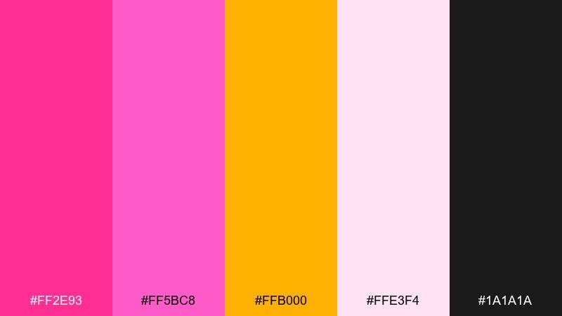
HEX: #FF2E93 #FF5BC8 #FFB000 #FFE3F4 #1A1A1A
Mood: bold, energetic, nightlife
Best for: music posters and streetwear drops
Bold chewable neon with a black anchor feels like club lights and glossy candy wrappers. It is great for music posters, streetwear drop graphics, and attention-grabbing promos where you want instant impact. Keep backgrounds light pink and use black for type to avoid readability issues on neon areas. For punchy bubble gum color combinations, let orange act as a small flare rather than a full block of color.
Image example of neon chew burst generated using media.io
7) Rose Quartz Soda
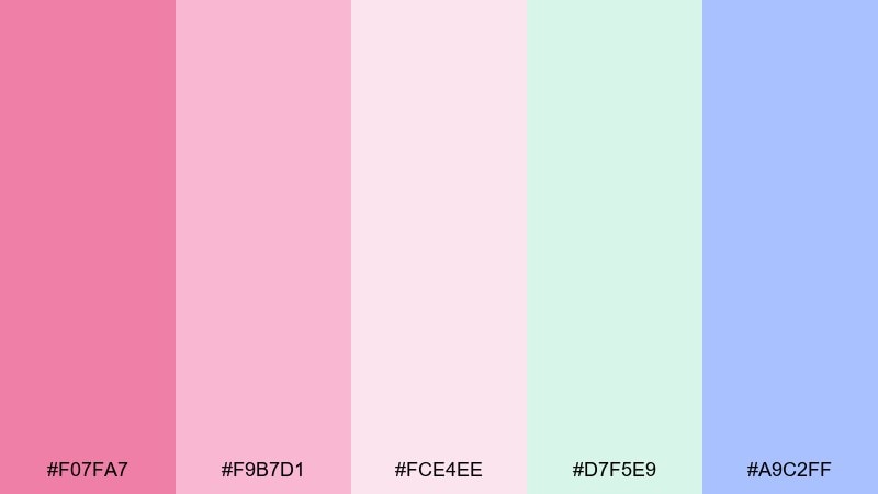
HEX: #F07FA7 #F9B7D1 #FCE4EE #D7F5E9 #A9C2FF
Mood: sparkly, optimistic, modern
Best for: wellness branding and email headers
Sparkly rose quartz pinks with mint and periwinkle feel optimistic, like a fizzy soda poured over ice. These colors fit wellness branding, email headers, and lifestyle graphics that need a friendly, modern softness. Pair with airy photography and simple icon sets so the palette stays the star. Tip: keep periwinkle for small links or badges to prevent the layout from turning too cool.
Image example of rose quartz soda generated using media.io
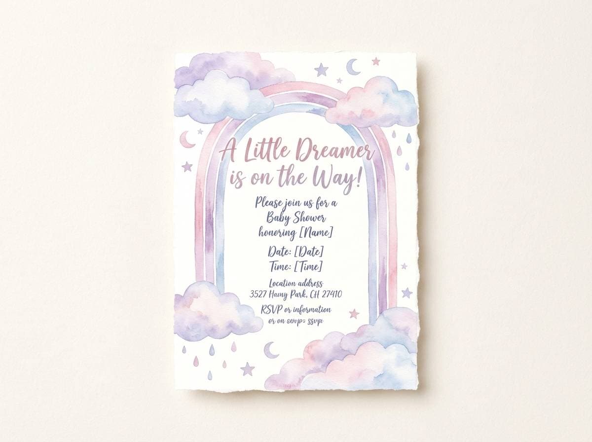
8) Marshmallow Sky
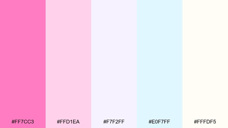
HEX: #FF7CC3 #FFD1EA #F7F2FF #E0F7FF #FFFDF5
Mood: dreamy, weightless, gentle
Best for: baby shower invites and soft illustrations
Dreamy marshmallow pinks and cloudlike cool pastels evoke a soft sky at sunrise. It is perfect for baby shower invites, gentle illustration work, and sweet announcement cards. Pair with light gray text and plenty of margin so the pale tones feel intentional rather than washed out. Tip: add a thin outline around key shapes to keep them readable on the near-white shades.
Image example of marshmallow sky generated using media.io
9) Raspberry Sorbet
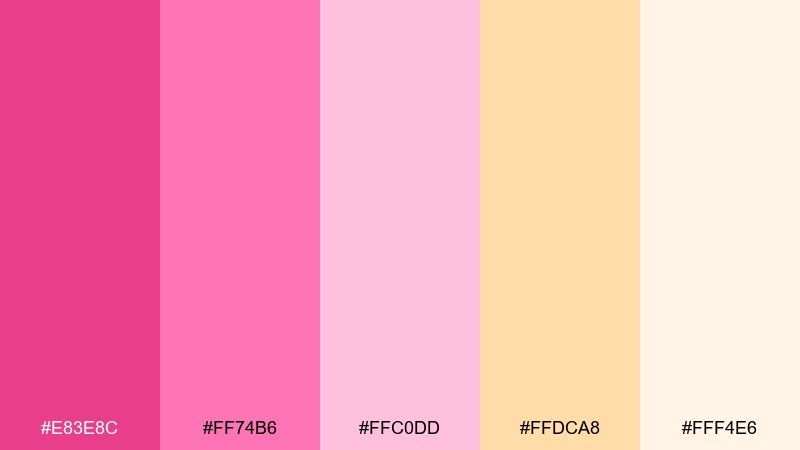
HEX: #E83E8C #FF74B6 #FFC0DD #FFDCA8 #FFF4E6
Mood: juicy, fun, appetite-friendly
Best for: dessert shop menus and Instagram promos
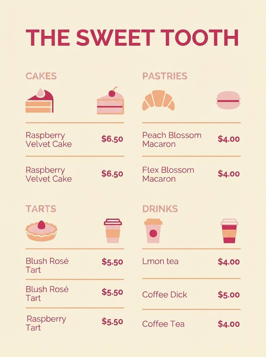
Juicy raspberry pinks with creamy peach and vanilla tones feel delicious and inviting. It is a strong choice for dessert shop menus, cafe promos, and social posts that benefit from a warm, appetite-friendly palette. Pair with clean white space and simple food photography to avoid visual clutter. Tip: use the deepest raspberry for prices and headings so the layout stays readable.
Image example of raspberry sorbet generated using media.io
10) Peony Punch
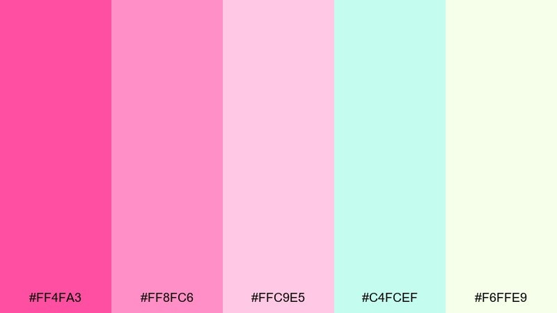
HEX: #FF4FA3 #FF8FC6 #FFC9E5 #C4FCEF #F6FFE9
Mood: flirty, bright, refreshing
Best for: summer campaign landing pages
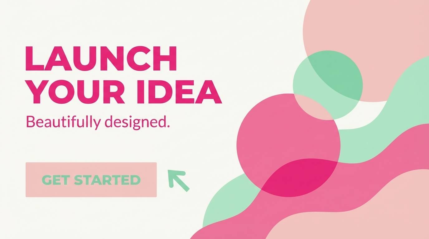
Flirty peony pinks with a refreshing mint splash feel like a summer drink with crushed ice. These tones work well for campaign landing pages, signup sections, and bright promo blocks. Pair with bold headlines and large buttons so the saturated pink reads as intentional. Tip: keep mint to secondary sections or badges to maintain a pink-first hierarchy.
Image example of peony punch generated using media.io
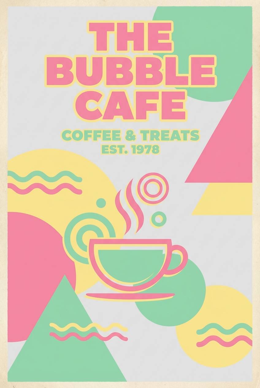
11) Retro Diner Pastels
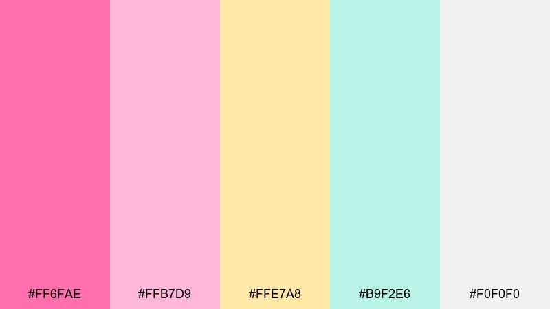
HEX: #FF6FAE #FFB7D9 #FFE7A8 #B9F2E6 #F0F0F0
Mood: nostalgic, cheerful, friendly
Best for: cafe branding and retro posters
Nostalgic diner pastels bring to mind milkshakes, chrome details, and sunny counter seats. It fits cafe branding, retro posters, and menu boards that want a cheerful throwback vibe. Pair with bold sans-serif type and simple geometric shapes for a true mid-century feel. Tip: use gray as the grounding neutral so yellow stays bright instead of muddy.
Image example of retro diner pastels generated using media.io
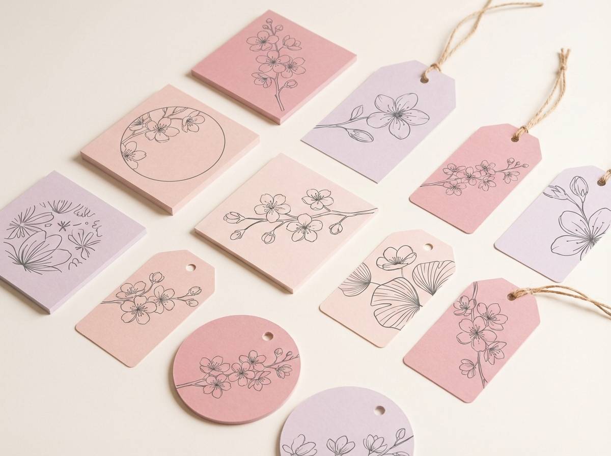
12) Sakura Sprinkle
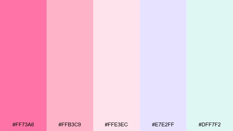
HEX: #FF73A6 #FFB3C9 #FFE3EC #E7E2FF #DFF7F2
Mood: soft, romantic, springtime
Best for: seasonal product labels and gift tags
Soft sakura pinks with lavender and airy mint feel like petals drifting over a spring market. It works especially well for seasonal labels, gift tags, and limited-edition packaging. Pair with delicate line illustrations and a warm white background for a handcrafted look. Tip: keep the lavender to small pattern details so the pinks stay dominant.
Image example of sakura sprinkle generated using media.io
13) Flamingo Frost
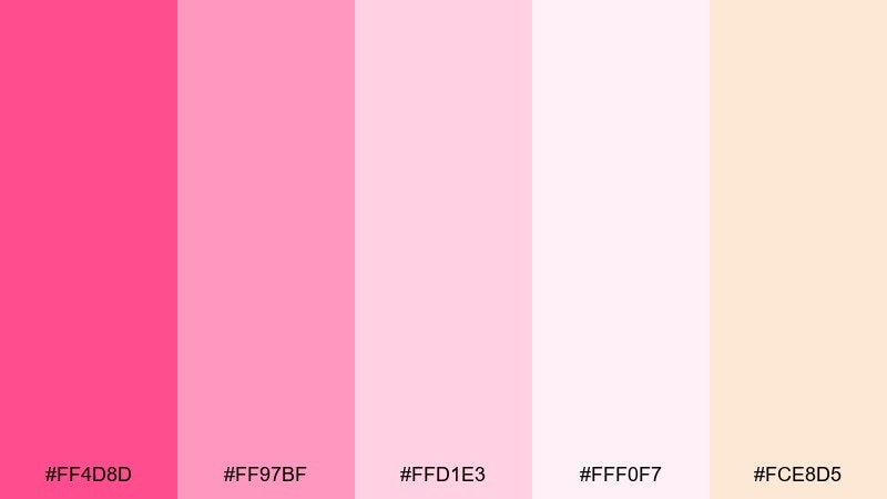
HEX: #FF4D8D #FF97BF #FFD1E3 #FFF0F7 #FCE8D5
Mood: warm, glossy, romantic
Best for: cosmetics e-commerce banners
Warm flamingo pinks with frosted blush and a hint of peach feel glossy and romantic. They suit cosmetics e-commerce banners, product category headers, and promotional strips where color needs to sell the mood quickly. Pair with high-contrast black or deep plum type for readability across the pale surfaces. Tip: use the deepest pink for badges like new or limited to guide the eye.
Image example of flamingo frost generated using media.io
14) Soft Pop Gradient
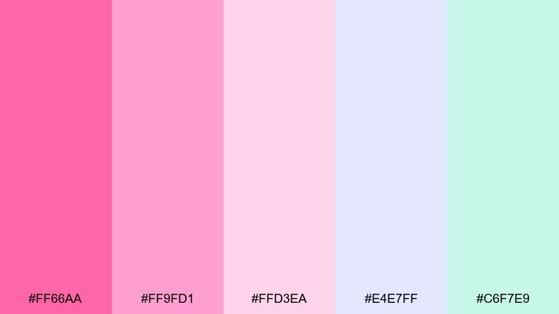
HEX: #FF66AA #FF9FD1 #FFD3EA #E4E7FF #C6F7E9
Mood: smooth, modern, calming
Best for: app gradients and SaaS illustrations
Smooth pop gradients in pink, lilac, and mint feel modern and calm, like a soft neon glow behind frosted glass. It is ideal for app backgrounds, SaaS illustration sets, and subtle hero gradients that do not overpower content. Pair with dark navy text and simple icons to keep contrast reliable. Tip: build a two-color gradient from pink to lilac, then add mint only as a highlight stroke.
Image example of soft pop gradient generated using media.io
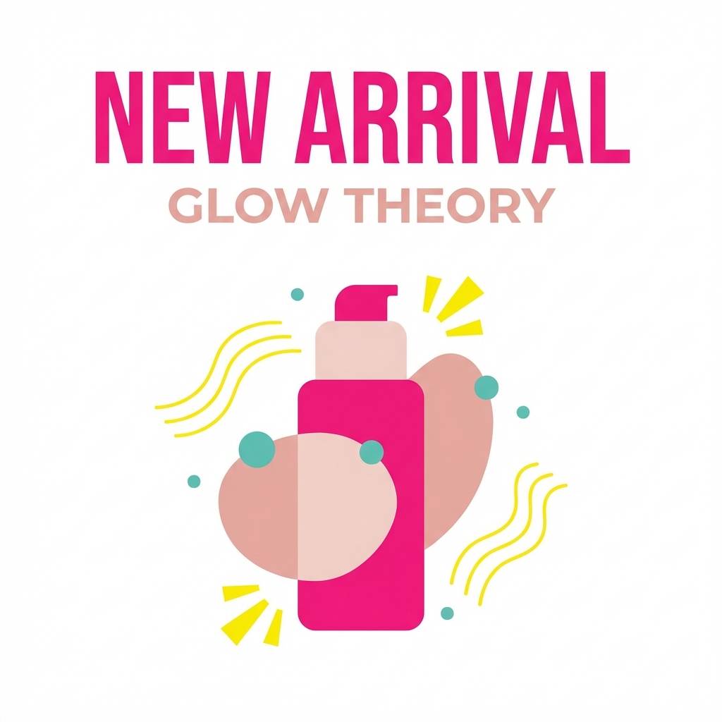
15) Candy Shop Contrast
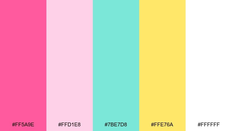
HEX: #FF5A9E #FFD1E8 #7BE7D8 #FFE76A #FFFFFF
Mood: playful, bright, high-contrast
Best for: product launch graphics and ads
Playful candy colors with crisp contrast feel loud in the best way, like a bright storefront window display. They work for product launch graphics, bold ads, and punchy social carousels that need to stop the scroll. Pair with white space and simple shapes so the yellow does not overwhelm the pink. For bubble gum color combinations that stay modern, keep teal limited to icons and small supporting blocks.
Image example of candy shop contrast generated using media.io
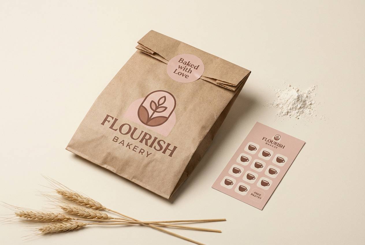
16) Blush and Cocoa
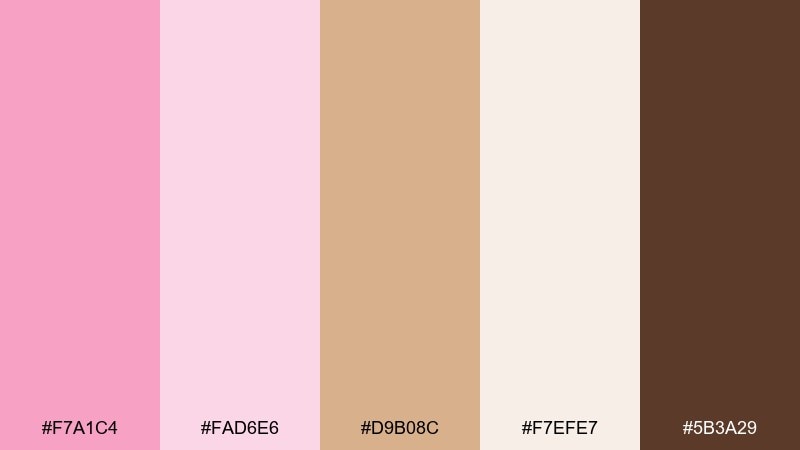
HEX: #F7A1C4 #FAD6E6 #D9B08C #F7EFE7 #5B3A29
Mood: cozy, sophisticated, boutique
Best for: bakery packaging and cafe loyalty cards
Cozy blush paired with cocoa browns feels like a pink latte and warm pastry on a quiet morning. It is great for bakery packaging, cafe loyalty cards, and boutique branding that needs sweetness with maturity. Pair with kraft textures and dark brown typography to reinforce the handmade feel. Tip: keep the darkest cocoa for logos and key text so blush can stay soft and airy.
Image example of blush and cocoa generated using media.io
17) Lavender Taffy
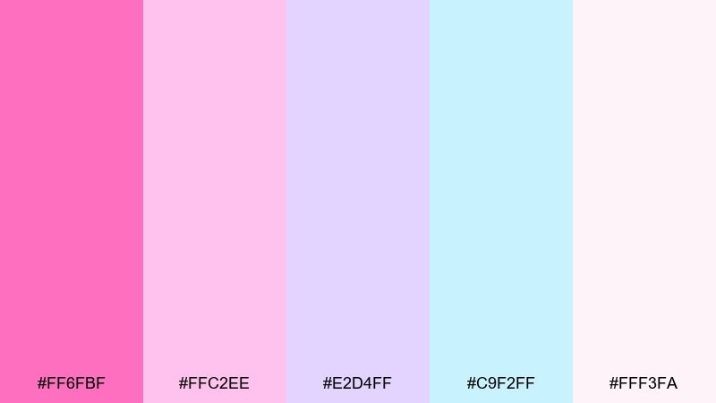
HEX: #FF6FBF #FFC2EE #E2D4FF #C9F2FF #FFF3FA
Mood: whimsical, light, dreamy
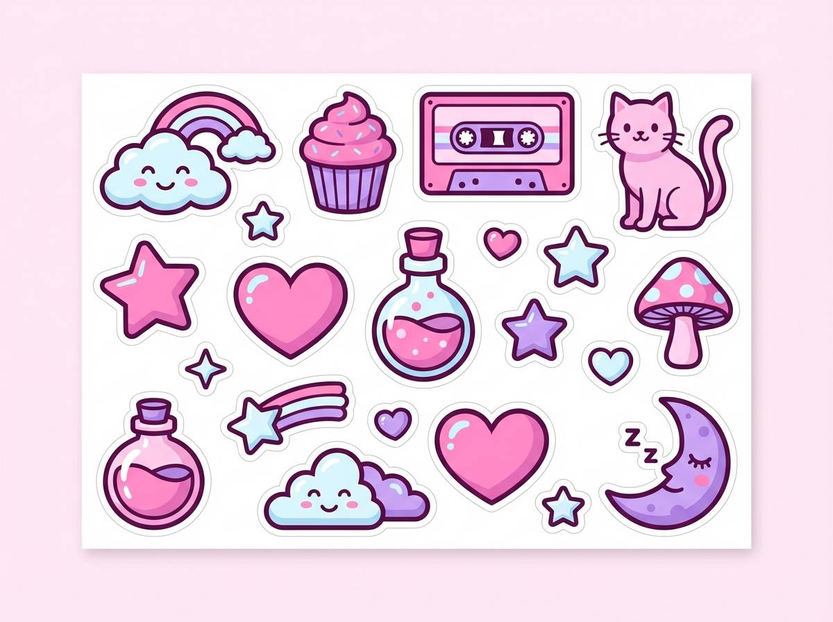
Best for: creator merch and sticker packs
Whimsical pink-lavender taffy tones feel dreamy and light, perfect for playful shapes and cute characters. They are a strong fit for creator merch, sticker packs, and illustrated assets where you want softness without going beige. Pair with dark plum outlines and simple shading so the pastels stay readable. Tip: use the icy blue only for highlights and sparkles to keep the mood warm.
Image example of lavender taffy generated using media.io
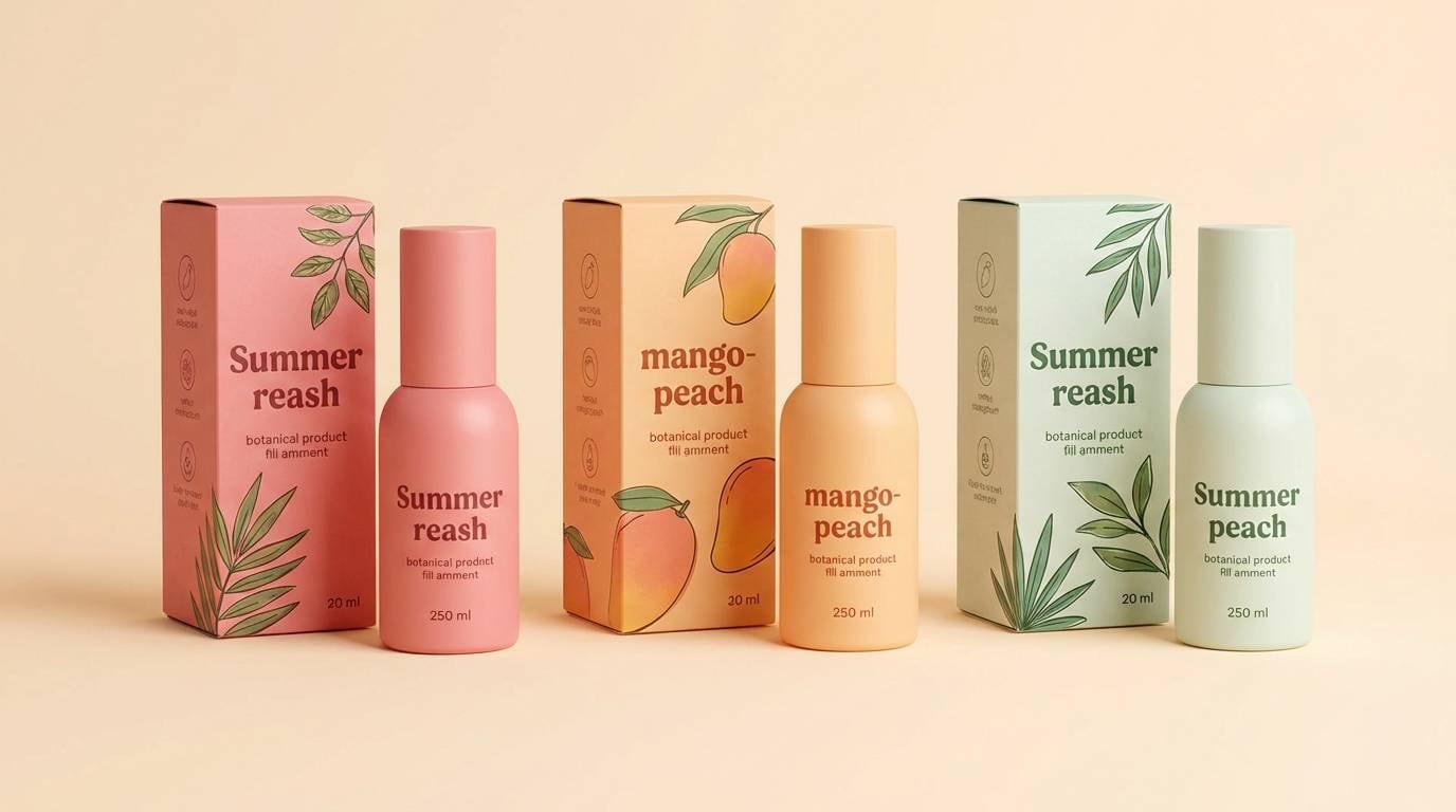
18) Melon Sugar Glow
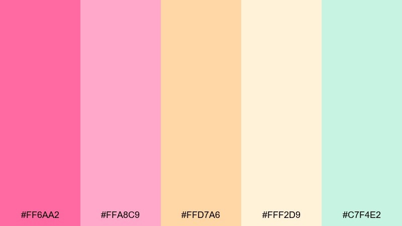
HEX: #FF6AA2 #FFA8C9 #FFD7A6 #FFF2D9 #C7F4E2
Mood: warm, sunny, friendly
Best for: summer packaging and lifestyle posts
Warm melon pink with creamy mango and a cool mint hint feels sunny and approachable. It works nicely for summer packaging, lifestyle posts, and promotional bundles where you want color that looks good on both light and warm backgrounds. Pair with minimal shadows and soft gradients for a modern glow effect. Tip: keep the peachy cream as the main background to make the pink feel richer.
Image example of melon sugar glow generated using media.io
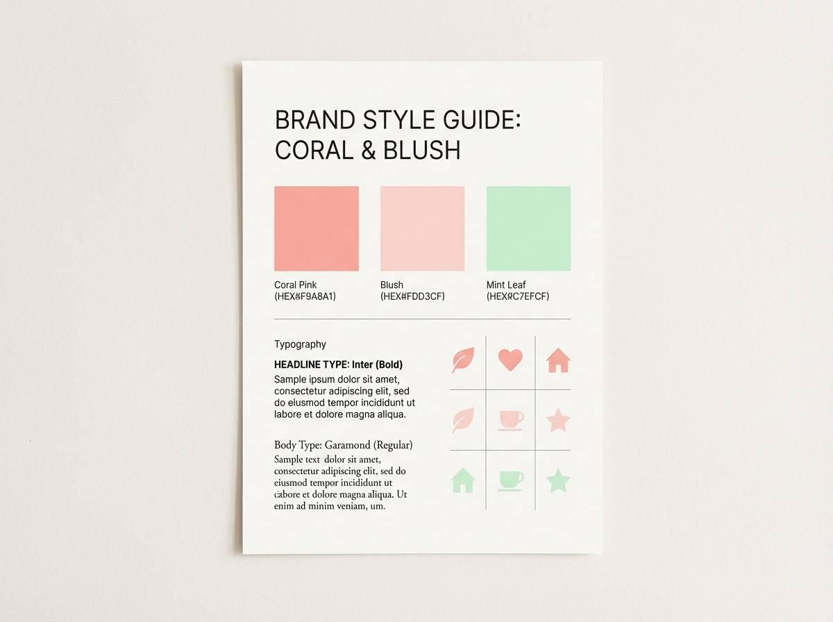
19) Coral Chew Chic
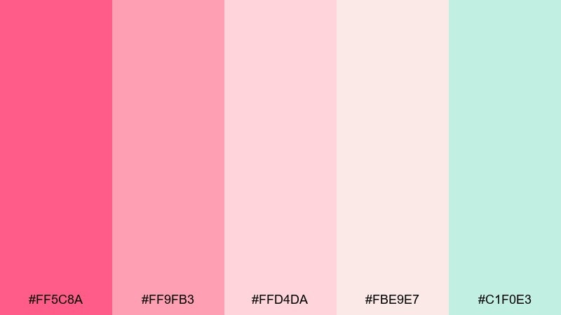
HEX: #FF5C8A #FF9FB3 #FFD4DA #FBE9E7 #C1F0E3
Mood: modern, lively, approachable
Best for: brand style guides and pitch decks
Modern coral-leaning pinks with soft blush and mint feel lively but professional enough for brand work. This mix is great for style guides, pitch decks, and startup branding where you want warmth without looking childish. Pair with clean grids, plenty of white space, and a single dark neutral for type. Tip: use mint for charts and highlights so the coral family remains the hero.
Image example of coral chew chic generated using media.io
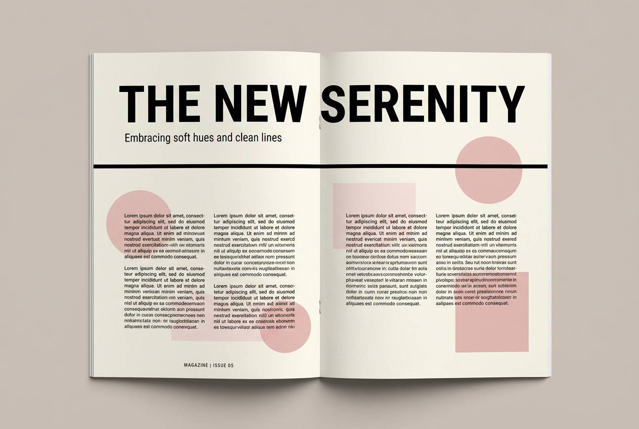
20) Powder Pink Editorial
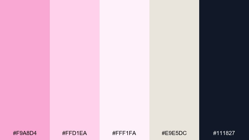
HEX: #F9A8D4 #FFD1EA #FFF1FA #E9E5DC #111827
Mood: editorial, polished, fashion-forward
Best for: magazine layouts and lookbooks
Powder pink with cream and a strong ink-black accent feels fashion-forward and clean, like a modern beauty editorial. It is well suited to magazine layouts, lookbooks, and portfolio pages where typography needs to lead. Pair with large headlines, tight spacing, and monochrome imagery so the pink reads as intentional art direction. Tip: keep black to type and small rules only, letting the page stay airy and premium.
Image example of powder pink editorial generated using media.io
What Colors Go Well with Bubble Gum?
Bubble gum pink pairs best with soft neutrals (cream, warm off-white, pale gray) when you want a clean, modern base that keeps the palette wearable. Add one dark anchor (ink black, deep plum, cocoa brown) for typography and structure.
For fresher bubble gum color combinations, mint and teal accents add “clean” contrast without making the layout feel cold. Lavender and periwinkle lean dreamy and whimsical, while peach and pale yellow push the palette warmer and more appetizing.
If you want a bolder direction, use neon magenta with a controlled pop of orange or yellow—but keep large text on a dark neutral for readability.
How to Use a Bubble Gum Color Palette in Real Designs
Start with roles: pick one hero pink (CTA/buttons), one light surface color (background/cards), and one dark type color (headlines/body). This prevents “too much pink” while keeping the bubble gum vibe clear.
In branding and packaging, bubble gum palettes look best with simple shapes and restrained typography—think one clean font family and generous spacing. Let texture (paper stock, matte vs. gloss) carry depth instead of adding more colors.
For UI, test contrast early. Use the deepest pink for interactive states and reserve the palest blush/cream for large areas so the interface stays readable and calm.
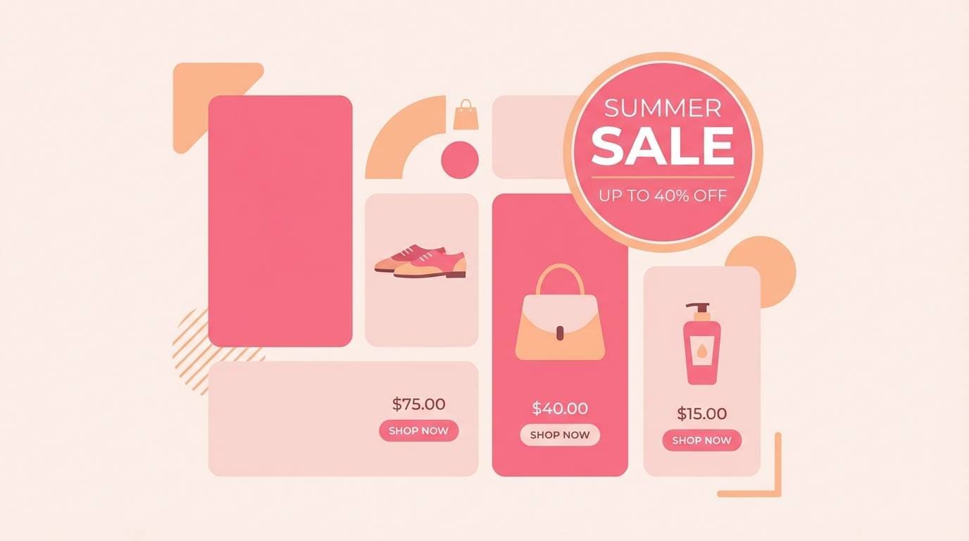
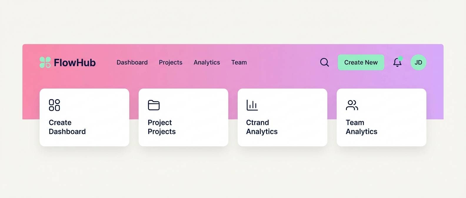
Create Bubble Gum Palette Visuals with AI
If you have HEX codes but need real mockups (ads, labels, onboarding screens, hero banners), generating visuals is the fastest way to validate how the palette feels in context. A good prompt plus clear lighting/style cues can make pastel pinks look premium instead of flat.
With Media.io’s Text-to-Image, you can create bubble gum palette examples for branding, UI, packaging, and social graphics in minutes—then iterate by swapping accents (mint vs. lilac) to match your audience.
Bubble Gum Color Palette FAQs
-
What is a bubble gum color palette?
A bubble gum color palette is a set of colors built around bright or pastel pinks, often paired with soft creams, blush tints, and playful accents like mint, lilac, or pale yellow. -
Is bubble gum pink the same as hot pink?
Not always. Hot pink is typically more saturated and intense, while bubble gum pink can range from vivid candy pink to softer, creamy pastel variations. -
What neutral colors pair best with bubble gum tones?
Cream, warm off-white, light gray, and soft beige work especially well. For typography, use a deep neutral like ink black (#111827) or dark brown for dependable contrast. -
How do I keep a bubble gum color scheme from looking childish?
Use fewer accent colors, increase whitespace, and add one strong dark anchor for type. Choosing refined neutrals (cream, cocoa, charcoal) and clean typography makes the palette feel more editorial and premium. -
What are good accent colors with bubble gum pink for UI design?
Mint/teal for fresh contrast, lilac/periwinkle for a dreamy feel, and pale yellow/peach for warmth. Keep accents small and let one deeper pink handle buttons and active states. -
Which bubble gum palettes work best for packaging?
Soft, creamy mixes like Cotton Candy Cream, Blush and Cocoa, and Melon Sugar Glow are strong for labels and boxes because they print gently and still feel on-brand. -
Can I generate bubble gum palette mockups with AI?
Yes. Use Media.io Text-to-Image with prompts that specify lighting, materials (matte, glossy, paper texture), and where each color should dominate to produce consistent, brand-ready visuals.
Next: Sepia Color Palette


