

A cowboy color palette blends rugged earth tones with modern contrast, giving you a look that feels both heritage and fresh. It’s perfect when you want designs to feel grounded, tactile, and confident.
Below are 20+ ready-to-use cowboy color palette ideas with HEX codes, plus quick tips for pairing them in branding, UI, posters, and more.
In this article
- Why Cowboy Palettes Work So Well
-
- saddle leather
- desert trail
- denim dusk
- rusty spur
- prairie sage
- campfire smoke
- cactus bloom
- sunbaked clay
- rodeo midnight
- bandana red
- silver buckle
- barnwood neutral
- dusty coral
- whiskey caramel
- mustang tan
- sunset lariat
- canyon rose
- river stone
- sheriff badge gold
- frontier nightfall
- dust and denim
- copper creek
- What Colors Go Well with Cowboy?
- How to Use a Cowboy Color Palette in Real Designs
- Create Cowboy Palette Visuals with AI
Why Cowboy Palettes Work So Well
Cowboy palettes are built on familiar, natural color cues—leather browns, sunbaked clay, denim blues, sand, and charcoal. Because they’re rooted in real materials, they instantly feel authentic in branding and layout design.
They also balance warmth and structure. Warm tans and creams create a welcoming base, while deep browns, navies, or charcoals add contrast that keeps typography and UI elements readable.
Best of all, western color tones are flexible: you can go classic and rustic, or push them modern by adding cool grays, muted teals, or a single bold accent like rust red.
20+ Cowboy Color Palette Ideas (with HEX Codes)
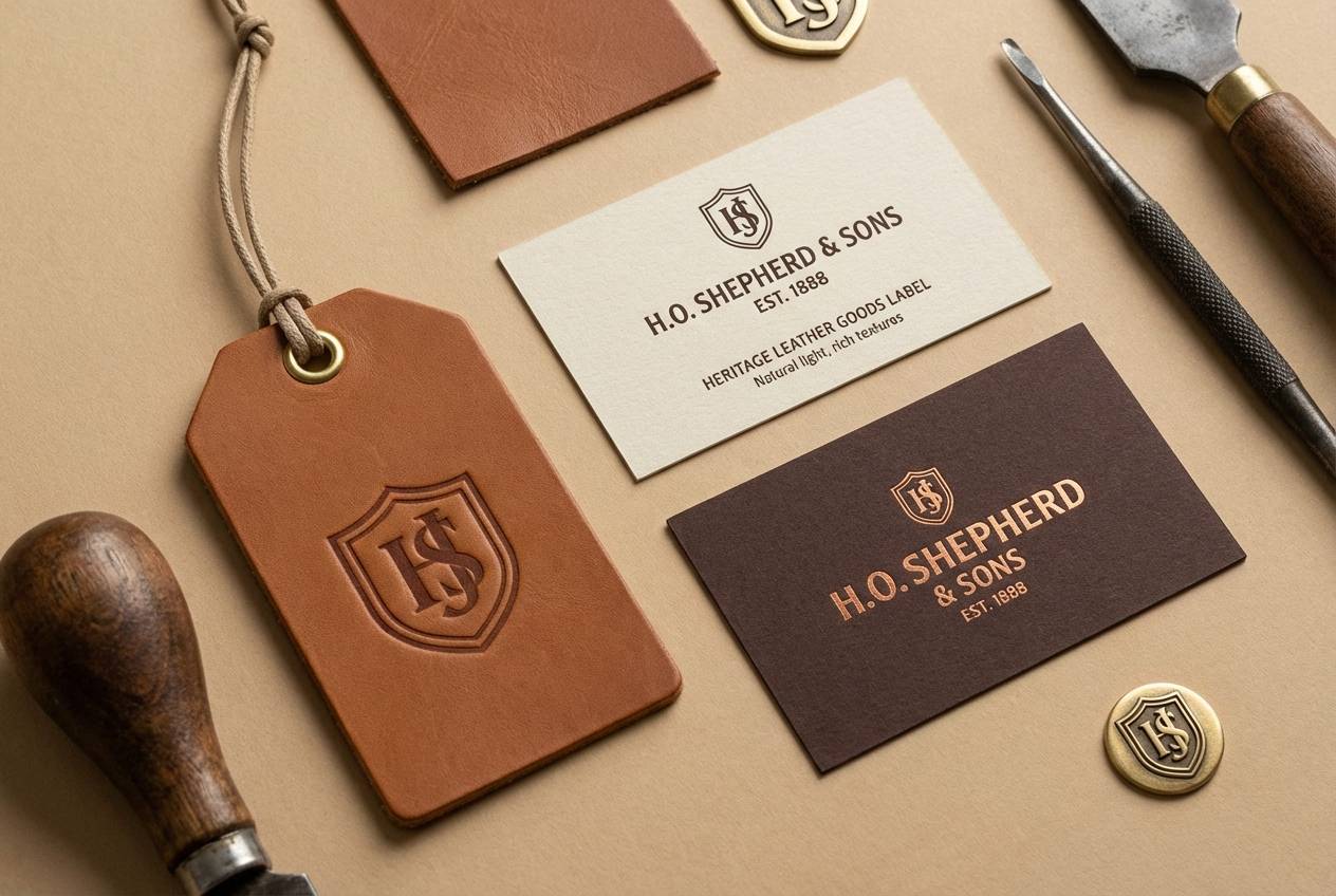
1) Saddle Leather
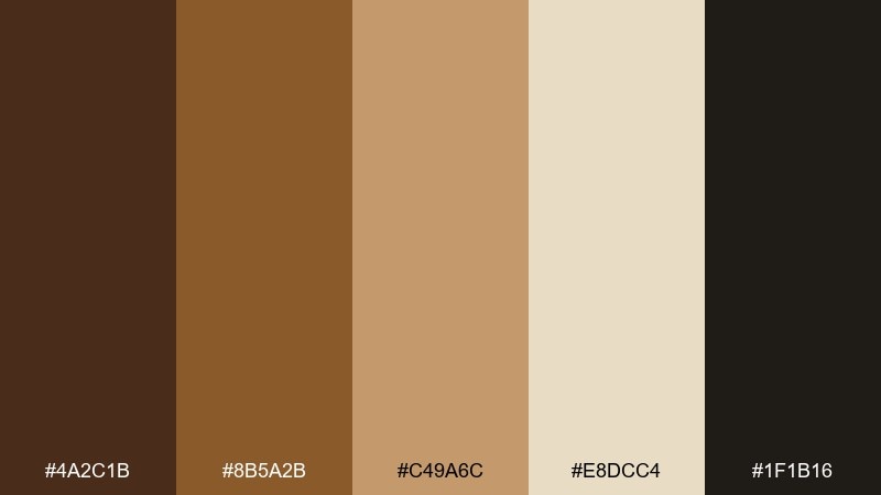
HEX: #4A2C1B #8B5A2B #C49A6C #E8DCC4 #1F1B16
Mood: rugged, warm, grounded
Best for: branding for craft goods and heritage labels
Worn leather and sun-faded canvas set a rugged, welcoming tone. Use the dark brown as your anchor, then let tan and sand carry backgrounds and packaging panels. It works beautifully with textured paper, embossed marks, and minimal typography. Tip: keep the black-brown for small details like borders and icons so the palette stays warm, not heavy.
Image example of saddle leather generated using media.io
Media.io is an online AI studio for creating and editing video, image, and audio in your browser.

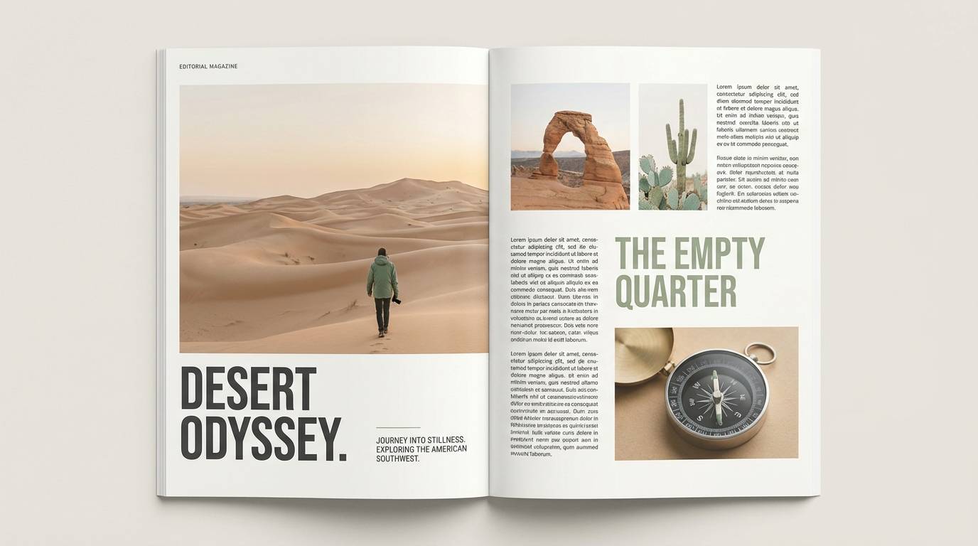
2) Desert Trail
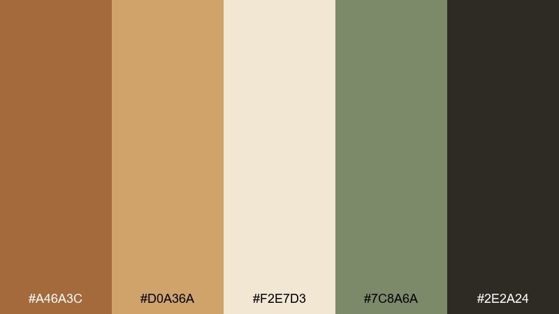
HEX: #A46A3C #D0A36A #F2E7D3 #7C8A6A #2E2A24
Mood: dusty, calm, outdoorsy
Best for: travel posters and editorial spreads
Dry earth, pale sand, and a hint of scrubby sage evoke long trail miles and open sky. Pair the cream with warm tan for big background fields, then add sage as a quiet accent for headings or callouts. It shines in print layouts with generous margins and natural-grain textures. Tip: reserve the dark charcoal for captions and fine rules to keep the page airy.
Image example of desert trail generated using media.io
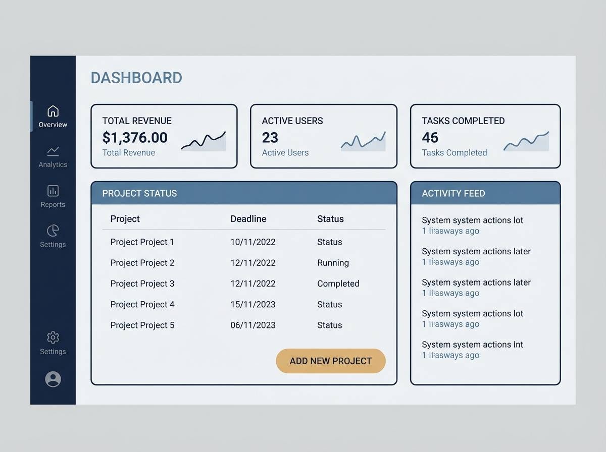
3) Denim Dusk
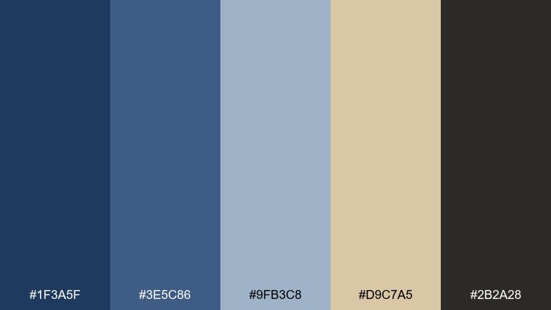
HEX: #1F3A5F #3E5C86 #9FB3C8 #D9C7A5 #2B2A28
Mood: cool, dependable, modern-western
Best for: app UI themes and dashboards
Faded indigo and steel-blue tones feel like denim at dusk, steady and understated. These cowboy color combinations work best when the navy leads navigation and headers, with pale blue for cards and states. Add the warm sand as a contrast highlight for primary buttons or key metrics. Tip: keep charcoal for icons so the interface stays crisp without looking harsh.
Image example of denim dusk generated using media.io
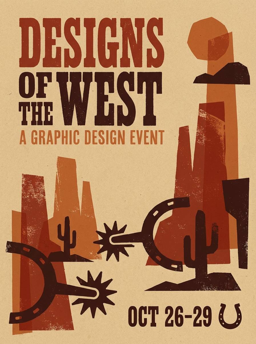
4) Rusty Spur
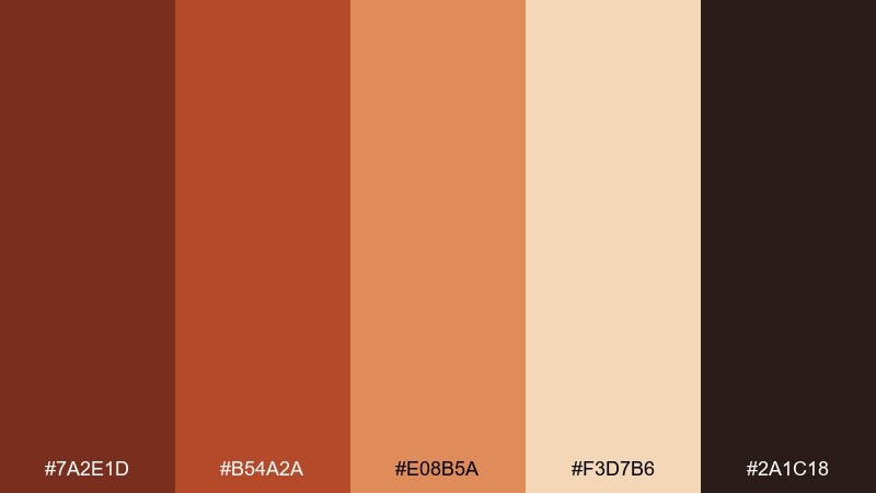
HEX: #7A2E1D #B54A2A #E08B5A #F3D7B6 #2A1C18
Mood: bold, sunbaked, energetic
Best for: event posters and bold social graphics
Rust-red metal and baked clay bring punchy heat and motion. For a cowboy color palette that reads instantly, set the deep rust for headlines and the peachy clay for supporting shapes. Creamy tan keeps layouts from feeling too intense, especially in posters with dense type. Tip: use the darkest brown sparingly as an outline or drop shadow to sharpen contrast.
Image example of rusty spur generated using media.io
5) Prairie Sage
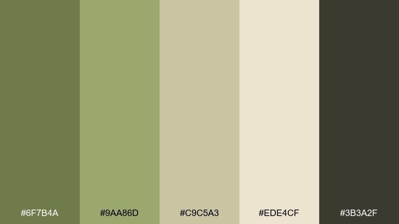
HEX: #6F7B4A #9AA86D #C9C5A3 #EDE4CF #3B3A2F
Mood: fresh, quiet, natural
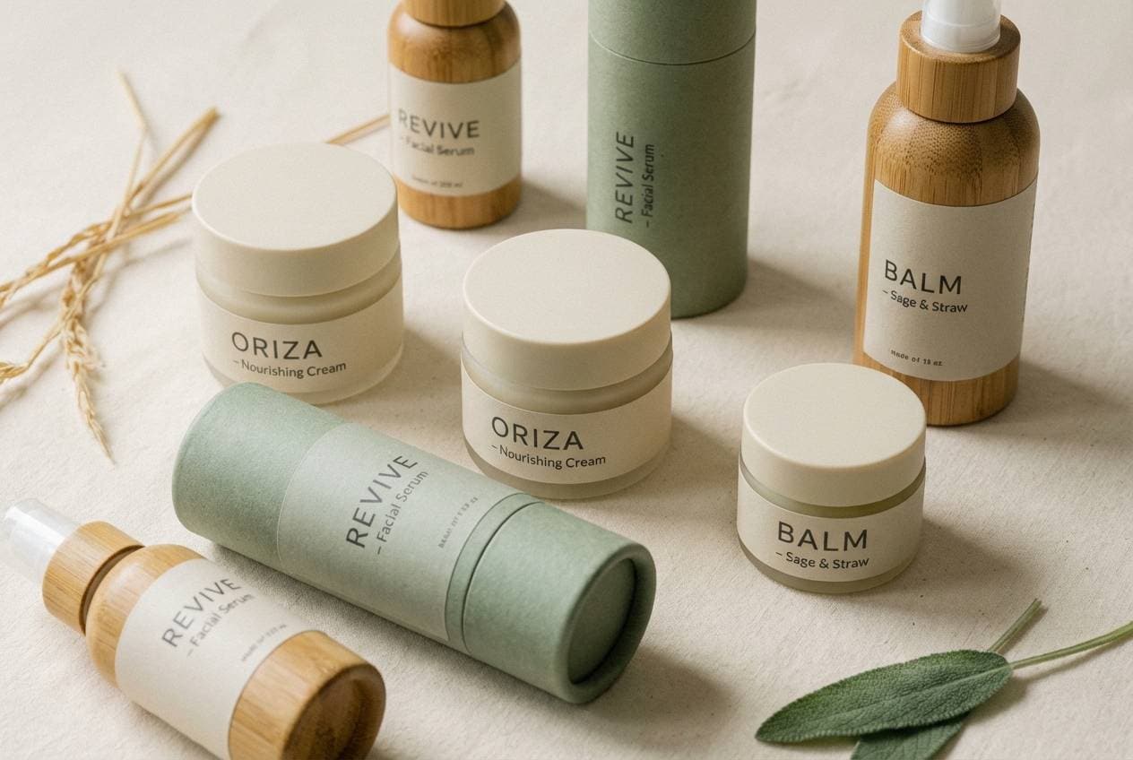
Best for: wellness brands and sustainable packaging
Soft sage and straw neutrals feel like wind through prairie grass. Let the light cream set the base, then build layers with muted greens for labels and secondary panels. It pairs nicely with kraft paper, matte finishes, and simple line icons. Tip: choose charcoal for small text and barcodes so legibility stays strong on pale stock.
Image example of prairie sage generated using media.io
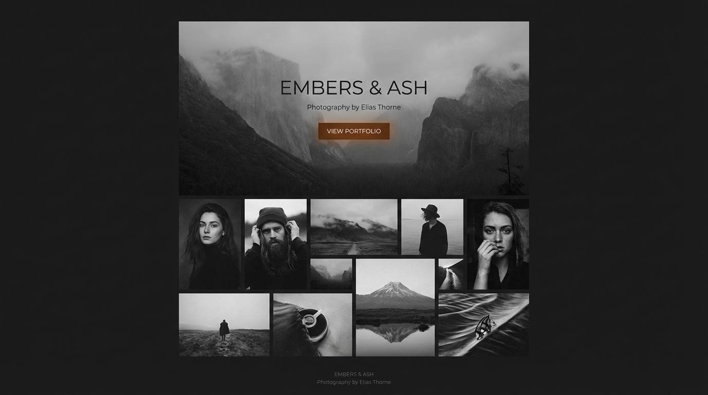
6) Campfire Smoke
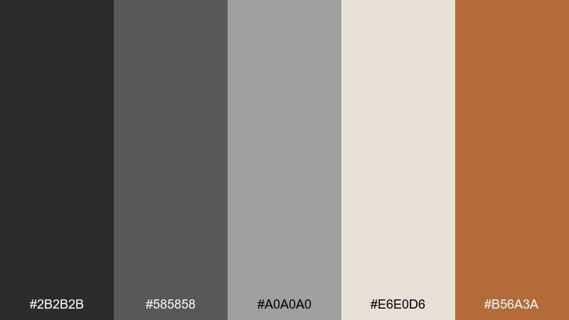
HEX: #2B2B2B #585858 #A0A0A0 #E6E0D6 #B56A3A
Mood: moody, rustic, smoky
Best for: photography portfolios and landing pages
Smoky charcoals with a warm ember-brown accent create a late-night campfire mood. Use the near-black for hero sections and overlays, then bring in light ash for content blocks and spacing. The ember tone works best as a single CTA color so it feels intentional, not noisy. Tip: add subtle grain or film-like texture to deepen the atmosphere without adding extra colors.
Image example of campfire smoke generated using media.io
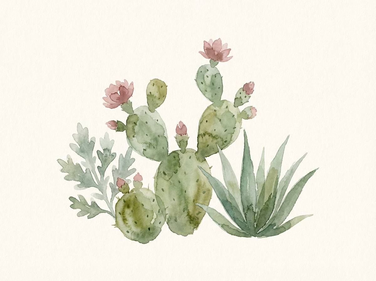
7) Cactus Bloom
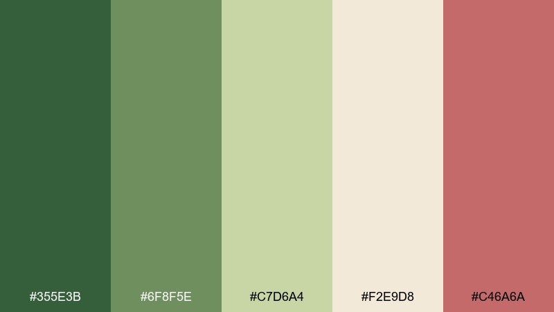
HEX: #355E3B #6F8F5E #C7D6A4 #F2E9D8 #C46A6A
Mood: botanical, soft, sunlit
Best for: illustrations and spring announcements
Desert greens with a dusty rose accent feel like cactus blossoms after rain. Keep cream as the paper-like base, then layer mid-green shapes for foliage and structure. The rose is best as a small focal point for stamps, icons, or a single headline word. Tip: use gentle gradients only within the greens to maintain a calm, illustrated look.
Image example of cactus bloom generated using media.io
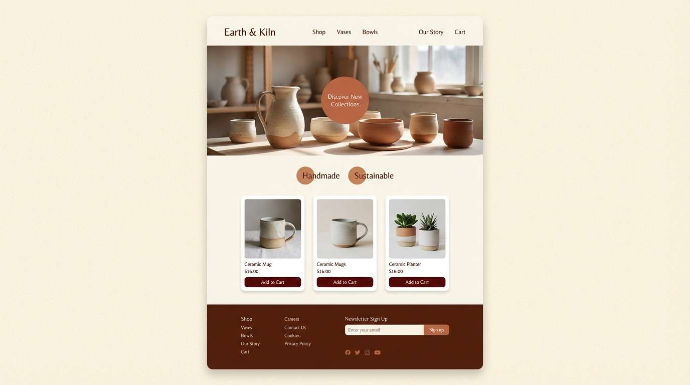
8) Sunbaked Clay
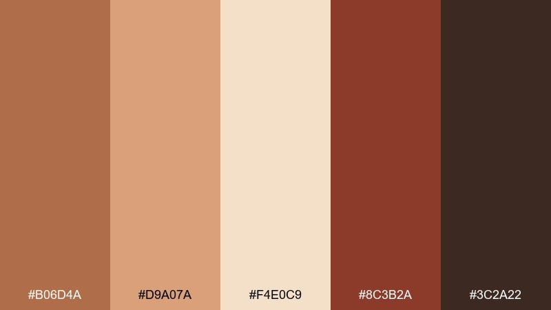
HEX: #B06D4A #D9A07A #F4E0C9 #8C3B2A #3C2A22
Mood: warm, handmade, earthy
Best for: ceramics shops and artisan websites
Hand-thrown clay and kiln warmth come through in these toasted terracotta tones. Use the light cream as negative space, then balance mid-clay and deep red-brown for headlines and product badges. It pairs well with serif type, natural photography, and textured backgrounds. Tip: keep the darkest brown for footer areas and microcopy to ground the page.
Image example of sunbaked clay generated using media.io
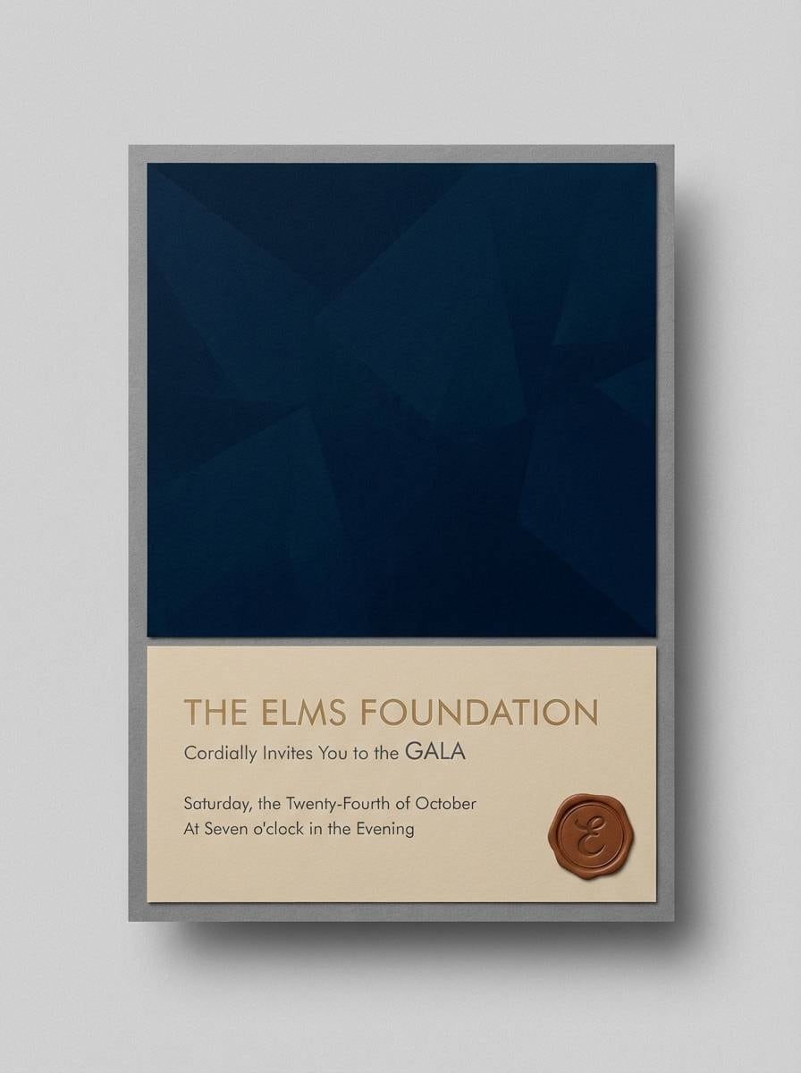
9) Rodeo Midnight
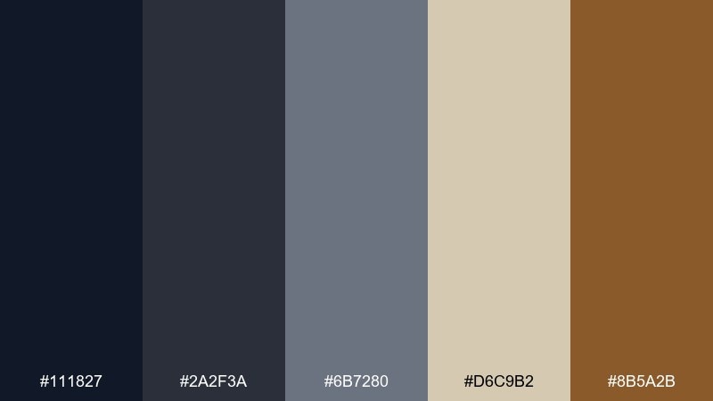
HEX: #111827 #2A2F3A #6B7280 #D6C9B2 #8B5A2B
Mood: dramatic, refined, nocturnal
Best for: luxury invitations and ticket designs
Midnight navy and smoky grays feel like arena lights against a dark sky. Set the deep navy as your background and let warm sand act as the paper-like contrast for type blocks and monograms. The saddle brown is a perfect accent for rules, seals, and small flourishes. Tip: choose high letter spacing in headings so the dark tones stay elegant, not heavy.
Image example of rodeo midnight generated using media.io
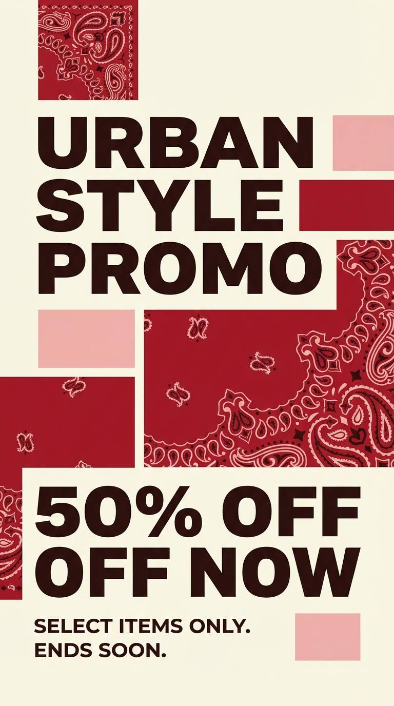
10) Bandana Red
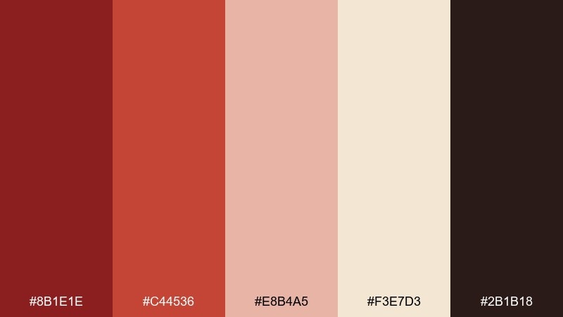
HEX: #8B1E1E #C44536 #E8B4A5 #F3E7D3 #2B1B18
Mood: confident, spirited, classic
Best for: merch graphics and promo flyers
Bandana reds and soft blush tones deliver bold energy with a vintage nod. When you need cowboy color combinations that pop, lead with deep red for big shapes and keep blush for secondary blocks and gradients. Cream works as a clean buffer so designs stay readable on print and screen. Tip: add the dark espresso only in type and small icons to avoid muddy shadows.
Image example of bandana red generated using media.io
11) Silver Buckle
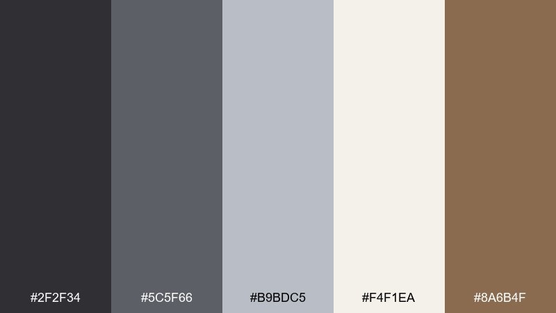
HEX: #2F2F34 #5C5F66 #B9BDC5 #F4F1EA #8A6B4F
Mood: clean, polished, modern-rustic
Best for: corporate decks and clean UI kits
Cool grays and soft ivory feel like brushed metal against worn leather. Use light ivory for slide backgrounds or app surfaces, then build hierarchy with mid-gray headings and darker gray body text. The warm brown reads as a tasteful accent for highlights, tabs, or small badges. Tip: keep contrast high by avoiding gray-on-gray for key labels and controls.
Image example of silver buckle generated using media.io
12) Barnwood Neutral
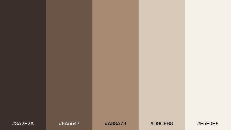
HEX: #3A2F2A #6A5547 #A88A73 #D9C9B8 #F5F0E8
Mood: cozy, timeless, organic
Best for: home decor brands and lifestyle blogs
Weathered barnwood browns and soft linen neutrals create an easy, lived-in warmth. Build pages with the lightest cream as your base, then use taupe and mid-brown for section dividers and headings. It pairs naturally with photography featuring wood, stone, and textiles. Tip: limit dark brown to navigation and footers to keep the layout bright and inviting.
Image example of barnwood neutral generated using media.io
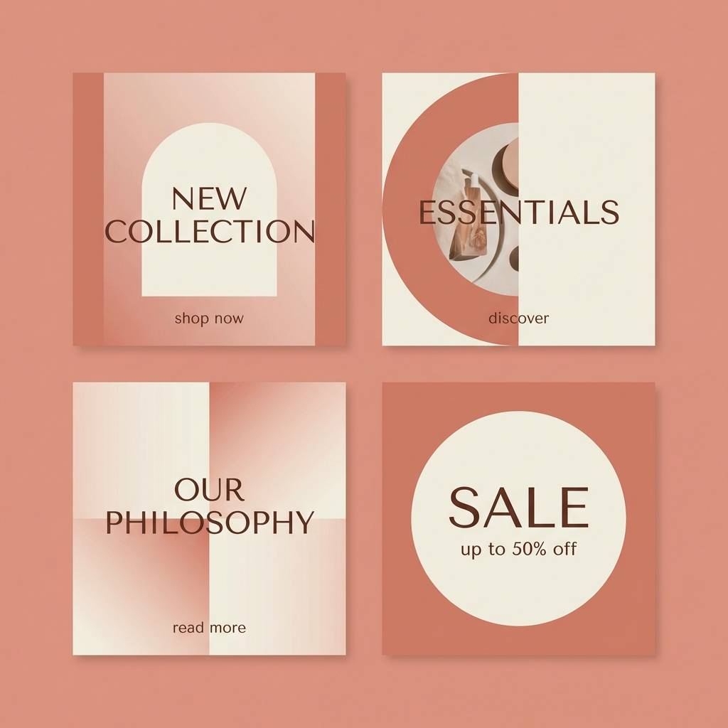
13) Dusty Coral
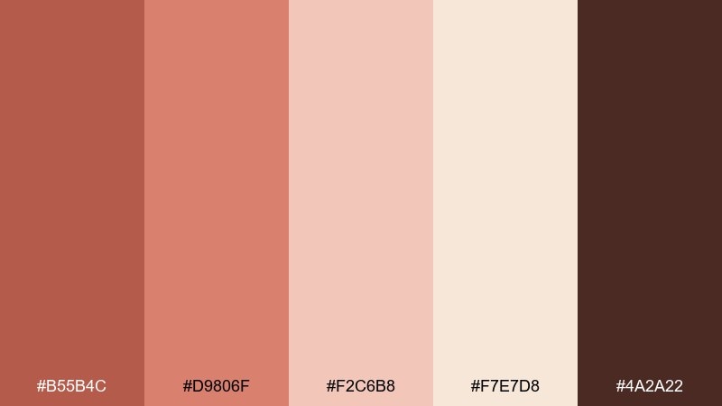
HEX: #B55B4C #D9806F #F2C6B8 #F7E7D8 #4A2A22
Mood: friendly, sun-washed, approachable
Best for: boutique branding and social templates
Dusty coral and soft blush feel like late-afternoon light on adobe walls. This cowboy color scheme leans modern when you use cream for breathing room and keep coral for big blocks and buttons. Deep cocoa works best for typography, giving warmth without the starkness of pure black. Tip: try a coral-to-blush gradient in headers, but keep body sections flat for clarity.
Image example of dusty coral generated using media.io
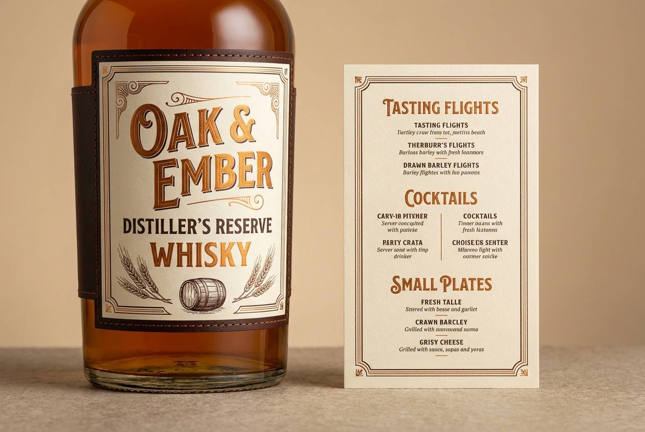
14) Whiskey Caramel
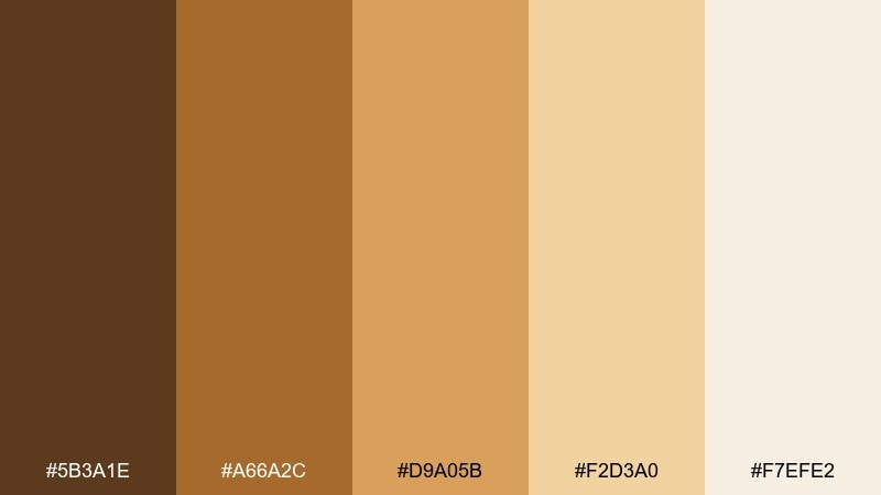
HEX: #5B3A1E #A66A2C #D9A05B #F2D3A0 #F7EFE2
Mood: golden, rich, inviting
Best for: beverage packaging and menu design
Warm caramel and amber-gold tones evoke aged whiskey and glowing bar light. Use the light cream as your label base, then layer amber for headlines and icons that need instant attention. Dark brown creates premium contrast for fine print and borders. Tip: add subtle metallic foil only on the gold hue to keep the finish upscale, not flashy.
Image example of whiskey caramel generated using media.io
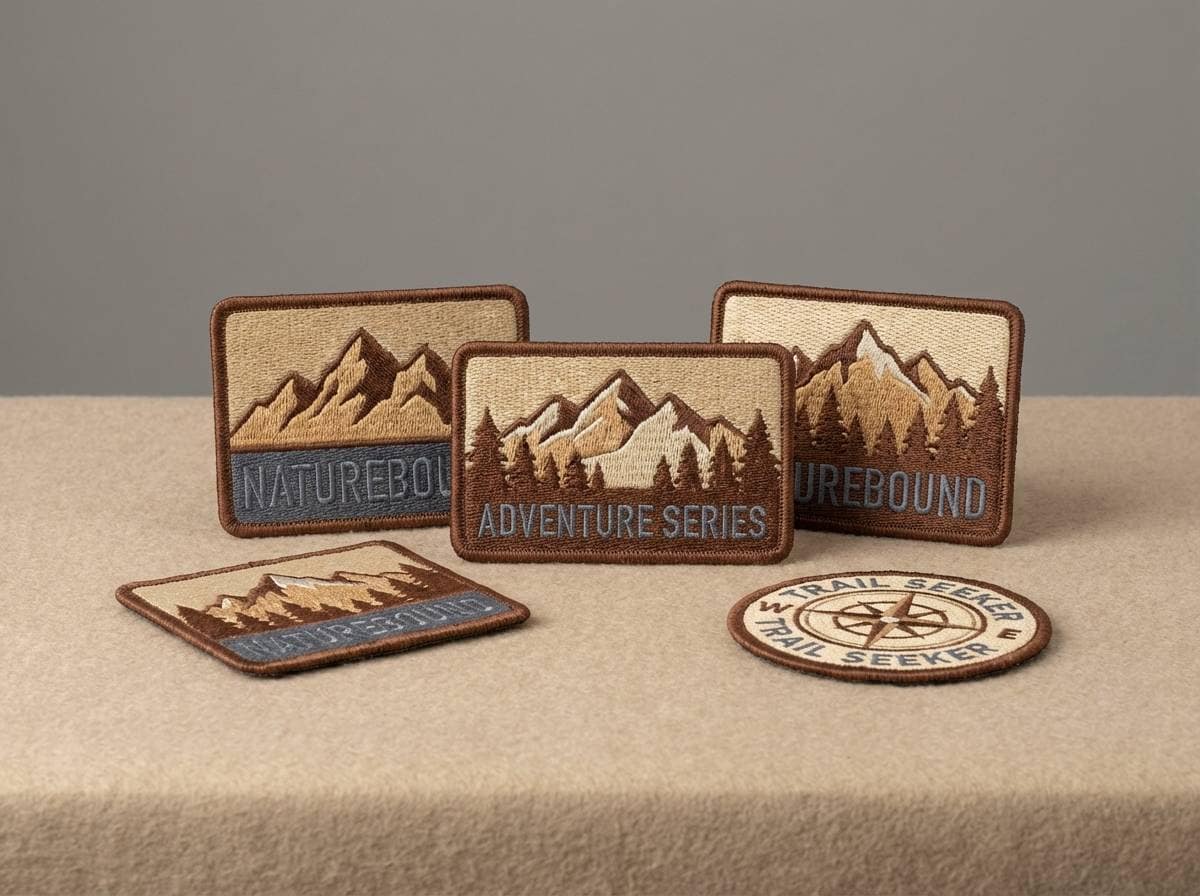
15) Mustang Tan
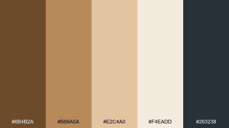
HEX: #6B4B2A #B88A5A #E2C4A0 #F4EADD #263238
Mood: strong, warm, balanced
Best for: outdoor gear branding and patches
Mustang tan and warm sand feel sturdy and capable, like well-broken-in boots. For a cowboy color palette that holds up on fabric and embroidery, keep the mid-tan as the main fill and use deep brown for outlines. The cool slate works as a modern counterweight in type and small icon details. Tip: test the light sand on actual material, since it can wash out under bright stitching.
Image example of mustang tan generated using media.io
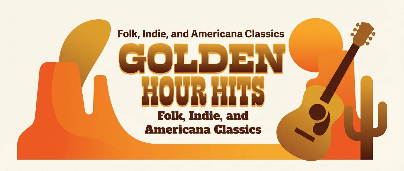
16) Sunset Lariat
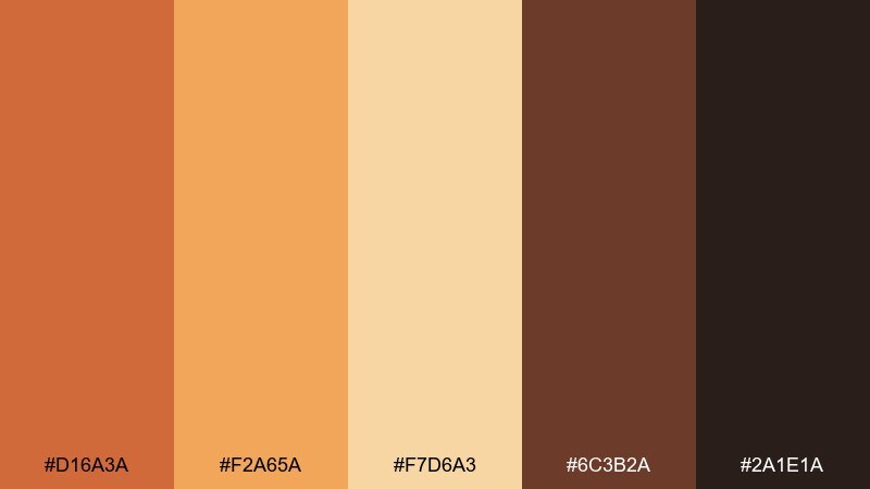
HEX: #D16A3A #F2A65A #F7D6A3 #6C3B2A #2A1E1A
Mood: warm, optimistic, cinematic
Best for: cover art and hero banners
Sunset oranges and honeyed golds create a cinematic glow with real warmth. Use the bright orange as a focal color for titles, while the softer gold supports gradients and background shapes. The dark browns add weight for subtitles and UI overlays without killing the sunset feel. Tip: keep gradients smooth and large-scale, and avoid tiny orange text that can vibrate on screens.
Image example of sunset lariat generated using media.io
17) Canyon Rose
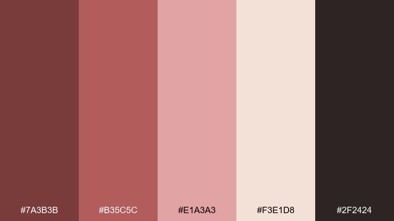
HEX: #7A3B3B #B35C5C #E1A3A3 #F3E1D8 #2F2424
Mood: romantic, dusty, vintage
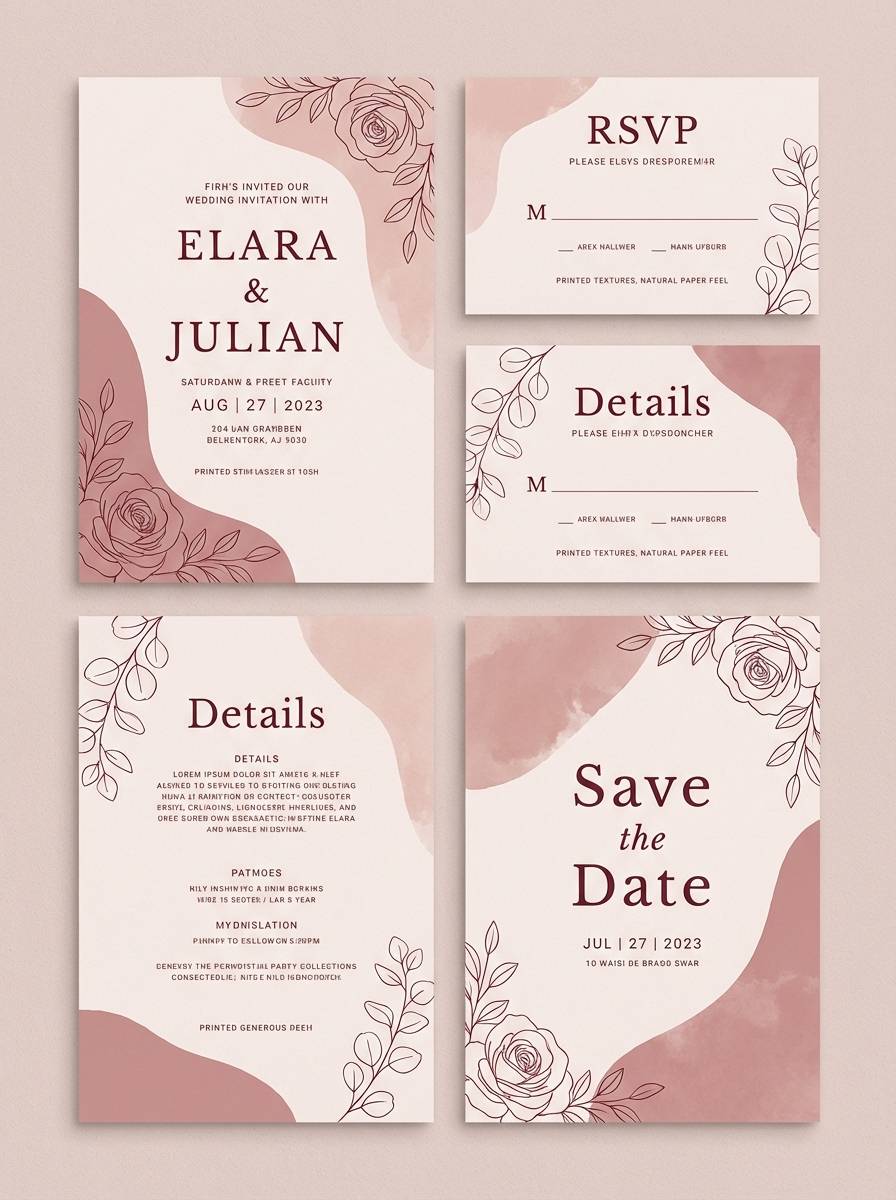
Best for: wedding stationery and invitations
Dusty rose and muted burgundy feel like canyon walls blushing at golden hour. Keep the pale blush as the main paper tone, then use burgundy for names, monograms, and borders. It pairs well with script type, minimal florals, and soft grain. Tip: print-test the mid-rose to ensure it stays muted, not bubblegum, on coated stock.
Image example of canyon rose generated using media.io
18) River Stone
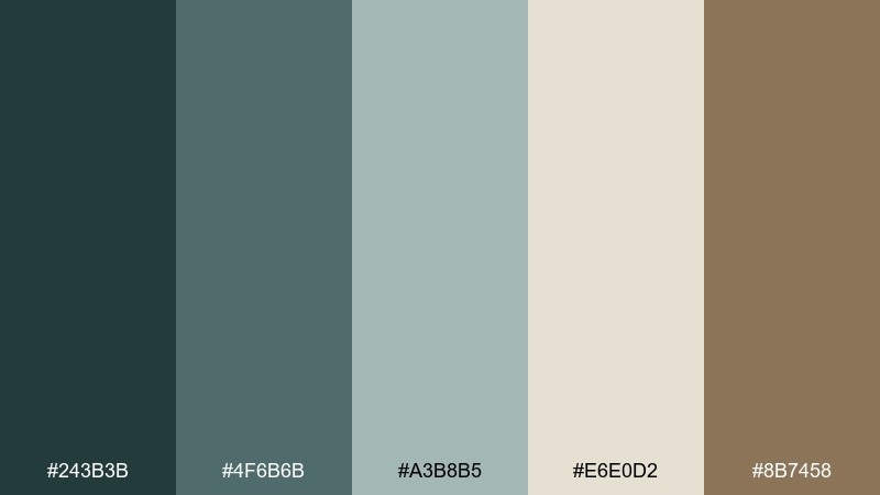
HEX: #243B3B #4F6B6B #A3B8B5 #E6E0D2 #8B7458
Mood: cool, steady, outdoorsy
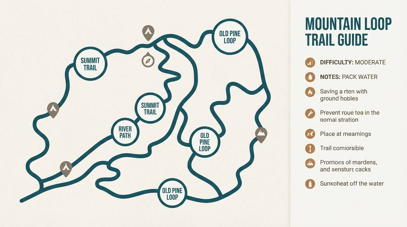
Best for: maps, guides, and information design
River-stone teals and misty neutrals feel calm, practical, and trail-ready. Use the light neutral as a background for clarity, with deep teal for headings and route lines. The warm stone-brown is ideal for markers or callouts when you need a single contrasting accent. Tip: for accessibility, keep body text on the lightest tone and use teal only for emphasis.
Image example of river stone generated using media.io
19) Sheriff Badge Gold
HEX: #6B4E16 #B28A2E #E2C65B #F4E7B2 #2B2416
Mood: bold, vintage, celebratory
Best for: award graphics and product badges
Badge golds and buttery yellows bring a vintage shine without going neon. These cowboy color combinations are great for seals, award stamps, and premium callouts on packaging. Use the pale gold as a soft field, then layer the mid and bright gold for depth in emblems. Tip: add the dark brown only for outlines and tiny type so the gold stays the star.
Image example of sheriff badge gold generated using media.io
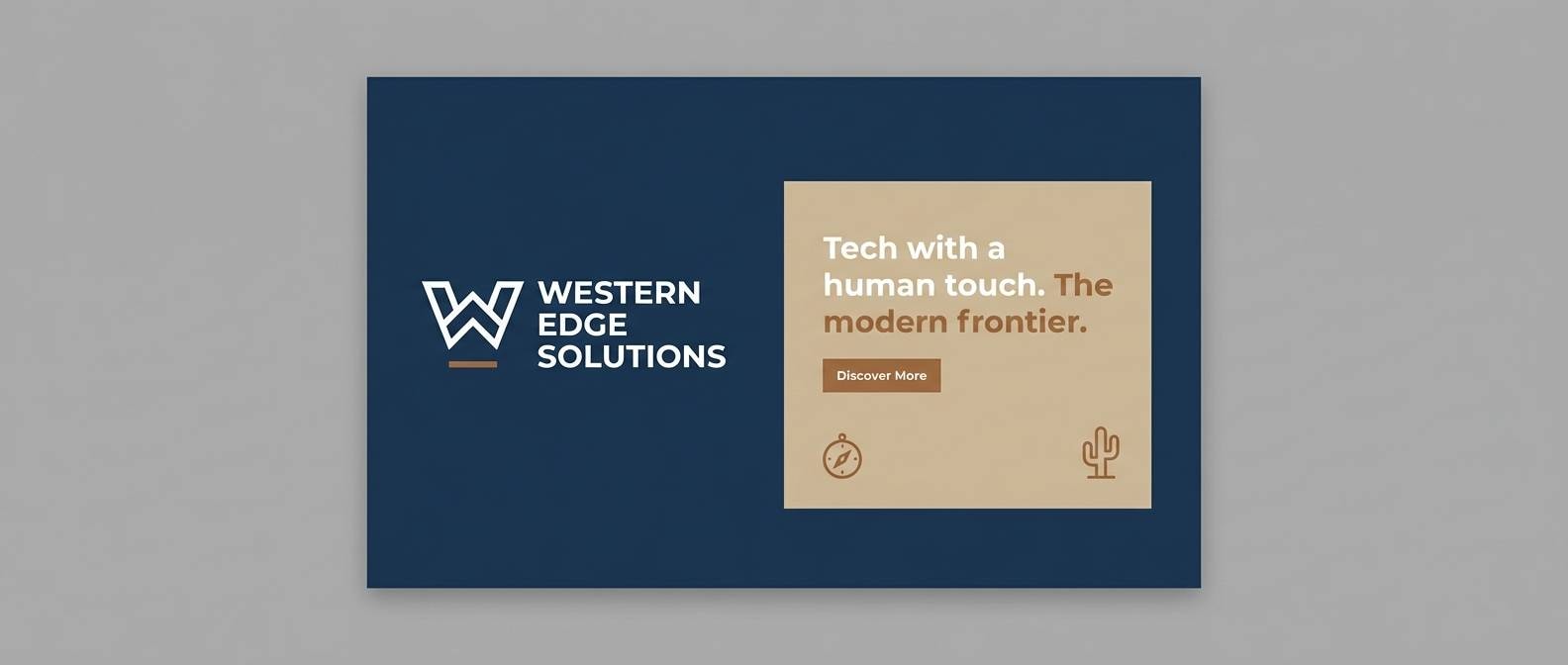
20) Frontier Nightfall
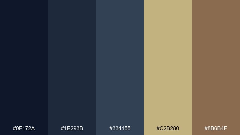
HEX: #0F172A #1E293B #334155 #C2B280 #8B6B4F
Mood: sleek, modern, grounded
Best for: tech branding with a western edge
Deep night blues with sand and warm brown feel modern, capable, and quietly rugged. Use navy for backgrounds and headers, then bring sand in for cards and whitespace that softens the mood. The warm brown makes a great accent for icons, highlights, and small brand elements. Tip: when building a logo lockup, keep the mark in navy and use sand for the wordmark to boost contrast.
Image example of frontier nightfall generated using media.io
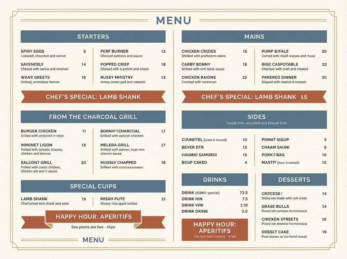
21) Dust and Denim
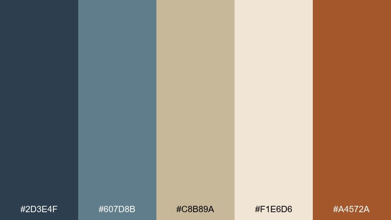
HEX: #2D3E4F #607D8B #C8B89A #F1E6D6 #A4572A
Mood: classic, balanced, approachable
Best for: restaurant menus and rustic cafes
Dusty blue-gray and warm sand feel like denim against a sunlit porch. The pairing reads clean on menus: use the pale cream for backgrounds, blue-gray for section headers, and rust as a highlight for specials. It plays nicely with simple icons and a mix of serif and sans type. Tip: keep the rust tone to one or two elements per page to maintain a calm, readable hierarchy.
Image example of dust and denim generated using media.io
22) Copper Creek
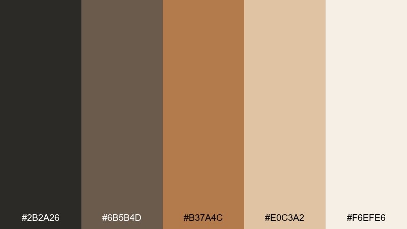
HEX: #2B2A26 #6B5B4D #B37A4C #E0C3A2 #F6EFE6
Mood: warm, understated, premium
Best for: product pages and ecommerce highlights
Copper warmth and soft cream feel refined, like a well-kept tack room with polished details. Use cream for the page base and let copper-brown drive buttons, price tags, and key highlights. The dark charcoal adds structure in headings and navigation without turning the design cold. Tip: on product pages, place copper accents near photos to echo warm tones and boost perceived richness.
Image example of copper creek generated using media.io
What Colors Go Well with Cowboy?
Cowboy palettes pair best with desert neutrals (cream, sand, taupe) plus one strong anchor like leather brown, charcoal, or midnight navy. This keeps the overall look rugged but clean.
For accents, reach for rust red, ember orange, or badge gold when you need punch in headlines, CTAs, or labels. Muted greens (sage, cactus) are great for a calmer, outdoorsy twist.
If you want a modern-western feel, mix denim blues or cool grays with warm browns. The warm/cool contrast adds clarity in UI and makes posters feel more contemporary.
How to Use a Cowboy Color Palette in Real Designs
Start with a “material” base: cream or sand for backgrounds, then build contrast with one deep tone (brown, navy, or charcoal) for text and structure. This keeps layouts readable while still feeling western.
Limit bright accents to one role—like a single rust or gold for buttons, price tags, or key callouts. Cowboy color combinations look best when they feel intentional and not overly colorful.
For print, add texture (paper grain, leather emboss, wood or canvas photography) to make the palette feel tactile. For digital, keep UI surfaces light and reserve dark tones for nav and key hierarchy.
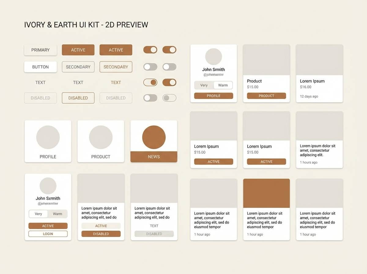
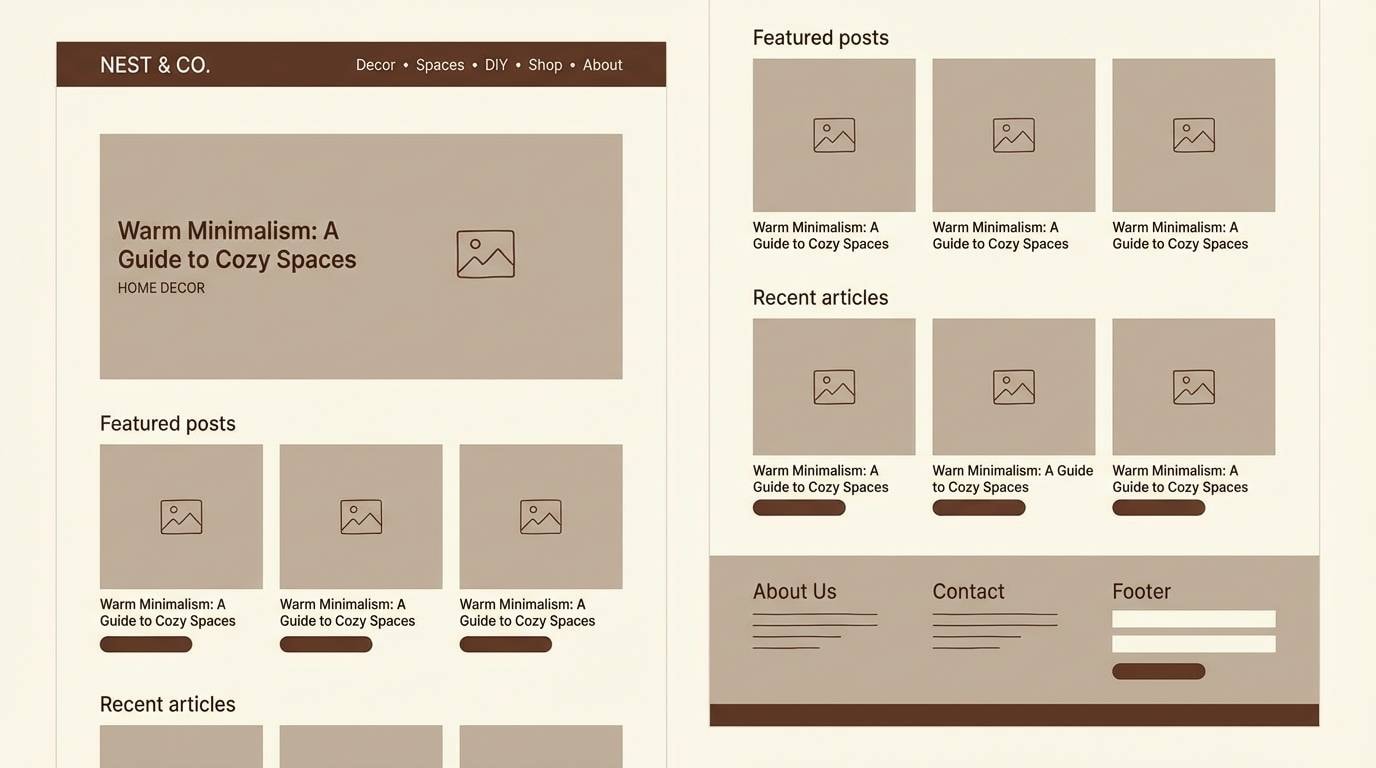
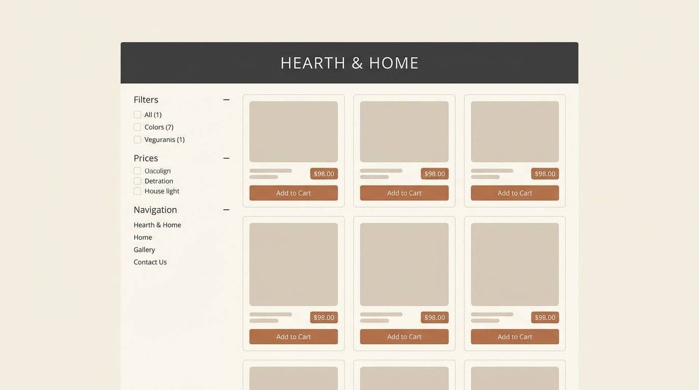
Create Cowboy Palette Visuals with AI
If you already have HEX codes, you can turn them into on-brand visuals fast by generating mockups like posters, packaging, UI screens, and invitation layouts. This helps you preview how your cowboy palette behaves in real composition.
With Media.io’s text-to-image tool, you can iterate quickly: swap a rust red for bandana red, test lighter creams for accessibility, or explore denim vs. charcoal backgrounds—without rebuilding designs from scratch.
Pick a palette above, copy a prompt style you like, and generate a few variations until the mood matches your brand.
Cowboy Color Palette FAQs
-
What is a cowboy color palette?
A cowboy color palette is a set of western-inspired tones—typically leather browns, sand/cream neutrals, rust reds, denim blues, sage greens, and charcoals—used to create a rugged, heritage, or modern-western look. -
What are the most common western color tones?
The most common western color tones are saddle brown, tan, sand, warm cream, rust/terracotta, charcoal, and denim or midnight blue. Many palettes also include muted sage as a natural accent. -
Which cowboy colors are best for branding?
For branding, start with a warm neutral base (cream/sand), add an anchor (dark brown or charcoal), and choose one accent (rust, ember, or gold). This creates strong recognition while staying versatile across print and digital. -
Can a cowboy palette work for modern UI design?
Yes. Palettes like Denim Dusk, Silver Buckle, and Frontier Nightfall work well for UI because they include cool structured tones (navy/gray) plus warm accents (sand/brown) for clear hierarchy and friendly contrast. -
How do I keep cowboy palettes from looking too dark or heavy?
Use cream or light sand for most of the background area, reserve dark browns/charcoals for text and navigation, and keep accents limited. High whitespace and subtle texture help the palette feel warm rather than heavy. -
What accent color pops best with leather brown?
Rust red, ember orange, and badge gold pop best with leather brown. For a quieter contrast, try dusty rose or muted sage instead of a saturated bright. -
How can I preview cowboy palette ideas before designing?
Generate quick mockups (posters, menus, packaging, UI screens) using an AI text-to-image tool. It’s an easy way to test contrast, mood, and composition before committing to a full build.


