

Cobalt is a bold, high-clarity blue that instantly signals confidence, quality, and focus. It stands out in digital UI, stays crisp in print, and pairs beautifully with both warm accents and calm neutrals.
Below are 20 designer-ready cobalt color palette ideas with HEX codes, plus practical tips and AI-ready prompts you can use to generate matching visuals in seconds.
In this article
- Why Cobalt Palettes Work So Well
-
- coastal cobalt
- urban nightfall
- porcelain and cobalt
- citrus spark
- sage blueprint
- velvet plum studio
- concrete and chrome
- sandstone blue
- neon arcade blue
- winter ink
- botanical cobalt
- copper workshop
- rose quartz blue
- minimal cobalt mono
- ocean glass
- harvest contrast
- film noir accent
- lavender blueprint
- retro athletic
- desert dusk
- What Colors Go Well with Cobalt?
- How to Use a Cobalt Color Palette in Real Designs
- Create Cobalt Palette Visuals with AI
Why Cobalt Palettes Work So Well
Cobalt sits in a “sweet spot” of saturation: strong enough to feel premium and intentional, but clean enough to stay readable on screens and in print. That makes it a reliable anchor color for branding systems and UI themes.
It also plays well with contrast. Pair cobalt with near-black and cool grays for a modern, tech-forward look, or bring in gold, copper, coral, and amber to add warmth and energy without losing polish.
Because cobalt is naturally attention-grabbing, it’s great for hierarchy. Used as a primary, it can define a brand; used as an accent, it can guide actions like buttons, links, and key data points.
20+ Cobalt Color Palette Ideas (with HEX Codes)
1) Coastal Cobalt
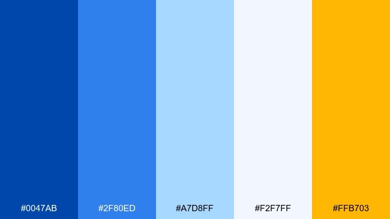
HEX: #0047AB #2F80ED #A7D8FF #F2F7FF #FFB703
Mood: bright, breezy, optimistic
Best for: travel branding and summer social posts
Bright and breezy like sunlit water against a deep blue horizon, these tones feel instantly uplifting. Use the golden accent for calls to action while keeping the lighter blues for spacious backgrounds. Pair with clean sans-serif type and plenty of white space to keep it airy. Tip: reserve the darkest blue for logos and headlines to anchor the layout.
Image example of coastal cobalt generated using media.io
Media.io is an online AI studio for creating and editing video, image, and audio in your browser.

2) Urban Nightfall
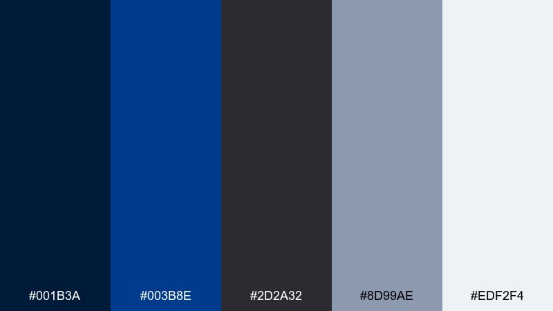
HEX: #001B3A #003B8E #2D2A32 #8D99AE #EDF2F4
Mood: moody, sleek, metropolitan
Best for: tech landing pages and app dashboards
Moody and metropolitan, it evokes late-night streets lit by cool signage and steel reflections. Keep the near-black and navy for headers and navigation, then use the slate and off-white to maintain readability. A brighter blue works well for active states and primary buttons without feeling loud. Tip: test contrast on small UI text and icons to keep the dark tones accessible.
Image example of urban nightfall generated using media.io
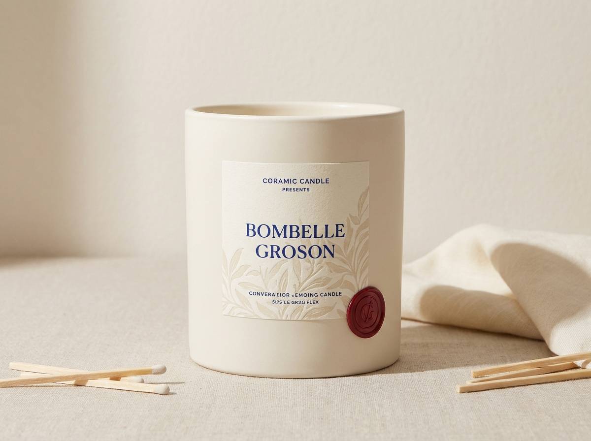
3) Porcelain and Cobalt
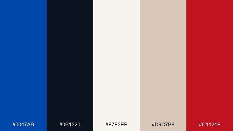
HEX: #0047AB #0B1320 #F7F3EE #D9C7B8 #C1121F
Mood: classic, refined, artisanal
Best for: packaging for home goods and ceramics
Classic and refined, it recalls hand-painted porcelain with a small hit of lacquer-red detail. This cobalt color palette shines on premium labels, where cream backgrounds and warm beige keep the blue from feeling harsh. Add the red sparingly for seals, stickers, or small typographic accents. Tip: use a matte paper stock so the deep blue feels ink-rich rather than glossy.
Image example of porcelain and cobalt generated using media.io
4) Citrus Spark
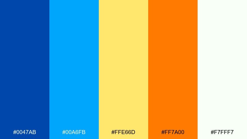
HEX: #0047AB #00A6FB #FFE66D #FF7A00 #F7FFF7
Mood: playful, energetic, punchy
Best for: event posters and youth marketing
Playful and energetic, it feels like electric blue skies with a burst of citrus peel. Use the cobalt and bright cyan for big shapes and gradients, then let yellow and orange carry the excitement in small but bold accents. It works best on clean white or very pale backgrounds to avoid visual overload. Tip: keep typography simple and heavy so it holds up against the saturated colors.
Image example of citrus spark generated using media.io
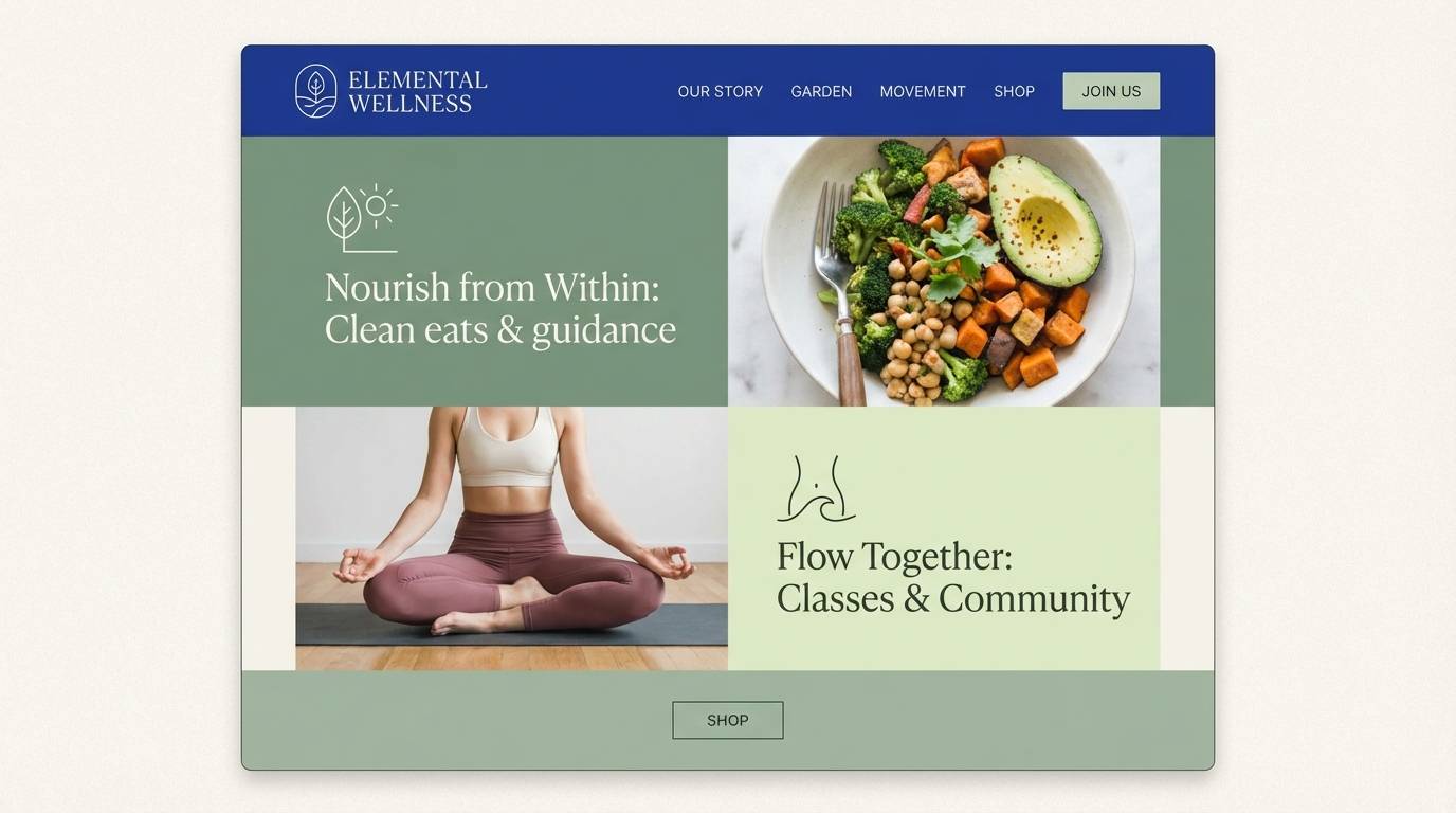
5) Sage Blueprint
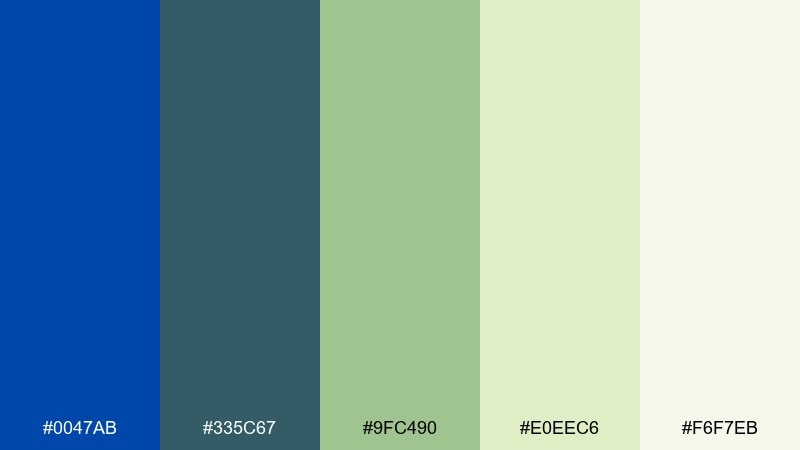
HEX: #0047AB #335C67 #9FC490 #E0EEC6 #F6F7EB
Mood: calm, grounded, fresh
Best for: wellness websites and eco brands
Calm and grounded, it suggests botanical notes sketched over a crisp blueprint. Let the deep blue handle structure like headers and key icons, while sage and pale greens soften the overall tone. This pairing is excellent for brands that want trust plus approachability. Tip: use the lightest shades for section spacing and cards to keep the page feeling breathable.
Image example of sage blueprint generated using media.io
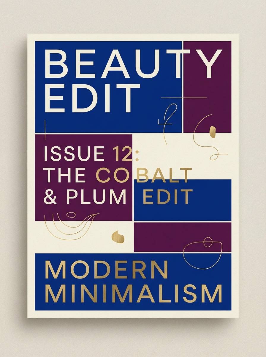
6) Velvet Plum Studio
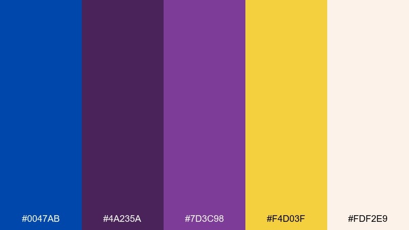
HEX: #0047AB #4A235A #7D3C98 #F4D03F #FDF2E9
Mood: dramatic, luxe, creative
Best for: beauty campaigns and editorial covers
Dramatic and luxe, it feels like stage velvet under a spotlight with jewel-toned shadows. These cobalt color combinations look strongest when blue and plum lead, while the soft cream keeps skin tones and typography from fighting the palette. Use the gold-yellow as a tiny highlight for badges or product benefits. Tip: avoid using all three saturated colors at equal weight; pick one hero and one supporting accent.
Image example of velvet plum studio generated using media.io
7) Concrete and Chrome
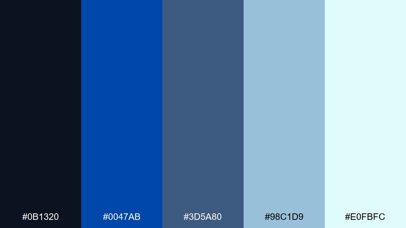
HEX: #0B1320 #0047AB #3D5A80 #98C1D9 #E0FBFC
Mood: industrial, crisp, modern
Best for: product UI and SaaS branding
Industrial and crisp, it brings to mind polished metal against cool concrete. The near-black and deep blue create confident hierarchy, while the lighter blues handle panels, tables, and subtle dividers. It pairs nicely with geometric icons and thin line strokes for a tech-forward feel. Tip: use the palest shade as a background so data visualizations stay clear and calm.
Image example of concrete and chrome generated using media.io
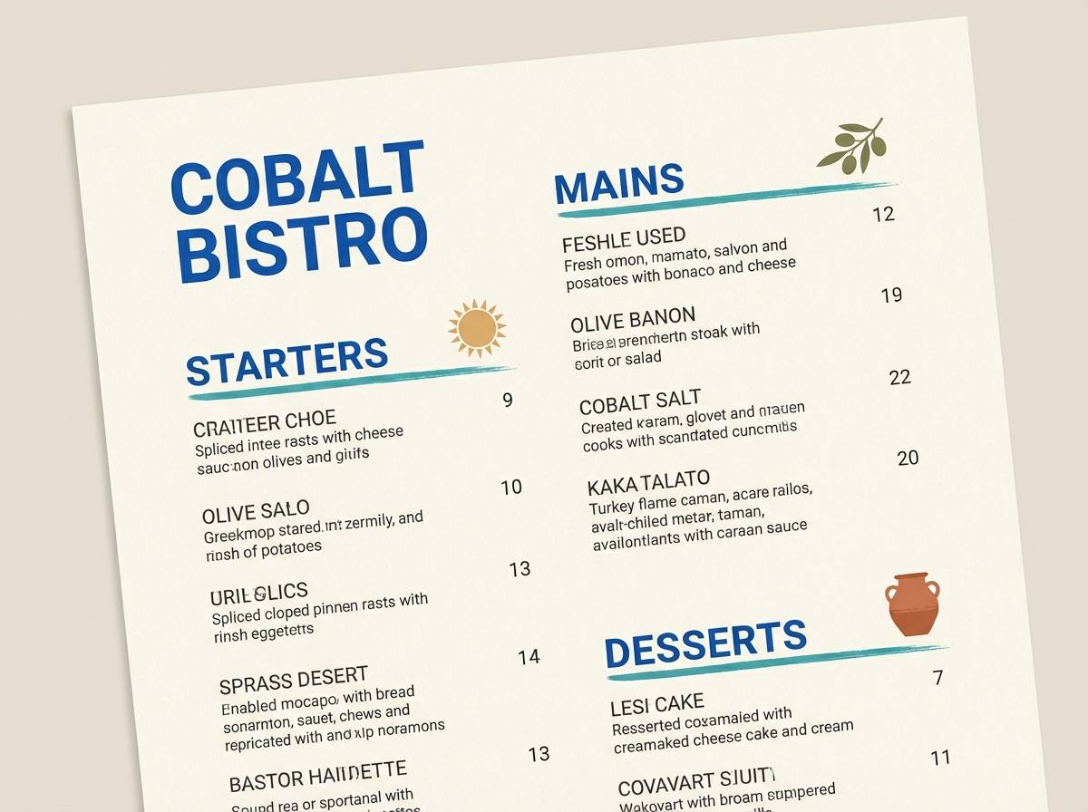
8) Sandstone Blue
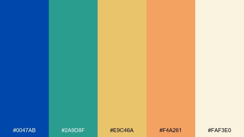
HEX: #0047AB #2A9D8F #E9C46A #F4A261 #FAF3E0
Mood: sun-warmed, relaxed, coastal
Best for: restaurant menus and lifestyle branding
Sun-warmed and relaxed, it feels like ocean blue paired with sandy stone and terracotta. Keep the cream as your base, then layer cobalt for headings and teal for supporting blocks and icons. The warm yellows and oranges make excellent highlights for prices, buttons, or section tags. Tip: use cobalt in smaller areas if you want the palette to read more Mediterranean than nautical.
Image example of sandstone blue generated using media.io
9) Neon Arcade Blue
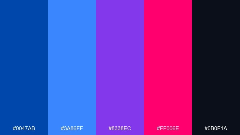
HEX: #0047AB #3A86FF #8338EC #FF006E #0B0F1A
Mood: bold, futuristic, nightlife
Best for: music promos and streamer graphics
Bold and futuristic, it evokes arcade glow and club lighting against a deep midnight base. Let the dark shade carry backgrounds, then use cobalt and electric blue for big shapes and type. Magenta and violet should be accents only, perfect for icons, badges, or small gradients. Tip: keep plenty of negative space so the neon moments feel intentional, not chaotic.
Image example of neon arcade blue generated using media.io

10) Winter Ink
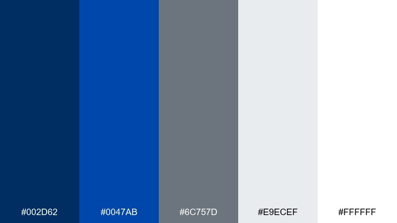
HEX: #002D62 #0047AB #6C757D #E9ECEF #FFFFFF
Mood: clean, professional, cool
Best for: corporate reports and presentations
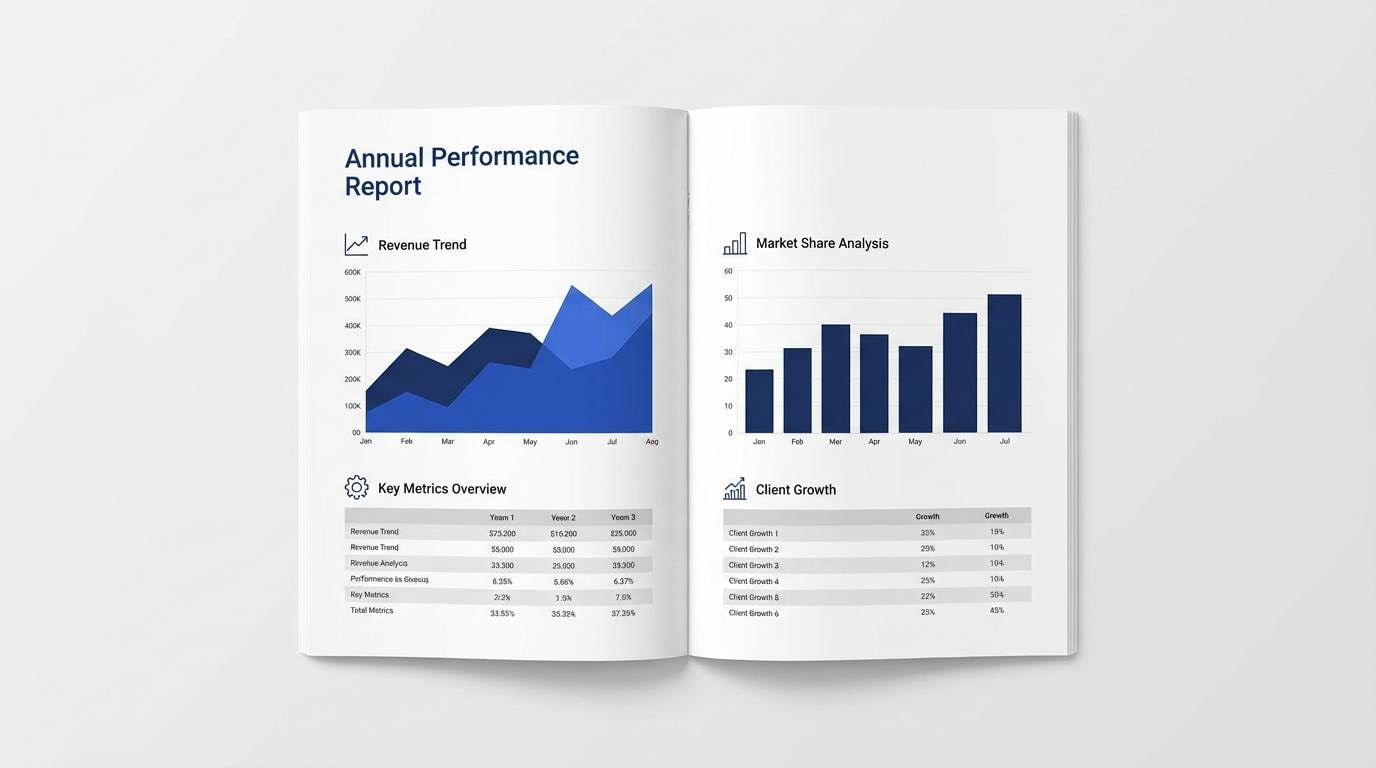
Clean and professional, it feels like fresh snow with sharp ink lines. Use the two blues for headings, charts, and key takeaways, while gray and off-white keep the page quiet and readable. This mix is ideal for documents that need authority without looking heavy. Tip: apply cobalt to data highlights only so your charts stay easy to scan.
Image example of winter ink generated using media.io
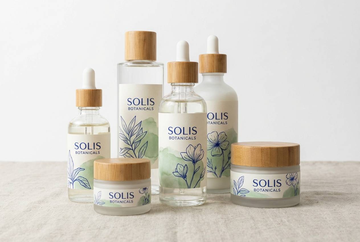
11) Botanical Cobalt
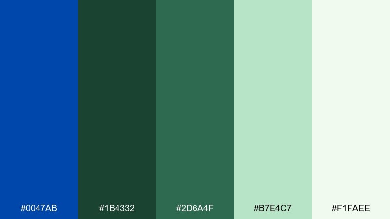
HEX: #0047AB #1B4332 #2D6A4F #B7E4C7 #F1FAEE
Mood: fresh, natural, confident
Best for: skincare packaging and eco labels
Fresh and natural, it reads like deep blue glass beside lush leaves and soft morning light. This cobalt color palette works especially well for eco-minded products when you keep the greens dominant and the blue as a premium accent. Pair with tactile textures such as recycled paper and simple botanical line art. Tip: print the darkest tones with slightly reduced ink coverage to prevent muddy edges on uncoated stock.
Image example of botanical cobalt generated using media.io
12) Copper Workshop
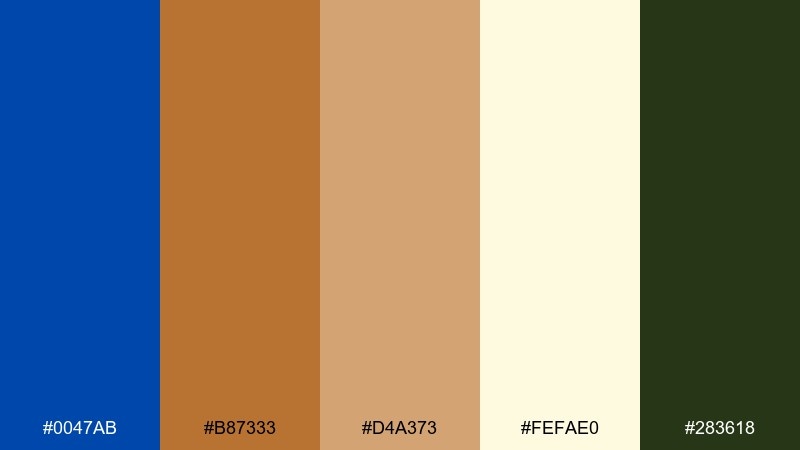
HEX: #0047AB #B87333 #D4A373 #FEFAE0 #283618
Mood: crafty, warm, heritage
Best for: artisan product ads and maker brands
Crafty and warm, it suggests copper tools, aged paper, and a strong blue stamp of approval. Use cream as your base, then add cobalt for brand marks and headings to create a crisp contrast. Copper and tan tones make beautiful borders, badges, and packaging trims. Tip: keep the dark green for small text or secondary labels to avoid competing with the blue.
Image example of copper workshop generated using media.io
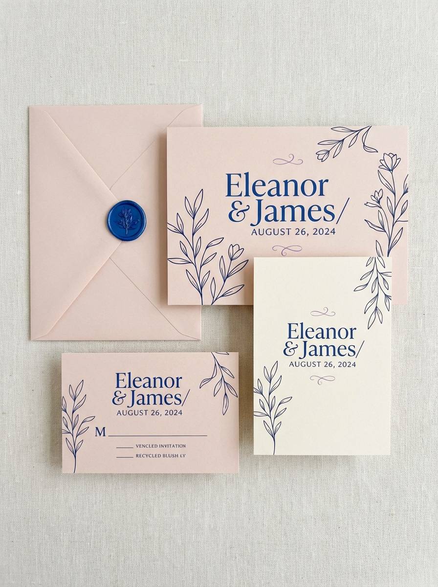
13) Rose Quartz Blue
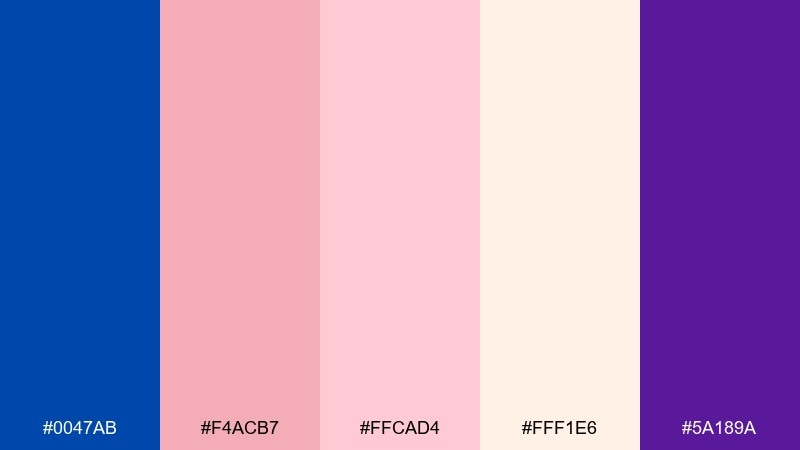
HEX: #0047AB #F4ACB7 #FFCAD4 #FFF1E6 #5A189A
Mood: soft, romantic, modern
Best for: wedding invitations and beauty socials
Soft and romantic, it feels like blush petals set against a crisp, confident blue. Use the pale creams and pinks for backgrounds, then bring in cobalt for names, monograms, or key details. The violet is best as a subtle shadow or small decorative flourish. Tip: choose elegant serif type for the romance and a clean sans for the supporting info.
Image example of rose quartz blue generated using media.io
14) Minimal Cobalt Mono
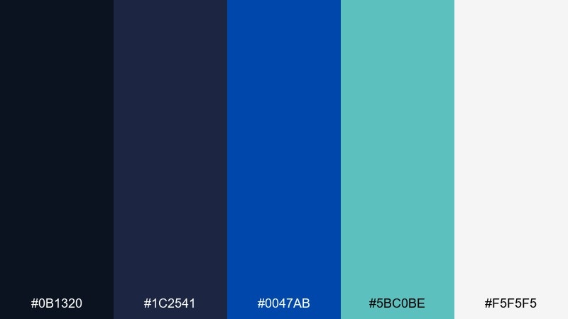
HEX: #0B1320 #1C2541 #0047AB #5BC0BE #F5F5F5
Mood: minimal, sharp, confident
Best for: portfolio sites and case studies
Minimal and sharp, it looks like dark ink, cool teal highlights, and a clean gallery wall. Keep the near-black and deep navy for typography, then use cobalt for links and key UI states. The teal adds a modern twist when used sparingly for tags, icons, or hover effects. Tip: stick to a strict spacing system so the dark tones feel intentional and premium.
Image example of minimal cobalt mono generated using media.io
15) Ocean Glass
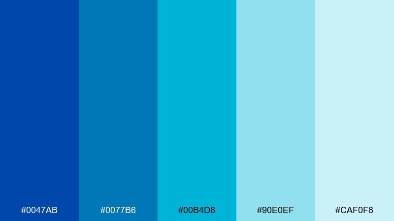
HEX: #0047AB #0077B6 #00B4D8 #90E0EF #CAF0F8
Mood: cool, refreshing, airy
Best for: SaaS onboarding and fintech UI
Cool and refreshing, it reads like layered water and glass reflections. Use the two deepest blues for structure and navigation, then let the lighter aqua shades soften cards, modals, and empty states. This set is especially strong for onboarding screens that need clarity and calm. Tip: add subtle gradients between the mid blues to create depth without introducing new colors.
Image example of ocean glass generated using media.io
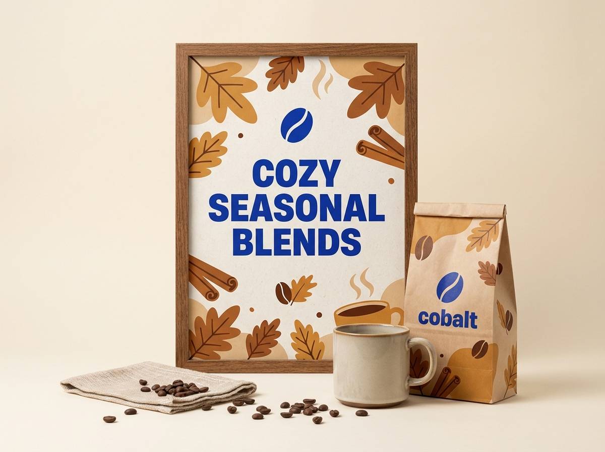
16) Harvest Contrast
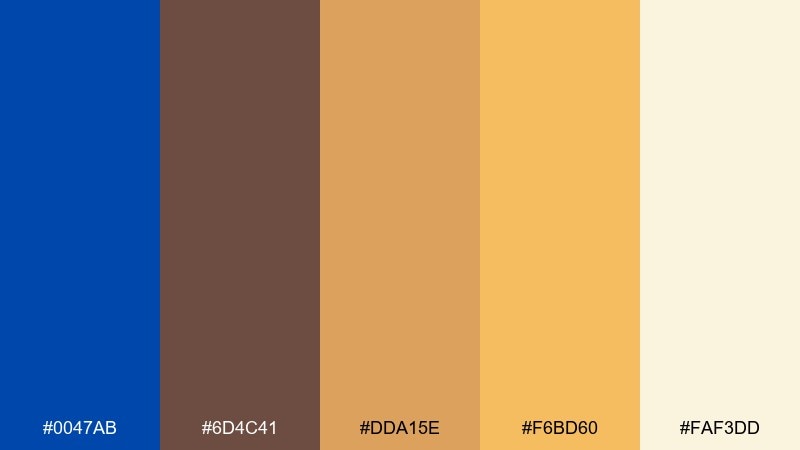
HEX: #0047AB #6D4C41 #DDA15E #F6BD60 #FAF3DD
Mood: cozy, earthy, inviting
Best for: cafe branding and seasonal promotions
Cozy and earthy, it feels like a warm bakery interior with a bold blue sign outside. The cream and caramel tones make friendly backgrounds, while cobalt adds a modern punch for logos and headlines. Use the brown for grounding elements like dividers, stamps, and small text. Tip: keep the blue limited to high-impact moments so the palette stays inviting rather than cold.
Image example of harvest contrast generated using media.io
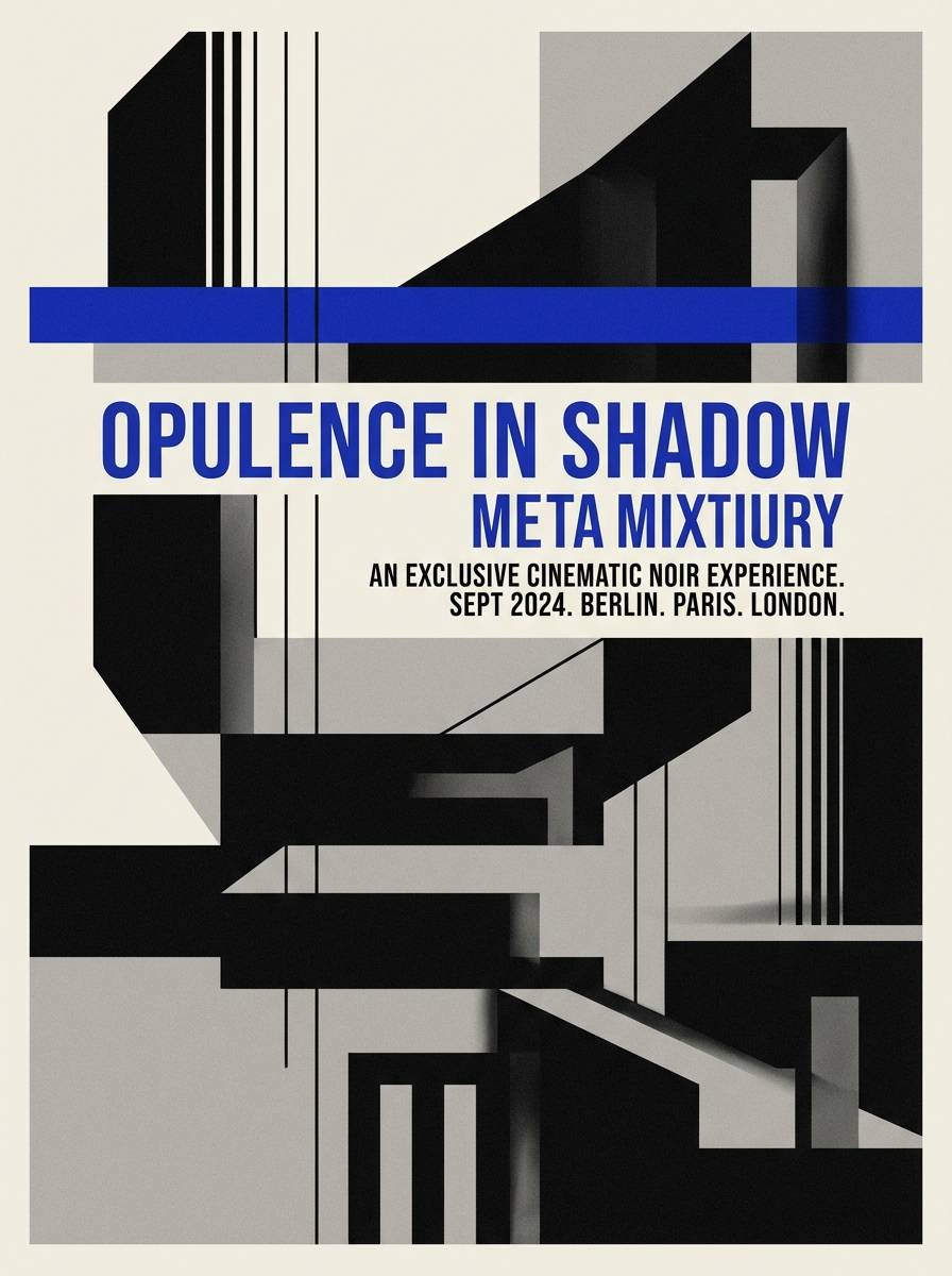
17) Film Noir Accent
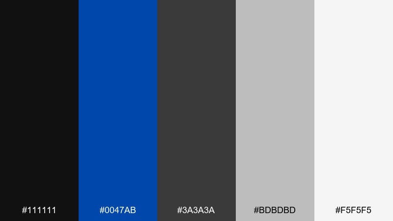
HEX: #111111 #0047AB #3A3A3A #BDBDBD #F5F5F5
Mood: cinematic, bold, high-contrast
Best for: luxury ads and monochrome posters
Cinematic and high-contrast, it channels noir posters with a single electric note cutting through the dark. These cobalt color combinations are best when blue is used like a spotlight: one stripe, one headline, one key icon. The grays handle structure, while the off-white keeps text readable and refined. Tip: avoid drop shadows and use hard edges to preserve the crisp, poster-like look.
Image example of film noir accent generated using media.io
18) Lavender Blueprint
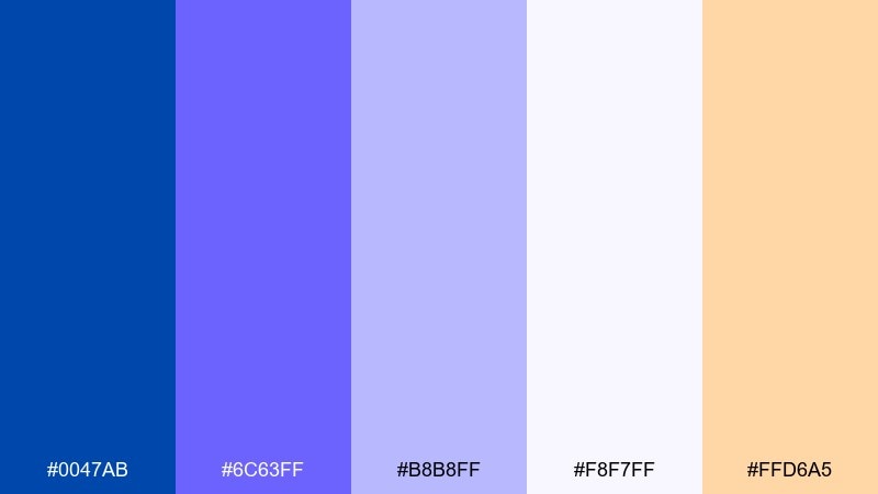
HEX: #0047AB #6C63FF #B8B8FF #F8F7FF #FFD6A5
Mood: dreamy, inventive, friendly
Best for: creative agencies and startup pitch decks
Dreamy and inventive, it feels like sketchbook ideas colored in with soft violet ink. Keep cobalt for structure, then lean on lavender tones for friendly sections and background panels. The peach accent is great for highlights like stats, badges, or slide numbers. Tip: use large color blocks per slide so the deck looks cohesive at a glance.
Image example of lavender blueprint generated using media.io
19) Retro Athletic
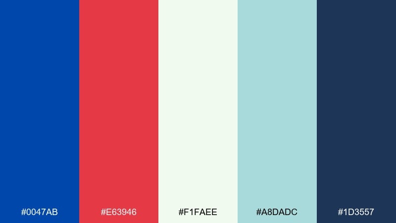
HEX: #0047AB #E63946 #F1FAEE #A8DADC #1D3557
Mood: sporty, retro, spirited
Best for: team merch and social graphics
Sporty and spirited, it brings back vintage jerseys and bold sideline banners. Use the dark navy and cobalt for the base, then let red punch up the callouts and numbers. The minty tones keep it fresh and help balance heavy blocks of color. Tip: outline text in the lightest shade for legibility on saturated backgrounds.
Image example of retro athletic generated using media.io
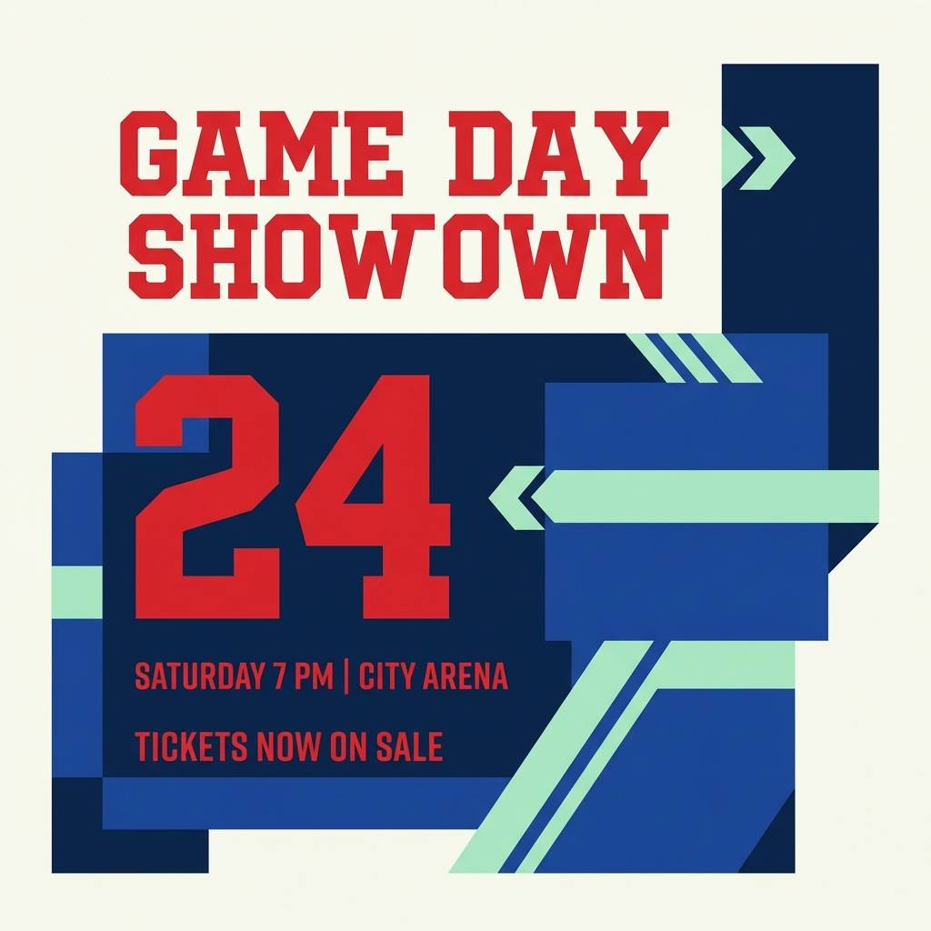
20) Desert Dusk
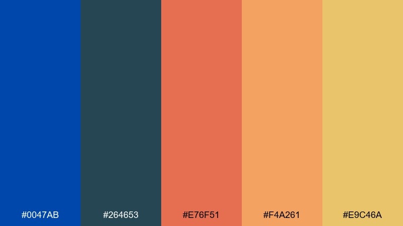
HEX: #0047AB #264653 #E76F51 #F4A261 #E9C46A
Mood: adventurous, warm, modern
Best for: outdoor brands and campaign ads
Adventurous and warm, it suggests a deep blue sky fading into desert sunset tones. Use cobalt and teal for the primary brand layer, then bring in coral and ochre for energetic highlights. It works beautifully for bold headlines, badges, and illustrated accents on clean layouts. Tip: keep coral for the single strongest call to action so it stays punchy.
Image example of desert dusk generated using media.io
What Colors Go Well with Cobalt?
Neutrals are the easiest match: off-white, cool grays, and near-black make cobalt feel sharper and more modern. These pairings are ideal for UI, editorial layouts, and brand systems that need clear hierarchy.
Warm accents (gold, amber, copper, coral, orange) add energy and make cobalt feel more human and inviting. Use warm tones as small highlights—CTAs, badges, price tags—so cobalt remains the anchor.
Nature-forward greens (sage, pine, eucalyptus) soften cobalt’s intensity and help brands communicate freshness and trust. This is especially effective for wellness, eco packaging, and lifestyle identities.
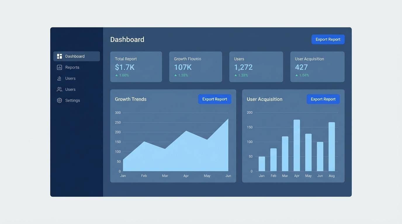
How to Use a Cobalt Color Palette in Real Designs
Start by assigning roles: choose one cobalt as your primary (brand marks, key UI states), then a neutral base for backgrounds, and one accent for emphasis. This prevents cobalt-heavy designs from feeling loud or visually dense.
In UI, test contrast early—especially for small text, icons, and disabled states. Cobalt works best when paired with ample spacing and clear typography so it reads “premium” rather than “busy.”
For print, paper choice matters. Uncoated stocks can mute deep blues; coated stocks can make them look glossy. If you need a rich cobalt, run proofs and adjust ink coverage to avoid muddy edges.
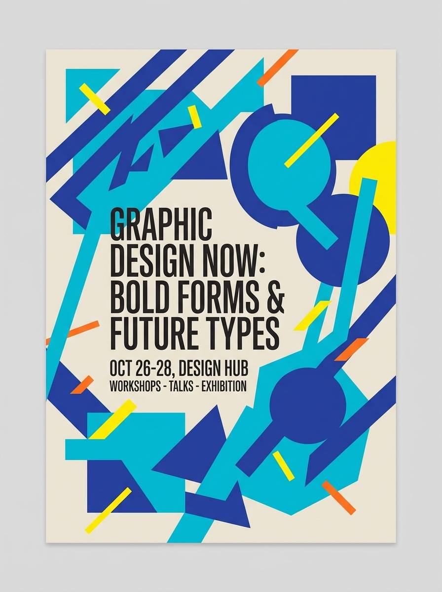
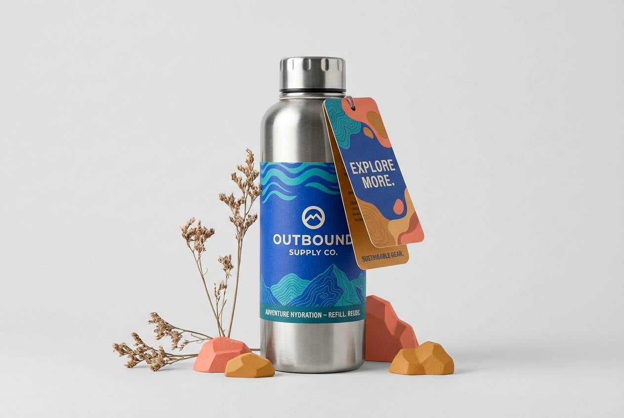
Create Cobalt Palette Visuals with AI
If you already have HEX codes, you can generate matching mockups, posters, packaging, and UI screens by describing the layout and naming the palette colors. Consistent prompts help you keep style, lighting, and composition aligned across a campaign.
Use one “hero cobalt,” specify your background (cream, off-white, or near-black), then call out a single warm or neon accent. That simple structure makes AI outputs cleaner and more on-brand.
Cobalt Color Palette FAQs
-
What is the HEX code for classic cobalt blue?
A common “classic cobalt” used in design is #0047AB, which is a deep, saturated blue that holds up well in branding, UI, and print accents. -
Is cobalt better as a primary color or an accent?
Both work, but cobalt is naturally attention-grabbing—so it’s safest as a primary anchor paired with neutrals, or as a focused accent for CTAs, links, and highlights. -
What neutral colors pair best with cobalt?
Off-white, cool light grays, slate, and near-black create clean contrast and keep cobalt looking modern and professional. -
What warm colors go well with cobalt blue?
Gold, amber, copper, coral, and orange add warmth and make cobalt feel more approachable. Use warm tones sparingly for badges, buttons, or small emphasis areas. -
Does cobalt work well for dark mode UI?
Yes—cobalt pops on deep navy and near-black backgrounds. Just verify accessibility contrast for small text and icons, and reserve the brightest blues for active states. -
How do I keep a cobalt palette from looking too intense?
Increase whitespace, rely on soft neutrals for large backgrounds, and limit saturated companions (like magenta or orange) to small accents. -
Can I generate cobalt-themed mockups and visuals with AI?
Yes. Describe the design format (UI, poster, packaging), specify cobalt as the dominant color, list supporting neutrals/accents, and keep lighting/style consistent for a cohesive set.
Next: Black Tan Color Palette


