

Black tan palettes combine crisp depth with warm neutrality, making layouts feel premium without relying on loud color. The result is a versatile scheme that works across branding, interiors, and social graphics.
Below are 20 black tan color palette ideas with HEX codes, plus practical tips and AI prompts you can reuse to generate matching visuals fast.
In this article
Why Black Tan Palettes Work So Well
Black brings instant structure: it defines typography, frames imagery, and creates strong hierarchy. Tan softens that intensity, keeping the overall look warm, approachable, and modern.
This pairing is naturally flexible because you can dial contrast up or down. Push more black for bold, editorial impact, or let cream/tan lead for a lighter, lifestyle-friendly feel.
Black and tan also photograph well and print reliably, which is why they show up in premium packaging, menswear branding, and calm UI themes where clarity matters.
20+ Black Tan Color Palette Ideas (with HEX Codes)
1) Desert Noir
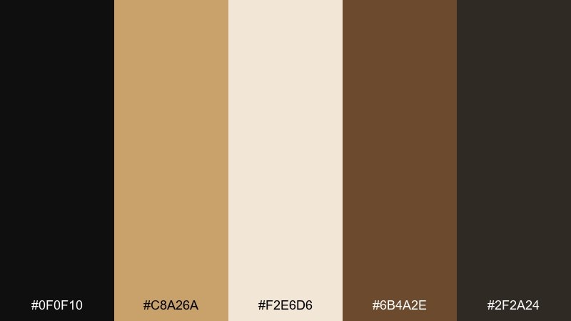
HEX: #0f0f10 #c8a26a #f2e6d6 #6b4a2e #2f2a24
Mood: bold, warm, cinematic
Best for: hero banner for a lifestyle website
Bold, warm contrast with a cinematic desert-at-dusk feel, where deep black reads like night and tan feels sun-baked. It works beautifully for hero sections, fashion lookbooks, and landing pages that need instant focus. Pair it with generous cream space to keep the palette breathable and premium. Usage tip: reserve the black for headlines and CTAs, and use tan as the main fill so the page feels warm rather than harsh.
Image example of desert noir generated using media.io
Media.io is an online AI studio for creating and editing video, image, and audio in your browser.

2) Camel & Carbon
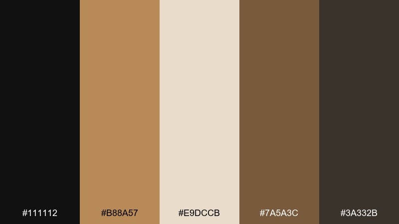
HEX: #111112 #b88a57 #e9dccb #7a5a3c #3a332b
Mood: modern, grounded, confident
Best for: brand identity kit for a menswear label
Modern and grounded, like camel wool against carbon-black tailoring. The tones feel confident for logos, hang tags, and a clean identity system. Add the soft cream as negative space to keep everything refined and readable. Usage tip: print tan on uncoated stock and keep black type slightly warm to avoid a cold, bluish cast.
Image example of camel & carbon generated using media.io
3) Linen Shadow
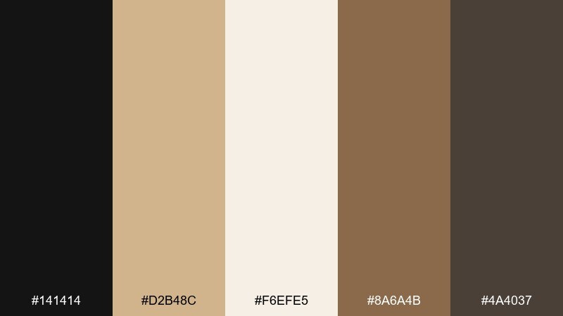
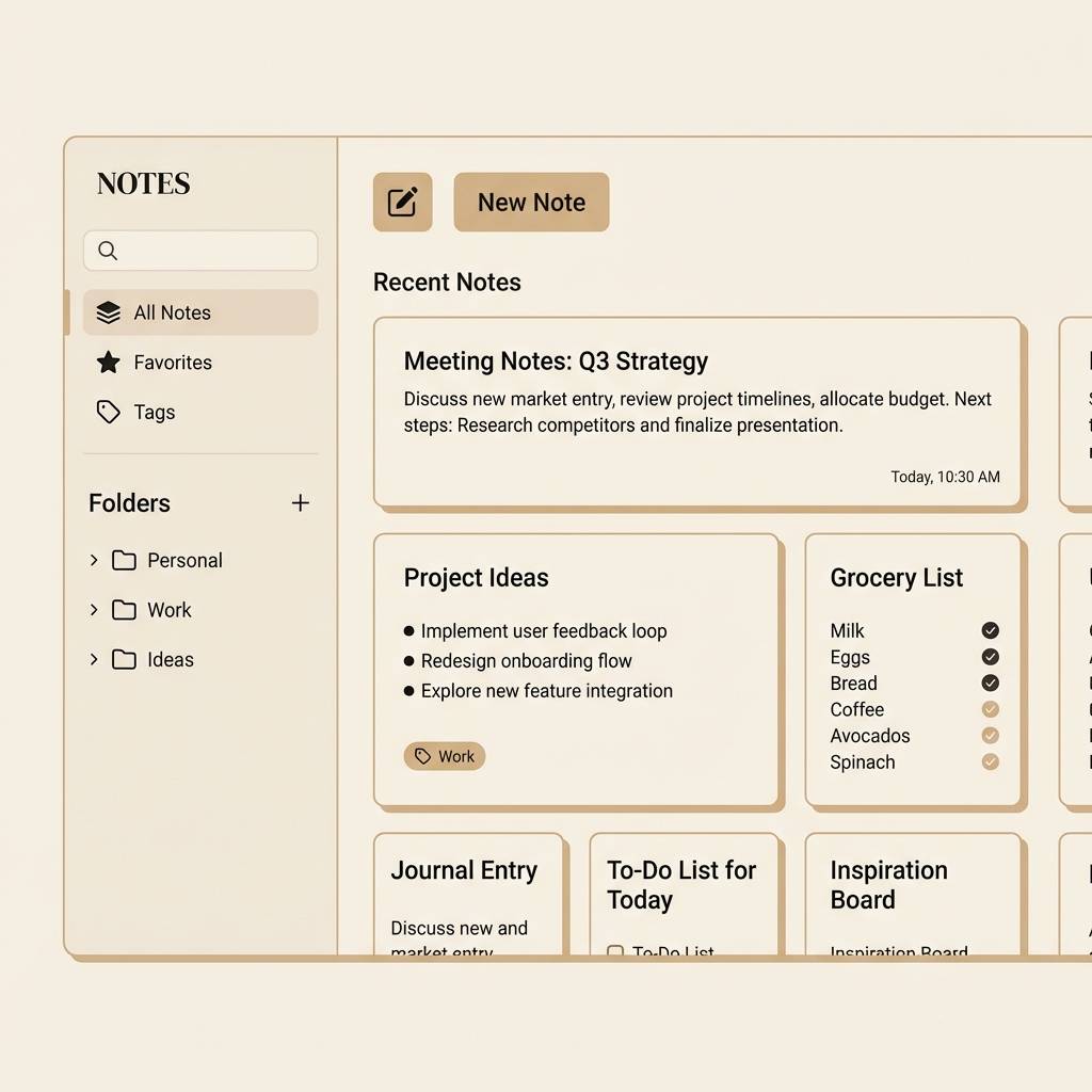
HEX: #141414 #d2b48c #f6efe5 #8a6a4b #4a4037
Mood: soft, airy, minimal
Best for: minimal UI for a note-taking app
Soft and airy, like linen in bright light with a crisp shadow line. It suits minimal interfaces where comfort matters as much as clarity. Keep the light cream as the main canvas and use tan for cards, toggles, and subtle emphasis. Usage tip: test contrast on smaller labels and use the deeper brown for secondary text instead of pure black when possible.
Image example of linen shadow generated using media.io
4) Coffeehouse Chic
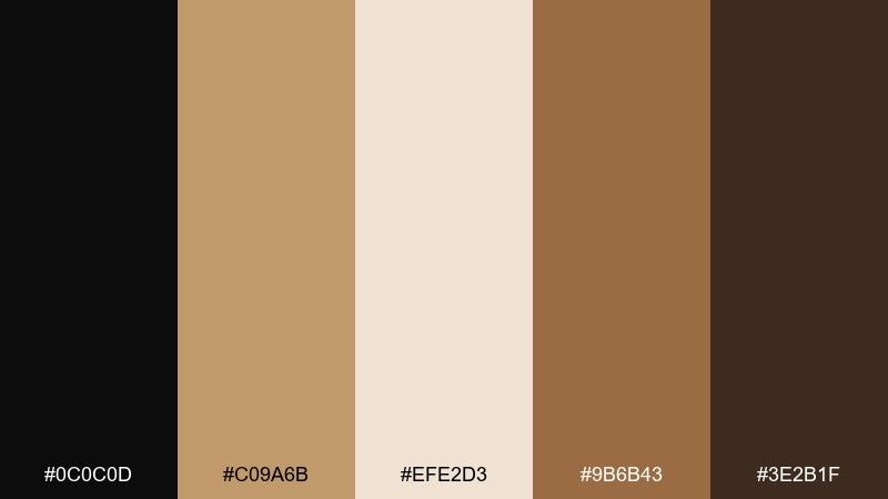
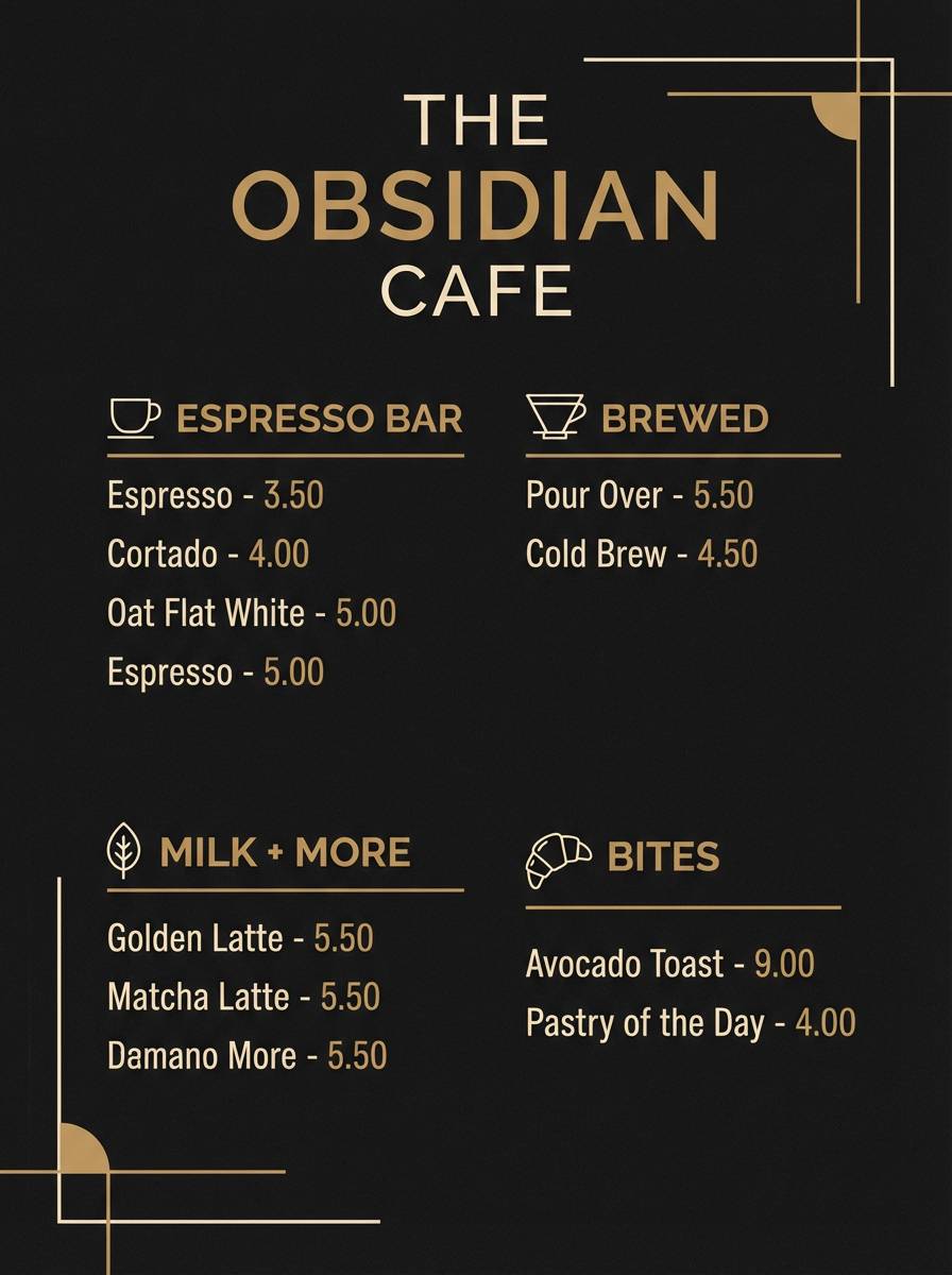
HEX: #0c0c0d #c09a6b #efe2d3 #9b6b43 #3e2b1f
Mood: cozy, inviting, upscale
Best for: coffee shop menu poster
Cozy and inviting, like espresso crema on dark roast with a warm pastry glow. These black tan color combinations shine on menus and signage where you want richness without looking heavy. Pair with simple line icons and plenty of cream space to keep it legible at a distance. Usage tip: make prices and section headers black, then use tan blocks to group items for quick scanning.
Image example of coffeehouse chic generated using media.io
5) Safari Minimal
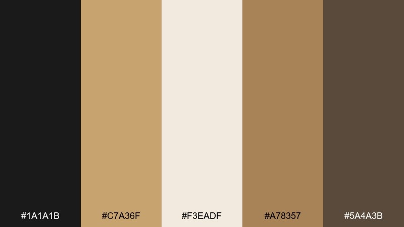
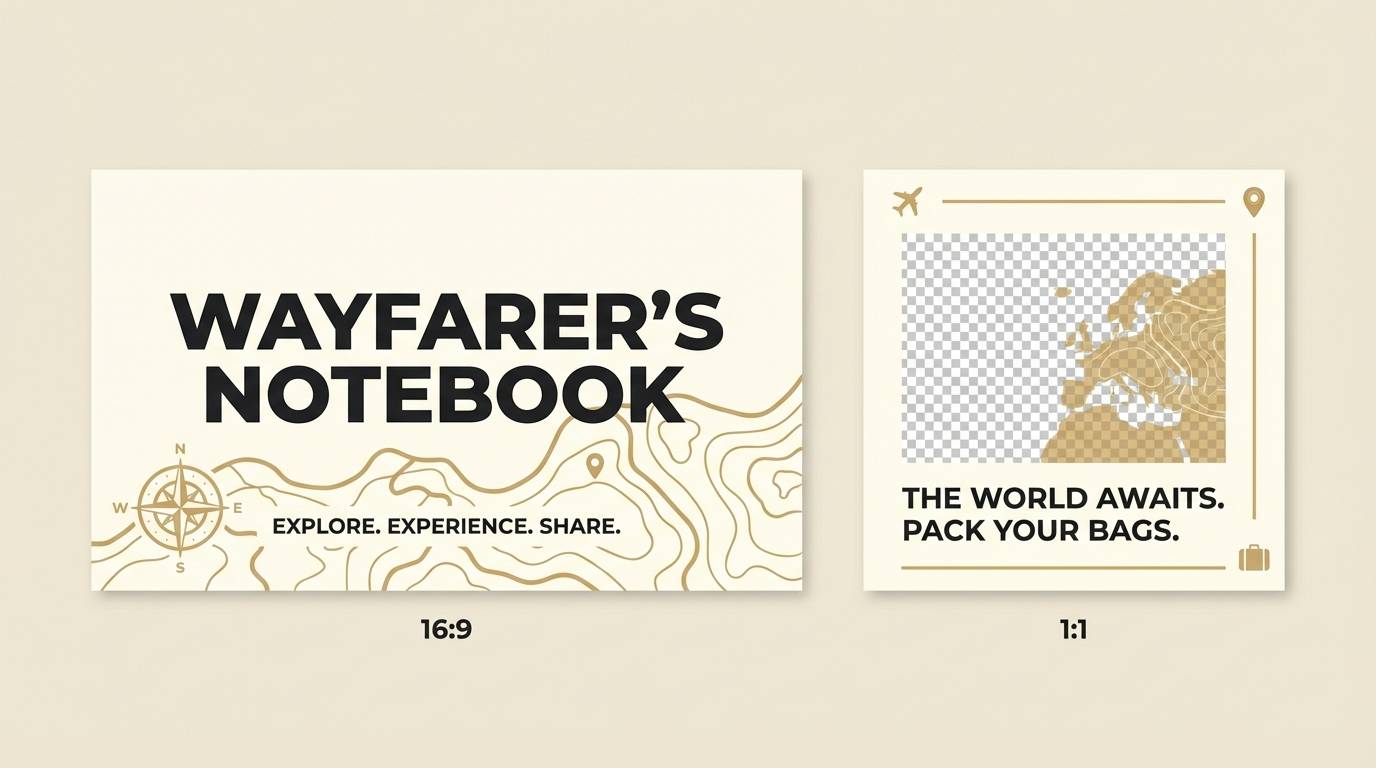
HEX: #1a1a1b #c7a36f #f3eadf #a78357 #5a4a3b
Mood: adventurous, clean, earthy
Best for: travel blog header and social templates
Adventurous but clean, like khaki canvas, dust trails, and a sharp horizon line. It fits travel headers and reusable social templates that need warmth and structure. Pair with bold sans-serif type and simple map-style patterns for texture. Usage tip: use tan for highlight badges and keep imagery framed with dark borders for a crisp editorial finish.
Image example of safari minimal generated using media.io
6) Brass Buckle
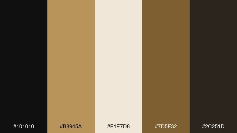
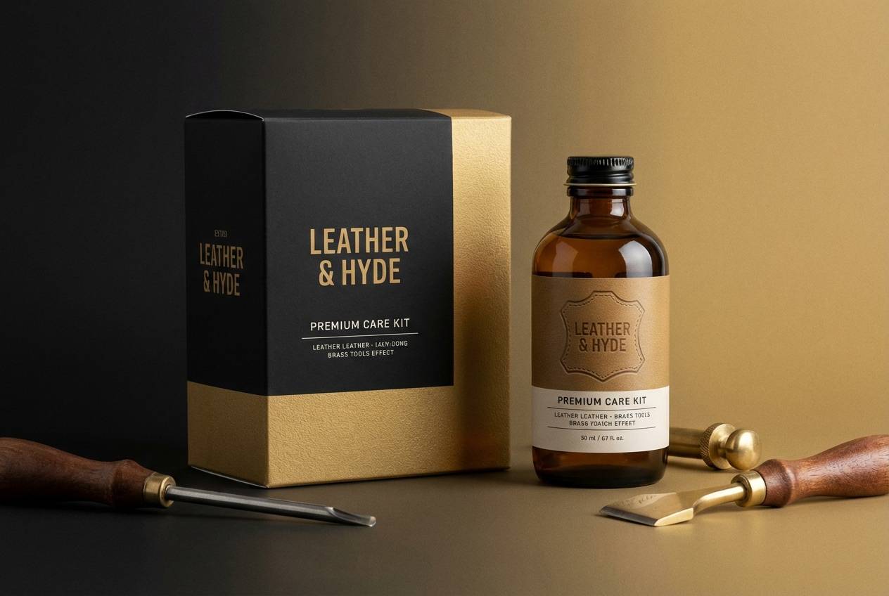
HEX: #101010 #b8945a #f1e7d8 #7d5f32 #2c251d
Mood: heritage, polished, masculine
Best for: product packaging for a leather care kit
Heritage and polished, like a brass buckle catching light against dark leather. It is ideal for packaging where you want a crafted, premium story. Pair with embossed textures and minimal copy so the colors do the heavy lifting. Usage tip: keep tan as the label field and use the deeper brown for subtle dividers and ingredient lines.
Image example of brass buckle generated using media.io
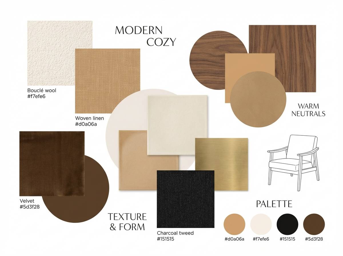
7) Warm Suede
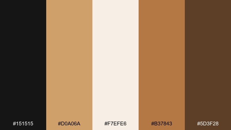
HEX: #151515 #d0a06a #f7efe6 #b37843 #5d3f28
Mood: warm, tactile, welcoming
Best for: interior design mood board
Warm and tactile, like suede upholstery and soft lamplight on a quiet evening. This black tan color palette fits mood boards, material guides, and client presentations where you want comfort with contrast. Pair it with matte textures, natural wood, and rounded shapes for a gentle, lived-in feel. Usage tip: let cream dominate the board and use black sparingly as thin lines and captions to keep it inviting.
Image example of warm suede generated using media.io
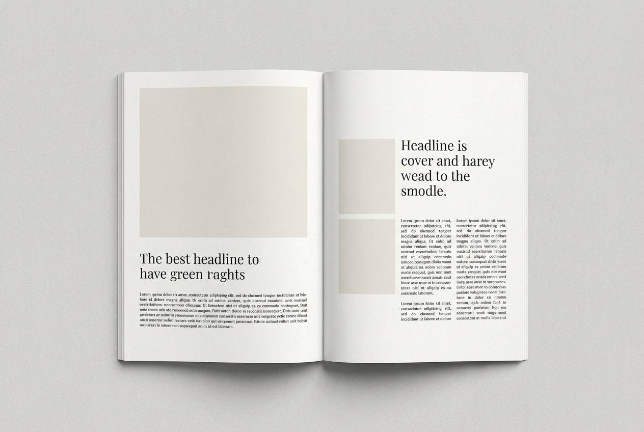
8) Sandstone Ink
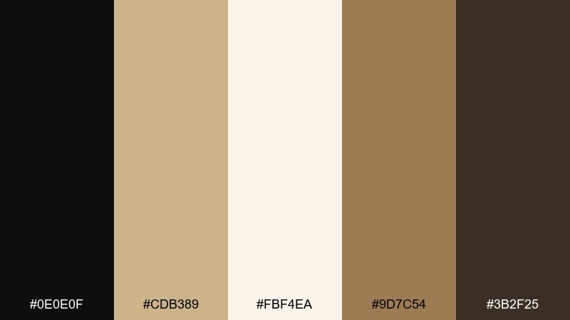
HEX: #0e0e0f #cdb389 #fbf4ea #9d7c54 #3b2f25
Mood: calm, editorial, refined
Best for: editorial magazine spread
Calm and refined, like sandstone pages with rich ink pressed into the grain. The mix is excellent for magazine layouts, essays, and long-form reading where contrast must stay gentle. Pair with serif headlines and warm photography that leans golden rather than cool. Usage tip: set body text in the dark brown instead of pure black to reduce glare on bright backgrounds.
Image example of sandstone ink generated using media.io
9) Mocha Matinee
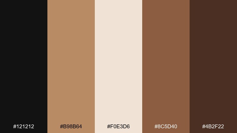
HEX: #121212 #b98b64 #f0e3d6 #8c5d40 #4b2f22
Mood: romantic, nostalgic, cinematic
Best for: movie night event flyer
Romantic and nostalgic, like a matinee ticket stub and mocha foam under dim lights. It works for event flyers and posters that need warmth without loud color. Pair with bold type and simple silhouettes to keep the retro vibe clean and modern. Usage tip: use tan for the main title block and keep secondary details on cream for easy reading.
Image example of mocha matinee generated using media.io
10) Sepia Studio
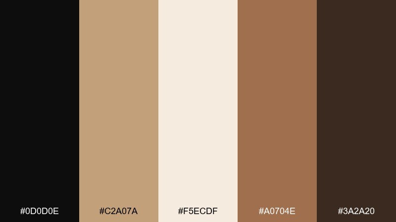
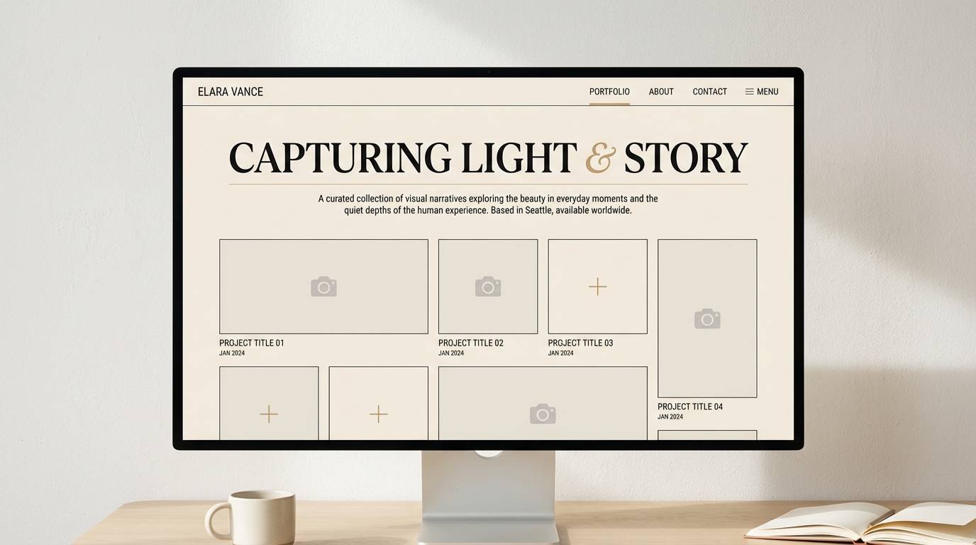
HEX: #0d0d0e #c2a07a #f5ecdf #a0704e #3a2a20
Mood: creative, warm, understated
Best for: photography portfolio landing page
Creative and understated, like sepia prints drying in a quiet studio. These black tan color combinations feel especially good for portfolios and case studies where images should stay front and center. Pair with thin rules, tasteful whitespace, and a single accent tone for hover states. Usage tip: keep navigation black on cream, then use tan for active states so the UI stays subtle.
Image example of sepia studio generated using media.io
11) Blackened Honey
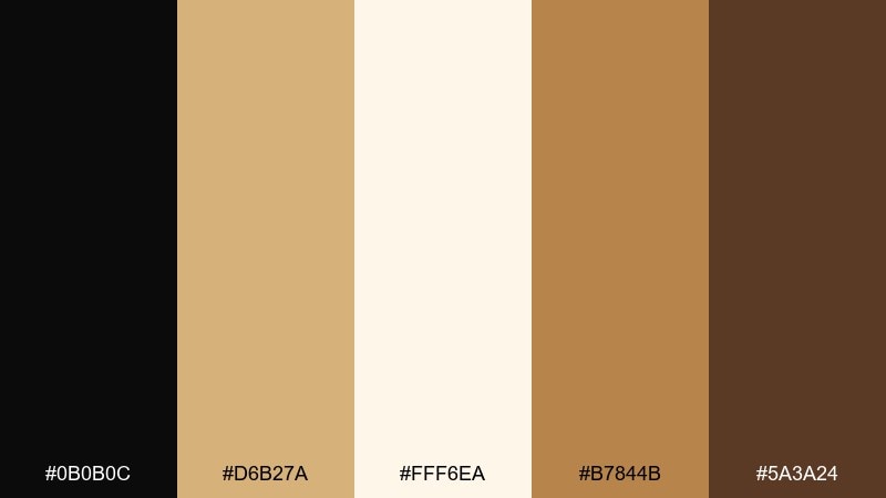
HEX: #0b0b0c #d6b27a #fff6ea #b7844b #5a3a24
Mood: sweet, luxe, glowing
Best for: skincare product ad
Sweet and luxe, like honey warmed under soft studio lights with a dramatic dark backdrop. It is great for skincare ads where you want glow and credibility at the same time. Pair with macro textures and minimal copy so the color story reads premium. Usage tip: use the light cream for the background and let honey tan frame the product to create a halo effect.
Image example of blackened honey generated using media.io
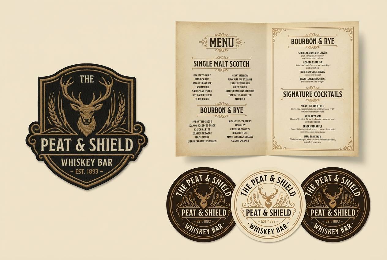
12) Cigar Lounge
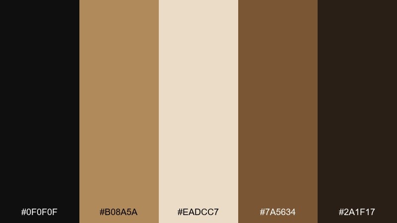
HEX: #0f0f0f #b08a5a #eadcc7 #7a5634 #2a1f17
Mood: smoky, intimate, sophisticated
Best for: whiskey bar logo and menu set
Smoky and intimate, like leather booths and low light in a classic lounge. A black tan color scheme like this suits bar branding, drink menus, and signage with a timeless edge. Pair with condensed typography and small ornamental dividers to lean into the mood. Usage tip: keep tan as the menu paper tone and use near-black for type so details stay crisp under warm lighting.
Image example of cigar lounge generated using media.io
13) Pebble & Pitch
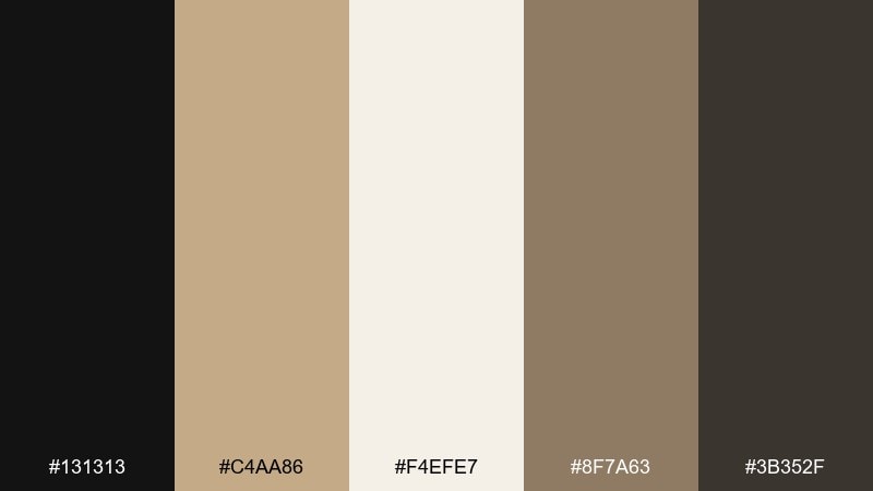
HEX: #131313 #c4aa86 #f4efe7 #8f7a63 #3b352f
Mood: balanced, quiet, contemporary
Best for: presentation deck for a real estate pitch
Balanced and quiet, like smooth pebbles beside dark slate. It works well for pitch decks that need to feel trustworthy and modern without shouting. Pair with clean charts, muted icons, and plenty of breathing room between sections. Usage tip: set charts in tan and gray-brown, then reserve black for key numbers and slide titles.
Image example of pebble & pitch generated using media.io
14) Artisan Leather
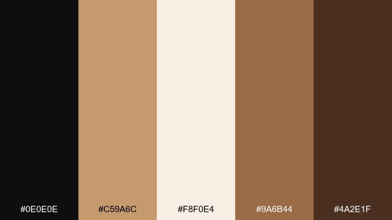
HEX: #0e0e0e #c59a6c #f8f0e4 #9a6b44 #4a2e1f
Mood: craft, rustic, premium
Best for: ecommerce product page for handmade goods
Craft-forward and premium, like hand-burnished leather and paper tags. The colors suit ecommerce pages for handmade goods where texture and trust matter. Pair with close-up product shots and simple iconography for materials and care details. Usage tip: keep buttons tan with black text for a friendly feel, then use black buttons only for primary checkout actions.
Image example of artisan leather generated using media.io
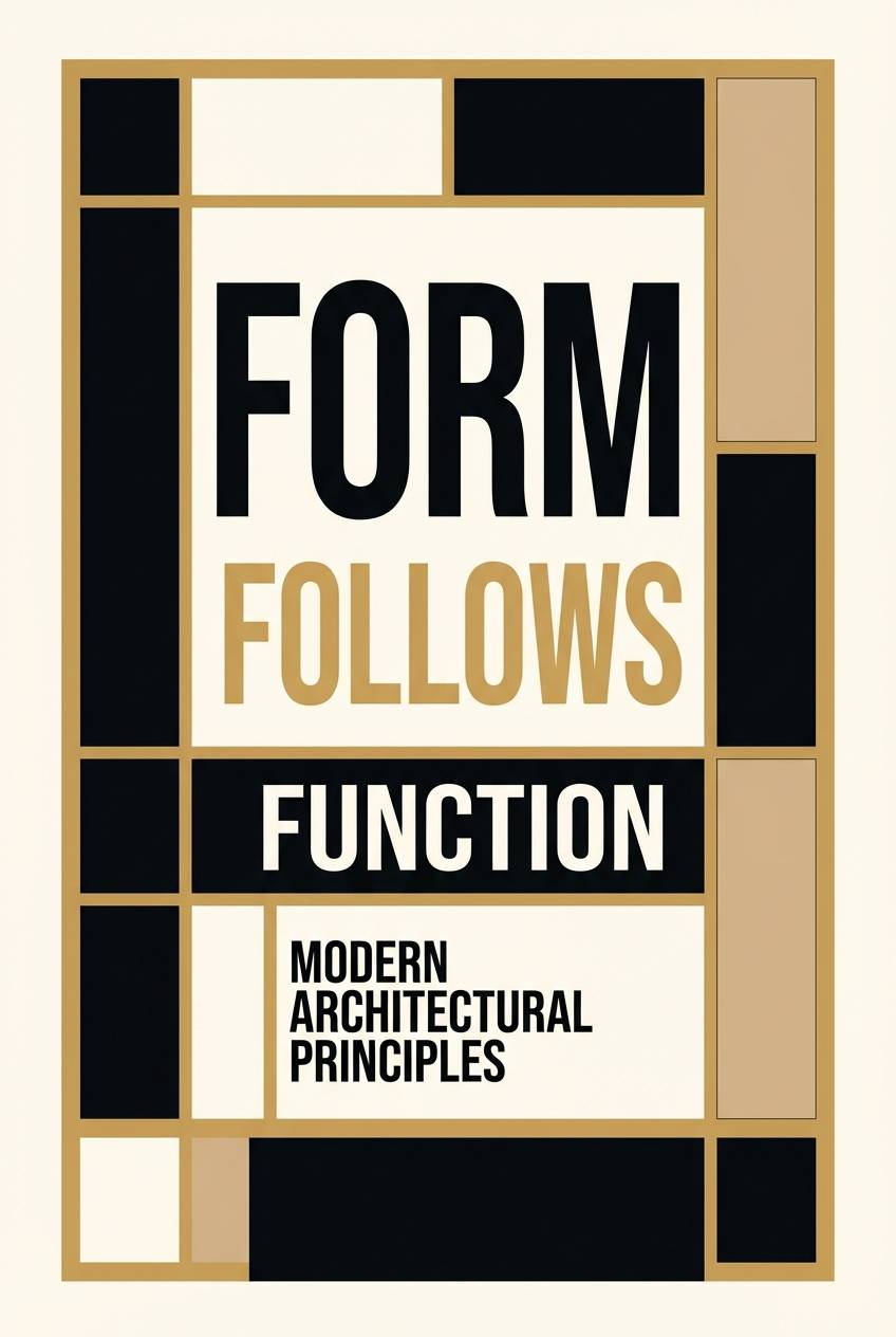
15) Dune Typography
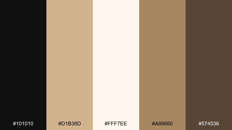
HEX: #101010 #d1b38d #fff7ee #a88660 #574536
Mood: graphic, sharp, minimal
Best for: typography poster series
Graphic and sharp, like wind-cut dunes with hard-edged shadows. It is perfect for typography-led posters where letterforms are the main visual. Pair with large scale type, tight grids, and subtle tan blocks for hierarchy. Usage tip: use the light cream as the base paper tone and layer tan shapes behind headlines for contrast without clutter.
Image example of dune typography generated using media.io
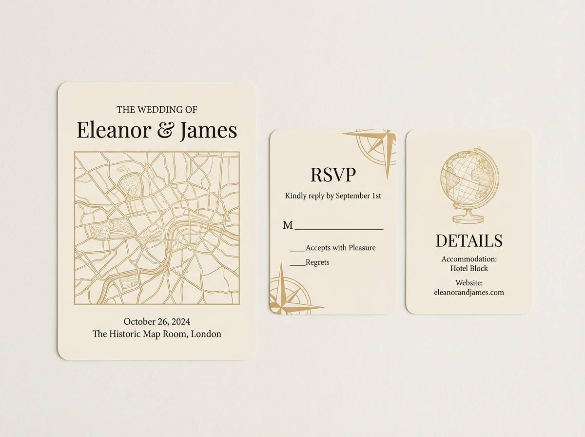
16) Vintage Map
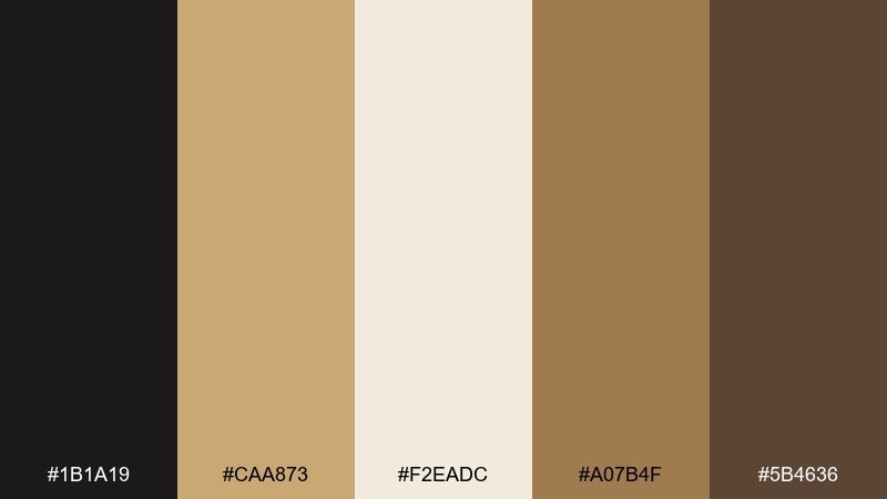
HEX: #1b1a19 #caa873 #f2eadc #a07b4f #5b4636
Mood: nostalgic, exploratory, warm
Best for: wedding invitation suite with vintage vibe
Nostalgic and exploratory, like an old map with inked routes and sun-warmed paper. It fits invitation suites that want vintage charm without feeling dated. Pair with delicate flourishes, serif type, and thin line illustrations. Usage tip: print the tan tones as a soft background wash, then use near-black for names and key details to keep everything readable.
Image example of vintage map generated using media.io
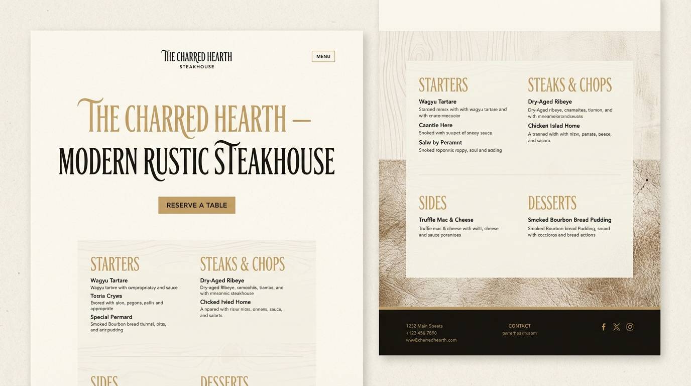
17) Modern Ranch
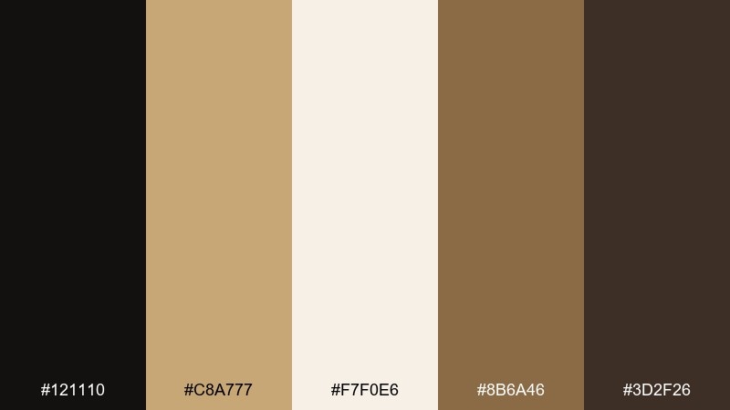
HEX: #121110 #c8a777 #f7f0e6 #8b6a46 #3d2f26
Mood: rugged, modern, approachable
Best for: restaurant website for a steakhouse
Rugged but modern, like weathered wood, cast iron, and warm bread tones. It is a natural fit for restaurant sites that want appetite appeal with a clean, contemporary layout. Pair with high-contrast food photography and simple section dividers. Usage tip: use black for navigation and overlays, then bring tan into buttons and highlights to keep the page welcoming.
Image example of modern ranch generated using media.io
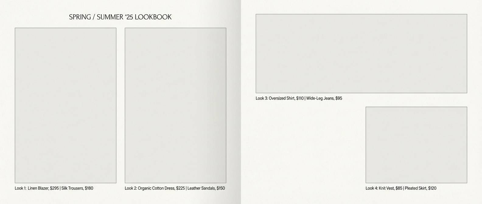
18) Tanline Editorial
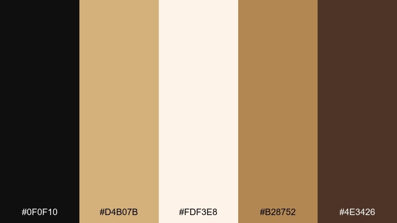
HEX: #0f0f10 #d4b07b #fdf3e8 #b28752 #4e3426
Mood: sunlit, stylish, editorial
Best for: fashion lookbook PDF
Sunlit and stylish, like golden hour on tailored fabrics with crisp black contrast. The black tan color palette feels editorial for lookbooks, line sheets, and collection notes. Pair with wide margins and tight typographic hierarchy for a premium, gallery-like layout. Usage tip: use tan as section tabs and page numbers so navigation feels subtle but consistent.
Image example of tanline editorial generated using media.io
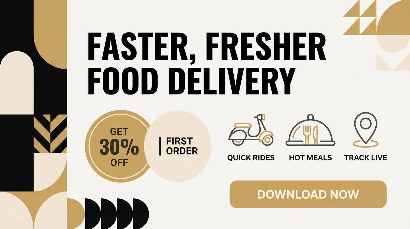
19) Night Market
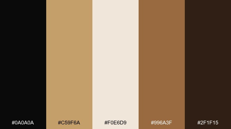
HEX: #0a0a0a #c59f6a #f0e6d9 #996a3f #2f1f15
Mood: lively, warm, streetwise
Best for: food delivery app promo banner
Lively and warm, like lantern light cutting through a dark street scene. It works well for promo banners that need energy while staying grounded in neutrals. Pair with bold food typography and simple sticker shapes for discounts. Usage tip: set the discount badge in tan and keep the rest of the layout dark so the offer pops instantly.
Image example of night market generated using media.io
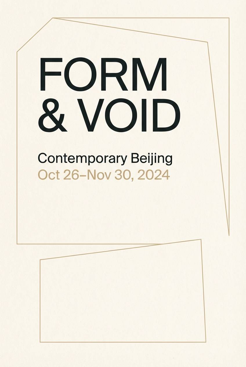
20) Gallery Neutral
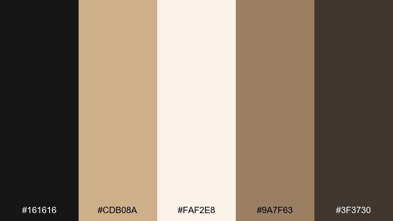
HEX: #161616 #cdb08a #faf2e8 #9a7f63 #3f3730
Mood: quiet, curated, elegant
Best for: art gallery exhibition poster
Quiet and curated, like a calm gallery wall with warm spotlights and deep shadows. These black tan color combinations support artwork and typography without competing for attention. Pair with lots of empty space, small details, and a strong grid. Usage tip: keep the background cream and use black for the exhibit title, then add tan as a subtle frame or footer bar.
Image example of gallery neutral generated using media.io
What Colors Go Well with Black Tan?
Black and tan pair smoothly with creamy whites, warm browns, and muted grays, giving you an easy neutral system for backgrounds, borders, and text. For a subtle “modern earth tones” look, keep everything slightly warm instead of bluish.
If you want a small accent color, try olive/sage for an outdoorsy feel, muted teal for a refined contrast, or terracotta for extra warmth. For premium looks, metallic gold/brass accents also work well with tan.
When adding a third color, treat it like a spice: keep black for structure, tan/cream for the main surfaces, then use the accent only for highlights (badges, links, hover states, or small icons).
How to Use a Black Tan Color Palette in Real Designs
Start with role-based color assignment: use cream as your primary background, tan as the dominant surface color (cards, sections, packaging fields), and black for headings, icons, and key CTAs. This keeps contrast clean and avoids a heavy, overly dark page.
For readability, consider using a deep brown (instead of pure black) for long paragraphs on light backgrounds. In print, test paper stock: tan tones often look richer on uncoated or textured paper, while glossy stock can push them brighter.
Add texture through shapes and spacing rather than extra colors—thin rules, subtle patterns, and warm shadows help the palette feel dimensional while staying minimal.
Create Black Tan Palette Visuals with AI
If you already have HEX codes, you can generate on-brand mockups quickly by describing the layout (poster, UI, packaging) and specifying your black and tan tones as dominant colors. Keeping prompts design-focused (no busy backgrounds) helps the palette read clearly.
Reuse the prompts above, swap in your own HEX values, and keep the aspect ratio tag the same to maintain consistent outputs across a series. This is especially useful for creating social templates, pitch decks, and ad variations.
Generate a few options, then refine by asking for “more cream negative space” or “higher contrast typography” until your black tan scheme looks balanced.
Black Tan Color Palette FAQs
-
What does a black tan color palette communicate in branding?
It usually signals premium simplicity: black provides authority and clarity, while tan adds warmth and approachability. Together, they’re popular for lifestyle, fashion, hospitality, and product packaging. -
Is tan and black a good palette for websites and UI?
Yes—use cream as the main background, tan for surfaces (cards/sections), and black for headings and primary actions. For long body text, a deep brown can reduce glare and feel softer than pure black. -
How do I keep black tan designs from looking too dark?
Let cream dominate (backgrounds and whitespace), then use black sparingly for hierarchy (titles, dividers, key buttons). Tan works best as the main “fill” color rather than a tiny accent. -
What accent colors pair well with a black tan color scheme?
Olive/sage, muted teal, terracotta, and brass/gold accents all pair well. Keep accents limited to small UI states, badges, or highlight elements so the palette stays clean. -
Which is better for print: pure black or near-black with tan?
Near-black (a slightly warm black) often looks more harmonious next to tan and avoids a cold, bluish cast. Always test on your target paper stock, especially for packaging and invitations. -
How can I generate black tan palette mockups with AI?
Use a layout-first prompt (e.g., “menu poster layout” or “brand identity kit”), specify your dominant HEX colors, and keep the background simple. Generate a few variations, then refine with instructions like “more cream negative space” or “bolder typography.” -
What’s the easiest way to apply a black tan palette consistently?
Assign roles: cream = background, tan = surfaces/sections, black = headlines and primary CTAs, brown = secondary text and subtle dividers. This role system keeps contrast predictable across pages and templates.
Next: Brown Color Palette


