

Brown olive sits right at the intersection of earthy brown warmth and muted green calm—making it a natural choice for designs that need to feel grounded, trustworthy, and timeless.
Below are 20 curated brown olive color palette ideas with HEX codes, plus practical use notes for branding, interiors, and UI.
In this article
- Why Brown Olive Palettes Work So Well
-
- rustic grove
- desert lichen
- olive bark minimal
- copper moss
- vintage field
- forest clay
- herbal leather
- stone sage
- autumn canopy
- quiet hearth
- coastal olive drift
- botanical study
- artisan packaging
- modern dashboard
- editorial spread
- wedding greenery
- cafe menu
- athletic outdoors
- nature classroom
- night garden luxe
- What Colors Go Well with Brown Olive?
- How to Use a Brown Olive Color Palette in Real Designs
- Create Brown Olive Palette Visuals with AI
Why Brown Olive Palettes Work So Well
Brown olive palettes feel “naturally designed” because they mirror what we see outdoors: wood, soil, bark, moss, and dried grasses. That built-in familiarity makes them ideal for brands that want to feel authentic and dependable.
They also balance warmth and restraint. Browns add comfort and heritage, while olive greens add a calm, functional tone—useful for UI, packaging, and interiors that need to stay soothing instead of loud.
Finally, brown olive plays nicely with both light neutrals (cream, sand, greige) and premium accents (brass, copper, matte black). That flexibility makes it easy to build consistent systems across print and digital.
20+ Brown Olive Color Palette Ideas (with HEX Codes)
1) Rustic Grove
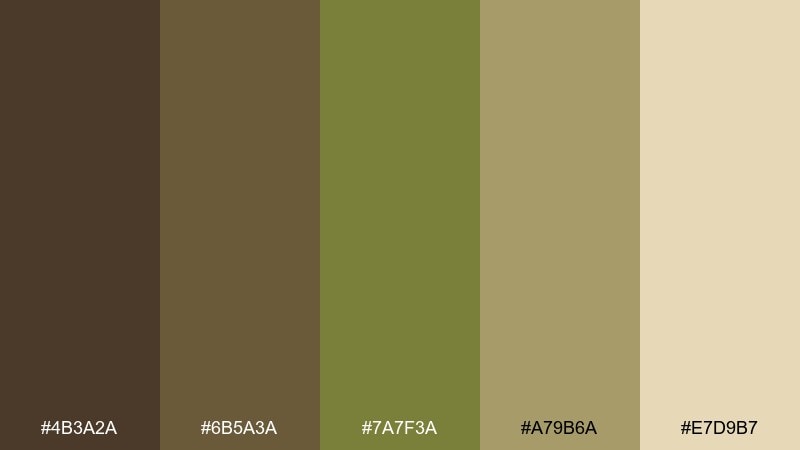
HEX: #4B3A2A #6B5A3A #7A7F3A #A79B6A #E7D9B7
Mood: warm, grounded, outdoorsy
Best for: cabin interiors and lifestyle branding
Warm and grounded like sunlit timber and dry leaves under evergreens. These tones shine in cozy interiors, outdoor brands, and packaging that wants to feel honest and handcrafted. Pair with matte black hardware or off-white space to keep it from feeling heavy. Usage tip: use the cream as your main background and reserve the deepest brown for headlines or trim.
Image example of rustic grove generated using media.io
Media.io is an online AI studio for creating and editing video, image, and audio in your browser.

2) Desert Lichen
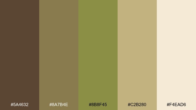
HEX: #5A4632 #8A7B4E #8B8F45 #C2B280 #F4EAD6
Mood: sunbaked, airy, natural
Best for: boho home decor and eco product labels
Sunbaked and airy, like lichen on rock with sand carried in the wind. The soft khaki and creamy neutral keep the greens approachable for decor, skincare, and eco-friendly goods. Pair with uncoated paper textures and simple line icons for a clean, modern rustic vibe. Usage tip: keep the olive as an accent stripe or seal to avoid overpowering light layouts.
Image example of desert lichen generated using media.io
3) Olive Bark Minimal
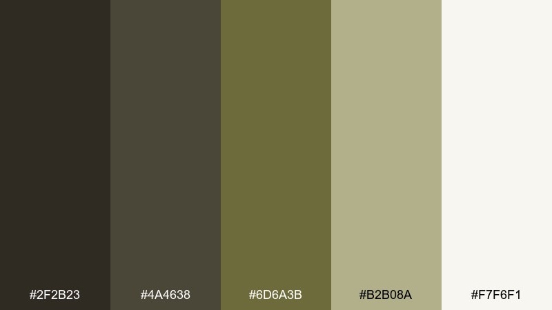
HEX: #2F2B23 #4A4638 #6D6A3B #B2B08A #F7F6F1
Mood: minimal, calm, premium
Best for: modern UI themes and minimalist branding
Calm and premium, like dark bark against a muted field at dusk. The near-black and soft off-white create a high-contrast structure that reads well in interfaces and identity systems. Pair with a single metallic accent, like brushed brass, if you need a touch of luxury without clutter. Usage tip: set buttons in olive and keep body text on the off-white for easy readability.
Image example of olive bark minimal generated using media.io
4) Copper Moss
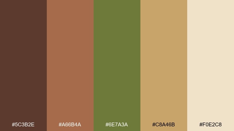
HEX: #5C3B2E #A66B4A #6E7A3A #C8A46B #F0E2C8
Mood: rich, artisanal, inviting
Best for: coffee brands and boutique retail packaging
Rich and artisanal, like copper cookware beside fresh moss after rain. This brown olive color palette feels especially inviting for cafes, candles, and small-batch goods where warmth matters. Pair with cream typography and a restrained copper foil detail to push it upscale. Usage tip: make the copper tone your hero accent, and let olive support secondary labels and icons.
Image example of copper moss generated using media.io
5) Vintage Field
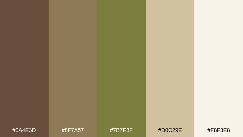
HEX: #6A4E3D #8F7A57 #7B7E3F #D0C29E #F8F3E8
Mood: nostalgic, soft, pastoral
Best for: heritage branding and editorial photography overlays
Nostalgic and soft, like a faded postcard of farmland in late summer. The gentle taupes and khaki balance the olive so it works beautifully over photography. Pair with serif headlines and subtle grain for a heritage feel that still reads modern. Usage tip: use the lightest tone as an overlay panel to keep text legible on busy images.
Image example of vintage field generated using media.io
6) Forest Clay
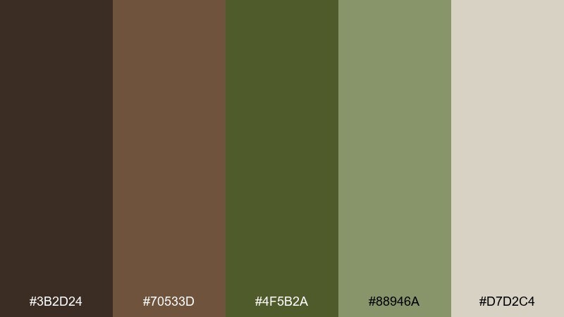
HEX: #3B2D24 #70533D #4F5B2A #88946A #D7D2C4
Mood: earthy, quiet, sturdy
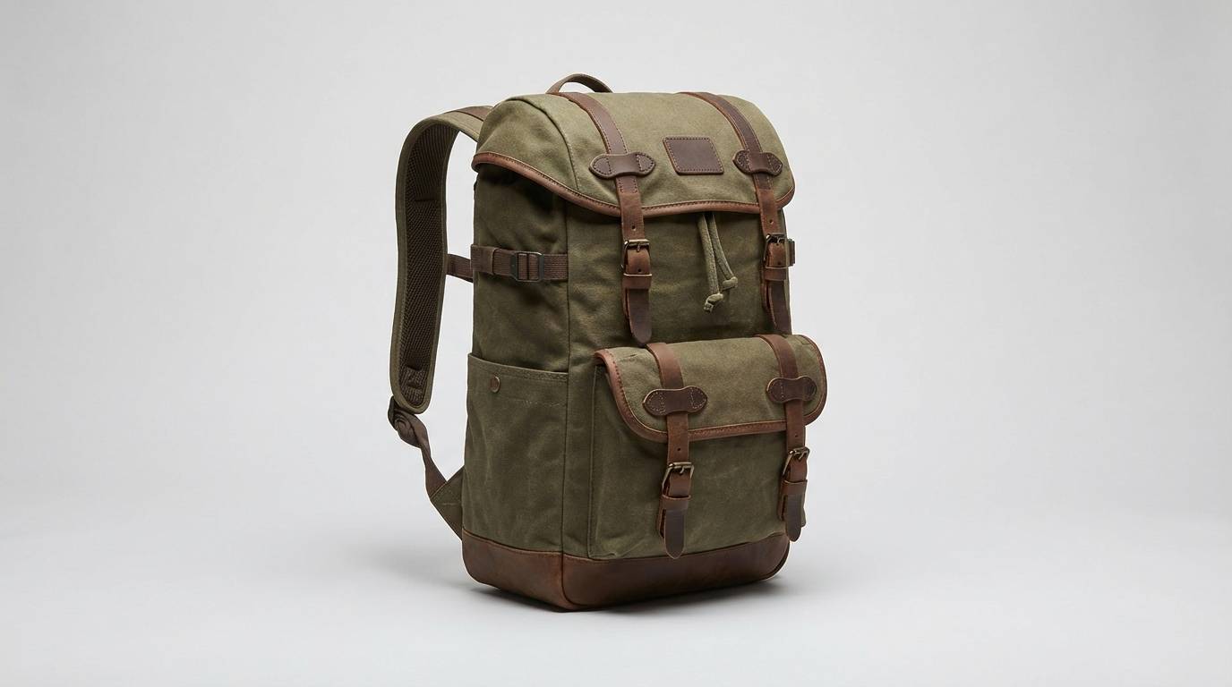
Best for: outdoor gear branding and rustic web design
Earthy and quiet, like clay soil and pine needles after a long hike. The darker olive keeps it rugged, while the pale greige adds breathing room for layouts. Pair with durable textures such as canvas, leather, or recycled paper to reinforce the outdoorsy story. Usage tip: reserve the darkest tones for navigation and use the greige for content blocks to reduce visual weight.
Image example of forest clay generated using media.io
7) Herbal Leather
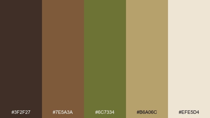
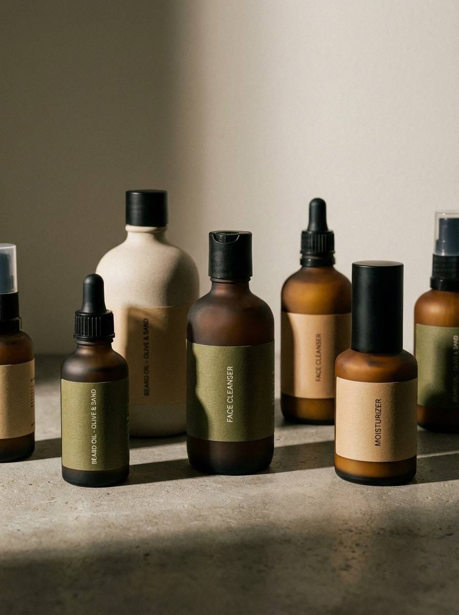
HEX: #3F2F27 #7E5A3A #6C7334 #B6A06C #EFE5D4
Mood: classic, masculine, refined
Best for: mens grooming and premium accessories
Classic and refined, like worn leather next to crushed herbs on a workbench. The mix of deep brown and herbaceous olive feels confident for grooming, accessories, and boutique services. Pair with clean sans-serif type and generous spacing to keep it contemporary. Usage tip: use the beige as a label base and let olive appear in small badges or icons.
Image example of herbal leather generated using media.io
8) Stone Sage
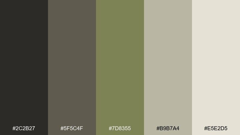
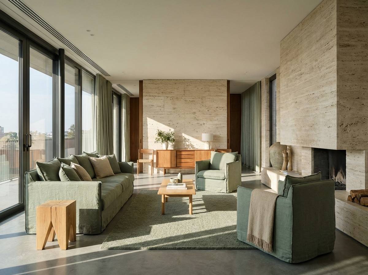
HEX: #2C2B27 #5F5C4F #7D8355 #B9B7A4 #E5E2D5
Mood: balanced, neutral, architectural
Best for: interior design boards and modern real estate marketing
Balanced and architectural, like smooth stone with a sage tint. The grayed neutrals make the olive feel sophisticated rather than loud, ideal for interiors and clean marketing materials. Pair with concrete textures, minimalist photography, and subtle shadowing for depth. Usage tip: keep the darkest tone for typography and use mid neutrals for large surfaces to avoid a harsh contrast.
Image example of stone sage generated using media.io
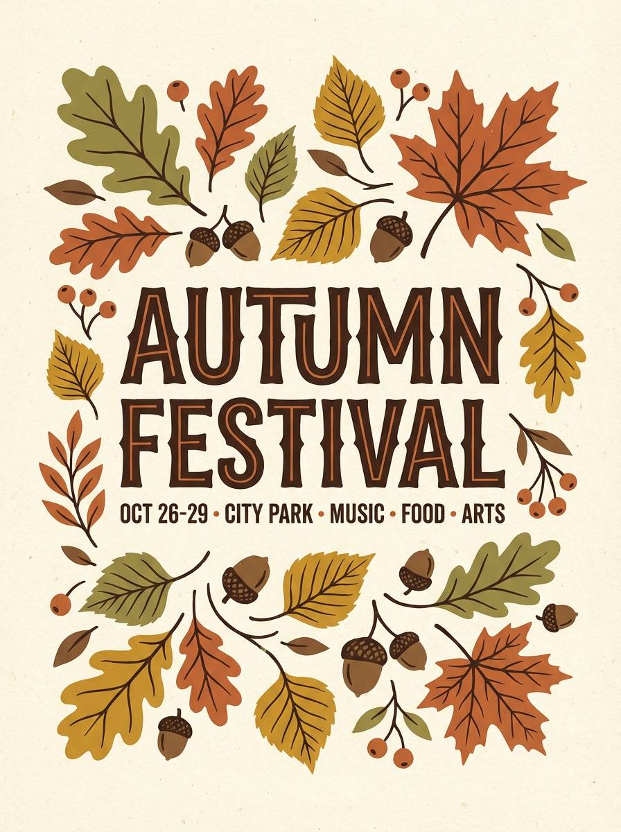
9) Autumn Canopy
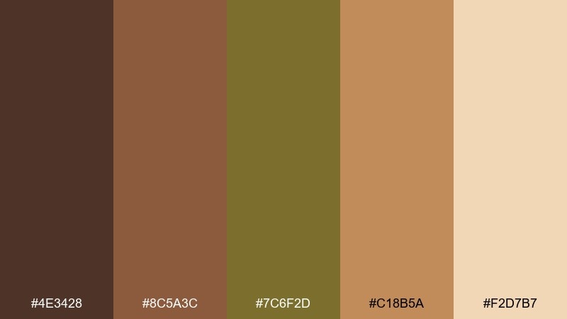
HEX: #4E3428 #8C5A3C #7C6F2D #C18B5A #F2D7B7
Mood: bold, seasonal, energetic
Best for: fall campaigns and event posters
Bold and seasonal, like a canopy of turning leaves with warm light breaking through. These brown olive color combinations work well for fall promotions, farmers markets, and lively event graphics. Pair with hand-drawn illustrations or textured gradients to amplify the seasonal energy. Usage tip: place the warm cream behind key text and use the orange-brown as your call-to-action accent.
Image example of autumn canopy generated using media.io
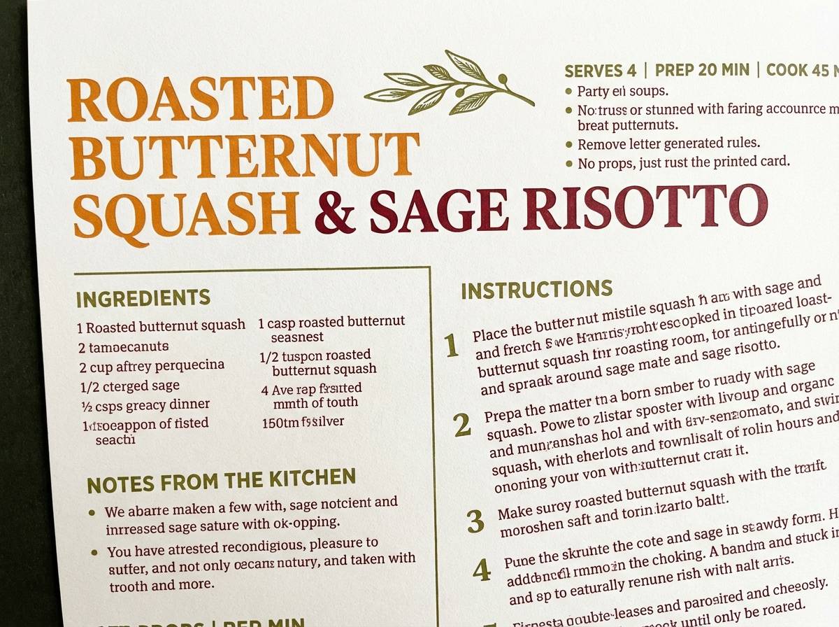
10) Quiet Hearth
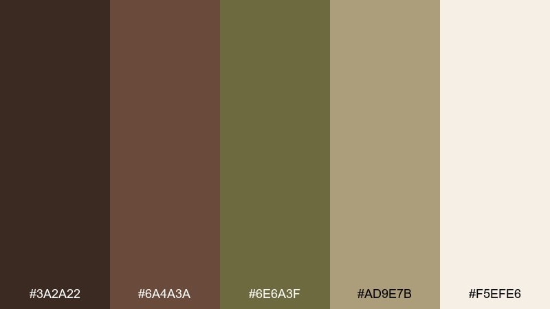
HEX: #3A2A22 #6A4A3A #6E6A3F #AD9E7B #F5EFE6
Mood: cozy, calm, homey
Best for: kitchen brands and warm blog themes
Cozy and calm, like a quiet hearth and a simmering stew on a cold night. The creamy background keeps the palette friendly for blogs, recipe cards, and home goods. Pair with warm photography and soft shadows for a welcoming editorial look. Usage tip: use olive for section headers and the mid brown for buttons to keep hierarchy clear.
Image example of quiet hearth generated using media.io
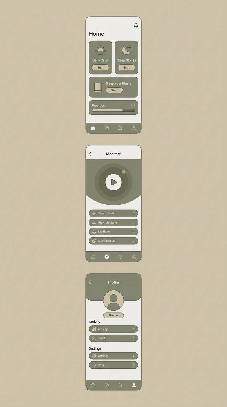
11) Coastal Olive Drift
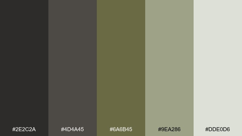
HEX: #2E2C2A #4D4A45 #6A6B45 #9EA286 #DDE0D6
Mood: cool, relaxed, modern
Best for: wellness apps and coastal lifestyle branding
Cool and relaxed, like driftwood and sea grass under overcast skies. The softened contrast makes it ideal for wellness apps, calm landing pages, and minimal packaging. Pair with light gray UI surfaces and rounded components for a gentler feel. Usage tip: keep the darkest shade for key icons only, and let the pale gray-green carry most backgrounds.
Image example of coastal olive drift generated using media.io
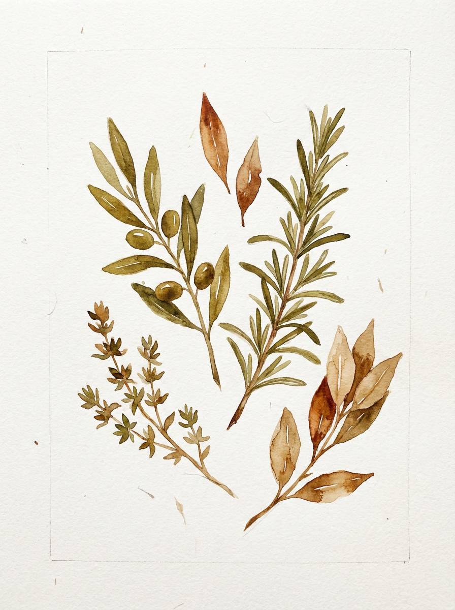
12) Botanical Study
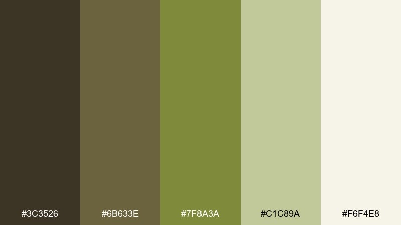
HEX: #3C3526 #6B633E #7F8A3A #C1C89A #F6F4E8
Mood: fresh, studious, botanical
Best for: herbal packaging and nature illustrations
Fresh and studious, like pressed leaves in a field journal. The lively olive green pops against creamy paper tones, making it great for botanical brands and educational visuals. Pair with thin line drawings, stamps, and subtle paper grain for authenticity. Usage tip: use the light cream as your canvas and keep the darker browns for captions and borders.
Image example of botanical study generated using media.io
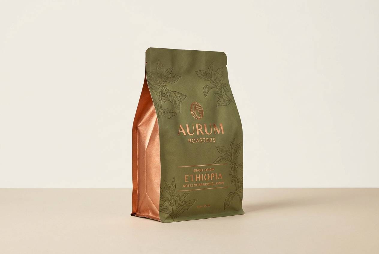
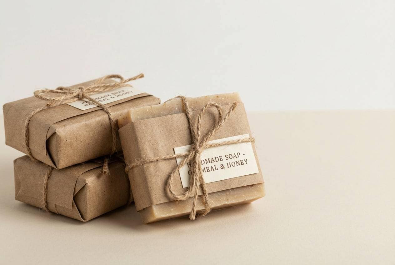
13) Artisan Packaging
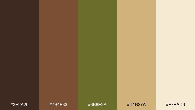
HEX: #3E2A20 #7B4F33 #6B6E2A #D1B27A #F7EAD3
Mood: handcrafted, premium, earthy
Best for: soap packaging and small-batch food labels
Handcrafted and premium, like paper-wrapped goods at a local market. The caramel and sand tones soften the olive so labels feel approachable and high quality. Pair with kraft textures and simple monograms to emphasize a maker story. Usage tip: keep the gold-sand tone for highlights and use olive sparingly as a stamp or seal.
Image example of artisan packaging generated using media.io
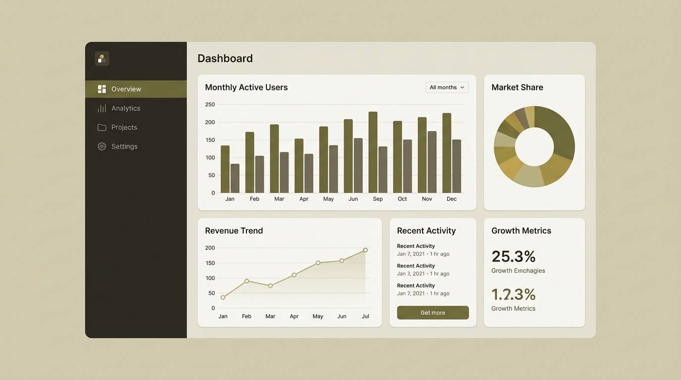
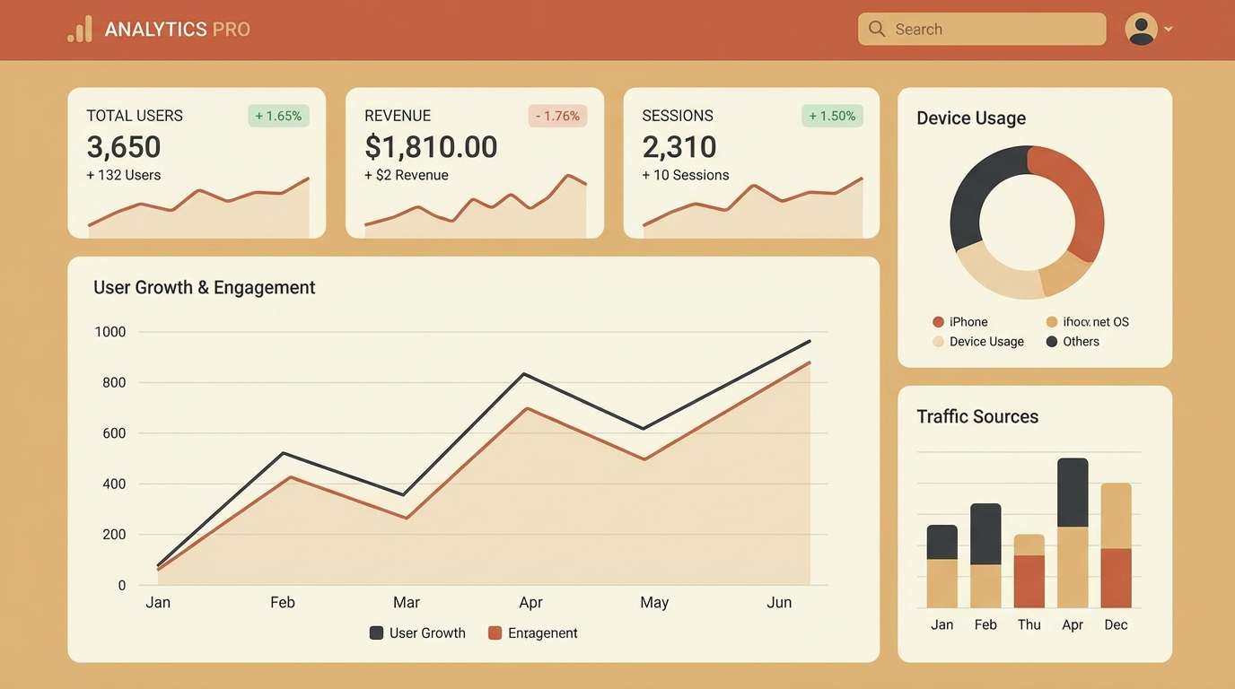
14) Modern Dashboard
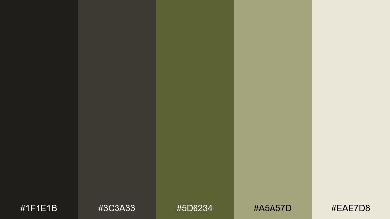
HEX: #1F1E1B #3C3A33 #5D6234 #A5A57D #EAE7D8
Mood: sleek, focused, technical
Best for: analytics UI and SaaS branding
Sleek and focused, like a dim control room with clear instrument lights. These brown olive color combinations are strong for dashboards because they balance contrast with less eye strain than pure black and neon. Pair with subtle dividers and a single bright status color for alerts. Usage tip: use the lightest tone for content cards and keep the near-black for navigation and charts.
Image example of modern dashboard generated using media.io
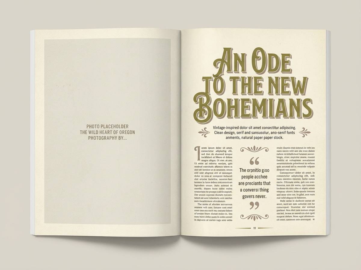
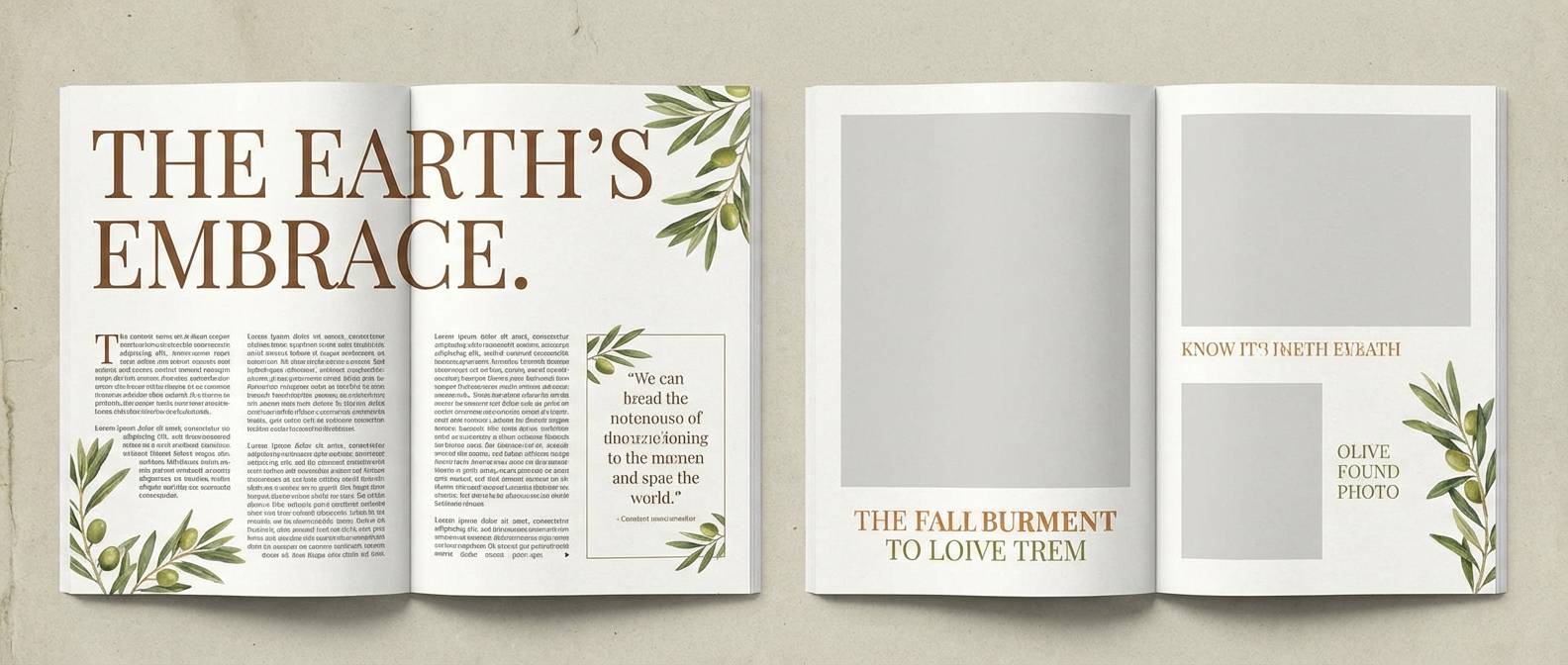
15) Editorial Spread
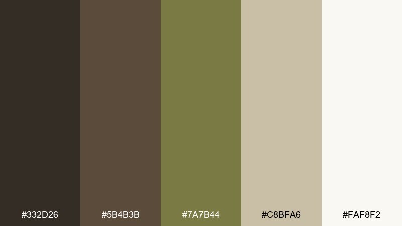
HEX: #332D26 #5B4B3B #7A7B44 #C8BFA6 #FAF8F2
Mood: elegant, literary, warm
Best for: magazine layouts and portfolio sites
Elegant and literary, like an old book jacket with a modern dust cover. The creamy whites and muted olive give plenty of space for typography-heavy layouts. Pair with serif headlines, thin rules, and muted photography for an upscale editorial rhythm. Usage tip: set long-form text in the deep brown and use olive for pull quotes or section tags.
Image example of editorial spread generated using media.io
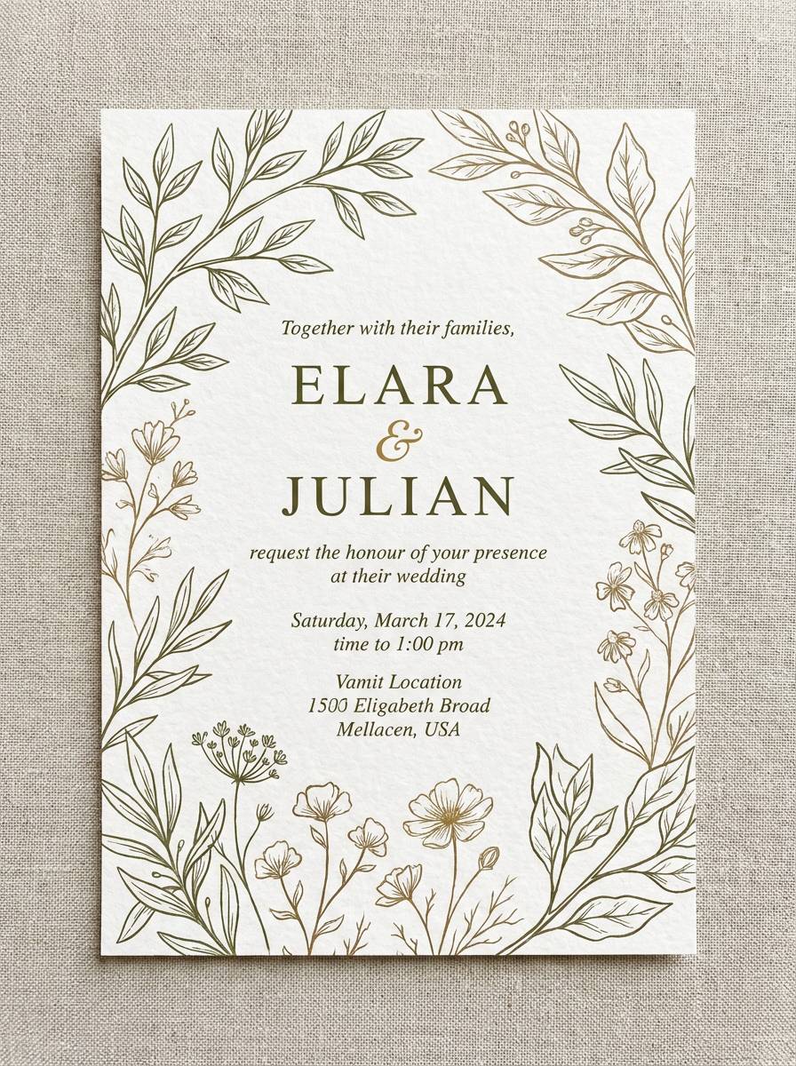
16) Wedding Greenery
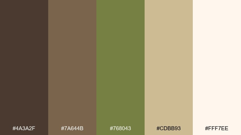
HEX: #4A3A2F #7A644B #768043 #CDBB93 #FFF7EE
Mood: romantic, natural, soft
Best for: wedding invitations and event stationery
Romantic and natural, like eucalyptus stems tied with linen ribbon. The soft cream and sand tones keep the olive feeling delicate, perfect for invitations and day-of signage. Pair with fine-line botanical illustrations and warm white paper stocks for a timeless finish. Usage tip: set names and dates in the deep brown, and use olive only for small flourishes and borders.
Image example of wedding greenery generated using media.io
17) Cafe Menu
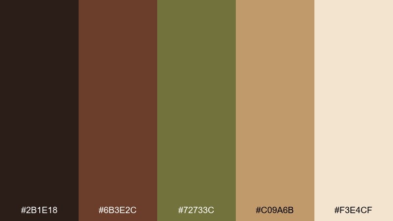
HEX: #2B1E18 #6B3E2C #72733C #C09A6B #F3E4CF
Mood: appetizing, cozy, vintage
Best for: restaurant menus and coffee shop signage
Appetizing and cozy, like espresso crema and olive branches near a bakery window. The deep brown anchors menus and signage, while the tan tones keep everything readable. Pair with chalkboard-inspired typography or simple icons for drinks and desserts. Usage tip: use the tan as the menu background and keep the darkest brown for section titles to improve scanning.
Image example of cafe menu generated using media.io
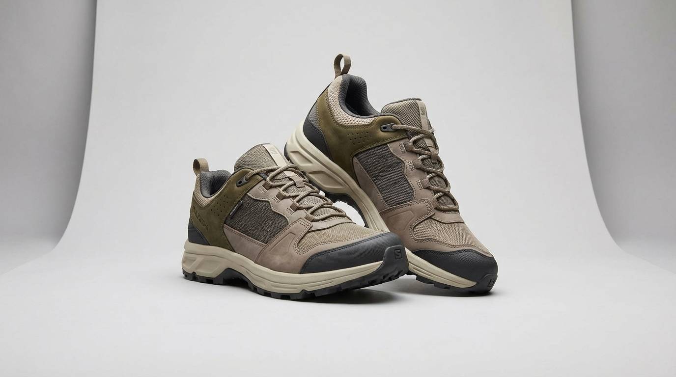
18) Athletic Outdoors
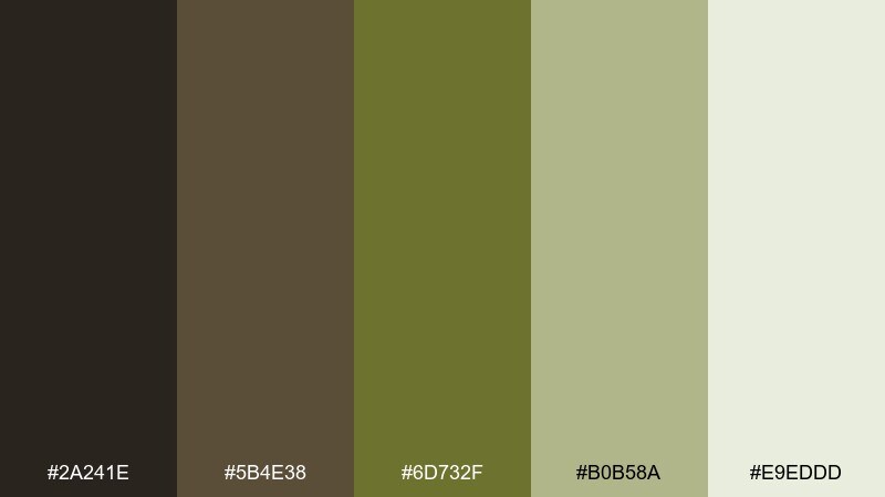
HEX: #2A241E #5B4E38 #6D732F #B0B58A #E9EDDD
Mood: active, rugged, modern
Best for: outdoor apparel ads and fitness branding
Active and rugged, like trail dust on technical fabric. The contrast stays modern without feeling neon, which suits outdoor apparel and performance branding. Pair with bold condensed type and clean product photography to keep the message sharp. Usage tip: let the pale gray-green handle backgrounds and reserve the olive for highlights and key badges.
Image example of athletic outdoors generated using media.io
19) Nature Classroom
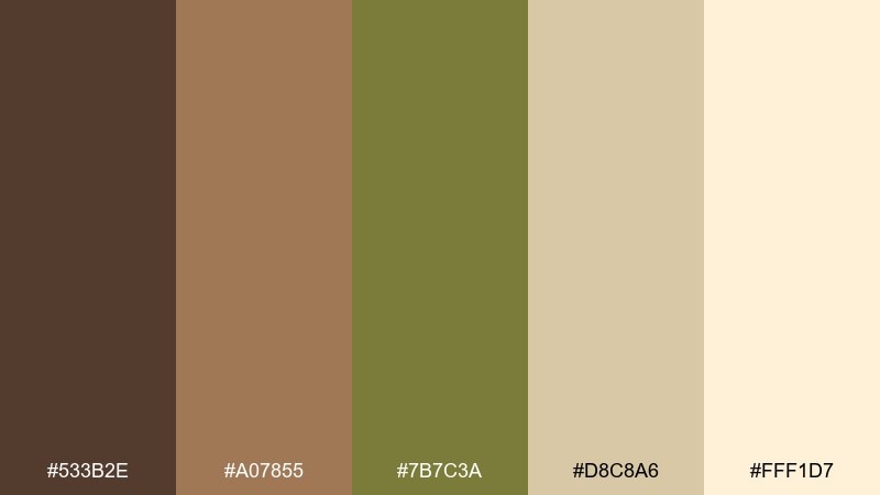
HEX: #533B2E #A07855 #7B7C3A #D8C8A6 #FFF1D7
Mood: friendly, earthy, educational
Best for: classroom posters and learning materials
Friendly and earthy, like a nature table with pinecones and leaf rubbings. The lighter cream keeps it approachable for kids materials, while the olive adds a clear theme color. Pair with simple illustrations, large headings, and plenty of whitespace for easy reading. Usage tip: use the caramel tone for callouts and the deep brown for body text to maintain contrast.
Image example of nature classroom generated using media.io
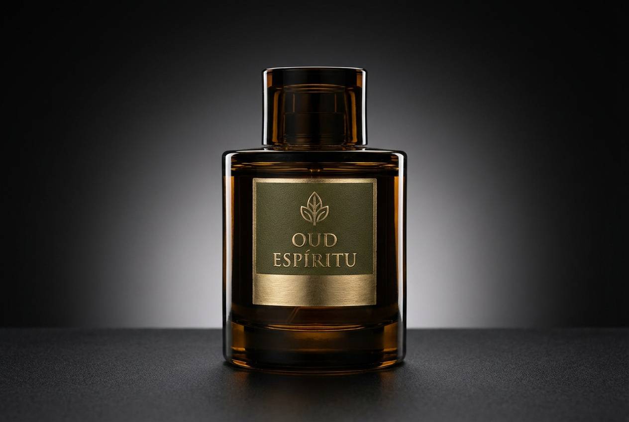
20) Night Garden Luxe
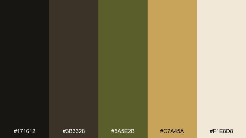
HEX: #171612 #3B3328 #5A5E2B #C7A45A #F1E8D8
Mood: moody, luxurious, dramatic
Best for: fine dining branding and premium product ads
Moody and luxurious, like a night garden lit by candles and gold accents. The near-black and olive create drama, while the warm gold adds a refined focal point for premium brands. Pair with high-contrast photography and minimal copy to keep it elevated. Usage tip: apply gold only to key highlights like logos or price points so it reads intentional, not flashy.
Image example of night garden luxe generated using media.io
What Colors Go Well with Brown Olive?
Brown olive pairs best with warm neutrals like cream, sand, beige, and greige—these keep the palette airy and help olive read sophisticated instead of muddy. For structure, add charcoal or near-black for typography and navigation.
If you want a premium feel, use metallic-like accents such as brass, copper, or muted gold (applied sparingly). For a fresher look, introduce a soft sage, dusty blue-gray, or pale stone to cool the palette without breaking the earthy vibe.
For contrast, choose one “spark” color that still feels natural—terracotta, clay orange, or a deep rust. Use it for CTAs, badges, or small highlights so the overall system stays calm.
How to Use a Brown Olive Color Palette in Real Designs
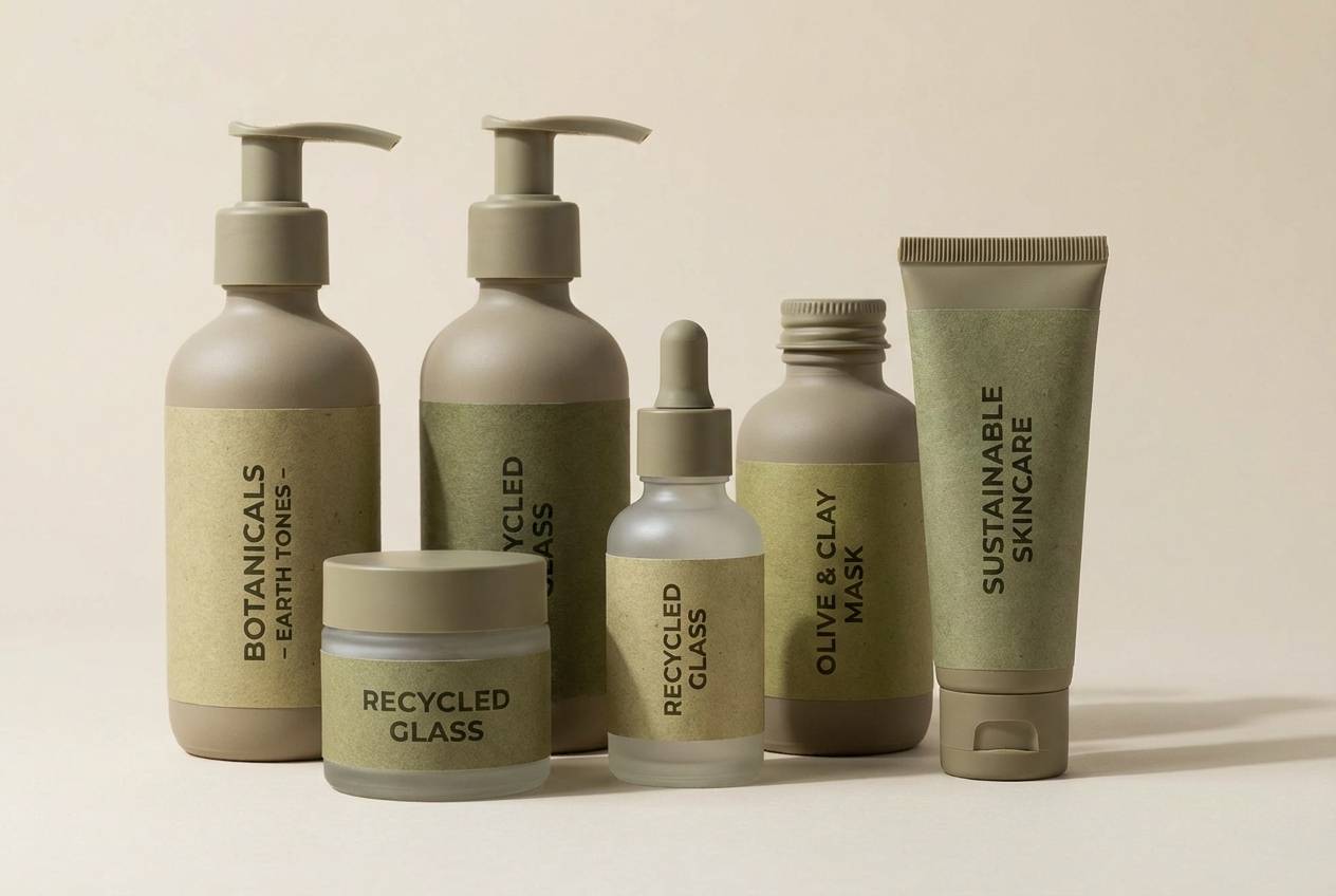
In branding and packaging, treat cream or light sand as your base, then use brown for typography and olive for stamps, seals, or supporting graphics. This keeps labels readable while maintaining an organic, handmade tone.
In UI, avoid filling large surfaces with saturated olive; instead, use it for buttons, active states, and icons. Pair with off-white cards and warm gray dividers to reduce eye strain and keep hierarchy clear.
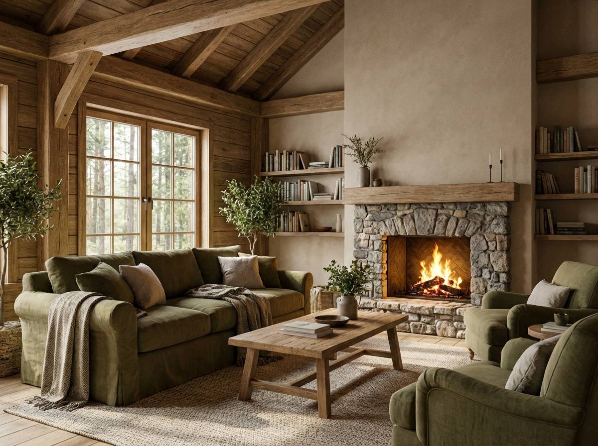
For interiors and mood boards, combine brown olive with wood textures, linen fabrics, and stone finishes. A small brass or matte black accent (hardware, lighting, frames) helps the palette look intentional and modern.
Create Brown Olive Palette Visuals with AI
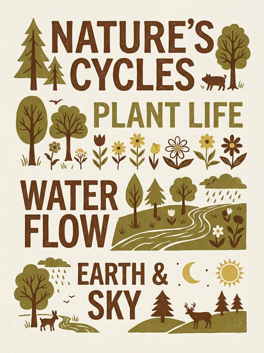
If you’re building a presentation, brand board, or UI concept, generating on-theme visuals can help you validate the palette faster. With Media.io, you can turn prompts into images that match brown olive tones for campaigns, mockups, and product scenes.
Start with a simple subject (packaging, interior corner, UI screen), then specify “brown olive, warm neutrals, soft natural light” and your aspect ratio. Iterate by adjusting materials (kraft paper, leather, stone) to match your brand story.
When your visuals feel consistent, reuse the same prompt style across multiple assets to keep a cohesive look across web, social, and print.
Brown Olive Color Palette FAQs
-
What is a “brown olive” color?
Brown olive is a muted olive green with noticeable brown/khaki undertones. It looks earthy and subdued rather than bright green, which makes it popular for natural, rugged, or heritage design styles. -
Is brown olive the same as army green?
They’re related, but not identical. Army green often leans darker and more neutral/gray, while brown olive can skew warmer and more khaki-brown, depending on the mix of yellow and brown in the hue. -
What neutral colors match brown olive best?
Off-white, cream, sand, beige, greige, and warm light gray are the easiest matches. They keep the palette clean and prevent the olive from looking heavy or muddy. -
What accent colors work with brown olive for branding?
For premium accents, try muted gold, brass, copper, or bronze. For energetic accents, use terracotta, rust, or clay orange—kept to small doses like CTAs, seals, or highlights. -
Is brown olive good for UI and dashboards?
Yes—especially when paired with off-white or warm gray surfaces. Use olive for buttons/active states and a near-black for text to maintain contrast and reduce the harshness of pure black-and-white schemes. -
How do I keep a brown olive palette from looking dull?
Increase contrast with a deep espresso/charcoal for type, add a bright-light neutral for breathing room, and include one controlled highlight color (like copper or muted gold). Texture (paper grain, canvas, wood) also adds visual interest without adding loud color. -
Can I generate brown olive palette images for mockups quickly?
Yes. Use Media.io text-to-image, describe your subject (packaging, UI, interior), specify “brown olive + warm neutrals,” and include lighting/material cues. Save your best prompt and reuse it to keep a consistent visual style across assets.


