

Brown is one of the most versatile design neutrals: it can feel cozy and rustic, modern and minimal, or premium and editorial depending on how deep or creamy you go.
Below are 20+ brown color palette ideas with HEX codes, plus pairing tips and AI-ready prompts you can use to generate matching visuals fast.
In this article
Why Brown Palettes Work So Well
Brown sits close to what we see in nature—wood, leather, soil, stone—so it reads as familiar and trustworthy. That makes brown color schemes a strong baseline for branding that needs warmth without feeling loud.
It’s also highly flexible in value: espresso-dark browns can replace black for softer typography, while tan and cream give you breathable backgrounds that still feel rich and intentional.
Finally, brown plays well with both warm and cool accents. A muted green, dusty rose, or crisp off-white can completely change the mood while keeping the palette grounded.
20+ Brown Color Palette Ideas (with HEX Codes)
1) Cocoa Cabin
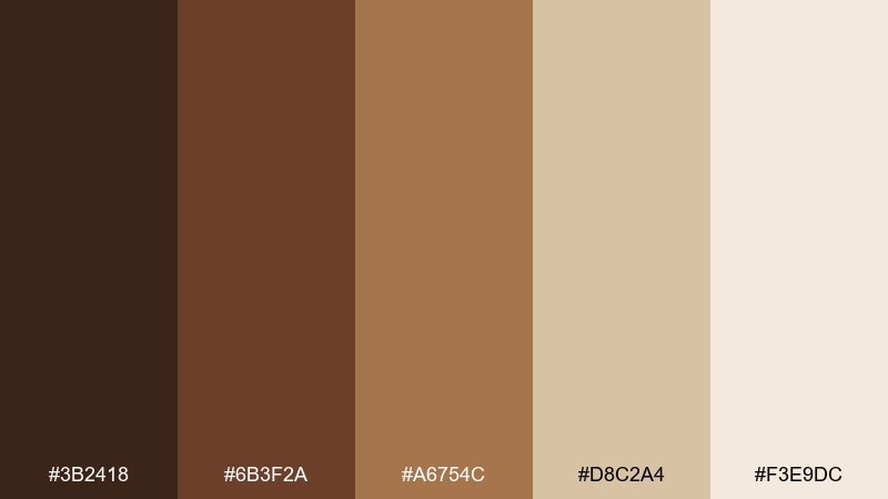
HEX: #3B2418 #6B3F2A #A6754C #D8C2A4 #F3E9DC
Mood: cozy, rustic, fireside
Best for: cabin rental branding and landing pages
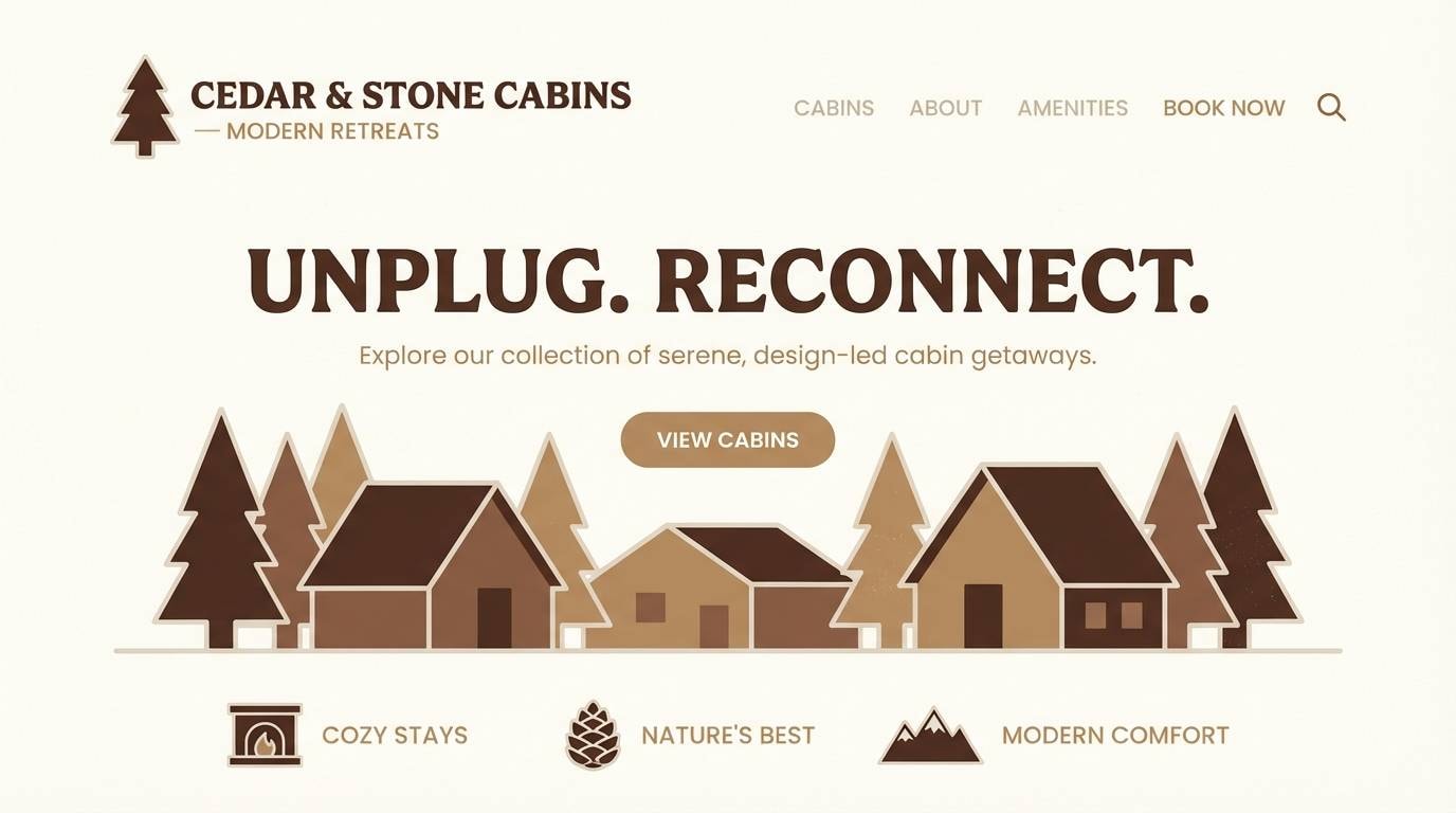
Cozy and fireside, these tones feel like cedar walls, wool blankets, and hot cocoa. Use the deep cocoa as your anchor, then let the tan and cream open up whitespace for readability. Pair with simple serif headlines and warm lifestyle photography to keep it premium, not kitschy. Tip: reserve the darkest shade for buttons and CTAs so the palette stays airy.
Image example of cocoa cabin generated using media.io
Media.io is an online AI studio for creating and editing video, image, and audio in your browser.

2) Toffee Latte
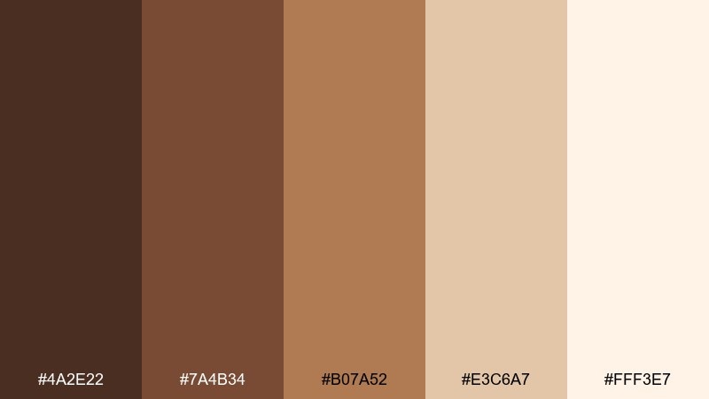
HEX: #4A2E22 #7A4B34 #B07A52 #E3C6A7 #FFF3E7
Mood: warm, creamy, approachable
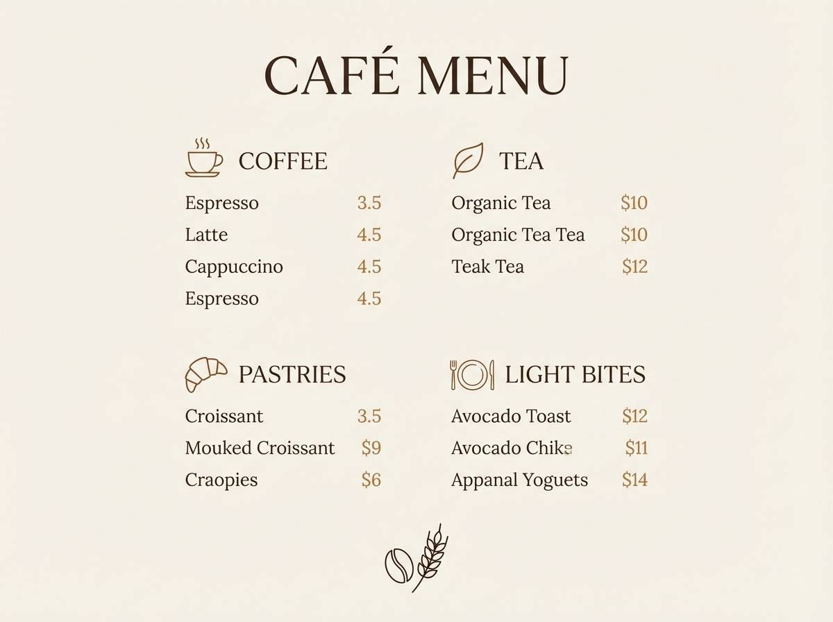
Best for: cafe menu design and loyalty cards
Warm and creamy, this mix brings to mind espresso crema, toffee drizzle, and steamed milk foam. It works beautifully on print menus where contrast matters but harsh black feels too sharp. Pair with off-white paper texture and a single dark accent for prices and section headers. Tip: keep body text in the deepest shade to avoid low-contrast tan-on-cream issues.
Image example of toffee latte generated using media.io
3) Walnut Sage
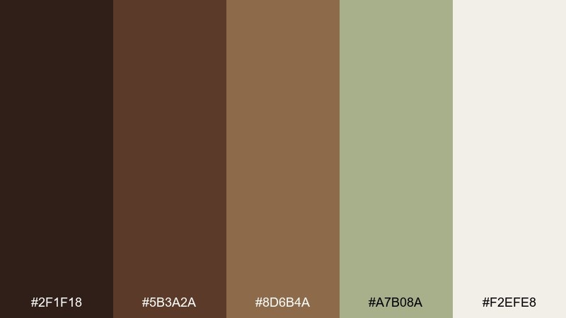
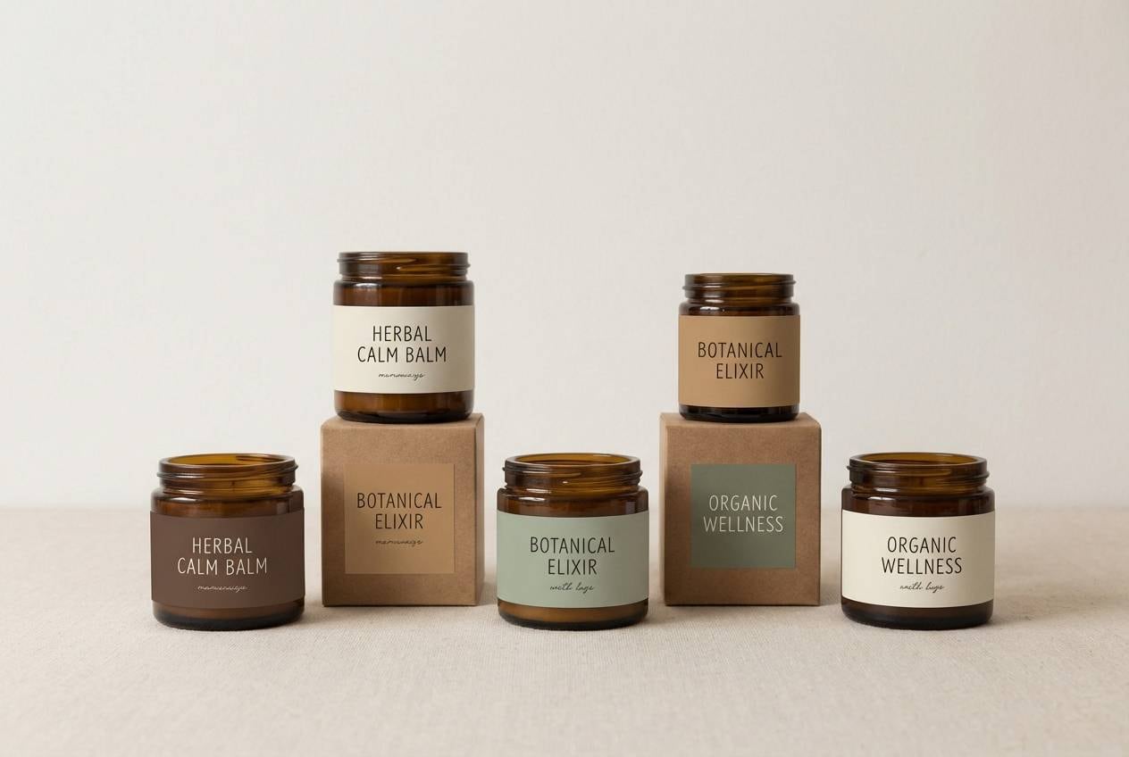
HEX: #2F1F18 #5B3A2A #8D6B4A #A7B08A #F2EFE8
Mood: grounded, natural, calm
Best for: wellness brand identity and labels
Grounded and natural, these shades feel like walnut shells, dried herbs, and linen cloth. The muted sage softens the earthy browns and gives you a gentle secondary accent for icons or callouts. Pair with minimalist layouts and matte packaging finishes for a calm, modern look. Tip: use sage for highlights only, so the identity stays warm rather than green-forward.
Image example of walnut sage generated using media.io
4) Sepia Studio
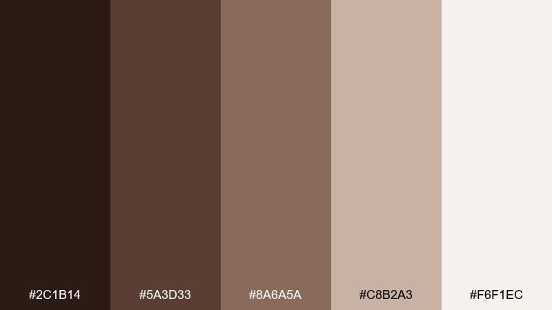
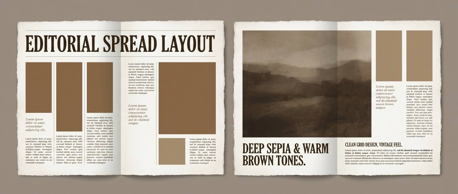
HEX: #2C1B14 #5A3D33 #8A6A5A #C8B2A3 #F6F1EC
Mood: vintage, editorial, refined
Best for: magazine layouts and photo essays
Vintage and editorial, these sepia tones echo darkroom prints and classic paper stock. Use the mid browns for captions and pull quotes, then let the pale paper shade carry most of the page. Pair with monochrome imagery or warm-filtered photos to keep everything cohesive. Tip: keep grids roomy so the palette reads refined instead of heavy.
Image example of sepia studio generated using media.io
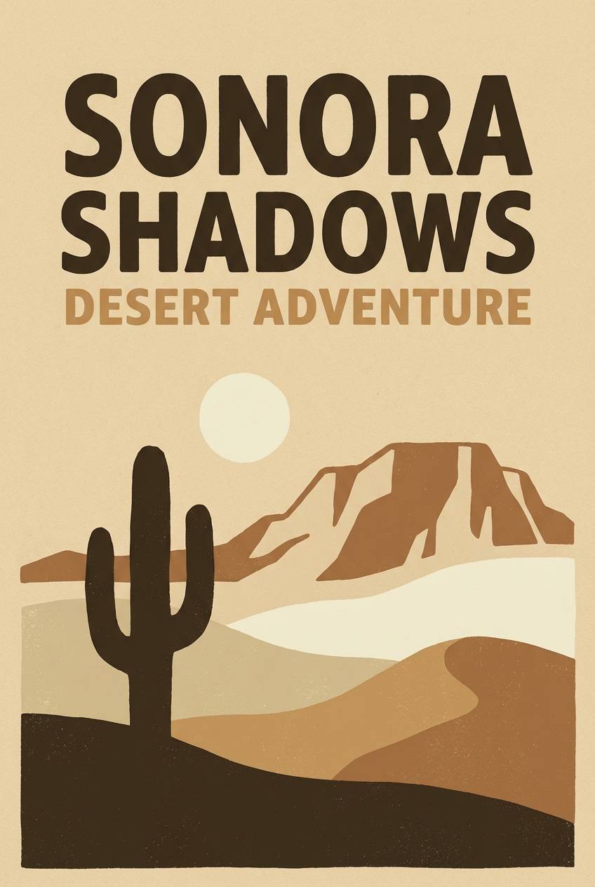
5) Desert Dune
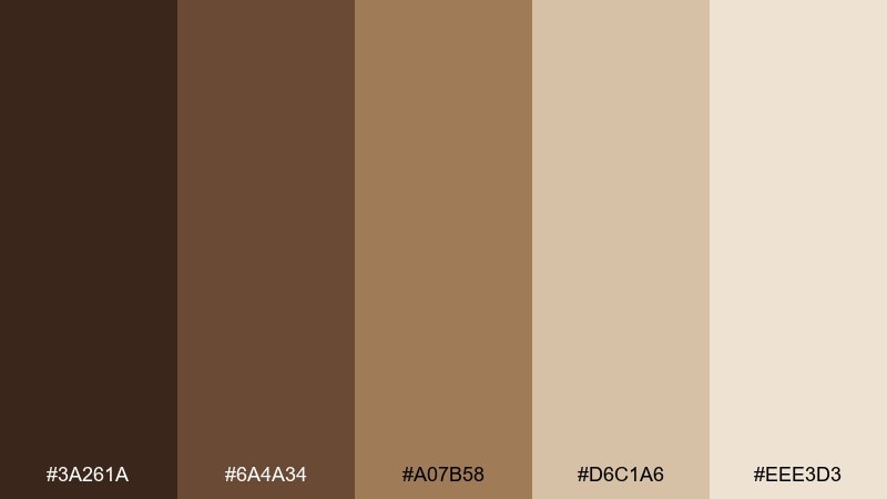
HEX: #3A261A #6A4A34 #A07B58 #D6C1A6 #EEE3D3
Mood: sun-baked, airy, adventurous
Best for: travel posters and outdoorsy campaigns
Sun-baked and airy, these dune-like neutrals suggest wind-swept trails and golden hour haze. The tan and sand shades make an excellent backdrop for bold typography and simple map graphics. Pair with minimal line illustrations and plenty of negative space to keep it modern. Tip: add texture sparingly, so the design stays crisp at small sizes.
Image example of desert dune generated using media.io
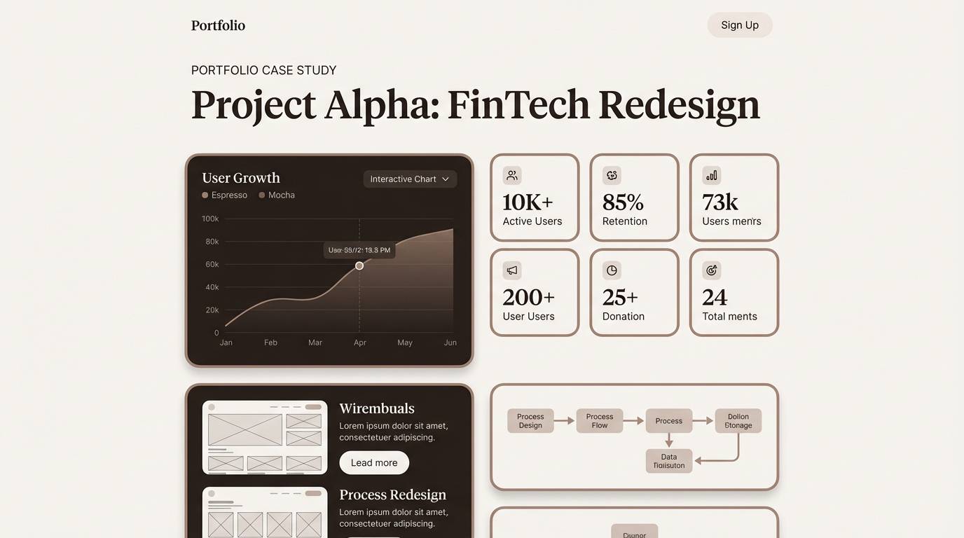
6) Mocha Minimal
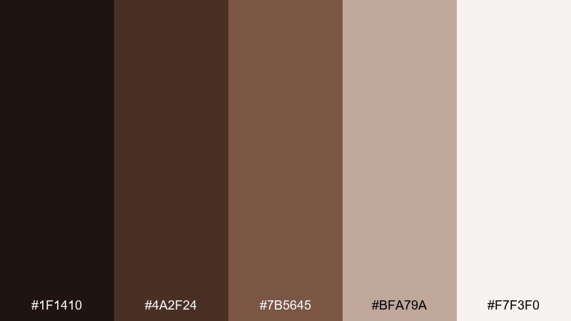
HEX: #1F1410 #4A2F24 #7B5645 #BFA79A #F7F3F0
Mood: sleek, modern, intimate
Best for: portfolio websites and UX case studies
Sleek and intimate, this set feels like a quiet coffee bar with soft lighting and clean surfaces. For a modern brown color palette in UI, lean on the near-black espresso for nav and type, then use the dusty taupe for cards and dividers. Pair with neutral grayscale photography or warm product shots to avoid color clashes. Tip: keep interactive states subtle by shifting only one step lighter or darker within the set.
Image example of mocha minimal generated using media.io
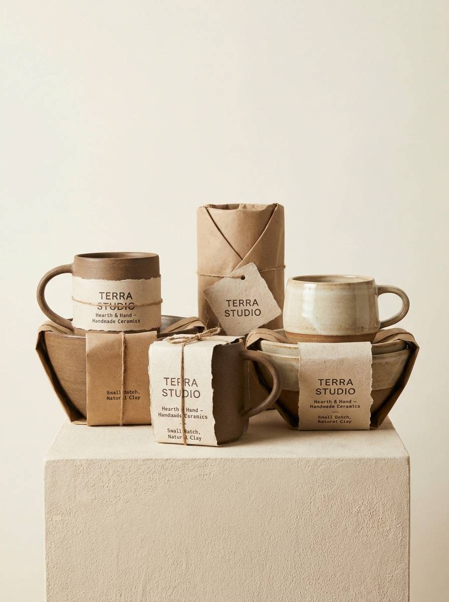
7) Caramel Clay
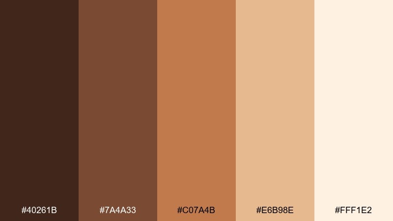
HEX: #40261B #7A4A33 #C07A4B #E6B98E #FFF1E2
Mood: handmade, warm, artisan
Best for: ceramics shop branding and packaging
Handmade and warm, these tones recall kiln-fired clay, caramel glaze, and creamy slip. The brighter caramel works as a friendly accent for stickers, seals, and small icons. Pair with tactile materials like kraft paper or uncoated stock to amplify the artisan feel. Tip: keep the light cream as your main background so product photos stay true-to-color.
Image example of caramel clay generated using media.io
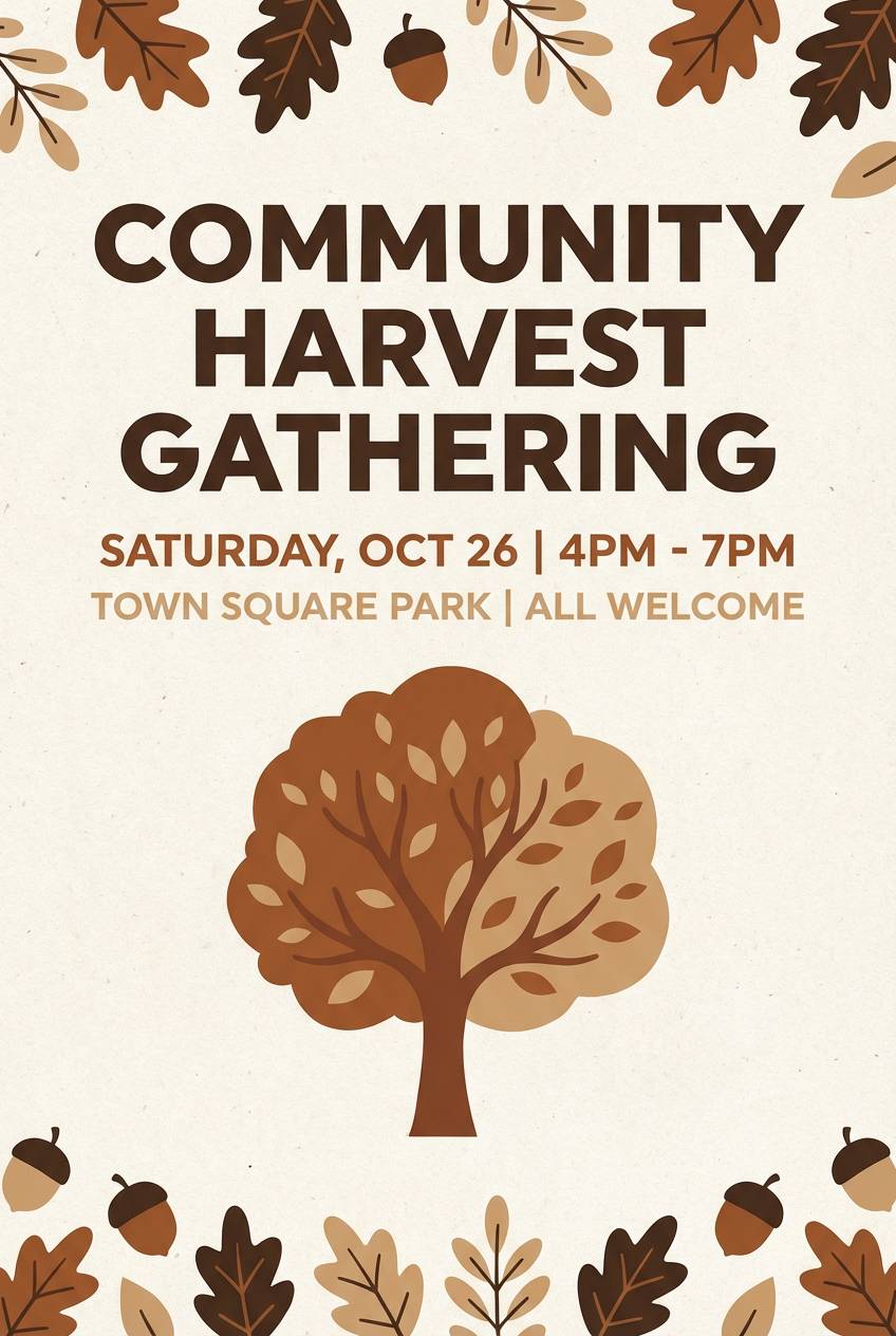
8) Autumn Bark
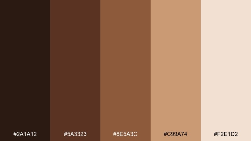
HEX: #2A1A12 #5A3323 #8E5A3C #C99A74 #F2E1D2
Mood: cozy, seasonal, outdoors
Best for: fall event flyers and community posters
Cozy and seasonal, this range feels like tree bark, cinnamon sticks, and crisp leaves on a trail. Use the mid browns for headline blocks and the pale beige for spacious margins. Pair with warm-toned photography and simple leaf motifs, keeping details minimal for legibility at distance. Tip: print a quick proof, because darker browns can gain density on matte paper.
Image example of autumn bark generated using media.io
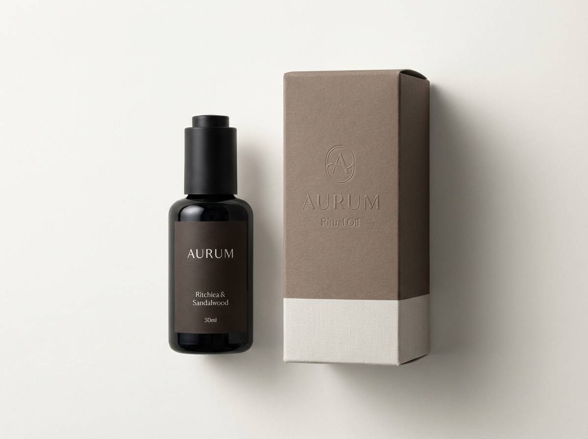
9) Espresso Linen
HEX: #1B1210 #3C2A24 #6A4A3D #BDAA9A #FAF6F0
Mood: premium, calm, understated
Best for: luxury skincare product ads
Premium and understated, these shades evoke espresso crema against crisp linen fabric. For product visuals, let the linen white dominate and use deep espresso for typography and small details. This is one of those brown color combinations that looks expensive when paired with soft shadows and minimal copy. Tip: add a tiny warm midtone as a separator line to keep layouts from feeling flat.
Image example of espresso linen generated using media.io
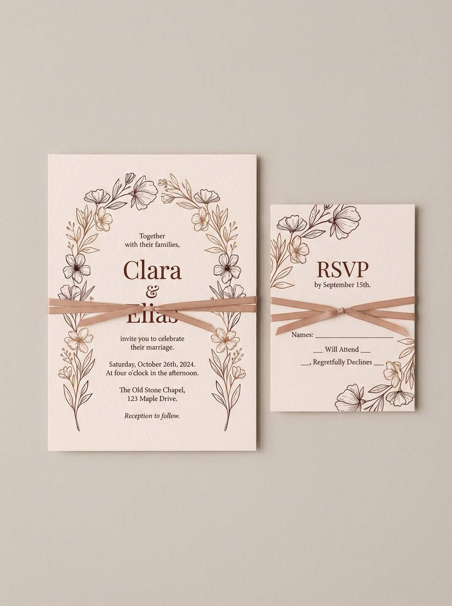
10) Chestnut Bloom
HEX: #2B1915 #62362C #9B5D44 #D3A48C #F7E8DE
Mood: romantic, soft, inviting
Best for: wedding invitations and RSVP cards
Romantic and soft, these hues suggest chestnut wood, blush petals, and candlelit dinners. Use the pale blush-tan as the paper tone, then set type in the darkest shade for formal clarity. Pair with delicate florals or monoline illustrations, keeping embellishments to the edges. Tip: foiling works best when you keep it minimal and let the warmth do the talking.
Image example of chestnut bloom generated using media.io
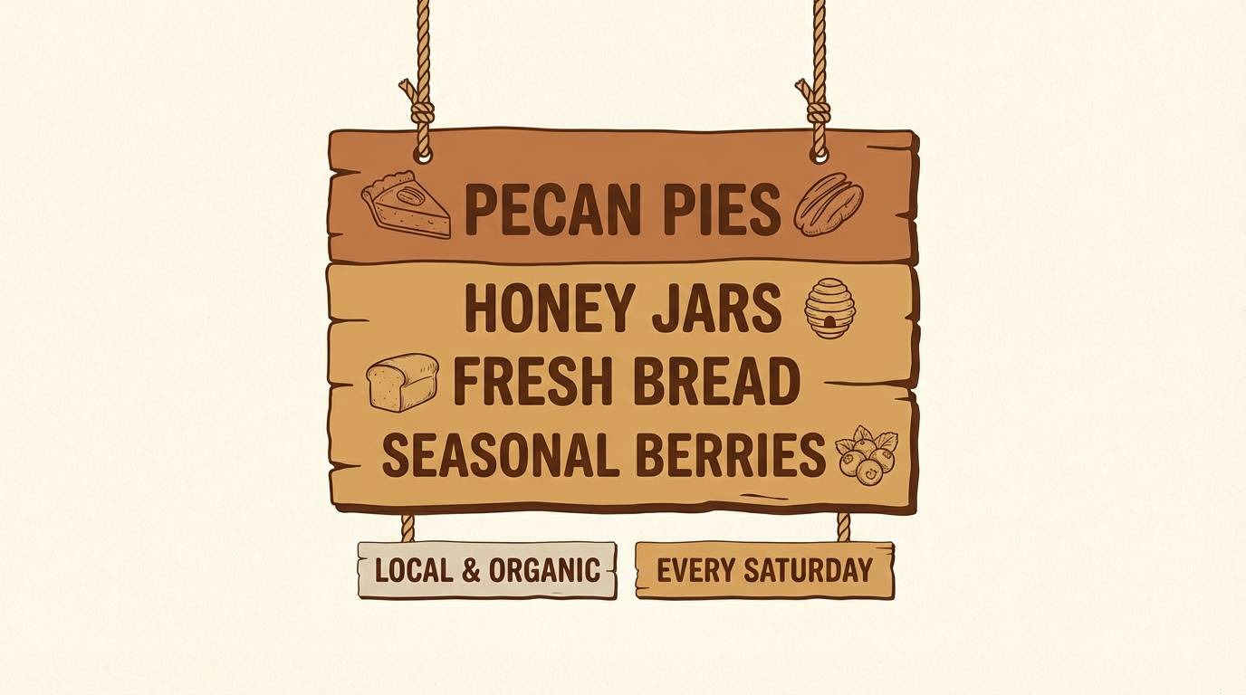
11) Pecan Picnic
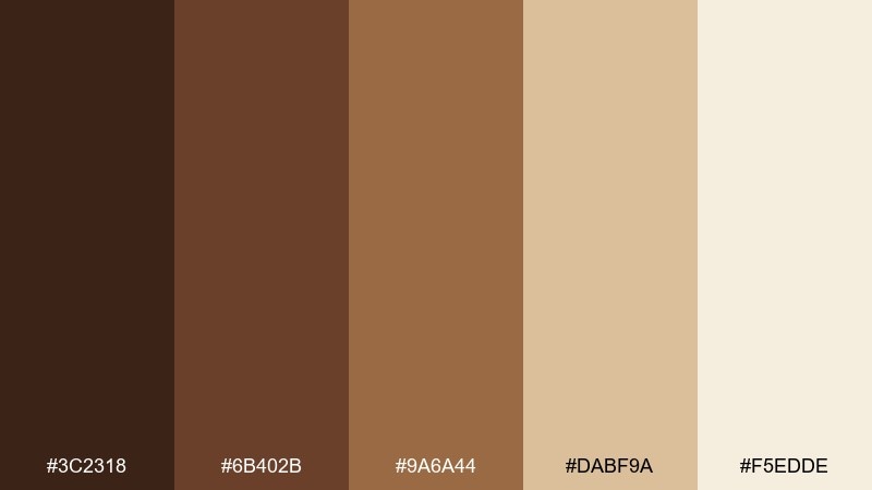
HEX: #3C2318 #6B402B #9A6A44 #DABF9A #F5EDDE
Mood: friendly, nostalgic, sunny
Best for: farmers market signage and labels
Friendly and nostalgic, these tones feel like pecans, picnic blankets, and sunlit baskets. They hold up well on signage where you need warmth without overpowering product names. Pair with simple slab-serif type and hand-drawn icons for a local, honest vibe. Tip: keep the lightest shade as your sign base so the darker inks stay crisp from a distance.
Image example of pecan picnic generated using media.io
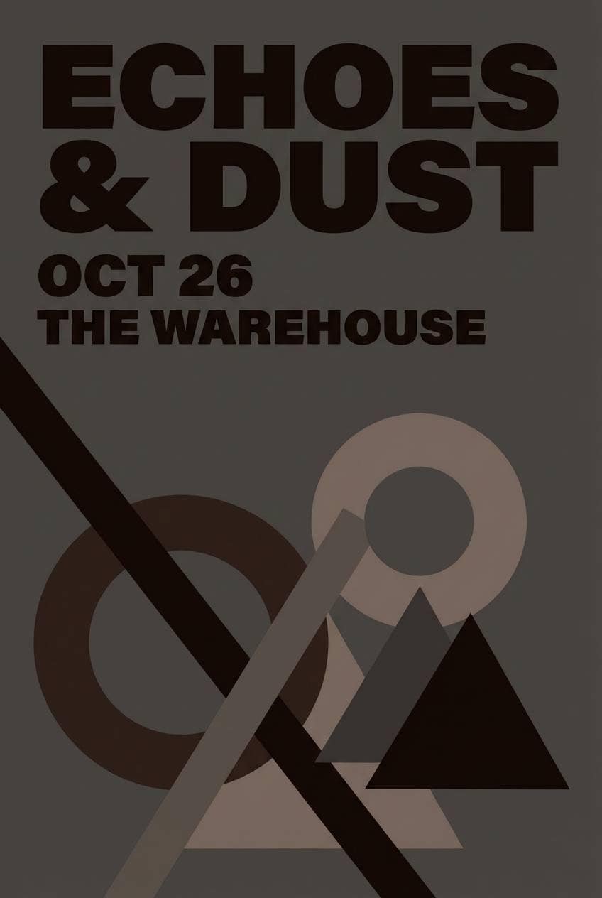
12) Smoked Umber
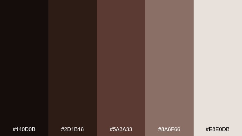
HEX: #140D0B #2D1B16 #5A3A33 #8A6F66 #E8E0DB
Mood: moody, cinematic, dramatic
Best for: music poster designs and album promos
Moody and cinematic, this range reads like stage smoke, dark wood, and velvet curtains. Use the near-black and deep umber for big type and high-contrast shapes, then soften with smoky taupe for secondary text. The look suits minimal compositions with bold hierarchy and lots of breathing room. Tip: keep backgrounds slightly textured to avoid banding in dark gradients.
Image example of smoked umber generated using media.io
13) Maple Leather
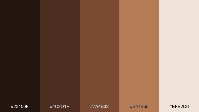
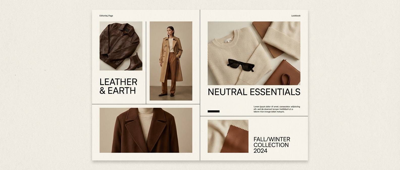
HEX: #23150F #4C2D1F #7A4B32 #B47B55 #EFE2D6
Mood: heritage, rugged, premium
Best for: menswear branding and lookbooks
Heritage and rugged, these shades call up worn leather, maple woodgrain, and sturdy stitching. As a brown color scheme, it works best with clean editorial typography and high-contrast product photography. Pair with minimal black accents and plenty of cream to keep the pages feeling upscale. Tip: use the maple highlight sparingly for price tags or key callouts.
Image example of maple leather generated using media.io
14) Bronze Orchard
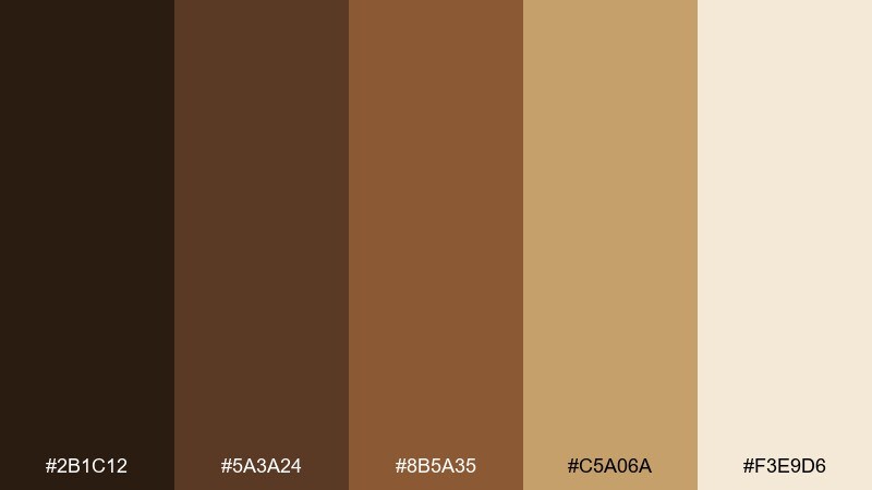
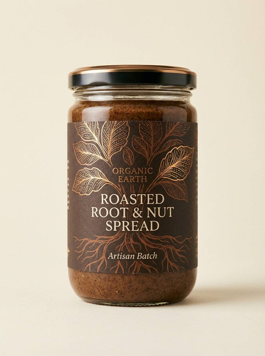
HEX: #2B1C12 #5A3A24 #8B5A35 #C5A06A #F3E9D6
Mood: harvest, sunlit, wholesome
Best for: organic food packaging and labels
Harvest-warm and sunlit, this palette brings to mind orchards, baked crust, and amber syrup. Use the bronze-gold tone to spotlight flavor notes or badges, while deeper browns ground the logo and nutritional info. Pair with simple botanical illustrations and uncoated paper for a trustworthy feel. Tip: keep the light cream as the main label field for easy scanning on shelves.
Image example of bronze orchard generated using media.io
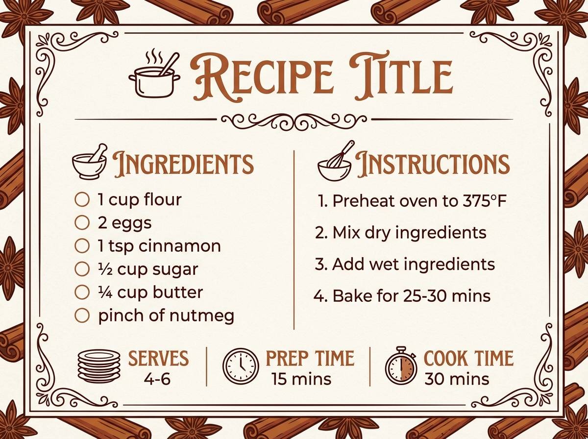
15) Cinnamon Paper
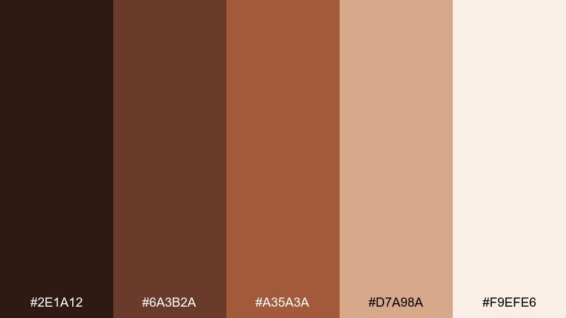
HEX: #2E1A12 #6A3B2A #A35A3A #D7A98A #F9EFE6
Mood: spiced, cheerful, handcrafted
Best for: holiday recipe cards and printables
Spiced and cheerful, these colors feel like cinnamon dust on warm paper. The rosy midtone adds energy without pushing into loud reds, making it great for seasonal printables. Pair with playful doodles and clear sans-serif text for easy reading in the kitchen. Tip: use the darkest shade for ingredient headers so the hierarchy stays obvious.
Image example of cinnamon paper generated using media.io
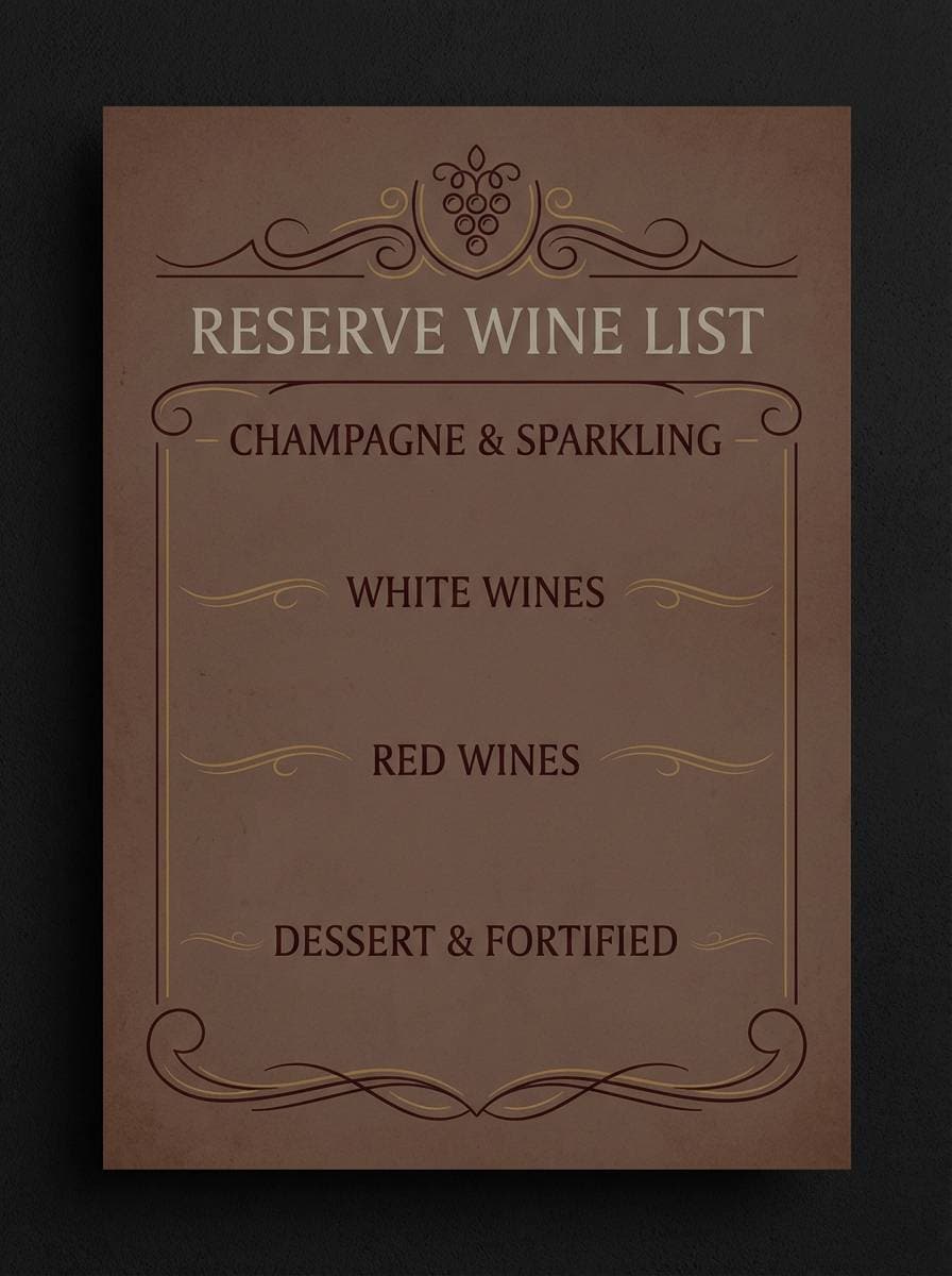
16) Mahogany Night
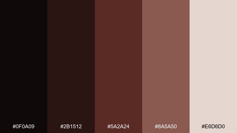
HEX: #0F0A09 #2B1512 #5A2A24 #8A5A50 #E6D6D0
Mood: luxurious, nocturnal, bold
Best for: restaurant branding and wine lists
Luxurious and nocturnal, these tones suggest mahogany tables, dim lighting, and aged wine. Build the layout on the near-black for drama, then use the dusty rose-brown for section dividers and small ornaments. Pair with serif typography and lots of spacing to keep it elegant, not heavy. Tip: for print, avoid large solid dark fills and use rich textures to prevent blotchy areas.
Image example of mahogany night generated using media.io
17) Sandstone Trail
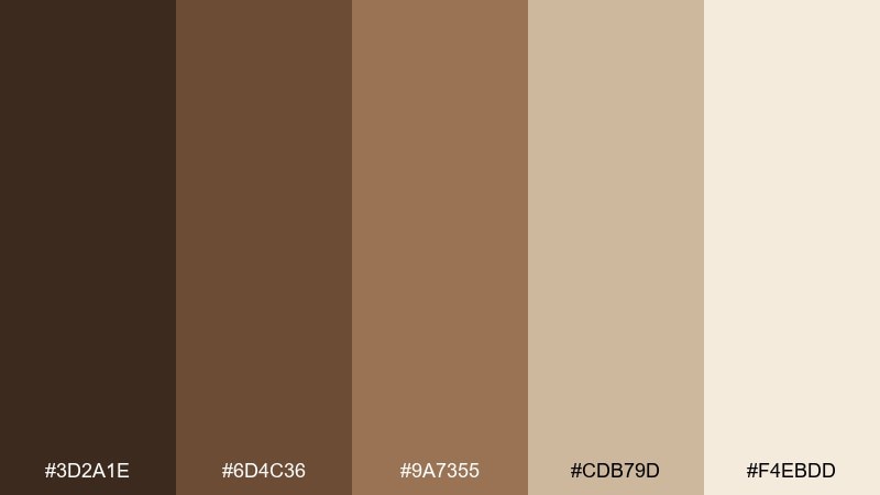
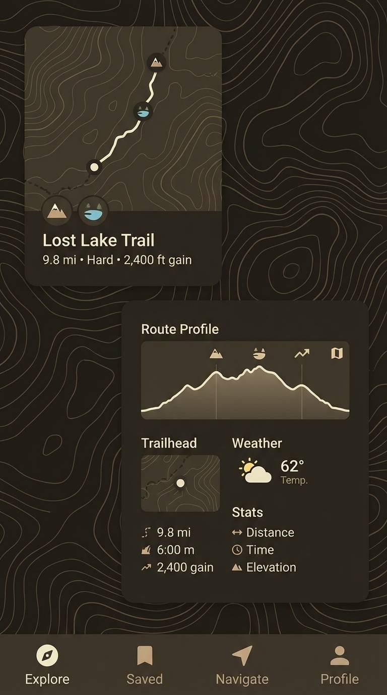
HEX: #3D2A1E #6D4C36 #9A7355 #CDB79D #F4EBDD
Mood: outdoorsy, balanced, clean
Best for: hiking app UI and trail guides
Outdoorsy and balanced, these shades feel like sandstone paths, dusty boots, and sunlit maps. Use the light sandstone as the main canvas, then lean on the deeper browns for navigation and pins. Pair with simple topographic lines and restrained iconography so the interface stays readable. Tip: test contrast for accessibility, especially for text over the midtone tan.
Image example of sandstone trail generated using media.io
18) Rustic Hearth
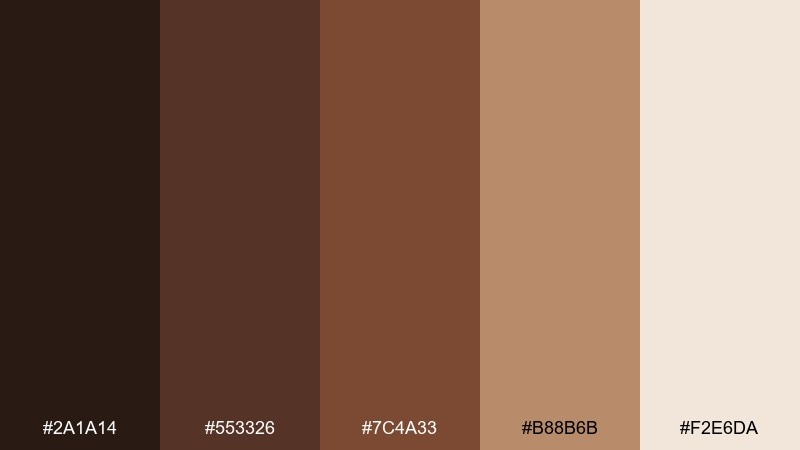
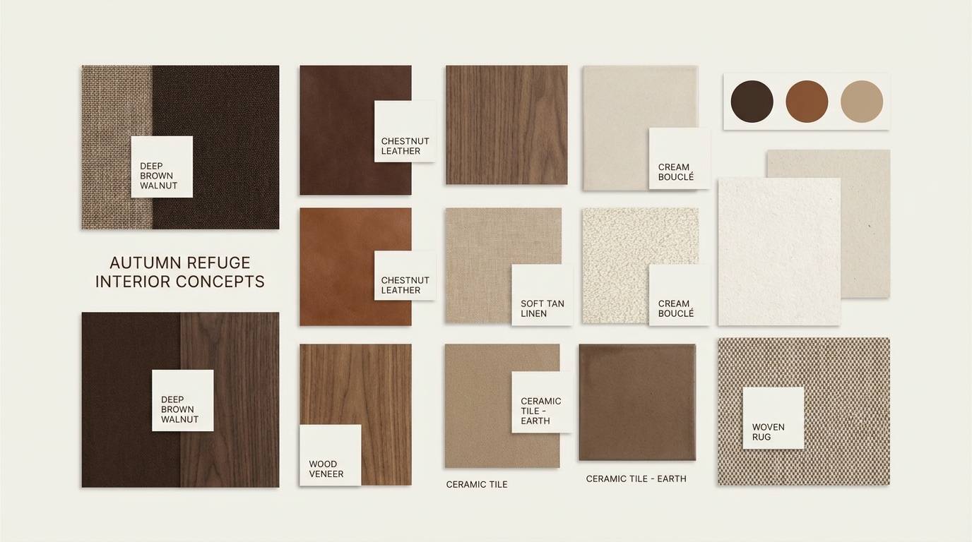
HEX: #2A1A14 #553326 #7C4A33 #B88B6B #F2E6DA
Mood: homey, comforting, traditional
Best for: interior design moodboards and brochures
Homey and comforting, these colors evoke a rustic hearth, baked bread, and warm plaster walls. Use the creamy tone for open space, then layer in the mid browns for furniture callouts and material swatches. For a welcoming brown color combination, pair it with natural textures like linen, oak, and matte metal fixtures. Tip: keep the darkest shade as a thin outline or headline color to avoid making spreads feel dim.
Image example of rustic hearth generated using media.io
19) Praline Sunset
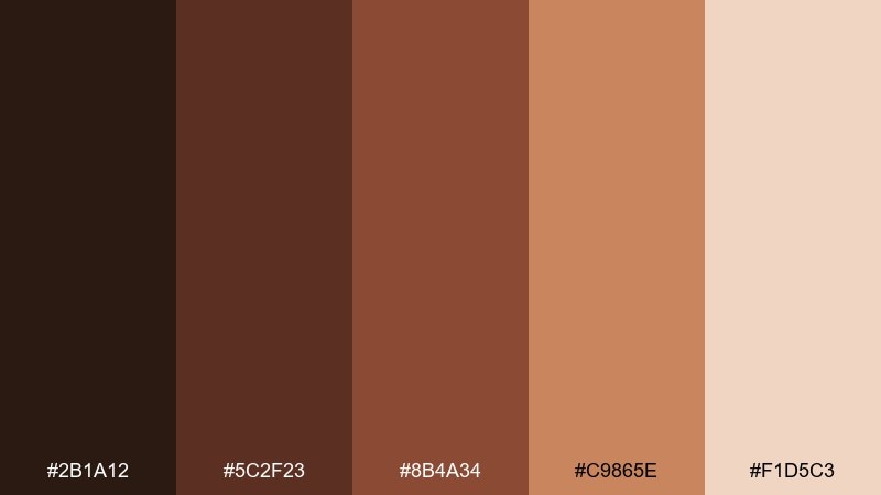
HEX: #2B1A12 #5C2F23 #8B4A34 #C9865E #F1D5C3
Mood: golden, romantic, lively
Best for: social media promos for bakeries
Golden and lively, these shades feel like pralines cooling at sunset. The caramel-copper highlight adds punch for stickers, discount badges, and buttons. Pair with creamy backgrounds and close-up pastry photos for an irresistible feed aesthetic. Tip: keep text on the light blush base for clarity, and reserve the darker tones for framing elements.
Image example of praline sunset generated using media.io

20) Earthbound Editorial
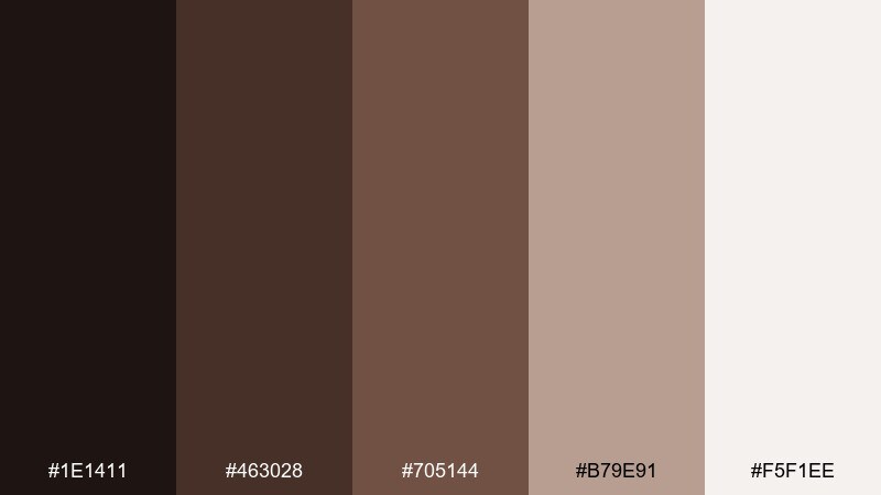
HEX: #1E1411 #463028 #705144 #B79E91 #F5F1EE
Mood: modern, grounded, quiet
Best for: brand guidelines and pitch decks
Modern and quietly grounded, these neutrals feel like recycled paper, clay ink, and soft studio light. A tight type system and generous margins help the mid browns read confident rather than dull. This brown color palette is especially strong for decks, where consistent tone matters across charts, dividers, and title slides. Tip: use the rosy taupe for chart fills and the deepest shade for axes to keep data legible.
Image example of earthbound editorial generated using media.io
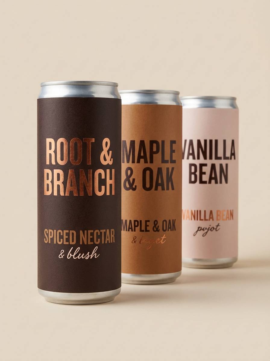
21) Copper Kettle
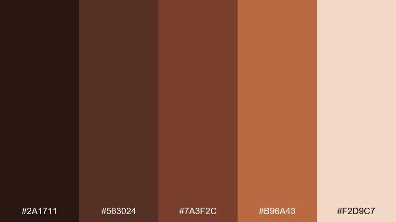
HEX: #2A1711 #563024 #7A3F2C #B96A43 #F2D9C7
Mood: artisan, warm, energetic
Best for: craft beverage can design
Artisan and energetic, these shades bring up copper kettles, toasted sugar, and steam in a small-batch brewery. The copper accent makes branding pop without needing bright primaries. For punchy brown color combinations, set bold lettering in the darkest tone and keep the light blush as negative space. Tip: limit gradients on cans and use solid fields to avoid banding in print.
Image example of copper kettle generated using media.io
What Colors Go Well with Brown?
Brown pairs naturally with soft neutrals like cream, ivory, and warm gray—these keep layouts light and help brown typography feel less harsh than pure black.
For accents, try muted greens (sage, olive) for an earthy look, or dusty pinks and terracotta for a warm, romantic direction. If you want a cleaner modern contrast, add a cool off-white plus a restrained slate or charcoal.
Metallic-inspired tones like bronze and copper also work beautifully with brown palettes, especially for badges, dividers, and small highlight details.
How to Use a Brown Color Palette in Real Designs
Start by choosing your “anchor” brown (usually the darkest shade) for headings, buttons, or navigation. Then assign one midtone for supporting UI/print elements and reserve your lightest cream for background and breathing room.
Watch contrast carefully: tan-on-cream often looks stylish but can fail readability. If you’re designing for web or mobile, test text over midtones and consider using the deepest brown for body copy.
Add texture intentionally—kraft paper, linen, woodgrain, or subtle noise can elevate brown schemes, but too much texture can make designs feel heavy. Keep it minimal and consistent.
Create Brown Palette Visuals with AI
If you’re building a moodboard, landing page, poster, or packaging concept, generating a few on-brand visuals can help you validate the palette fast before committing to production.
Use the prompts under each palette as a starting point, then tweak the subject (menu, label, UI, poster) while keeping the same brown tones and lighting style for consistency.
When you find a direction you like, create a small set (hero image, social post, product mock, and background texture) so your brown color scheme feels unified across channels.
Brown Color Palette FAQs
-
What does the color brown symbolize in design?
Brown often signals warmth, stability, reliability, and “real-world” materials like wood, leather, coffee, and earth. It’s widely used to create a grounded, trustworthy, and cozy brand feel. -
Is brown a good choice for modern UI design?
Yes—especially espresso or near-black browns paired with soft off-whites. Brown can replace black for a softer, more inviting interface while still maintaining strong contrast when applied thoughtfully. -
How do I keep a brown color scheme from looking dull?
Increase value contrast (dark anchor + bright cream background), add one accent (sage, copper, dusty rose), and use plenty of negative space. Subtle texture can help, but keep it consistent. -
What are the best neutral pairings with brown?
Cream/ivory, warm gray, taupe, and linen-white are the easiest matches. They brighten the palette and make brown typography and icons feel premium rather than heavy. -
Does brown work well for print projects?
It does, but darker browns can print heavier on matte stock. Proof your design when possible, avoid huge solid dark fills, and consider using texture or rich tones to reduce blotchiness. -
What accent colors go best with brown for branding?
Muted greens (sage/olive) feel natural, copper/bronze feel premium, and blush or clay tones feel romantic and friendly. Choose accents based on the mood you want rather than adding many competing colors. -
How can I generate on-brand images that match my brown palette?
Use a text-to-image tool and specify the dominant tones (espresso, walnut, tan, cream), lighting (soft diffused, golden hour, moody), and design type (poster, label, UI). Reuse the same prompt structure for consistency across assets.
Next: Orange Color Palette


