

British racing green is a deep, heritage-rich shade that instantly signals confidence, craftsmanship, and timeless style. It’s equally at home on luxury branding, modern UI, or warm interior moodboards.
Below are 20+ curated british racing green color palette ideas with HEX codes—each designed to help you balance depth with clean neutrals, metallic accents, or fresh modern highlights.
In this article
- Why British Racing Green Palettes Work So Well
-
- heritage track
- oxford tweed
- gilded club
- misty moor
- forest and cream
- copper loden
- midnight pit lane
- sage and stone
- ivy vintage
- modern motorsport
- emerald noir
- cottage garden
- warm walnut
- sea glass green
- art deco racing
- minimal label
- autumn estate
- winter pine
- sunlit conservatory
- classic pub sign
- verdant gallery
- alpine spruce
- What Colors Go Well with British Racing Green?
- How to Use a British Racing Green Color Palette in Real Designs
- Create British Racing Green Palette Visuals with AI
Why British Racing Green Palettes Work So Well
British racing green sits in a sweet spot: dark enough to feel premium and stable, but colorful enough to feel distinctive compared to black or navy. That makes it a reliable “anchor” color for brands and interfaces that need trust and polish.
It also pairs effortlessly with warm neutrals (cream, oat, walnut) for a heritage look, or cool grays and teal accents for a modern, technical vibe. Small metallic touches—gold, brass, or copper—can elevate it without overpowering the palette.
Because it naturally carries high perceived value, a well-balanced racing green palette helps designs feel intentional: structured layouts, readable typography, and a clear hierarchy of accents.
20+ British Racing Green Color Palette Ideas (with HEX Codes)
1) Heritage Track
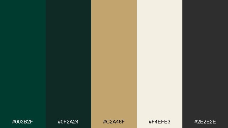
HEX: #003b2f #0f2a24 #c2a46f #f4efe3 #2e2e2e
Mood: heritage, confident, premium
Best for: luxury branding and stationery
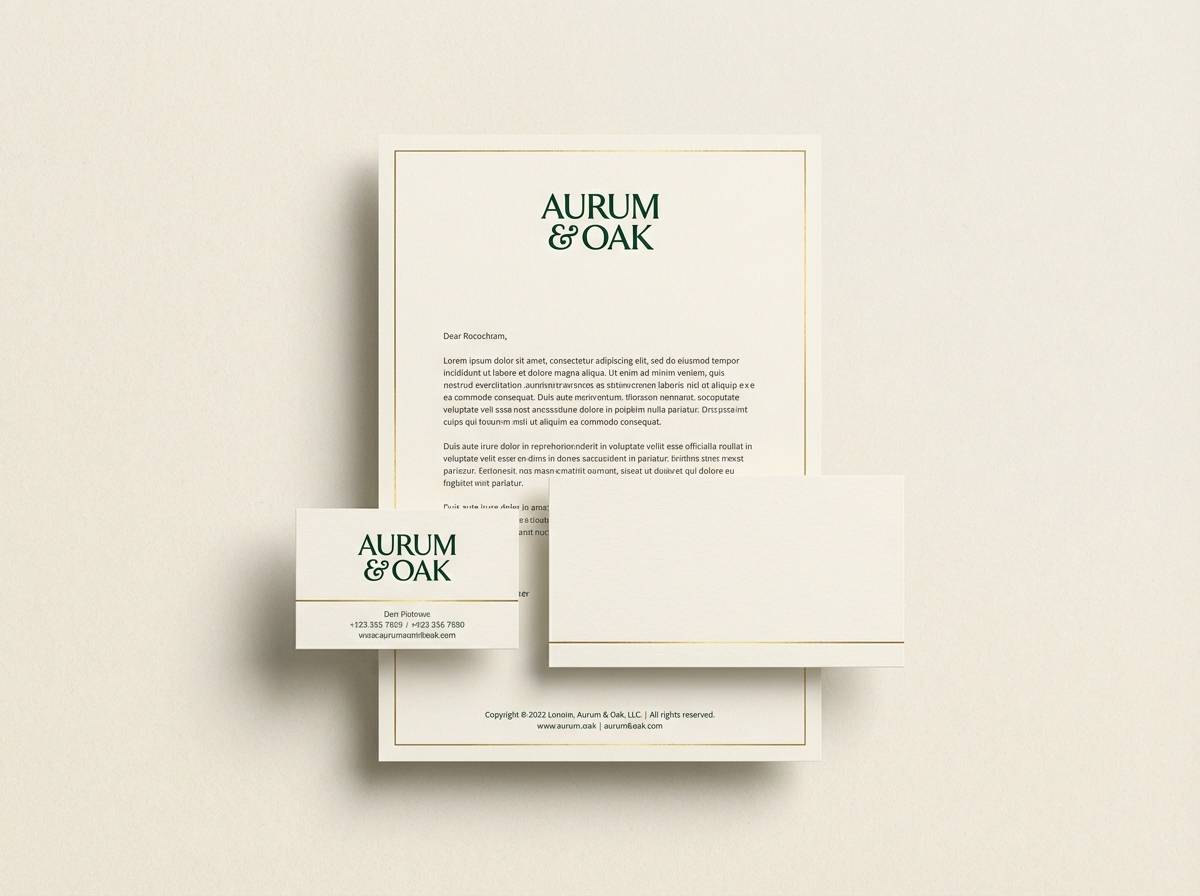
Heritage and confidence come through like polished wood, brass details, and a well-kept grandstand. Pair the deep green with warm gold and soft cream for a premium, traditional feel. Use the charcoal as your typography anchor to keep layouts crisp. Tip: reserve the gold for small highlights like rules, icons, or seals so it reads elevated, not flashy.
Image example of heritage track generated using media.io
Media.io is an online AI studio for creating and editing video, image, and audio in your browser.

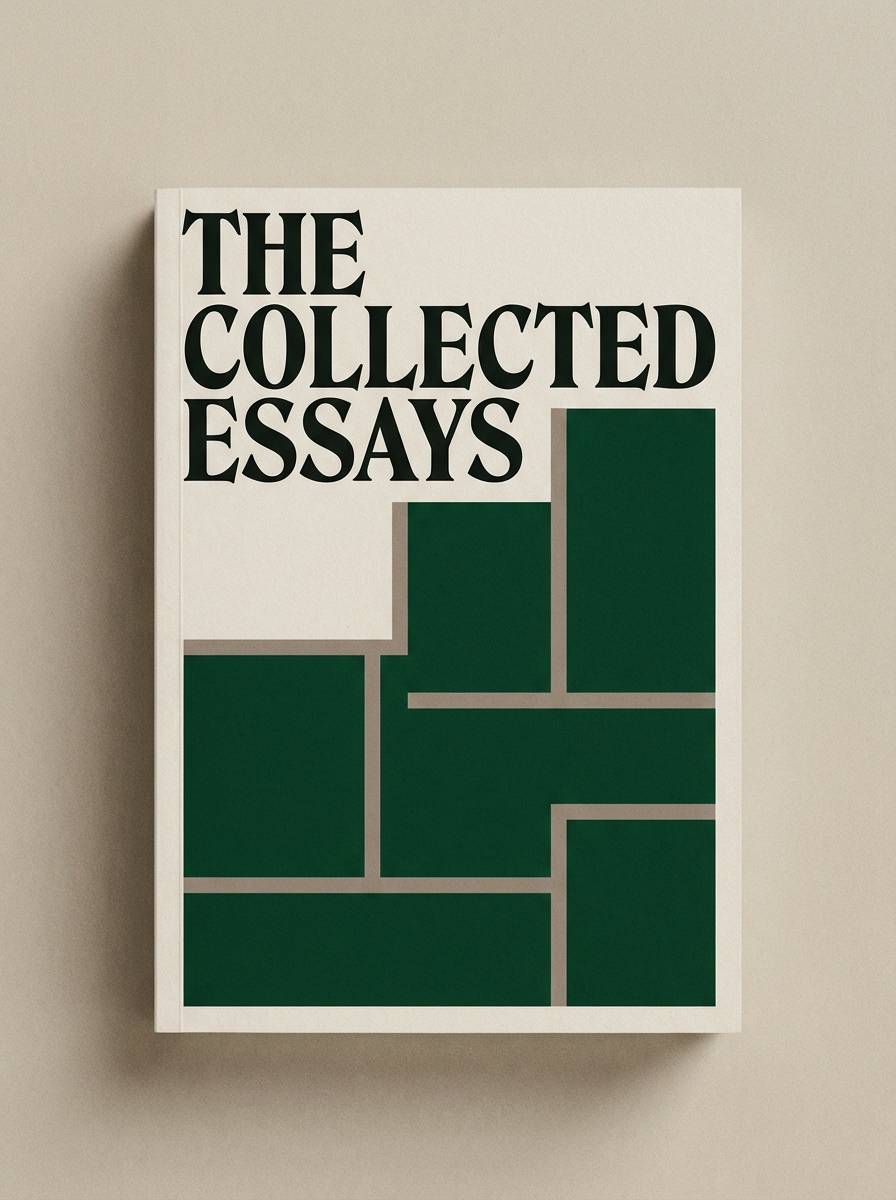
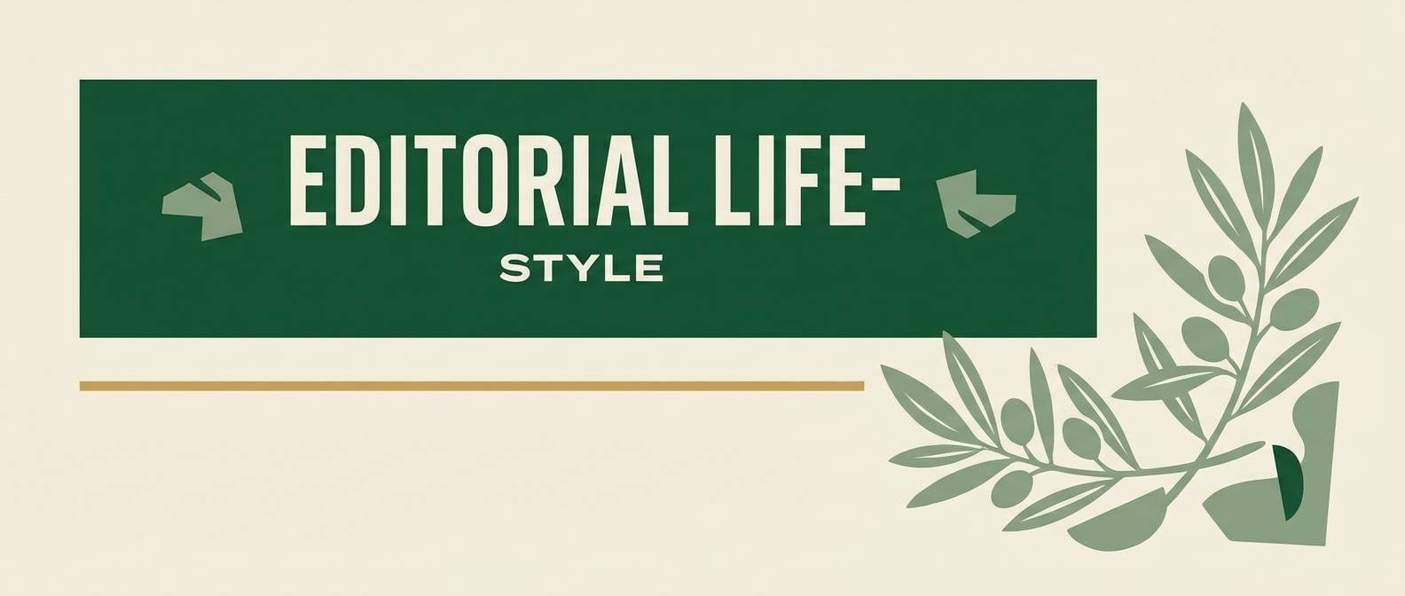
2) Oxford Tweed
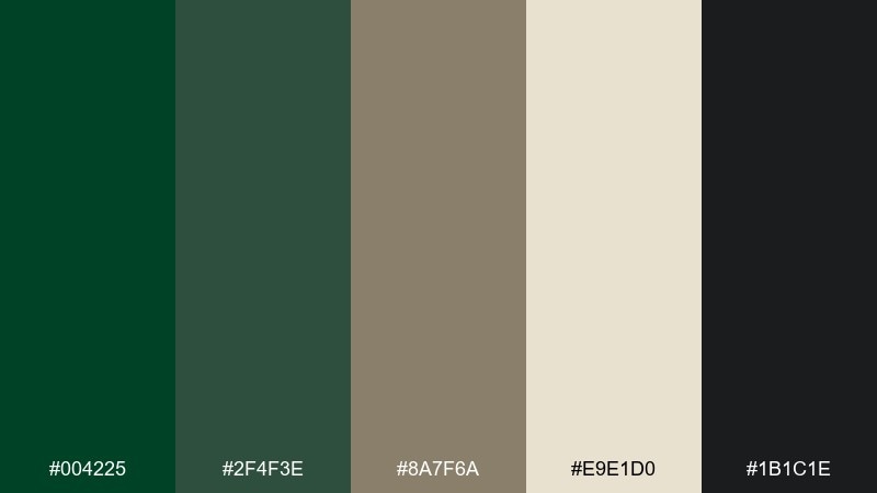
HEX: #004225 #2f4f3e #8a7f6a #e9e1d0 #1b1c1e
Mood: scholarly, cozy, refined
Best for: book covers and editorial headers
Scholarly and cozy, it feels like tweed jackets, old libraries, and rainy walks past stone buildings. This british racing green color palette works beautifully with oatmeal paper tones and ink-dark text for readable editorial design. Keep the mid green for subheads and pull quotes to build hierarchy without shouting. Tip: add generous margins so the darker shades feel calm rather than heavy.
Image example of oxford tweed generated using media.io
3) Gilded Club
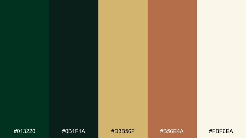
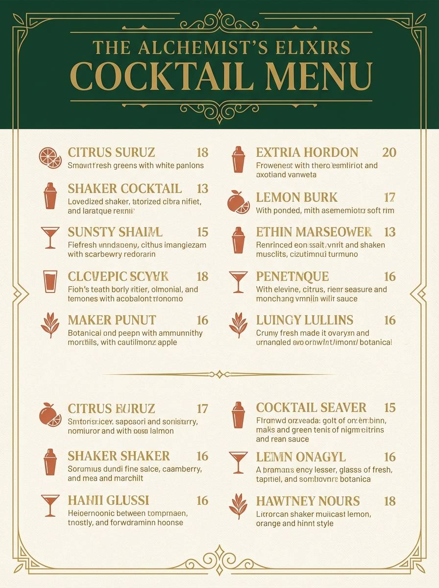
HEX: #013220 #0b1f1a #d3b56f #b56e4a #fbf6ea
Mood: opulent, intimate, classic
Best for: cocktail menus and event posters
Opulent and intimate, it evokes a candlelit club with leather chairs and gilt frames. Let the deep green dominate backgrounds, then bring in gold for borders, bullets, and small ornaments. Terracotta adds a surprising warmth that keeps the palette from feeling too formal. Tip: use the light cream for negative space behind prices and key details to improve scanability.
Image example of gilded club generated using media.io
4) Misty Moor
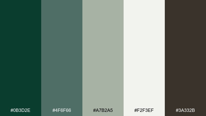
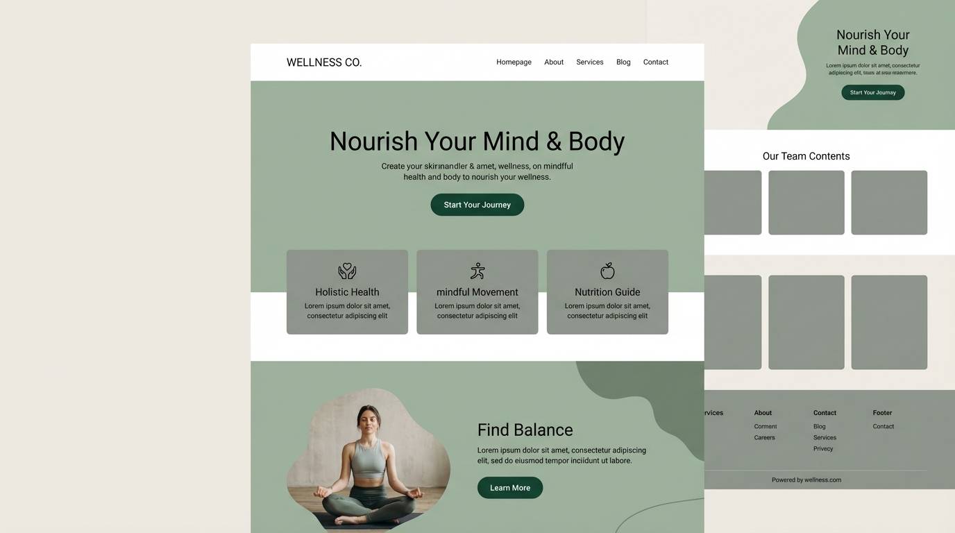
HEX: #0b3d2e #4f6f66 #a7b2a5 #f2f3ef #3a332b
Mood: quiet, natural, airy
Best for: wellness websites and blogs
Quiet and natural, it reads like mist over hills and soft grass underfoot. Combine the deep green with sage and foggy gray-greens for a soothing, modern look. Use the off-white as your main canvas so content stays light and breathable. Tip: keep contrast strong for buttons by pairing the darkest green with the palest background.
Image example of misty moor generated using media.io
5) Forest and Cream
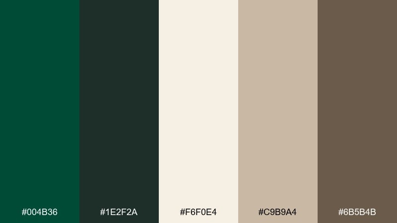
HEX: #004b36 #1e2f2a #f6f0e4 #c9b9a4 #6b5b4b
Mood: warm, grounded, inviting
Best for: interior paint guides and moodboards
Warm and grounded, it suggests evergreen branches against creamy plaster and natural wood. Use cream as the dominant wall tone in layouts, then bring the green in for swatches, headings, or feature panels. The tan and walnut shades make transitions feel organic, especially for home and lifestyle content. Tip: repeat the walnut color in small UI elements to create a consistent, lived-in rhythm.
Image example of forest and cream generated using media.io
6) Copper Loden
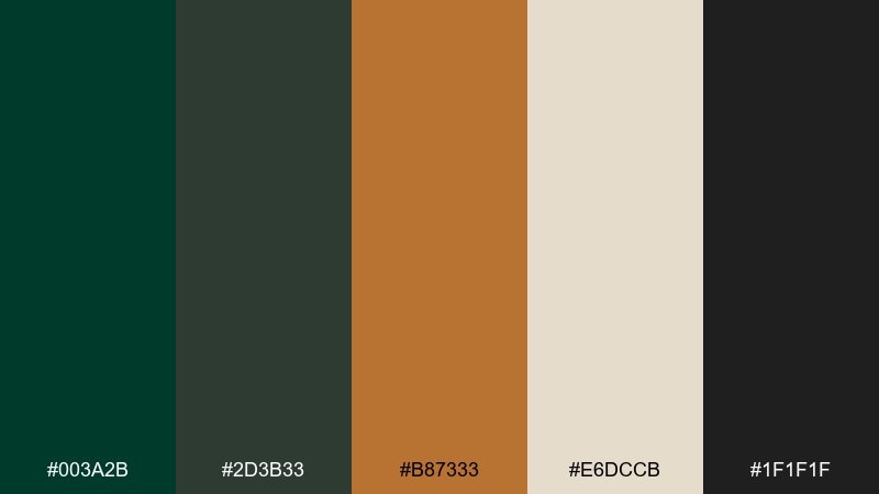
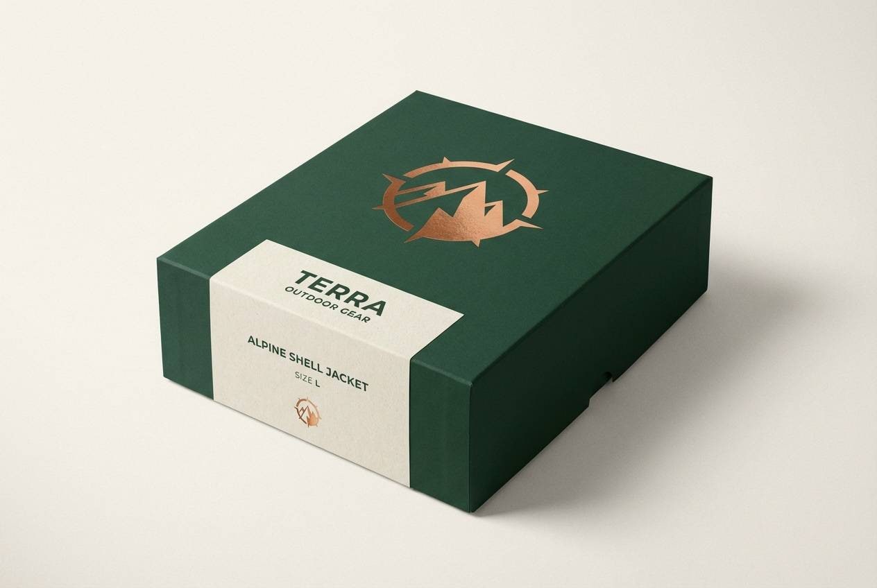
HEX: #003a2b #2d3b33 #b87333 #e6dccb #1f1f1f
Mood: rugged, warm, contemporary
Best for: outdoor product ads and gear packaging
Rugged warmth shows up like waxed canvas, copper hardware, and dark evergreen shade. These british racing green color combinations feel especially strong for outdoor gear when copper becomes the hero accent. Keep the cream for labeling so product info stays clear at a glance. Tip: limit copper to one focal area, such as a logo badge or zipper detail, to avoid visual noise.
Image example of copper loden generated using media.io
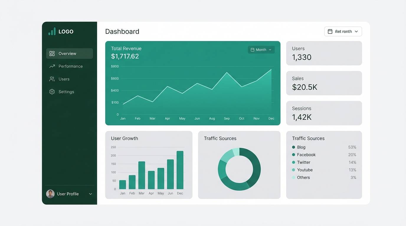
7) Midnight Pit Lane
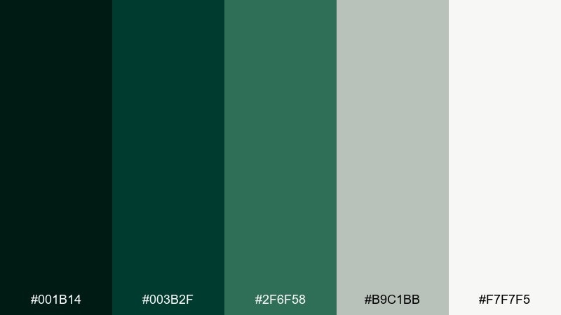
HEX: #001b14 #003b2f #2f6f58 #b9c1bb #f7f7f5
Mood: sleek, high-contrast, technical
Best for: dashboard UI and data visualizations
Sleek and technical, it looks like asphalt at night with LEDs cutting through the dark. Use the near-black green for nav and headers, then lean on the brighter teal-green for charts and active states. The pale grays keep dense data from feeling claustrophobic. Tip: reserve the brightest accent for one interaction state per component so the UI stays predictable.
Image example of midnight pit lane generated using media.io
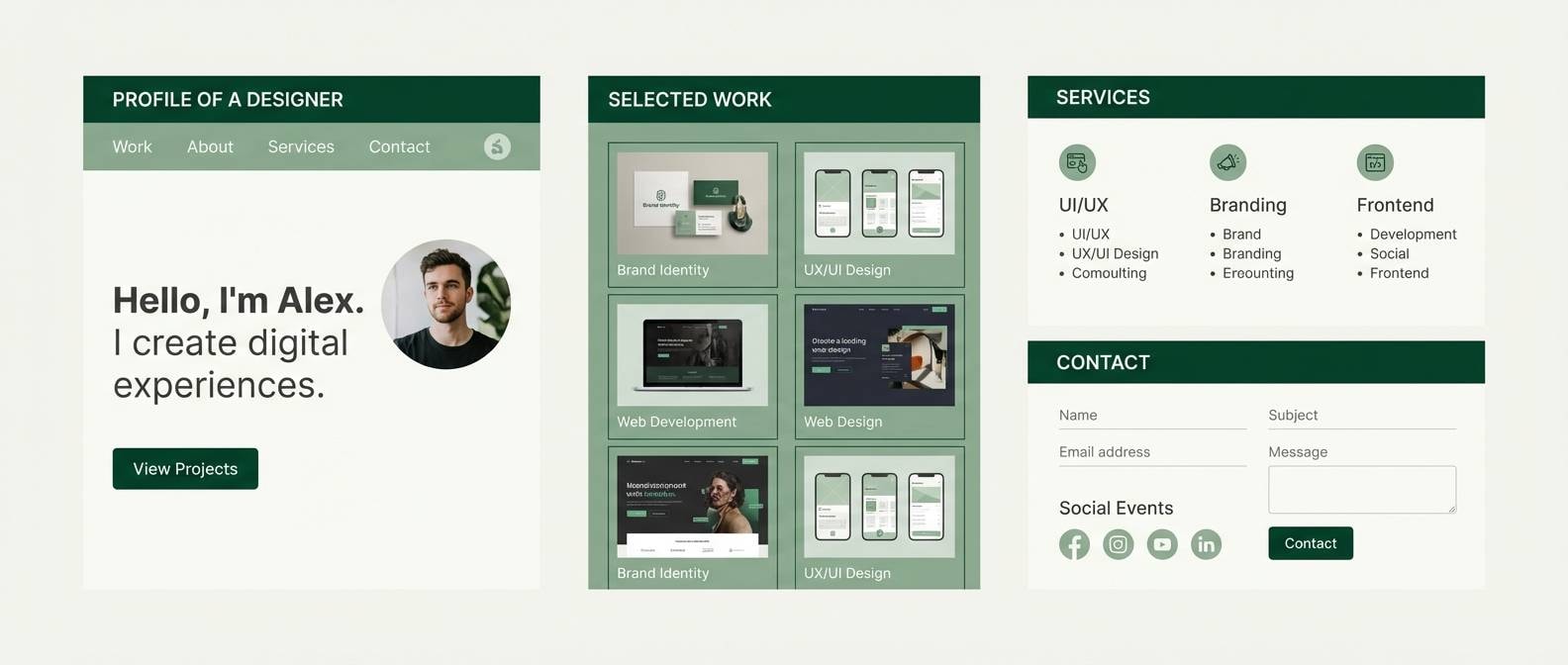
8) Sage and Stone
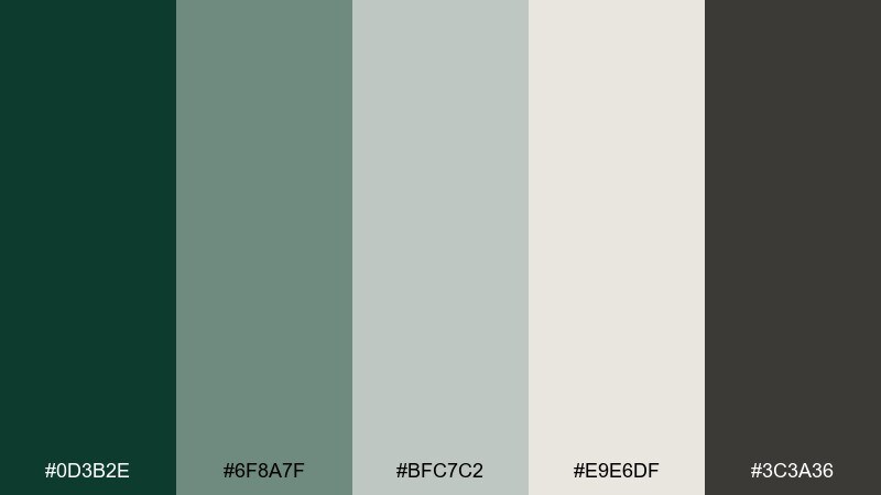
HEX: #0d3b2e #6f8a7f #bfc7c2 #e9e6df #3c3a36
Mood: minimal, calm, modern
Best for: architectural portfolios and resumes
Minimal calm comes through like sage leaves against cool stone and soft linen. Keep the palette mostly neutral, using the deep green only for section titles or a single standout button. The gray-greens make a clean bridge between text and background without harsh contrast. Tip: use consistent line weights in the darker gray to maintain a precise, architectural feel.
Image example of sage and stone generated using media.io
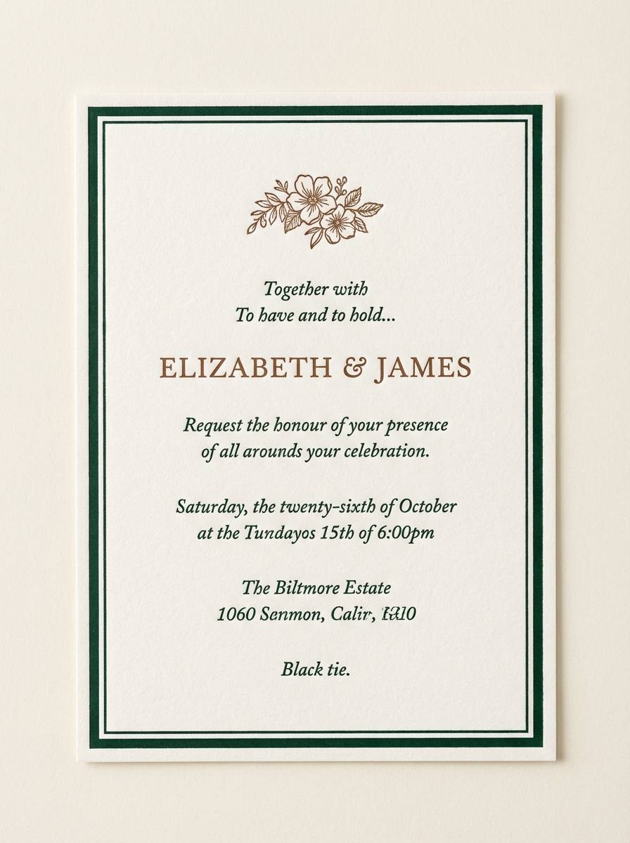
9) Ivy Vintage
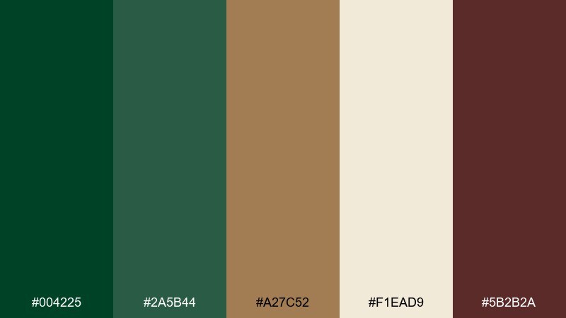
HEX: #004225 #2a5b44 #a27c52 #f1ead9 #5b2b2a
Mood: nostalgic, romantic, handcrafted
Best for: wedding invitations and save the dates
Nostalgic and romantic, it feels like ivy on brick and sun-faded paper. Use the cream as the invitation base, then layer green for borders and type accents. The cinnamon and wine-brown notes add a vintage warmth that works well with serif fonts. Tip: add a subtle texture overlay only in the light areas so the palette stays elegant, not busy.
Image example of ivy vintage generated using media.io
10) Modern Motorsport
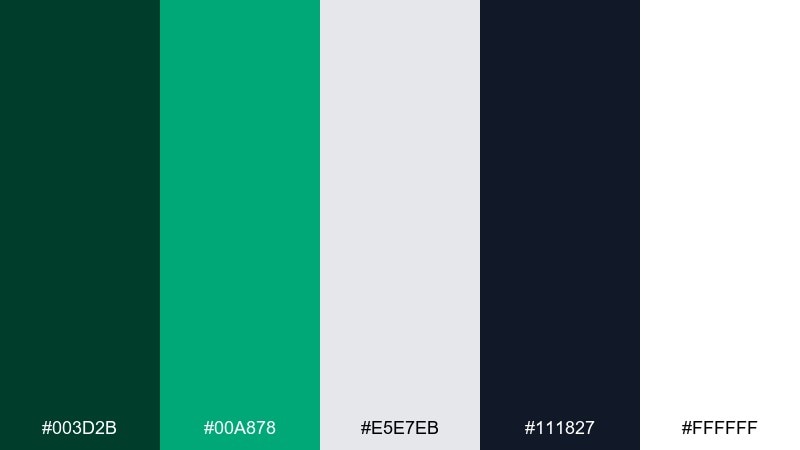
HEX: #003d2b #00a878 #e5e7eb #111827 #ffffff
Mood: fresh, energetic, bold
Best for: sports social ads and promo banners
Fresh energy hits like a clean pit crew uniform with a sharp neon-green stripe. Keep the bright accent for CTAs and key numbers, while the dark slate handles readability and contrast. Light grays help your content breathe on modern feeds without going sterile. Tip: use the bright green sparingly so it stays special and instantly clickable.
Image example of modern motorsport generated using media.io

11) Emerald Noir
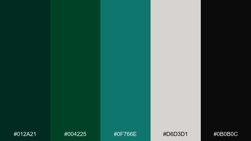
HEX: #012a21 #004225 #0f766e #d6d3d1 #0b0b0c
Mood: dramatic, luxe, cinematic
Best for: beauty packaging and premium product ads
Dramatic and luxe, it evokes velvet shadows with a jewel-toned shimmer. This british racing green color palette looks striking on matte-black packaging with a single emerald highlight. Use the pale stone tone for ingredient panels or small type so details stay legible. Tip: pair glossy accents with mostly matte surfaces to amplify the cinematic contrast.
Image example of emerald noir generated using media.io
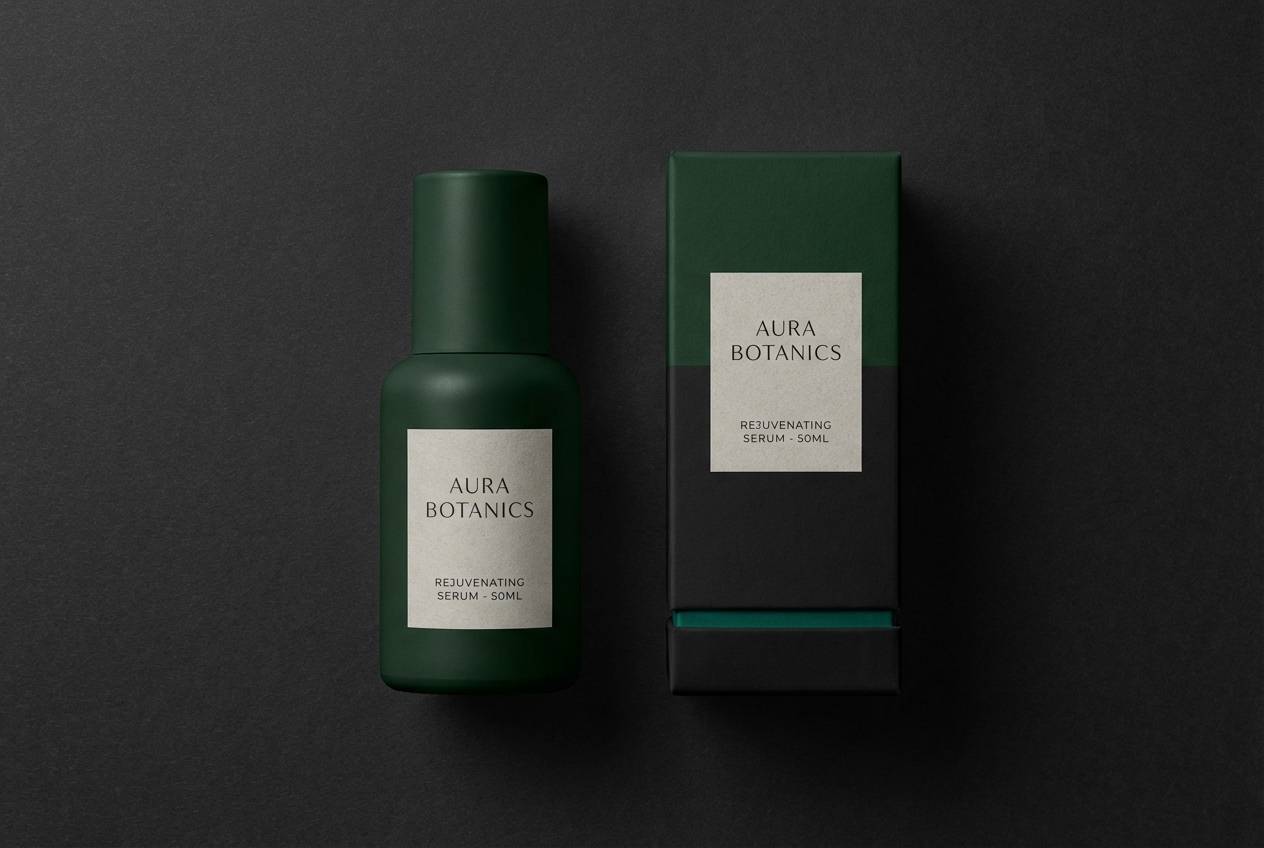
12) Cottage Garden
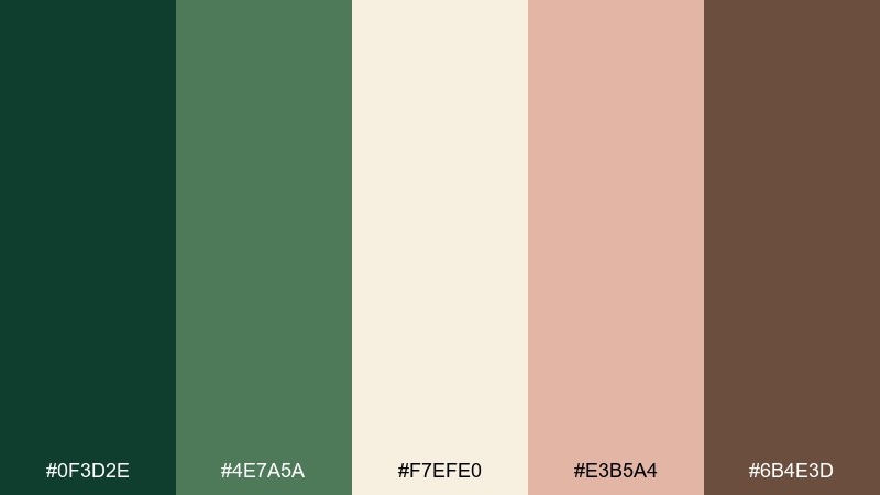
HEX: #0f3d2e #4e7a5a #f7efe0 #e3b5a4 #6b4e3d
Mood: soft, botanical, friendly
Best for: floral illustrations and spring campaigns
Soft and botanical, it brings to mind garden greens, blush petals, and sun-warmed soil. Let the cream background carry most of the space, then use greens to define stems, leaves, and headings. The dusty pink works as a gentle highlight for badges, prices, or dates. Tip: keep outlines in warm brown to make illustrations feel handcrafted and cohesive.
Image example of cottage garden generated using media.io
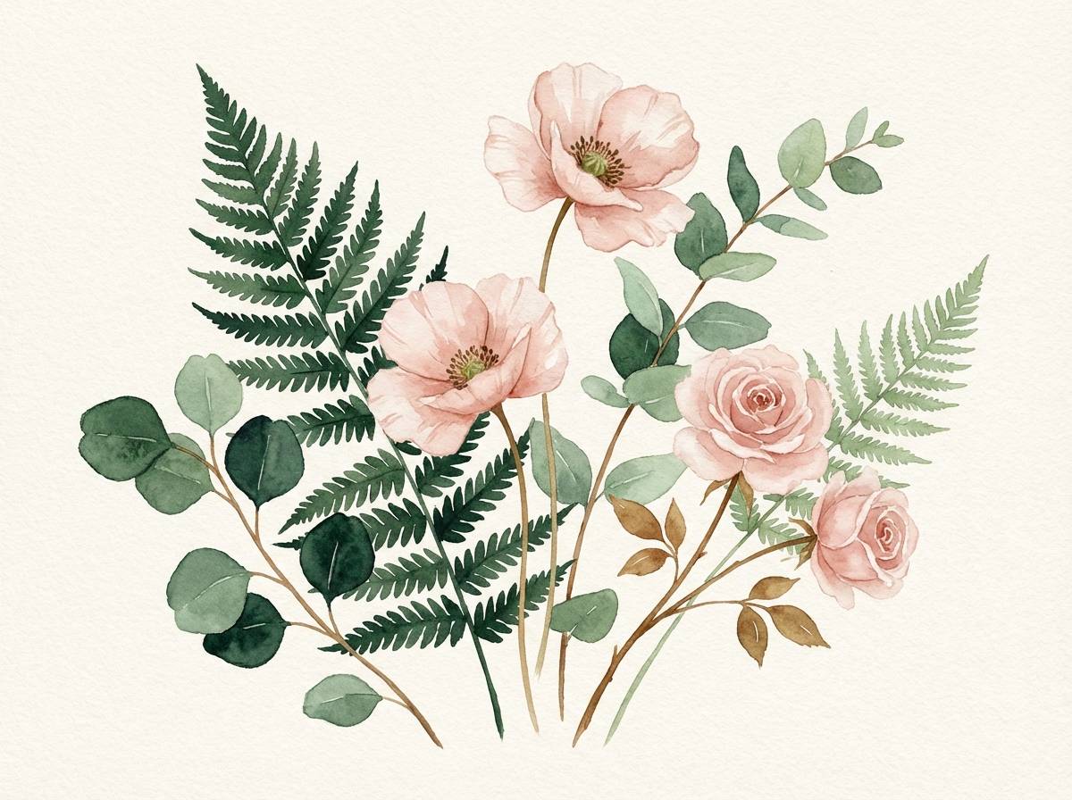
13) Warm Walnut
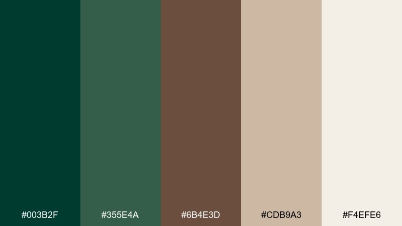
HEX: #003b2f #355e4a #6b4e3d #cdb9a3 #f4efe6
Mood: cozy, artisanal, grounded
Best for: coffee shop menus and cafe branding
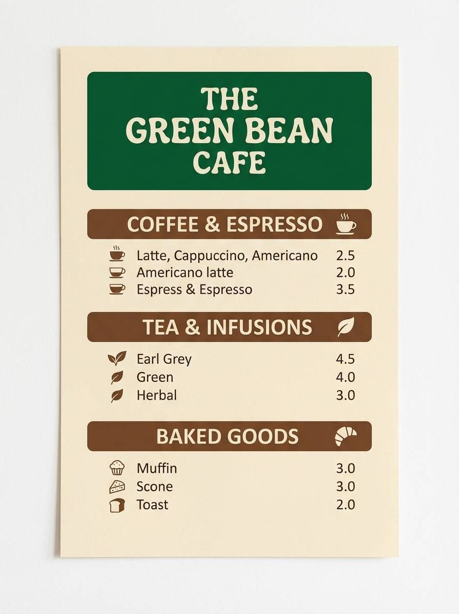
Cozy and artisanal, it feels like espresso crema, walnut counters, and deep green tiles. Use the warm neutrals for menus and backgrounds, then apply green for headings and icons. The brown adds richness that pairs well with hand-drawn elements or a friendly slab serif. Tip: keep the green at one consistent shade across touchpoints to build instant brand recognition.
Image example of warm walnut generated using media.io
14) Sea Glass Green
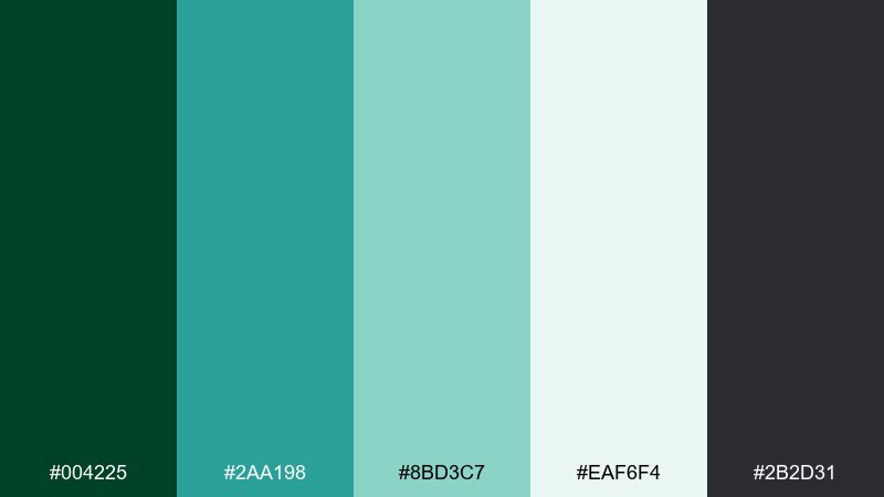
HEX: #004225 #2aa198 #8bd3c7 #eaf6f4 #2b2d31
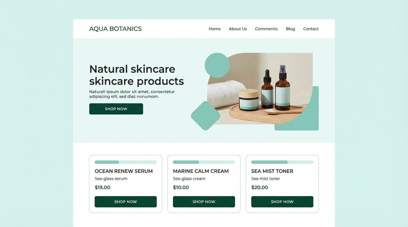
Mood: clean, coastal, refreshing
Best for: spa ads and skincare landing pages
Clean and refreshing, it suggests sea-glass shimmer with deep green depth underneath. Use the aqua tones for icons, highlights, and gentle gradients, while the darker green keeps CTAs grounded. The pale minty white is ideal for airy sections and before-after modules. Tip: avoid heavy shadows and instead use soft borders so the palette stays light and spa-like.
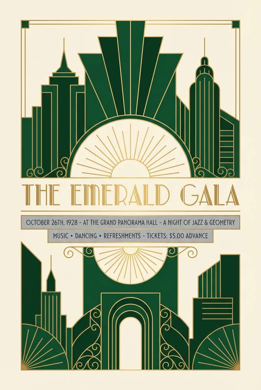
Image example of sea glass green generated using media.io
15) Art Deco Racing
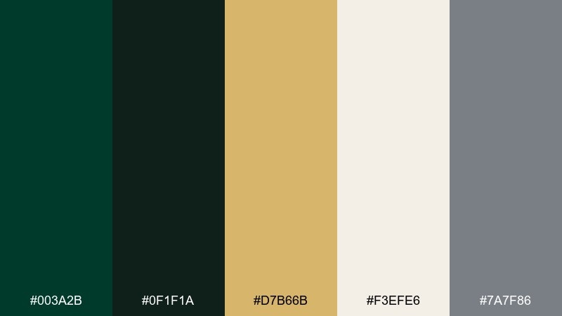
HEX: #003a2b #0f1f1a #d7b66b #f3efe6 #7a7f86
Mood: glamorous, geometric, vintage
Best for: poster design and night events
Glamorous and geometric, it nods to art deco lines on a vintage race poster. Use deep greens for big shapes and frames, then set thin gold rules for that signature deco sparkle. The steel gray adds a modern edge that keeps the look from turning costume-like. Tip: keep your grid symmetrical and repeat line motifs to make the design feel intentional.
Image example of art deco racing generated using media.io
16) Minimal Label
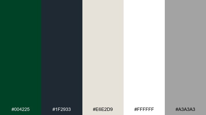
HEX: #004225 #1f2933 #e6e2d9 #ffffff #a3a3a3
Mood: clean, modern, understated
Best for: label design and ecommerce product pages
Clean and understated, it feels like a modern apothecary label with crisp type and calm spacing. The green works best as a single brand bar or logo stamp while the off-white handles most of the surface. Use the grays for hierarchy, from headlines to secondary details like size and ingredients. Tip: stick to one sans serif family and use weight changes to keep the minimal vibe strong.
Image example of minimal label generated using media.io
17) Autumn Estate
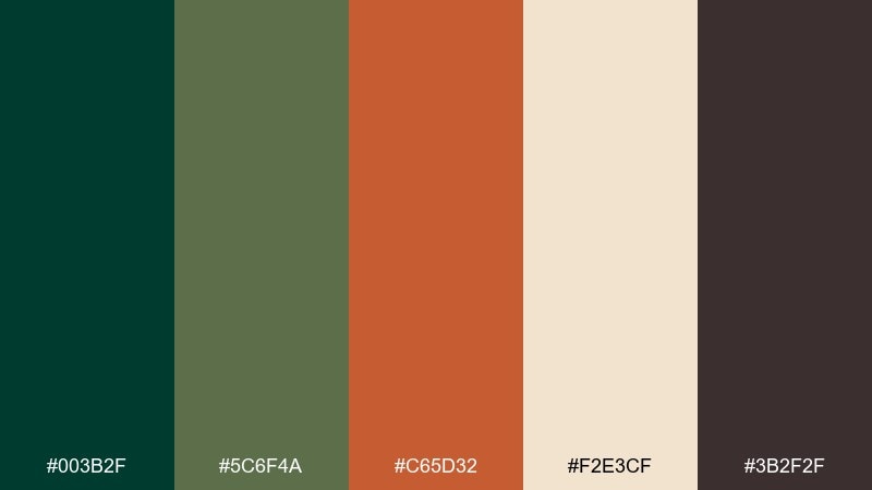
HEX: #003b2f #5c6f4a #c65d32 #f2e3cf #3b2f2f
Mood: seasonal, rustic, rich
Best for: fall marketing and harvest events
Seasonal and rich, it brings up images of evergreen hedges beside copper leaves and warm stone paths. A british racing green color combination like this works best when the orange is treated as a small, punchy accent. Use cream for readable posters and email headers, and keep the darkest brown for body copy. Tip: place the orange only on the most important action element so it does the heavy lifting.
Image example of autumn estate generated using media.io
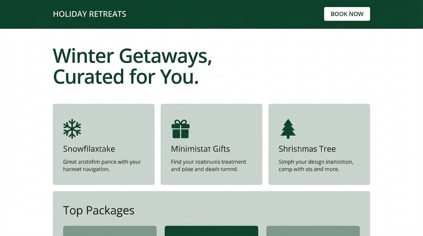
18) Winter Pine
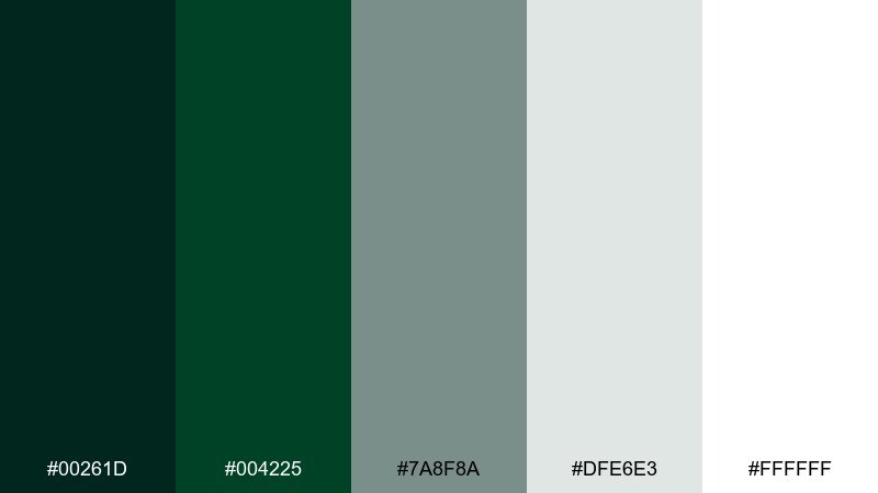
HEX: #00261d #004225 #7a8f8a #dfe6e3 #ffffff
Mood: crisp, wintery, serene
Best for: holiday landing pages and email design
Crisp and serene, it feels like pine needles dusted with frost and cool morning air. Use the darkest green for headers and footers, then layer the pale gray-green for sections and dividers. White space is your friend here, keeping the holiday vibe elegant rather than loud. Tip: add subtle patterns only in the light gray to keep the design refined and readable.
Image example of winter pine generated using media.io
19) Sunlit Conservatory
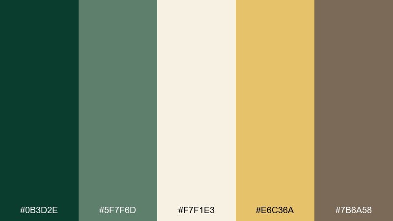
HEX: #0b3d2e #5f7f6d #f7f1e3 #e6c36a #7b6a58
Mood: bright, airy, optimistic
Best for: lifestyle blogs and home decor graphics
Bright and optimistic, it recalls sun through glass, leafy plants, and warm wicker. Use cream as the primary background and bring in green for headings, frames, or chart elements. The soft gold is perfect for small highlights like list markers or star ratings without feeling metallic. Tip: keep the gold to under ten percent of the layout so the palette stays airy.
Image example of sunlit conservatory generated using media.io
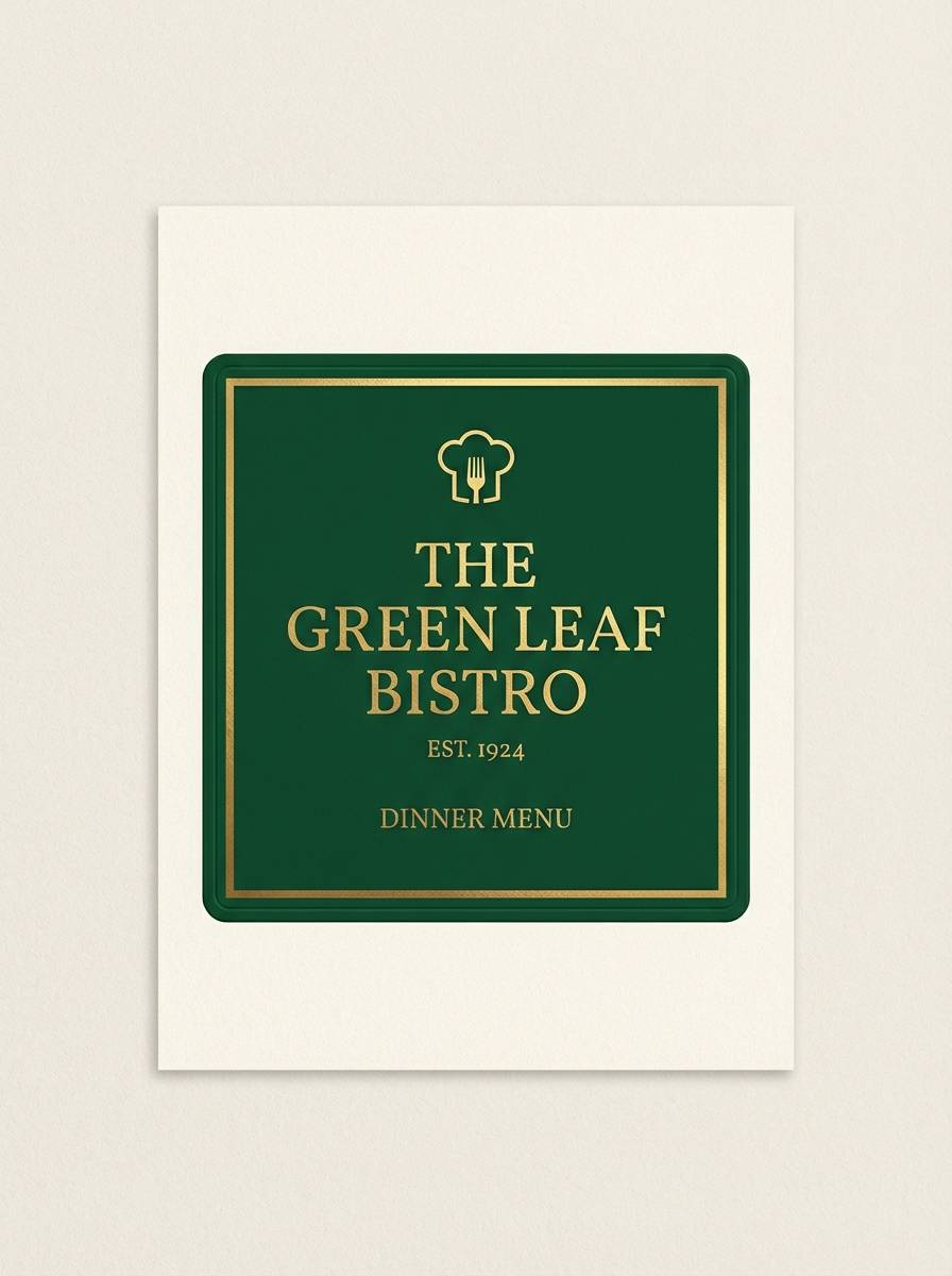
20) Classic Pub Sign
HEX: #004225 #0f1f1a #f0d9a6 #b48a3c #f7f2e8
Mood: traditional, welcoming, bold
Best for: restaurant signage and menu branding
Traditional and welcoming, it looks like painted pub signage with gold trim and deep green enamel. These british racing green color combinations shine in menus where contrast and warmth need to coexist. Use the pale cream for the main field, then set dark text and green panels for structure. Tip: keep gold as a border and icon color so it frames the content rather than competing with it.
Image example of classic pub sign generated using media.io
21) Verdant Gallery
HEX: #003b2f #2a3f3a #9aa39b #efe8dc #7c5c3b
Mood: artful, muted, sophisticated
Best for: museum posters and exhibition invites
Artful and muted, it feels like a quiet gallery with linen walls and dark green wayfinding. The soft neutrals make images and typography look considered, while the walnut accent adds warmth for dates and small stamps. Use the mid gray-green for secondary blocks and captions to avoid harsh contrast. Tip: choose one strong alignment and repeat it across all pieces for a curated, exhibition-ready look.
Image example of verdant gallery generated using media.io
22) Alpine Spruce
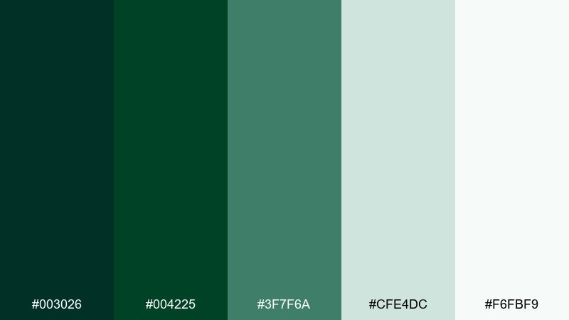
HEX: #003026 #004225 #3f7f6a #cfe4dc #f6fbf9
Mood: fresh, outdoorsy, uplifting
Best for: travel banners and eco campaigns
Fresh and outdoorsy, it brings to mind alpine air, spruce tips, and pale sky haze. Use the deep greens for bold headings, then let the minty tints support backgrounds and card surfaces. This british racing green color palette stays light enough for travel marketing without losing its grounded feel. Tip: keep photography overlays minimal and use solid color bands for text to maintain contrast.
Image example of alpine spruce generated using media.io

What Colors Go Well with British Racing Green?
Warm neutrals are the classic match: cream, ivory, tan, and walnut make british racing green feel welcoming and traditional. Add a brass or gold accent for a heritage, premium finish that works well in print and interiors.
For modern branding colors and UI color palettes, pair racing green with cool grays, off-whites, and a controlled teal or mint accent. This keeps contrast sharp, improves readability, and gives dashboards or landing pages a clean, technical edge.
If you want a bolder twist, use a small pop of terracotta, burnt orange, or blush. The key is restraint: make the warm hue the “attention color” for one element (CTA, badge, price) and keep the rest calm.
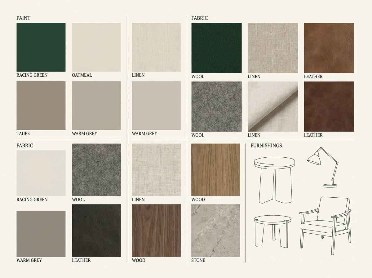
How to Use a British Racing Green Color Palette in Real Designs
Start by assigning roles: use the deepest green for headers, navigation, or hero blocks; keep a light neutral for the main canvas; choose one mid-tone for secondary UI or dividers; and reserve a single accent (gold, copper, bright green, or terracotta) for actions and highlights.
In branding and packaging, british racing green works best when paired with high-quality texture cues—matte finishes, subtle paper grain, or minimal linework. In digital layouts, lean on spacing and typography hierarchy so the dark green feels refined rather than heavy.
Always check contrast for accessibility, especially with dark green on charcoal or gray-blue. When in doubt, place dark text on warm off-white, and use racing green as a strong block color behind light type.
Create British Racing Green Palette Visuals with AI
If you’re building a moodboard, ad concept, label mockup, or UI header, AI-generated visuals help you preview how your british racing green palette will look in context. This is especially useful when you’re testing multiple accent directions like gold vs. copper vs. neon green.
With Media.io text-to-image, you can generate clean palette-based examples fast—then iterate on lighting, layout, and style while keeping your HEX direction consistent.
British Racing Green Color Palette FAQs
-
What is the HEX code for British racing green?
British racing green doesn’t have a single universal HEX value, but common “racing green” anchors include deep tones like #004225 or #003b2f. Your best choice depends on whether you want a warmer heritage green or a cooler, more modern green. -
Is British racing green a warm or cool color?
It can read warm or cool depending on the undertone. Palettes that lean toward olive, cream, and walnut feel warmer, while pairings with steel gray, teal, and crisp white feel cooler and more technical. -
What accent colors pair best with British racing green?
Gold/brass and copper are the most “premium” accents, while terracotta or burnt orange adds a seasonal punch. For modern UI, a bright green or teal accent can create a sporty, high-energy contrast. -
How do I keep a dark green palette from feeling too heavy?
Use off-white or cream as the dominant background, increase whitespace, and limit the darkest green to structural elements (headers, frames, key blocks). Keep accents small and consistent to maintain clarity. -
Does British racing green work for websites and apps?
Yes—especially for dashboards, finance, wellness, and premium ecommerce. Use a near-black green for navigation, a light neutral for content surfaces, and a brighter accent shade for active states and CTAs. -
What fonts look good with a British racing green color scheme?
Heritage palettes pair well with elegant serifs or classic editorial type, while modern palettes look sharp with clean sans serif families. Choose fonts with clear weights so your hierarchy stays readable against dark green blocks. -
How many colors should I use in a racing green palette?
Five is a practical set: a deep anchor green, a secondary green/gray-green, a light neutral, a dark neutral for text, and one accent. This structure makes it easy to apply the palette consistently across branding, interiors, and UI.
Next: Gray Blue Color Palette


