

A yellow teal color palette is one of the easiest ways to balance warmth and coolness in a single look. Yellow brings optimism and visibility, while teal adds depth, trust, and a clean modern edge.
Whether you’re building a UI, designing packaging, or laying out print materials, yellow and teal can feel beachy, retro, luxurious, or minimal depending on the supporting neutrals and contrast choices.
In this article
- Why Yellow Teal Palettes Work So Well
-
- sunlit lagoon
- citrus tide
- retro cabana
- desert oasis
- minted mustard
- festival surf
- nordic harbor
- playful twist
- botanical terrace
- midcentury patio
- coastal market
- teal velvet gold
- soft nursery bay
- café tilework
- studio highlight
- rainy day pop
- tropical stationery
- museum label
- sports energy
- evening cocktail
- golden kelp
- What Colors Go Well with Yellow Teal?
- How to Use a Yellow Teal Color Palette in Real Designs
- Create Yellow Teal Palette Visuals with AI
Why Yellow Teal Palettes Work So Well
Yellow and teal sit in a sweet spot of contrast: yellow is naturally attention-grabbing, while teal feels stable and controlled. Put together, they create a clear visual hierarchy—perfect for headlines, buttons, and key information.
This pairing also adapts across styles. With crisp whites and slates it becomes modern and techy; with creams and browns it turns handcrafted and retro; with dark navies it can look premium and dramatic.
Most importantly, yellow teal color combinations are flexible for accessibility. If you keep body text on dark neutrals and reserve yellow for accents, you get a lively palette that still reads cleanly on screens and in print.
20+ Yellow Teal Color Palette Ideas (with HEX Codes)
1) Sunlit Lagoon
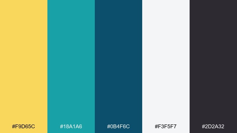
HEX: #F9D65C #18A1A6 #0B4F6C #F3F5F7 #2D2A32
Mood: fresh, clean, seaside
Best for: travel brand landing page UI
Fresh and airy like noon light on shallow water, these tones feel crisp and optimistic. Use the bright yellow for CTAs and the teal range for navigation and headers. Pair with lots of white space and a dark ink text color to keep it readable. Tip: reserve the deepest blue-teal for active states so the interface feels calm, not loud.
Image example of sunlit lagoon generated using media.io

Media.io is an online AI studio for creating and editing video, image, and audio in your browser.

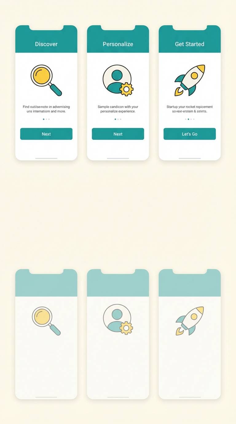
2) Citrus Tide
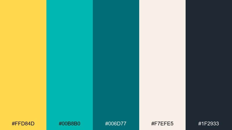
HEX: #FFD84D #00B8B0 #006D77 #F7EFE5 #1F2933
Mood: zesty, modern, energetic
Best for: app onboarding screens UI
Zesty and upbeat, it brings the snap of citrus against cool ocean tones. Let yellow highlight key steps and icons, while teal anchors panels and progress elements. Warm off-white keeps the screens welcoming and reduces glare. Tip: keep body text in the deep slate so the bright accents stay special.
Image example of citrus tide generated using media.io
3) Retro Cabana
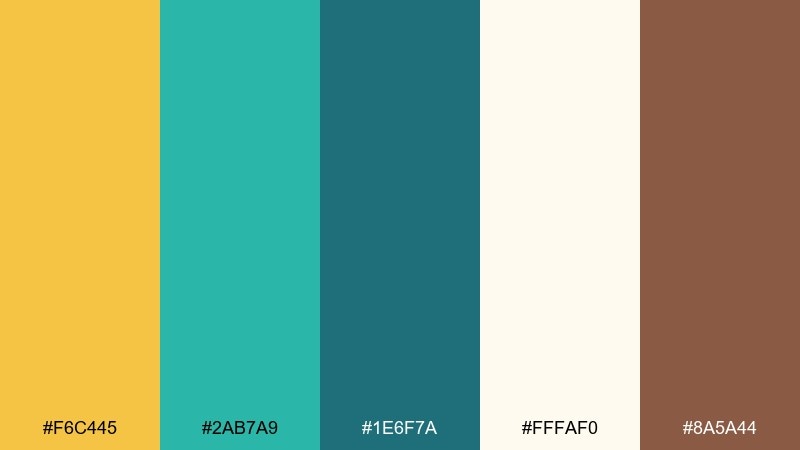
HEX: #F6C445 #2AB7A9 #1E6F7A #FFFAF0 #8A5A44
Mood: retro, playful, sunny
Best for: summer event poster design
Playful and nostalgic, it feels like striped cabana chairs and vintage sunglasses. Use the warm yellow for headline blocks and the teal for large shapes or borders. Creamy white keeps it airy, while a touch of warm brown adds a retro print vibe. Tip: use simple geometric patterns so the palette does the storytelling.
Image example of retro cabana generated using media.io

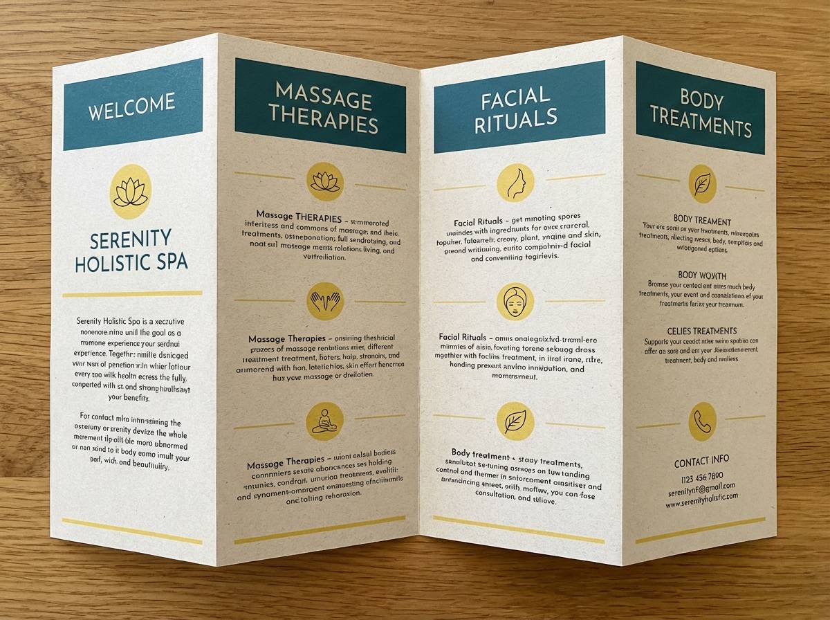
4) Desert Oasis
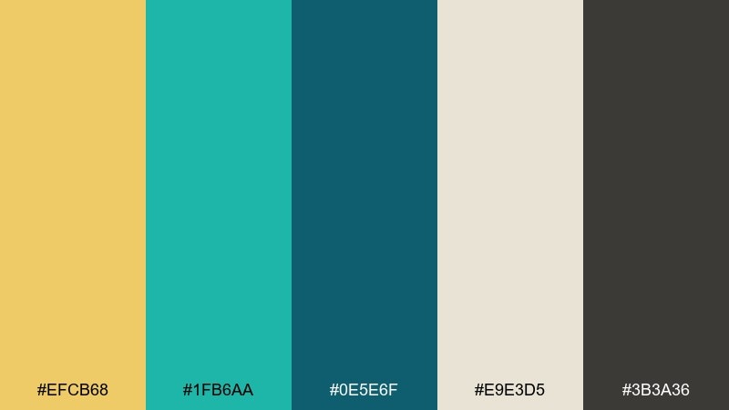
HEX: #EFCB68 #1FB6AA #0E5E6F #E9E3D5 #3B3A36
Mood: grounded, warm, calming
Best for: spa brochure layout
Grounded and soothing, it evokes sun-warmed sand meeting cool pool water. The muted yellow works beautifully as a soft background tone, while teal adds calm emphasis for section headers. Pair with natural textures like linen paper and minimal line icons. Tip: keep contrast high for body copy by using the charcoal gray for text.
Image example of desert oasis generated using media.io
5) Minted Mustard
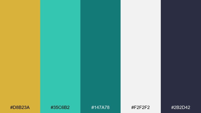
HEX: #D8B23A #35C6B2 #147A78 #F2F2F2 #2B2D42
Mood: smart, youthful, techy
Best for: SaaS dashboard UI
Smart and punchy, it feels like clean charts with a hint of personality. Use teal for primary UI surfaces and the mustard yellow for alerts, highlights, and key metrics. Light gray keeps the dashboard neutral and professional. Tip: apply yellow sparingly so it reads as a priority signal, not constant noise.
Image example of minted mustard generated using media.io

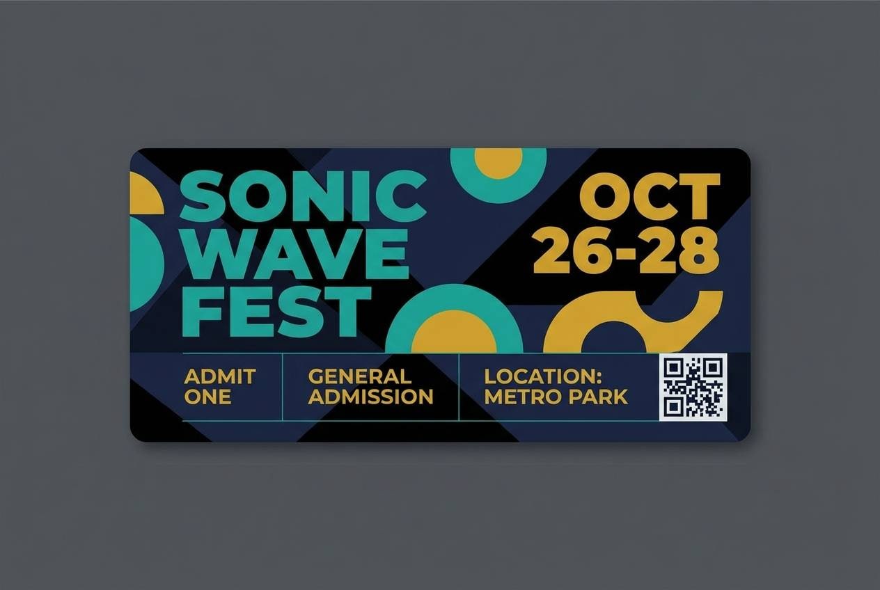
6) Festival Surf
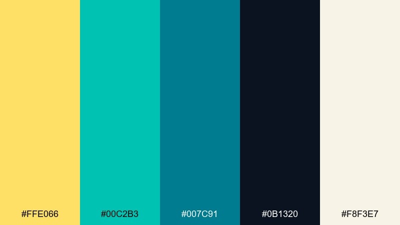
HEX: #FFE066 #00C2B3 #007C91 #0B1320 #F8F3E7
Mood: bold, lively, high-contrast
Best for: music festival ticket graphic
Bold and electric, it reads like neon wristbands against deep night. Push the bright yellow for pricing and dates, then let teal carry supporting shapes and dividers. The near-black adds drama and makes the accents pop. Tip: keep typography chunky and simple for maximum legibility at small sizes.
Image example of festival surf generated using media.io
7) Nordic Harbor
HEX: #F2D96B #4CB7A5 #2D6A78 #E8EEF2 #243B4A
Mood: cool, minimal, polished
Best for: brand guidelines page
Cool and tidy, it suggests a quiet harbor under pale sunlight. Use the misty gray-blue as a base, then add teal for brand blocks and navigation elements. Yellow works best as a secondary accent for callouts and icons. Tip: combine with a clean sans-serif and generous margins for a Scandinavian feel.
Image example of nordic harbor generated using media.io
8) Playful Twist
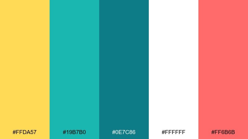
HEX: #FFDA57 #19B7B0 #0E7C86 #FFFFFF #FF6B6B
Mood: fun, youthful, upbeat
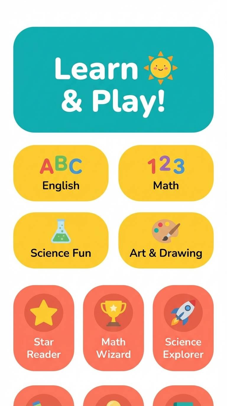
Best for: kids learning app UI
Cheerful and bouncy, it feels like stickers, flashcards, and bright classroom posters. Teal keeps the interface stable, while yellow and coral bring friendly energy to buttons and rewards. White space helps the colors stay readable for younger users. Tip: use the coral only for celebrations so it never competes with core actions.
Image example of playful twist generated using media.io
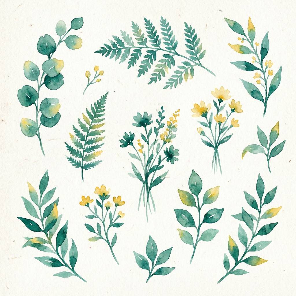
9) Botanical Terrace
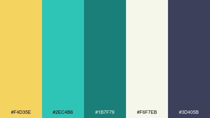
HEX: #F4D35E #2EC4B6 #1B7F79 #F6F7EB #3D405B
Mood: fresh, leafy, sunlit
Best for: spring botanical illustration set
Fresh and sunlit, it evokes new leaves, painted planters, and warm afternoon light. The teal range reads beautifully for stems and shadows, while yellow adds gentle flower centers and highlights. Pair with soft paper texture and loose watercolor edges. Tip: keep the background off-white so the greens and yellows stay natural.
Image example of botanical terrace generated using media.io
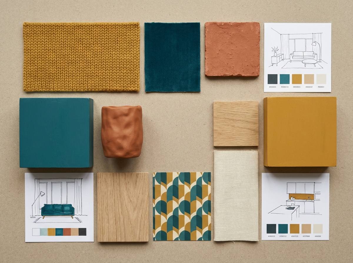
10) Midcentury Patio
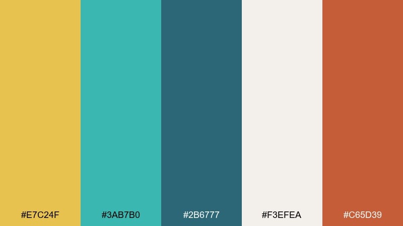
HEX: #E7C24F #3AB7B0 #2B6777 #F3EFEA #C65D39
Mood: midcentury, warm, curated
Best for: home decor moodboard
Curated and cozy, it recalls midcentury tiles, teak furniture, and a sunny patio door. Teal works well for big surfaces like walls or blocks, while yellow and clay accents bring warmth. Pair with natural materials like wood, rattan, and matte ceramics. Tip: repeat the clay tone in small doses to tie the look together.
Image example of midcentury patio generated using media.io
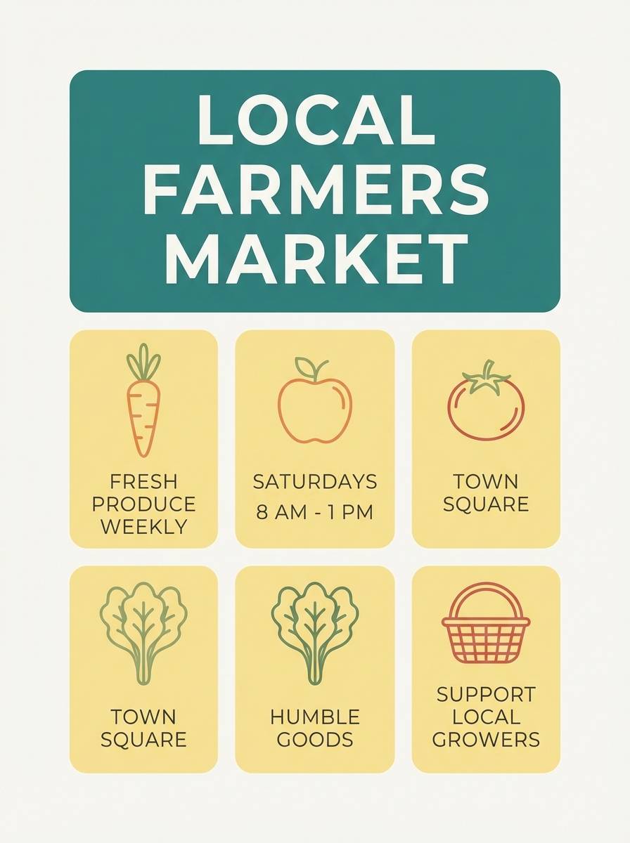
11) Coastal Market
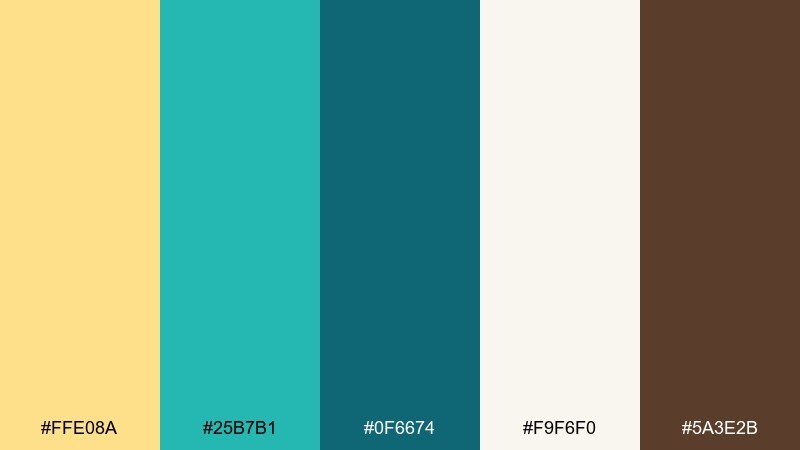
HEX: #FFE08A #25B7B1 #0F6674 #F9F6F0 #5A3E2B
Mood: welcoming, artisanal, bright
Best for: farmers market flyer
Welcoming and handmade, it feels like painted signs, fresh fruit, and sea air. Use the pale yellow as a warm base, then add teal for headings and directional arrows. The brown reads like kraft paper and works great for small text and borders. Tip: add simple hand-drawn icons to lean into the artisanal vibe.
Image example of coastal market generated using media.io
12) Teal Velvet Gold
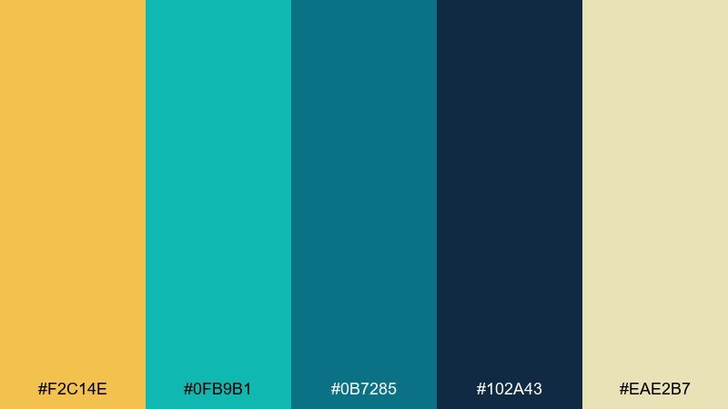
HEX: #F2C14E #0FB9B1 #0B7285 #102A43 #EAE2B7
Mood: lux, moody, dramatic
Best for: cocktail bar menu design
Lux and moody, it suggests velvet booths, brass details, and low teal lighting. Use the deep navy as the main background, then bring in gold-yellow for menu highlights and prices. Teal adds a refined accent for dividers and icons. Tip: choose a high-contrast serif for headings so the dark base stays elegant, not heavy.
Image example of teal velvet gold generated using media.io
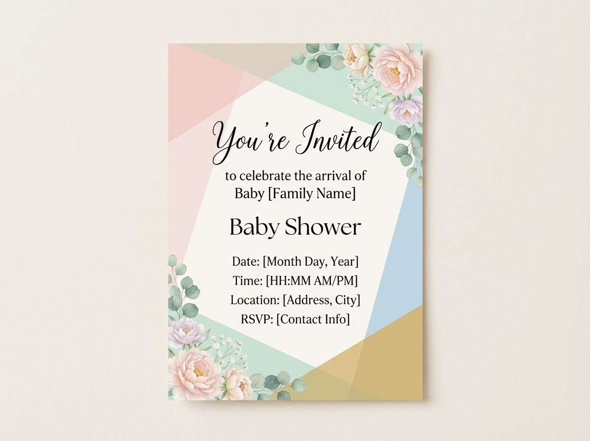
13) Soft Nursery Bay
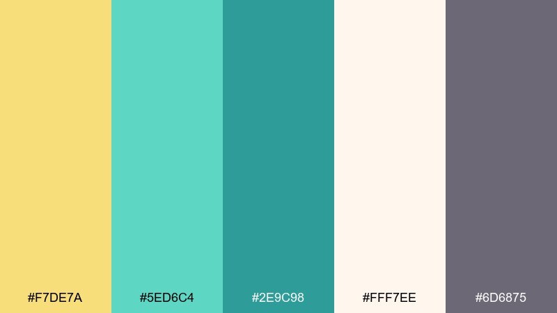
HEX: #F7DE7A #5ED6C4 #2E9C98 #FFF7EE #6D6875
Mood: soft, gentle, comforting
Best for: baby shower invitation
Soft and comforting, it feels like sun through curtains and a calm afternoon nap. The pastel yellow and aqua-teal sit nicely on warm cream paper without feeling overly sweet. Pair with rounded typography and simple line illustrations. Tip: keep text in the muted mauve-gray for a gentle, readable finish.
Image example of soft nursery bay generated using media.io
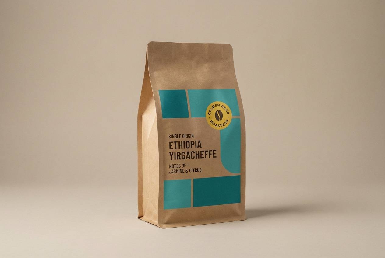
14) Café Tilework

HEX: #F1CF4A #22B8A8 #1B5E6A #FAF3E0 #3D2C2E
Mood: cozy, editorial, handcrafted
Best for: coffee packaging design
Cozy and handcrafted, it brings to mind patterned tile, citrus pastries, and a teal espresso cup. Use the cream as the main label base, then place teal blocks for brand name and origin info. Yellow works well for roast notes or small badges. Tip: add a subtle geometric pattern in the darkest tone for a premium café look.
Image example of café tilework generated using media.io
15) Studio Highlight

HEX: #FFD24A #00B4A6 #005B66 #F5F7FA #111827
Mood: clean, confident, professional
Best for: creative agency hero section UI
Clean and confident, it feels like a bright studio with crisp shadows and sharp typography. Make teal the dominant brand color for headers and links, then use yellow for a single standout action. Light gray keeps the page modern and reduces contrast fatigue. Tip: pair with bold black typography and simple iconography for a polished first impression.
Image example of studio highlight generated using media.io

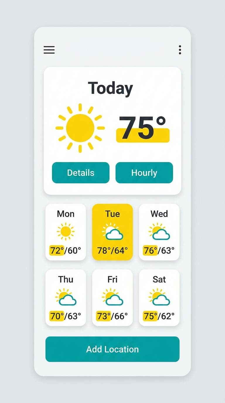
16) Rainy Day Pop
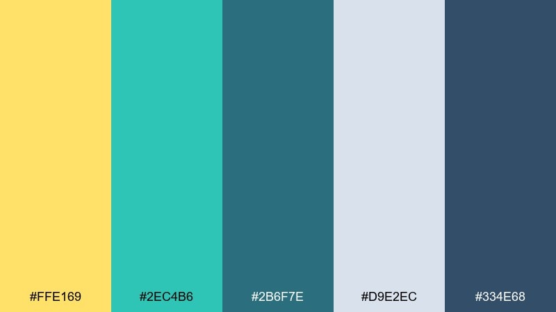
HEX: #FFE169 #2EC4B6 #2B6F7E #D9E2EC #334E68
Mood: cheery, balanced, everyday
Best for: weather app UI
Cheery but balanced, it's like a bright umbrella on a gray, drizzly day. Use the cool grays for backgrounds and cards, then bring in teal for primary controls. Yellow works perfectly as a highlight for sunny states and key notifications. Tip: keep icon fills consistent so the accent colors read clearly at a glance.
Image example of rainy day pop generated using media.io
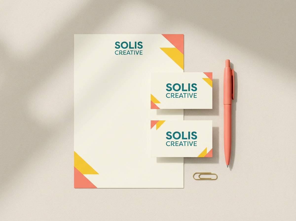
17) Tropical Stationery
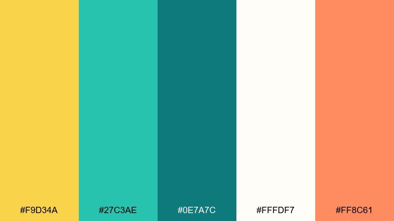
HEX: #F9D34A #27C3AE #0E7A7C #FFFDF7 #FF8C61
Mood: bright, friendly, creative
Best for: stationery set mockup
Bright and friendly, it channels tropical postcards and clean resort signage. Teal holds the layout together on letterheads, while yellow and coral add cheerful stamps, borders, or small motifs. Keep the base near-white so printed pieces stay crisp. Tip: choose uncoated paper in the mockup to soften the bold accents.
Image example of tropical stationery generated using media.io
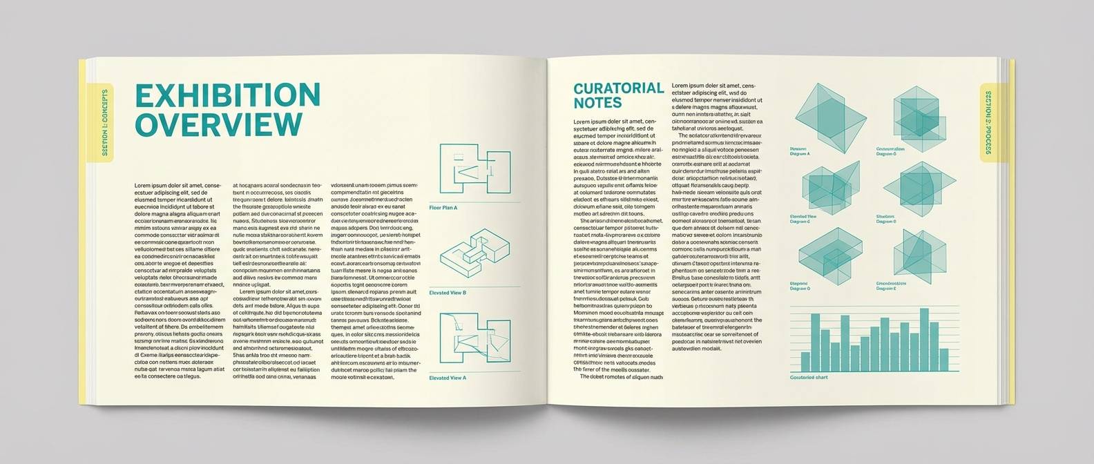
18) Museum Label
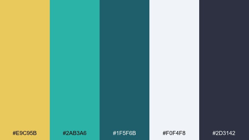
HEX: #E9C95B #2AB3A6 #1F5F6B #F0F4F8 #2D3142
Mood: quiet, informative, refined
Best for: exhibition catalog layout
Quiet and refined, it feels like a well-lit gallery with carefully printed labels. Use the pale slate background for breathing room, then set teal as the system color for headings and captions. Yellow is best for subtle callouts like edition marks or section tabs. Tip: align everything to a strict grid to keep the layout museum-clean.
Image example of museum label generated using media.io
19) Sports Energy
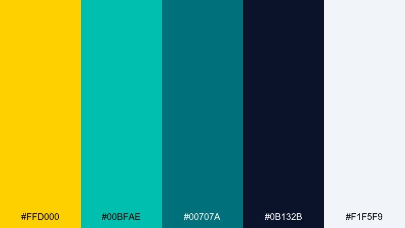
HEX: #FFD000 #00BFAE #00707A #0B132B #F1F5F9
Mood: fast, punchy, competitive
Best for: sports promo banner
Fast and punchy, it looks like stadium lights reflecting off a teal field. Use yellow for the main headline and score highlights, while teal supports secondary text and graphic stripes. The dark navy adds intensity and keeps the bright accents sharp. Tip: add diagonal shapes and tight spacing to amplify the sense of motion.
Image example of sports energy generated using media.io

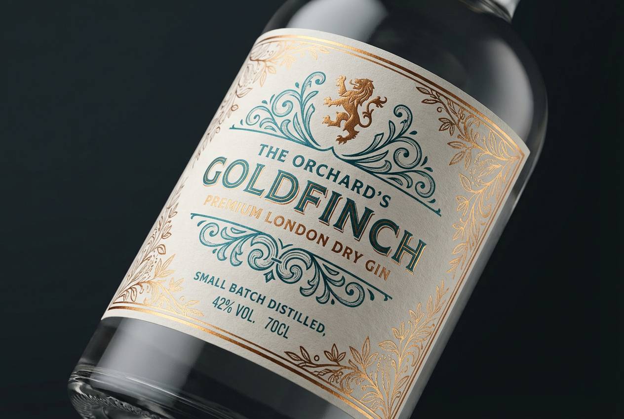
20) Evening Cocktail
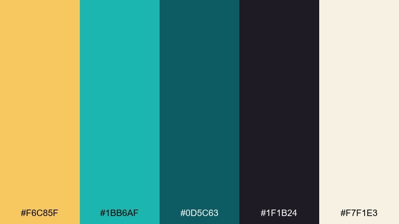
HEX: #F6C85F #1BB6AF #0D5C63 #1F1B24 #F7F1E3
Mood: sophisticated, intimate, chic
Best for: premium gin label design
Sophisticated and intimate, it evokes candlelight, citrus peel, and a cool teal glass. For premium packaging, let the near-black carry most of the label and use teal for decorative lines or seals. Yellow reads like a warm metallic accent for small typographic moments. Tip: these yellow teal color combinations look best with restrained layout and lots of negative space.
Image example of evening cocktail generated using media.io
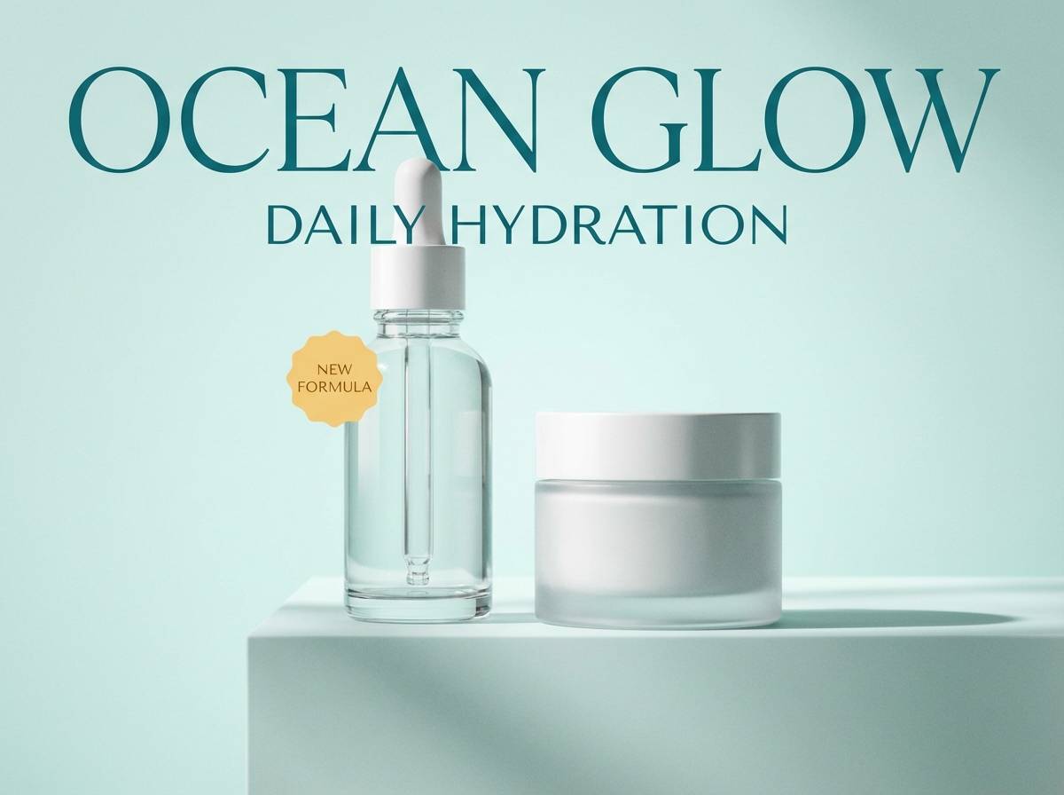
21) Golden Kelp
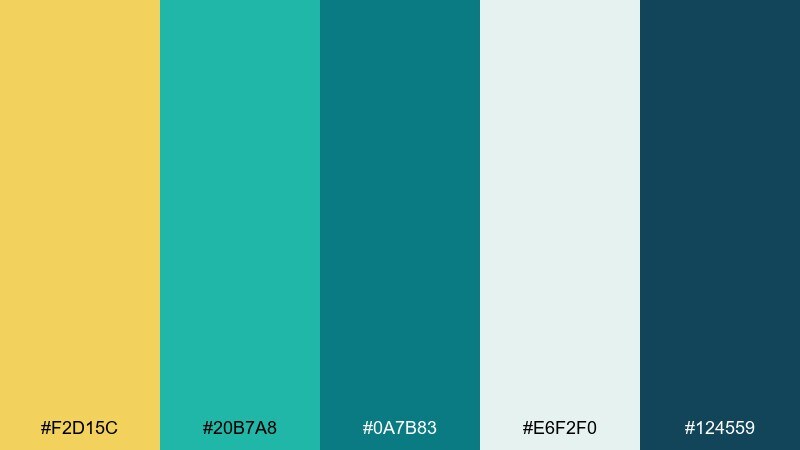
HEX: #F2D15C #20B7A8 #0A7B83 #E6F2F0 #124559
Mood: oceanic, natural, restorative
Best for: skincare product ad
Oceanic and restorative, it brings to mind kelp forests with sunbeams cutting through water. Use the pale aqua as a clean backdrop, then add teal for product claims and structure. Yellow works best as a warm highlight on badges like new or vitamin-rich. Tip: in a yellow teal color palette like this, keep gradients subtle so it still feels botanical and calm.
Image example of golden kelp generated using media.io
What Colors Go Well with Yellow Teal?
Neutrals are the easiest match: white, off-white, light gray, charcoal, and near-black help yellow stay bright and teal stay crisp. They also make typography more readable, especially in UI layouts.
For extra warmth, add clay, terracotta, rust, or warm browns to push the palette toward retro or artisanal vibes. For a fresher direction, introduce seafoam, mint, and pale aqua—just keep one teal as the anchor to avoid “too many greens.”
If you want a bolder pop, coral or soft red can work as a third accent, but use it sparingly. With yellow already acting as a highlight, your design usually needs only one additional “spark” color.
How to Use a Yellow Teal Color Palette in Real Designs
Start by deciding which color is dominant. In most modern layouts, teal works best as the primary brand/system color (navigation, headings, UI components), while yellow becomes the accent for CTAs, badges, and key data points.
Control contrast with supporting neutrals. If your teal is deep, pair it with off-white backgrounds; if your yellow is bright, keep it away from long text blocks and use dark slate/charcoal for body copy.
For print, consider paper tone and ink coverage. Creamy stock can soften bright yellows, and dark bases (navy/near-black) can make teal and yellow look more premium—just ensure small text remains high-contrast.
Create Yellow Teal Palette Visuals with AI
When you already have HEX codes, you can generate on-brand mockups faster by describing the layout and then specifying where yellow and teal should appear (buttons, headers, badges, dividers, and backgrounds). This helps you test multiple directions without rebuilding assets from scratch.
Try creating a few variations: one minimal UI, one poster, and one packaging mockup. You’ll quickly see whether your yellow is better as a bright CTA or a softer background tint, and whether your teal should lean green or blue for your niche.
Use Media.io’s text-to-image tool to turn your palette into consistent visuals for branding, web, and print.
Yellow Teal Color Palette FAQs
-
What does a yellow and teal color scheme communicate?
It usually communicates optimism + clarity (yellow) paired with trust + calm energy (teal). Together they feel friendly, modern, and easy to notice—great for brands that want to look approachable but still polished. -
Is yellow teal a good combination for UI design?
Yes—especially when teal is the main UI color and yellow is reserved for CTAs, alerts, and key highlights. Add a neutral background (white/light gray) and keep body text in a dark slate to maintain readability. -
How do I keep yellow from overpowering teal?
Use yellow as an accent rather than a large background, and balance it with plenty of neutral space. If you need larger yellow areas, choose a muted mustard or pastel yellow and rely on teal/dark neutrals for structure. -
What neutrals pair best with teal yellow HEX palettes?
Off-white, warm cream, light gray, charcoal, and near-black are the most reliable. They stabilize the contrast and keep both yellow and teal from looking too loud or too “toy-like.” -
Can I add a third accent color to yellow and teal?
Yes—coral, clay, or warm brown work well for a retro/handmade feel, while navy can add a premium mood. Keep the third accent minimal so it doesn’t compete with yellow’s attention-grabbing role. -
Are yellow teal color combinations good for print materials?
They can be excellent, but test on the actual paper stock. Bright yellows can shift depending on coating, and deep teals can print darker than expected—use proofs and ensure text contrast stays strong. -
How can I generate yellow teal design mockups quickly?
Use a text-to-image generator and describe a specific layout (poster, landing page, packaging) while calling out where teal and yellow should be applied. This lets you explore multiple compositions before committing to final design files.
Next: Rust Color Palette


