

Art Nouveau color palettes balance nature-inspired greens, jewel-toned accents, and warm parchment neutrals—perfect for designs that feel ornate but still usable.
Below are 20 ready-to-use Art Nouveau color scheme ideas with HEX codes, plus practical tips and AI prompts you can reuse for posters, UI, and packaging.
In this article
- Why Art Nouveau Color Schemes Work So Well
-
- gilded iris
- peacock fresco
- sage stained glass
- copper fern
- lilac nouveau
- amber absinthe
- rose quartz scroll
- midnight vine
- celadon cameo
- golden parchment
- opal orchid
- terracotta bouquet
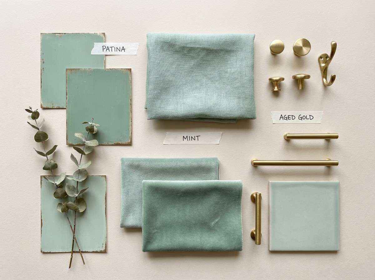
- verde patina
- ivory ink
- aubergine velvet
- seafoam mosaic
- sunlit marigold
- smoky pearl
- jade and gold filigree
- blush garden gate
- What Colors Go Well with Art Nouveau?
- How to Use a Art Nouveau Color Palette in Real Designs
- Create Art Nouveau Palette Visuals with AI
Why Art Nouveau Color Schemes Work So Well
Art Nouveau color schemes feel instantly decorative because they borrow from botanical life: leaf greens, petal pinks, and flower-like purples, often framed by ink-dark outlines. That organic base makes even simple layouts feel illustrated and intentional.
They also lean on “heritage neutrals” like parchment, ivory, clay, and patina—tones that soften contrast and make gold accents or jewel colors look more precious. This is why Art Nouveau color combinations translate so well to posters, packaging, and editorial graphics.
Finally, the style thrives on controlled drama: one deep anchor (near-black, charcoal, forest) plus a few midtones and a light background. That structure keeps ornate visuals readable and modern-friendly.
20+ Art Nouveau Color Palette Ideas (with HEX Codes)
1) Gilded Iris
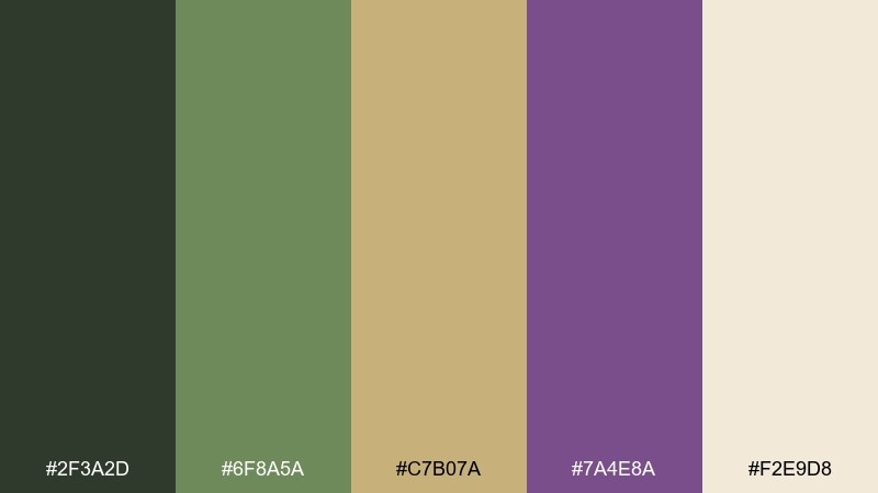
HEX: #2F3A2D #6F8A5A #C7B07A #7A4E8A #F2E9D8
Mood: romantic, ornate, vintage
Best for: wedding invitation design
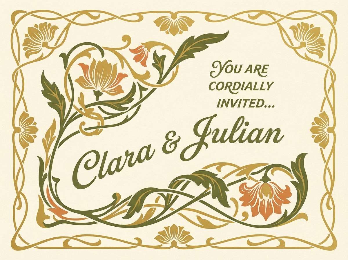
Romantic and ornate, these Art Nouveau tones feel like pressed irises, antique brass, and parchment. They shine on invitations, save-the-dates, and premium stationery where detail matters. Pair the purple with the gold for focal flourishes, and keep the cream as generous negative space. Usage tip: reserve the deepest green for typography so the gilded accents stay bright.
Image example of gilded iris generated using media.io
Media.io is an online AI studio for creating and editing video, image, and audio in your browser.

2) Peacock Fresco
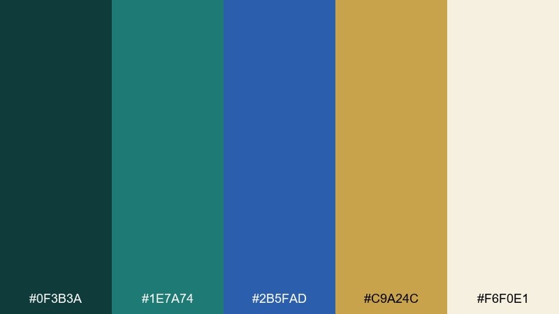
HEX: #0F3B3A #1E7A74 #2B5FAD #C9A24C #F6F0E1
Mood: opulent, artistic, lively
Best for: restaurant menu layout
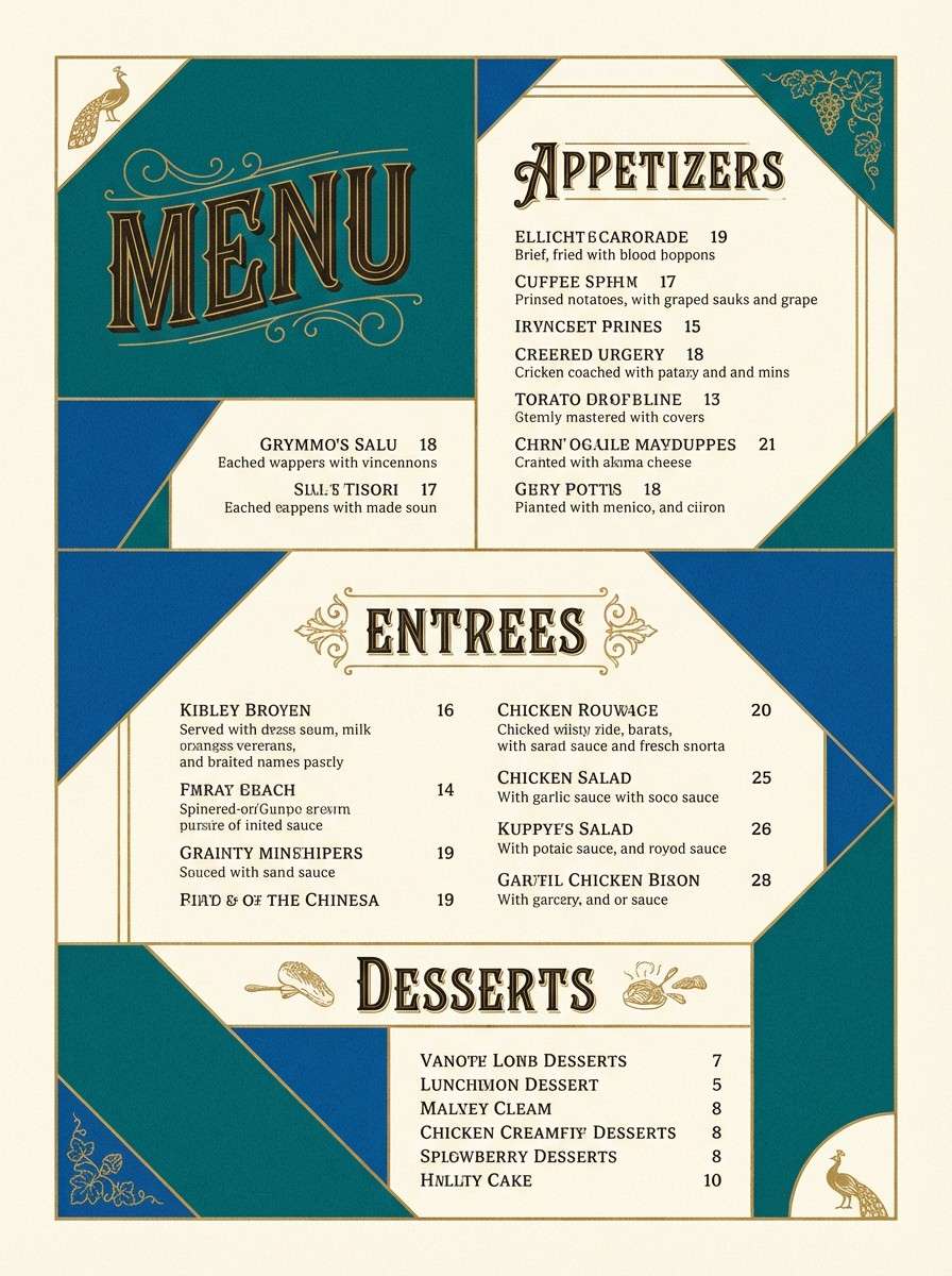
Opulent and lively, this mix recalls peacock feathers, glazed tiles, and warm gilt. It works beautifully for menus, bar programs, and hospitality branding that wants a confident jewel-tone punch. Let teal and blue take the lead, then use gold as the highlight for section headers and dividers. Usage tip: keep body text on the soft ivory so the saturated hues never feel heavy.
Image example of peacock fresco generated using media.io
3) Sage Stained Glass
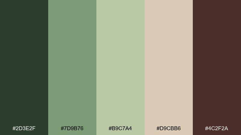
HEX: #2D3E2F #7D9B76 #B9C7A4 #D9CBB6 #4C2F2A
Mood: calm, natural, handcrafted
Best for: botanical watercolor print
Calm and handcrafted, these sage greens and clay browns evoke stained glass leaves in soft afternoon light. They suit botanical prints, packaging labels, and calm lifestyle content where subtle texture matters. Pair the darker green with the warm brown to frame the composition, and let the beige act like paper tone. Usage tip: add fine linework in the deepest green to keep watercolor washes feeling crisp.
Image example of sage stained glass generated using media.io
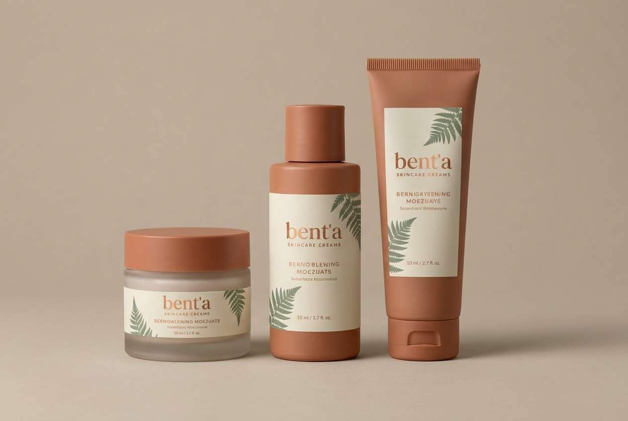
4) Copper Fern
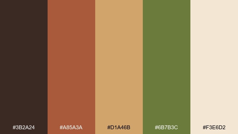
HEX: #3B2A24 #A85A3A #D1A46B #6B7B3C #F3E6D2
Mood: earthy, warm, artisanal
Best for: skincare product packaging
Earthy and artisanal, the copper and fern notes feel like apothecary labels and sun-warmed terracotta. This Art Nouveau color palette is a strong fit for skincare packaging, candle labels, and craft product branding. Use the cream as the base, then bring in copper for the logo mark and the muted green for secondary information. Usage tip: keep metallic effects subtle and matte so the palette stays vintage rather than flashy.
Image example of copper fern generated using media.io
5) Lilac Nouveau
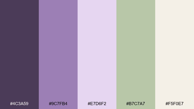
HEX: #4C3A59 #9C7FB4 #E7D6F2 #B7C7A7 #F5F0E7
Mood: soft, airy, romantic
Best for: UI landing page mockup
Soft and airy, lilac and pale orchid tones create a gentle, dreamy mood. These Art Nouveau colors work well for wellness apps, creative portfolios, and boutique ecommerce pages that need calm but not bland. Pair the deep plum with the sage for buttons and key UI states, then let the off-white do most of the heavy lifting. Usage tip: use the light lavender in large gradients, and keep contrast checks for accessibility.
Image example of lilac nouveau generated using media.io

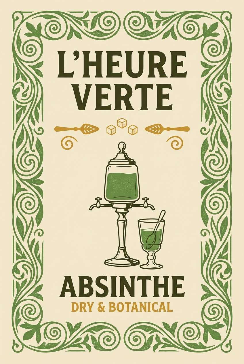
6) Amber Absinthe
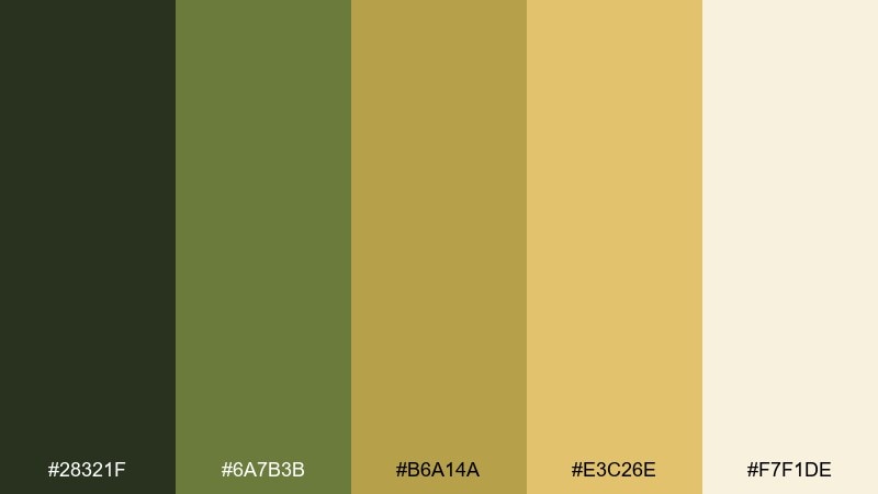
HEX: #28321F #6A7B3B #B6A14A #E3C26E #F7F1DE
Mood: vintage, spirited, luminous
Best for: cocktail poster design
Vintage and spirited, these absinthe greens and amber golds suggest smoky bars and glowing signage. They are ideal for cocktail posters, event flyers, and drink menus with a retro edge. Use the dark olive for big type, and reserve the brighter gold for small icon accents and price highlights. Usage tip: add a subtle grain texture to the cream background to make the palette feel printed and authentic.
Image example of amber absinthe generated using media.io
7) Rose Quartz Scroll
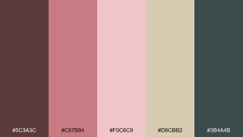
HEX: #5C3A3C #C97B84 #F0C6C9 #D8CBB2 #3B4A4B
Mood: tender, classic, elegant
Best for: bridal brand identity
Tender and classic, dusty rose and parchment beige feel like ribbon, wax seals, and hand-drawn scrollwork. This art nouveau color palette is a lovely match for bridal branding, monograms, and small business stationery sets. Let the charcoal-teal anchor the logo while rose shades carry supporting patterns and seals. Usage tip: keep accent lines thin so the softer tones stay refined rather than sweet.
Image example of rose quartz scroll generated using media.io
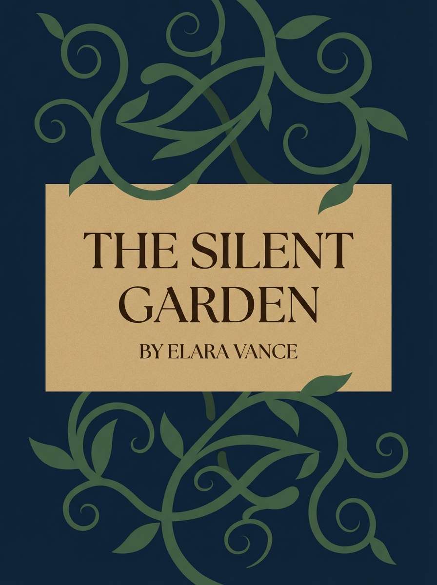
8) Midnight Vine
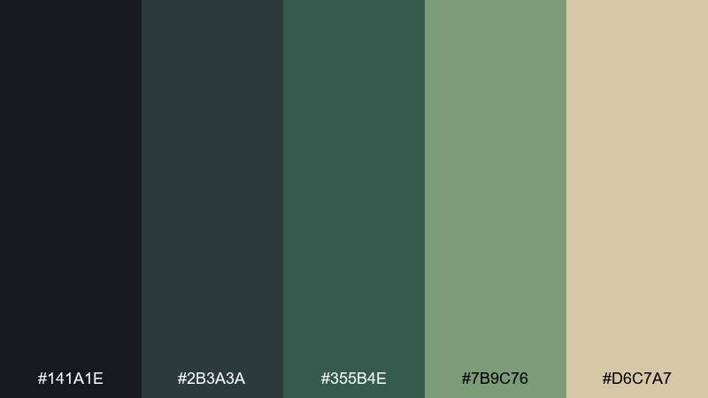
HEX: #141A1E #2B3A3A #355B4E #7B9C76 #D6C7A7
Mood: moody, botanical, sophisticated
Best for: book cover design
Moody and sophisticated, these shadowy greens read like vines at dusk against aged paper. They fit book covers, podcast artwork, and premium editorial graphics where atmosphere is the point. Pair the pale sand tone with the near-black for legible titles, and use the mid greens for illustrated foliage. Usage tip: add a single light highlight around the title block to prevent the dark base from swallowing details.
Image example of midnight vine generated using media.io
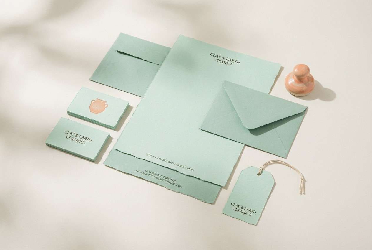
9) Celadon Cameo
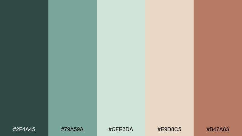
HEX: #2F4A45 #79A59A #CFE3DA #E9D8C5 #B47A63
Mood: fresh, graceful, curated
Best for: ceramics shop stationery set
Fresh and graceful, celadon greens with cameo peach feel like glazed pottery and soft linen. This pairing suits stationery, small shop packaging, and calm social templates. Use the peach as a sparing accent for seals or icons, while the pale mint keeps layouts open and airy. Usage tip: stick to rounded shapes and thin borders to echo the gentle, handcrafted vibe.
Image example of celadon cameo generated using media.io
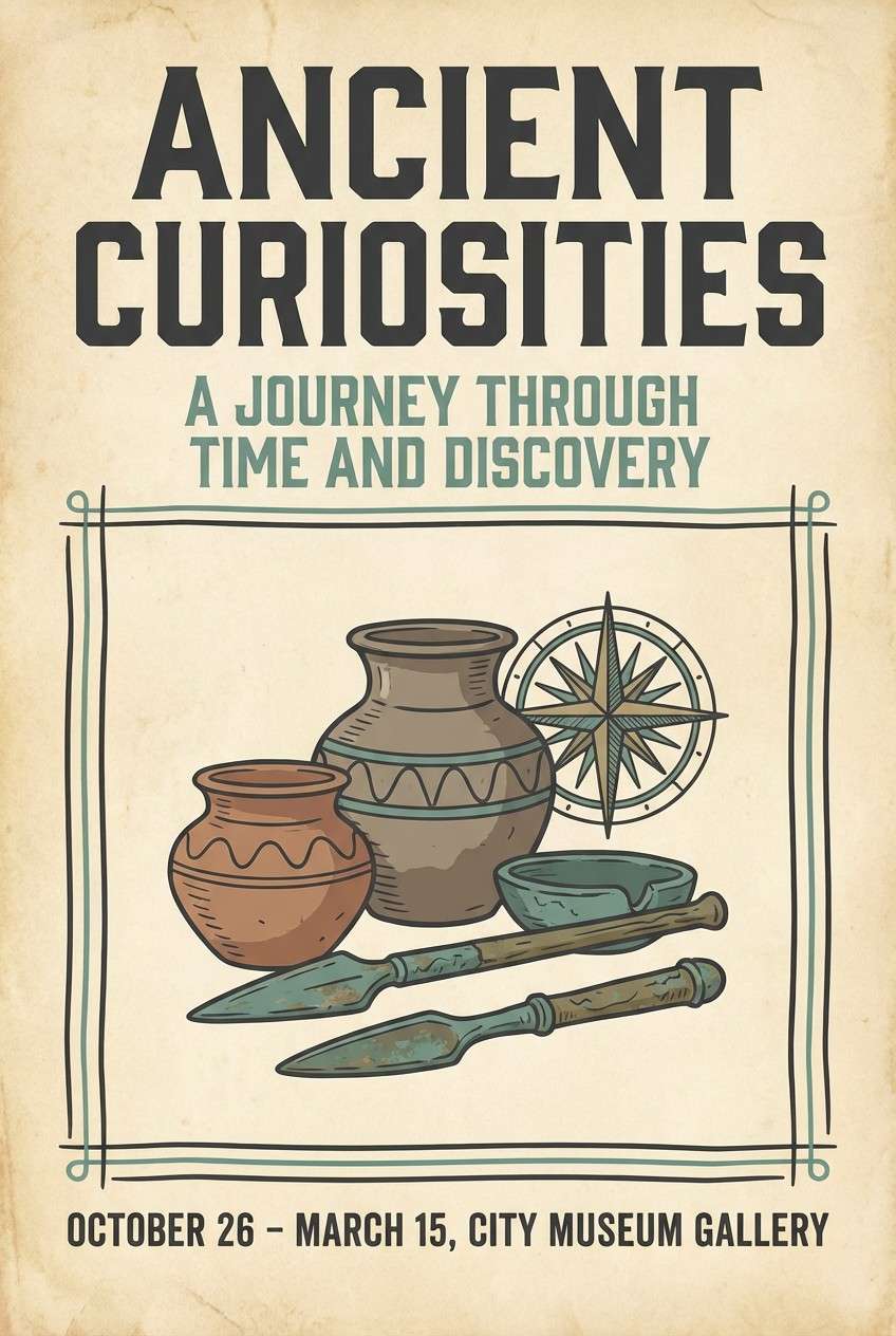
10) Golden Parchment
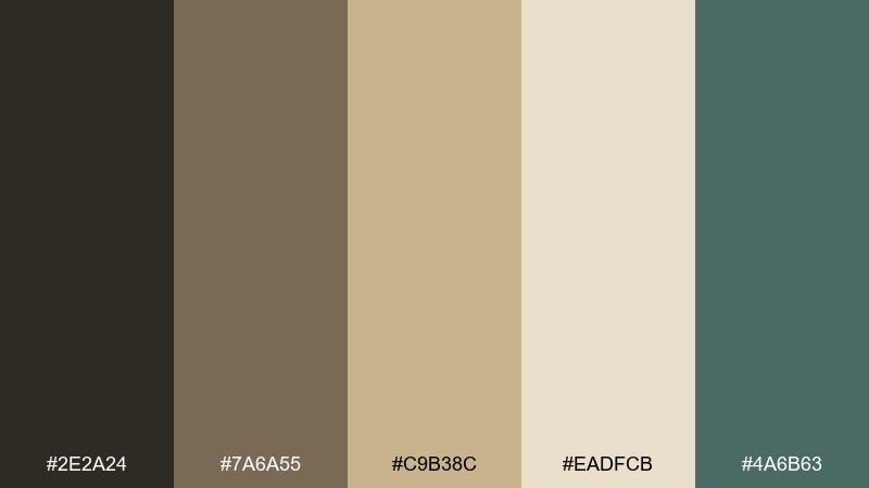
HEX: #2E2A24 #7A6A55 #C9B38C #EADFCB #4A6B63
Mood: heritage, quiet, refined
Best for: museum exhibit poster
Heritage and refined, these neutrals feel like archival paper, worn leather, and muted patina. They are ideal for museum posters, gallery signage, and cultural event branding that needs authority without stiffness. Let the parchment tones carry the background, and use the deep charcoal for titles with patina teal for small directional cues. Usage tip: keep photography warm-toned so it harmonizes with the gold-beige midpoints.
Image example of golden parchment generated using media.io
11) Opal Orchid
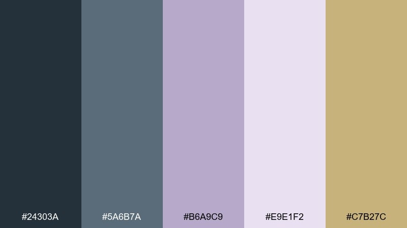
HEX: #24303A #5A6B7A #B6A9C9 #E9E1F2 #C7B27C
Mood: polished, airy, editorial
Best for: magazine spread layout
Polished and airy, opal lavender and slate blue suggest elegant ink work with a hint of gold leaf. This Art Nouveau color scheme is well suited to editorial layouts, lookbooks, and portfolio spreads that need softness without losing structure. Use slate for headlines, keep body copy on the pale lavender-white, and add gold as a restrained pull-quote accent. Usage tip: repeat one curved motif across pages to tie the layout together cleanly.
Image example of opal orchid generated using media.io
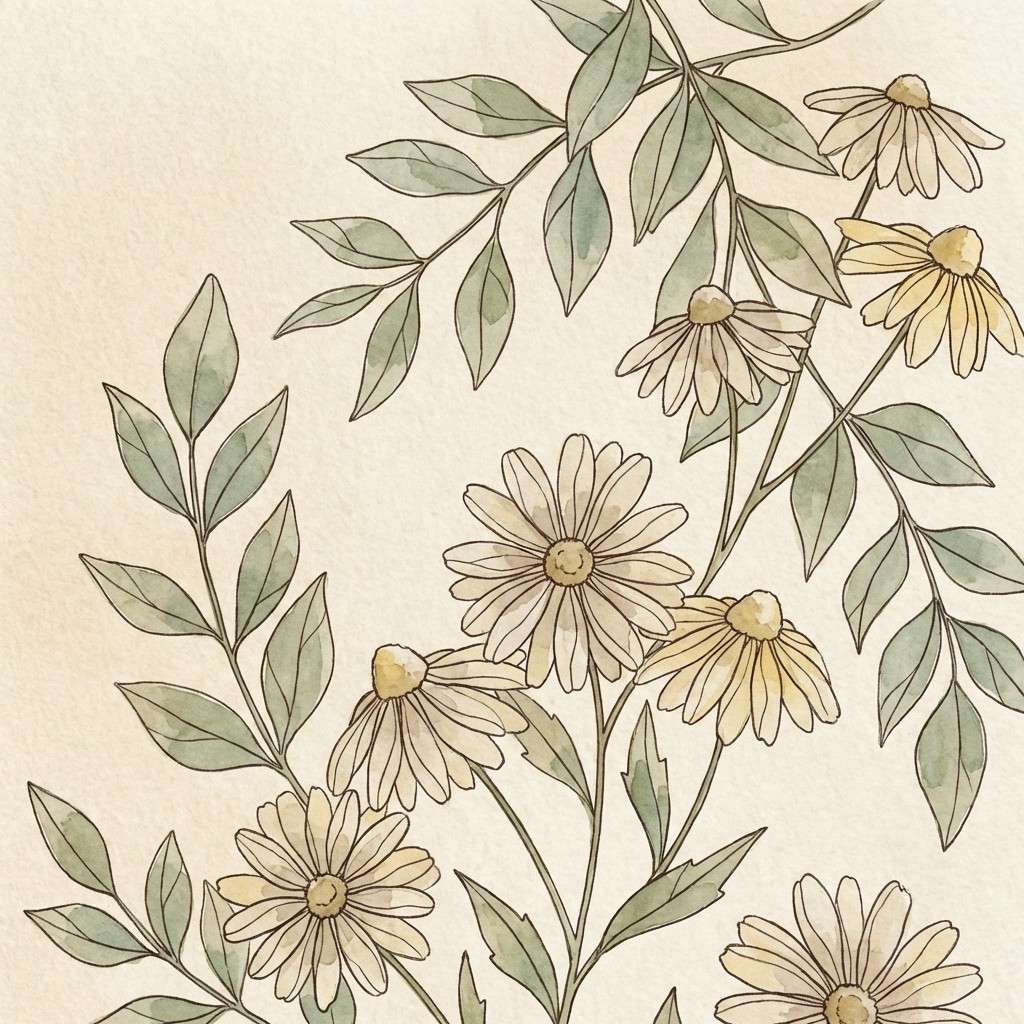
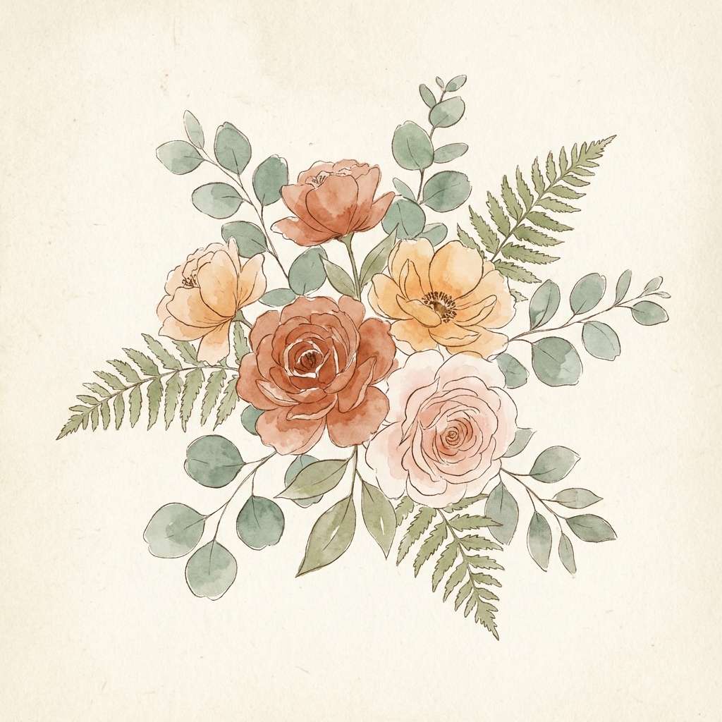
12) Terracotta Bouquet
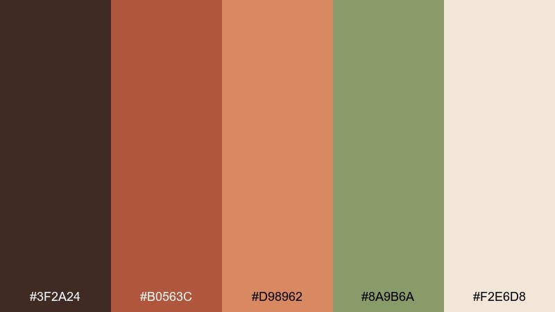
HEX: #3F2A24 #B0563C #D98962 #8A9B6A #F2E6D8
Mood: warm, sunny, floral
Best for: spring watercolor illustration
Warm and sunny, terracotta and apricot tones look like petals catching late-day light. They are perfect for spring illustrations, greeting cards, and handmade market posters. Pair the leafy green with the deeper brown to outline stems and add contrast, then keep the cream as paper texture. Usage tip: limit the darkest brown to small details so the bouquet stays light and buoyant.
Image example of terracotta bouquet generated using media.io
13) Verde Patina
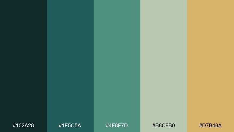
HEX: #102A28 #1F5C5A #4F8F7D #B8C8B0 #D7B46A
Mood: architectural, cool, collected
Best for: interior design mood board
Architectural and collected, these greens feel like oxidized metal, tiled facades, and quiet courtyards. They are great for interior mood boards, tile and paint presentations, and design proposals. Use the near-black green to frame swatches, and bring in the warm gold as a small accent for hardware or lighting notes. Usage tip: keep materials matte and textured to make the patina tones feel believable.
Image example of verde patina generated using media.io
14) Ivory Ink
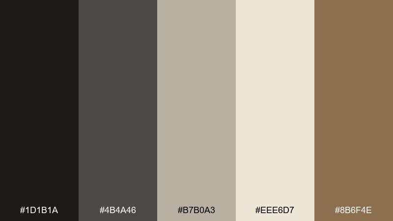
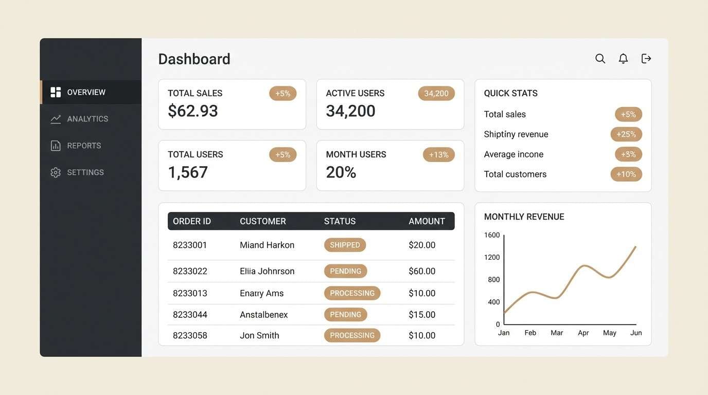
HEX: #1D1B1A #4B4A46 #B7B0A3 #EEE6D7 #8B6F4E
Mood: minimal, timeless, grounded
Best for: dashboard UI design
Minimal and timeless, these ink-and-ivory tones evoke letterpress prints and quiet library shelves. They work for dashboards, portfolios, and documentation sites where readability is non-negotiable. Use ivory for the canvas, charcoal for text, and warm tan for subtle badges or progress indicators. Usage tip: introduce hierarchy through spacing and weight first, then add color as the finishing touch.
Image example of ivory ink generated using media.io
15) Aubergine Velvet
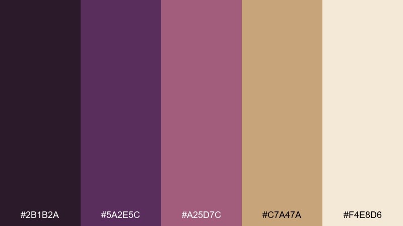
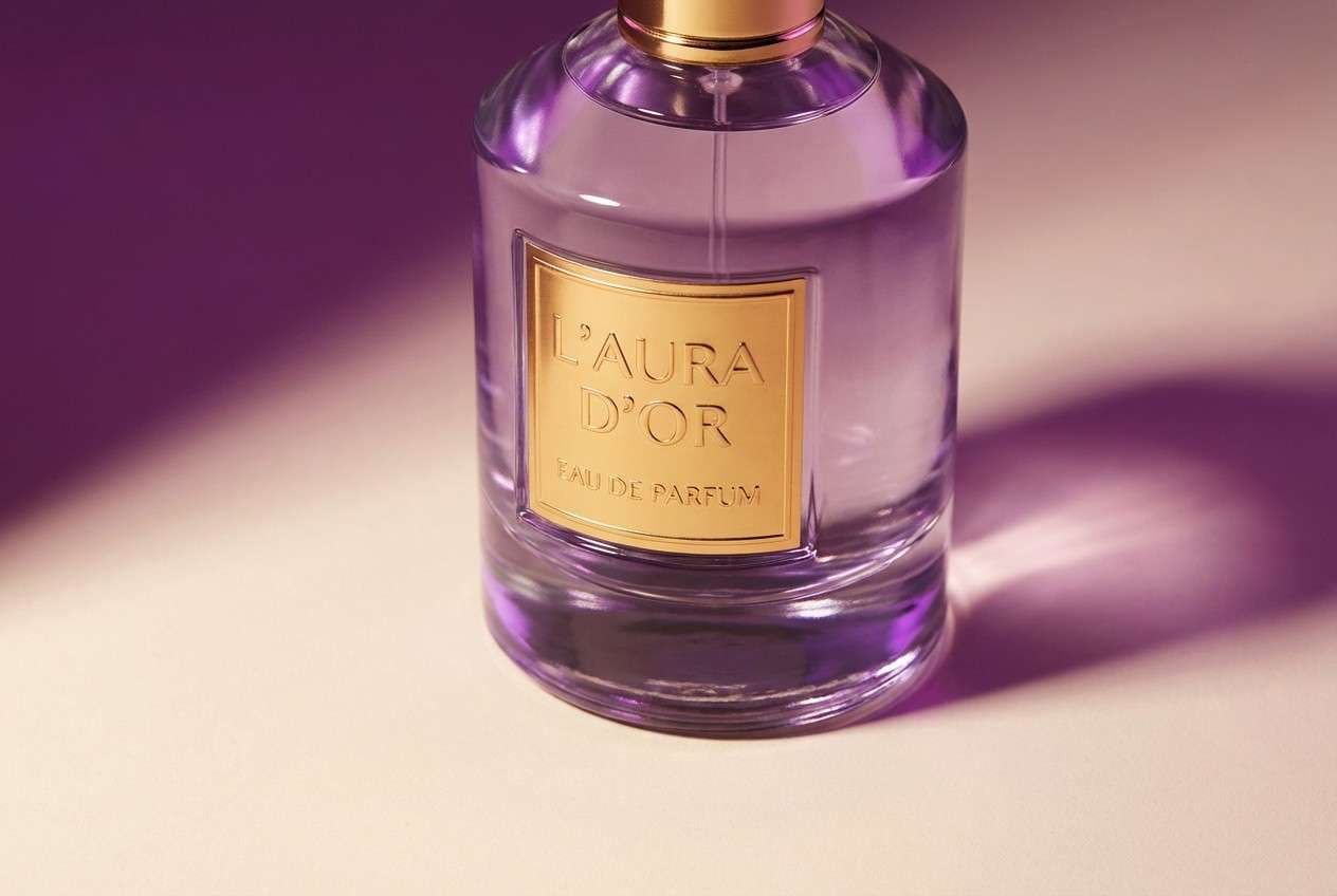
HEX: #2B1B2A #5A2E5C #A25D7C #C7A47A #F4E8D6
Mood: dramatic, luxe, sensual
Best for: luxury perfume advertisement
Dramatic and luxe, aubergine and rose-mauve feel like velvet curtains and candlelit glass. These Art Nouveau tones suit perfume ads, premium packaging, and campaign visuals that want richness without neon. Pair the gold with the deepest purple for high-end contrast, and keep the cream as the studio backdrop. Usage tip: add glossy highlights on the bottle only, so the surrounding tones stay soft and expensive.
Image example of aubergine velvet generated using media.io
16) Seafoam Mosaic
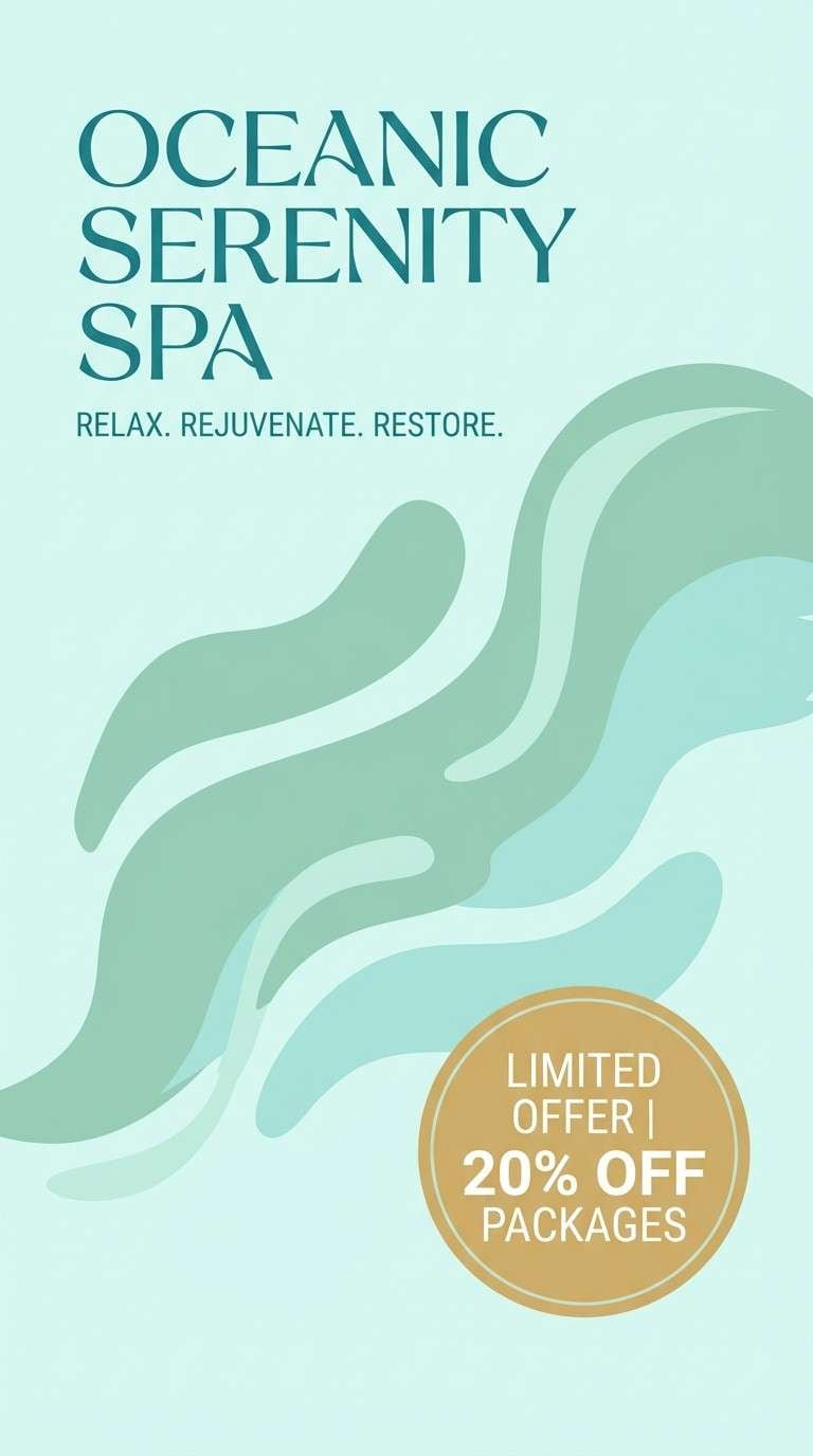
HEX: #16333A #2A6B73 #78B7B0 #D3E8E3 #E3C08A
Mood: refreshing, clean, coastal
Best for: spa flyer design
Refreshing and clean, seafoam tones look like rippling water over mosaic tile. They are a natural fit for spa flyers, wellness promotions, and skincare launches that need a calm, hygienic feel. Use the pale aqua as the background, then bring in teal for headlines and the warm sand-gold for a single callout. Usage tip: keep shapes rounded and airy so the design feels breathable.
Image example of seafoam mosaic generated using media.io
17) Sunlit Marigold
HEX: #3A2B1A #8A5B2E #D7A13A #F0D58A #F7F1E4
Mood: cheerful, warm, nostalgic
Best for: kids room wall art
Cheerful and nostalgic, these marigold tones feel like storybook sunshine and honeyed wood. They work well for kids room prints, playful posters, and family-friendly packaging. Pair the rich brown with the bright gold for strong outlines, and use the pale butter-yellow to fill larger shapes. Usage tip: keep contrast bold in the illustration so the palette reads clearly from across the room.
Image example of sunlit marigold generated using media.io

18) Smoky Pearl
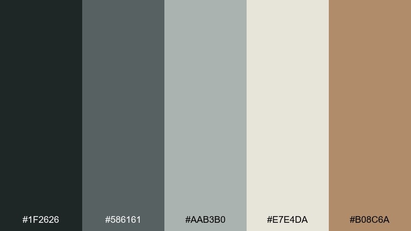
HEX: #1F2626 #586161 #AAB3B0 #E7E4DA #B08C6A
Mood: modern, muted, confident
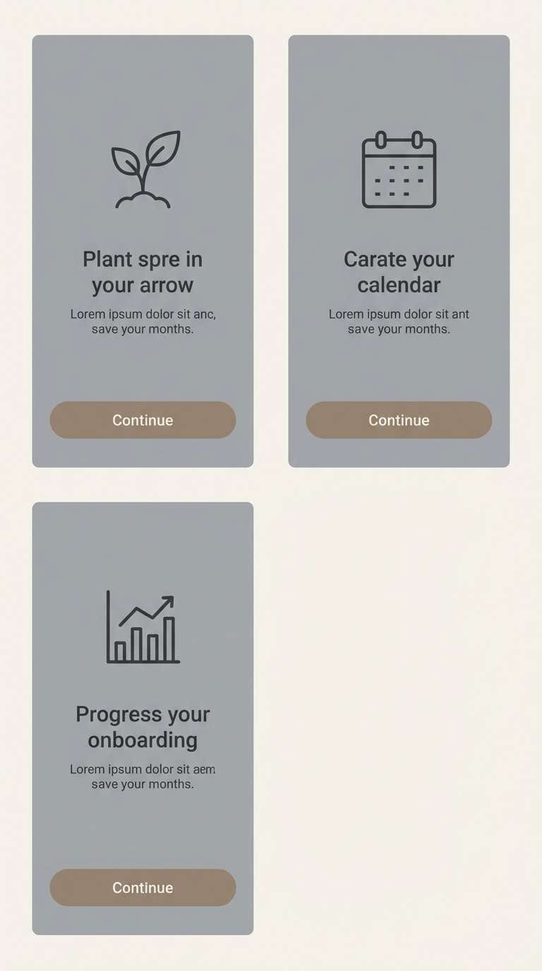
Best for: app onboarding screens
Modern and muted, smoky grays with warm taupe feel like polished stone and soft pearl sheen. This art nouveau color scheme translates nicely into onboarding screens, where calm structure helps content feel trustworthy. Let the pearl off-white be the base, use charcoal for type, and reserve taupe for one key button or progress marker. Usage tip: add gentle gradients within the gray range to create depth without adding new colors.
Image example of smoky pearl generated using media.io
19) Jade and Gold Filigree
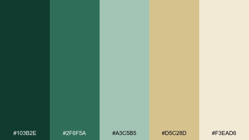
HEX: #103B2E #2F6F5A #A3C5B5 #D5C28D #F3EAD6
Mood: regal, intricate, botanical
Best for: jewelry brand packaging
Regal and intricate, jade greens with antique gold suggest filigree patterns and heirloom boxes. These Art Nouveau color combinations are ideal for jewelry packaging, tags, and boutique unboxing moments. Keep the cream as the carton base, then use jade for patterning and gold for a restrained logo stamp. Usage tip: scale the pattern up slightly so it reads as elegant ornament, not visual noise.
Image example of jade and gold filigree generated using media.io

20) Blush Garden Gate
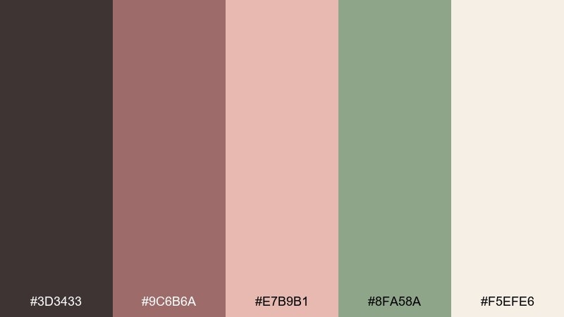
HEX: #3D3433 #9C6B6A #E7B9B1 #8FA58A #F5EFE6
Mood: welcoming, soft, vintage
Best for: cafe menu design
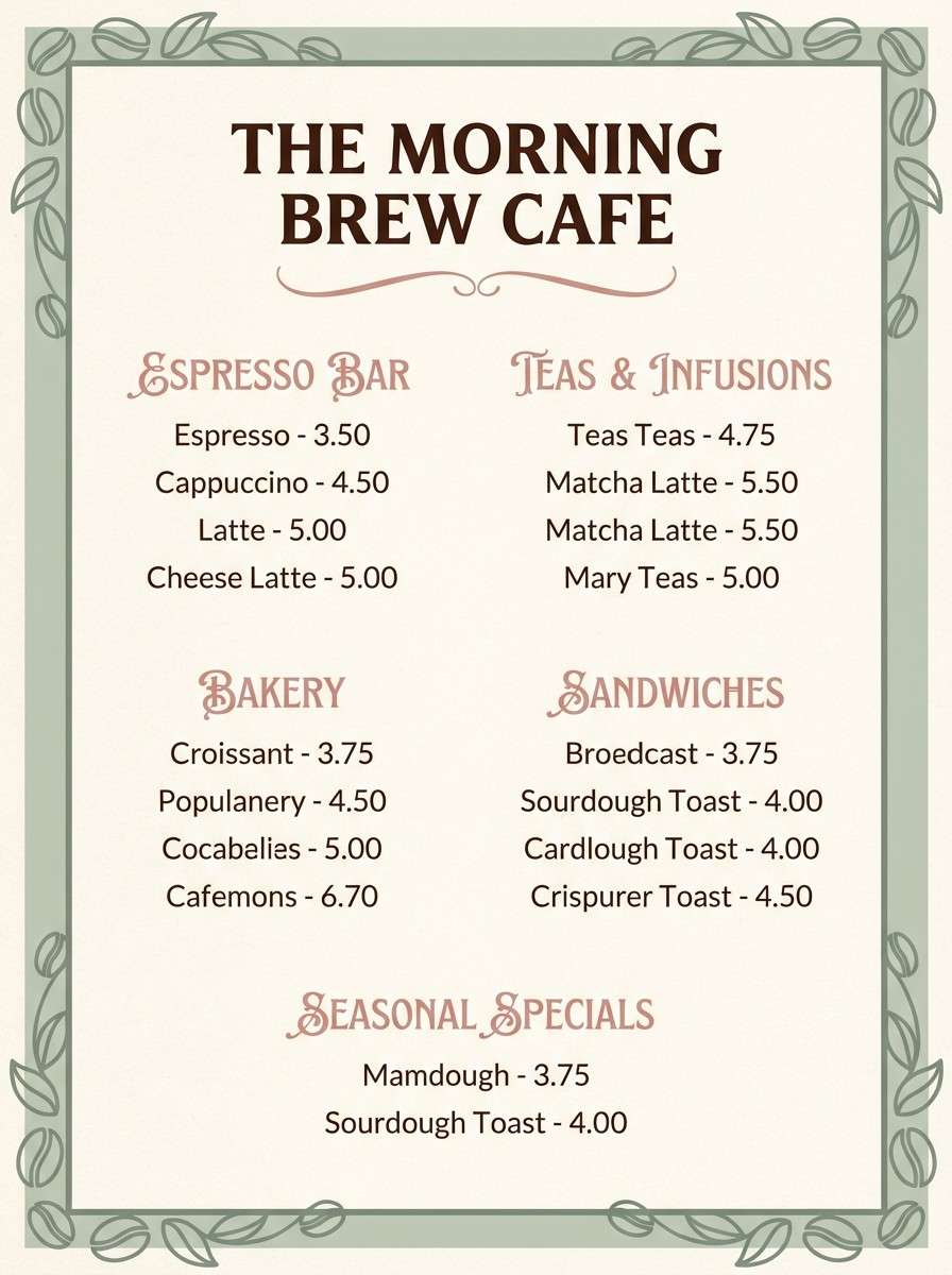
Welcoming and soft, blush pink with muted sage feels like climbing roses over a wrought gate. This Art Nouveau color palette suits cafe menus, dessert labels, and cozy neighborhood branding. Use the deep brown for readability, then bring in blush for section headers and sage for small icons or borders. Usage tip: keep photos warm and lightly desaturated so they blend seamlessly with the vintage tones.
Image example of blush garden gate generated using media.io
What Colors Go Well with Art Nouveau?
Art Nouveau colors pair best when you combine a botanical base (sage, moss, celadon, teal) with a warm “printed” neutral (ivory, parchment, beige). That contrast echoes vintage posters and stained-glass-inspired motifs.
For accents, choose one jewel tone (aubergine, cobalt, peacock blue) or a restrained metallic-like hue (antique gold, warm ochre). Keeping accents small makes ornate details feel intentional instead of busy.
To modernize the look, anchor the palette with near-black/charcoal for typography and UI elements. This creates readability and lets curves, borders, and flourishes stand out.
How to Use a Art Nouveau Color Palette in Real Designs
Start with the background: Art Nouveau designs often look best on cream, parchment, or soft off-white—like paper. Use that as your main canvas so curved borders and florals don’t feel heavy.
Next, assign roles to colors: one dark for text and outlines, two midtones for fills and sections, one accent for highlights, and one light neutral for breathing room. This role-based approach keeps your Art Nouveau color scheme consistent across layouts.
Finally, match finish to mood: matte textures, subtle grain, and gentle gradients make these vintage design colors feel authentic. Use glossy effects sparingly (like on a product hero element) so the palette stays timeless.
Create Art Nouveau Palette Visuals with AI
If you want to preview an Art Nouveau color palette before committing to a full design, generate quick visuals with AI—menus, posters, UI screens, packaging shots, and more. This helps you test contrast, ornament density, and overall mood in minutes.
Reuse the prompts above and simply swap in your subject (invitation, perfume ad, museum poster) to keep results stylistically consistent. You can also iterate variations by changing one accent color (gold vs. copper, teal vs. sage) while keeping the same composition.
When your draft looks right, export and refine in your design tool—keeping the HEX codes locked for brand consistency across print and digital.
Art Nouveau Color Palette FAQs
-
What defines an Art Nouveau color palette?
An Art Nouveau color palette typically combines nature-led greens (sage, moss, celadon), warm paper-like neutrals (ivory, parchment, beige), and a restrained accent such as antique gold or a jewel tone (aubergine, cobalt, peacock teal). -
Are Art Nouveau colors good for modern UI design?
Yes—use an off-white background, charcoal text for accessibility, and keep ornament-inspired colors (teal, lilac, gold) for buttons, badges, and section headers so the interface stays readable. -
What are the best Art Nouveau colors for posters?
Deep greens or charcoal for typography, a warm cream/parchment base, and one bold accent like gold, cobalt, or aubergine. This combo mimics vintage print contrast and makes decorative borders pop. -
How do I keep an Art Nouveau color scheme from looking too busy?
Limit strong accents to 5–10% of the layout, keep most areas in neutrals, and reserve the darkest color for outlines and type. Repetition (same border color, same highlight hue) also reduces visual noise. -
Do Art Nouveau palettes work for packaging?
They’re a strong fit for premium packaging because parchment neutrals and antique gold feel “heritage,” while botanical greens suggest craftsmanship. Use matte textures and fine linework for a refined finish. -
What’s a safe dark text color for Art Nouveau palettes?
Near-black charcoals and deep green-blacks (like #141A1E or #102A28) usually read better than pure black while still delivering strong contrast on cream backgrounds. -
Can I generate Art Nouveau-style visuals from HEX palettes?
Yes—feed your prompt with the subject and style (floral scrollwork, stained-glass shapes, gilded accents) and then apply your HEX palette during refinement. Media.io makes it easy to iterate quickly and compare variations.


