

Carolina blue is a clear, friendly blue that instantly feels open and modern. It’s light enough to keep layouts airy, but still saturated enough to lead a brand.
Below are 20 Carolina blue color palette ideas with HEX codes, plus practical ways to use them in UI, print, and interiors.
In this article
Why Carolina Blue Palettes Work So Well
Carolina blue sits in a “sweet spot” between soft sky blues and more corporate navies. That balance makes it feel approachable while still communicating stability and clarity.
It also plays well with both warm and cool partners: creamy off-whites keep it fresh, charcoals sharpen legibility, and accents like coral, gold, or teal add energy without breaking trust.
In digital design, Carolina blue is especially useful for creating hierarchy—light tints for surfaces, deeper blues for states and headings—so interfaces feel calm instead of noisy.
20+ Carolina Blue Color Palette Ideas (with HEX Codes)
1) Coastal Campus
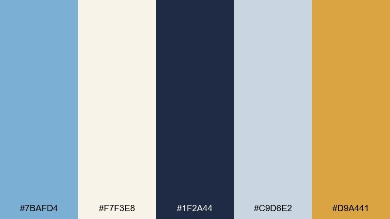
HEX: #7BAFD4 #F7F3E8 #1F2A44 #C9D6E2 #D9A441
Mood: breezy, confident, collegiate
Best for: university branding landing page
Breezy and confident, it feels like a sunny quad with ocean air in the distance. This carolina blue color palette balances clarity with authority by anchoring light blues in navy and soft stone neutrals. Use the gold as a sparing accent for CTAs, seals, or key stats. Tip: keep backgrounds off-white to maintain contrast and accessibility while letting the blue lead.
Image example of coastal campus generated using media.io

Media.io is an online AI studio for creating and editing video, image, and audio in your browser.

2) Skywashed Minimal
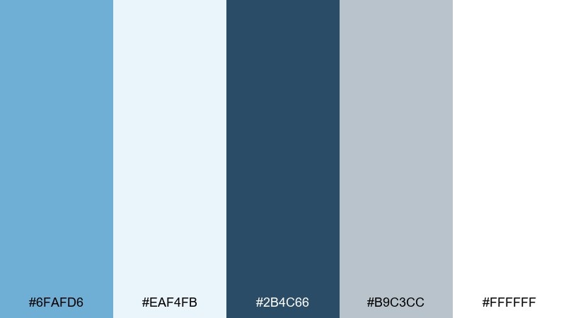
HEX: #6FAFD6 #EAF4FB #2B4C66 #B9C3CC #FFFFFF
Mood: clean, airy, modern
Best for: saas dashboard ui
Clean and airy, it reads like open sky and polished glass. The pale tints make dense dashboards feel lighter while the deep slate-blue keeps labels legible. Pair it with generous white space and simple icon strokes for a calm, modern rhythm. Tip: reserve the darkest tone for headings and active states to avoid visual fatigue.
Image example of skywashed minimal generated using media.io

3) Harbor Dusk
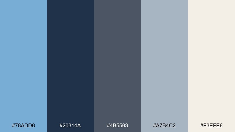
HEX: #78ADD6 #20314A #4B5563 #A7B4C2 #F3EFE6
Mood: moody, refined, editorial
Best for: magazine feature layout
Moody and refined, it evokes a harbor at dusk with steel-blue shadows and soft light on paper. The darker tones build structure for long-form typography while the blue keeps the page feeling fresh instead of heavy. Pair it with warm off-white stock and restrained photo treatments for a premium look. Tip: use the light gray-blue for pull quotes and section dividers to guide the eye.
Image example of harbor dusk generated using media.io
4) Peach Pier
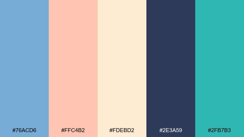
HEX: #76ACD6 #FFC4B2 #FDEBD2 #2E3A59 #2FB7B3
Mood: playful, sunny, inviting
Best for: summer event poster
Playful and sunny, it feels like pastel lights along a pier and warm sand underfoot. These carolina blue color combinations work especially well when the peach is treated as the friendly highlight against a soft cream base. Add the teal for small energetic details like dates, icons, or separators. Tip: keep the navy for title text so the poster stays readable from a distance.
Image example of peach pier generated using media.io

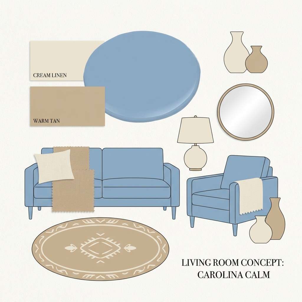
5) Linen and Lake
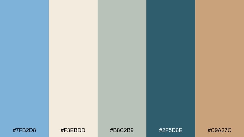
HEX: #7FB2D8 #F3EBDD #B8C2B9 #2F5D6E #C9A27C
Mood: calm, natural, homey
Best for: living room paint and decor plan
Calm and natural, it suggests linen curtains, pale wood, and a quiet lake view. The blue is soft enough for larger wall areas, while the deeper teal grounds trim, shelving, or built-ins. Pair with warm tan textures like rattan, oak, or leather to prevent the room from feeling too cool. Tip: repeat the tan in small decor pieces to tie the palette together without clutter.
Image example of linen and lake generated using media.io
6) Retro Poolside
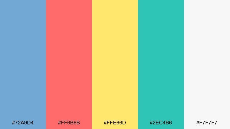
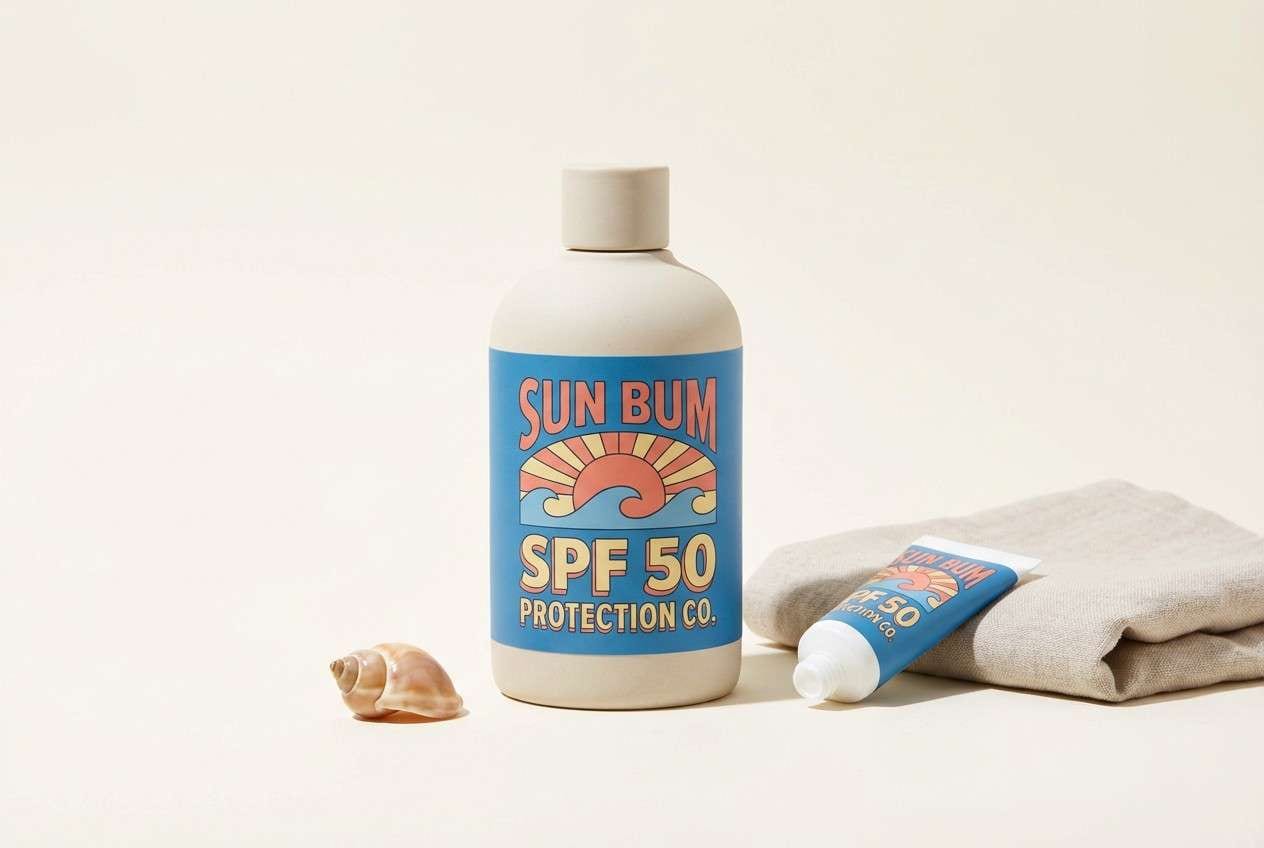
HEX: #72A9D4 #FF6B6B #FFE66D #2EC4B6 #F7F7F7
Mood: retro, energetic, summery
Best for: sunscreen packaging design
Retro and energetic, it brings to mind pool tiles, fruity popsicles, and bright sun. The blue keeps the composition cool while coral and yellow add instant shelf pop. Pair with simple geometric shapes and generous white space so the accents feel intentional. Tip: use coral for the brand mark and yellow for small benefit callouts like SPF or water resistant.
Image example of retro poolside generated using media.io
7) Stormy Slate
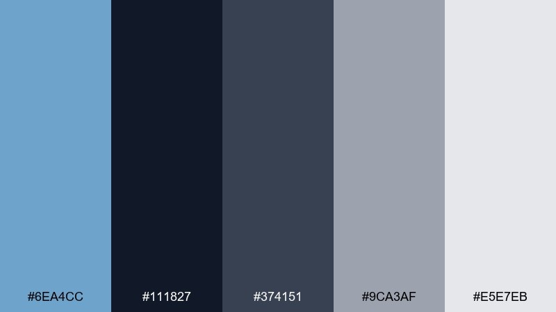
HEX: #6EA4CC #111827 #374151 #9CA3AF #E5E7EB
Mood: serious, sleek, tech-forward
Best for: fintech app interface
Serious and sleek, it feels like rainclouds clearing to a sharp blue horizon. The dark base creates trust and focus, while the blue gives just enough lift for primary actions. Pair with subtle gradients and thin dividers to keep the UI feeling premium. Tip: use the light gray for secondary surfaces so your dark screens do not look flat.
Image example of stormy slate generated using media.io
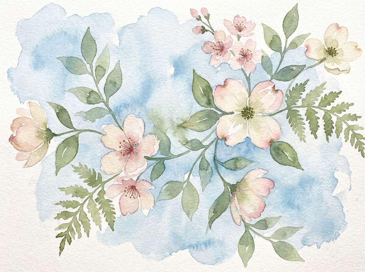
8) Botanical Breeze
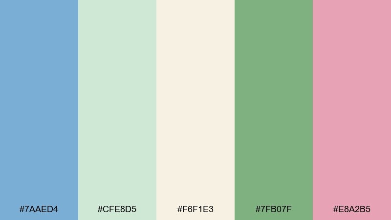
HEX: #7AAED4 #CFE8D5 #F6F1E3 #7FB07F #E8A2B5
Mood: fresh, gentle, springlike
Best for: watercolor floral illustration
Fresh and gentle, it looks like new leaves, soft petals, and a pale blue spring sky. The creamy neutral keeps the greens and blush from competing, so the artwork feels airy and balanced. Pair the deeper green with fine linework for stems and leaves, then let blush appear in small blooms. Tip: keep the blue as a light wash in the background to unify the composition.
Image example of botanical breeze generated using media.io
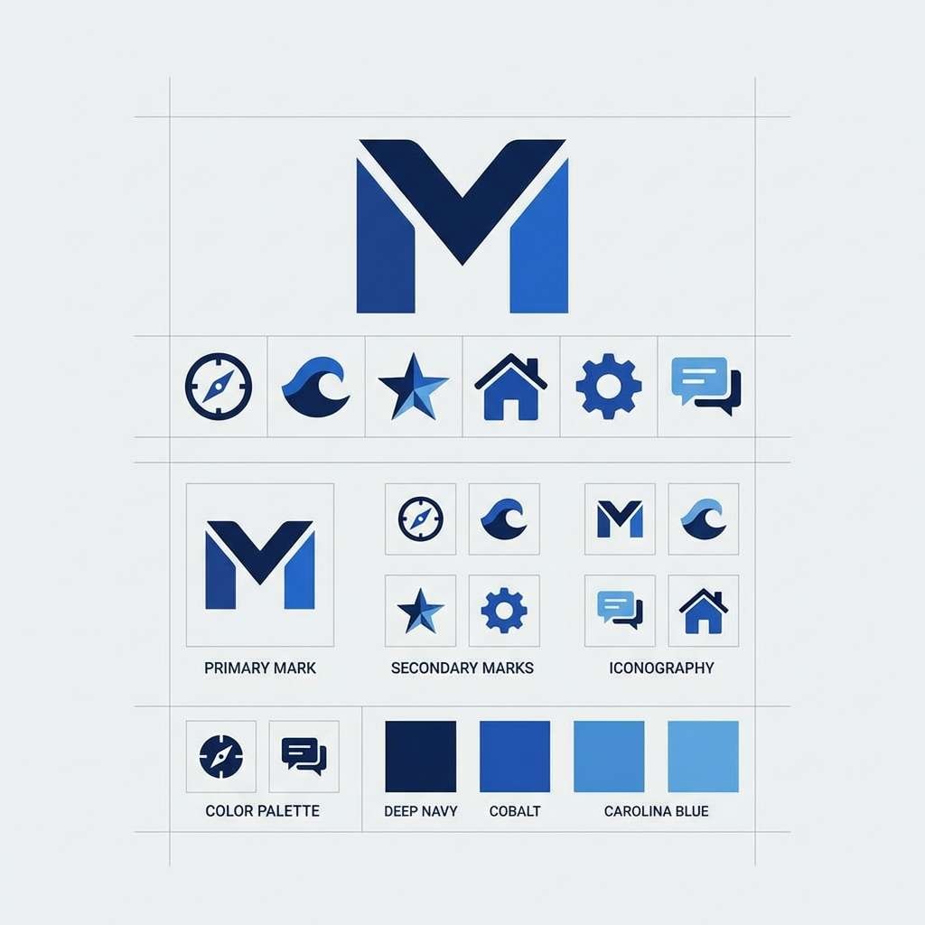
9) Chalk and Cobalt
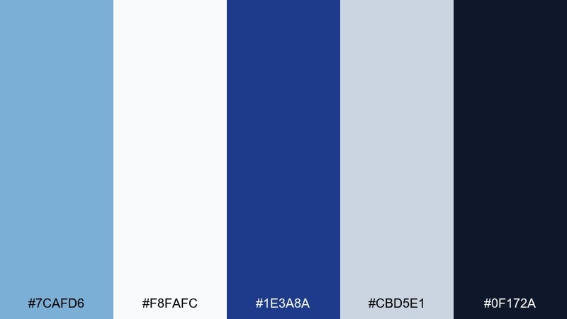
HEX: #7CAFD6 #F8FAFC #1E3A8A #CBD5E1 #0F172A
Mood: crisp, high-contrast, confident
Best for: minimal logo and icon set
Crisp and confident, it feels like chalk on a bright board with a strong cobalt punch. The darker blues provide excellent contrast for marks, icons, and wordmarks that need to scale down cleanly. Pair with plenty of white and keep gradients off to maintain a sharp identity. Tip: test your logo in one-color navy first, then reintroduce the lighter blue as a secondary brand tone.
Image example of chalk and cobalt generated using media.io
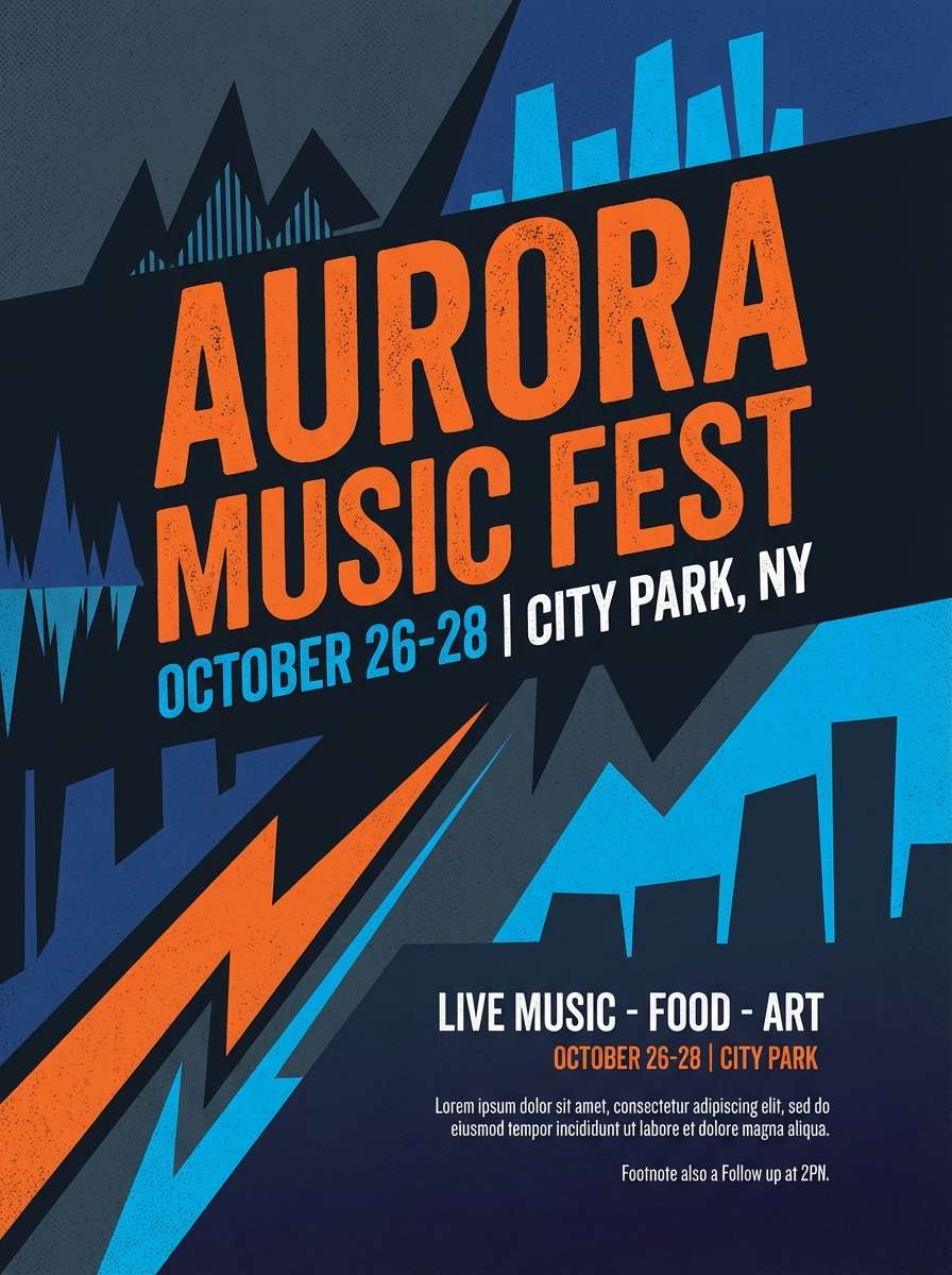
10) Night Boardwalk
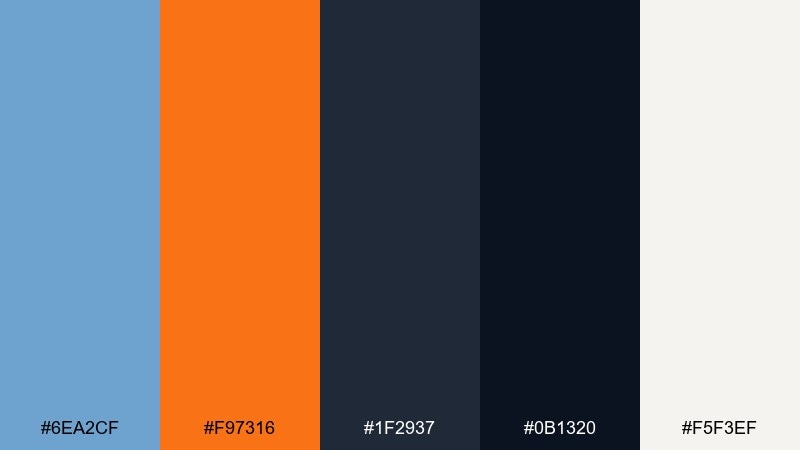
HEX: #6EA2CF #F97316 #1F2937 #0B1320 #F5F3EF
Mood: bold, nocturnal, cinematic
Best for: music festival flyer
Bold and cinematic, it captures neon signage against a dark night sky. The bright orange works as an attention magnet, while the blue keeps the mood cool and modern. Pair with heavy typography and sharp shapes for a flyer that feels loud without becoming messy. Tip: place orange only on the headline and one key detail so the dark background stays dominant.
Image example of night boardwalk generated using media.io
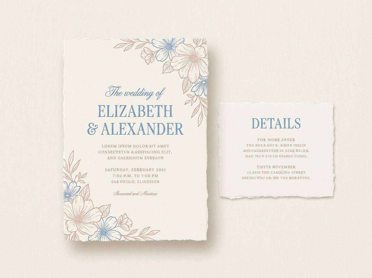
11) Seaside Wedding
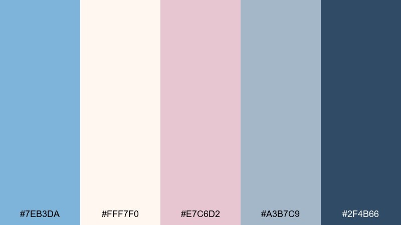
HEX: #7EB3DA #FFF7F0 #E7C6D2 #A3B7C9 #2F4B66
Mood: romantic, soft, elegant
Best for: wedding invitation suite
Romantic and soft, it recalls sea glass, blush roses, and handwritten notes on cream paper. The pale blue and blush pair beautifully for invitations, menus, and place cards with a light, elegant touch. Use the deeper blue for names and headings to keep the suite readable in print. Tip: choose a slightly textured cream stock so the pastel tones feel richer and less flat.
Image example of seaside wedding generated using media.io
12) Ice Cream Parlor
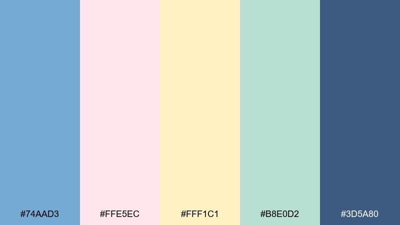
HEX: #74AAD3 #FFE5EC #FFF1C1 #B8E0D2 #3D5A80
Mood: sweet, nostalgic, cheerful
Best for: cafe menu design
Sweet and nostalgic, it feels like a vintage ice cream shop with pastel scoops and clean counters. This carolina blue color palette shines in menus when the darker blue is used for pricing and section headers. Pair the mint and soft yellow as background blocks to group items without harsh lines. Tip: keep body text in the deep blue and avoid pure black for a gentler look.
Image example of ice cream parlor generated using media.io
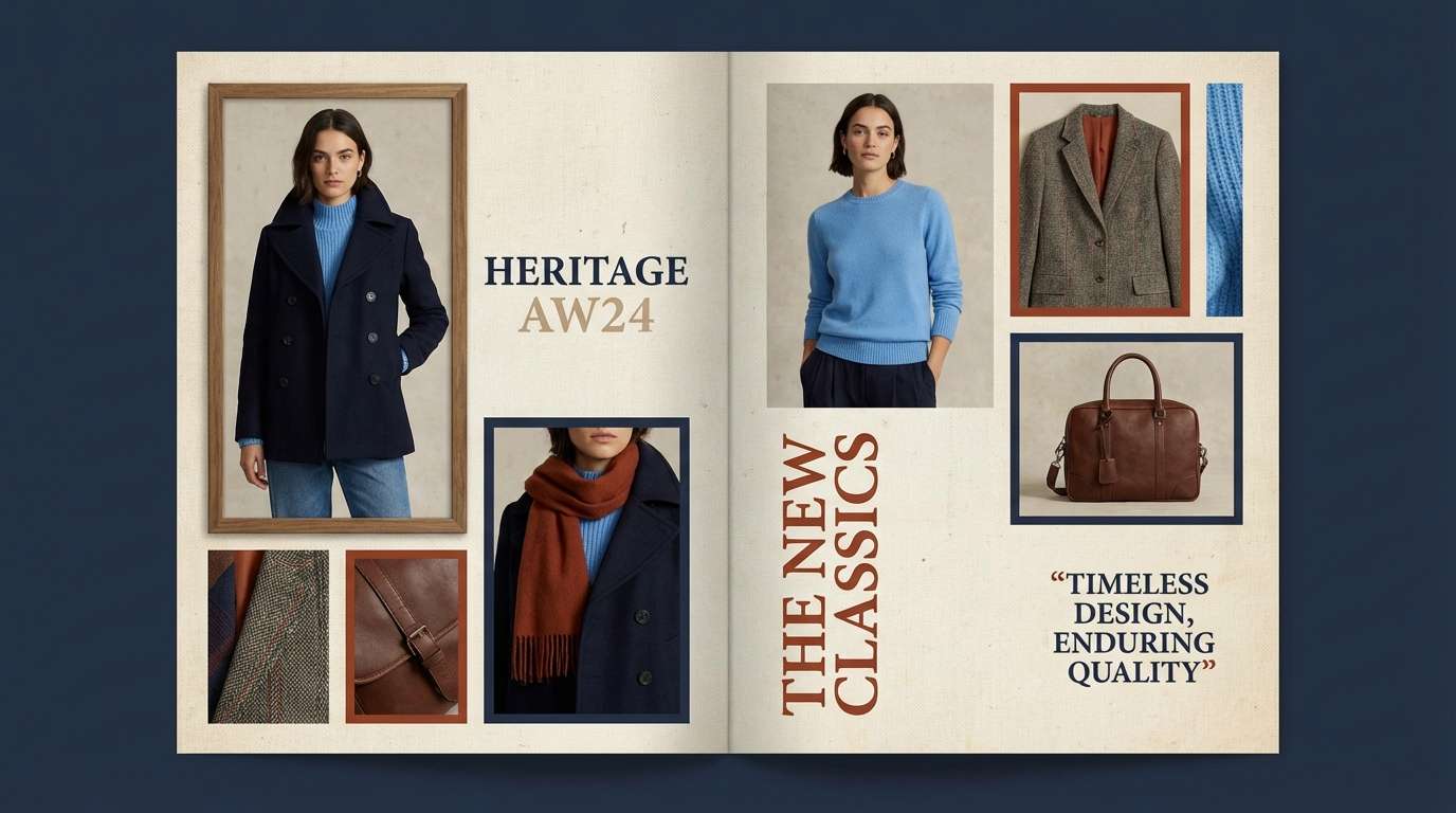
13) Nautical Heritage
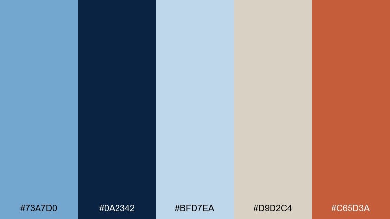
HEX: #73A7D0 #0A2342 #BFD7EA #D9D2C4 #C65D3A
Mood: classic, rugged, timeless
Best for: clothing brand lookbook
Classic and rugged, it evokes navy uniforms, weathered canvas, and coastal brick. The light blue works as a fresh accent on top of deep navy, while the warm rust keeps the palette grounded and masculine. Pair with grainy photography and serif headlines for a heritage feel. Tip: use rust only for small tags or section markers so the blues remain the main identity.
Image example of nautical heritage generated using media.io
14) Tech Cloud
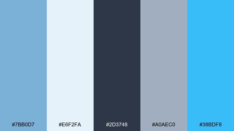
HEX: #7BB0D7 #E6F2FA #2D3748 #A0AEC0 #38BDF8
Mood: bright, trustworthy, contemporary
Best for: startup website hero ui
Bright and trustworthy, it feels like crisp air and cloud computing done right. The light tint supports spacious layouts, while the vivid cyan gives you a modern highlight for links and micro-interactions. Pair with charcoal text and simple line icons for a clean product story. Tip: keep the vivid accent under 10 percent of the screen so it stays special.
Image example of tech cloud generated using media.io

15) Coral Reef Pop
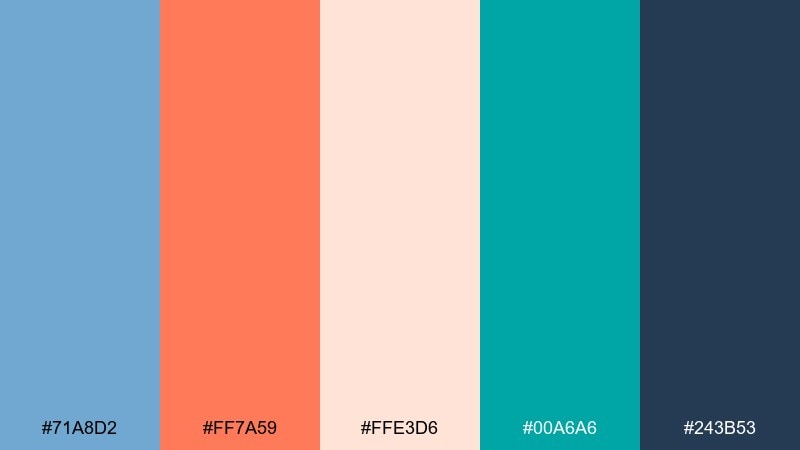
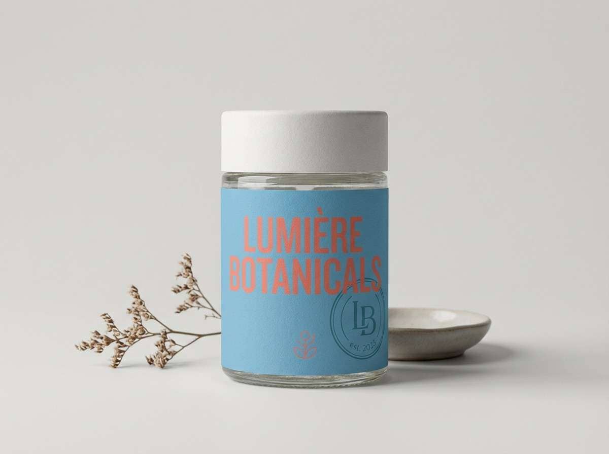
HEX: #71A8D2 #FF7A59 #FFE3D6 #00A6A6 #243B53
Mood: vibrant, punchy, social
Best for: instagram product ad
Vibrant and punchy, it brings reef coral energy to a cool blue base. These carolina blue color combinations are ideal for social ads where you need a friendly pop without losing trust. Pair the coral with short, bold headlines and use teal for small badges like new or limited. Tip: keep the background in blush-peach so the call-to-action button in blue stands out.
Image example of coral reef pop generated using media.io
16) Museum Calm
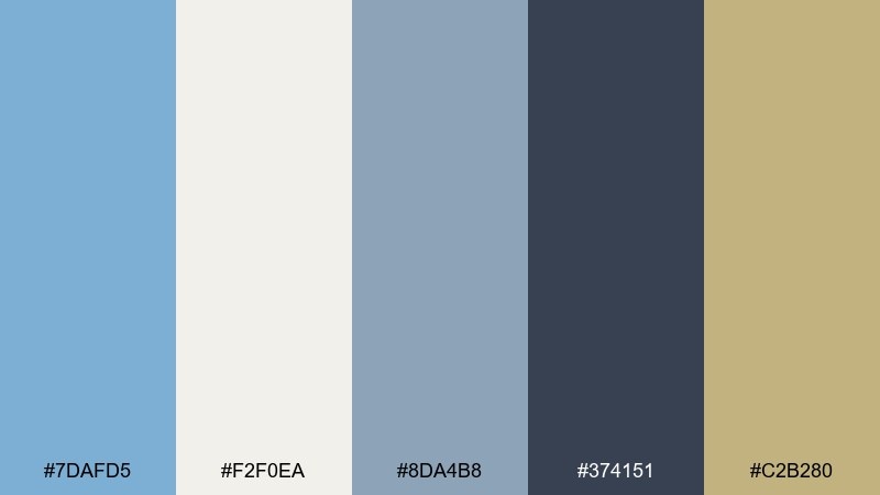
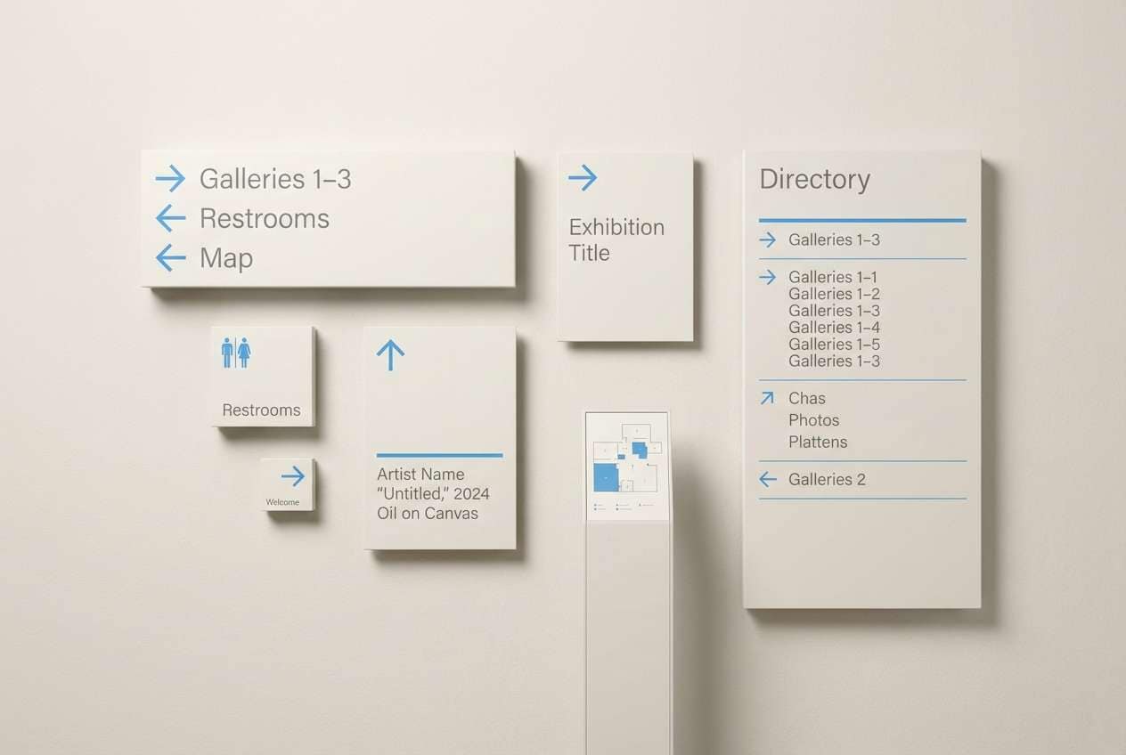
HEX: #7DAFD5 #F2F0EA #8DA4B8 #374151 #C2B280
Mood: quiet, cultured, balanced
Best for: gallery signage system
Quiet and cultured, it feels like calm halls, soft lighting, and curated labels. The blue works as a gentle wayfinding cue while the warm sand keeps the system approachable. Pair with generous margins, sans-serif type, and subtle gray rules for a museum-grade finish. Tip: use the sand tone for highlight panels so visitors immediately spot key information.
Image example of museum calm generated using media.io
17) Mountain Morning
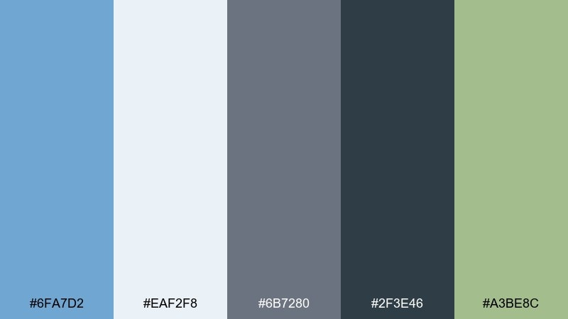
HEX: #6FA7D2 #EAF2F8 #6B7280 #2F3E46 #A3BE8C
Mood: outdoorsy, fresh, grounded
Best for: travel brochure cover
Outdoorsy and fresh, it suggests cool morning air, distant peaks, and pine trails. The green adds a natural accent that keeps the blues from feeling overly coastal. Pair with landscape photography and clean overlays for a modern travel vibe. Tip: use the darkest tone for text over photos and the lightest blue for translucent panels.
Image example of mountain morning generated using media.io

18) Classroom Friendly
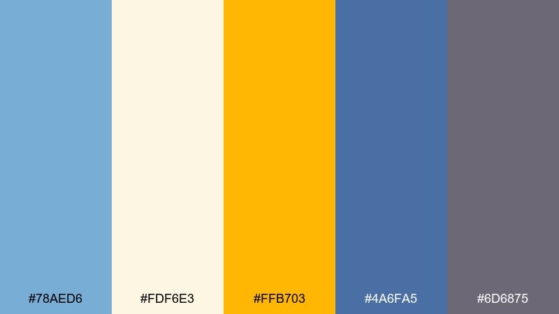
HEX: #78AED6 #FDF6E3 #FFB703 #4A6FA5 #6D6875
Mood: approachable, clear, upbeat
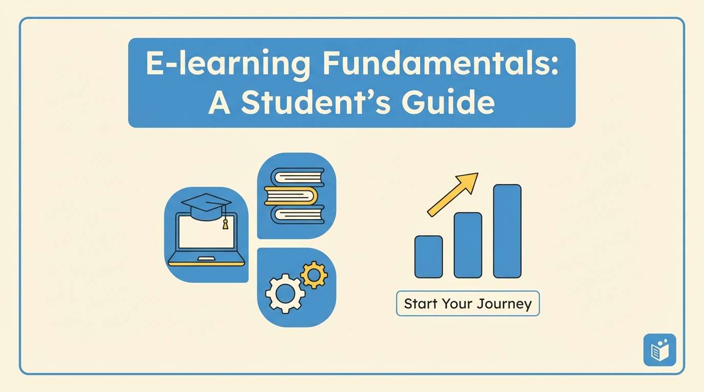
Best for: e-learning slide deck
Approachable and clear, it feels like tidy notebooks and bright highlighters without the noise. The blue tones make a dependable base for headings, while the warm yellow keeps learners engaged on key points. Pair with simple charts and big icons for quick comprehension. Tip: use yellow only for callouts and quiz answers so it stays meaningful.
Image example of classroom friendly generated using media.io
19) Ceramic Spa
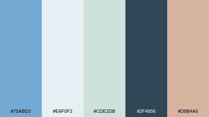
HEX: #75ABD3 #E6F0F2 #CDE2DB #2F4858 #D8B4A0
Mood: soothing, clean, spa-like
Best for: skincare packaging
Soothing and clean, it resembles glazed ceramic, steam, and cool water in a quiet spa. The muted blue-green tones feel clinical in the best way, while the blush adds a human, comforting note. Pair with minimal typography and matte finishes for a premium skincare look. Tip: keep the blush as a small label detail or cap color to avoid tipping too pink.
Image example of ceramic spa generated using media.io
20) Neon Regatta
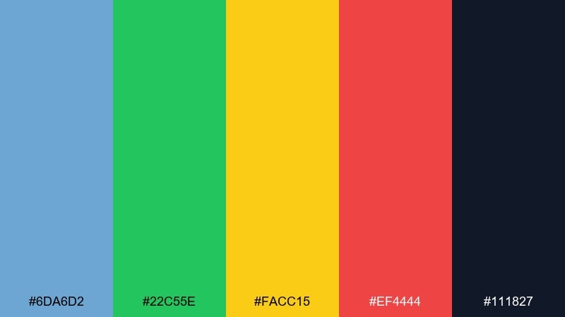
HEX: #6DA6D2 #22C55E #FACC15 #EF4444 #111827
Mood: sporty, loud, competitive
Best for: team spirit poster
Sporty and loud, it feels like race flags snapping in the wind under stadium lights. The bright accents create instant energy, while the dark base keeps everything readable and bold. Pair with condensed typography and strong diagonal shapes to emphasize motion. Tip: choose one accent as the primary highlight per poster so the message does not compete with itself.
Image example of neon regatta generated using media.io

What Colors Go Well with Carolina Blue?
Carolina blue pairs beautifully with warm neutrals like cream, ivory, and sand because they keep the overall look bright while adding softness. These combinations are ideal for backgrounds, paper stock, and large UI surfaces.
For contrast and readability, combine it with navy, charcoal, or slate-blue. Dark anchors make Carolina blue feel sharper and more premium—especially for headings, navigation, and button states.
If you want a pop, reach for coral, peach, gold, teal, or vivid cyan. Keep accents limited so Carolina blue stays the “main character” and the design doesn’t turn into a rainbow.
How to Use a Carolina Blue Color Palette in Real Designs
In branding, use Carolina blue as the primary, a deep navy/charcoal for typography, and a warm neutral for backgrounds. Then add one accent color for CTAs, badges, or key highlights so the system stays consistent.
In UI, build a tint ladder: very light blue for panels, mid blue for selected states, and dark slate for text. This makes interfaces feel airy and accessible while preserving clear hierarchy.
For interiors, Carolina blue works best when balanced with texture: warm wood, tan leather, linen textiles, or brass accents. Use deeper tones on trim or built-ins to ground the room.
Create Carolina Blue Palette Visuals with AI
Want to see these Carolina blue color combinations in action before you commit? Generate quick mockups for posters, landing pages, packaging, or mood boards using AI—then iterate in minutes.
Start with one palette, paste the prompt style you like, and swap the subject (UI, invitation, product shot) while keeping the same HEX direction. You’ll get cohesive visuals that match your brand mood faster.
Carolina Blue Color Palette FAQs
-
What is the HEX code for Carolina blue?
Carolina blue doesn’t have a single universal HEX value, but it’s commonly represented as a light, slightly muted sky blue. In this article, examples include shades like #7BAFD4 and #6FAFD6 to capture that Carolina blue feel. -
Is Carolina blue good for website UI?
Yes. Carolina blue works especially well for SaaS and content-heavy layouts because it feels light and modern, and it can be paired with dark slate or navy for strong text contrast. -
What colors complement Carolina blue?
Warm neutrals (cream, ivory, sand), deep anchors (navy, charcoal), and warm accents (coral, peach, gold) complement Carolina blue. Teal and bright cyan also add a contemporary tech highlight. -
How do I keep a Carolina blue palette from feeling too cold?
Add warmth through creams, tans, rust, blush, or gold accents, and use natural textures (wood, paper, linen). Keeping backgrounds off-white instead of pure white can also soften the feel. -
What’s a safe accent color for Carolina blue CTAs?
Gold and coral are reliable CTA accents because they contrast well against blue while still looking friendly. Use the accent sparingly (often under 10%) so it stays attention-grabbing. -
Does Carolina blue print well?
It can print beautifully, especially when paired with warm paper tones like cream or off-white. For best results, proof your blues (they can shift in print) and use darker blues for small text. -
Can I generate Carolina blue palette mockups with AI?
Yes—use Media.io’s text-to-image tool to create fast concept visuals like posters, UI screens, packaging, and invitation suites. Start from a prompt, then iterate by changing the subject while keeping the palette consistent.
Next: Vanilla Color Palette


