

Amethyst sits in the sweet spot between bold and soothing, making it a reliable choice for modern branding, UI, and print. Depending on what you pair it with, it can read luxurious, romantic, futuristic, or grounded.
Below are 20 amethyst color palette ideas with HEX codes, plus practical tips for choosing accents (neutrals, metallics, greens, and teals) that keep purple looking intentional and readable.
In this article
- Why Amethyst Palettes Work So Well
-
- velvet geode
- lavender haze
- plum noir
- orchid sandstone
- mystic meadow
- gilded amethyst
- twilight lilac
- berry sorbet
- dusty mauve studio
- royal iris
- sage and violet
- blush amethyst
- nebula night
- heather minimal
- candlelit velvet
- winter wisteria
- clay and crystal
- electric violet pop
- vintage apothecary
- aurora quartz
- What Colors Go Well with Amethyst?
- How to Use a Amethyst Color Palette in Real Designs
- Create Amethyst Palette Visuals with AI
Why Amethyst Palettes Work So Well
Amethyst is versatile because it naturally carries both warmth (red undertones) and coolness (blue undertones). That means it can lean romantic and soft, or sleek and high-tech, without changing the “purple family” feel.
It also creates instant hierarchy. Deep violets make strong anchors for headers, nav bars, and hero sections, while lilacs and pale tints open up readable space for body text and UI surfaces.
Finally, amethyst pairs unusually well with “character accents” like gold, sage, teal, or terracotta. These accents keep purple from feeling flat and help you steer the mood to premium, organic, or energetic.
20+ Amethyst Color Palette Ideas (with HEX Codes)
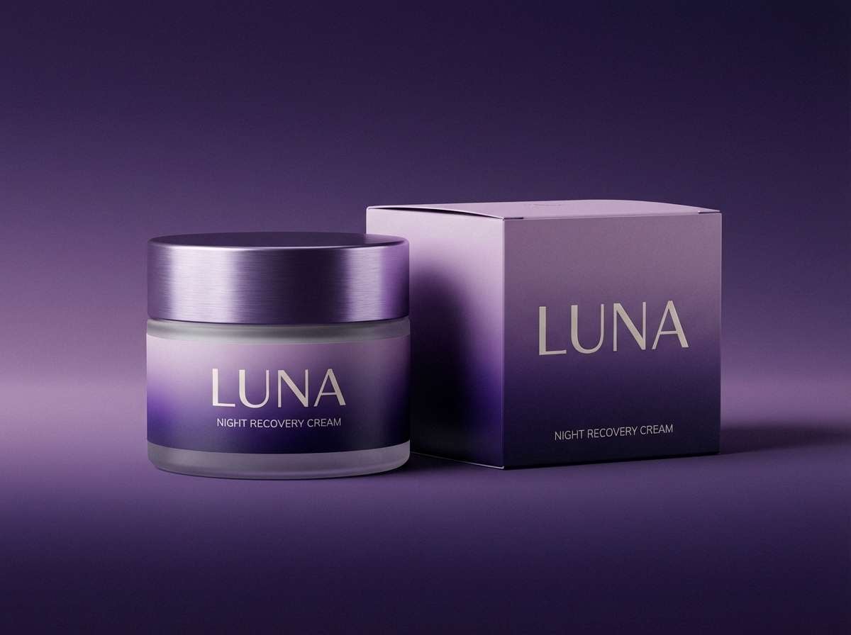
1) Velvet Geode
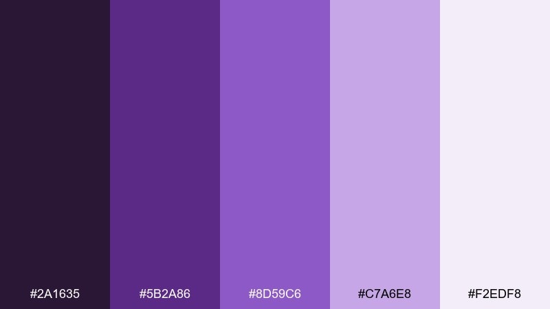
HEX: #2A1635 #5B2A86 #8D59C6 #C7A6E8 #F2EDF8
Mood: luxurious and calm
Best for: beauty branding and premium packaging
Luxurious and calm, like a polished geode lit from within. Use the deep violet as your anchor, then let the softer lilac and pale tint open up breathing room for labels and headers. Pair it with warm white, matte black, or subtle foil accents for a high-end feel. Tip: keep body text on the lightest shade and reserve the darkest tone for logos and key claims.
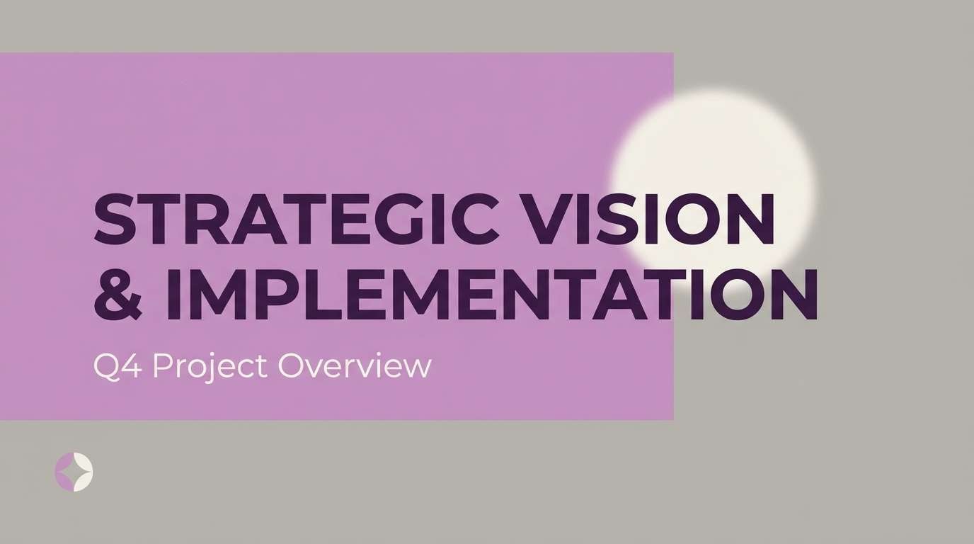
Image example of velvet geode generated using media.io
Media.io is an online AI studio for creating and editing video, image, and audio in your browser.

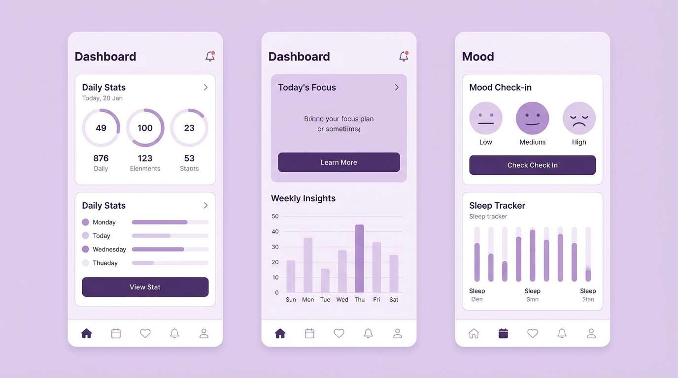
2) Lavender Haze
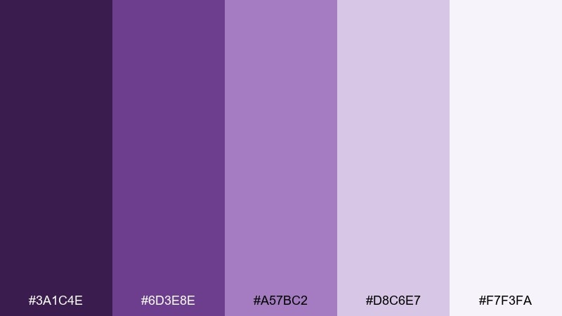
HEX: #3A1C4E #6D3E8E #A57BC2 #D8C6E7 #F7F3FA
Mood: soft and airy
Best for: wellness websites and calming UI
Soft and airy, like morning fog over lavender fields. Build a gentle hierarchy by using the mid lavender for buttons and the palest tint for backgrounds. This amethyst color scheme pairs beautifully with light gray, parchment, and muted silver for a clean, spa-like finish. Tip: add contrast by keeping icons and small text on the darkest purple instead of pure black.
Image example of lavender haze generated using media.io
3) Plum Noir
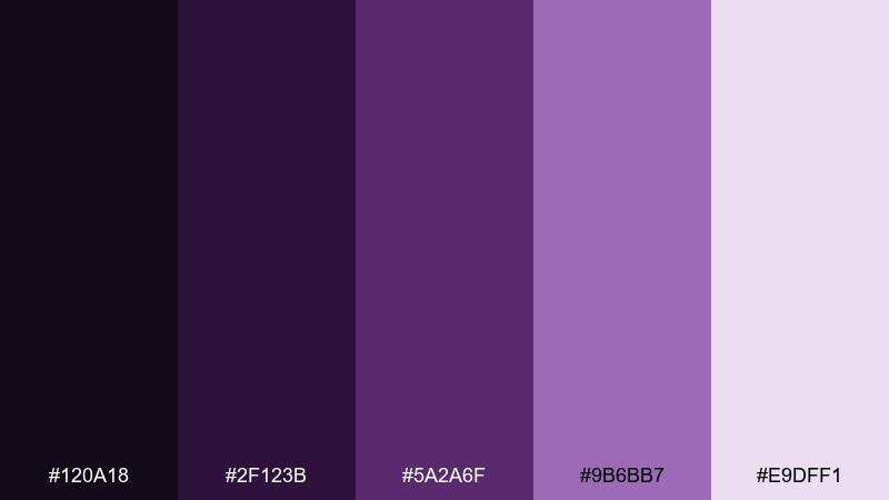
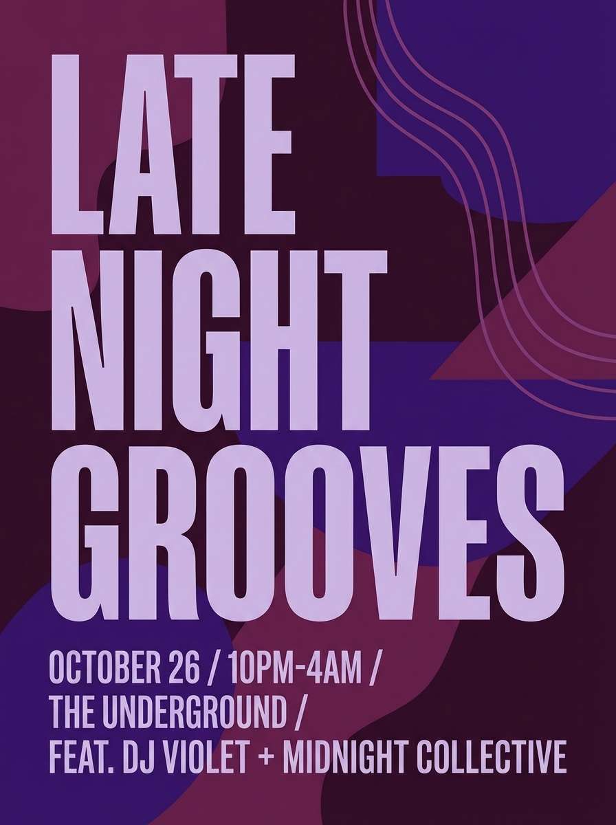
HEX: #120A18 #2F123B #5A2A6F #9B6BB7 #E9DFF1
Mood: dramatic and sleek
Best for: nightlife posters and event branding
Dramatic and sleek, like velvet curtains in a dim lounge. Let the near-black shades take over the background, then use the brighter violet for titles and focal details. It pairs well with charcoal textures and a hint of pearl white for readability. Tip: use the lightest tone only for small highlights so the overall look stays cinematic.
Image example of plum noir generated using media.io
4) Orchid Sandstone
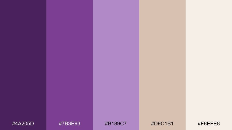
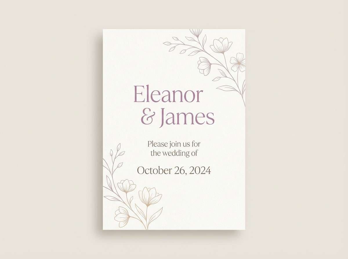
HEX: #4A205D #7B3E93 #B189C7 #D9C1B1 #F6EFE8
Mood: warm and romantic
Best for: wedding invitations and stationery
Warm and romantic, like orchid petals against sunlit stone. The mauve-beige notes soften the purples, making it ideal for formal invites that still feel approachable. Pair this amethyst color palette with textured paper whites, copper, or muted taupe envelopes to keep everything cohesive. Tip: print the darkest purple for names and headings, and use the beige as a background wash.
Image example of orchid sandstone generated using media.io
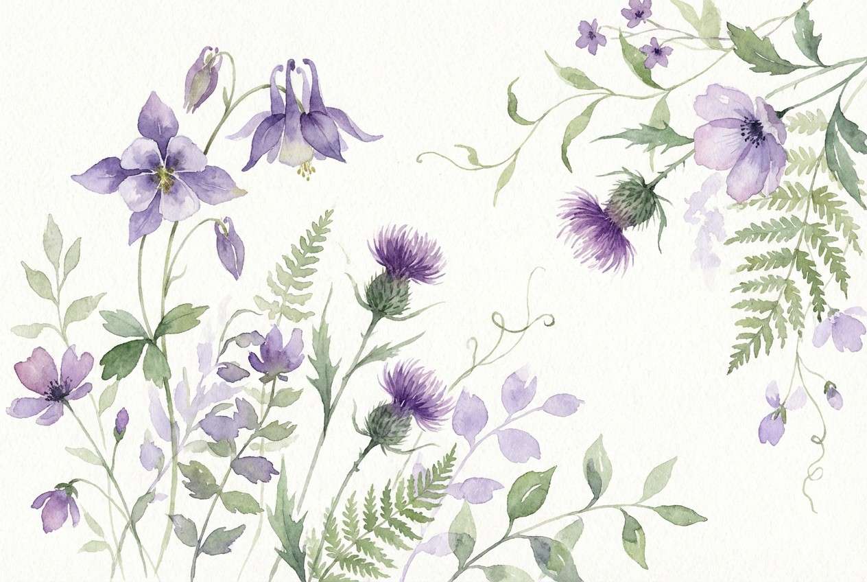
5) Mystic Meadow
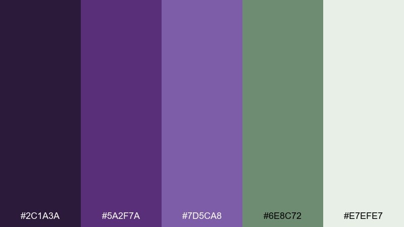
HEX: #2C1A3A #5A2F7A #7D5CA8 #6E8C72 #E7EFE7
Mood: grounded and enchanting
Best for: botanical illustrations and spring campaigns
Grounded and enchanting, like purple wildflowers in a shaded meadow. The muted green keeps the violets from feeling too sweet and adds a natural, earthy balance. Pair it with creamy whites and paper textures for an organic look that still feels polished. Tip: use green for secondary elements like leaves or captions so the purple remains the hero.
Image example of mystic meadow generated using media.io
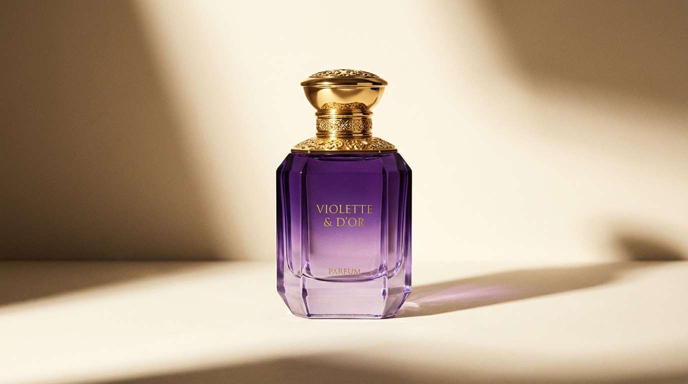
6) Gilded Amethyst
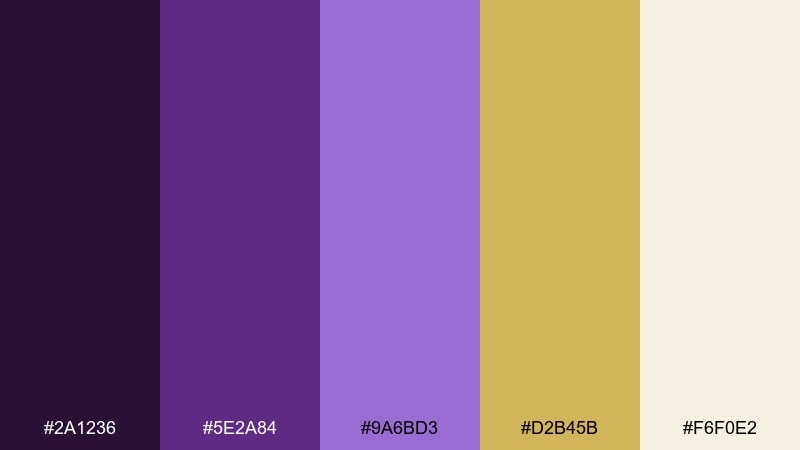
HEX: #2A1236 #5E2A84 #9A6BD3 #D2B45B #F6F0E2
Mood: opulent and celebratory
Best for: luxury product ads and hero banners
Opulent and celebratory, like candlelight catching a gold ring. The honeyed gold adds a bright counterpoint to purple, creating one of the most eye-catching amethyst color combinations for premium launches. Pair it with warm ivory and minimal black lines to avoid visual clutter. Tip: limit gold to accents such as borders, badges, or one standout CTA.
Image example of gilded amethyst generated using media.io
7) Twilight Lilac
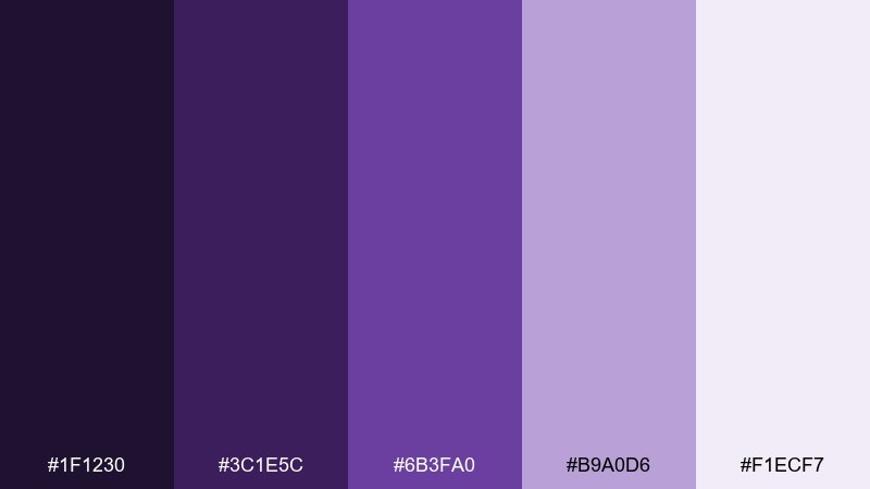
HEX: #1F1230 #3C1E5C #6B3FA0 #B9A0D6 #F1ECF7
Mood: dreamy and modern
Best for: streaming thumbnails and tech branding
Dreamy and modern, like twilight fading into city lights. Use the darker shades for depth and gradients, then bring in lilac for labels and UI chips. This amethyst color palette works nicely with minimal white space and thin-line icons to keep a sleek, digital feel. Tip: add a soft glow behind headings using the lightest tint for instant readability.
Image example of twilight lilac generated using media.io

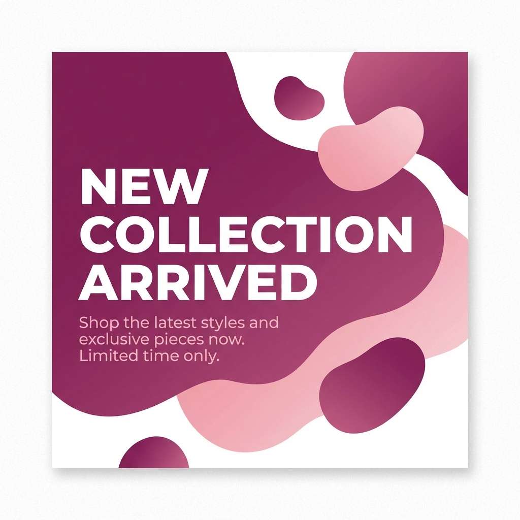
8) Berry Sorbet
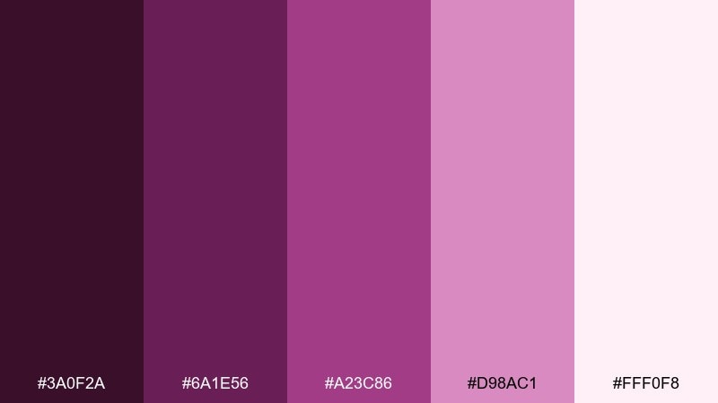
HEX: #3A0F2A #6A1E56 #A23C86 #D98AC1 #FFF0F8
Mood: playful and sweet
Best for: social media promos and beauty launches
Playful and sweet, like berry gelato swirled into whipped cream. The pink-leaning purples make bold headlines feel friendly rather than formal. Pair with crisp white, soft blush backgrounds, and simple sans-serif type for quick-scrolling content. Tip: keep one deep shade for text to maintain contrast on pastel posts.
Image example of berry sorbet generated using media.io
9) Dusty Mauve Studio
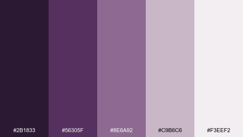
HEX: #2B1833 #56305F #8E6A92 #C9B6C6 #F3EEF2
Mood: quiet and refined
Best for: editorial layouts and portfolios
Quiet and refined, like dried flowers pressed into a sketchbook. The dusty midtones keep the look mature, making this amethyst color scheme great for long-form pages with lots of typography. Pair with warm gray, off-white margins, and subtle line rules to echo a print feel. Tip: use the darkest tone for headings only and keep body text on a neutral for comfort.
Image example of dusty mauve studio generated using media.io
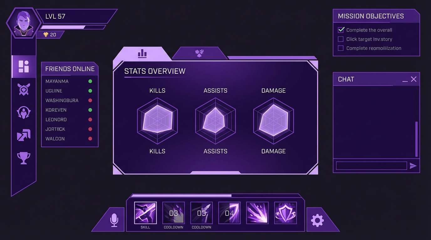
10) Royal Iris
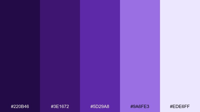
HEX: #220B46 #3E1672 #5D29A8 #9A6FE3 #EDE6FF
Mood: bold and regal
Best for: gaming overlays and energetic UI
Bold and regal, like stage lights on an iris satin robe. The high-contrast purples are perfect for punchy interfaces, badges, and motion graphics. Pair with black or deep charcoal and keep the light lavender for highlights and stats panels. Tip: reserve the brightest violet for interactive states like hover, active, and selected tabs.
Image example of royal iris generated using media.io
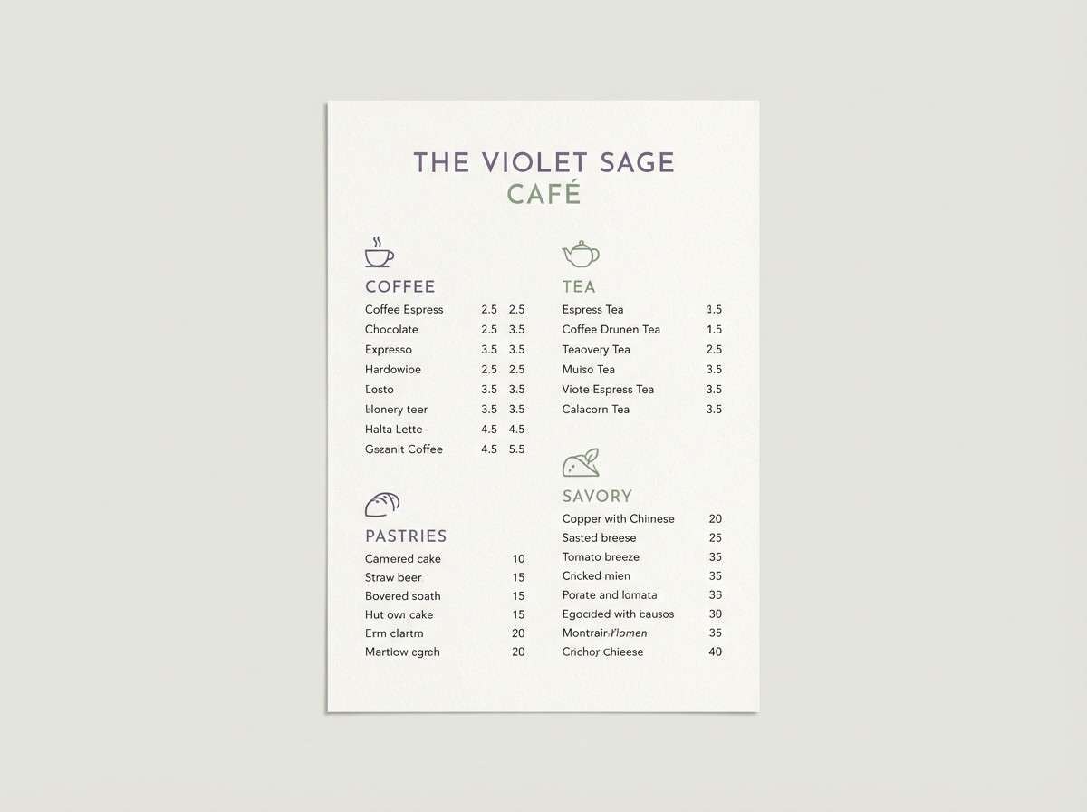
11) Sage and Violet
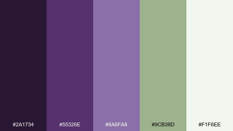
HEX: #2A1734 #55326E #8A6FA8 #9CB38D #F1F6EE
Mood: fresh and balanced
Best for: eco brands and café menus
Fresh and balanced, like herbs bundled beside purple blooms. The sage note adds a clean, sustainable vibe, turning the set into a versatile amethyst color scheme for modern nature-led brands. Pair with recycled-paper whites, soft charcoal text, and minimal illustrations. Tip: use sage for supporting UI chips or menu category labels to reduce purple fatigue.
Image example of sage and violet generated using media.io
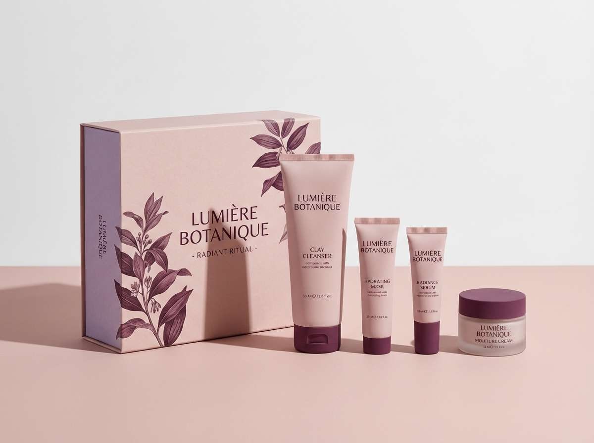
12) Blush Amethyst
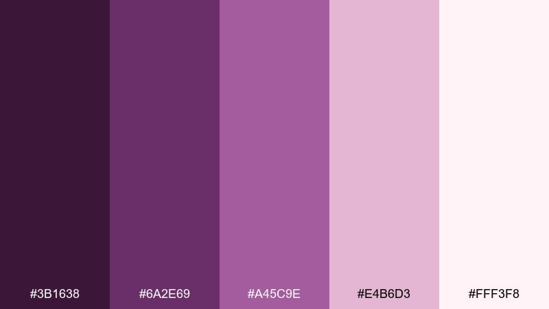
HEX: #3B1638 #6A2E69 #A45C9E #E4B6D3 #FFF3F8
Mood: romantic and modern
Best for: skincare landing pages and gift sets
Romantic and modern, like blush silk with a purple undertone. These amethyst color combinations make product pages feel soft without losing structure, especially when you keep layouts minimal. Pair with white space and a touch of warm gray to stop the pinks from feeling overly sweet. Tip: choose one midtone for buttons and keep the rest as background layers and gentle gradients.
Image example of blush amethyst generated using media.io
13) Nebula Night
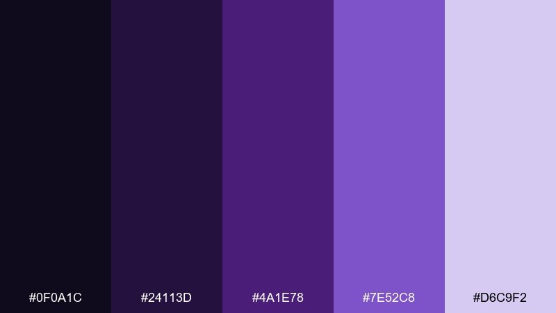
HEX: #0F0A1C #24113D #4A1E78 #7E52C8 #D6C9F2
Mood: mysterious and futuristic
Best for: album art and sci-fi posters
Mysterious and futuristic, like a nebula drifting through deep space. Strong darks make the bright violet feel electric, ideal for cover art that needs instant punch. Pair with subtle grain, star-like dots, and a restrained white for credits. Tip: keep the lightest tone for glow effects and small text so the mood stays nocturnal.
Image example of nebula night generated using media.io

14) Heather Minimal
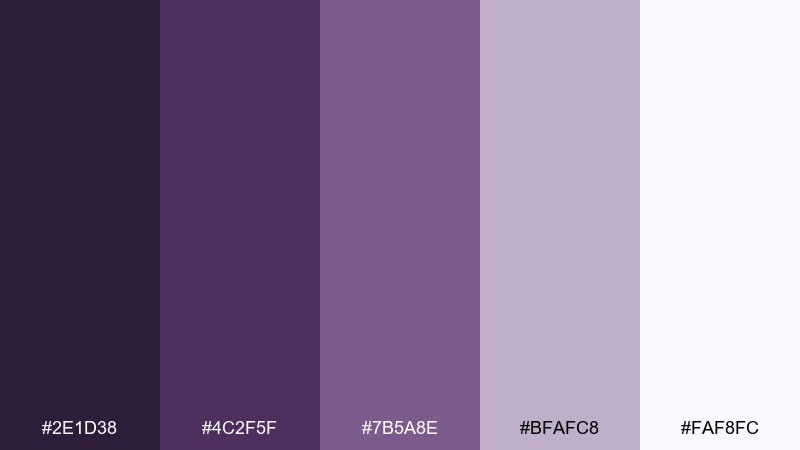
HEX: #2E1D38 #4C2F5F #7B5A8E #BFAFC8 #FAF8FC
Mood: minimal and cozy
Best for: blog themes and clean presentations
Minimal and cozy, like heather knit against fresh linen. The gentle contrast keeps slides and articles readable while still feeling distinct from standard grays. Pair with thin dividers, lots of margin space, and one accent color from the midrange for emphasis. Tip: use the palest tint as your background to reduce glare and keep the page airy.
Image example of heather minimal generated using media.io
15) Candlelit Velvet
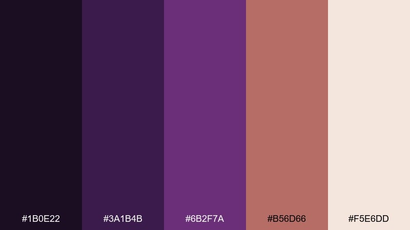
HEX: #1B0E22 #3A1B4B #6B2F7A #B56D66 #F5E6DD
Mood: intimate and vintage
Best for: restaurant branding and evening flyers
Intimate and vintage, like candlelight warming deep velvet. The muted terracotta note adds a flattering, human warmth that keeps purple from feeling cold. Pair with cream paper, serif typography, and subtle texture for a classic hospitality look. Tip: set the background in the darkest shade and use cream for menus to boost readability under low light.
Image example of candlelit velvet generated using media.io

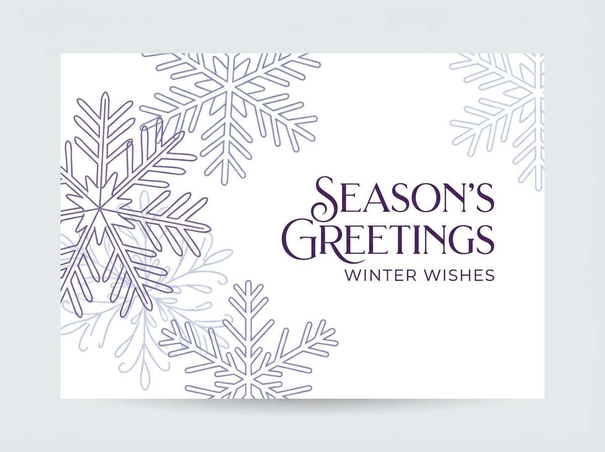
16) Winter Wisteria
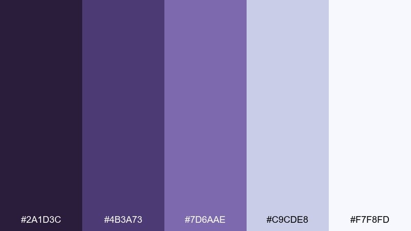
HEX: #2A1D3C #4B3A73 #7D6AAE #C9CDE8 #F7F8FD
Mood: crisp and serene
Best for: holiday cards and seasonal banners
Crisp and serene, like wisteria shadows on fresh snow. The cool periwinkle tint makes the purple feel winter-ready without going icy. Pair with silver details, frosted gradients, and plenty of white space for a clean seasonal look. Tip: use the mid purple for headings and keep decorative elements in the pale blue-lavender to stay light.
Image example of winter wisteria generated using media.io
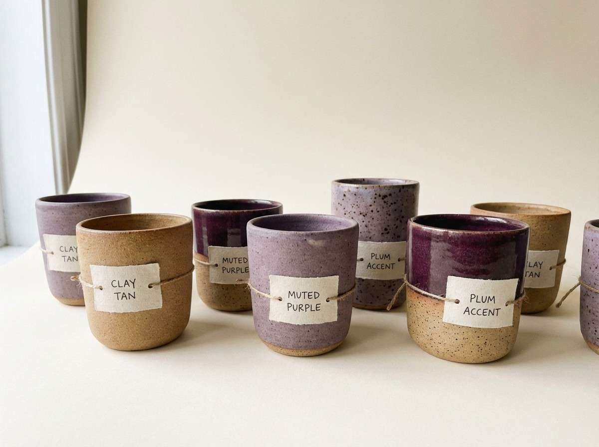
17) Clay and Crystal
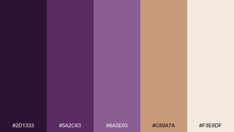
HEX: #2D1333 #5A2C63 #8A5E93 #C89A7A #F3E9DF
Mood: artisan and earthy
Best for: ceramics shops and handmade product pages
Artisan and earthy, like purple glaze on sun-baked clay. The warm tan creates one of those amethyst color combinations that feel handcrafted rather than glossy. Pair with cream backdrops, natural shadows, and simple product photography to reinforce the handmade story. Tip: keep the purple in headings and accents, and let clay tones dominate the page for calm balance.
Image example of clay and crystal generated using media.io
18) Electric Violet Pop
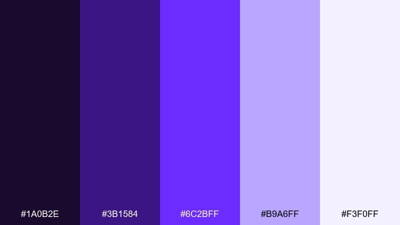
HEX: #1A0B2E #3B1584 #6C2BFF #B9A6FF #F3F0FF
Mood: energetic and edgy
Best for: app promos and bold CTAs
Energetic and edgy, like neon light bouncing off a dark wall. The bright violet is made for attention-grabbing buttons, stickers, and highlight states in fast-paced layouts. Pair with near-black backgrounds and plenty of spacing so the neon note feels intentional, not noisy. Tip: use the vivid shade sparingly and rely on the soft lavender for secondary panels.
Image example of electric violet pop generated using media.io

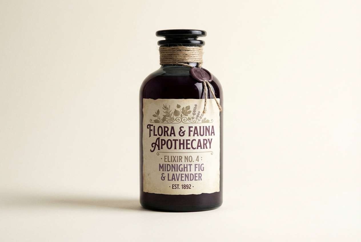
19) Vintage Apothecary
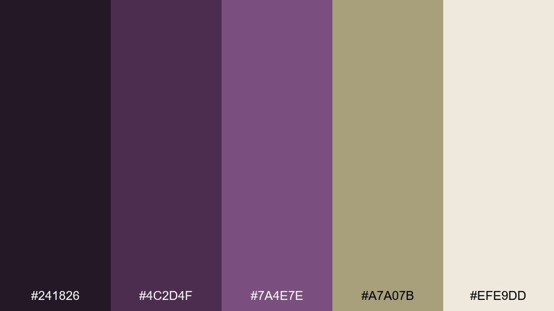
HEX: #241826 #4C2D4F #7A4E7E #A7A07B #EFE9DD
Mood: heritage and moody
Best for: label design and boutique packaging
Heritage and moody, like old glass bottles lined on a wooden shelf. The olive-khaki adds an unexpected twist that makes labels and badges feel storied. Pair with cream stock, etched illustrations, and a deep plum for brand marks. Tip: keep the typography in the darkest tone and use khaki only as a background panel or seal.
Image example of vintage apothecary generated using media.io
20) Aurora Quartz
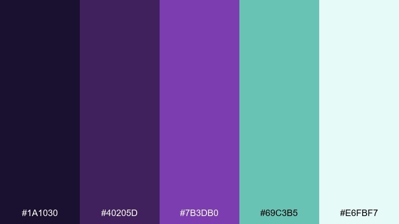
HEX: #1A1030 #40205D #7B3DB0 #69C3B5 #E6FBF7
Mood: fresh and luminous
Best for: startup branding and landing pages
Fresh and luminous, like an aurora ripple across a violet sky. The teal accent creates modern contrast, giving you amethyst color combinations that look instantly digital and new. Pair with clean white sections, rounded UI elements, and lightweight typography for a friendly startup vibe. Tip: use teal for interactive elements and keep purple for brand blocks and headlines.
Image example of aurora quartz generated using media.io

What Colors Go Well with Amethyst?
Neutrals are the easiest win: warm ivory, soft gray, and charcoal keep amethyst feeling sophisticated and readable. If you want a modern look, lean into near-black backgrounds with pale lavender surfaces for contrast.
Metallics add instant “premium” energy. Gold and brass warm up violet and make CTAs, badges, and packaging details pop; silver and chrome push the palette toward a cleaner, cooler tech vibe.
For bolder accents, try nature and neon opposites: sage and olive bring an earthy balance, while teal adds contemporary contrast. Use these accents sparingly so the purple remains the hero.
How to Use a Amethyst Color Palette in Real Designs
Start with roles, not swatches: pick one dark amethyst for headers/navigation, one midtone for interactive elements, and one very light tint for backgrounds. Then add a single accent (gold, sage, teal, or terracotta) for emphasis.
Protect readability by checking contrast on your most common text sizes. If your palette includes near-black purple, it often works better than pure black for icons and small text because it stays in-family.
In print, test how purples shift on different papers and finishes. Uncoated stock usually softens amethyst; coated stock boosts saturation, so you may want more neutral space to avoid heavy pages.
Create Amethyst Palette Visuals with AI
If you want to preview how an amethyst palette will look on packaging, posters, or UI, generate quick mock visuals before committing to a full design system. This helps you validate contrast, mood, and accent balance in minutes.
With Media.io Text-to-Image, you can paste a prompt (like the examples above), iterate on style, and quickly compare multiple compositions—ideal for mood boards and early-stage creative direction.
Amethyst Color Palette FAQs
-
What is the best neutral to pair with amethyst?
Warm ivory and soft off-white are the most forgiving because they keep purple looking rich without making the design feel cold. Charcoal is a strong alternative when you want a dramatic, modern look. -
Does amethyst work well for UI design?
Yes—use a light lavender tint for surfaces, a deep amethyst for headers, and a midtone for buttons. Avoid using fully saturated purple everywhere; reserve it for interactive states and highlights. -
What accent colors make amethyst look more premium?
Gold, brass, and champagne tones add a luxury signal fast. Keep metallics as accents (borders, icons, badges, or a single CTA) so they don’t overpower the purple base. -
How do I keep an amethyst palette from feeling too “sweet” or pink?
Add grounding elements like charcoal, warm gray, sage/olive, or clay/tan. Also reduce the amount of pastel pink-lilac in large backgrounds and increase neutral space. -
What colors go well with amethyst for eco or natural branding?
Sage green, muted olive, and creamy paper whites create an organic balance. Use purple for brand marks and headlines, then let greens and neutrals carry the supporting layout. -
Is amethyst better with silver or gold?
Gold makes amethyst warmer and more opulent, while silver pushes it cooler and more futuristic. Choose based on your product tone, then keep the metal as a controlled accent. -
How can I quickly visualize an amethyst color scheme before designing?
Generate a few mock images (packaging, UI screens, posters) using the same palette and compare which contrast levels feel best. Media.io’s AI image generation makes it easy to iterate on style and composition.


