

Black, green, and yellow is a high-contrast trio that can feel natural (forest + sunlight) or ultra-modern (dark UI + neon accents). It’s one of the fastest ways to communicate energy while keeping layouts grounded and readable.
Below are 20 ready-to-use black green yellow color palettes with HEX codes, plus prompts you can turn into AI-generated visuals for posters, branding, packaging, and UI.
In this article
- Why Black Green Yellow Palettes Work So Well
-
- neon jungle pop
- industrial hazard
- mossy gold minimal
- retro arcade noir
- forest lantern
- olive streetwear
- solar eclipse
- safari signage
- citrus ivy
- midnight meadow
- urban park poster
- tech terminal
- vintage field notes
- championship banner
- botanical ink
- monochrome lime accent
- workshop safety
- night market glow
- minimal grid
- golden canopy
- What Colors Go Well with Black Green Yellow?
- How to Use a Black Green Yellow Color Palette in Real Designs
- Create Black Green Yellow Palette Visuals with AI
Why Black Green Yellow Palettes Work So Well
Black provides instant structure and readability, green adds a grounded “safe” or nature-forward signal, and yellow delivers attention on demand. Together, they create a clear hierarchy: background, support, and accent.
This combination is naturally associated with outdoor gear, safety signage, sports energy, and tech dashboards. That makes it versatile—able to swing from rugged and utilitarian to sleek and futuristic just by shifting saturation and spacing.
Because yellow can overpower, black and deep greens act like visual “brakes,” letting you keep designs bold without becoming messy. Used with restraint, yellow becomes a precise highlight for CTAs, warnings, dates, and key labels.
20+ Black Green Yellow Color Palette Ideas (with HEX Codes)
1) Neon Jungle Pop
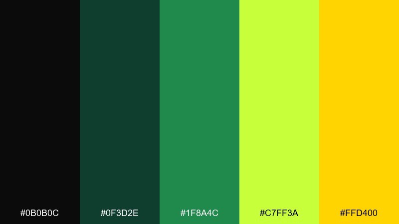
HEX: #0b0b0c #0f3d2e #1f8a4c #c7ff3a #ffd400
Mood: electric, playful, high-contrast
Best for: gaming poster
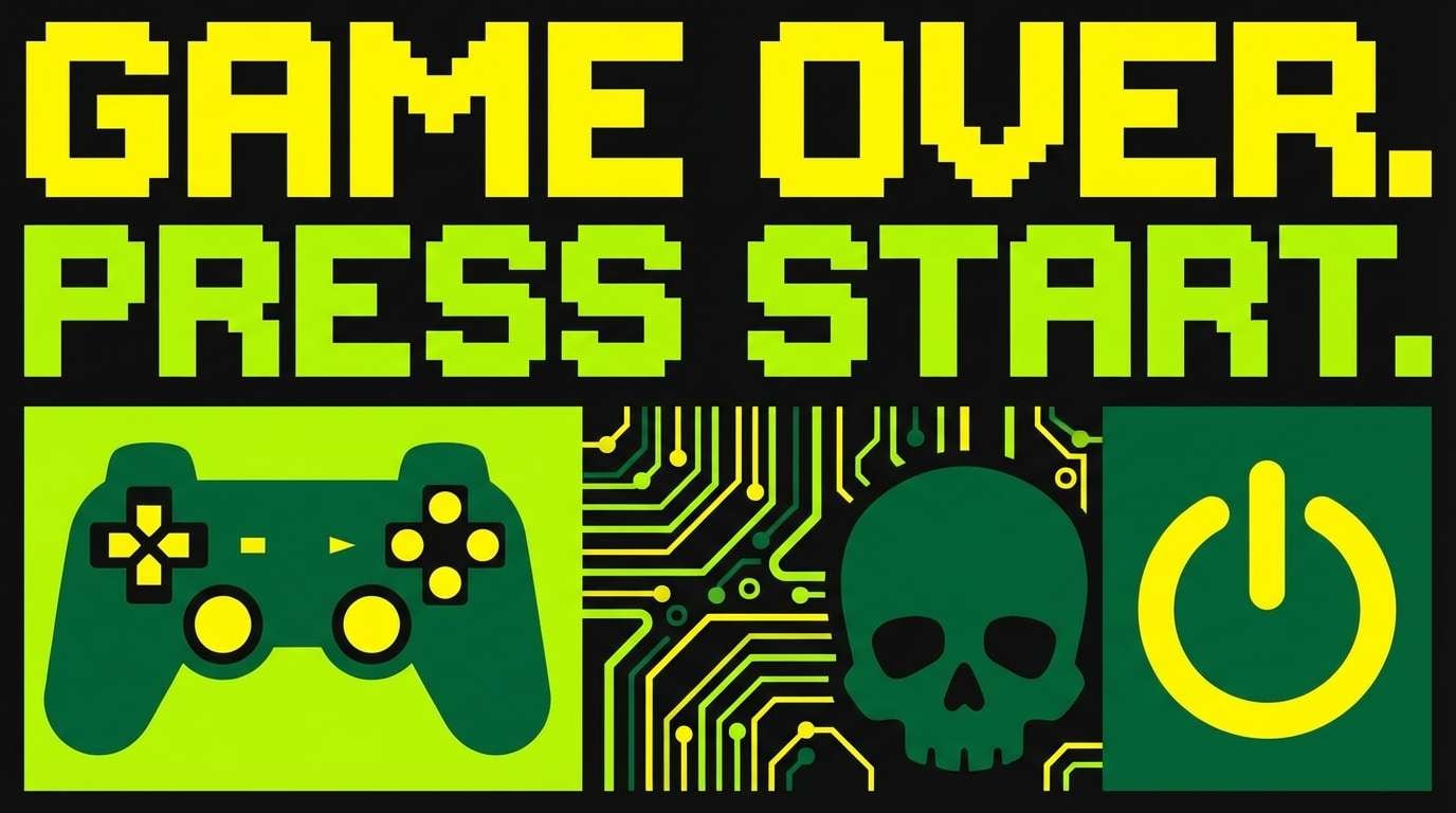
Electric and playful, it feels like neon leaves under a midnight streetlight. The deep near-black anchors the layout while the sharp yellow pushes energy to the front. Use it for gaming promos, event posters, and bold social graphics where legibility matters. Tip: keep type in near-black or pale yellow, and reserve the brightest lime for icons and highlights.
Image example of neon jungle pop generated using media.io
Media.io is an online AI studio for creating and editing video, image, and audio in your browser.

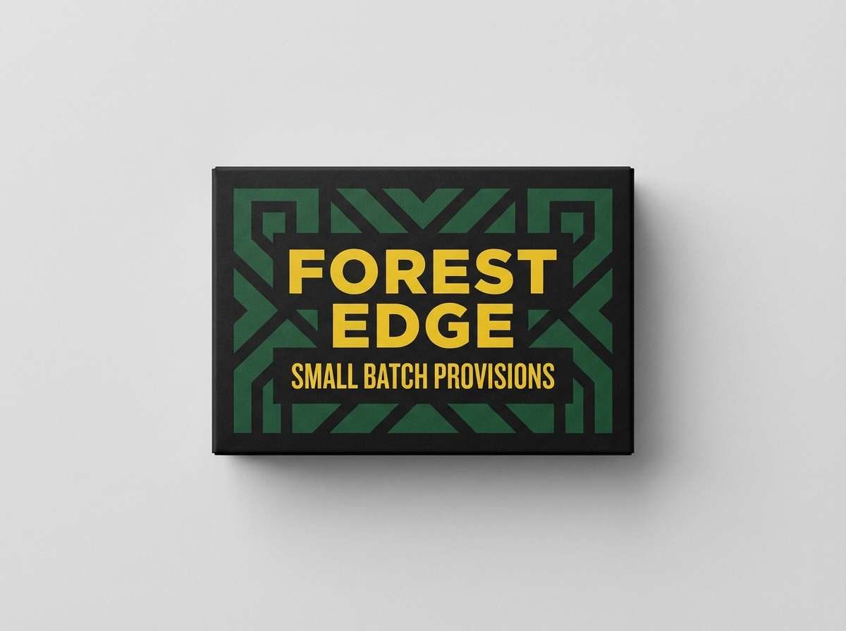
2) Industrial Hazard
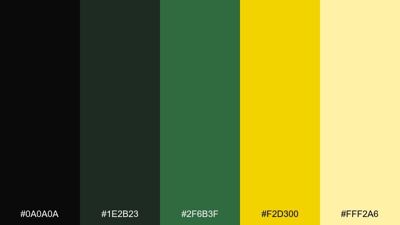
HEX: #0a0a0a #1e2b23 #2f6b3f #f2d300 #fff2a6
Mood: rugged, utilitarian, bold
Best for: product packaging label
Rugged and utilitarian, it evokes factory floors, caution tape, and tough materials. The black and dark green build trust and grit, while yellow works as an instant attention cue. It suits tool packaging, outdoor goods, and shipping labels that need clear hierarchy. Tip: use yellow for warnings or key benefits, and keep body copy on light yellow for readability.
Image example of industrial hazard generated using media.io
3) Mossy Gold Minimal
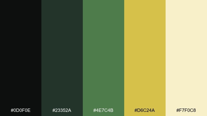
HEX: #0d0f0e #23352a #4e7c4b #d6c24a #f7f0c8
Mood: calm, earthy, refined
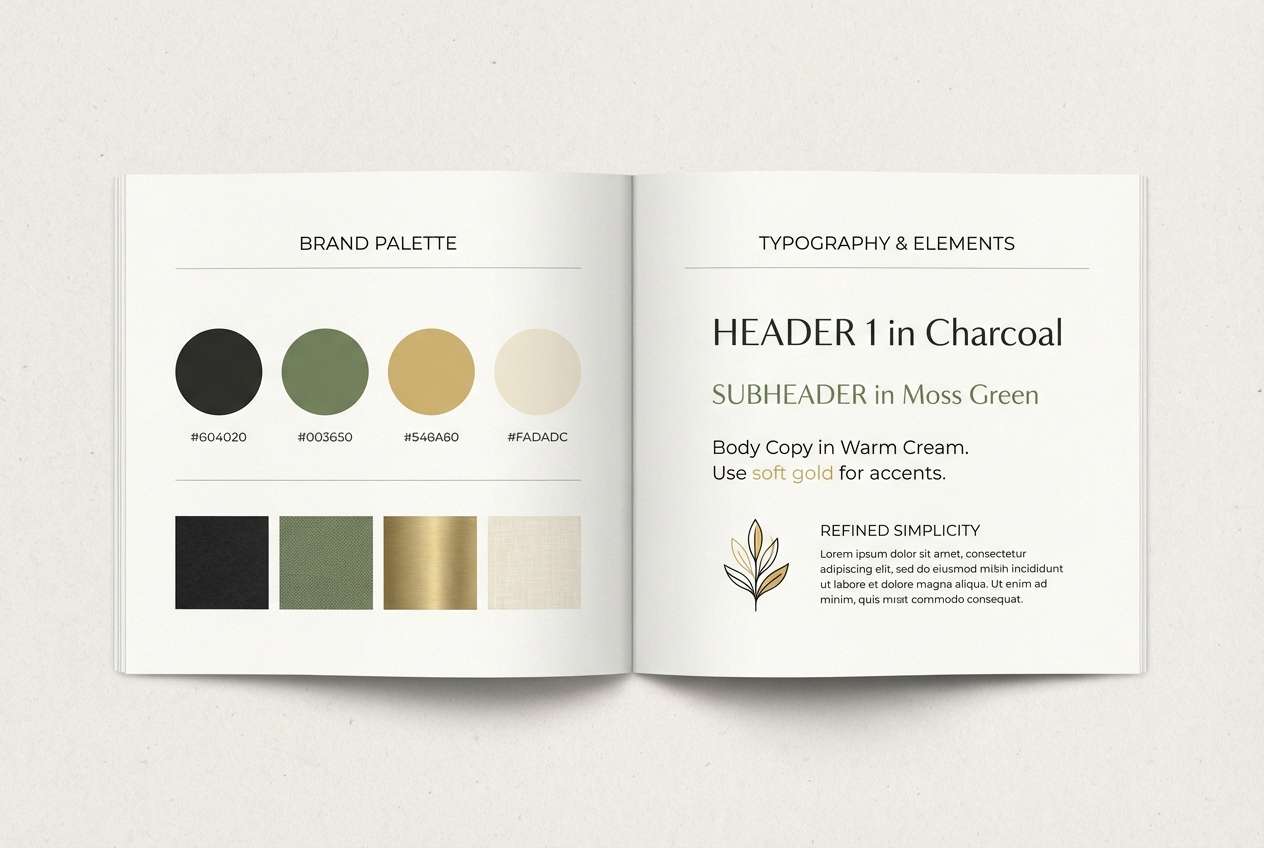
Best for: brand style guide
Calm and earthy, it reads like moss, bark, and a soft gold foil detail. The warm cream keeps the set approachable, making dark tones feel less heavy. It works well for wellness brands, eco-friendly packaging, and premium stationery. Tip: pair with textured paper or subtle grain, and let the gold tone be your only bright accent.
Image example of mossy gold minimal generated using media.io
4) Retro Arcade Noir
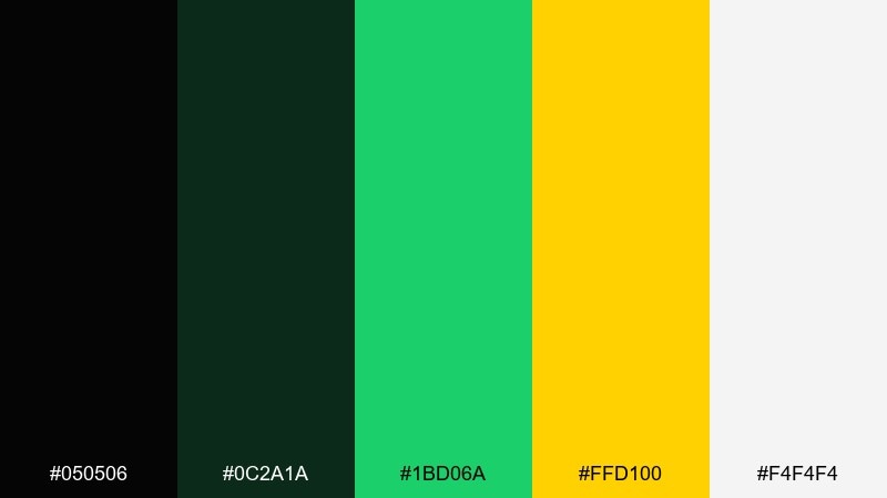
HEX: #050506 #0c2a1a #1bd06a #ffd100 #f4f4f4
Mood: retro, punchy, night-life
Best for: event flyer
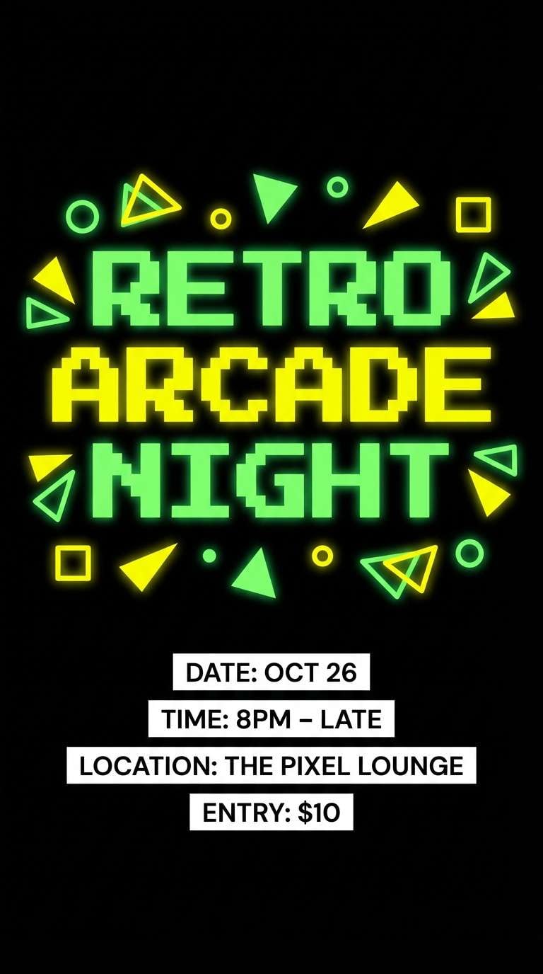
Retro and punchy, it brings arcade glow against a dark room vibe. Bright green reads like pixel lighting, while yellow sells urgency for dates and ticket info. Use this black green yellow color palette for club flyers, esports nights, or pop-up announcements. Tip: keep backgrounds nearly black and frame key details with small neon blocks for a true retro feel.
Image example of retro arcade noir generated using media.io
5) Forest Lantern

HEX: #0b0d0c #163527 #2f7a4a #f1c40f #fcecc5
Mood: warm, outdoorsy, inviting
Best for: camping website hero
Warm and outdoorsy, it feels like lantern light cutting through a pine forest at dusk. The greens give depth and calm, while golden yellow adds welcoming warmth. It is great for travel landing pages, camping brands, and adventure newsletters. Tip: use the cream tone for large text areas so the yellow can stay purely decorative.
Image example of forest lantern generated using media.io

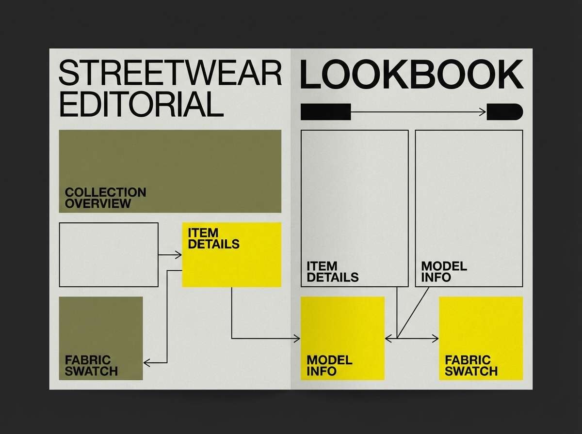
6) Olive Streetwear
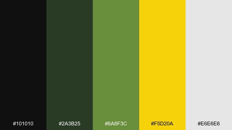
HEX: #101010 #2a3b25 #6a8f3c #f5d20a #e6e6e6
Mood: urban, sporty, confident
Best for: streetwear lookbook
Urban and confident, it suggests cargo fabric, rubber soles, and bold hangtags. The olive tones feel wearable, and the yellow behaves like a spotlight for pricing or drops. It fits apparel lookbooks, product pages, and limited-release announcements. Tip: keep most layouts monochrome, then hit one key element per section with yellow for a clean streetwear rhythm.
Image example of olive streetwear generated using media.io
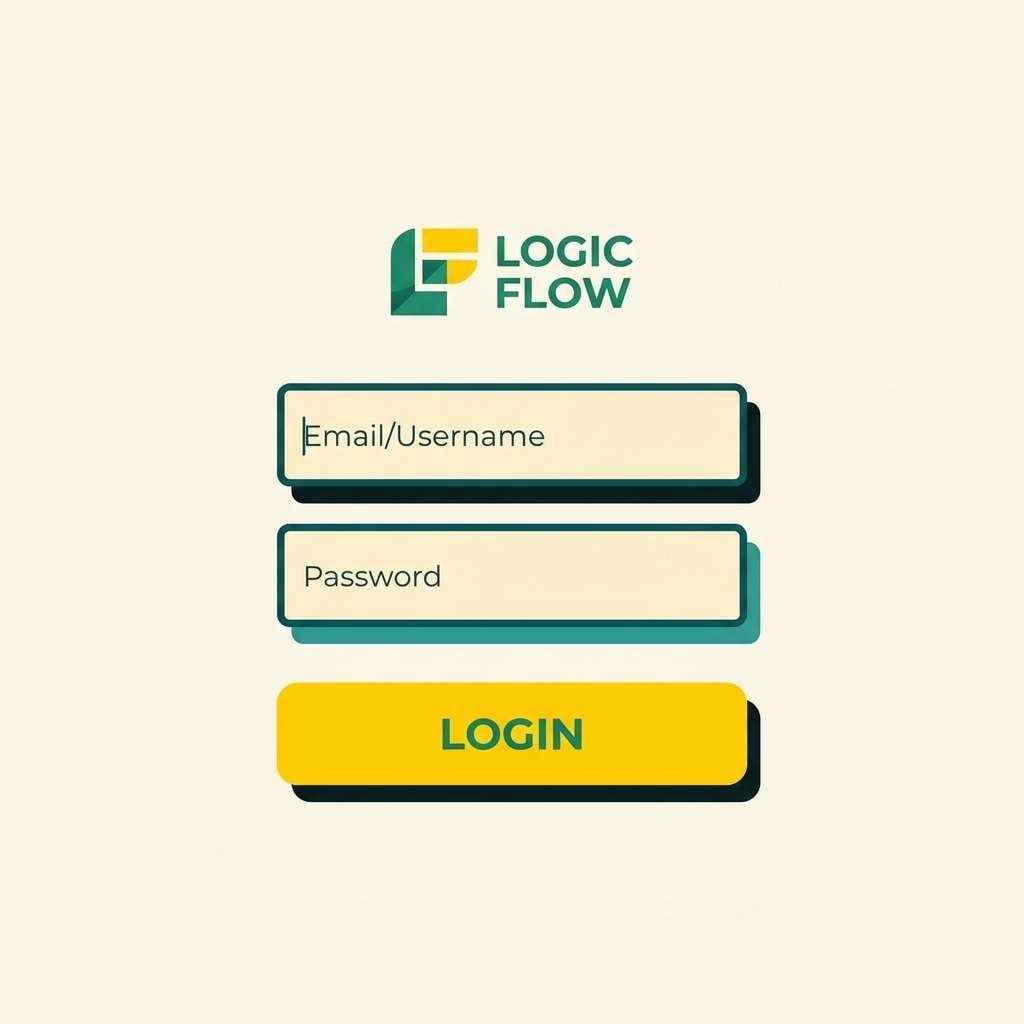
7) Solar Eclipse
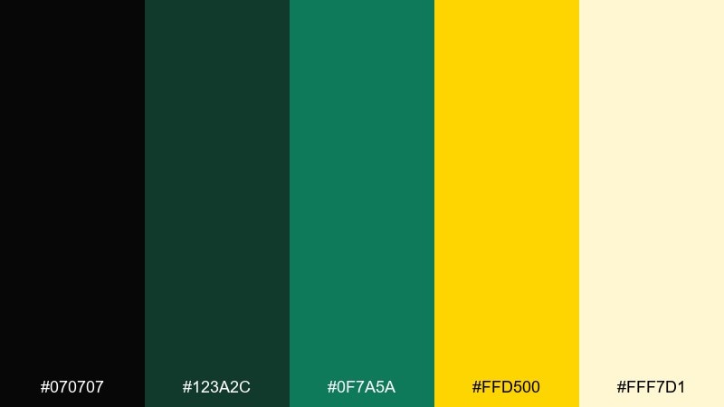
HEX: #070707 #123a2c #0f7a5a #ffd500 #fff7d1
Mood: dramatic, clean, modern
Best for: app login screen
Dramatic and clean, it feels like a bright corona edge against deep shadow. The green tones read as trustworthy and tech-forward, while yellow adds optimistic momentum. For a black green yellow color combination in UI, use yellow sparingly for primary actions and notifications. Tip: add generous spacing and keep inputs on the pale tint to avoid harsh contrast.
Image example of solar eclipse generated using media.io
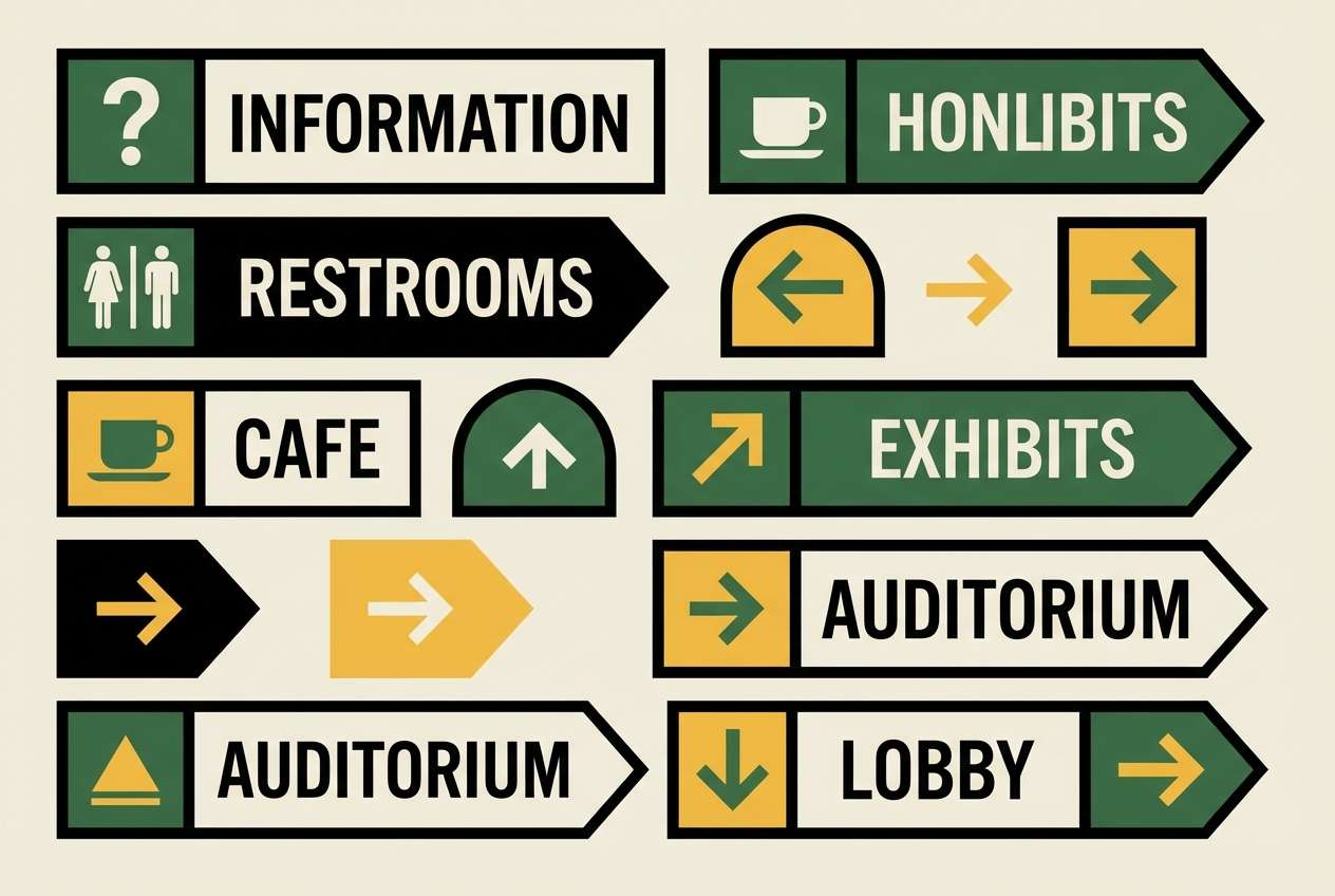
8) Safari Signage
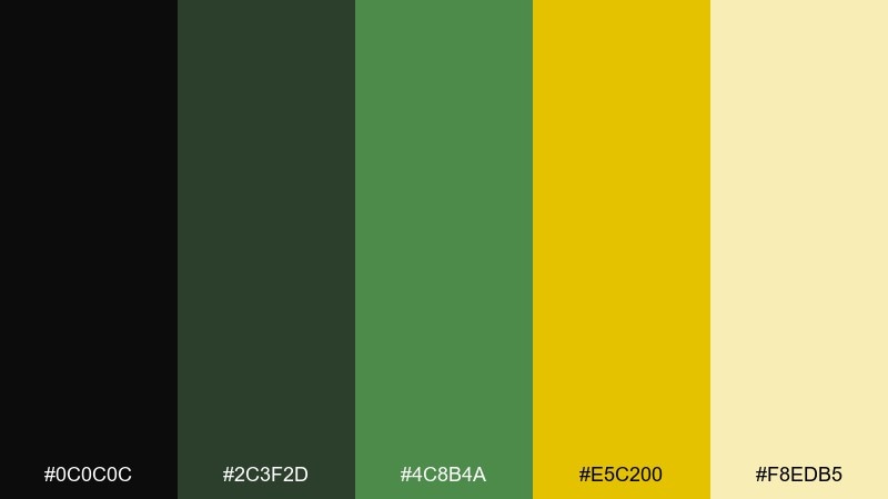
HEX: #0c0c0c #2c3f2d #4c8b4a #e5c200 #f8edb5
Mood: adventurous, clear, friendly
Best for: wayfinding signage
Adventurous and clear, it looks like trail markers and park maps with a sunny twist. The strong dark base improves contrast, while the yellow helps directional cues pop from a distance. Use it for wayfinding systems, museum graphics, and campus signage where clarity is non-negotiable. Tip: test the yellow-on-black pairing for accessibility and widen letterforms for better readability.
Image example of safari signage generated using media.io
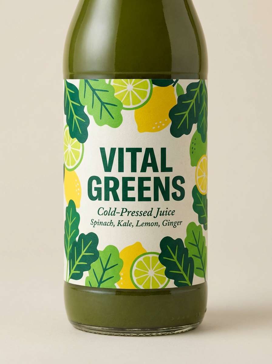
9) Citrus Ivy
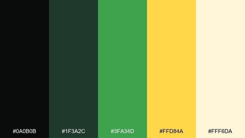
HEX: #0a0b0b #1f3a2c #3fa34d #ffd84a #fff6da
Mood: fresh, bright, approachable
Best for: juice brand label
Fresh and bright, it evokes citrus zest tucked into leafy greens. The palette stays friendly thanks to the creamy off-white, which keeps the yellow from feeling too loud. It is a strong fit for beverage labels, café menus, and seasonal promos. Tip: pair with hand-drawn leaves or simple line icons to underline the natural vibe.
Image example of citrus ivy generated using media.io
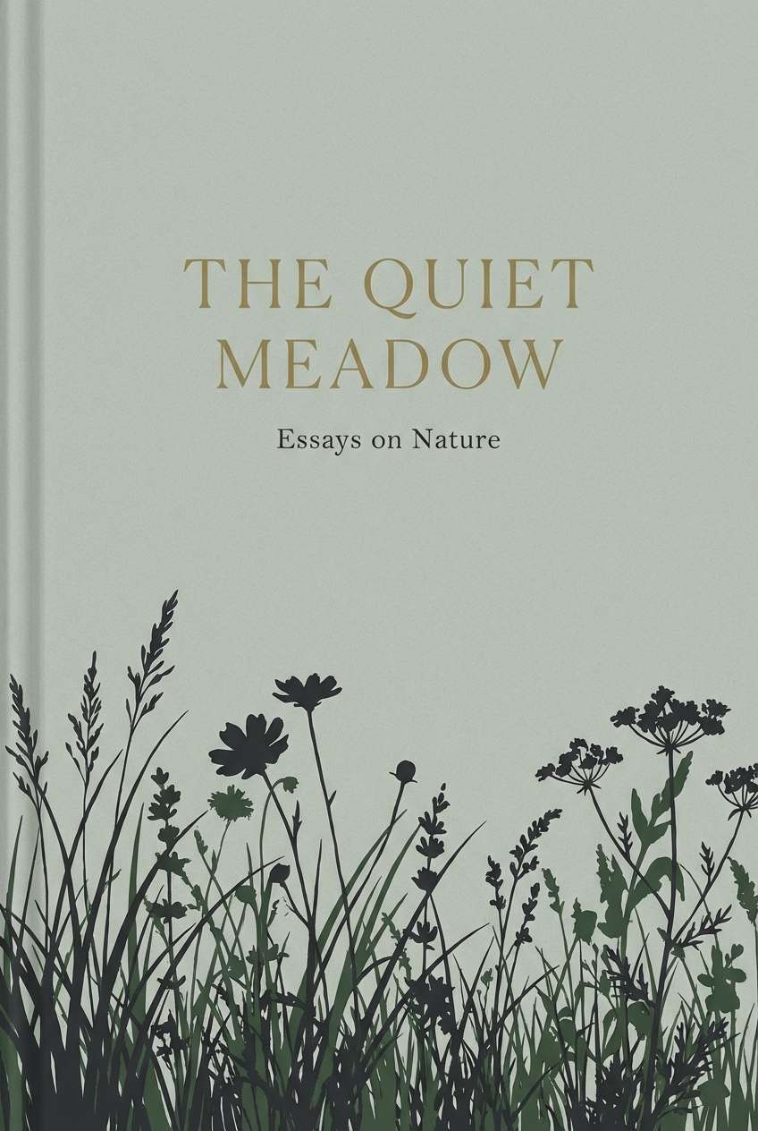
10) Midnight Meadow
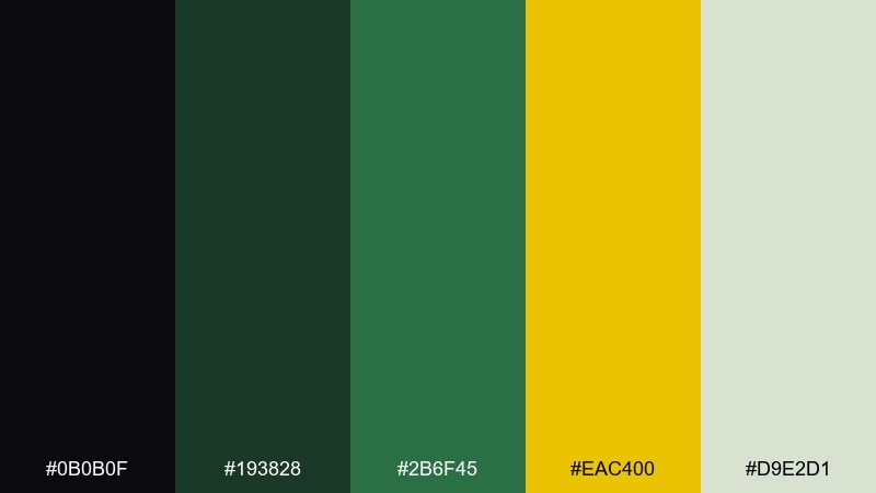
HEX: #0b0b0f #193828 #2b6f45 #eac400 #d9e2d1
Mood: moody, natural, elegant
Best for: book cover
Moody and elegant, it reads like wild grass silhouettes under a night sky with a hint of gold. The softer gray-green adds breathing room between the darkest tones and the accent. Use it for literary covers, nature essays, and premium journals. Tip: keep the yellow as a small foil-like detail for titles or author names.
Image example of midnight meadow generated using media.io
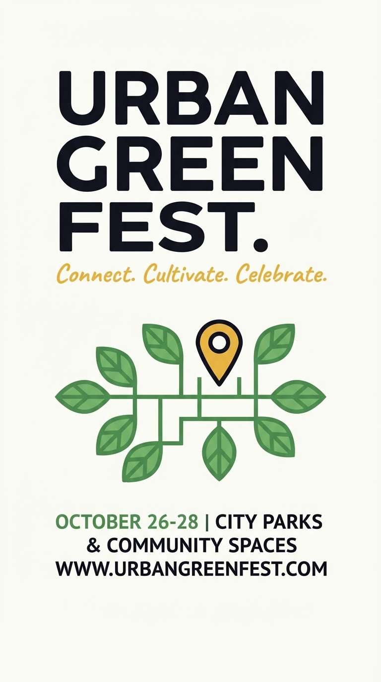
11) Urban Park Poster
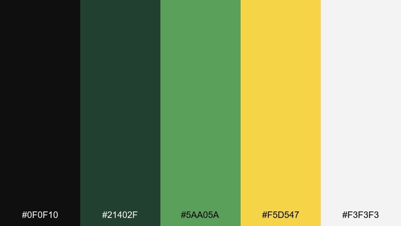
HEX: #0f0f10 #21402f #5aa05a #f5d547 #f3f3f3
Mood: optimistic, clean, civic
Best for: city event poster
Optimistic and civic, it feels like clean typography on a park notice board. Greens keep the tone grounded and community-oriented, while yellow adds a friendly burst for dates and calls to action. As a black green yellow color scheme, it is especially effective for public events and informational posters. Tip: keep the layout airy and use yellow only for the most important line of text.
Image example of urban park poster generated using media.io
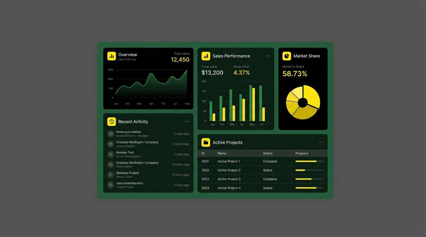
12) Tech Terminal
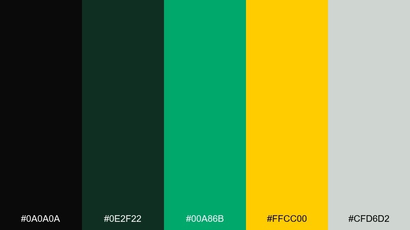
HEX: #0a0a0a #0e2f22 #00a86b #ffcc00 #cfd6d2
Mood: sleek, technical, energetic
Best for: dashboard UI
Sleek and technical, it recalls terminal screens with a crisp alert highlight. The vibrant green gives a data-ready feel, while yellow works perfectly for warnings, tags, and system states. Use it for dashboards, admin panels, and monitoring screens that need fast scanning. Tip: limit yellow to status badges and keep charts primarily green to avoid visual fatigue.
Image example of tech terminal generated using media.io
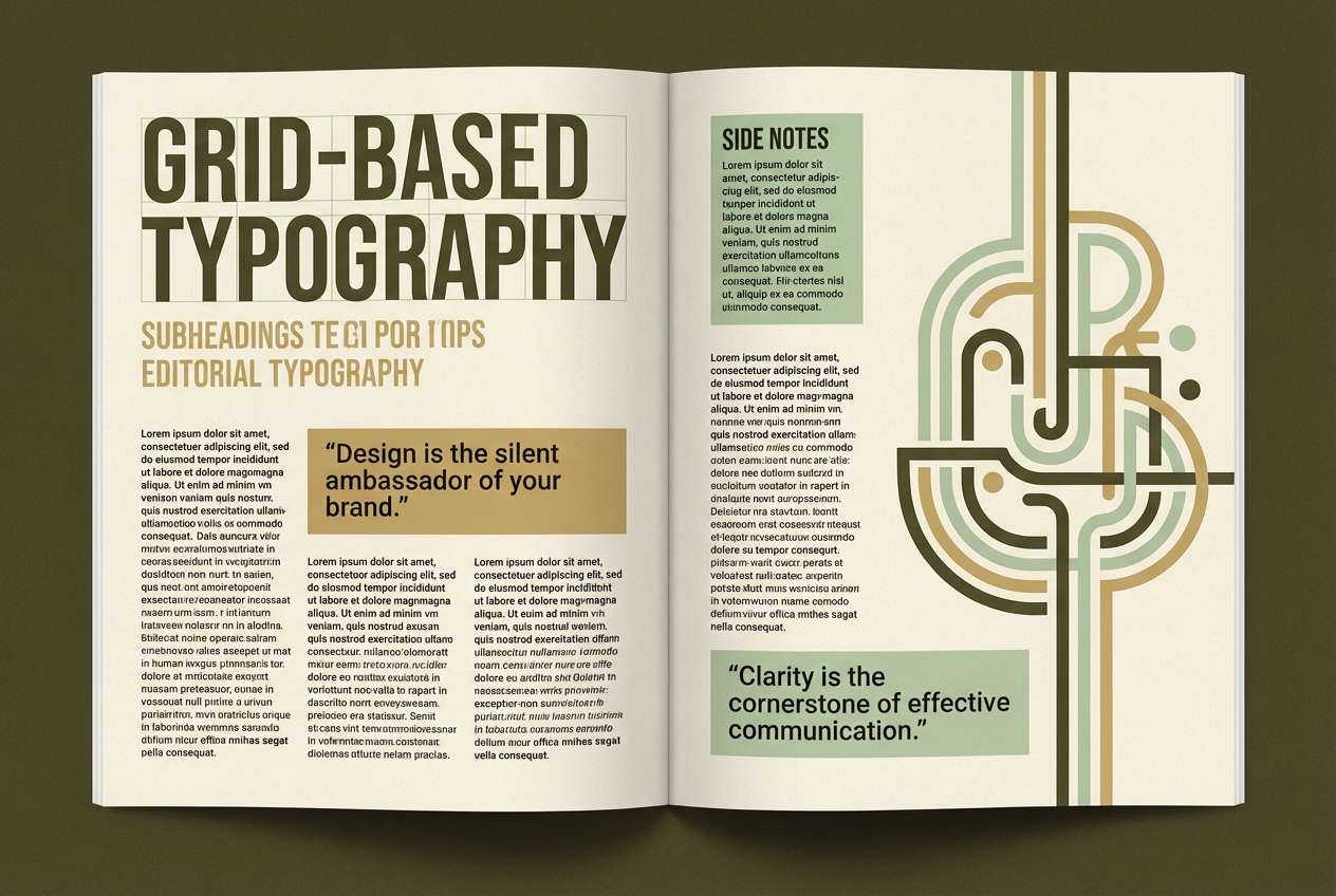
13) Vintage Field Notes
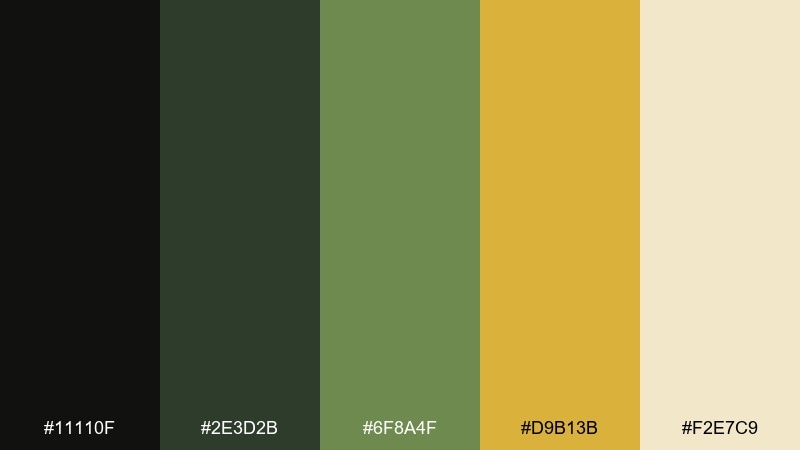
HEX: #11110f #2e3d2b #6f8a4f #d9b13b #f2e7c9
Mood: nostalgic, tactile, warm
Best for: editorial magazine spread
Nostalgic and tactile, it suggests worn notebooks, pressed leaves, and aged paper. The golden yellow feels like a subtle highlighter rather than a neon accent. It works beautifully in editorial layouts, heritage branding, and museum catalogs. Tip: add light paper grain and keep photo frames in the darkest tone for a cohesive vintage finish.
Image example of vintage field notes generated using media.io
14) Championship Banner

HEX: #0a0a0a #12321f #1d7a43 #ffdf00 #ffffff
Mood: competitive, loud, celebratory
Best for: sports team banner
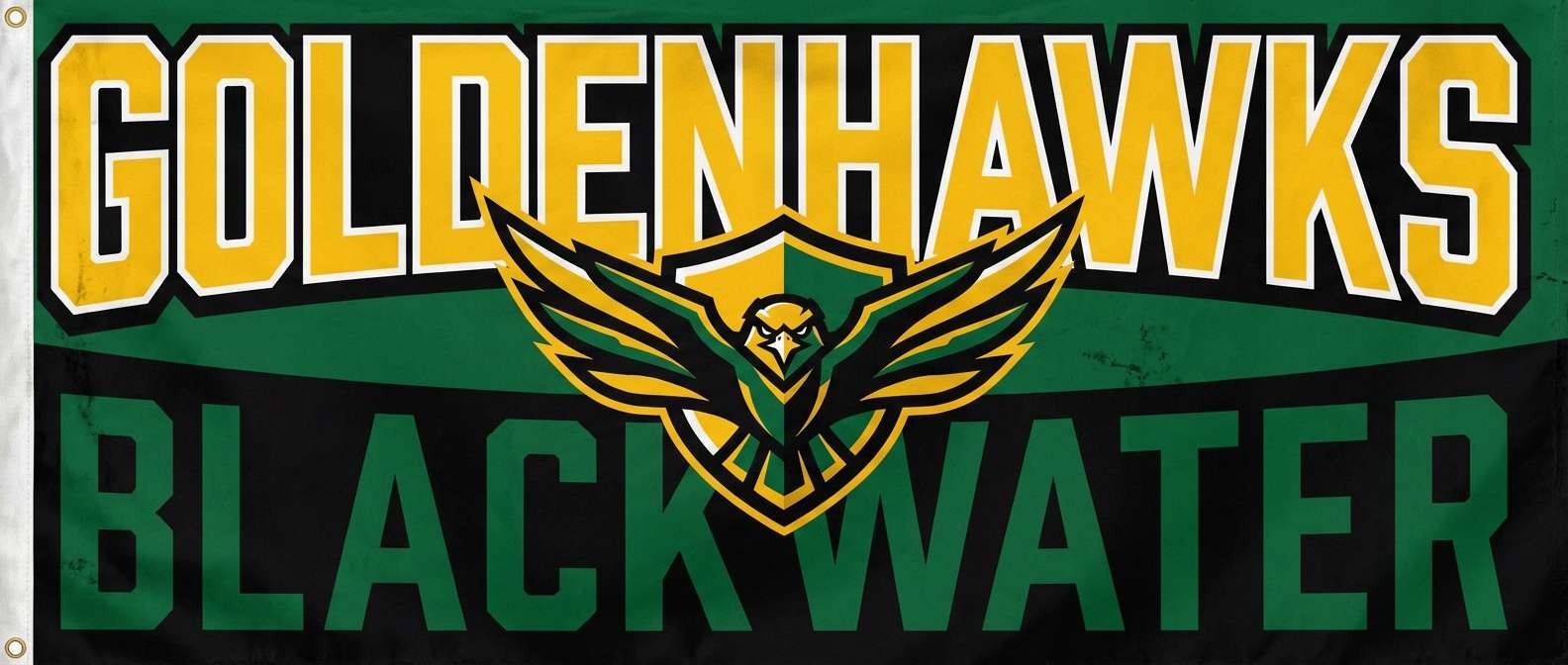
Competitive and celebratory, it feels like stadium lights, fresh turf, and a gold medal moment. The strong contrast helps headlines read from far away, especially on digital boards. Use this black green yellow color palette for team banners, tournament graphics, and merch drops. Tip: set big type in white or yellow, and outline it with black for maximum punch.
Image example of championship banner generated using media.io
15) Botanical Ink
HEX: #0b0c0c #193326 #3d6f4b #f0c52a #eef3ec
Mood: artsy, natural, understated
Best for: botanical illustration print
Artsy and understated, it resembles inked leaves with a sunlit wash. The pale gray-green keeps the overall look airy, even with a dark base. It is ideal for art prints, packaging inserts, and stationery sets. Tip: use the yellow like a watercolor glaze behind line art to create depth without overpowering details.
Image example of botanical ink generated using media.io
16) Monochrome Lime Accent
HEX: #0a0a0a #2b2b2b #1f5a3a #d8ff2a #f5f5f5
Mood: minimal, sharp, contemporary
Best for: startup landing page
Minimal and sharp, it looks like a grayscale layout punctuated by a lime marker. The near-black and charcoal build structure, and the accent green-yellow adds instant focus. It suits startup sites, SaaS landing pages, and portfolio headers. Tip: keep accents to one button style and one link style to maintain a premium, controlled feel.
Image example of monochrome lime accent generated using media.io
17) Workshop Safety
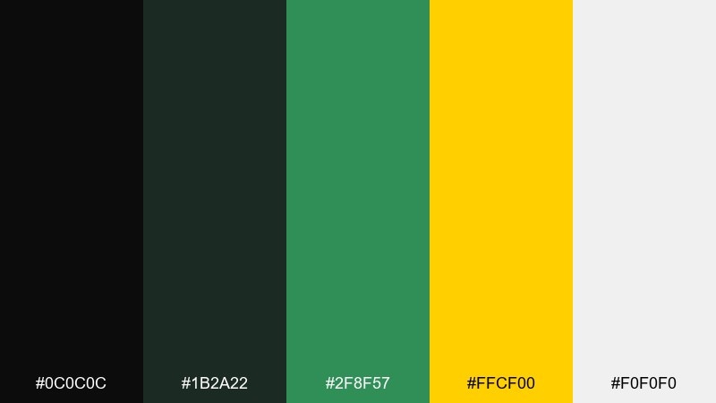
HEX: #0c0c0c #1b2a22 #2f8f57 #ffcf00 #f0f0f0
Mood: practical, alert, straightforward
Best for: instruction manual cover
Practical and alert, it feels like workshop signage and safety labels made tidy. The bright yellow communicates warnings fast, while green supports success states and approved marks. Use it for manuals, onboarding sheets, and quick-start guides that need strong scanning. Tip: keep diagrams on light gray, then color only the callouts and icons for clarity.
Image example of workshop safety generated using media.io

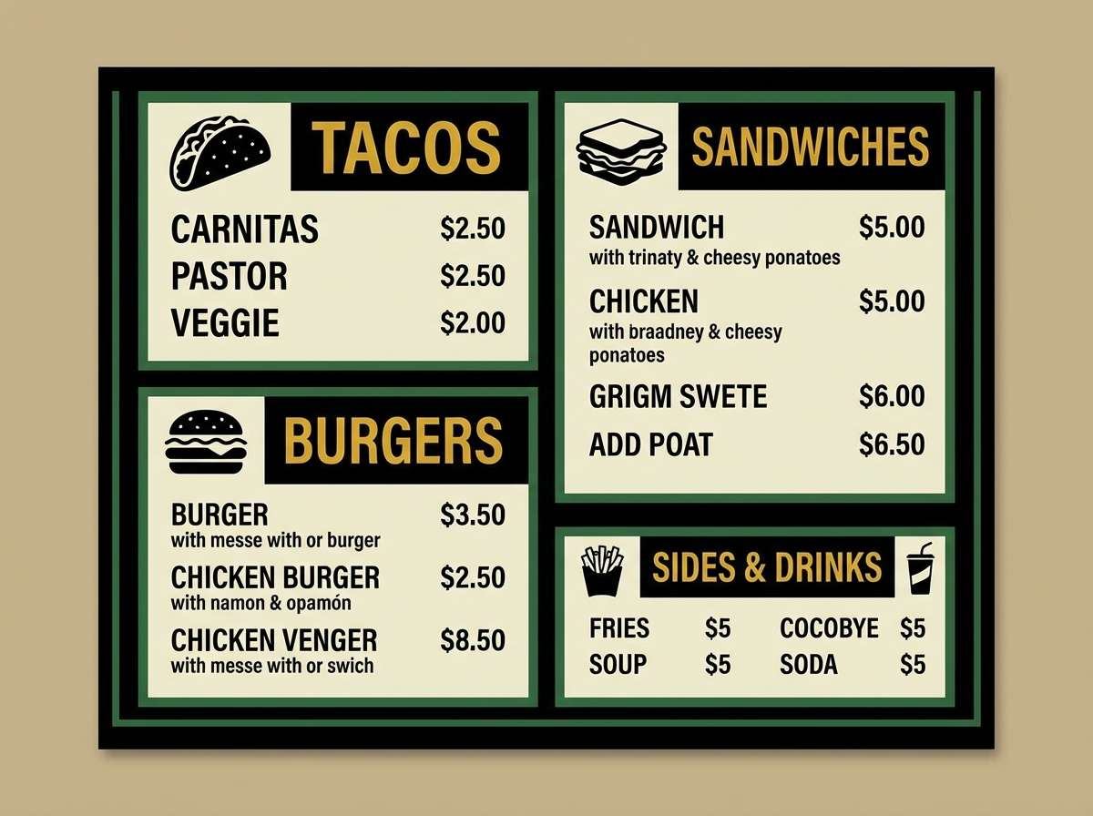
18) Night Market Glow
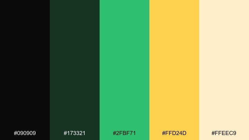
HEX: #090909 #173321 #2fbf71 #ffd24d #ffeec9
Mood: lively, warm, bustling
Best for: food truck menu
Lively and warm, it brings to mind street stalls, sizzling grills, and glowing marquee signs. The green keeps things fresh and food-friendly, and the yellow reads like warm light. For black green yellow color combinations in menus, make prices and section headers yellow while ingredients stay on the pale tint. Tip: use chunky type and clear spacing so the dark background never feels crowded.
Image example of night market glow generated using media.io
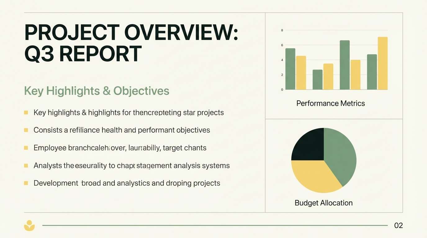
19) Minimal Grid
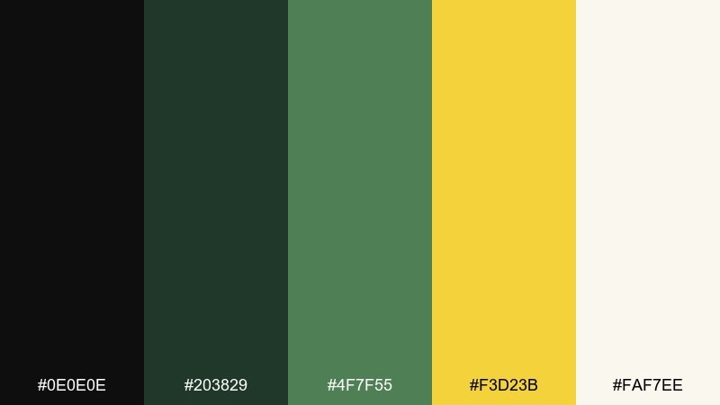
HEX: #0e0e0e #203829 #4f7f55 #f3d23b #faf7ee
Mood: orderly, modern, balanced
Best for: presentation template
Orderly and modern, it feels like a clean grid with a confident highlight pen. The softened yellow avoids harshness, so slides stay professional even with high contrast. It is ideal for decks, reports, and workshops that need structure plus energy. Tip: use the pale background for most slides and flip to dark only for section dividers.
Image example of minimal grid generated using media.io
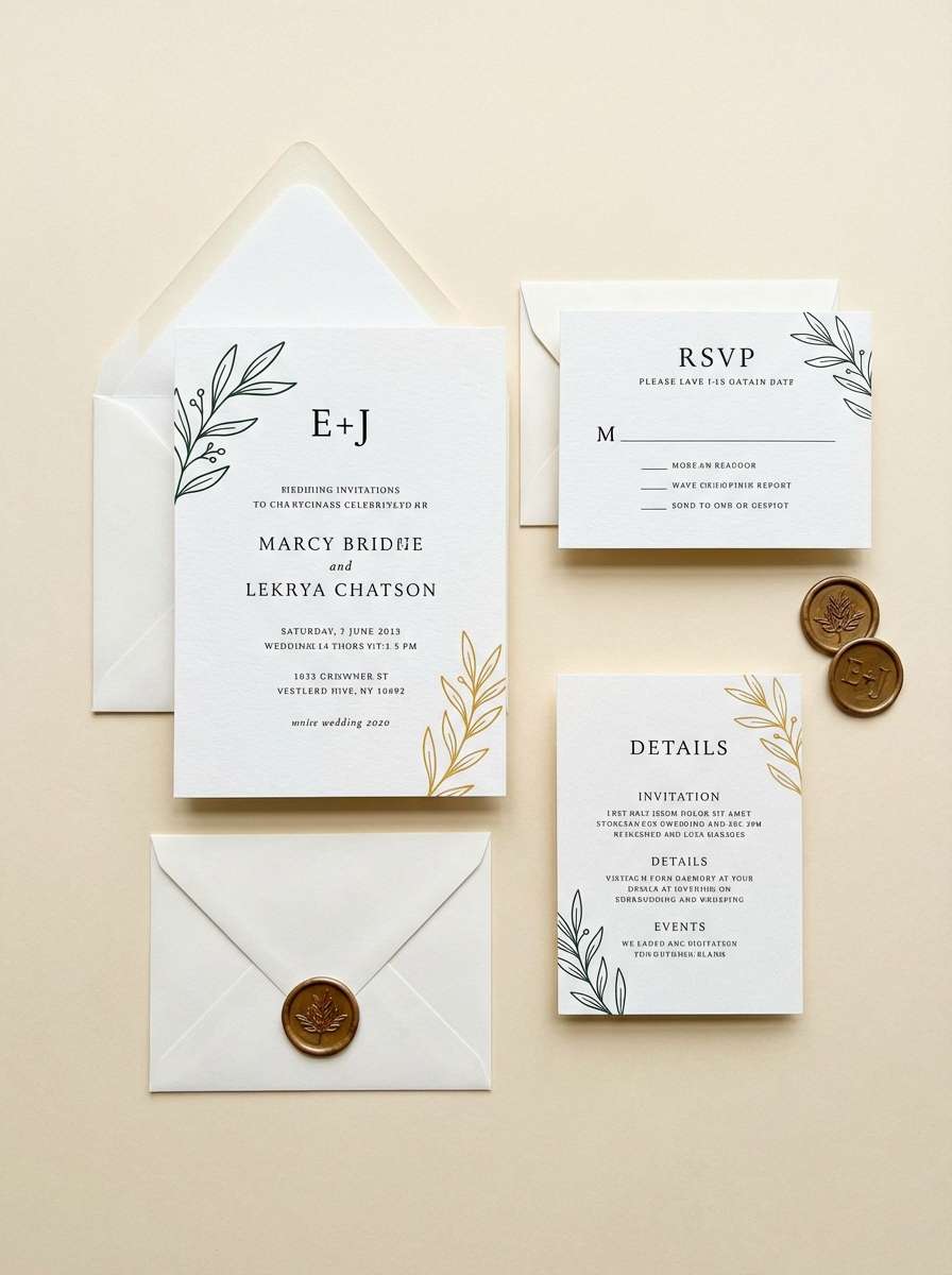
20) Golden Canopy
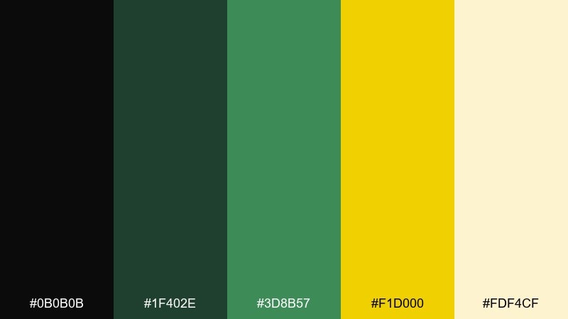
HEX: #0b0b0b #1f402e #3d8b57 #f1d000 #fdf4cf
Mood: uplifting, natural, sunny
Best for: wedding invitation suite
Uplifting and natural, it reads like sun filtering through a green canopy. The creamy tint makes the palette feel soft enough for formal print, while black keeps type crisp. It works for modern wedding stationery, garden events, and elegant invites that want a hint of color. Tip: print the yellow as a thin border or monogram accent, and keep the rest mostly cream and deep green.
Image example of golden canopy generated using media.io
What Colors Go Well with Black Green Yellow?
Soft off-whites and warm creams are the easiest partners—they reduce glare, give text room to breathe, and make yellow look more premium than harsh. Light grays also help you add UI surfaces without competing with the accent.
For a richer look, try deep browns, dark teals, or muted olives to create a natural gradient from black into green. If you want extra pop, use tiny hits of white (for type) or a cool cyan/teal (for secondary highlights) while keeping yellow as the primary attention color.
In print, metallic gold or a textured paper stock can replace “bright yellow” energy with a more refined feel. That’s especially useful for stationery, editorial, and premium packaging.
How to Use a Black Green Yellow Color Palette in Real Designs
Start with black (or near-black) as the base for structure, then pick one green as your primary brand color for backgrounds, shapes, or illustrations. Use yellow last—ideally for only one job in the layout: CTA buttons, warnings, prices, or dates.
For readability, avoid long paragraphs in pure yellow on black. Instead, place body text on a light tint (cream/off-white) and reserve yellow for short labels or UI states where speed matters.
Keep contrast consistent across components: one headline style, one button style, and one highlight style. That restraint is what makes black green yellow feel modern rather than chaotic.
Create Black Green Yellow Palette Visuals with AI
If you have HEX codes but need real examples (posters, menus, UI, labels), AI can help you explore composition fast. Generate multiple variations, then refine typography, spacing, and where the yellow accent appears.
Use the prompts under each palette as a starting point, and swap in your product type (e.g., “coffee bag label” or “mobile onboarding screen”) while keeping the same color mood. This makes it easy to keep branding consistent across assets.
When you land on a direction, export a few options and A/B test the yellow emphasis—small changes in accent size can dramatically shift how “loud” the design feels.
Black Green Yellow Color Palette FAQs
-
Why do black, green, and yellow look so high-contrast?
Black creates maximum value contrast, while yellow is naturally high-luminance and draws attention immediately. Green sits between them as a stabilizer, so the palette feels energetic but still grounded. -
What’s the best background choice: black or light cream?
Use black backgrounds for bold, punchy layouts (flyers, dashboards, banners). Use light cream/off-white backgrounds for text-heavy pieces (manuals, invitations, editorial) and keep black + green for structure with yellow as accents. -
How do I keep yellow from overpowering the design?
Limit yellow to one primary role (CTA, price, warning, or date), and use it in smaller areas than you think. Add breathing room (padding/whitespace) and keep most large surfaces in black, deep green, or cream. -
Are black green yellow palettes good for UI design?
Yes—especially for dark mode dashboards and apps where you need fast scanning. Use yellow for primary actions and alerts, green for success/data states, and reserve high-contrast combos for short text or icons to protect readability. -
What colors can I add as neutrals to this palette?
Off-white, warm cream, and light gray work best as supporting neutrals. They soften contrast, improve legibility, and help yellow feel more intentional rather than “neon everywhere.” -
Does this palette fit branding outside of sports or safety themes?
Definitely. If you mute the yellow into gold and choose moss/olive greens, it becomes premium and natural for wellness, stationery, and eco brands. If you push neon greens and bright yellow, it becomes tech-forward for gaming and startups. -
How can I generate matching visuals for these palettes quickly?
Use a text-to-image tool and keep the prompt focused on layout type (poster, label, UI) plus “dominant tones” aligned to your HEX set. Generate a few variations, then iterate by changing only one element at a time (accent size, background tone, or typography style).
Next: Cartoon Color Palette


