

A zombie apocalypse color palette lives in the space between fear and function: sickly greens, soot-dark neutrals, and worn rusts that still keep UI and typography readable.
Below are 20 gritty, cinematic zombie apocalypse colors with HEX codes—ready for posters, games, thumbnails, interfaces, and branding that needs tension without visual chaos.
In this article
- Why Zombie Apocalypse Palettes Work So Well
-
- ashen bunker
- rotting olive
- bloodless concrete
- rusted barricade
- toxic fog
- night watch
- graveyard mist
- moldy denim
- spore print
- abandoned hospital
- highway ash
- canned rations
- radioactive lichen
- broken neon sign
- wet asphalt
- burnt timber
- cold rations steel
- cemetery floral
- survivor canvas
- dawn after outbreak
- What Colors Go Well with Zombie Apocalypse?
- How to Use a Zombie Apocalypse Color Palette in Real Designs
- Create Zombie Apocalypse Palette Visuals with AI
Why Zombie Apocalypse Palettes Work So Well
Zombie apocalypse palettes are built for high-stakes storytelling: low-light neutrals, dirty greens, and oxidized warms instantly suggest decay, survival, and danger. Even without imagery, the colors alone communicate the genre.
They also work because they’re practical. Dark bases reduce glare in UI, muted midtones keep large areas calm, and controlled accents (rust, lime, sand) create clear focal points for buttons, titles, and warnings.
Most importantly, these schemes preserve readability. When you treat the lightest swatch as “signal” (text, icons, highlights), you get gritty atmosphere without sacrificing clarity.
20+ Zombie Apocalypse Color Palette Ideas (with HEX Codes)
1) Ashen Bunker
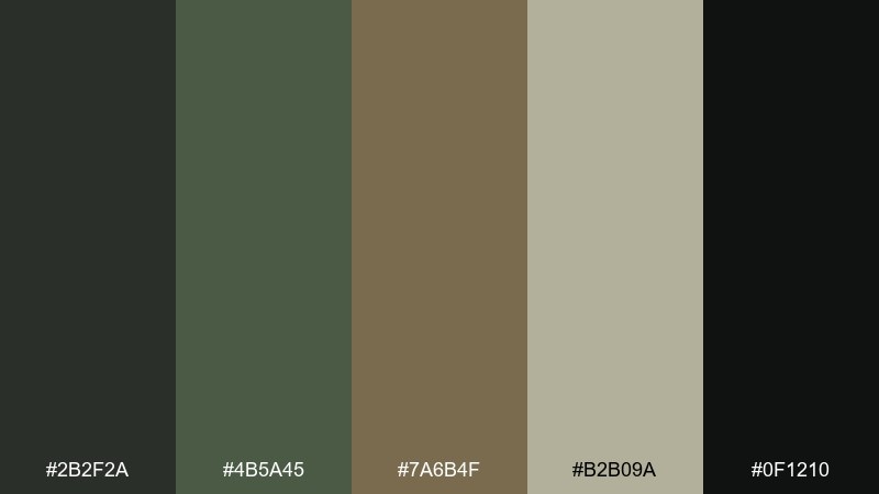
HEX: #2b2f2a #4b5a45 #7a6b4f #b2b09a #0f1210
Mood: grim, tactical, grounded
Best for: survival game UI and HUD design
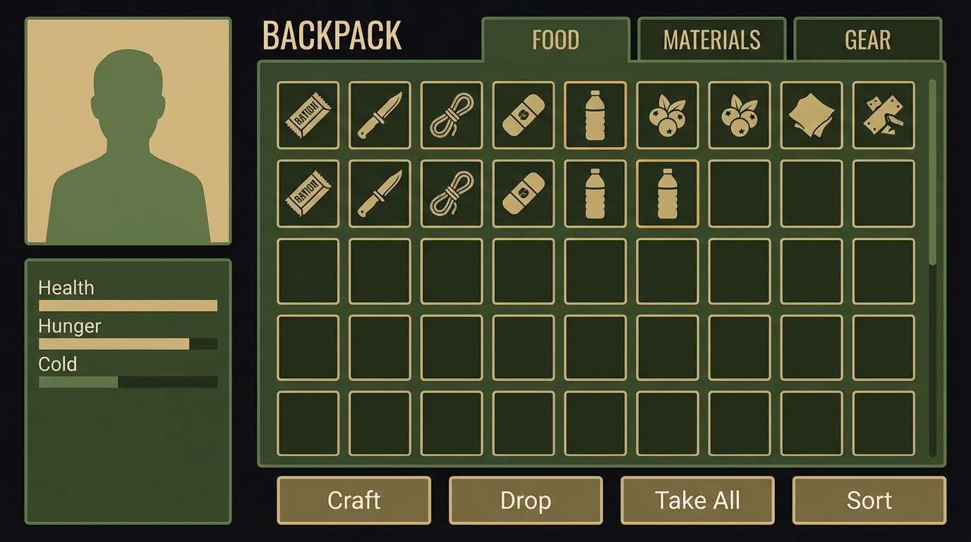
Grim and tactical, these tones feel like concrete dust, dried moss, and dim emergency lighting. Use the deep near-black as your base, then layer olive and khaki for readable panels and badges. The warm beige works best as a micro-accent for focus states or item rarity. Tip: keep contrast high by reserving the lightest swatch for text and key icons only.
Image example of ashen bunker generated using media.io
Media.io is an online AI studio for creating and editing video, image, and audio in your browser.

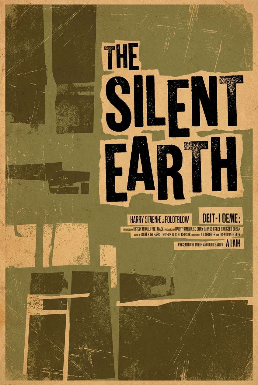
2) Rotting Olive
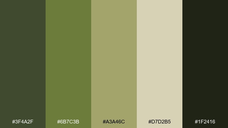
HEX: #3f4a2f #6b7c3b #a3a46c #d7d2b5 #1f2416
Mood: decayed, earthy, suspenseful
Best for: horror movie posters and teaser art
Decayed and earthy, it reads like overgrown alleys, moldy fabric, and dust-covered daylight. These zombie apocalypse color combinations work well when you push the darkest green into heavy shadows and let the pale sand carry the title. Pair with distressed grain and simple silhouettes rather than detailed imagery for a stronger hit. Tip: use the mid olive for credits and small copy to avoid muddy text.
Image example of rotting olive generated using media.io
3) Bloodless Concrete
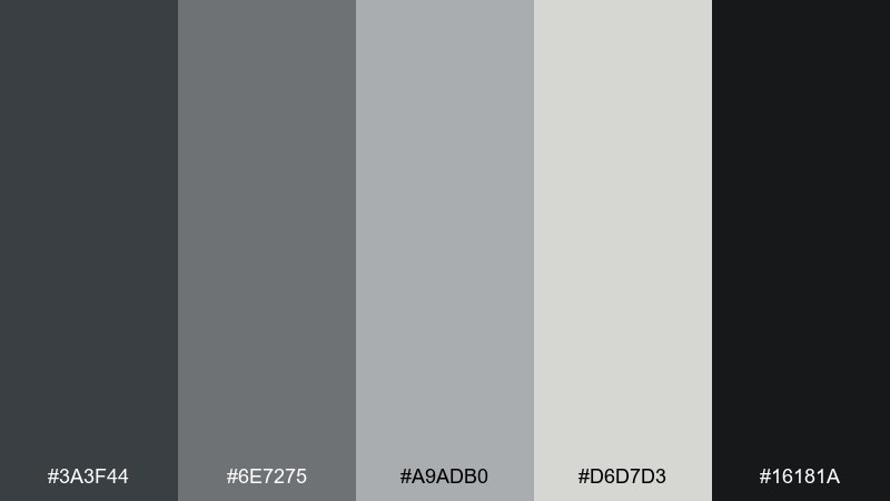
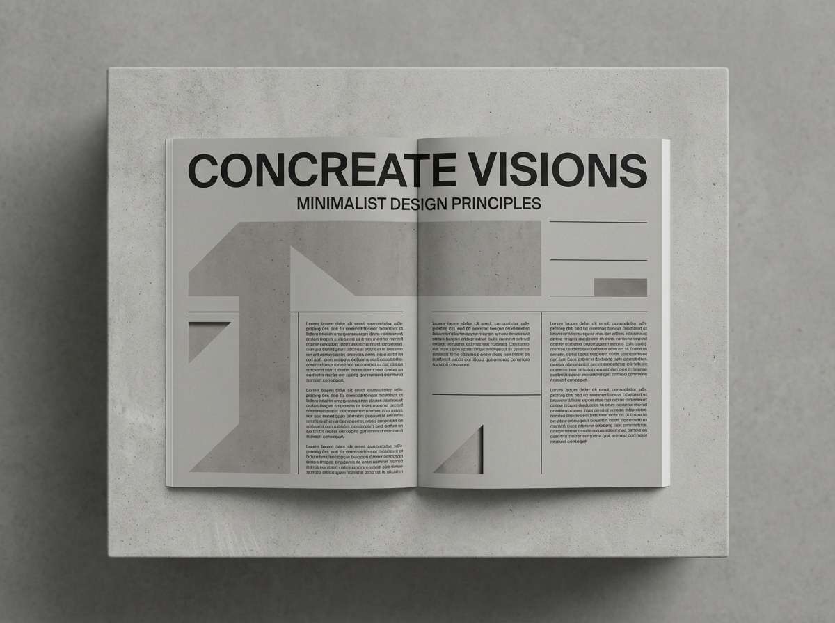
HEX: #3a3f44 #6e7275 #a9adb0 #d6d7d3 #16181a
Mood: cold, clinical, minimal
Best for: editorial layouts and long-form articles
Cold and clinical, these grays evoke abandoned stations and fogged glass without the drama of heavy color. Use the near-black for headers, medium gray for body text, and keep the light gray as generous negative space. The soft off-white is ideal for paper-like backgrounds that still feel modern. Tip: add hierarchy with weight and spacing, not extra colors.
Image example of bloodless concrete generated using media.io
4) Rusted Barricade
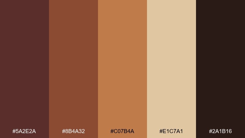
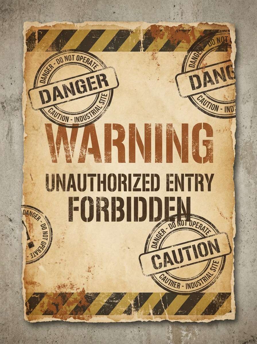
HEX: #5a2e2a #8b4a32 #c07b4a #e1c7a1 #2a1b16
Mood: urgent, worn, industrial
Best for: warning flyers and evacuation notices
Urgent and worn, it looks like oxidized metal, scorched wood, and faded paper taped to a fence. This zombie apocalypse color palette shines in bold blocks, especially when you use the deep brown for type and the sand tone for readable backgrounds. Pair with icons, stamps, and rough borders to sell the barricade vibe. Tip: keep the orange-rust as a single accent stripe so it feels intentional, not noisy.
Image example of rusted barricade generated using media.io
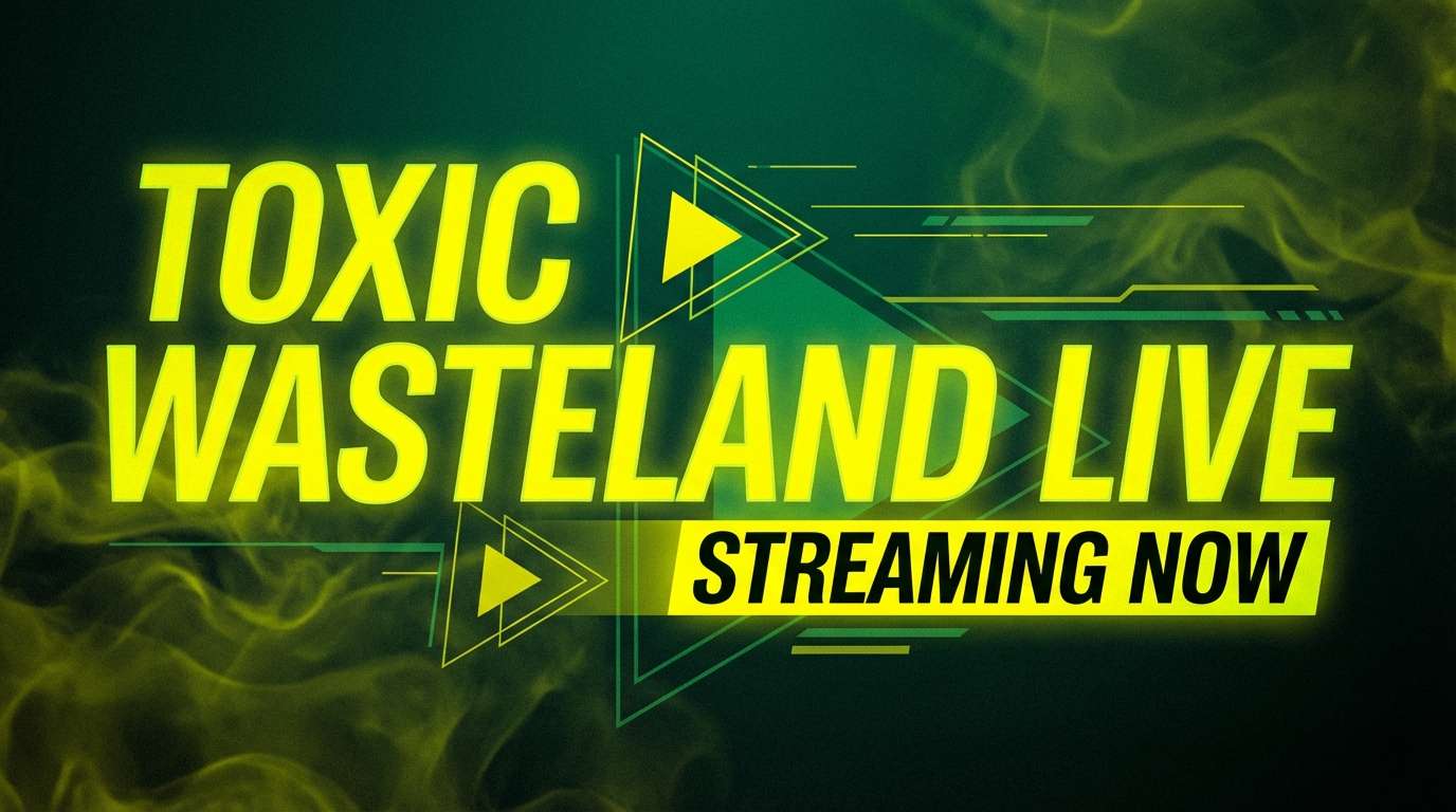
5) Toxic Fog
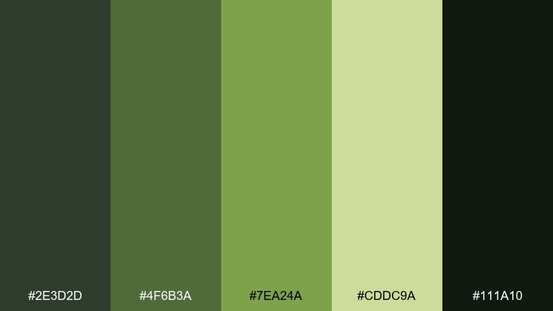
HEX: #2e3d2d #4f6b3a #7ea24a #cddc9a #111a10
Mood: eerie, contaminated, tense
Best for: streaming thumbnails and video covers
Eerie and contaminated, the greens feel like streetlight haze cutting through a chemical mist. Build the frame with the dark forest tones, then punch in the yellow-green for focal objects and urgent callouts. The pale green reads best as a glow effect or soft outline. Tip: avoid using all five at once; pick three and let the rest support shadows and highlights.
Image example of toxic fog generated using media.io
6) Night Watch
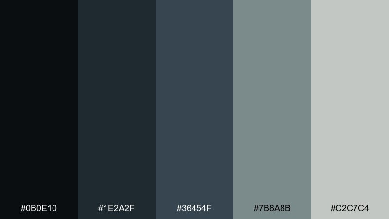
HEX: #0b0e10 #1e2a2f #36454f #7b8a8b #c2c7c4
Mood: stealthy, modern, controlled
Best for: app onboarding and dark-mode screens
Stealthy and controlled, it evokes midnight patrols, rain-wet glass, and low-lit control rooms. Use the jet black as the canvas, then step up through blue-gray for cards and dividers. The pale gray is best reserved for primary text and key CTAs in dark mode. Tip: keep borders subtle and rely on spacing to maintain a premium feel.
Image example of night watch generated using media.io

7) Graveyard Mist
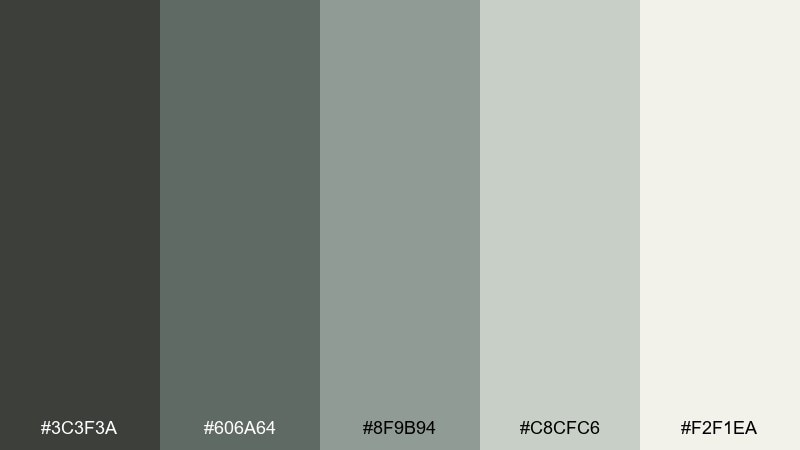
HEX: #3c3f3a #606a64 #8f9b94 #c8cfc6 #f2f1ea
Mood: quiet, haunted, airy
Best for: website backgrounds and hero sections
Quiet and haunted, these soft grays feel like morning fog rolling over stone. Let the off-white and pale gray carry the background, then use the deeper tones for navigation and headings. It pairs beautifully with minimalist photography or line illustrations that need breathing room. Tip: add a single strong black only for micro-contrast, not for large blocks.
Image example of graveyard mist generated using media.io

8) Moldy Denim
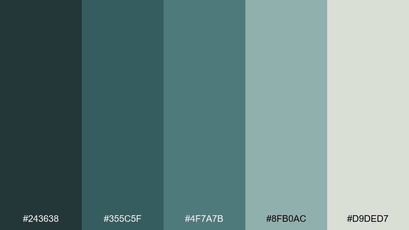
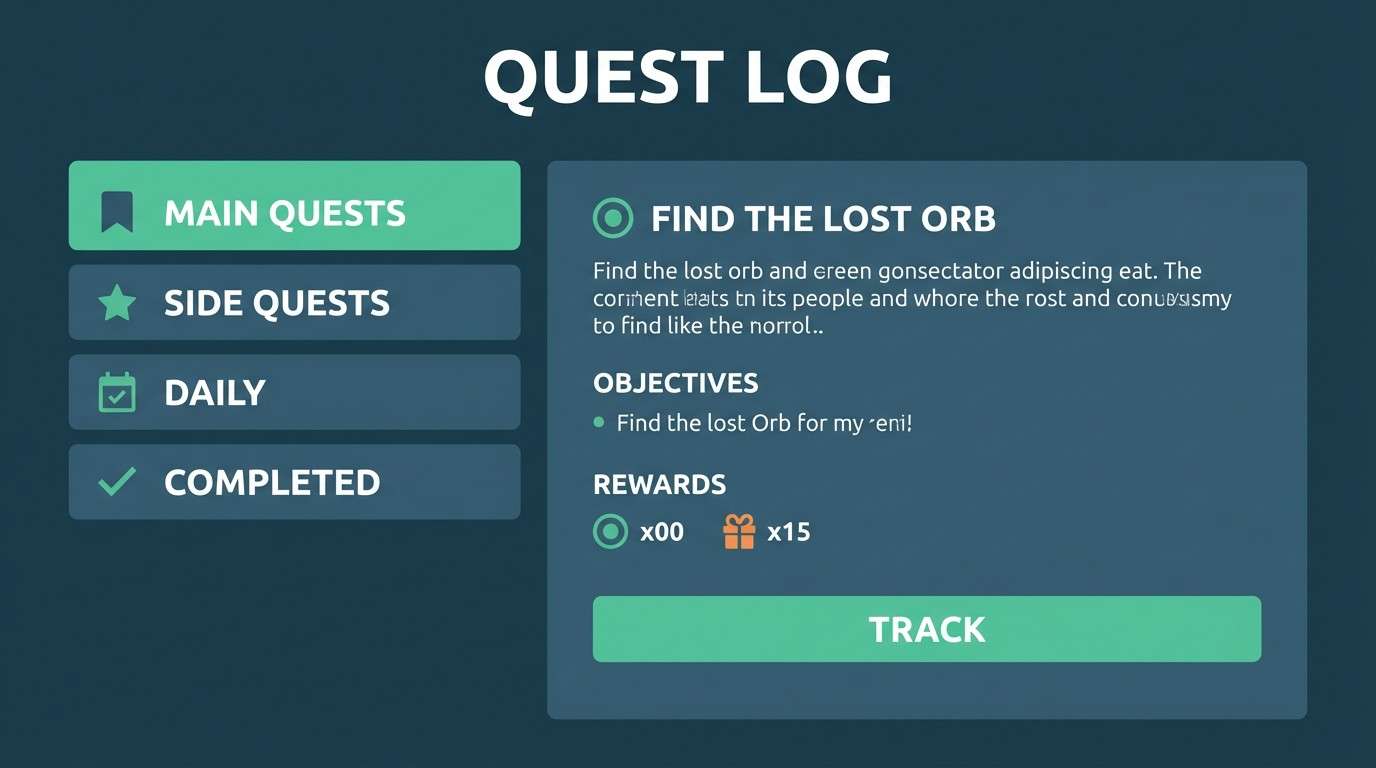
HEX: #243638 #355c5f #4f7a7b #8fb0ac #d9ded7
Mood: weathered, cool, investigative
Best for: mystery game menus and quest logs
Weathered and cool, the teal-grays suggest soaked denim, oxidized metal, and quiet tension. Use the darkest teal for sidebars and modal frames, then lift key states with the seafoam highlight. The pale gray-green is great for background panels that still feel moody. Tip: keep accent usage consistent across the menu so the UI stays navigable under low contrast.
Image example of moldy denim generated using media.io
9) Spore Print
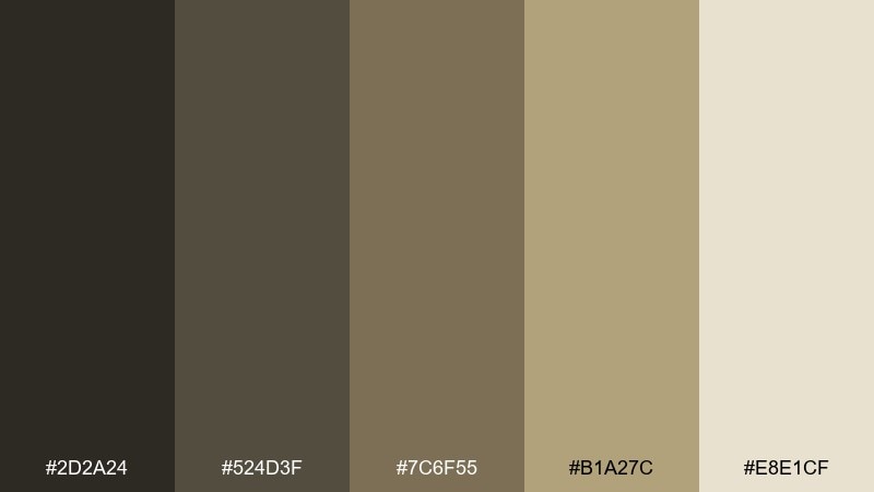
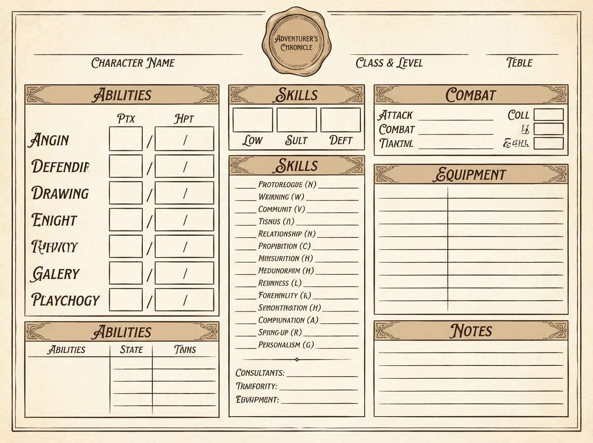
HEX: #2d2a24 #524d3f #7c6f55 #b1a27c #e8e1cf
Mood: dusty, analog, survivalist
Best for: tabletop RPG character sheets and printables
Dusty and analog, it feels like old maps, stained paper, and field notes written by lantern light. These zombie apocalypse color combinations are perfect for printable sheets where readability matters more than spectacle. Pair the cream background with dark brown text, then use the tan as section dividers and stat boxes. Tip: add subtle noise to the background to hide printer banding and keep it tactile.
Image example of spore print generated using media.io
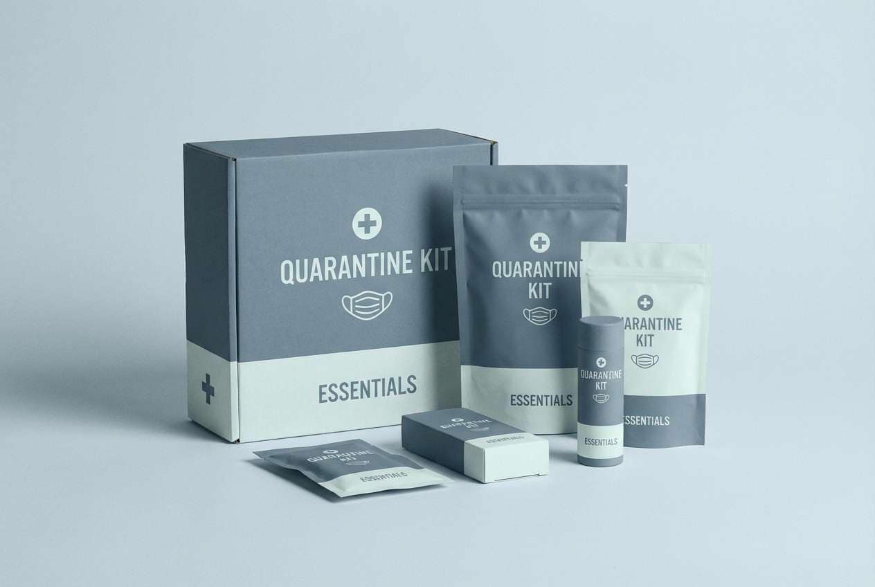
10) Abandoned Hospital
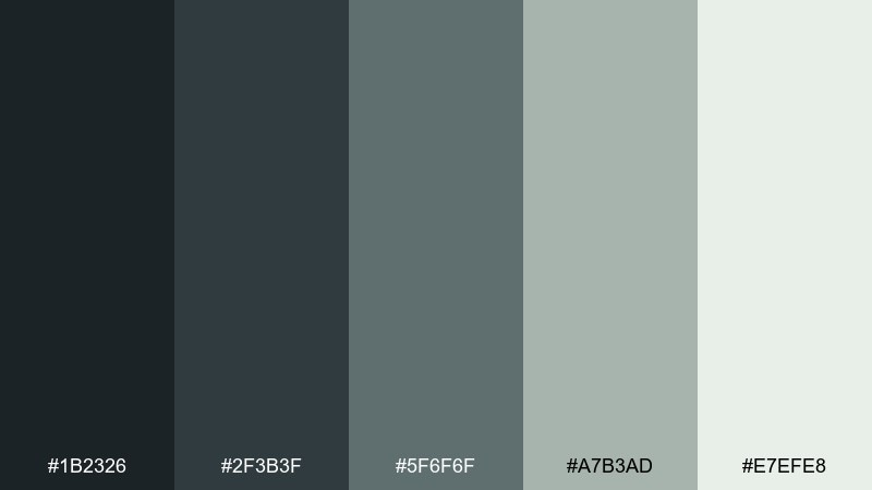
HEX: #1b2326 #2f3b3f #5f6f6f #a7b3ad #e7efe8
Mood: sterile, uneasy, muted
Best for: quarantine branding and safety guides
Sterile and uneasy, it evokes empty corridors, surgical steel, and fluorescent hush. Keep the darkest blue-gray for headers and warning labels, while the pale mint-white makes a clean backdrop for diagrams. It pairs well with simple pictograms and thin-line icons. Tip: use the mid gray-green for callout boxes so alerts feel serious without turning harsh.
Image example of abandoned hospital generated using media.io
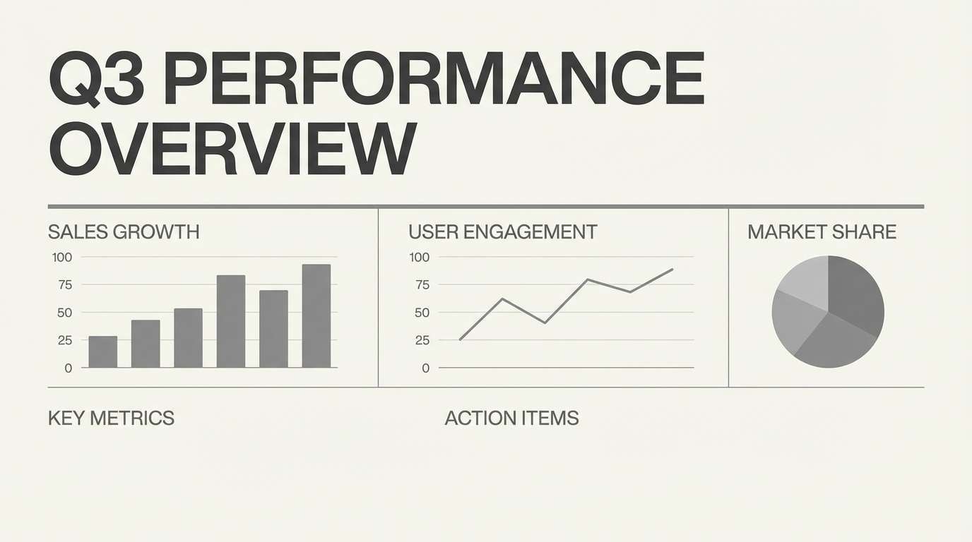
11) Highway Ash
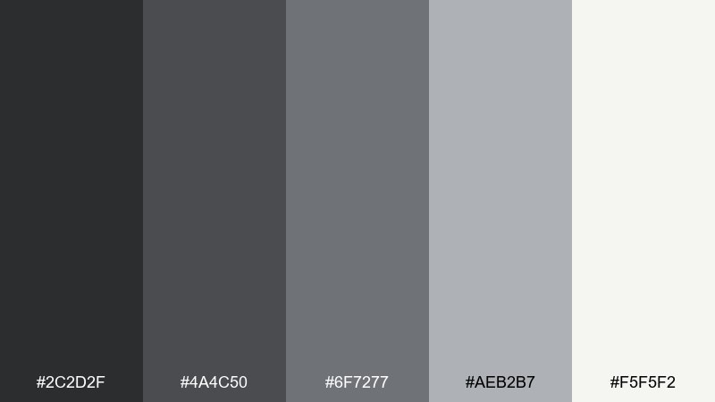
HEX: #2c2d2f #4a4c50 #6f7277 #aeb2b7 #f5f5f2
Mood: bleak, modern, cinematic
Best for: presentation templates and pitch decks
Bleak and modern, these asphalt grays feel like an empty highway after a storm. For clean slides, use the off-white as the base and bring in charcoal for big headlines and charts. The mid grays help you build depth in tables without clutter. Tip: this zombie apocalypse color scheme looks sharp when paired with one accent color from your brand, used sparingly for data emphasis.
Image example of highway ash generated using media.io
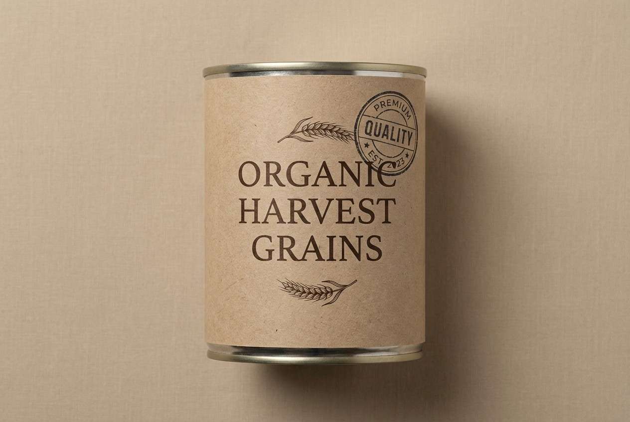
12) Canned Rations
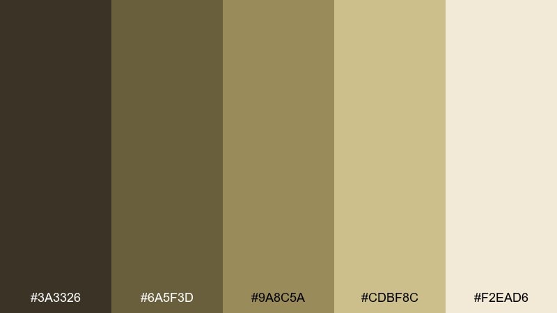
HEX: #3a3326 #6a5f3d #9a8c5a #cdbf8c #f2ead6
Mood: practical, rugged, warm
Best for: food label designs and survival kits
Practical and rugged, it brings to mind dented tins, burlap straps, and pantry staples. Use the dark brown for label typography and the lighter wheat tones for background panels and ingredient blocks. It pairs well with simple badges, stamped seals, and monospace text for an utilitarian look. Tip: keep the lightest cream for whitespace so the label does not feel heavy.
Image example of canned rations generated using media.io
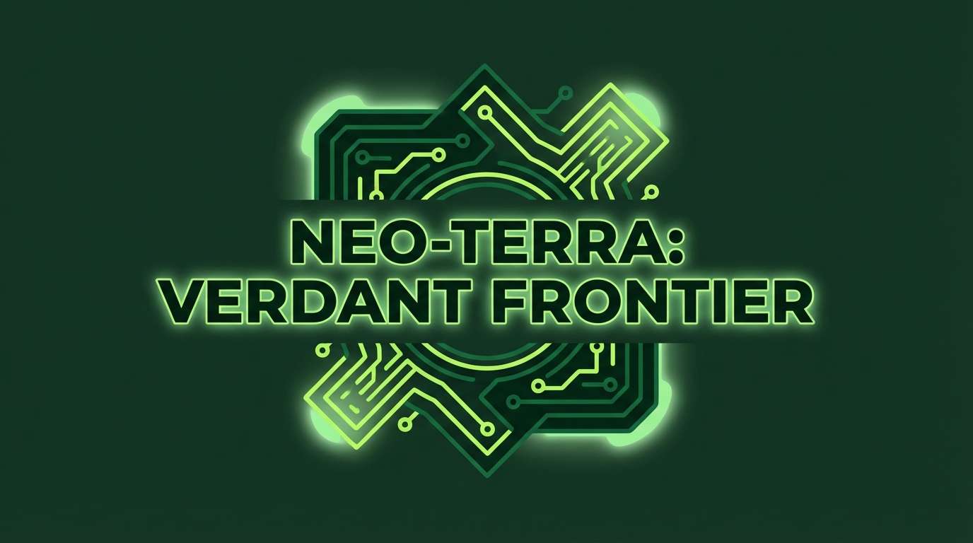
13) Radioactive Lichen
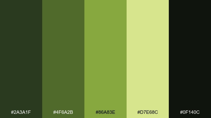
HEX: #2a3a1f #4f6a2b #86a83e #d7e68c #0f140c
Mood: charged, hazardous, alive
Best for: sci-fi game banners and promo art
Charged and hazardous, the greens look like lichen glowing on cracked concrete. Use the near-black green to frame the composition, then let the bright lime sit on focal elements like badges or countdown timers. The pale yellow-green works best as a soft glow behind text rather than a full background. Tip: add a subtle gradient between the mid and bright greens to avoid flat neon patches.
Image example of radioactive lichen generated using media.io
14) Broken Neon Sign
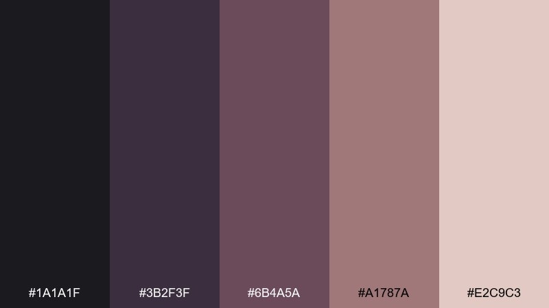
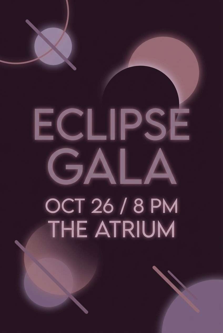
HEX: #1a1a1f #3b2f3f #6b4a5a #a1787a #e2c9c3
Mood: noir, bruised, stylish
Best for: event posters and moody cover art
Noir and bruised, it feels like a flickering sign over a deserted street. This zombie apocalypse color palette is a strong fit for posters where you want menace with a touch of style, especially with big type and negative space. Pair the deep plum with dusty rose accents for highlights and subtle gradients. Tip: keep the light blush only for small glints so the palette stays dark and cinematic.
Image example of broken neon sign generated using media.io
15) Wet Asphalt
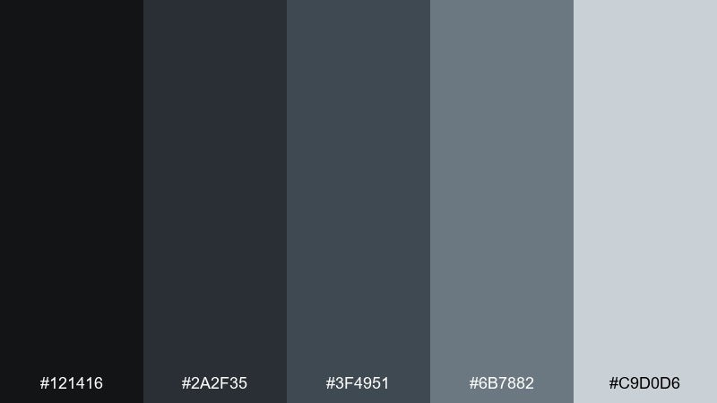
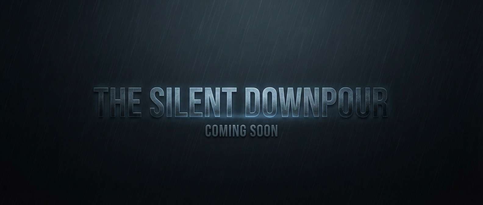
HEX: #121416 #2a2f35 #3f4951 #6b7882 #c9d0d6
Mood: stormy, sleek, cinematic
Best for: trailer title cards and motion graphics
Stormy and sleek, it reads like rain on pavement with cold reflections. Use the dark tones for full-bleed title cards, then bring in the steel blue-gray for secondary type and subtle lines. The light gray works well as a glow or edge highlight in motion. Tip: keep backgrounds nearly black so animated text stays crisp and dramatic.
Image example of wet asphalt generated using media.io
16) Burnt Timber
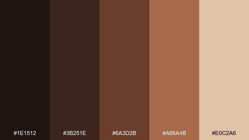
HEX: #1e1512 #3b251e #6a3d2b #a66a4b #e0c2a6
Mood: charred, earthy, resilient
Best for: merch patches and outdoor brand marks
Charred and earthy, it suggests scorched beams, leather straps, and campfire embers. The deep brown-black makes a strong base for logos, while the copper and tan create stitching-like contrast. Pair with bold shapes and minimal detail so the mark holds up on fabric. Tip: use the light beige as the thread color in mockups for a realistic finish.
Image example of burnt timber generated using media.io

17) Cold Rations Steel
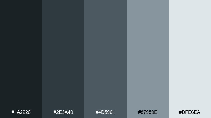
HEX: #1a2226 #2e3a40 #4d5961 #87959e #dfe6ea
Mood: technical, cool, dependable
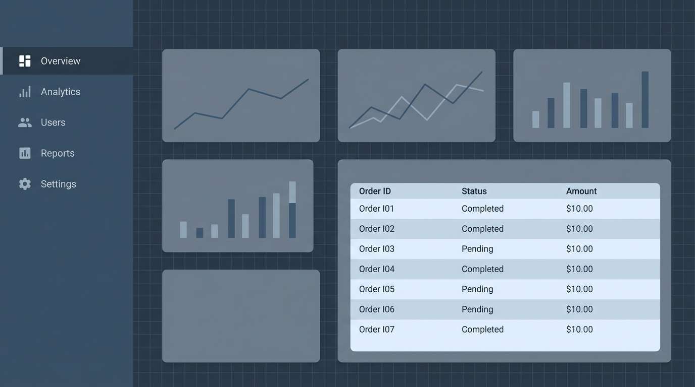
Best for: SaaS admin dashboards and data tables
Technical and dependable, these steel blues feel like utilitarian gear and calm decision-making under pressure. Use the darkest swatch for navigation, then apply the mid tones to cards and table headers. The pale blue-gray is perfect for subtle row striping that improves scanning. Tip: reserve the lightest tint for input fields so forms feel clean and intentional.
Image example of cold rations steel generated using media.io
18) Cemetery Floral
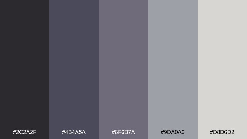
HEX: #2c2a2f #4b4a5a #6f6b7a #9da0a6 #d8d6d2
Mood: somber, poetic, muted
Best for: book covers and journal designs
Somber and poetic, the muted purples and grays feel like dried flowers pressed into a notebook. Use the darkest violet-gray for the title, then let the light gray carry the cover background. It pairs well with thin botanical line art or subtle paper texture. Tip: keep the mid lavender for small ornamental rules so the design stays restrained.
Image example of cemetery floral generated using media.io
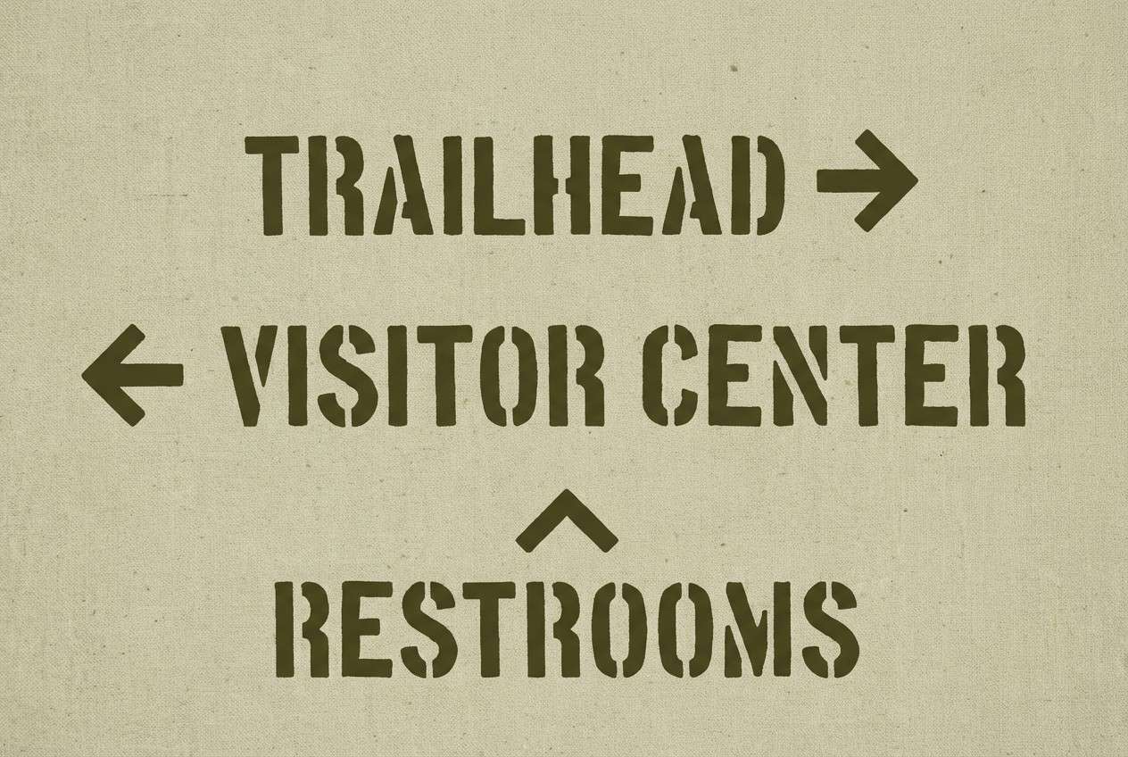
19) Survivor Canvas
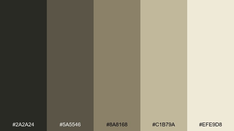
HEX: #2a2a24 #5a5546 #8a8168 #c1b79a #efe9d8
Mood: resourceful, vintage, calm
Best for: wayfinding signs and campsite graphics
Resourceful and calm, it resembles canvas tents, rope, and sun-faded gear. The dark olive-brown keeps signage legible, while the lighter khakis make great background panels for arrows and symbols. It pairs nicely with stencil typography and simple pictograms. Tip: use the cream as negative space around icons to boost visibility from a distance.
Image example of survivor canvas generated using media.io
20) Dawn After Outbreak
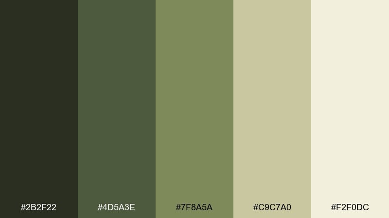
HEX: #2b2f22 #4d5a3e #7f8a5a #c9c7a0 #f2f0dc
Mood: somber, hopeful, natural
Best for: storyboards and end-credit frames
Somber but hopeful, these greens and warm neutrals feel like quiet daylight after a long night. Use the deepest shade for frame borders and captions, then layer the softer olive for blocks and notes. The pale cream works as a calm background that still matches the tone. Tip: these zombie apocalypse color combinations look best with matte textures and minimal contrast transitions, like film stills.
Image example of dawn after outbreak generated using media.io
What Colors Go Well with Zombie Apocalypse?
Zombie apocalypse schemes pair best with grounded neutrals and “contaminated” accents. Think charcoal, gunmetal, asphalt gray, and dirty off-white as your structure—then bring in olive, moss, and swamp green for atmosphere.
For tension and urgency, add a single warm accent like rust, dried blood brown, or burnt orange (in small doses). If you want a more sci-fi infected vibe, a controlled lime or toxic yellow-green works well as a glow or alert color.
To keep readability strong, reserve your lightest tint for typography and icons, and let midtones do the heavy lifting for panels, cards, and backgrounds.
How to Use a Zombie Apocalypse Color Palette in Real Designs
Start with a dark base (near-black, charcoal, deep green) and build a clear hierarchy: one background, one surface color for cards/panels, and one high-contrast text color. This keeps the “grit” without turning the layout muddy.
Use the accent color like a warning system. Apply it to CTAs, badges, danger states, and key props—then repeat consistently so users learn what it means at a glance.
Finish with texture sparingly: subtle grain, paper wear, fog gradients, or light scratches. Small texture adds realism; too much will destroy contrast and legibility.
Create Zombie Apocalypse Palette Visuals with AI
If you already have HEX codes but need real-looking visuals—posters, UI mockups, cover art, or title cards—AI helps you prototype fast while keeping the palette consistent.
In Media.io, you can paste a prompt, describe the mood (tactical, eerie, clinical), and iterate until the composition and contrast feel right for your use case.
Use the palette name plus one or two key colors (e.g., “moss green + soot black”) in your prompt to steer results while leaving room for lighting and texture.
Zombie Apocalypse Color Palette FAQs
-
What defines a zombie apocalypse color palette?
It’s typically built from dark neutrals (charcoal, soot, asphalt), decayed greens (olive, moss, swamp), and worn accents (rust, sand, dirty cream) to communicate survival, decay, and tension while staying readable. -
Are zombie apocalypse colors always green?
No. Green is common because it signals rot and contamination, but many effective palettes lean gray/steel for a clinical vibe, or rust/brown for industrial collapse. The key is muted, weathered tones with controlled contrast. -
How do I keep text readable in gritty color schemes?
Use a near-black for backgrounds, a light neutral for text (off-white or pale gray), and keep saturated accents minimal. Also rely on spacing and font weight so you don’t need extra colors for hierarchy. -
What’s the best accent color for zombie apocalypse UI?
Rust/orange works well for warnings and urgency, while toxic lime works for “infection” alerts. Pick one primary accent and use it consistently for CTAs, status badges, and critical states. -
Which palette here is best for dark mode?
Night Watch and Wet Asphalt are strong dark-mode options because they provide clean steps between near-black surfaces and readable light text, with cool midtones for cards and dividers. -
Can I use zombie apocalypse palettes for professional designs?
Yes—use the more neutral sets (Bloodless Concrete, Highway Ash, Cold Rations Steel) and keep any “genre” accents subtle. You’ll get a modern, serious look with a hint of grit. -
How can I generate palette-based visuals quickly?
Use Media.io’s text-to-image tool with a prompt that names the mood, the design type (poster, UI, packaging), and 1–2 key colors from your palette, then iterate with small changes to lighting and texture.


