

A professional color palette helps your brand feel trustworthy, organized, and easy to navigate—whether you’re designing a website, app UI, or business collateral.
Below are modern, ready-to-use professional color combinations (with HEX codes) plus AI prompts you can use to generate matching visuals in minutes.
In this article
- Why Professional Palettes Work So Well
-
- executive navy & silver
- charcoal sandstone
- teal ledger
- olive audit
- graphite & cobalt accent
- burgundy brief
- sunrise boardroom
- minimal mint & ink
- steel & saffron
- clean cloud blue
- plum spreadsheet
- terracotta ledger
- forest & paper
- slate lavender
- copper & concrete
- coastal teal lime
- espresso cream
- mono with rose gold
- indigo & warm gray
- azure & citrus
- What Colors Go Well with Professional?
- How to Use a Professional Color Palette in Real Designs
- Create Professional Palette Visuals with AI
Why Professional Palettes Work So Well
Professional palettes rely on balanced neutrals, clear contrast, and disciplined accent usage—so interfaces feel stable and content stays readable across screens and print.
They also create instant hierarchy. Dark anchors (navy, charcoal, ink) define structure, while soft off-whites reduce fatigue and keep layouts looking clean and modern.
Most importantly, professional color schemes scale well: they work in dashboards, pitch decks, websites, reports, packaging, and social templates without needing constant redesign.
20+ Professional Color Palette Ideas (with HEX Codes)
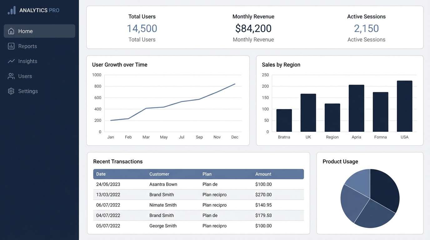
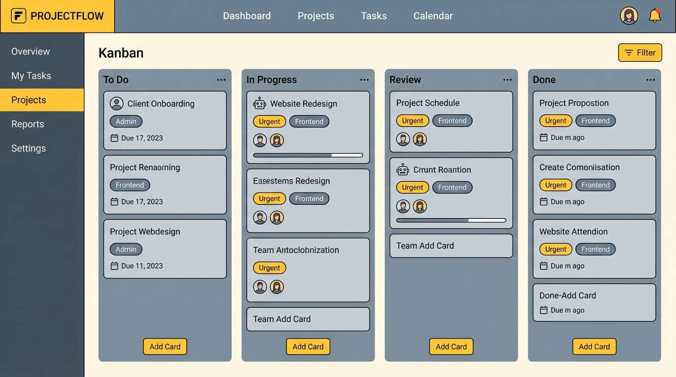
1) Executive Navy & Silver
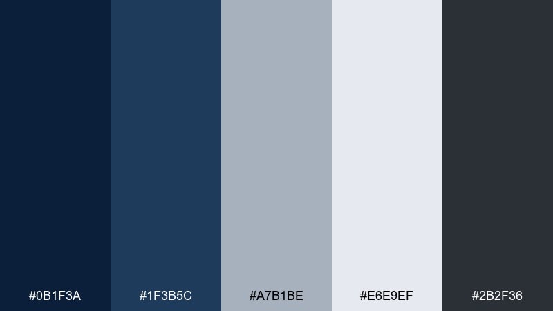
HEX: #0B1F3A #1F3B5C #A7B1BE #E6E9EF #2B2F36
Mood: confident, structured, executive
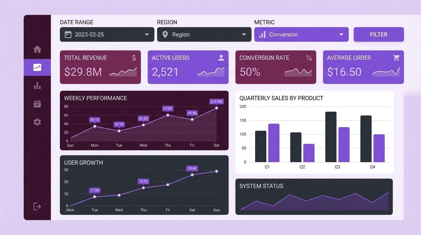
Best for: 2D SaaS analytics dashboard UI
Confident and structured, this mix evokes tailored suits, boardroom glass, and crisp reports. Use navy for navigation and key surfaces, then let silver-gray carry tables and secondary panels. Pair it with generous whitespace to keep dense data readable. Tip: reserve the darkest tone for headers and active states so hierarchy is instantly clear.
Image example of executive navy & silver generated using media.io
Media.io is an online AI studio for creating and editing video, image, and audio in your browser.

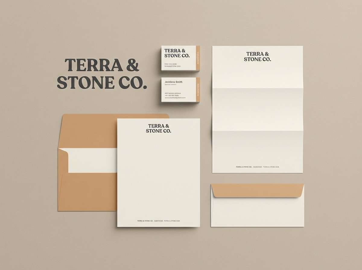
2) Charcoal Sandstone
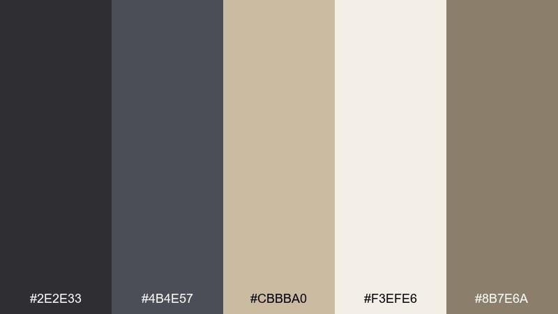
HEX: #2E2E33 #4B4E57 #CBBBA0 #F3EFE6 #8B7E6A
Mood: grounded, mature, understated
Best for: law firm brand identity kit
Grounded and mature, these tones feel like stone architecture and archival paper. The contrast reads premium without shouting, making it a dependable professional color palette for conservative industries. Use charcoal for wordmarks and headings, then bring sandstone into stationery accents and section dividers. Tip: keep the warm neutrals slightly dominant to avoid a heavy, overly dark look.
Image example of charcoal sandstone generated using media.io
3) Teal Ledger
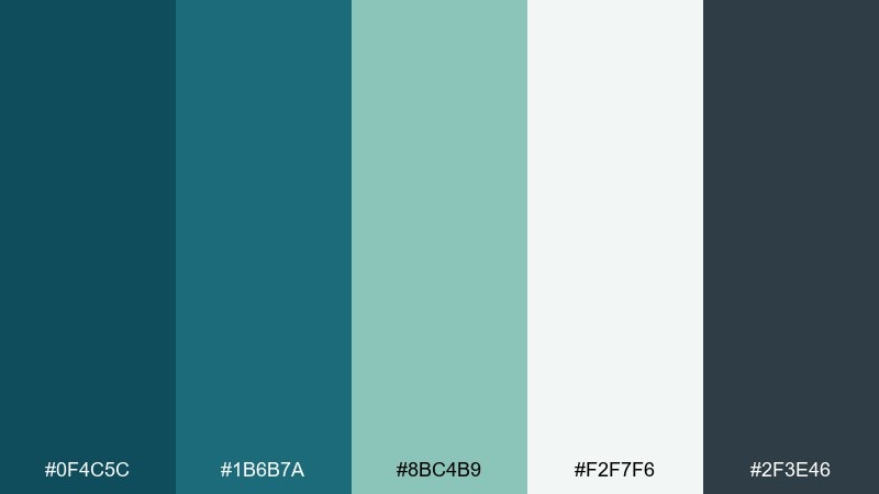
HEX: #0F4C5C #1B6B7A #8BC4B9 #F2F7F6 #2F3E46
Mood: clear, modern, trustworthy
Best for: fintech landing page hero and sections
Clear and modern, the teal range suggests clarity, transparency, and calm progress. Use the deeper teal for headlines and buttons, then layer the aqua tone into charts, icons, or highlight cards. Pair with a near-white background to keep the page feeling open and credible. Tip: repeat the same teal in CTAs and key links for consistent conversion cues.
Image example of teal ledger generated using media.io

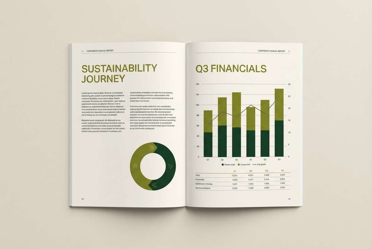
4) Olive Audit
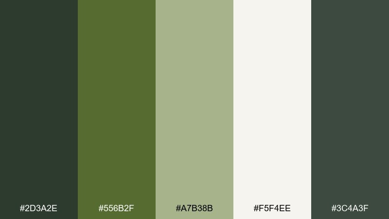
HEX: #2D3A2E #556B2F #A7B38B #F5F4EE #3C4A3F
Mood: steady, natural, dependable
Best for: annual report layout
Steady and natural, the olive greens read like polished wood, paper textures, and quiet confidence. They work well for long-form documents where fatigue is a risk, especially when balanced with a warm off-white. Pair with simple charts and restrained iconography so the tones do the heavy lifting. Tip: use the mid olive as a consistent callout color for key figures and pull quotes.
Image example of olive audit generated using media.io
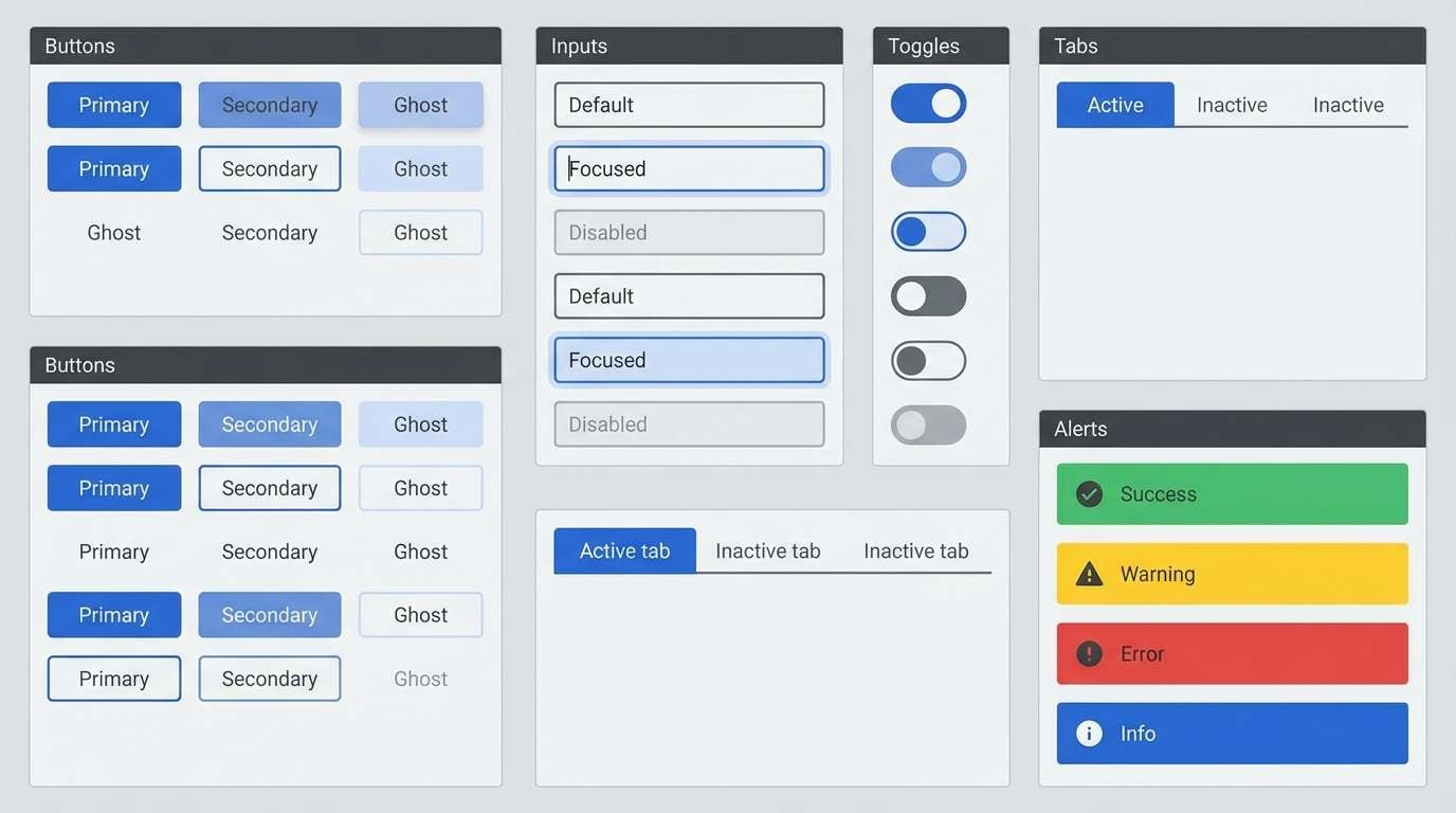
5) Graphite & Cobalt Accent
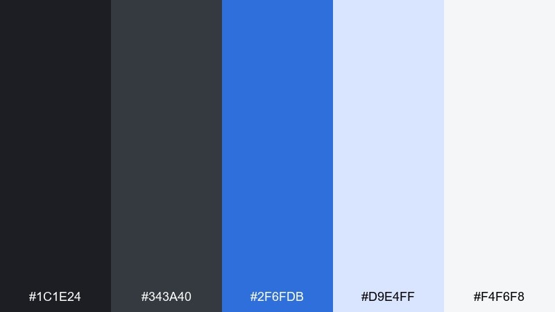
HEX: #1C1E24 #343A40 #2F6FDB #D9E4FF #F4F6F8
Mood: sharp, tech-forward, decisive
Best for: B2B product UI component library
Sharp and tech-forward, graphite with cobalt feels like precision tools and clean interfaces. These professional color combinations shine in buttons, links, and active states while keeping the base UI neutral. Pair the bright blue with soft pale tints for hover and focus treatments that still pass accessibility checks. Tip: limit cobalt to one action level per screen to avoid competing CTAs.
Image example of graphite & cobalt accent generated using media.io
6) Burgundy Brief
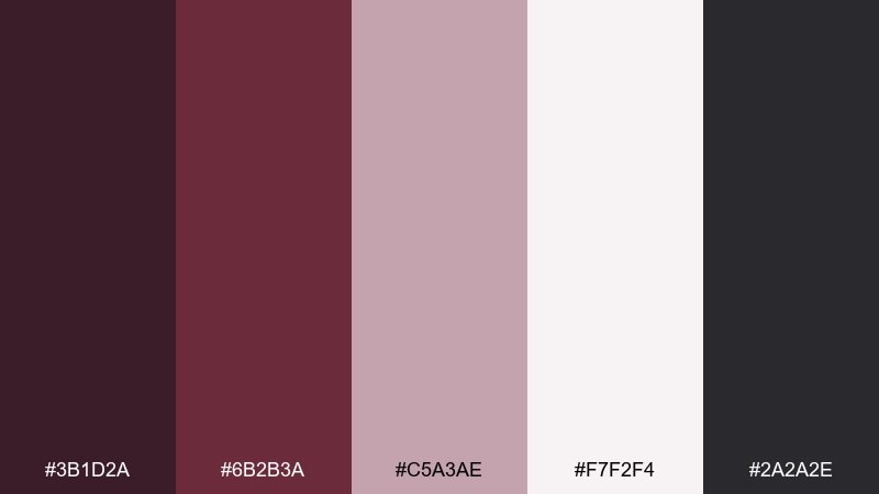
HEX: #3B1D2A #6B2B3A #C5A3AE #F7F2F4 #2A2A2E
Mood: refined, intimate, premium
Best for: consulting firm pitch deck theme
Refined and premium, burgundy brings a quiet luxury that still feels serious. Use the deep wine tone for title slides and section breaks, then soften charts with dusty rose tints. Pair with dark charcoal text for readability on lighter slides. Tip: keep photography desaturated so the burgundy accent stays the focal point.
Image example of burgundy brief generated using media.io
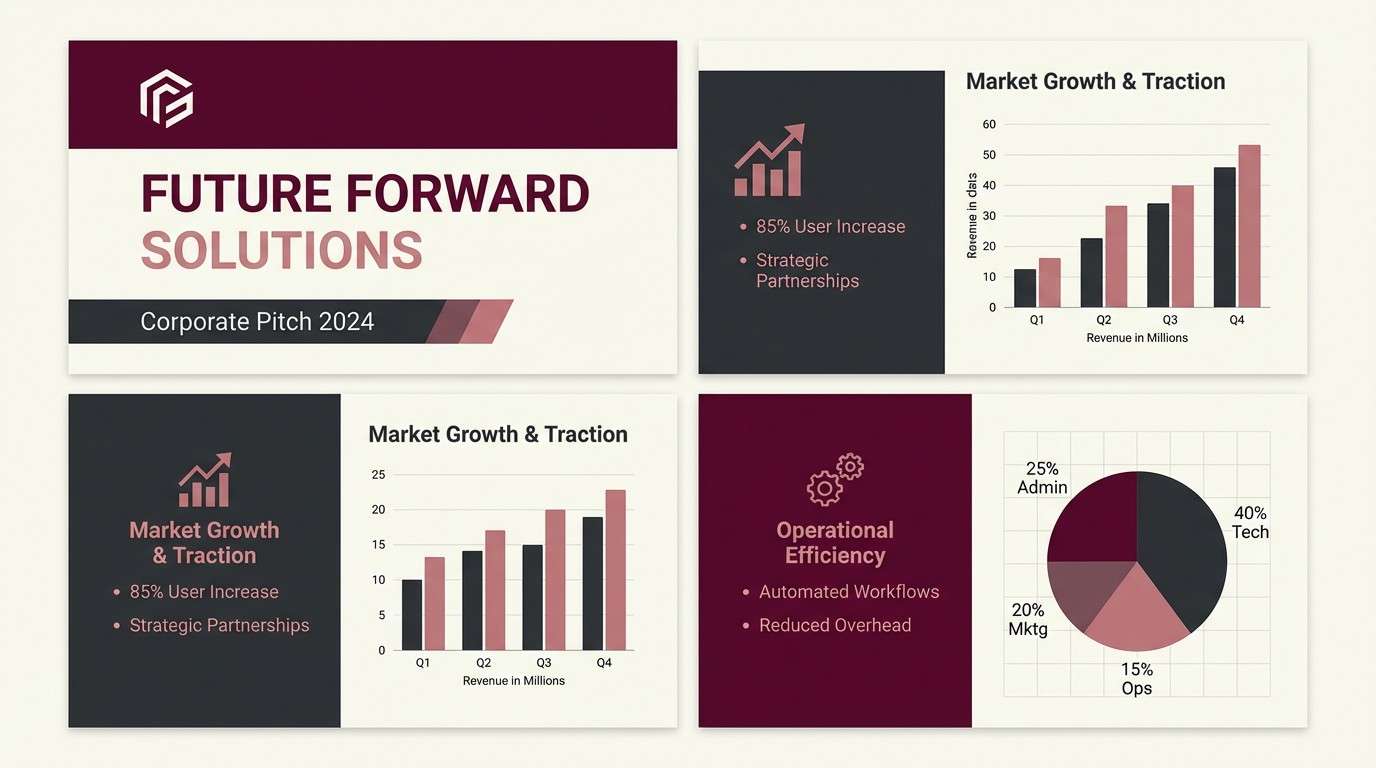
7) Sunrise Boardroom
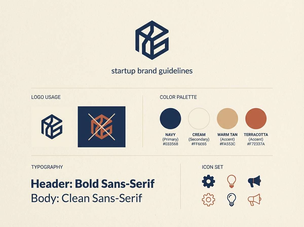
HEX: #2B2D42 #8D99AE #F2E9E4 #D9B08C #A44A3F
Mood: approachable, warm, confident
Best for: startup brand guidelines one-pager
Approachable and warm, these tones feel like early light on concrete and polished wood. The navy anchors the system while terracotta adds a human touch for headings, highlights, or illustration strokes. Pair with cream backgrounds to keep it friendly and modern rather than rustic. Tip: use terracotta sparingly as an emphasis color for key claims and metrics.
Image example of sunrise boardroom generated using media.io
8) Minimal Mint & Ink
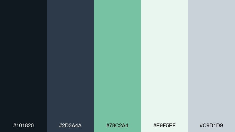
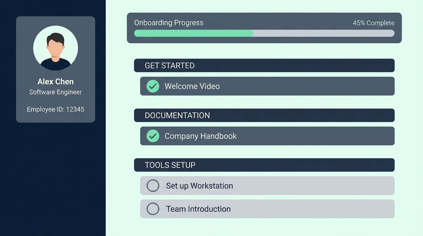
HEX: #101820 #2D3A4A #78C2A4 #E9F5EF #C9D1D9
Mood: fresh, orderly, calm
Best for: HR onboarding portal UI
Fresh and orderly, mint against ink-like dark tones suggests clarity and reassurance. Use the dark shades for navigation and headings, then bring mint into success states, progress steps, and subtle highlights. Pair with pale green-tinted surfaces to reduce contrast glare on long sessions. Tip: keep mint for positive cues so users learn the meaning instantly.
Image example of minimal mint & ink generated using media.io
9) Steel & Saffron
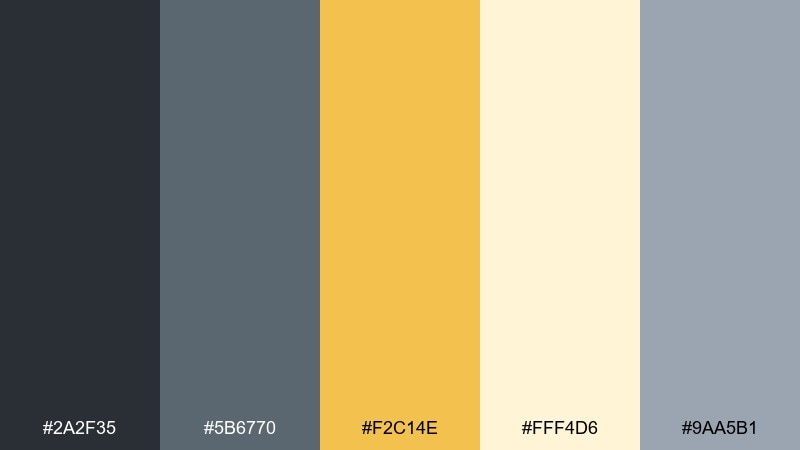
HEX: #2A2F35 #5B6770 #F2C14E #FFF4D6 #9AA5B1
Mood: energetic, pragmatic, upbeat
Best for: project management web app UI
Energetic but pragmatic, saffron adds motivation to cool steel grays. Use gray for most surfaces and typography, then let the yellow drive notifications, priority tags, or key buttons. Pair with the pale cream tint to keep highlights soft rather than neon. Tip: apply saffron to one status type at a time so the interface stays scannable.
Image example of steel & saffron generated using media.io
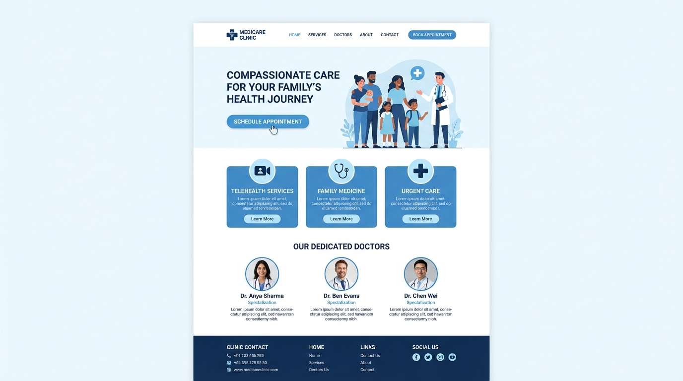
10) Clean Cloud Blue
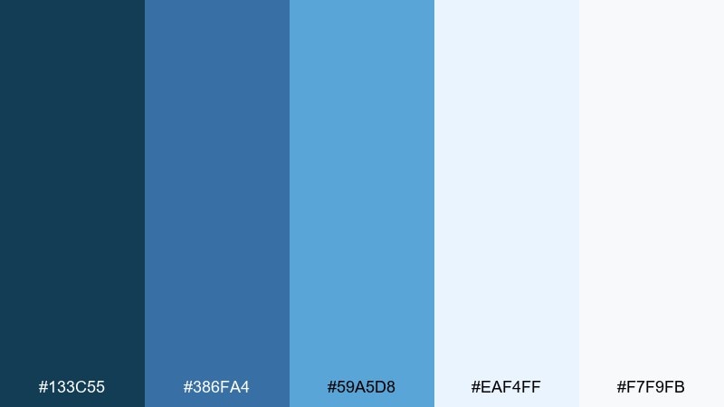
HEX: #133C55 #386FA4 #59A5D8 #EAF4FF #F7F9FB
Mood: open, calm, competent
Best for: medical clinic website design
Open and calm, these blues evoke clean air, clear water, and dependable care. Use the deeper blue for headings and navigation, while the brighter sky tone supports icons and small highlights. Pair with near-white backgrounds for a hygienic, trustworthy feel. Tip: keep body text in a dark neutral to avoid low-contrast reading issues on pale blue panels.
Image example of clean cloud blue generated using media.io
11) Plum Spreadsheet
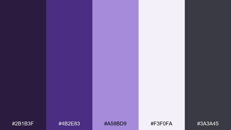
HEX: #2B1B3F #4B2E83 #A58BD9 #F3F0FA #3A3A45
Mood: smart, analytical, modern
Best for: data visualization dashboard UI
Smart and analytical, plum purples feel like late-night focus and sharp thinking. The darker tones create a strong frame for charts, while the lavender tint works well for series differentiation and hover states. As a professional color palette, it brings personality without losing credibility in B2B contexts. Tip: use the light lilac for secondary data series so the primary trend stands out.
Image example of plum spreadsheet generated using media.io
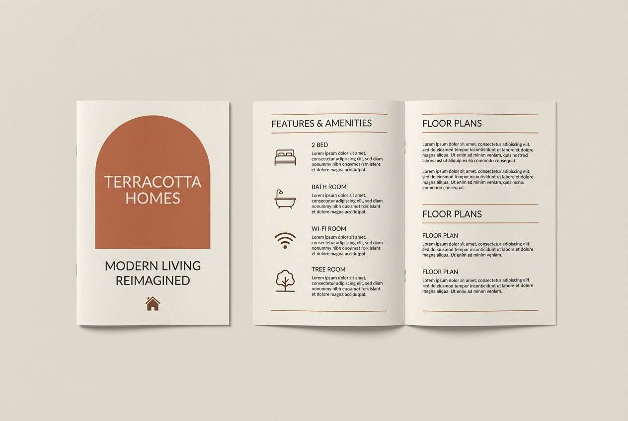
12) Terracotta Ledger
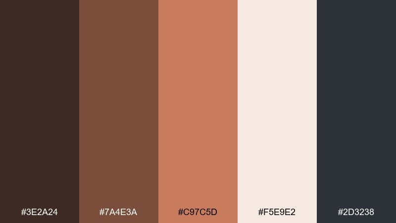
HEX: #3E2A24 #7A4E3A #C97C5D #F5E9E2 #2D3238
Mood: earthy, articulate, welcoming
Best for: real estate brochure design
Earthy and welcoming, the terracotta warmth reads like brick, leather, and sunlit interiors. Use the mid terracotta for section headers and property highlights, while the cream tone keeps pages airy. Pair with charcoal text and simple line icons for a modern finish. Tip: keep photos warm-toned so the palette feels cohesive across spreads.
Image example of terracotta ledger generated using media.io
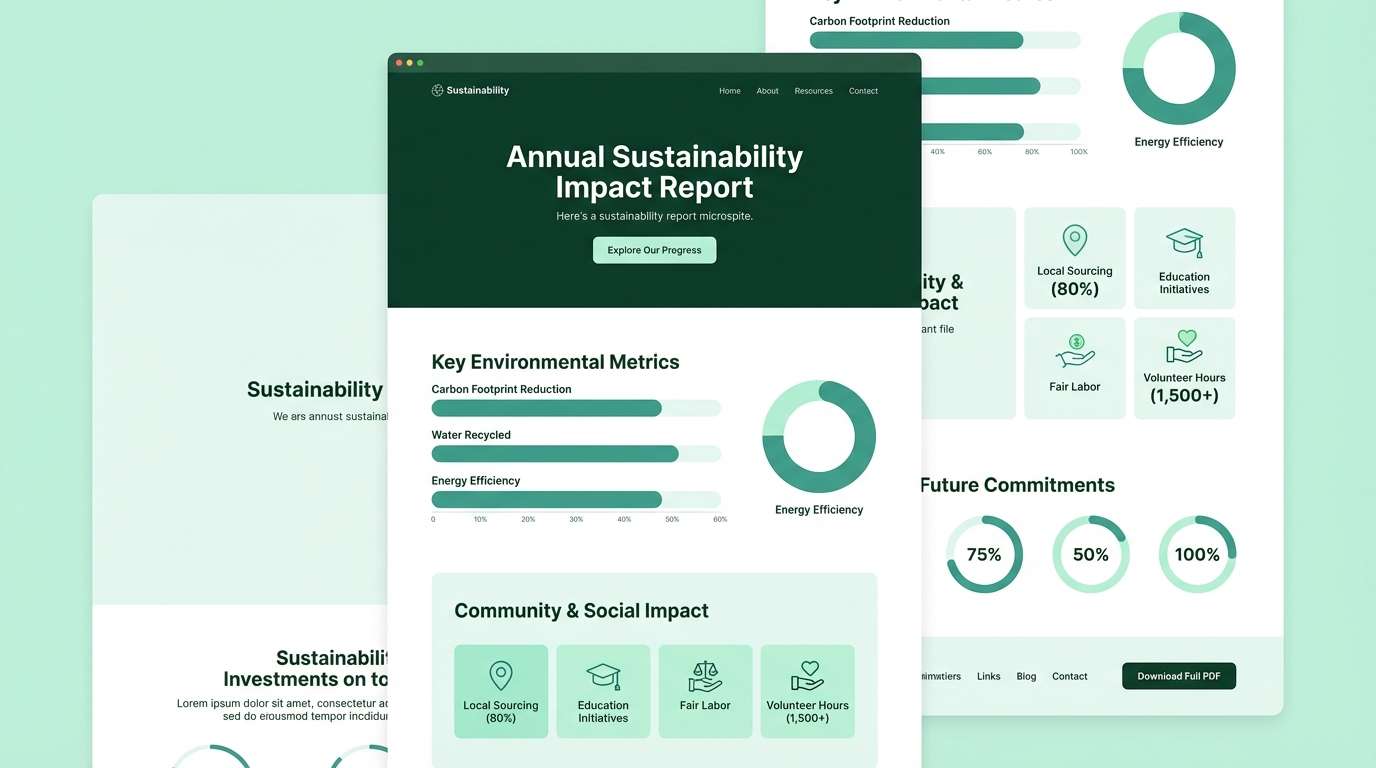
13) Forest & Paper
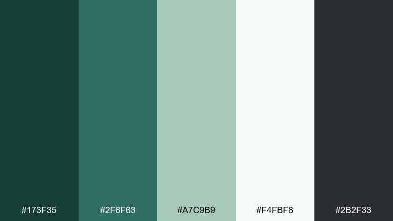
HEX: #173F35 #2F6F63 #A7C9B9 #F4FBF8 #2B2F33
Mood: ethical, calm, reassuring
Best for: sustainability report microsite
Ethical and calm, forest greens with airy paper tones suggest responsibility and transparency. Use the deep green for navigation and key headings, then soften sections with pale mint panels and subtle dividers. Pair with simple infographics and plenty of breathing room to keep the story readable. Tip: keep CTAs in the darker green so they feel aligned with the message, not salesy.
Image example of forest & paper generated using media.io
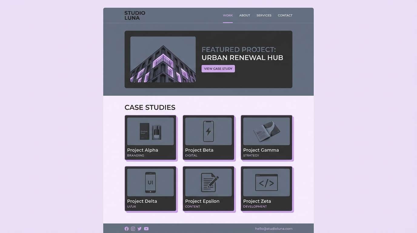
14) Slate Lavender
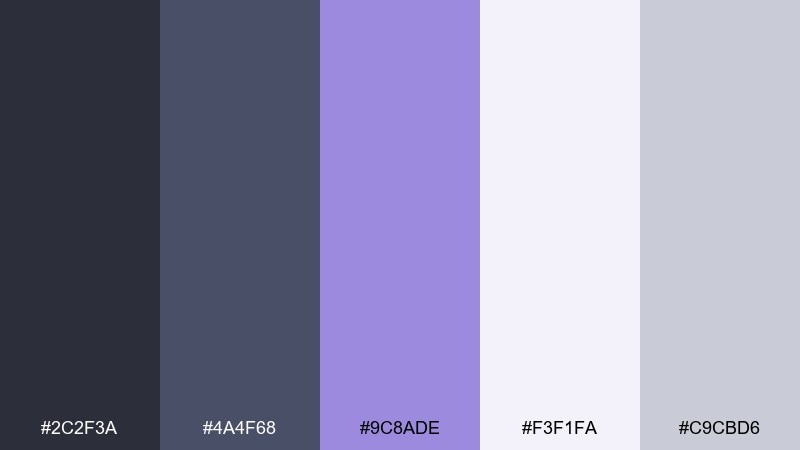
HEX: #2C2F3A #4A4F68 #9C8ADE #F3F1FA #C9CBD6
Mood: polished, creative, composed
Best for: agency portfolio website UI
Polished and creative, slate with lavender feels like a modern studio with soft lighting. Use slate for structure and typography, then let lavender highlight links, badges, and featured work. Pair with light lilac surfaces to keep pages bright without relying on pure white. Tip: keep gradients subtle so the accent stays elegant, not playful.
Image example of slate lavender generated using media.io
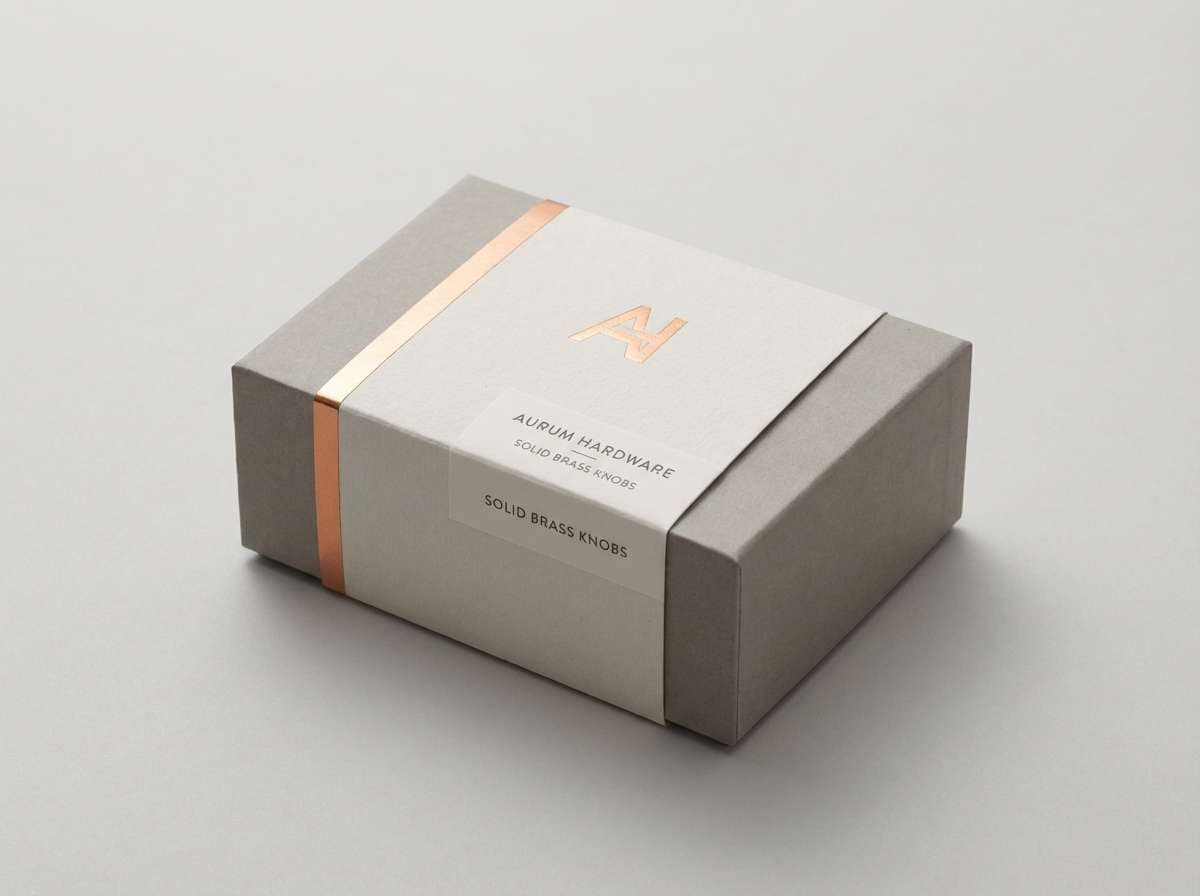
15) Copper & Concrete
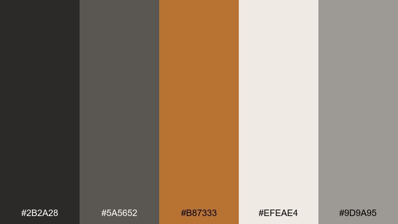
HEX: #2B2A28 #5A5652 #B87333 #EFEAE4 #9D9A95
Mood: industrial, premium, balanced
Best for: luxury hardware product packaging
Industrial and premium, copper against concrete neutrals feels like crafted metal and modern architecture. Use the copper as a foil-like accent for logos or seals, while grays handle the main layout and technical details. Pair with an off-white base to keep it clean and upscale. Tip: apply copper only to a few focal elements to preserve its luxury impact.
Image example of copper & concrete generated using media.io
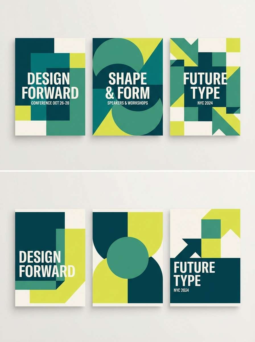
16) Coastal Teal Lime
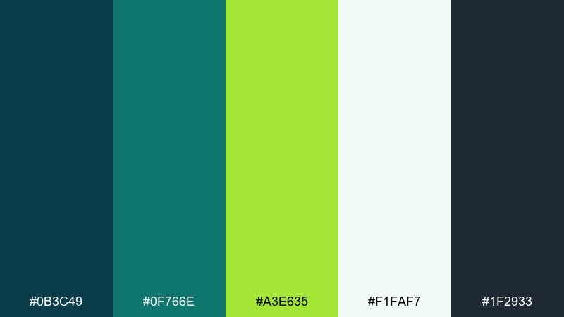
HEX: #0B3C49 #0F766E #A3E635 #F1FAF7 #1F2933
Mood: fresh, optimistic, contemporary
Best for: conference event poster series
Fresh and optimistic, teal with a lime spark feels like coastal air with a highlighter-bright idea. These professional color combinations work well when teal carries the layout and lime is saved for dates, bullets, or a single hero shape. Pair with deep charcoal text to keep the message crisp at distance. Tip: print-test the lime on matte paper to ensure it stays vibrant but readable.
Image example of coastal teal lime generated using media.io
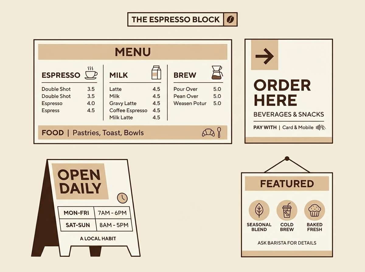
17) Espresso Cream
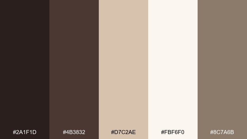
HEX: #2A1F1D #4B3832 #D7C2AE #FBF6F0 #8C7A6B
Mood: warm, reliable, classic
Best for: cafe brand menu and signage
Warm and reliable, espresso browns with cream feel like craft, comfort, and consistency. Use the darkest tone for type and icons, and bring the beige into borders, highlights, and ingredient callouts. Pair with lots of cream background so the design stays airy rather than heavy. Tip: keep accent areas small to maintain a clean, premium menu hierarchy.
Image example of espresso cream generated using media.io
18) Mono with Rose Gold
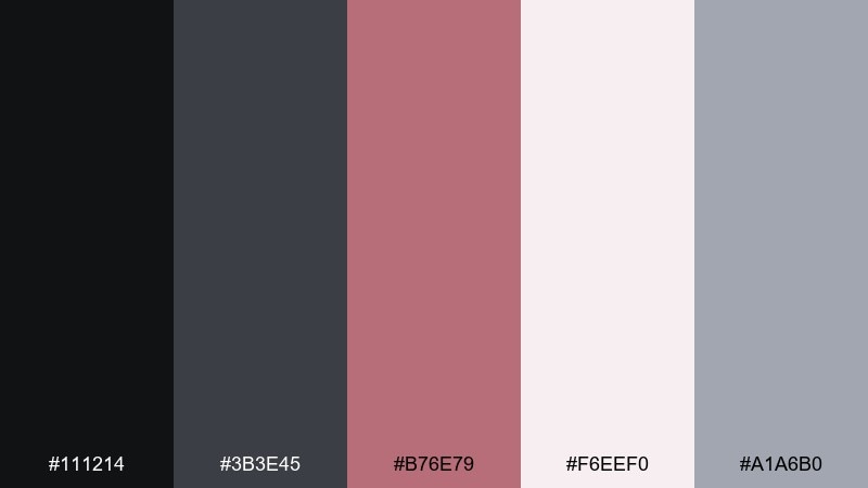
HEX: #111214 #3B3E45 #B76E79 #F6EEF0 #A1A6B0
Mood: sleek, elegant, modern
Best for: beauty brand social ad templates
Sleek and elegant, monochrome grays with rose gold read like satin packaging and studio lighting. Use the dark tones for bold typography and framing, then bring rose into buttons, badges, or price tags. Pair with pale blush backgrounds for softness without losing contrast. Tip: keep product photography neutral so the rose accent stays consistent across a campaign.
Image example of mono with rose gold generated using media.io
19) Indigo & Warm Gray
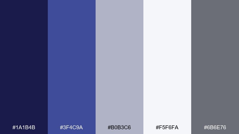
HEX: #1A1B4B #3F4C9A #B0B3C6 #F5F6FA #6B6E76
Mood: serious, stable, intelligent
Best for: enterprise software login and settings UI
Serious and stable, indigo paired with warm gray feels like secure systems and well-organized settings. Use indigo for primary actions and active tabs, while the grays keep forms and preferences tidy. Pair with a soft near-white background to reduce visual noise in credential flows. Tip: keep error states muted and distinct so they do not compete with the indigo CTA.
Image example of indigo & warm gray generated using media.io
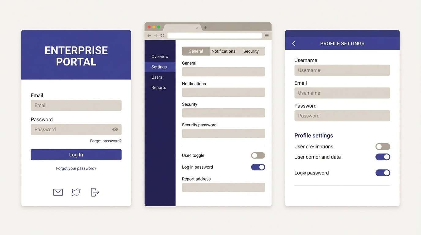
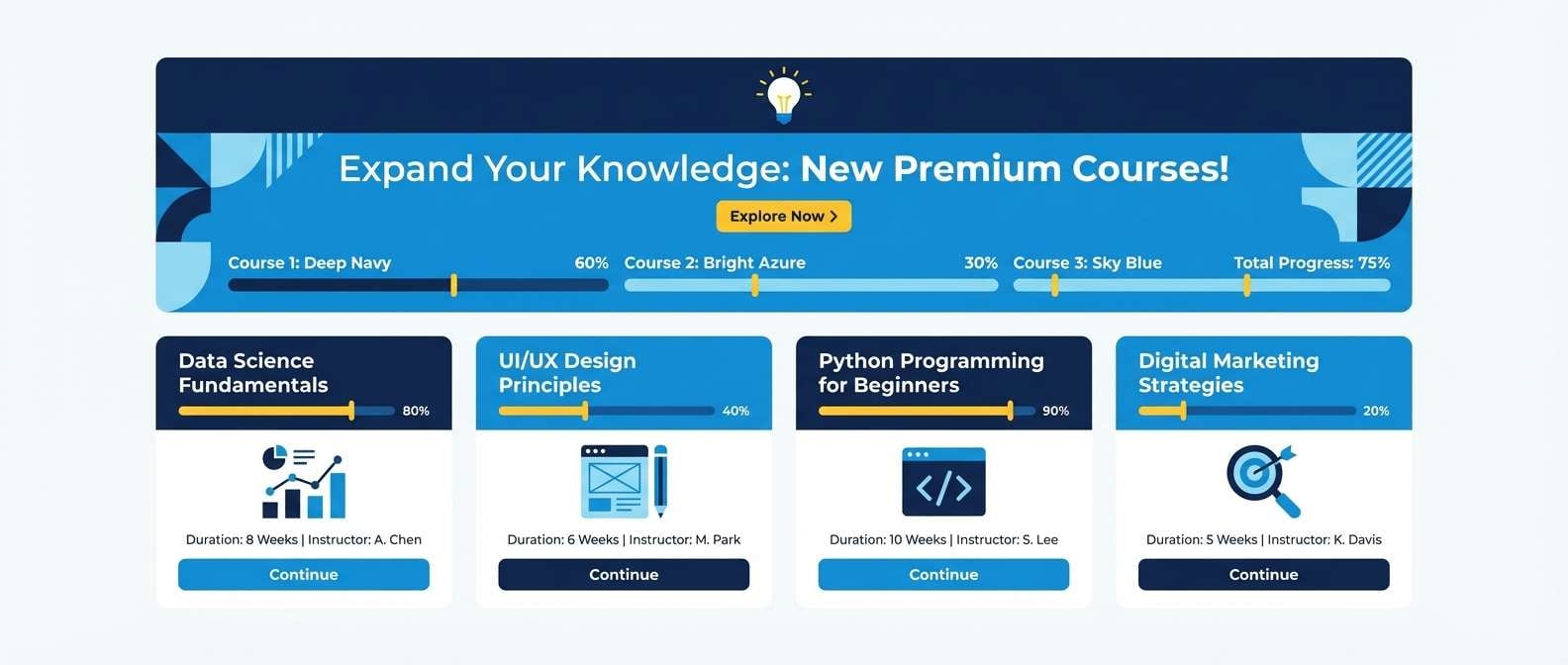
20) Azure & Citrus
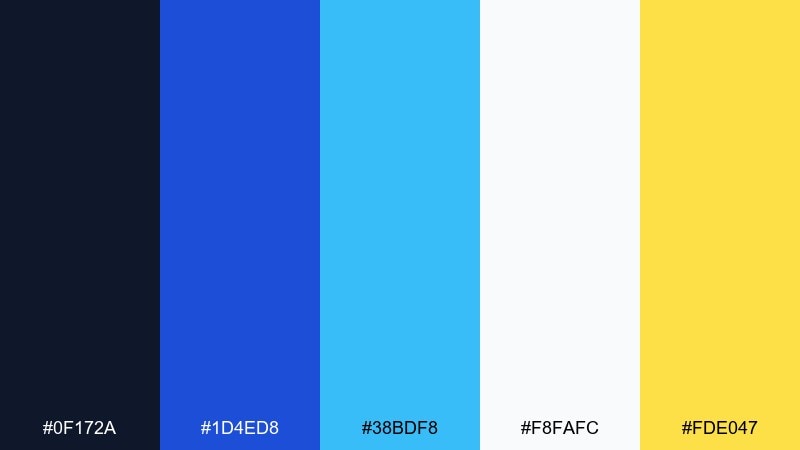
HEX: #0F172A #1D4ED8 #38BDF8 #F8FAFC #FDE047
Mood: bright, capable, contemporary
Best for: e-learning platform UI and banner set
Bright and capable, azure with a citrus pop feels like clear direction and quick wins. Use the blues for structure, navigation, and typography, then bring yellow into badges, progress markers, or key announcements. A light background keeps the interface clean while still feeling lively. Tip: limit yellow to small UI highlights so it reads as guidance, not clutter.
Image example of azure & citrus generated using media.io
What Colors Go Well with Professional?
Professional color schemes pair best with structured neutrals: navy, charcoal, slate, and warm gray create a stable base that looks credible in B2B and corporate settings.
For accents, choose one confident hue (cobalt, teal, indigo) or one warm humanizing tone (terracotta, saffron, rose). Keeping accents limited makes your hierarchy clearer and your UI easier to scan.
To maintain a modern feel, add a soft surface color (off-white, pale blue, blush, paper) instead of pure white everywhere—this reduces glare and makes layouts feel more premium.
How to Use a Professional Color Palette in Real Designs
Start with roles, not swatches: assign one dark “anchor” for navigation and headings, one primary background, one surface color for cards, and one accent for actions and highlights.
In UI, keep buttons and links consistent (same accent family) and use light tints for hover/focus states. In decks and reports, repeat the accent in section headers, callouts, and key charts to create rhythm.
Finally, check contrast early—especially on tinted panels. A professional palette looks best when it’s readable at a glance, even in data-dense layouts.
Create Professional Palette Visuals with AI
If you’re building brand guidelines, pitch decks, posters, or UI mockups, generating palette-matched visuals can speed up iteration and keep everything cohesive.
Use the prompts above as a starting point, then swap layout keywords (dashboard, landing page, brochure) to match your real project. Keep the same dominant colors to preserve a consistent professional look.
With Media.io, you can quickly create on-brand images in your browser—no complex setup required.
Professional Color Palette FAQs
-
What is a professional color palette?
A professional color palette is a set of coordinated colors—usually anchored by neutrals and supported by restrained accents—designed to look trustworthy, organized, and polished across brand and UI materials. -
Which colors feel the most “corporate” and professional?
Navy, charcoal, slate gray, cool blues, and off-whites are the most common corporate branding colors because they communicate stability, clarity, and confidence. -
How many colors should a professional brand palette include?
Most modern brand identity systems work well with 5–8 colors total: 1–2 dark anchors, 1–2 light backgrounds/surfaces, 1 main accent, and a couple of supporting tints for states and charts. -
How do I pick an accent color without losing a professional feel?
Choose one accent (like cobalt, teal, terracotta, or saffron) and use it deliberately for CTAs, highlights, and key metrics. Limiting accent usage keeps the design disciplined and avoids visual noise. -
Are warm tones like terracotta or burgundy still professional?
Yes—warm accents can look highly professional when paired with strong neutrals (navy/charcoal) and light paper-like backgrounds. The key is using warm tones as emphasis, not as the dominant base. -
What background color is best for a professional UI?
Soft near-whites (paper, cloud blue, pale gray) are ideal because they reduce glare, feel premium, and keep content readable. Pure white can work, but it often benefits from subtle surface tints. -
How can I create images that match my professional color scheme?
Use an AI image generator and include color direction in your prompt (dominant base + accent + background). Media.io Text-to-Image makes it easy to generate consistent visuals for landing pages, posters, decks, and UI concepts.


