

A zen color palette is all about calm: soft neutrals, gentle greens, smoky grays, and warm earth tones that reduce visual noise. It’s a go-to choice for minimalist UI, wellness branding, editorial layouts, and interiors that feel breathable.
Below are 20 curated zen color schemes with HEX codes, practical use tips, and AI image prompts you can reuse to generate matching visuals.
In this article
Why Zen Palettes Work So Well
Zen palettes work because they balance low saturation with strong value structure—light backgrounds, mid-tone surfaces, and a single deep anchor for readable type. This keeps designs clear while still feeling warm and human.
They also borrow from nature and natural materials (paper, stone, wood, moss), which makes the color story instantly familiar. That familiarity lowers cognitive load and supports a slower, calmer browsing experience.
Finally, zen color schemes are flexible: they can look modern and architectural in cool grays, or handcrafted and cozy in warm taupes and browns—without ever becoming loud.
20+ Zen Color Palette Ideas (with HEX Codes)
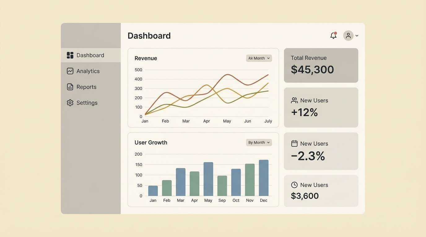
1) Misty Tatami
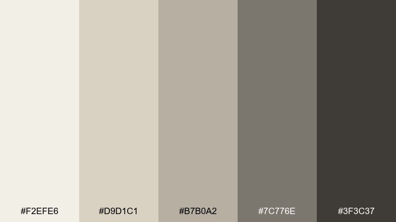
HEX: #f2efe6 #d9d1c1 #b7b0a2 #7c776e #3f3c37
Mood: soft, grounded, minimal
Best for: minimal UI dashboard
Soft, foggy neutrals evoke woven tatami mats and quiet morning light. These zen tones are ideal for dashboards where clarity matters and visual noise is the enemy. Pair the deeper charcoal with the light cream for readable type and component borders, and reserve mid tones for secondary surfaces. Usage tip: keep contrast consistent by using the darkest swatch only for text and key icons.
Image example of misty tatami generated using media.io
Media.io is an online AI studio for creating and editing video, image, and audio in your browser.

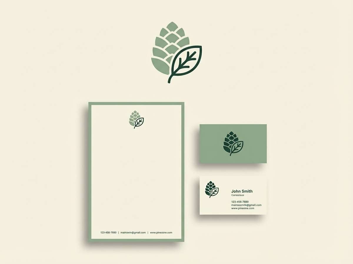
2) Bamboo Steam
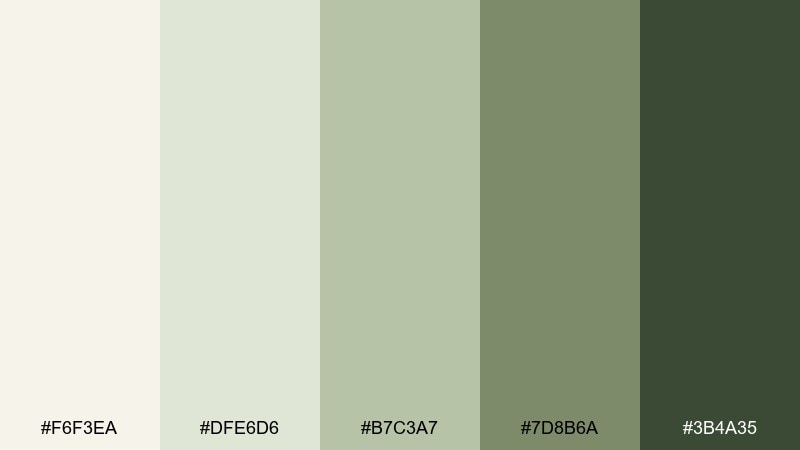
HEX: #f6f3ea #dfe6d6 #b7c3a7 #7d8b6a #3b4a35
Mood: fresh, restorative, botanical
Best for: spa branding logo and stationery
Fresh greens and milky neutrals feel like bamboo leaves in warm steam. The zen color palette reads clean and caring, making it strong for wellness brands that want to look premium without being cold. Pair the darkest green with the pale cream for crisp marks and legible taglines, then let the sage tones carry backgrounds. Usage tip: use the mid sage for subtle patterns like rice-paper textures or gentle waves.
Image example of bamboo steam generated using media.io
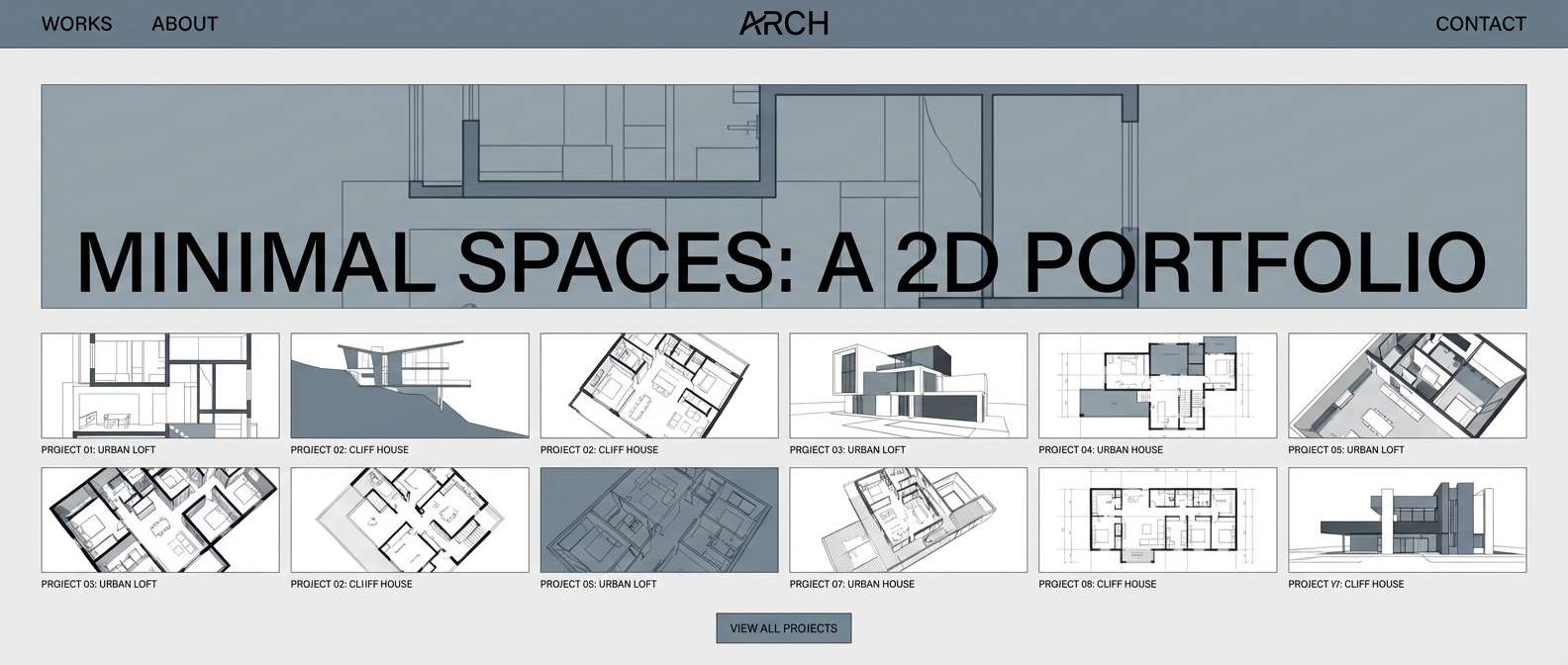
3) Stone Rill
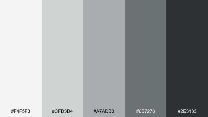
HEX: #f4f5f3 #cfd3d4 #a7adb0 #6b7276 #2e3133
Mood: cool, architectural, composed
Best for: architecture portfolio website
Cool grays flow like water over smooth river stones. The restrained range creates a confident, modern frame for photography and project renderings. Pair the near-black for headlines with pale gray backgrounds to keep layouts airy, and use the mid gray for dividers and captions. Usage tip: add depth by layering two adjacent grays in cards instead of adding new accent colors.
Image example of stone rill generated using media.io
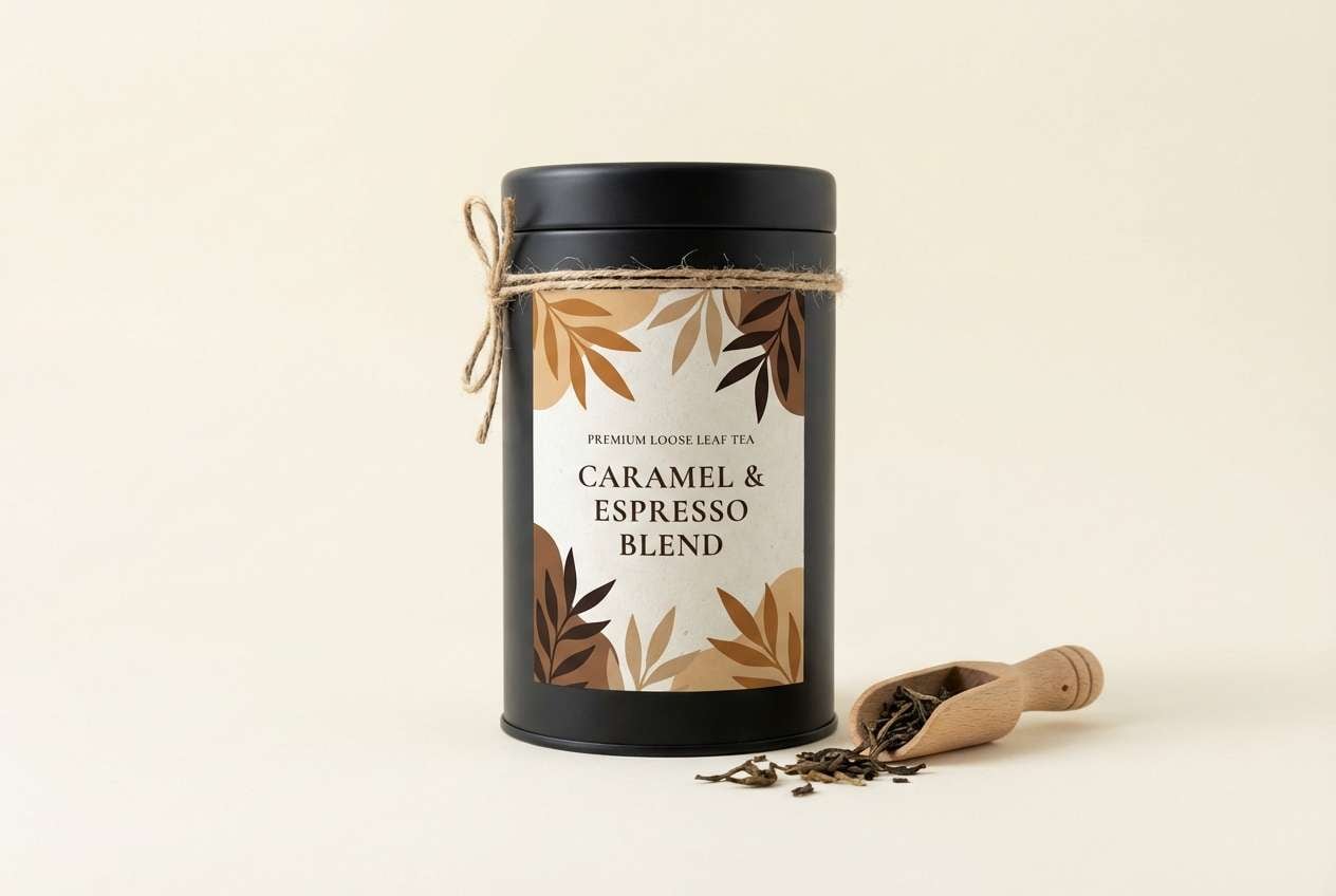
4) Tea Ceremony
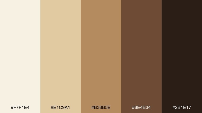
HEX: #f7f1e4 #e1c9a1 #b38b5e #6e4b34 #2b1e17
Mood: warm, ceremonial, artisanal
Best for: tea packaging design
Warm caramel and toasted browns recall roasted hojicha, clay cups, and wooden trays. This zen color palette fits premium tea, coffee, and small-batch pantry goods where craft should feel tangible. Pair the pale cream with the near-espresso tone for high-end labels, and let the honey tan support patterns or seals. Usage tip: emboss the darkest swatch on matte stock to make the design feel quietly luxurious.
Image example of tea ceremony generated using media.io
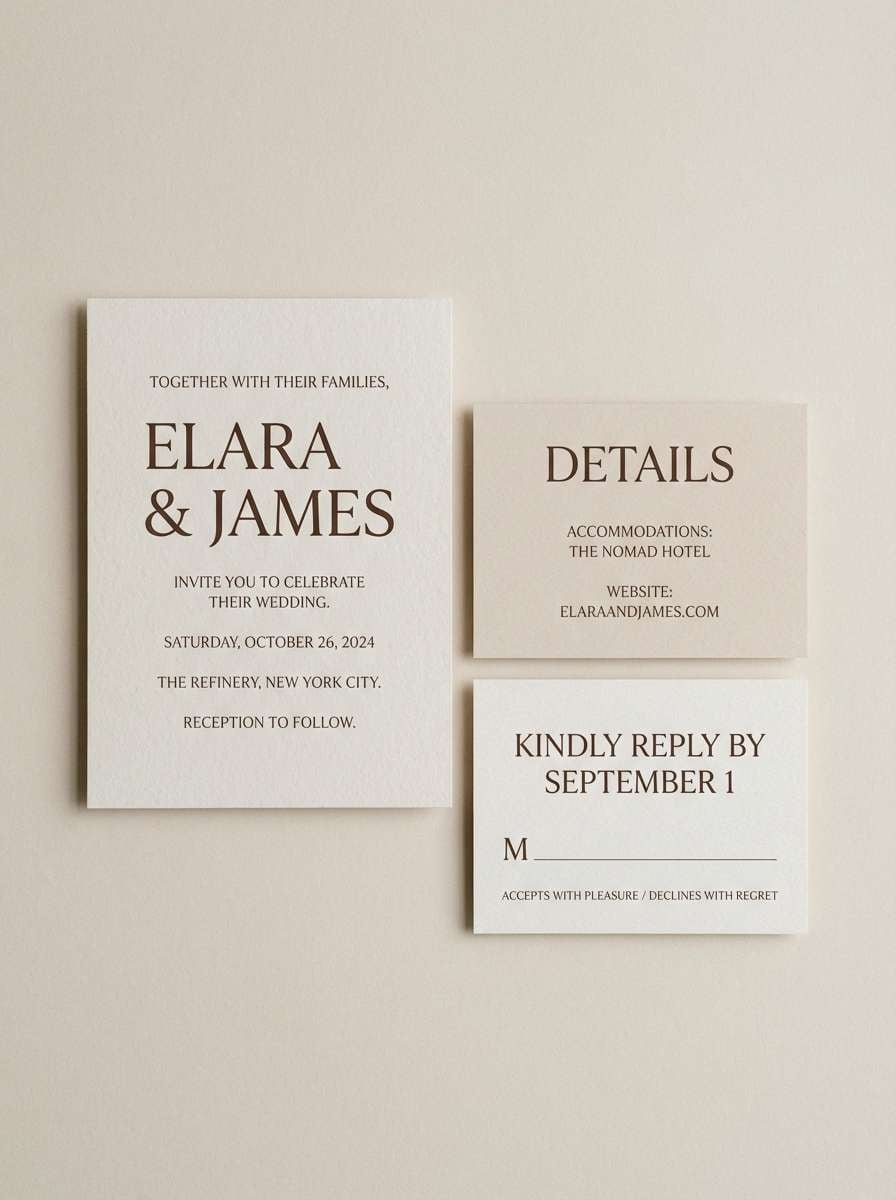
5) Sand Garden
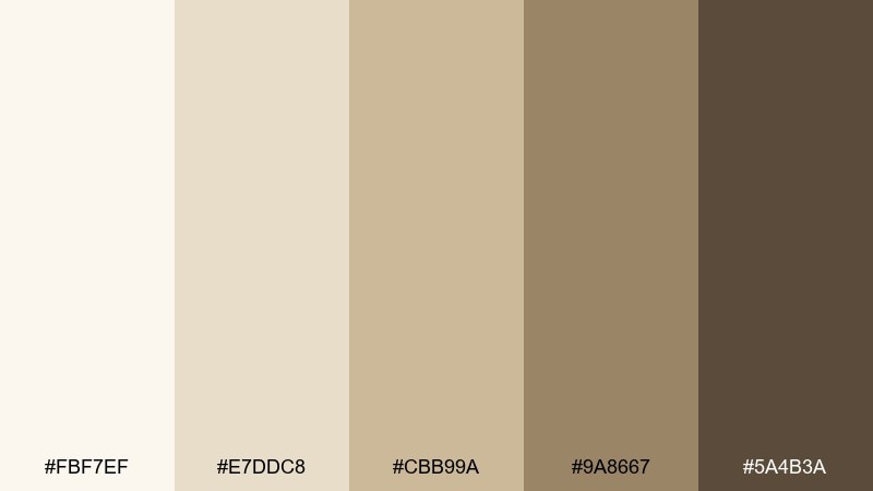
HEX: #fbf7ef #e7ddc8 #cbb99a #9a8667 #5a4b3a
Mood: serene, airy, timeless
Best for: wedding invitation suite
Powdery beiges and stone browns evoke raked sand, soft shadows, and calm vows. These zen color combinations are perfect for invitations that should feel elegant but not overly formal. Pair the lightest tone with the darkest brown for clean typography, then use the mid beige for borders, monograms, or venue illustrations. Usage tip: choose uncoated or cotton paper so the neutrals look natural rather than glossy.
Image example of sand garden generated using media.io
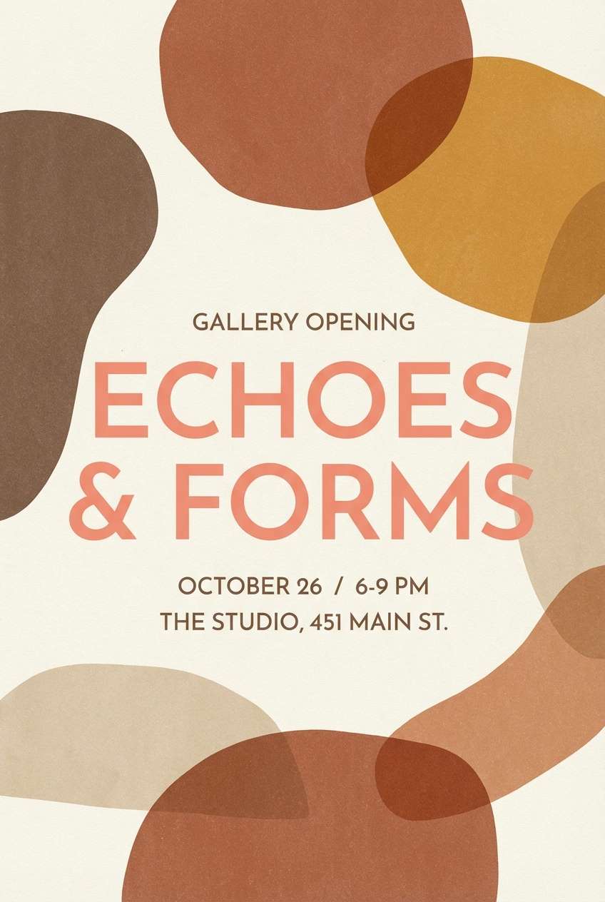
6) Koi Shadow
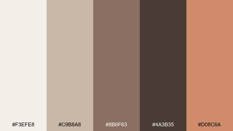
HEX: #f3efe8 #c9b8a8 #8b6f63 #4a3b35 #d08c6a
Mood: earthy, moody, subtly lively
Best for: gallery opening poster
Muted clay and cocoa shades feel like dusk on water, with a koi-like accent that flickers to life. The mix works well for art posters and cultural events that want warmth without loud saturation. Pair the coral-tan accent with the deepest brown for calls to action and dates, then keep backgrounds in the pale linen. Usage tip: limit the accent to 5 to 10 percent of the layout so it stays special.
Image example of koi shadow generated using media.io
7) Linen Aura
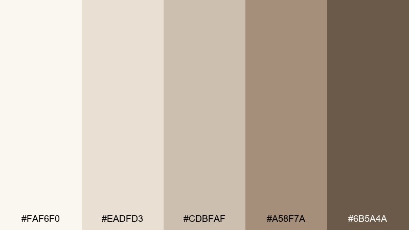
HEX: #faf6f0 #eadfd3 #cdbfaf #a58f7a #6b5a4a
Mood: cozy, natural, refined
Best for: interior design mood board
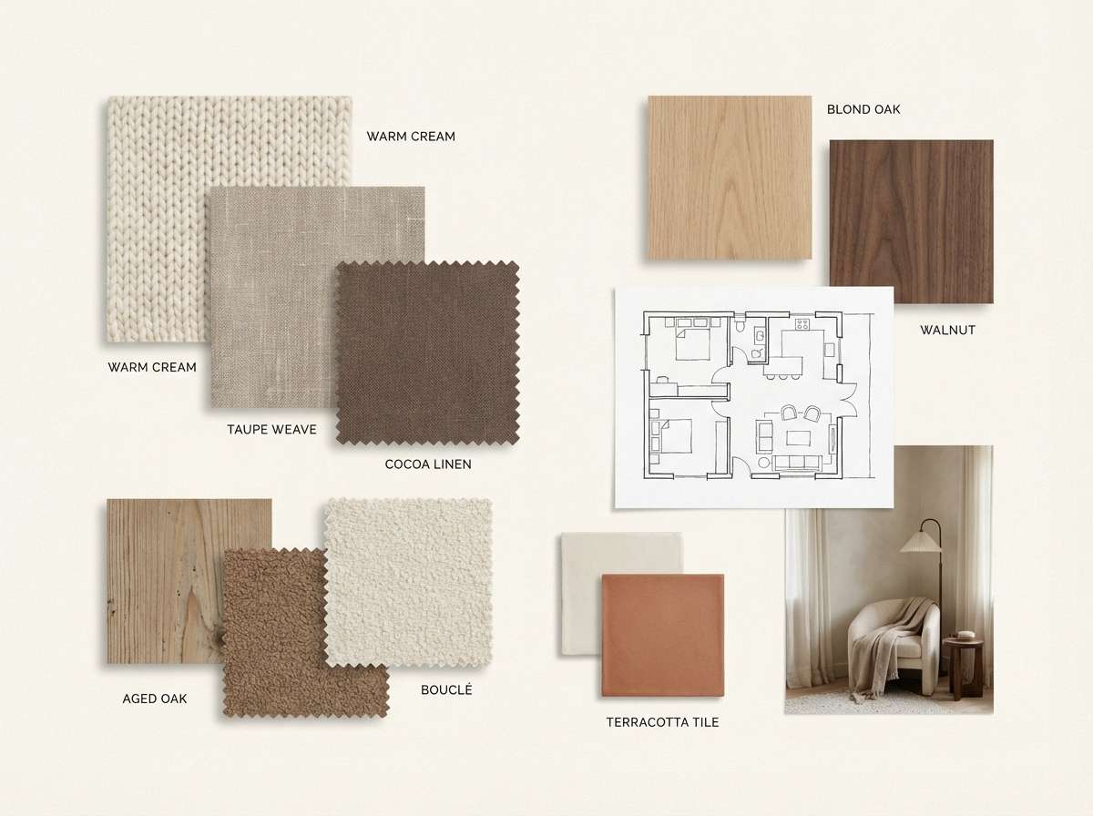
Warm linen and taupe tones suggest soft textiles, sunlit plaster, and quiet weekends at home. This range is excellent for interior concept boards where materials need to feel tactile and harmonious. Pair the light cream with the deeper taupe for labels and room names, and use the mid tones for swatches and blocks. Usage tip: add subtle grain or paper texture so the neutrals do not look flat on screen.
Image example of linen aura generated using media.io
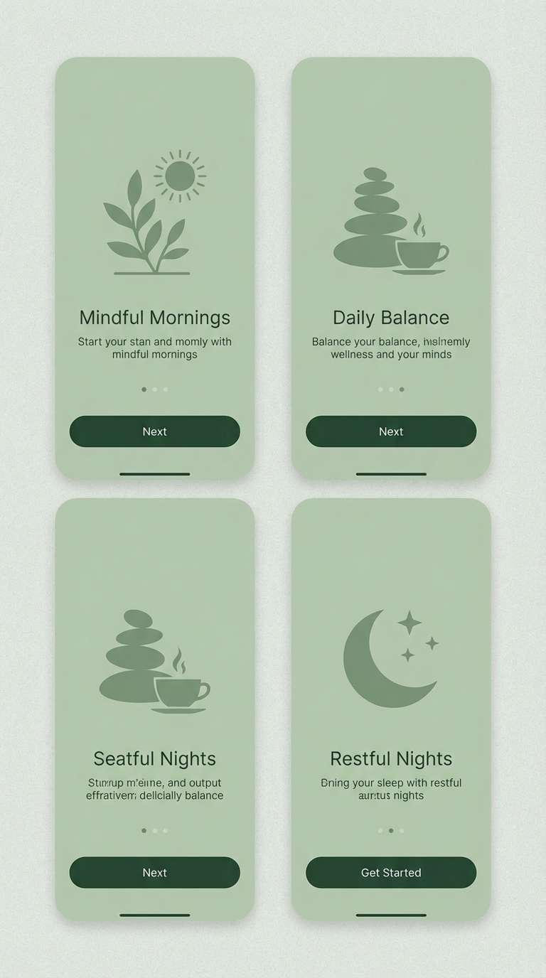
8) Quiet Moss
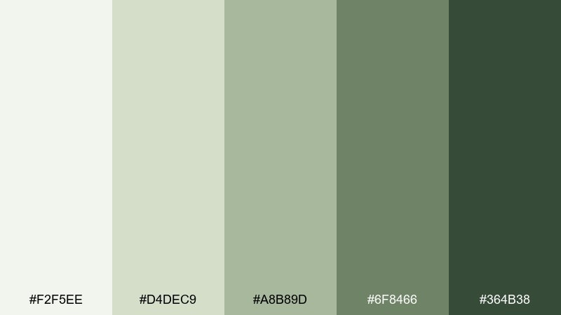
HEX: #f2f5ee #d4dec9 #a8b89d #6f8466 #364b38
Mood: calm, natural, focused
Best for: meditation app onboarding screens
Gentle moss greens feel like a shaded garden after rain. The colors create a calming flow for onboarding, where you want users to slow down and read. Pair the pale green-gray as a background with the deepest forest tone for headings and primary buttons, keeping mid sages for illustrations. Usage tip: use the darkest green for one action per screen to avoid competing emphasis.
Image example of quiet moss generated using media.io
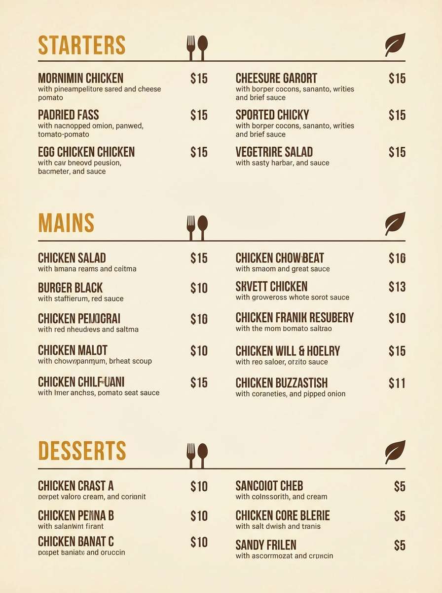
9) Paper Lantern
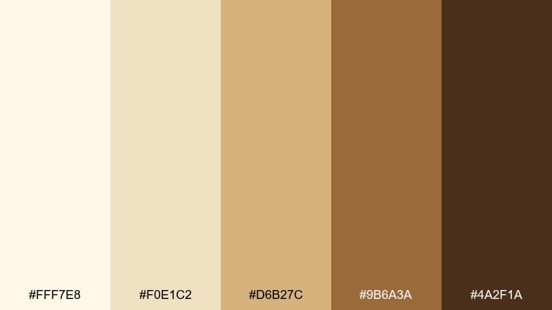
HEX: #fff7e8 #f0e1c2 #d6b27c #9b6a3a #4a2f1a
Mood: welcoming, golden, handcrafted
Best for: restaurant menu design
Golden ambers and toasted browns glow like lantern light on paper. The zen palette suits menus that should feel warm, approachable, and slightly artisanal. Pair the light cream with the darkest brown for body text, and use the amber tone for section headers and icons. Usage tip: keep large color fills in the palest tones so the menu stays easy to scan.
Image example of paper lantern generated using media.io
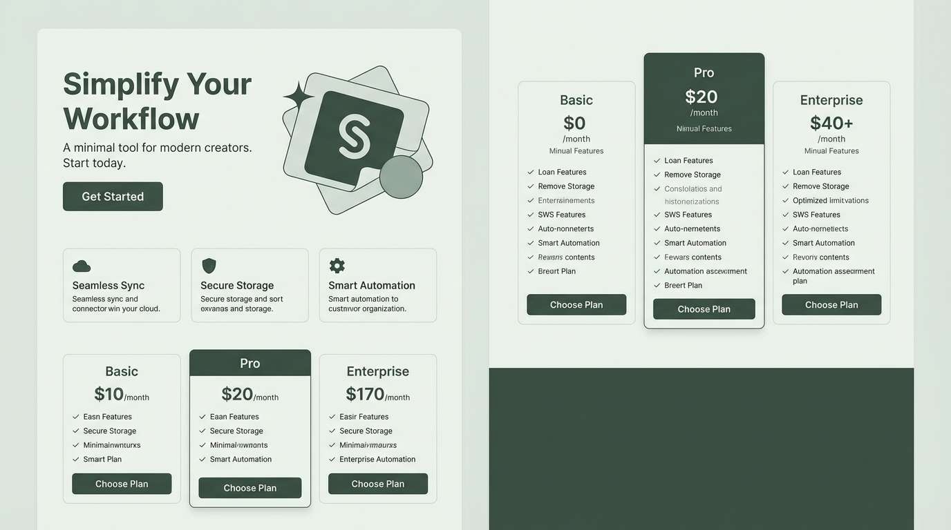
10) River Pebble
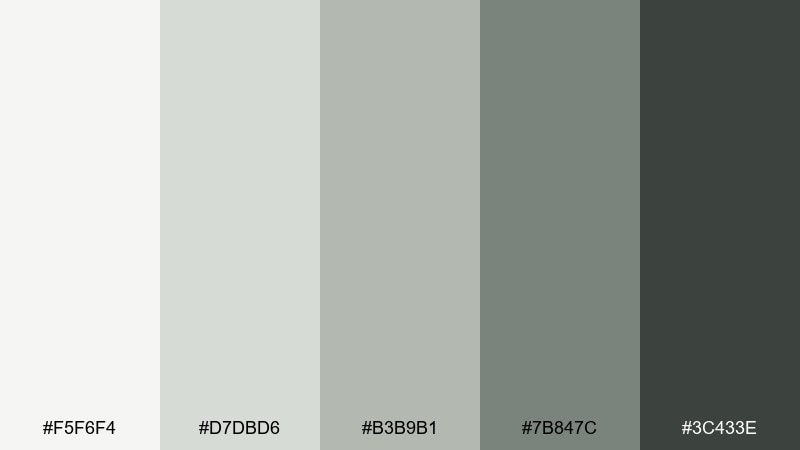
HEX: #f5f6f4 #d7dbd6 #b3b9b1 #7b847c #3c433e
Mood: neutral, clean, balanced
Best for: product landing page UI
Clean gray-greens feel like pebbles smoothed by running water. This zen color scheme is dependable for landing pages that need a modern, quiet backdrop for product photography. Pair the palest swatch as the page canvas with the deep gray-green for navigation and key links, keeping the mid tones for cards and pricing tables. Usage tip: use subtle shadows rather than darker fills to preserve the airy mood.
Image example of river pebble generated using media.io
11) Cloud Ink
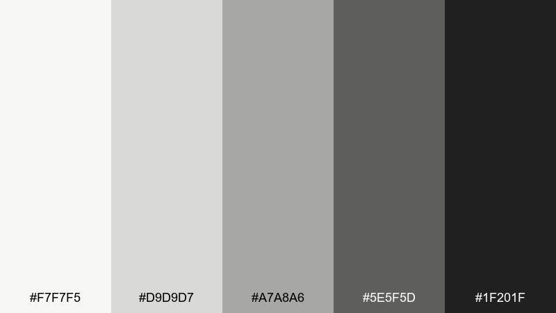
HEX: #f7f7f5 #d9d9d7 #a7a8a6 #5e5f5d #1f201f
Mood: editorial, minimal, confident
Best for: magazine spread layout
Soft cloud whites with inky grays feel crisp, modern, and quietly authoritative. The contrast range is strong for editorial typography, pull quotes, and structured grids. Pair the near-black for headlines with the lightest gray for margins, and let mid grays handle captions and rules. Usage tip: keep one accent treatment only, like a single dark bar or label, to maintain an uncluttered page.
Image example of cloud ink generated using media.io
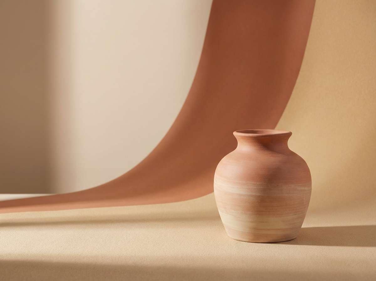
12) Warm Clay
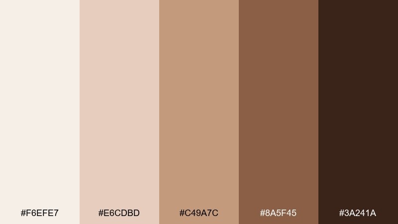
HEX: #f6efe7 #e6cdbd #c49a7c #8a5f45 #3a241a
Mood: earthy, warm, artisanal
Best for: ceramic product ad
Earthy clay and cocoa shades bring to mind kiln-fired pottery and sun-warmed terracotta. These zen tones are a natural fit for handmade goods, home decor, and craft-forward product ads. Pair the pale blush-beige with the deep brown for clear pricing and product names, and use the mid clay as the hero color behind the item. Usage tip: choose soft, diffused lighting so the warm hues stay smooth and premium.
Image example of warm clay generated using media.io
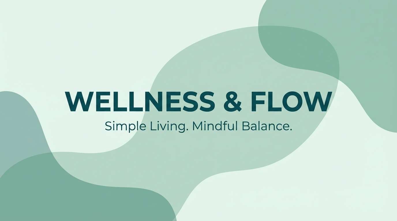
13) Sea Glass
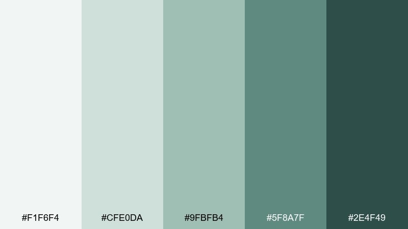
HEX: #f1f6f4 #cfe0da #9fbfb4 #5f8a7f #2e4f49
Mood: cool, soothing, airy
Best for: wellness blog header graphics
Muted sea-glass greens feel breezy, clean, and lightly coastal. The balance of pale mint and deep teal works well for blog headers, social templates, and calm brand visuals. Pair the lightest swatch as negative space with the deep teal for titles, and use the mid tones for abstract shapes or wave motifs. Usage tip: keep gradients subtle to avoid drifting into overly tropical color territory.
Image example of sea glass generated using media.io
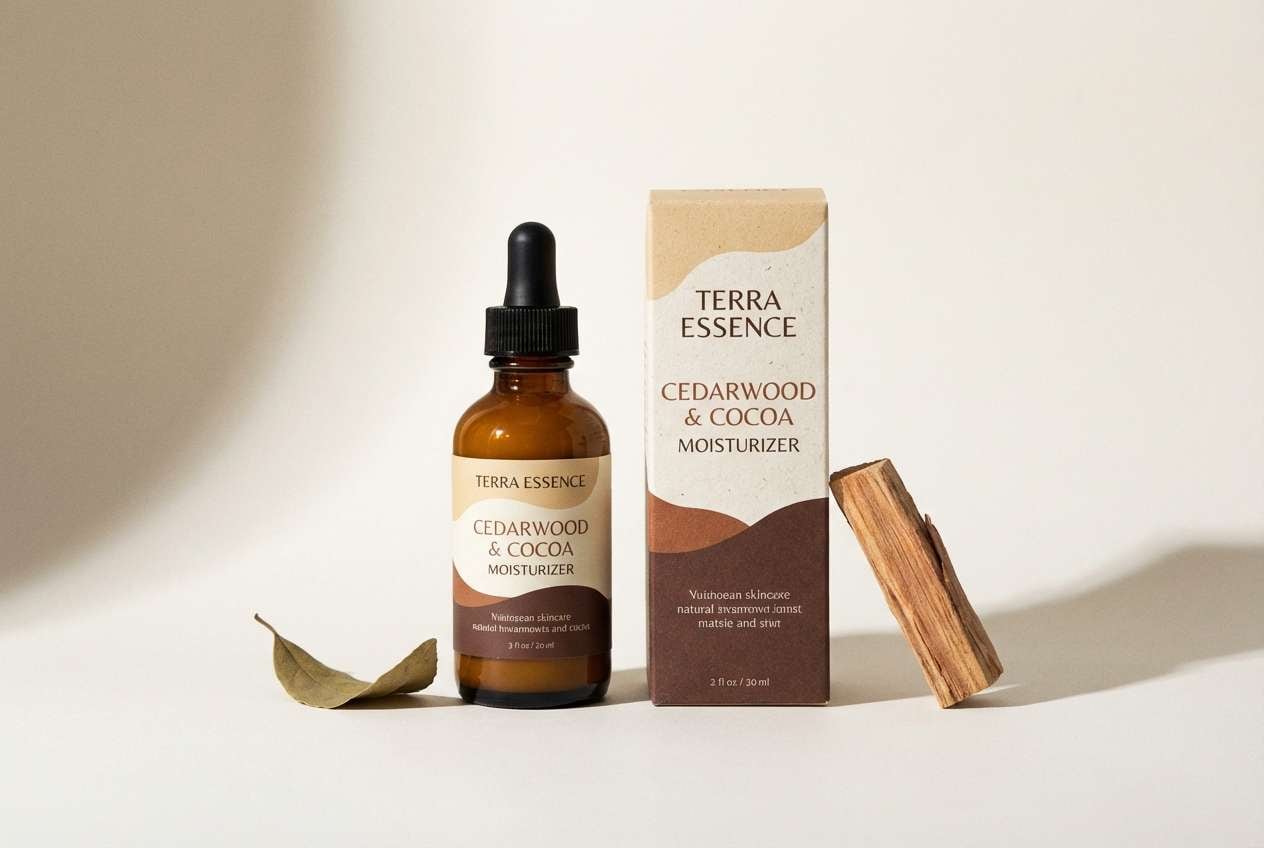
14) Cedar Calm
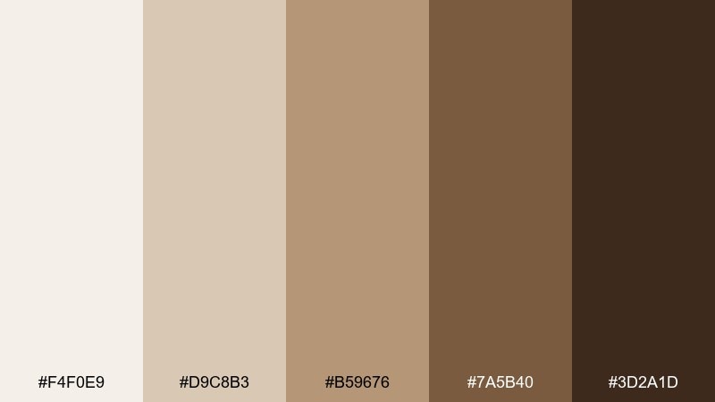
HEX: #f4f0e9 #d9c8b3 #b59676 #7a5b40 #3d2a1d
Mood: woody, calm, grounded
Best for: natural skincare packaging
Woody browns and creamy tans evoke cedar shelves, herbal oils, and a tidy apothecary. The tones feel trustworthy and natural, ideal for skincare lines that want warmth over clinical white. Pair the pale cream with the deep brown for ingredient lists and labels, and use the mid tan for brand marks and patterns. Usage tip: matte finishes and kraft textures amplify the grounded feel.
Image example of cedar calm generated using media.io
15) Moonlit Shoji
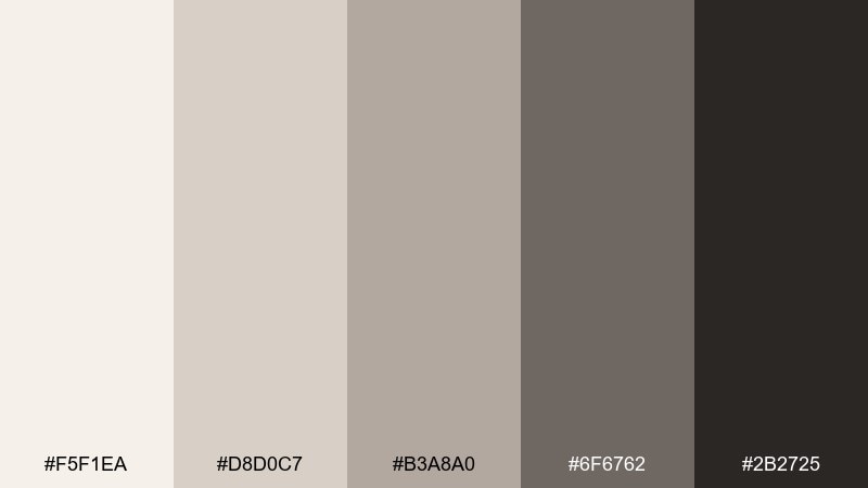
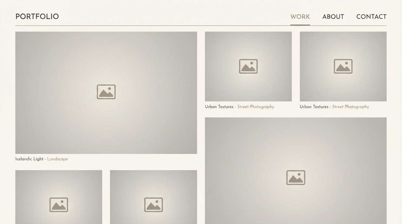
HEX: #f5f1ea #d8d0c7 #b3a8a0 #6f6762 #2b2725
Mood: quiet, modern, understated
Best for: photography portfolio website
Cool taupes and smoky charcoals feel like moonlight through shoji screens. This zen color palette is a strong choice for portfolios where images should lead and the interface should disappear. Pair the lightest tone for page backgrounds with the darkest charcoal for navigation, and keep mid grays for captions and filters. Usage tip: use a single charcoal button style across the site to keep interactions consistent and calm.
Image example of moonlit shoji generated using media.io
16) Orchid Whisper
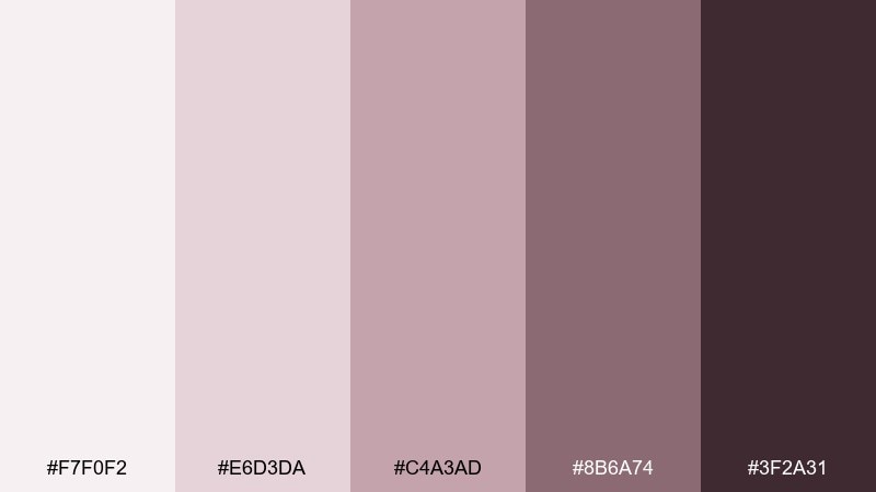
HEX: #f7f0f2 #e6d3da #c4a3ad #8b6a74 #3f2a31
Mood: soft, serene, elegant
Best for: spa flyer design
Muted mauves and rosy neutrals feel like petals pressed into handmade paper. The palette is gentle and refined for spa flyers, self-care promos, and boutique beauty services. Pair the pale blush with the deep plum-brown for readable headings, and use the mid mauve for icons and separators. Usage tip: keep typography light and airy, and avoid heavy blocks that make the colors feel too sweet.
Image example of orchid whisper generated using media.io

17) Sumi Brush
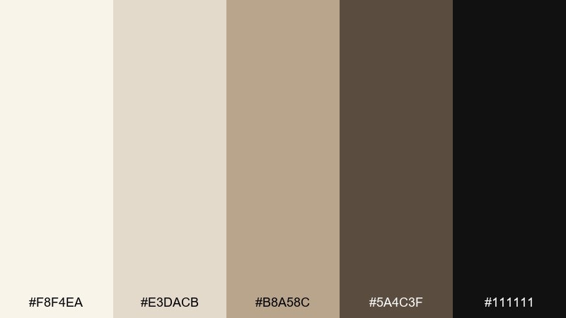
HEX: #f8f4ea #e3dacb #b8a58c #5a4c3f #111111
Mood: inked, traditional, bold
Best for: calligraphy workshop poster
Warm paper neutrals with true ink black evoke brushwork, quiet focus, and craft. The contrast is excellent for posters where type and gesture need to feel intentional. Pair the black with the lightest cream for striking titles, and use the mid tan for stamps, seals, or textured backgrounds. Usage tip: add one oversized brushstroke element in the dark swatch to anchor the whole layout.
Image example of sumi brush generated using media.io

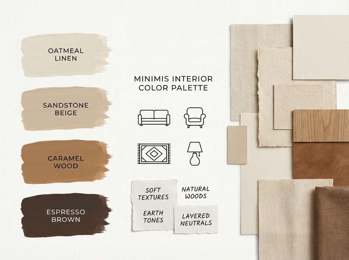
18) Hearth Wabi
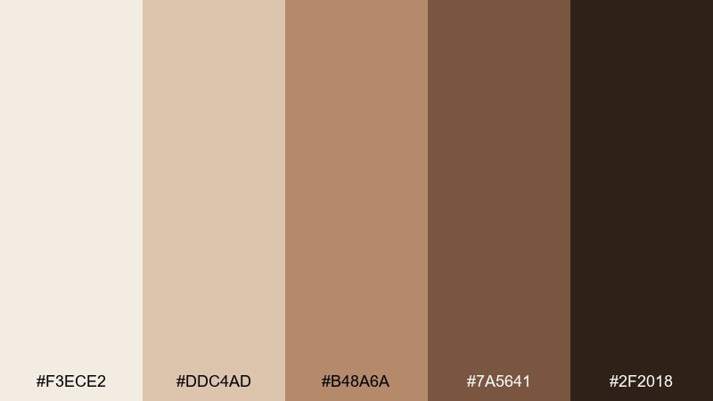
HEX: #f3ece2 #ddc4ad #b48a6a #7a5641 #2f2018
Mood: rustic, cozy, balanced
Best for: cafe interior palette board
Toasty browns and creamy beiges feel like a small hearth, worn wood, and handmade ceramics. The mix works beautifully for cafe concepts and hospitality visuals that want warmth without heavy saturation. Pair the lightest tone for walls and menus with the deeper brown for signage and seating accents, and use the mid clay for textiles. Usage tip: repeat the darkest swatch in small details like lamp frames to tie the room together.
Image example of hearth wabi generated using media.io
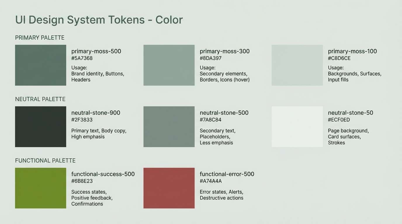
19) Minimal Terrace
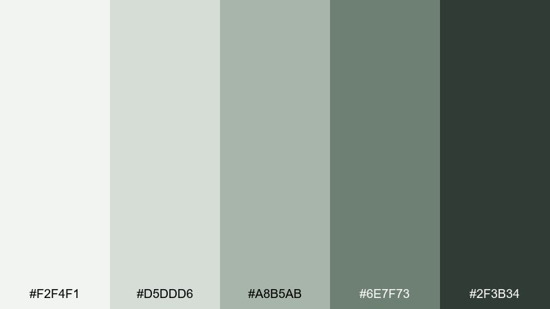
HEX: #f2f4f1 #d5ddd6 #a8b5ab #6e7f73 #2f3b34
Mood: clean, modern, quietly green
Best for: UI design system color tokens
Green-grays and soft neutrals feel like a shaded terrace with concrete and plants. This zen color scheme is great for design systems because they scale across backgrounds, borders, and states without fighting content. Pair the darkest tone for primary text and active states, and use the pale gray-green as the default canvas with mid tones for secondary components. Usage tip: define hover and disabled states by stepping one swatch lighter or darker, not by changing hue.
Image example of minimal terrace generated using media.io
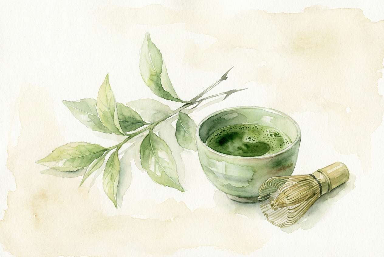
20) Evening Matcha
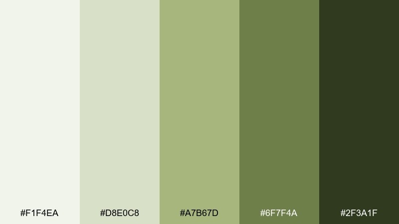
HEX: #f1f4ea #d8e0c8 #a7b67d #6f7f4a #2f3a1f
Mood: herbal, calming, softly vibrant
Best for: watercolor botanical illustration
Herbal greens look like whisked matcha, fresh leaves, and the calm of late afternoon. The palette supports botanical art and gentle packaging illustrations with just enough richness for depth. Pair the pale green as paper tone with the darkest green for line accents, and let the mid matcha shade carry the main forms. Usage tip: keep edges soft and layered so the greens blend naturally rather than turning graphic.
Image example of evening matcha generated using media.io
What Colors Go Well with Zen?
Zen colors pair best with soft neutrals (warm creams, paper whites, greige, and stone gray) because they keep the overall mood quiet and cohesive. These shades also make it easier to maintain consistent contrast for typography.
For accents, choose one restrained highlight: muted coral, amber, matcha green, or deep teal. The key is to keep accent usage minimal so it reads like a deliberate moment rather than a competing palette.
If you need extra depth, layer adjacent tones instead of introducing new hues—two close grays or two sage greens often look more “zen” than adding a bright secondary color.
How to Use a Zen Color Palette in Real Designs
Start with a light base (the palest swatch) for backgrounds, then assign mid tones to surfaces like cards, panels, and dividers. Reserve the darkest swatch for text, icons, and one primary action to keep hierarchy simple.
In branding and print, zen palettes look best with tactile choices: matte finishes, uncoated paper, subtle grain, and minimal ink coverage. This helps warm neutrals and earthy greens feel natural instead of flat.
For UI, treat the palette as a system: define default, hover, active, and disabled states by stepping one swatch up or down. This creates calm interaction cues without relying on loud colors.
Create Zen Palette Visuals with AI
If you already have HEX codes but need matching visuals, generate consistent mockups, posters, mood boards, and UI concepts using text prompts. This is especially helpful when you want multiple design directions without manually building each layout.
Reuse the prompts above and swap subjects (menu, app screen, packaging) while keeping the same color language. You’ll get a cohesive set of assets for branding, presentations, or social templates.
With Media.io, you can quickly create zen-style image examples, then refine them into ready-to-use graphics for web and print.
Zen Color Palette FAQs
-
What is a zen color palette?
A zen color palette is a calm, low-saturation set of colors—often warm neutrals, soft grays, sage greens, and earthy browns—designed to feel minimal, balanced, and soothing. -
Which zen colors are best for UI design?
Use a pale neutral for the canvas, mid tones for surfaces and borders, and one deep charcoal/forest tone for text and primary buttons. Palettes like Misty Tatami, River Pebble, and Minimal Terrace are especially UI-friendly. -
How do I keep a zen palette from looking boring?
Add depth with texture (grain, paper, subtle shadows) and value layering (two adjacent mid tones). You can also introduce a single restrained accent like muted coral or amber and keep it under 10% of the layout. -
Do zen palettes work for branding and packaging?
Yes—zen colors are common in spa, skincare, tea, and cafe branding because they communicate care and craftsmanship. Matte finishes and natural materials make the palette feel premium and grounded. -
What accent color goes well with beige and sage?
Muted coral, warm amber, or deep teal are strong options. Choose one accent and pair it with your darkest neutral for key labels, dates, or calls to action. -
How can I generate zen palette images for presentations or mockups?
Use a text-to-image tool and specify the subject (UI, packaging, poster) plus your desired mood (minimal, soft lighting, paper texture). Keeping the prompt focused on muted neutrals and natural materials helps maintain the zen feel. -
What’s the easiest way to ensure readable contrast in a zen scheme?
Assign the darkest swatch to body text and key icons, and keep backgrounds in the lightest one or two swatches. Avoid using mid tones for small text, and be consistent with a single “text color” across screens.
Next: Wenge Color Palette


