

Wenge is a deep, espresso-leaning brown that instantly adds warmth, weight, and a sense of craft to modern design.
In a wenge color palette, the magic comes from pairing that rich base with soft neutrals, muted greens, blush tones, or metallic accents—so your layouts feel cozy, premium, and readable.
In this article
- Why Wenge Palettes Work So Well
-
- smoked walnut
- cocoa linen
- forest espresso
- dusty rosewood
- copper and charcoal
- sage cabinetry
- misty taupe studio
- midnight library
- clay pottery
- winter stone
- aubergine velvet
- desert sandstone
- olive grove
- nordic hearth
- ink and parchment
- mocha marble
- golden hour cafe
- teal accent desk
- blush and bark
- minimal concrete
- What Colors Go Well with Wenge?
- How to Use a Wenge Color Palette in Real Designs
- Create Wenge Palette Visuals with AI
Why Wenge Palettes Work So Well
Wenge sits in the “dark neutral” zone, so it behaves like black in terms of structure and hierarchy—but it feels warmer, softer, and more human. That makes it ideal for premium branding, editorial layouts, and product design that needs contrast without harshness.
Because wenge carries red-brown undertones, it pairs naturally with creams, tans, and taupes for a cozy baseline. Add a muted accent (sage, teal, copper, blush) and you get modern color combinations that still feel grounded and timeless.
In digital design, wenge is especially useful for headers, navigation, and hero typography: it improves legibility while keeping your UI from feeling overly stark. In print, it looks rich on uncoated stocks and works beautifully with texture.
20+ Wenge Color Palette Ideas (with HEX Codes)
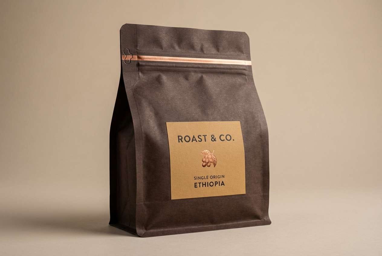
1) Smoked Walnut
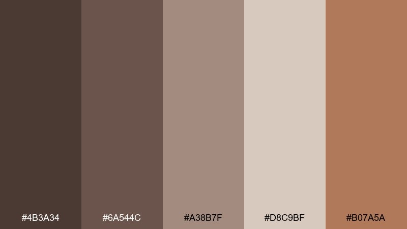
HEX: #4b3a34 #6a544c #a38b7f #d8c9bf #b07a5a
Mood: cozy, grounded, artisanal
Best for: coffee packaging and rustic labels
Cozy and grounded like a woodshop at dusk, these tones feel hand-finished and real. Use the deep walnut and wenge-like brown as your anchor, then let the warm tan and soft beige carry typography and whitespace. The coppery accent works well for seals, icons, and small highlights. Tip: keep the darkest shade for headers only so the layout stays breathable.
Image example of smoked walnut generated using media.io
Media.io is an online AI studio for creating and editing video, image, and audio in your browser.

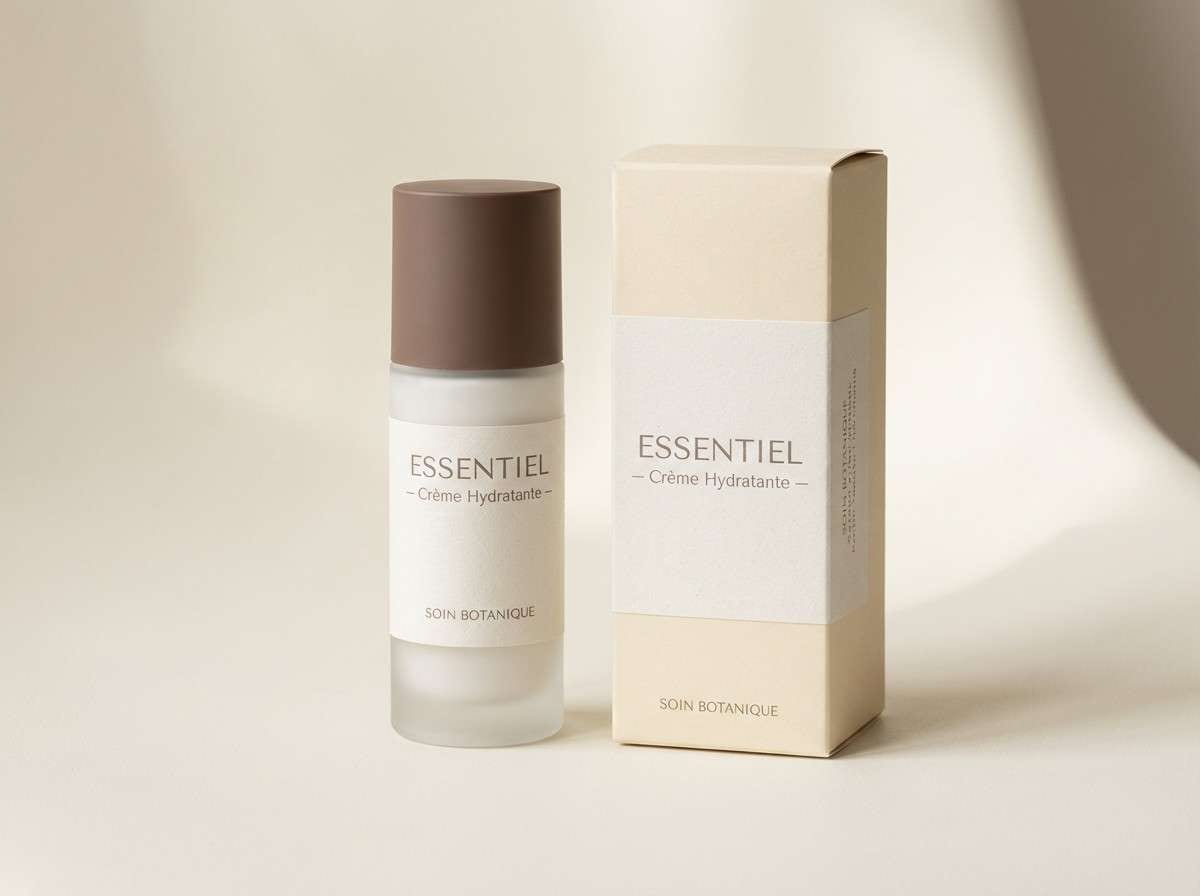
2) Cocoa Linen
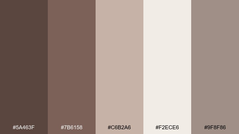
HEX: #5a463f #7b6158 #c6b2a6 #f2ece6 #9f8f86
Mood: soft, calm, minimal
Best for: skincare branding and stationery
Soft and calm like cocoa stirred into warm milk, this mix reads clean without feeling cold. Pair the deep brown with creamy linen for a premium, minimalist foundation, and use the mid taupe for secondary text. It shines on uncoated paper, envelopes, and simple product labels. Tip: print the lightest tone as background and reserve the darkest for logotypes and key claims.
Image example of cocoa linen generated using media.io
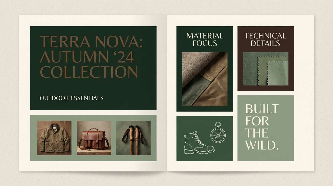
3) Forest Espresso
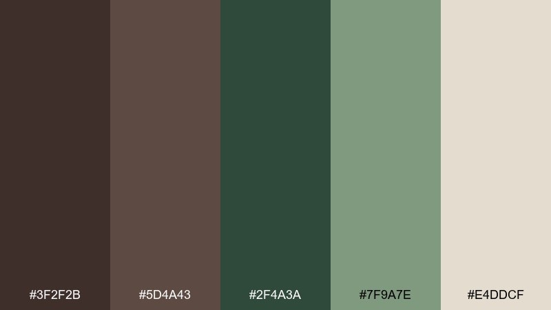
HEX: #3f2f2b #5d4a43 #2f4a3a #7f9a7e #e4ddcf
Mood: moody, natural, refined
Best for: outdoor brand identity and lookbooks
Moody and natural like a forest trail after rain, the dark espresso base adds instant depth. For a wenge color palette that feels outdoorsy, let the evergreen sit as the secondary hero and keep the cream for margins and captions. The sage tone softens transitions and keeps pages from going too heavy. Tip: use the green shades for navigation states and callouts, not large body backgrounds.
Image example of forest espresso generated using media.io
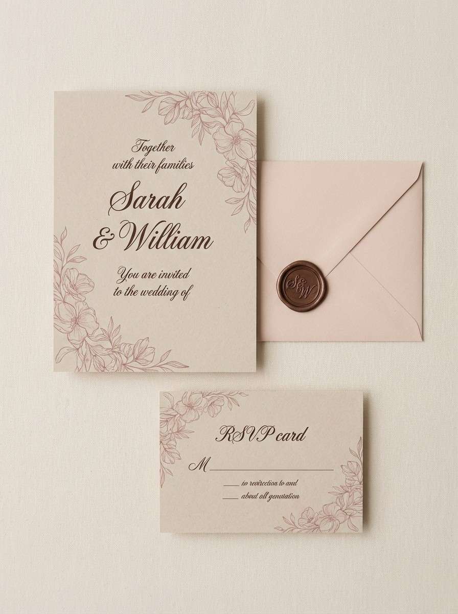
4) Dusty Rosewood
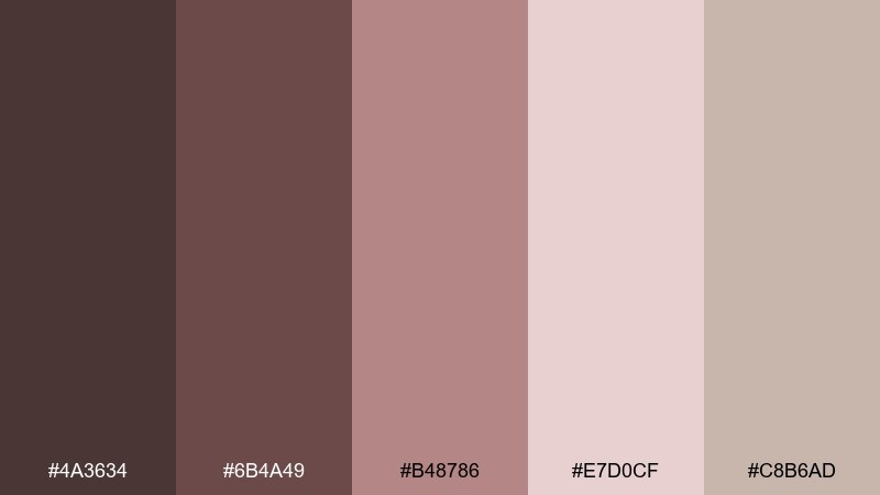
HEX: #4a3634 #6b4a49 #b48786 #e7d0cf #c8b6ad
Mood: romantic, muted, vintage
Best for: wedding invitations and boutique flyers
Romantic and muted like pressed petals in an old book, the rosewood tones feel intimate and timeless. Use the dark brown for names and headings, then lean on blush and dusty pink for borders, monograms, and subtle illustrations. Creamy neutrals keep the layout airy and print-friendly. Tip: choose one pink as the accent and keep the other as a background wash to avoid a muddy blend.
Image example of dusty rosewood generated using media.io
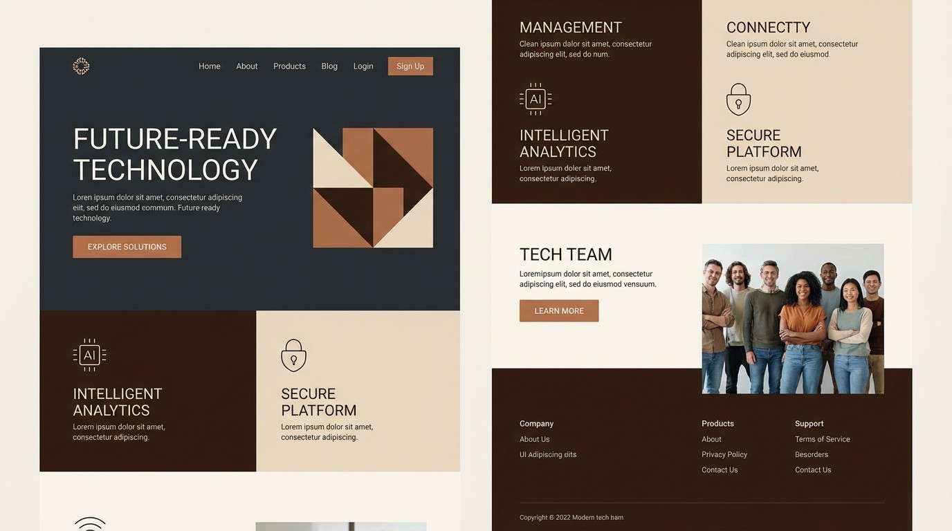
5) Copper and Charcoal
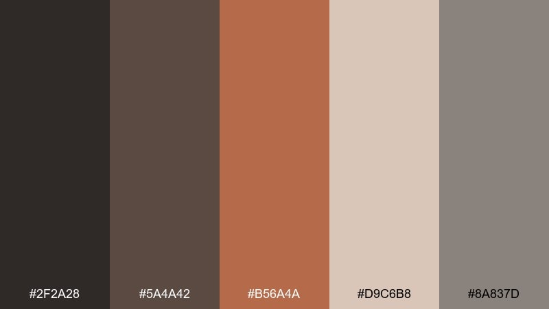
HEX: #2f2a28 #5a4a42 #b56a4a #d9c6b8 #8a837d
Mood: bold, modern, high-contrast
Best for: tech landing pages and product hero sections
Bold and modern like brushed metal under soft light, this set is built for contrast. These wenge color combinations work best when charcoal and dark brown handle structure while copper becomes the attention cue for buttons. Keep the pale beige for generous whitespace and the gray for dividers and secondary UI. Tip: limit copper to one primary action per screen for a premium, not flashy, feel.
Image example of copper and charcoal generated using media.io
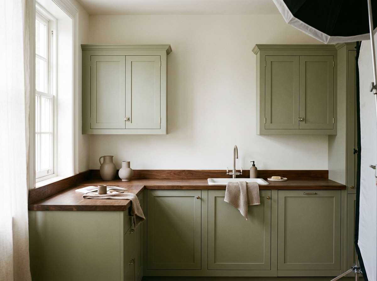
6) Sage Cabinetry
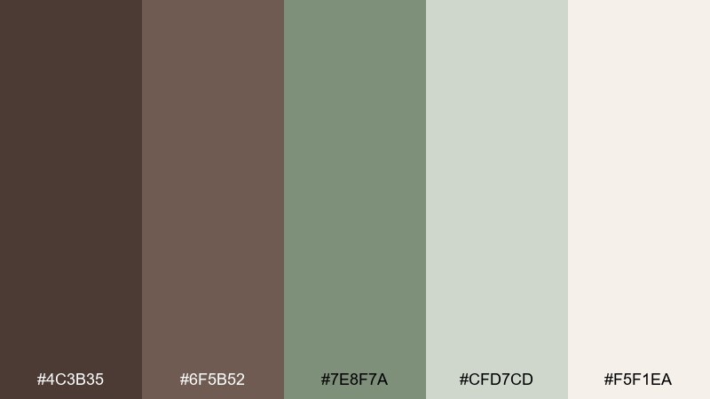
HEX: #4c3b35 #6f5b52 #7e8f7a #cfd7cd #f5f1ea
Mood: homey, fresh, balanced
Best for: kitchen mood boards and interior renders
Homey and fresh like painted cabinets in morning light, these tones balance warmth with a hint of green. Use the wenge-leaning brown for wood accents and hardware, and let sage carry larger surfaces without overwhelming the room. The pale neutrals keep it bright and easy to layer with textures. Tip: repeat the darkest brown in small touches only, like shelving, frames, or stools, to keep the space light.
Image example of sage cabinetry generated using media.io
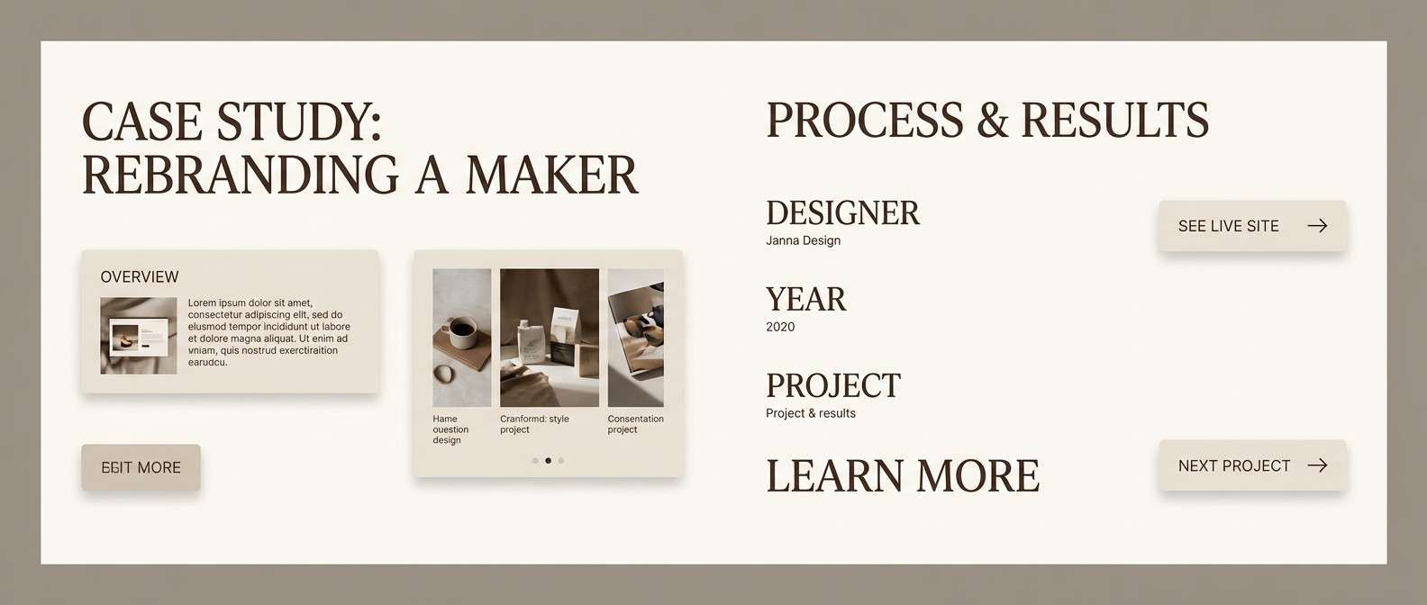
7) Misty Taupe Studio
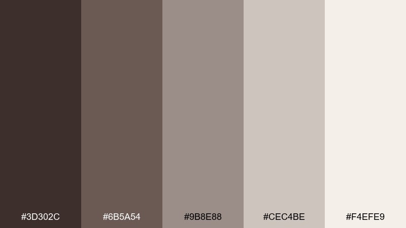
HEX: #3d302c #6b5a54 #9b8e88 #cec4be #f4efe9
Mood: quiet, editorial, soft-neutral
Best for: portfolio websites and case studies
Quiet and editorial like a sunlit studio with linen backdrops, this palette stays understated and professional. Build your hierarchy with the deep brown for headlines, mid taupe for body text, and the light neutrals for sections and cards. It pairs naturally with monochrome photography and simple line icons. Tip: add contrast using font weight and spacing rather than new colors.
Image example of misty taupe studio generated using media.io
8) Midnight Library
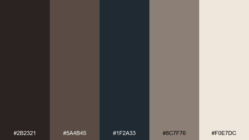
HEX: #2b2321 #5a4b45 #1f2a33 #8c7f76 #f0e7dc
Mood: scholarly, dramatic, sophisticated
Best for: book covers and author branding
Scholarly and dramatic like a quiet library at midnight, the dark tones feel intelligent and composed. For a wenge color scheme with extra depth, use the inky blue-black as the primary background and bring in warm cream for titles and pull quotes. The taupe keeps supporting elements readable without glare. Tip: use cream at 90 to 95 percent opacity to reduce harsh contrast on dark backgrounds.
Image example of midnight library generated using media.io

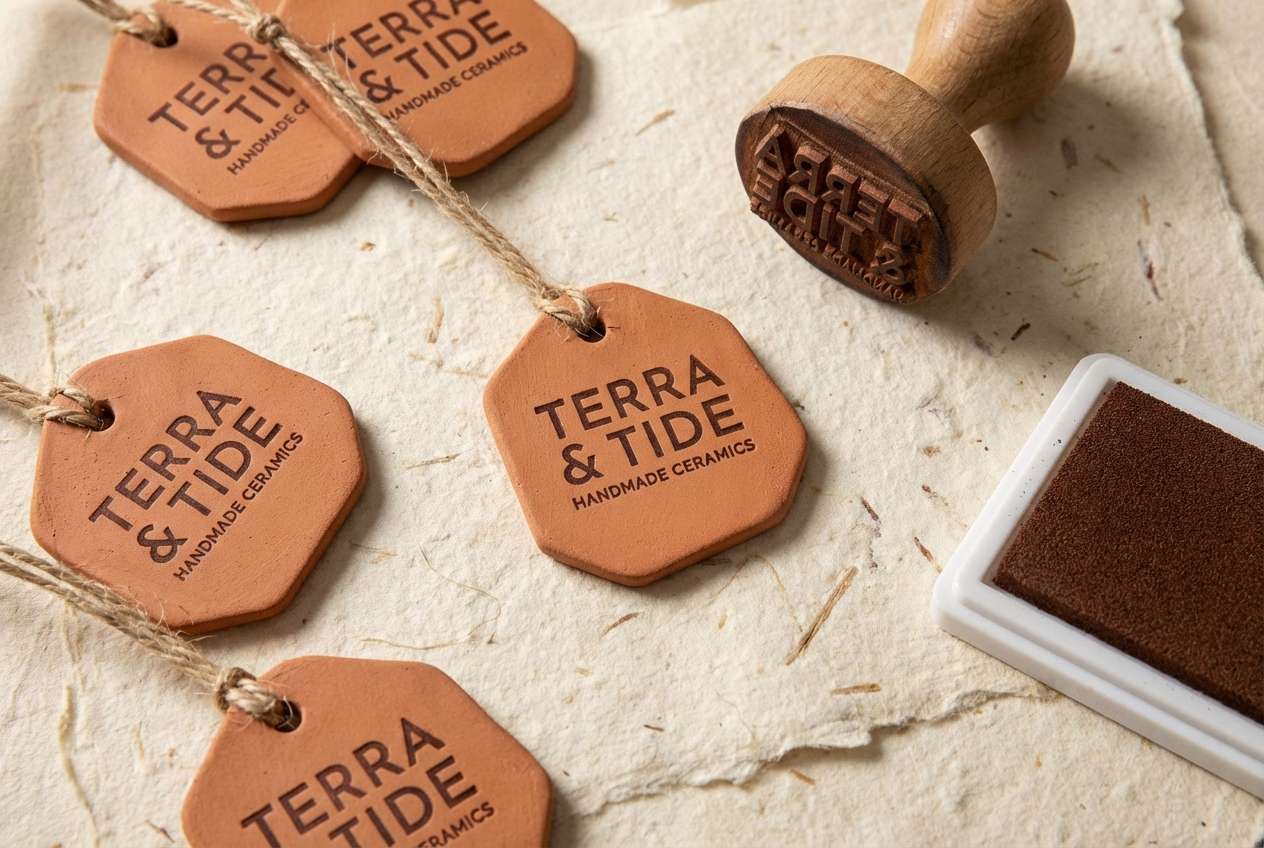
9) Clay Pottery
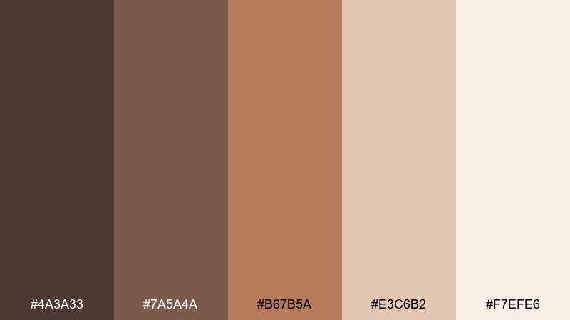
HEX: #4a3a33 #7a5a4a #b67b5a #e3c6b2 #f7efe6
Mood: earthy, sunbaked, welcoming
Best for: ceramic shop branding and product tags
Earthy and sunbaked like handmade clay on a wheel, these browns and terracottas feel inviting. Use the deepest shade for logos and stamps, then lean into terracotta for highlights and pattern work. The pale creams keep tags and labels readable in small sizes. Tip: add subtle grain or paper texture so the warm colors feel even more tactile.
Image example of clay pottery generated using media.io
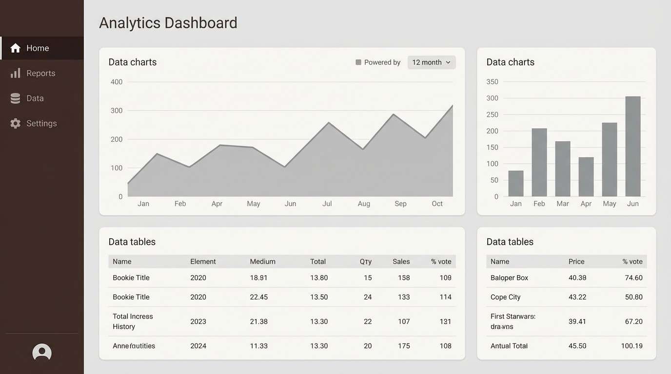
10) Winter Stone
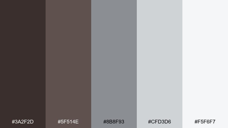
HEX: #3a2f2d #5f514e #8b8f93 #cfd3d6 #f5f6f7
Mood: cool, sleek, modern
Best for: dashboard UI and data-heavy layouts
Cool and sleek like winter light on stone, the neutrals here keep interfaces clean and focused. Let the deep brown handle top navigation and key text, while soft grays build cards, tables, and dividers. The near-white background preserves contrast and reduces visual fatigue. Tip: use the medium gray for disabled states so the hierarchy stays consistent.
Image example of winter stone generated using media.io
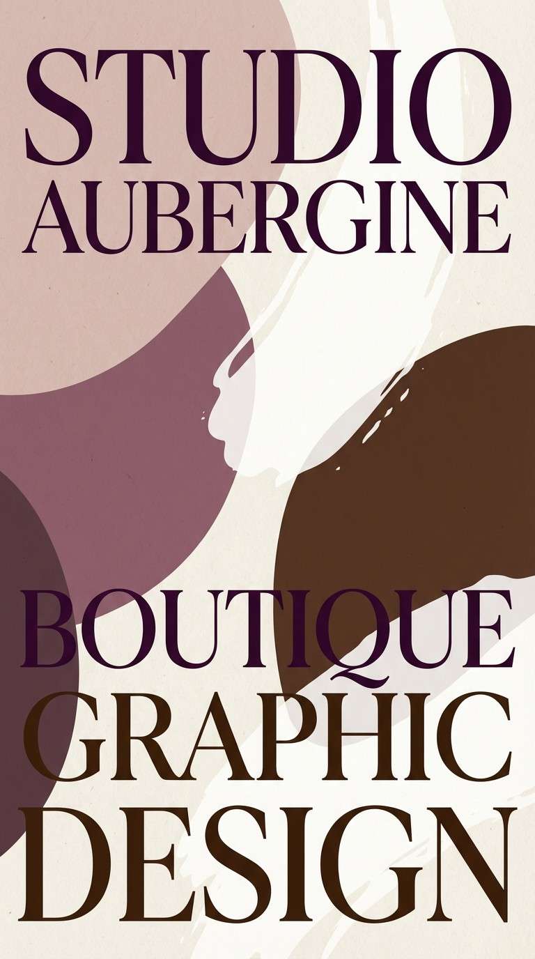
11) Aubergine Velvet
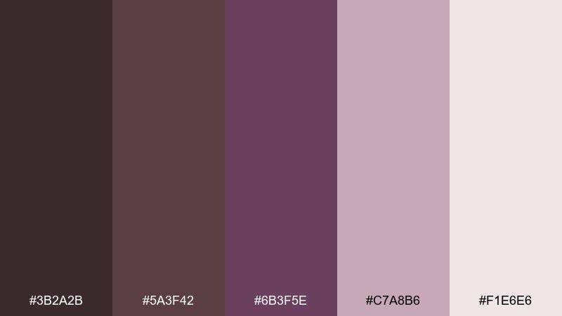
HEX: #3b2a2b #5a3f42 #6b3f5e #c7a8b6 #f1e6e6
Mood: luxurious, intimate, creative
Best for: beauty campaigns and boutique posters
Luxurious and intimate like velvet in low light, the plum notes add drama without going neon. Use deep brown and aubergine for big shapes and type, then let the dusty pink soften edges and gradients. It works beautifully on posters, social ads, and premium beauty visuals. Tip: keep backgrounds light or very dark, and avoid mid-tone backgrounds that can flatten the contrast.
Image example of aubergine velvet generated using media.io
12) Desert Sandstone
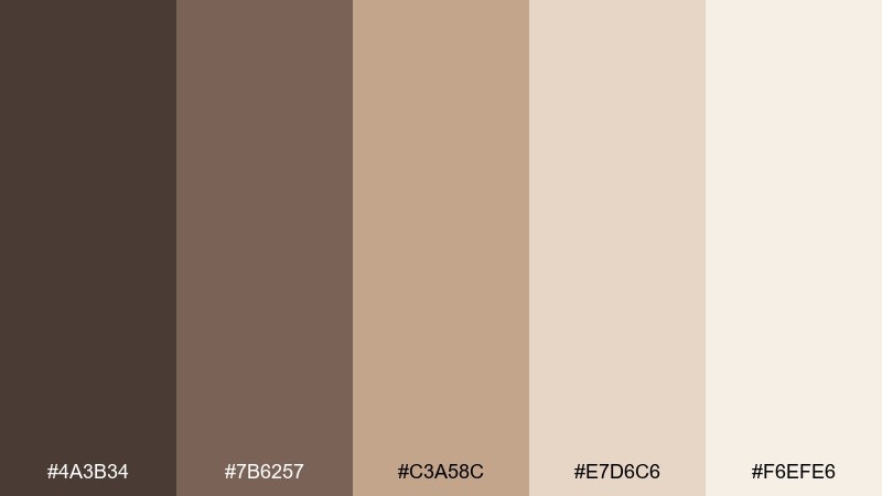
HEX: #4a3b34 #7b6257 #c3a58c #e7d6c6 #f6efe6
Mood: warm, airy, sunlit
Best for: travel brochures and lifestyle blogs
Warm and airy like sunlit sandstone, these tones feel relaxed and approachable. Anchor the page with the deep brown for headings, then use sandy beige for large backgrounds and section breaks. The lighter creams make photos and editorial blocks feel open. Tip: add thin rules in the mid brown to guide reading without heavy boxes.
Image example of desert sandstone generated using media.io
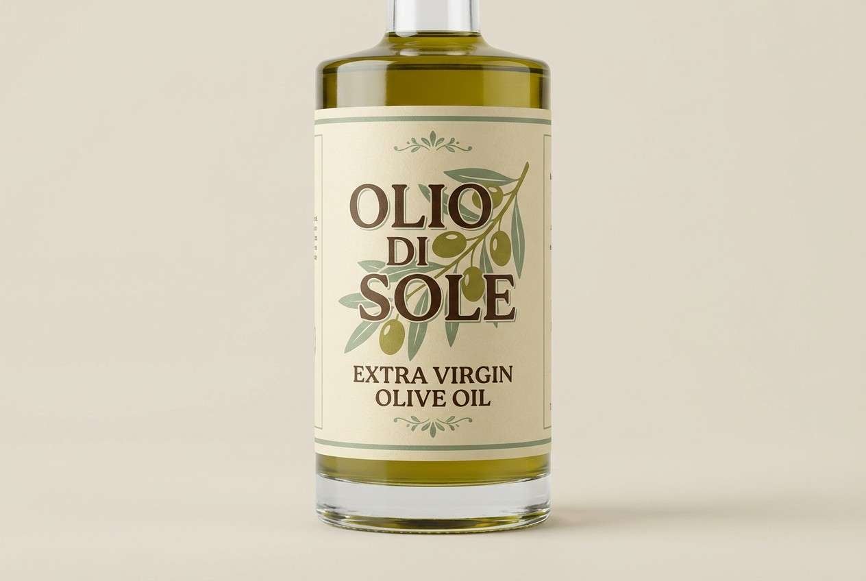
13) Olive Grove
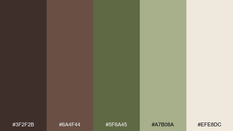
HEX: #3f2f2b #6a4f44 #5f6a45 #a7b08a #efe8dc
Mood: rustic, organic, balanced
Best for: olive oil labels and farm brands
Rustic and organic like an olive grove at golden hour, the green-brown pairing feels honest and grounded. Use the deep brown for type and borders, and let olive and sage carry illustration work or ingredient callouts. The warm cream keeps labels legible and premium. Tip: pair with simple line art and avoid overly glossy finishes to preserve the natural vibe.
Image example of olive grove generated using media.io
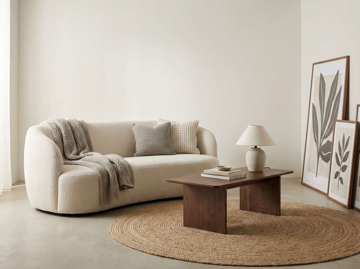
14) Nordic Hearth
HEX: #352b28 #5a4a42 #8a776d #d8cec7 #f7f3ef
Mood: cozy, modern, understated
Best for: interior styling guides and furniture brands
Cozy and modern like a Nordic living room with a quiet fireplace, these neutrals feel effortless. A wenge color palette like this excels when you emphasize texture: wood grain, wool, and matte ceramics. Use the darkest brown for key anchors like product names, and keep the lightest tones for spacious backgrounds. Tip: add one natural material photo per section to make the neutrals feel warm, not flat.
Image example of nordic hearth generated using media.io
15) Ink and Parchment
HEX: #241f1e #4d3e39 #a08b7e #e8dccf #f7f1e8
Mood: classic, literary, warm-neutral
Best for: resume templates and editorial PDFs
Classic and literary like ink on parchment, this set is made for long-form reading. Use near-black brown for body text, warm beige for sidebars, and keep the lightest tone as the page base. It pairs well with serif fonts, subtle rules, and generous margins. Tip: avoid pure black and use the darkest brown instead to keep the page softer on screens.
Image example of ink and parchment generated using media.io
16) Mocha Marble
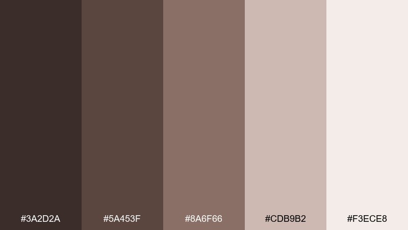
HEX: #3a2d2a #5a453f #8a6f66 #cdb9b2 #f3ece8
Mood: polished, warm, premium
Best for: jewelry ads and luxury social posts
Polished and warm like mocha marble under gallery lighting, these browns feel expensive and controlled. Use the deepest shade for bold type and shadows, then let the mid browns create soft gradients and depth. The pale blush-beige works as a clean backdrop for products and typography. Tip: add a single specular highlight and keep saturation low for a luxe finish.
Image example of mocha marble generated using media.io
17) Golden Hour Cafe
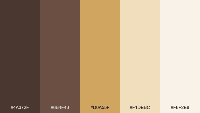
HEX: #4a372f #6b4f43 #d0a55f #f1debc #f8f2e8
Mood: warm, cheerful, inviting
Best for: cafe menus and promo posters
Warm and cheerful like late sunlight on a cafe counter, this mix adds friendliness to deep browns. Use caramel gold for highlights such as prices, badges, or promo callouts, while the browns keep the layout grounded. Creamy backgrounds keep text crisp and print-ready. Tip: place gold behind small text only when you also add enough padding for readability.
Image example of golden hour cafe generated using media.io
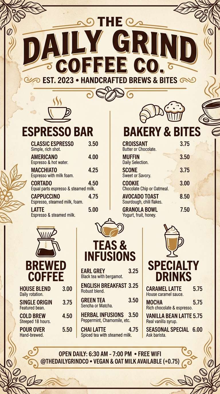
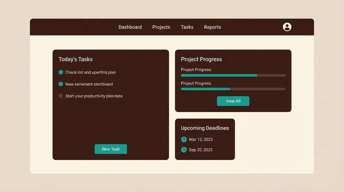
18) Teal Accent Desk
HEX: #2f2624 #5a4a42 #2f6b64 #8ab7b1 #f1ece6
Mood: smart, calm, contemporary
Best for: SaaS UI and productivity tools
Smart and calm like a tidy desk with a green-glass accessory, teal adds focus to the warm browns. These wenge color combinations are strongest when teal is reserved for active states, links, and progress indicators. Keep cream as the main canvas so charts and cards feel light. Tip: use the soft teal for hover states and the deeper teal for selected states to maintain a clear UI ladder.
Image example of teal accent desk generated using media.io
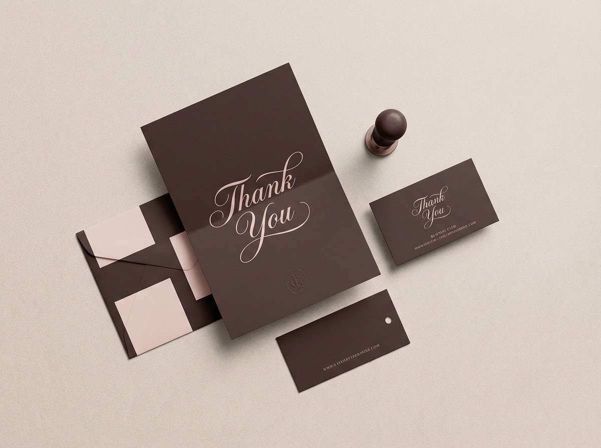
19) Blush and Bark
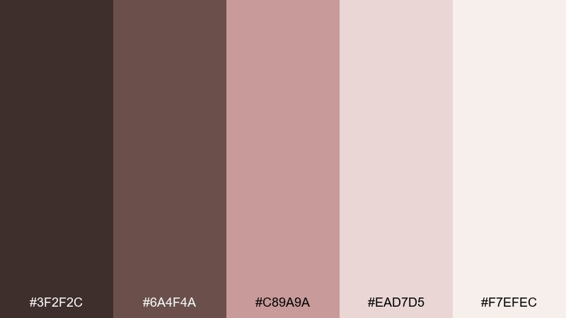
HEX: #3f2f2c #6a4f4a #c89a9a #ead7d5 #f7efec
Mood: soft, elegant, friendly
Best for: boutique branding and thank-you cards
Soft and elegant like blush fabric against dark bark, this pairing feels friendly and polished. Use the browns for structure and legibility, then apply blush to stickers, borders, or small illustrated motifs. The pale tints work well as background panels for notes and inserts. Tip: keep blush elements slightly desaturated so they stay sophisticated next to the deep brown.
Image example of blush and bark generated using media.io
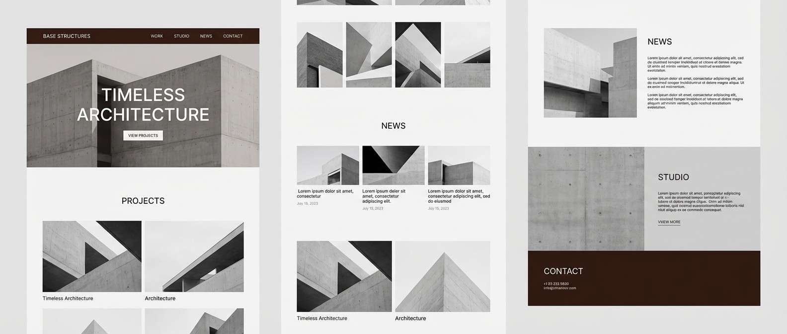
20) Minimal Concrete
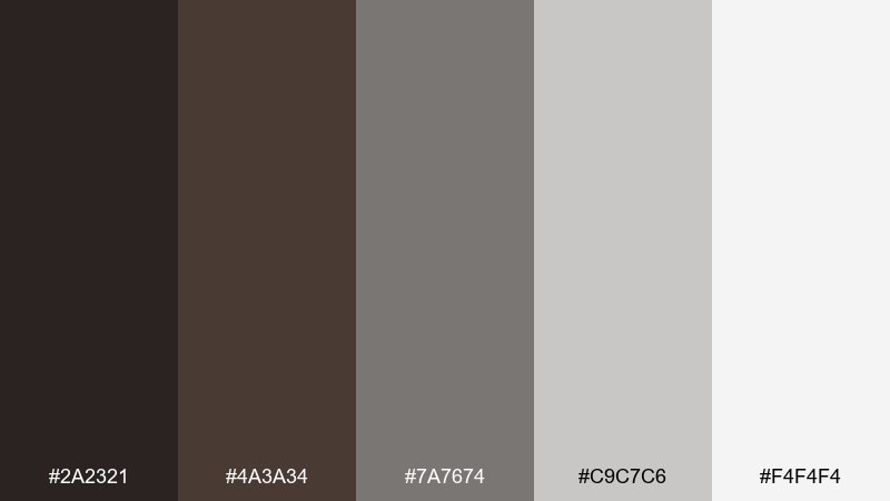
HEX: #2a2321 #4a3a34 #7a7674 #c9c7c6 #f4f4f4
Mood: industrial, clean, understated
Best for: architecture portfolios and studio sites
Industrial and clean like concrete with warm shadow, these tones feel modern without being harsh. Use the near-black brown for navigation and captions, then build sections with layered grays and plenty of white space. It pairs nicely with architectural line drawings and monochrome imagery. Tip: add one warm brown accent block per page to prevent the grays from feeling too cold.
Image example of minimal concrete generated using media.io
What Colors Go Well with Wenge?
Wenge pairs beautifully with warm off-whites, parchment, sand, and linen tones because they keep the palette breathable while preserving that rich, coffee-brown character. These neutrals are ideal for backgrounds, cards, and large content areas.
For accents, muted greens (sage, olive, evergreen) create an organic, grounded feel, while teal adds a sharper contemporary edge for UI states and links. If you want something more luxe, copper and caramel-gold highlights bring a premium “metal + wood” vibe.
Soft blush and dusty rose also work well when you want warmth without turning the scheme loud—great for boutique branding, invitations, and lifestyle graphics that need a gentle emotional tone.
How to Use a Wenge Color Palette in Real Designs
Use wenge as your anchor: navigation bars, headers, key typography, or framing elements. Then let the lightest neutral handle the majority of surface area so your design doesn’t feel heavy, especially on mobile screens.
Keep accents intentional. Choose one standout color (like copper, teal, or blush) for CTAs, badges, or emphasis, and use the remaining mid-neutrals for dividers, secondary text, and subtle depth.
In print and interiors, wenge works best when you balance it with texture—matte paper, grain, stone, linen, or soft lighting—so the dark brown reads rich rather than flat.
Create Wenge Palette Visuals with AI
If you’re pitching a brand direction or building a mood board, generating realistic mockups can help stakeholders “see” the palette faster. With Media.io, you can turn a prompt into on-style visuals that match wenge’s cozy, premium tone.
Try describing your target medium (packaging, UI, poster, interior), then specify the wenge base plus your accent color. Iterate by adjusting lighting (studio, natural, moody) and materials (matte paper, wood grain, brushed metal) to refine the look.
Once you have a strong result, reuse the same prompt structure to produce a consistent set for your social posts, landing pages, or presentation deck.
Wenge Color Palette FAQs
-
What is “wenge” as a color?
Wenge is a very dark brown inspired by wenge wood, often described as espresso or chocolate brown with warm, slightly reddish undertones. -
Is wenge closer to black or brown?
Wenge is firmly a brown, but it can function like black in layouts because it’s deep and low-saturation. It usually feels softer and warmer than pure black. -
What are the best light background colors to pair with wenge?
Warm off-whites and beiges—like linen, parchment, cream, and sand—pair best because they maintain comfort and readability while letting wenge provide contrast. -
What accent colors look modern with wenge?
Teal, sage/olive greens, copper, and caramel-gold accents look especially modern with wenge, balancing warmth with a clean contemporary edge. -
How do I use wenge in UI without making the page feel too dark?
Limit wenge to structure (nav, headings, key text) and keep most surfaces light. Use one accent color for CTAs, and rely on spacing and typography for hierarchy. -
Does wenge print well?
Yes—wenge looks rich on uncoated and textured stocks. For smoother results, avoid ultra-saturated dark mixes and test on your chosen paper to prevent muddy shadows. -
Can I generate wenge palette mockups with AI?
Yes. Use Media.io Text-to-Image prompts that specify a wenge base plus your accent colors, along with materials (matte paper, wood, metal) and lighting (studio, natural) for consistent results.
Next: Salmon Color Palette


