

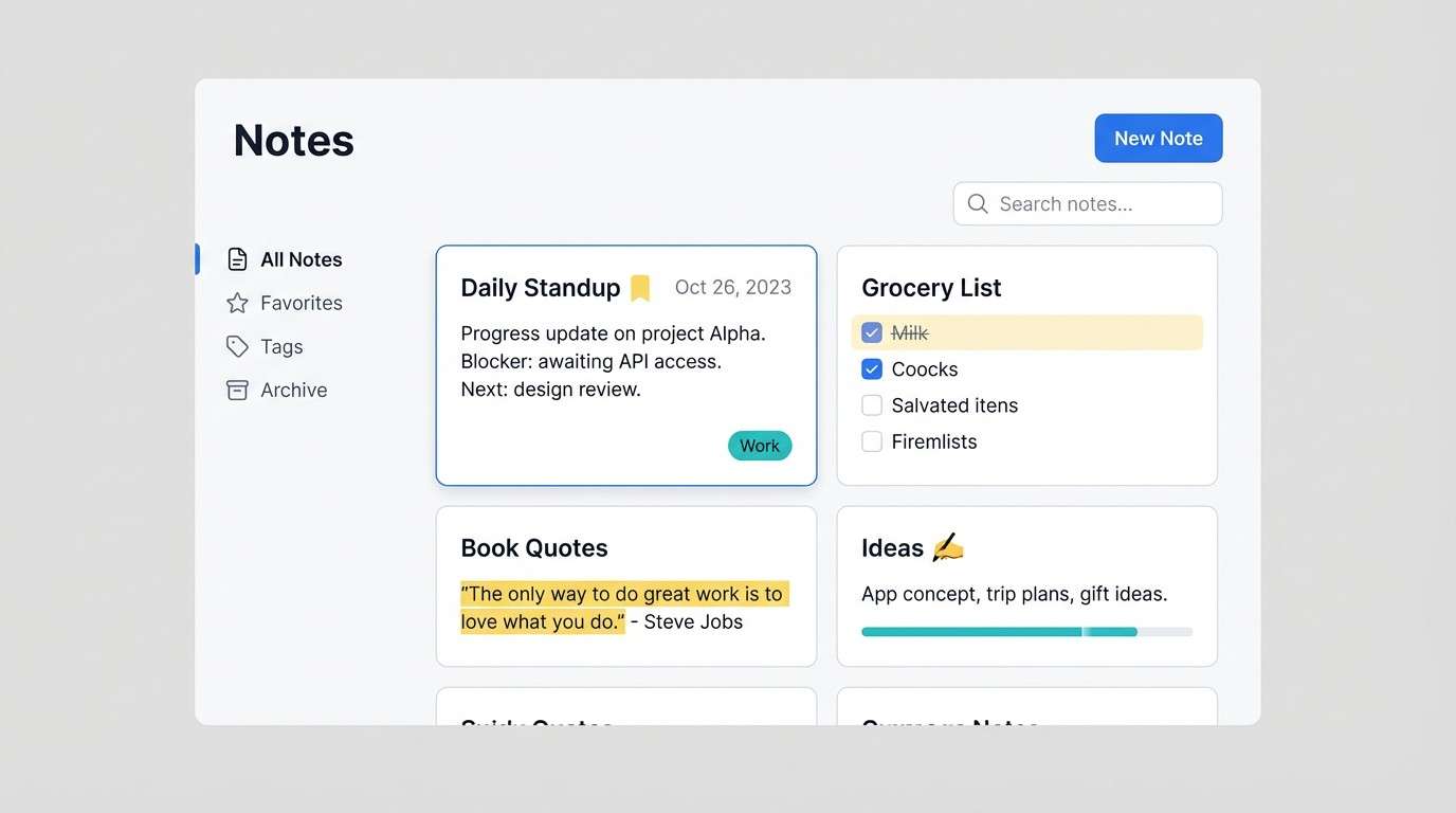
A yellow teal blue color palette blends sunshine warmth with water-cool freshness, so it feels energetic without getting chaotic. It’s an easy trio for modern branding, UI, posters, and interiors.
Below are 20+ yellow teal blue palette ideas with HEX codes and ready-to-use prompts you can run in Media.io to generate matching visuals fast.
In this article
- Why Yellow Teal Blue Palettes Work So Well
-
- sunlit lagoon
- citrus tide
- marigold marina
- poolside lemonade
- retro surf shop
- coastal classroom
- sunrise over bay
- minimal aqua note
- golden kelp forest
- breezy resort signage
- modern museum ticket
- yacht club classic
- fresh market labels
- night swim neon
- calm clinic wayfinding
- storybook seaside
- tech conference stage
- spring botanical card
- heritage tilework
- studio product spotlight
- lighthouse editorial
- sunny harbor wedding
- What Colors Go Well with Yellow Teal Blue?
- How to Use a Yellow Teal Blue Color Palette in Real Designs
- Create Yellow Teal Blue Palette Visuals with AI
Why Yellow Teal Blue Palettes Work So Well
Yellow brings instant attention and optimism, while teal and blue add calm, credibility, and structure. Together, they create a balanced temperature mix (warm + cool) that feels fresh and versatile.
Because blue naturally supports readability and hierarchy, it’s easy to assign roles: blue for headings/navigation, teal for interactive states, and yellow for highlights (pricing, badges, key data points). That makes the scheme especially strong for UI and branding systems.
Another advantage is range: you can swing the same trio from playful (bright lemon + aqua) to premium (gold + deep navy + muted teal) simply by adjusting saturation and using softer neutrals for breathing room.
20+ Yellow Teal Blue Color Palette Ideas (with HEX Codes)
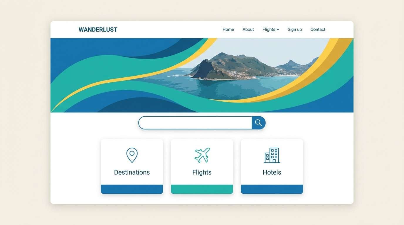
1) Sunlit Lagoon
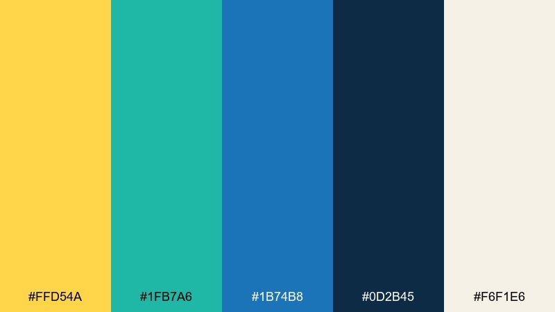
HEX: #ffd54a #1fb7a6 #1b74b8 #0d2b45 #f6f1e6
Mood: bright, coastal, optimistic
Best for: travel landing page UI
Bright and coastal, it feels like sun hitting clear water beside deep ocean shadows. Use it on travel or hospitality pages where you want energy without chaos. Pair the teal for buttons, the blue for headers, and the warm yellow for key highlights and pricing. Tip: keep the cream as the main background to prevent the yellow from overpowering body text.
Image example of sunlit lagoon generated using media.io
Media.io is an online AI studio for creating and editing video, image, and audio in your browser.

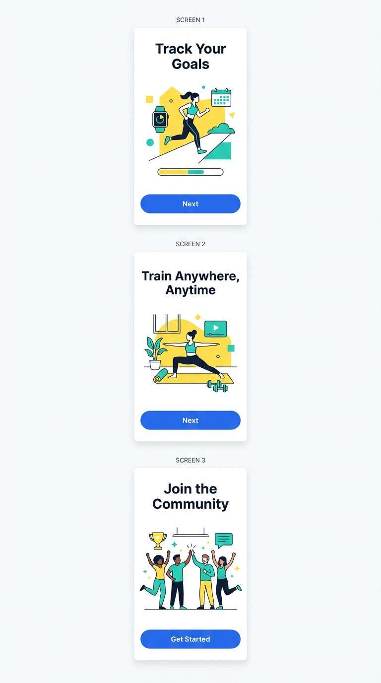
2) Citrus Tide
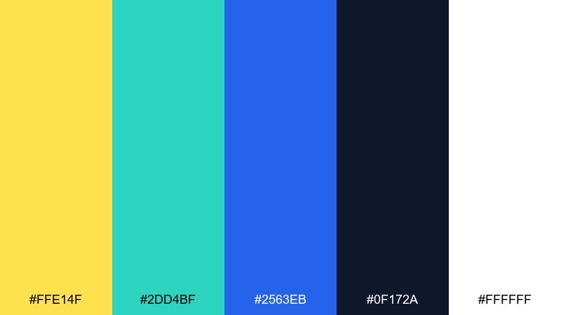
HEX: #ffe14f #2dd4bf #2563eb #0f172a #ffffff
Mood: clean, sporty, high-contrast
Best for: fitness app onboarding screens
Clean and sporty, it reads like fresh citrus against crisp water and midnight navy. The strong contrast makes it ideal for onboarding flows and feature callouts. Use the teal for progress states, the blue for primary actions, and yellow for micro-highlights like badges. Tip: reserve the navy for typography to keep readability sharp on white.
Image example of citrus tide generated using media.io
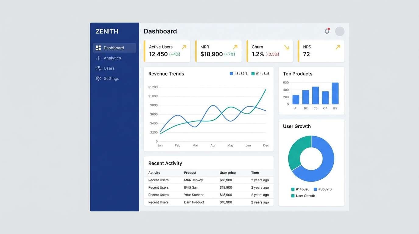
3) Marigold Marina
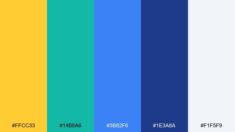
HEX: #ffcc33 #14b8a6 #3b82f6 #1e3a8a #f1f5f9
Mood: fresh, nautical, modern
Best for: SaaS dashboard UI
Fresh and nautical, it suggests marina flags and clean sea air with a modern edge. It works well for dashboards where you need clear hierarchy and status colors. Use the pale gray-blue for surfaces, the darker blues for navigation, and the marigold for alerts or key KPIs. Tip: keep yellow to small areas so it stays premium rather than playful.
Image example of marigold marina generated using media.io
4) Poolside Lemonade
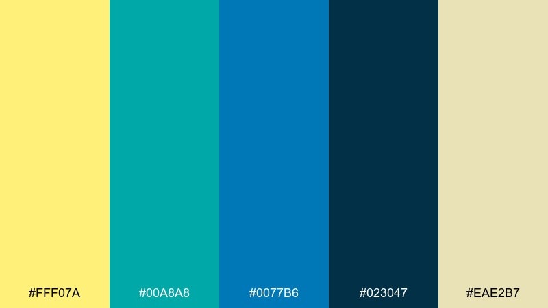
HEX: #fff07a #00a8a8 #0077b6 #023047 #eae2b7
Mood: sunny, relaxed, summery
Best for: summer event poster
Sunny and relaxed, it looks like lemonade in hand beside a bright pool and a shaded cabana. These yellow teal blue color combinations are perfect for summer posters, menus, and seasonal promos. Pair the deep navy for text, the aqua for shapes and borders, and the yellow for the headline. Tip: add generous spacing and let the sandy neutral soften the contrast.
Image example of poolside lemonade generated using media.io

5) Retro Surf Shop
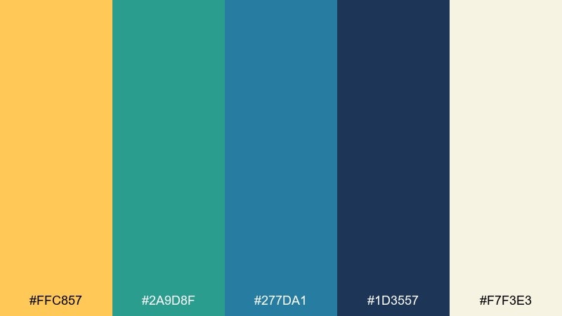
HEX: #ffc857 #2a9d8f #277da1 #1d3557 #f7f3e3
Mood: retro, friendly, beachy
Best for: t-shirt and sticker merch
Retro and friendly, it brings to mind surf wax, vintage signage, and a salty breeze. It suits merch graphics where you want a throwback vibe without going full neon. Use the cream for base prints, navy for outlines, and yellow for a sunburst or logo badge. Tip: keep the teal slightly muted in large fills to maintain a classic feel.
Image example of retro surf shop generated using media.io

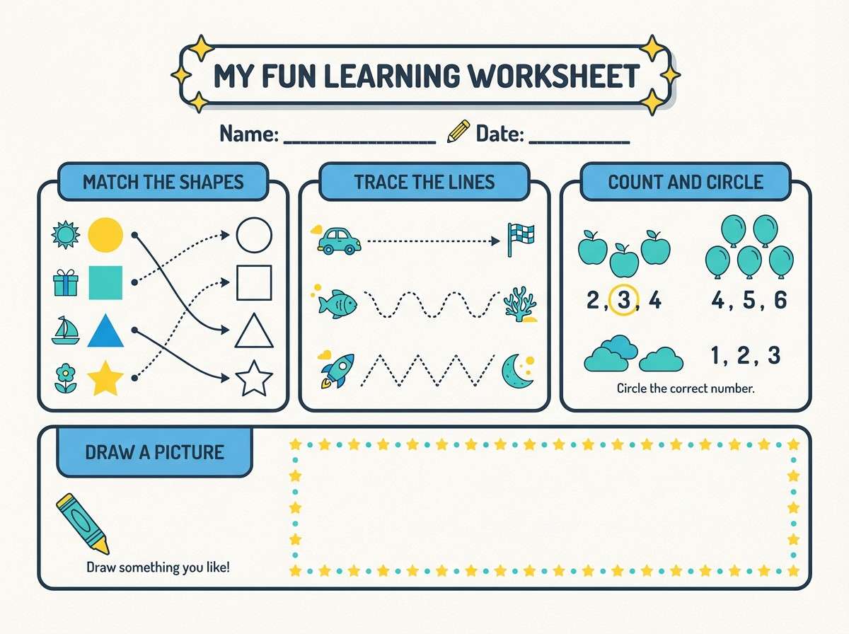
6) Coastal Classroom
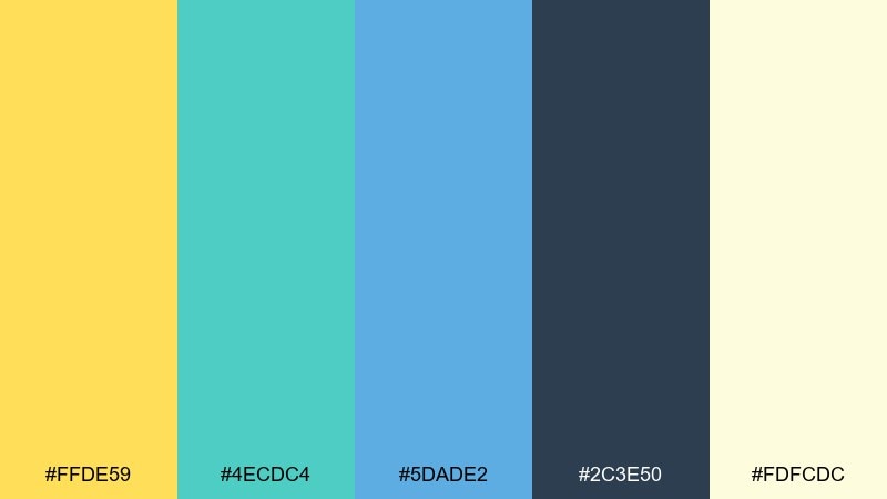
HEX: #ffde59 #4ecdc4 #5dade2 #2c3e50 #fdfcdc
Mood: cheerful, approachable, educational
Best for: kids learning worksheet printable
Cheerful and approachable, it feels like a bright classroom near the coast. The tones are friendly for kids content while still readable for parents and teachers. Use the pale cream as the paper tone, the dark slate for instructions, and the yellow for section headers. Tip: repeat teal as a consistent icon color to reduce visual clutter.
Image example of coastal classroom generated using media.io
7) Sunrise Over Bay
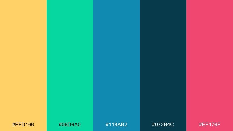
HEX: #ffd166 #06d6a0 #118ab2 #073b4c #ef476f
Mood: playful, vibrant, energetic
Best for: social media promo carousel
Playful and vibrant, it looks like a sunrise gradient popping over water with a punchy coral echo. It is great for swipeable promos where you need motion and contrast. Use blue as the base, teal for mid blocks, and yellow for the hook lines or discount tags. Tip: keep the coral to one repeated element so it feels intentional, not noisy.
Image example of sunrise over bay generated using media.io

8) Minimal Aqua Note
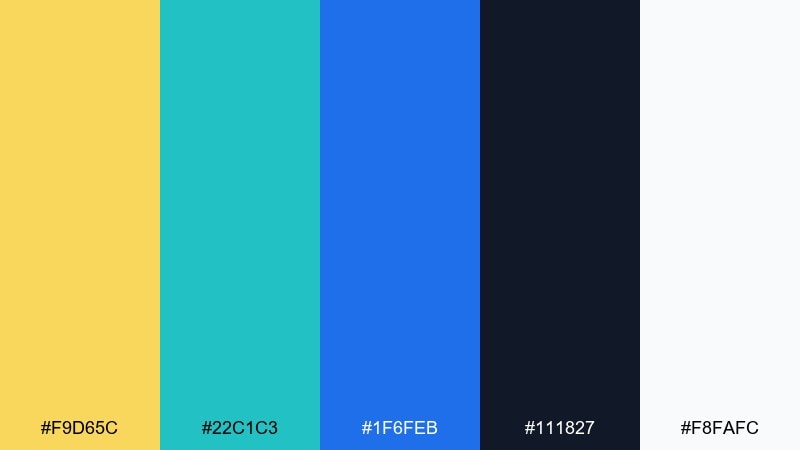
HEX: #f9d65c #22c1c3 #1f6feb #111827 #f8fafc
Mood: minimal, crisp, tech-forward
Best for: note-taking app UI
Minimal and crisp, it feels like clean paper with a cool aqua highlighter and precise blue ink. This yellow teal blue color palette shines in productivity apps that rely on clear focus states. Use the near-white for canvases, the dark ink for text, and the yellow for subtle emphasis like pinned notes. Tip: keep teal for interactive hover states so users learn it quickly.
Image example of minimal aqua note generated using media.io
9) Golden Kelp Forest
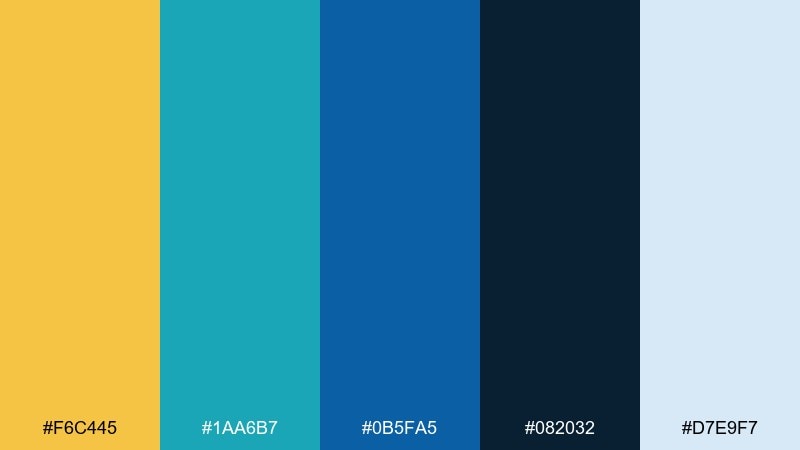
HEX: #f6c445 #1aa6b7 #0b5fa5 #082032 #d7e9f7
Mood: moody, oceanic, adventurous
Best for: documentary thumbnail and title card
Moody and oceanic, it suggests kelp shadows with a golden glint filtering through deep water. It is a strong choice for documentary visuals, covers, and title cards that need drama. Let the darkest navy carry the background, then layer teal gradients and reserve the gold for the title. Tip: add a subtle light blue haze to create depth without extra colors.
Image example of golden kelp forest generated using media.io

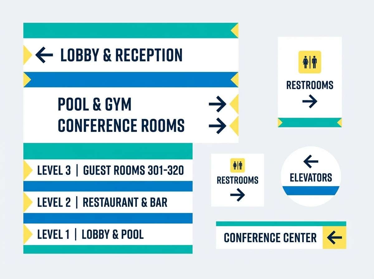
10) Breezy Resort Signage
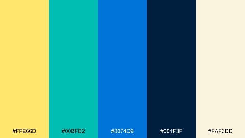
HEX: #ffe66d #00bfb2 #0074d9 #001f3f #faf3dd
Mood: welcoming, airy, polished
Best for: hotel wayfinding signage set
Welcoming and airy, it reads like sunlit corridors with cool sea air. The contrast supports clear directional signage while still feeling upscale. Use navy for text and arrows, teal for section bands, and the warm yellow for floor or wing markers. Tip: keep the cream consistent across signs so the system looks unified.
Image example of breezy resort signage generated using media.io
11) Modern Museum Ticket
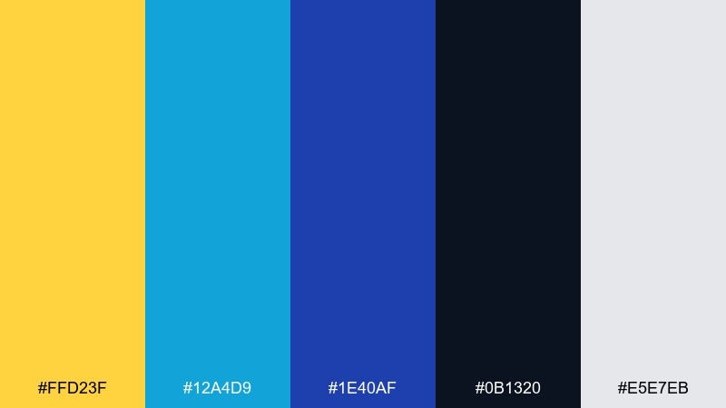
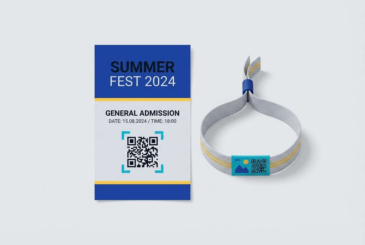
HEX: #ffd23f #12a4d9 #1e40af #0b1320 #e5e7eb
Mood: sleek, curated, contemporary
Best for: event ticket and wristband design
Sleek and curated, it feels like gallery lighting on modern prints with a confident pop of yellow. As a yellow teal blue color scheme, it balances playful energy with serious typography. Use the dark ink for QR codes and fine type, the bright blue for main blocks, and the yellow for seat class or entry time. Tip: keep plenty of gray space so the ticket looks premium and scannable.
Image example of modern museum ticket generated using media.io
12) Yacht Club Classic
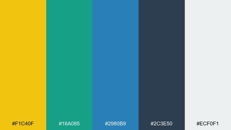
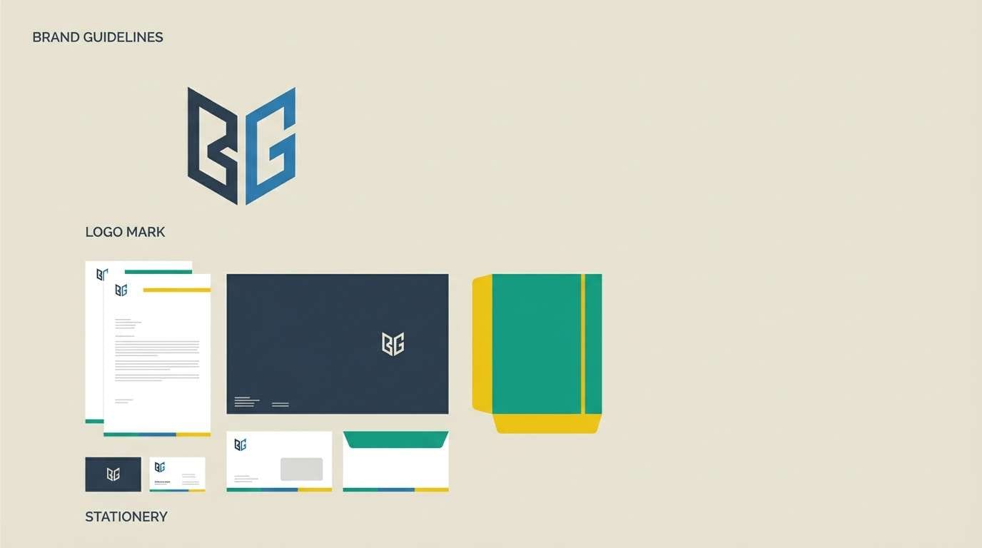
HEX: #f1c40f #16a085 #2980b9 #2c3e50 #ecf0f1
Mood: classic, nautical, confident
Best for: brand identity for a coastal business
Classic and nautical, it recalls polished brass, painted hulls, and crisp uniforms. It works for identity systems that need to feel established but still fresh. Use the slate blue as the core brand color, bring teal into supporting patterns, and save yellow for stamps, seals, and calls to action. Tip: build a one-color logo in navy first, then add yellow as an optional accent.
Image example of yacht club classic generated using media.io
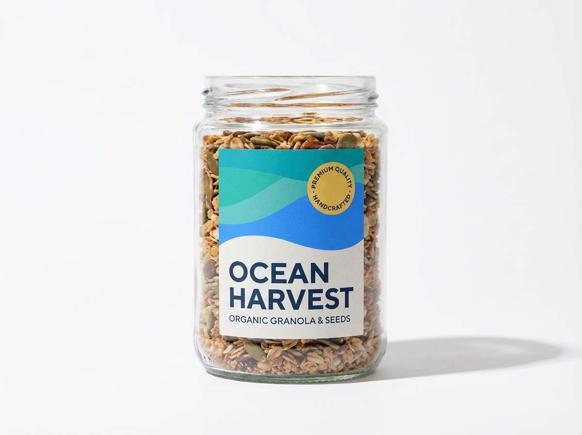
13) Fresh Market Labels

HEX: #ffdf6c #2ec4b6 #3a86ff #1d3557 #fefefe
Mood: fresh, friendly, modern retail
Best for: food jar label and packaging
Fresh and friendly, it evokes clean ingredients and a bright market stall by the sea. These yellow teal blue color combinations read especially well on small labels where contrast matters. Use white as the base, navy for ingredients text, and teal for flavor cues, then add yellow as a quality badge. Tip: keep the bright blue for a single bold stripe so the shelf look stays tidy.
Image example of fresh market labels generated using media.io
14) Night Swim Neon
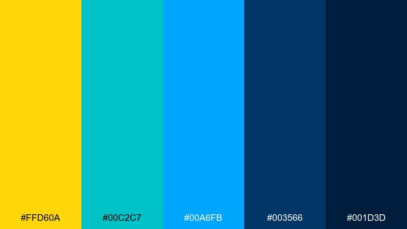
HEX: #ffd60a #00c2c7 #00a6fb #003566 #001d3d
Mood: bold, electric, nightlife
Best for: club flyer cover
Bold and electric, it feels like pool lights at night with neon reflections and deep indigo shadows. It is built for high-impact covers where you want instant energy. Use indigo as the base, then layer cyan and teal gradients to create glow, and drop in yellow for the main headline. Tip: add a soft grain texture to keep the brights from looking flat.
Image example of night swim neon generated using media.io

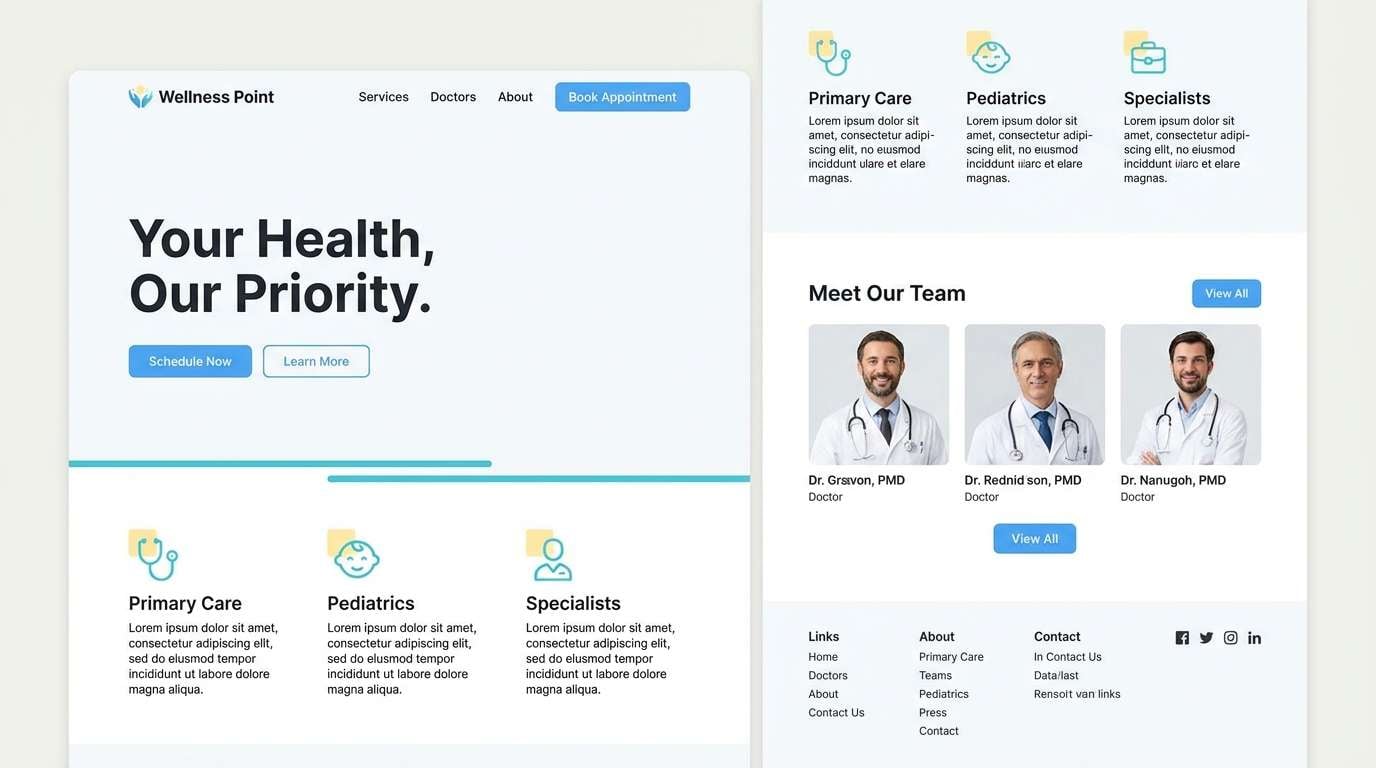
15) Calm Clinic Wayfinding
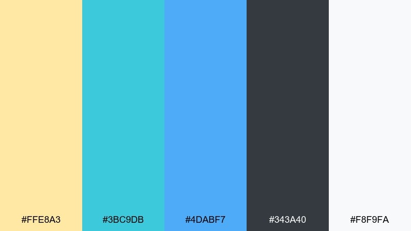
HEX: #ffe8a3 #3bc9db #4dabf7 #343a40 #f8f9fa
Mood: calm, hygienic, reassuring
Best for: clinic website and signage
Calm and reassuring, it reads like soft daylight with clean water tones and gentle warmth. It is ideal for clinics, dental practices, and wellness brands that need trust first. Use the off-white for open space, charcoal for text, and rotate the blues for sections and buttons. Tip: keep the pale yellow as a small accent for friendly cues like appointment reminders.
Image example of calm clinic wayfinding generated using media.io
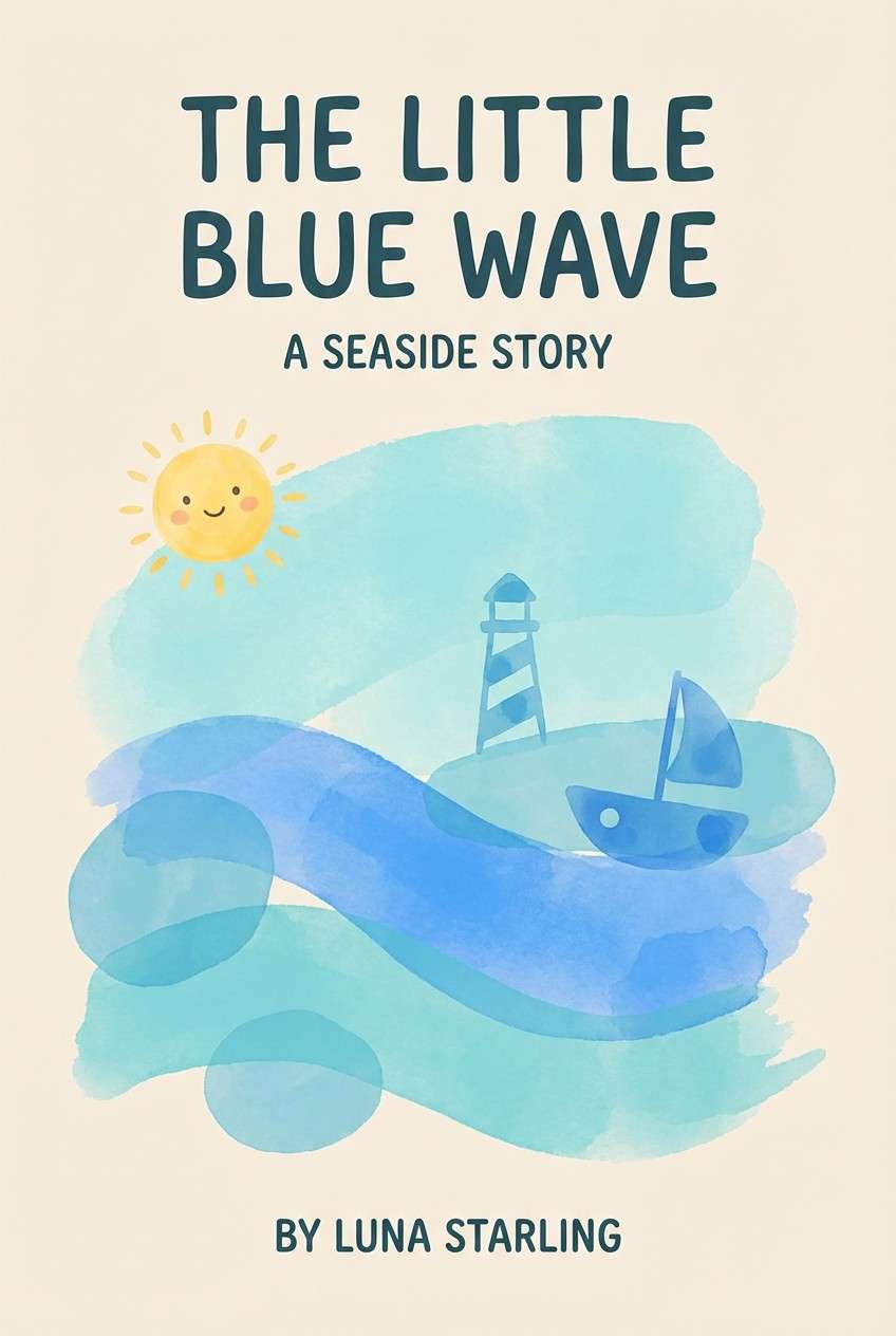
16) Storybook Seaside
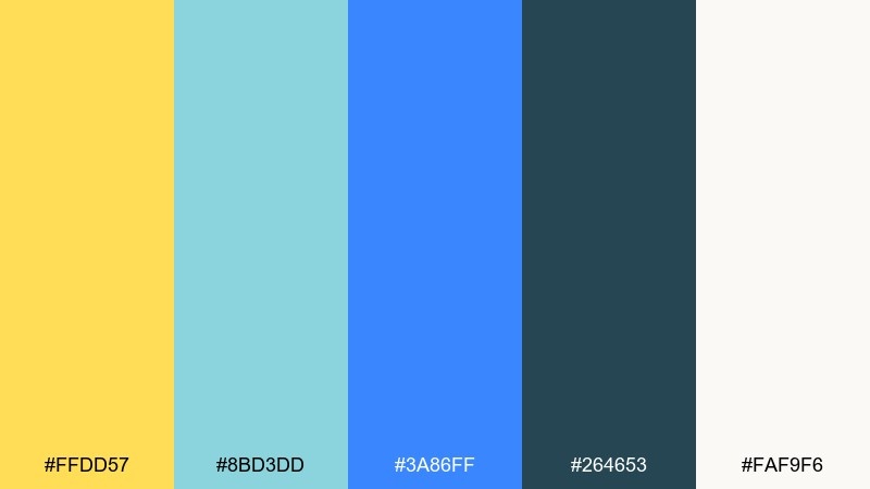
HEX: #ffdd57 #8bd3dd #3a86ff #264653 #faf9f6
Mood: soft, whimsical, family-friendly
Best for: children book cover illustration
Soft and whimsical, it suggests gentle waves, sunny sand, and a calm horizon in a storybook world. The palette is friendly for illustrated covers and chapter openers. Use the deep teal for title lettering, the sky blue for large washes, and the warm yellow for small focal points like stars or lanterns. Tip: keep the background near-white so the illustration stays airy.
Image example of storybook seaside generated using media.io
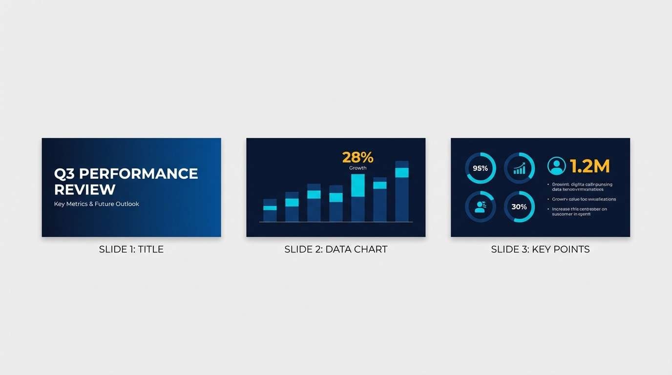
17) Tech Conference Stage
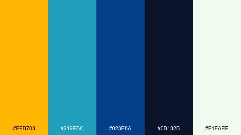
HEX: #ffb703 #219ebc #023e8a #0b132b #f1faee
Mood: confident, modern, high-impact
Best for: conference keynote slide theme
Confident and modern, it feels like a spotlight cutting through deep stage blues with a warm gold cue. This yellow teal blue color palette is especially strong for keynote decks that need clear structure and visual punch. Use the near-black navy for full-bleed slides, teal for charts, and gold for section dividers and key numbers. Tip: keep body text on the pale tint to avoid eye strain in dark rooms.
Image example of tech conference stage generated using media.io
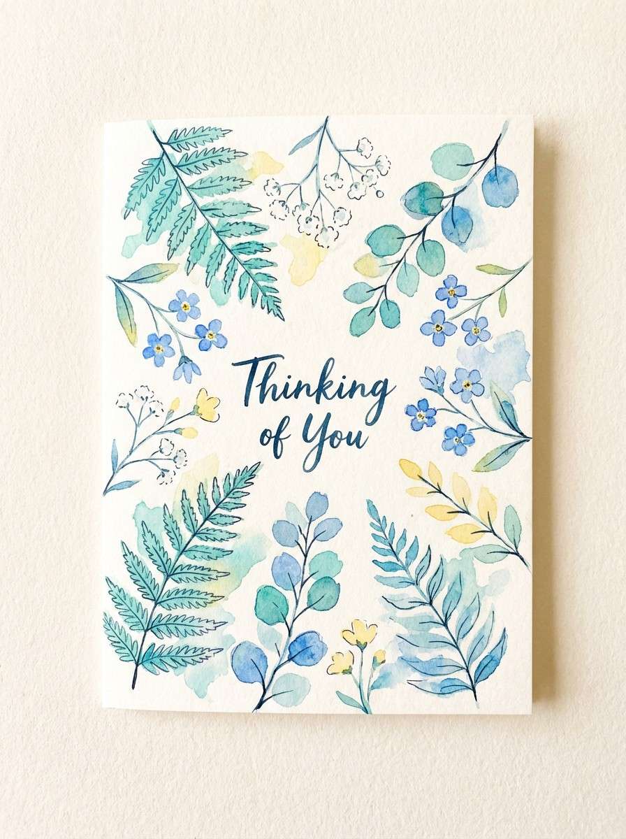
18) Spring Botanical Card
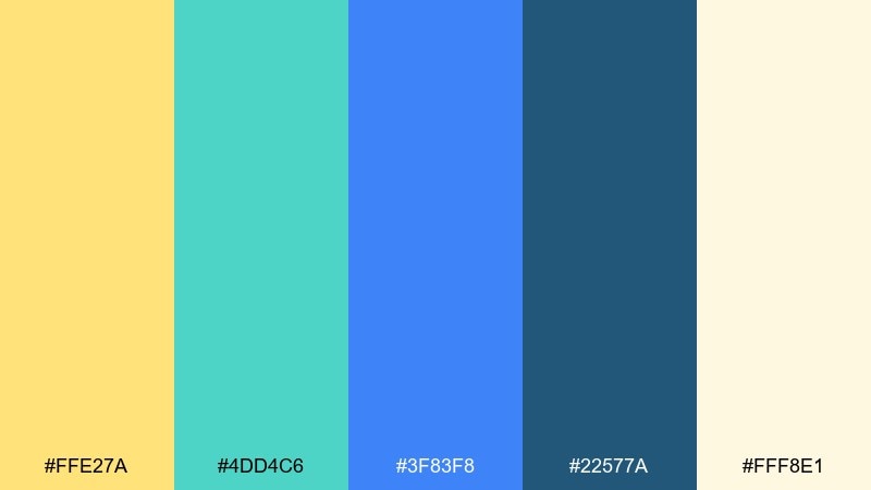
HEX: #ffe27a #4dd4c6 #3f83f8 #22577a #fff8e1
Mood: light, botanical, uplifting
Best for: watercolor greeting card
Light and botanical, it evokes spring leaves with sunlit petals and cool morning shadows. It is a gentle fit for greeting cards, invitations, and small art prints. Use the cream as paper, paint teal foliage, and keep blue for delicate outlines or a border. Tip: let the yellow appear as soft washes rather than solid blocks for a handmade look.
Image example of spring botanical card generated using media.io
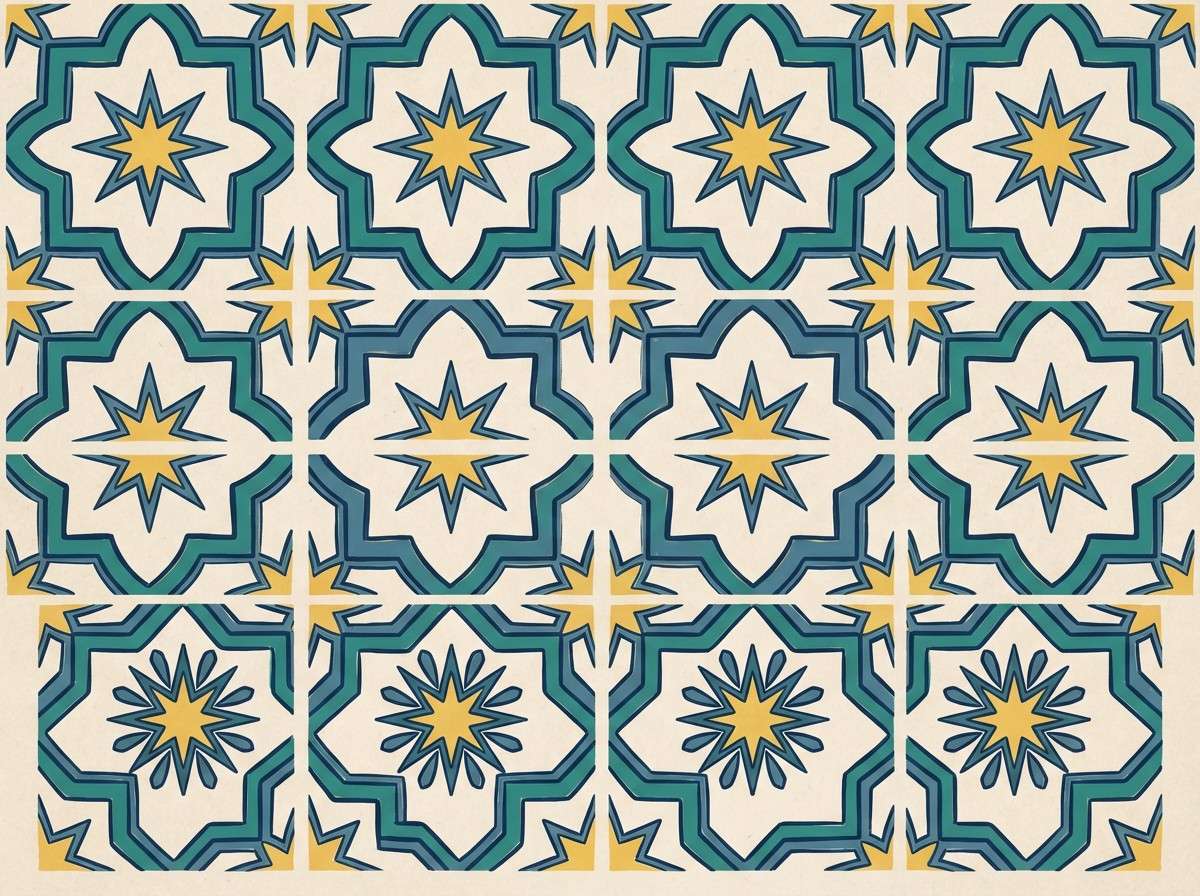
19) Heritage Tilework
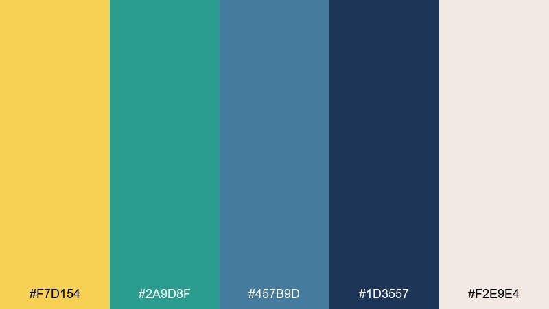
HEX: #f7d154 #2a9d8f #457b9d #1d3557 #f2e9e4
Mood: artisan, Mediterranean, grounded
Best for: kitchen backsplash visualizer
Artisan and grounded, it recalls hand-painted tiles warmed by late afternoon sun. The muted blues keep it sophisticated while the yellow brings life to the pattern. Use the cream as grout or background, the deep navy for outlines, and the teal for repeating motifs. Tip: scale the pattern up slightly on screens to avoid moire in previews.
Image example of heritage tilework generated using media.io
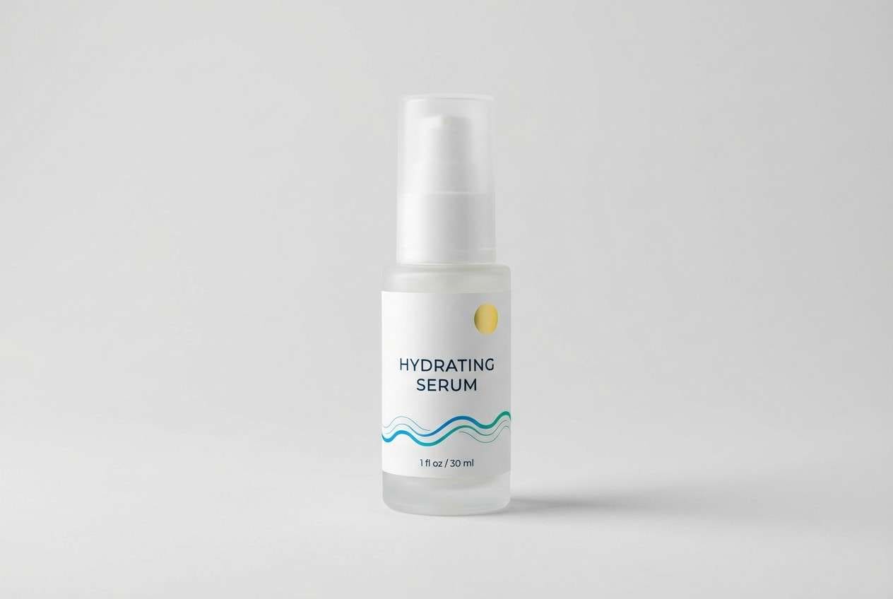
20) Studio Product Spotlight
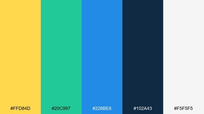
HEX: #ffd84d #20c997 #228be6 #102a43 #f5f5f5
Mood: sharp, commercial, polished
Best for: skincare product ad
Sharp and polished, it looks like a clean studio set with a bright accent light and cool aquatic reflections. It is great for product ads that need a modern, fresh tone. Use the gray-white as the background, blue for the main headline, and teal for secondary callouts, then pop yellow on a small sticker or discount tag. Tip: keep shadows neutral so the colors stay true and premium.
Image example of studio product spotlight generated using media.io
21) Lighthouse Editorial
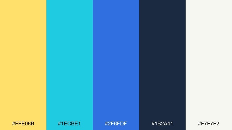
HEX: #ffe06b #1ecbe1 #2f6fdf #1b2a41 #f7f7f2
Mood: editorial, crisp, contemporary
Best for: magazine feature layout
Crisp and contemporary, it brings to mind a lighthouse beam cutting through bright sea mist. It suits editorial layouts that need strong headings and calm reading space. Use the off-white for columns, the navy for body text, and blue for section headers, then add yellow for pull quotes. Tip: keep teal to small rule lines and icons so it does not fight the headline color.
Image example of lighthouse editorial generated using media.io
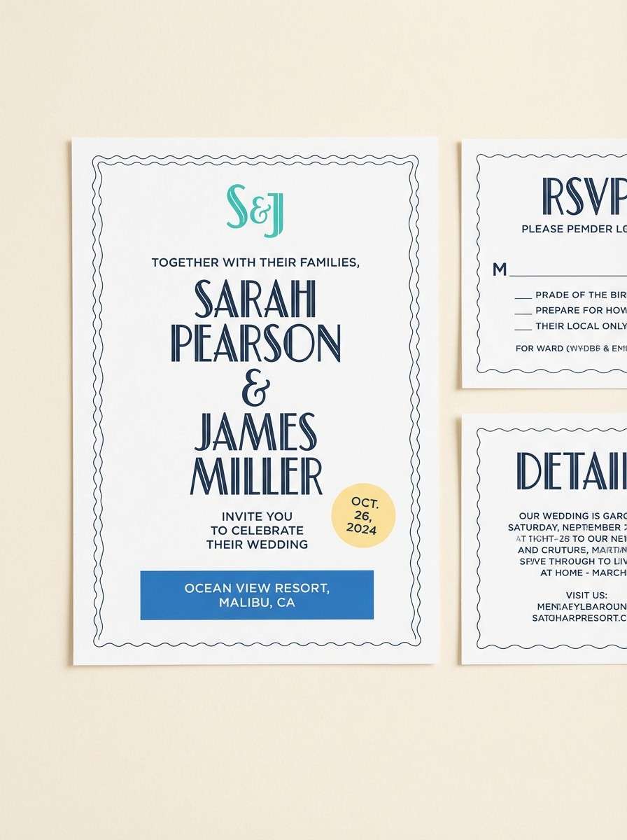
22) Sunny Harbor Wedding
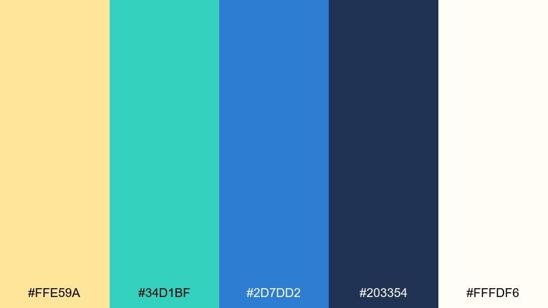
HEX: #ffe59a #34d1bf #2d7dd2 #203354 #fffdf6
Mood: romantic, breezy, elegant
Best for: beach wedding invitation suite
Romantic and breezy, it feels like a calm harbor ceremony with warm sun and clear water. It works beautifully for invitation suites where you want elegance without heavy pastels. Use the soft cream for the card stock, navy for typography, and bring in teal for monograms or borders. Tip: apply yellow as a tiny seal or date highlight to keep the look refined.
Image example of sunny harbor wedding generated using media.io
What Colors Go Well with Yellow Teal Blue?
Neutrals are the easiest wins: white, cream, sand, light gray, and deep charcoal help control contrast and keep the bright yellow from dominating. Navy also pairs naturally with teal/blue to anchor layouts and improve readability.
For accents, coral and warm pinks add a lively complementary punch, while mint or seafoam softens the overall feel for wellness and lifestyle designs. If you want a more premium direction, try muted golds and desaturated teals with lots of off-white space.
When you need extra depth, add near-black blue (ink/navy) for typography and backgrounds. It keeps the scheme looking intentional and makes yellow highlights feel crisp and high-impact.
How to Use a Yellow Teal Blue Color Palette in Real Designs
Assign clear roles: use blue as your primary brand/base color, teal for secondary UI states (hover, progress, highlights), and yellow as the “attention” color for CTA badges, pricing, alerts, or key numbers. This prevents the palette from feeling noisy.
Control proportions with a simple guideline: 60% neutral background, 30% blue/teal surfaces, 10% yellow accents. In print, consider slightly muting yellow for large areas and keeping it for headings, icons, or small shapes.
For accessibility, keep body text on white/cream or very dark navy, and test contrast for buttons. Yellow often works best as a background only when paired with dark navy text, not white.
Create Yellow Teal Blue Palette Visuals with AI
If you want to see your yellow teal blue color scheme in action, generate quick mockups with AI before committing to a full design system. This helps you validate contrast, hierarchy, and vibe (sporty vs. elegant vs. playful) in minutes.
Use the prompts above as a starting point, then swap in your exact HEX codes and output ratios (1:1, 16:9, 9:16) for social, web, or print. Keep neutrals consistent so your yellow accents stay clean and intentional.
Media.io makes it simple to create on-brand images for landing pages, posters, packaging, and UI concepts—right in the browser.
Yellow Teal Blue Color Palette FAQs
-
What mood does a yellow teal blue color palette create?
It usually feels fresh, optimistic, and modern—yellow adds energy, while teal and blue bring calm and clarity. The overall vibe can shift from playful to premium depending on how muted or saturated you keep the colors. -
How do I keep yellow from overpowering my design?
Use yellow as an accent (badges, highlights, small shapes) and rely on neutrals like white/cream plus navy for most surfaces and text. If you need large yellow areas, pair them with very dark navy typography for balance. -
What are the best neutral colors to pair with yellow teal blue?
Off-white, cream, light gray, and sand tones work especially well. Deep navy or charcoal is ideal for typography because it maintains strong contrast and keeps the palette looking structured. -
Is yellow teal blue a good UI color scheme?
Yes—blue/teal can carry navigation and interactive elements, while yellow is perfect for emphasis (CTAs, alerts, pricing highlights). Just make sure to check contrast ratios, especially when yellow is used near white. -
What accent colors work with yellow teal blue besides neutrals?
Coral/pink can add a lively complementary pop, and mint/seafoam can soften the look for wellness themes. For a more serious or editorial feel, add ink navy and keep accents minimal. -
How do I choose which of the 20+ palettes to use for branding?
Pick based on your brand tone and contrast needs: high-contrast sets (with deep navy) suit tech and fitness, softer sets (with creams and pastel tints) suit education and family brands, and moody sets (dark bases with gold accents) suit film/editorial. -
Can I generate matching images for my palette without design skills?
Yes—use Media.io’s text-to-image tool with prompts like the examples above, then adjust the HEX colors and layout keywords (poster, UI mockup, packaging, etc.) to match your project.
Next: Cadet Blue Color Palette


