

Cadet blue (#5F9EA0) is a muted blue-green that feels calm, modern, and trustworthy without looking cold. It’s a reliable base color for UI, branding, and print because it plays nicely with both warm and cool accents.
Below are cadet blue color combinations with HEX codes, plus practical tips for using each scheme in real designs—from airy coastal minimalism to high-contrast dark mode.
In this article
- Why Cadet Blue Color Combinations Work So Well
-
- harbor mist
- brass blueprints
- seaside linen
- stormy pier
- coral signal
- ink sea glass
- modern nautical accent
- foggy monochrome
- desert marina
- art deco harbor
- botanical conservatory
- winter spa
- clay studio
- retro poolside
- tech onyx
- minimal stationery
- copper tide
- orchard breeze
- midnight aquarium
- soft wedding coast
- nordic lakehouse
- What Colors Go Well with Cadet Blue?
- How to Use a Cadet Blue Color Combination in Real Designs
- Create Cadet Blue Palette Visuals with AI
Why Cadet Blue Color Combinations Work So Well
Cadet blue sits in a sweet spot between blue and green, so it can feel oceanic and fresh while still reading as professional and stable. That balance makes it a strong “primary brand” color that won’t overwhelm layouts.
Because it’s naturally muted, cadet blue reduces visual noise in interfaces and print systems. It supports long-form reading, data-heavy dashboards, and product pages where clarity matters more than loud color.
It also pairs easily: brighten it with clean whites, warm it with creams and metallics, or deepen it with charcoals and navies for high-contrast modern looks.
20+ Cadet Blue Color Palette Ideas (with HEX Codes)
1) Harbor Mist
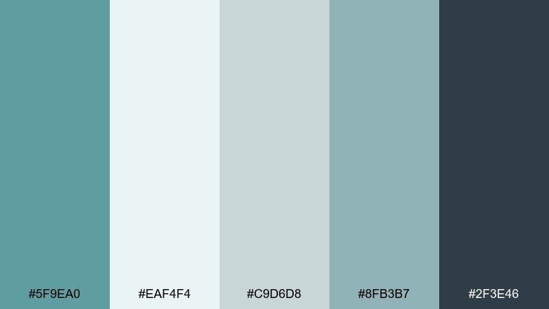
HEX: #5F9EA0 #EAF4F4 #C9D6D8 #8FB3B7 #2F3E46
Mood: calm, airy, coastal
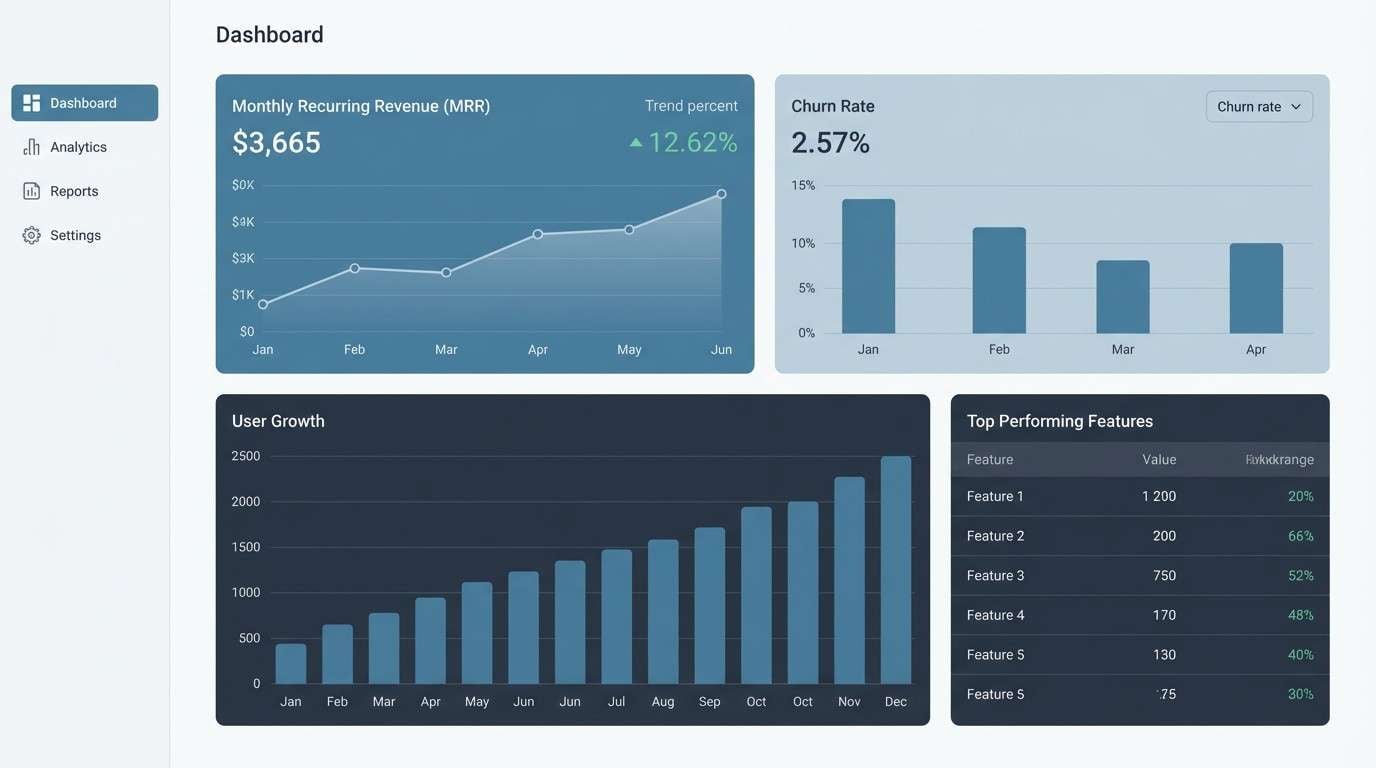
Best for: SaaS dashboards and analytics UI
Calm and coastal, these cadet blue tones feel like sea fog rolling over a quiet harbor. Use the pale blue-grays for large surfaces, then anchor layouts with the deep slate for headers and navigation. It pairs beautifully with clean whites and subtle line icons for a modern, low-noise interface. Tip: reserve the darkest shade for primary CTAs to keep contrast accessible.
Image example of harbor mist generated using media.io
Media.io is an online AI studio for creating and editing video, image, and audio in your browser.

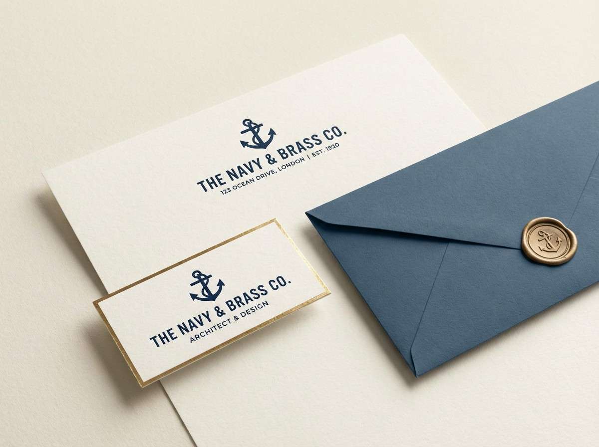
2) Brass Blueprints
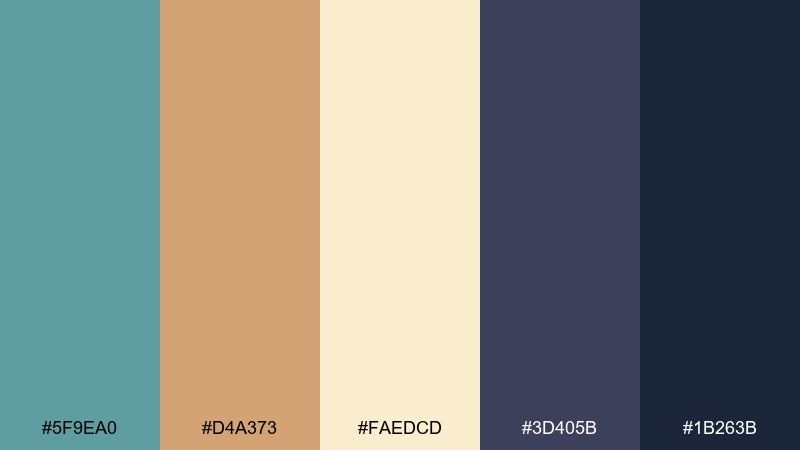
HEX: #5F9EA0 #D4A373 #FAEDCD #3D405B #1B263B
Mood: refined, vintage, confident
Best for: brand identity and business cards
Refined and slightly vintage, this cadet blue mix evokes drafting paper, brass fixtures, and inked plans. Let cadet blue lead, then use the brass tone as a premium accent for logos, foil details, or icons. The navy and indigo keep typography sharp and professional without feeling harsh. Tip: print the cream shade uncoated for a tactile, modern-classic finish.
Image example of brass blueprints generated using media.io
3) Seaside Linen
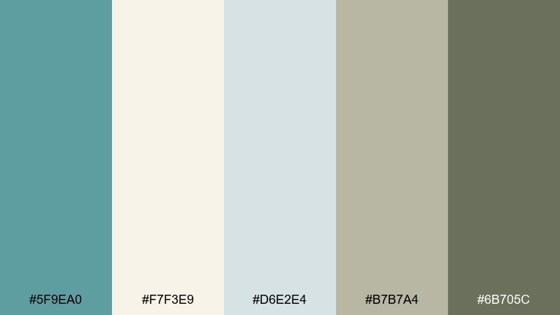
HEX: #5F9EA0 #F7F3E9 #D6E2E4 #B7B7A4 #6B705C
Mood: soft, natural, relaxed
Best for: lifestyle blogs and editorial layouts
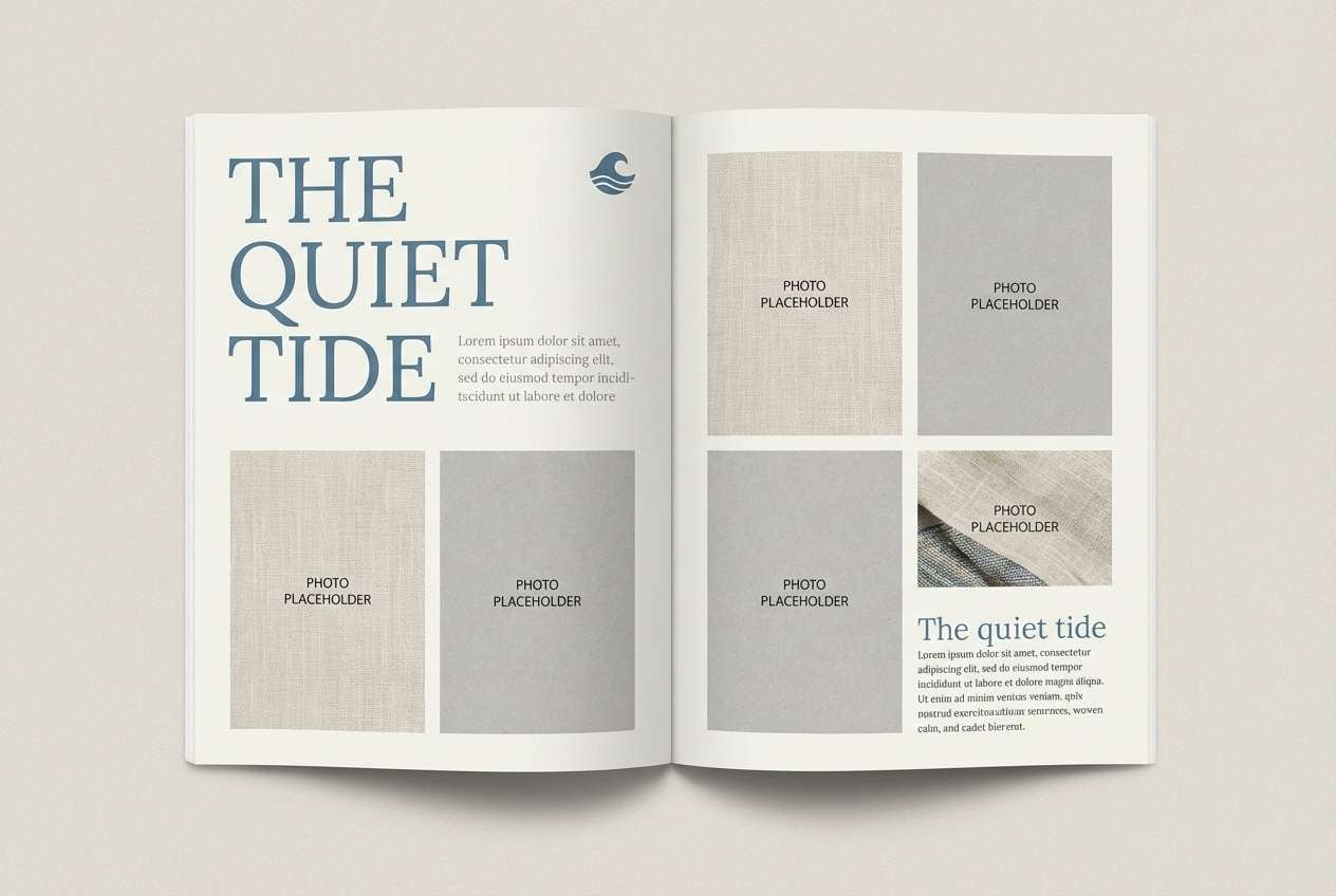
Soft and natural, it feels like sun-bleached linen and driftwood by the shore. This cadet blue color palette works best when the warm neutrals take up most of the page and the blue is saved for headings, pull quotes, and links. Pair it with gentle serif typography and generous spacing for an effortless editorial rhythm. Tip: add subtle grain textures to keep the light tones from feeling flat.
Image example of seaside linen generated using media.io
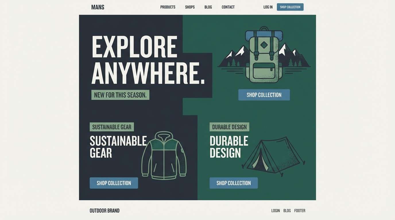
4) Stormy Pier
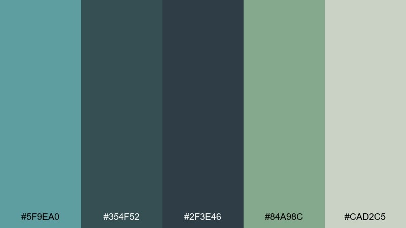
HEX: #5F9EA0 #354F52 #2F3E46 #84A98C #CAD2C5
Mood: moody, grounded, outdoorsy
Best for: outdoor brands and product landing pages
Moody and grounded, these cadet blue shades echo a storm rolling in over wet wood and salt air. Use the charcoal greens for strong hero sections and let cadet blue soften the edges in buttons, badges, or highlights. The sage and pale fog color keep the design breathable and nature-forward. Tip: choose warm photography and keep overlays semi-transparent to preserve depth.
Image example of stormy pier generated using media.io
5) Coral Signal
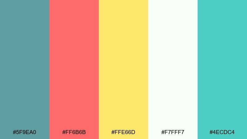
HEX: #5F9EA0 #FF6B6B #FFE66D #F7FFF7 #4ECDC4
Mood: playful, sunny, energetic
Best for: social media graphics and promos
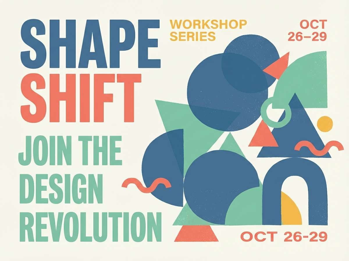
Playful and sunny, these cadet blue color combinations reads like beach umbrellas, coral markers, and bright afternoon light. Keep cadet blue and seafoam as the base so the coral and yellow feel like intentional pops rather than noise. This set is great for promo tiles, story templates, and event announcements that need quick readability. Tip: limit the coral to one focal element per graphic to avoid competing accents.
Image example of coral signal generated using media.io
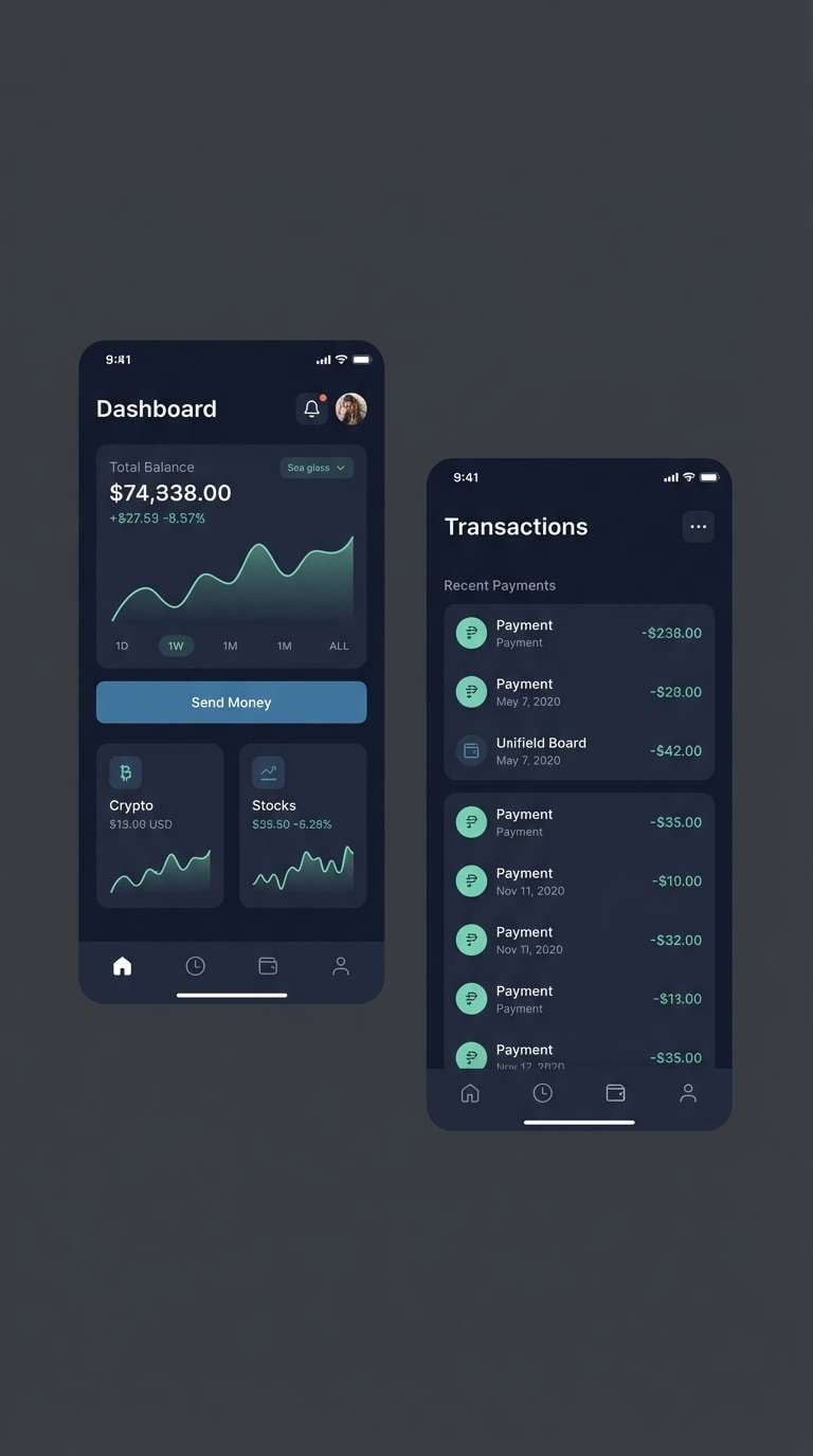
6) Ink Sea Glass
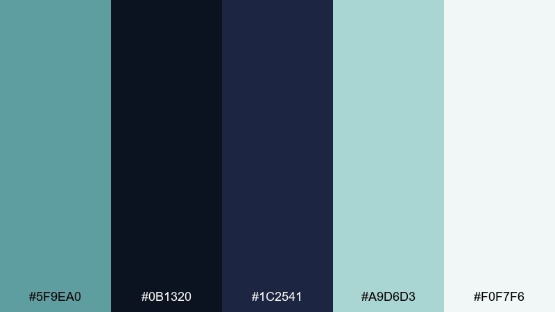
HEX: #5F9EA0 #0B1320 #1C2541 #A9D6D3 #F0F7F6
Mood: sleek, modern, high-contrast
Best for: dark mode UI and fintech apps
Sleek and modern, it feels like ink-dark water with polished sea glass catching light. Use the deep navy shades for backgrounds and containers, then bring in cadet blue for interactive states and focus rings. The minty tones add clarity for charts and data highlights without going neon. Tip: keep body text off-white and slightly muted to reduce glare in dark mode.
Image example of ink sea glass generated using media.io
7) Modern Nautical Accent
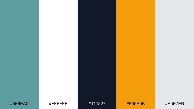
HEX: #5F9EA0 #FFFFFF #111827 #F59E0B #E5E7EB
Mood: crisp, modern, punchy
Best for: startup websites and hero sections
Crisp and modern, it brings to mind clean sails, graphite type, and a warm flash of sunlight. These cadet blue color combinations shine when white dominates, black is used for strong type, and amber is saved for a single standout highlight. It works especially well for SaaS homepages, pricing tables, and feature callouts. Tip: use amber only on one primary action per screen to keep hierarchy clear.
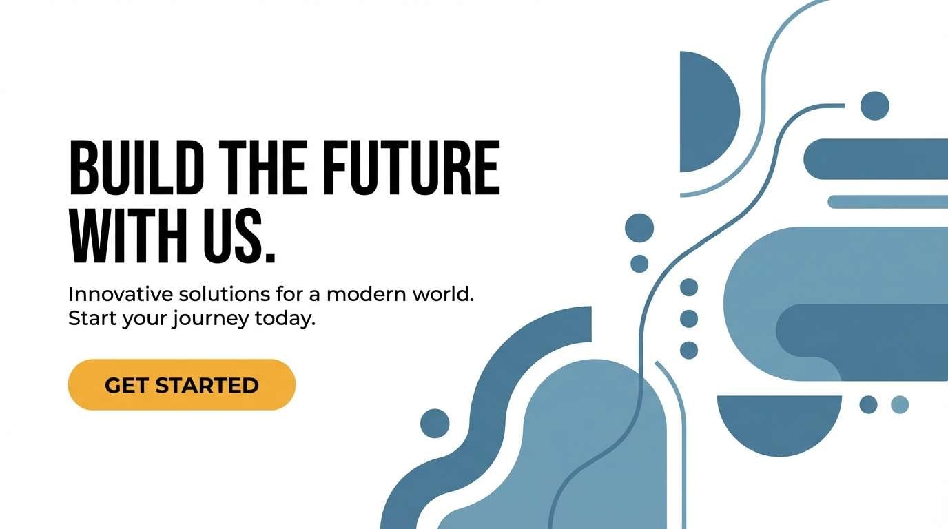
Image example of modern nautical accent generated using media.io
8) Foggy Monochrome
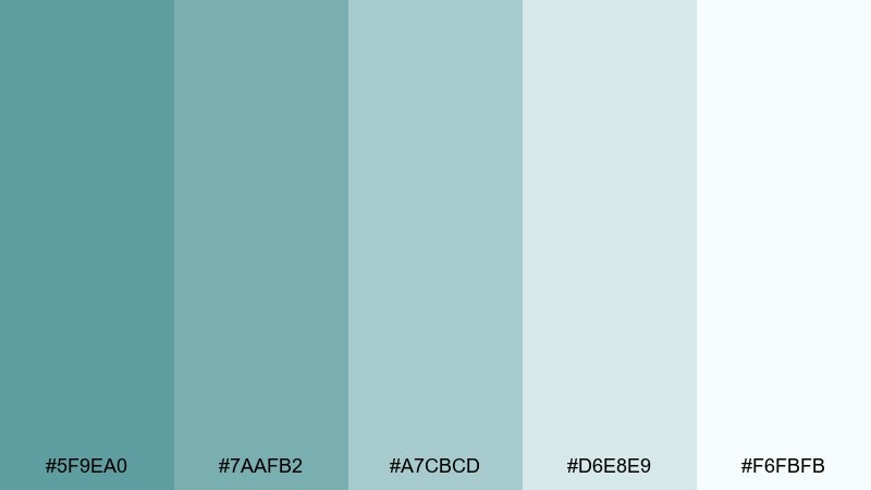
HEX: #5F9EA0 #7AAFB2 #A7CBCD #D6E8E9 #F6FBFB
Mood: quiet, gentle, minimal
Best for: wellness apps and calming UI
Quiet and gentle, this cadet blue set feels like a soft gradient of morning haze. Build with the lightest tones for backgrounds and cards, then step up through the mid teals for dividers and subtle emphasis. It pairs nicely with rounded UI components and low-saturation illustrations. Tip: rely on typography weight and spacing for hierarchy instead of adding extra colors.
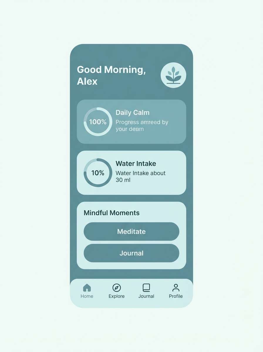
Image example of foggy monochrome generated using media.io
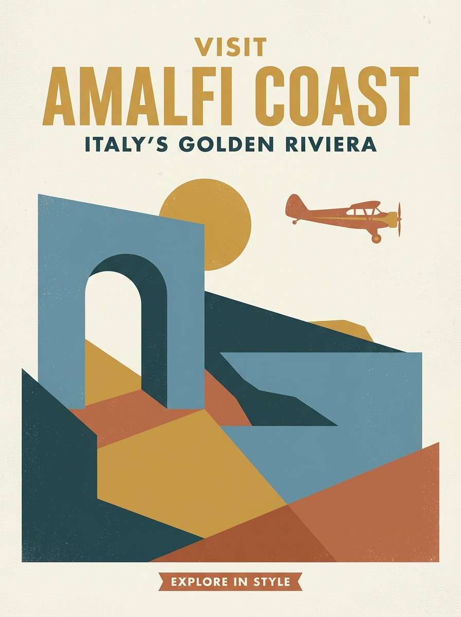
9) Desert Marina
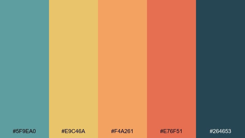
HEX: #5F9EA0 #E9C46A #F4A261 #E76F51 #264653
Mood: warm, adventurous, sunlit
Best for: travel posters and campaign creatives
Warm and adventurous, these cadet blue color combinations blend dockside blues with desert sun and clay tones. Use the deep blue-green as your anchor for titles, then let the gold and terracotta drive illustrations and shapes. This mix is ideal for travel campaigns, event posters, and bold seasonal launches. Tip: keep gradients subtle and choose flat shapes so the warm accents stay crisp.
Image example of desert marina generated using media.io
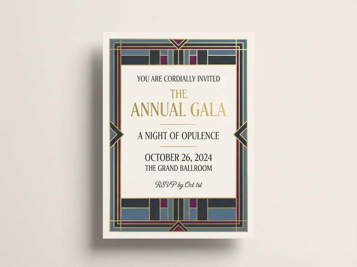
10) Art Deco Harbor
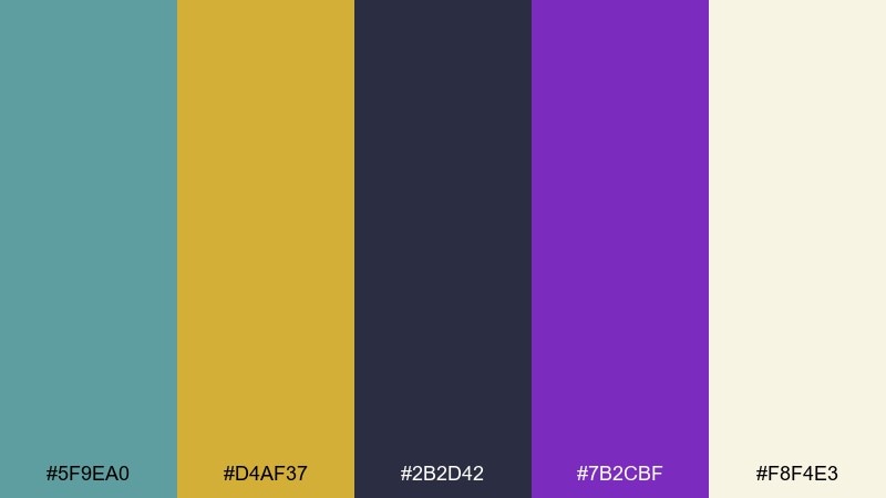
HEX: #5F9EA0 #D4AF37 #2B2D42 #7B2CBF #F8F4E3
Mood: glam, dramatic, luxurious
Best for: event invitations and gala flyers
Glam and dramatic, it suggests velvet eveningwear, brass lights, and a cool ocean breeze outside the venue. A cadet blue color combination like this works best with bold geometry, high contrast type, and gold used sparingly as a premium detail. Pair it with art deco patterns, thin linework, and generous margins for an upscale finish. Tip: keep backgrounds either ivory or deep charcoal, not both on the same piece, to avoid visual clutter.
Image example of art deco harbor generated using media.io
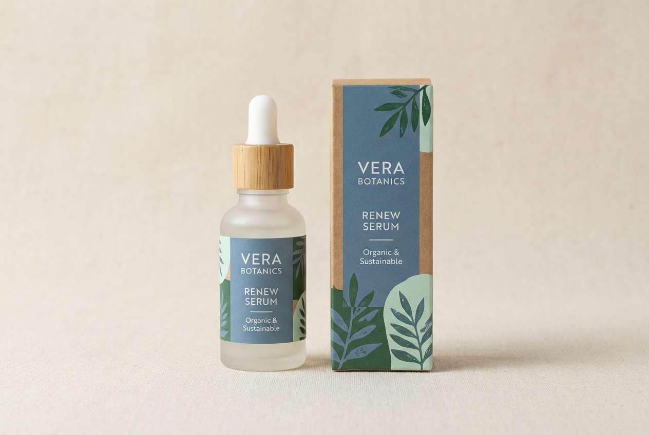
11) Botanical Conservatory
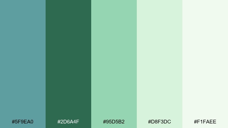
HEX: #5F9EA0 #2D6A4F #95D5B2 #D8F3DC #F1FAEE
Mood: fresh, botanical, restorative
Best for: eco branding and skincare packaging
Fresh and restorative, this cadet blue color palette feels like misted glass, leafy stems, and a bright conservatory. Use cadet blue for structure and trust, then layer the greens to communicate natural ingredients and calm energy. It pairs well with simple sans-serif type and botanical line illustrations. Tip: choose a matte finish so the light greens stay soft instead of glossy.
Image example of botanical conservatory generated using media.io
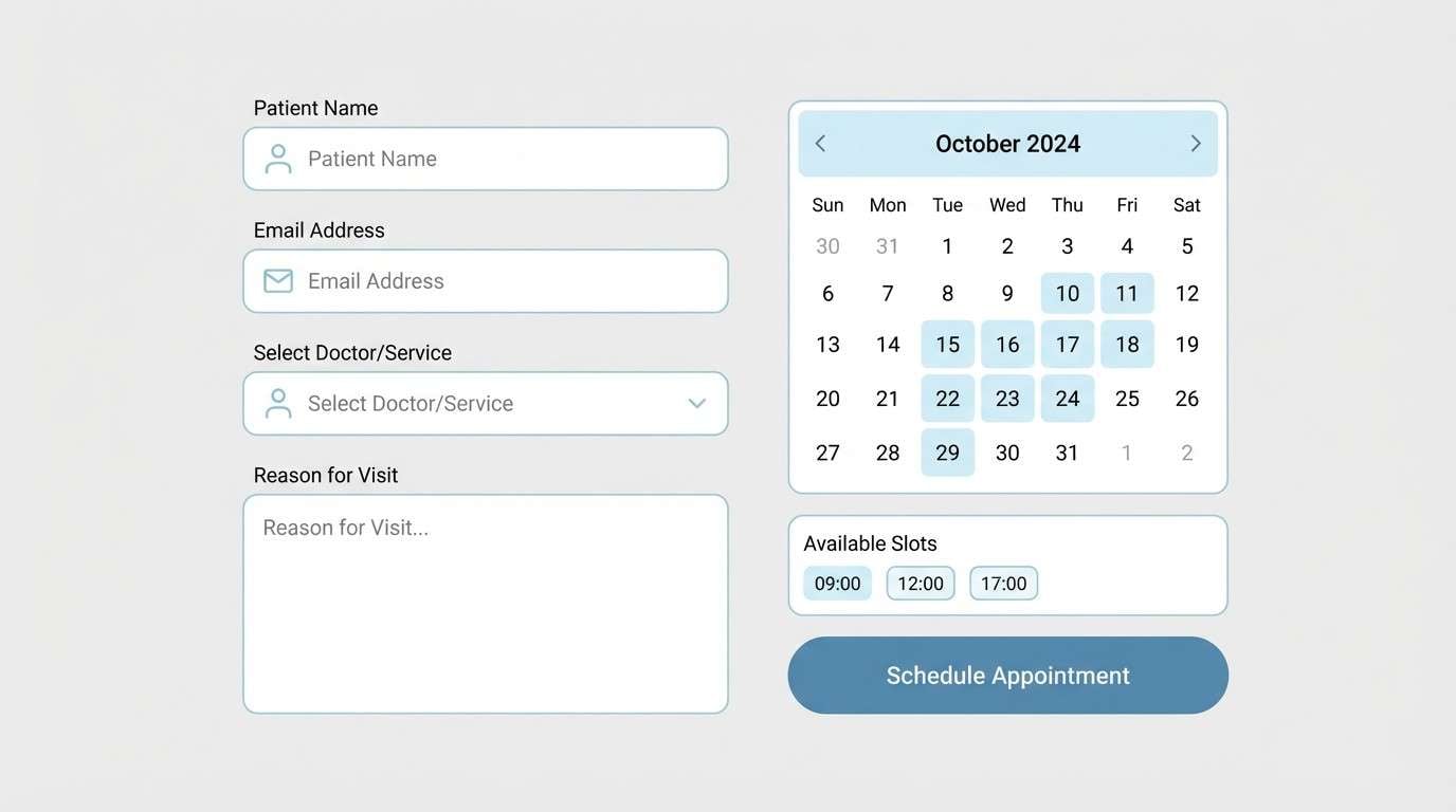
12) Winter Spa
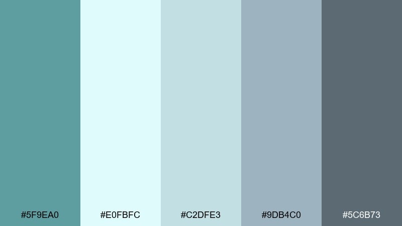
HEX: #5F9EA0 #E0FBFC #C2DFE3 #9DB4C0 #5C6B73
Mood: cool, clean, soothing
Best for: healthcare websites and booking pages
Cool and clean, it evokes frosted glass, folded towels, and quiet winter mornings. Let the icy tints cover most surfaces, with cadet blue for primary UI elements and gentle emphasis. The steel-gray shades help with typography and form outlines without turning harsh. Tip: add extra whitespace and rounded corners to reinforce the soothing tone.
Image example of winter spa generated using media.io
13) Clay Studio
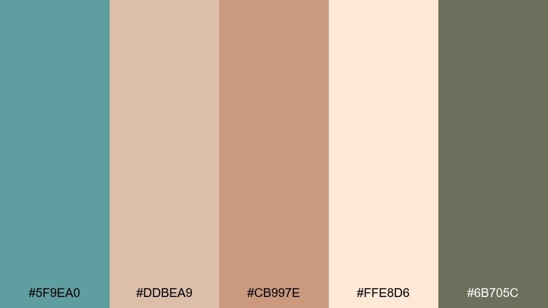
HEX: #5F9EA0 #DDBEA9 #CB997E #FFE8D6 #6B705C
Mood: cozy, handmade, earthy
Best for: craft shops and handmade product pages
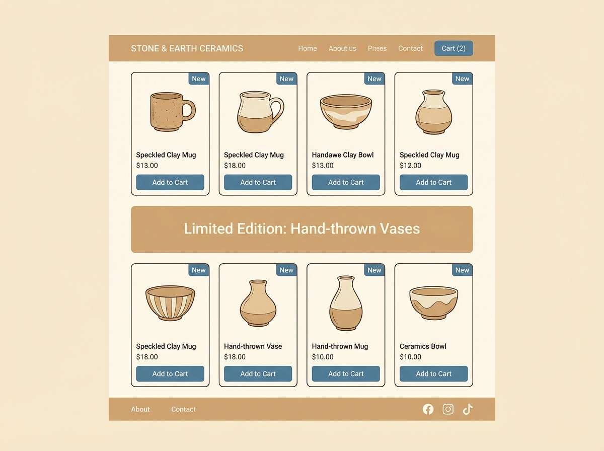
Cozy and handmade, these cadet blue tones feel like pottery clay, linen aprons, and a cool blue glaze. Use the warm creams and tans for backgrounds and product photography frames, then bring in cadet blue for links and small labels. The olive-gray helps ground headings and keep the palette from becoming too sweet. Tip: use subtle paper textures and avoid pure white to keep it artisanal.
Image example of clay studio generated using media.io
14) Retro Poolside
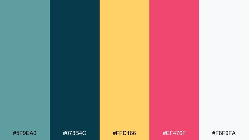
HEX: #5F9EA0 #073B4C #FFD166 #EF476F #F8F9FA
Mood: retro, upbeat, summery
Best for: festival posters and merchandise graphics
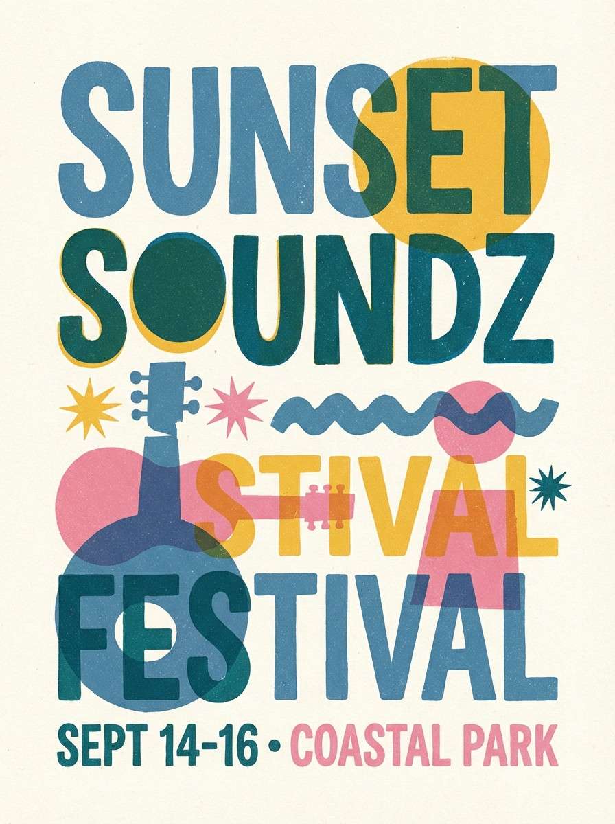
Retro and upbeat, this cadet blue color scheme reads like pool tiles, sun hats, and bold neon signage without the harshness. Keep the deep teal for typography and outlines, then let cadet blue fill larger shapes for that classic aquatic feel. Yellow and pink should act as small, high-energy accents for dates, stickers, or icon details. Tip: use thick strokes and simple shapes to match the vintage poster vibe.
Image example of retro poolside generated using media.io
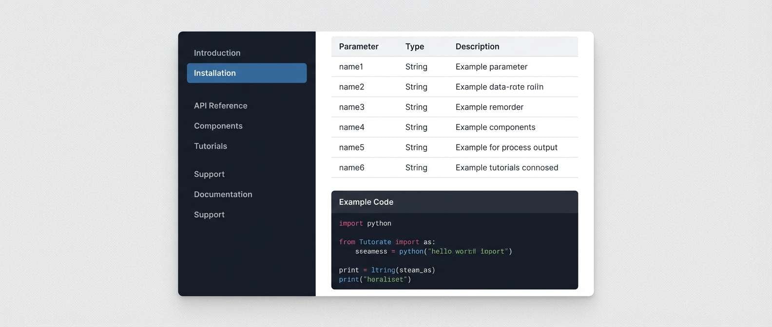
15) Tech Onyx
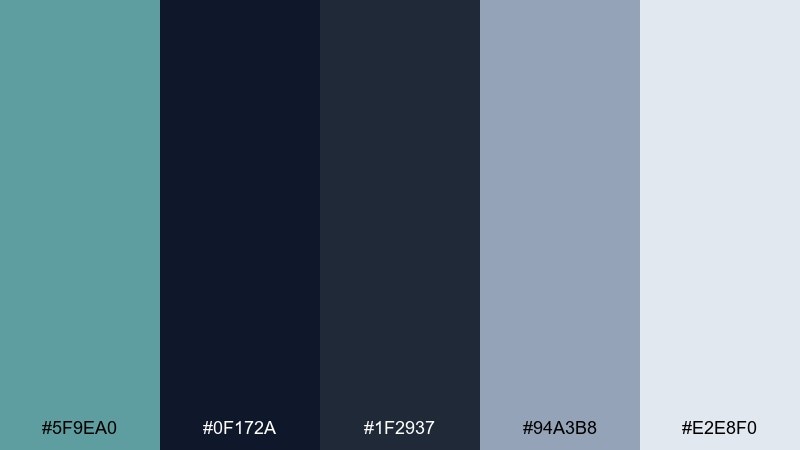
HEX: #5F9EA0 #0F172A #1F2937 #94A3B8 #E2E8F0
Mood: sleek, serious, tech-forward
Best for: B2B software UI and documentation
Sleek and serious, it feels like polished onyx with a cool, trustworthy blue highlight. Use the dark shades for navigation and code blocks, and lean on cadet blue for links, toggles, and active states. The soft steel tones keep tables and documentation pages readable for long sessions. Tip: keep icons monochrome and use the blue only to communicate state changes.
Image example of tech onyx generated using media.io
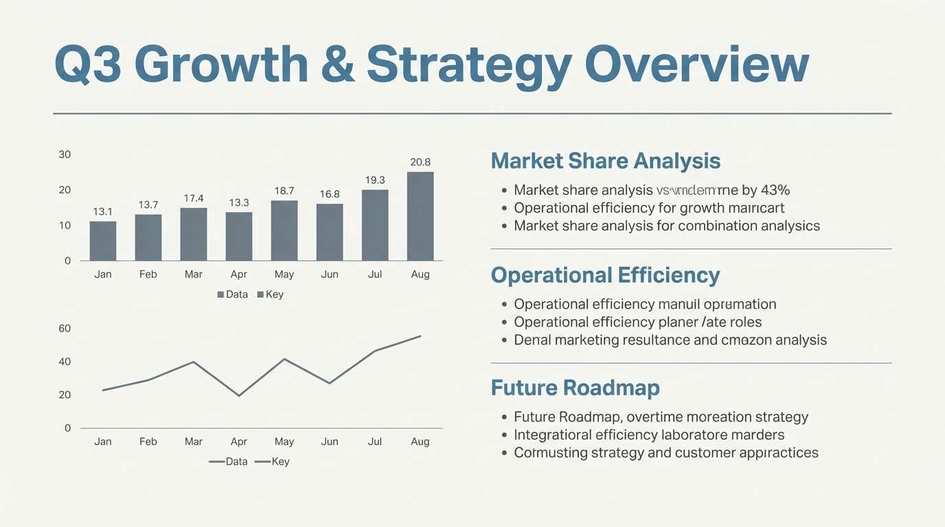
16) Minimal Stationery
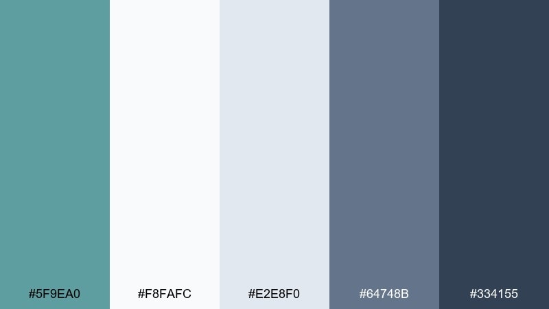
HEX: #5F9EA0 #F8FAFC #E2E8F0 #64748B #334155
Mood: minimal, tidy, professional
Best for: resume templates and presentations
Minimal and tidy, it brings the feel of crisp paper, neat margins, and confident small details. Use the near-whites as your base, then add cadet blue for section headings and key highlights. The slate range supports charts and dividers without overpowering the content. Tip: keep accent usage consistent across slides so the design reads as intentional.
Image example of minimal stationery generated using media.io
17) Copper Tide
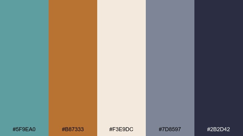
HEX: #5F9EA0 #B87333 #F3E9DC #7D8597 #2B2D42
Mood: warm, coastal, premium
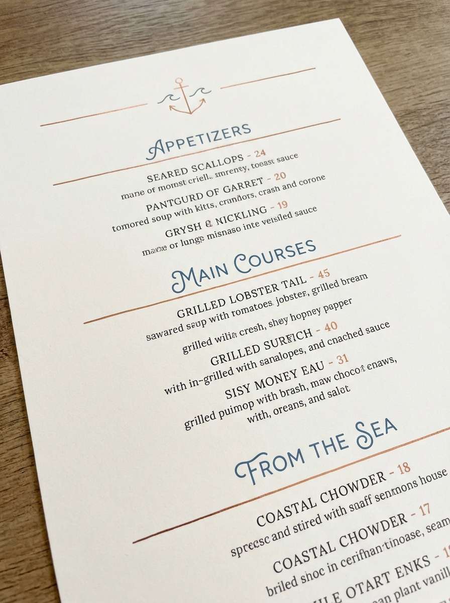
Best for: restaurant branding and menus
Warm and premium, it suggests copper cookware against a cool sea-weathered backdrop. This cadet blue color palette is especially strong for menus where you want calm readability with a luxe accent. Pair cadet blue with cream for the main canvas, then use copper for section dividers, pricing highlights, or stamps. Tip: print copper as a flat color or metallic ink, but keep it under 10 percent coverage for elegance.
Image example of copper tide generated using media.io
18) Orchard Breeze
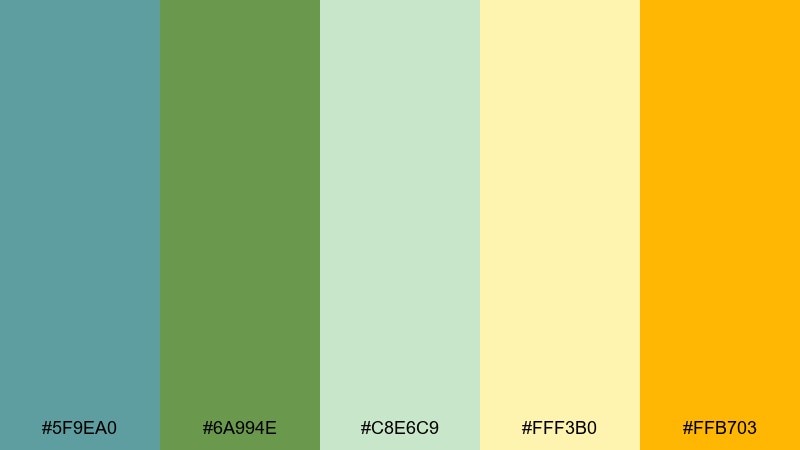
HEX: #5F9EA0 #6A994E #C8E6C9 #FFF3B0 #FFB703
Mood: fresh, cheerful, springlike
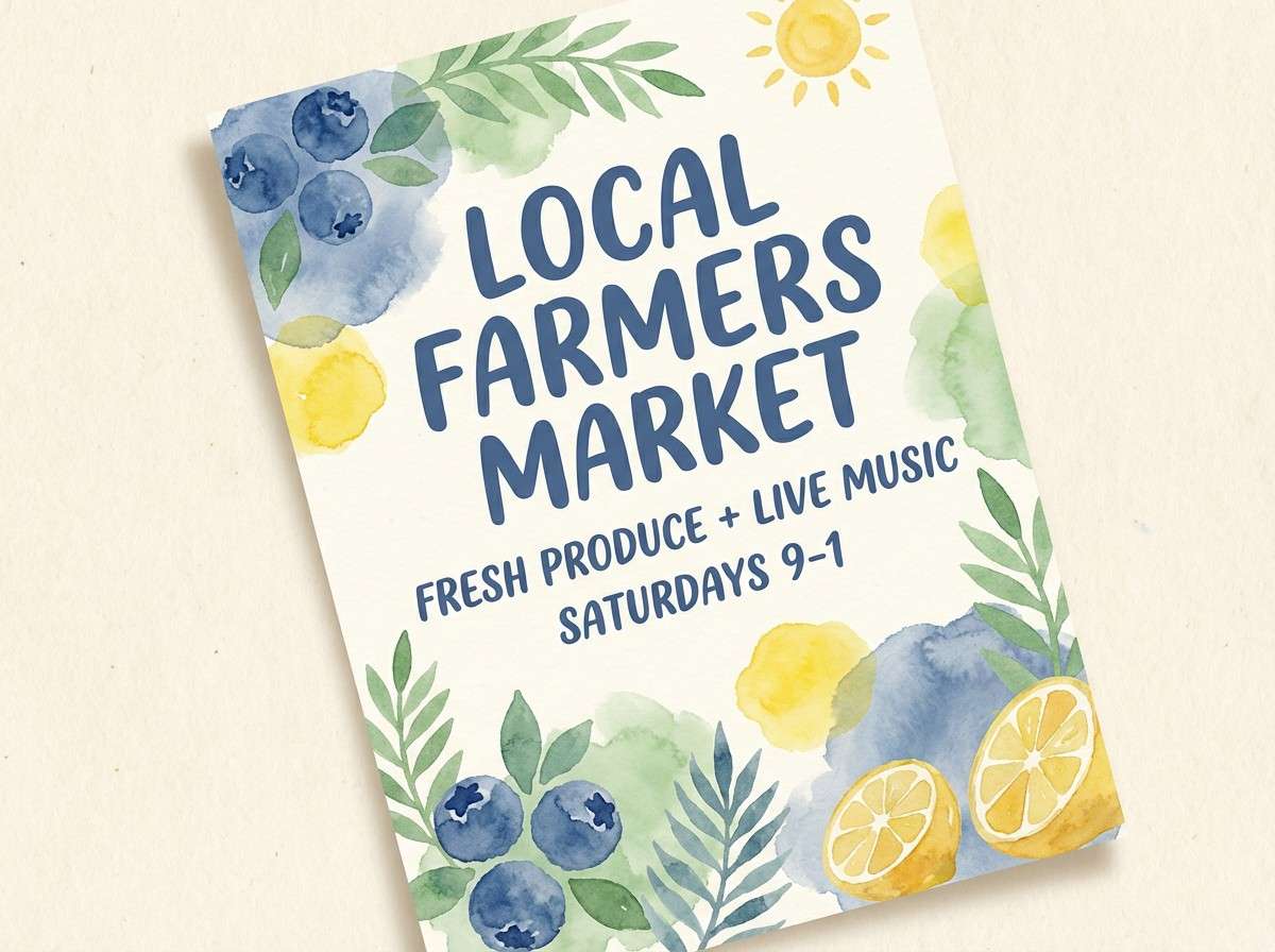
Best for: farmers market flyers and seasonal promos
Fresh and springlike, it feels like a cool breeze through orchards with sunlit fruit stands nearby. Use cadet blue to cool down the warm yellows, while the greens handle badges, icons, and category labels. It pairs well with hand-drawn illustrations and simple, friendly typography. Tip: keep yellow as the highlight color for dates and calls to action so it stays readable.
Image example of orchard breeze generated using media.io
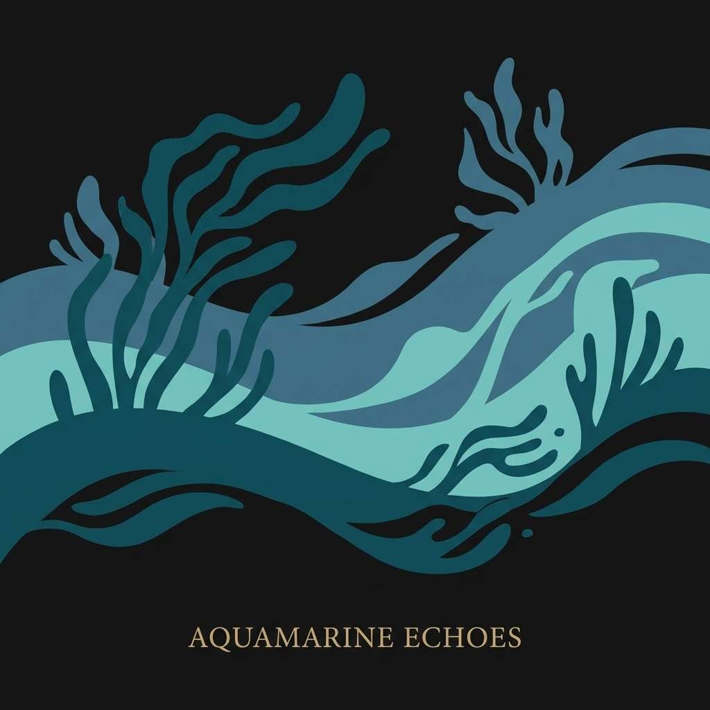
19) Midnight Aquarium
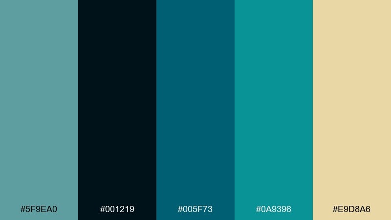
HEX: #5F9EA0 #001219 #005F73 #0A9396 #E9D8A6
Mood: deep, immersive, cinematic
Best for: music cover art and streaming thumbnails
Deep and cinematic, these cadet blue color combinations bring the mood of an aquarium at night with glints of light passing through water. Layer the near-black and deep teal for dramatic backgrounds, then let cadet blue and aqua drive focal shapes and highlights. The sand tone is perfect for small type or a single logo mark that needs to pop. Tip: use soft glow effects sparingly so the palette stays sophisticated.
Image example of midnight aquarium generated using media.io
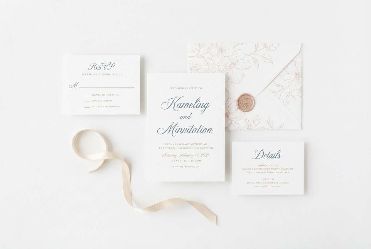
20) Soft Wedding Coast
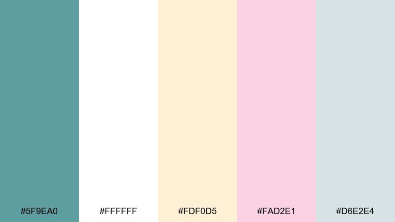
HEX: #5F9EA0 #FFFFFF #FDF0D5 #FAD2E1 #D6E2E4
Mood: romantic, airy, elegant
Best for: wedding invitations and RSVP cards
Romantic and airy, it feels like coastal weddings with blush flowers and light fabric in the breeze. Use the creams and whites as the main paper tone, with cadet blue for names, borders, and small motifs. The blush shade adds warmth without overpowering the calm blue-green foundation. Tip: choose fine-line illustration details and avoid heavy blocks of color for a refined print look.
Image example of soft wedding coast generated using media.io
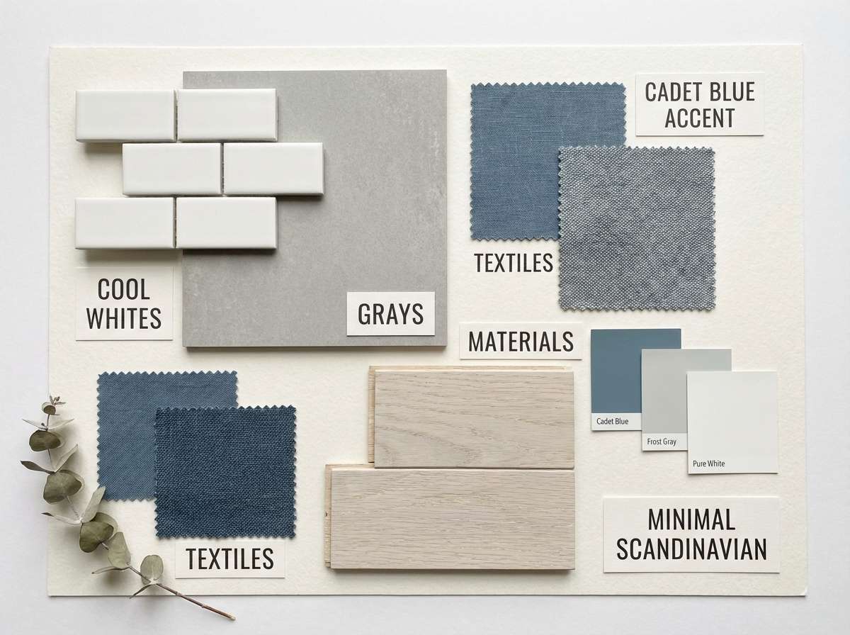
21) Nordic Lakehouse
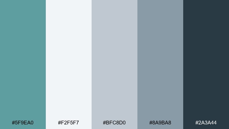
HEX: #5F9EA0 #F2F5F7 #BFC8D0 #8A9BA8 #2A3A44
Mood: scandinavian, quiet, balanced
Best for: interior design mood boards
Scandinavian and quiet, it mirrors a lakehouse morning with cool air and soft light on painted wood. Use the near-white and pale gray for large swatches, then bring in cadet blue as a signature accent in textiles or titles. The deeper slate is ideal for labels and grid lines so the board stays organized. Tip: keep imagery desaturated so the palette remains the hero.
Image example of nordic lakehouse generated using media.io
What Colors Go Well with Cadet Blue?
Cadet blue works beautifully with crisp whites and soft blue-grays for airy, modern layouts. If you want a calm, minimal look, stay within cool neutrals and gentle tints of teal.
For warmer contrast, pair it with creams, sand, brass, copper, or terracotta—these accents add energy while keeping the overall palette sophisticated. For bold emphasis, coral and sunny yellow can pop as small highlights.
If you’re building dark UI, cadet blue pairs well with navy, charcoal, and slate. Add a minty or pale aqua for data highlights and accessible contrast states.
How to Use a Cadet Blue Color Combination in Real Designs
Start by assigning roles: use lighter tints for backgrounds and cards, cadet blue for interactive elements (links, buttons, focus rings), and a deeper slate/navy for typography and navigation. This keeps hierarchy clear without adding extra colors.
In branding, cadet blue reads trustworthy and calm, so it’s ideal for tech, wellness, eco, and coastal lifestyles. Keep warm accents (gold, copper, coral) to small areas like icons, stamps, or one primary CTA for cleaner visual rhythm.
For print, avoid overly bright whites if you want a softer, premium look—cream stock and matte finishes help cadet blue feel more natural. Always test contrast (especially with mid-tone teals) to ensure legibility in headings and small text.
Create Cadet Blue Palette Visuals with AI
If you want to preview how a cadet blue color scheme looks in a real layout, generate quick mockups (posters, UI screens, invitations, packaging) before committing to final design files. Seeing the palette applied helps you choose the right accent color and contrast level.
Use your selected HEX set as guidance, then describe the design type, background tone, and where cadet blue should dominate (buttons, headers, shapes, or typography). You’ll get fast variations to compare for mood and readability.
Cadet Blue Color Palette FAQs
-
What is the HEX code for cadet blue?
Cadet blue is commonly represented as #5F9EA0, a muted blue-green that sits between teal and soft blue. -
Is cadet blue more blue or green?
Cadet blue leans slightly green compared to classic sky blues, but it still reads as “blue” in most design contexts because of its muted, ocean-like character. -
What colors complement cadet blue best?
Great complements include warm neutrals (cream, sand), metallic accents (brass/copper), and deeper anchors (navy, charcoal). For playful contrast, use coral or yellow as small highlights. -
Can I use cadet blue for a website UI?
Yes. Cadet blue is excellent for UI because it’s calm and readable, especially when paired with white or light gray backgrounds and a darker slate/navy for text and navigation. -
How do I make a cadet blue palette look more premium?
Pair cadet blue with cream/ivory, add a restrained metallic-like accent (gold or copper), and use deep charcoal or navy for typography. Keep accent coverage low for a cleaner hierarchy. -
Does cadet blue work in dark mode?
It does. Use deep navy/onyx backgrounds, keep body text slightly off-white to reduce glare, and apply cadet blue to interactive states like buttons, toggles, and focus rings. -
What’s a good rule for using bright accents with cadet blue?
Limit bright accents (coral, yellow, amber) to one focal element per screen or graphic. Let cadet blue and neutrals carry the layout, then use the accent strictly for priority cues like primary CTAs.


