

Yellow and maroon is a timeless pairing: bright, optimistic warmth balanced by deep, wine-like richness. It’s an easy way to make designs feel premium, inviting, and confident without relying on trendy neon tones.
Below are 20+ yellow maroon color palette ideas with HEX codes, plus practical tips for UI, branding, and print so you can apply the scheme with better contrast and hierarchy.
In this article
- Why Yellow Maroon Palettes Work So Well
-
- golden garnet
- autumn bistro
- saffron velvet
- harvest library
- marigold merlot
- spice market
- vintage collegiate
- sunlit vineyard
- mustard mahogany minimal
- art deco brass
- cozy cabin plaid
- desert ochre wine
- festival lanterns
- retro diner
- botanical amber
- modern heritage ui
- rustic wedding toast
- museum label
- warm sports branding
- nightfall maroon glow
- sunset press
- gilded cherry
- citrus cabernet
- What Colors Go Well with Yellow Maroon?
- How to Use a Yellow Maroon Color Palette in Real Designs
- Create Yellow Maroon Palette Visuals with AI
Why Yellow Maroon Palettes Work So Well
Yellow brings energy, friendliness, and attention, while maroon adds depth, heritage, and a sense of craft. Together, they create a warm contrast that reads as intentional and “designed,” not accidental.
This pairing is also versatile across mediums. In digital UI, yellow is an excellent accent for key actions and status highlights, while maroon can carry navigation, headings, and background blocks without looking flat.
For print and packaging, warm golds and maroons feel tactile and premium—especially on textured or uncoated stock. You get impact without the harshness of pure primary colors.
20+ Yellow Maroon Color Palette Ideas (with HEX Codes)
1) Golden Garnet
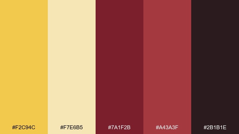
HEX: #f2c94c #f7e6b5 #7a1f2b #a43a3f #2b1b1e
Mood: radiant, classic, confident
Best for: premium branding and logo accents
Radiant and classic, these tones feel like polished brass against deep garnet velvet. Use the bright yellow as a highlight on marks and buttons, then let the maroons carry the weight in headers and backgrounds. Pair with warm ivory for breathing room and a near-black for typography. Tip: keep yellow to 10–15% of the layout so it reads as intentional luxury, not noise.
Image example of golden garnet generated using media.io
Media.io is an online AI studio for creating and editing video, image, and audio in your browser.

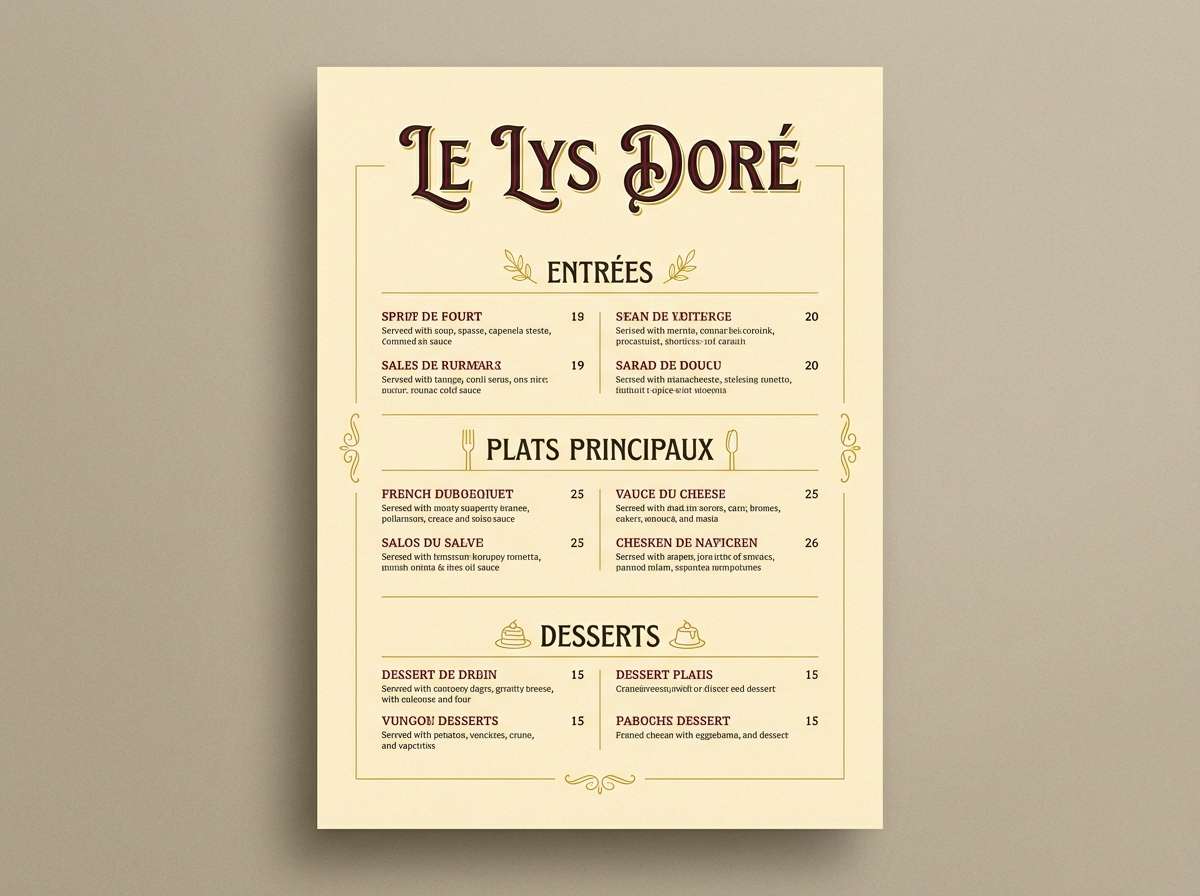
2) Autumn Bistro
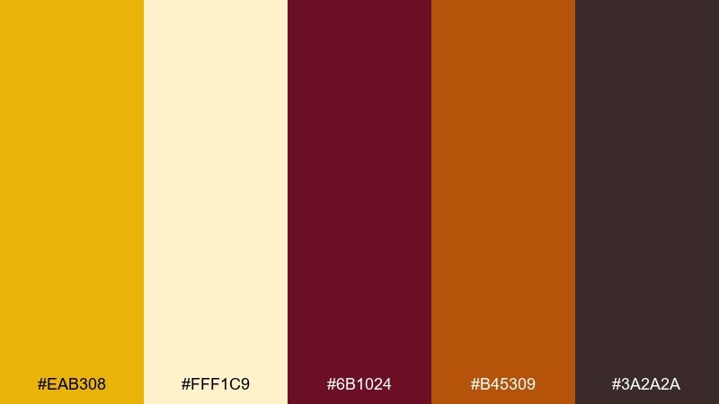
HEX: #eab308 #fff1c9 #6b1024 #b45309 #3a2a2a
Mood: cozy, rustic, inviting
Best for: restaurant menu design
Cozy and rustic, it evokes candlelit tables, wood grain, and a hint of spice. Use maroon for menu section bars and headings, then bring mustard in for price highlights or icons. Cream keeps long text readable, while the dark brown anchors the hierarchy. Tip: print on uncoated stock to make the warm hues feel even more appetizing.
Image example of autumn bistro generated using media.io
3) Saffron Velvet
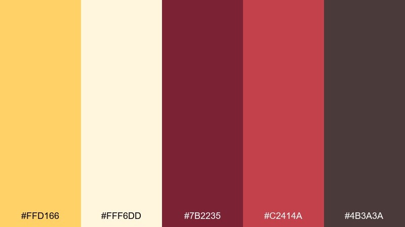
HEX: #ffd166 #fff6dd #7b2235 #c2414a #4b3a3a
Mood: romantic, warm, elegant
Best for: wedding invitation suite
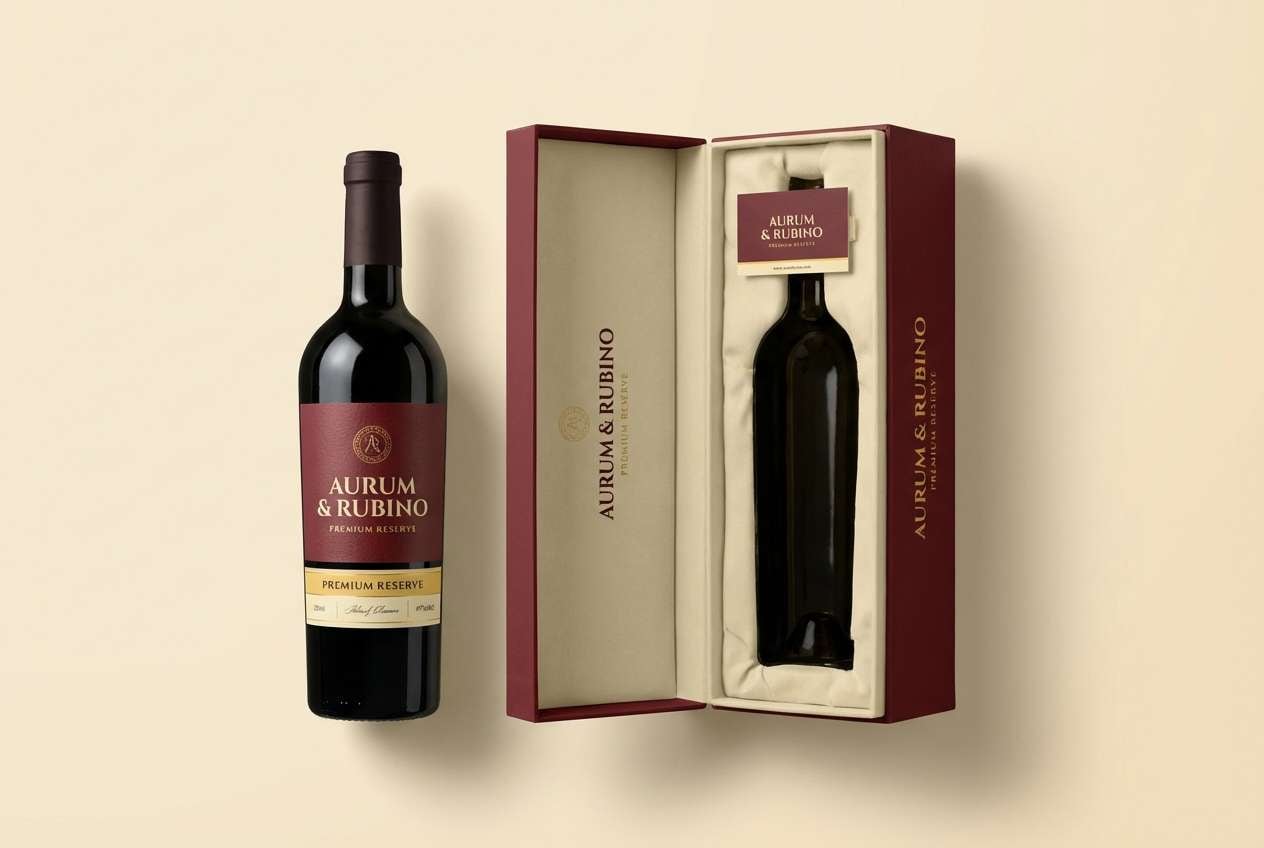
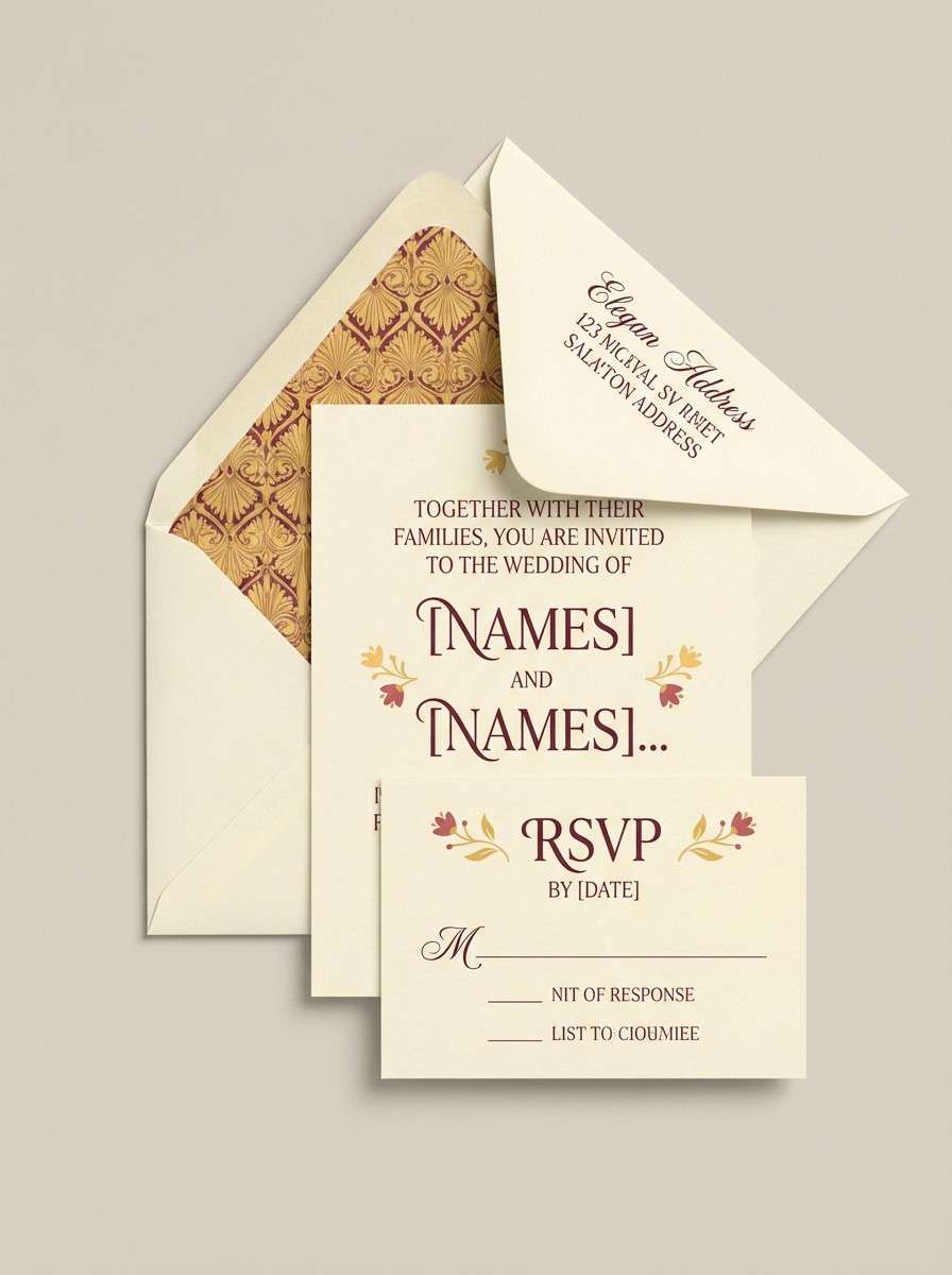
Romantic and warm, it feels like saffron silk laid over velvet drapes. For a refined invitation suite, set maroon as the primary ink color and keep yellow as a wax-seal accent or thin border. Cream paper tones prevent the palette from getting too heavy. Tip: add subtle embossing so the darker hues read luxe without needing extra ornament.
Image example of saffron velvet generated using media.io
4) Harvest Library
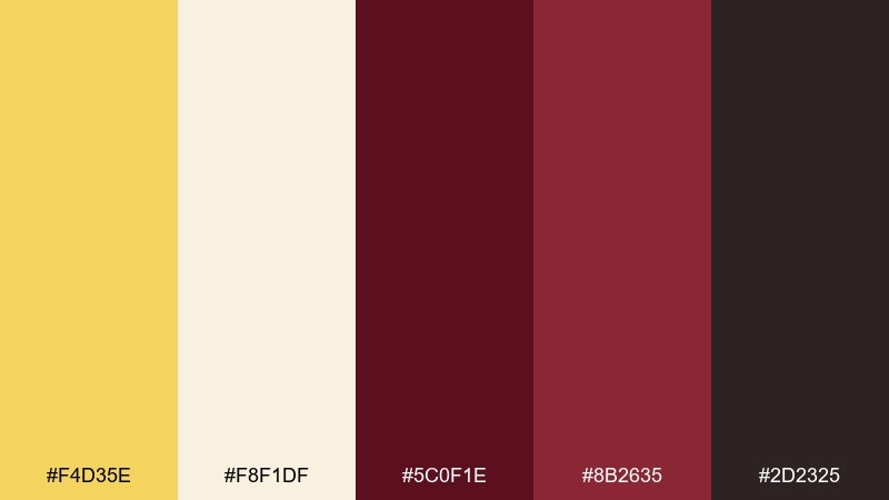
HEX: #f4d35e #f8f1df #5c0f1e #8b2635 #2d2325
Mood: scholarly, calm, heritage
Best for: book cover design
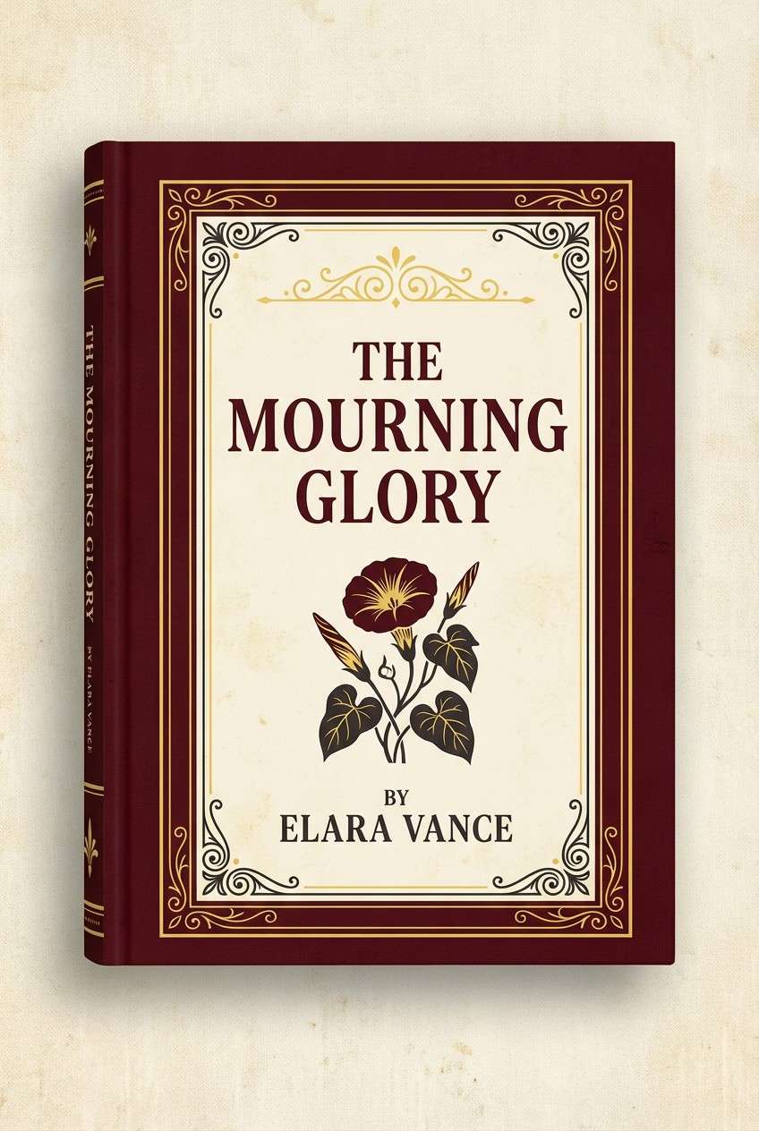
Scholarly and calm, it suggests old paper, leather spines, and late-afternoon light. Use the maroons for titles and key shapes, while the soft yellow works as a warm background wash. Keep contrast high with the near-black for legibility at thumbnail size. Tip: reserve the brightest yellow for a small badge or series mark to guide the eye.
Image example of harvest library generated using media.io
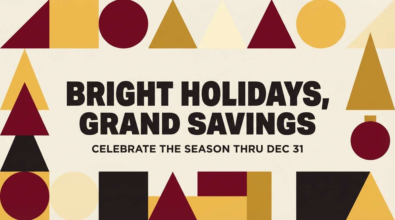
5) Marigold Merlot
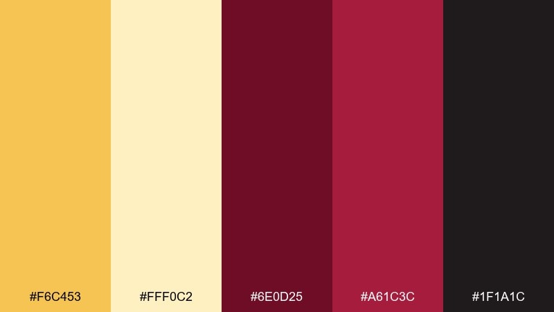
HEX: #f6c453 #fff0c2 #6e0d25 #a61c3c #1f1a1c
Mood: bold, festive, upscale
Best for: holiday campaign graphics
Bold and festive, it feels like marigold garlands against a glass of merlot. Lean on maroon for banners and typography, then use yellow for spark and callouts. The light cream keeps layouts airy when you need lots of copy. Tip: for social posts, push contrast by placing yellow text only on the darkest maroon blocks.
Image example of marigold merlot generated using media.io
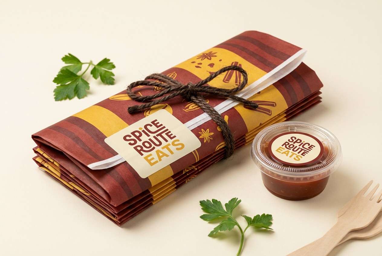
6) Spice Market

HEX: #f0b429 #fef3c7 #7f1d1d #b91c1c #3f2d2d
Mood: energetic, earthy, lively
Best for: street food brand packaging
Energetic and earthy, it brings to mind spice tins, roasted peppers, and sunlit stalls. Use the strong reds for bold type and patterns, and let the yellow carry punchy stickers or flavor tags. Cream keeps the pack feeling friendly rather than aggressive. Tip: combine thick maroon outlines with yellow fills to maintain clarity from a distance.
Image example of spice market generated using media.io
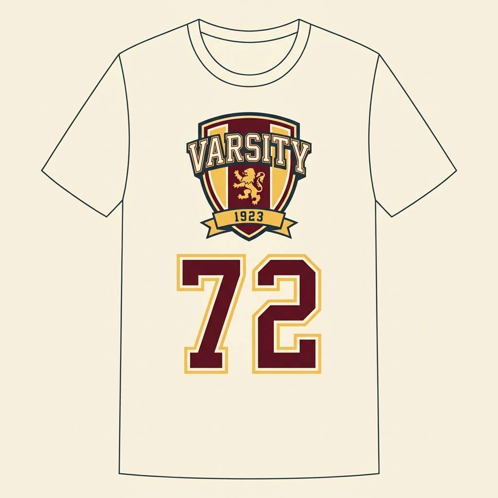
7) Vintage Collegiate
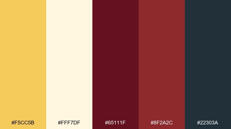
HEX: #f5cc5b #fff7df #65111f #8f2a2c #22303a
Mood: nostalgic, sporty, structured
Best for: varsity-style apparel graphics
Nostalgic and sporty, it recalls letterman jackets and classic campus posters. Make maroon the base for crests and type, then use golden yellow for outlines, numbers, and trim. The deep slate adds a modern counterweight for secondary text. Tip: keep shapes chunky and high-contrast so the design holds up in embroidery and screen print.
Image example of vintage collegiate generated using media.io
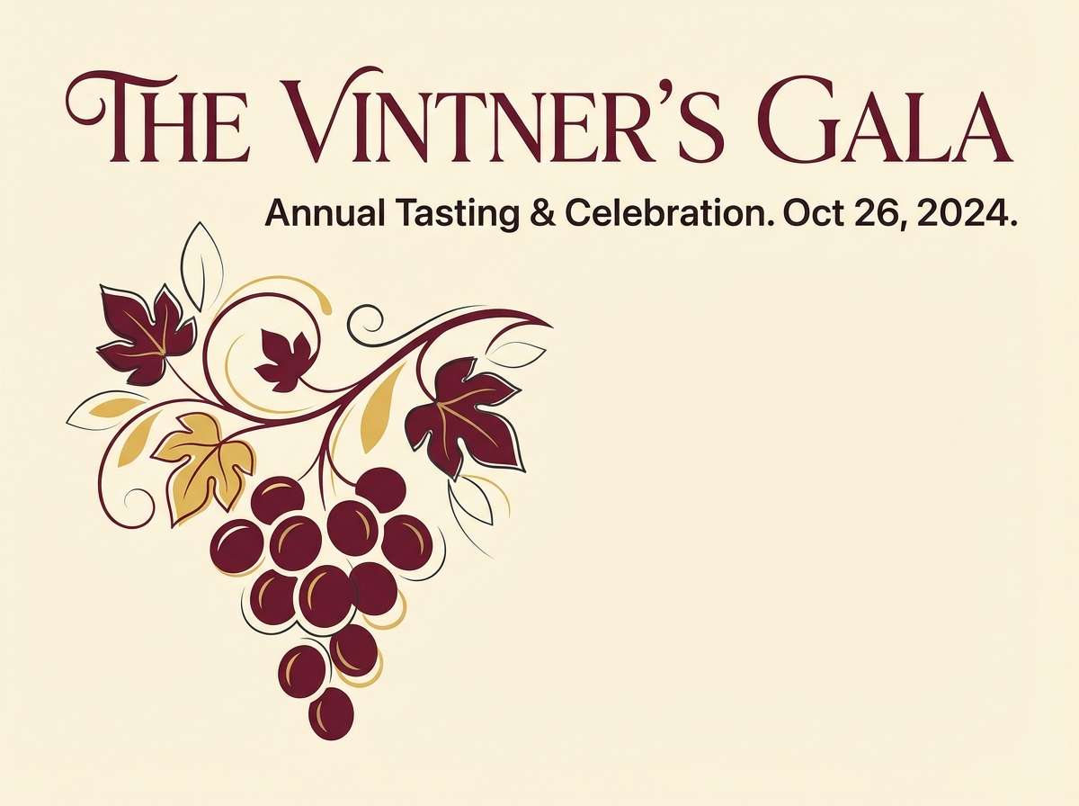
8) Sunlit Vineyard
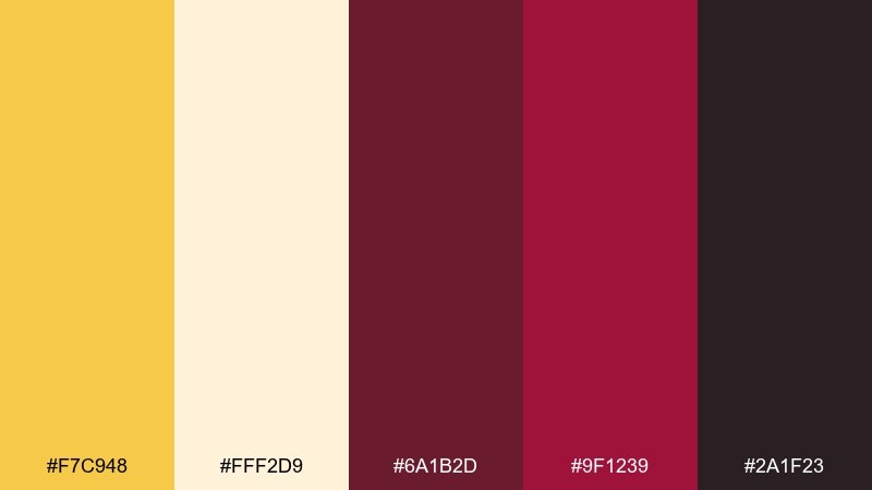
HEX: #f7c948 #fff2d9 #6a1b2d #9f1239 #2a1f23
Mood: sunny, refined, grounded
Best for: event poster for a tasting
Sunny and refined, it feels like golden hour over vineyard rows and deep wine tones in the shade. These yellow maroon color combinations work best when the light yellow becomes the poster field and maroon carries the headline. Add the darker base for sponsor logos and fine print so everything stays readable. Tip: limit extra imagery and let typography plus a simple grape motif do the storytelling.
Image example of sunlit vineyard generated using media.io
9) Mustard Mahogany Minimal
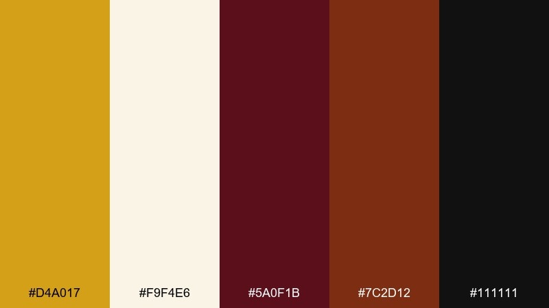
HEX: #d4a017 #f9f4e6 #5a0f1b #7c2d12 #111111
Mood: minimal, serious, modern
Best for: portfolio website UI
Minimal and serious, it reads like mustard ink on mahogany with a crisp studio edge. Use the dark maroon for navigation and hero text, then add mustard sparingly for active states and links. The off-white background keeps the interface calm and editorial. Tip: apply the yellow only to the most important action so the UI feels premium, not playful.
Image example of mustard mahogany minimal generated using media.io
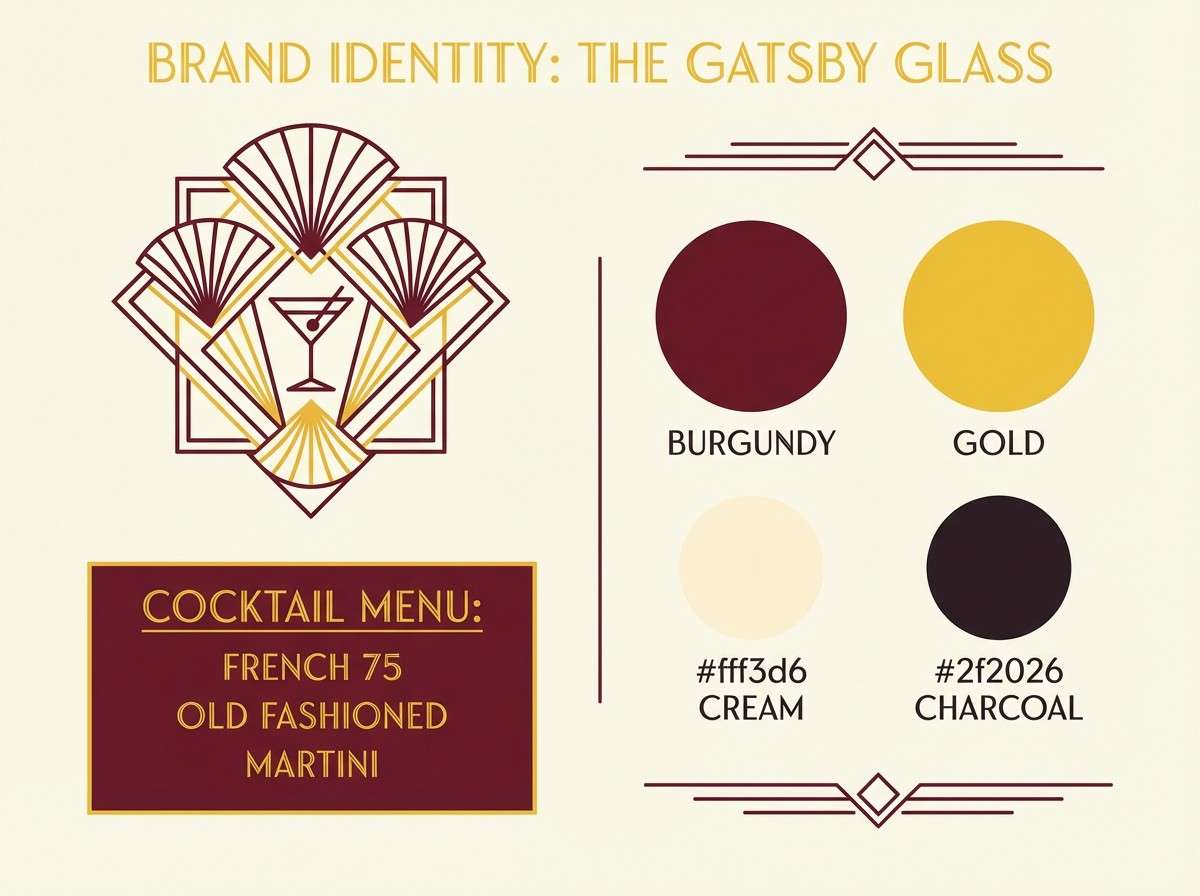
10) Art Deco Brass
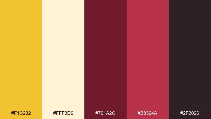
HEX: #f1c232 #fff3d6 #701a2c #b8324a #2f2026
Mood: glamorous, geometric, dramatic
Best for: cocktail bar brand identity
Glamorous and dramatic, it channels brass fixtures, sharp geometry, and moody lounges. A yellow maroon color scheme shines when maroon becomes the backdrop and the yellow acts like metallic linework. Add cream for negative space on menus and coasters so the layout stays crisp. Tip: use thin rules and symmetrical patterns to push the deco vibe without clutter.
Image example of art deco brass generated using media.io
11) Cozy Cabin Plaid
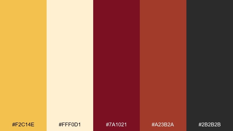
HEX: #f2c14e #fff0d1 #7a1021 #a23b2a #2b2b2b
Mood: toasty, outdoorsy, familiar
Best for: seasonal social media templates
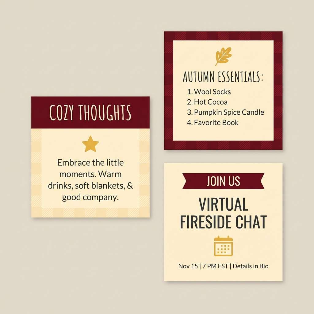
Toasty and outdoorsy, it brings up cabin blankets, hot cider, and firelight. Use maroon blocks for text overlays and add yellow as a warm corner tab or sticker. Cream keeps the template flexible for photos while charcoal supports small captions. Tip: build a simple plaid pattern in the background at low opacity to add texture without stealing focus.
Image example of cozy cabin plaid generated using media.io
12) Desert Ochre Wine
HEX: #e9b949 #fef3e2 #6d1424 #8c3b2a #3b2f2f
Mood: sunbaked, earthy, relaxed
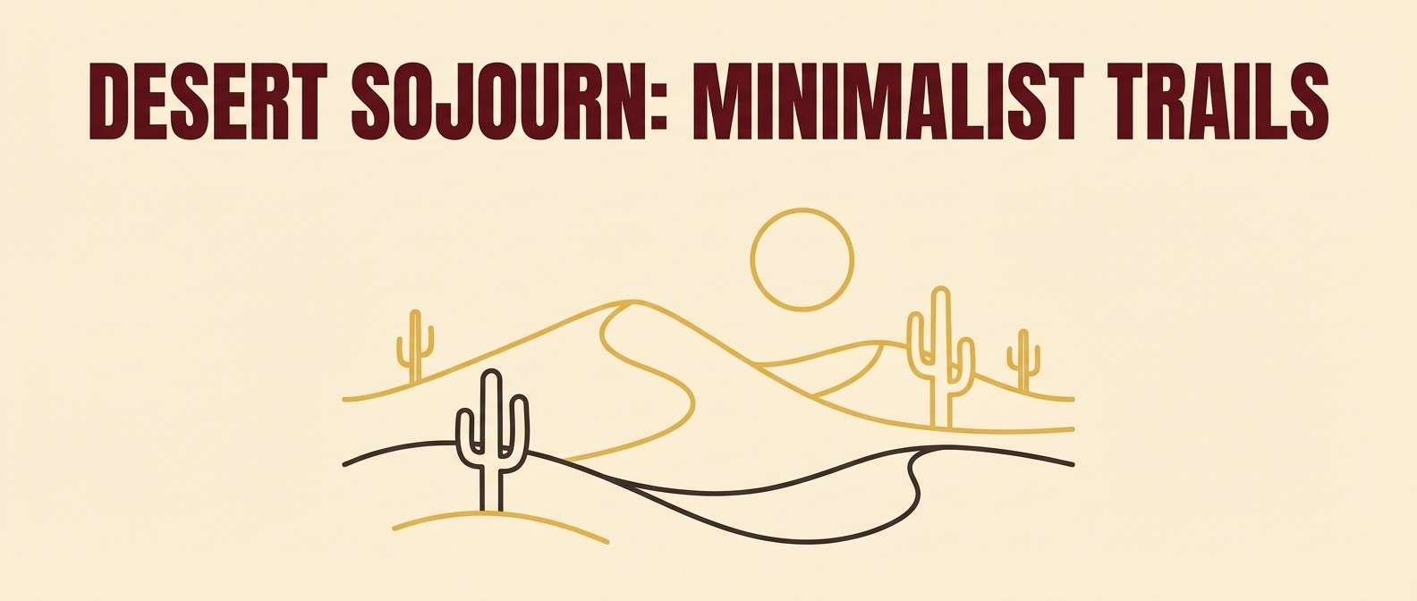
Best for: travel blog hero graphics
Sunbaked and relaxed, it feels like desert sand warmed by evening wine tones. Let the pale cream carry large areas, then layer ochre as a gradient or highlight bar behind headlines. The maroon adds depth for buttons and category tags. Tip: pair with simple line icons and plenty of whitespace to keep the hero clean and readable.
Image example of desert ochre wine generated using media.io
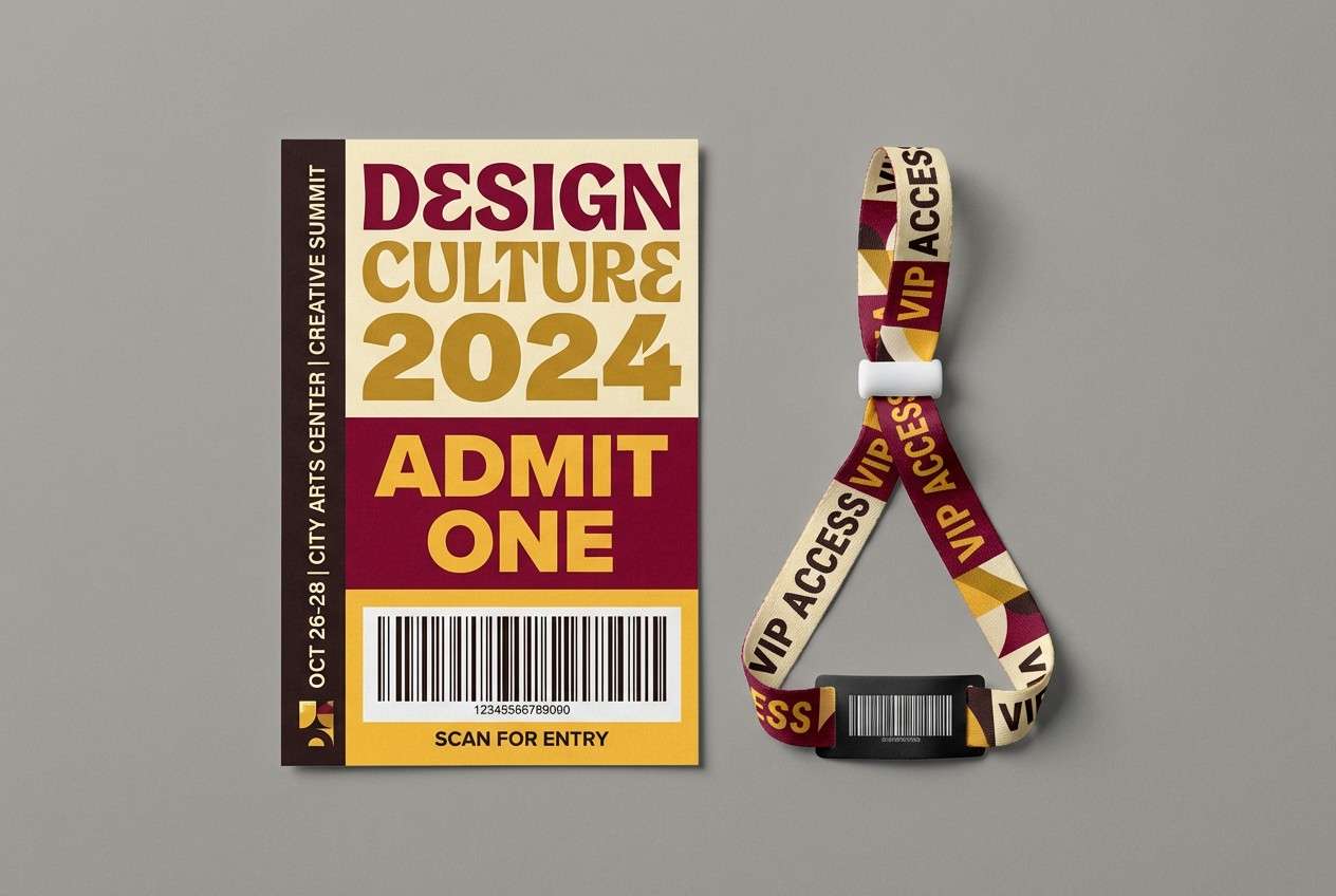
13) Festival Lanterns
HEX: #ffcc33 #fff2cc #800020 #b22222 #2a1a1a
Mood: celebratory, bright, punchy
Best for: event ticket and wristband design
Celebratory and punchy, it evokes glowing lanterns and nighttime crowds. A yellow maroon color palette like this works well for tickets because the contrast stays strong under low light. Use maroon for barcodes and key info, then reserve bright yellow for section labels and VIP markers. Tip: test a small-print proof so the deep tones do not fill in on matte stock.
Image example of festival lanterns generated using media.io
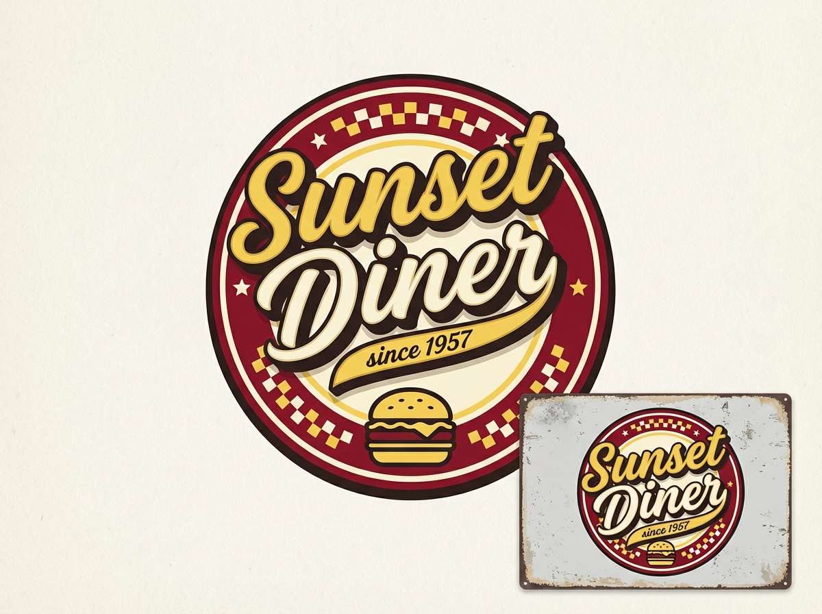
14) Retro Diner
HEX: #f6d55c #fff7e8 #7d1128 #c44536 #2e2a2a
Mood: playful, retro, bold
Best for: food truck logo and signage
Playful and retro, it nods to diner booths, hand-painted signs, and warm bulbs. Put maroon in the wordmark for instant punch, then use the sunny yellow for outlines and starburst shapes. Cream makes the palette feel friendly, not heavy. Tip: keep curves thick and simple so the logo reads cleanly on a moving truck.
Image example of retro diner generated using media.io
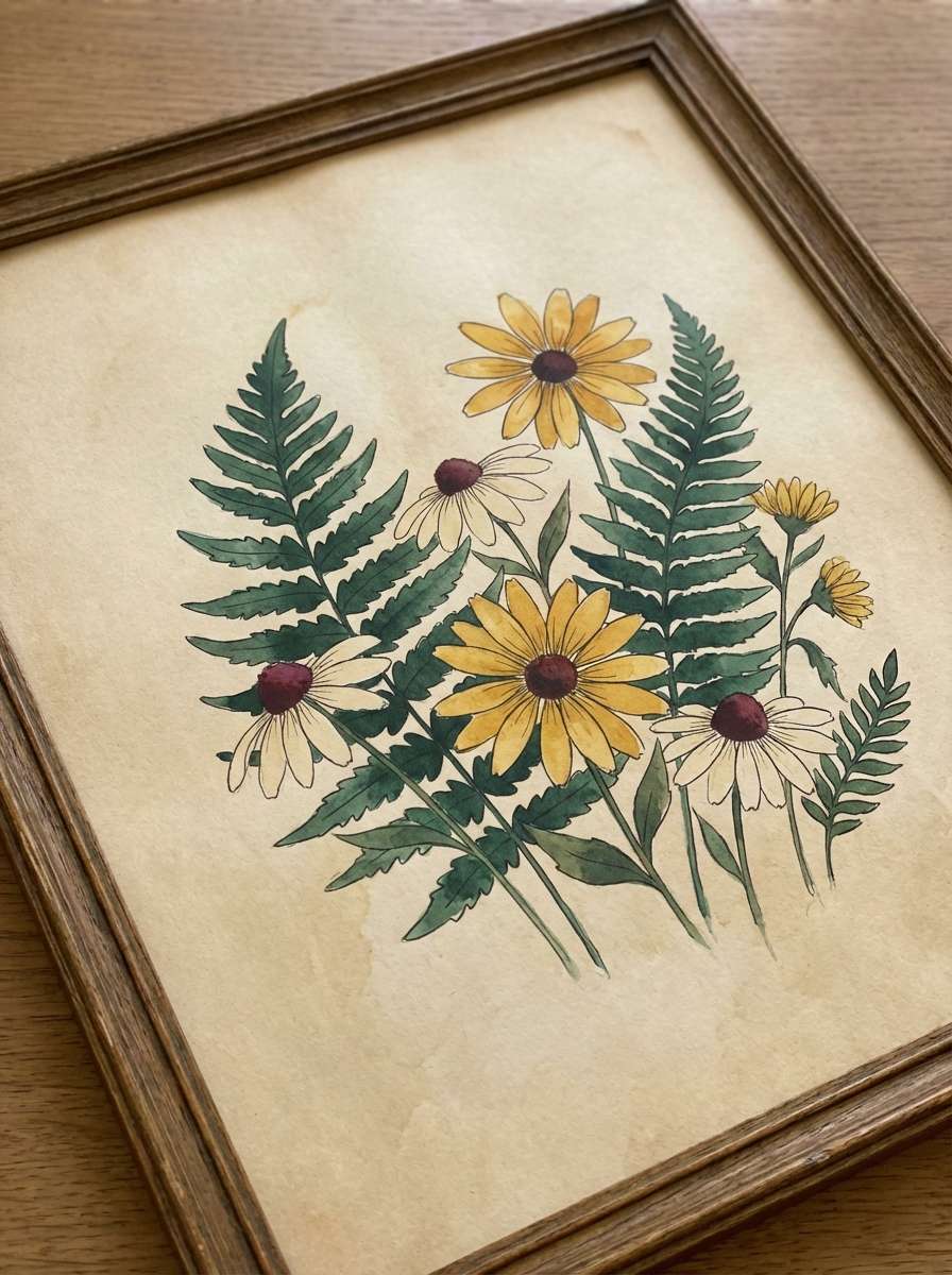
15) Botanical Amber
HEX: #f4c542 #fff6db #6b0f1a #2f6f55 #2b2b2b
Mood: natural, warm, balanced
Best for: botanical illustration prints
Natural and warm, it feels like pressed leaves lit by amber sunlight. Use the green as a calming bridge between the golden yellow and the rich maroon. Cream works as paper tone for illustrated prints, while charcoal supports captions and labels. Tip: keep the maroon for stems and shadows so the composition stays grounded.
Image example of botanical amber generated using media.io
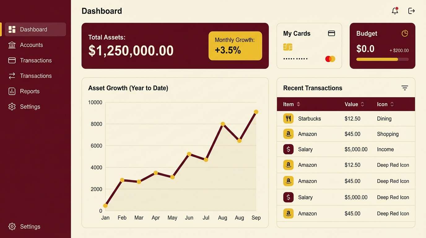
16) Modern Heritage UI
HEX: #f3c623 #faf5e6 #6c1324 #9a2f3f #1a1a1a
Mood: trustworthy, modern, warm
Best for: dashboard UI for a finance app
Trustworthy and modern, it blends heritage warmth with clean interface contrast. Try maroon as the primary navigation and card headers, then use the yellow for alerts, progress highlights, and key metrics. The soft off-white reduces glare across long sessions. Tip: use the darkest neutral for text and icons to keep accessibility strong on light panels.
Image example of modern heritage ui generated using media.io
17) Rustic Wedding Toast
HEX: #f5c451 #fff3dd #7c1d2d #a35a3a #3c2f2f
Mood: tender, rustic, celebratory
Best for: wedding signage and place cards
Tender and rustic, it suggests vineyard toasts and soft candle glow. Use the cream as your card stock tone, then print maroon names for a timeless look. Bring yellow in through small icons, border rules, or table numbers to add warmth. Tip: choose a slightly textured paper so the palette feels handcrafted rather than glossy.
Image example of rustic wedding toast generated using media.io
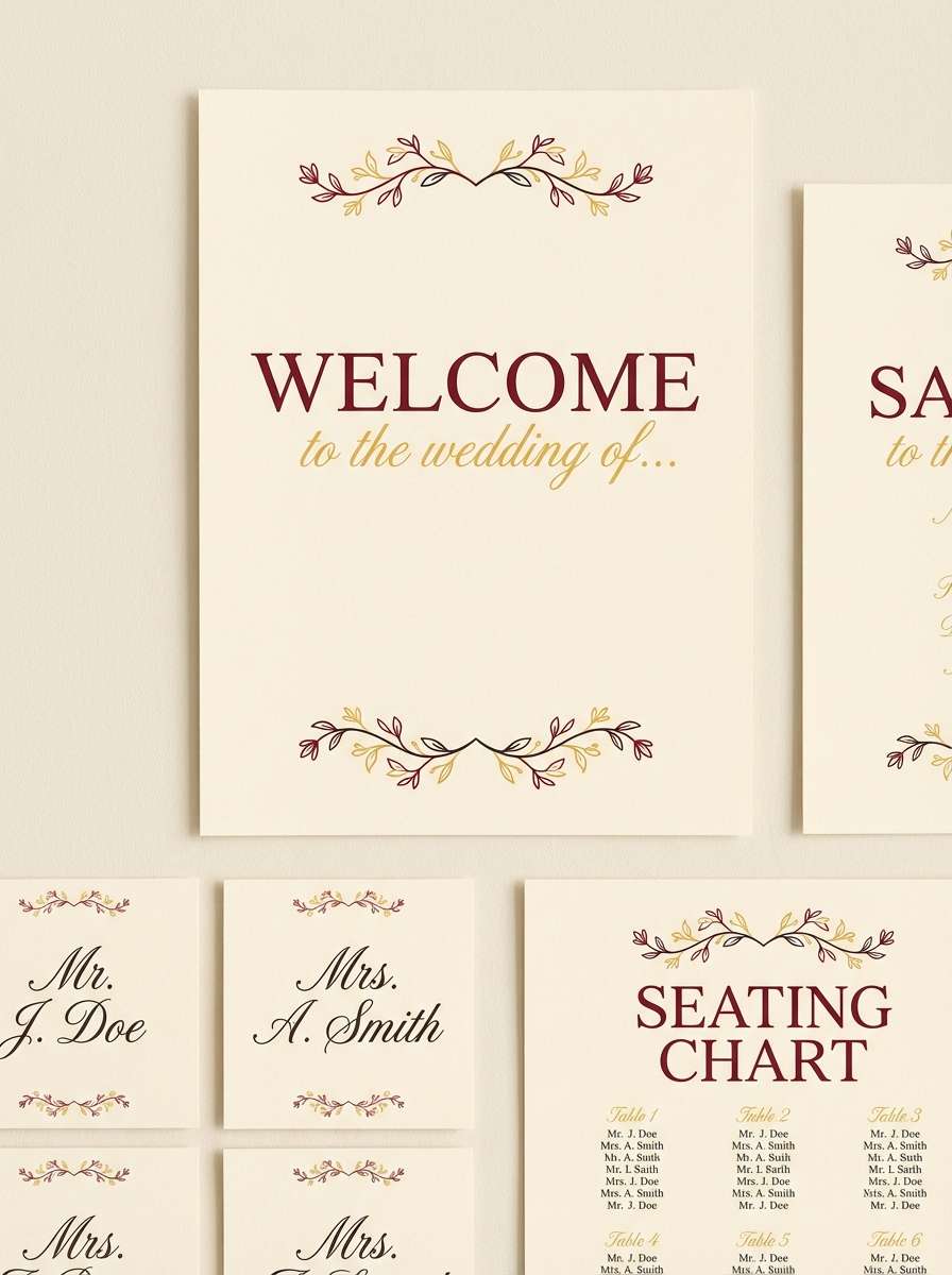
18) Museum Label
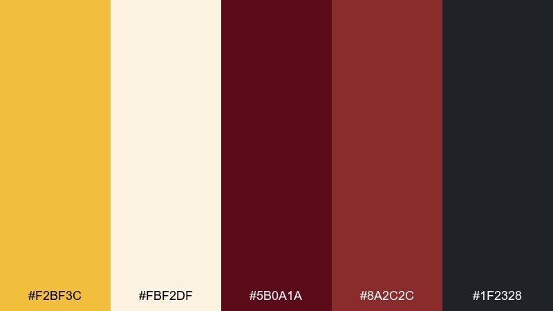
HEX: #f2bf3c #fbf2df #5b0a1a #8a2c2c #1f2328
Mood: quiet, curated, authoritative
Best for: exhibition label system
Quiet and curated, it brings to mind gallery walls with warm spotlights. Use the off-white as the label base and lean on maroon for titles, dates, and hierarchy. Add yellow only for section markers or floor icons so visitors can scan quickly. Tip: keep line weights thin and spacing generous to maintain a museum-grade feel.
Image example of museum label generated using media.io
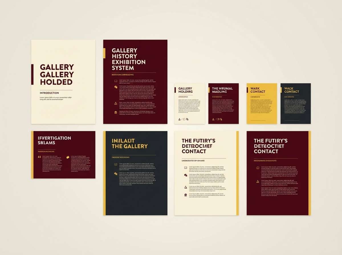
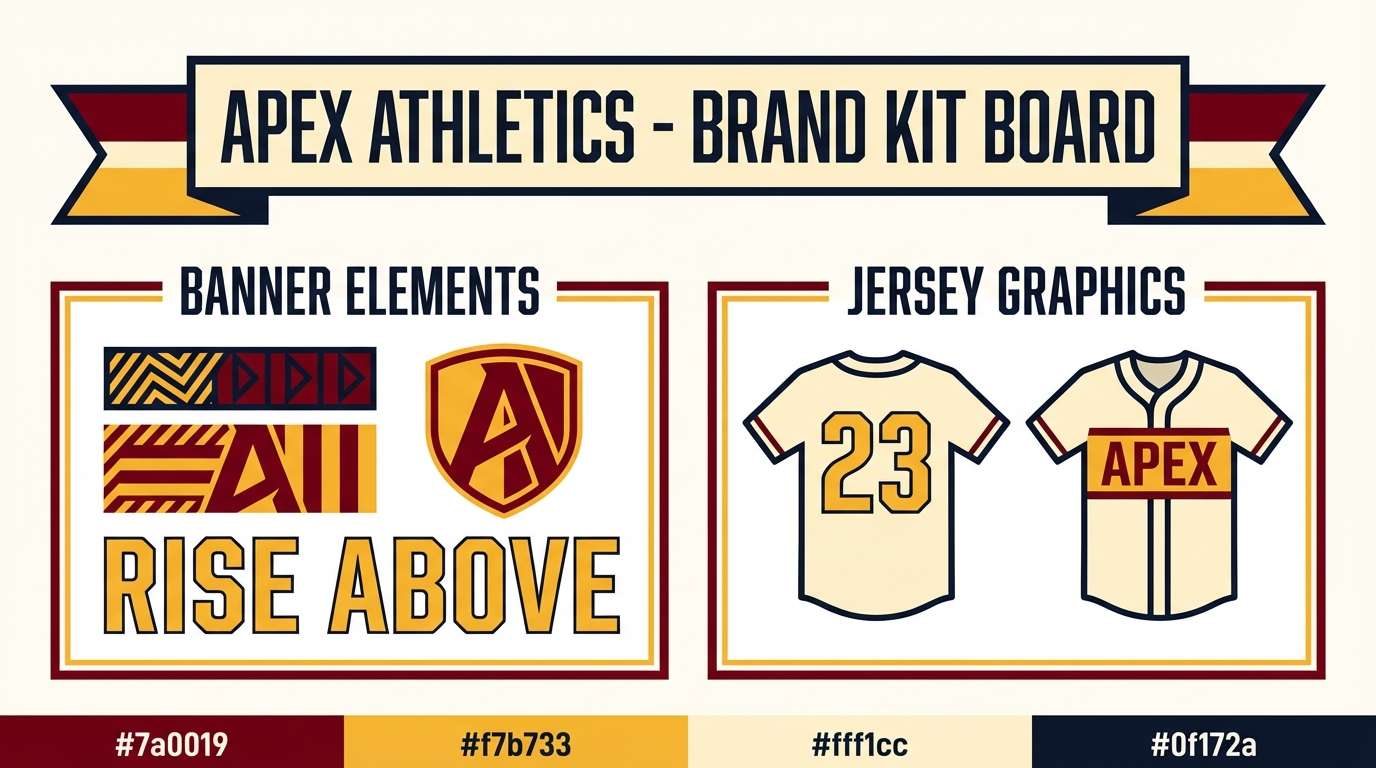
19) Warm Sports Branding
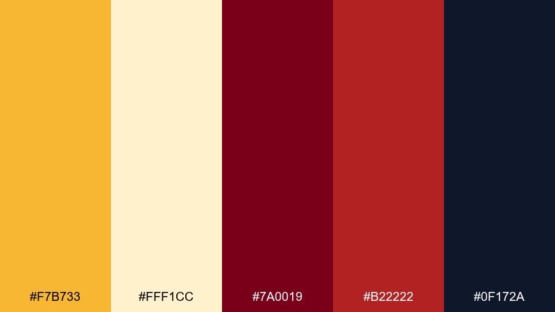
HEX: #f7b733 #fff1cc #7a0019 #b22222 #0f172a
Mood: competitive, bold, energetic
Best for: team brand kit and banners
Competitive and bold, it feels like stadium lights hitting a deep maroon jersey. These yellow maroon color combinations are strong for banners, where you need impact at long distance. Use yellow for numbers and calls to action, then keep maroon for large fields and patterns. Tip: add the navy only for contrast accents and shadows so the core tones stay dominant.
Image example of warm sports branding generated using media.io
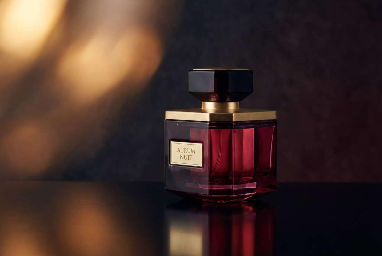
20) Nightfall Maroon Glow
HEX: #f9d65c #fff5dc #4a0b1b #7a2031 #101014
Mood: moody, cinematic, sophisticated
Best for: product ad for a fragrance
Moody and cinematic, it resembles a golden glow fading into nightfall maroon. Use the darkest tones for the background and bottle silhouette, then let yellow appear as a soft rim light or small highlight. Cream supports readable copy without breaking the atmosphere. Tip: add gentle gradients instead of flat blocks to keep the ad looking premium and photographic.
Image example of nightfall maroon glow generated using media.io
21) Sunset Press
HEX: #f6be3b #fff0d8 #72162a #a93c4d #2c2a2a
Mood: editorial, warm, polished
Best for: magazine feature layout
Editorial and polished, it feels like a sunset-tinted spread on creamy paper. Use maroon for pull quotes and section headers, while yellow works best as a small highlight behind key phrases. Keep body text on the light background for comfortable reading. Tip: align accents to the grid so the warmth looks deliberate and high-end.
Image example of sunset press generated using media.io
22) Gilded Cherry

HEX: #ffcf4a #fff4de #7b0f2a #c1124a #241a1d
Mood: luxurious, vibrant, confident
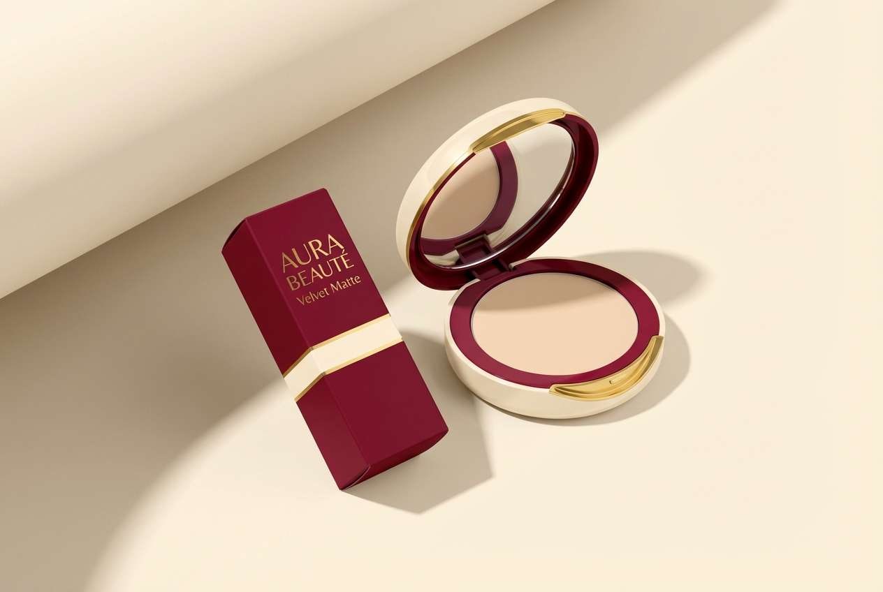
Best for: cosmetics packaging
Luxurious and vibrant, it reads like gilded foil paired with cherry lacquer. Yellow maroon color combinations like these are ideal for cosmetics where you want glamour without neon. Use maroon for the pack body and typography, then add yellow as a foil stamp or thin border. Tip: keep the brightest red as a small hero accent so the design stays cohesive.
Image example of gilded cherry generated using media.io
23) Citrus Cabernet
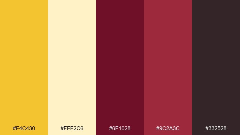
HEX: #f4c430 #fff2c6 #6f1028 #9c2a3c #332528
Mood: zesty, rich, upbeat
Best for: email newsletter template
Zesty and rich, it balances citrus brightness with cabernet depth. Use the light tones as the email canvas, then place maroon in headers and dividers to structure content. Yellow works well for buttons and small badges, especially in short promotional blocks. Tip: keep button text dark for readability and avoid using yellow on long text sections.
Image example of citrus cabernet generated using media.io
What Colors Go Well with Yellow Maroon?
Soft neutrals are the easiest match: ivory, cream, warm beige, and off-white keep the palette breathable and make maroon typography feel refined rather than heavy. They’re also ideal for long-form reading and packaging labels.
Deep darks like charcoal, near-black, espresso brown, and navy add structure and accessibility. They help small text, icons, and outlines stay crisp when yellow is used as a highlight.
For extra range, add a muted green (sage/forest) to bridge the warm yellow and red-maroon, or a dusty pink/terracotta for a gentler, romantic variation.
How to Use a Yellow Maroon Color Palette in Real Designs
Start with roles: maroon works well as a primary brand color for headers, nav, and hero blocks, while yellow is most effective as an accent for CTAs, badges, and key metrics. This keeps attention focused and prevents “all-warm-everywhere” overload.
Prioritize contrast and readability. Avoid setting small yellow text on light backgrounds; instead place yellow on the darkest maroon/charcoal, or use yellow as a background highlight behind dark text.
In print, test proofs because maroons can darken on matte stock and small details may fill in. If you’re using yellow for “gold,” consider a foil/spot color effect or subtle gradients to mimic metallic depth.
Create Yellow Maroon Palette Visuals with AI
If you already have HEX codes but need on-brand visuals (posters, packaging mockups, UI screens, or social templates), generating examples with AI can speed up exploration. You can quickly test how much yellow to use and how maroon performs as a background.
Use your palette as “dominant” and “accent” guidance in the prompt, then iterate on lighting, texture, and layout style (minimal, rustic, deco, editorial). Save the best prompt versions so your designs stay consistent across campaigns.
Yellow Maroon Color Palette FAQs
-
What does a yellow and maroon color palette communicate?
Yellow signals warmth, optimism, and visibility, while maroon adds sophistication, heritage, and depth. Together, they often feel premium, cozy, and confident. -
How do I keep yellow from overpowering maroon?
Use maroon as the base (background blocks, headers, large shapes) and keep yellow for accents like buttons, icons, labels, or thin linework—often around 10–15% of the layout. -
Is yellow maroon good for UI design and accessibility?
Yes, when you manage contrast. Avoid small yellow text on light backgrounds; instead place yellow on dark maroon/charcoal or use dark text on yellow. Reserve the darkest neutral for body text and icons. -
What neutral colors pair best with yellow and maroon?
Warm ivory, cream, and off-white are the most natural matches. Charcoal and near-black are great for typography and UI structure. -
What accent colors work with yellow maroon besides neutrals?
Muted greens (sage/forest) balance the warmth and add a natural feel. Navy can add sharper contrast for sports or corporate layouts, and dusty pink/terracotta can soften the palette for weddings. -
Does maroon print darker than expected?
Often, yes—especially on matte or uncoated paper. Print a small proof first, increase spacing for fine details, and consider slightly lighter maroon values if small text or thin lines are involved. -
How can I quickly generate mockups using this palette?
Use an AI text-to-image tool and specify which HEX colors are dominant vs accents. Iterate on composition (menu, label, poster, UI) and lighting/texture to find a style that fits your brand.


