

A Scandinavian color palette is built around light neutrals, muted blues/greens, and warm wood-inspired accents. The result feels calm, functional, and modern—perfect for minimal interiors, clean branding, and UI that stays readable.
Below are 20+ Nordic-inspired palette pairings with HEX codes, plus ready-to-use AI prompts so you can generate matching visuals in seconds.
In this article
- Why Scandinavian Palettes Work So Well
-
- fjord mist
- birch & linen
- arctic dusk
- copper cabin
- sage sauna
- winterberry wool
- stone harbor
- sea glass minimal
- amber lantern
- mossy path
- nordic denim
- oat & ash
- midnight spruce
- clay pottery
- glacier blueprint
- sunlit pine
- charcoal hygge
- rosewood quiet
- pebble & cloud
- coastal driftwood
- frosted lavender
- rust & snow
- What Colors Go Well with Scandinavian?
- How to Use a Scandinavian Color Palette in Real Designs
- Create Scandinavian Palette Visuals with AI
Why Scandinavian Palettes Work So Well
Scandinavian color schemes rely on high-lightness neutrals and low-saturation accents, which creates a “bright but soft” look. This makes spaces and interfaces feel open, even when layouts are content-heavy.
Because contrast is handled with charcoal and slate instead of pure black, the overall aesthetic stays gentle and modern. It’s a practical choice for readability, accessibility, and long-term brand consistency.
Most Nordic palettes also include a warm element—wood, clay, rust, or amber—so the minimalism feels human. That balance is what gives Scandinavian design its cozy, lived-in clarity.
20+ Scandinavian Color Palette Ideas (with HEX Codes)
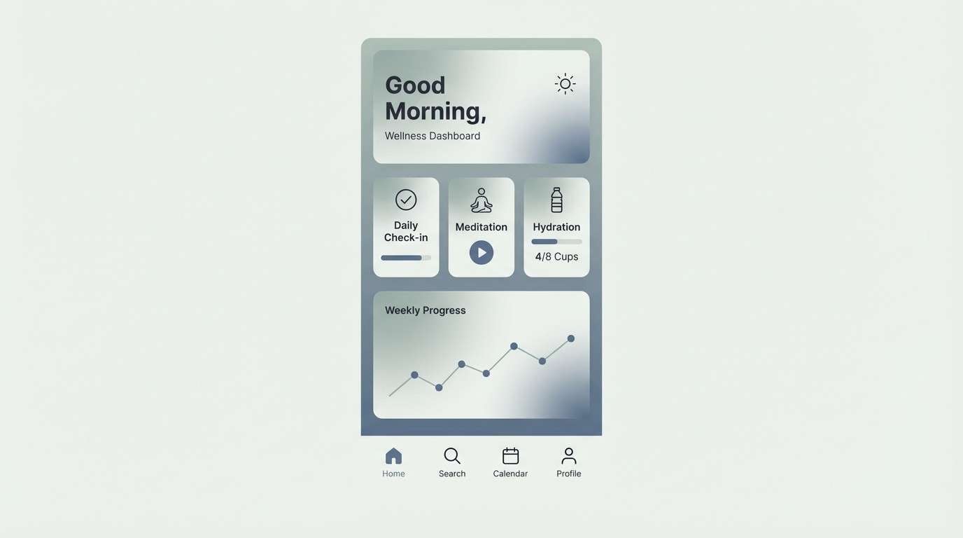
1) Fjord Mist
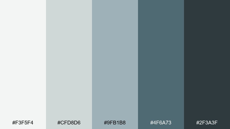
HEX: #f3f5f4 #cfd8d6 #9fb1b8 #4f6a73 #2f3a3f
Mood: calm and airy
Best for: wellness app UI
Calm and airy like morning fog rolling over a quiet fjord, these tones feel clean without turning cold. Use the pale gray-green as your background, then let slate blue carry buttons and navigation. Add the deep charcoal for text and icons to keep contrast crisp. Usage tip: keep shadows soft and wide so the UI stays light and Nordic.
Image example of fjord mist generated using media.io
Media.io is an online AI studio for creating and editing video, image, and audio in your browser.

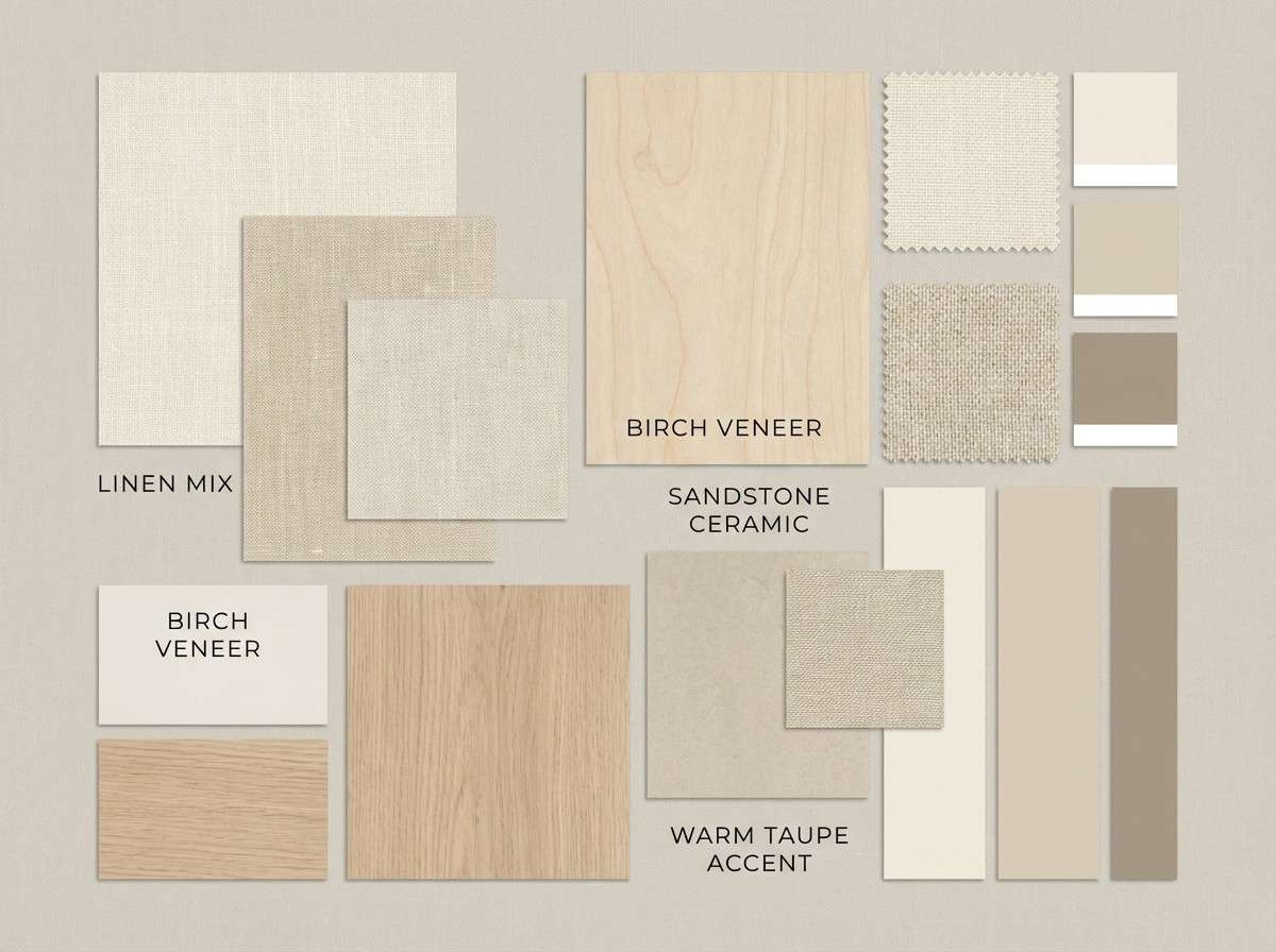
2) Birch & Linen
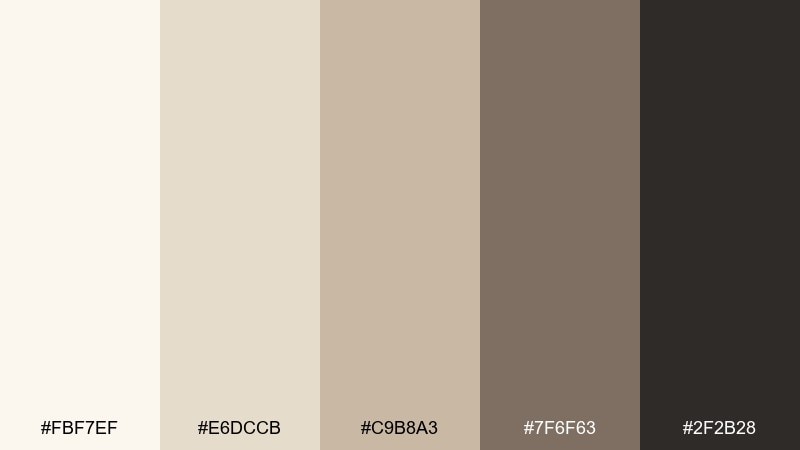
HEX: #fbf7ef #e6dccb #c9b8a3 #7f6f63 #2f2b28
Mood: warm and tactile
Best for: cozy interior mood board
Warm and tactile like birch bark, woven linen, and sunlit wood floors, this mix reads inviting and understated. It works beautifully as a scandinavian color palette for living spaces, retail lookbooks, or calm brand photography. Pair the creamy base with mid-tan blocks, then ground the layout with espresso text. Usage tip: introduce texture through paper grain or fabric overlays instead of adding more color.
Image example of birch & linen generated using media.io
3) Arctic Dusk

HEX: #f6f8fb #d7e2ee #8aa4bf #4b647f #1f2a36
Mood: quiet and focused
Best for: SaaS dashboard UI
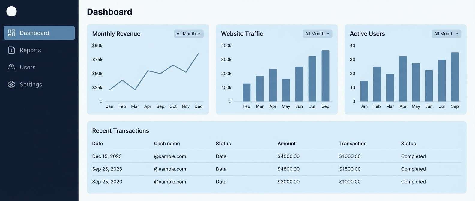
Quiet and focused like twilight settling over an icy shoreline, these blues lean modern and professional. Use the pale ice tint for panels, then reserve the steel blue for charts and highlights. The navy-black anchors headers and keeps data readable. Usage tip: keep accent usage consistent, one chart color at a time, for a cleaner dashboard.
Image example of arctic dusk generated using media.io
4) Copper Cabin
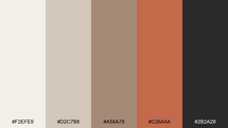
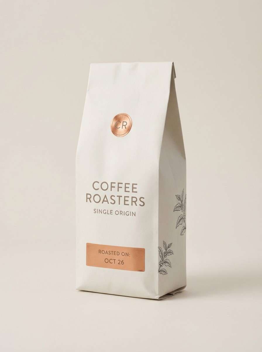
HEX: #f2efe9 #d2c7b8 #a58a78 #c26a4a #2b2a28
Mood: rustic and modern
Best for: coffee packaging design
Rustic and modern like a cabin stove glowing against pale timber, this set balances soft neutrals with a confident copper hit. It is ideal for scandinavian color combinations that need warmth without losing minimalism. Let the off-white carry the label, then use copper for the hero mark and a single callout badge. Usage tip: print the copper as a matte spot color to keep it earthy, not shiny.
Image example of copper cabin generated using media.io
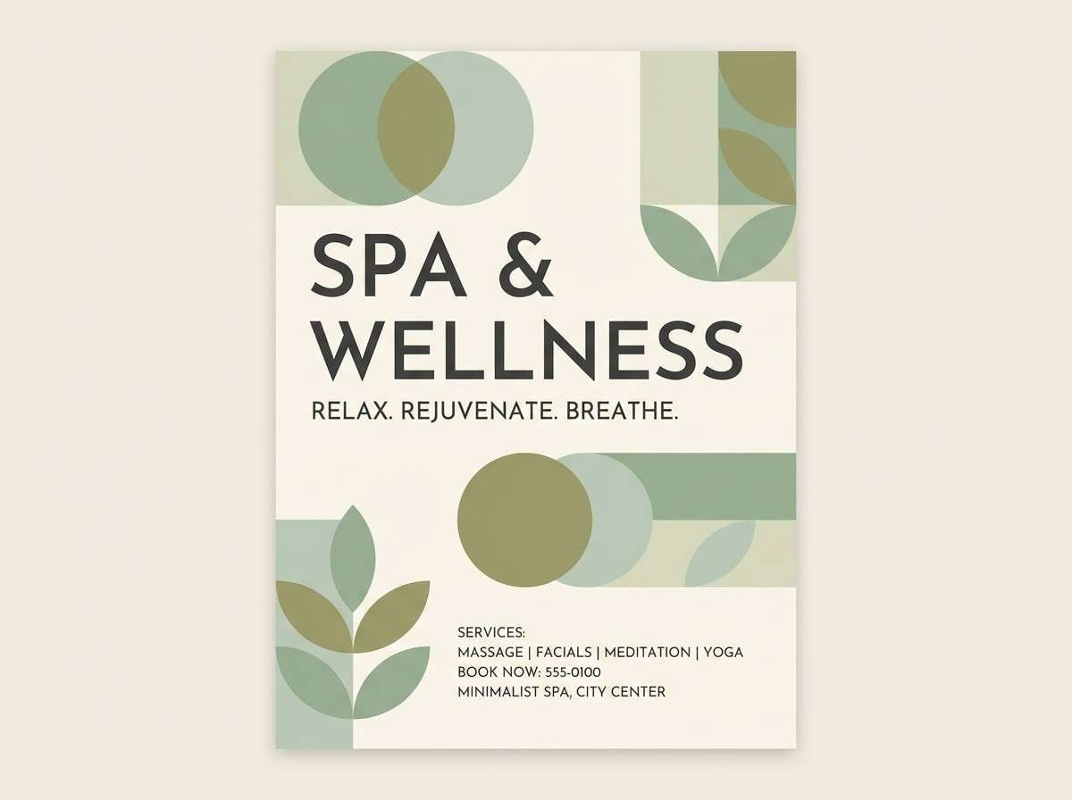
5) Sage Sauna
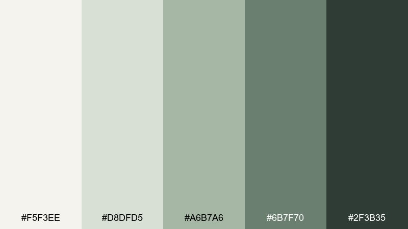
HEX: #f5f3ee #d8dfd5 #a6b7a6 #6b7f70 #2f3b35
Mood: grounded and fresh
Best for: spa flyer design
Grounded and fresh like steam, cedar, and crushed sage leaves, these greens feel restorative. Use the lightest cream as your background and the soft sage for blocks and dividers. The deeper forest tone works well for headings and pricing, especially on print. Usage tip: keep plenty of whitespace so the greens read like a breath, not a wall.
Image example of sage sauna generated using media.io
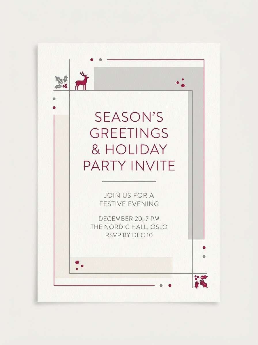
6) Winterberry Wool
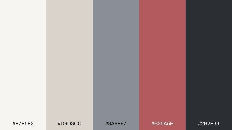
HEX: #f7f5f2 #d9d3cc #8a8f97 #b35a5e #2b2f33
Mood: cozy with a spark
Best for: holiday invitation
Cozy with a spark like wool blankets and winter berries on a snowy table, this palette feels festive but restrained. The muted rose-red makes a beautiful accent for names, borders, or a single illustration detail. Pair it with soft grays to keep the look modern rather than traditional. Usage tip: use the berry tone at 10 to 15 percent coverage so it stays elegant.
Image example of winterberry wool generated using media.io
7) Stone Harbor
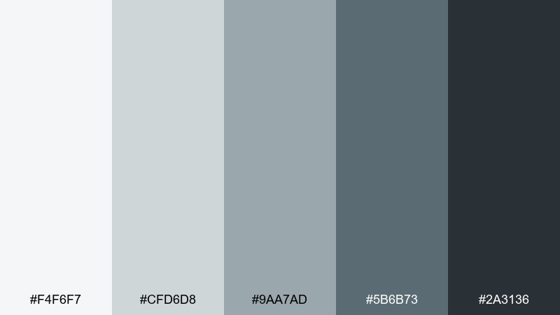
HEX: #f4f6f7 #cfd6d8 #9aa7ad #5b6b73 #2a3136
Mood: cool and steady
Best for: architecture portfolio layout
Cool and steady like a stone pier and a flat winter sea, these grays bring quiet confidence. Use the light tones for generous margins and image frames, then lean on mid-slate for captions and rules. The deep charcoal gives you crisp typography without harsh black. Usage tip: keep photo saturation low so the layout feels unified.
Image example of stone harbor generated using media.io
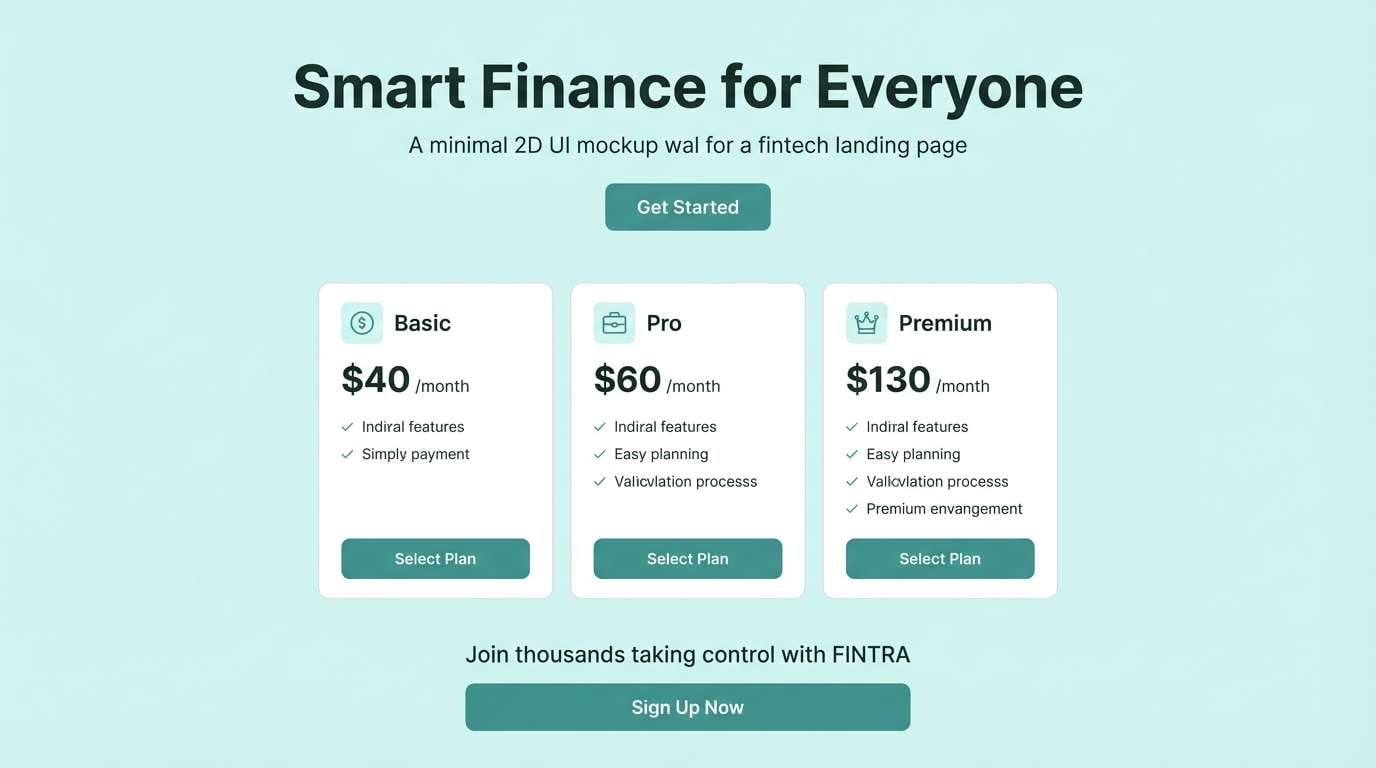
8) Sea Glass Minimal
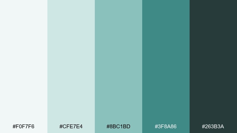
HEX: #f0f7f6 #cfe7e4 #8bc1bd #3f8a86 #263b3a
Mood: fresh and modern
Best for: fintech landing page UI
Fresh and modern like sea glass smoothed by cold water, these teals feel clean and trustworthy. Use the palest aqua for sections and the mid-teal for primary buttons and badges. Anchor key numbers with the deep green-charcoal for legibility. Usage tip: limit gradients to subtle two-step blends so the page stays minimal.
Image example of sea glass minimal generated using media.io
9) Amber Lantern
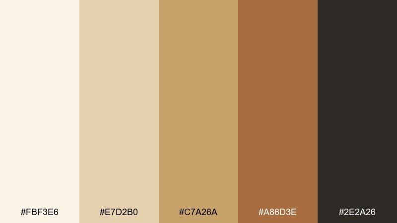
HEX: #fbf3e6 #e7d2b0 #c7a26a #a86d3e #2e2a26
Mood: golden and inviting
Best for: restaurant menu design
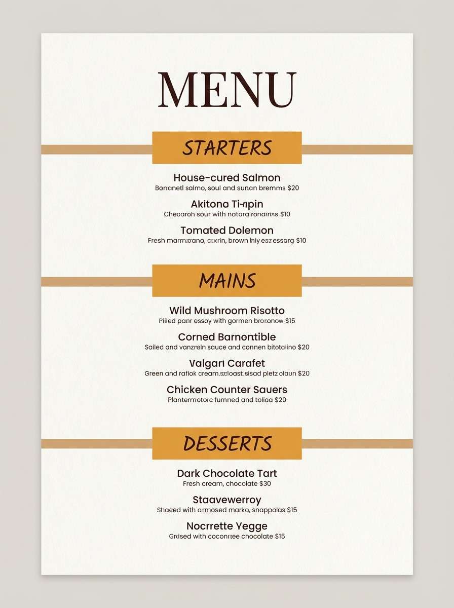
Golden and inviting like lantern light on a long wooden table, these browns and ambers feel welcoming. The creamy base keeps the menu readable, while caramel tones highlight sections and specials. Use the dark espresso for type and thin dividers to maintain a premium look. Usage tip: keep imagery warm-toned or convert photos to sepia for consistency.
Image example of amber lantern generated using media.io
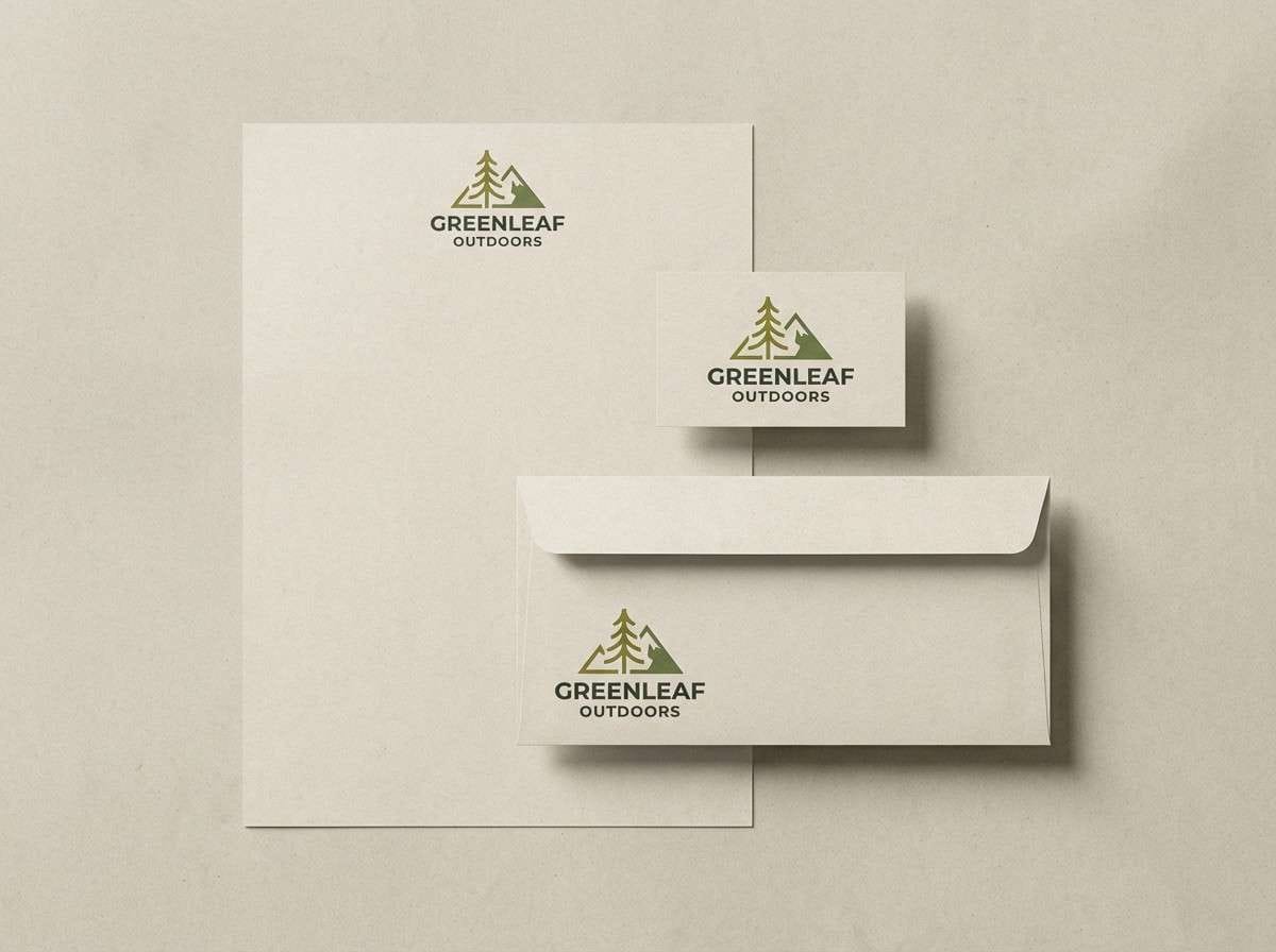
10) Mossy Path
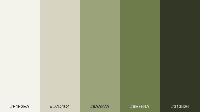
HEX: #f4f2ea #d7d4c4 #9aa27a #6e7b4a #313826
Mood: natural and grounded
Best for: outdoor brand logo and stationery
Natural and grounded like moss on stone and late-summer trails, these olives feel earthy but refined. Use the light oat tone as paper stock, then build marks in moss and forest for a timeless identity. The charcoal-green gives you strong contrast for stamps and monograms. Usage tip: try an uncoated paper so the greens print soft and organic.
Image example of mossy path generated using media.io
11) Nordic Denim
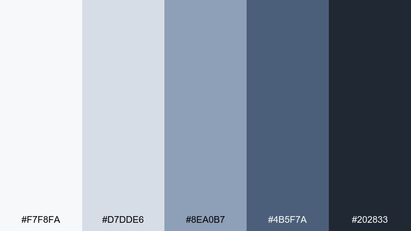
HEX: #f7f8fa #d7dde6 #8ea0b7 #4b5f7a #202833
Mood: crisp and dependable
Best for: ecommerce product page UI
Crisp and dependable like worn denim against fresh snow, this blue range feels practical and polished. Use the light gray-blue for page backgrounds and the mid denim tone for links and active states. Keep the near-black for prices and key UI labels to avoid the washed-out look. Usage tip: pair it with simple line icons and lots of spacing to keep the page breathable.
Image example of nordic denim generated using media.io
12) Oat & Ash
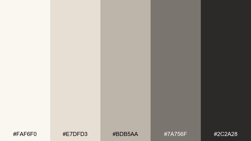
HEX: #faf6f0 #e7dfd3 #bdb5aa #7a756f #2c2a28
Mood: soft and neutral
Best for: minimalist blog theme
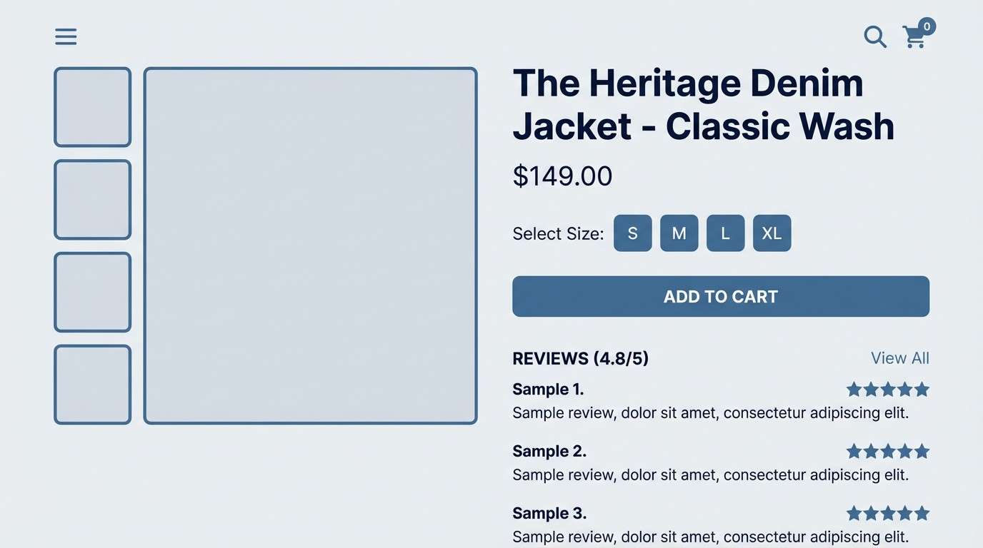
Soft and neutral like oat milk, warm paper, and fireplace ash, these shades feel timeless. They shine in editorial layouts where readability matters more than decoration. Use ash gray for headings and the darkest tone for body text to keep contrast gentle. Usage tip: add one textured background section per page to avoid looking flat.
Image example of oat & ash generated using media.io
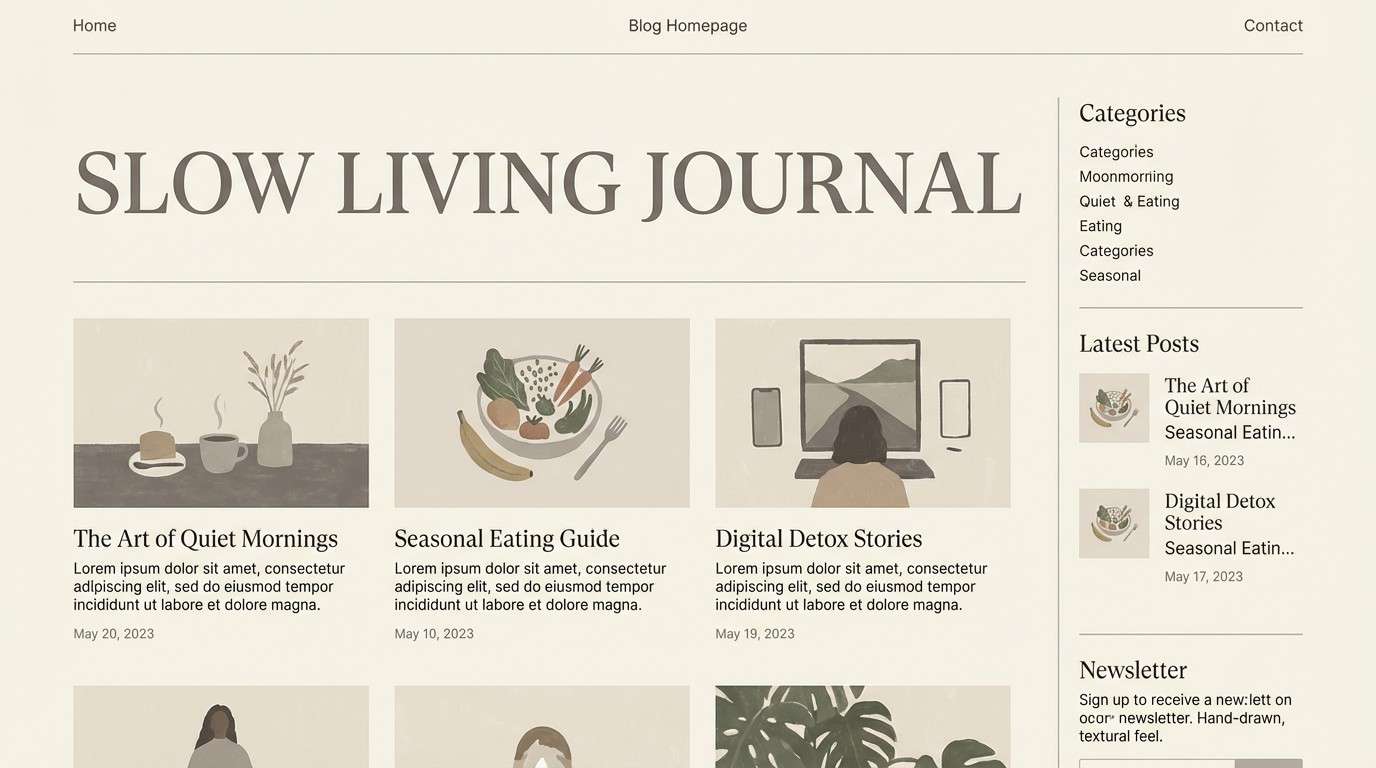
13) Midnight Spruce
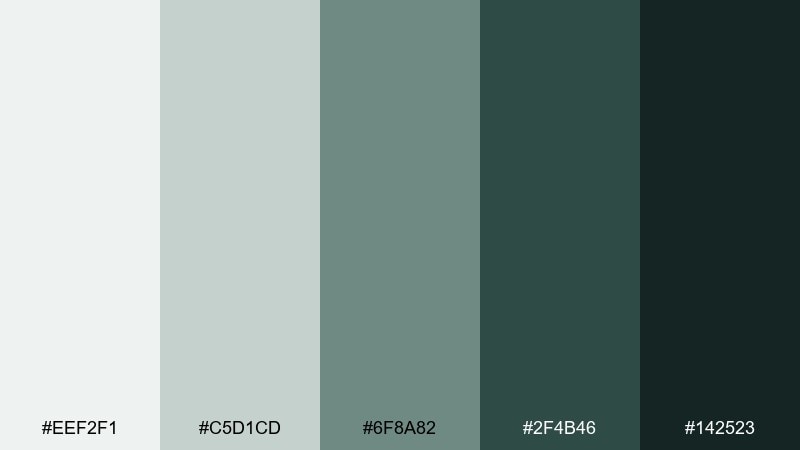
HEX: #eef2f1 #c5d1cd #6f8a82 #2f4b46 #142523
Mood: moody and refined
Best for: luxury skincare product ad
Moody and refined like evergreen needles under moonlight, these greens feel premium and calm. Use the pale mint-gray as negative space, then let the deep spruce carry the bottle label and headline. The near-black adds depth for fine print and ingredients. Usage tip: keep lighting soft and directional to make dark greens look velvety, not harsh.
Image example of midnight spruce generated using media.io
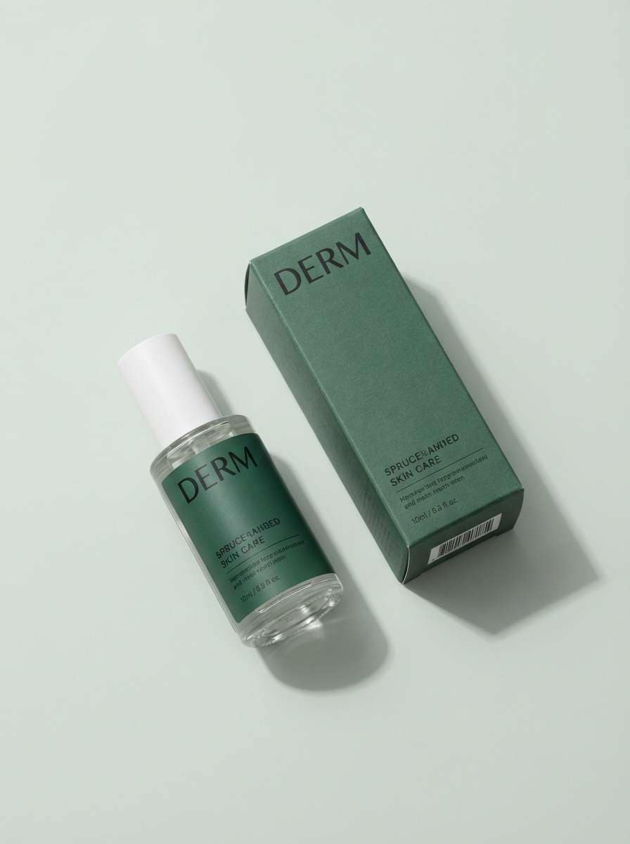
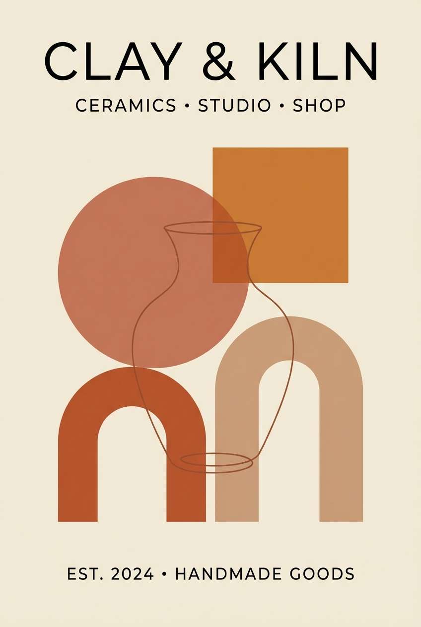
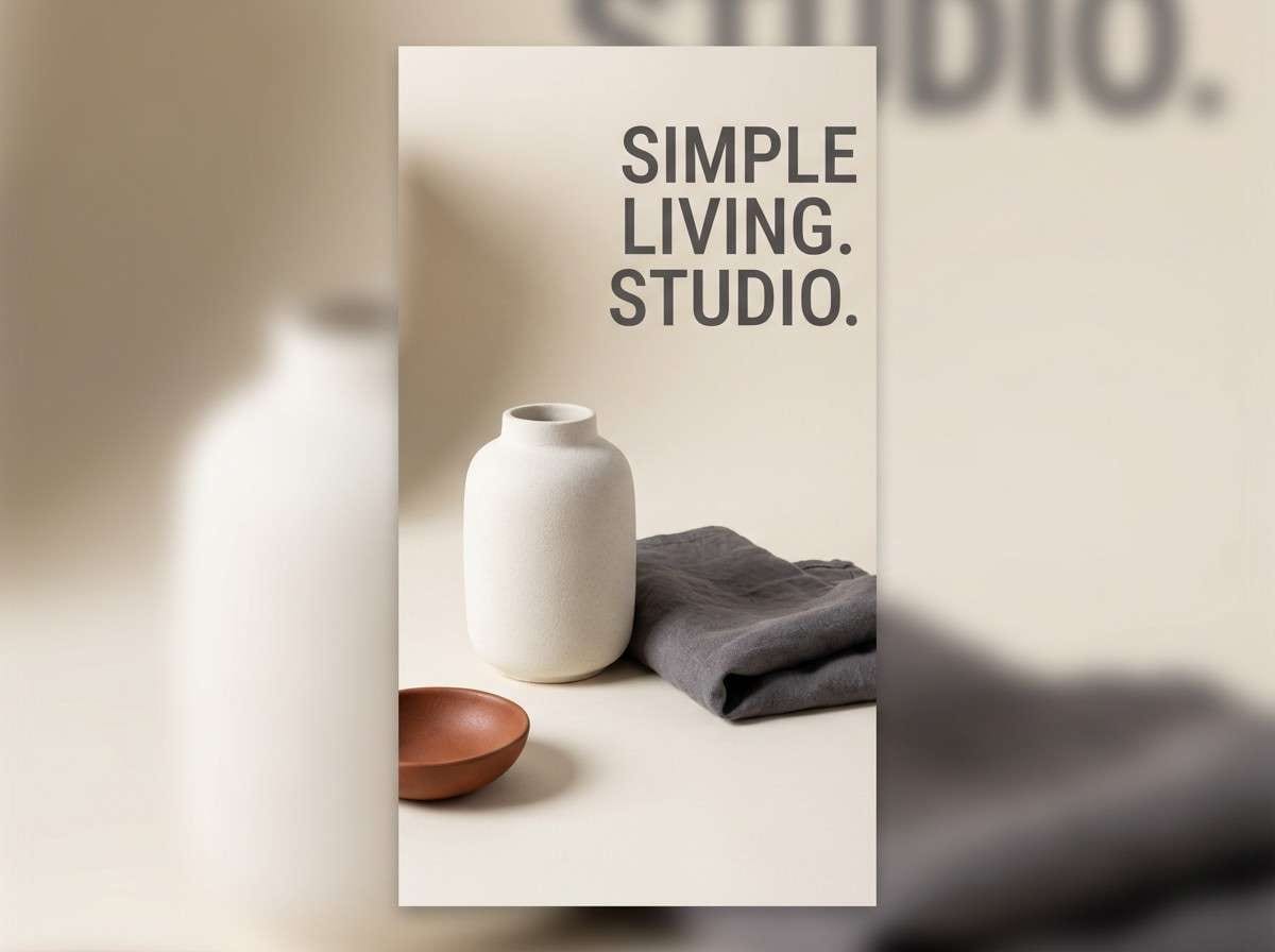
14) Clay Pottery
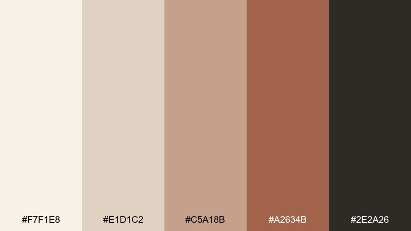
HEX: #f7f1e8 #e1d1c2 #c5a18b #a2634b #2e2a26
Mood: earthy and artisanal
Best for: ceramics shop poster
Earthy and artisanal like hand-thrown clay and kiln warmth, these tans and terracottas feel crafted. Use the creamy base for negative space and the clay tones for headline blocks and simple illustrations. The deep brown-black keeps type sharp without looking stark. Usage tip: try a slightly imperfect texture overlay to echo handmade surfaces.
Image example of clay pottery generated using media.io
15) Glacier Blueprint
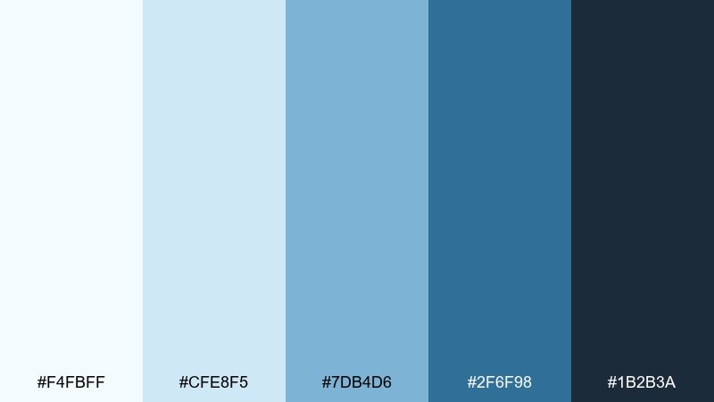
HEX: #f4fbff #cfe8f5 #7db4d6 #2f6f98 #1b2b3a
Mood: bright and technical
Best for: presentation slide deck
Bright and technical like glacial water over clean lines, these blues feel precise and optimistic. Use the ice tint as your slide background, then build charts with the mid and deep blues. Keep the dark ink tone for headers so text stays crisp on projectors. Usage tip: reserve the strongest blue for one key metric per slide.
Image example of glacier blueprint generated using media.io
16) Sunlit Pine
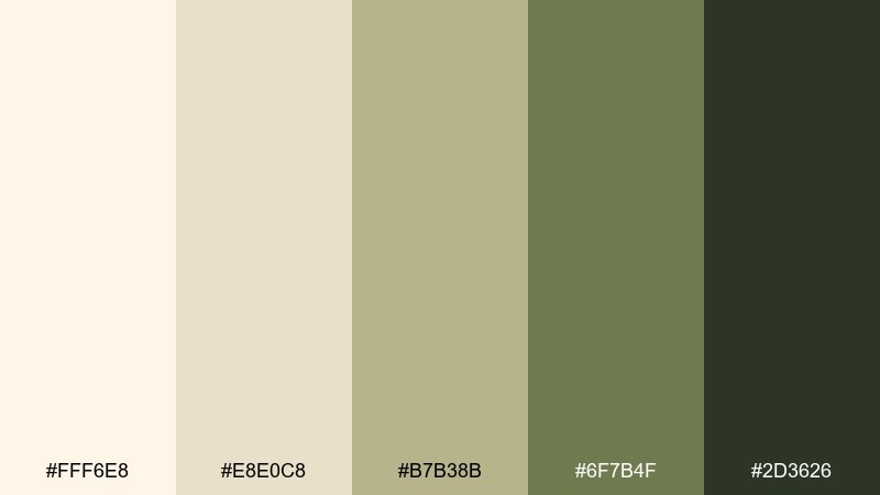
HEX: #fff6e8 #e8e0c8 #b7b38b #6f7b4f #2d3626
Mood: bright and outdoorsy
Best for: nature podcast cover art
Bright and outdoorsy like sun hitting pine needles, this mix feels optimistic and grounded. Use the pale cream as the cover base, then bring in olive for the title and simple iconography. A darker green-black anchors the typography so it stays readable at thumbnail size. Usage tip: keep illustration shapes bold and minimal to avoid muddy greens when scaled down.
Image example of sunlit pine generated using media.io

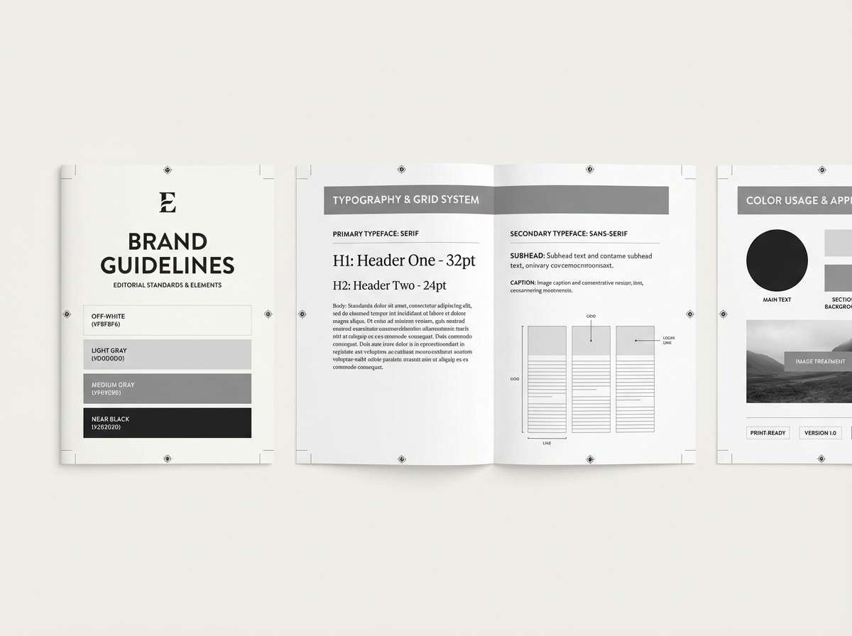
17) Charcoal Hygge
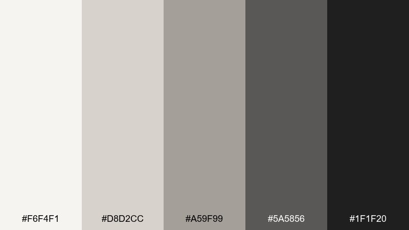
HEX: #f6f4f1 #d8d2cc #a59f99 #5a5856 #1f1f20
Mood: minimal and cozy
Best for: brand guidelines document
Minimal and cozy like candlelight against charcoal knit, these neutrals feel confident and timeless. As a scandinavian color palette for brand systems, it keeps layouts consistent across web, print, and social. Use the off-white for pages, mid-gray for UI components, and the near-black for headings and logos. Usage tip: add one warm-tinted photo style so the grays never feel sterile.
Image example of charcoal hygge generated using media.io
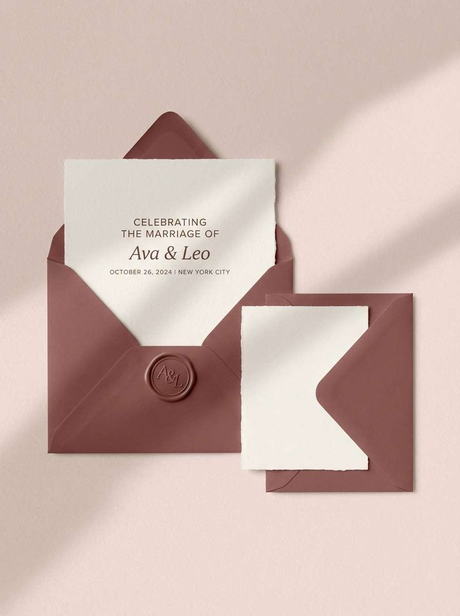
18) Rosewood Quiet
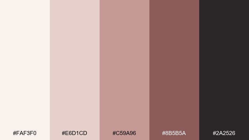
HEX: #faf3f0 #e6d1cd #c59a96 #8b5b5a #2a2526
Mood: soft and romantic
Best for: wedding stationery suite
Soft and romantic like dried roses and polished wood, these pink-browns feel modern rather than sugary. Use blush as a gentle background, then bring in rosewood for monograms and section headers. The deep cocoa shade keeps body text legible on light papers. Usage tip: foil only the monogram in rosewood and leave the rest matte for a calm finish.
Image example of rosewood quiet generated using media.io
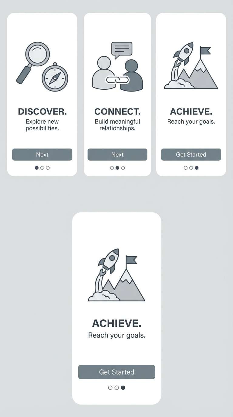
19) Pebble & Cloud
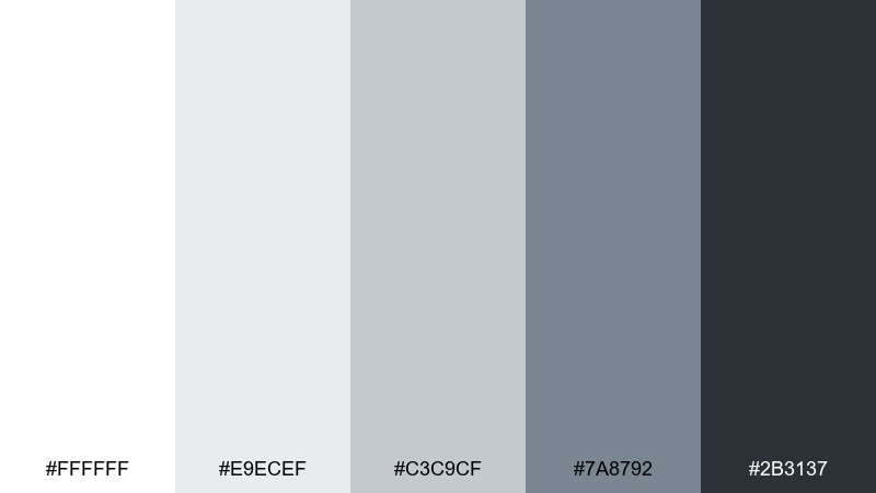
HEX: #ffffff #e9ecef #c3c9cf #7a8792 #2b3137
Mood: clean and spacious
Best for: mobile app onboarding screens
Clean and spacious like smooth pebbles under a bright overcast sky, these cool neutrals feel effortless. Use white and cloud gray for backgrounds, then highlight key steps with the steel tone. The darker slate is perfect for concise copy and progress indicators. Usage tip: keep illustrations monochrome so onboarding stays fast to scan.
Image example of pebble & cloud generated using media.io
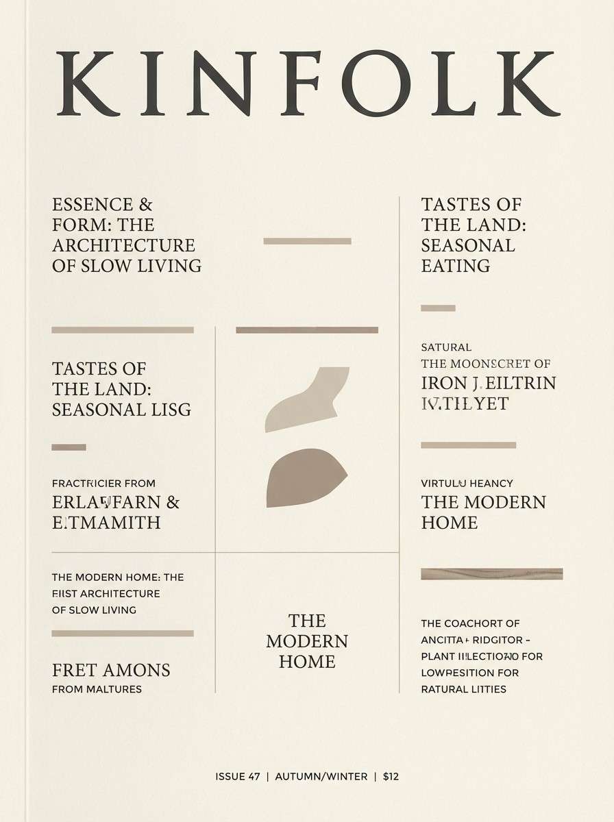
20) Coastal Driftwood
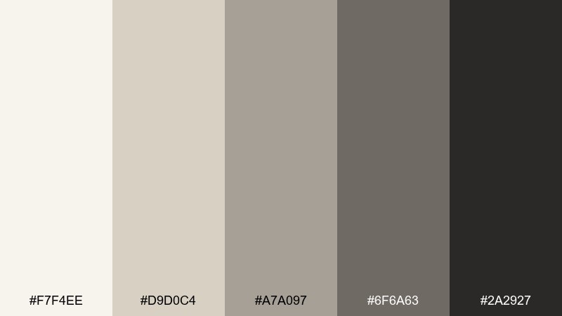
HEX: #f7f4ee #d9d0c4 #a7a097 #6f6a63 #2a2927
Mood: weathered and calm
Best for: lifestyle magazine cover
Weathered and calm like driftwood and salt-worn stone, these taupes feel relaxed and editorial. They suit cover layouts that rely on typography, negative space, and subtle hierarchy. Use the light cream as the base, then set the masthead in dark charcoal for a premium look. Usage tip: keep one accent line in warm taupe to guide the eye without shouting.
Image example of coastal driftwood generated using media.io
21) Frosted Lavender
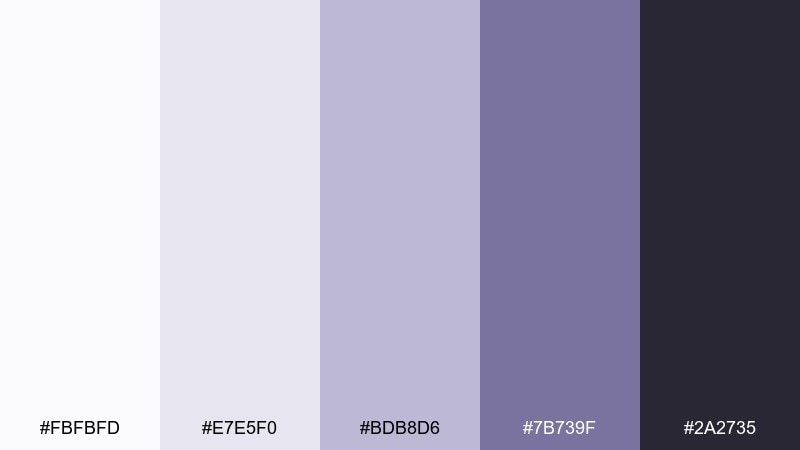
HEX: #fbfbfd #e7e5f0 #bdb8d6 #7b739f #2a2735
Mood: soft and dreamy
Best for: beauty newsletter header
Soft and dreamy like frost on lavender fields at dawn, these purples feel calm and modern. Use the near-white for breathing room, then build the header with pale lilac blocks and one deeper violet accent. The inky plum gives you strong typography without going pure black. Usage tip: keep gradients subtle and avoid extra bright pinks so the look stays sophisticated.
Image example of frosted lavender generated using media.io

22) Rust & Snow
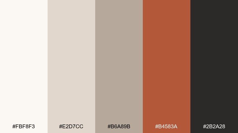
HEX: #fbf8f3 #e2d7cc #b6a89b #b4583a #2b2a28
Mood: bold and cozy
Best for: home decor product ad
Bold and cozy like a rust-toned throw on fresh snow, this mix adds heat to a minimalist setting. It fits scandinavian color combinations when you want one strong accent without losing that quiet balance. Use rust for a single hero object or headline, and let the creamy neutrals handle the rest of the canvas. Usage tip: keep rust in one material finish, like knit or ceramic, to avoid visual noise.
Image example of rust & snow generated using media.io
What Colors Go Well with Scandinavian?
Scandinavian palettes pair best with airy whites, soft greiges, and gentle cool tones like slate blue, misty teal, and steel gray. These colors keep the overall look bright, organized, and easy to live with.
To add warmth without breaking the minimal feel, lean into natural accents: tan, sand, clay, terracotta, copper, and amber. They echo wood and ceramics, which are classic Nordic materials.
For contrast, choose charcoal, deep navy, or green-black instead of pure black. It keeps typography crisp while preserving the softer “hygge” mood.
How to Use a Scandinavian Color Palette in Real Designs
Start with a light neutral base (off-white, cloud gray, oat) and treat it as your main canvas. Then pick one mid-tone for structure—cards, panels, dividers, and secondary typography.
Add a single accent for focus: a rust badge, a teal CTA button, or a berry detail on invitations. Scandinavian color schemes feel strongest when accent coverage stays controlled and intentional.
Finally, support the palette with texture and spacing rather than extra hues. Paper grain, linen overlays, matte finishes, and generous whitespace do the heavy lifting for a Nordic look.
Create Scandinavian Palette Visuals with AI
If you’re building a mood board, a landing page mockup, or product-style shots, you can generate on-brand visuals quickly with AI. The key is to describe the format (poster, UI, packaging), lighting (soft, natural), and your exact Scandinavian tones.
Use the prompts above as templates, then swap in your subject and aspect ratio. Keeping “minimal,” “plain background,” and “soft shadows” in the prompt helps maintain a clean Scandinavian aesthetic.
Scandinavian Color Palette FAQs
-
What is a Scandinavian color palette?
A Scandinavian color palette is a Nordic-inspired mix of bright neutrals (white, cream, light gray) with muted accents (slate blue, sage, teal) and grounding darks (charcoal, deep navy). It’s designed to feel airy, calm, and functional. -
Why are Scandinavian color schemes so popular in UI design?
They prioritize readability and clarity: light backgrounds, gentle contrast, and one controlled accent color for actions. This makes interfaces feel modern, accessible, and less visually tiring over long sessions. -
What accent colors work best with Scandinavian neutrals?
Muted accents work best—sage green, dusty teal, steel blue, berry red, or rust. Keep them slightly desaturated so they complement the calm base instead of overpowering it. -
How do I keep a Scandinavian palette from looking too cold?
Add warmth through wood-like tones (sand, tan, amber, clay) or warm lighting in imagery. You can also swap pure white for off-white or oat to make the background feel softer. -
Is black used in Scandinavian color palettes?
Usually not as a dominant color. Designers often use charcoal, near-black, or deep navy for text and icons because it looks softer than pure black while still providing strong contrast. -
How many colors should a Scandinavian palette include?
Typically 3–5 core colors: one light base, one light-mid neutral, one mid-tone, one dark for contrast, and one accent. Limiting the set helps the design stay minimal and cohesive. -
Can I generate Scandinavian-style images from a palette?
Yes—use an AI text-to-image tool and describe the design type (UI, poster, packaging), the mood (minimal, soft shadows), and include your color cues (misty off-white, slate blue, charcoal). This keeps the output aligned with Scandinavian styling.
Next: Teal Rust Color Palette


