

Wisteria sits in that sweet spot between lavender, lilac, and soft purple—calm enough for UI, romantic enough for weddings, and polished enough for branding.
Below are 20+ wisteria color palette ideas with HEX codes, plus practical pairing and usage tips to help you apply them confidently across digital and print.
In this article
- Why Wisteria Palettes Work So Well
-
- lilac haze
- vintage botanica
- dusk and linen
- plum velvet
- paris cafe pastel
- orchid neon pop
- coastal lavender
- moonlit slate
- rosewater wisteria
- matcha and mauve
- iridescent night
- minimal studio
- autumn heather
- celestial gradient
- artisan pottery
- spring stationery
- luxe bridal
- retro arcade
- forest fairy
- editorial ink
- soft charcoal bloom
- gilded orchard
- quiet gradient ui
- What Colors Go Well with Wisteria?
- How to Use a Wisteria Color Palette in Real Designs
- Create Wisteria Palette Visuals with AI
Why Wisteria Palettes Work So Well
Wisteria is naturally “balanced”: it carries the softness of pastel purple while still feeling intentional and design-forward. That makes it easy to use as a primary brand tone or a supporting accent without overwhelming layouts.
It also pairs smoothly with both warm and cool neighbors—creams, blushes, charcoals, sage greens, slate blues—so you can steer the mood from romantic to modern to techy with small shifts in neutrals and accents.
Finally, wisteria tends to photograph and print beautifully when you anchor it with a dark ink color. With the right contrast, it stays readable in UI and crisp on invitations, packaging, and editorial spreads.
20+ Wisteria Color Palette Ideas (with HEX Codes)
1) Lilac Haze
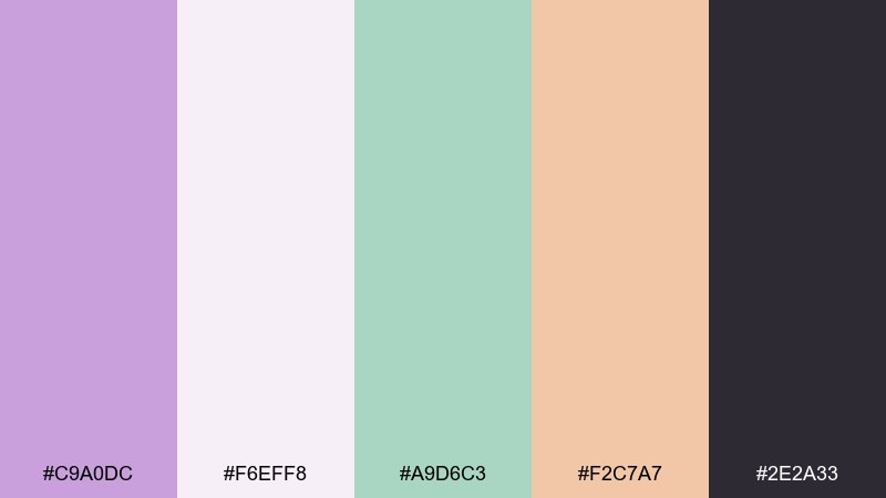
HEX: #C9A0DC #F6EFF8 #A9D6C3 #F2C7A7 #2E2A33
Mood: airy, modern, friendly
Best for: brand identity and social templates
Airy lilac mist and soft cream feel like morning light on petals. Use it for beauty, lifestyle, or boutique branding where you want gentle warmth without looking childish. Pair the green as a calm secondary and let charcoal anchor headlines and logos. Usage tip: keep backgrounds light and reserve the peach for small calls to action.
Image example of lilac haze generated using media.io
Media.io is an online AI studio for creating and editing video, image, and audio in your browser.

2) Vintage Botanica
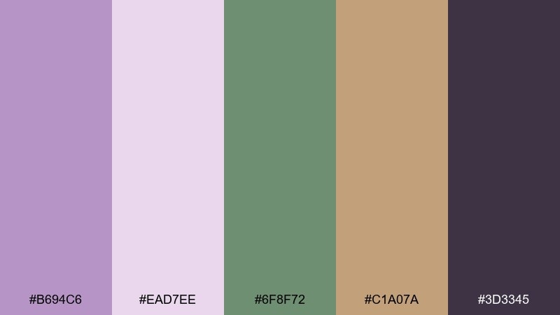
HEX: #B694C6 #EAD7EE #6F8F72 #C1A07A #3D3345
Mood: nostalgic, earthy, romantic
Best for: botanical illustrations and packaging labels
Nostalgic purple and parchment tones evoke pressed flowers in an old journal. The olive green and warm tan make it feel grounded, ideal for herbal products, candles, and apothecary-style labels. Pair the deep eggplant for type and thin line art to keep details crisp. Usage tip: print on uncoated stock to enhance the vintage softness.
Image example of vintage botanica generated using media.io
3) Dusk and Linen
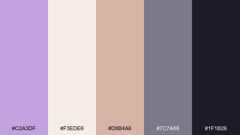
HEX: #C2A3DF #F3EDE6 #D8B4A6 #7C7A88 #1F1B26
Mood: calm, refined, cozy
Best for: interior mood boards and lifestyle photography edits
Calm dusk purple against linen neutrals feels like soft lamps in a quiet room. This wisteria color palette works beautifully for interiors, editorial shoots, and calm creator feeds. Pair the warm blush as fabric or accent decor, then use slate for shadows and structure. Usage tip: keep the deep near-black for small, high-contrast text and frames.
Image example of dusk and linen generated using media.io
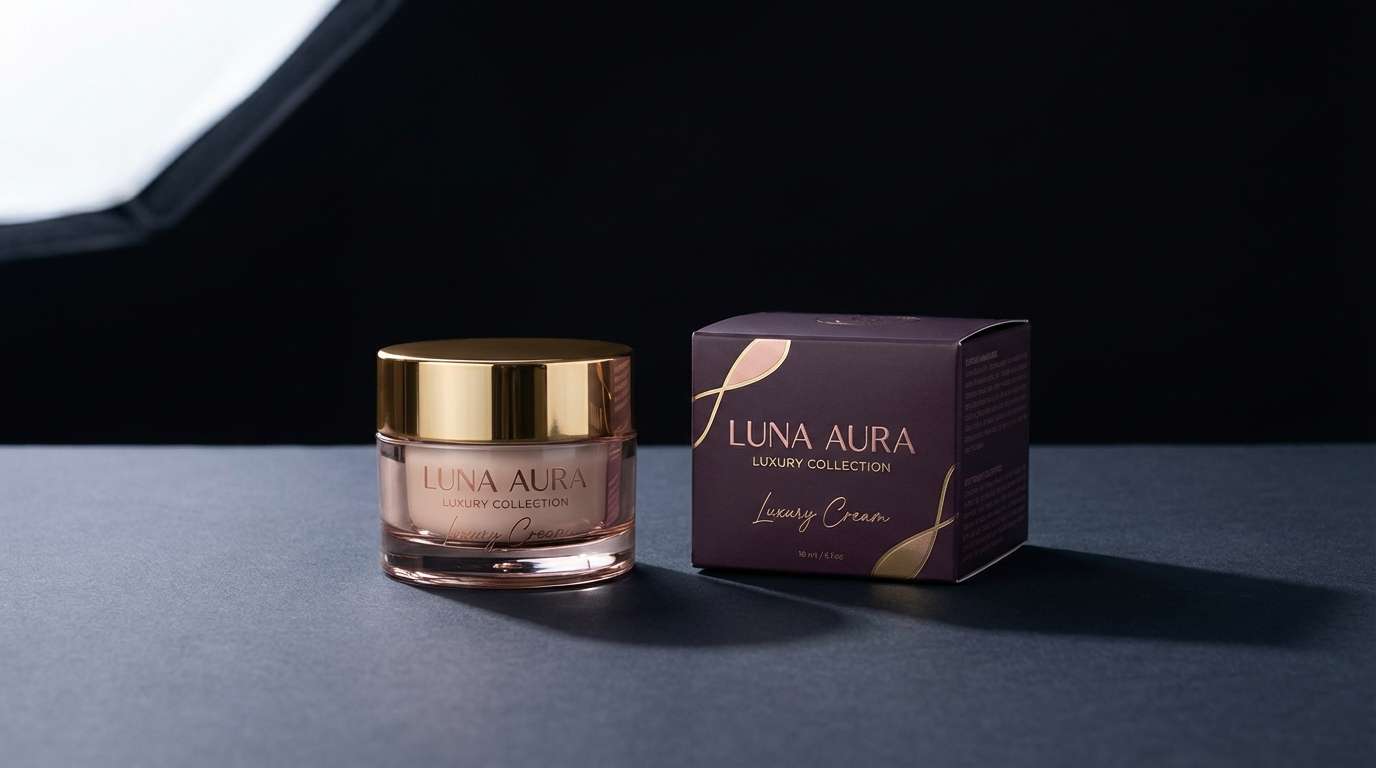
4) Plum Velvet
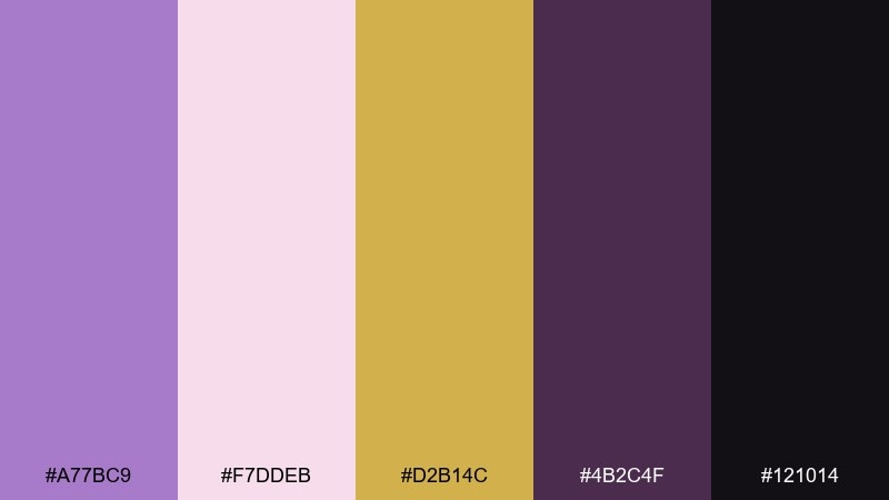
HEX: #A77BC9 #F7DDEB #D2B14C #4B2C4F #121014
Mood: dramatic, luxe, glamorous
Best for: beauty product ads and premium promos
Velvety purple and deep plum read like stage curtains and glossy lipstick. The soft blush keeps it wearable, while the antique gold adds instant premium energy for beauty, fragrance, and jewelry. Pair gold with minimal type and let the darkest tones create depth through shadows. Usage tip: use metallic foil or spot UV on the gold to make it pop in print.
Image example of plum velvet generated using media.io
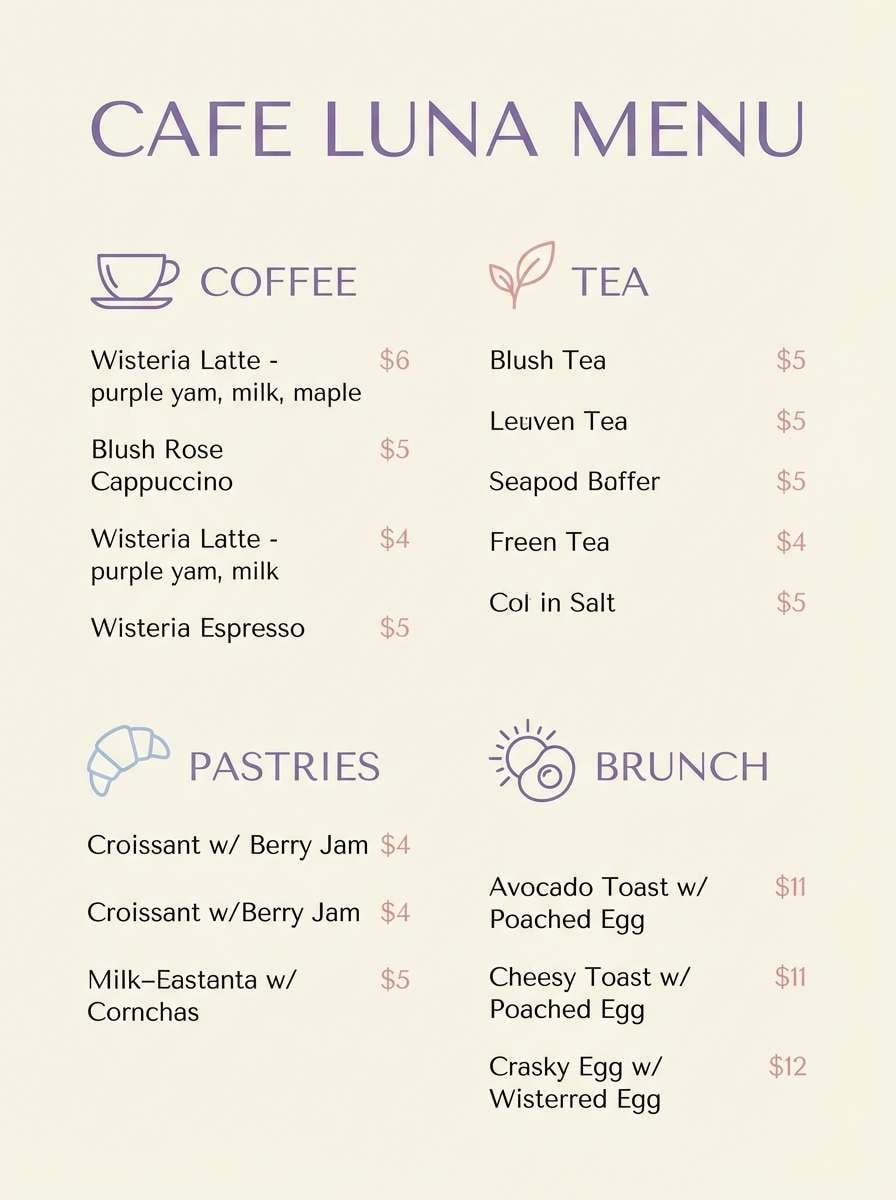
5) Paris Cafe Pastel
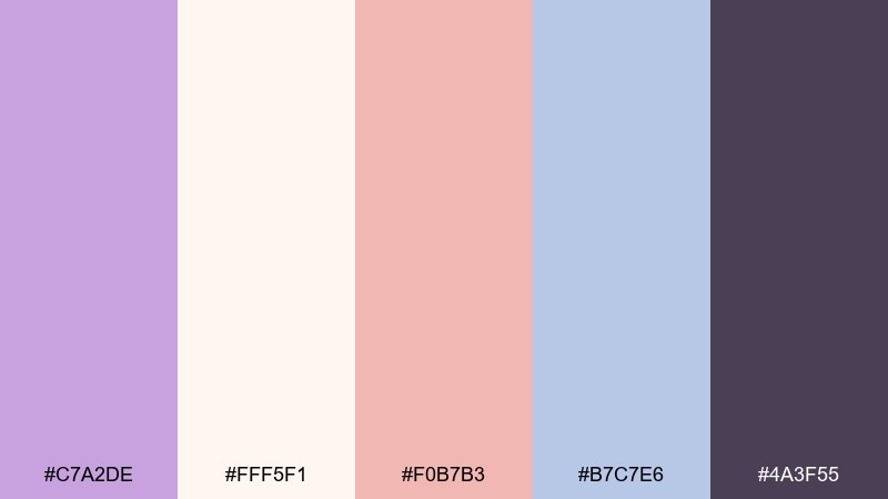
HEX: #C7A2DE #FFF5F1 #F0B7B3 #B7C7E6 #4A3F55
Mood: sweet, chic, inviting
Best for: cafe menus and dessert branding
Sweet lilac with whipped-cream white feels like macarons in a glass case. The blush and powder blue add playful contrast without overpowering the main purple. Pair the dark mauve for readable headings and simple icons so the pastels stay elegant. Usage tip: limit blue to section dividers or small badges to keep the menu cohesive.
Image example of paris cafe pastel generated using media.io
6) Orchid Neon Pop
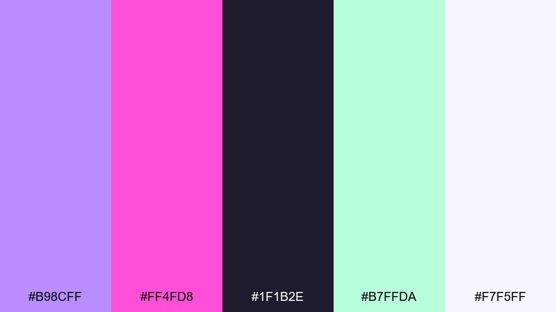
HEX: #B98CFF #FF4FD8 #1F1B2E #B7FFDA #F7F5FF
Mood: energetic, playful, futuristic
Best for: music event posters and streaming promos
Electric orchid and hot pink feel like club lights cutting through haze. Use it for youth-oriented posters, music drops, and bold social promos where contrast matters. Pair mint as a highlight color for stickers, dates, or key buttons, then keep the dark navy as your base. Usage tip: apply a subtle grain texture to prevent the neon tones from looking flat.
Image example of orchid neon pop generated using media.io

7) Coastal Lavender
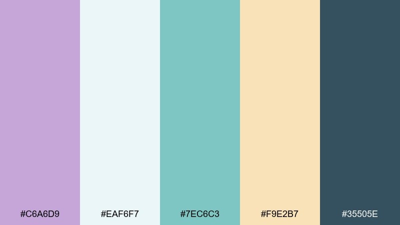
HEX: #C6A6D9 #EAF6F7 #7EC6C3 #F9E2B7 #35505E
Mood: fresh, breezy, optimistic
Best for: travel headers and lifestyle blog graphics
Breezy purple with seafoam and sunlit sand feels like a calm seaside morning. It suits travel blogs, wellness newsletters, and light product launches that want an airy, clean mood. Pair teal for buttons and links, then keep slate-blue for readable navigation and captions. Usage tip: let the pale aqua act as negative space so the lavender stays soft, not heavy.
Image example of coastal lavender generated using media.io

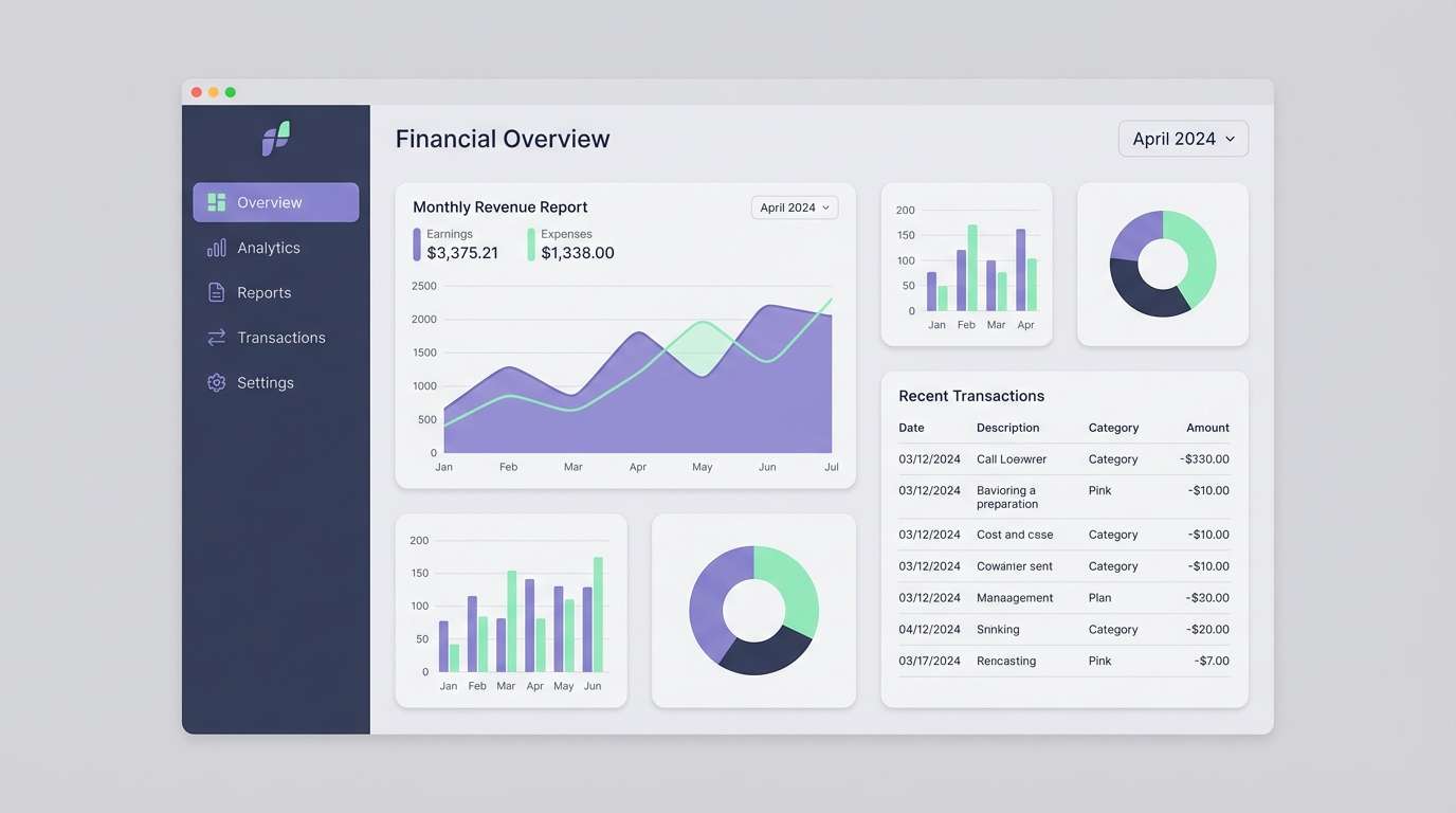
8) Moonlit Slate
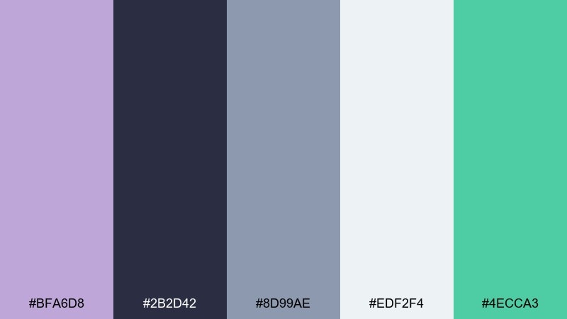
HEX: #BFA6D8 #2B2D42 #8D99AE #EDF2F4 #4ECCA3
Mood: sleek, confident, techy
Best for: finance dashboards and app UI themes
Moonlit purple against slate and cool gray feels crisp and trustworthy. This wisteria color scheme fits fintech, analytics, and productivity tools where calm clarity matters. Pair the mint as a success state or active highlight, while keeping most surfaces in near-white for legibility. Usage tip: reserve the wisteria tone for key navigation and charts to avoid visual noise.
Image example of moonlit slate generated using media.io
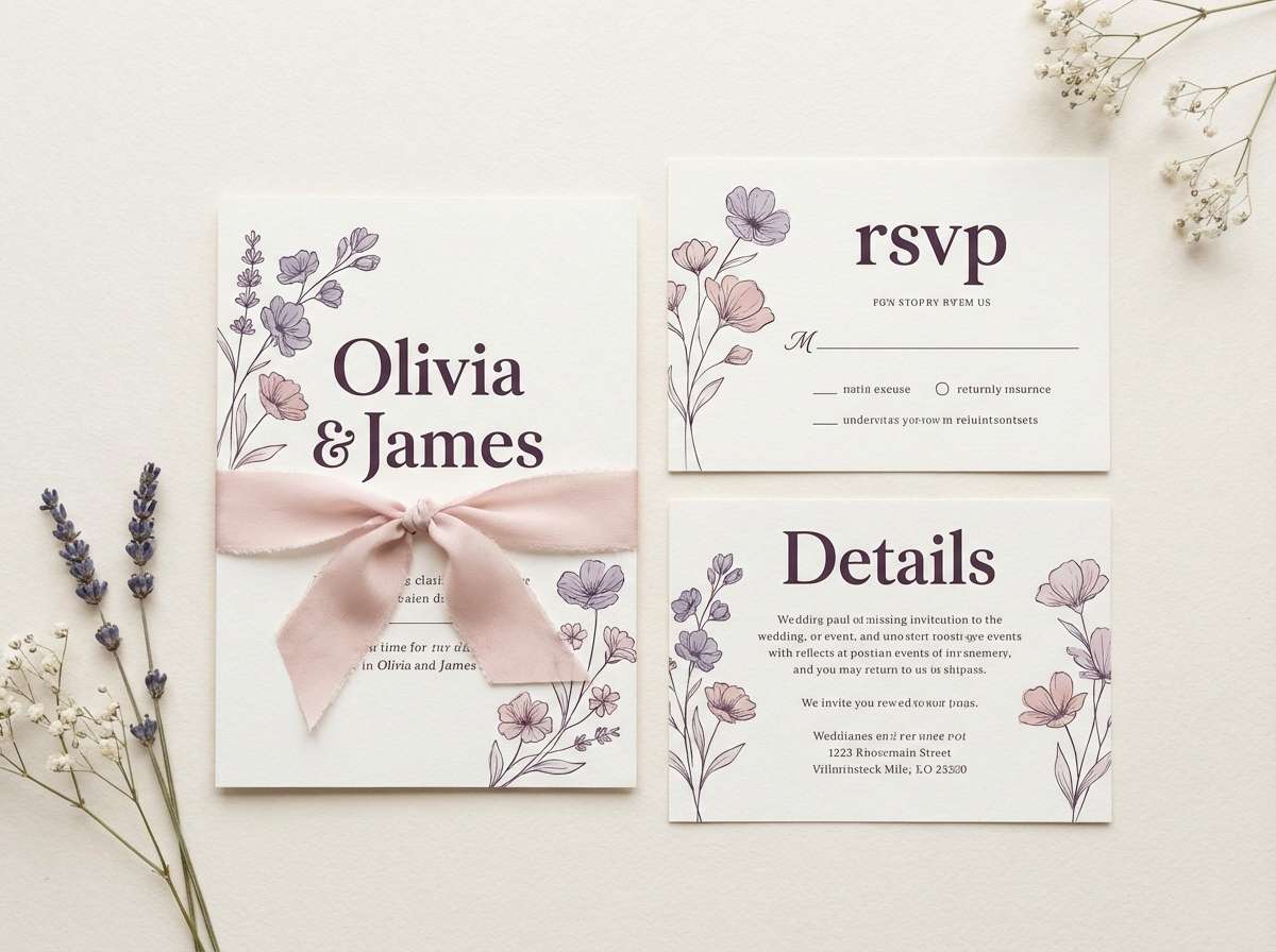
9) Rosewater Wisteria
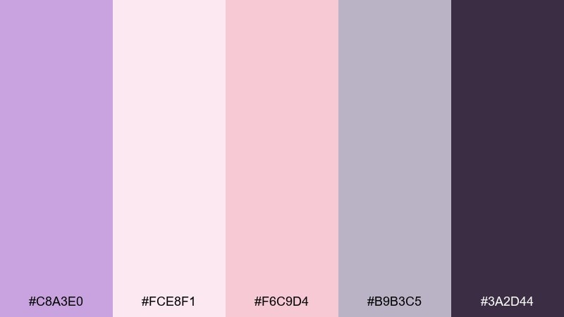
HEX: #C8A3E0 #FCE8F1 #F6C9D4 #B9B3C5 #3A2D44
Mood: tender, romantic, elegant
Best for: wedding invitations and bridal stationery
Tender lavender and rosewater blush feel like silk ribbons and fresh petals. It works beautifully for invitations, save-the-dates, and day-of signage that needs a soft, upscale tone. Pair the mauve-gray for secondary text and use the deep aubergine for monograms or borders. Usage tip: keep contrast high on small text to prevent blush backgrounds from washing out.
Image example of rosewater wisteria generated using media.io
10) Matcha and Mauve
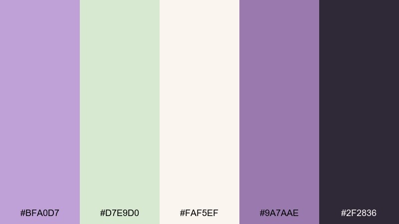
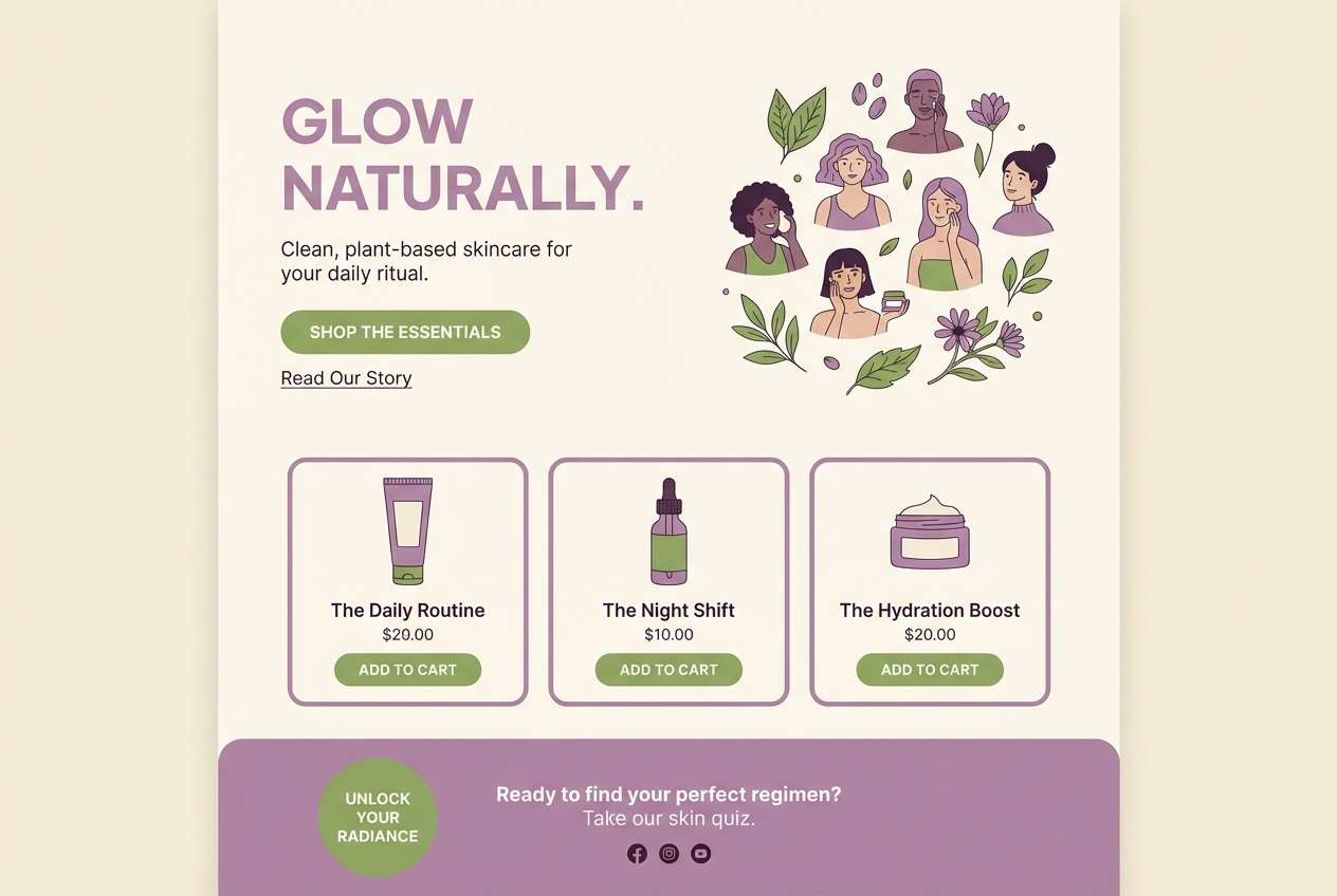
HEX: #BFA0D7 #D7E9D0 #FAF5EF #9A7AAE #2F2836
Mood: calming, natural, modern
Best for: wellness landing pages and subscription brands
Soft mauve with matcha green feels like a slow morning routine and warm tea. Use it for wellness, coaching, or skincare brands that want a natural vibe without leaning too earthy. Pair the deeper purple for headings and the near-black for buttons to keep contrast accessible. Usage tip: use the cream as the main canvas and let green highlight key benefits or icons.
Image example of matcha and mauve generated using media.io
11) Iridescent Night
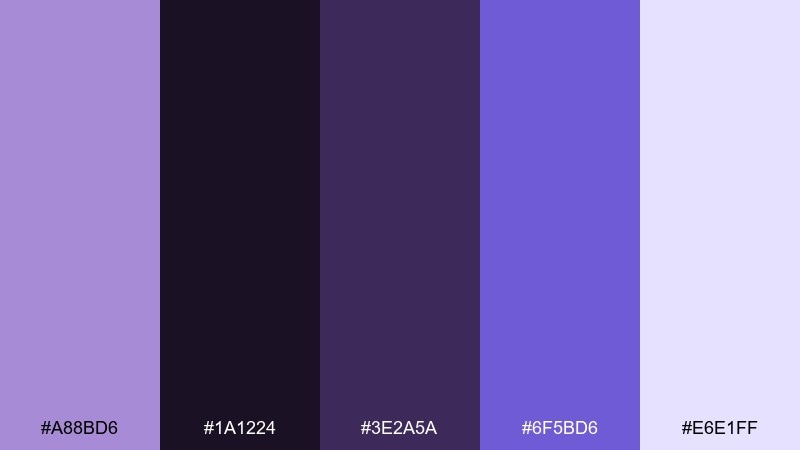
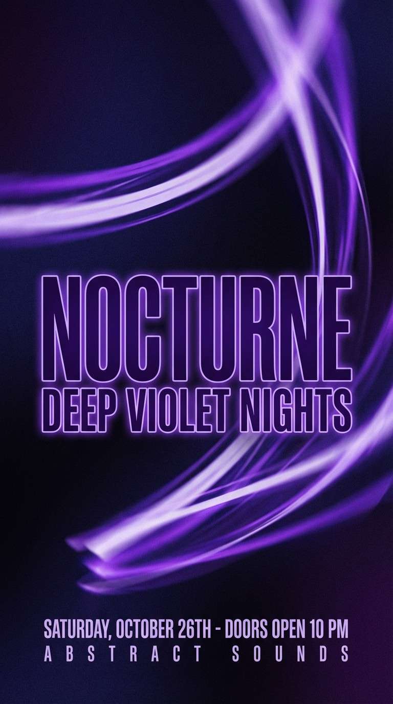
HEX: #A88BD6 #1A1224 #3E2A5A #6F5BD6 #E6E1FF
Mood: mysterious, cinematic, bold
Best for: nightlife flyers and performance promos
Inky purple and violet glow feel like city lights reflecting on rain. It is perfect for nightlife flyers, theater promos, or dramatic album announcements. Pair the electric violet for titles and use the pale lavender as a subtle haze behind text blocks. Usage tip: keep backgrounds mostly dark and add glow effects sparingly for premium impact.
Image example of iridescent night generated using media.io
12) Minimal Studio

HEX: #C5A7DE #FFFFFF #ECE7F2 #6C6474 #111015
Mood: minimal, airy, professional
Best for: portfolio websites and clean UI systems
Clean whites with a whisper of lavender feel like a bright studio with soft shadows. It suits portfolios, SaaS landing pages, and brand guidelines where typography needs to lead. Pair the mid-gray for secondary text and keep black for primary actions and strong hierarchy. Usage tip: apply the purple only to key interactive states like hover, focus, and selected tabs.
Image example of minimal studio generated using media.io
13) Autumn Heather
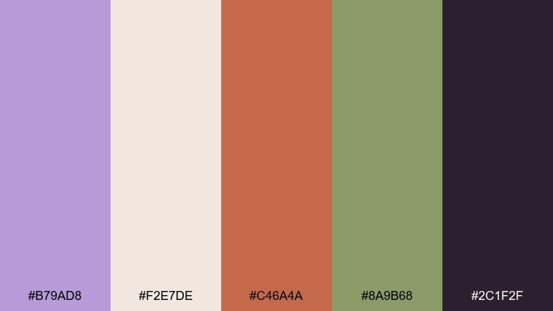
HEX: #B79AD8 #F2E7DE #C46A4A #8A9B68 #2C1F2F
Mood: warm, rustic, grounded
Best for: seasonal campaigns and autumn posts
Heather purple with clay and olive feels like late-afternoon light in early fall. Use it for seasonal campaigns, cozy blog graphics, or artisan goods where warmth matters. Pair clay as the main accent and keep deep plum for strong typography and icons. Usage tip: avoid using all warm tones at once; let one accent dominate to keep the layout clean.
Image example of autumn heather generated using media.io

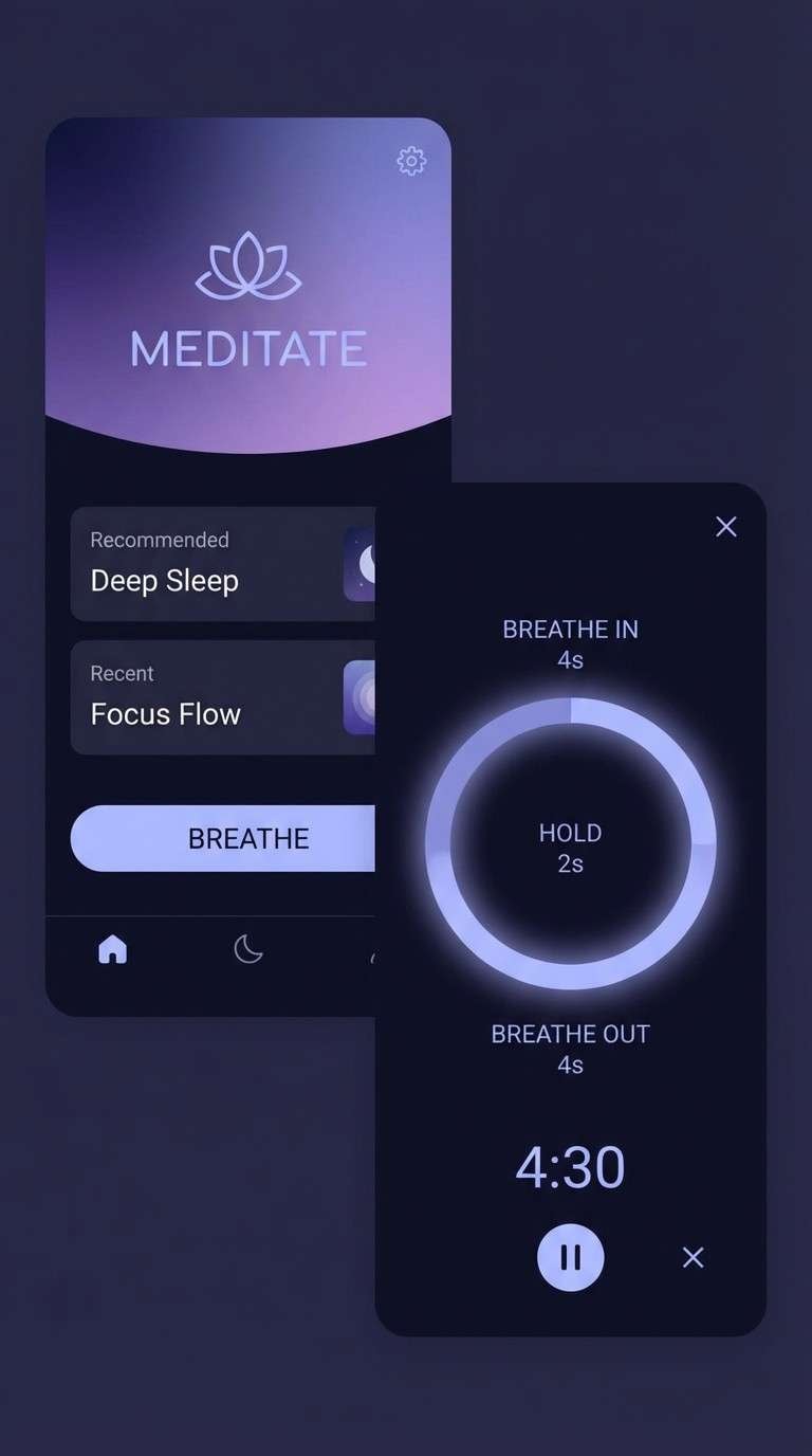
14) Celestial Gradient
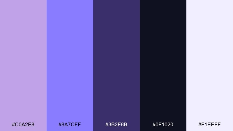
HEX: #C0A2E8 #8A7CFF #3B2F6B #0F1020 #F1EEFF
Mood: dreamy, cosmic, modern
Best for: meditation apps and ambient UI themes
Dreamy purples shifting into midnight tones feel like a sky full of quiet stars. It fits meditation apps, sleep podcasts, and calming UI where depth and softness need to coexist. Pair the light lavender as your breathing room and use the bright periwinkle for progress and active states. Usage tip: use subtle gradients in backgrounds while keeping text on solid dark panels for readability.
Image example of celestial gradient generated using media.io
15) Artisan Pottery
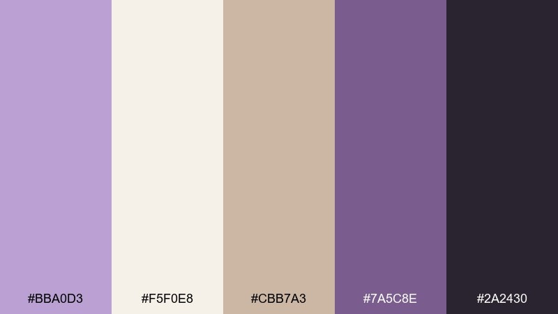
HEX: #BBA0D3 #F5F0E8 #CBB7A3 #7A5C8E #2A2430
Mood: handmade, cozy, tactile
Best for: ceramic packaging and craft shop branding
Soft purple with clay-beige neutrals feels like handmade mugs on a studio shelf. It is ideal for pottery, home goods, and small-batch brands that want warmth without losing polish. Pair the deeper mauve for logos and stamps, and keep the near-black for barcodes and ingredient panels. Usage tip: use textured paper labels to match the tactile mood.
Image example of artisan pottery generated using media.io
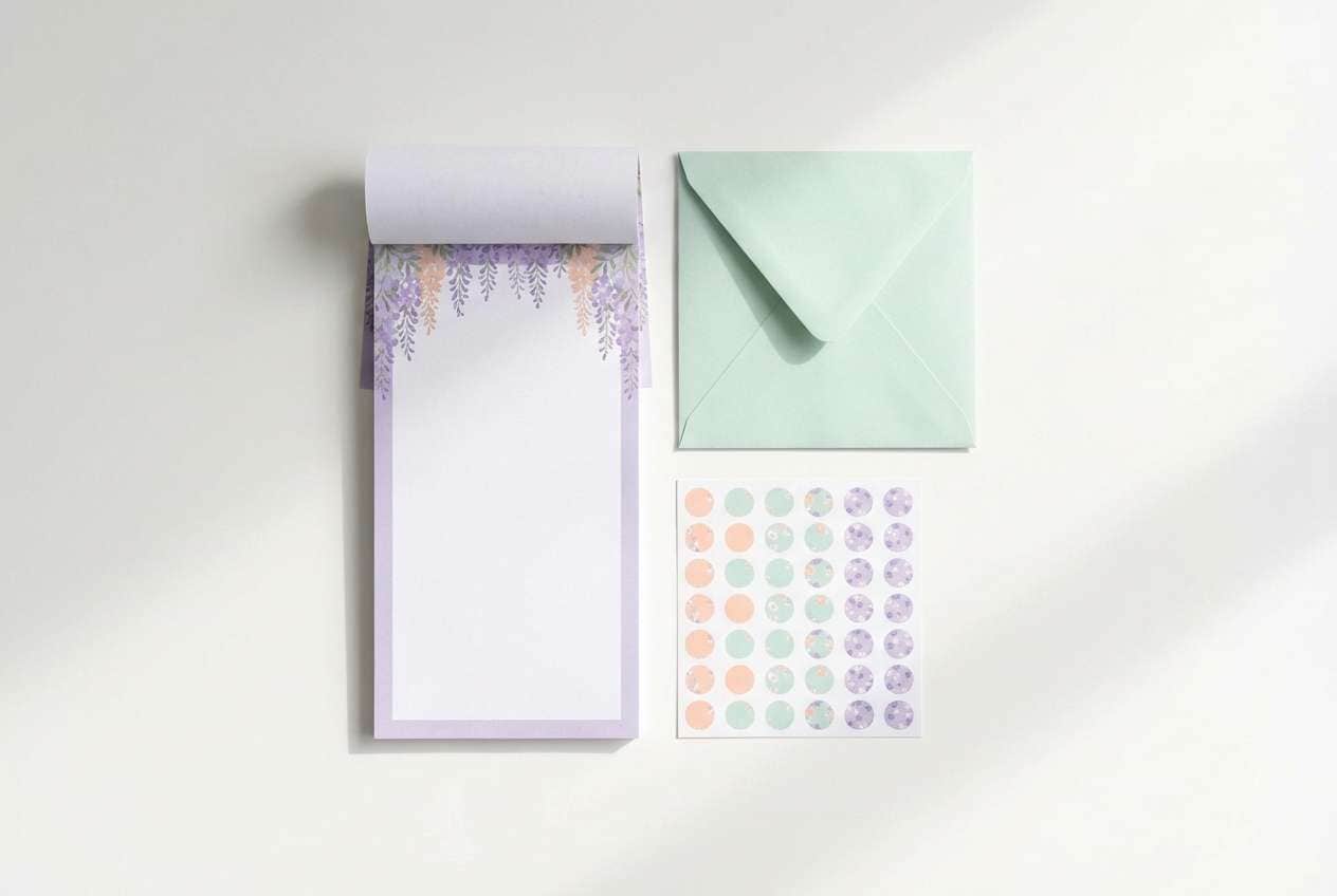
16) Spring Stationery
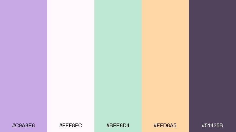
HEX: #C9A8E6 #FFF8FC #BFE8D4 #FFD6A5 #51435B
Mood: fresh, cheerful, gentle
Best for: stationery sets and planner inserts
Fresh lavender with mint and peach feels like new notebooks and spring blooms. Use it for planner pages, sticker packs, classroom printables, and friendly brand collateral. Pair the dark mauve for headings and outlines, while keeping most surfaces in the soft whites and pastels. Usage tip: keep peach for highlights only so pages stay airy and easy to scan.
Image example of spring stationery generated using media.io
17) Luxe Bridal
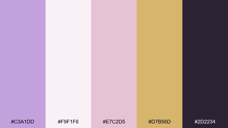
HEX: #C3A1DD #F9F1F6 #E7C2D5 #D7B56D #2D2234
Mood: romantic, luxurious, timeless
Best for: bridal lookbooks and wedding mood art
Romantic purple with blush and soft champagne gold feels like satin, pearls, and candlelight. These wisteria color combinations suit bridal lookbooks, venue brochures, and premium wedding planners who want a refined glow. Pair gold with minimal ornamentation and keep the deep plum for elegant typography and separators. Usage tip: use a warm white base and add gold only where you want the eye to linger.
Image example of luxe bridal generated using media.io
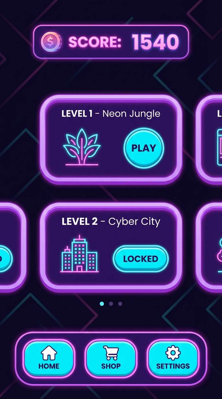
18) Retro Arcade
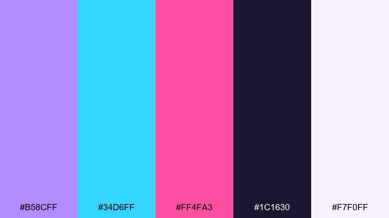
HEX: #B58CFF #34D6FF #FF4FA3 #1C1630 #F7F0FF
Mood: fun, high-contrast, retro
Best for: game UI and playful app themes
Punchy purple with cyan and pink feels like neon signs and high scores. It is great for casual games, youth apps, and campaign microsites that need a loud, memorable look. Pair the dark base for screens and menus, then use cyan for primary actions and pink for badges or rewards. Usage tip: keep the light background for splash screens only so the neon accents stay strong.
Image example of retro arcade generated using media.io
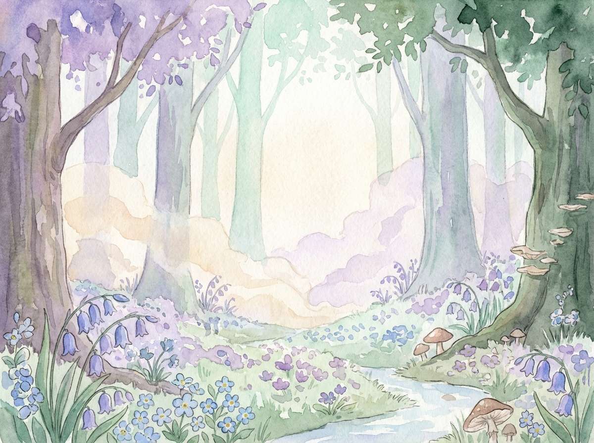
19) Forest Fairy
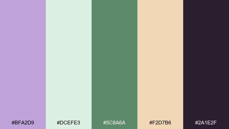
HEX: #BFA2D9 #DCEFE3 #5C8A6A #F2D7B6 #2A1E2F
Mood: whimsical, natural, storybook
Best for: fantasy illustrations and nature brands
Whimsical lavender and forest greens feel like hidden paths and soft magic. Use it for nature-focused brands, eco events, or illustrated storytelling where you want gentle wonder. Pair the deep evergreen for titles and frames, and let the cream-beige act as warm light in the scene. Usage tip: add tiny line details in the dark tone to keep the illustration readable at small sizes.
Image example of forest fairy generated using media.io
20) Editorial Ink
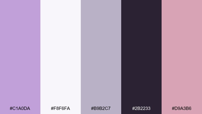
HEX: #C1A0DA #F8F6FA #B9B2C7 #2B2233 #D9A3B6
Mood: editorial, stylish, balanced
Best for: magazine layouts and lookbooks
Stylish lavender with ink-black and cool grays feels like a modern fashion spread. Use it for magazine layouts, lookbooks, and client decks that need quiet sophistication. Pair blush as a subtle callout color for pull quotes and section tags, while keeping most typography in the deep ink. Usage tip: stick to one accent per page and let whitespace do the heavy lifting.
Image example of editorial ink generated using media.io
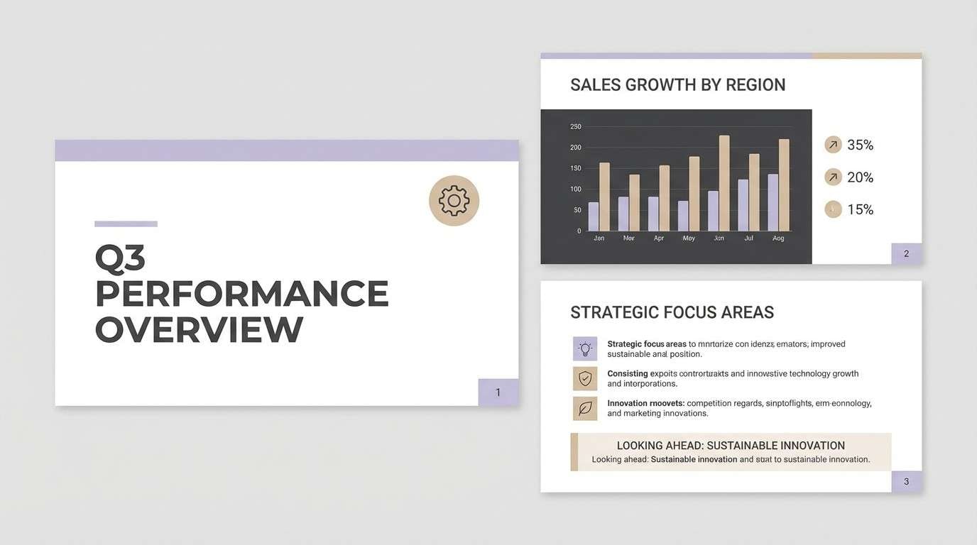
21) Soft Charcoal Bloom
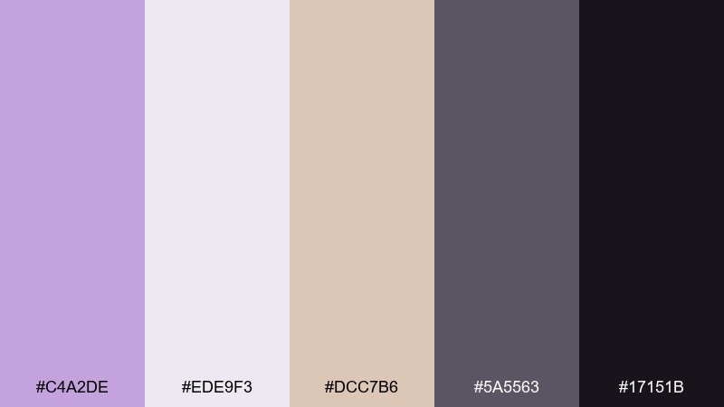
HEX: #C4A2DE #EDE9F3 #DCC7B6 #5A5563 #17151B
Mood: mature, cozy, understated
Best for: corporate presentations and calm brand decks
Understated lavender with charcoal shadows feels like fresh blooms in a modern office. The warm beige keeps it human, making it a strong choice for calm corporate decks and service brands. Pair charcoal for charts and headlines, then use the light lilac as section backgrounds. Usage tip: keep accent color use below 15 percent to maintain a polished, professional tone.
Image example of soft charcoal bloom generated using media.io
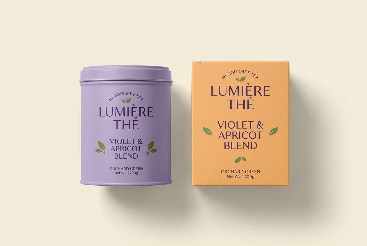
22) Gilded Orchard
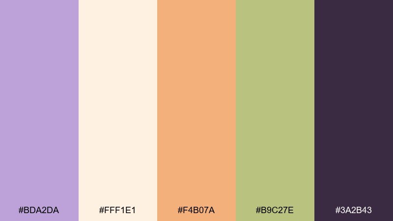
HEX: #BDA2DA #FFF1E1 #F4B07A #B9C27E #3A2B43
Mood: sunny, artisanal, upscale
Best for: gourmet food packaging and small-batch ads
Sunny lavender with apricot and orchard green feels like a farmers market with a premium twist. It works well for gourmet snacks, tea blends, and artisanal packaging where you want warmth and clarity. Pair the deep violet for ingredient lists and brand marks, and use cream as the main label base. Usage tip: let apricot lead in hero photography and keep purple for brand consistency across SKUs.
Image example of gilded orchard generated using media.io
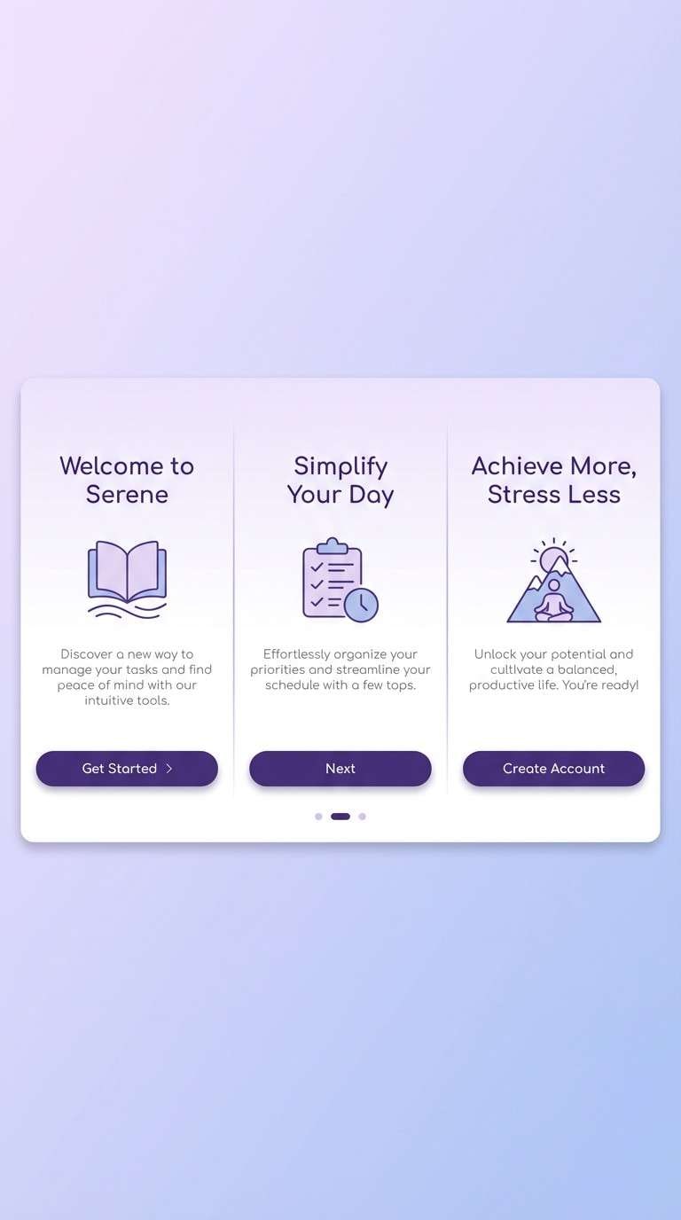
23) Quiet Gradient UI
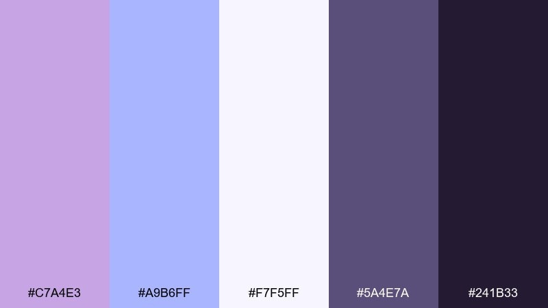
HEX: #C7A4E3 #A9B6FF #F7F5FF #5A4E7A #241B33
Mood: soft, modern, focused
Best for: product UI and onboarding screens
Soft purple fading into periwinkle feels like a gentle sunrise on glass. These wisteria color combinations are especially useful for onboarding screens where you want a welcoming glow without sacrificing contrast. Pair the light tone as your main canvas and use the deep violet for primary buttons and key labels. Usage tip: keep gradients subtle and reserve the darkest color for one clear call to action per screen.
Image example of quiet gradient ui generated using media.io
What Colors Go Well with Wisteria?
Wisteria looks especially clean with soft neutrals like warm white, cream, parchment, and light gray. These keep the purple airy and help it feel premium instead of overly “cute.”
For contrast, pair it with charcoal, deep plum, ink-black, or slate navy—great for type, UI controls, borders, and icons. If you want a fresher mood, add mint, seafoam, or sage as a calming secondary.
For a more celebratory direction, blush pink and champagne gold give wisteria a romantic, luxe lift. Use metallic gold sparingly (or as foil/spot UV in print) to keep the palette refined.
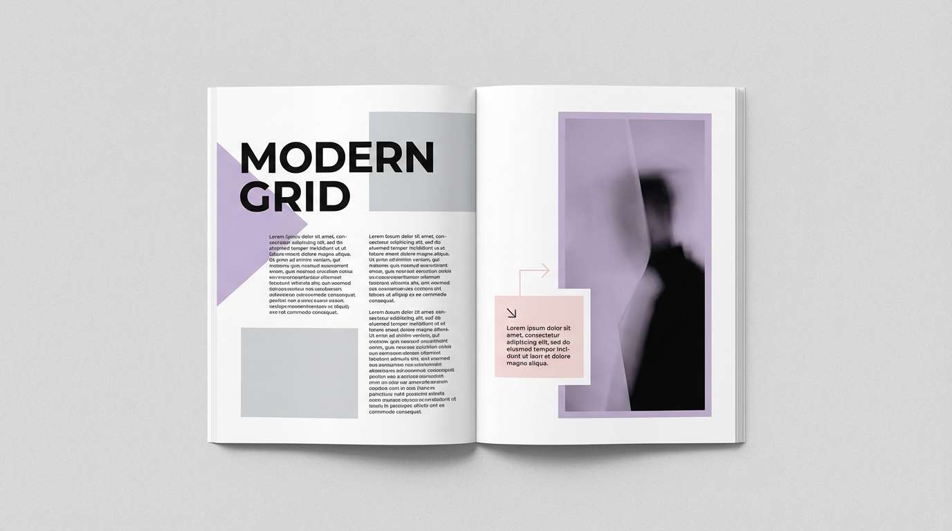
How to Use a Wisteria Color Palette in Real Designs
In UI, treat wisteria as a brand accent: navigation highlights, active states, badges, and chart series. Keep most surfaces neutral and ensure text contrast stays accessible, especially on blush or lavender backgrounds.
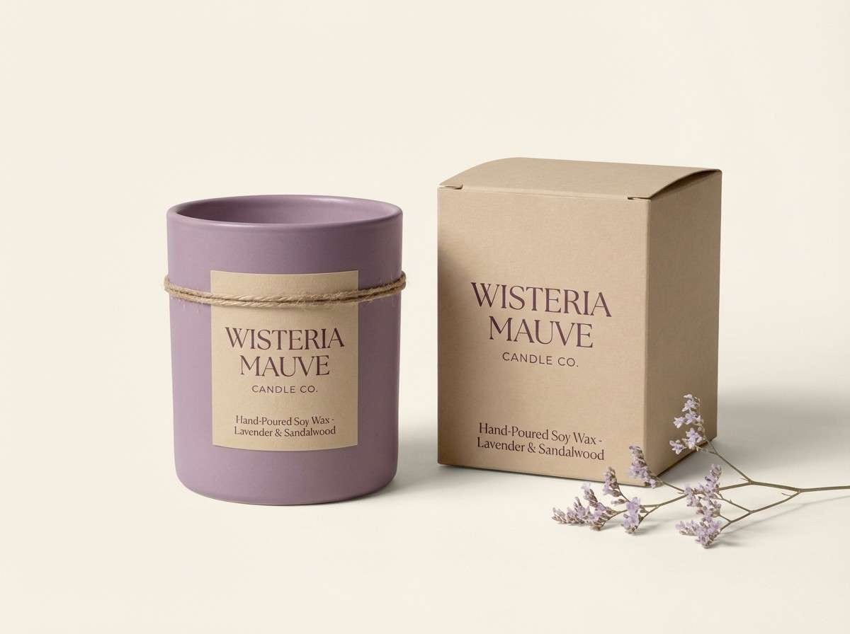
In branding and packaging, anchor wisteria with a deep “ink” tone for logos and ingredient text, then let lighter lilacs do the mood work. If you’re printing, test on your chosen stock—uncoated paper often makes purples feel softer and more natural.
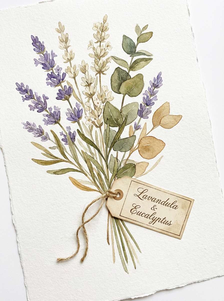
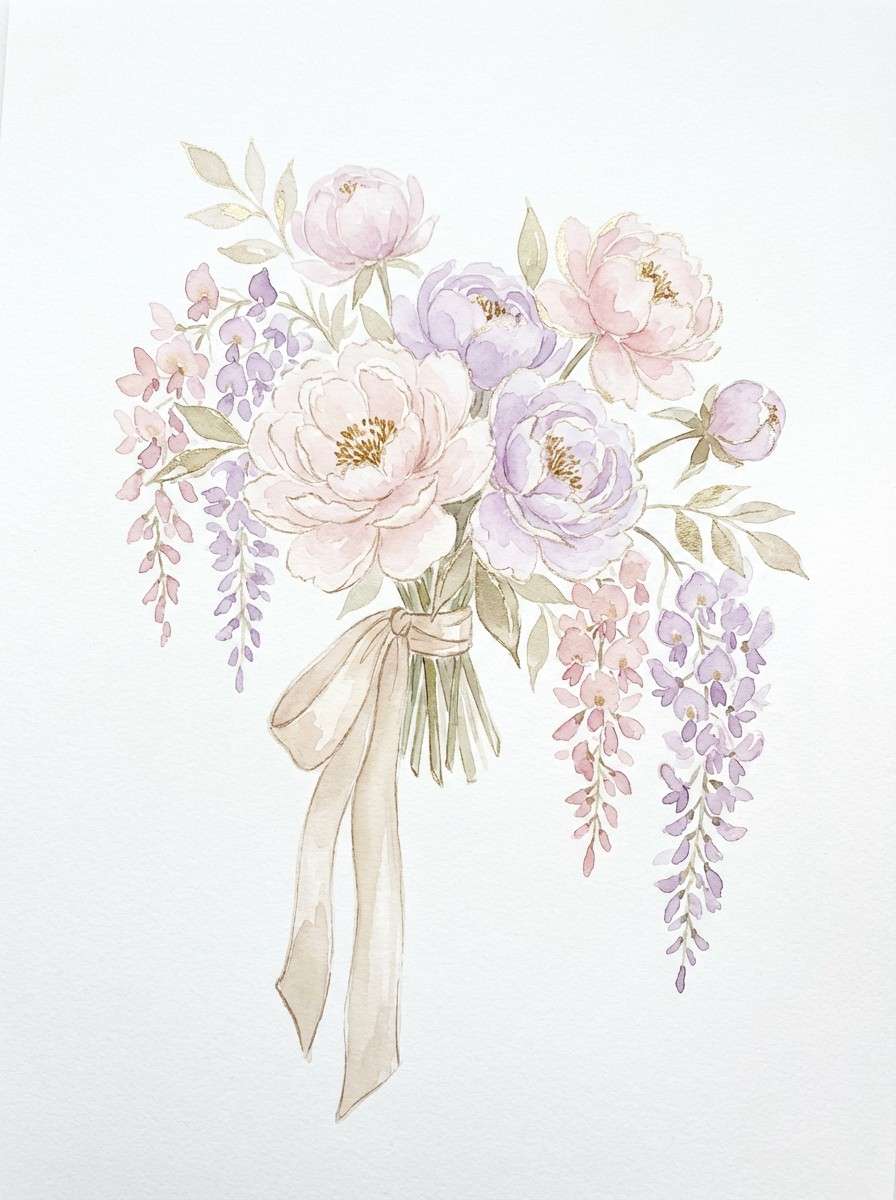
For weddings and stationery, wisteria shines in layered details: monograms, borders, and floral line art. Balance it with warm whites and add one supporting accent (blush, sage, or gold) so the suite feels cohesive.
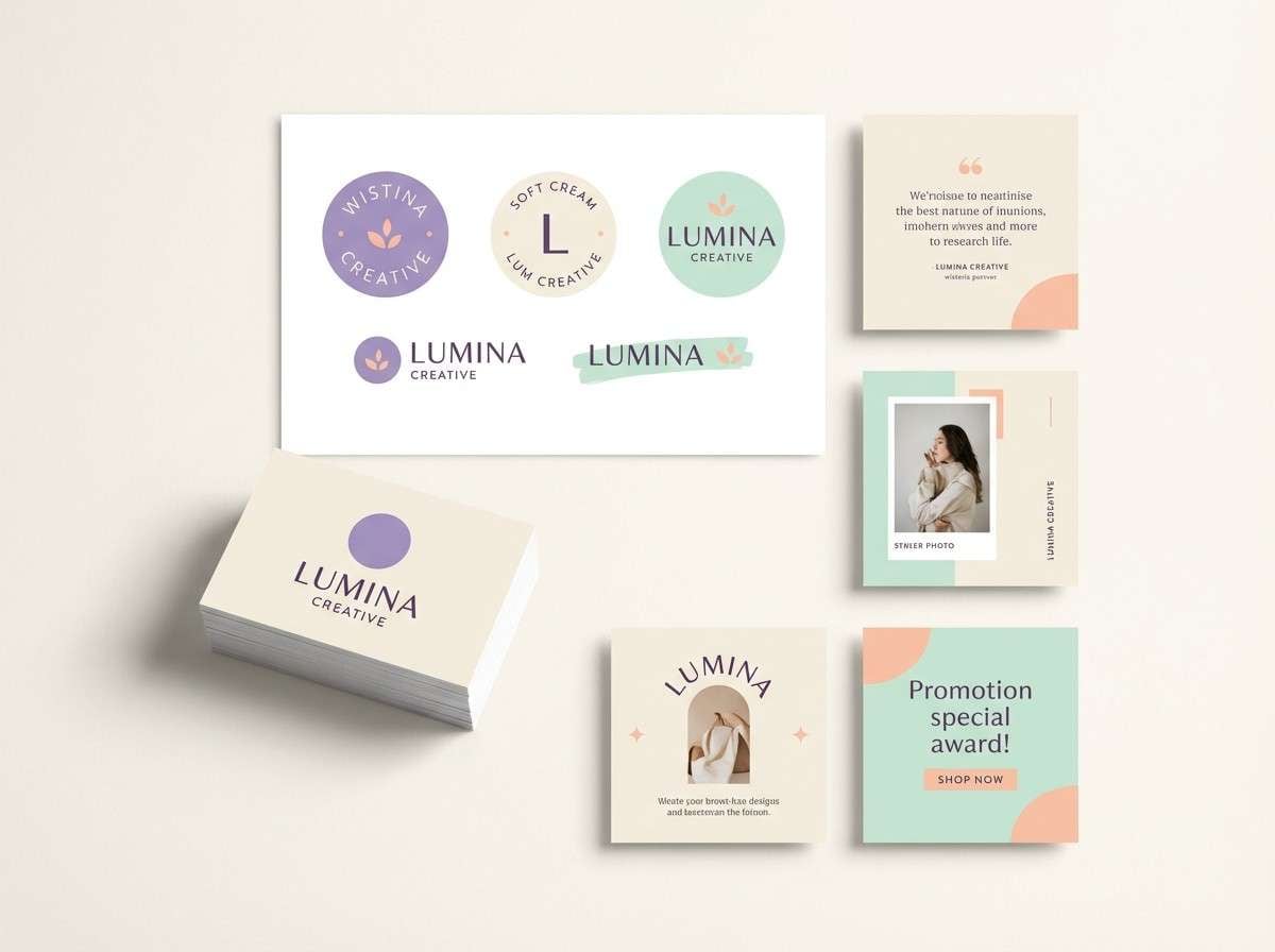
Create Wisteria Palette Visuals with AI
If you already have HEX codes, the next step is seeing them “in context” on posters, invitations, UI mockups, or packaging. That’s where AI-generated examples help you validate mood, contrast, and hierarchy fast.
With Media.io’s Text to Image, you can describe the layout you need (menu, dashboard, label, flyer) and specify wisteria plus your supporting tones. Iterate prompts to test different lighting, paper textures, and typography styles.
Once you like a direction, generate multiple variations to compare, then pick the strongest visual for your campaign or brand kit.
Wisteria Color Palette FAQs
-
What color is wisteria (in design terms)?
Wisteria is typically a soft, floral purple that sits between lavender and lilac. In digital design, it often appears as a light-to-mid purple with a gentle pink or blue undertone, depending on the palette. -
Is wisteria a good brand color?
Yes—wisteria can feel modern, calming, and premium. It works especially well for beauty, wellness, boutique retail, and editorial brands when paired with clean neutrals and a dark ink color for contrast. -
What are the best neutral pairings for wisteria?
Warm white, cream, parchment, light gray, and charcoal are the easiest neutrals to pair with wisteria. They keep layouts readable and let the purple stay soft instead of overpowering the design. -
What accent colors go well with a wisteria palette?
Sage, mint, and seafoam add fresh balance; blush and rose tones add romance; gold adds a luxe highlight; slate blue or navy adds a techy, confident edge. -
How do I keep wisteria UI colors accessible?
Use wisteria for accents and states (selected tabs, focus rings, charts), not for long text. Put body text on white or near-white surfaces, and use charcoal/near-black for primary text to maintain strong contrast. -
Does wisteria print accurately?
Purple hues can shift between screens and print, so it’s best to run a proof. Paper choice matters: uncoated stocks soften wisteria, while glossy stocks make it brighter and more saturated.
Next: Malachite Color Palette


