

Malachite is a vivid green that instantly signals freshness, growth, and modern energy. In palettes, it can swing from calm and minimal to electric and nightlife-ready—depending on the neutrals and accents you pair with it.
Below are 20+ malachite color palette ideas with HEX codes, plus practical guidance for using them in branding, UI, and print without overpowering your layout.
In this article
- Why Malachite Palettes Work So Well
-
- emerald jungle
- vintage botanical
- dark academia green
- tropical lagoon
- minimal mint studio
- art deco marble
- sunset over green
- forest and linen
- neon garden night
- spa serenity
- modern museum
- rustic herb market
- cyber mint ui
- wedding sage glam
- sports energy
- coastal aloe
- winter evergreen
- clay and malachite
- orchid contrast
- monochrome malachite
- citrus green pop
- What Colors Go Well with Malachite?
- How to Use a Malachite Color Palette in Real Designs
- Create Malachite Palette Visuals with AI
Why Malachite Palettes Work So Well
Malachite sits in a sweet spot: bright enough to feel modern and confident, but still “natural” enough to read as healthy, eco-friendly, and approachable. That makes it versatile for both brand identity and interface design.
It also pairs easily because it can act as either a hero color (buttons, key visuals) or a supporting accent (icons, tags, highlights). With the right neutrals—cream, warm white, charcoal, greige—it stays readable and premium instead of neon.
Finally, malachite plays well with warm accents (gold, terracotta, coral, sand) for contrast that feels human and tactile, while cooler accents (mint, teal) keep things crisp, techy, and refreshing.
20+ Malachite Color Palette Ideas (with HEX Codes)
1) Emerald Jungle
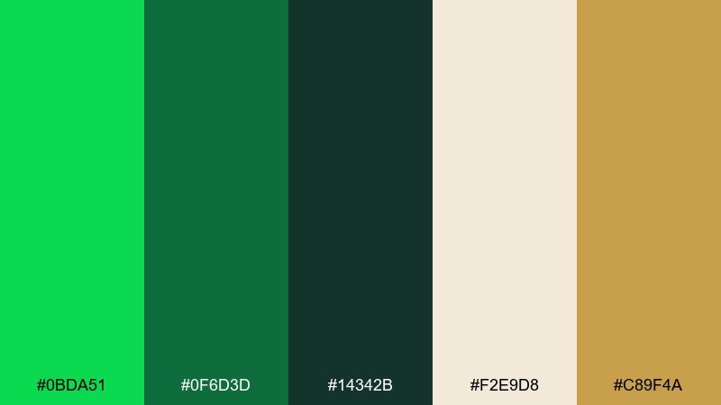
HEX: #0BDA51 #0F6D3D #14342B #F2E9D8 #C89F4A
Mood: lush, adventurous, grounded
Best for: outdoor brand identity and packaging
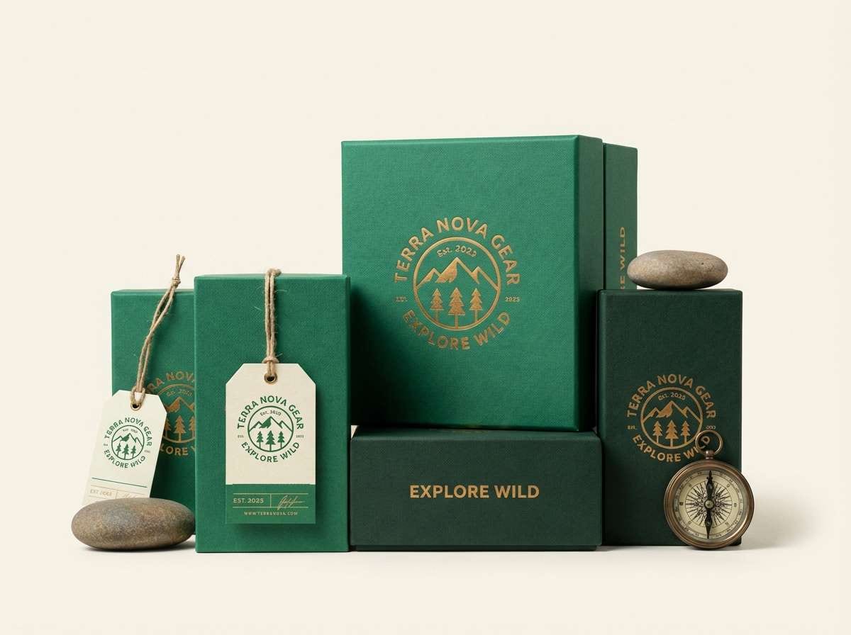
Lush and adventurous, it feels like dense leaves, warm sun, and well-worn trail gear. Use the deep greens as your foundation and let the linen cream keep layouts breathable. The golden accent adds premium energy without turning flashy. Tip: reserve the gold for small details like seals, icons, or a single headline underline.
Image example of emerald jungle generated using media.io
Media.io is an online AI studio for creating and editing video, image, and audio in your browser.

2) Vintage Botanical
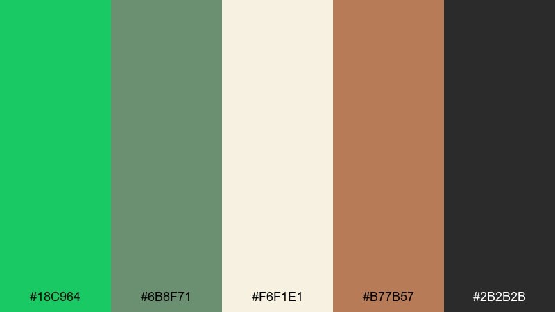
HEX: #18C964 #6B8F71 #F6F1E1 #B77B57 #2B2B2B
Mood: nostalgic, soft, editorial
Best for: botanical poster and stationery
Nostalgic and soft, it evokes pressed leaves in an old journal with a hint of terracotta ink. Pair the malachite green with sage to create gentle depth, then let the cream do the heavy lifting for readability. The warm clay note keeps it human and tactile. Tip: use the near-black for type only, not large blocks, to preserve the airy vintage feel.
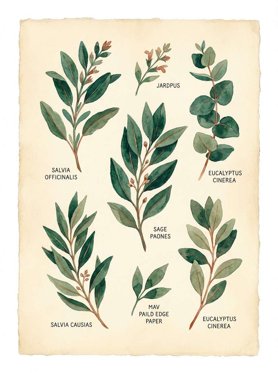
Image example of vintage botanical generated using media.io
3) Dark Academia Green
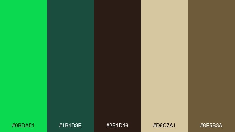
HEX: #0BDA51 #1B4D3E #2B1D16 #D6C7A1 #6E5B3A
Mood: moody, scholarly, cinematic
Best for: book cover and editorial layout
Moody and scholarly, it suggests library shadows, leather spines, and a green desk lamp glow. This malachite color palette works best when the brown and charcoal act as the base and the bright green is treated like a highlight. Cream paper tones keep paragraphs comfortable to read. Tip: set the malachite as a single focal element, such as a title stamp or small emblem.
Image example of dark academia green generated using media.io
4) Tropical Lagoon
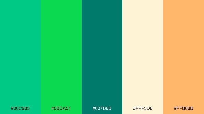
HEX: #00C985 #0BDA51 #007B6B #FFF3D6 #FFB86B
Mood: sunny, playful, refreshing
Best for: summer event flyer design
Sunny and refreshing, it feels like lagoon water, palm shade, and a citrus drink on ice. Let the teal-green duo carry the background shapes while the cream keeps text crisp. The soft orange makes calls to action pop without looking aggressive. Tip: use orange only for one priority element per section to avoid a scattered look.
Image example of tropical lagoon generated using media.io

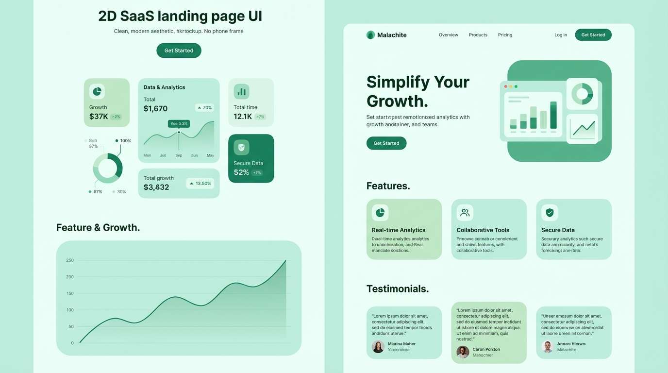
5) Minimal Mint Studio
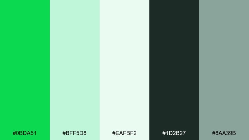
HEX: #0BDA51 #BFF5D8 #EAFBF2 #1D2B27 #8AA39B
Mood: clean, modern, calm
Best for: SaaS landing page UI mockup
Clean and calm, it reads like a bright studio with matte surfaces and quiet focus. Use the pale mints for sections and cards, then anchor navigation and headings with the charcoal green. A single strong malachite button color gives clear hierarchy for actions. Tip: keep shadows subtle and rely on spacing and contrast instead of heavy borders.
Image example of minimal mint studio generated using media.io
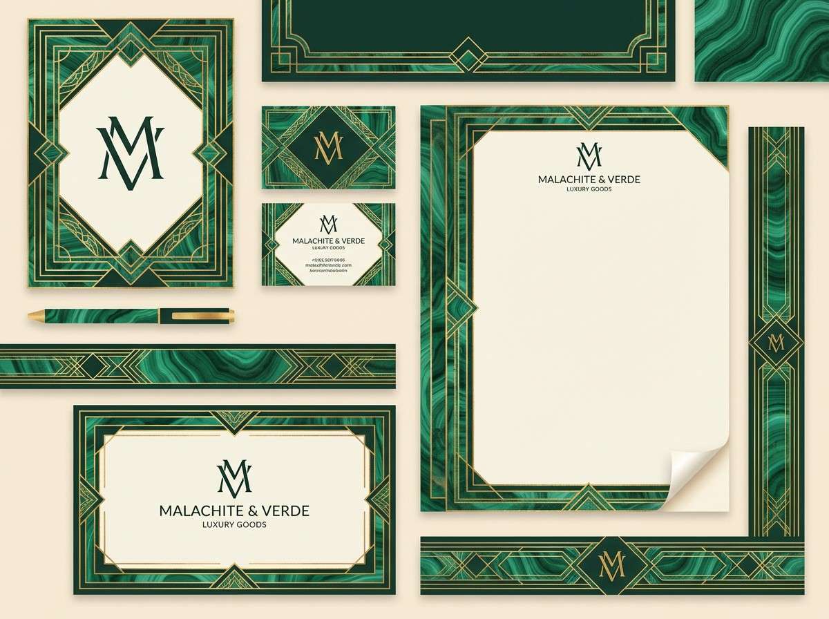
6) Art Deco Marble
HEX: #0BDA51 #0A3D2E #F4F0E8 #C7A86B #1A1A1A
Mood: glamorous, structured, upscale
Best for: luxury salon brand kit
Glamorous and structured, it recalls marble counters, brass trims, and sharp geometric lines. This malachite color scheme shines when you keep the cream as the main canvas and build contrast with near-black type. Gold works best as thin rules, monograms, and icon strokes. Tip: choose one Deco pattern scale and repeat it consistently across cards, bags, and signage.
Image example of art deco marble generated using media.io
7) Sunset Over Green
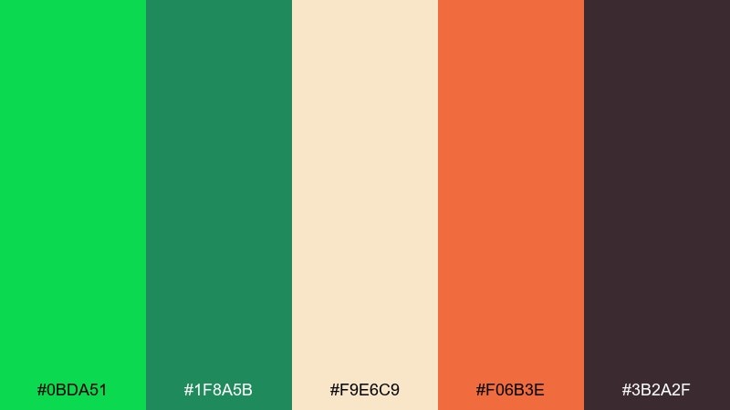
HEX: #0BDA51 #1F8A5B #F9E6C9 #F06B3E #3B2A2F
Mood: warm, bold, optimistic
Best for: social media campaign graphics
Warm and bold, it feels like a late sunset cutting through bright foliage. The malachite color combination works best when green leads and the coral is saved for emphasis. Cream softens the contrast so posts still look friendly on mobile. Tip: keep coral to one headline or one sticker-style badge per graphic for consistent rhythm.
Image example of sunset over green generated using media.io
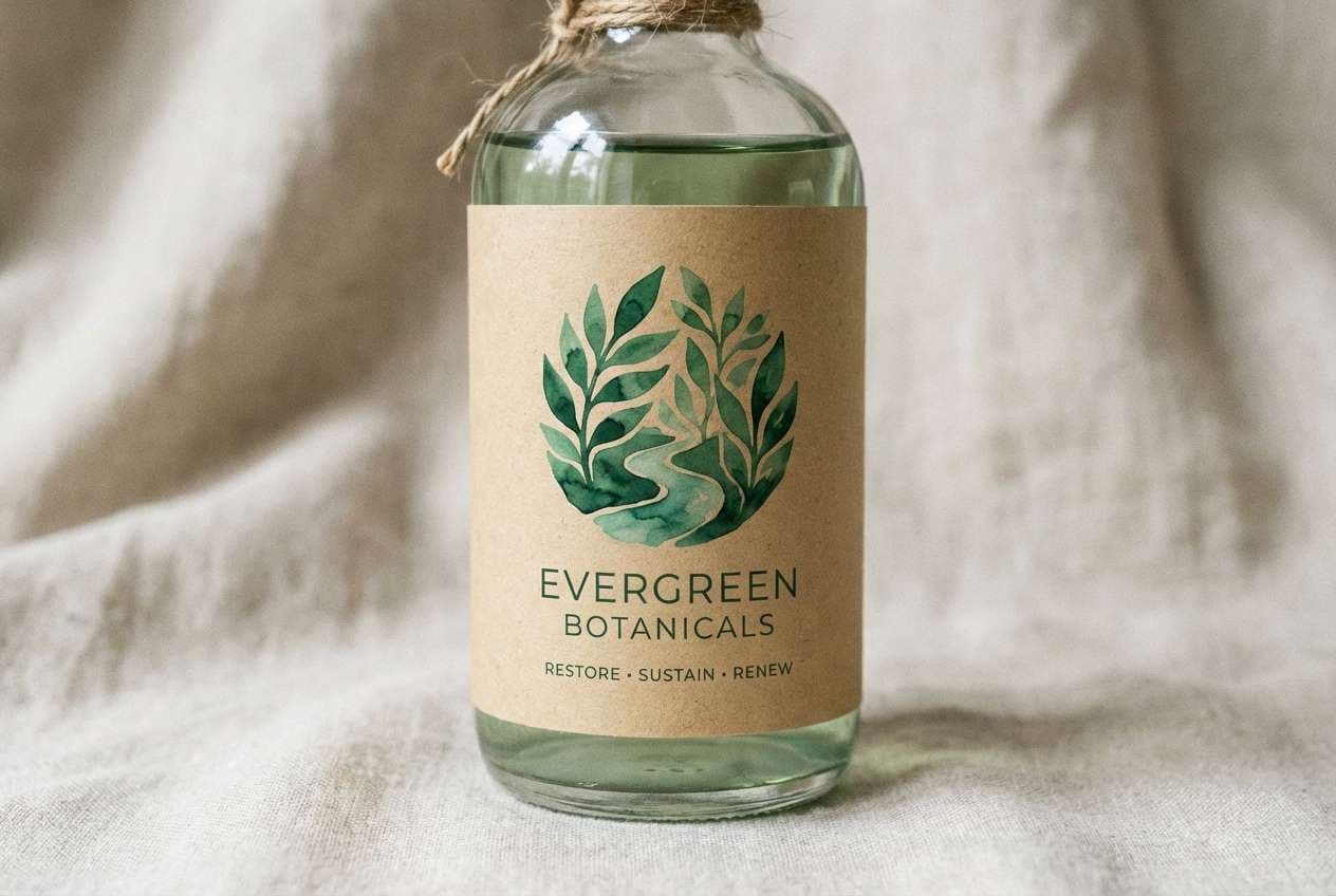
8) Forest and Linen
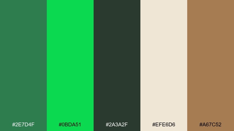
HEX: #2E7D4F #0BDA51 #2A3A2F #EFE6D6 #A67C52
Mood: earthy, cozy, natural
Best for: eco-friendly product label
Earthy and cozy, it suggests pine needles, linen fabric, and a warm wooden shelf. Use linen as the background color for labels so the greens feel fresh rather than heavy. A touch of tan adds handmade warmth and pairs well with kraft materials. Tip: choose uncoated paper and keep ink coverage moderate to avoid muddy greens.
Image example of forest and linen generated using media.io
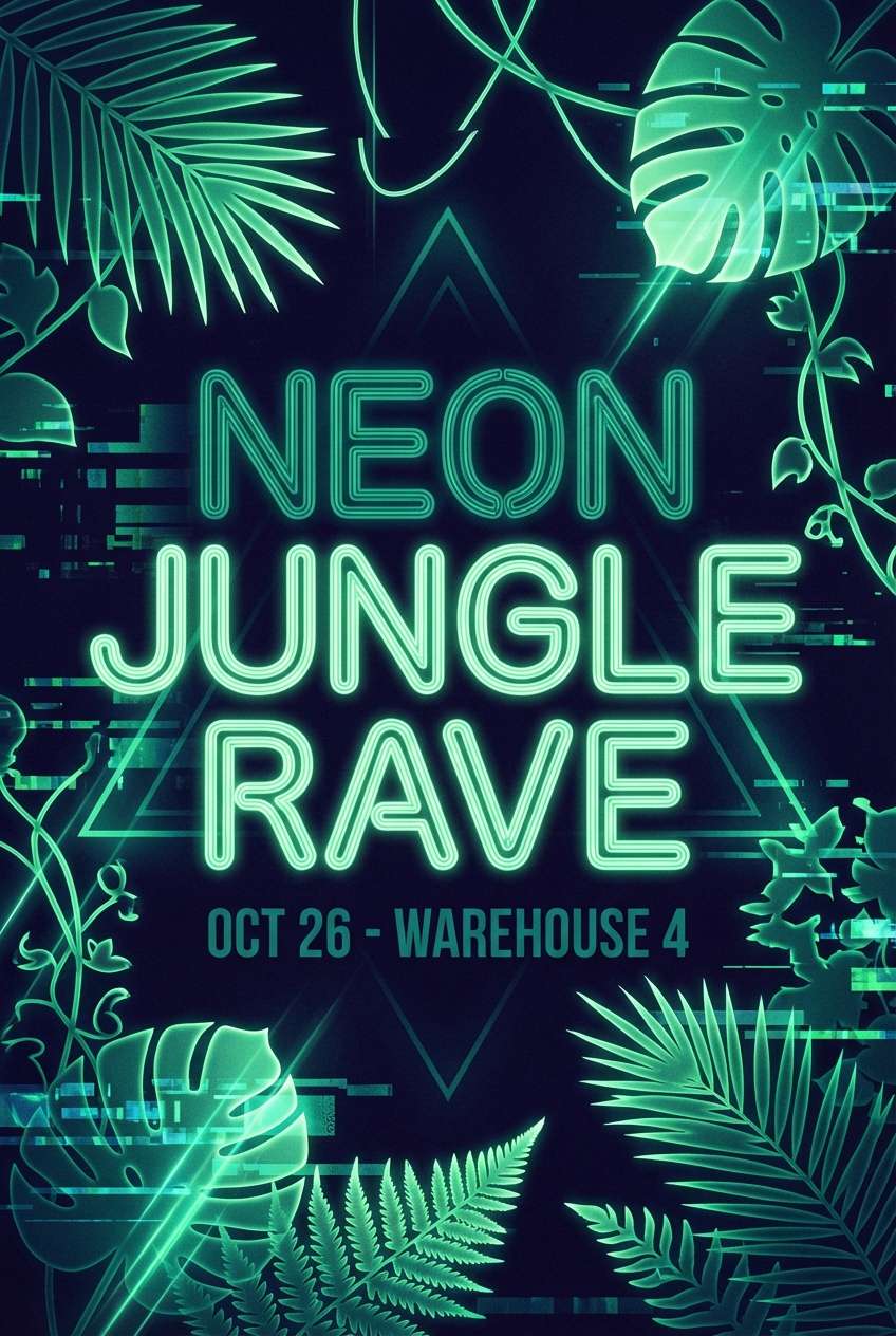
9) Neon Garden Night
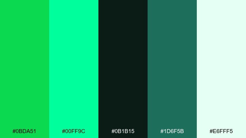
HEX: #0BDA51 #00FF9C #0B1B15 #1D6F5B #E6FFF5
Mood: electric, nightlife, high-contrast
Best for: music poster design
Electric and high-contrast, it looks like glowing leaves under club lights. Let the near-black carry the background, then stack the two bright greens for headlines and key shapes. The icy mint keeps small text readable without breaking the night vibe. Tip: add grain or a subtle glow around the brightest green to avoid harsh edges in print.
Image example of neon garden night generated using media.io
10) Spa Serenity
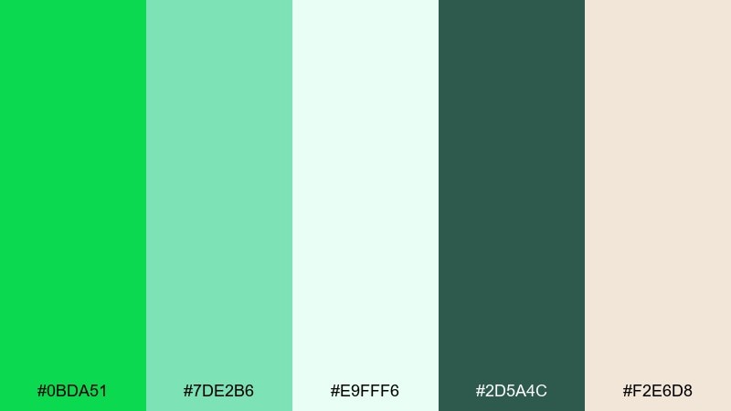
HEX: #0BDA51 #7DE2B6 #E9FFF6 #2D5A4C #F2E6D8
Mood: soothing, fresh, airy
Best for: wellness app onboarding screens
Soothing and airy, it brings to mind steam, eucalyptus, and clean towels. Use the pale aqua-mint for backgrounds and reserve malachite for progress indicators and primary actions. The muted deep green is ideal for icons and small UI labels. Tip: keep gradients very subtle, otherwise the calm spa feel turns glossy.
Image example of spa serenity generated using media.io
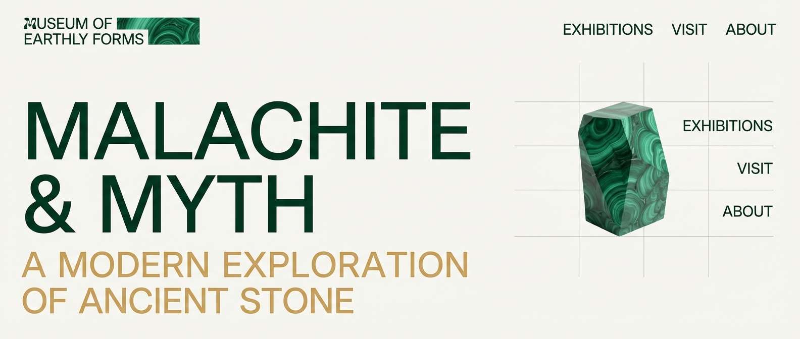
11) Modern Museum
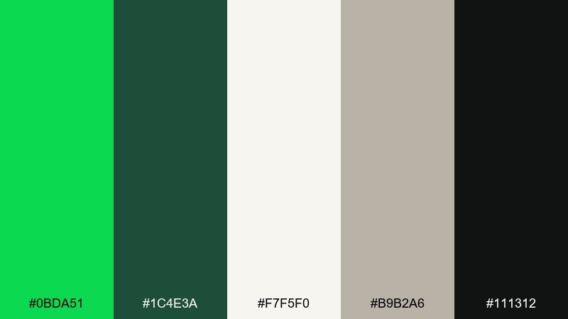
HEX: #0BDA51 #1C4E3A #F7F5F0 #B9B2A6 #111312
Mood: refined, minimal, contemporary
Best for: gallery website header and typography
Refined and contemporary, it feels like polished concrete, quiet rooms, and a single vivid artwork. This malachite color palette is strongest when malachite appears in small, intentional moments against warm white space. Use the greige for dividers, captions, and subtle UI states. Tip: keep typography large and restrained so the green reads as curated, not loud.
Image example of modern museum generated using media.io
12) Rustic Herb Market
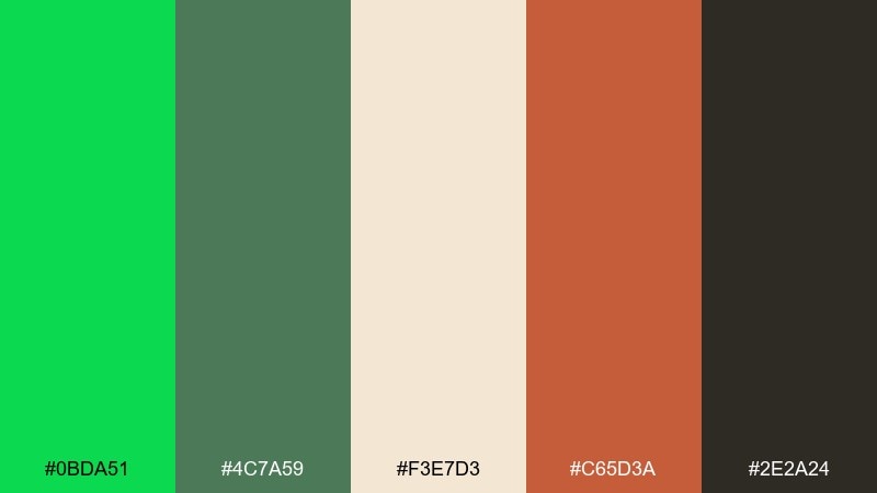
HEX: #0BDA51 #4C7A59 #F3E7D3 #C65D3A #2E2A24
Mood: rustic, friendly, artisanal
Best for: farmers market sign and price tags
Rustic and friendly, it resembles herb bundles, chalkboard signs, and sun-warmed terracotta pots. Keep cream as the base so handwritten or display type stays clear from a distance. The red clay accent is perfect for prices or special badges. Tip: use a slightly rough texture in backgrounds to reinforce the market-made vibe.
Image example of rustic herb market generated using media.io
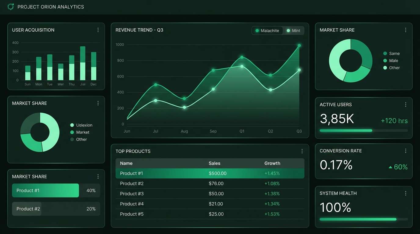
13) Cyber Mint UI
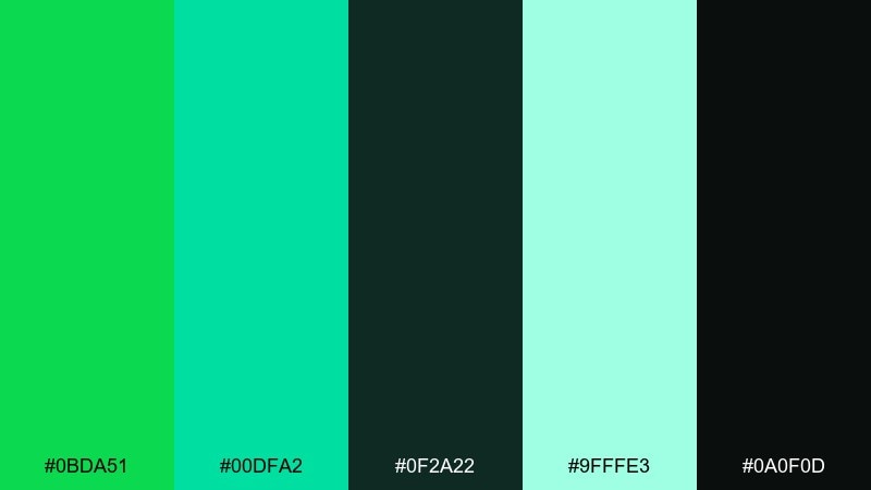
HEX: #0BDA51 #00DFA2 #0F2A22 #9FFFE3 #0A0F0D
Mood: techy, sharp, futuristic
Best for: dashboard UI and data viz
Techy and sharp, it reads like a night dashboard with crisp highlights and clean data lines. The dark greens provide depth while the bright mints define charts, toggles, and status badges. Keep the light mint for tooltips and small surfaces so the interface stays legible. Tip: limit chart series to two greens plus neutral grays to avoid visual noise.
Image example of cyber mint ui generated using media.io
14) Wedding Sage Glam
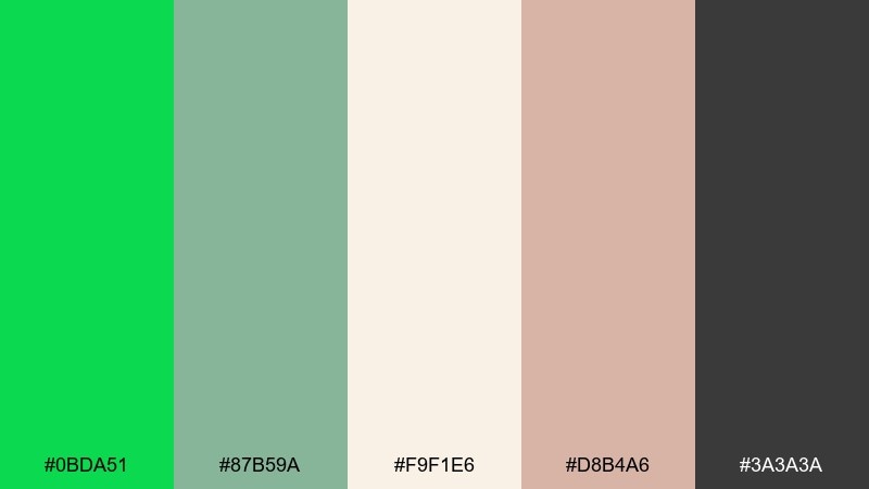
HEX: #0BDA51 #87B59A #F9F1E6 #D8B4A6 #3A3A3A
Mood: romantic, elegant, soft
Best for: wedding invitation suite
Romantic and elegant, it feels like fresh greenery paired with blush florals and creamy paper. Use sage for large areas and keep malachite for monograms or a single border line. Blush works beautifully for RSVP highlights and wax-seal inspired shapes. Tip: choose one metallic finish at most, and let the greens do the sophistication work.
Image example of wedding sage glam generated using media.io
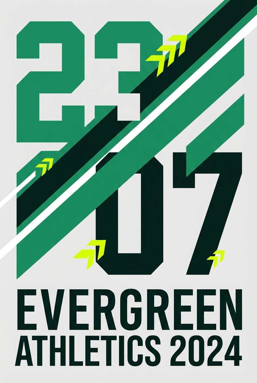
15) Sports Energy
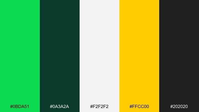
HEX: #0BDA51 #0A3A2A #F2F2F2 #FFCC00 #202020
Mood: bold, competitive, punchy
Best for: sports team poster and merch
Bold and competitive, it hits like stadium lights and a sharp whistle. The high-contrast whites and dark greens create instant readability, while yellow brings fast energy to key stats. These malachite color combinations work especially well for numbers, stripes, and badge marks on apparel. Tip: keep yellow to 10 to 15 percent of the design so it stays a highlight, not a takeover.
Image example of sports energy generated using media.io
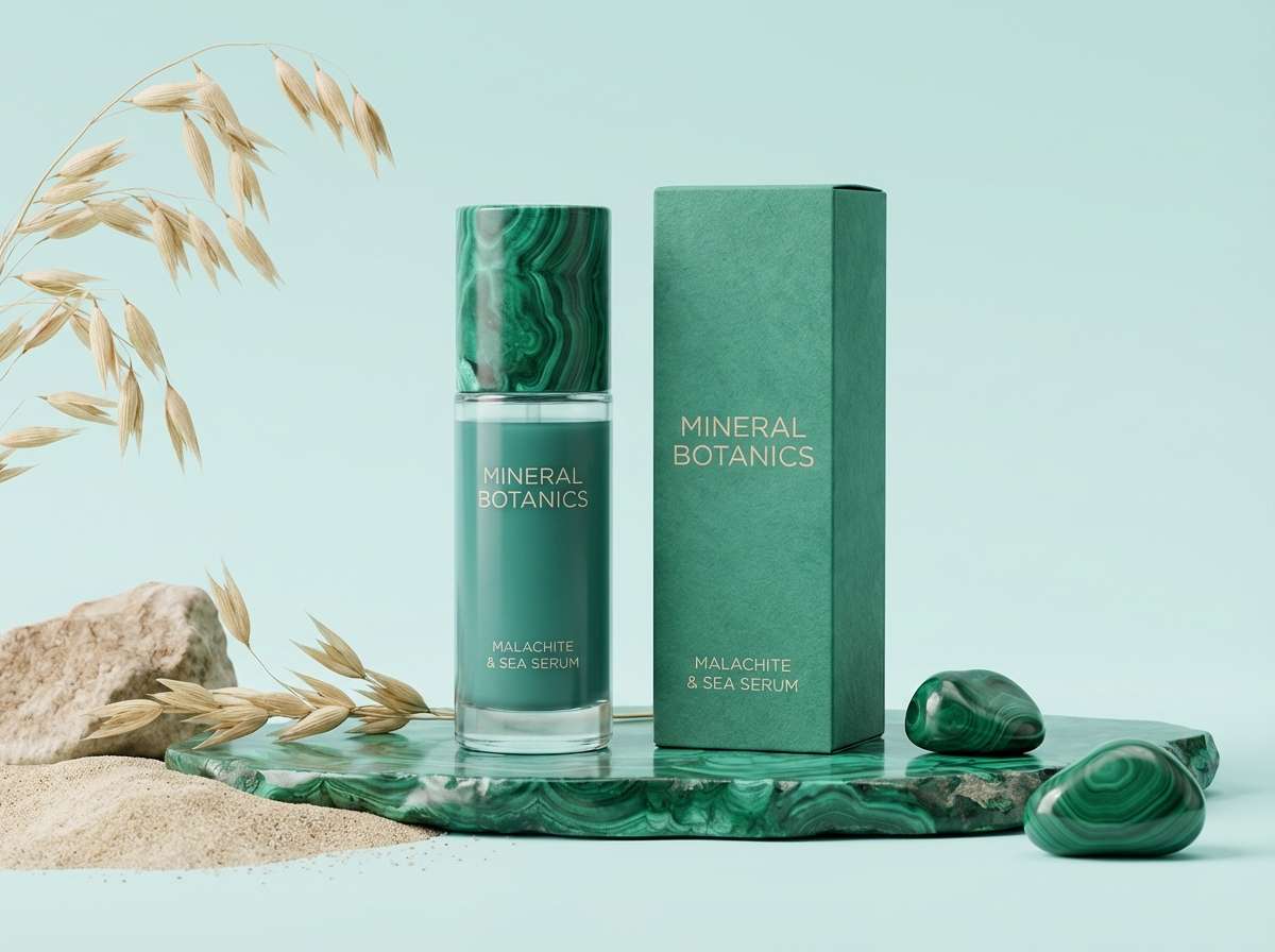
16) Coastal Aloe
HEX: #0BDA51 #4CC9A6 #E7FBF6 #1B6A5A #F5D7B2
Mood: breezy, clean, vacation
Best for: skincare product ad
Breezy and clean, it suggests aloe gel, sea air, and sunlit skin. Use the pale aqua as a spacious background and keep malachite for the product name or key benefit line. The warm sand tone prevents the greens from feeling too clinical. Tip: shoot on a simple light backdrop and add only one soft shadow for a premium, coastal look.
Image example of coastal aloe generated using media.io
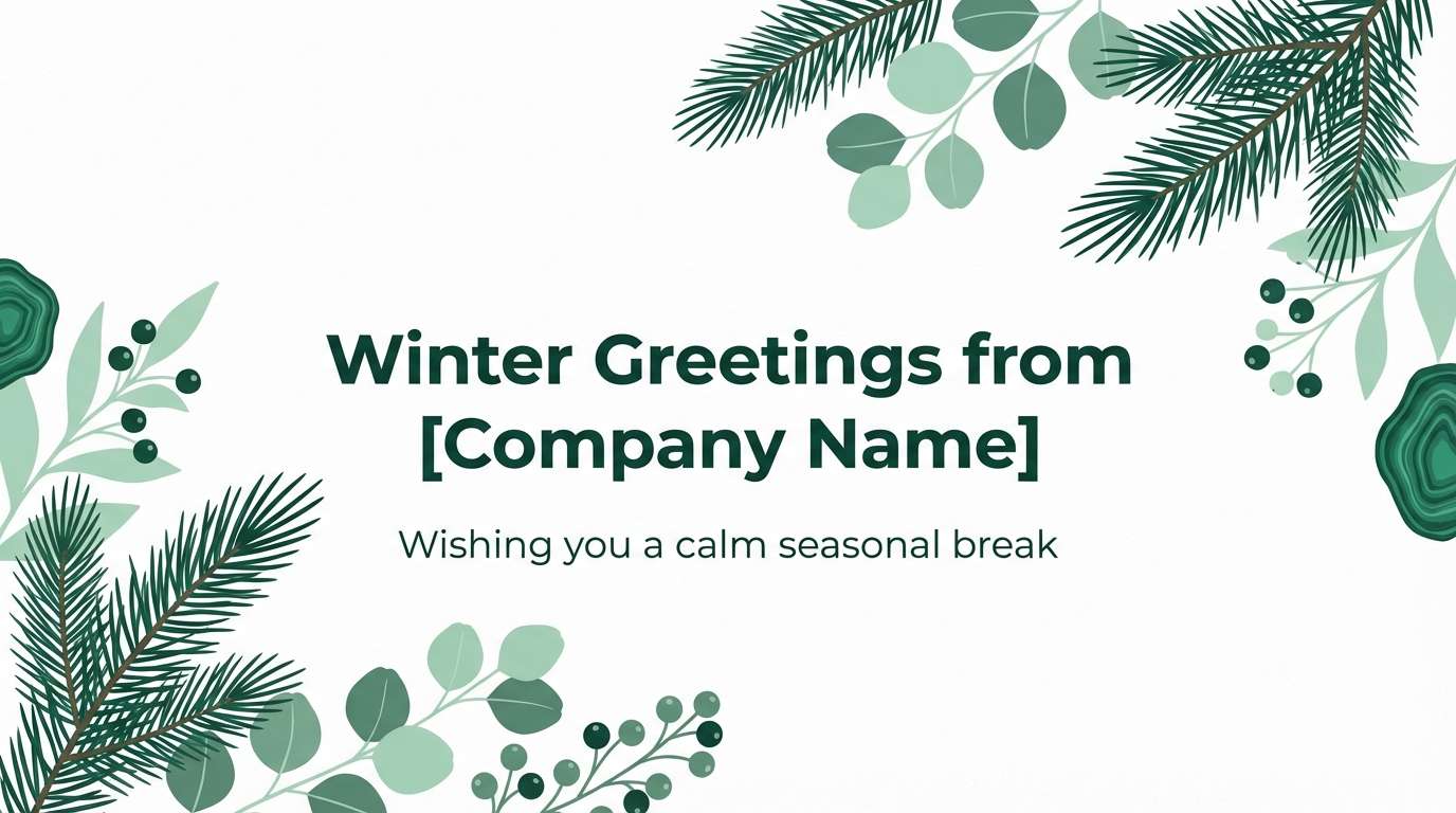
17) Winter Evergreen
HEX: #0BDA51 #0E3B2E #A7D9C9 #F7FAFF #6C7A76
Mood: crisp, quiet, seasonal
Best for: holiday email header
Crisp and quiet, it feels like evergreen branches against fresh snow. Let the icy white and soft mint handle the background while deep green supports type and dividers. Malachite adds a lively spark for buttons or small ornaments. Tip: use plenty of whitespace so the palette stays wintery rather than heavy.
Image example of winter evergreen generated using media.io
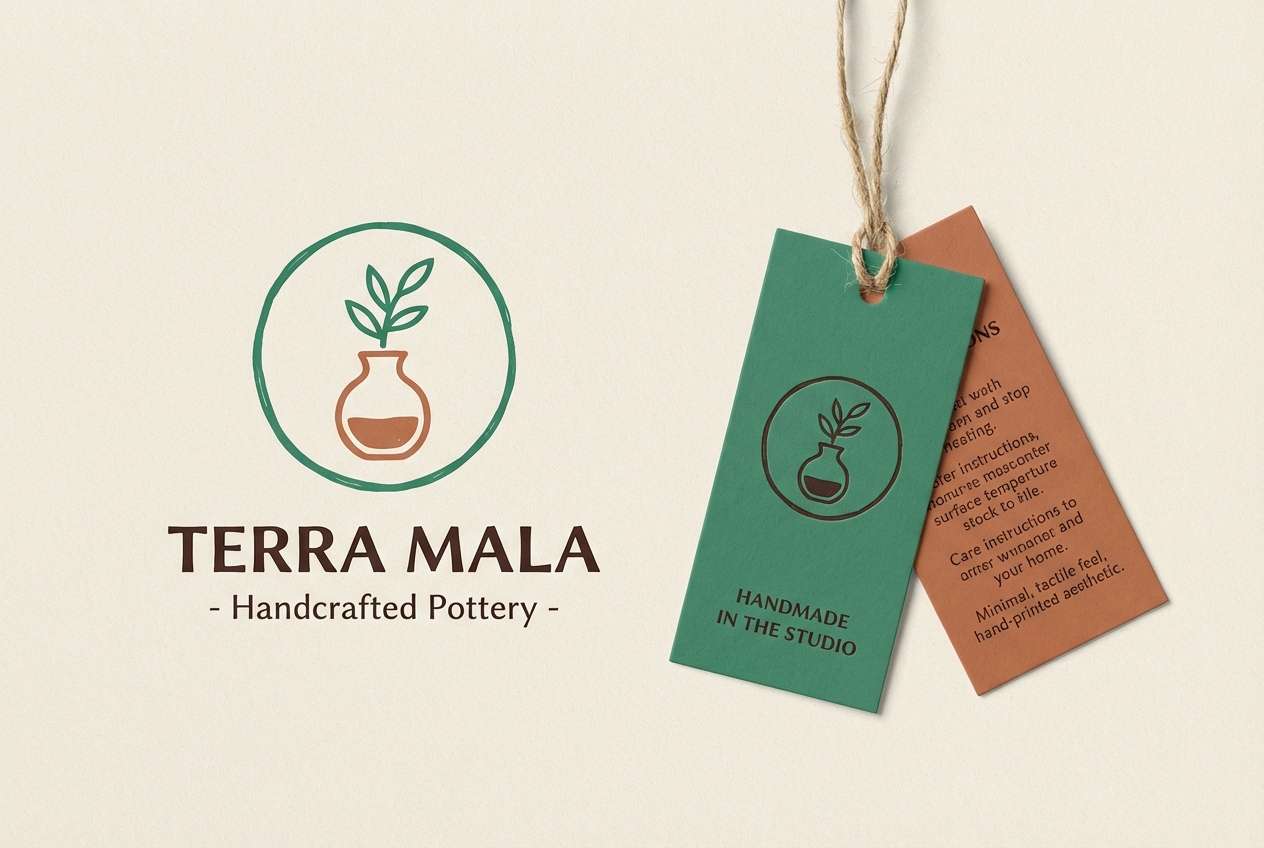
18) Clay and Malachite
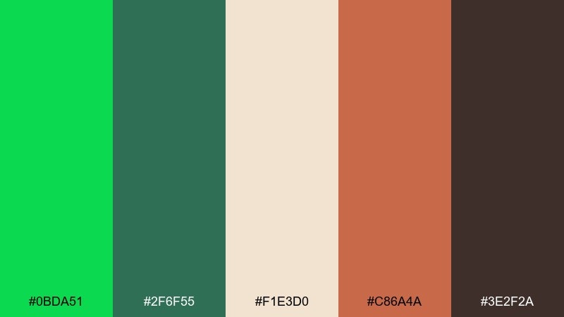
HEX: #0BDA51 #2F6F55 #F1E3D0 #C86A4A #3E2F2A
Mood: handcrafted, warm, grounded
Best for: ceramics studio logo and tags
Handcrafted and warm, it brings up wheel-thrown clay, glaze drips, and studio aprons. Pair the greens with cream to keep the identity light, then use terracotta for a tactile, maker-forward accent. The cocoa brown is perfect for stamps, labels, and small text. Tip: print tags on textured stock so the earth tones feel authentic.
Image example of clay and malachite generated using media.io
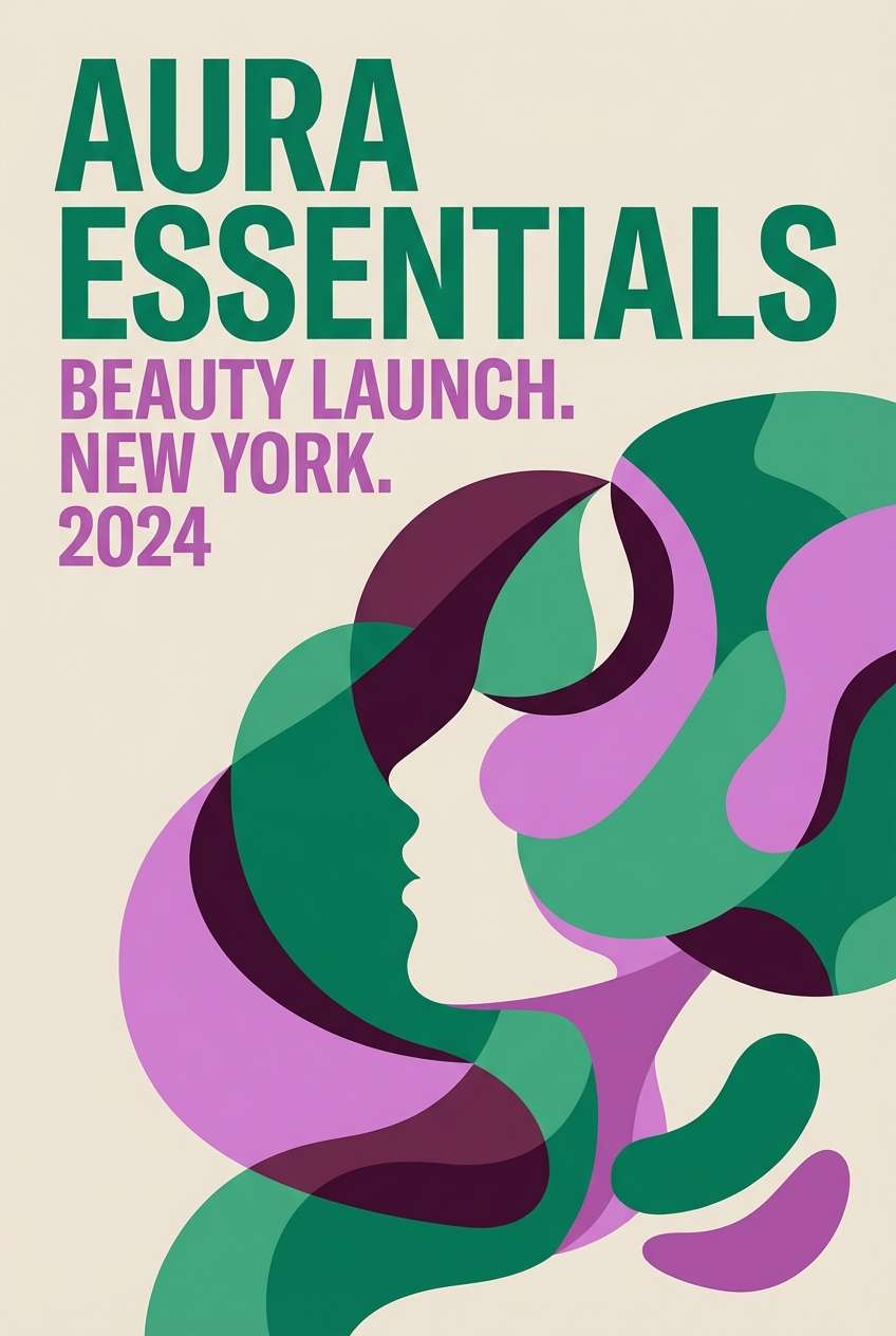
19) Orchid Contrast
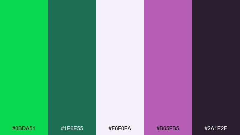
HEX: #0BDA51 #1E6E55 #F6F0FA #B65FB5 #2A1E2F
Mood: creative, vibrant, modern
Best for: beauty brand launch poster
Creative and vibrant, it feels like bright green leaves paired with bold orchid petals. Use the lilac-white as breathing room and keep the purple for hero typography or one standout shape. Deep plum makes the whole set feel intentional and editorial. Tip: avoid gradients between green and purple; use clean blocks to keep the contrast sophisticated.
Image example of orchid contrast generated using media.io
20) Monochrome Malachite
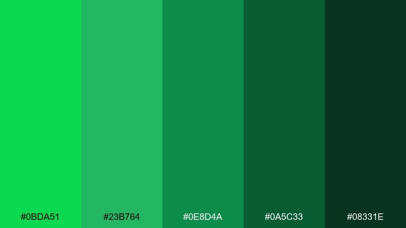
HEX: #0BDA51 #23B764 #0E8D4A #0A5C33 #08331E
Mood: focused, cohesive, punchy
Best for: app icon set and UI accents
Focused and punchy, it looks like layered glass with shifting green depth. A near-monochrome set is perfect for icons, charts, and micro-interactions where consistency matters. Use the brightest tint sparingly for active states, and keep mid-tones for default UI elements. Tip: test contrast at small sizes so the darker shades do not merge on low-quality screens.
Image example of monochrome malachite generated using media.io

21) Citrus Green Pop
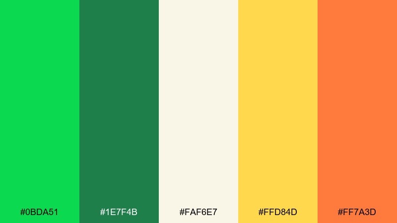
HEX: #0BDA51 #1E7F4B #FAF6E7 #FFD84D #FF7A3D
Mood: zesty, youthful, energetic
Best for: food delivery promo banner
Zesty and youthful, it feels like fresh lime zest with a splash of orange soda. Use malachite and deep green to frame the message, then let yellow carry discount badges. A small orange accent adds appetite appeal and keeps the promo from looking too corporate. Tip: keep backgrounds light and use green for structure so prices stay instantly readable.
Image example of citrus green pop generated using media.io

What Colors Go Well with Malachite?
Malachite pairs beautifully with warm neutrals like cream, linen, warm white, and greige—these keep the green feeling curated and readable for UI and print. Charcoal and near-black add instant contrast for typography and high-impact layouts.
For accents, gold and tan create a premium, outdoorsy tone; terracotta and coral add friendly warmth; and yellow brings sporty, energetic emphasis. If you want a cleaner, more modern look, match malachite with mint, aqua, or teal for a fresh, tech-forward palette.
For bold contrast, purple/plum accents can look editorial and fashion-led—just keep transitions clean (solid blocks over gradients) so the pairing feels intentional.
How to Use a Malachite Color Palette in Real Designs
Treat malachite as a “signal” color: buttons, active states, key data lines, or a single hero element. Then rely on soft whites/creams and darker greens for the bulk of surfaces and text structure.
In branding, use malachite for marks, trims, or packaging highlights while keeping backgrounds neutral to avoid visual fatigue. In print, test coverage and paper stock—greens can shift on uncoated paper, so leave breathing room and avoid over-inking large blocks.
For accessibility, validate contrast for text and UI states. Malachite is bright, but it doesn’t always meet contrast requirements on white—pair it with deep green or charcoal for labels and body copy.
Create Malachite Palette Visuals with AI
If you want to see these malachite color combinations in real scenes (posters, packaging, UI mockups), generating quick concept visuals can help you choose the right mood before committing to production.
With Media.io, you can turn a simple prompt into on-brand palette imagery, then iterate on style, lighting, and layout while keeping your HEX direction consistent.
Malachite Color Palette FAQs
-
What is the HEX code for malachite green?
A commonly used digital malachite green is #0BDA51. Depending on the palette, you may also see malachite-like variants that lean more teal or more emerald. -
Is malachite closer to emerald or neon green?
Malachite sits between emerald and neon: it’s more saturated and lively than classic emerald, but it can be toned down with deep forest greens and warm neutrals to avoid a neon look. -
What neutral colors work best with malachite?
Cream, warm white, linen, greige, and charcoal are the most reliable. They help malachite read premium and keep typography and spacing comfortable. -
Can I use malachite in a professional UI without it feeling too loud?
Yes—use malachite for primary actions and active states, and keep most surfaces in soft neutrals. Reserve the brightest green for a small percentage of the interface to maintain hierarchy. -
What accent colors create strong contrast with malachite?
Warm accents like coral, terracotta, and gold add punch without clashing. For a bolder, editorial contrast, pair malachite with plum or orchid purple and anchor with near-black. -
Does malachite print well?
It can, but greens are sensitive to paper and ink coverage. For the cleanest results, avoid heavy full-bleed green on uncoated stock and run test prints to check shifts toward yellow or blue. -
How do I keep a malachite palette accessible?
Don’t rely on malachite alone for text on white. Use deep green/charcoal for type, ensure sufficient contrast ratios for UI states, and differentiate status colors with both hue and shape/icons.


