

White ivory is a warm, refined neutral that reads clean without feeling stark. It’s perfect when you want brightness, softness, and a premium “paper-like” base for design.
Below are white ivory color palette ideas with HEX codes, plus practical tips for branding, interiors, wedding stationery, and UI—so you can build calm layouts with confident contrast.
In this article
- Why White Ivory Palettes Work So Well
-
- porcelain linen
- oatmilk sage
- antique pearl blush
- sunlit wheat
- ivory ink studio
- coastal shell blue
- warm minimal ui
- botanical paper
- champagne copper
- museum marble
- ivory lavender mist
- quiet terracotta
- nordic fog
- vintage bookshop
- studio clay
- garden party
- luxe noir
- soft aqua spa
- apricot silk
- olive espresso
- What Colors Go Well with White Ivory?
- How to Use a White Ivory Color Palette in Real Designs
- Create White Ivory Palette Visuals with AI
Why White Ivory Palettes Work So Well
White ivory sits between pure white and cream, which makes it feel softer and more inviting while still looking bright. That warmth helps reduce the “clinical” vibe that some minimalist designs can accidentally create.
Because it’s a neutral base, it supports both calm monochrome layouts and high-contrast typography. You can pair it with deep charcoals for clarity or add muted colors for gentle personality.
In print and packaging, ivory is especially forgiving: it flatters paper textures, foils, and natural materials. In digital UI, it can make surfaces feel less harsh, especially in long-form reading or dashboard layouts.
20+ White Ivory Color Palette Ideas (with HEX Codes)
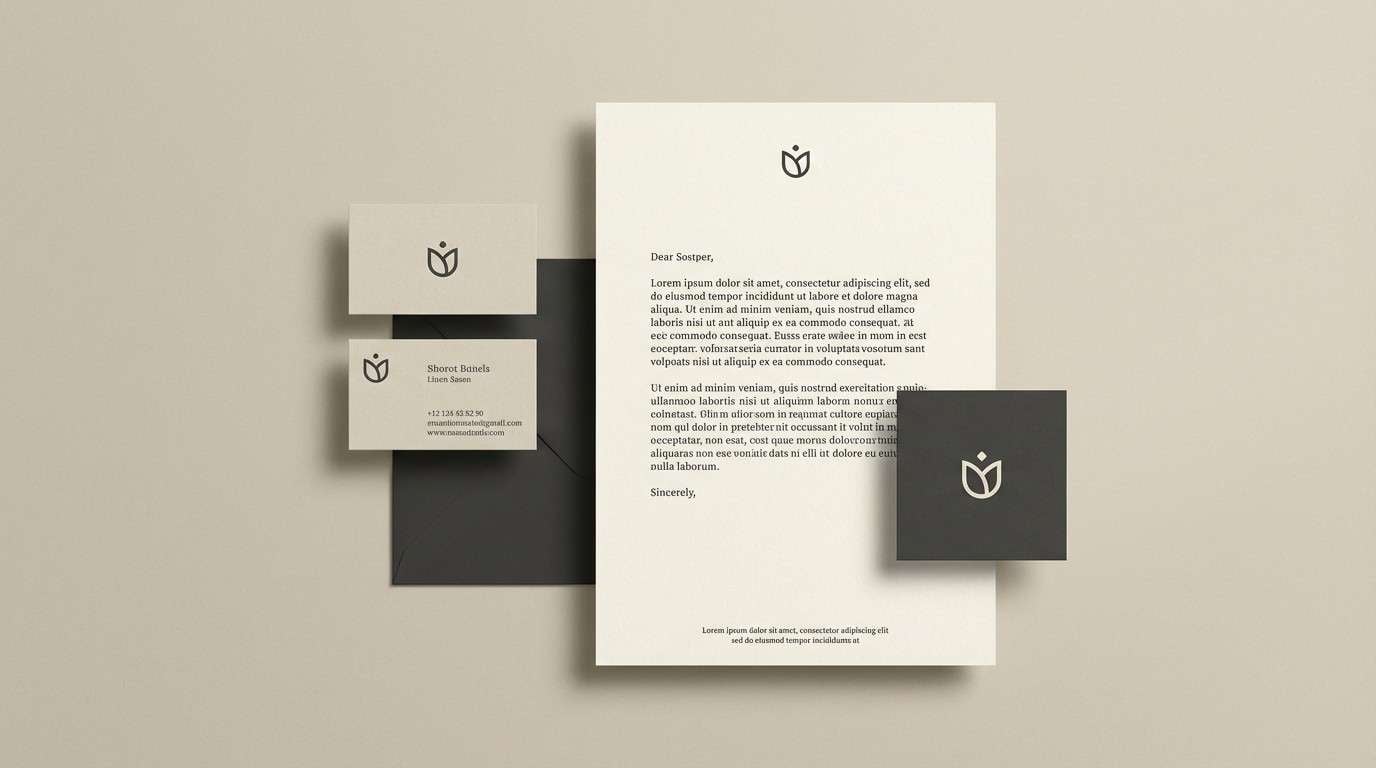
1) Porcelain Linen
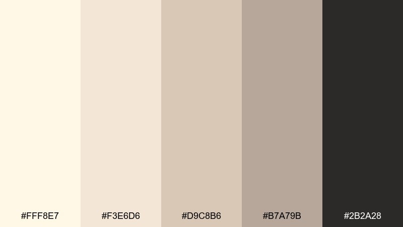
HEX: #FFF8E7 #F3E6D6 #D9C8B6 #B7A79B #2B2A28
Mood: clean, timeless, gallery-bright
Best for: minimal branding and stationery
Clean and quiet like fresh linen on a sunlit morning, this set keeps everything airy without feeling cold. Use the ivory and sand tones as your base, then anchor typography with the charcoal for crisp contrast. It works beautifully for logos, letterheads, and premium packaging that needs restraint. Tip: keep the dark shade to small areas like headlines and marks to preserve the light, porcelain feel.
Image example of porcelain linen generated using media.io
Media.io is an online AI studio for creating and editing video, image, and audio in your browser.

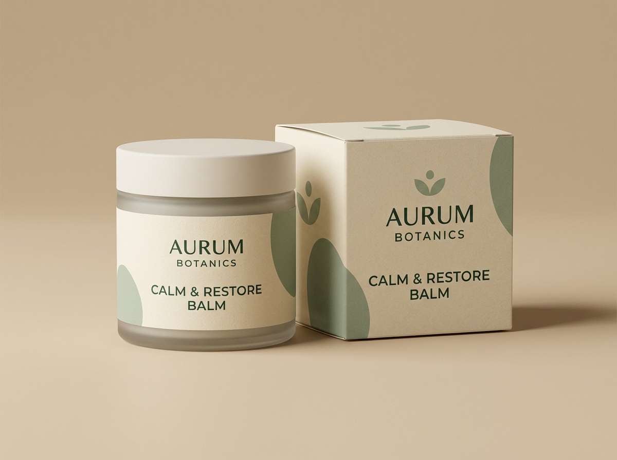
2) Oatmilk Sage
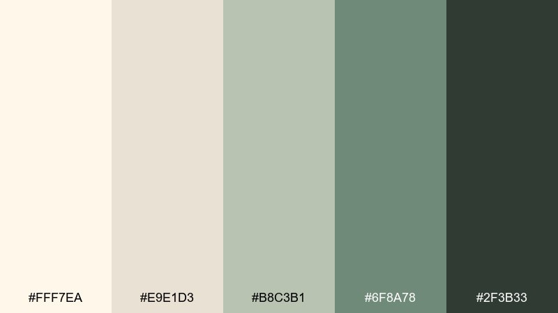
HEX: #FFF7EA #E9E1D3 #B8C3B1 #6F8A78 #2F3B33
Mood: calm, organic, modern rustic
Best for: wellness packaging and labels
Calm and earthy, like oatmilk foam with crushed sage leaves, this mix reads natural and contemporary. Let the warm ivory carry most of the surface area, then use the deeper greens for ingredient highlights and seals. It suits skincare, tea, supplements, and eco-friendly product lines that want trust and softness. Tip: pair matte textures with a single dark green for legibility on small labels.
Image example of oatmilk sage generated using media.io
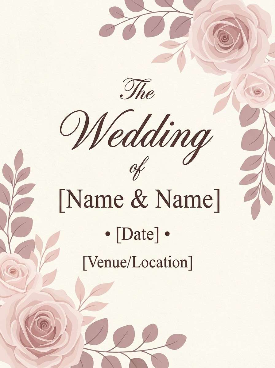
3) Antique Pearl Blush
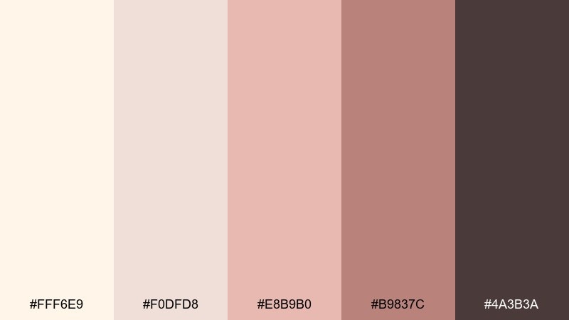
HEX: #FFF6E9 #F0DFD8 #E8B9B0 #B9837C #4A3B3A
Mood: romantic, vintage, soft-glam
Best for: wedding invitations
Romantic and gentle, like antique pearls beside faded rose petals, this palette feels intimate and elegant. Use the pale tones for the paper background and let the blush and mauve do the decorative work in borders or florals. It fits weddings, bridal showers, and anniversary invites where warmth matters more than brightness. Tip: choose the deep cocoa for names and dates so the typography stays readable.
Image example of antique pearl blush generated using media.io
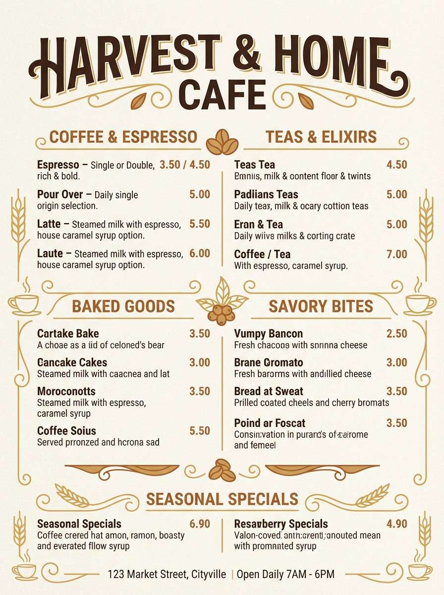
4) Sunlit Wheat
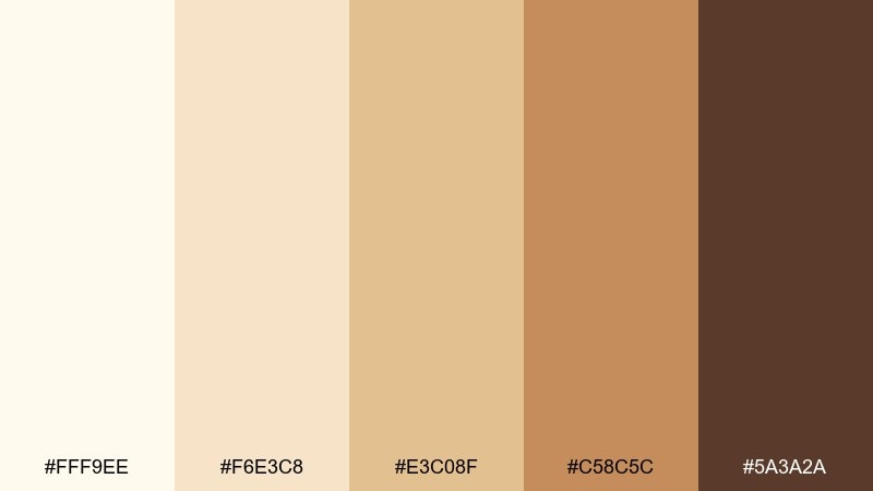
HEX: #FFF9EE #F6E3C8 #E3C08F #C58C5C #5A3A2A
Mood: warm, sunbaked, approachable
Best for: cafe menu and signage
Warm and sunbaked, like wheat fields at golden hour, these tones feel friendly and appetizing. Build your layout on the light ivory, then bring in the honey and caramel shades for section headers and icons. Perfect for cafes, bakeries, and farm-to-table brands that want a handcrafted look. Tip: reserve the deep brown for prices and key callouts to keep contrast strong.
Image example of sunlit wheat generated using media.io
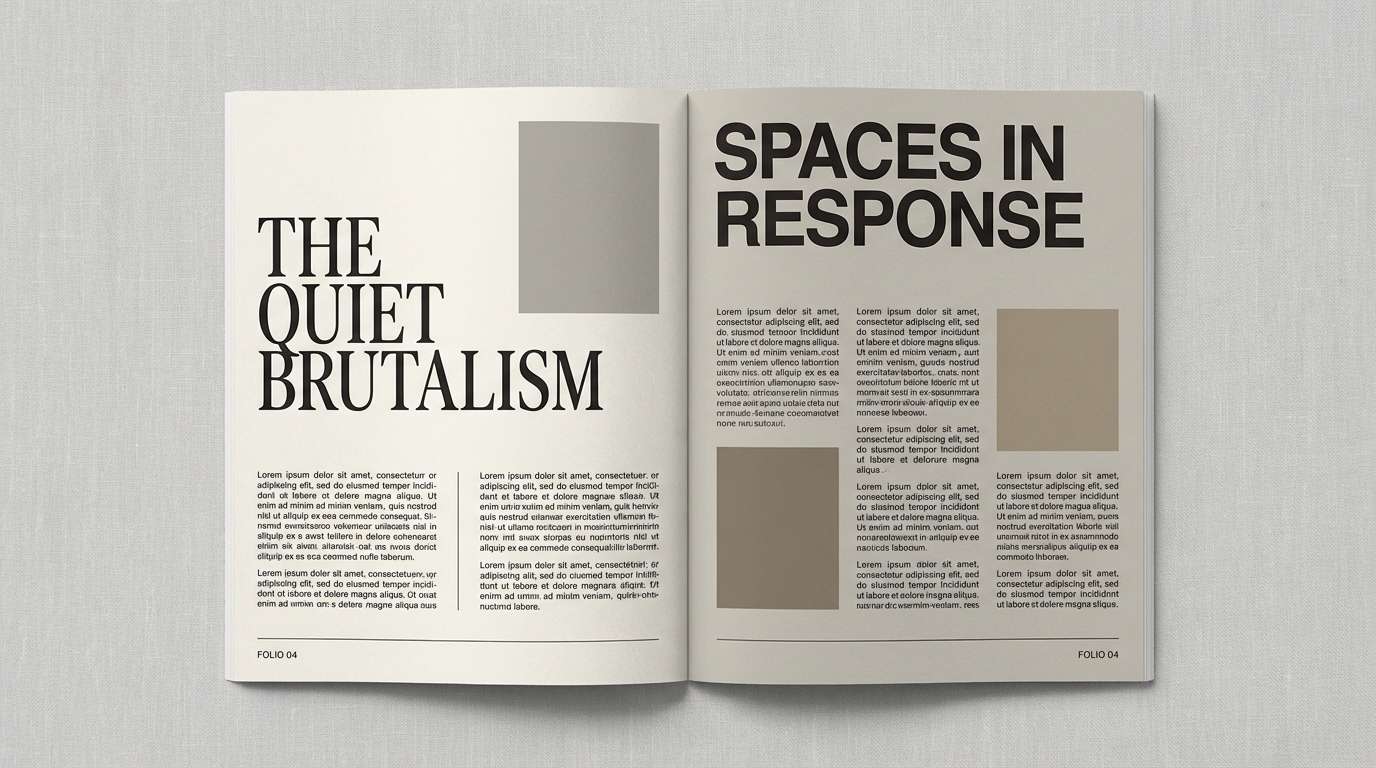
5) Ivory Ink Studio
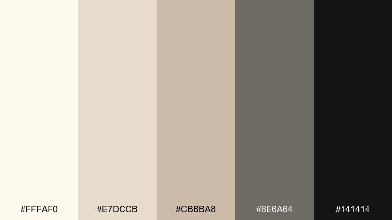
HEX: #FFFAF0 #E7DCCB #CBBBA8 #6E6A64 #141414
Mood: editorial, confident, high-contrast
Best for: magazine layouts and portfolios
Bold and editorial, like fresh ink on textured paper, this set balances softness with authority. The white ivory color palette shines when you keep backgrounds bright and push contrast with near-black for headlines. Use the mid neutrals for rules, captions, and grid structure to make pages feel premium. Tip: apply the darkest tone sparingly on key typographic elements to avoid making the layout feel heavy.
Image example of ivory ink studio generated using media.io
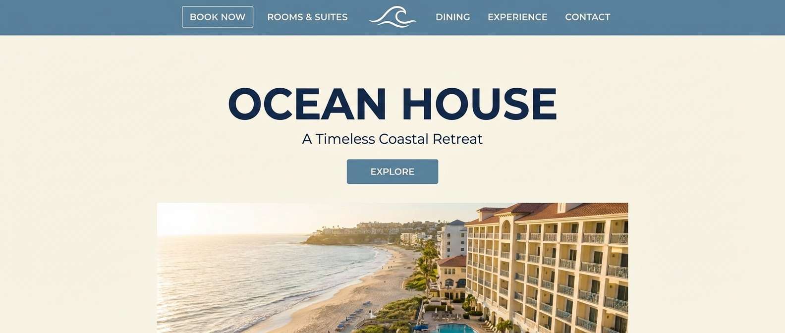
6) Coastal Shell Blue
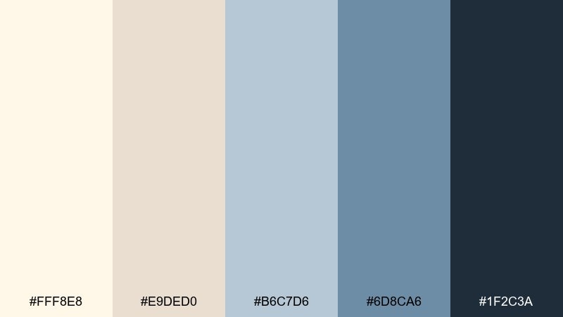
HEX: #FFF8E8 #E9DED0 #B6C7D6 #6D8CA6 #1F2C3A
Mood: breezy, coastal, polished
Best for: hotel website hero section
Breezy and polished, like shells and sea glass on pale sand, these tones feel refreshing without going cold. Use the soft ivory and dune beige for spacious backgrounds, then layer dusty blues for buttons and highlights. Great for hospitality, travel, and lifestyle brands that want calm sophistication. Tip: keep the navy as your accessibility color for text and CTAs.
Image example of coastal shell blue generated using media.io
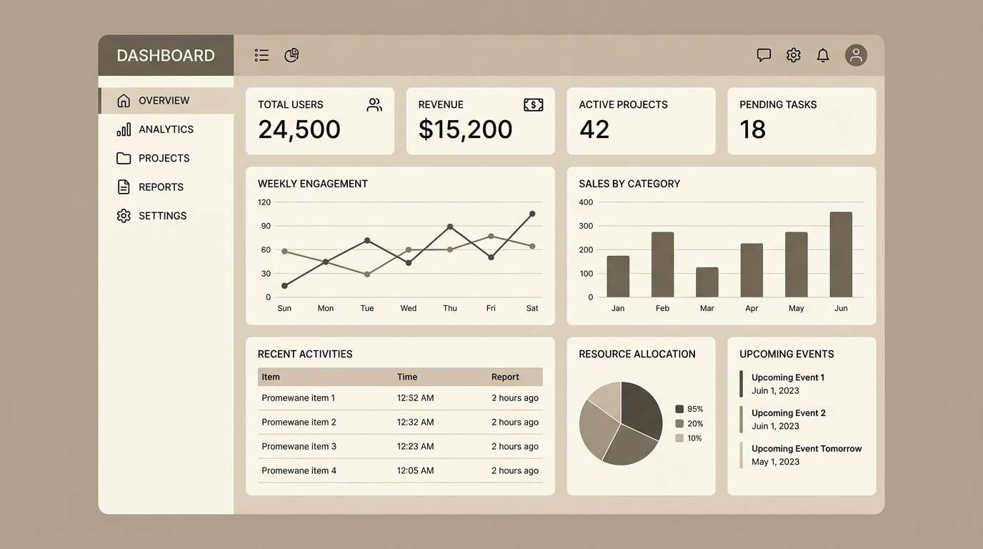
7) Warm Minimal UI
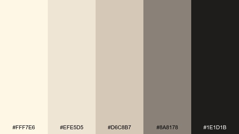
HEX: #FFF7E6 #EFE5D5 #D6C8B7 #8A8178 #1E1D1B
Mood: minimal, warm, product-focused
Best for: dashboard UI
Minimal and warm, like softly lit plaster walls, this grouping keeps interfaces calm and readable. As a white ivory color scheme, it pairs beautifully with clean typography and subtle shadows. Use the light tones for surfaces and cards, then rely on the deep near-black for primary text and critical states. Tip: introduce the taupe as a single consistent divider color to make layouts feel intentional.
Image example of warm minimal ui generated using media.io
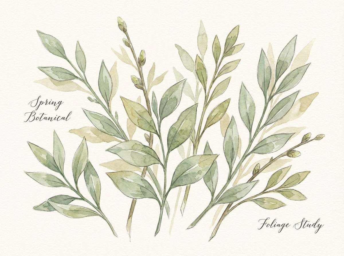
8) Botanical Paper
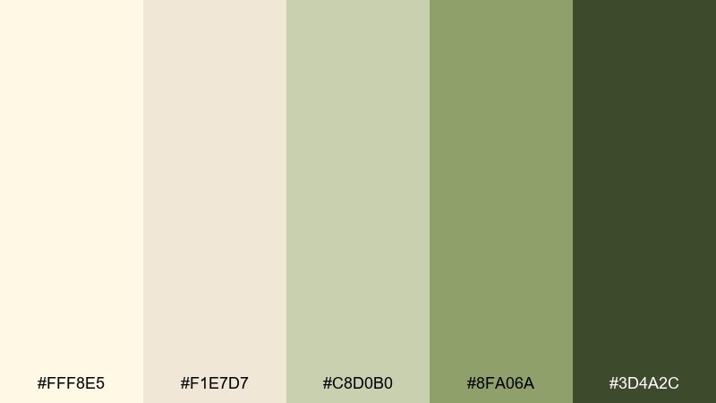
HEX: #FFF8E5 #F1E7D7 #C8D0B0 #8FA06A #3D4A2C
Mood: fresh, botanical, hand-touched
Best for: spring botanical illustration
Fresh and botanical, like pressed leaves on creamy paper, this mix feels handcrafted and calm. Let the ivory and parchment tones act as your watercolor paper, while the greens shape stems, shadows, and small type. Ideal for seasonal prints, eco events, and nature-forward packaging. Tip: keep the darkest green for tiny details so the illustration stays light and airy.
Image example of botanical paper generated using media.io
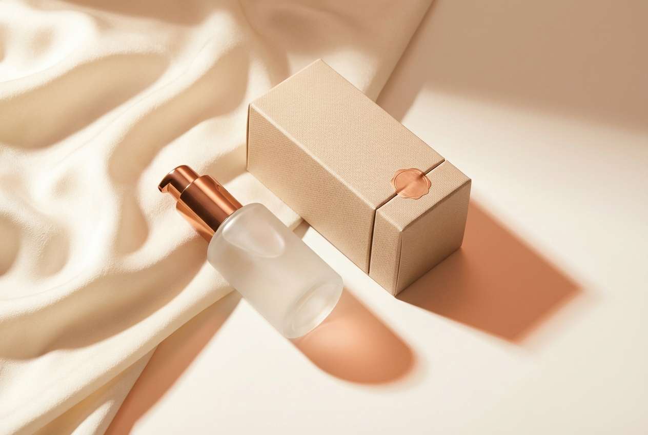
9) Champagne Copper
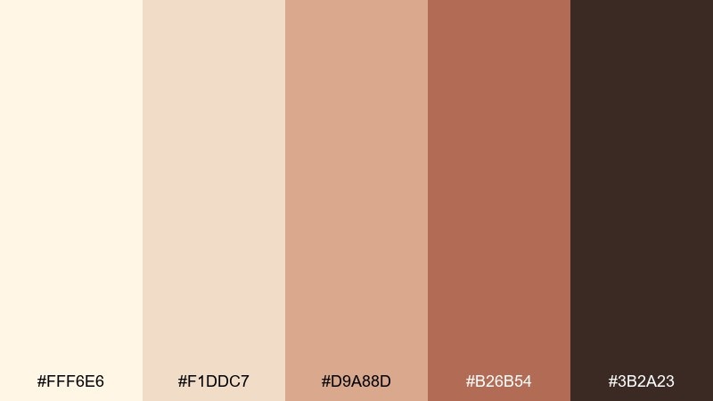
HEX: #FFF6E6 #F1DDC7 #D9A88D #B26B54 #3B2A23
Mood: luxe, warm, celebratory
Best for: beauty product ad
Luxe and celebratory, like champagne bubbles over brushed metal, these warm tones feel instantly premium. The white ivory color combinations here work best when the light base dominates and copper shades appear as shine, seals, or gradient accents. Use it for beauty launches, jewelry promos, and holiday campaigns that need warmth without loud color. Tip: add subtle grain or metallic foil effects only on the copper tones to keep it tasteful.
Image example of champagne copper generated using media.io
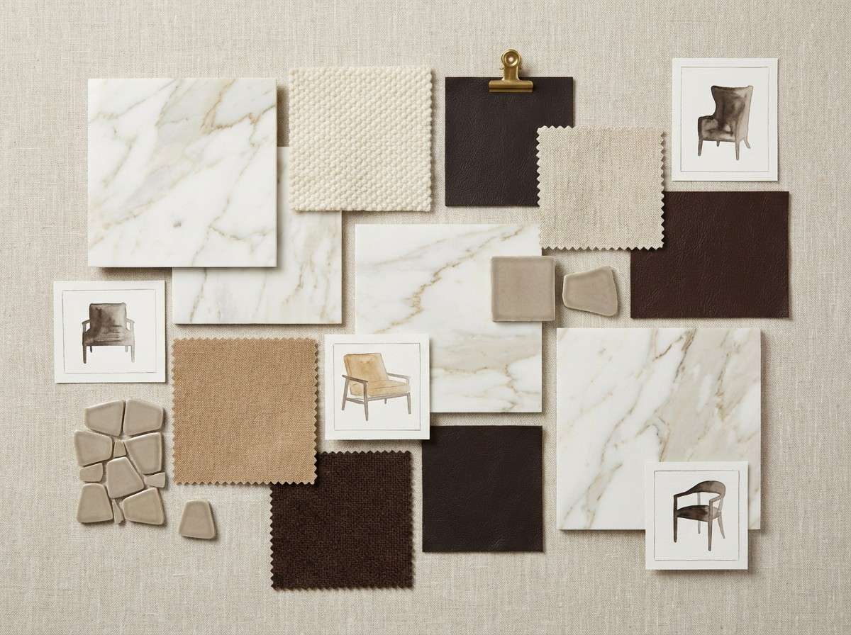
10) Museum Marble
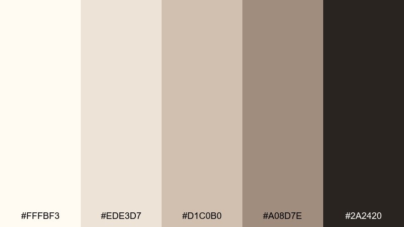
HEX: #FFFBF3 #EDE3D7 #D1C0B0 #A08D7E #2A2420
Mood: refined, architectural, quiet luxury
Best for: interior mood board
Refined and architectural, like marble and stone in a quiet museum hall, this palette reads expensive but understated. Use the brightest tone for walls and negative space, then layer the taupes in textiles and furniture blocks. It is a strong choice for interiors, real estate decks, and high-end lifestyle branding. Tip: keep the deepest brown for small anchors like headings or trim so the overall look stays light.
Image example of museum marble generated using media.io
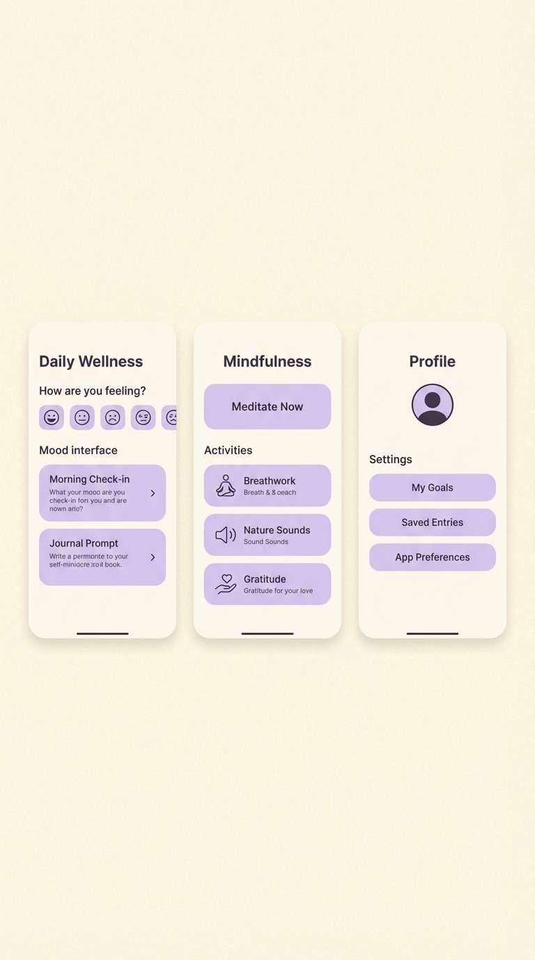
11) Ivory Lavender Mist
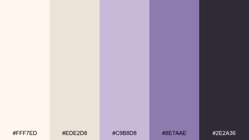
HEX: #FFF7ED #EDE2D8 #C9B8D8 #8E7AAE #2E2A36
Mood: dreamy, soft, modern romantic
Best for: self-care app UI
Dreamy and soft, like lavender mist over creamy clouds, this mix feels soothing and slightly magical. Use ivory for the main surfaces, then bring lavender in for gentle highlights, toggles, and illustrations. It works well for self-care apps, meditation tools, and boutique lifestyle brands that want calm with personality. Tip: keep body text in the deep charcoal-purple to protect readability on pale backgrounds.
Image example of ivory lavender mist generated using media.io
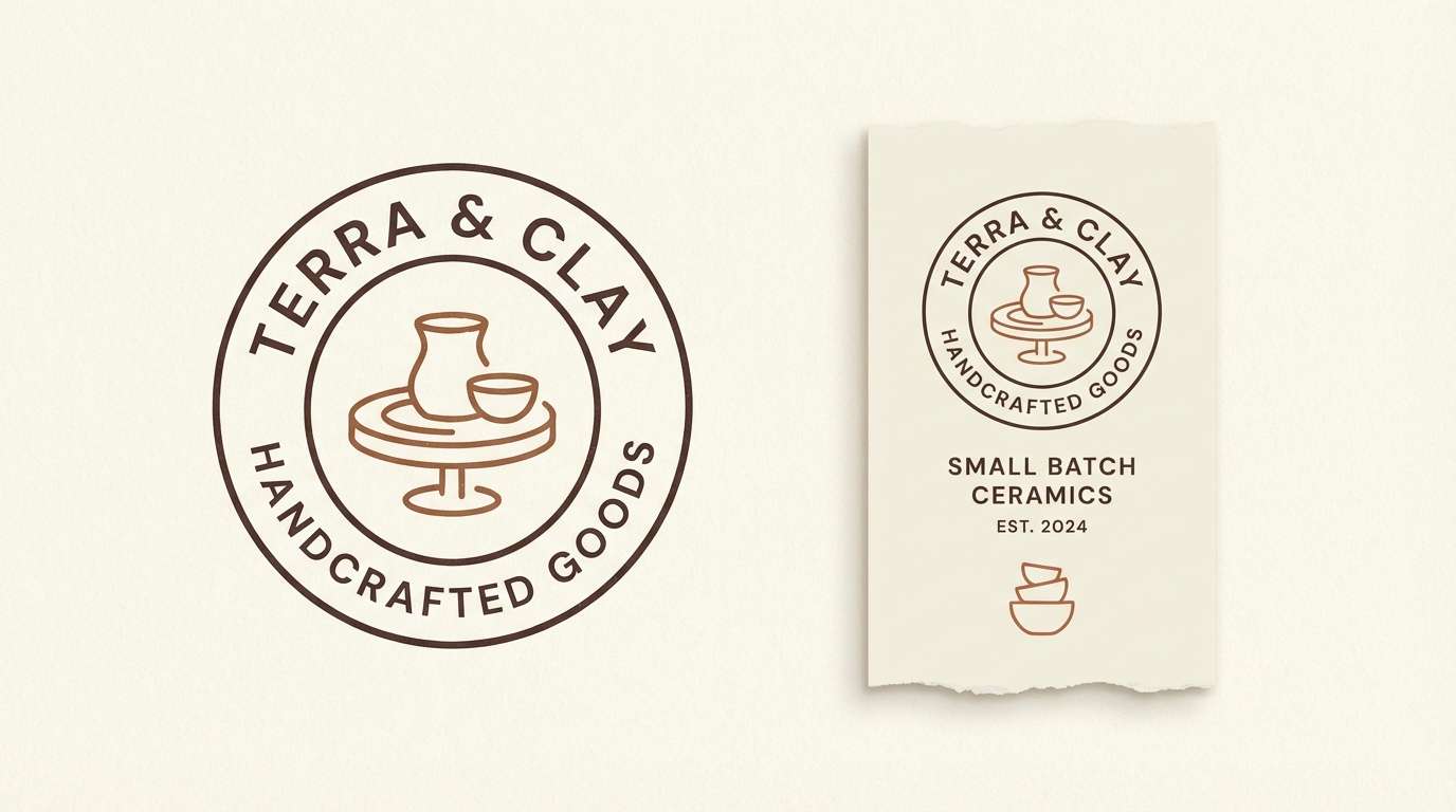
12) Quiet Terracotta
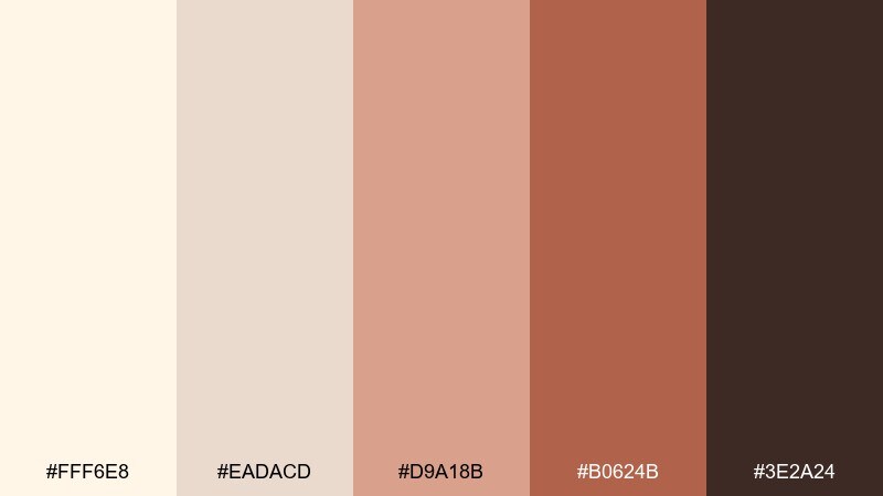
HEX: #FFF6E8 #EADACD #D9A18B #B0624B #3E2A24
Mood: grounded, cozy, artisan
Best for: ceramics shop branding
Grounded and cozy, like hand-thrown clay beside creamy slip, this palette feels artisan and welcoming. The white ivory color palette becomes richer when terracotta is used in small, confident blocks for stamps, icons, and highlights. Great for ceramics, home goods, and small-batch food brands that want warmth and tactility. Tip: choose the dark brown for logo marks and keep the brighter clay tone for secondary accents.
Image example of quiet terracotta generated using media.io
13) Nordic Fog
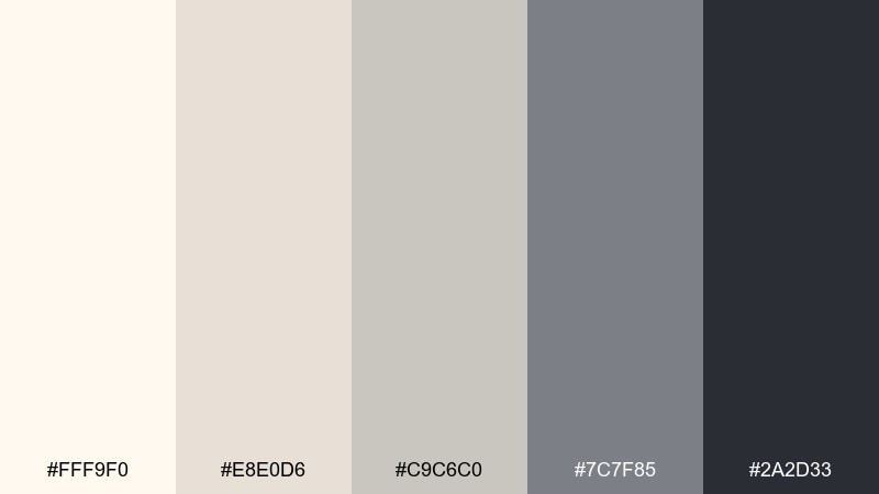
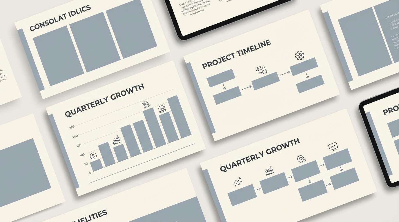
HEX: #FFF9F0 #E8E0D6 #C9C6C0 #7C7F85 #2A2D33
Mood: cool, restrained, modern
Best for: presentation deck
Cool and restrained, like fog over pale stone, these neutrals feel modern and confident. Use the light ivory for slide backgrounds, then organize content with soft grays and a single dark tone for titles. Ideal for tech decks, architecture portfolios, and data-heavy presentations that need clarity. Tip: keep charts mostly grayscale and highlight only one key metric per slide.
Image example of nordic fog generated using media.io
14) Vintage Bookshop
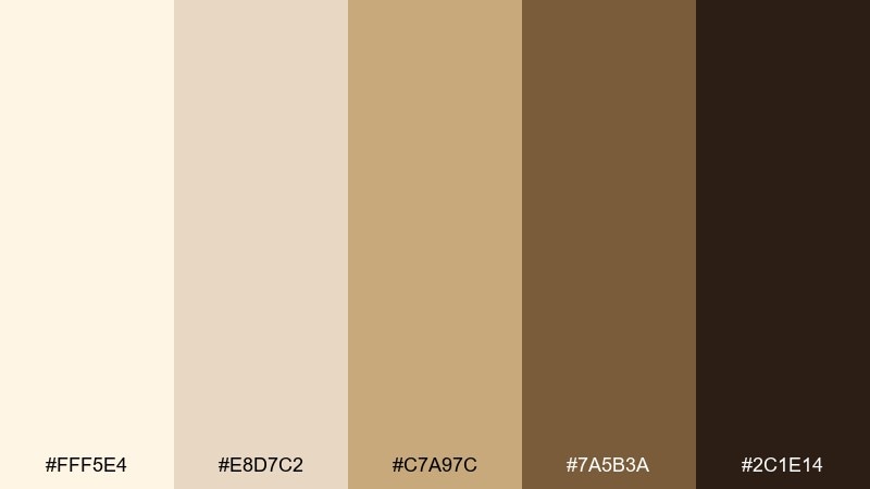
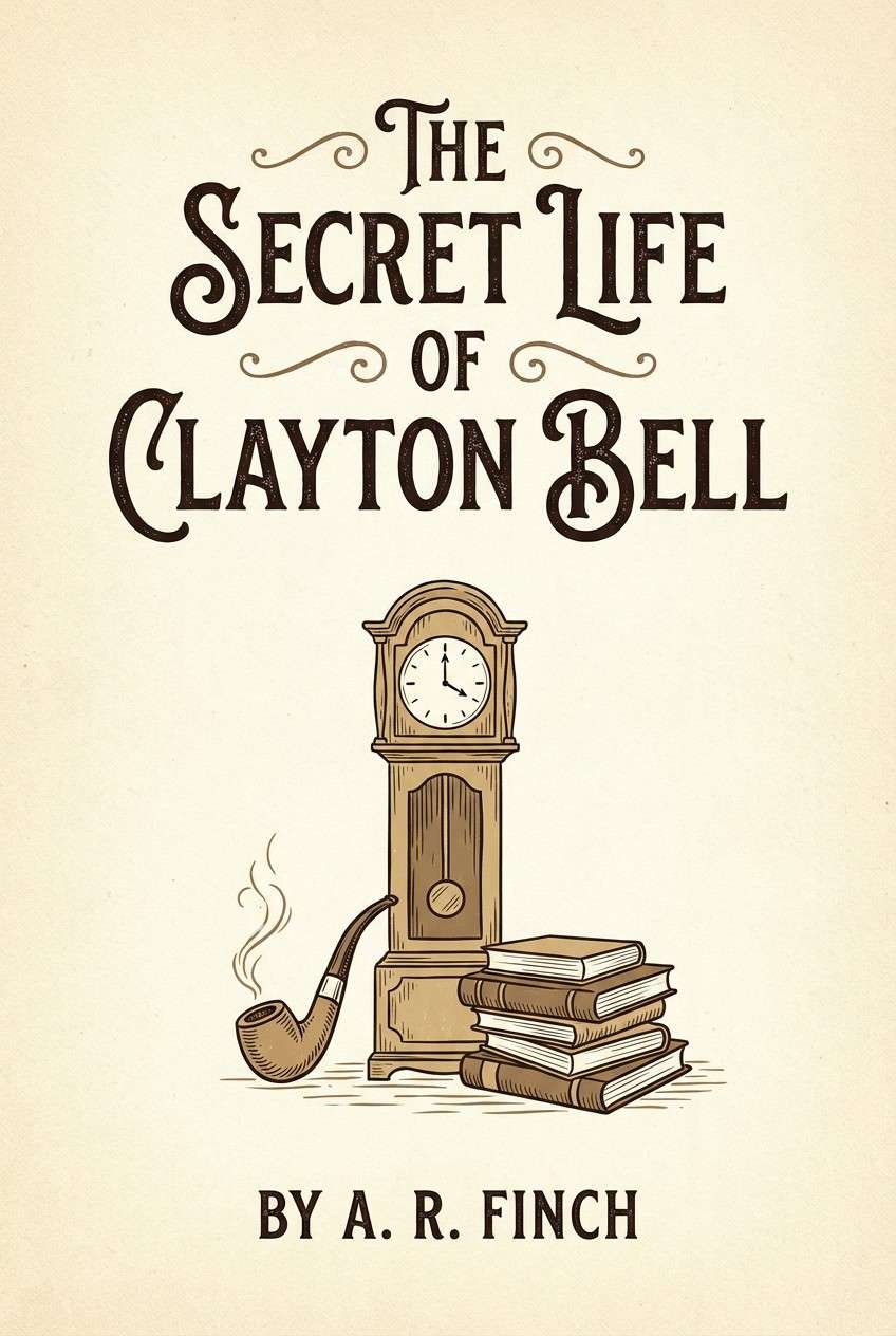
HEX: #FFF5E4 #E8D7C2 #C7A97C #7A5B3A #2C1E14
Mood: nostalgic, literary, warm
Best for: book cover design
Nostalgic and literary, like aged paper and worn leather, this palette feels quietly storied. Use the pale tones for background and margins, then build title contrast with the deep espresso and warm brown. It suits book covers, posters for readings, and heritage-inspired brands. Tip: add a subtle paper texture in the lightest shade to enhance the vintage mood without muddying the type.
Image example of vintage bookshop generated using media.io
15) Studio Clay
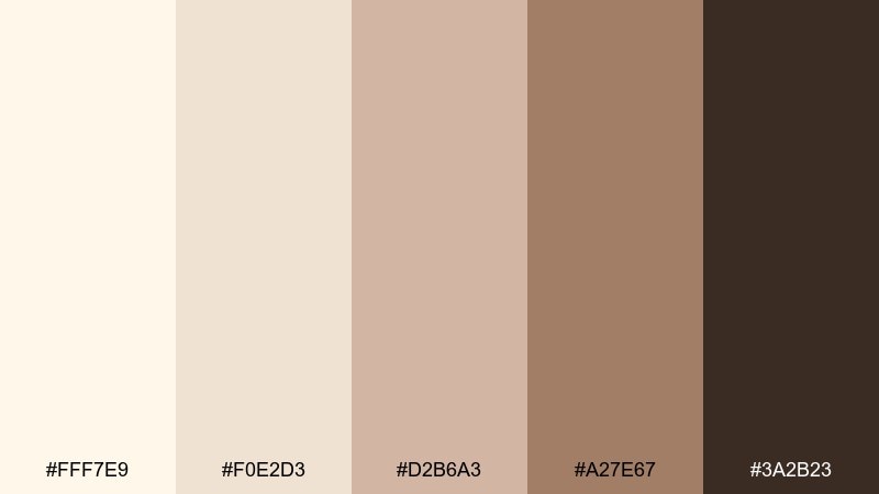
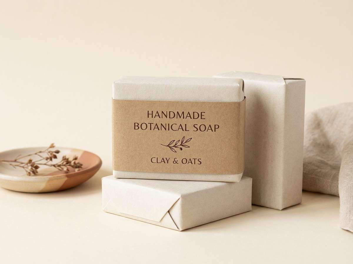
HEX: #FFF7E9 #F0E2D3 #D2B6A3 #A27E67 #3A2B23
Mood: earthy, calm, craft-forward
Best for: handmade soap packaging
Earthy and calm, like studio clay drying on a workbench, these tones feel handmade and sincere. Keep the ivory base for a clean label field, then use the dusty browns for ingredient panels and stamps. Perfect for soaps, candles, and apothecary-style goods that want an honest, grounded look. Tip: use the darkest shade for small-print compliance text so it stays readable on warm paper stocks.
Image example of studio clay generated using media.io
16) Garden Party
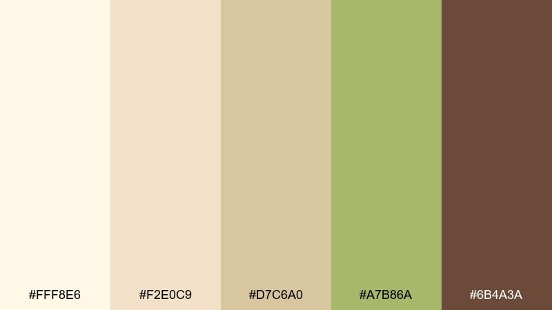
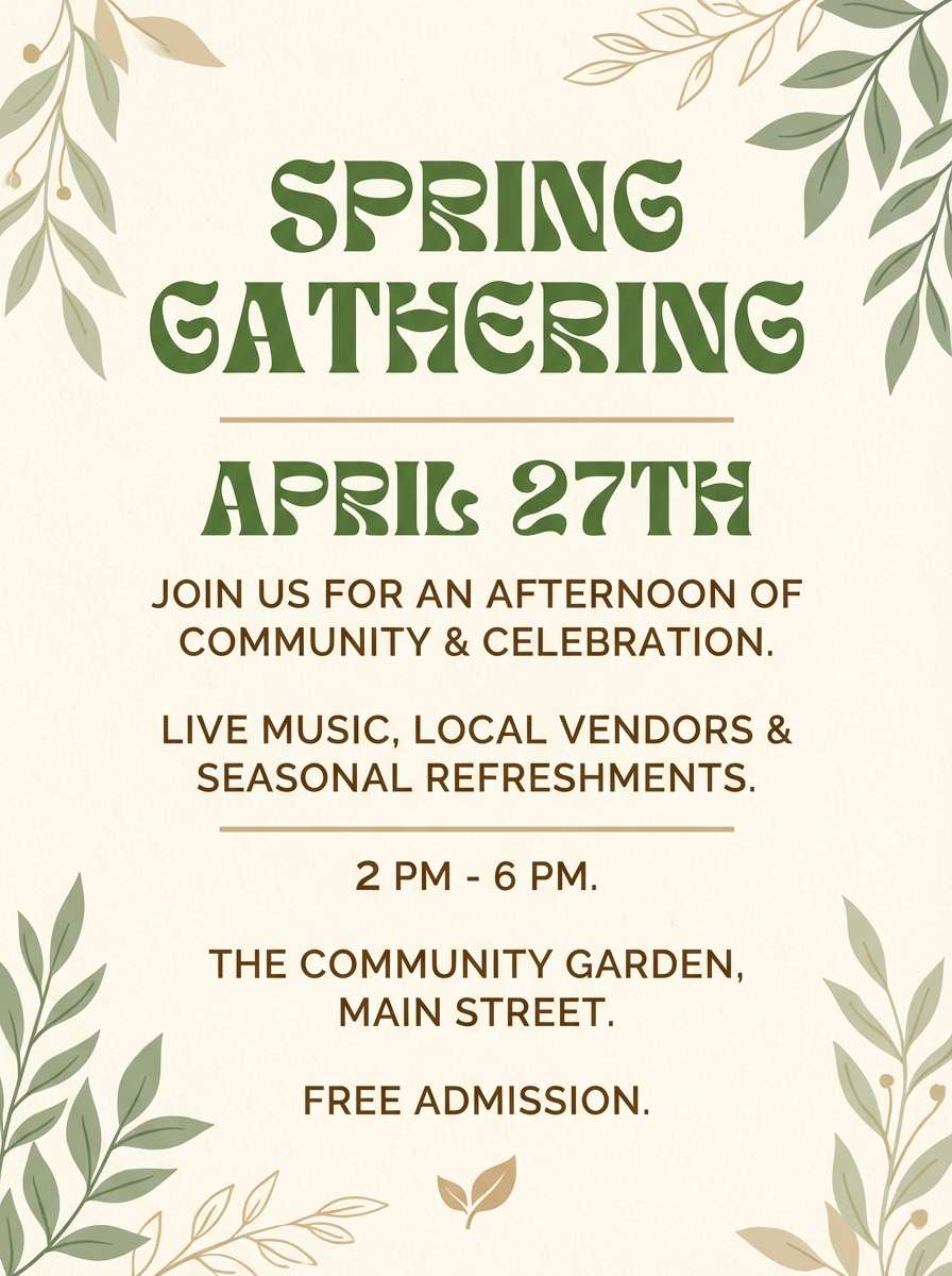
HEX: #FFF8E6 #F2E0C9 #D7C6A0 #A7B86A #6B4A3A
Mood: cheerful, outdoorsy, relaxed
Best for: spring event flyer
Cheerful and outdoorsy, like picnic linens under fresh greenery, this palette feels relaxed and inviting. Use ivory for the flyer background, then bring in leafy green for headers and small motifs. It is great for spring events, farmers markets, and community workshops where warmth matters. Tip: keep the brown for only a few typographic elements so the green stays the hero accent.
Image example of garden party generated using media.io
17) Luxe Noir
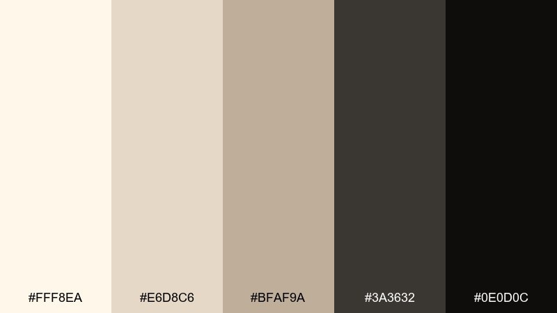
HEX: #FFF8EA #E6D8C6 #BFAF9A #3A3632 #0E0D0C
Mood: dramatic, premium, modern classic
Best for: fashion lookbook
Dramatic and premium, like runway spotlights on ivory silk, this set delivers instant sophistication. Keep spreads mostly light, then use the deep blacks for bold typography and framing elements. Ideal for fashion lookbooks, luxury services, and high-end portfolios that need contrast. Tip: use the mid taupe as a soft divider so black elements do not feel too harsh.
Image example of luxe noir generated using media.io
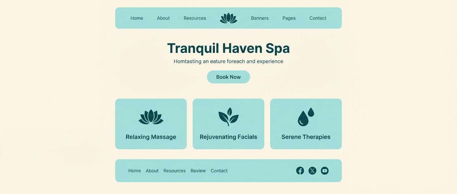
18) Soft Aqua Spa
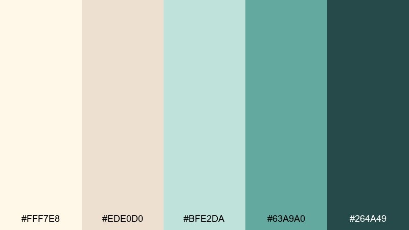
HEX: #FFF7E8 #EDE0D0 #BFE2DA #63A9A0 #264A49
Mood: fresh, clean, restorative
Best for: spa landing page
Fresh and restorative, like warm steam meeting cool water, these tones feel clean and calming. The white ivory color combinations look best when aqua is used as a focused accent for buttons, icons, and key benefits. Great for spa websites, skincare clinics, and wellness newsletters that want serenity without looking sterile. Tip: use the deep teal for primary text to maintain contrast on the pale background.
Image example of soft aqua spa generated using media.io
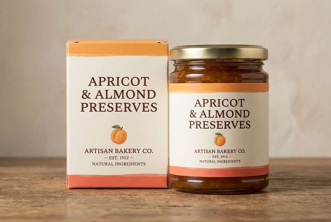
19) Apricot Silk
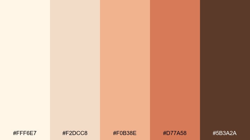
HEX: #FFF6E7 #F2DCC8 #F0B38E #D77A58 #5B3A2A
Mood: sunny, soft, uplifting
Best for: bakery product label
Sunny and soft, like apricot glaze on warm pastry, this palette feels upbeat and approachable. Use the ivory and cream tones for the label base, then add apricot and coral for flavor bands and small illustrations. Ideal for bakeries, jams, and seasonal food packaging that needs warmth and appetite appeal. Tip: keep the brown for barcodes and mandatory text so the label stays playful.
Image example of apricot silk generated using media.io
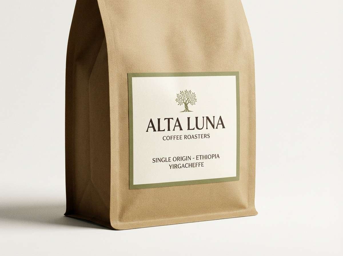
20) Olive Espresso
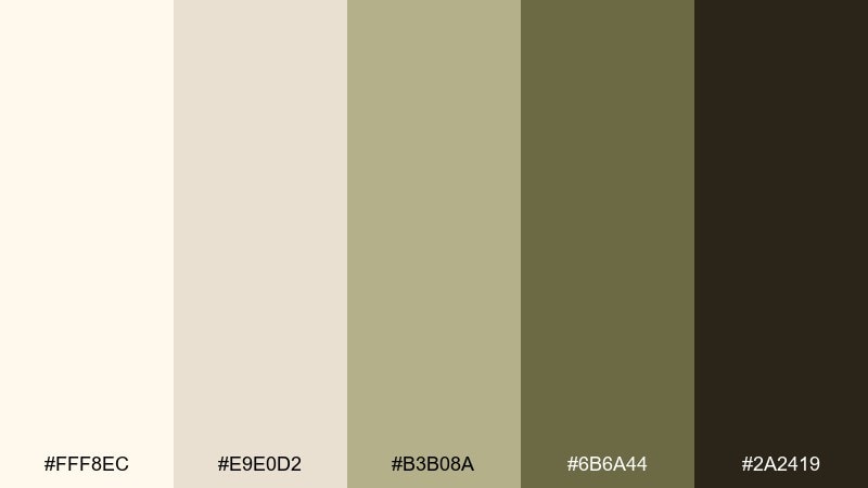
HEX: #FFF8EC #E9E0D2 #B3B08A #6B6A44 #2A2419
Mood: earthy, mature, understated
Best for: coffee bag packaging
Earthy and mature, like espresso crema with an olive grove in the distance, these tones feel grounded and confident. Keep the light ivory for the main panel, then use olive and deep brown for badges, origins, and roast notes. It is a natural fit for coffee packaging, gourmet goods, and outdoor brands that prefer muted color. Tip: use the mid olive as a consistent highlight color to build recognition across SKUs.
Image example of olive espresso generated using media.io
What Colors Go Well with White Ivory?
White ivory pairs effortlessly with deep neutrals like charcoal, espresso brown, and near-black, creating crisp readability for logos, headings, and UI text. These combinations keep the overall look bright while still feeling grounded.
For softer accents, try dusty blues, sage greens, lavender, or muted terracotta. These tones add personality while preserving the calm, premium feel that ivory backgrounds naturally create.
If you want a more festive or luxury direction, warm metallic-inspired hues (champagne, copper, caramel) work beautifully with ivory. Keep accents controlled so the palette stays elegant instead of busy.
How to Use a White Ivory Color Palette in Real Designs
Start with ivory as your main surface color, then choose one dark “ink” tone for text and icons. This simple structure keeps layouts readable across print and digital while maintaining that warm, editorial softness.
Use mid-neutrals (beige, taupe, warm gray) for dividers, cards, and secondary backgrounds. They create hierarchy without introducing harsh contrast, especially in dashboards, presentations, and multi-page documents.
When adding an accent color, assign it a clear role: buttons, stamps, highlights, or decorative borders. Consistency matters more than variety—repeat the same accent in key touchpoints for a cohesive system.
Create White Ivory Palette Visuals with AI
Need quick mockups for a brand board, invitation set, or UI concept? Generate clean, on-style images using your palette and a simple prompt, then iterate on mood (minimal, vintage, luxe) in seconds.
With Media.io, you can produce consistent palette-based visuals for ads, packaging concepts, hero sections, or illustration directions—without rebuilding everything from scratch each time.
Try describing your layout, materials, and lighting, then include your target colors and a clear aspect ratio. You’ll get design-ready inspiration you can refine into final assets.
White Ivory Color Palette FAQs
-
What is the difference between white ivory and pure white?
White ivory has warm yellow-beige undertones, while pure white is more neutral or cool. Ivory feels softer and more natural on backgrounds, paper, and product packaging. -
Is white ivory a good background color for websites?
Yes. Ivory reduces harsh glare compared to pure white and can feel more comfortable for reading. Pair it with charcoal or near-black text to keep contrast and accessibility strong. -
What accent colors look best with white ivory?
Muted accents work best: sage green, dusty blue, lavender, terracotta, and warm copper/champagne tones. They add personality while keeping the overall design calm and premium. -
How do I keep a white ivory palette from looking “too beige”?
Add a darker anchor (charcoal, espresso, navy) and use it consistently for typography. You can also introduce one cool-leaning accent (dusty blue or cool gray) to balance warmth. -
Which text color is most readable on ivory?
Deep charcoal, near-black, or very dark brown typically performs best. Avoid light gray body text on ivory, since it can reduce legibility—especially on smaller font sizes. -
Does ivory work well for wedding stationery?
Absolutely. Ivory paper tones feel romantic and timeless, and they pair beautifully with blush, mauve, cocoa brown, gold/champagne accents, and delicate botanical greens. -
Can I generate palette-based mockups with AI using these HEX codes?
Yes. Use the palette HEX codes as guidance in your prompt (plus keywords like “ivory background” and “charcoal text”), then iterate until the image matches the warmth and contrast you want.


