

Canary yellow (#FFD400) is a high-energy, high-visibility hue that instantly signals optimism, clarity, and “look here” emphasis. Used well, it can feel modern and premium rather than loud or childish.
Below are 20 canary yellow color palette ideas with ready-to-use HEX codes, plus practical guidance for applying them to branding, UI, print, and social design.
In this article
- Why Canary Yellow Palettes Work So Well
-
- sunlit citrus
- retro lemonade
- canary and charcoal
- golden pollen pastels
- urban sunbeam
- soft canary neutrals
- coastal canary
- canary lavender pop
- honey and terracotta
- tech lime canary
- sunrise gradient
- canary blue classic
- botanical canary olive
- monochrome canary tints
- canary rose gold
- night market glow
- canary denim
- desert canary
- canary plum elegance
- sunny graphite
- What Colors Go Well with Canary Yellow?
- How to Use a Canary Yellow Color Palette in Real Designs
- Create Canary Yellow Palette Visuals with AI
Why Canary Yellow Palettes Work So Well
Canary yellow sits in a sweet spot between warm sunshine and modern highlighter energy, so it naturally creates strong focal points. That makes it ideal for calls to action, hero elements, and “attention” states in UI and print.
It also pairs well across temperature: cool blues and teals sharpen it, while warm terracotta and sand tones mellow it. With the right neutrals (cream, charcoal, graphite), canary yellow becomes readable, premium, and controllable.
Finally, canary yellow photographs and prints with a distinctive glow when you avoid pure white backgrounds. Slightly creamy whites and soft grays help the yellow look richer and less harsh.
20+ Canary Yellow Color Palette Ideas (with HEX Codes)
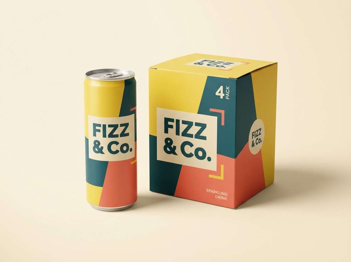
1) Sunlit Citrus
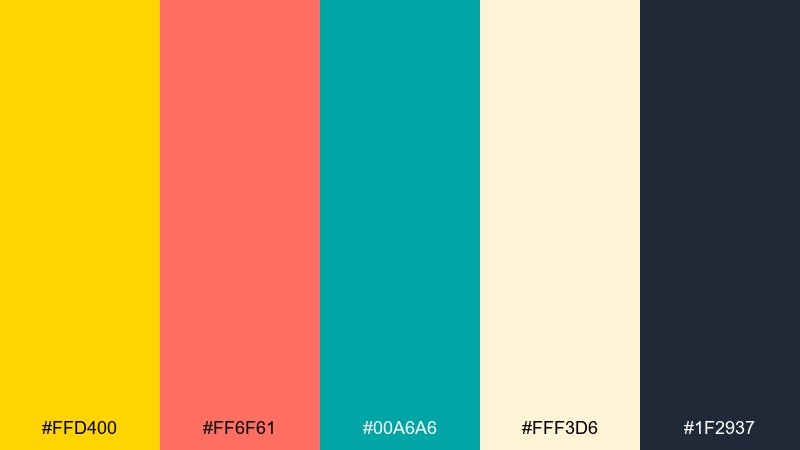
HEX: #FFD400 #FF6F61 #00A6A6 #FFF3D6 #1F2937
Mood: zesty, sunny, energetic
Best for: summer beverage brand packaging
Zesty and sun-warmed, this mix feels like citrus peel, cold bubbles, and a bright afternoon. Use the yellow as the hero color, then lean on teal for contrast and coral for friendly appetite appeal. It works especially well on cans, cartons, and shelf-ready labels where you need instant pop. Tip: keep the background creamy instead of pure white to make the yellow look richer and less harsh.
Image example of sunlit citrus generated using media.io
Media.io is an online AI studio for creating and editing video, image, and audio in your browser.

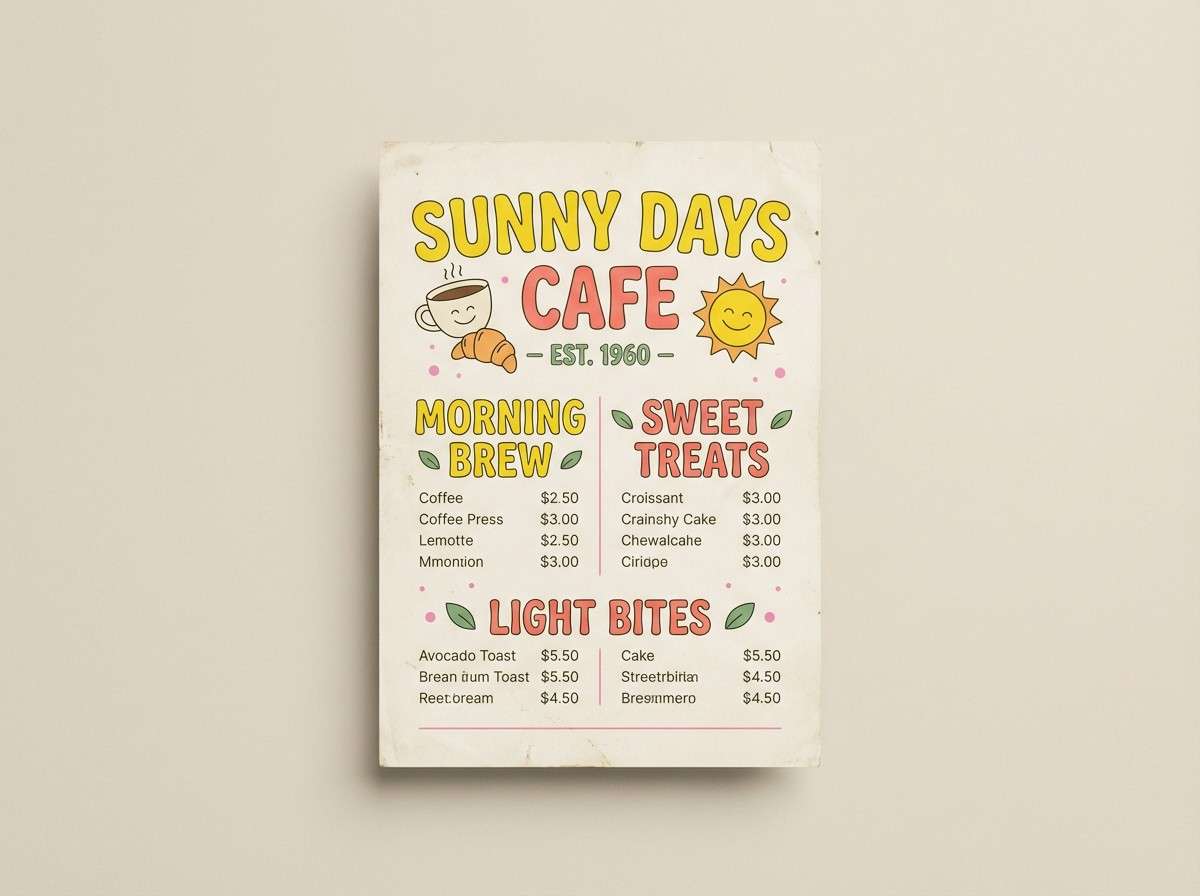
2) Retro Lemonade
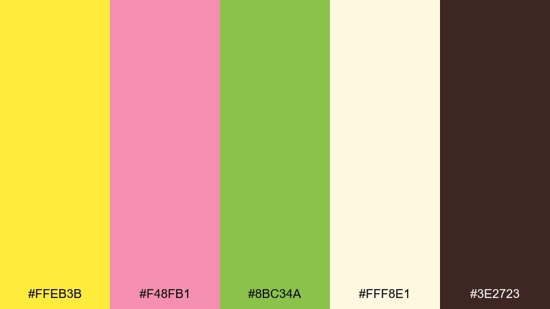
HEX: #FFEB3B #F48FB1 #8BC34A #FFF8E1 #3E2723
Mood: playful, nostalgic, sweet
Best for: vintage cafe menu flyer
Playful and nostalgic, it evokes striped awnings, soda fountains, and pastel treats. Pair the sunny yellow with bubblegum pink for headings and use leafy green as a supportive accent for sections and icons. It shines on cafe menus and flyers where you want charm without feeling childish. Tip: reserve the dark brown for type only so the layout stays light and appetizing.
Image example of retro lemonade generated using media.io
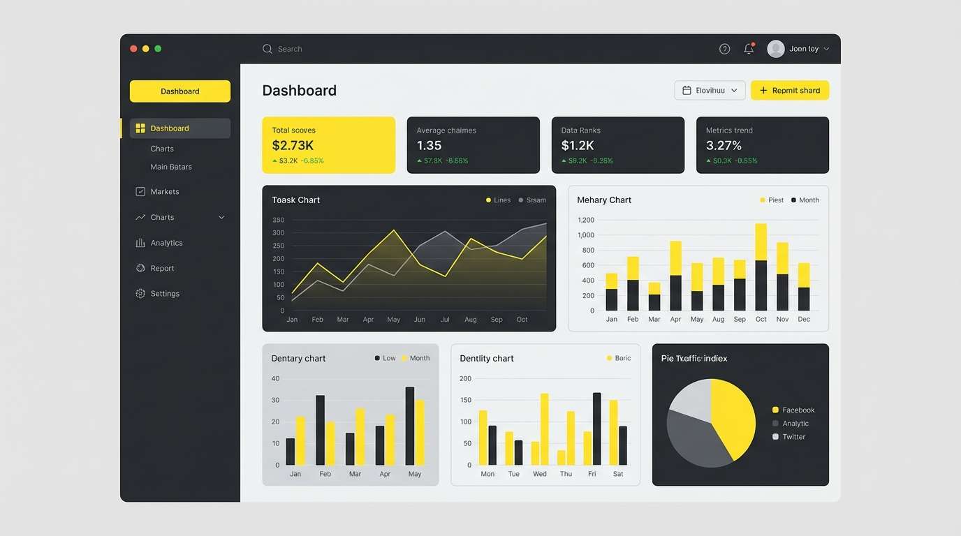
3) Canary and Charcoal
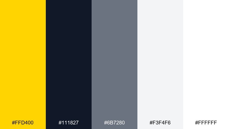
HEX: #FFD400 #111827 #6B7280 #F3F4F6 #FFFFFF
Mood: clean, confident, high-contrast
Best for: saas dashboard ui mockup
Clean and confident, the look feels like bright highlight tape on sleek graphite paper. This canary yellow color scheme is ideal for dashboards where alerts, buttons, and key metrics need crisp hierarchy. Use yellow sparingly for primary actions, and let the grays carry surfaces and secondary controls. Tip: keep body text on the light gray instead of pure white to reduce glare on long sessions.
Image example of canary and charcoal generated using media.io
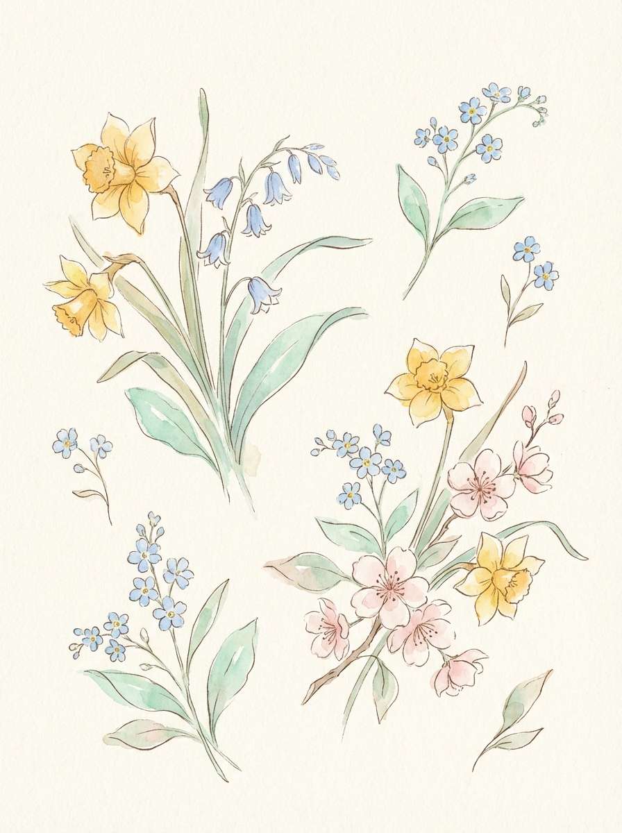
4) Golden Pollen Pastels
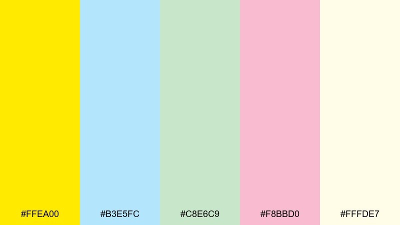
HEX: #FFEA00 #B3E5FC #C8E6C9 #F8BBD0 #FFFDE7
Mood: airy, gentle, springlike
Best for: watercolor botanical spring illustration
Airy and gentle, it brings to mind pollen-dusted petals and soft morning light. The yellow reads as a warm center, while the pastels keep the overall feel calm and approachable. Use it for spring illustrations, stationery, and light lifestyle graphics where you want optimism without loud contrast. Tip: let the off-white sit behind everything so the pastels stay crisp and not muddy.
Image example of golden pollen pastels generated using media.io
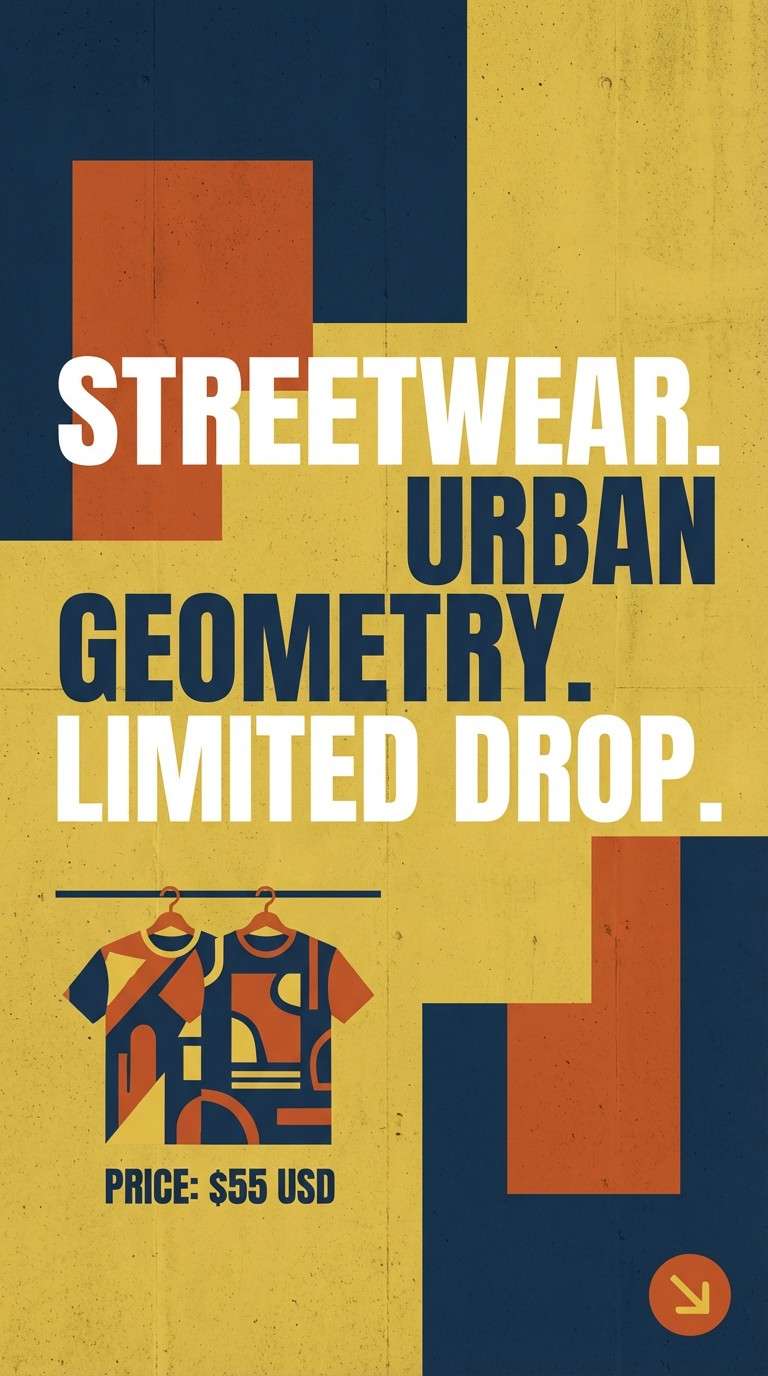
5) Urban Sunbeam
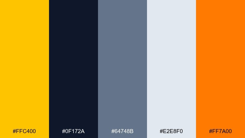
HEX: #FFC400 #0F172A #64748B #E2E8F0 #FF7A00
Mood: bold, sporty, street
Best for: streetwear product ad poster
Bold and sporty, it feels like sunlight hitting concrete and reflective tape. The deep navy grounds the look, while the yellow and orange create fast, kinetic emphasis. Use it for streetwear ads, limited drops, and bold social posters that need immediate attention. Tip: use the light gray as negative space to keep the typography breathable and modern.
Image example of urban sunbeam generated using media.io
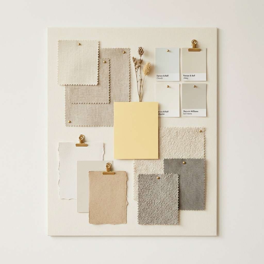
6) Soft Canary Neutrals
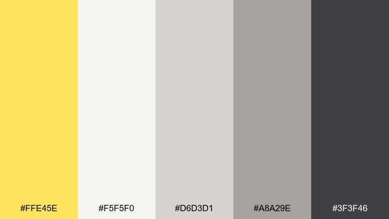
HEX: #FFE45E #F5F5F0 #D6D3D1 #A8A29E #3F3F46
Mood: warm, calm, understated
Best for: minimal interior mood board
Warm and calm, these tones suggest linen curtains, sunlight on plaster, and quiet mornings. The soft yellow works best as a subtle accent against creamy neutrals and stone grays. Use it for interior mood boards, lifestyle branding, and minimalist packaging where restraint is the point. Tip: add the darkest gray only in small doses for structure, like captions or thin lines.
Image example of soft canary neutrals generated using media.io
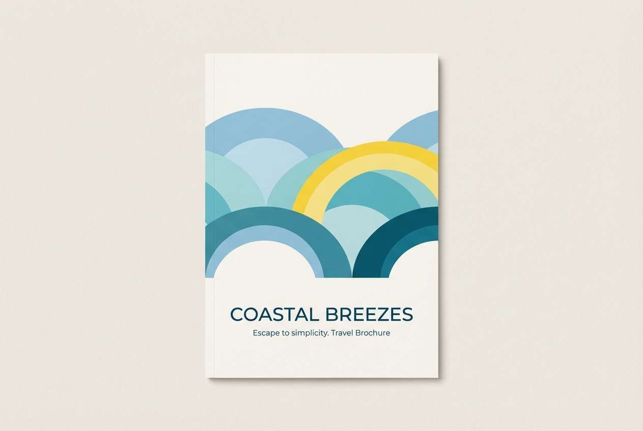
7) Coastal Canary
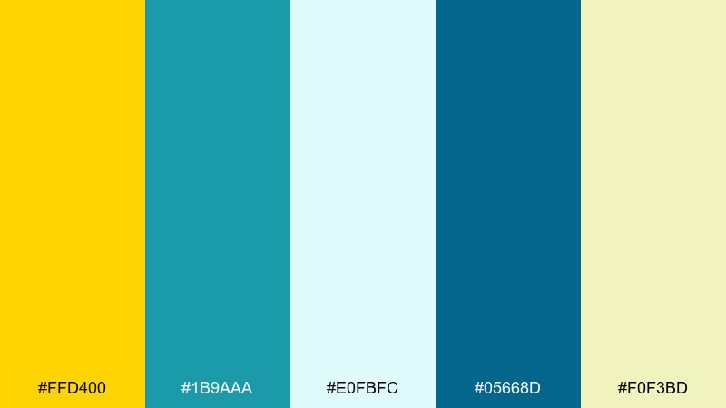
HEX: #FFD400 #1B9AAA #E0FBFC #05668D #F0F3BD
Mood: fresh, breezy, seaside
Best for: travel brochure cover design
Fresh and breezy, it feels like a seaside boardwalk with sun glare on water. Use the deeper blue for headings and structure, then bring in bright yellow as a spotlight color for calls to action. It fits travel brochures, tour covers, and summer campaign graphics. Tip: keep the pale aqua as the main background so the yellow reads like sunlight, not neon.
Image example of coastal canary generated using media.io
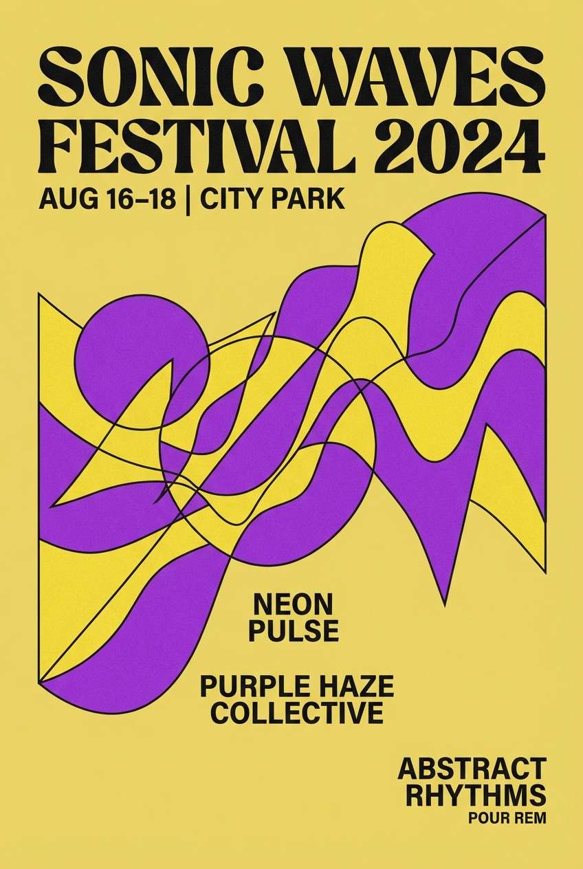
8) Canary Lavender Pop
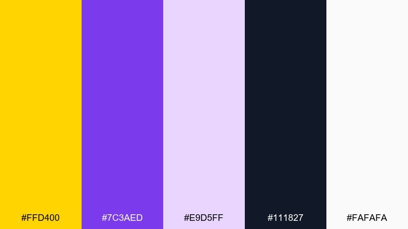
HEX: #FFD400 #7C3AED #E9D5FF #111827 #FAFAFA
Mood: loud, modern, playful
Best for: music festival poster
Loud and modern, it evokes stage lights, sticker art, and a late-night set list. These canary yellow color combinations work best when purple takes the supporting role and black anchors the type. Use it for music posters, club flyers, and bold merch graphics that need a youthful edge. Tip: set the background to off-white and keep the yellow for the headline to maximize punch.
Image example of canary lavender pop generated using media.io
9) Honey and Terracotta
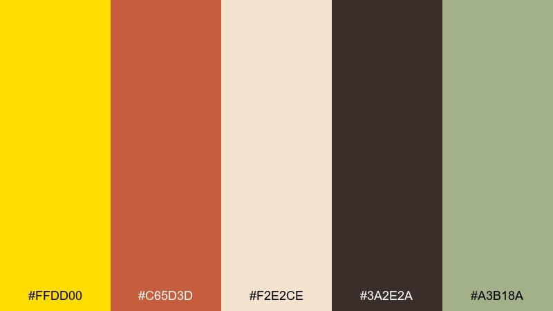
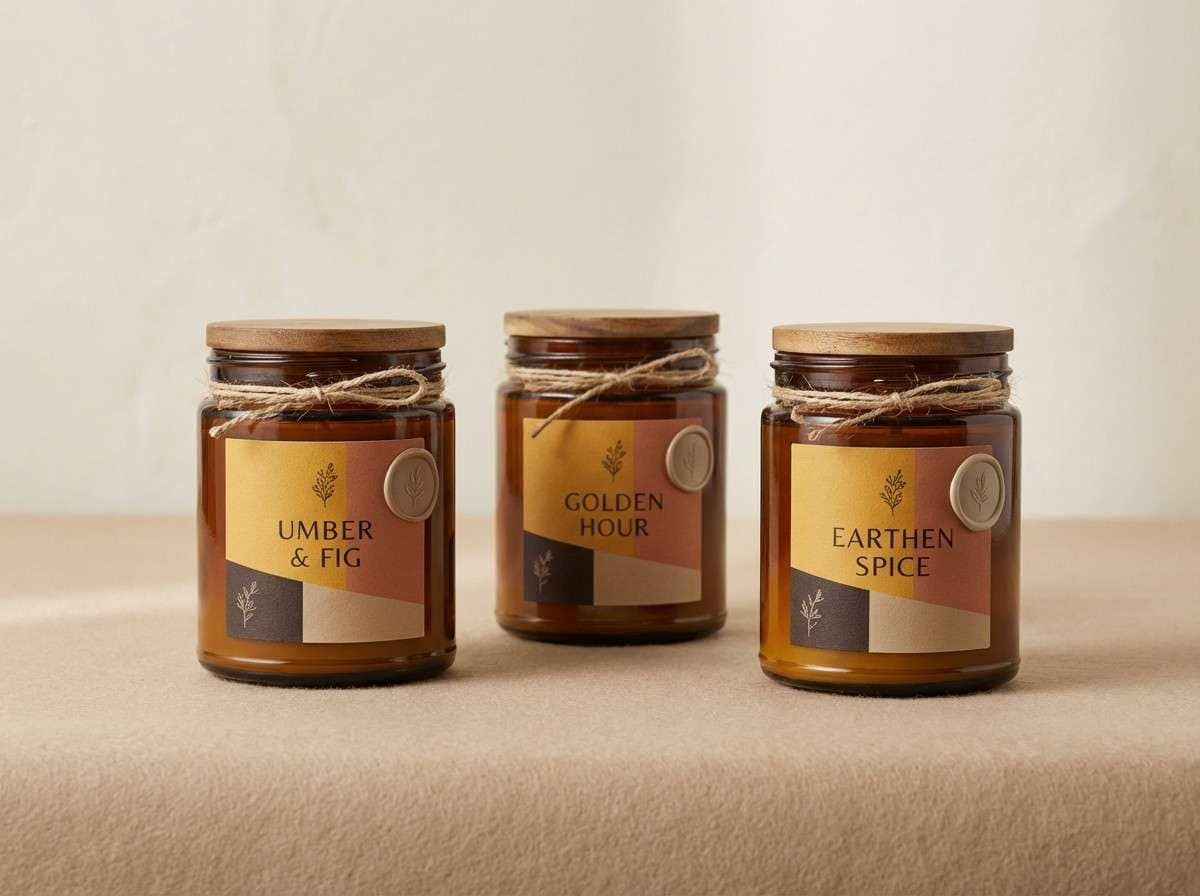
HEX: #FFDD00 #C65D3D #F2E2CE #3A2E2A #A3B18A
Mood: earthy, cozy, artisanal
Best for: artisan candle packaging
Earthy and cozy, it feels like warm wax, clay pots, and a sunlit studio. The honeyed yellow pairs naturally with terracotta for a handcrafted look, while sage adds a botanical touch. Use it on candle labels, soap wraps, and small-batch packaging where texture matters. Tip: keep the dark espresso for brand marks and ingredient text to maintain a premium feel.
Image example of honey and terracotta generated using media.io
10) Tech Lime Canary
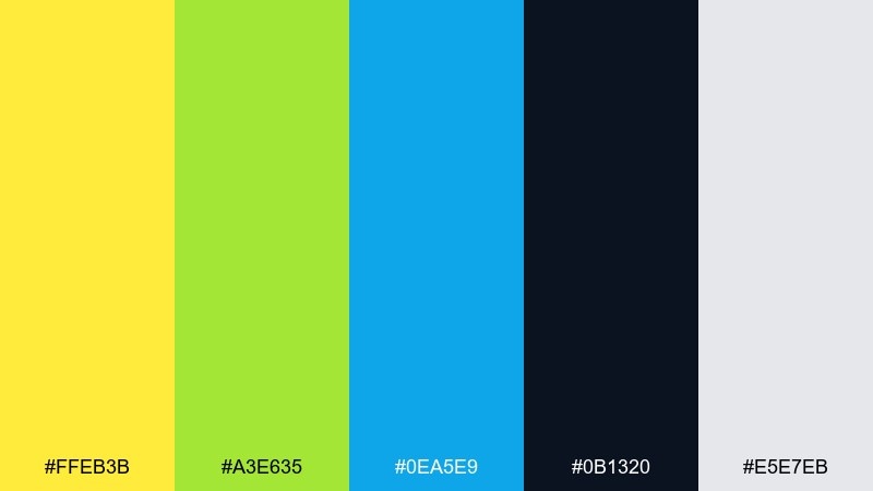
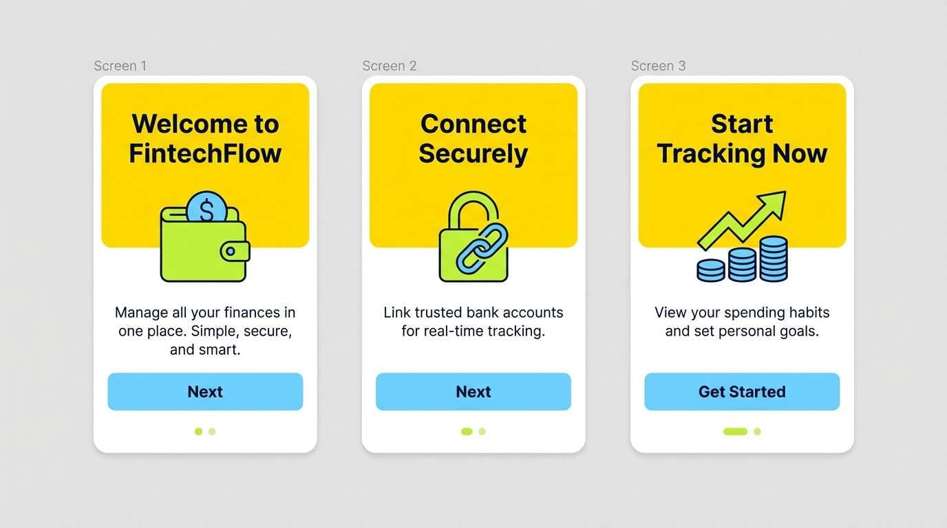
HEX: #FFEB3B #A3E635 #0EA5E9 #0B1320 #E5E7EB
Mood: active, digital, optimistic
Best for: fintech app onboarding ui mockup
Active and digital, it suggests progress bars, fresh dashboards, and quick wins. Use the yellow for key highlights, lime for secondary emphasis, and blue for links and supportive icons. It works well in onboarding flows where you want energy without relying on red or orange warnings. Tip: keep the dark navy for headers and use the light gray for card surfaces to stay readable.
Image example of tech lime canary generated using media.io
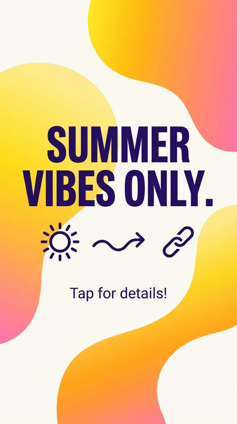
11) Sunrise Gradient
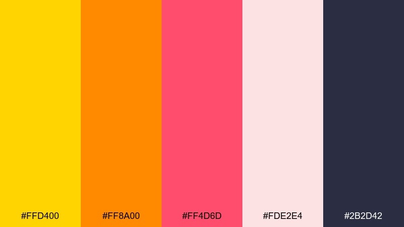
HEX: #FFD400 #FF8A00 #FF4D6D #FDE2E4 #2B2D42
Mood: radiant, friendly, upbeat
Best for: instagram story template design
Radiant and friendly, it feels like a sunrise fade over soft clouds. The warm ramp from yellow to orange to rosy pink makes headlines feel welcoming and energetic. Use it for story templates, launch teasers, and seasonal promos where motion and warmth matter. Tip: set text in the deep indigo for contrast and keep gradients subtle to avoid banding.
Image example of sunrise gradient generated using media.io
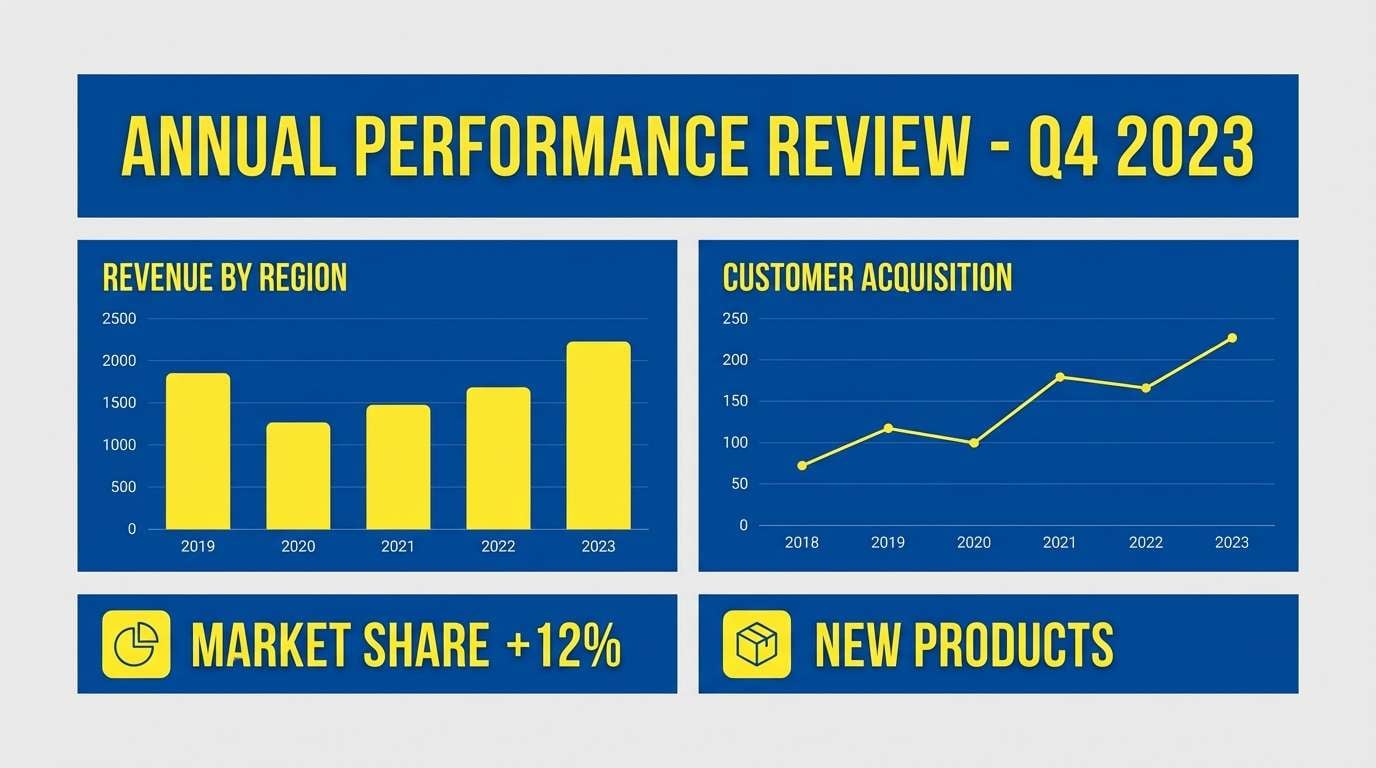
12) Canary Blue Classic
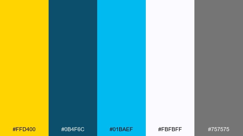
HEX: #FFD400 #0B4F6C #01BAEF #FBFBFF #757575
Mood: trustworthy, crisp, professional
Best for: corporate presentation slide template
Trustworthy and crisp, it evokes clean charts, clear messaging, and confident delivery. The blues provide stability, while the yellow acts like a highlighter for key takeaways. Use it in slide decks, reports, and webinar graphics where clarity is non-negotiable. Tip: keep yellow to one accent per slide, such as a callout box or a single chart series.
Image example of canary blue classic generated using media.io
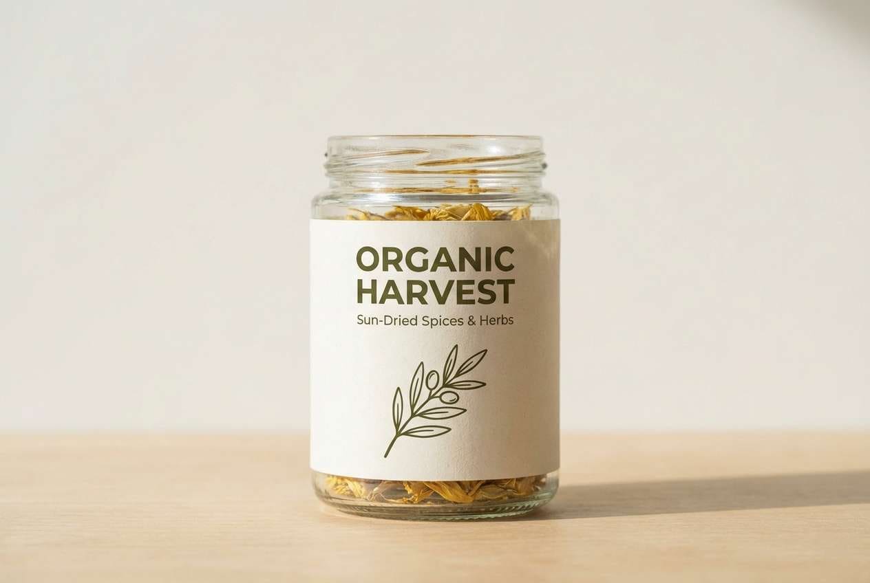
13) Botanical Canary Olive
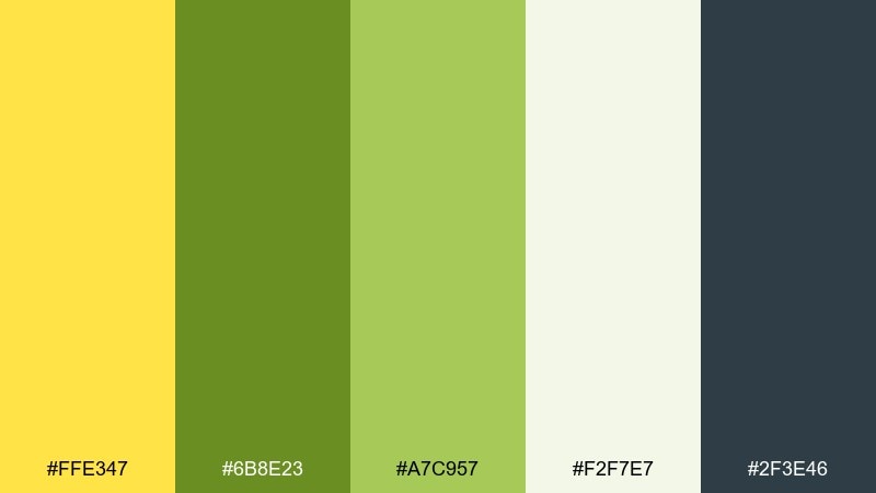
HEX: #FFE347 #6B8E23 #A7C957 #F2F7E7 #2F3E46
Mood: natural, grounded, fresh
Best for: eco food jar label
Natural and grounded, it feels like herb gardens, olive leaves, and sunlit fields. Yellow brings warmth without overpowering, while olive and deep green signal sustainability and quality. Use it for eco labels, organic pantry goods, and farmer-market branding. Tip: print the yellow slightly muted on matte paper to avoid glare and keep the label readable.
Image example of botanical canary olive generated using media.io
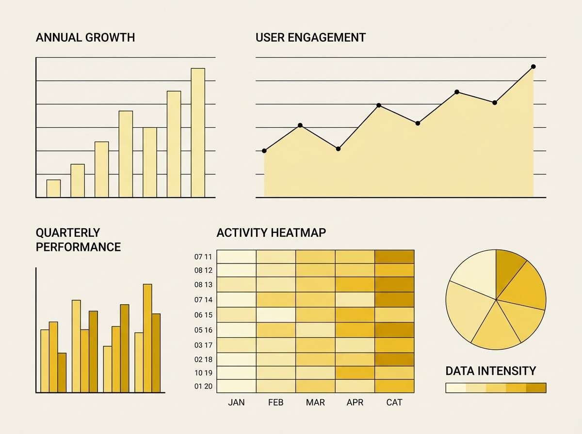
14) Monochrome Canary Tints
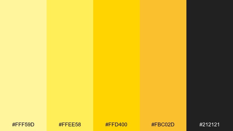
HEX: #FFF59D #FFEE58 #FFD400 #FBC02D #212121
Mood: focused, bold, systematic
Best for: data visualization chart theme
Focused and systematic, it resembles layered highlighter tones on a clean workspace. The stepped yellows create clear hierarchy for charts, progress states, and heatmaps. Use black for axes and labels, then map intensity with the deeper gold. Tip: assign the brightest tint to backgrounds and save the darkest yellow for the most important data series.
Image example of monochrome canary tints generated using media.io
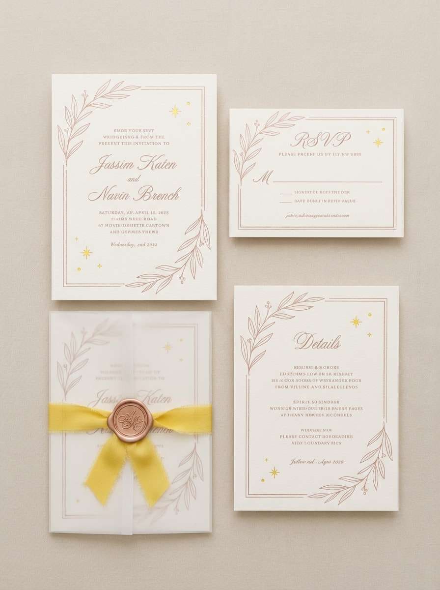
15) Canary Rose Gold
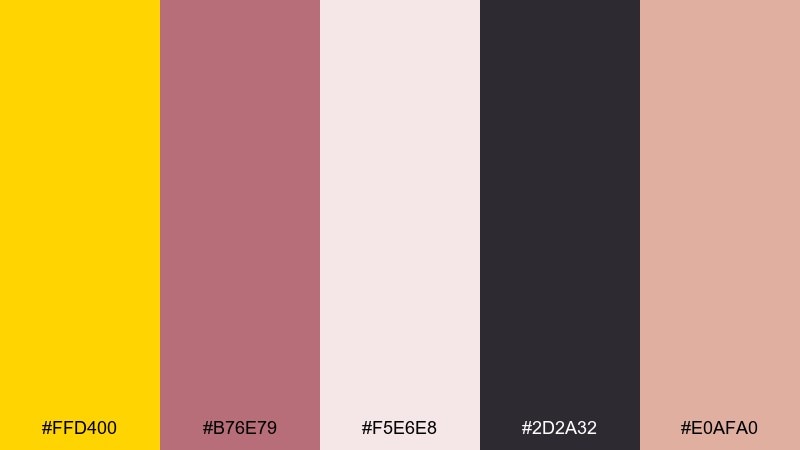
HEX: #FFD400 #B76E79 #F5E6E8 #2D2A32 #E0AFA0
Mood: romantic, polished, celebratory
Best for: wedding invitation suite
Romantic and polished, it brings to mind champagne sparkle and soft blush florals. This canary yellow color palette feels freshest when yellow is used as a tiny foil accent against rose tones and deep ink text. It works beautifully for wedding invitations, save-the-dates, and elegant event stationery. Tip: use embossed or foil details for the yellow to keep it refined rather than loud.
Image example of canary rose gold generated using media.io
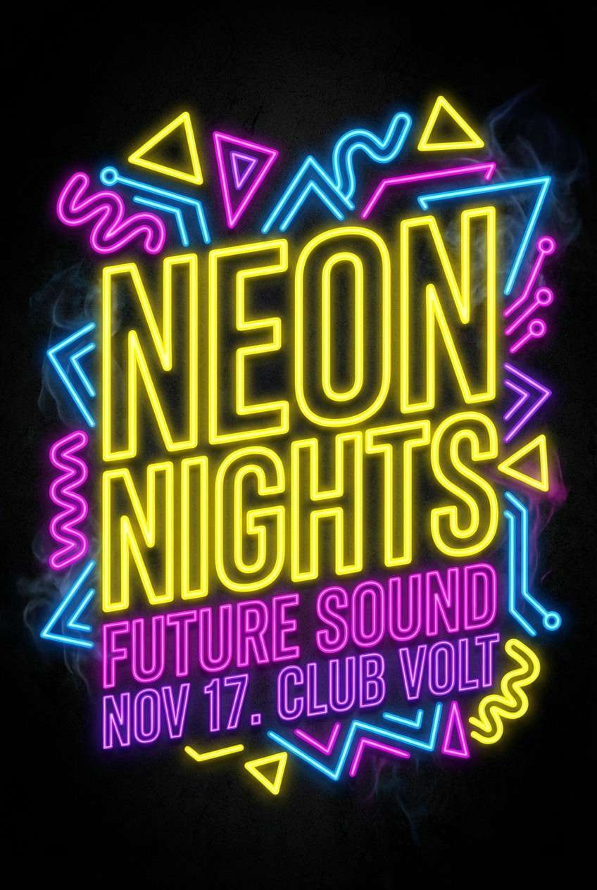
16) Night Market Glow
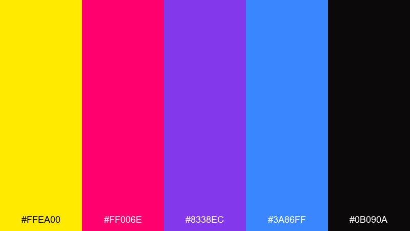
HEX: #FFEA00 #FF006E #8338EC #3A86FF #0B090A
Mood: electric, nightlife, energetic
Best for: neon event flyer
Electric and bold, it feels like neon signs and late-night street markets. The black base makes the yellow and saturated accents look brighter and more cinematic. Use it for event flyers, DJ lineups, and club promos where contrast is the whole vibe. Tip: keep type in white or yellow and limit magenta to small bursts so it does not overpower.
Image example of night market glow generated using media.io
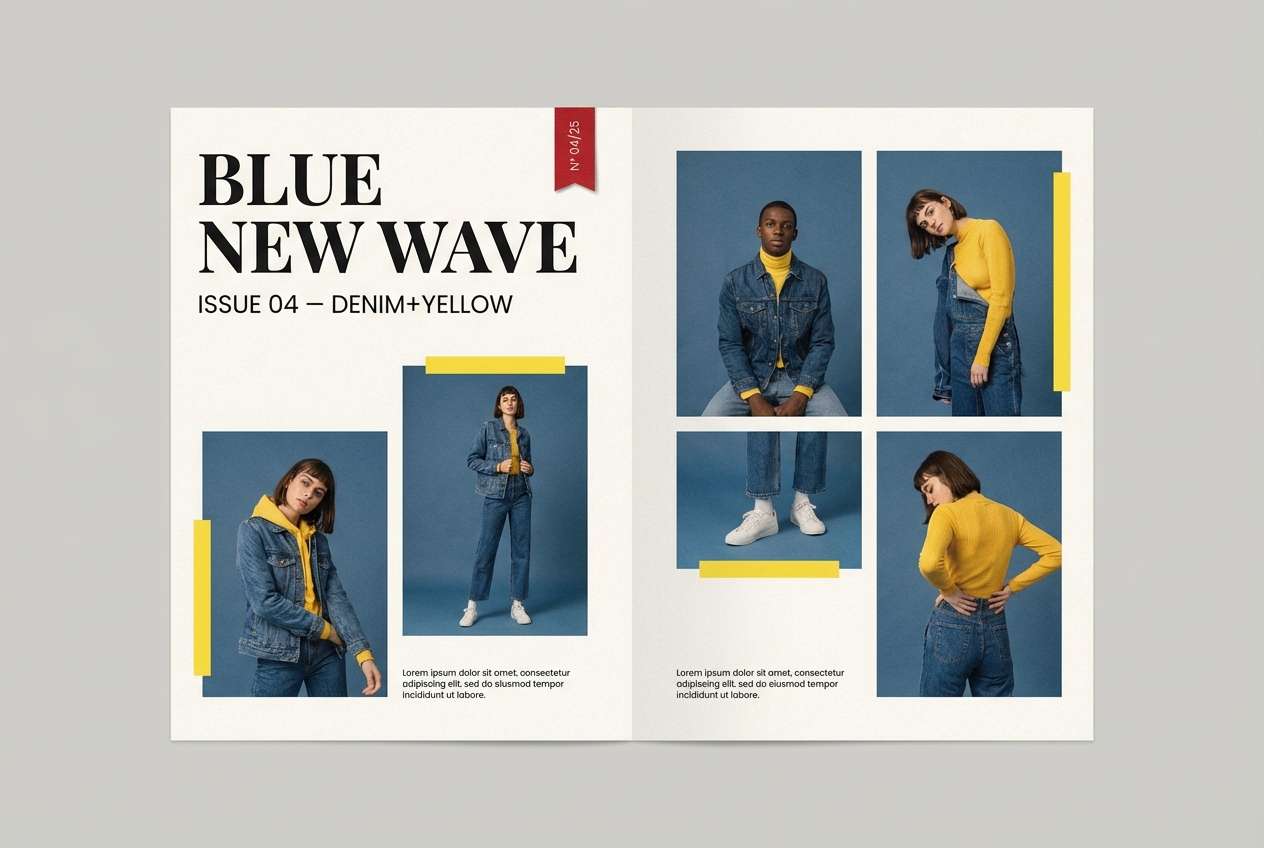
17) Canary Denim
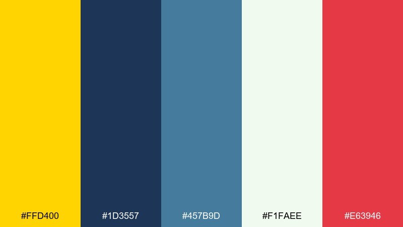
HEX: #FFD400 #1D3557 #457B9D #F1FAEE #E63946
Mood: casual, sporty, Americana
Best for: casual apparel lookbook page
Casual and sporty, it evokes denim jackets, varsity details, and sunlit weekends. The blues provide a familiar base, while yellow adds upbeat highlights and the red acts as a small attention cue. Use it for lookbooks, retail banners, and editorial layouts where you want a clean, youthful rhythm. Tip: keep red to one element per spread, like a price tag or small badge.
Image example of canary denim generated using media.io
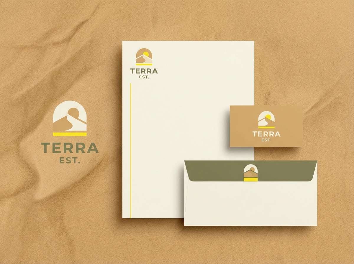
18) Desert Canary
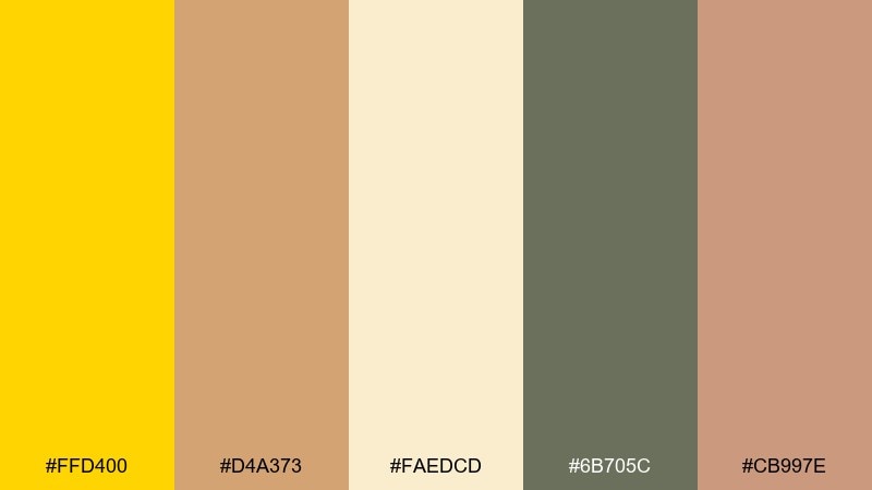
HEX: #FFD400 #D4A373 #FAEDCD #6B705C #CB997E
Mood: sunbaked, earthy, relaxed
Best for: outdoor brand logo and stationery
Sunbaked and relaxed, it recalls dunes, canvas tents, and golden hour trails. These canary yellow color combinations look best when yellow is a small beacon against sandy neutrals and muted olive. Use it for outdoor brands, stationery systems, and badges where you need warmth without shouting. Tip: choose the cream as the default paper tone and keep the darker olive for stamps and outlines.
Image example of desert canary generated using media.io
19) Canary Plum Elegance
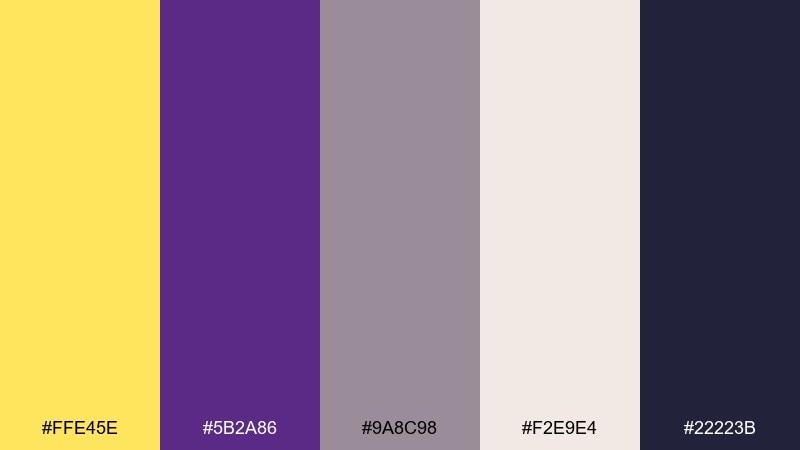
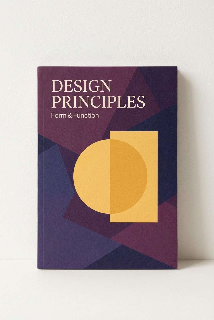
HEX: #FFE45E #5B2A86 #9A8C98 #F2E9E4 #22223B
Mood: elegant, moody, artistic
Best for: book cover design
Elegant and slightly moody, it feels like gallery lighting on rich fabric. Plum adds depth and sophistication, while the yellow brings a sharp focal point for titles or a small emblem. Use it for book covers, album art, and premium editorial graphics. Tip: keep the background in warm off-white for approachability, then use the deep navy for all type.
Image example of canary plum elegance generated using media.io
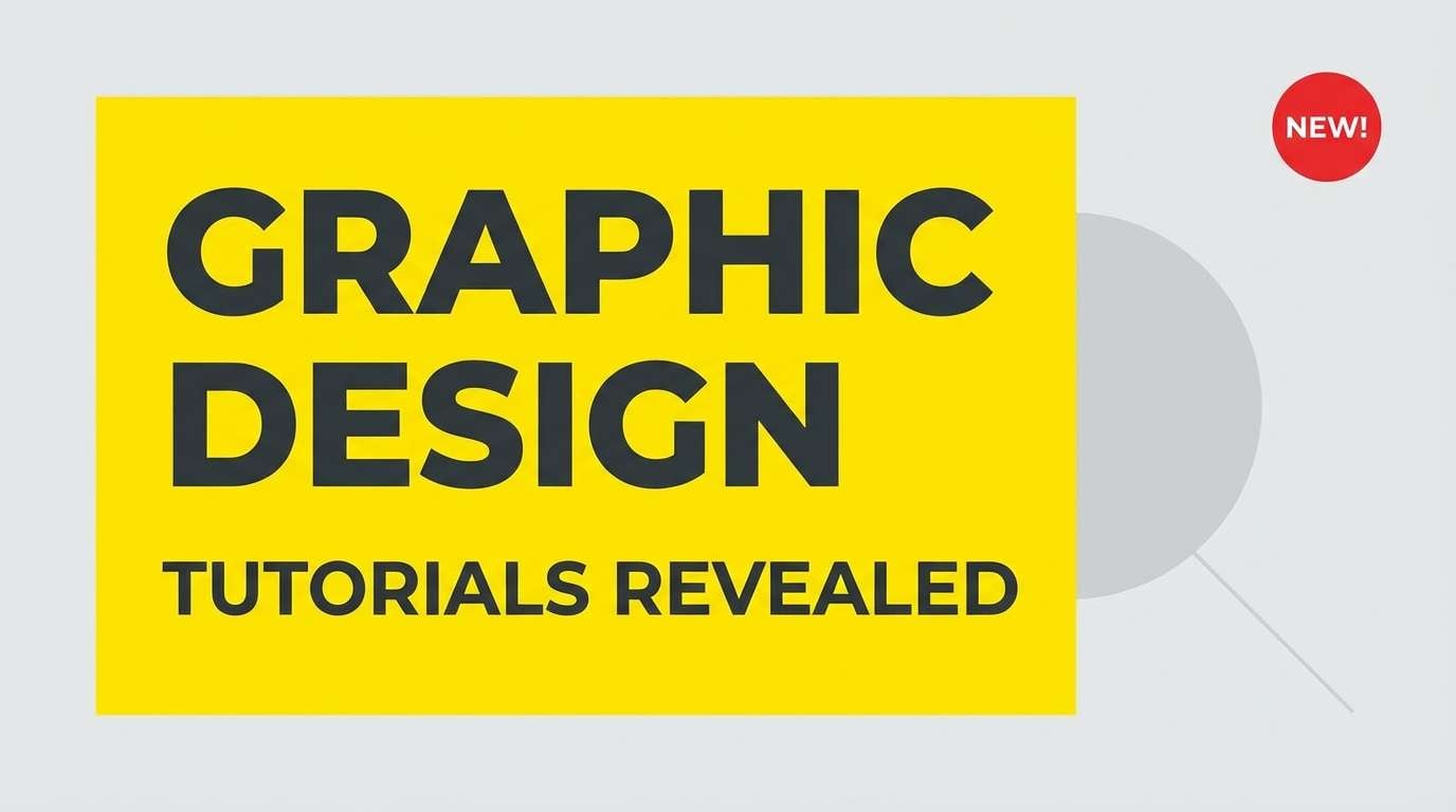
20) Sunny Graphite
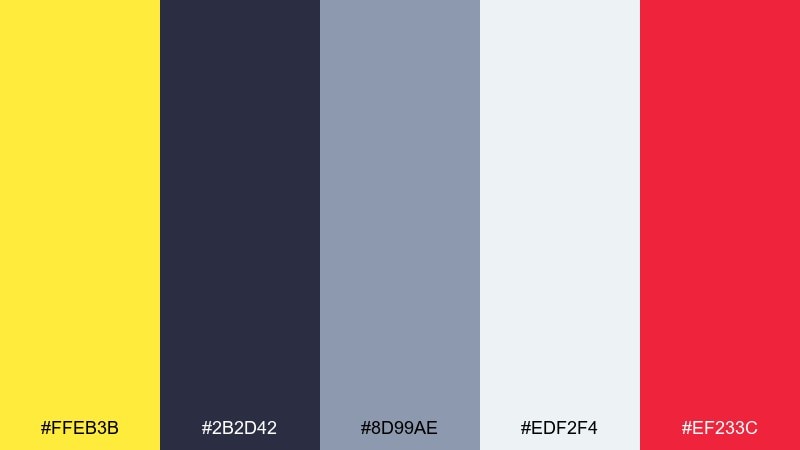
HEX: #FFEB3B #2B2D42 #8D99AE #EDF2F4 #EF233C
Mood: punchy, modern, attention-grabbing
Best for: youtube thumbnail template
Punchy and modern, it reads like a spotlight against a clean studio wall. A canary yellow color combination like this works best when graphite handles structure and red is reserved for one urgent cue. Use it for thumbnails, banners, and quick-hit social graphics where readability at small sizes matters. Tip: set the main headline in graphite on a yellow block, and keep everything else minimal.
Image example of sunny graphite generated using media.io
What Colors Go Well with Canary Yellow?
Deep neutrals like charcoal, graphite, and inky navy make canary yellow look sharper and more premium, which is why the combo is common in UI and sporty branding. Soft neutrals (cream, off-white, light gray) help reduce glare and keep layouts comfortable.
For modern contrast, pair canary yellow with teal, cyan, or ocean blues—cool hues make the yellow pop without feeling muddy. For warmth and craft, sand, terracotta, and warm browns create a sunbaked, tactile vibe.
If you want playful or nightlife energy, try canary yellow with purple, magenta, or electric blue—just anchor type with black or deep navy to keep legibility strong.
How to Use a Canary Yellow Color Palette in Real Designs
Use canary yellow as an accent first: buttons, badges, highlights, chart series, and key icons. In most layouts, 5–15% coverage is enough to get the “spark” without overwhelming the page.
Choose your background carefully. Creamy whites and light grays make canary yellow feel richer, while pure white can look harsh and over-bright—especially in long-form interfaces and print.
For accessibility, avoid yellow body text on light backgrounds. Keep text in charcoal/navy, and reserve yellow for fills, borders, underlines, or large headline blocks with dark type.
Create Canary Yellow Palette Visuals with AI
If you want to preview how a canary yellow color palette will look on real designs (packaging, flyers, UI screens, and posters), generating quick mock visuals can save hours of manual iteration.
With Media.io’s text-to-image tool, you can paste a prompt, specify a layout (like “dashboard UI mockup” or “wedding invite suite”), and iterate until the contrast and mood match your brand.
Once you like the direction, export the image as a reference for your design system, client presentation, or print-ready comps.
Canary Yellow Color Palette FAQs
-
What is the HEX code for canary yellow?
A commonly used canary yellow HEX is #FFD400. Depending on brand and print needs, you may also see nearby variants like #FFEB3B or #FFC400. -
Is canary yellow warm or cool?
Canary yellow is generally a warm yellow, but it can feel cooler when paired with teal/cyan or deep blues. Its perceived temperature shifts a lot based on the surrounding neutrals. -
What colors pair best with canary yellow for a modern look?
Charcoal/graphite, deep navy, cool grays, teal, and clean off-whites are the most reliable modern pairings. They keep the yellow crisp and prevent it from feeling overly playful. -
How do I keep canary yellow from looking too bright?
Use it as an accent, place it on cream or light gray instead of pure white, and balance with dark neutrals for structure. In print, consider matte paper to reduce glare. -
Can I use canary yellow in UI design?
Yes—use it for primary actions, highlights, and status emphasis. Avoid yellow for small text on light backgrounds, and verify contrast for accessibility (especially for buttons and chart labels). -
What’s a good canary yellow palette for branding?
Try canary yellow with charcoal and light gray for tech/SaaS, with teal/coral for food and beverage, or with sand/olive for outdoor and eco brands—each keeps the yellow intentional and on-brand. -
Does canary yellow print accurately?
Bright yellows can shift in print depending on ink and paper. Test swatches first, and consider slightly muting the yellow for matte stocks to maintain readability and avoid a “neon” feel.


