

White, green, and yellow is a go-to palette when you want designs to feel clean, fresh, and instantly positive. It combines clarity (white), nature and balance (green), and attention-grabbing warmth (yellow).
Below are 20 ready-to-use white green yellow color palettes with HEX codes, plus practical tips for UI, branding, and print workflows.
In this article
Why White Green Yellow Palettes Work So Well
White green yellow palettes feel “naturally modern” because they mirror real-world cues: clean light, foliage, and sunlight. That makes them especially effective for wellness, sustainability, food, and outdoor brands.
Functionally, white gives you spacing and legibility, green delivers stable mid-tones for UI surfaces and brand elements, and yellow creates high-visibility accents for CTAs, highlights, and key information.
They also scale well from digital to print: keep white dominant, choose one main green for consistency, and use yellow like a spotlight so designs stay calm rather than overly saturated.
20+ White Green Yellow Color Palette Ideas (with HEX Codes)
1) Citrus Meadow
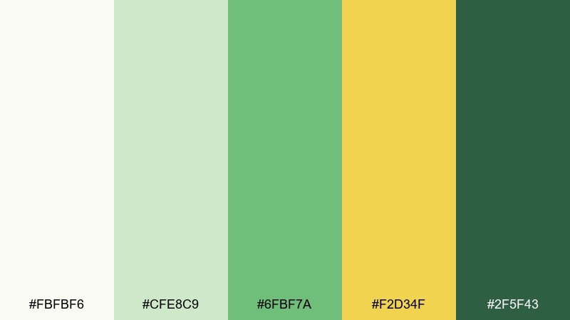
HEX: #fbfbf6 #cfe8c9 #6fbf7a #f2d34f #2f5f43
Mood: fresh and optimistic
Best for: eco brand identity and label design
Fresh and optimistic, it feels like a sunny picnic on new grass with lemonade nearby. Use the pale cream as breathing room, then let the soft green carry most surfaces. The golden yellow works best as a highlight for seals, icons, or key product claims. Pair with uncoated paper textures and simple sans type, and keep dark green for small but high-contrast text.
Image example of citrus meadow generated using media.io
Media.io is an online AI studio for creating and editing video, image, and audio in your browser.

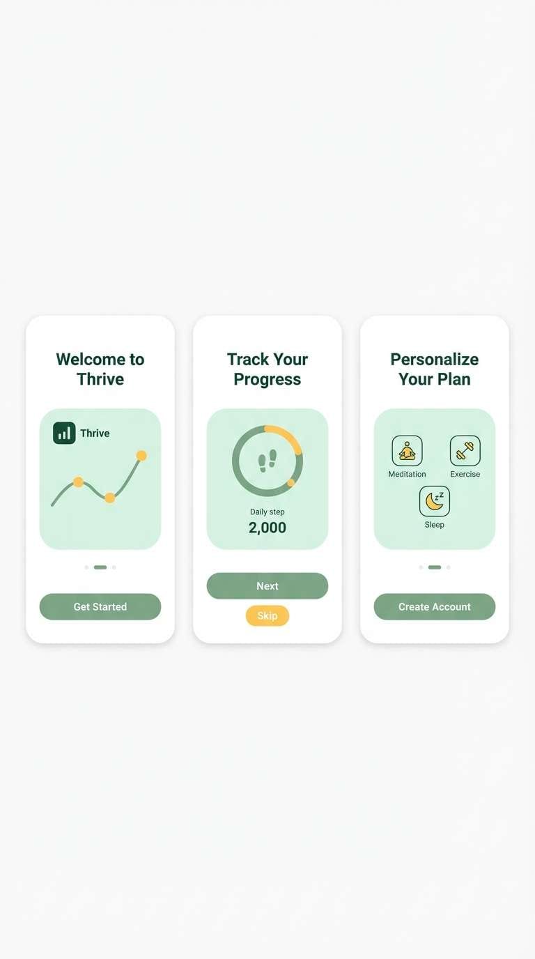
2) Sage Lemonade
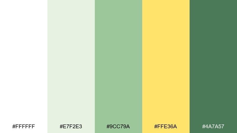
HEX: #ffffff #e7f2e3 #9cc79a #ffe36a #4a7a57
Mood: calm and clean
Best for: health app ui and onboarding screens
Calm and clean, it reads like chilled lemonade with herbs floating on top. As a white green yellow color palette, it performs well when the white stays dominant and the sage becomes your system color for buttons and states. Use the brighter yellow sparingly for notifications, progress, or small badges to avoid fatigue. Pair with soft shadows and generous spacing, and test contrast for accessibility on the mid-green.
Image example of sage lemonade generated using media.io
3) Alpine Spring
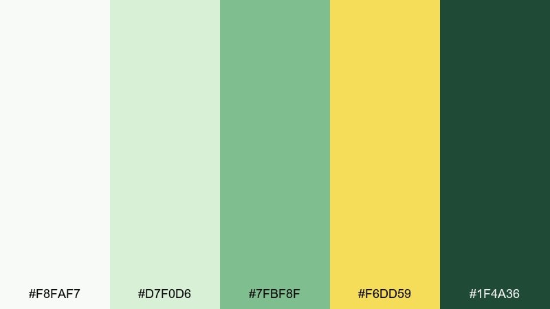
HEX: #f8faf7 #d7f0d6 #7fbf8f #f6dd59 #1f4a36
Mood: crisp and outdoorsy
Best for: travel poster and event flyers
Crisp and outdoorsy, it brings to mind mountain air, wildflowers, and sunlit trails. Keep the light tones as your background to mimic open sky and paper. Reserve the deeper green for titles and route details so the design stays readable from a distance. A small pop of yellow on dates or callouts makes the layout feel energetic without getting loud.
Image example of alpine spring generated using media.io

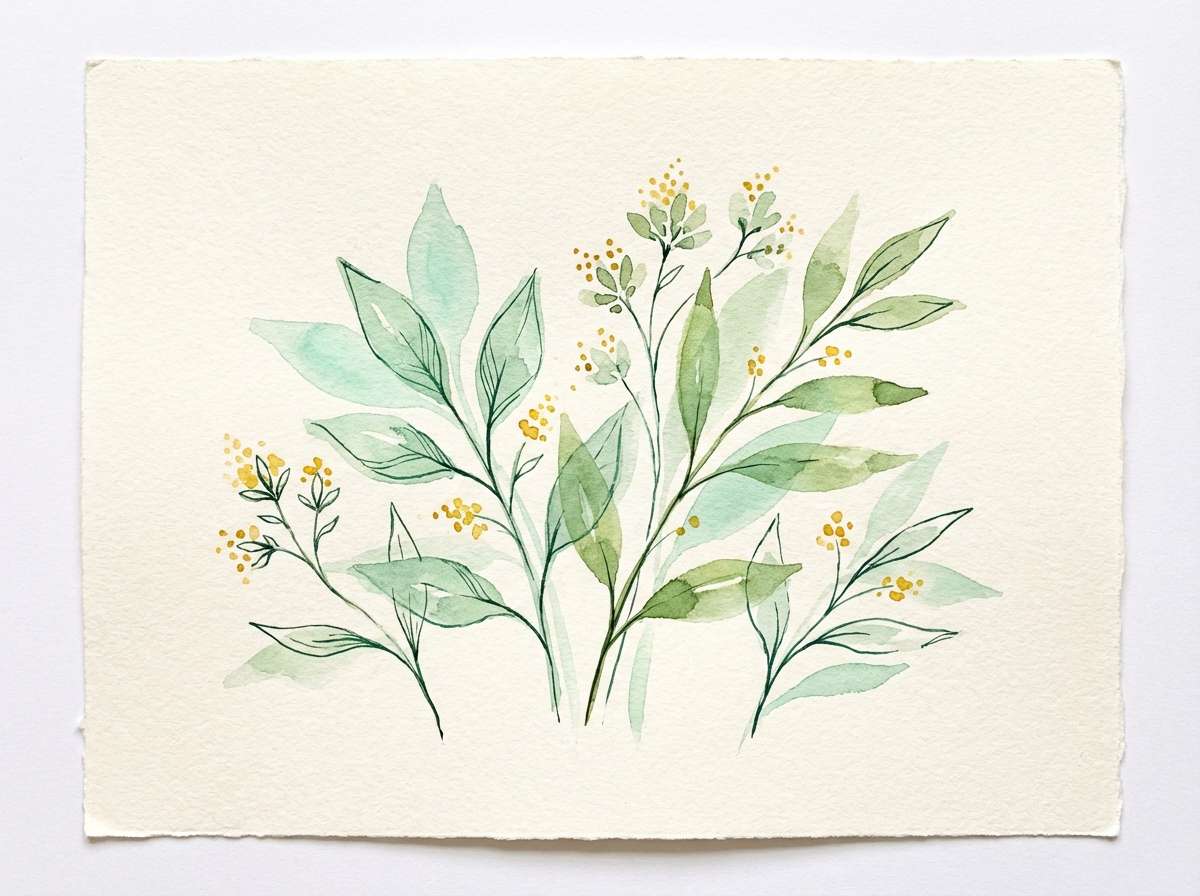
4) Sunny Herbarium
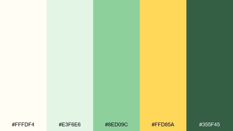
HEX: #fffdf4 #e3f6e6 #8ed09c #ffd85a #355f45
Mood: airy and botanical
Best for: watercolor botanical illustration sets
Airy and botanical, it feels like pressed leaves on warm paper with a late-morning glow. Let the cream and pale green wash carry most of the canvas for that herbal softness. Use yellow as a pollen-like accent on buds, labels, or small shapes. For a cohesive set, keep outlines in deep green and avoid introducing harsh blacks.
Image example of sunny herbarium generated using media.io
5) Mint Marigold
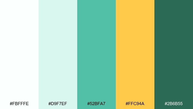
HEX: #fbfffe #d9f7ef #52bfa7 #ffc94a #2b6b55
Mood: playful and bright
Best for: summer cafe menu and tabletop signage
Playful and bright, it suggests mint sprigs beside marigold petals and iced drinks. Use the cool mint as a background tint so the warmer yellow can shine on prices and section headers. Deep green anchors the typography and prevents the layout from feeling sugary. A helpful tip is to keep yellow on flat shapes rather than large text for cleaner readability.
Image example of mint marigold generated using media.io
6) Linen Lime Zest
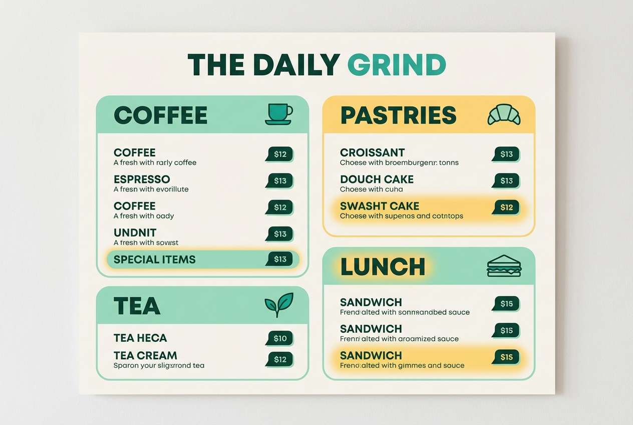
HEX: #f7f2e8 #e2f1d3 #8bcf66 #f5e26c #5a6a3f
Mood: warm and natural
Best for: wellness blog theme and lifestyle web design
Warm and natural, it evokes linen fabric, lime peel, and sunlit countertops. As a white green yellow color scheme, start with the linen base for sections and cards, then use the grassy green for links and primary buttons. The soft yellow works best as a gentle emphasis for quotes or checklist markers. Pair with rounded serif headings and keep the darker olive strictly for navigation and footers.
Image example of linen lime zest generated using media.io
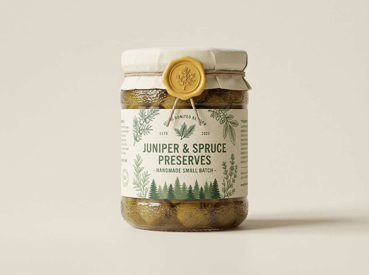
7) Forest Buttercream
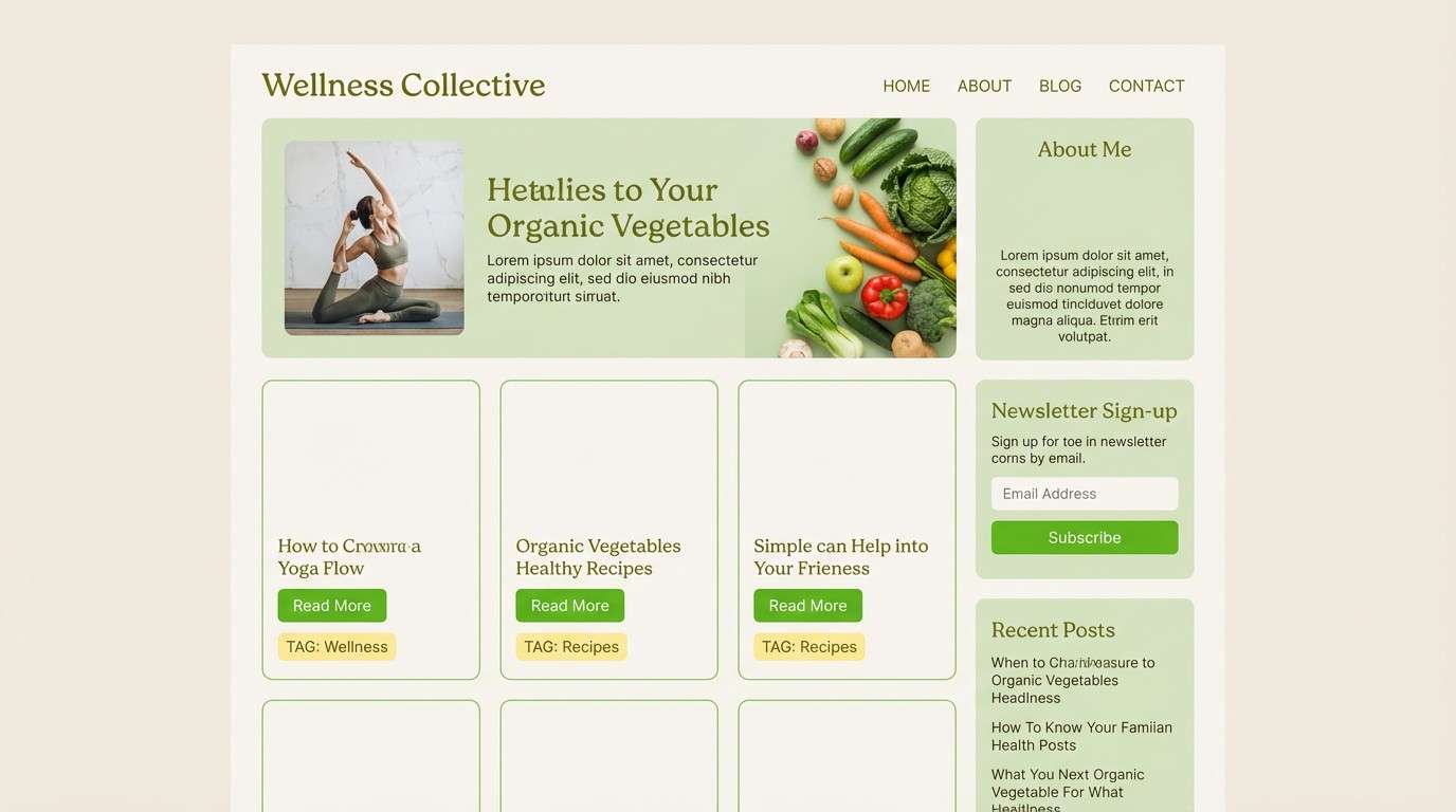
HEX: #fffaf1 #e6f3e6 #4f9f6d #f2cf57 #1f3f2f
Mood: cozy and grounded
Best for: artisanal food packaging and jar labels
Cozy and grounded, it feels like a forest walk followed by buttered toast and honey tea. Use the buttercream tone as the label base to keep the pack looking premium and friendly. Mid green works beautifully for brand marks and ingredient callouts, while the deep green should carry legal text and barcodes. Tip: add a thin yellow border or seal to make the front panel pop on shelves without increasing clutter.
Image example of forest buttercream generated using media.io
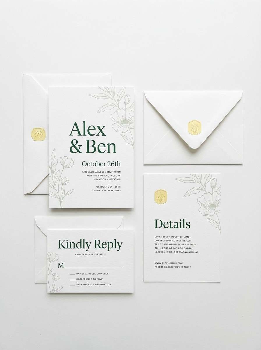
8) Pear Blossom
HEX: #ffffff #eef8e8 #a7d8a2 #ffe88a #3f6b4c
Mood: gentle and romantic
Best for: spring wedding invitation suite
Gentle and romantic, it brings pear blossoms, soft greenery, and a warm afternoon glow to mind. Keep the invitation background bright and clean, then layer pale greens in borders or subtle florals. Yellow works best as a tiny highlight in monograms or wax-seal graphics. For print, choose a slightly textured stock and keep the darkest green for names and key details.
Image example of pear blossom generated using media.io
9) Dewy Daffodil
HEX: #f9fffb #dcf7de #74c08a #ffda3a #2d5c3f
Mood: energetic and uplifting
Best for: social media campaign graphics
Energetic and uplifting, it looks like dew on leaves with a daffodil burst in the sun. These white green yellow color combinations work best when you pick one dominant green and let yellow act like a spotlight for the message. Use off-white as the breathing space so posts do not feel overly saturated. A practical tip is to keep yellow behind short text lines or icons, not as the full background.
Image example of dewy daffodil generated using media.io
10) Olive Sunbeam
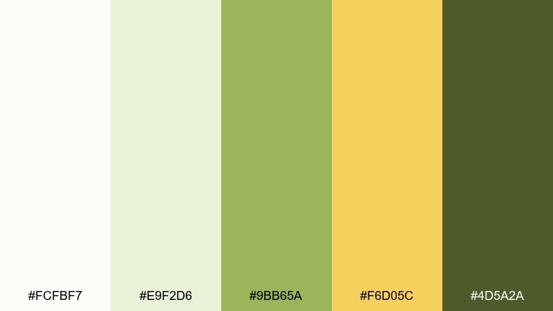
HEX: #fcfbf7 #e9f2d6 #9bb65a #f6d05c #4d5a2a
Mood: rustic and confident
Best for: outdoor gear product ads
Rustic and confident, it recalls olive branches, canvas, and sunlight on worn metal. Lean on the olive for product names and key features, then use the sunbeam yellow to guide the eye to pricing or CTAs. The pale tones help keep the ad feeling premium rather than tactical. Pair with bold condensed type and leave generous margins so the composition stays clean.
Image example of olive sunbeam generated using media.io

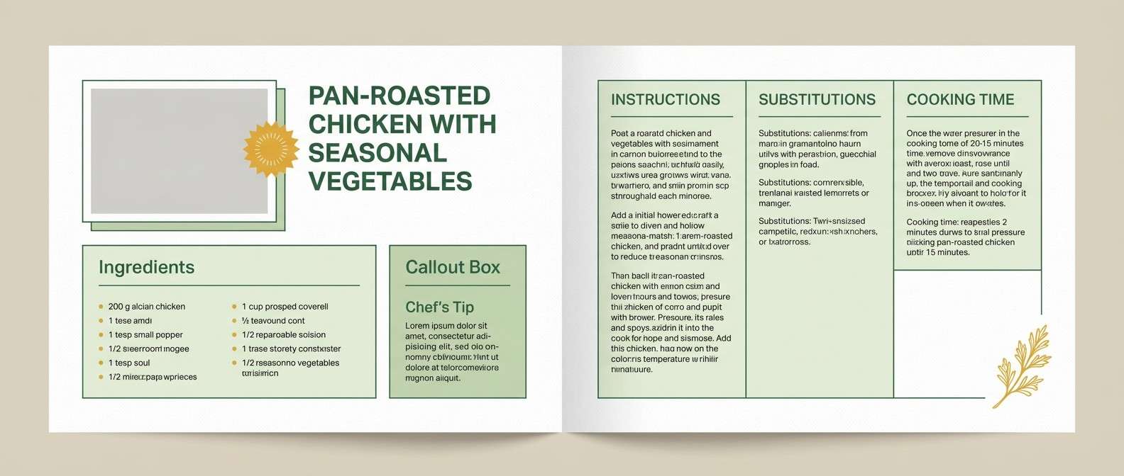
11) Tea Garden
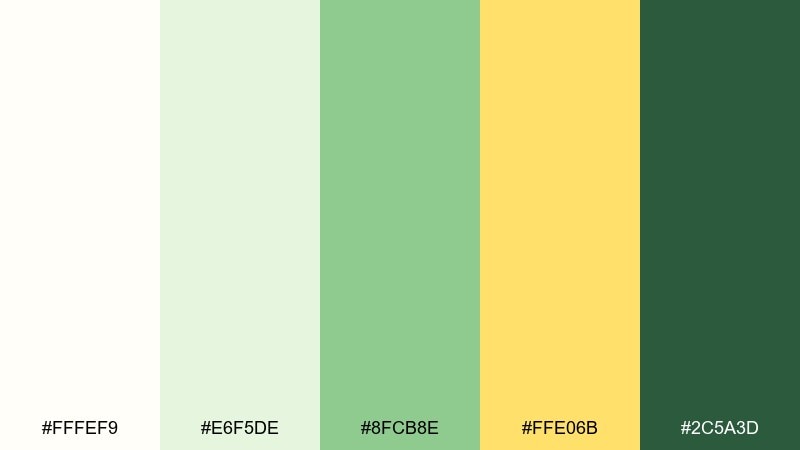
HEX: #fffef9 #e6f5de #8fcb8e #ffe06b #2c5a3d
Mood: soft and soothing
Best for: editorial magazine layout and recipe spreads
Soft and soothing, it suggests a quiet tea garden with fresh leaves and lemon slices. As a white green yellow color palette, it shines in editorial pages where white margins stay wide and calming. Use the mid green for subheads and pull-quote rules, then apply yellow only to tiny markers like page numbers or ingredient icons. Tip: keep photos slightly warm so the palette feels cohesive rather than clinical.
Image example of tea garden generated using media.io
12) Fresh Cut Citrus
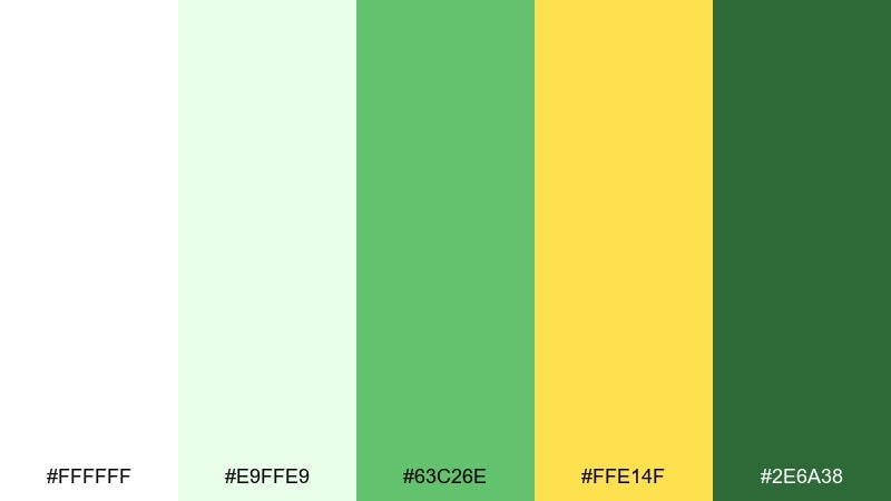
HEX: #ffffff #e9ffe9 #63c26e #ffe14f #2e6a38
Mood: zesty and modern
Best for: startup landing page and saas hero section
Zesty and modern, it feels like fresh citrus slices against crisp greens. Use white for the hero background and let the bright green own primary CTAs and links. Yellow becomes the perfect accent for badges, highlights, and small micro-interactions. For balance, keep the dark green for headings only and avoid using it on large blocks.
Image example of fresh cut citrus generated using media.io

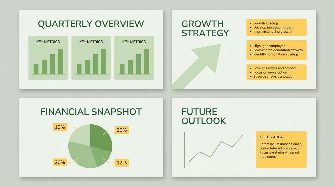
13) Bamboo Chalk
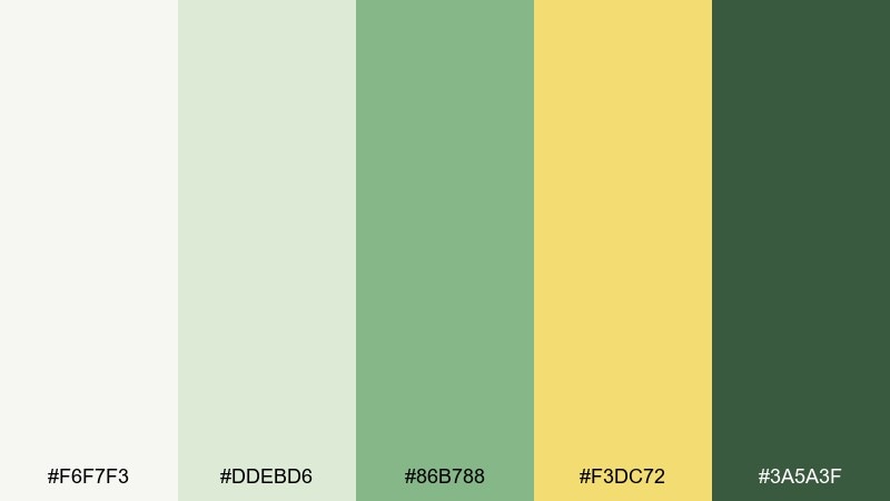
HEX: #f6f7f3 #ddebd6 #86b788 #f3dc72 #3a5a3f
Mood: minimal and mindful
Best for: presentation templates and pitch decks
Minimal and mindful, it resembles bamboo shadows on a chalky wall with a warm beam of light. Use the chalk white for slide backgrounds to keep content readable and modern. The mid green works well for charts and section dividers, while yellow is best for one or two key data callouts per slide. Tip: keep diagrams simple and rely on spacing rather than heavy borders.
Image example of bamboo chalk generated using media.io
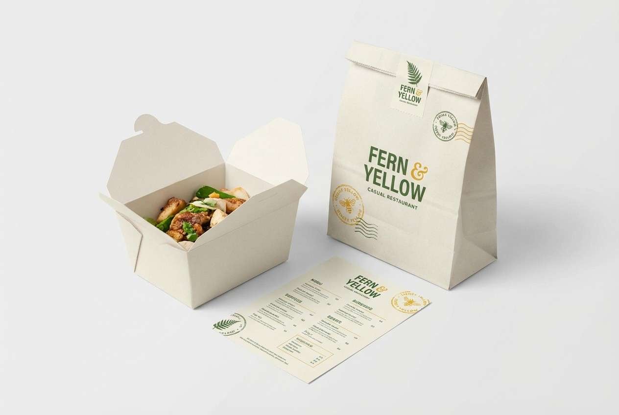
14) Honeyed Fern
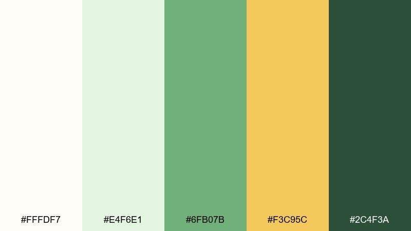
HEX: #fffdf7 #e4f6e1 #6fb07b #f3c95c #2c4f3a
Mood: inviting and earthy
Best for: restaurant branding and takeout packaging
Inviting and earthy, it reads like ferns in shade with a drizzle of honey in the sunlight. Make the off-white the primary surface so menus and boxes feel clean. Use green for logos and navigation, and keep yellow for stamp-like marks or featured items. Pair with kraft paper textures and avoid glossy finishes for a more authentic look.
Image example of honeyed fern generated using media.io
15) Celery Cream
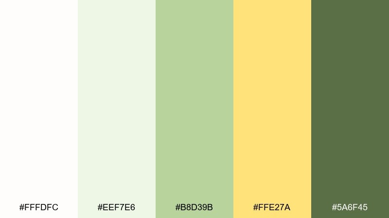
HEX: #fffdfc #eef7e6 #b8d39b #ffe27a #5a6f45
Mood: light and approachable
Best for: kids education worksheets and classroom printables
Light and approachable, it feels like celery leaves and vanilla cream with a sunny sticker accent. Keep backgrounds mostly white to reduce ink use and maintain clarity. Use the softer greens for sections and borders, then save yellow for stars, rewards, and key instructions. Tip: set body text in the darker olive so photocopies stay legible.
Image example of celery cream generated using media.io
16) Chartreuse Cotton
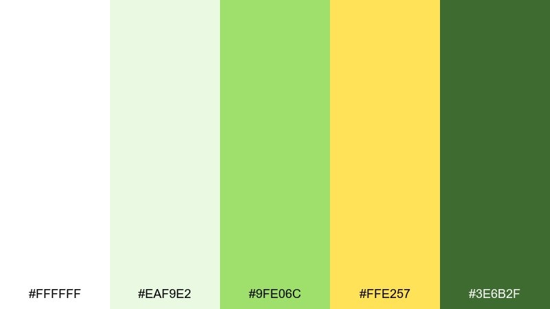
HEX: #ffffff #eaf9e2 #9fe06c #ffe257 #3e6b2f
Mood: bold and youthful
Best for: streetwear poster and merch drops
Bold and youthful, it looks like chartreuse fabric against clean cotton with a bright spotlight. Use the punchy green in large blocks for maximum impact, then keep white as a sharp counterweight. Yellow can act as a secondary accent for drop dates, pricing, or small stickers. Tip: limit body text to deep green so the poster stays readable from across the room.
Image example of chartreuse cotton generated using media.io
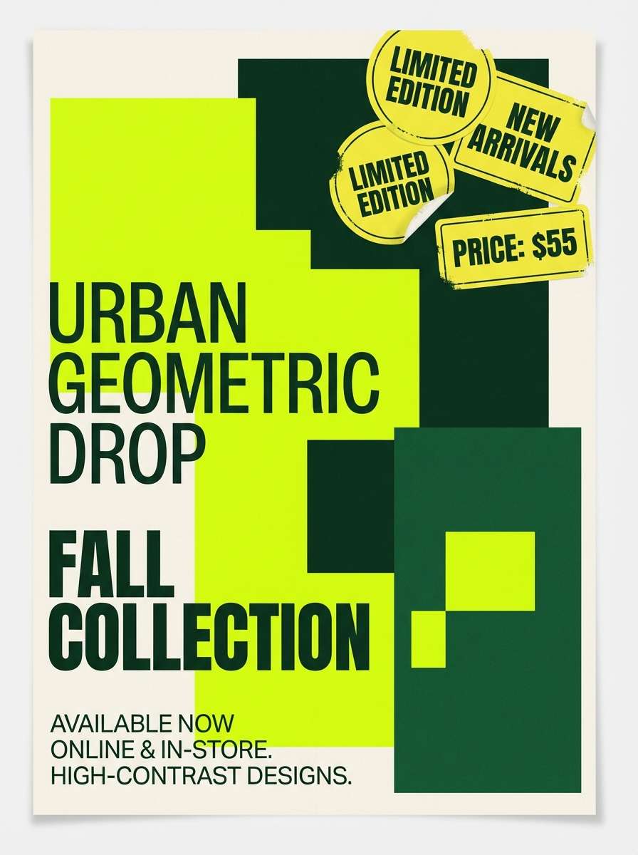
17) Pollen and Pistachio
HEX: #fbfff8 #e3f4df #9bd3a8 #ffd24d #2b5b43
Mood: springy and friendly
Best for: email newsletter design
Springy and friendly, it suggests pistachio gelato with a pollen-yellow sparkle. These white green yellow color combinations are easiest to manage in email when white carries most of the layout. Use pistachio tones for section headers and button fills, and keep yellow for a single standout CTA or limited-time badge. Tip: use deep green for all paragraph text to avoid gray, low-contrast rendering in inboxes.
Image example of pollen and pistachio generated using media.io
18) Lemon Sprout
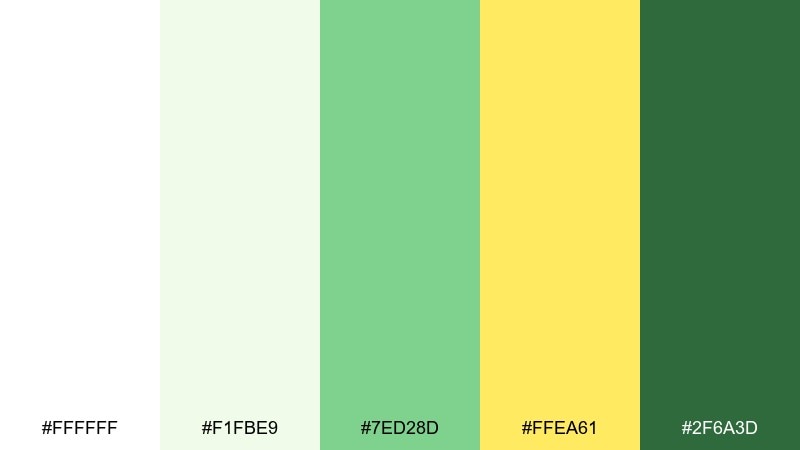
HEX: #ffffff #f1fbe9 #7ed28d #ffea61 #2f6a3d
Mood: bright and hopeful
Best for: nonprofit campaign landing page
Bright and hopeful, it feels like tiny sprouts pushing through soil toward a lemony sun. Use the pale green as a soft section background to break up long pages without adding heaviness. Yellow makes a convincing donation or sign-up accent when used on one primary button per screen. Tip: keep headings in deep green and use plenty of whitespace to make messages feel trustworthy.
Image example of lemon sprout generated using media.io
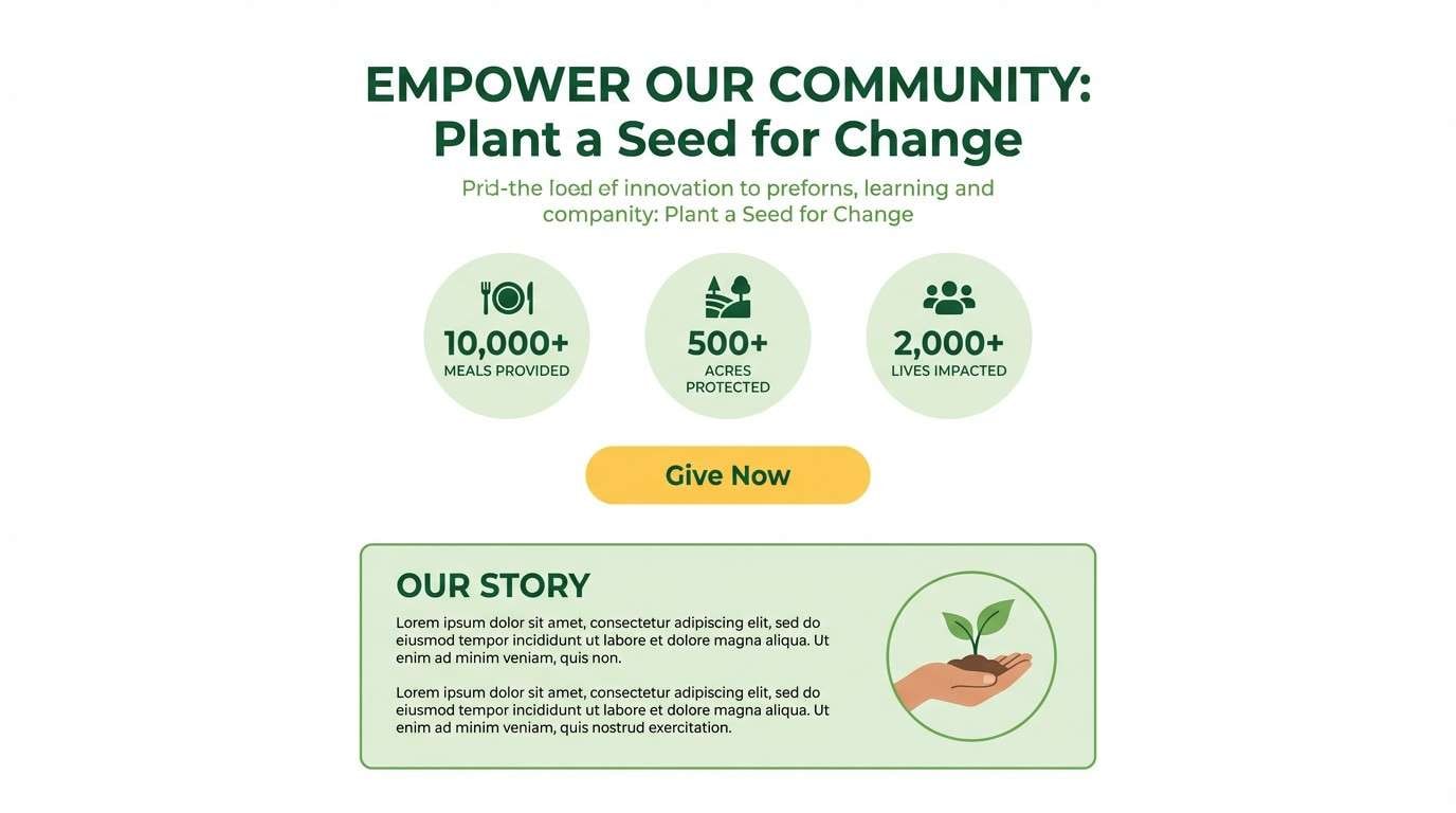
19) Garden Patio
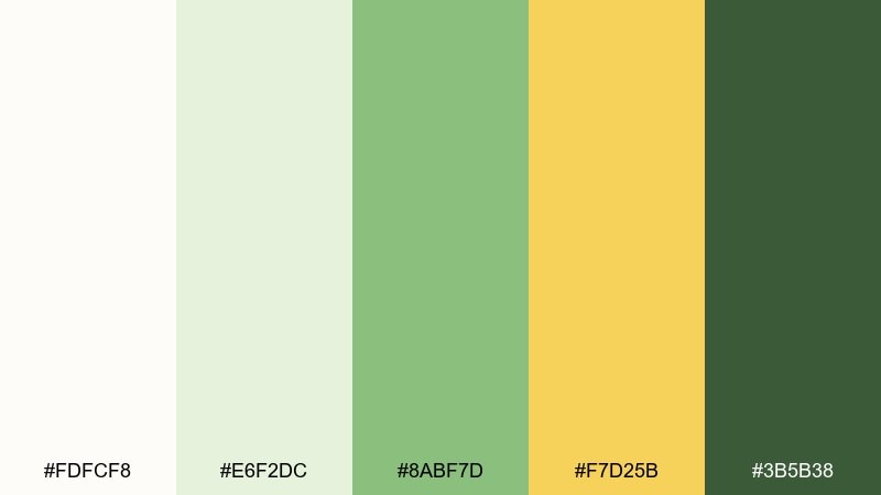
HEX: #fdfcf8 #e6f2dc #8abf7d #f7d25b #3b5b38
Mood: relaxed and welcoming
Best for: home and garden blog photography presets
Relaxed and welcoming, it brings to mind a garden patio with leafy shade and sun-warmed stone. Keep highlights creamy rather than pure white to preserve a natural look in photos. Greens work nicely for foliage enhancement, while yellow can lift sunlight areas and indoor lamps without turning orange. Tip: apply the darker green sparingly in shadows to avoid muddy contrast.
Image example of garden patio generated using media.io
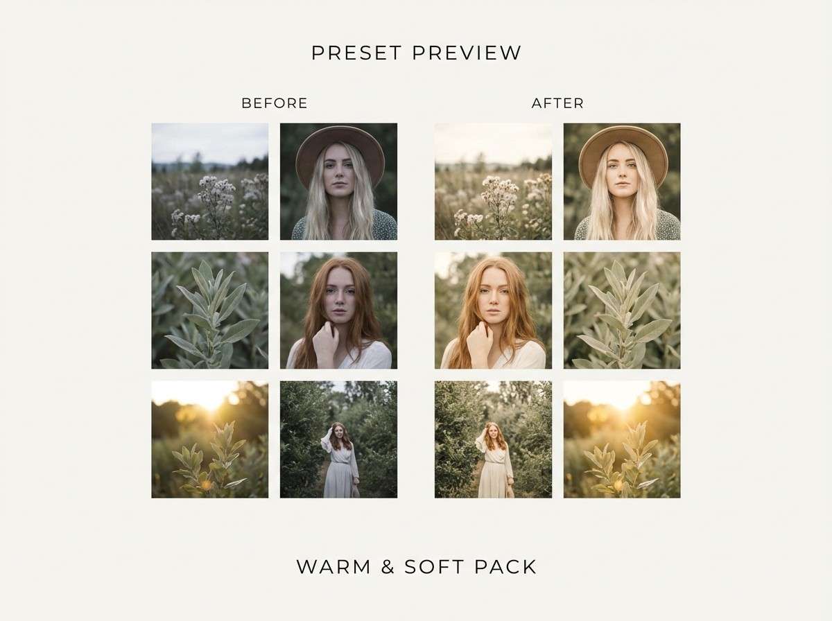
20) Minimal Matcha
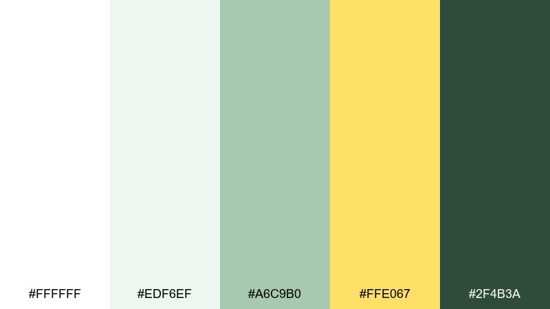
HEX: #ffffff #edf6ef #a6c9b0 #ffe067 #2f4b3a
Mood: modern and serene
Best for: productivity dashboard ui
Modern and serene, it reads like matcha foam on a white cup with a lemon slice on the side. Use the palest green for panels and cards so the interface feels calm even with dense data. Yellow can serve as a status indicator for deadlines or warnings, while deep green keeps labels crisp. Tip: avoid using yellow for long text and keep it to icons, dots, and short tags.
Image example of minimal matcha generated using media.io
What Colors Go Well with White Green Yellow?
Neutrals are the easiest wins: add warm beige or linen tones for a natural, lifestyle feel, or use cool light gray to make a UI look more tech-forward while keeping the palette clean.
For contrast, deep navy and charcoal pair well with green-yellow accents while improving readability for long text. If you want a softer look, dusty pink or terracotta can balance the freshness with a human, handcrafted warmth.
In print and packaging, consider adding kraft brown or matte black in small doses (like rules, stamps, or legal text) to ground the composition without fighting the cheerful yellow.
How to Use a White Green Yellow Color Palette in Real Designs
Start with a hierarchy: let white be the base, pick one green as your primary brand/UI color, then treat yellow as the “attention color” for a single purpose (CTA, badge, or highlight). This keeps the design crisp and prevents yellow from overwhelming the layout.
For accessibility, avoid yellow text on white and test contrast for mid-greens used on buttons or links. If a green fails contrast, shift it darker for text or add a white outline/filled button treatment to preserve readability.
In branding and print, use off-white (cream/linen) instead of pure white to feel more premium, and keep dark green for fine details like ingredients, captions, or navigation labels.
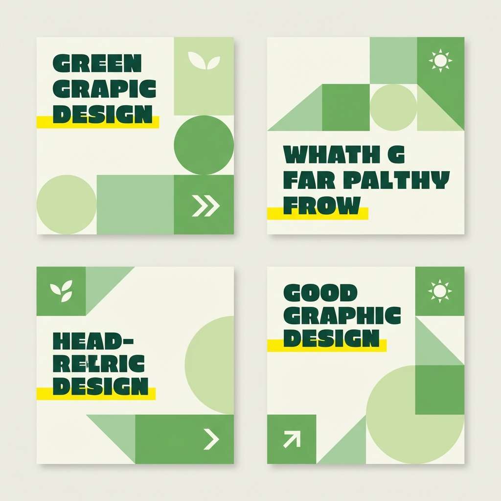
Create White Green Yellow Palette Visuals with AI
If you already have HEX codes, you can turn them into consistent concept visuals—brand boards, UI mockups, posters, labels, or social templates—by describing the layout and specifying your palette mood.
Media.io makes it simple to generate image examples fast, iterate on style (minimal, watercolor, editorial, modern UI), and keep outputs aligned to your white green yellow color scheme.
White Green Yellow Color Palette FAQs
-
What does a white green yellow color palette communicate?
It typically signals freshness, health, nature, optimism, and clarity. White creates cleanliness, green adds balance and trust, and yellow adds energy and attention for highlights. -
How do I keep yellow from overpowering the design?
Use yellow as an accent color only—badges, icons, thin borders, or one primary CTA per screen. Keep white dominant and let green handle most UI surfaces or brand blocks. -
Is white green yellow good for UI design?
Yes—especially for wellness, productivity, food, and eco products. Use dark green for text, reserve yellow for status/notifications, and avoid yellow text on white for readability. -
What are good background choices besides pure white?
Try off-whites like cream, butter, or linen to feel warmer and more premium in print and branding. In UI, a very pale green can work well for cards and sections while staying calm. -
What colors pair well with white green yellow for contrast?
Deep navy, charcoal, and forest green add strong contrast and improve legibility. For a softer companion accent, dusty pink or terracotta can balance the palette’s freshness. -
How can I use this palette for packaging?
Use off-white as the main label surface, green for brand marks and ingredient hierarchy, and yellow for a seal, flavor cue, or small highlight. Matte/uncoated finishes often make the colors feel more natural. -
Can I generate matching visuals for these palettes quickly?
Yes—use Media.io text-to-image to create style guides, posters, UI mockups, and product scenes by describing the composition and mood, then iterate until it matches your brand.
Next: Sports Color Palette


