

Sports design needs color that reads fast, feels energetic, and stays consistent across jerseys, posters, scoreboards, and apps. A strong sports palette helps teams look unified while keeping fans focused on the action.
Below are 20 sports color palette ideas with HEX codes—from gold-to-charcoal premium combos to neon esports schemes—plus tips to apply them in real branding and UI.
In this article
- Why Sports Palettes Work So Well
-
- victory gold and charcoal
- stadium neon nights
- classic varsity red and navy
- turf green and cream
- ice rink blues
- track day orange and slate
- marathon minimal mono
- retro basketball warmth
- surf league aqua and sand
- boxing gym grit
- olympic rings remix
- snowboard storm
- cricket field heritage
- cycling peloton pop
- baseball diamond pastels
- esports pulse purple
- tennis court lime
- motorsport carbon and chrome
- yoga studio calm
- medal ceremony bronze
- What Colors Go Well with Sports?
- How to Use a Sports Color Palette in Real Designs
- Create Sports Palette Visuals with AI
Why Sports Palettes Work So Well
Sports visuals compete with motion, noise, and distance—so color has to communicate instantly. High-contrast pairings (dark neutrals with bright accents) keep numbers, names, and calls to action readable in a split second.
They also carry emotion. Gold and charcoal feels “championship,” neon on black feels “night match hype,” and clean greens and creams feel “fresh field energy.” The right palette sets expectations before a single word is read.
Most importantly, a repeatable color system scales across everything: kits, merch, signage, streaming overlays, and mobile UI. Consistency builds recognition, and recognition builds loyalty.
20+ Sports Color Palette Ideas (with HEX Codes)
1) Victory Gold and Charcoal
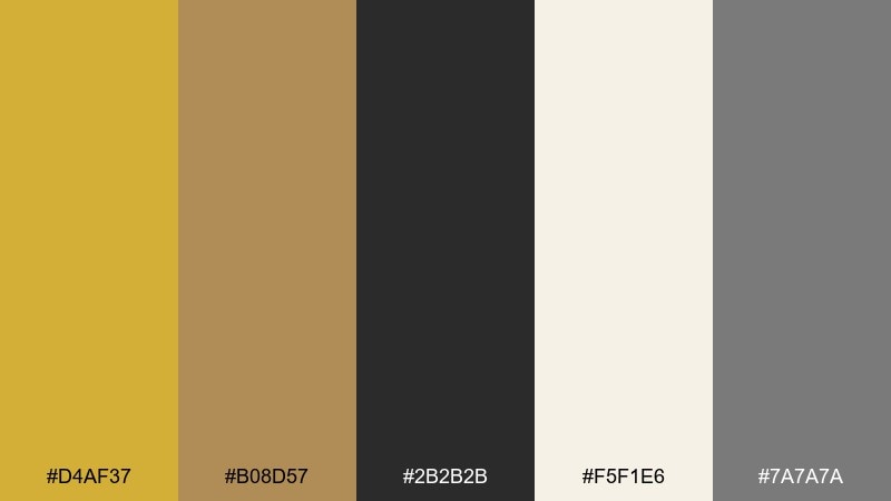
HEX: #d4af37 #b08d57 #2b2b2b #f5f1e6 #7a7a7a
Mood: championship, premium, confident
Best for: team branding kit and jersey accents
Championship energy meets a polished, trophy-like glow, grounded by deep charcoal. Use the gold and bronze as the hero tones on dark backgrounds for instant contrast. This works especially well for crests, captain patches, and premium membership tiers. Tip: keep the cream for negative space so the metallic hues feel brighter without turning harsh.
Image example of victory gold and charcoal generated using media.io
Media.io is an online AI studio for creating and editing video, image, and audio in your browser.

2) Stadium Neon Nights
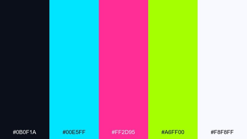
HEX: #0b0f1a #00e5ff #ff2d95 #a6ff00 #f8f8ff
Mood: electric, nightlife, high-impact
Best for: esports match poster and social stories
Electric lighting and late-night hype come through in sharp neon hits on a dark base. Let cyan and magenta lead your headlines, then use lime as a call-to-action accent. It shines on posters, countdown stories, and highlight reels where readability matters. Tip: reserve the off-white for small text so the neons stay the main event.
Image example of stadium neon nights generated using media.io
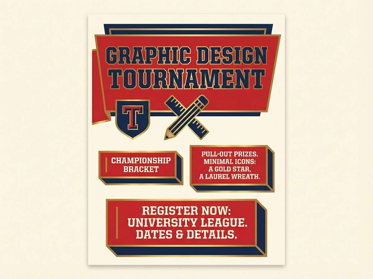
3) Classic Varsity Red and Navy
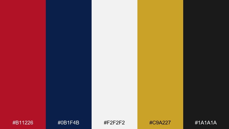
HEX: #b11226 #0b1f4b #f2f2f2 #c9a227 #1a1a1a
Mood: traditional, spirited, collegiate
Best for: school tournament flyer and merchandise tags
A classic varsity vibe with bold red and deep navy, like stitched lettering on a well-worn jacket. Pair the gold as a trim color for medals, rankings, or sponsor locks. It works for tournaments, alumni events, and merch that needs to feel timeless rather than trendy. Tip: keep black for outlines and small icons to maintain crisp edges in print.
Image example of classic varsity red and navy generated using media.io
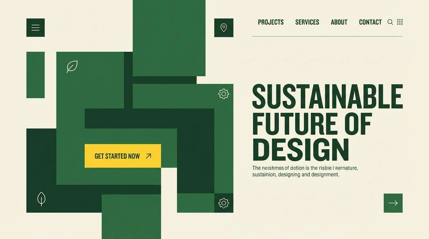
4) Turf Green and Cream
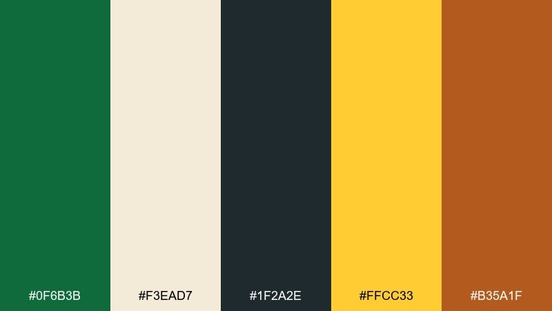
HEX: #0f6b3b #f3ead7 #1f2a2e #ffcc33 #b35a1f
Mood: fresh, outdoorsy, grounded
Best for: soccer club website hero and signage
Fresh field energy with clean cream highlights, like sunlight across a well-kept pitch. These sports color combinations are easy to balance: keep green dominant, use cream for breathing room, and drop in yellow for key actions. It suits club websites, wayfinding signs, and season announcements. Tip: use the warm clay tone sparingly for secondary buttons or badges so the palette stays airy.
Image example of turf green and cream generated using media.io
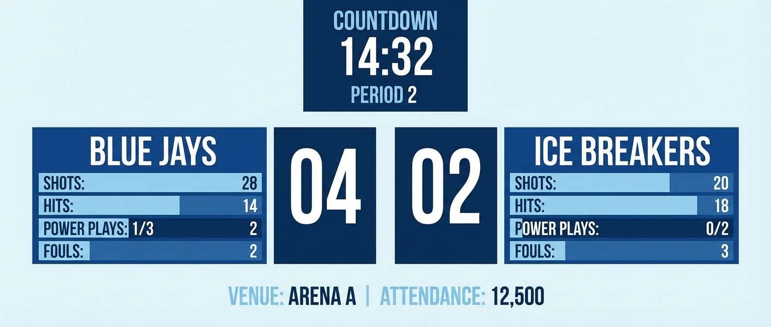
5) Ice Rink Blues
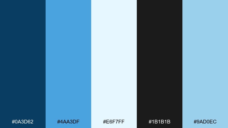
HEX: #0a3d62 #4aa3df #e6f7ff #1b1b1b #9ad0ec
Mood: cool, crisp, fast
Best for: hockey scoreboard ui and stats panels
Cool, crisp blues evoke clean ice, quick passes, and sharp breath in the arena. Use the deep blue for headers and the lighter tones for data blocks and hover states. It performs well for stat-heavy layouts where contrast and hierarchy are critical. Tip: keep the near-black for numbers and labels so the icy palette never feels washed out.
Image example of ice rink blues generated using media.io
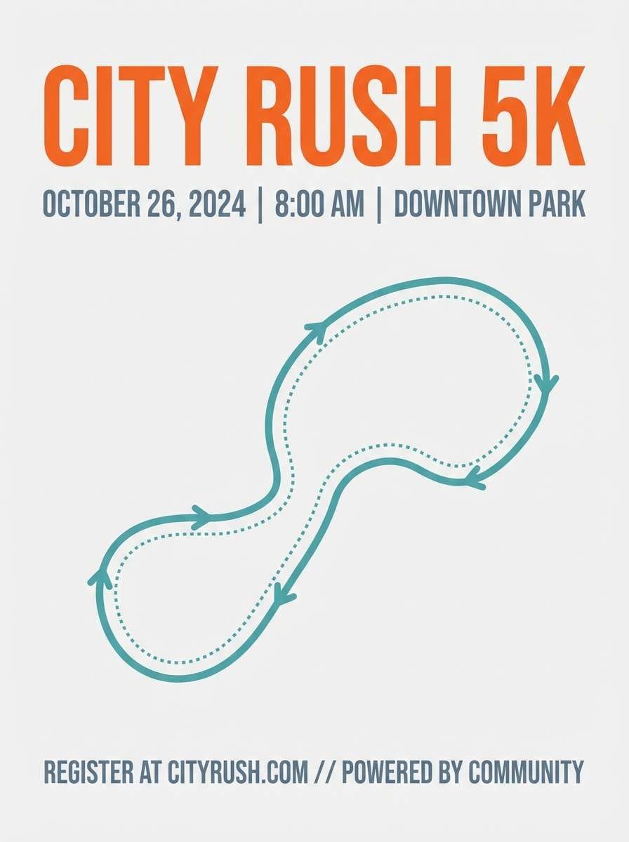
6) Track Day Orange and Slate
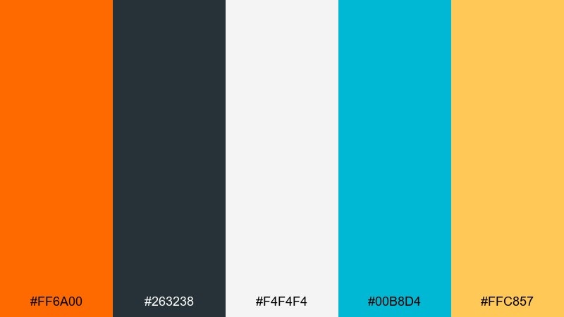
HEX: #ff6a00 #263238 #f4f4f4 #00b8d4 #ffc857
Mood: speedy, modern, bold
Best for: running event poster and bib design
Fast and modern, like cones on asphalt and bright lane markers at dawn. Orange brings urgency while slate keeps everything sleek and readable. Use teal as a digital-friendly accent for links, QR callouts, or route highlights. Tip: on bib numbers, prioritize slate on light gray to keep legibility high in motion.
Image example of track day orange and slate generated using media.io
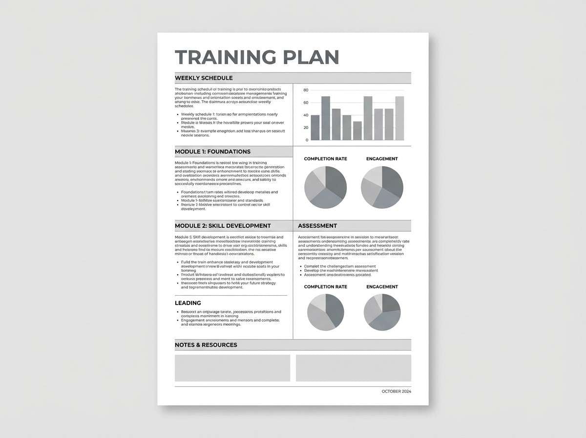
7) Marathon Minimal Mono
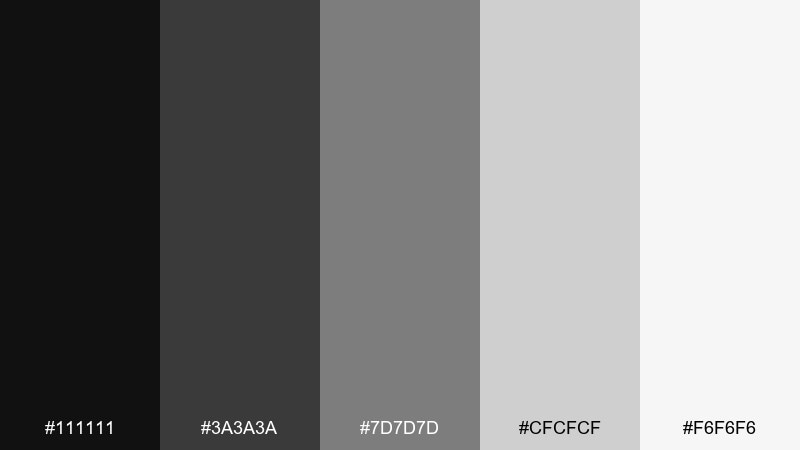
HEX: #111111 #3a3a3a #7d7d7d #cfcfcf #f6f6f6
Mood: focused, clean, editorial
Best for: training plan pdf and editorial layouts
Focused and disciplined, like early-morning miles and a simple training log. The grayscale range makes typography and spacing do the heavy lifting. It is ideal for printable plans, race-day checklists, and minimalist social templates. Tip: differentiate sections using weight and rules instead of extra color so the layout stays calm.
Image example of marathon minimal mono generated using media.io
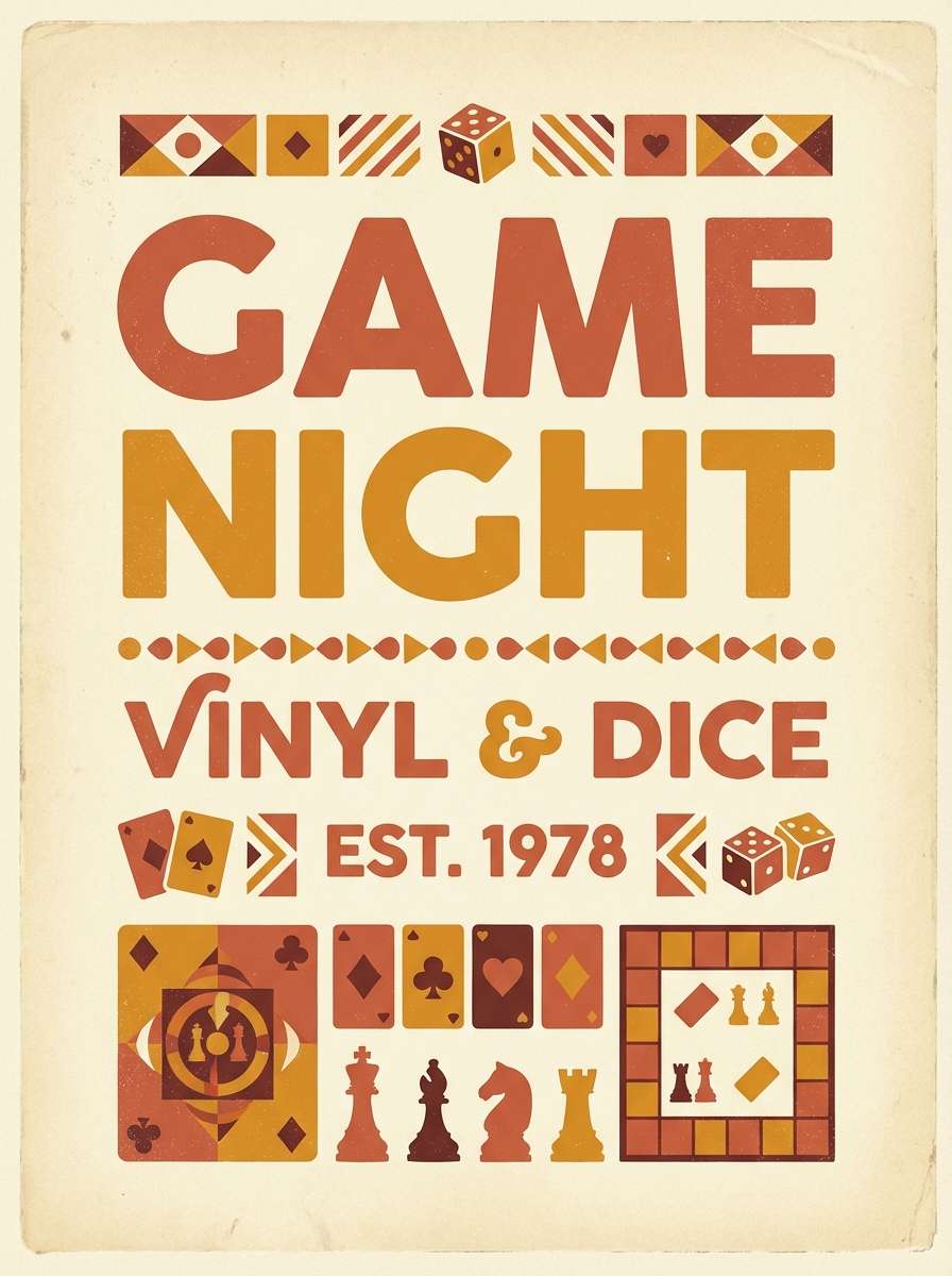
8) Retro Basketball Warmth
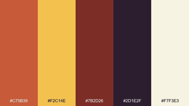
HEX: #c75b39 #f2c14e #7b2d26 #2d1e2f #f7f3e3
Mood: retro, cozy, energetic
Best for: vintage game night poster and ticket stub
Retro warmth like varnished courts, leather balls, and arena lights in a classic gym. Let the amber and terracotta carry big shapes, then ground the design with the deep plum. It works beautifully for throwback nights, ticket stubs, and limited-edition merch. Tip: keep the cream as the poster base so the warm colors look richer, not muddy.
Image example of retro basketball warmth generated using media.io
9) Surf League Aqua and Sand
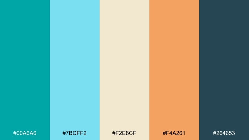
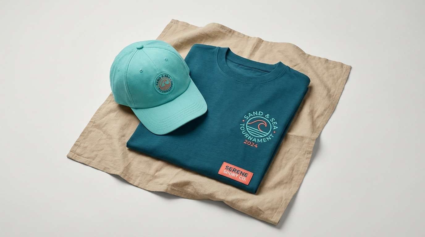
HEX: #00a6a6 #7bdff2 #f2e8cf #f4a261 #264653
Mood: sunny, coastal, upbeat
Best for: summer tournament branding and merch
Sunny and coastal, like salt spray, bright boards, and warm sand after a long heat. These sports color combinations feel friendly on tees, caps, and social headers without losing punch. Use deep teal for logos and outlines, then let aqua and sand fill the larger areas. Tip: keep coral as the limited accent for dates, scores, or discount stickers so it stays special.
Image example of surf league aqua and sand generated using media.io
10) Boxing Gym Grit
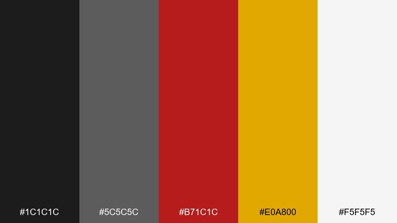
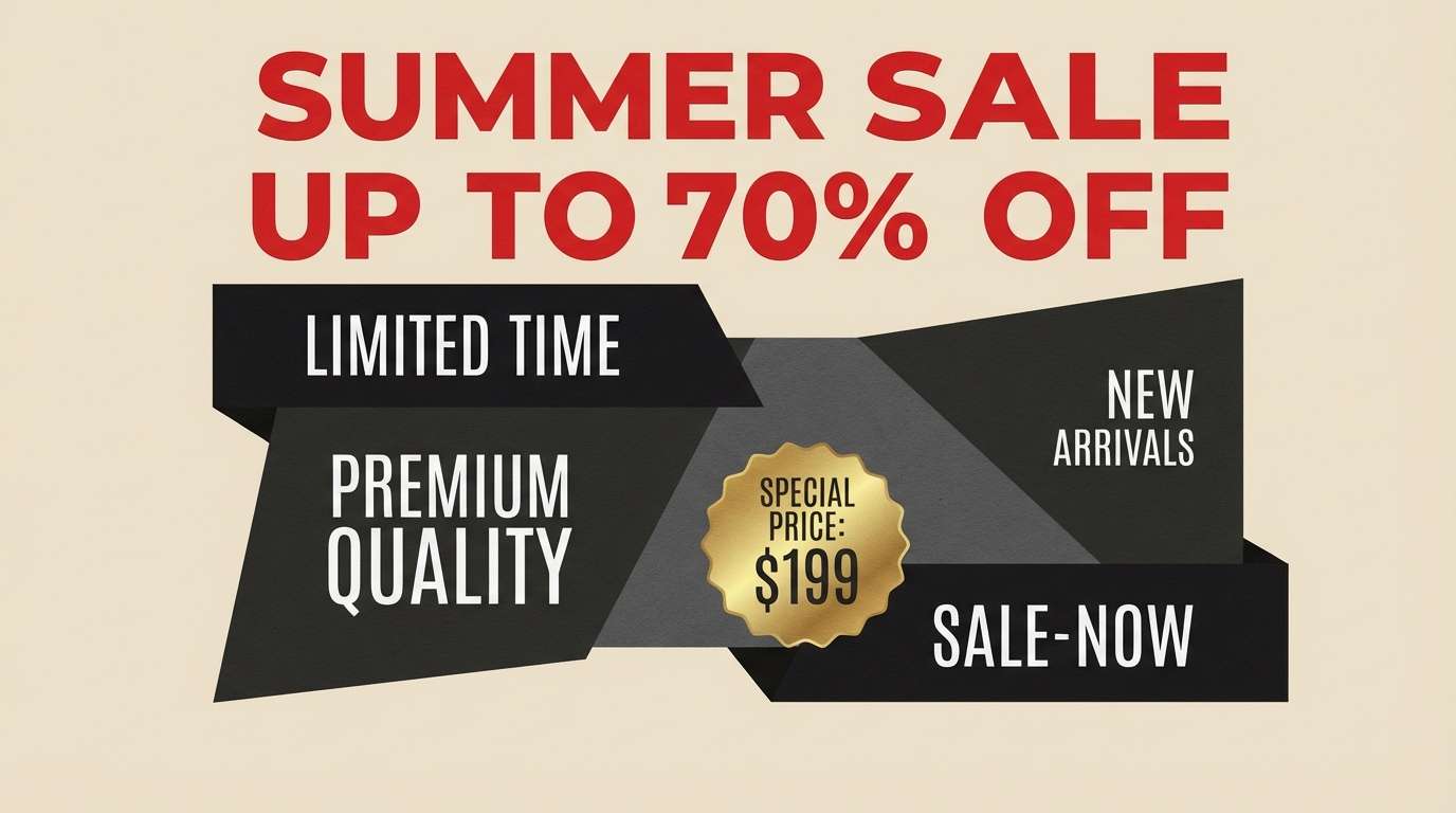
HEX: #1c1c1c #5c5c5c #b71c1c #e0a800 #f5f5f5
Mood: gritty, intense, industrial
Best for: gym membership ad and promo banner
Gritty and intense, like worn gloves, steel lockers, and heavy bag shadows. Use black and gray for the base, then let red hit the main offer and gold mark key benefits. It is strong for banners, membership promos, and small-format ads that need instant hierarchy. Tip: keep white for breathing room around pricing so the design does not feel claustrophobic.
Image example of boxing gym grit generated using media.io
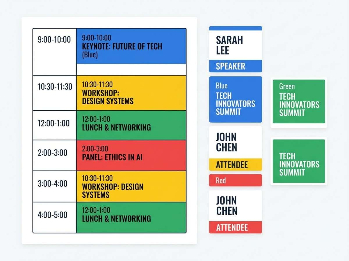
11) Olympic Rings Remix
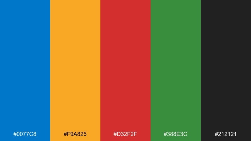
HEX: #0077c8 #f9a825 #d32f2f #388e3c #212121
Mood: global, celebratory, high-contrast
Best for: multi-sport event schedule and badges
Global and celebratory, with bright primaries that feel instantly event-ready. Pick one color per sport category, then use the dark neutral for typography and dividers. It is a reliable choice for schedules, credential badges, and venue maps with lots of labels. Tip: keep the saturation high but limit gradients to maintain clarity in print.
Image example of olympic rings remix generated using media.io
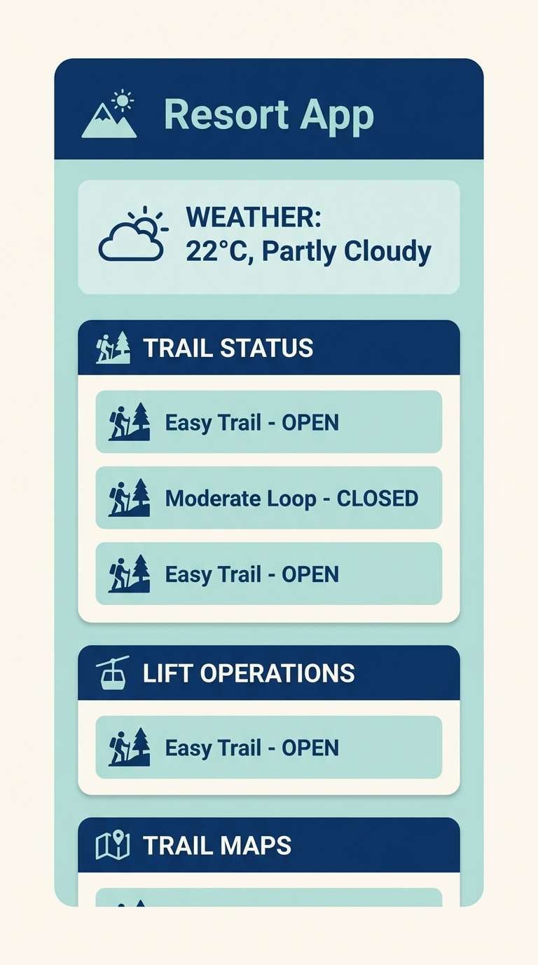
12) Snowboard Storm
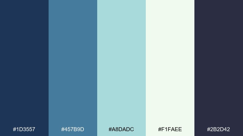
HEX: #1d3557 #457b9d #a8dadc #f1faee #2b2d42
Mood: icy, adventurous, cinematic
Best for: winter resort app ui and trail status
Icy and cinematic, like clouded peaks and wind-blown snow lines. This sports color scheme reads clearly on screens, with deep blues for navigation and pale mint for status states. Use the near-white for spacious cards and the darkest tone for primary text. Tip: reserve the light teal for live indicators so users spot updates at a glance.
Image example of snowboard storm generated using media.io
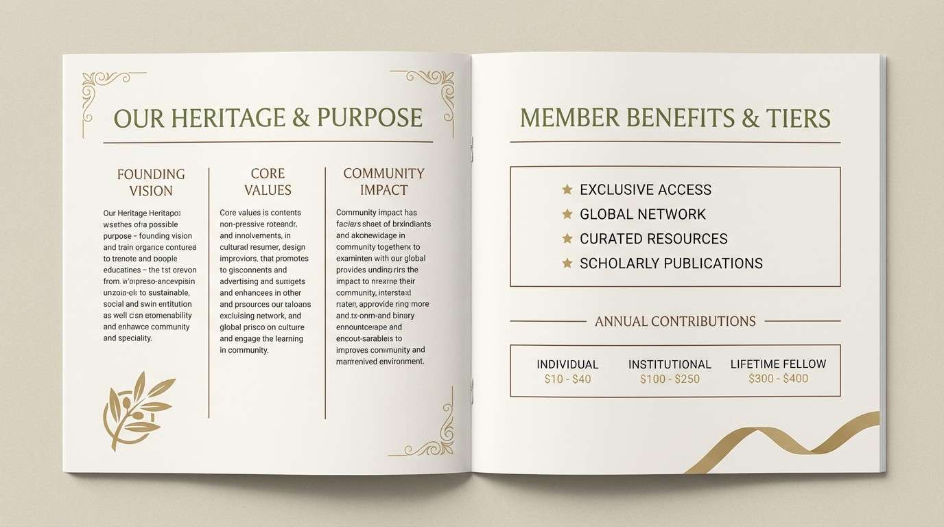
13) Cricket Field Heritage
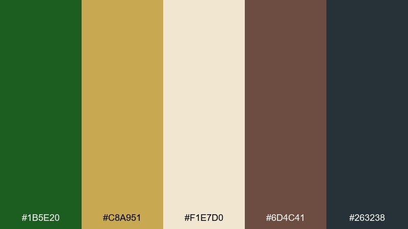
HEX: #1b5e20 #c8a951 #f1e7d0 #6d4c41 #263238
Mood: heritage, earthy, refined
Best for: club annual report and membership brochure
Heritage and tradition, like sunlit grass, polished wood, and old pavilion details. The muted gold reads as a premium accent without looking flashy. It works well for brochures, annual reports, and membership packs where trust is the goal. Tip: use the cream tone as the main page background to keep long text comfortable.
Image example of cricket field heritage generated using media.io
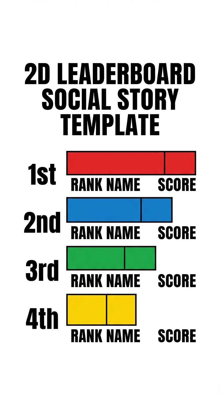
14) Cycling Peloton Pop
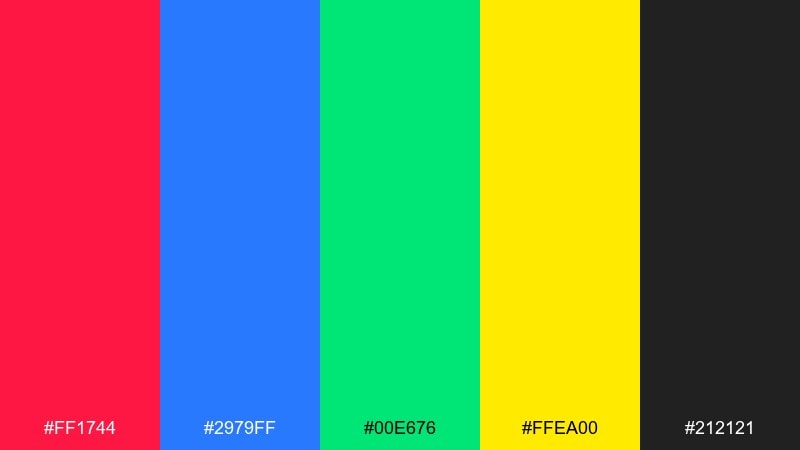
HEX: #ff1744 #2979ff #00e676 #ffea00 #212121
Mood: playful, competitive, high-energy
Best for: race day social templates and leaderboards
Playful and competitive, like a fast peloton and bright roadside flags. Use black to anchor the layout, then assign the bold colors to ranks, teams, or segments. It is perfect for leaderboards, split-time graphics, and story templates where quick scanning matters. Tip: keep one dominant accent per screen to avoid visual noise.
Image example of cycling peloton pop generated using media.io
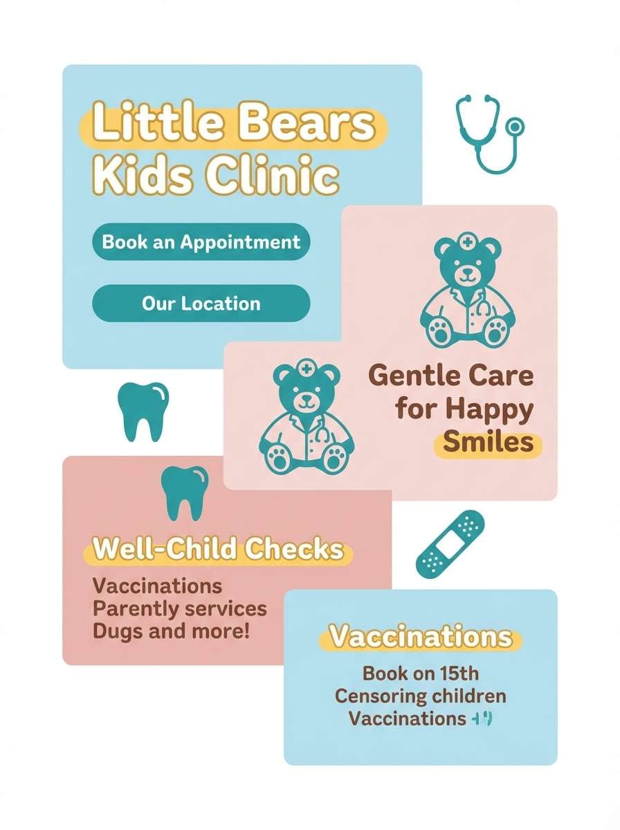
15) Baseball Diamond Pastels
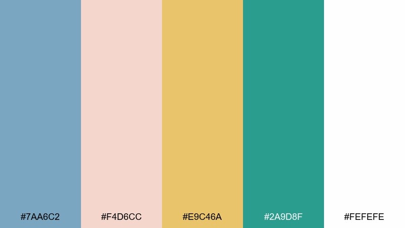
HEX: #7aa6c2 #f4d6cc #e9c46a #2a9d8f #fefefe
Mood: light, friendly, family-day
Best for: kids clinic flyer and concession menu
Light and friendly, like a weekend doubleheader with cotton-candy skies. Pastels keep the tone welcoming while teal adds a clean, modern anchor. It fits kids clinics, concession menus, and community announcements that should feel upbeat. Tip: use the white as the main canvas and apply color in big, simple shapes for easy printing.
Image example of baseball diamond pastels generated using media.io
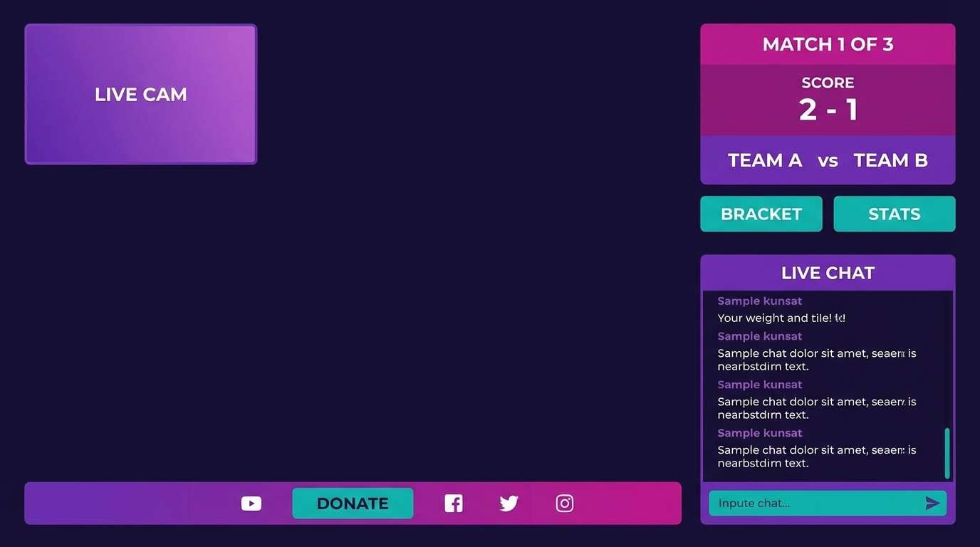
16) Esports Pulse Purple
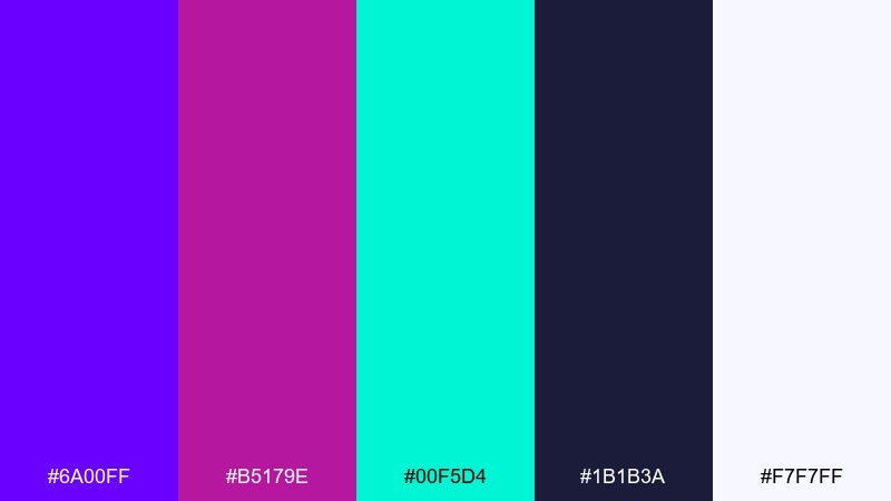
HEX: #6a00ff #b5179e #00f5d4 #1b1b3a #f7f7ff
Mood: futuristic, punchy, glossy
Best for: stream overlay ui and event countdown
Futuristic and punchy, like a neon pulse across a dark arena screen. Purple and magenta set the mood, while teal makes buttons and timers pop. It is strong for overlays, match cards, and countdown modules where you want instant depth. Tip: keep the near-white for small labels only, so the dark base stays dramatic.
Image example of esports pulse purple generated using media.io
17) Tennis Court Lime
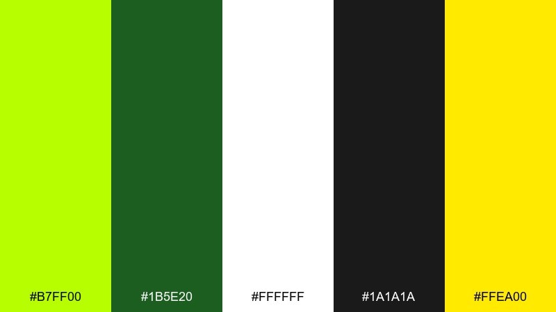
HEX: #b7ff00 #1b5e20 #ffffff #1a1a1a #ffea00
Mood: fresh, punchy, sunny
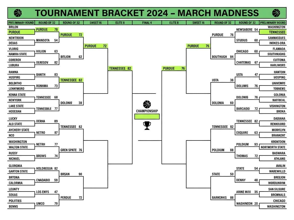
Best for: tournament bracket sheet and court signage
Fresh and punchy, like a bright ball against a clean court. Lime grabs attention fast, while green keeps the palette grounded and sporty. It works well for brackets, signage, and on-court directional graphics. Tip: use black text on white for the details, and save lime for highlights like winners and match times.
Image example of tennis court lime generated using media.io
18) Motorsport Carbon and Chrome
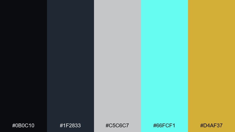
HEX: #0b0c10 #1f2833 #c5c6c7 #66fcf1 #d4af37
Mood: sleek, technical, premium
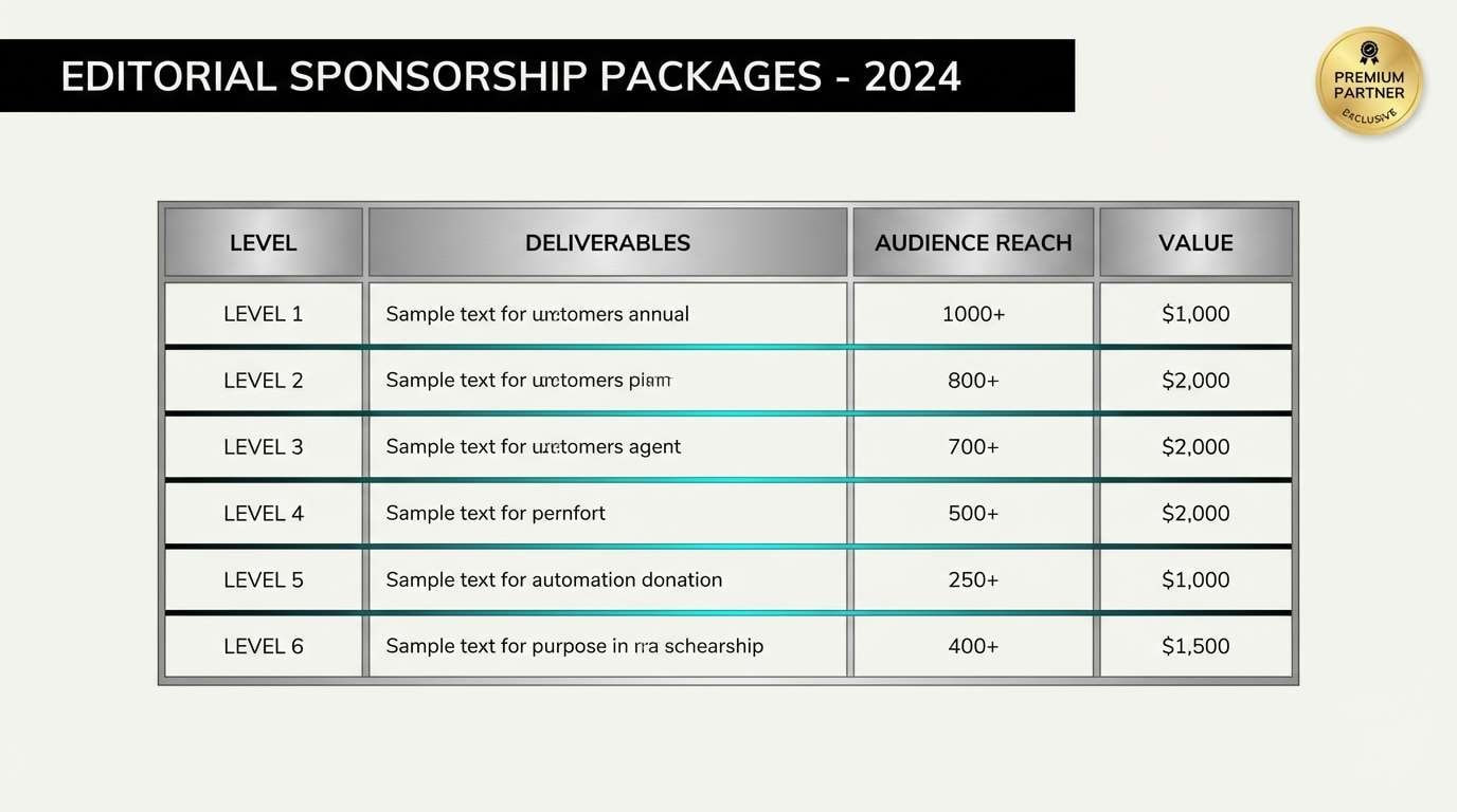
Best for: race team sponsor deck and car livery notes
Sleek and technical, like carbon fiber panels under pit-lane lights. The cool chrome grays handle layouts and tables, while teal adds a modern digital edge. As a sports color palette for motorsport-style branding, it feels premium without relying on loud primaries. Tip: use gold only for key wins, lap records, or sponsor callouts so it reads as elite, not decorative.
Image example of motorsport carbon and chrome generated using media.io
19) Yoga Studio Calm
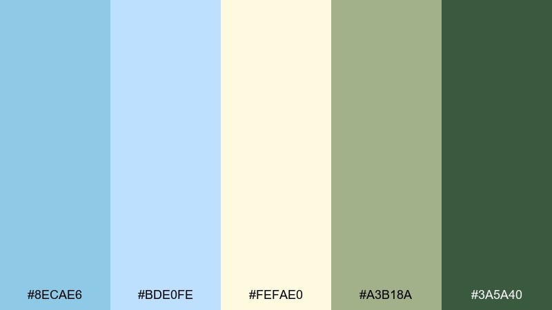
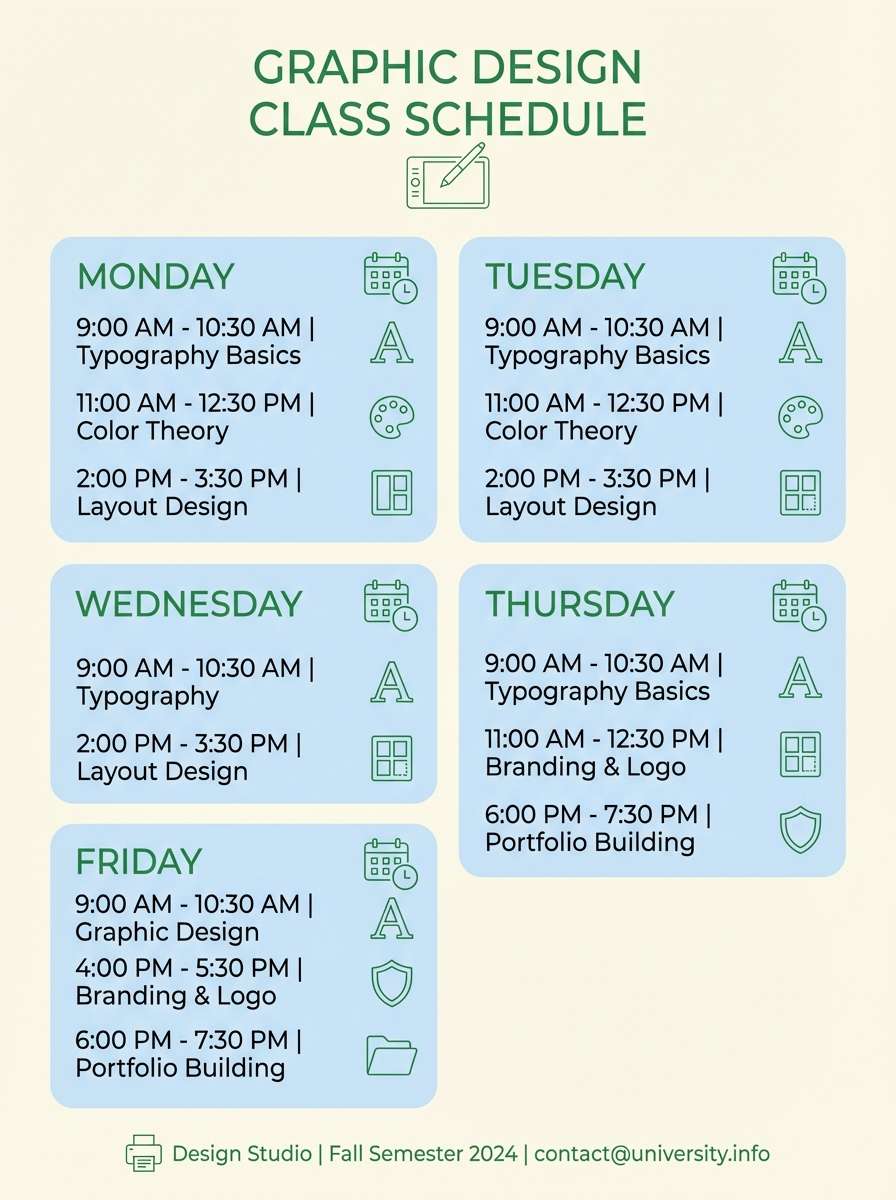
HEX: #8ecae6 #bde0fe #fefae0 #a3b18a #3a5a40
Mood: calm, airy, restorative
Best for: class schedule poster and wellness newsletter
Calm and airy, like soft daylight in a quiet studio. Light blues keep the mood gentle, while the greens add a grounded, natural finish. It suits schedules, newsletters, and membership emails that should feel welcoming rather than intense. Tip: let the cream tone be your main background and use the darkest green only for headings to avoid visual heaviness.
Image example of yoga studio calm generated using media.io
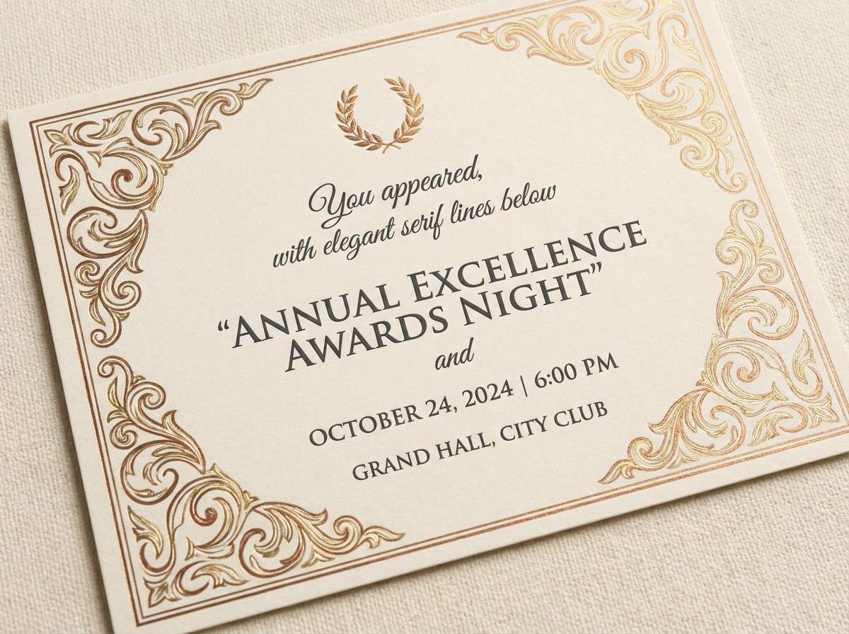
20) Medal Ceremony Bronze
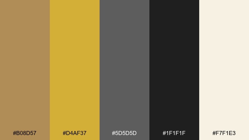
HEX: #b08d57 #d4af37 #5d5d5d #1f1f1f #f7f1e3
Mood: honor, warm, ceremonial
Best for: award night invitation and certificates
Warm and ceremonial, like spotlights on a podium and a ribboned medal in hand. Bronze and gold work best as accents against deep neutrals for a formal, premium feel. Use it for invitations, certificates, and sponsor thank-you cards where you want quiet prestige. Tip: print with plenty of cream space and use the darker tones for body text to keep everything readable.
Image example of medal ceremony bronze generated using media.io
What Colors Go Well with Sports?
Sports palettes work best when you pair a strong base (black, navy, charcoal, deep green) with one or two high-energy accents (gold, red, neon cyan, lime). This creates instant hierarchy for jerseys, posters, and UI.
For broader events, use a neutral text color (near-black or off-white) and assign one bold color per category (sport type, team, bracket, or venue). It keeps schedules and maps scannable under pressure.
If you want a premium feel, metallic-inspired tones like gold and bronze look strongest when surrounded by deep neutrals and plenty of light negative space, instead of being used everywhere at once.
How to Use a Sports Color Palette in Real Designs
Start with roles, not favorites: choose a primary color for large areas, a dark neutral for text and structure, and an accent for wins, CTAs, and highlights. This makes your system usable across print and digital without guesswork.
Protect legibility by testing contrast on real components: jersey numbers, scoreboard timers, sponsor rows, and small mobile labels. Often the “best” color becomes a trim, while neutrals do the heavy lifting for readability.
Finally, standardize your palette in a mini guide: HEX values, background/text pairings, and one or two “do not” rules (like avoiding neon text on white). Consistency is what turns colors into a recognizable team identity.
Create Sports Palette Visuals with AI
If you want to preview these sports color schemes as posters, jersey mockups, overlays, or app screens, generate fast concept visuals before you commit to production files. Seeing the palette in context makes it easier to choose the right contrast and balance.
With Media.io text-to-image, you can paste a prompt, pick an aspect ratio, and iterate quickly for different sports deliverables—social stories, flyers, banners, or UI layouts—using the same HEX-driven direction.
Sports Color Palette FAQs
-
What makes a good sports color palette?
A good sports palette is high-contrast, easy to reproduce, and built around clear roles: a primary team color, a dark neutral for text/structure, a light neutral for space, and one accent for highlights like wins, CTAs, or badges. -
How many colors should a team use?
Most teams perform best with 2 core colors plus 1–2 neutrals. You can add a secondary accent for special editions, but too many bright colors can make merch and layouts feel noisy. -
Which sports colors are best for readability on scoreboards and UI?
Deep neutrals (navy/charcoal/black) with bright accents (cyan, lime, gold) usually read best. Use near-black for numbers on light panels, and reserve neon tones for highlights rather than body text. -
Can I use gold and bronze together without looking “too metallic”?
Yes—treat gold/bronze as accents, not backgrounds. Pair them with charcoal or black for premium contrast, and keep plenty of cream/white negative space so the warm tones feel intentional and clean. -
What are the best color schemes for esports graphics?
Dark bases with neon accents work well for esports: indigo/black plus cyan, magenta, or lime. Keep off-white for small labels only so the overall look stays dramatic and high-impact. -
How do I choose a palette for a multi-sport event?
Pick a shared neutral system for typography and grids, then assign one bold color per sport category. This keeps schedules, badges, and maps consistent while still making each sport easy to identify. -
How can I quickly mock up sports palette ideas?
Use an AI generator to create posters, overlays, or UI screens from a prompt, then iterate. Media.io helps you explore multiple compositions and moods fast before moving to final design tools.


