

Volcano color palettes blend smoky charcoals, lava reds, and ash-toned neutrals into schemes that feel powerful, grounded, and modern.
Whether you’re designing a dark mode UI, bold packaging, or cinematic posters, these 20 ready-to-use volcano palettes come with HEX codes and AI image prompts you can reuse fast.
In this article
Why Volcano Palettes Work So Well
Volcano palettes are built on natural contrast: near-black rock and ash sit next to warm ember reds, copper browns, and sand-like highlights. That balance makes designs feel dramatic without becoming chaotic.
They’re also flexible across mediums. The dark bases create instant hierarchy for UI and editorial layouts, while the warm accents deliver strong calls-to-action for packaging, posters, and social graphics.
Because many volcano tones are muted rather than neon, they photograph and print well. You can keep a premium, textured look while still maintaining readable type and clean spacing.
20+ Volcano Color Palette Ideas (with HEX Codes)
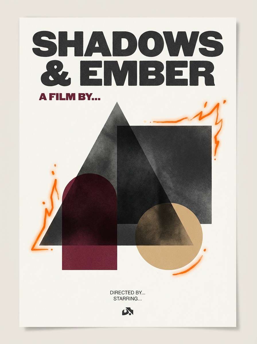
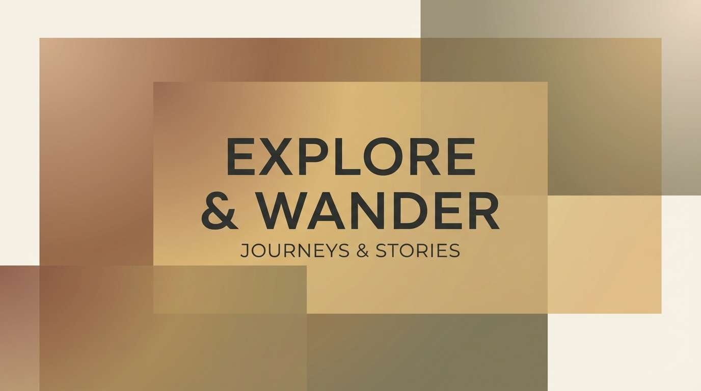
1) Lava Dusk
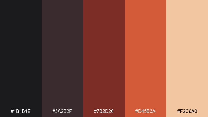
HEX: #1b1b1e #3a2b2f #7b2d26 #d45b3a #f2c6a0
Mood: dramatic and cinematic
Best for: movie poster and key art
Dramatic and cinematic, this mix feels like cooling lava under a smoky sunset. Use the near-black and deep maroon for big typography and shadowy backgrounds, then bring in ember orange for focal elements. The soft sand tone keeps skin tones and highlights from turning muddy. Pair it with matte textures and a single bold title font for maximum impact.
Image example of lava dusk generated using media.io
Media.io is an online AI studio for creating and editing video, image, and audio in your browser.

2) Basalt Bloom
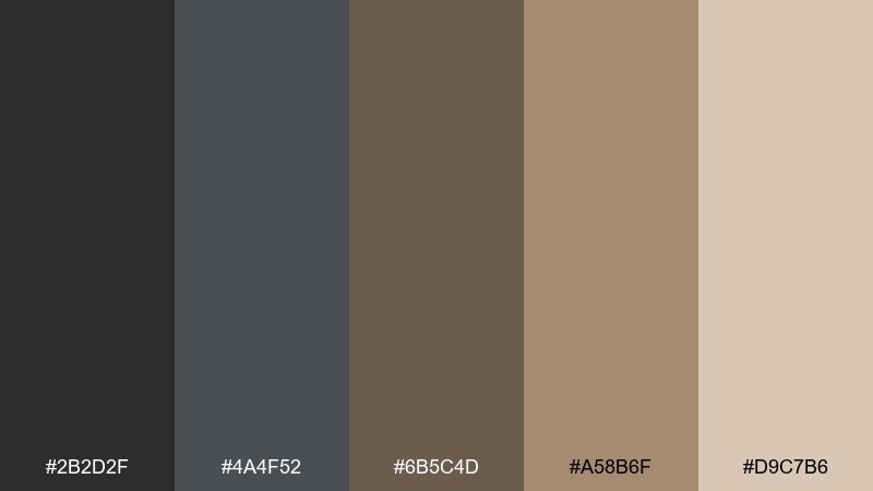
HEX: #2b2d2f #4a4f52 #6b5c4d #a58b6f #d9c7b6
Mood: grounded and modern
Best for: minimalist brand identity
Grounded and modern, these tones evoke basalt rock, worn leather, and soft studio light. Let the cool grays carry layouts and grids, then warm them up with tan and sand for approachability. This set works beautifully for premium crafts, studios, and understated lifestyle brands. Keep contrast crisp by reserving the lightest shade for negative space and margins.
Image example of basalt bloom generated using media.io
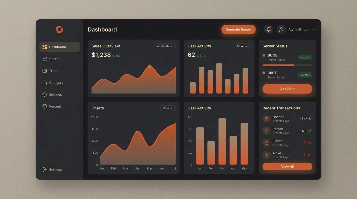
3) Ashen Glow
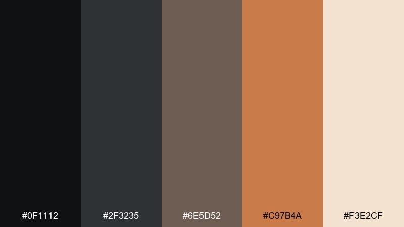
HEX: #0f1112 #2f3235 #6e5d52 #c97b4a #f3e2cf
Mood: sleek and high-contrast
Best for: dark mode UI
Sleek and high-contrast, it reads like ash clouds lit by a distant fireline. Use the darkest two shades for surfaces and navigation, then lift readability with the cream as primary text and card backgrounds. The warm clay and ember notes are ideal for buttons, badges, and active states. Tip: keep accents consistent by using only one warm highlight per screen to avoid visual noise.
Image example of ashen glow generated using media.io
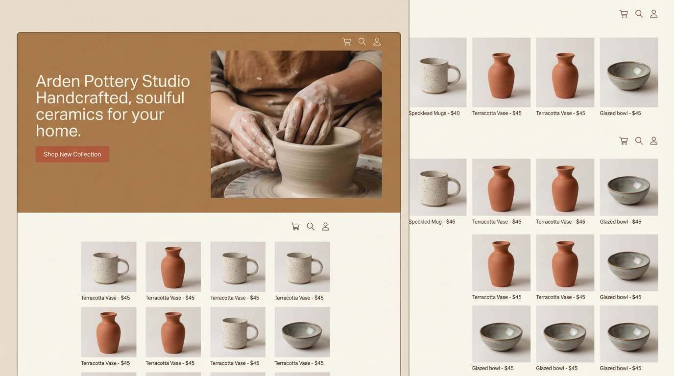
4) Crater Clay
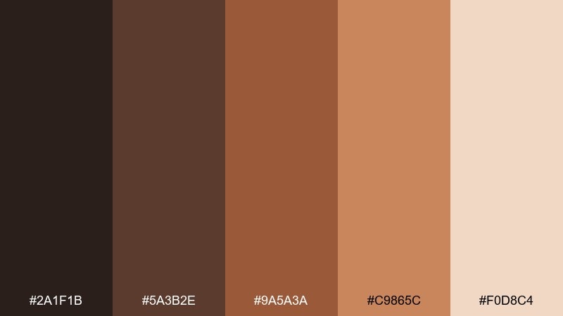
HEX: #2a1f1b #5a3b2e #9a5a3a #c9865c #f0d8c4
Mood: earthy and handcrafted
Best for: pottery studio website
Earthy and handcrafted, these shades feel like kiln-fired clay, worn aprons, and warm workshop light. Build your site with deep brown for headers and footers, then use terracotta and sienna for calls to action and highlights. The pale ceramic tint is perfect for airy sections and product grids. A good usage tip is to add subtle grain or paper texture so the warm midtones feel more authentic.
Image example of crater clay generated using media.io
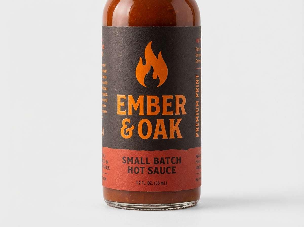
5) Emberstone

HEX: #1a1412 #4a2a1f #8b3a2a #c24f33 #ffb27a
Mood: bold and spicy
Best for: hot sauce packaging
Bold and spicy, it brings to mind glowing coals, charred wood, and a bright kick of heat. These volcano color combinations shine on labels where you need instant shelf impact, especially with the orange used for caps, seals, or flavor markers. Balance the intensity by giving the light peach shade room to breathe as a background panel. Tip: use spot gloss only on the warm accent to make it pop without overwhelming the design.
Image example of emberstone generated using media.io
6) Sulfur Mist
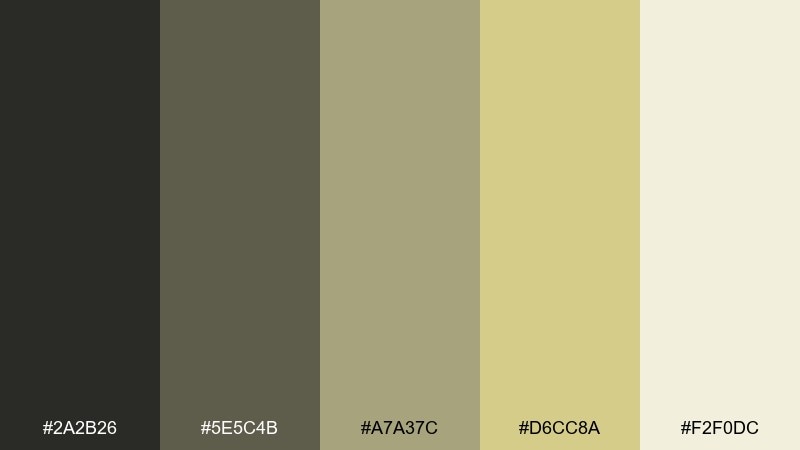
HEX: #2a2b26 #5e5c4b #a7a37c #d6cc8a #f2f0dc
Mood: calm and mineral
Best for: wellness app onboarding
Calm and mineral, this palette suggests steamy vents, soft lichen, and foggy morning light. Use the cream and pale sulfur tones for welcoming onboarding screens, then anchor navigation with the deeper olive-charcoal. The muted yellow works well for progress states and gentle highlights without feeling neon. Keep illustrations simple and line-based so the subtle midtones do not get lost.
Image example of sulfur mist generated using media.io
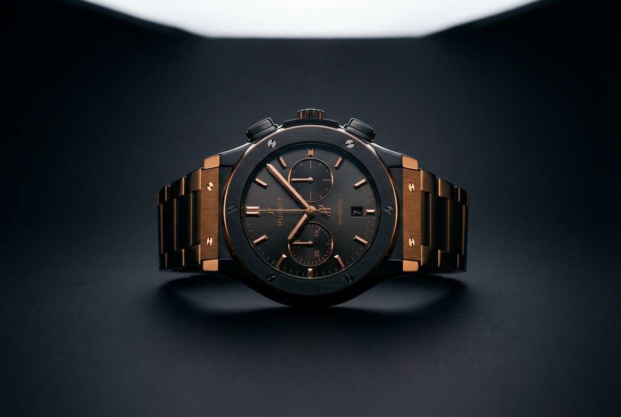
7) Obsidian Night
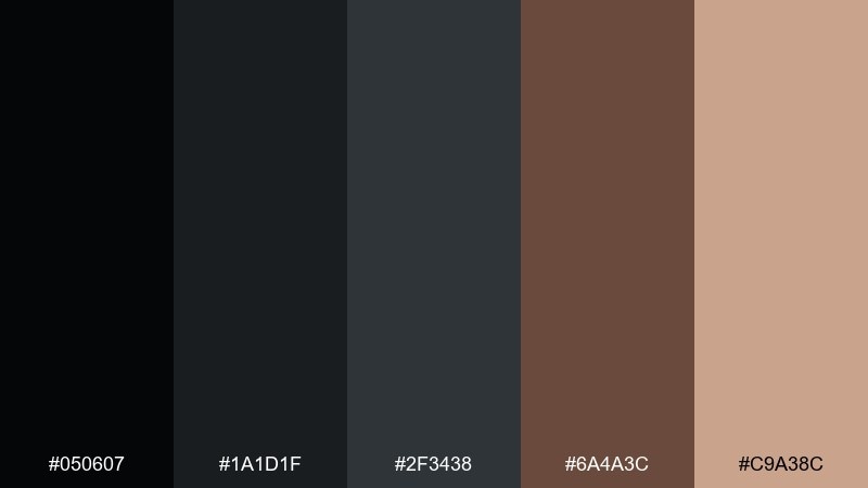
HEX: #050607 #1a1d1f #2f3438 #6a4a3c #c9a38c
Mood: luxurious and nocturnal
Best for: luxury watch ad
Luxurious and nocturnal, it feels like polished obsidian with a warm bronze glint. Let the blacks and graphite tones dominate the frame for a premium look, then add the bronze-brown as a refined accent. The soft beige highlight is ideal for small type, reflections, and subtle gradients. Tip: keep backgrounds nearly solid to preserve the high-end, minimal vibe.
Image example of obsidian night generated using media.io
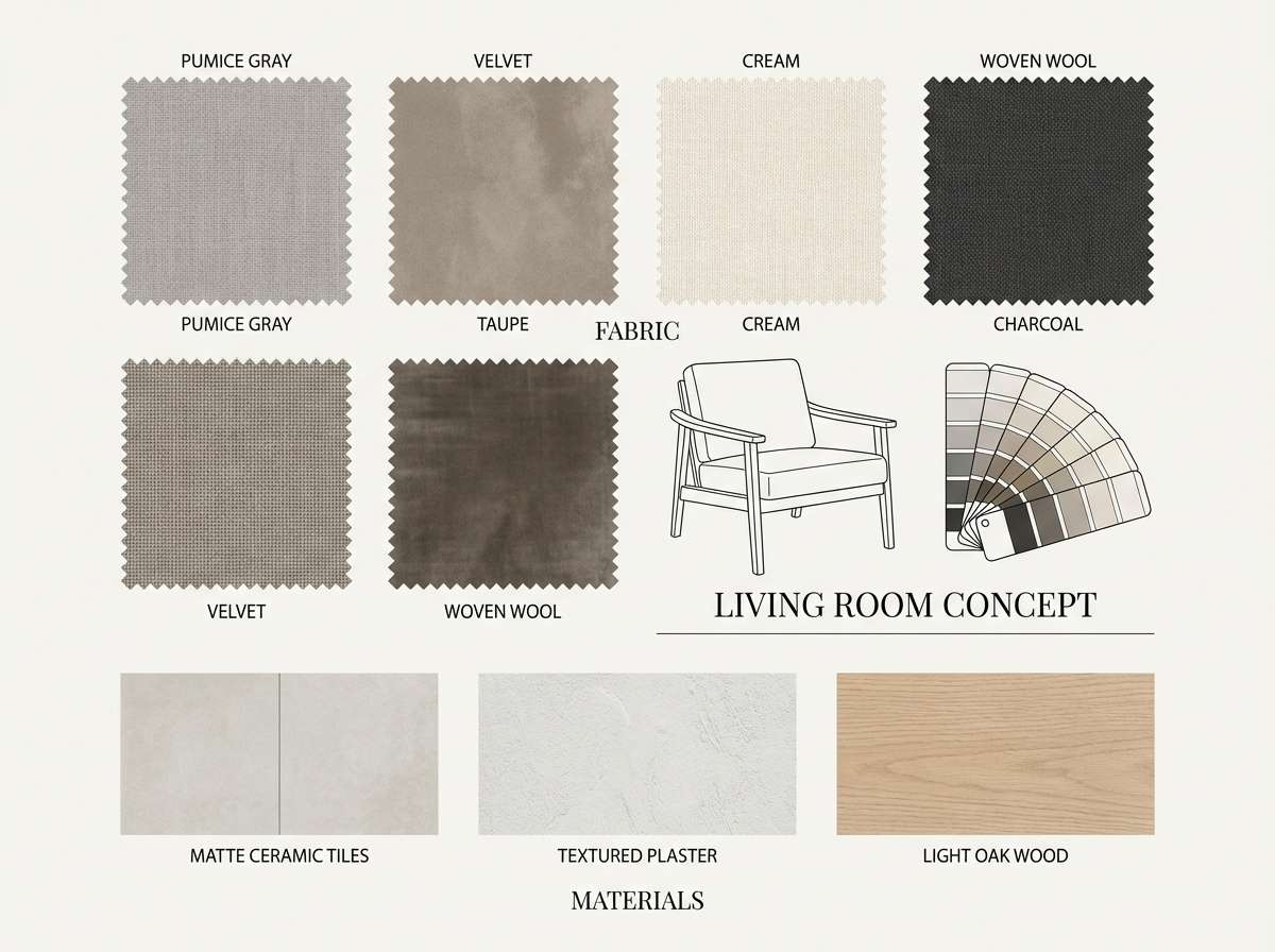
8) Pumice Sand
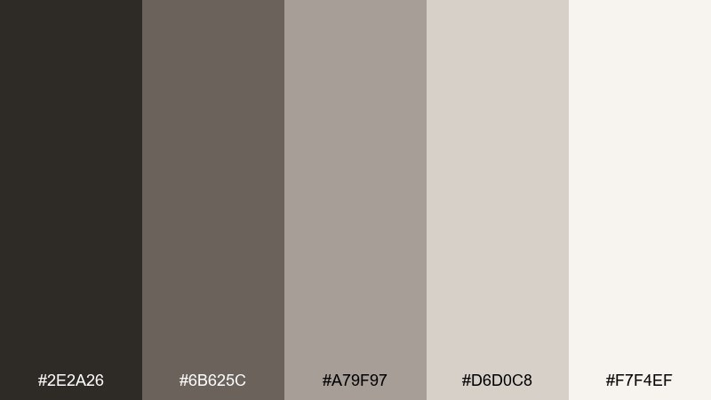
HEX: #2e2a26 #6b625c #a79f97 #d6d0c8 #f7f4ef
Mood: soft and neutral
Best for: interior design mood board
Soft and neutral, these shades recall pumice stone, linen, and sunlit plaster walls. They are perfect for calm mood boards where materials and textures should lead the story. Use the darker brown-gray for headings and swatches, while the lightest tone keeps layouts airy and spacious. A simple tip is to vary texture (concrete, fabric, wood) instead of adding extra colors.
Image example of pumice sand generated using media.io
9) Magma Rose
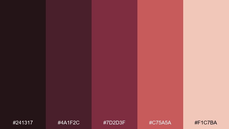
HEX: #241317 #4a1f2c #7d2d3f #c75a5a #f1c7ba
Mood: romantic and intense
Best for: beauty brand social post
Romantic and intense, it looks like molten rose pigment cooling into velvet shadows. As a volcano color palette for beauty, it works best with large color fields and close-cropped product silhouettes. Use the blush tone to soften headlines and keep the deepest plum for contrast and luxury. Tip: limit gradients to two steps so the reds stay rich and not muddy.
Image example of magma rose generated using media.io
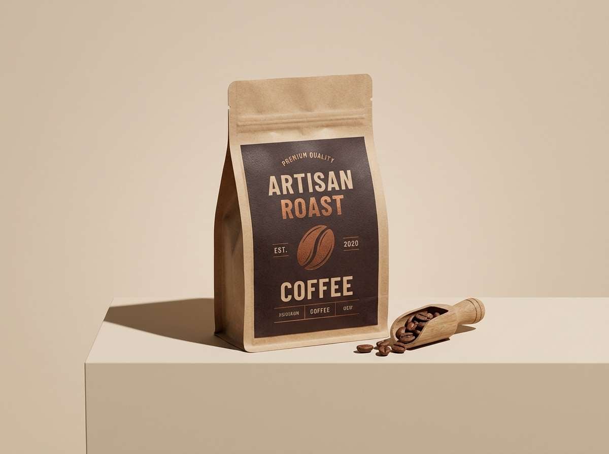
10) Cinder Copper
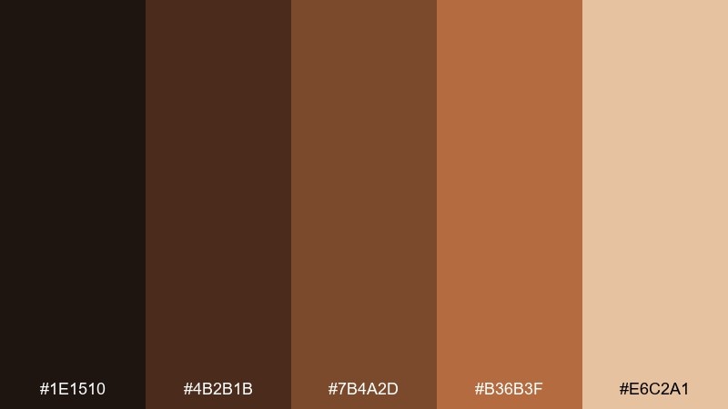
HEX: #1e1510 #4b2b1b #7b4a2d #b36b3f #e6c2a1
Mood: warm and rustic
Best for: coffee packaging
Warm and rustic, these tones suggest roasted beans, copper kettles, and toasted sugar. Use the deep espresso shade for bold brand blocks and the copper midtones for patterns or origin stamps. The pale crema tint makes a clean background for tasting notes and barcode areas. Tip: add a single copper foil element to echo the warm highlight without adding new colors.
Image example of cinder copper generated using media.io
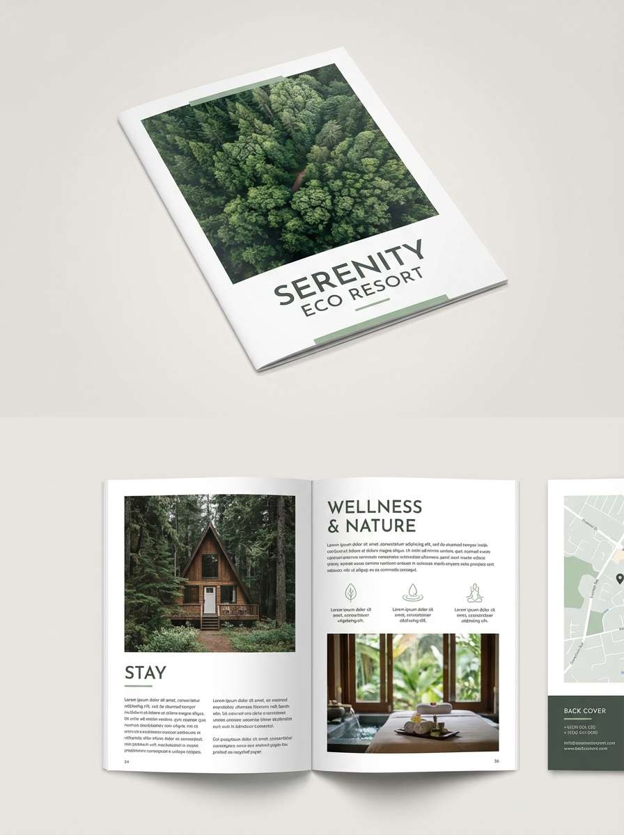
11) Volcanic Sage
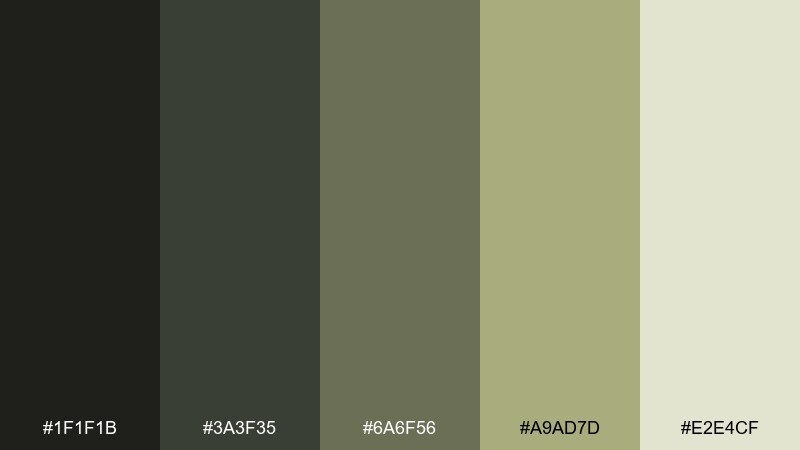
HEX: #1f1f1b #3a3f35 #6a6f56 #a9ad7d #e2e4cf
Mood: natural and restorative
Best for: eco resort brochure
Natural and restorative, it feels like hardy sage growing through dark rock. The deep charcoal-green anchors headings and photo captions, while the soft sage and pale mist shades keep pages light and breathable. This pairing works well with nature photography, wood textures, and simple icons. Tip: keep body text on the lightest tone for readability, and use the mid sage only for section dividers.
Image example of volcanic sage generated using media.io
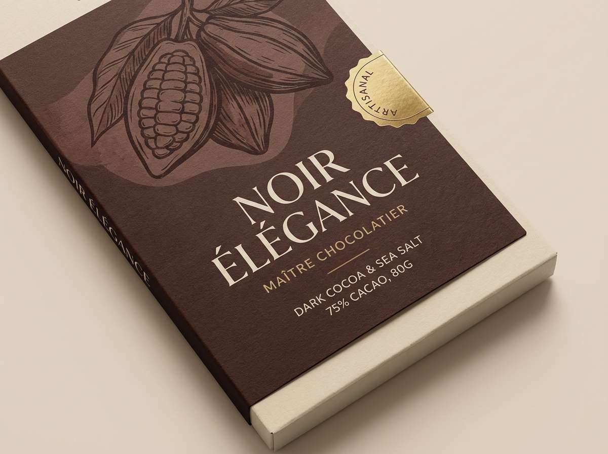
12) Charred Cocoa
HEX: #120d0b #3a251e #624036 #8d6a5a #dcc7b7
Mood: cozy and premium
Best for: chocolate label design
Cozy and premium, this range reads like dark chocolate, cocoa powder, and creamy fillings. Use the deepest shade for a bold label frame and the cocoa midtones for illustrated patterns or origin maps. The light cream adds a gourmet touch for flavor names and ingredient sections. Tip: combine with a serif headline font to lean into a classic, artisanal feel.
Image example of charred cocoa generated using media.io
13) Firelight Ochre
HEX: #2b1a0f #6a3a18 #b15a1d #d98b3a #f3d2a0
Mood: inviting and energetic
Best for: restaurant menu design
Inviting and energetic, it evokes firelight on stone walls and golden spice in the air. These volcano color combinations are ideal for menus that need warmth without looking overly red. Use the darkest brown for text and section bars, then reserve the bright ochre for prices, specials, and callouts. Tip: keep the light sand shade as the main paper color so the oranges stay crisp and legible.
Image example of firelight ochre generated using media.io
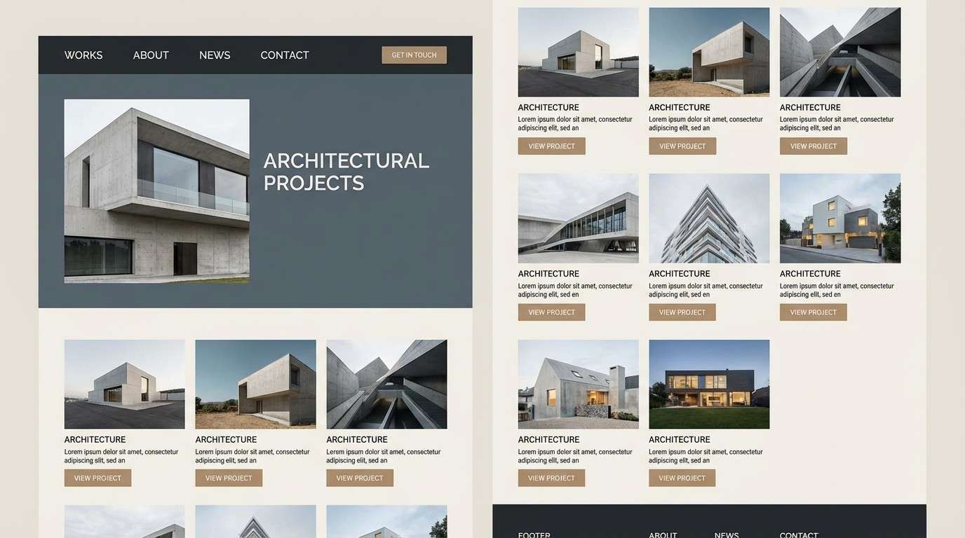
14) Iron Ridge
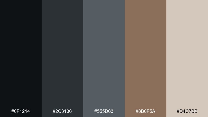
HEX: #0f1214 #2c3136 #555d63 #8b6f5a #d4c7bb
Mood: industrial and refined
Best for: architecture portfolio website
Industrial and refined, these tones feel like iron beams, slate concrete, and warm stone dust. Use the dark pair for navigation and project titles, then lean on the pale beige for clean galleries and generous spacing. The muted stone-brown adds warmth to buttons and hover states without breaking the minimal look. Tip: keep imagery slightly desaturated so the interface colors stay cohesive.
Image example of iron ridge generated using media.io
15) Smoked Terracotta
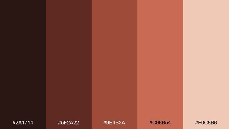
HEX: #2a1714 #5f2a22 #9e4b3a #c96b54 #f0c8b6
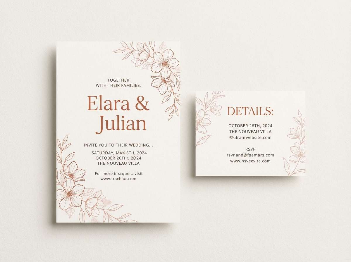
Mood: romantic and earthy
Best for: wedding invitation suite
Romantic and earthy, it feels like terracotta tiles warmed by a late-evening glow. The dark wine-brown gives elegant contrast for names and dates, while the softer terracotta shades suit florals, borders, and monograms. The blush tint helps keep the layout airy and modern. Tip: print the mid terracotta as a flat ink and use the darkest shade only for key text to preserve readability.
Image example of smoked terracotta generated using media.io
16) Seismic Slate
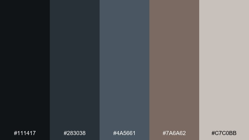
HEX: #111417 #283038 #4a5661 #7a6a62 #c7c0bb
Mood: cool and technical
Best for: analytics dashboard UI
Cool and technical, it reads like slate rock, steel panels, and dusted stone. The dark shades make a strong base for dashboards, while the pale gray keeps tables and cards clean. Add the warm taupe as a highlight for key metrics or alerts when you want emphasis without bright colors. Tip: use the mid slate for chart lines so they stay visible but not harsh.
Image example of seismic slate generated using media.io
17) Heat Haze
HEX: #2b231a #6a5538 #b08a58 #e0c08a #f6eedc
Mood: sunlit and hazy
Best for: travel blog header design
Sunlit and hazy, this palette feels like dust in the air and warm light on desert rock. It works well for headers and hero sections where you want warmth without aggressive saturation. Use the darkest brown for your site name and navigation, then layer the golden tans in gradients or subtle blocks. Tip: keep photography warm and low-contrast so the text overlay remains readable.
Image example of heat haze generated using media.io
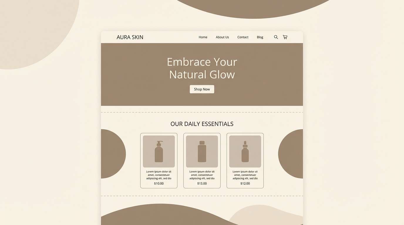
18) Caldera Cream
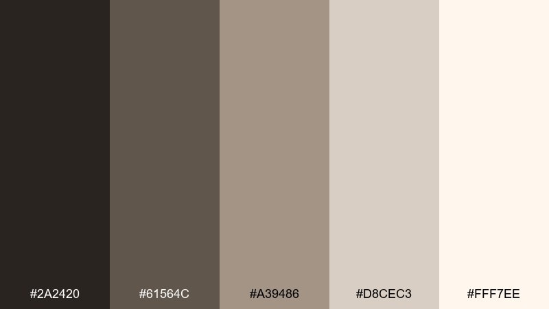
HEX: #2a2420 #61564c #a39486 #d8cec3 #fff7ee
Mood: soft and elegant
Best for: skincare landing page
Soft and elegant, it evokes mineral clay masks and creamy foam against warm stone. Use the cream as the main canvas, then bring in taupe and cocoa for navigation, icons, and gentle dividers. The mid beige is great for product cards and feature blocks that need subtle separation. Tip: keep buttons in the darkest shade for clear contrast while maintaining the calm aesthetic.
Image example of caldera cream generated using media.io
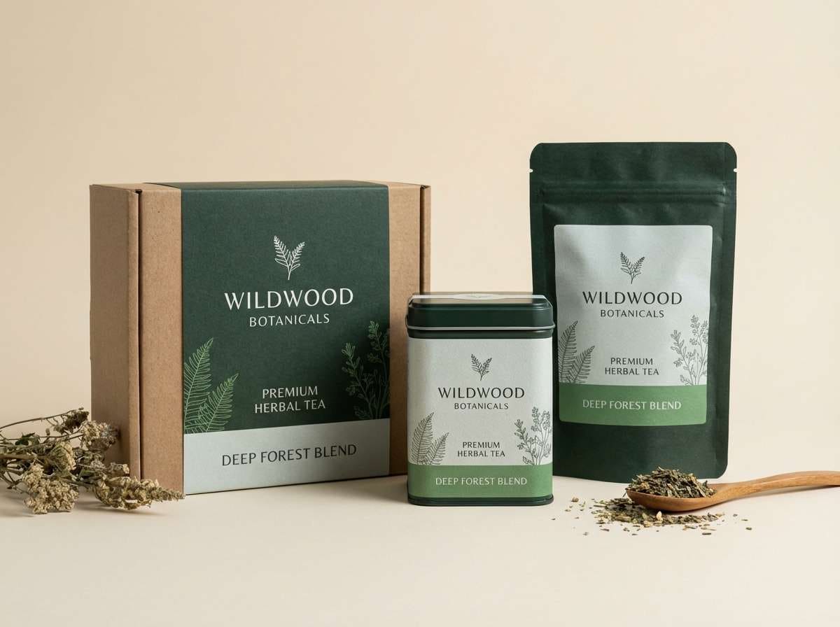
19) Fumarole Fern
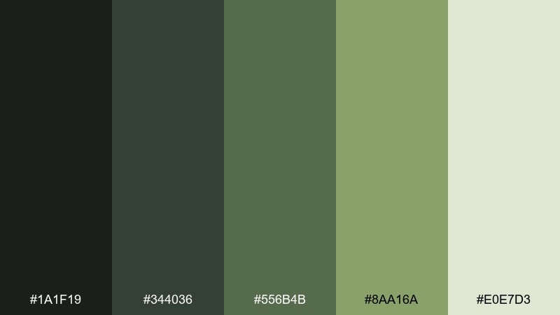
HEX: #1a1f19 #344036 #556b4b #8aa16a #e0e7d3
Mood: fresh and earthy
Best for: herbal tea packaging
Fresh and earthy, it brings to mind green fern fronds beside dark rock and steam. The deep forest tones feel trustworthy for wellness products, while the pale mist shade keeps labels clean and readable. Use the brighter fern green for flavor cues, seals, or small pattern accents. Tip: pair with simple botanical line art so the greens remain the hero.
Image example of fumarole fern generated using media.io
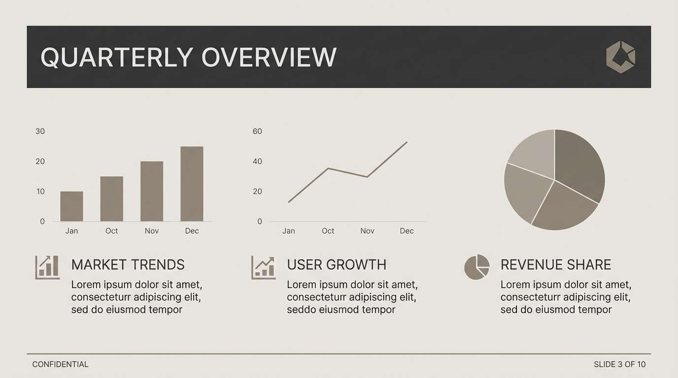
20) Horizon Smoke
HEX: #1b1c1e #3c3f44 #70757b #b6b0a9 #efe8df
Mood: clean and professional
Best for: presentation template
Clean and professional, it looks like distant smoke on the horizon with soft, warm light. Use the charcoal for title slides and section breaks, then rely on the light beige for content-heavy pages. The mid grays keep charts and diagrams tidy without harsh contrast. Tip: stick to one accent per slide and let whitespace do most of the design work.
Image example of horizon smoke generated using media.io
What Colors Go Well with Volcano?
Volcano tones pair best with warm neutrals (sand, cream, taupe) that keep compositions breathable and prevent dark bases from feeling heavy. These light shades also improve readability for type-heavy layouts.
For stronger contrast, add controlled accents like ember orange, copper, or ochre. Used sparingly, they create clear focal points for buttons, prices, headlines, or product seals.
If you want a more natural direction, introduce muted greens (sage or fern). They soften the heat of lava reds and make volcano palettes work beautifully for eco, wellness, and travel branding.
How to Use a Volcano Color Palette in Real Designs
Start with a “rock base” (charcoal, slate, deep brown) for backgrounds, frames, and navigation, then choose one “heat accent” (ember, terracotta, copper) for interactive elements and emphasis. This keeps the theme cohesive and avoids over-saturation.
Reserve your lightest shade (cream, sand, mist) for negative space, cards, and text areas. Volcano palettes feel premium when there’s generous spacing and the highlights are used like light reflecting on stone.
For print, lean into texture: matte paper, subtle grain, and minimal gradients. For UI, keep warm accents consistent across states (default/hover/active) so the interface feels intentional rather than noisy.
Create Volcano Palette Visuals with AI
If you already have HEX codes, you can quickly generate matching visuals—posters, packaging mockups, social tiles, or UI screens—by describing layout, style, and where each color should appear.
Use the prompts above as a starting point, then swap the subject (menu, brochure, label) while keeping the volcano color direction (ash base + ember accent + sand highlight) consistent.
When you iterate, change one variable at a time (typography style, composition, or texture) so you can compare results and keep the palette looking on-brand.
Volcano Color Palette FAQs
-
What is a volcano color palette?
A volcano color palette is a set of colors inspired by volcanic landscapes—typically charcoal blacks, ash grays, deep browns, lava reds, ember oranges, and sand or cream highlights. -
Which volcano colors are best for dark mode UI?
Use ash and charcoal shades for surfaces (#0f1112, #2f3235) and pair them with a warm accent like clay or ember (#c97b4a) plus a cream highlight (#f3e2cf) for readable text and cards. -
How do I keep lava reds from looking too aggressive?
Balance reds with smoky neutrals and warm creams, and limit bright accents to key elements only (buttons, badges, prices). Muted terracotta or copper often feels warmer and more premium than pure red. -
Do volcano palettes work for minimalist branding?
Yes. Palettes like Basalt Bloom or Horizon Smoke stay understated by using grays and warm neutrals, with just one controlled accent for emphasis and recognizability. -
What fonts pair well with volcano color schemes?
For cinematic or bold looks, use strong condensed sans serifs with high contrast layouts. For premium packaging and editorial designs, pair the palette with a classic serif headline and a clean sans serif for body text. -
What’s a simple rule for using five colors effectively?
Assign roles: 1–2 dark bases, 1 mid neutral for structure, 1 warm accent for focal points, and 1 light highlight for background/negative space. Keep accents consistent across the design. -
Can I generate volcano-themed visuals from these palettes with AI?
Yes. Use the included prompts with Media.io’s text-to-image tool, then refine the subject and layout while keeping the same “ash base + ember accent + sand highlight” color direction.
Next: Amber Color Palette


