

Violet is one of the most versatile hues in modern design—able to feel luxurious, playful, calming, or futuristic depending on the tones you choose.
Below you’ll find curated violet color palette ideas with HEX codes, plus practical pairing tips for branding, UI, and print.
In this article
- Why Violet Palettes Work So Well
-
- midnight orchid
- lavender mist
- plum velvet
- wisteria daydream
- amethyst neon
- grape soda pop
- iris and cream
- violet dusk
- berry ink
- lilac minimal
- purple raincoat
- cosmic violet
- violet and sage
- royal violet gold
- soft mauve wedding
- tech violet gradient
- vintage violet sepia
- violet botanical
- urban violet concrete
- candy violet pastels
- What Colors Go Well with Violet?
- How to Use a Violet Color Palette in Real Designs
- Create Violet Palette Visuals with AI
Why Violet Palettes Work So Well
Violet sits between blue and red, so it naturally balances calmness and energy. That makes violet color combinations flexible—easy to push toward soothing lavender or toward bold, high-impact purple.
It also scales well across mediums: soft tints look clean in UI backgrounds, mid violets make friendly brand accents, and near-black violets create premium contrast for editorial or luxury packaging.
Most importantly, violet pairs beautifully with both warm and cool companions—creams, golds, sage greens, icy whites, and even neon highlights—so you can build a complete system without fighting the palette.
20+ Violet Color Palette Ideas (with HEX Codes)
1) Midnight Orchid
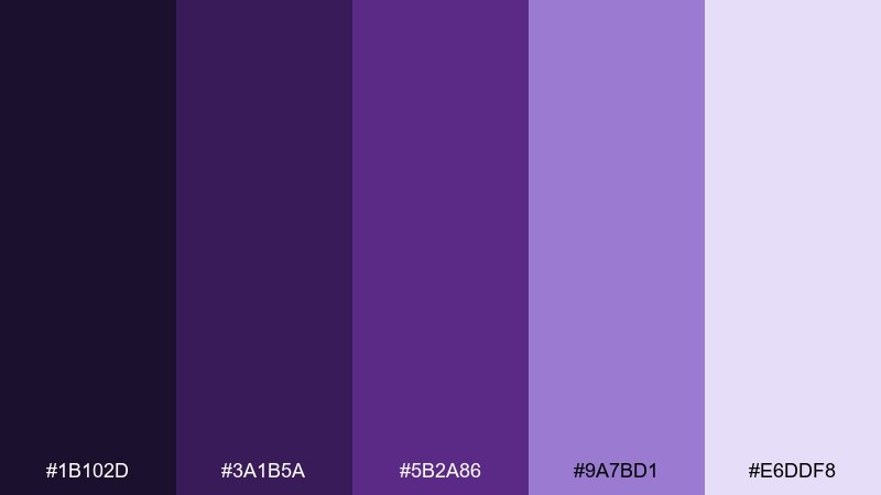
HEX: #1B102D #3A1B5A #5B2A86 #9A7BD1 #E6DDF8
Mood: moody and modern
Best for: dark mode UI, gaming branding
Moody night-sky purples and orchid highlights give off a sleek, after-dark glow. It works beautifully in dark mode interfaces, esports visuals, and tech branding where contrast matters. Pair the deep base with the pale lavender for readable type and keep the mid violet for buttons and icons. Usage tip: reserve the lightest shade for surfaces and cards so the layout stays crisp, not muddy.
Image example of midnight orchid generated using media.io
Media.io is an online AI studio for creating and editing video, image, and audio in your browser.

2) Lavender Mist
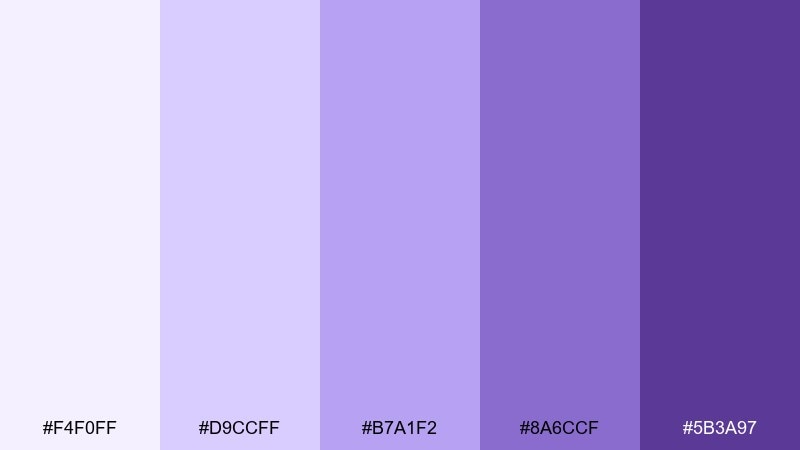
HEX: #F4F0FF #D9CCFF #B7A1F2 #8A6CCF #5B3A97
Mood: airy and calming
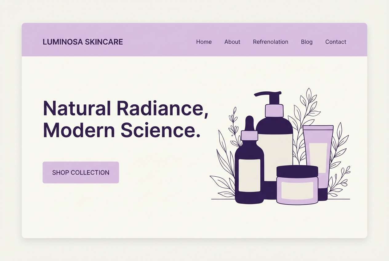
Best for: wellness landing page, skincare branding
Airy lavender haze and gentle violets feel clean, soft, and reassuring. These tones shine on wellness websites, beauty packaging, and calm social templates where you want a light touch. Pair the deeper violet with plenty of off-white space to keep the design breathable. Usage tip: use the mid lavender for section backgrounds and the darkest tone only for headings and key CTAs.
Image example of lavender mist generated using media.io
3) Plum Velvet
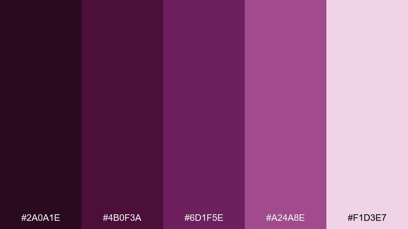
HEX: #2A0A1E #4B0F3A #6D1F5E #A24A8E #F1D3E7
Mood: luxurious and dramatic
Best for: luxury packaging, wine labels
Velvety plum shadows and rosy orchid notes create a rich, indulgent feel. It suits premium boxes, wine labels, and boutique product shots where you want depth without going fully black. This violet color palette pairs well with matte gold foil, warm cream paper, and minimalist typography. Usage tip: keep the light pink as a small highlight so the overall look stays sophisticated.
Image example of plum velvet generated using media.io
4) Wisteria Daydream
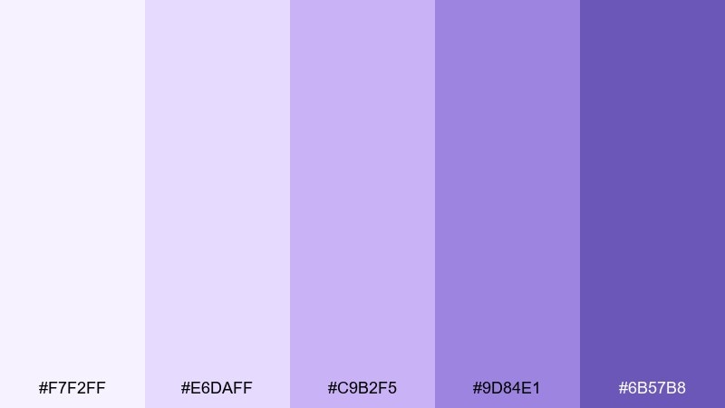
HEX: #F7F2FF #E6DAFF #C9B2F5 #9D84E1 #6B57B8
Mood: dreamy and whimsical
Best for: spring poster, nursery art
Dreamy wisteria petals and soft lilac light evoke a gentle spring morning. Use it for nursery prints, seasonal posters, or playful brand illustrations that need warmth without loud color. Pair with clean white space and rounded type to keep the mood sweet. Usage tip: let the medium lilac carry the main shapes and reserve the darkest violet for outlines and small details.
Image example of wisteria daydream generated using media.io
5) Amethyst Neon
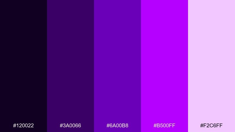
HEX: #120022 #3A0066 #6A00B8 #B500FF #F2C6FF
Mood: electric and bold
Best for: music festival flyer, nightlife promo
Electric amethyst and neon violet feel like club lights cutting through the dark. It is ideal for music flyers, nightlife promos, and punchy hero graphics that need instant energy. Pair with black or deep purple backgrounds and keep typography big and simple. Usage tip: use the brightest neon for one focal element only, like the date or headline, to avoid visual fatigue.
Image example of amethyst neon generated using media.io

6) Grape Soda Pop
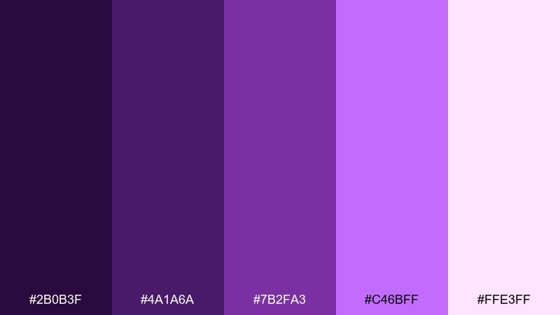
HEX: #2B0B3F #4A1A6A #7B2FA3 #C46BFF #FFE3FF
Mood: playful and punchy
Best for: social media ad, beverage branding
Bubbly grape tones and candy-like highlights feel fun, fizzy, and youthful. These colors fit snack and drink ads, energetic reels, and cheerful packaging concepts. Pair with clean white or very light pink backgrounds to keep the purple feeling fresh. Usage tip: let the bright lavender be the hero color and use the darkest grape only for text and logos.
Image example of grape soda pop generated using media.io
7) Iris and Cream
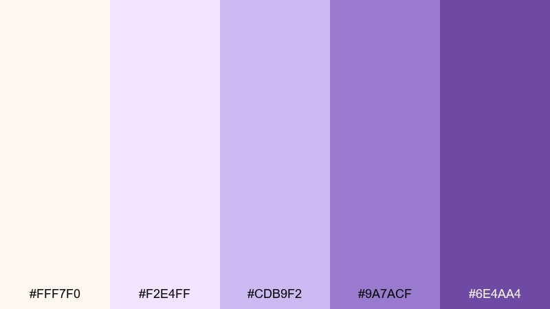
HEX: #FFF7F0 #F2E4FF #CDB9F2 #9A7ACF #6E4AA4
Mood: soft and elegant
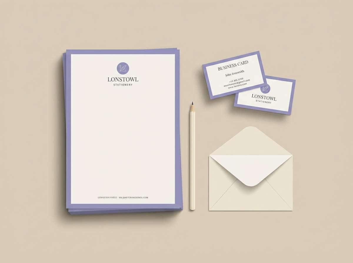
Best for: stationery design, blog theme
Creamy paper tones with iris violets bring a quiet, polished elegance. It works well for stationery, personal blogs, and gentle brand systems that lean classic. Pair with warm neutrals, thin line icons, and understated patterns for a refined look. Usage tip: keep the cream as the main background and use the darkest violet sparingly for headings and monograms.
Image example of iris and cream generated using media.io
8) Violet Dusk
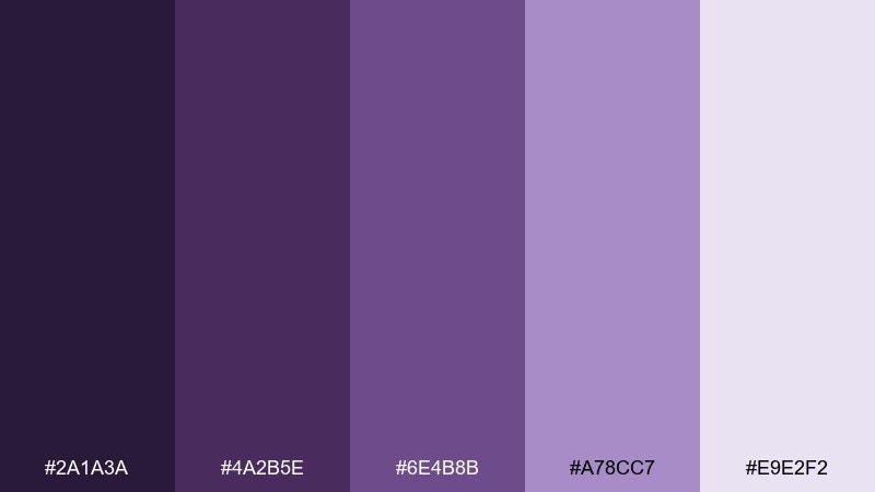
HEX: #2A1A3A #4A2B5E #6E4B8B #A78CC7 #E9E2F2
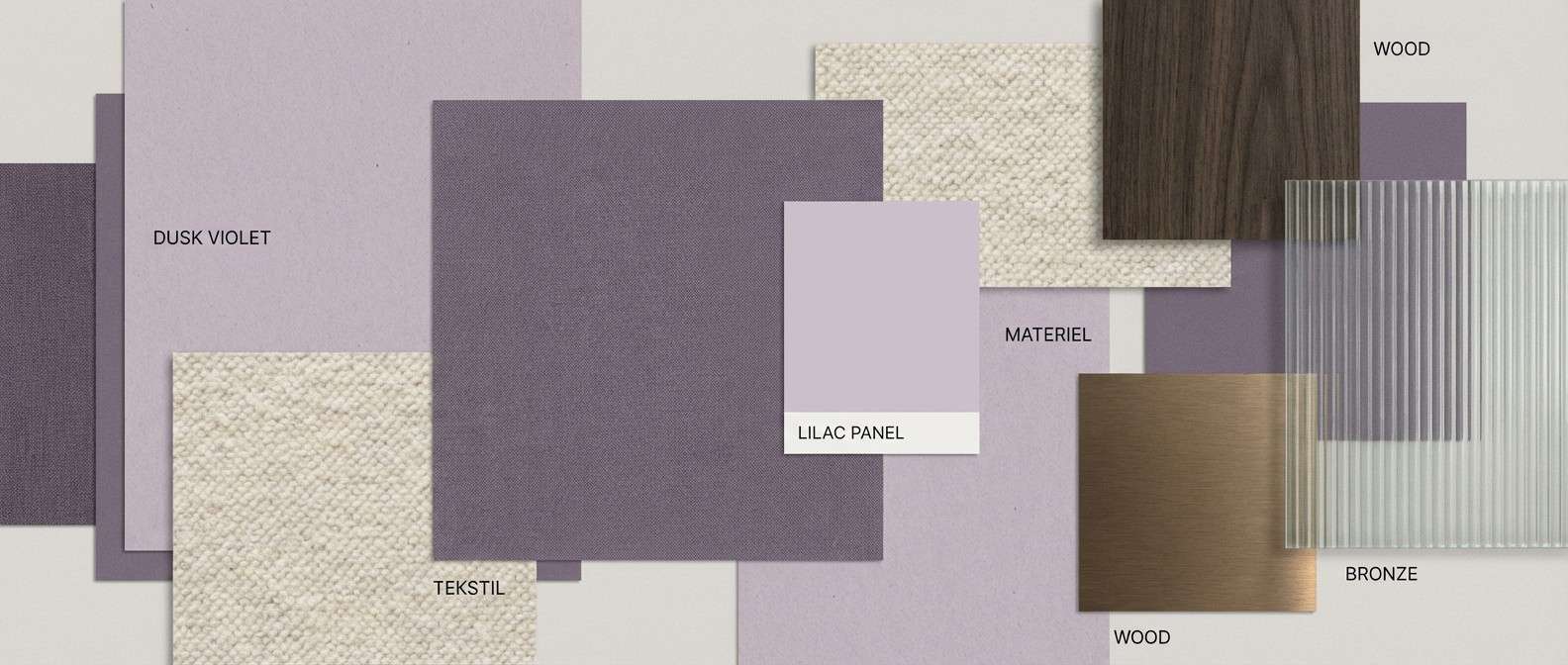
Mood: cozy and atmospheric
Best for: interior mood board, paint brochure
Cozy twilight purples and soft haze tones feel like dusk settling over a quiet room. These violet color combinations are great for interior mood boards, paint collections, and lifestyle branding that leans calm and mature. Pair with warm wood textures, oatmeal fabrics, and subtle patterns to keep it inviting. Usage tip: use the pale lilac as the dominant wall-like tone and layer darker accents only in small blocks.
Image example of violet dusk generated using media.io
9) Berry Ink
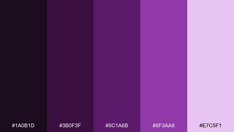
HEX: #1A0B1D #3B0F3F #5C1A6B #8F3AA8 #E7C5F1
Mood: editorial and sharp
Best for: magazine layout, book cover design
Inky berry shadows and vivid purple accents feel crisp, intelligent, and a little daring. This set is strong for editorial layouts, book covers, and high-contrast typographic work. Pair with plenty of white margins and a single accent block to keep the hierarchy clear. Usage tip: use the light lavender as a spotlight behind pull quotes to guide the reader.
Image example of berry ink generated using media.io
10) Lilac Minimal
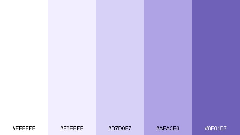
HEX: #FFFFFF #F3EEFF #D7D0F7 #AFA3E6 #6F61B7
Mood: clean and minimal
Best for: app onboarding, product UI
Clean lilac tints and soft gradients feel modern, simple, and friendly. Use it for onboarding screens, lightweight product UI, and calm dashboards where clarity comes first. Pair with neutral grays and a single deep violet for key actions. Usage tip: keep the contrast accessible by placing the darkest purple behind buttons while leaving most surfaces near-white.
Image example of lilac minimal generated using media.io
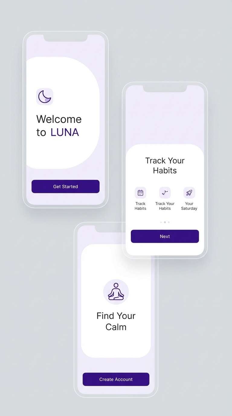
11) Purple Raincoat
HEX: #2D1B52 #5A3AB2 #7F6BFF #B9B0FF #FFF0A6
Mood: cheerful and kid-friendly
Best for: kids packaging, playful brand assets
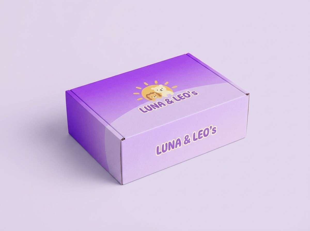
Bright purple pops with a sunny yellow accent feel like a raincoat on a cloudy day. These colors are great for kids products, playful stickers, and upbeat packaging where you need instant friendliness. Pair with rounded fonts and simple shapes to keep it approachable. Usage tip: use yellow as a tiny highlight for icons or badges so the purples stay in control.
Image example of purple raincoat generated using media.io
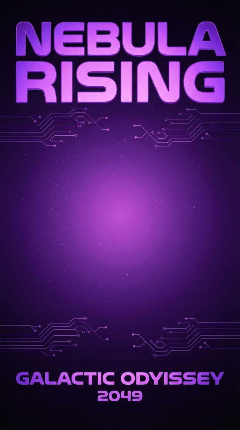
12) Cosmic Violet
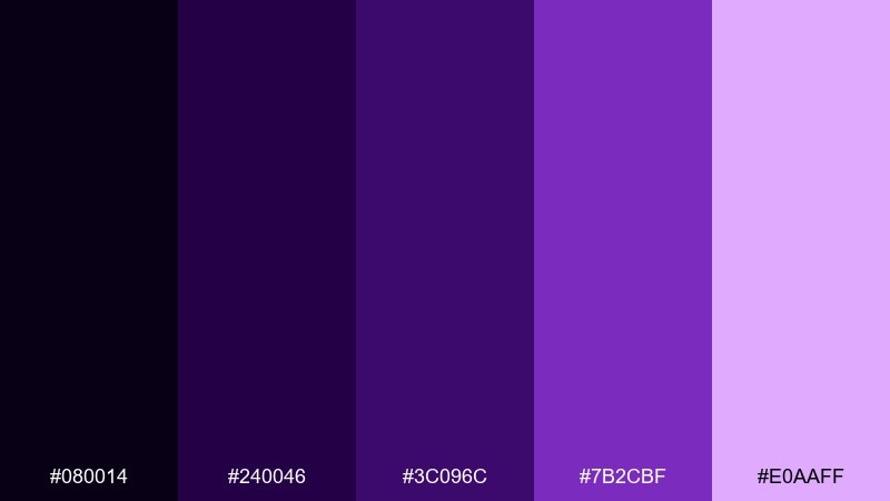
HEX: #080014 #240046 #3C096C #7B2CBF #E0AAFF
Mood: mysterious and cinematic
Best for: sci-fi poster, album cover
Mysterious space purples and glowing amethyst highlights feel cinematic and otherworldly. This violet color palette is a strong fit for sci-fi posters, album covers, and dramatic campaign art. Pair with subtle grain, star-like speckles, and sharp white type for contrast. Usage tip: build a gradient from the near-black base to the bright lavender to create depth without clutter.
Image example of cosmic violet generated using media.io
13) Violet and Sage
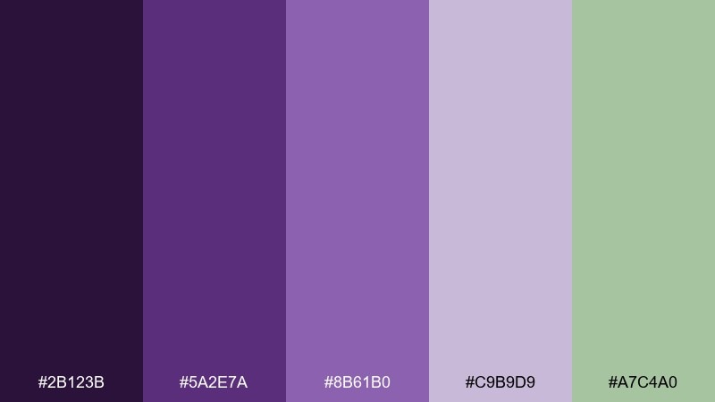
HEX: #2B123B #5A2E7A #8B61B0 #C9B9D9 #A7C4A0
Mood: earthy and balanced
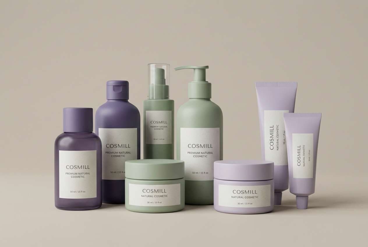
Best for: eco brand identity, natural cosmetics
Earthy violet shadows with a gentle sage note feel grounded and fresh at the same time. It is a smart pick for eco-minded branding, natural cosmetics, and packaging that needs calm credibility. Pair with recycled-paper textures, minimalist line art, and warm off-white backgrounds. Usage tip: treat sage as an accent for labels or icons while keeping violets as the main brand tone.
Image example of violet and sage generated using media.io
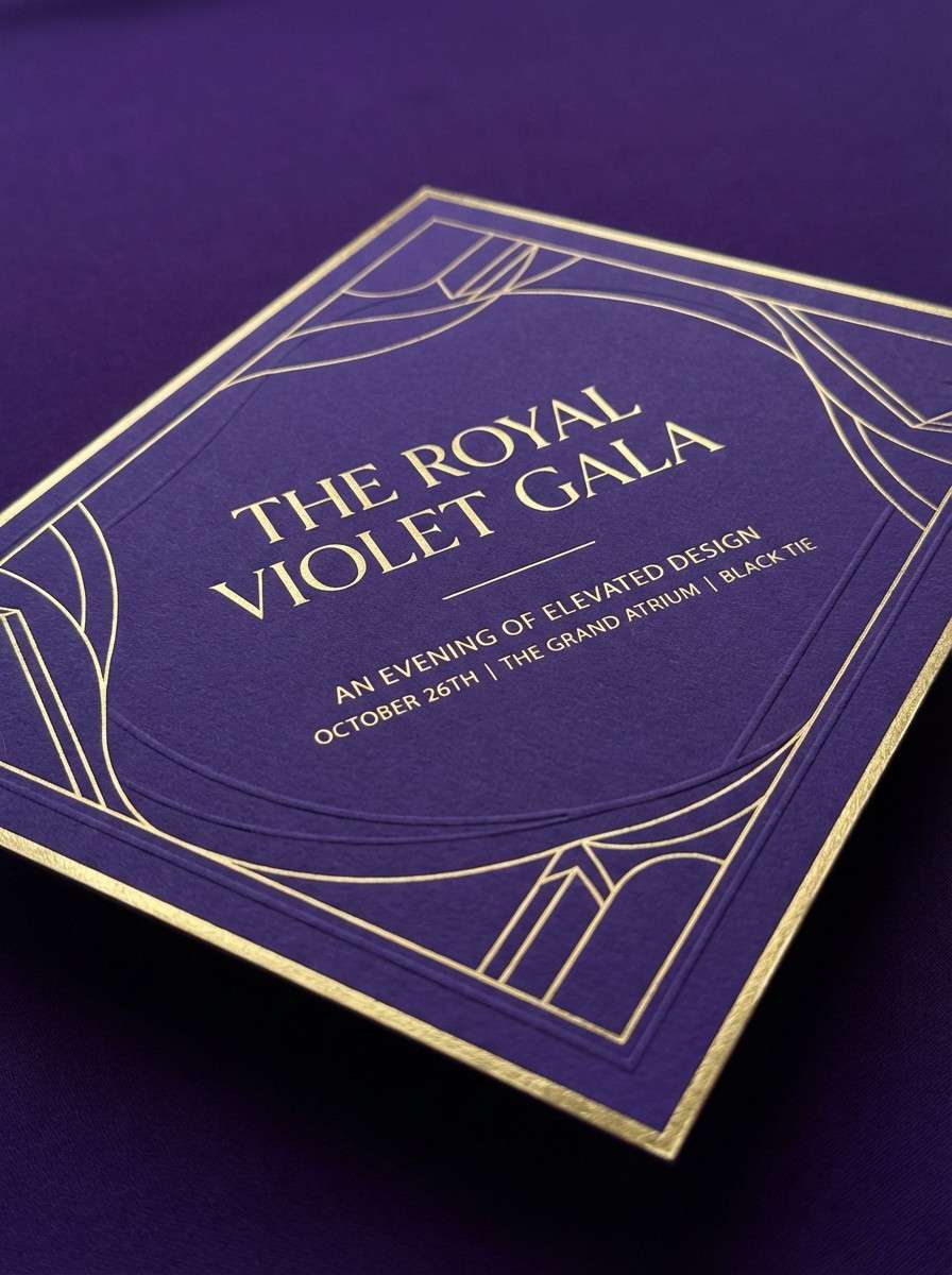
14) Royal Violet Gold
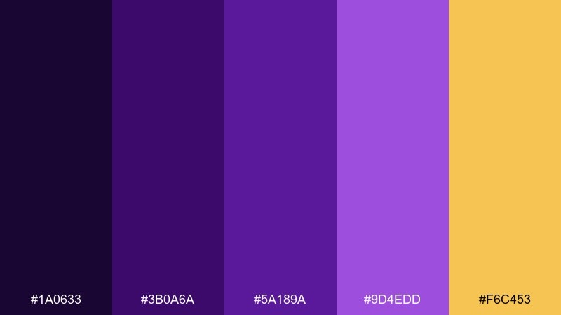
HEX: #1A0633 #3B0A6A #5A189A #9D4EDD #F6C453
Mood: regal and celebratory
Best for: gala invitation, premium flyer
Regal royal purples with a warm gold spark feel ceremonial and high-end. These violet color combinations work well for gala invitations, premium flyers, and upscale event branding. Pair with lots of negative space and one metallic-style accent to keep it classy. Usage tip: place gold on thin rules, icons, or borders rather than large fills so it reads as luxury, not loud.
Image example of royal violet gold generated using media.io
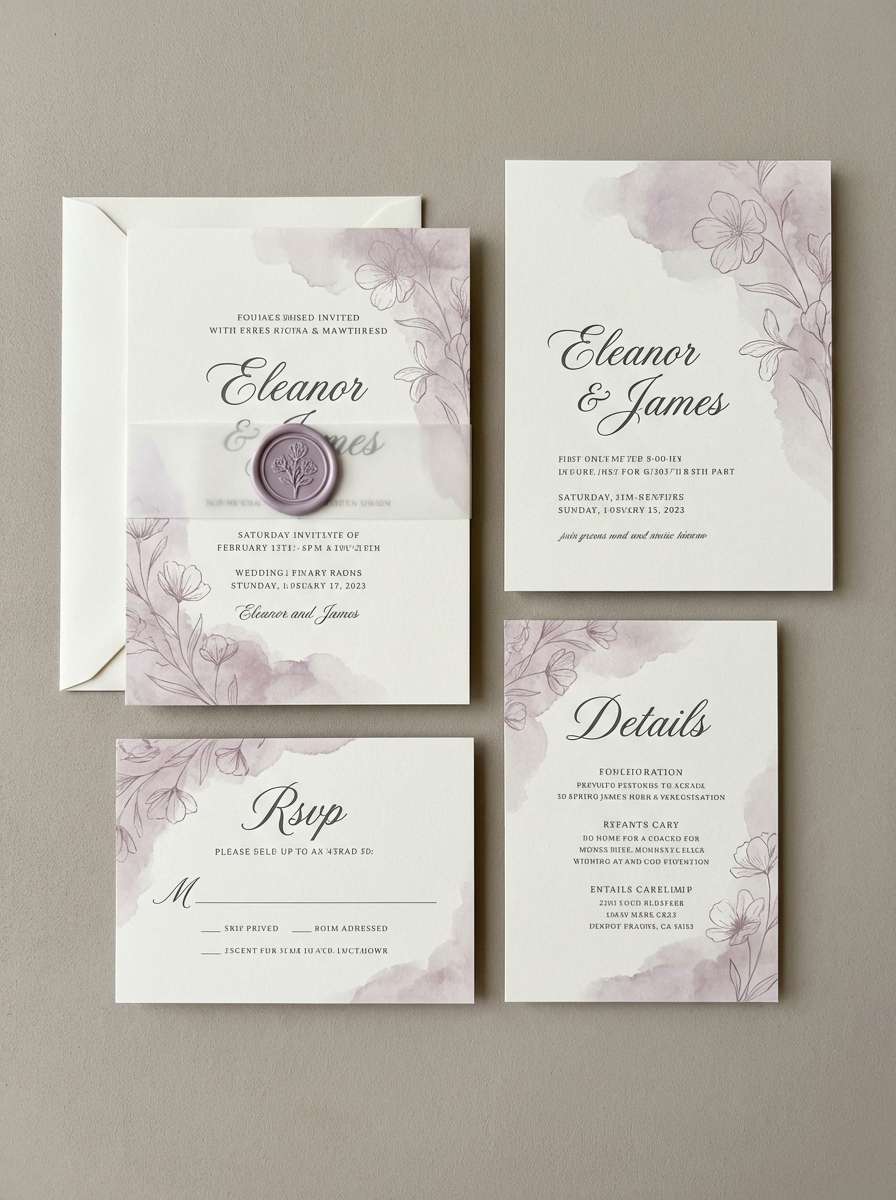
15) Soft Mauve Wedding
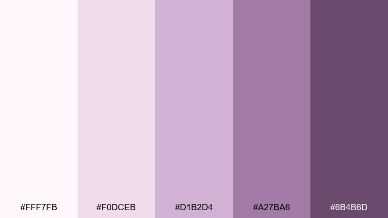
HEX: #FFF7FB #F0DCEB #D1B2D4 #A27BA6 #6B4B6D
Mood: romantic and gentle
Best for: wedding invitation suite, bridal branding
Romantic mauve and dusty lilac feel tender, timeless, and softly floral. It is perfect for wedding suites, bridal boutiques, and delicate announcement cards. Pair with warm ivory paper, thin serif fonts, and subtle botanical linework. Usage tip: keep the darkest mauve for names and dates so the text stays legible without breaking the softness.
Image example of soft mauve wedding generated using media.io
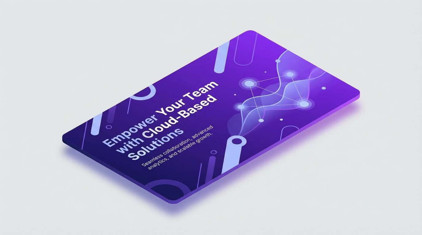
16) Tech Violet Gradient
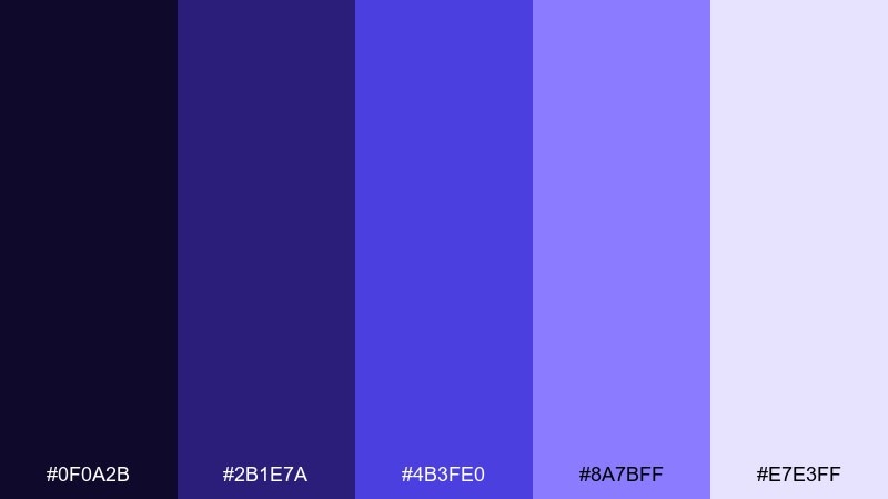
HEX: #0F0A2B #2B1E7A #4B3FE0 #8A7BFF #E7E3FF
Mood: futuristic and polished
Best for: saas hero banner, product marketing
Polished indigo-violet gradients feel futuristic, confident, and built for screens. Use it for SaaS hero banners, product marketing pages, and modern UI systems that need a clean glow. Pair with crisp white type and subtle glassy cards for a high-tech finish. Usage tip: build the gradient from the darkest navy-violet to the bright periwinkle and keep one solid accent color for buttons.
Image example of tech violet gradient generated using media.io
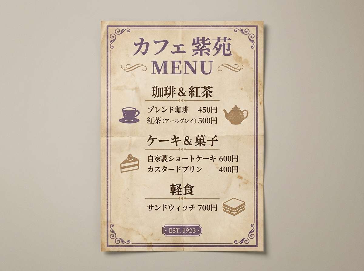
17) Vintage Violet Sepia
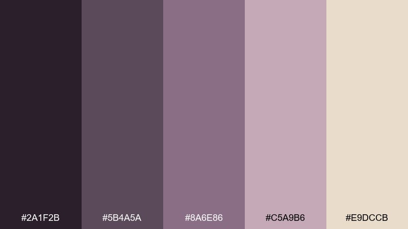
HEX: #2A1F2B #5B4A5A #8A6E86 #C5A9B6 #E9DCCB
Mood: nostalgic and warm
Best for: vintage poster, cafe menu design
Nostalgic violet-browns and dusty mauves feel like faded ink on textured paper. This violet color scheme is great for cafe menus, retro posters, and heritage-style branding. Pair with sepia paper backgrounds, classic serif fonts, and simple stamps or badges. Usage tip: keep contrast high by using the darkest tone for text and the warm beige for the main canvas.
Image example of vintage violet sepia generated using media.io
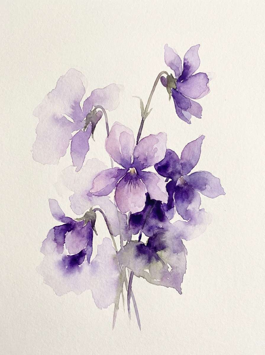
18) Violet Botanical
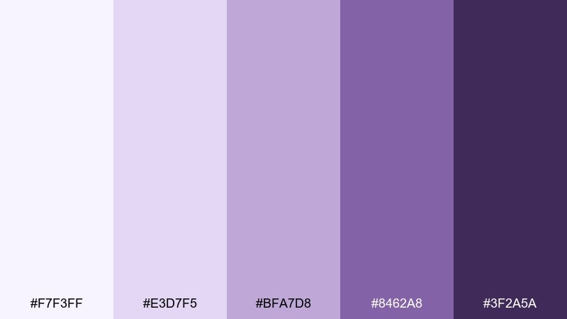
HEX: #F7F3FF #E3D7F5 #BFA7D8 #8462A8 #3F2A5A
Mood: botanical and serene
Best for: watercolor floral art, spring branding
Serene violet blooms and soft petal tints feel calm, natural, and lightly romantic. It is ideal for botanical illustrations, spring branding, and gentle gift tags. Pair with creamy whites and delicate linework to keep the artwork airy. Usage tip: let the lightest lilac wash fill large areas and add depth with the darkest violet only in centers and shadows.
Image example of violet botanical generated using media.io
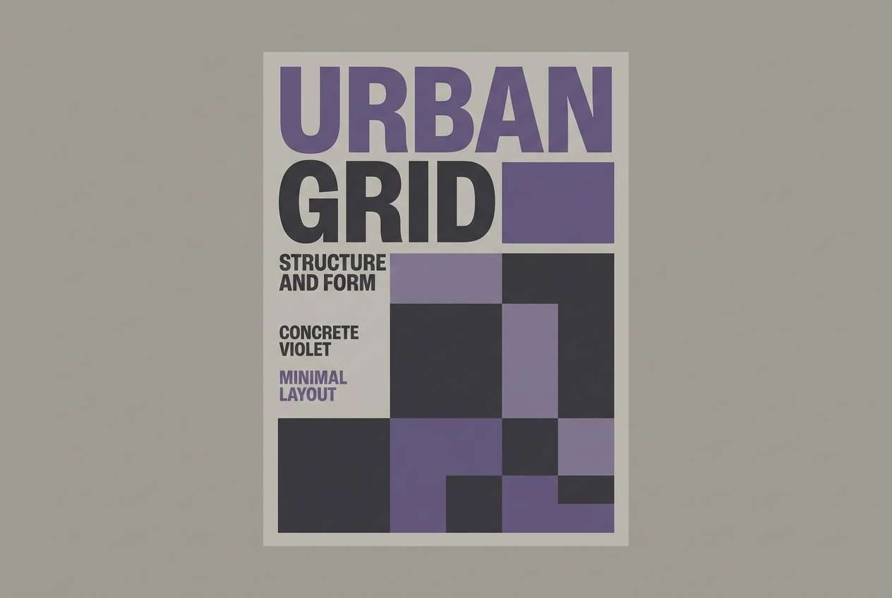
19) Urban Violet Concrete
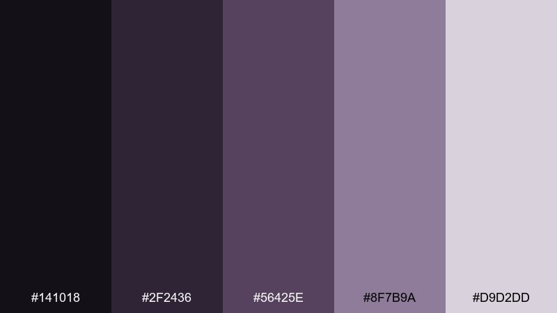
HEX: #141018 #2F2436 #56425E #8F7B9A #D9D2DD
Mood: urban and muted
Best for: streetwear lookbook, typography poster
Muted concrete violets feel gritty, modern, and understated. They are a strong match for streetwear lookbooks, monochrome photography overlays, and bold type posters. Pair with black, cool gray, and sharp sans-serif fonts for a clean edge. Usage tip: use the light gray-lilac for large background panels and keep the darkest tone for logo marks and headlines.
Image example of urban violet concrete generated using media.io
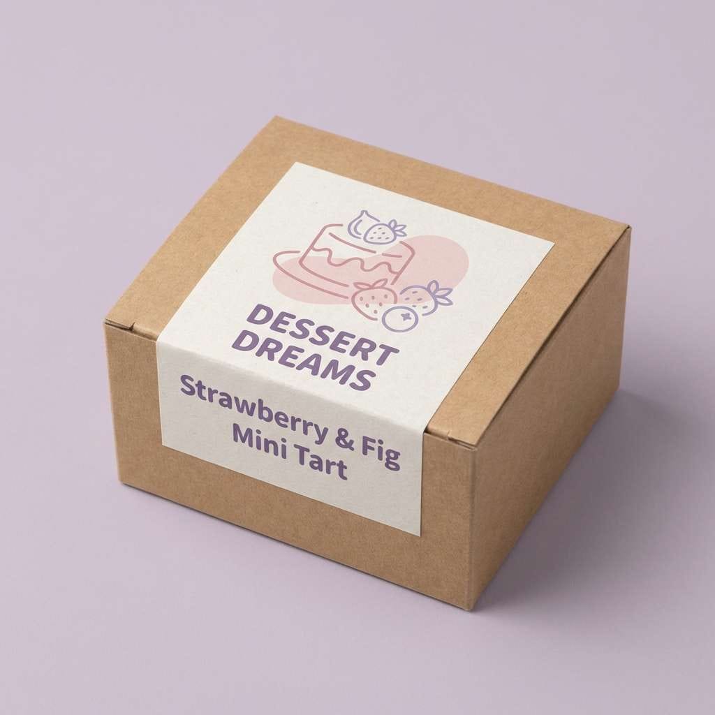
20) Candy Violet Pastels
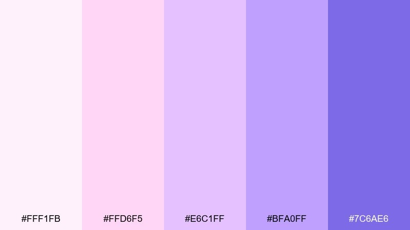
HEX: #FFF1FB #FFD6F5 #E6C1FF #BFA0FF #7C6AE6
Mood: sweet and uplifting
Best for: dessert social post, cute packaging
Sweet candy pastels and creamy violets feel upbeat, soft, and shareable. Use it for dessert brands, cute packaging stickers, and playful social posts that need instant charm. Pair with simple illustrations and lots of white space so the pastels do not get busy. Usage tip: anchor the design with the deeper periwinkle-violet for text while keeping the lighter pinks as fills and highlights.
Image example of candy violet pastels generated using media.io
What Colors Go Well with Violet?
Violet pairs naturally with soft neutrals like cream, warm ivory, and light gray—these keep the palette readable and let violet act as the signature color. For clean UI, near-white backgrounds with deep violet text/CTAs often feel modern and accessible.
For higher contrast and drama, match violet with near-black, midnight navy, or charcoal. If you want the violet to look brighter, add small accents of gold, lemon yellow, or blush pink.
For grounded, organic branding, try pairing violet with muted greens (sage, eucalyptus) and recycled-paper beige. This combination feels balanced—creative but still trustworthy.
How to Use a Violet Color Palette in Real Designs
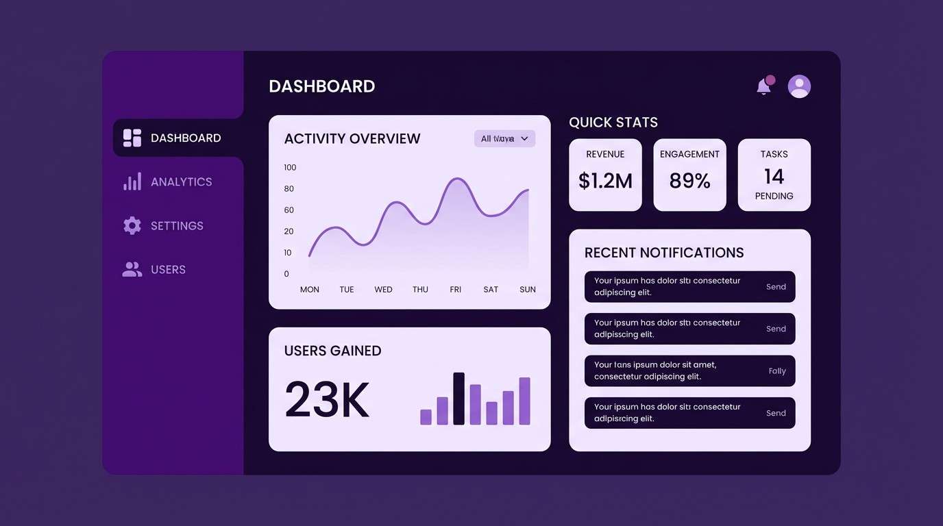
Start by assigning roles: pick one dark violet for text/contrast, one mid violet for interactive elements (buttons, links), and one pale lavender for surfaces (cards, sections). This keeps the system consistent across pages and screens.
In print, violet can shift depending on paper and ink density, so keep a light neutral in the palette and test swatches before committing. Gold foil or warm beige paper can make deep violets look especially premium.
For branding, limit bright violet accents to one or two “signature” moments—logo mark, CTA, or headline—then let tints handle backgrounds so the look stays refined rather than overwhelming.
Create Violet Palette Visuals with AI
If you already have HEX codes, you can quickly generate matching mockups—posters, packaging, UI screens, and more—by describing the style and lighting while keeping violet as the dominant theme.
To get more consistent results, reuse a prompt structure (subject + style + background + typography + “dominant violet tones”) and only swap the use case (e.g., “gala invite” vs “app onboarding”).
Media.io makes it simple to turn a violet color scheme into ready-to-share visuals right in your browser.
Violet Color Palette FAQs
-
What is the difference between violet and purple in design?
Violet typically leans cooler (closer to blue on the color wheel), while purple often reads a bit warmer (with more red). In practice, designers use both terms interchangeably, but “violet” usually suggests cleaner, bluer purples—great for modern UI and tech looks. -
Which background color works best with violet text?
Near-white, soft lavender, light gray, and warm cream backgrounds are the safest choices for readability. For dark mode, use near-black violet backgrounds and place text in very light lavender or off-white for contrast. -
What accent colors make violet pop?
Gold, lemon yellow, and warm peach create strong complementary contrast, making violet feel brighter. For a softer pop, try blush pink or icy periwinkle highlights. -
Is violet a good branding color?
Yes—violet can communicate creativity, premium quality, and modernity. Lighter violets feel gentle and wellness-friendly, while deeper violets and plum tones can feel luxurious and editorial. -
How do I keep a violet color scheme from feeling too dark?
Use at least one very light tint (lavender/near-white) as the dominant surface color, and reserve the darkest violet for headings, icons, and CTAs. Adding warm neutrals (cream/beige) also keeps the overall look lighter. -
What are common mistakes when using violet in UI?
Two big issues are low contrast (mid-violet text on lavender backgrounds) and overusing saturated neon accents. Keep accessible contrast ratios by using very dark violets for text or very light text on dark backgrounds, and limit bright accent violet to key focal elements. -
Can I generate violet-themed mockups with AI using these palettes?
Yes. Use the palette HEX codes as a guide and describe the design type (UI, poster, packaging) plus “dominant violet tones” in your prompt. With Media.io’s text-to-image tool, you can iterate quickly until the style matches your brand.


