

A pastel blue yellow color palette blends cool calm with sunny warmth, creating a look that feels light, friendly, and easy to scan. It’s especially popular for modern UI, spring branding, and print designs that need softness without losing clarity.
Below are ready-to-use pastel blue and pastel yellow color combinations with HEX codes, plus practical tips and AI prompts you can copy to generate matching visuals.
In this article
- Why Pastel Blue Yellow Palettes Work So Well
-
- sunlit sky picnic
- lemon cloud nursery
- coastal buttercream
- morning market awning
- soft retro diner
- springfield stationery
- seaside gelato
- skylight workspace ui
- buttered denim branding
- breezy onboarding screens
- daffodil botanical wash
- calm classroom slides
- artisan soap wrap
- bluebird brunch menu
- minimal ecommerce hero
- sunset boardwalk poster
- data viz pastels
- playful social tiles
- ice cream cart packaging
- fresh travel blog header
- What Colors Go Well with Pastel Blue Yellow?
- How to Use a Pastel Blue Yellow Color Palette in Real Designs
- Create Pastel Blue Yellow Palette Visuals with AI
Why Pastel Blue Yellow Palettes Work So Well
Pastel blue brings a sense of calm and spaciousness, while pastel yellow adds a gentle optimism that keeps the design from feeling cold. Together, they create a balanced “sky + sunlight” association that viewers recognize instantly.
Because both tones are light, they’re easy to layer into airy layouts with plenty of white space. This makes pastel blue yellow color schemes ideal for modern branding, editorial-style web design, and packaging that needs a clean, approachable vibe.
The key is contrast control: use a deeper slate or navy for text and outlines so readability stays strong. When you reserve yellow for highlights, calls to action, or key labels, the palette looks intentional rather than washed out.
20+ Pastel Blue Yellow Color Palette Ideas (with HEX Codes)
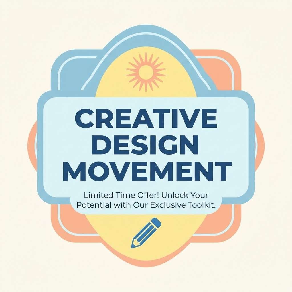
1) Sunlit Sky Picnic
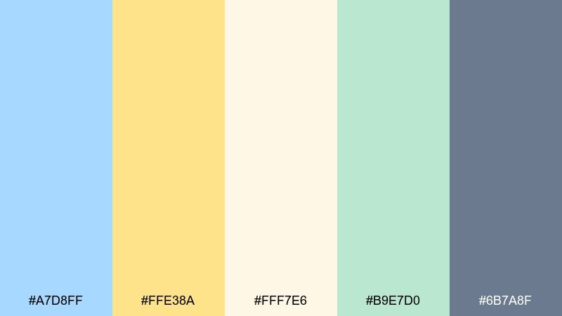
HEX: #A7D8FF #FFE38A #FFF7E6 #B9E7D0 #6B7A8F
Mood: cheerful, airy, friendly
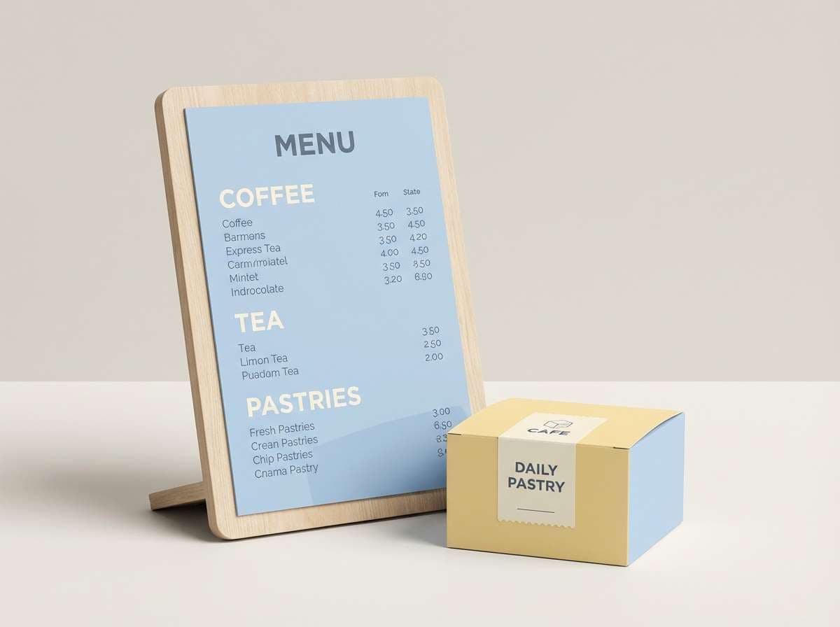
Best for: cafe branding and summer menu design
Cheerful and breezy like a picnic under a pale sky, these tones keep things light without feeling washed out. Use the soft blue as the base and let the warm yellow highlight prices, buttons, or special items. Pair it with cream for breathing room and the slate tone for readable text and outlines. Tip: reserve the green-mint accent for small icons so the layout stays calm.
Image example of sunlit sky picnic generated using media.io
Media.io is an online AI studio for creating and editing video, image, and audio in your browser.

2) Lemon Cloud Nursery
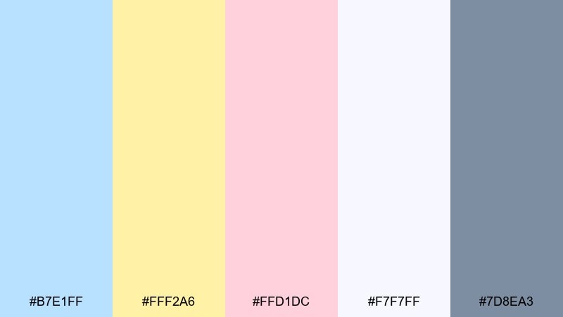
HEX: #B7E1FF #FFF2A6 #FFD1DC #F7F7FF #7D8EA3
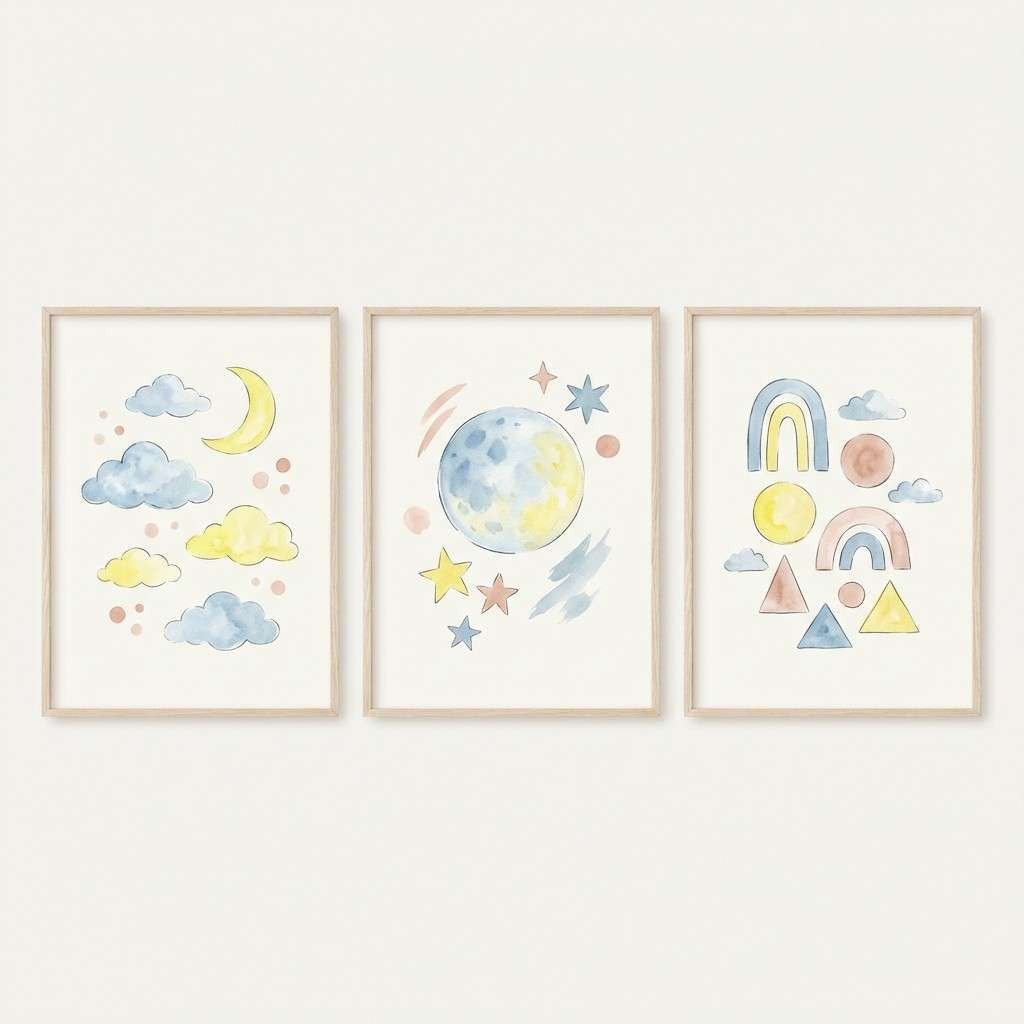
Mood: gentle, comforting, playful
Best for: nursery decor and baby shower themes
Gentle and comforting like a sunlit nap by the window, the mix feels sweet without going overly sugary. Keep the powdery blue on big surfaces, then add the lemon tone in small bursts for warmth. The blush note is perfect for tiny details like stars, hearts, or borders, while the gray-blue keeps type and outlines crisp. Tip: stick to one accent per panel to avoid a candy-store look.
Image example of lemon cloud nursery generated using media.io
3) Coastal Buttercream
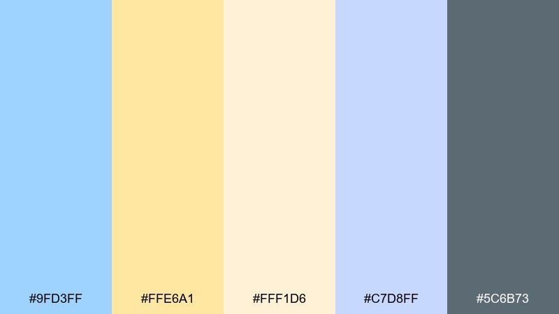
HEX: #9FD3FF #FFE6A1 #FFF1D6 #C7D8FF #5C6B73
Mood: relaxed, coastal, clean
Best for: lifestyle blog headers and travel posts
Relaxed and coastal like waves meeting warm sand, the tones read clean and inviting on screens. This pastel blue yellow color palette works best when the blue leads and the buttercream yellow acts as a soft callout. Pair it with warm ivory backgrounds and use the deep gray-blue for navigation and links. Tip: add subtle gradients between the two blues to create depth without adding new colors.
Image example of coastal buttercream generated using media.io
4) Morning Market Awning
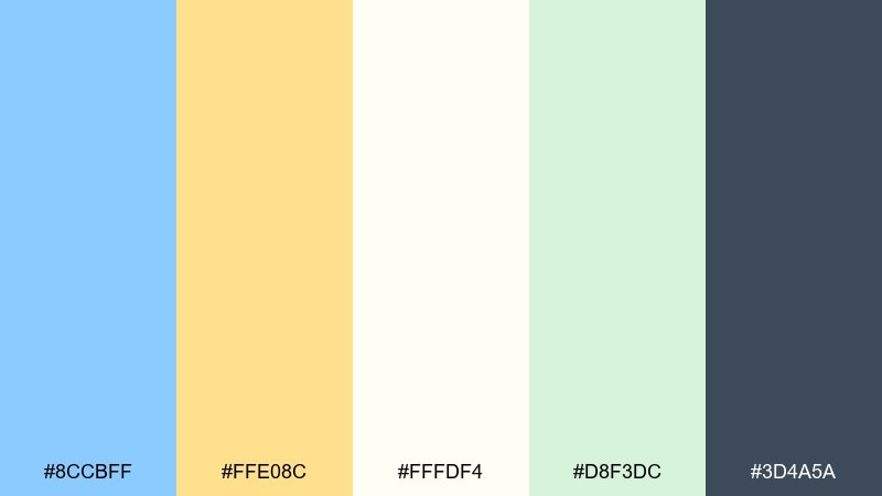
HEX: #8CCBFF #FFE08C #FFFDF4 #D8F3DC #3D4A5A
Mood: fresh, bright, organized
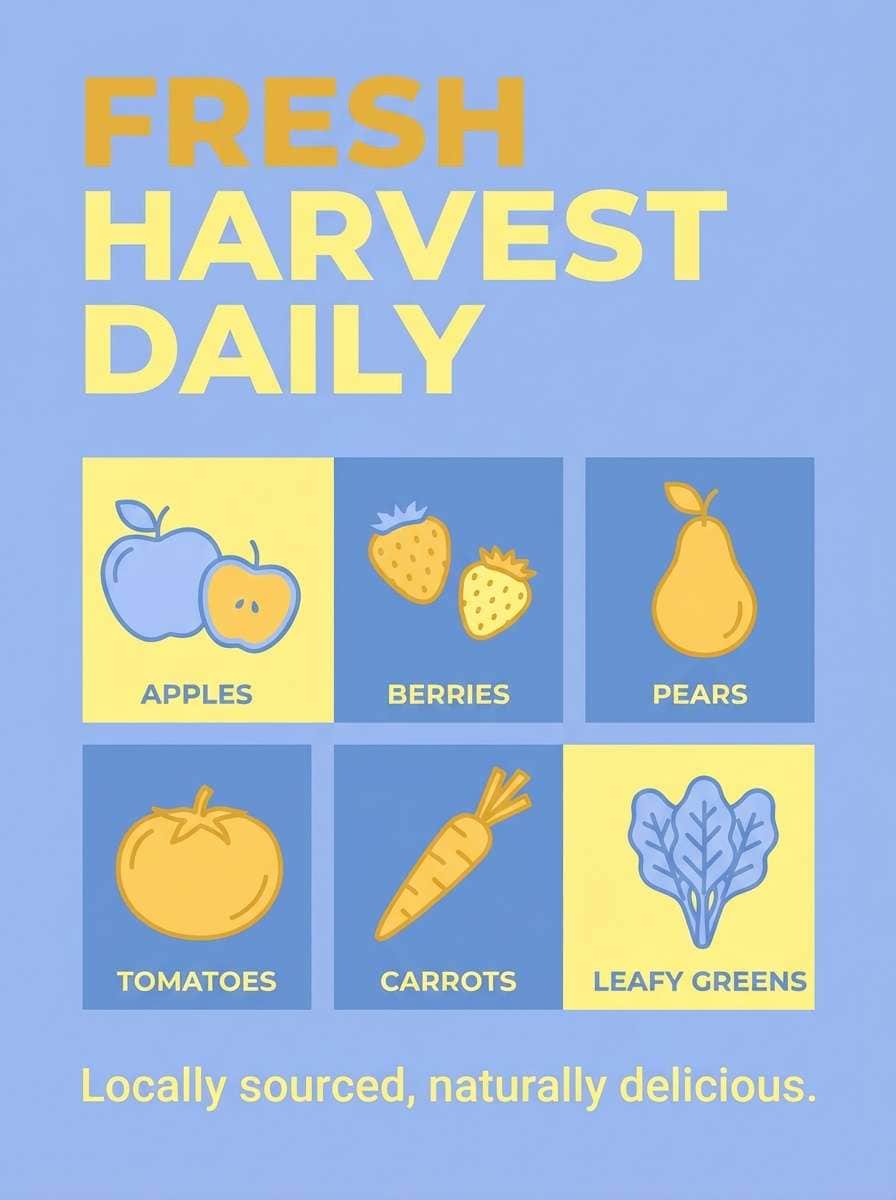
Best for: farmers market posters and vendor signage
Fresh and bright like striped awnings at an early market, these colors feel inviting and easy to scan from a distance. Use the yellow for headers and price tags so key info pops instantly. The near-white keeps the layout airy, while the dark blue-gray anchors typography and icons. Tip: keep the green as a supporting highlight for organic or seasonal callouts.
Image example of morning market awning generated using media.io
5) Soft Retro Diner
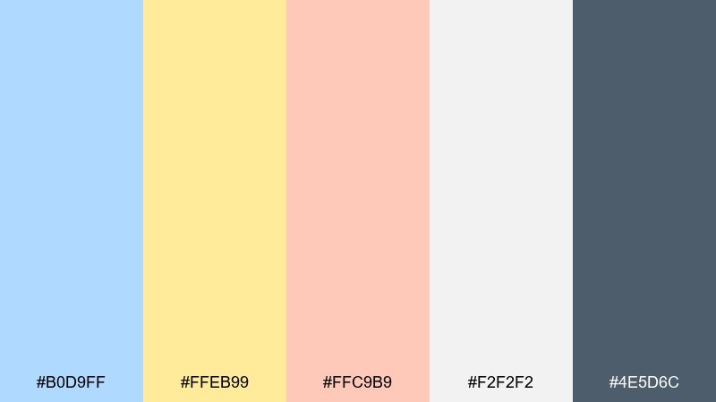
HEX: #B0D9FF #FFEB99 #FFC9B9 #F2F2F2 #4E5D6C
Mood: nostalgic, upbeat, welcoming
Best for: retro-inspired branding and social promos
Nostalgic and upbeat like a classic diner booth, the mix balances sweet pastels with a grounded ink tone. Let the blue carry backgrounds and shapes, then bring in yellow for badges and limited-time offers. The peachy accent plays well for friendly highlights, especially on social graphics. Tip: keep typography bold and simple so the palette reads playful, not fussy.
Image example of soft retro diner generated using media.io
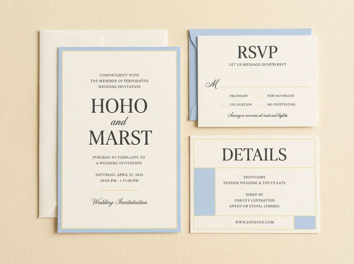
6) Springfield Stationery
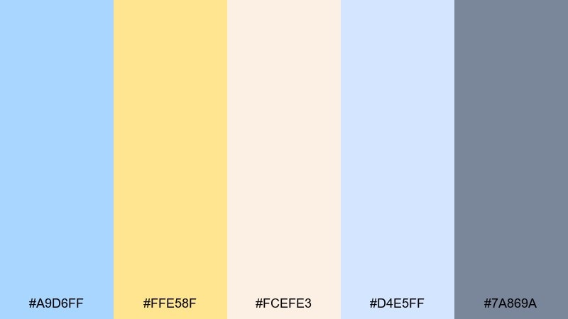
HEX: #A9D6FF #FFE58F #FCEFE3 #D4E5FF #7A869A
Mood: light, tidy, optimistic
Best for: wedding invitations and RSVP cards
Light and tidy like fresh paper and morning sun, these tones bring an optimistic feel to formal layouts. For pastel blue yellow color combinations that stay elegant, use the cream as the main canvas and keep the yellow to thin rules, monograms, or small flourishes. The two blues create subtle hierarchy across headings and subtext, while the gray-blue supports readable body copy. Tip: print the yellow slightly muted to avoid oversaturation on textured stock.
Image example of springfield stationery generated using media.io
7) Seaside Gelato
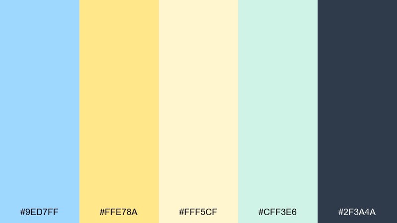
HEX: #9ED7FF #FFE78A #FFF5CF #CFF3E6 #2F3A4A
Mood: refreshing, sweet, summery
Best for: ice cream shop packaging and labels
Refreshing and sweet like gelato by the waterfront, the colors feel light but still punchy enough for shelves. Use the pale yellow as the label field and keep the blue for brand blocks and patterns. A minty green adds a crisp twist for flavor indicators, while the deep navy keeps ingredient text readable. Tip: add simple wave or sprinkle motifs using just two colors to maintain clarity.
Image example of seaside gelato generated using media.io
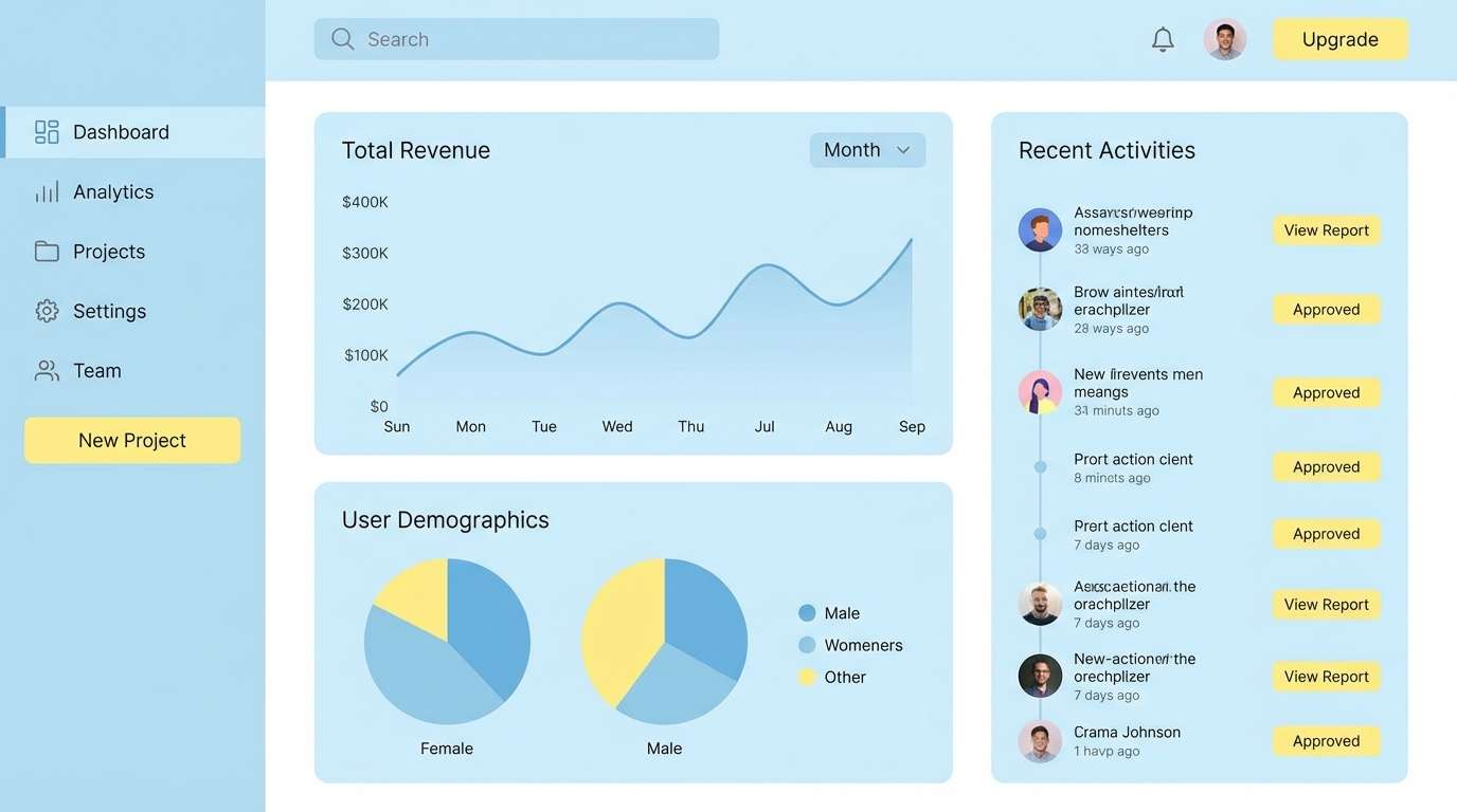
8) Skylight Workspace UI
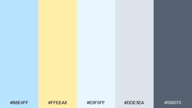
HEX: #B8E4FF #FFEEA8 #E9F5FF #DDE3EA #556070
Mood: calm, focused, modern
Best for: dashboard UI and data panels
Calm and focused like daylight spilling across a desk, the tones support long sessions without fatigue. Use the pale blue as your main surface, then save the yellow for key alerts, toggles, or active states. The cool neutrals keep cards and dividers crisp, while the steel text color maintains contrast. Tip: limit yellow to one primary action per screen for a cleaner hierarchy.
Image example of skylight workspace ui generated using media.io
9) Buttered Denim Branding
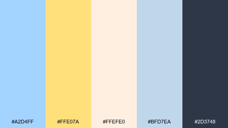
HEX: #A2D4FF #FFE07A #FFEFE0 #BFD7EA #2D3748
Mood: confident, warm, contemporary
Best for: startup branding and logo systems
Confident and warm like denim with a buttery highlight, this mix feels modern without being loud. A pastel blue yellow color combination shines when you keep the blue as the primary brand field and use yellow as a signature mark on icons or tags. The warm off-white keeps everything approachable, while the deep slate supports strong logotypes. Tip: test your yellow on dark backgrounds for accessibility before committing.
Image example of buttered denim branding generated using media.io
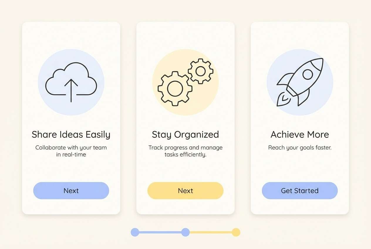
10) Breezy Onboarding Screens
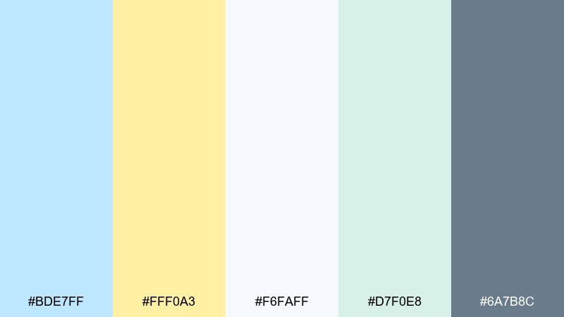
HEX: #BDE7FF #FFF0A3 #F6FAFF #D7F0E8 #6A7B8C
Mood: welcoming, clear, supportive
Best for: app onboarding and tutorial slides
Welcoming and clear like a bright morning walkthrough, the palette makes instructions feel friendly. Use the lightest tones for spacious backgrounds, and reserve yellow for progress dots, step numbers, or one key button. The minty accent can highlight success states without screaming green. Tip: keep illustrations simple and line-based so the pastels stay in control.
Image example of breezy onboarding screens generated using media.io
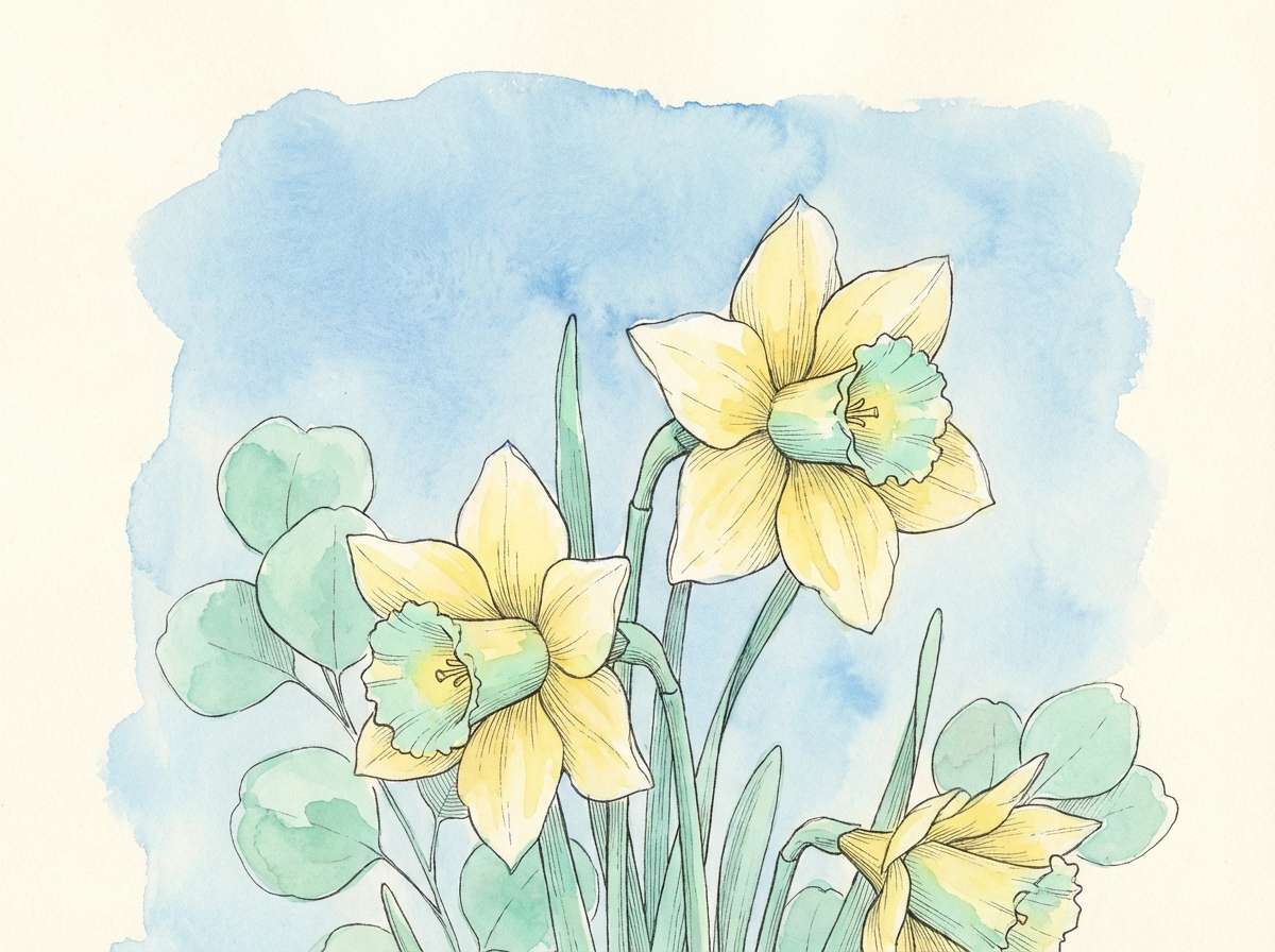
11) Daffodil Botanical Wash

HEX: #A6DBFF #FFED8B #FFF9E8 #BEEBD5 #6E7C87
Mood: springy, delicate, artistic
Best for: botanical illustrations and greeting cards
Springy and delicate like watercolor daffodils on handmade paper, these tones feel naturally uplifting. Let the blue sit in the sky-wash areas and use yellow for petals, pollen, or small stamped shapes. The creamy background keeps it soft, while the muted gray-blue is ideal for captions and small print. Tip: build texture with layered washes rather than adding extra colors.
Image example of daffodil botanical wash generated using media.io
12) Calm Classroom Slides
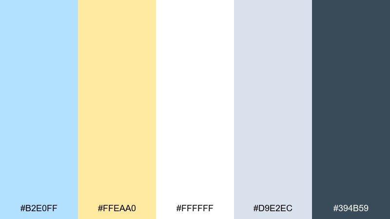
HEX: #B2E0FF #FFEAA0 #FFFFFF #D9E2EC #394B59
Mood: clear, patient, approachable
Best for: classroom presentations and learning decks
Clear and patient like a well-lit classroom, the mix makes content feel approachable for all ages. Use white and pale blue for the main slide surfaces, then add yellow for section headers and key takeaways. The cool gray works for separators and charts, while the deep blue keeps titles readable. Tip: keep yellow behind text minimal to maintain strong contrast.
Image example of calm classroom slides generated using media.io
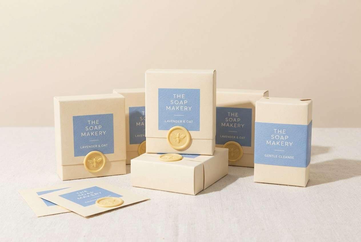
13) Artisan Soap Wrap
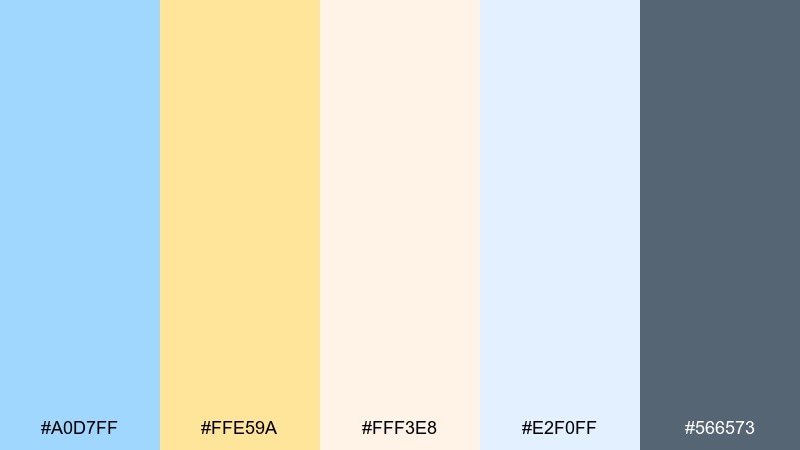
HEX: #A0D7FF #FFE59A #FFF3E8 #E2F0FF #566573
Mood: handmade, clean, soothing
Best for: skincare packaging and product labels
Handmade and clean like freshly wrapped soap, the tones signal softness and care. Use the warm cream as the label base and bring in blue for brand panels and ingredient callouts. Yellow is best as a small seal or scent indicator so it reads premium, not playful. Tip: choose matte paper and minimal foil to keep the pastel vibe authentic.
Image example of artisan soap wrap generated using media.io
14) Bluebird Brunch Menu
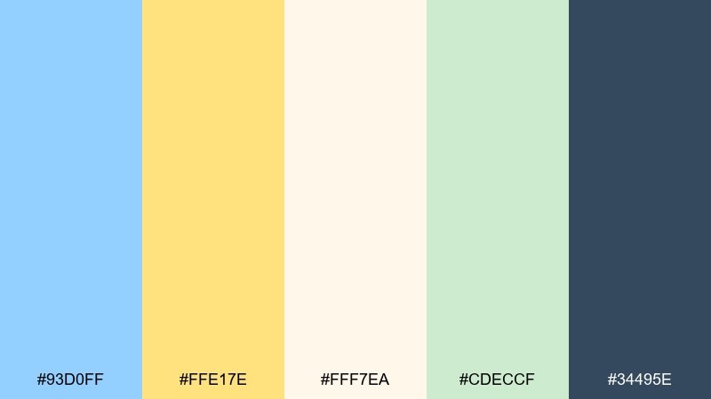
HEX: #93D0FF #FFE17E #FFF7EA #CDECCF #34495E
Mood: sunny, social, inviting
Best for: brunch menus and restaurant table cards
Sunny and social like a weekend brunch patio, the tones feel fresh and welcoming. This pastel blue yellow color palette is a great fit for menus where you want light backgrounds with clear category structure. Pair the creamy tone with the deep navy for text, then use yellow to highlight specials or add-ons. Tip: keep icons simple and repeat the yellow only in two or three consistent spots per page.
Image example of bluebird brunch menu generated using media.io
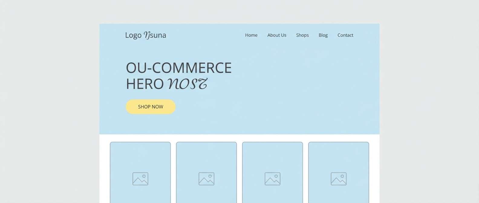
15) Minimal Ecommerce Hero

HEX: #B6E3FF #FFECA3 #F8FAFC #E6F2FF #475569
Mood: clean, modern, trustworthy
Best for: ecommerce landing pages and hero sections
Clean and modern like a neatly organized storefront, the palette feels trustworthy and easy to navigate. Use the icy blues for layout structure and product cards, then add yellow to draw attention to the primary call to action. The near-white background keeps product photography from feeling boxed in, while the slate tone supports strong readability. Tip: keep button fills yellow and leave secondary actions outlined in blue.
Image example of minimal ecommerce hero generated using media.io
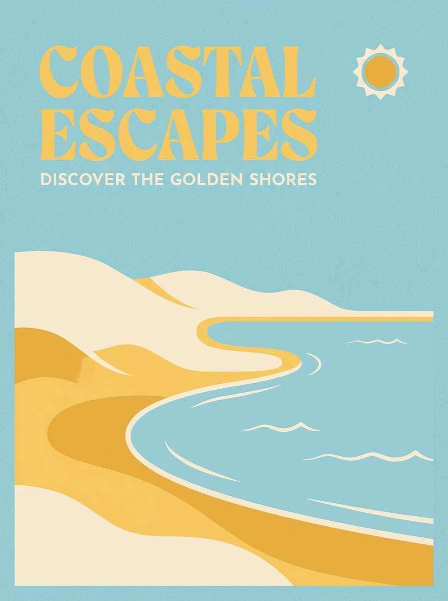
16) Sunset Boardwalk Poster
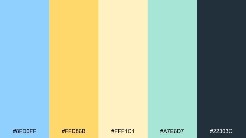
HEX: #8FD0FF #FFD86B #FFF1C1 #A7E6D7 #22303C
Mood: energetic, airy, nostalgic
Best for: travel posters and event promos
Energetic and airy like a boardwalk at golden hour, the colors feel lively without turning loud. Keep blue as the main field and let the deeper yellow-orange act as the headline highlight for quick impact. The soft cream and aqua add depth to simple illustrations and badges. Tip: use the dark ink color only for text and key outlines to preserve the pastel mood.
Image example of sunset boardwalk poster generated using media.io
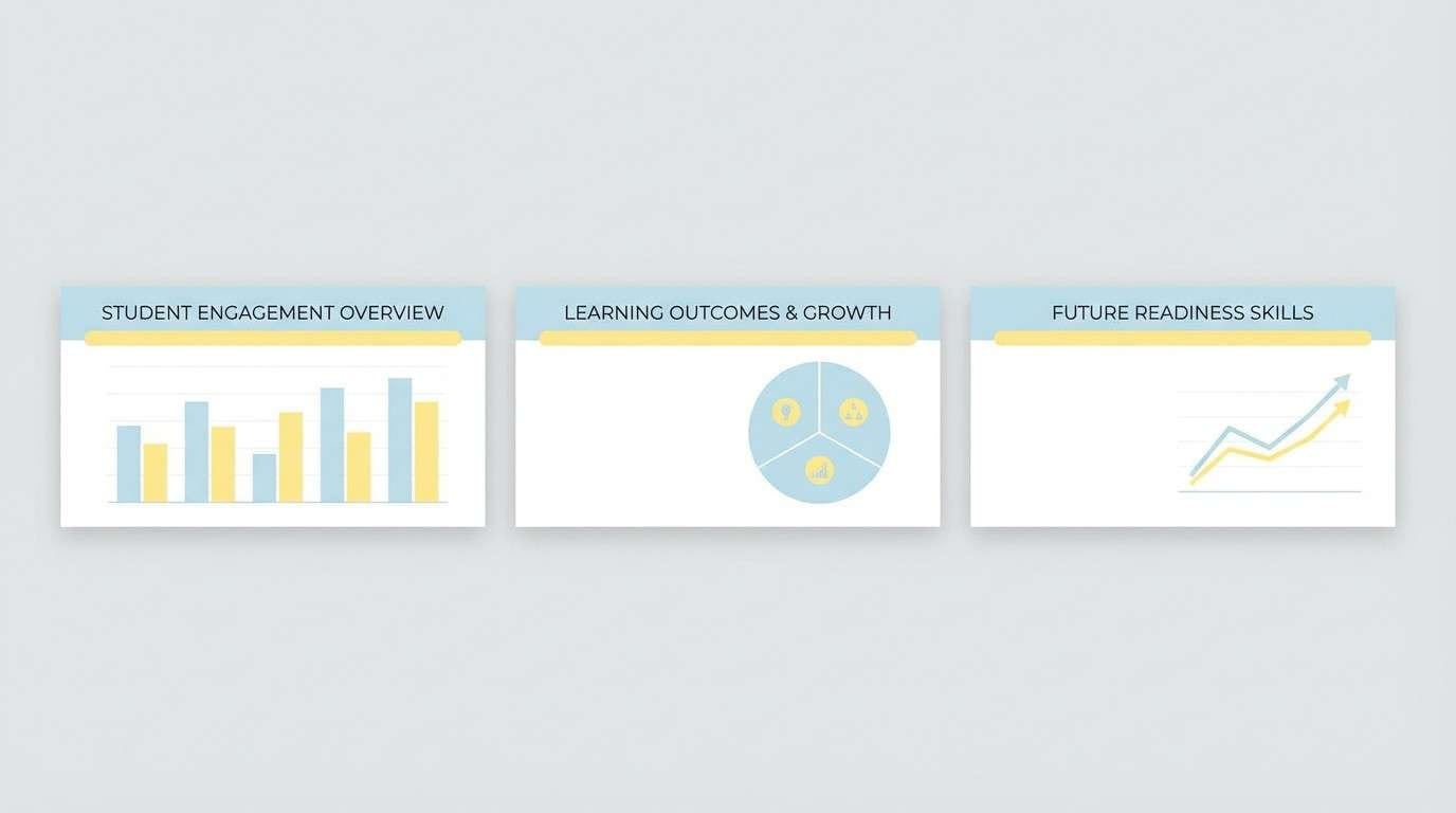
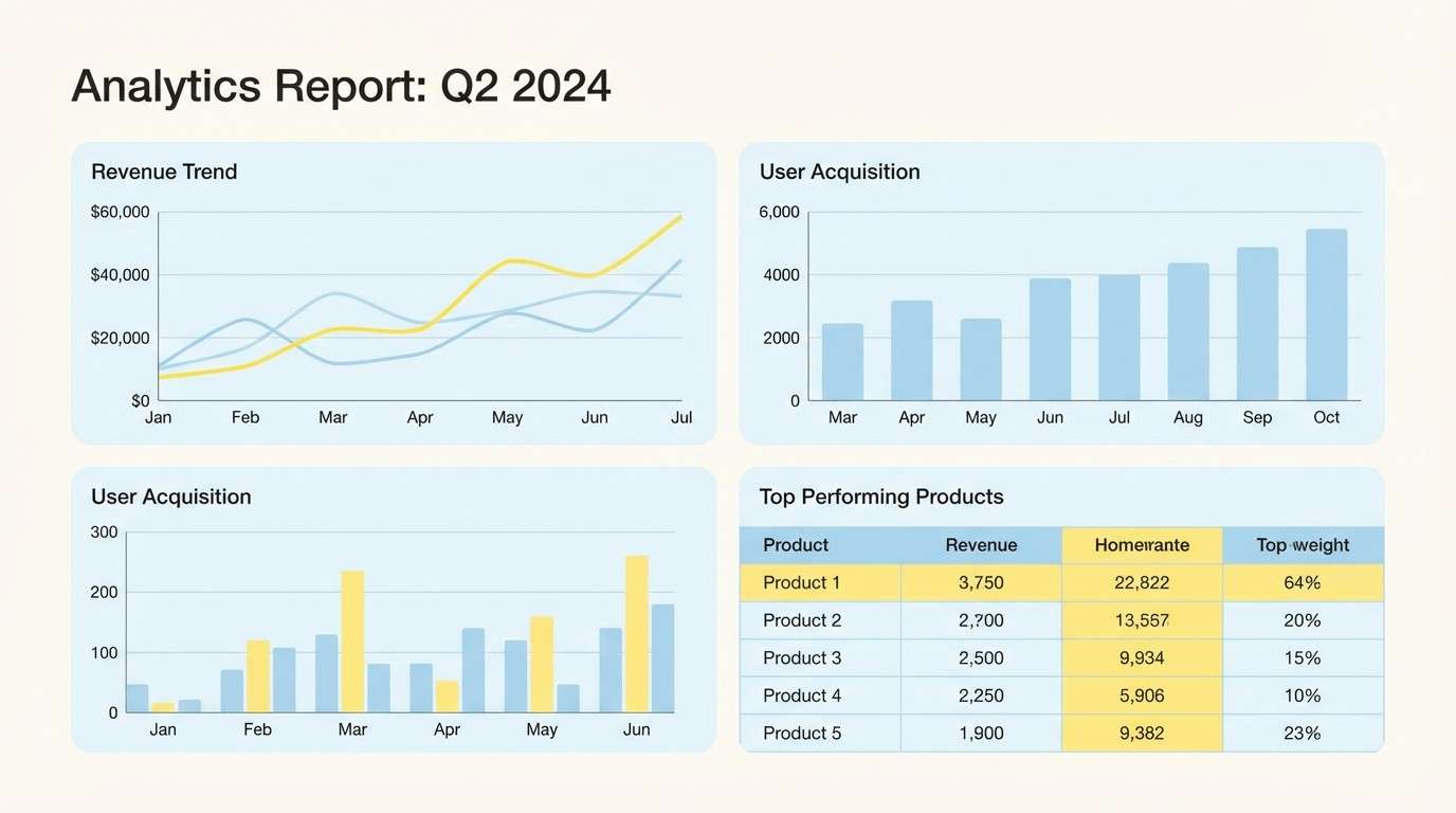
17) Data Viz Pastels
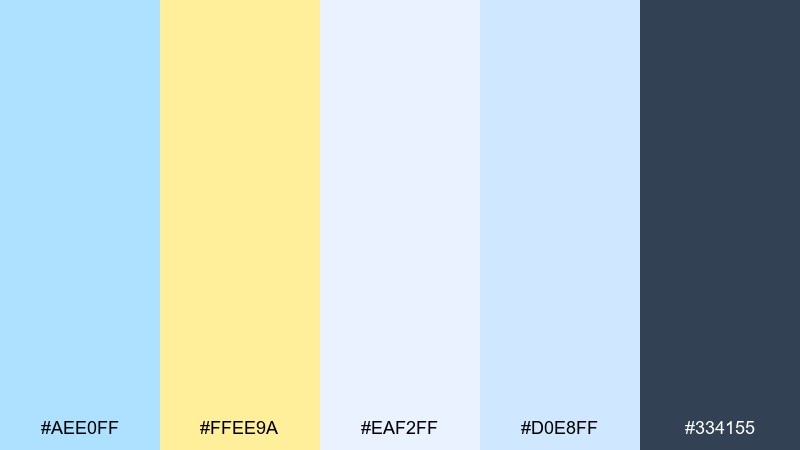
HEX: #AEE0FF #FFEE9A #EAF2FF #D0E8FF #334155
Mood: professional, calm, legible
Best for: reports, charts, and analytics decks
Professional and calm like a well-designed report, the tones keep focus on the data. Use the darker slate for axes and labels, then assign blue and yellow to primary series for instant clarity. The extra pale blues help with subtle gridlines and background bands without visual noise. Tip: reserve yellow for one series only so it stays meaningful.
Image example of data viz pastels generated using media.io
18) Playful Social Tiles
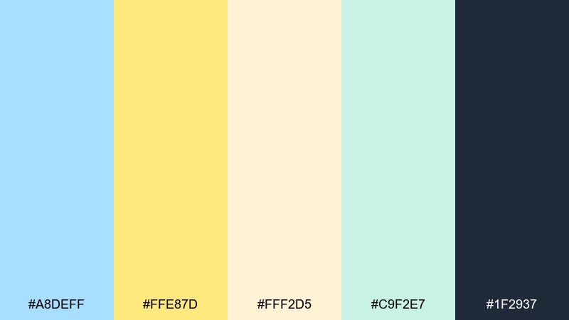
HEX: #A8DEFF #FFE87D #FFF2D5 #C9F2E7 #1F2937
Mood: bright, bouncy, youthful
Best for: instagram posts and story templates
Bright and bouncy like confetti in sunlight, these tones are made for quick scrolling moments. Pastel blue yellow color combinations work especially well here when you pick one dominant block color per tile and keep the rest as accents. Use the dark ink tone for punchy headings and keep cream as the breathing space around stickers or icons. Tip: repeat the yellow in the same corner across a series for a cohesive feed.
Image example of playful social tiles generated using media.io
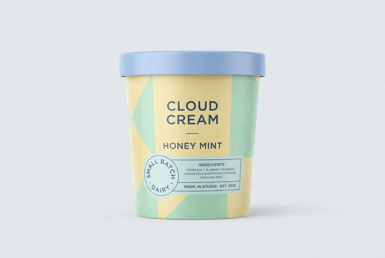
19) Ice Cream Cart Packaging
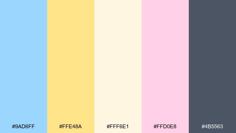
HEX: #9AD6FF #FFE48A #FFF6E1 #FFD0E8 #4B5563
Mood: sweet, nostalgic, playful
Best for: dessert packaging and seasonal promos
Sweet and nostalgic like an ice cream cart bell, the palette feels playful but still clean. Use the blue as the main wrapper color, then let yellow highlight flavor names and promotional bursts. The blush pink adds a friendly twist for limited editions, while the gray keeps ingredients and barcodes readable. Tip: keep patterns small and simple so the pastels do not turn muddy in print.
Image example of ice cream cart packaging generated using media.io
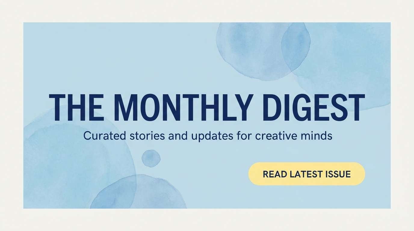
20) Fresh Travel Blog Header
HEX: #B3E6FF #FFED94 #FDF6E3 #C6F1DF #0F172A
Mood: fresh, optimistic, crisp
Best for: blog headers and newsletter banners
Fresh and optimistic like a new itinerary page, the tones feel crisp and easy to read. Use the bright navy for headlines and navigation so the softer colors can stay airy in the background. Yellow works best as a highlight behind a keyword or as a small button fill, while mint adds a light supportive accent. Tip: keep background shapes large and low-contrast to avoid clutter in email layouts.
Image example of fresh travel blog header generated using media.io
What Colors Go Well with Pastel Blue Yellow?
Neutrals are the easiest match: warm cream, soft ivory, and cool light grays help pastel blue and pastel yellow look intentional and “designed,” not accidental. For typography and UI icons, choose a deeper slate or navy to keep contrast comfortable.
For extra freshness, add small hints of mint or seafoam green, especially in lifestyle, food, and wellness visuals. If you want a sweeter direction (nursery, desserts, playful socials), blush or peach accents pair naturally with both blue and yellow.
For a more premium or mature look, reduce saturation and introduce a muted metal tone (like brass), using it sparingly in lines, badges, or logo marks.
How to Use a Pastel Blue Yellow Color Palette in Real Designs
Start with a clear hierarchy: let pastel blue be the main surface color (backgrounds, large shapes, cards), then use pastel yellow as the attention color for CTAs, price tags, labels, or highlighted keywords. This keeps the palette balanced and prevents “all-light” visuals.
In print, test your yellow early—light yellows can shift depending on paper and ink density. On screens, check accessibility by pairing yellow with dark text (slate/navy) rather than white.
If you need depth without adding new hues, use tints and subtle gradients within the blues, or add texture (paper grain, watercolor wash, soft noise) while keeping the same HEX family.
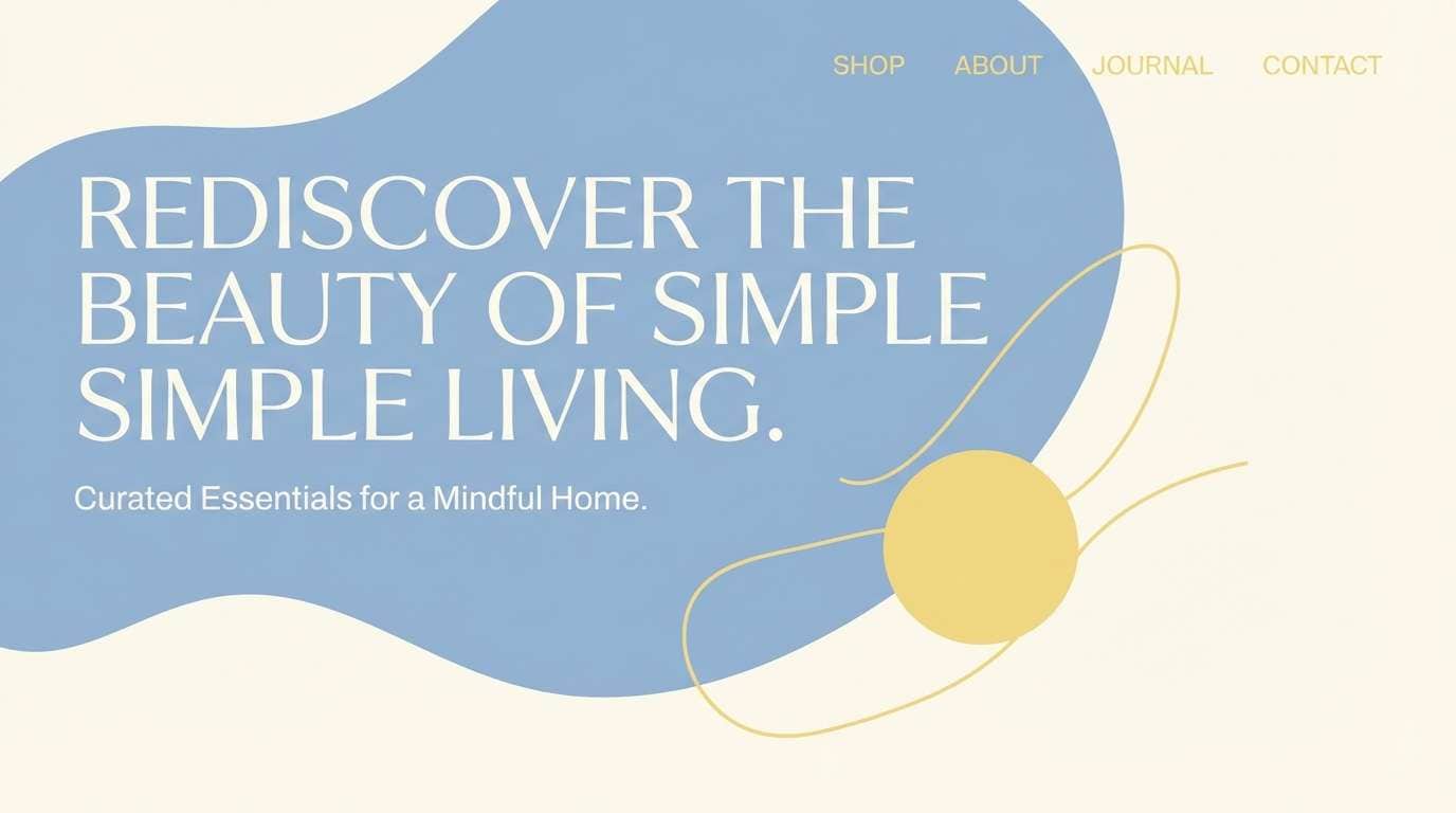
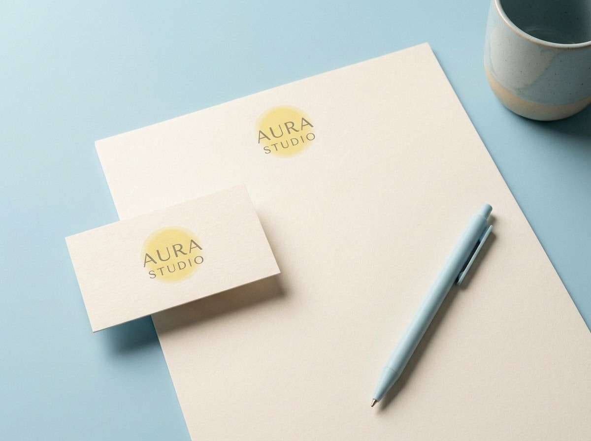
Create Pastel Blue Yellow Palette Visuals with AI
If you have HEX codes but need real mockups (menus, packaging, posters, UI screens), AI can help you generate consistent visuals faster. The prompts above are designed to keep the pastel blue yellow mood while staying clean and readable.
To get better results, describe the scene first (e.g., “dashboard UI mockup” or “wedding invitation suite”), then specify “dominant pastel blue and soft yellow,” and finish with details like “minimal typography” or “clean background.”
Pastel Blue Yellow Color Palette FAQs
-
What does a pastel blue yellow color palette communicate?
It usually communicates calm optimism—pastel blue feels airy and stable, while pastel yellow reads warm and friendly. Together they’re great for approachable brands, spring themes, and clean digital layouts. -
Is pastel yellow okay for buttons and CTAs?
Yes, but keep strong contrast: use dark slate/navy text on the yellow button, and reserve yellow for the primary action so it stays meaningful. Always check contrast for accessibility before shipping. -
What’s the best text color with pastel blue backgrounds?
Deep blue-gray, slate, or navy typically works best because it maintains readability without looking harsh. Pure black can feel too stark against soft pastels. -
How do I keep pastel blue and pastel yellow from looking washed out?
Add structure with neutrals (white/cream and cool grays), and include at least one darker anchor color for type and outlines. Also limit yellow to highlights instead of using it everywhere. -
Do pastel blue yellow palettes work for print?
They can, but pastel yellows are the most sensitive in print—paper and ink can shift them quickly. Run a small proof, and consider slightly muting or warming the yellow for textured stocks. -
What accent colors pair well with pastel blue yellow?
Mint/seafoam adds freshness, blush/peach adds playful sweetness, and muted metallics (like brass) add a premium touch. Keep accents small so the palette stays airy. -
Can I generate matching pastel blue yellow mockups with AI?
Yes—use a clear subject (menu, packaging, UI, poster), then specify “dominant pastel blue and soft yellow,” and add constraints like “minimal,” “clean background,” and “high detail” to keep results consistent.
Next: Brass Color Palette


