

A vintage circus color palette blends warm reds, teal, aged gold, and creamy paper tones to recreate the charm of classic big-top posters and ticket stubs. It’s bold enough for headlines, yet softened by weathered neutrals that feel authentic and timeworn.
Below are 20+ ready-to-use vintage circus color palette ideas with HEX codes, plus AI image prompts you can copy to generate matching visuals in seconds.
In this article
- Why Vintage Circus Palettes Work So Well
-
- big top velvet
- carnival ticket stub
- faded banner stripes
- ringmaster coat
- antique carousel lights
- dusty confetti
- old show poster
- taffy and sawdust
- brass and burgundy
- teal trapeze
- sepia spotlight
- cotton candy dusk
- parlor organ pipes
- vintage clown makeup
- weathered tent canvas
- gold foil marquee
- evening midway
- paper lantern parade
- storybook menagerie
- retro spotlight ui
- sideshow ink
- dark pink finale
- What Colors Go Well with Vintage Circus?
- How to Use a Vintage Circus Color Palette in Real Designs
- Create Vintage Circus Palette Visuals with AI
Why Vintage Circus Palettes Work So Well
Vintage circus colors are built for instant attention: rich reds and punchy teals create high-impact contrast that reads clearly from a distance. That’s why these palettes translate so well to posters, flyers, and social promos.
What makes them feel “vintage” is the supporting cast—cream, sepia, olive, and near-black tones that mimic aged paper, ink, and fabric. Those softer neutrals keep bold accents from looking overly modern or neon.
Because the style is rooted in print history (screenprint textures, limited inks, and bold outlines), these palettes naturally support strong hierarchy: one hero color, one counter color, and a few warm highlights for badges and borders.
20+ Vintage Circus Color Palette Ideas (with HEX Codes)
1) Big Top Velvet
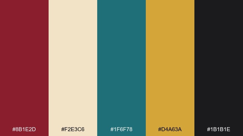
HEX: #8b1e2d #f2e3c6 #1f6f78 #d4a63a #1b1b1e
Mood: dramatic, nostalgic, premium
Best for: circus poster design
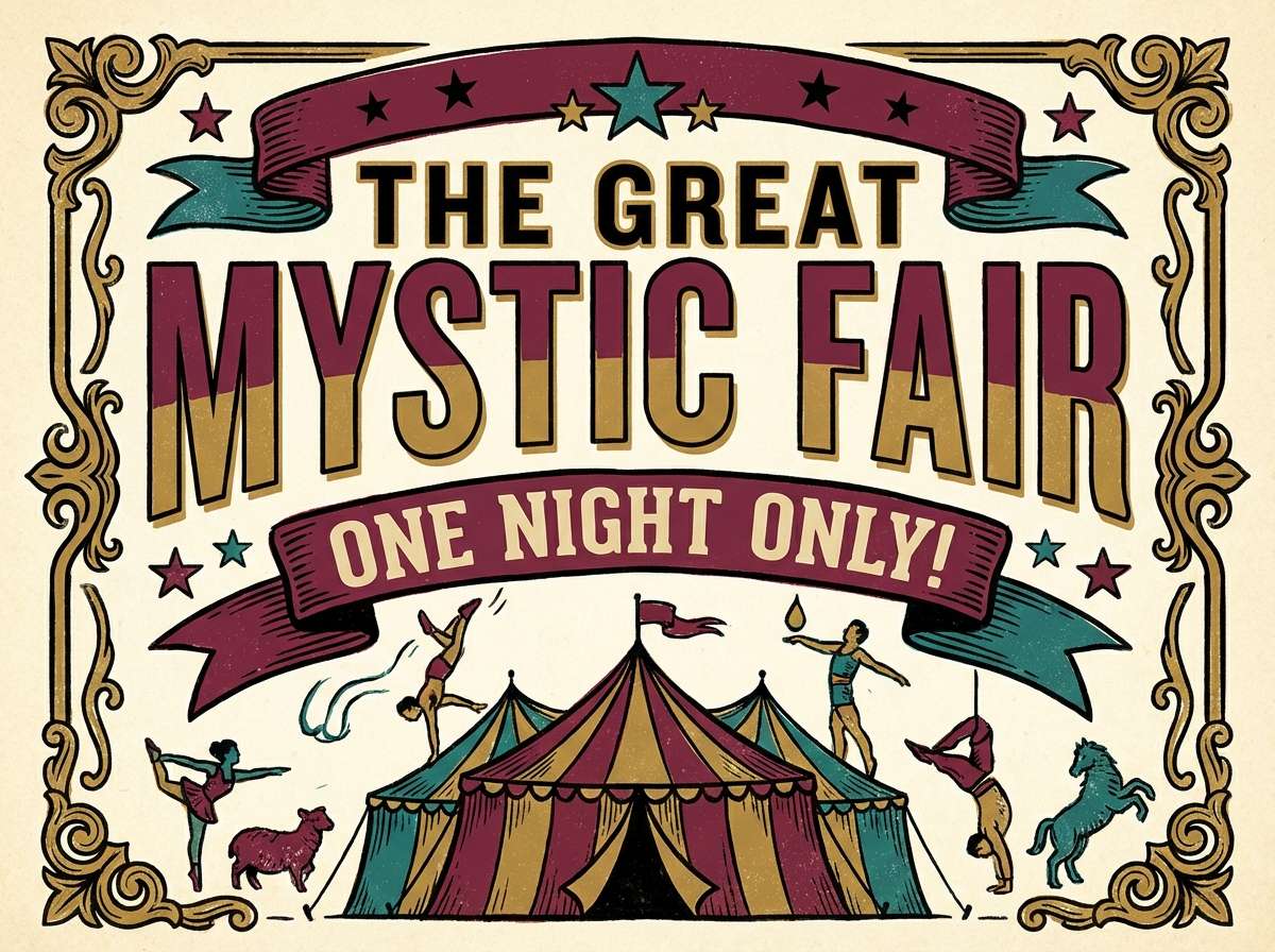
Dramatic and nostalgic, it feels like velvet curtains, brass trim, and a warm spotlight. These tones work beautifully for poster typography, badges, and illustrated characters. Pair the burgundy and teal as anchors, then add gold for highlights and cream for breathing room. Usage tip: keep black for thin lines only so the palette stays vintage, not heavy.
Image example of big top velvet generated using media.io
Media.io is an online AI studio for creating and editing video, image, and audio in your browser.

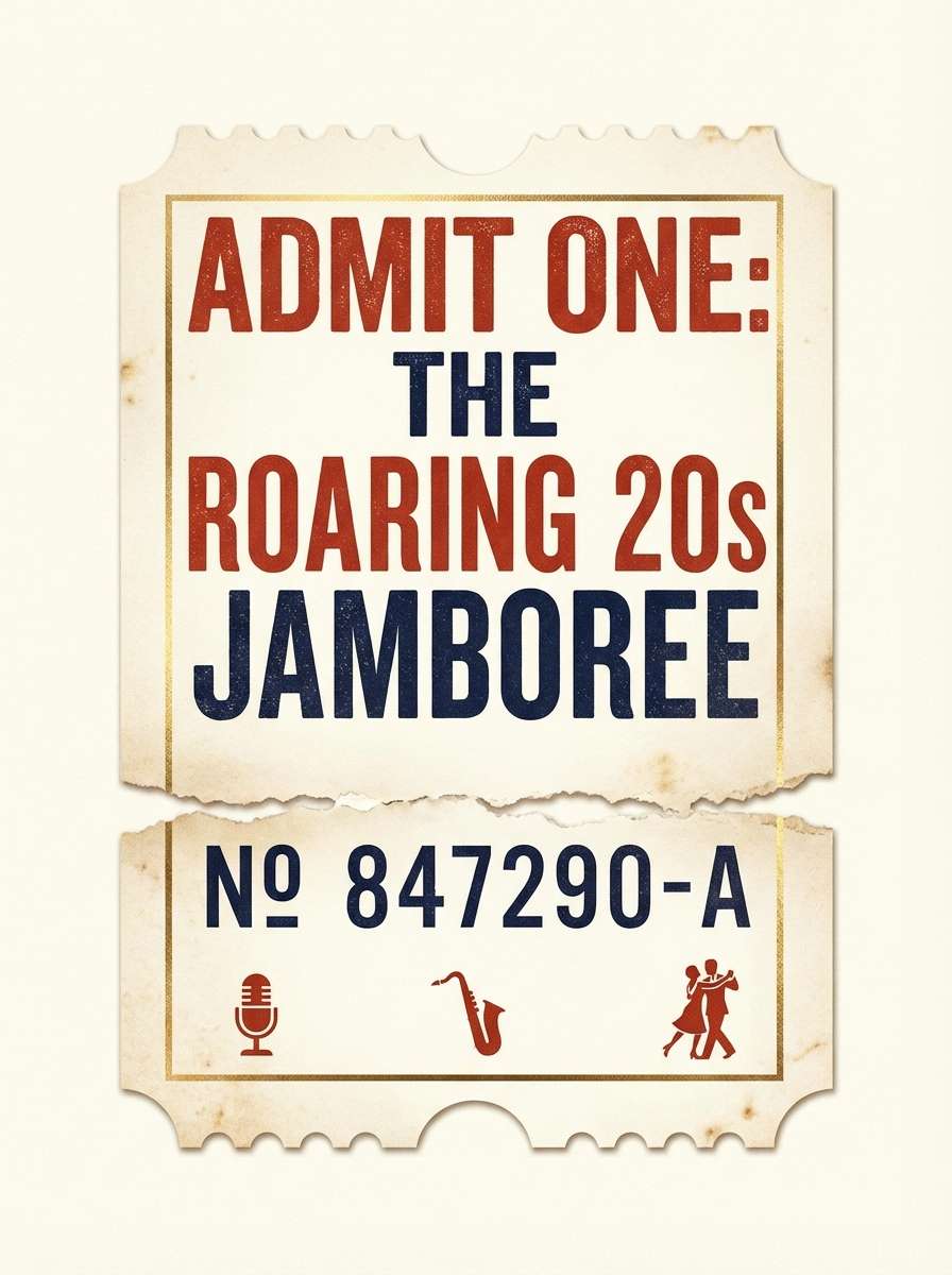
2) Carnival Ticket Stub
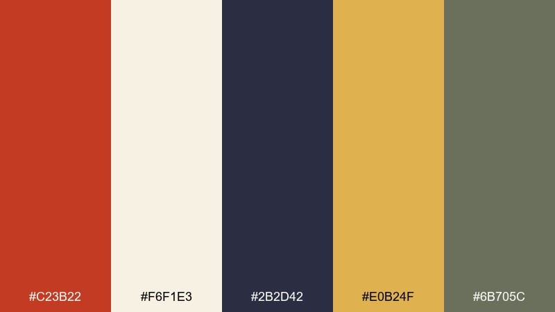
HEX: #c23b22 #f6f1e3 #2b2d42 #e0b24f #6b705c
Mood: cheerful, retro, approachable
Best for: event ticket and flyer templates
Cheerful and retro, it evokes torn paper tickets, stamped ink, and sun-faded signage. The warm red pops best on creamy backgrounds, while navy keeps type crisp and readable. Add muted olive as a soft neutral to prevent the layout from feeling too primary. Usage tip: use gold sparingly as a foil-like accent on icons or borders.
Image example of carnival ticket stub generated using media.io
3) Faded Banner Stripes
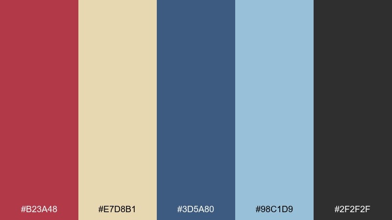
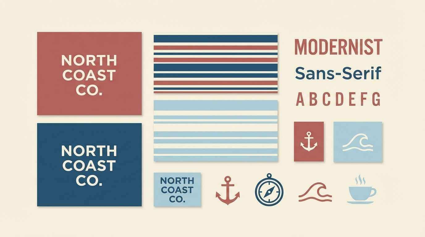
HEX: #b23a48 #e7d8b1 #3d5a80 #98c1d9 #2f2f2f
Mood: soft, weathered, classic
Best for: brand identity moodboards
Soft and weathered, it brings to mind striped fabric banners that have seen a few summers. The dusty red and deep blue feel classic together, while pale sky-blue lightens the mix without turning modern. Keep the cream as your primary field color for logos and wordmarks. Usage tip: pick one stripe color as dominant and let the others support in small blocks.
Image example of faded banner stripes generated using media.io
4) Ringmaster Coat
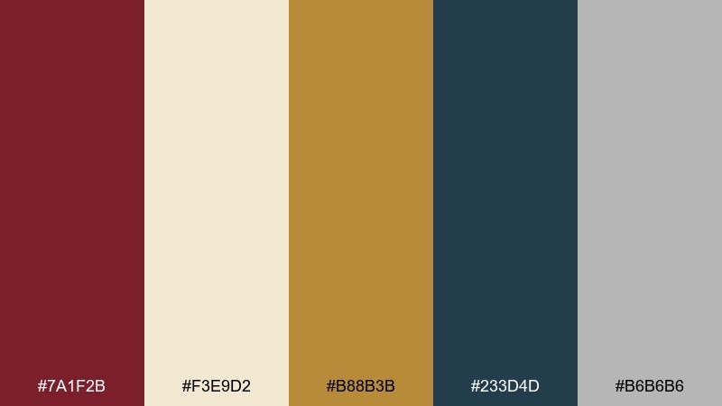
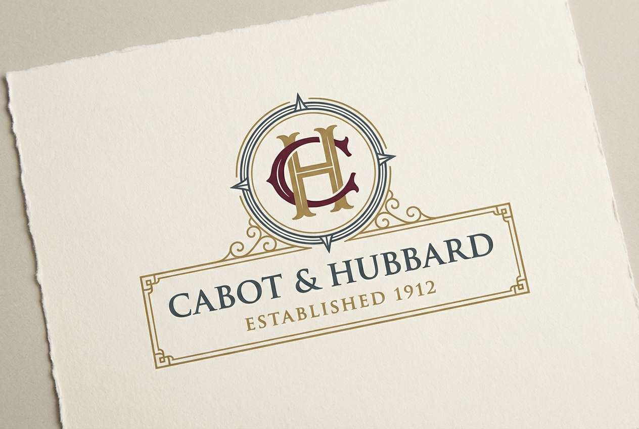
HEX: #7a1f2b #f3e9d2 #b88b3b #233d4d #b6b6b6
Mood: regal, structured, confident
Best for: premium branding and logos
Regal and structured, it feels like a tailored coat with brass buttons and crisp lapels. The burgundy and deep slate create authority, while cream keeps the look refined instead of harsh. Gold reads best as a metallic suggestion on thin rules, monograms, or seal marks. Usage tip: keep gray for secondary text to maintain hierarchy without losing the vintage vibe.
Image example of ringmaster coat generated using media.io
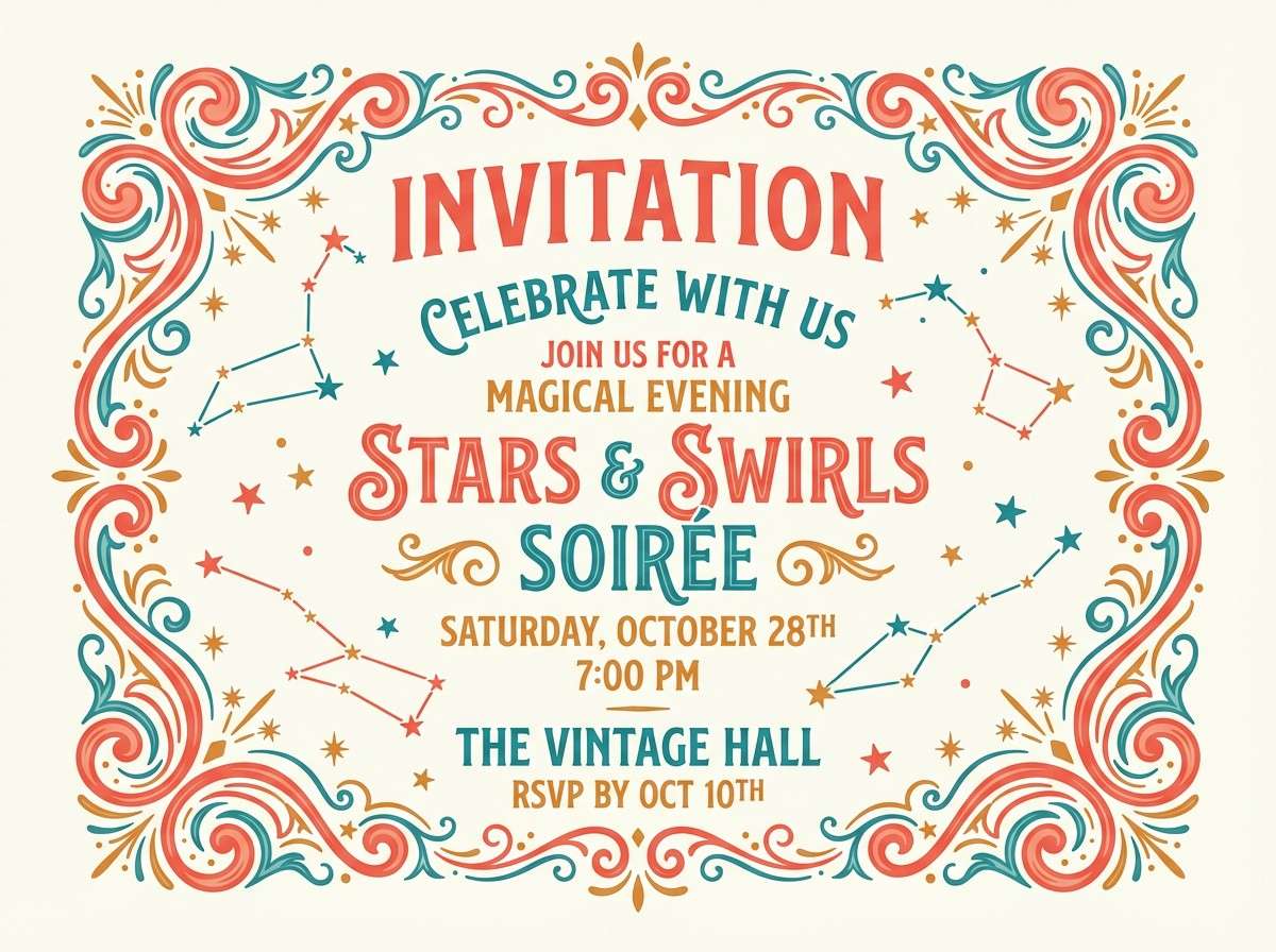
5) Antique Carousel Lights
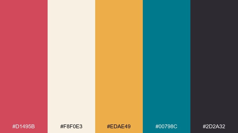
HEX: #d1495b #f8f0e3 #edae49 #00798c #2d2a32
Mood: lively, warm, nostalgic
Best for: party invitation designs
Lively and warm, it suggests carousel bulbs glowing against night air. Coral-red and teal make a punchy pairing, while the creamy off-white keeps text areas friendly. Use the golden amber on borders, stars, and small callouts for that lightbulb sparkle. Usage tip: reserve the near-black for outlines so the bright colors stay the focus.
Image example of antique carousel lights generated using media.io
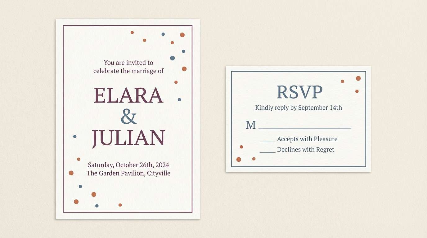
6) Dusty Confetti
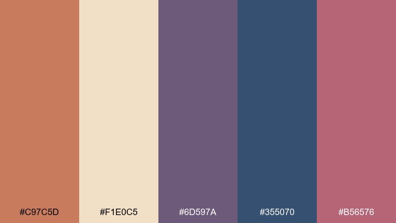
HEX: #c97c5d #f1e0c5 #6d597a #355070 #b56576
Mood: whimsical, muted, romantic
Best for: wedding or soirée stationery
Whimsical and muted, it feels like confetti in a paper bag with a hint of perfume and old velvet. The plum and slate-blue create a romantic backbone without going overly sweet. Use terracotta for headings and the soft blush for small flourishes like dividers or monograms. Usage tip: keep the cream as the dominant paper tone so the darker inks look intentional and elegant.
Image example of dusty confetti generated using media.io
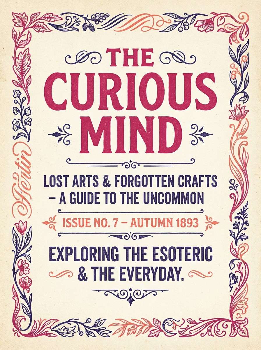
7) Old Show Poster
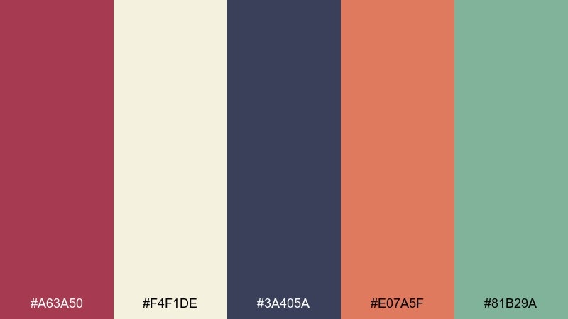
HEX: #a63a50 #f4f1de #3a405a #e07a5f #81b29a
Mood: storytelling, artsy, timeworn
Best for: editorial layouts and covers
Storytelling and timeworn, it recalls inked illustrations on thick, aged paper. The raspberry and indigo set a classic editorial contrast, while coral brings warmth to pull quotes and subheads. Sage-green softens the overall look and plays well with hand-drawn elements. Usage tip: let one warm tone dominate and keep the rest in smaller typographic accents.
Image example of old show poster generated using media.io
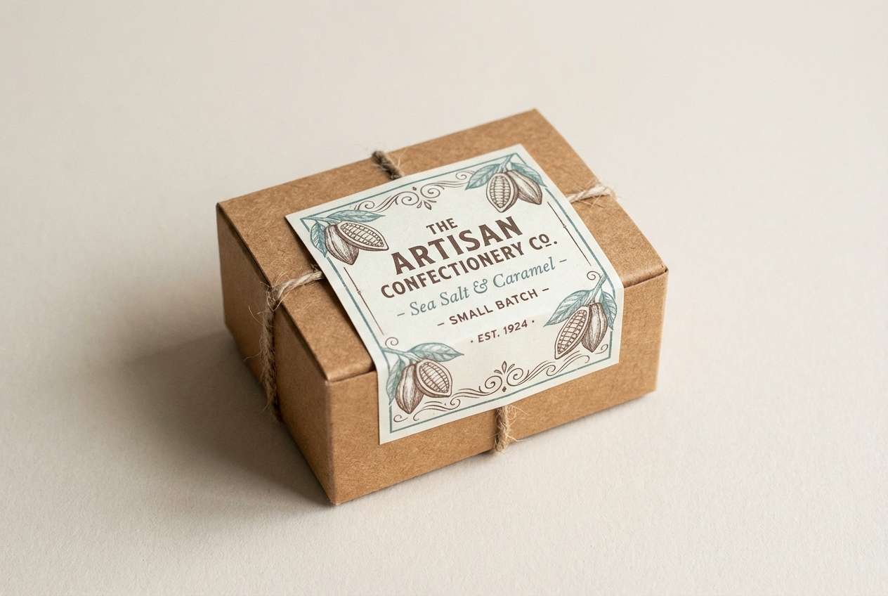
8) Taffy and Sawdust
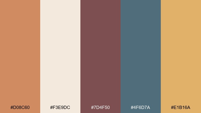
HEX: #d08c60 #f3e9dc #7d4f50 #4f6d7a #e1b16a
Mood: cozy, handcrafted, nostalgic
Best for: artisan food packaging
Cozy and handcrafted, it brings up taffy wrappers, sawdust floors, and warm lantern light. The cocoa-brown and dusty teal feel grounded, while caramel and honey tones make the design appetizing. Use the pale cream as the main label field so text stays readable. Usage tip: add a single bold shape in caramel to guide the eye to the product name.
Image example of taffy and sawdust generated using media.io
9) Brass and Burgundy
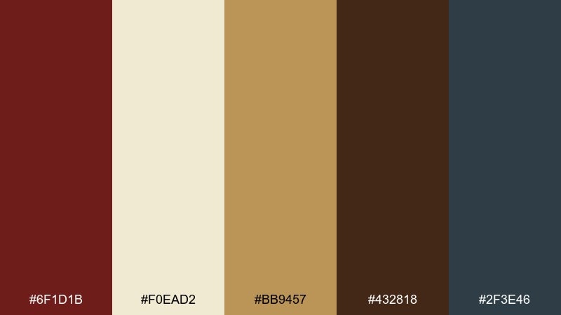
HEX: #6f1d1b #f0ead2 #bb9457 #432818 #2f3e46
Mood: moody, luxurious, old-world
Best for: whiskey labels and bottle tags
Moody and luxurious, it feels like a brass instrument case and deep red curtain folds. Cream and brass keep the palette readable and premium, while espresso brown adds richness for type and borders. The blue-gray works as a modern stabilizer without breaking the vintage mood. Usage tip: print the brass tone as a flat color, then mimic shine with highlights instead of gradients.
Image example of brass and burgundy generated using media.io
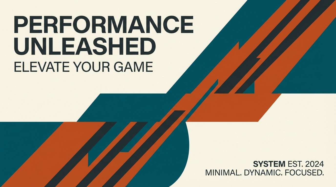
10) Teal Trapeze
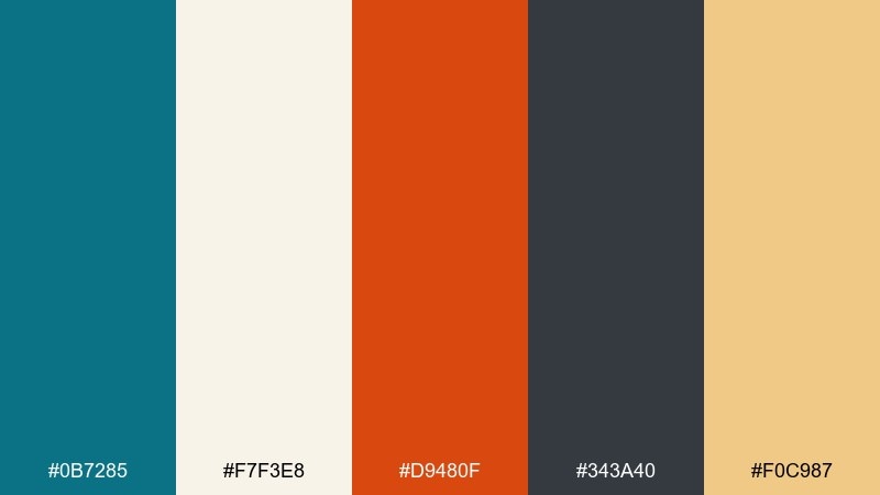
HEX: #0b7285 #f7f3e8 #d9480f #343a40 #f0c987
Mood: energetic, balanced, graphic
Best for: sports or performance branding
Energetic and balanced, it looks like a trapeze act against a bright marquee. Teal takes the lead, with burnt orange adding speed and urgency for calls to action. Cream keeps large areas light, while charcoal grounds typography and icon sets. Usage tip: use orange only for highlights so teal remains the brand signature.
Image example of teal trapeze generated using media.io
11) Sepia Spotlight
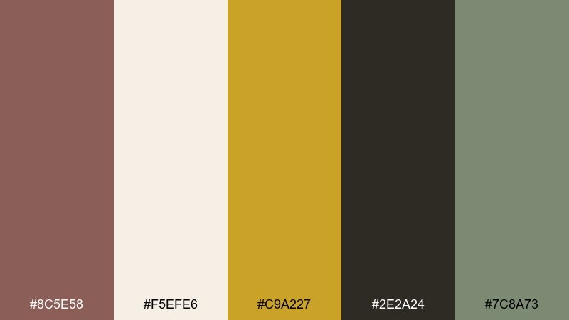
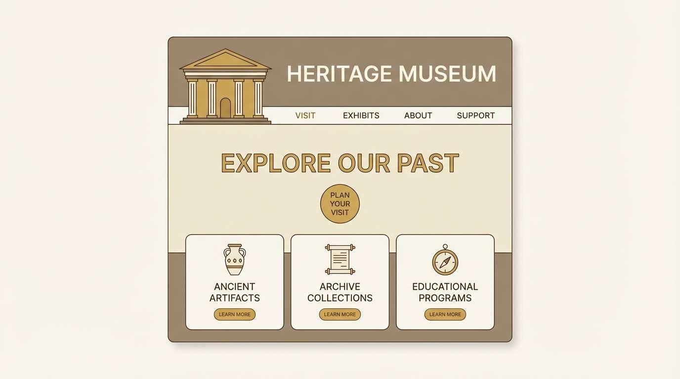
HEX: #8c5e58 #f5efe6 #c9a227 #2e2a24 #7c8a73
Mood: calm, sepia, museum-like
Best for: heritage landing pages
Calm and sepia-toned, it evokes a spotlight over old photographs and program notes. The warm taupe and inky brown create a trustworthy base for long reads and archival sections. Gold and sage make excellent accent buttons and link states without shouting. Usage tip: keep contrast high by pairing the dark brown with the light cream for body text areas.
Image example of sepia spotlight generated using media.io
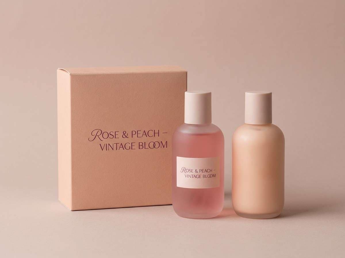
12) Cotton Candy Dusk
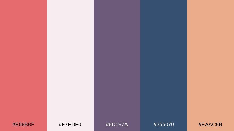
HEX: #e56b6f #f7edf0 #6d597a #355070 #eaac8b
Mood: sweet, dreamy, twilight
Best for: beauty product ads
Sweet and twilight-soft, it feels like cotton candy fading into evening lights. The rosy tones do the heavy lifting, with plum and navy adding sophistication for typography. Use the pale blush as negative space to keep layouts airy and modern. Usage tip: let navy appear only in small type and logos so the ad stays warm and inviting.
Image example of cotton candy dusk generated using media.io
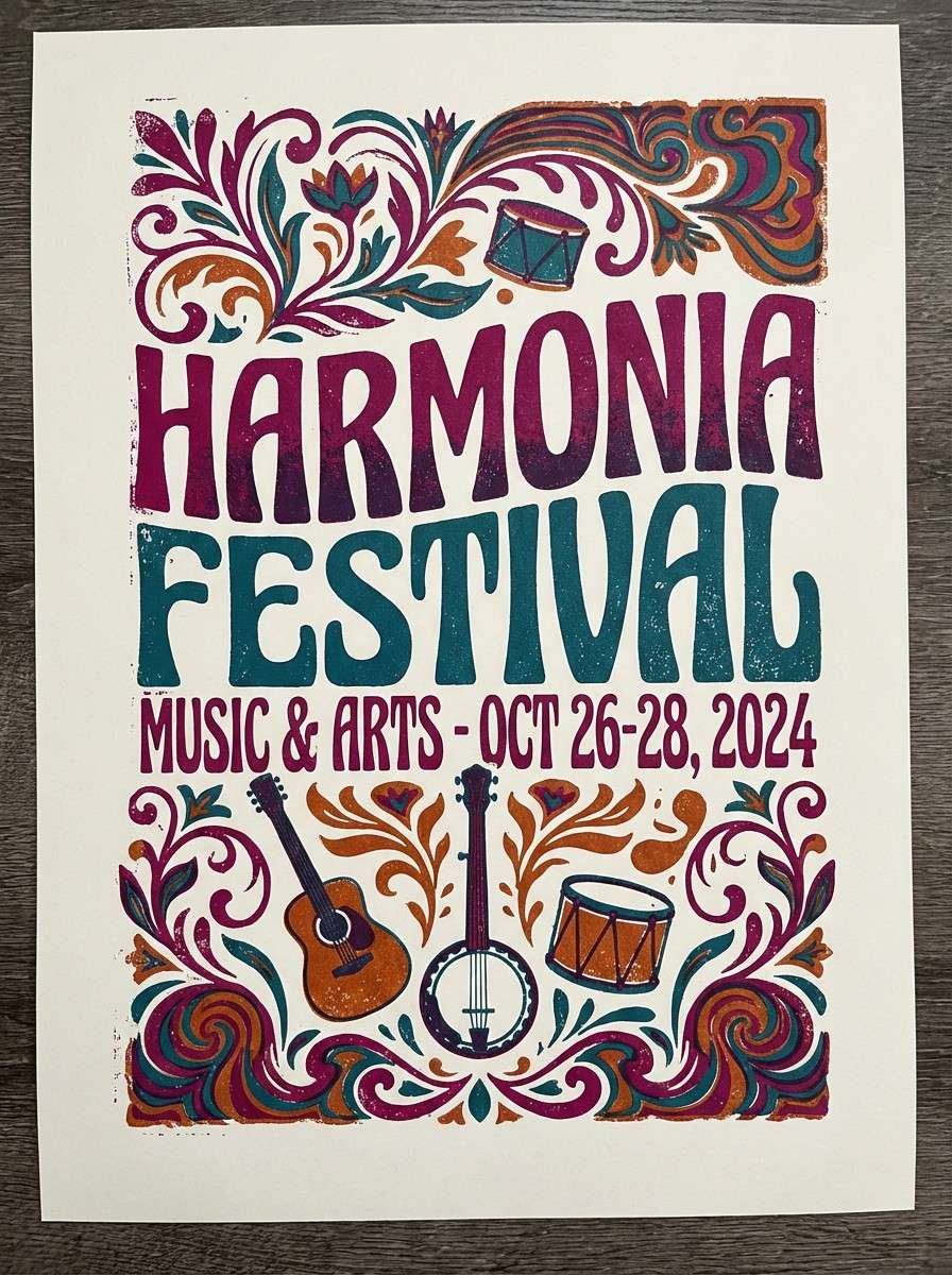
13) Parlor Organ Pipes
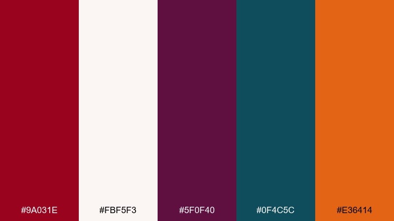
HEX: #9a031e #fbf5f3 #5f0f40 #0f4c5c #e36414
Mood: bold, theatrical, punchy
Best for: music festival posters
Bold and theatrical, it calls up organ music, painted letters, and bright stage cues. The deep magenta and teal make one of the most memorable vintage circus color combinations for headline-driven designs. Use orange as the energy switch for dates, tickets, and small bursts of emphasis. Usage tip: keep backgrounds light so the saturated inks feel intentional, not overpowering.
Image example of parlor organ pipes generated using media.io
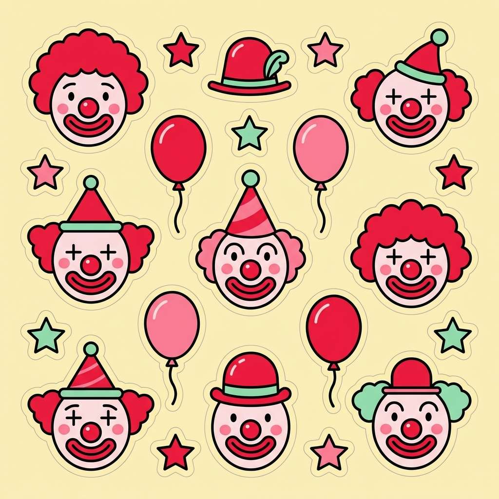
14) Vintage Clown Makeup
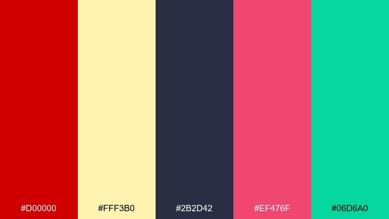
HEX: #d00000 #fff3b0 #2b2d42 #ef476f #06d6a0
Mood: playful, bright, slightly mischievous
Best for: kids party graphics and stickers
Playful with a mischievous edge, it resembles face paint, paper hats, and candy wrappers. The red and hot pink bring instant fun, while navy keeps outlines and text sharp. Mint adds a fresh twist so the bright tones do not feel too loud. Usage tip: limit red to one focal area per design and use the pale yellow as a soft buffer.
Image example of vintage clown makeup generated using media.io
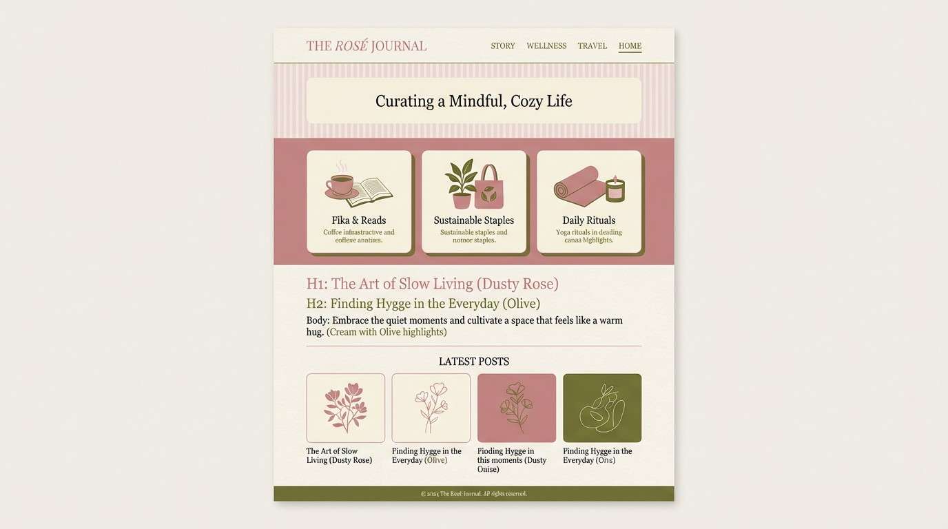
15) Weathered Tent Canvas
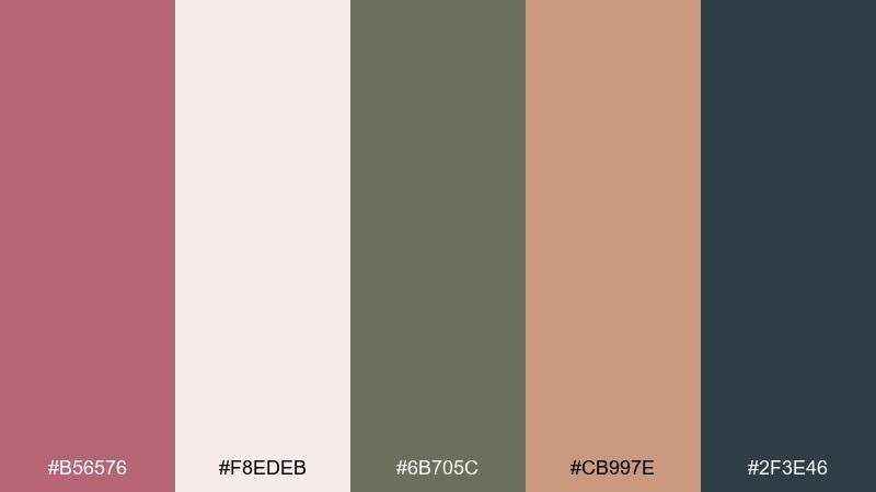
HEX: #b56576 #f8edeb #6b705c #cb997e #2f3e46
Mood: soft, earthy, relaxed
Best for: lifestyle blog themes
Soft and earthy, it feels like canvas seams, worn rope, and faded paint under sun. Dusty rose and tan make calm hero sections, while forest-olive tones support navigation and footers. Use the deep blue-gray for strong headings to keep the theme accessible. Usage tip: introduce patterns like subtle stripes in the lightest two colors for texture without clutter.
Image example of weathered tent canvas generated using media.io
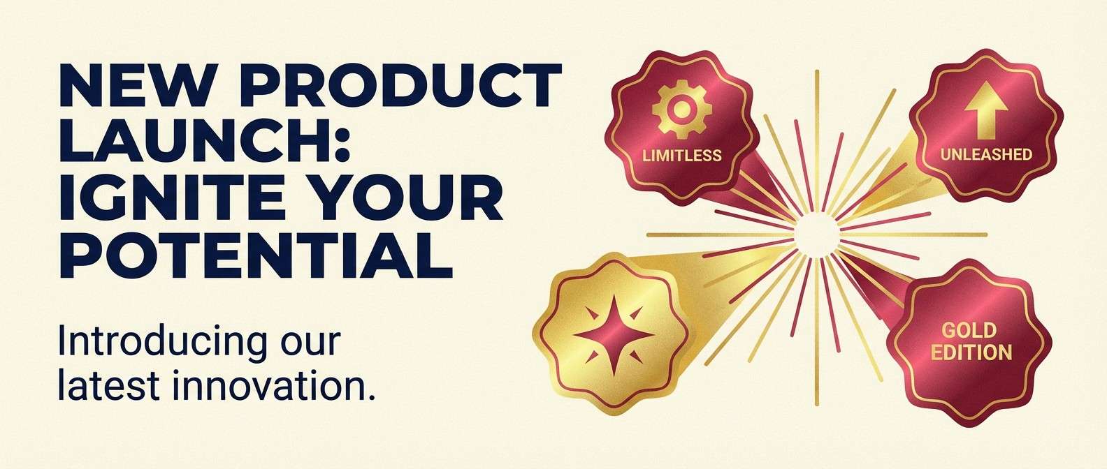
16) Gold Foil Marquee
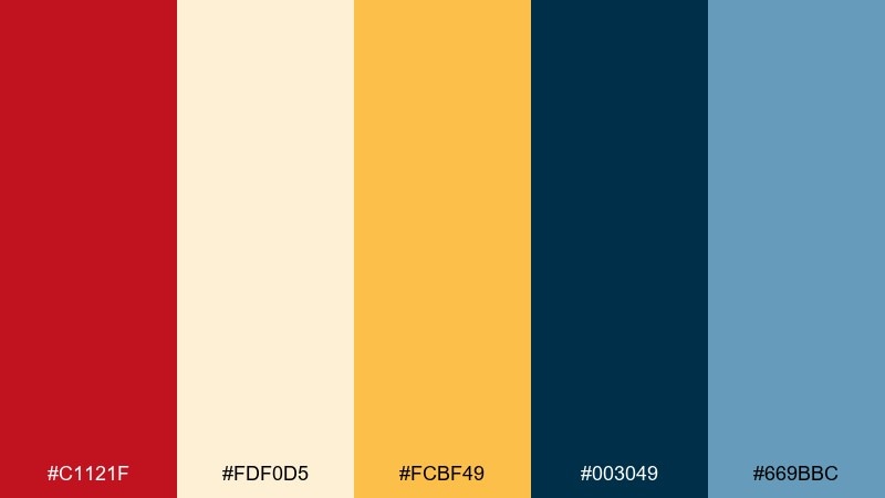
HEX: #c1121f #fdf0d5 #fcbf49 #003049 #669bbc
Mood: bright, celebratory, polished
Best for: product launch banners
Bright and celebratory, it looks like marquee bulbs reflecting on gold foil. The crimson and navy create bold contrast for announcement copy, while buttery cream keeps the background friendly. Use the golden yellow for price tags, badges, and button fills, then add light blue as a modern supporting accent. Usage tip: stick to two dominant hues per section to avoid a noisy layout.
Image example of gold foil marquee generated using media.io
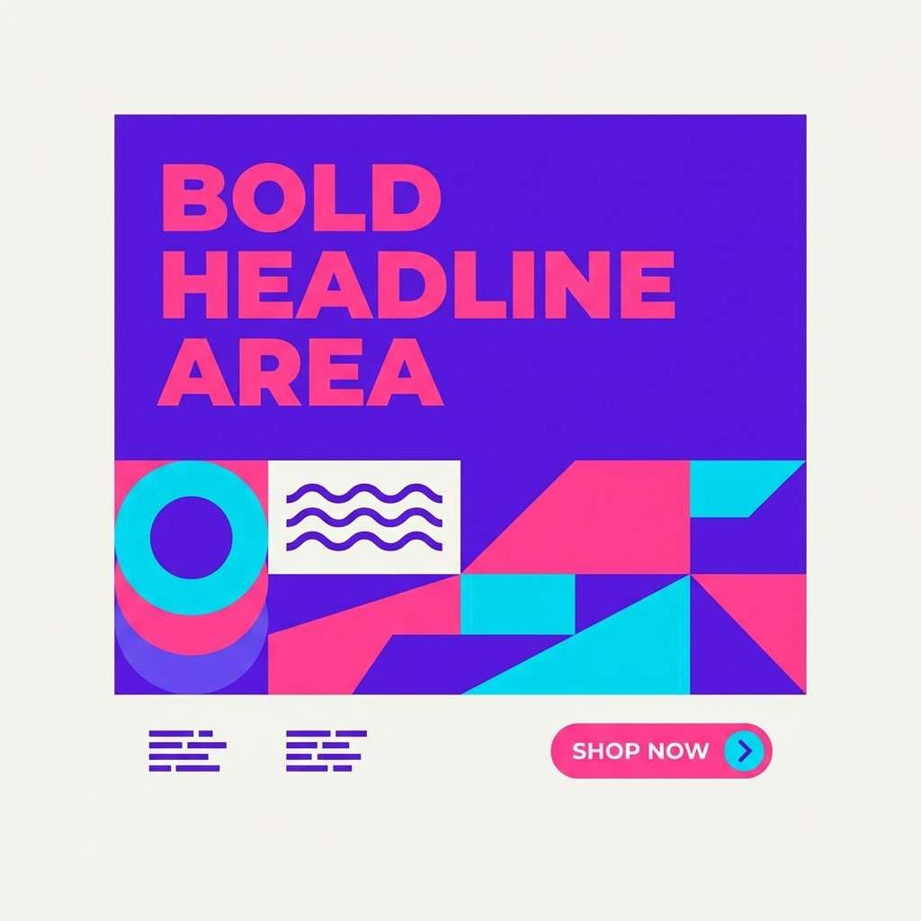
17) Evening Midway
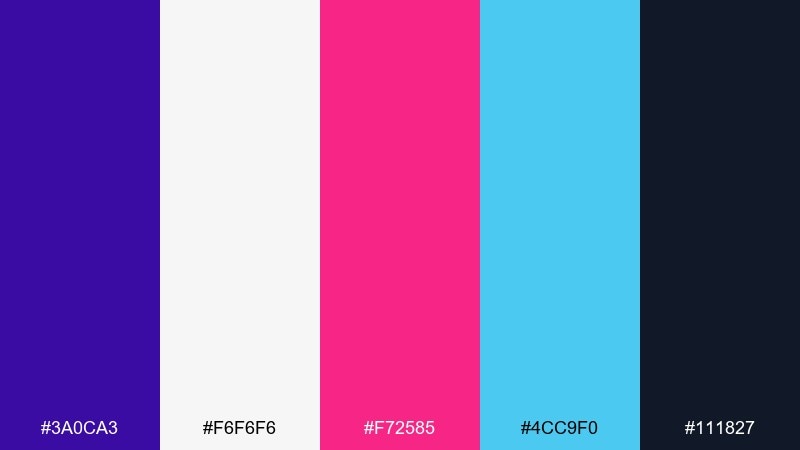
HEX: #3a0ca3 #f6f6f6 #f72585 #4cc9f0 #111827
Mood: neon-tinged, night, high contrast
Best for: social media promo templates
Neon-tinged and night-ready, it evokes a midway after dark with lights buzzing in the distance. The violet and hot pink do the heavy lifting for attention, while icy cyan makes accents feel electric. Keep white for spacing and the deep charcoal for readable captions. Usage tip: use gradients only between adjacent tones, like violet to pink, to keep the retro feel controlled.
Image example of evening midway generated using media.io
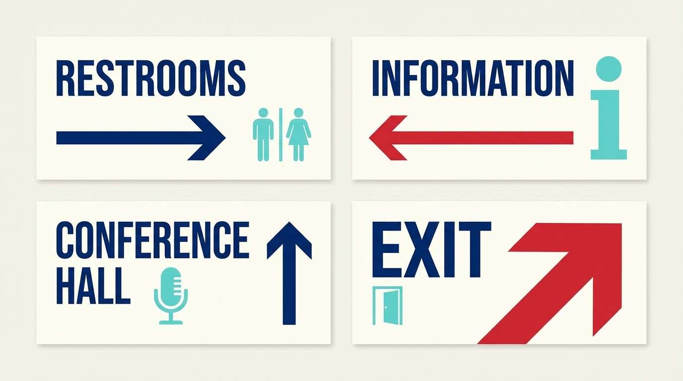
18) Paper Lantern Parade
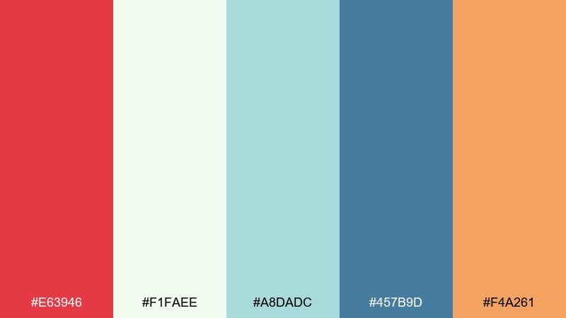
HEX: #e63946 #f1faee #a8dadc #457b9d #f4a261
Mood: festive, airy, friendly
Best for: summer fair signage
Festive and airy, it brings up paper lanterns, painted boards, and breezy afternoon crowds. Red and blue feel classic, while minty aqua keeps the look lighter for outdoor signage. Use the warm orange for directional arrows and small highlights that need quick recognition. Usage tip: increase letter spacing on dark blue type so it stays readable from a distance.
Image example of paper lantern parade generated using media.io
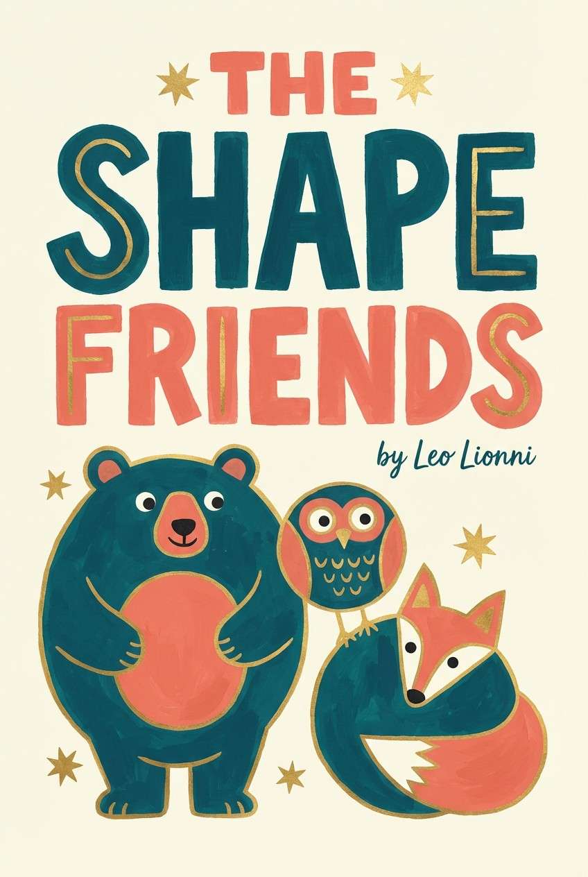
19) Storybook Menagerie
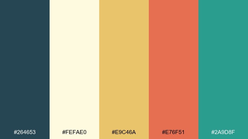
HEX: #264653 #fefae0 #e9c46a #e76f51 #2a9d8f
Mood: playful, illustrative, warm
Best for: children book covers
Playful and illustrative, it feels like storybook animals painted in gouache. The deep teal is a strong outline color, while cream keeps pages bright and approachable. Gold and coral make friendly character accents and title treatments, with sea-green supporting background shapes. Usage tip: use the teal for text and linework to keep the cover readable at thumbnail size.
Image example of storybook menagerie generated using media.io
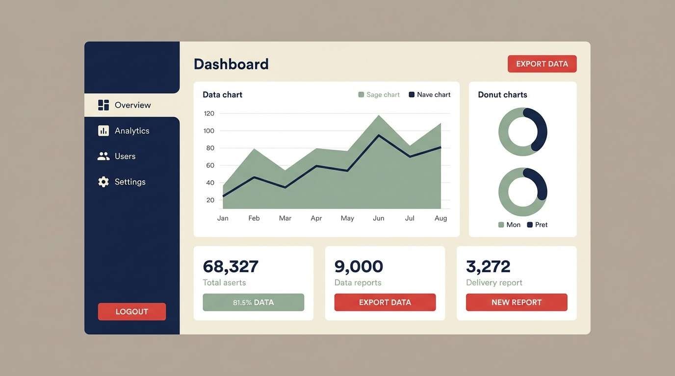
20) Retro Spotlight UI
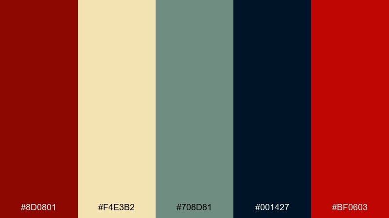
HEX: #8d0801 #f4e3b2 #708d81 #001427 #bf0603
Mood: bold, focused, editorial
Best for: dashboard UI theming
Bold and focused, it reads like a single spotlight cutting through a dark auditorium. This vintage circus color scheme works well for dashboards where hierarchy matters, with navy for surfaces and cream for cards. Use the two reds for status and primary actions, then bring in sage for calm secondary elements. Usage tip: keep red off large backgrounds and reserve it for buttons, alerts, and key numbers.
Image example of retro spotlight ui generated using media.io
21) Sideshow Ink
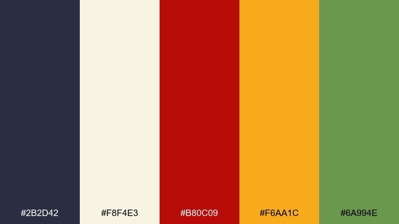
HEX: #2b2d42 #f8f4e3 #b80c09 #f6aa1c #6a994e
Mood: gritty, bold, handcrafted
Best for: tattoo flash and merch
Gritty and handcrafted, it channels sideshow ink, bold outlines, and worn paper. The dark navy and cream create a high-contrast base for illustrations and lettering. Red and marigold deliver punchy focal points, while green adds a classic old-school twist. Usage tip: keep the green for small fills so it feels like a surprise accent, not a second theme.
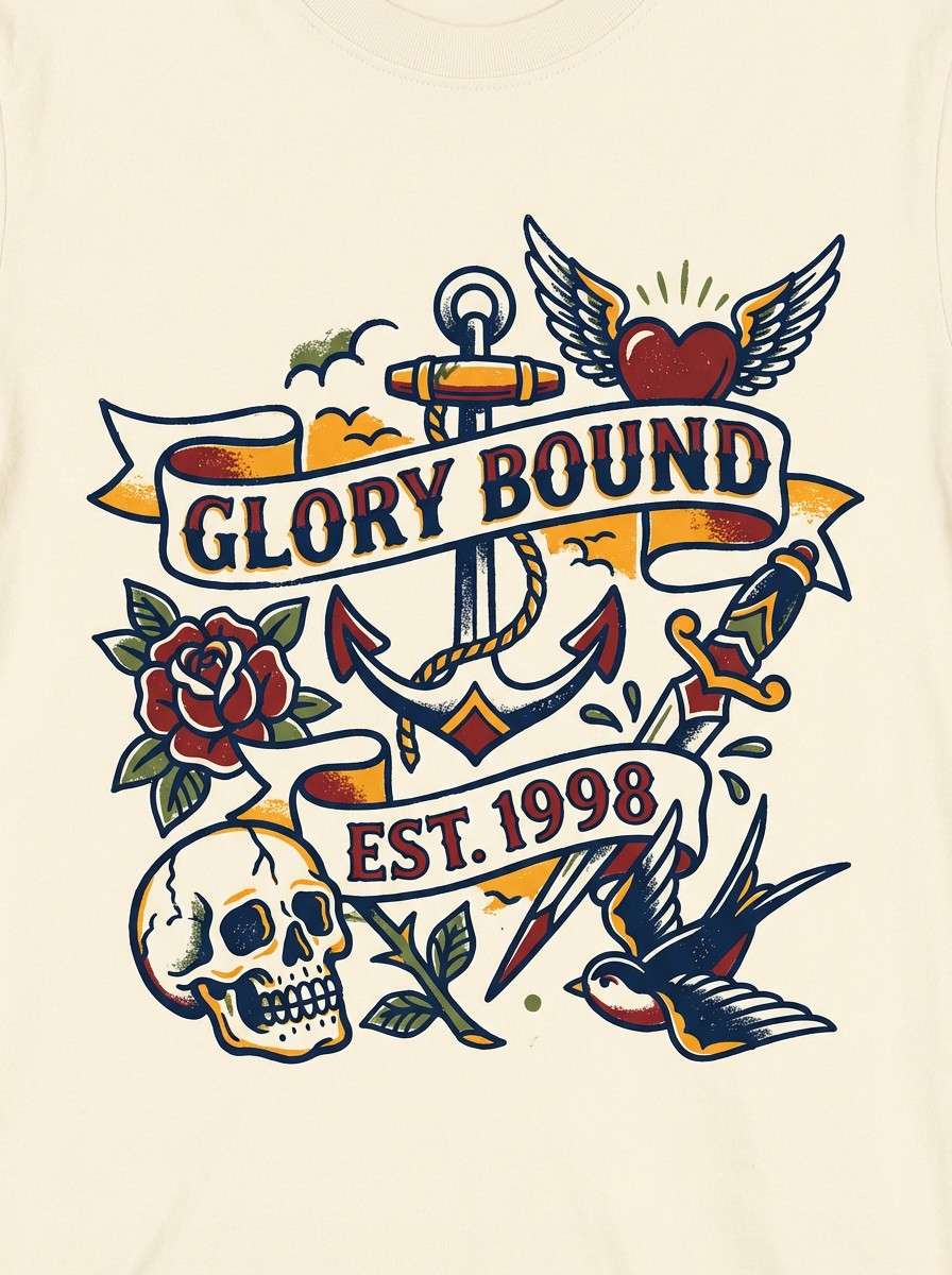
Image example of sideshow ink generated using media.io
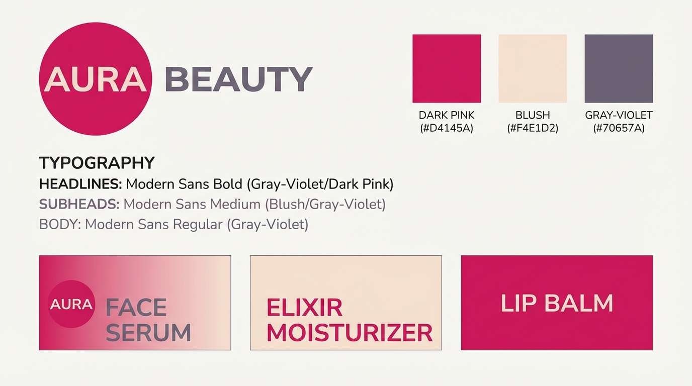
22) Dark Pink Finale
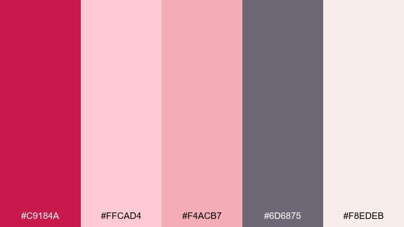
HEX: #c9184a #ffcad4 #f4acb7 #6d6875 #f8edeb
Mood: romantic, bold, modern-vintage
Best for: beauty brand rebrand concepts
Romantic but bold, it feels like the grand finale with rosy lights and satin ribbons. As a vintage circus color palette, it leans feminine without losing edge thanks to the smoky gray-violet. Use the dark pink for logos and CTAs, then build generous spacing with the pale blushes and soft cream. Usage tip: keep typography mostly gray-violet so the pinks stay vibrant and premium.
Image example of dark pink finale generated using media.io
What Colors Go Well with Vintage Circus?
Vintage circus palettes pair best with warm neutrals (cream, parchment, sand) that simulate old paper and keep saturated accents readable. If your design feels too loud, expanding the neutral space usually fixes it fast.
For classic big-top contrast, combine a deep red or burgundy with teal or navy. Then add aged gold or amber as a “marquee” accent for borders, badges, stars, and call-to-action highlights.
To keep the look authentic, use near-black or charcoal for outlines and small text rather than full black backgrounds. This preserves the vintage print feel without making the layout heavy.
How to Use a Vintage Circus Color Palette in Real Designs
Start with a paper-like background (cream/off-white), then choose one dominant “curtain” color (burgundy, crimson, or dusty red) for large shapes and headers. Add a cool counter-tone (teal/navy) for balance and navigation elements.
Use gold or amber as a limited accent: price tags, corner ornaments, button fills, or small icons. The smaller you keep the highlight color, the more it feels like metallic trim or marquee lighting.
Finish with texture and hierarchy: thin outlines, slightly desaturated fills, and strong type contrast. A vintage circus palette looks best when the layout is bold but the color distribution is controlled.
Create Vintage Circus Palette Visuals with AI
If you want matching poster layouts, invitation frames, or brand boards, generating a few AI concepts is a quick way to validate your palette. The prompts above are designed to produce vintage-friendly composition, spacing, and texture.
In Media.io, you can paste a prompt, iterate style variations, and keep outputs consistent across a full set—perfect for campaigns that need multiple formats (social posts, banners, flyers) with the same color story.
Once you find a direction you like, reuse the prompt and swap only the subject (poster, label, UI, cover) to build a cohesive vintage circus series.
Vintage Circus Color Palette FAQs
-
What defines a vintage circus color palette?
Most vintage circus palettes combine bold warm reds with cool teals/navies, then soften everything with cream “paper” tones and aged gold accents. Charcoal or near-black is typically used for outlines and small text to mimic classic print. -
Which vintage circus colors are best for readable typography?
Use deep navy/charcoal on cream for body text, and reserve bright reds or pinks for short headlines and badges. High contrast (dark-on-light) keeps the design feeling vintage and legible. -
How do I keep a circus palette from looking too modern?
Reduce saturation slightly, use warmer off-whites instead of pure white, and avoid large neon gradients. Adding subtle grain/screenprint texture and using near-black linework helps lock in the retro feel. -
What’s a good accent color for “marquee” highlights?
Aged gold, amber, or buttery yellow works best for starbursts, borders, and small callouts. Use it sparingly so it reads as trim/light rather than a third dominant color. -
Can I use a vintage circus palette for branding (not just posters)?
Yes—choose one signature color (like burgundy or teal), use cream as the primary background, and keep gold as a small premium accent. This creates a brand system that feels theatrical without becoming chaotic. -
What are the best color ratios for vintage circus designs?
A practical split is 60% cream/off-white, 25% dominant warm tone (red/burgundy), 10% cool counter-tone (teal/navy), and 5% accent (gold/amber). Adjust based on the format, but keep neutrals in control. -
How can I generate vintage circus visuals that match my palette?
Use Media.io’s text-to-image tool with prompts that mention “vintage circus poster,” “screenprint texture,” and your key colors (burgundy, teal, aged gold, cream). Iterate by changing only one variable at a time (layout, subject, or ratio) to stay consistent.
Next: Dark Pink Color Palette


