

Dark pink sits in the sweet spot between bold and refined—deep enough to feel premium, but still expressive and warm. It’s a go-to for brands that want emotion, confidence, and a modern edge.
Below are 20 curated dark pink color palette ideas with HEX codes, plus practical mood notes and pairing tips for UI, branding, print, and social templates.
In this article
- Why Dark Pink Palettes Work So Well
-
- velvet rose night
- raspberry mocha
- orchid smoke ui
- dusty fuchsia vows
- berry noir editorial
- rosewood clay home
- garnet blossom wax
- peony granite calm
- mulberry latte post
- cranberry copper cheer
- deep rose garden wash
- plum jam dessert
- magenta ink midnight
- antique pink neutrals
- rose quartz shadow
- sangria sunset gradient
- berry punch stickers
- dahlia denim street
- fig velvet lounge
- hot berry minimal icons
- What Colors Go Well with Dark Pink?
- How to Use a Dark Pink Color Palette in Real Designs
- Create Dark Pink Palette Visuals with AI
Why Dark Pink Palettes Work So Well
Dark pink tones (think berry, fuchsia, magenta, plum, and rosewood) carry a strong emotional signal: confident, romantic, and modern. They feel more mature than bubblegum pink, but less severe than pure red.
They’re also naturally flexible. A deep berry can anchor layouts like a near-neutral, while blush tints create breathing room for typography, UI surfaces, or print margins.
Most importantly, dark pink pairs beautifully with both warm and cool companions—charcoal for sharp contrast, creams for softness, and metallic-like accents (copper/rose gold) for a premium finish.
20+ Dark Pink Color Palette Ideas (with HEX Codes)
1) Velvet Rose Night
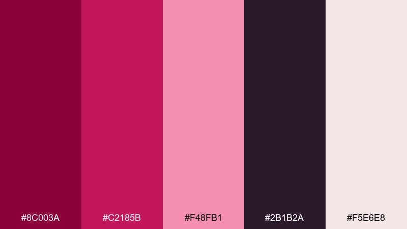
HEX: #8C003A #C2185B #F48FB1 #2B1B2A #F5E6E8
Mood: sultry, romantic, cinematic
Best for: beauty brand hero banner
Sultry velvet rose tones meet inky plum, like candlelight on satin. Use it for luxury beauty headers, perfume ads, and premium packaging where contrast sells the story. Pair the deep base with soft blush for readability, then add the pale tint for highlights and whitespace balance. Tip: keep body text dark and reserve the brightest pink for one focal call to action.
Image example of velvet rose night generated using media.io
Media.io is an online AI studio for creating and editing video, image, and audio in your browser.

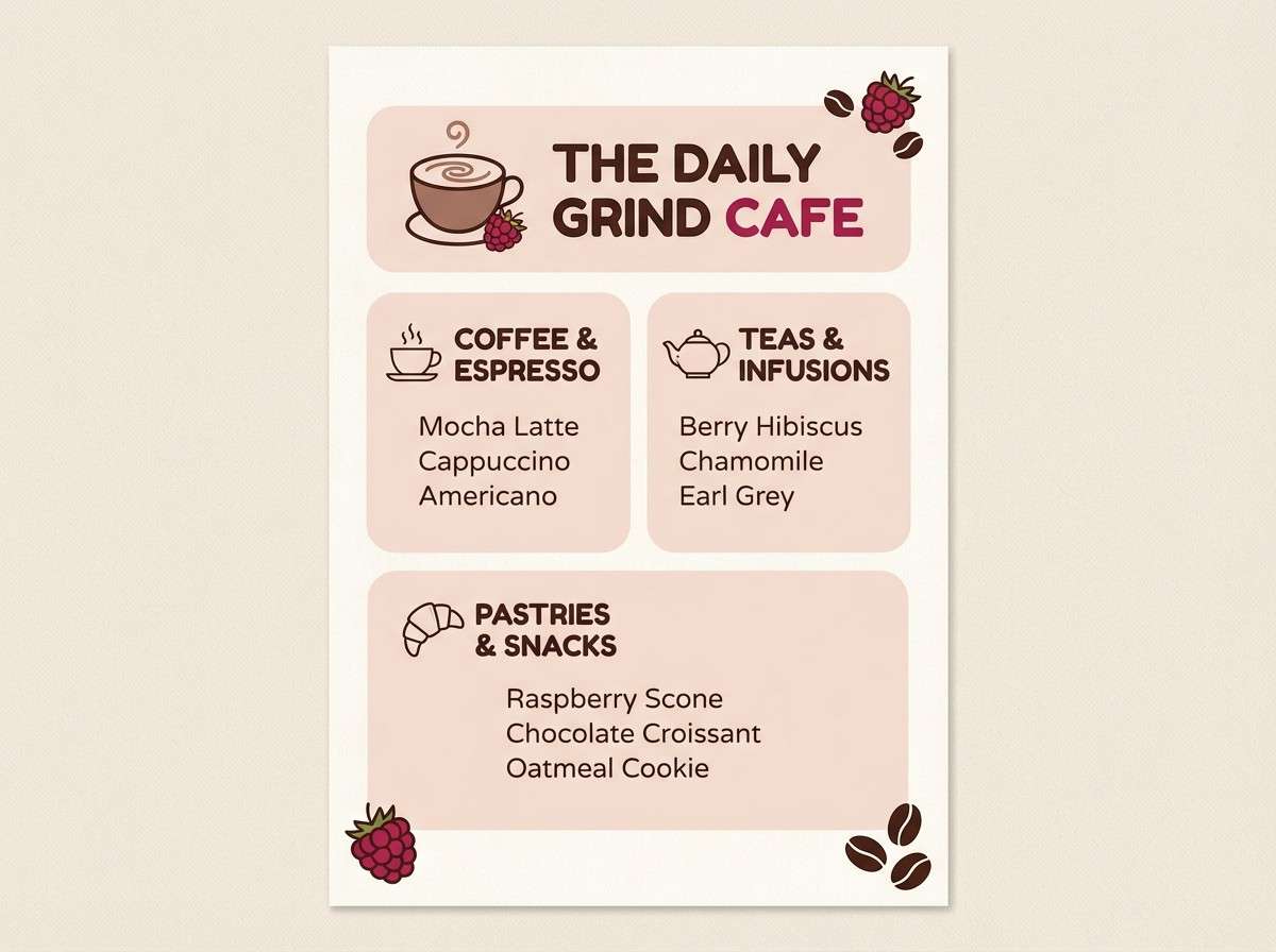
2) Raspberry Mocha
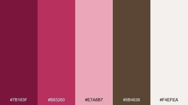
HEX: #7B163F #B83260 #E7A6B7 #5B4636 #F4EFEA
Mood: cozy, artisanal, inviting
Best for: cafe menu flyer
Cozy raspberry and mocha feel like a warm pastry case and a berry latte. These dark pink color combinations work beautifully for cafes, small-batch food brands, and seasonal specials. Pair the mocha brown as your type color with the soft cream for backgrounds to keep the layout friendly and readable. Tip: use the mid pink for section headers and the darkest berry for price highlights.
Image example of raspberry mocha generated using media.io
3) Orchid Smoke UI
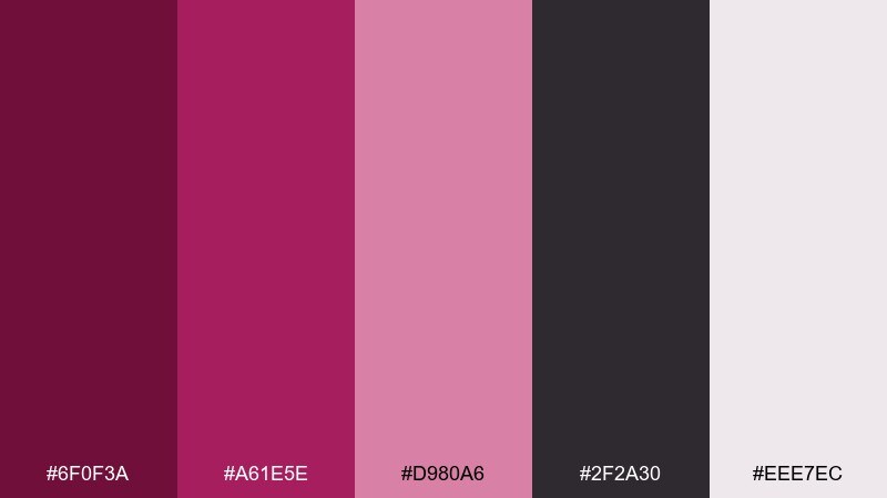
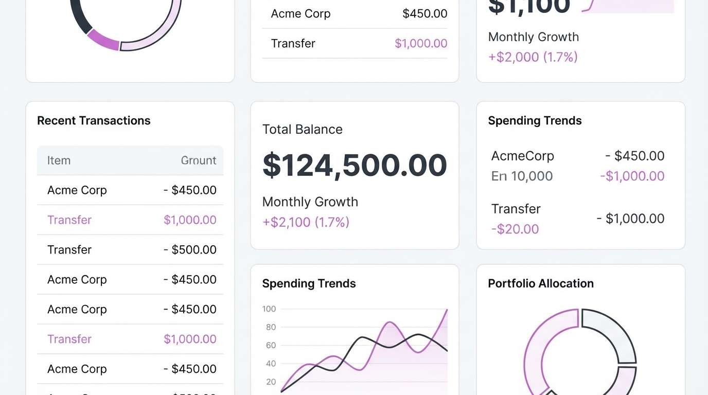
HEX: #6F0F3A #A61E5E #D980A6 #2F2A30 #EEE7EC
Mood: modern, confident, polished
Best for: 2d fintech dashboard ui mockup
Smoky orchid and charcoal read clean and confident, like a night-mode interface with a luxe twist. Use this dark pink color scheme for dashboards, account screens, and charts that need clear hierarchy without feeling cold. Pair the charcoal for structure, keep surfaces light, and use the saturated orchid for key metrics and active states. Tip: reserve the darkest berry for alerts so it stays distinct from primary actions.
Image example of orchid smoke ui generated using media.io
4) Dusty Fuchsia Vows
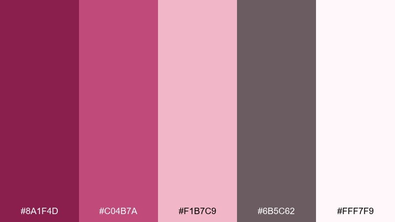
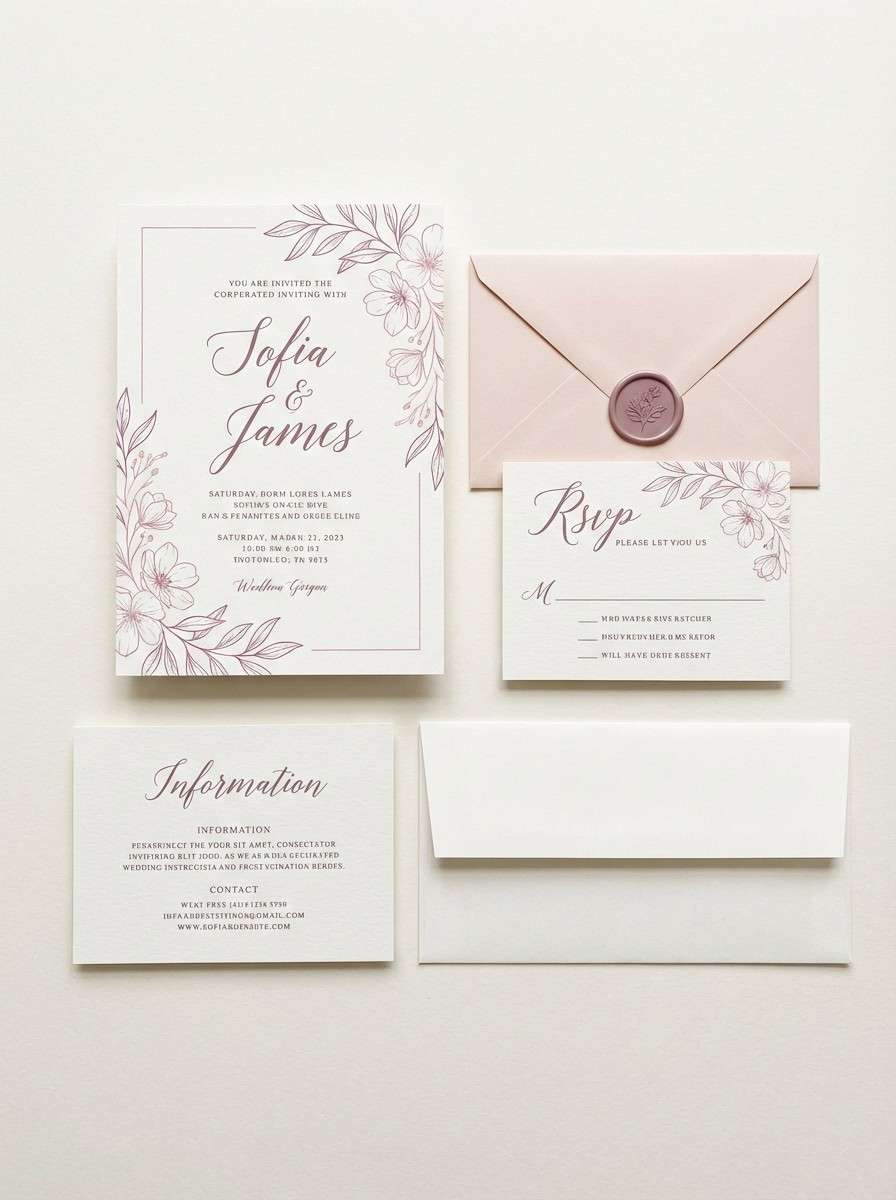
HEX: #8A1F4D #C04B7A #F1B7C9 #6B5C62 #FFF7F9
Mood: romantic, soft, elegant
Best for: wedding invitation suite
Dusty fuchsia feels like pressed petals tucked into a keepsake book. It suits wedding stationery, bridal shower sets, and elegant RSVP cards where softness matters. Pair the muted gray-mauve for text and linework, then use the deeper rose for names and monograms. Tip: print on warm white stock to keep the blush tones from turning too cool.
Image example of dusty fuchsia vows generated using media.io
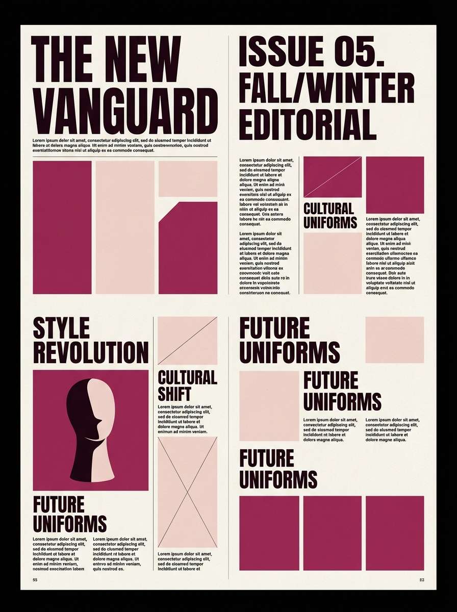
5) Berry Noir Editorial
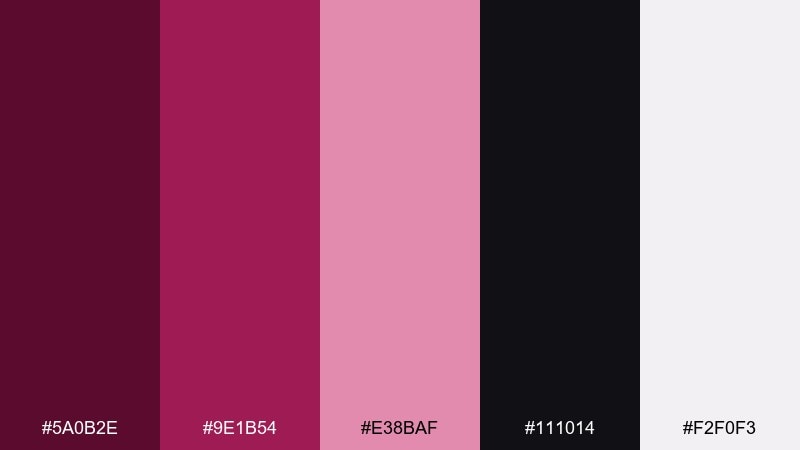
HEX: #5A0B2E #9E1B54 #E38BAF #111014 #F2F0F3
Mood: high-fashion, dramatic, sharp
Best for: fashion magazine layout
Berry noir looks like glossy lipstick against black silk. It fits fashion editorials, lookbooks, and bold typography spreads where contrast is the point. Pair the near-black for headlines and grids, then use the mid berry as a recurring accent for pull quotes and section labels. Tip: keep blush areas large and quiet so the dark tones feel intentional, not heavy.
Image example of berry noir editorial generated using media.io
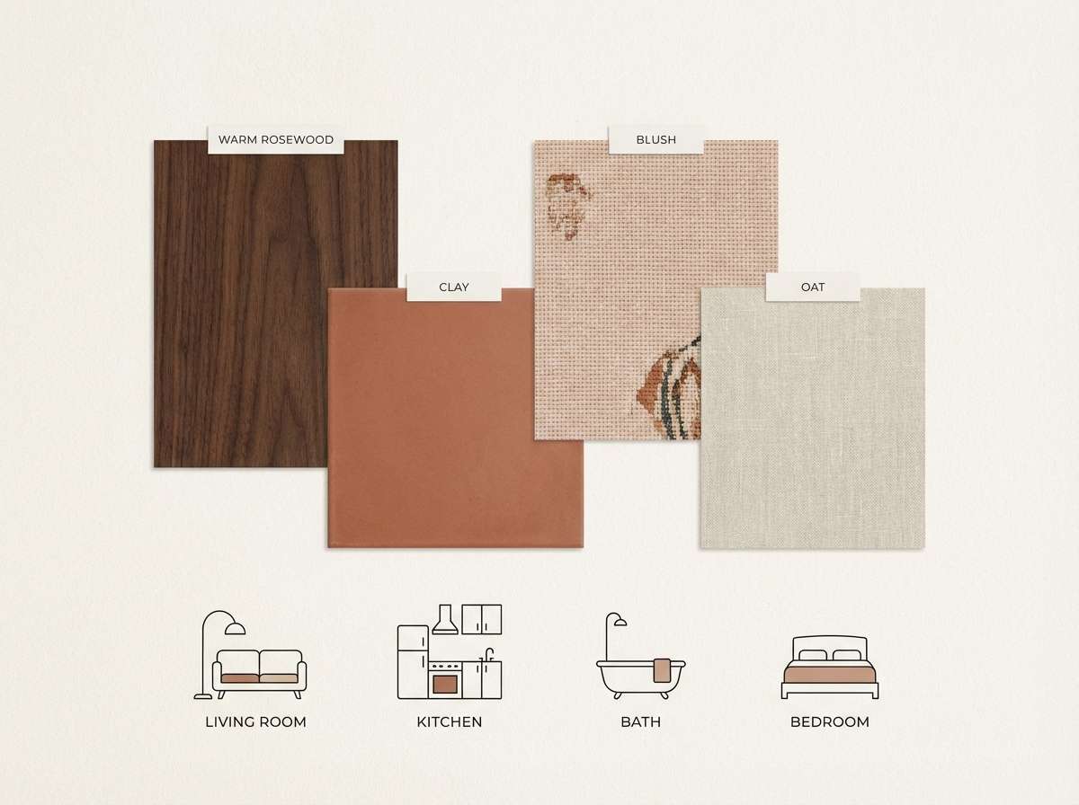
6) Rosewood Clay Home
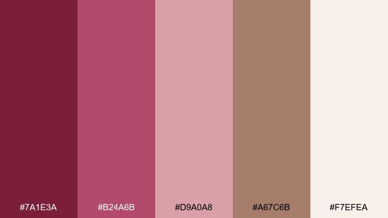
HEX: #7A1E3A #B24A6B #D9A0A8 #A67C6B #F7EFEA
Mood: earthy, warm, curated
Best for: living room color board
Rosewood and clay feel grounded, like terracotta pottery beside dried roses. Use it for interior mood boards, home decor branding, and lifestyle content that leans warm and organic. Pair the clay tone with the cream for large surfaces, then add rosewood for trim, headings, or key elements. Tip: a matte finish or subtle grain texture makes these hues look richer and less sugary.
Image example of rosewood clay home generated using media.io
7) Garnet Blossom Wax
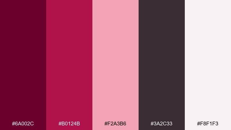
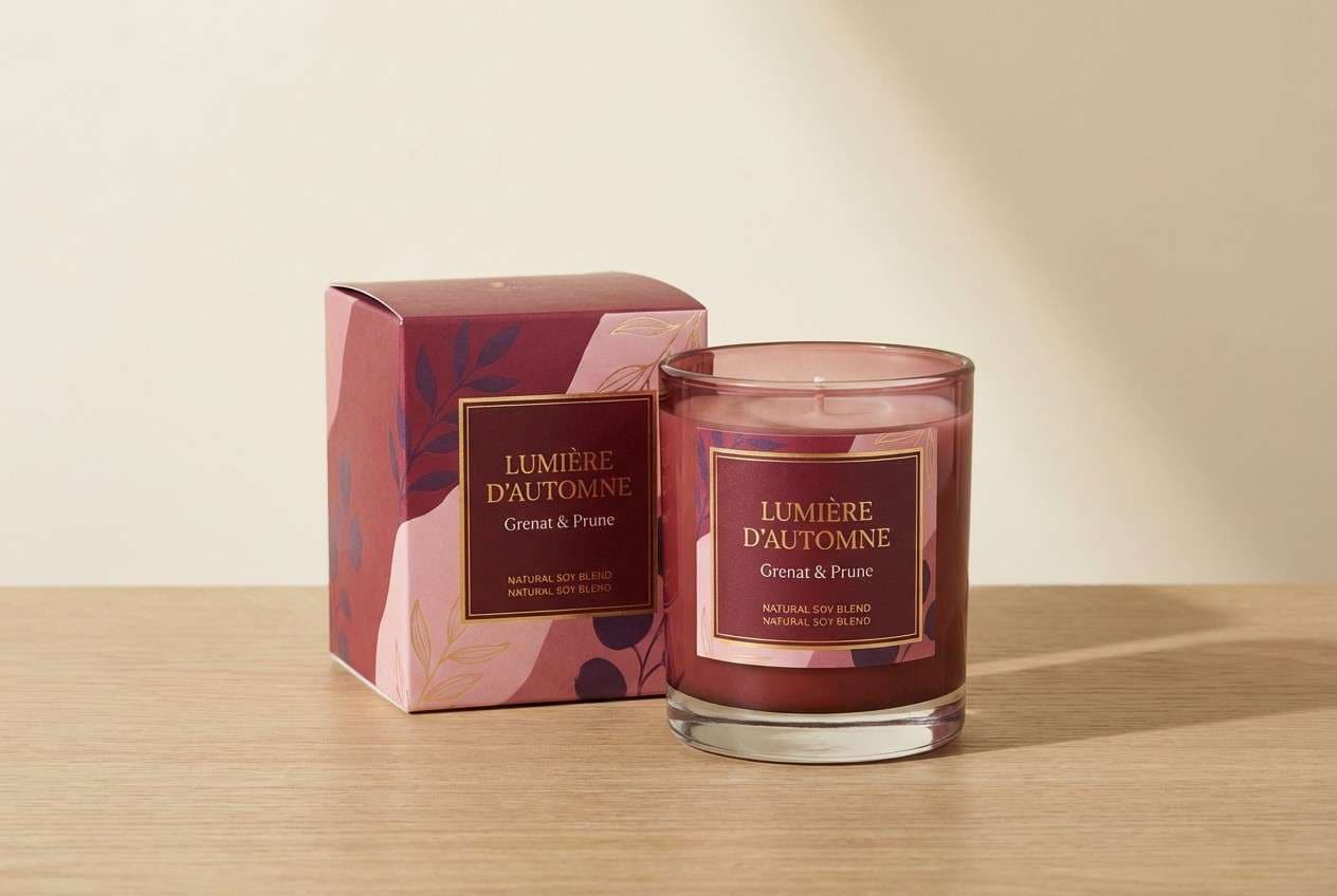
HEX: #6A002C #B0124B #F2A3B6 #3A2C33 #F8F1F3
Mood: luxury, moody, handcrafted
Best for: candle label and box packaging
Garnet blossom reads like a boutique candle shop after dark. It works for labels, boxes, and product shots that need depth without losing femininity. Pair the deep garnet for logos and borders with blush for background panels, then use the smoky plum as a secondary neutral. Tip: add minimal foil or spot gloss only on the darkest swatch to keep the premium vibe controlled.
Image example of garnet blossom wax generated using media.io
8) Peony Granite Calm
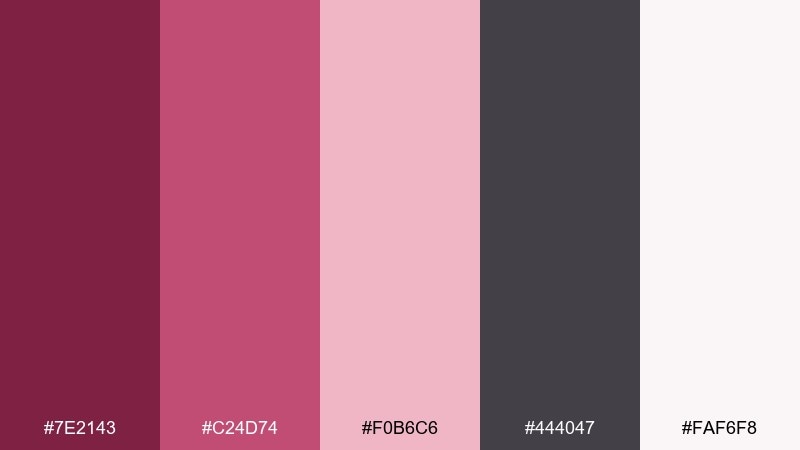
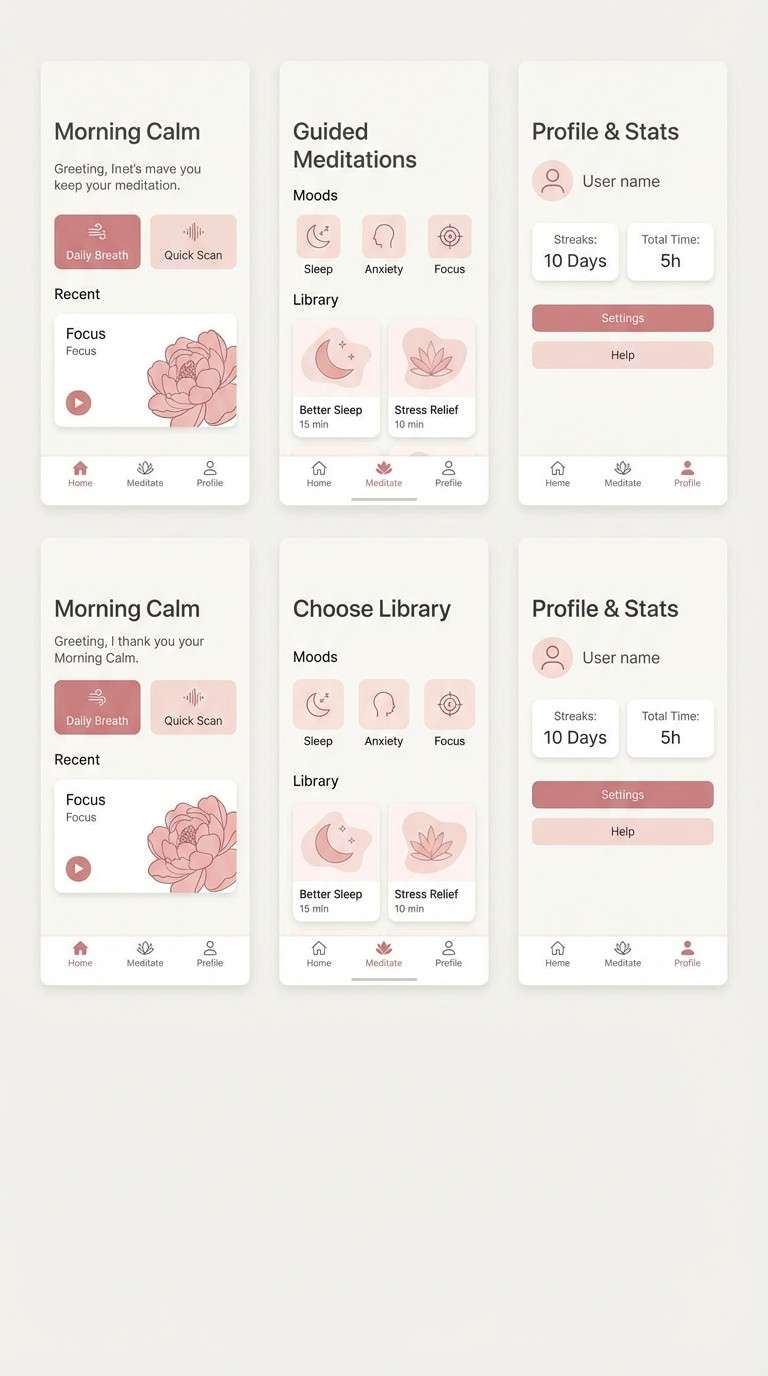
HEX: #7E2143 #C24D74 #F0B6C6 #444047 #FAF6F8
Mood: calm, modern, reassuring
Best for: meditation app ui screens
Peony pink softened by granite gray feels quiet and steady, like slow breathing in a dim room. Use it for wellness apps, guided meditation flows, and gentle onboarding where trust matters. Pair the gray for text and dividers, keep the background near-white, and let the mid pink mark progress and active states. Tip: avoid full-screen saturated pink and use it in small, repeatable UI cues instead.
Image example of peony granite calm generated using media.io
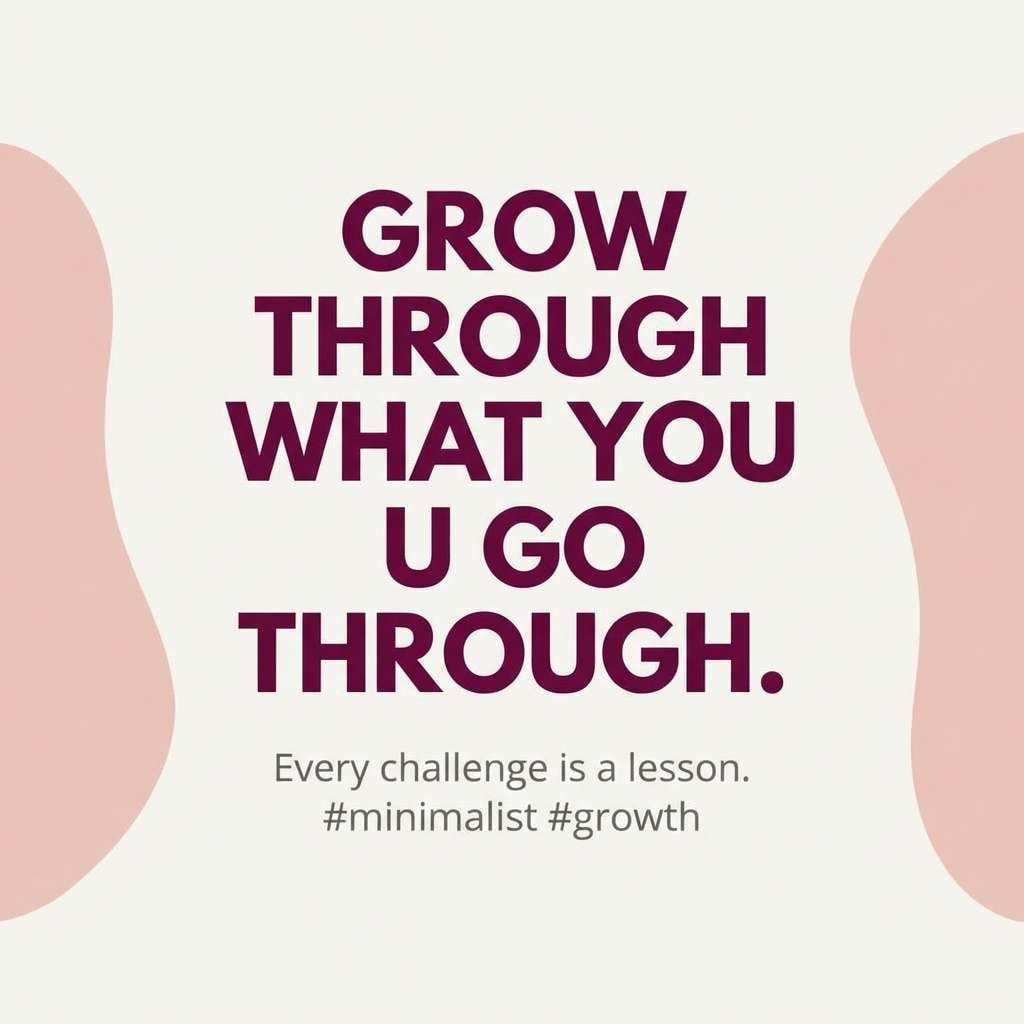
9) Mulberry Latte Post
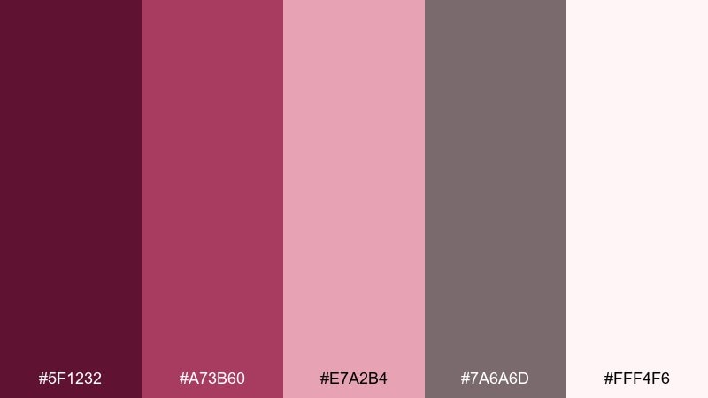
HEX: #5F1232 #A73B60 #E7A2B4 #7A6A6D #FFF4F6
Mood: friendly, stylish, social
Best for: instagram quote post
Mulberry and latte tones feel like a cozy caption with a confident edge. It suits quote tiles, announcements, and creator templates that need consistent brand color without shouting. Pair the near-white background with the mid berry for typography, then use blush for shapes and callouts. Tip: keep one strong accent per slide so the feed looks cohesive from a distance.
Image example of mulberry latte post generated using media.io
10) Cranberry Copper Cheer
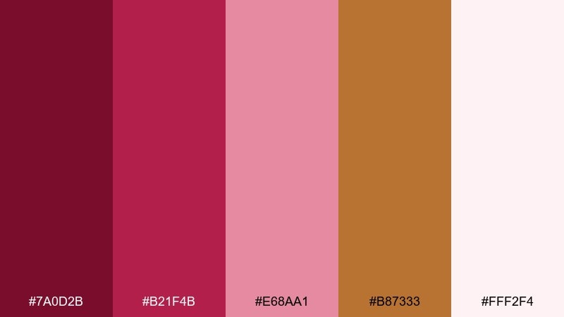
HEX: #7A0D2B #B21F4B #E68AA1 #B87333 #FFF2F4
Mood: festive, bold, warm
Best for: holiday poster
Cranberry with a copper kick feels celebratory, like lights reflecting on ribbons. Use it for holiday promos, winter events, and limited-time offers that should pop on a simple background. Pair copper as a metallic-like accent for borders or icons, and keep blush as the supporting field color. Tip: limit copper to small elements so it reads as a highlight, not a competing hue.
Image example of cranberry copper cheer generated using media.io

11) Deep Rose Garden Wash
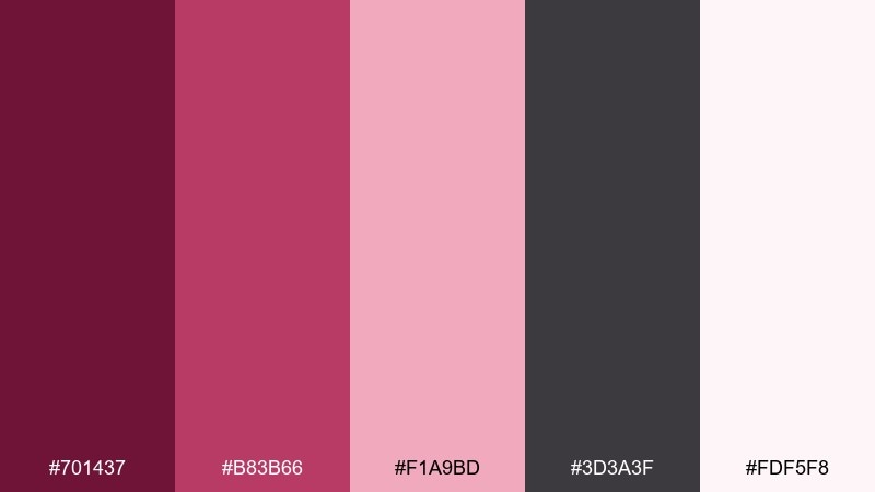
HEX: #701437 #B83B66 #F1A9BD #3D3A3F #FDF5F8
Mood: botanical, dreamy, delicate
Best for: botanical spring illustration
Deep rose garden shades feel like watercolor petals blooming into the page. It is perfect for spring prints, floral packaging, and event graphics that want softness with depth. Pair the darker rose for outlines and shadows, then wash large areas with the light blush for an airy finish. Tip: use a textured paper grain overlay to make the pinks look more natural and less flat.
Image example of deep rose garden wash generated using media.io
12) Plum Jam Dessert
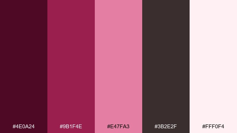
HEX: #4E0A24 #9B1F4E #E47FA3 #3B2E2F #FFF0F4
Mood: decadent, rich, indulgent
Best for: bakery product ad
Plum jam tones feel rich and glossy, like a fruit glaze under warm lights. Use it for dessert ads, bakery menus, or packaging where appetite appeal matters. Pair the deepest plum for type and logo marks, and let the pale pink act as a clean stage for product photography. Tip: keep highlights in the soft tint so the dark berry looks even more saturated by comparison.
Image example of plum jam dessert generated using media.io
13) Magenta Ink Midnight
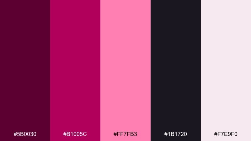
HEX: #5B0030 #B1005C #FF7FB3 #1B1720 #F7E9F0
Mood: electric, nightlife, bold
Best for: club event flyer
Magenta ink against midnight black feels like neon signage cutting through fog. Use it for club flyers, DJ promos, and ticket graphics where energy is the main message. Pair black as the dominant field with hot pink for the headline, then use the pale rose for supporting details and spacing. Tip: keep type large and geometric so the high contrast stays readable at a glance.
Image example of magenta ink midnight generated using media.io
14) Antique Pink Neutrals
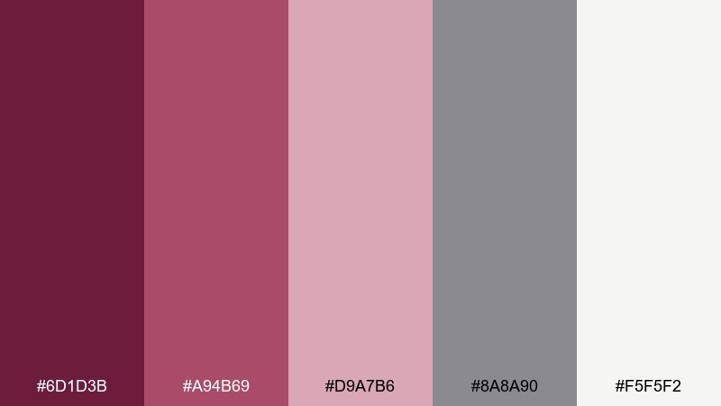
HEX: #6D1D3B #A94B69 #D9A7B6 #8A8A90 #F5F5F2
Mood: minimal, mature, professional
Best for: minimal portfolio website ui
Antique pink with soft neutrals feels composed, like linen and rose-tinted glass. It fits portfolios, studio sites, and case study pages that need personality without sacrificing clarity. Pair the cool gray for secondary text and dividers, while the deeper rose anchors nav and buttons. Tip: use the lightest neutral as the main background so the pink accents look intentional and modern.
Image example of antique pink neutrals generated using media.io
15) Rose Quartz Shadow
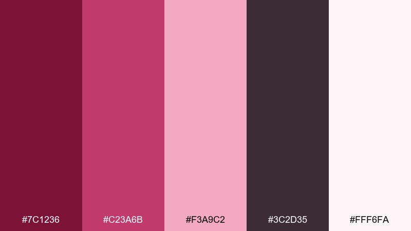
HEX: #7C1236 #C23A6B #F3A9C2 #3C2D35 #FFF6FA
Mood: glam, soft-focus, polished
Best for: makeup tutorial thumbnail
Rose quartz shadow feels like a soft-focus blush look with dramatic depth underneath. Use it for beauty thumbnails, creator branding, and product callouts where faces and text must stand out. Pair the deepest shade for outlines and title text, and keep the background pale so the mid pink reads clearly. Tip: add a subtle gradient from blush to near-white to make the layout feel more dimensional.
Image example of rose quartz shadow generated using media.io
16) Sangria Sunset Gradient
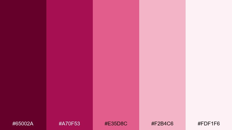
HEX: #65002A #A70F53 #E35D8C #F2B4C6 #FDF1F6
Mood: energetic, modern, optimistic
Best for: saas landing page background gradient
Sangria to sunset blush feels like a bold gradient sweeping across a hero section. It works for SaaS landing pages, campaign headers, and modern tech brands that want warmth instead of sterile blues. Pair the deepest sangria for top nav and key icons, then let the gradient carry the emotion behind your headline. Tip: keep UI components on pale cards so contrast stays accessible over the gradient.
Image example of sangria sunset gradient generated using media.io

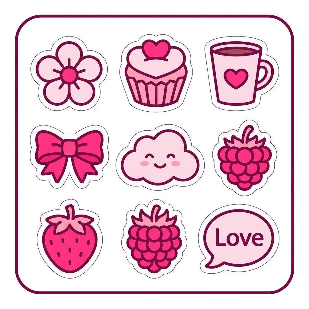
17) Berry Punch Stickers
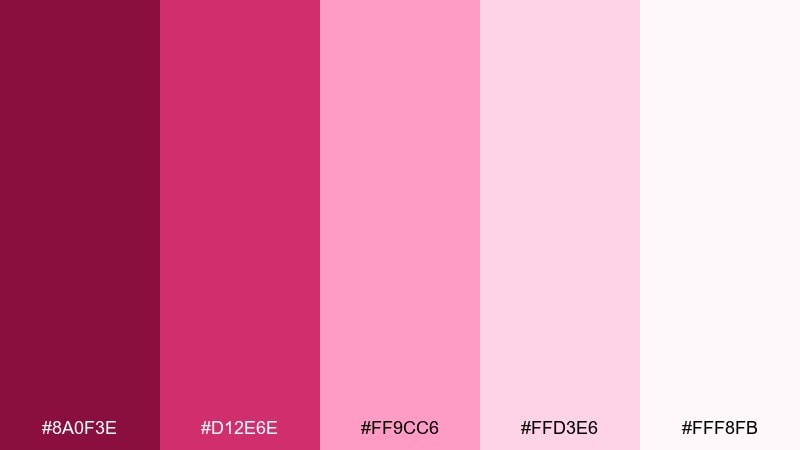
HEX: #8A0F3E #D12E6E #FF9CC6 #FFD3E6 #FFF8FB
Mood: playful, cute, bright
Best for: playful sticker set
Berry punch feels bubbly and fun, like candy wrappers and confetti. Use it for sticker packs, kids printables, and cheerful brand mascots that need high visibility. Pair the hot pink for outlines and key shapes, and use the pale tints for fill areas so the set stays light. Tip: repeat one accent color across all stickers to keep the collection cohesive.
Image example of berry punch stickers generated using media.io
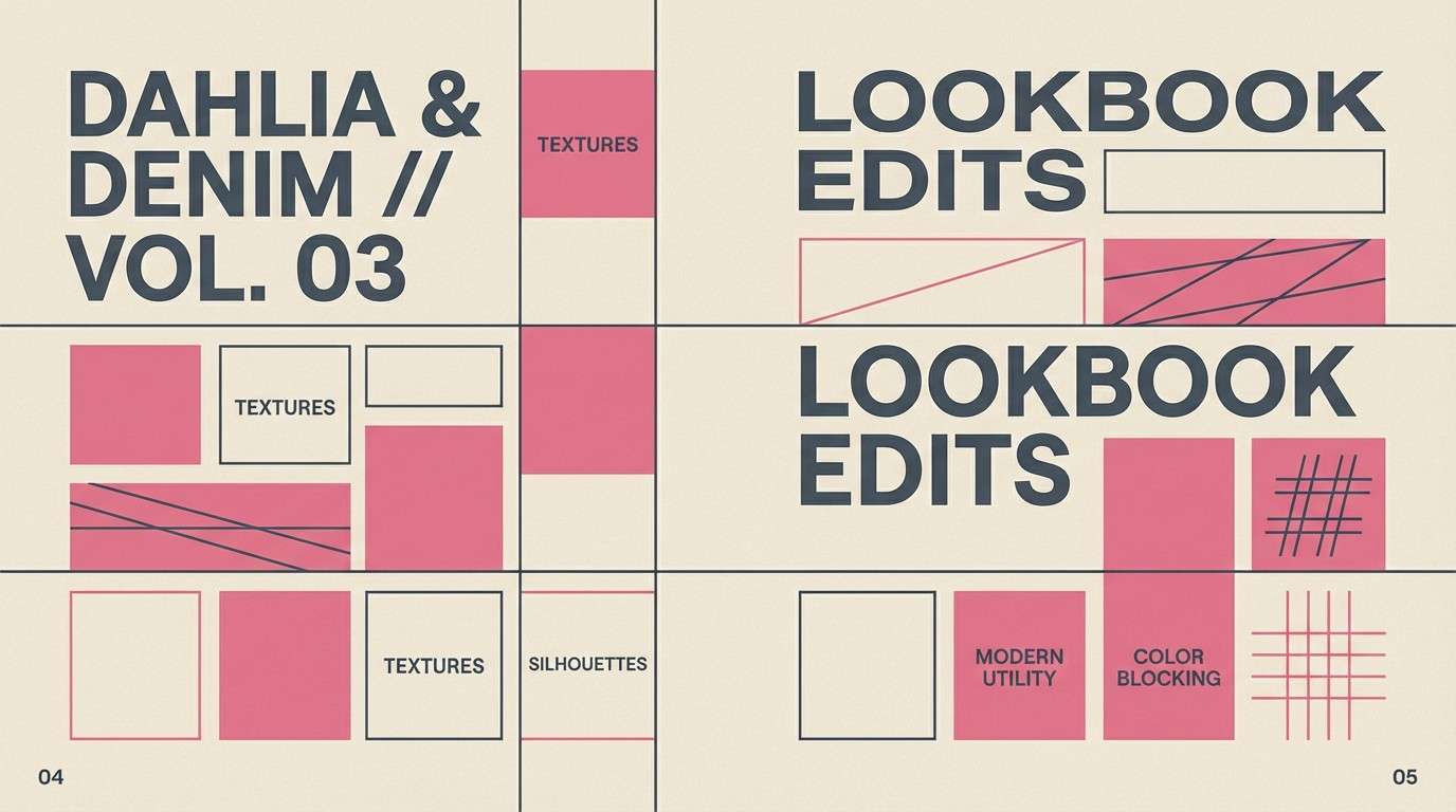
18) Dahlia Denim Street
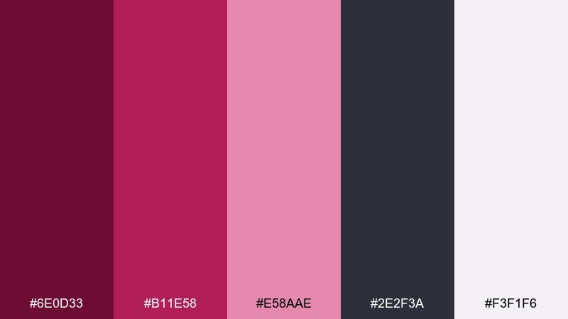
HEX: #6E0D33 #B11E58 #E58AAE #2E2F3A #F3F1F6
Mood: urban, cool, editorial
Best for: streetwear lookbook spread
Dahlia pink with denim-charcoal feels streetwise, like a graphic tee under city lights. It is great for lookbooks, drop announcements, and brand spreads that want edge without losing color. Pair the charcoal as the primary text color and grid, then use the richer pink for titles and tag-like elements. Tip: keep backgrounds light and let one saturated block carry the rhythm across the spread.
Image example of dahlia denim street generated using media.io
19) Fig Velvet Lounge
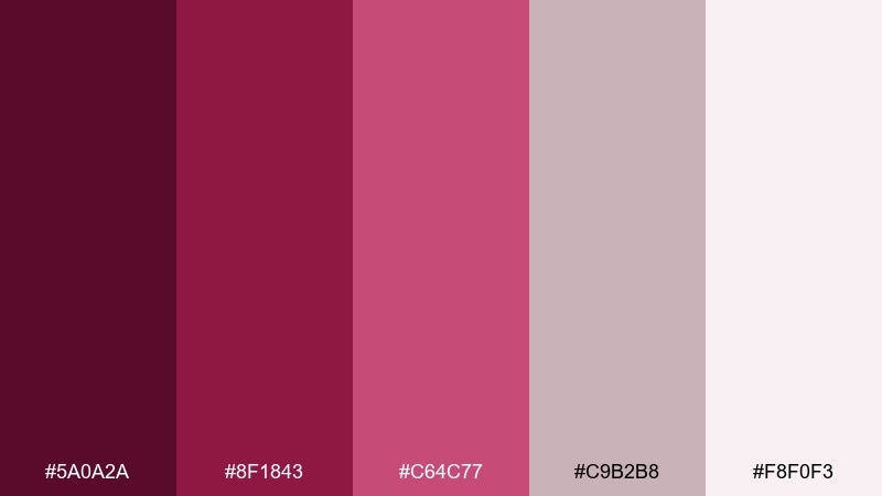
HEX: #5A0A2A #8F1843 #C64C77 #C9B2B8 #F8F0F3
Mood: intimate, upscale, welcoming
Best for: restaurant branding mockup
Fig velvet tones feel intimate and upscale, like a candlelit booth with plush upholstery. For a dark pink color palette that still reads sophisticated, use the deep fig for logos and the dusty blush for menus and loyalty cards. Pair the muted taupe-pink as a background neutral to keep the look warm instead of flashy. Tip: print menus on uncoated stock so the darker ink looks rich and tactile.
Image example of fig velvet lounge generated using media.io
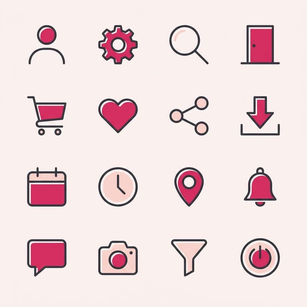
20) Hot Berry Minimal Icons
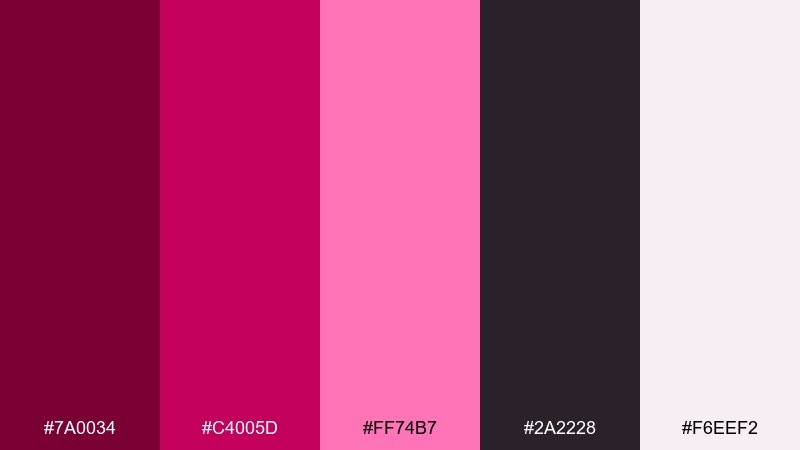
HEX: #7A0034 #C4005D #FF74B7 #2A2228 #F6EEF2
Mood: crisp, modern, high-contrast
Best for: icon set for mobile app
Hot berry on soft blush feels crisp, like sharp icons on a clean canvas. These dark pink color combinations are ideal for app icon sets, feature grids, and small UI elements that need instant recognition. Pair the charcoal for strokes and labels, and use the vivid pink sparingly for active states and badges. Tip: test icons at 24px and 16px to ensure the darkest lines stay clear on the pale background.
Image example of hot berry minimal icons generated using media.io
What Colors Go Well with Dark Pink?
Dark pink looks instantly elevated with deep neutrals like charcoal, near-black, and smoky plum—these add structure and keep layouts from feeling overly sweet. For a softer, editorial feel, pair it with warm whites, creams, and pale blush tints.
If you want a cozy, grounded palette, bring in warm browns (mocha, clay, terracotta) or muted taupes. For festive or premium accents, copper and rose-gold-like tones add a highlight effect without competing with the pink.
For modern UI, balance saturated berry actions with light surfaces and cool grays. That contrast makes dark pink buttons, badges, and charts feel intentional and readable.
How to Use a Dark Pink Color Palette in Real Designs
Start by assigning roles: pick one deep berry as your anchor (nav, headlines, key shapes), a mid pink for accents (buttons, labels), and a pale tint for background and whitespace. This keeps hierarchy clear while still feeling rich and expressive.
In print, test on warm white stock if you’re using blush tones, and consider matte finishes for a more premium, less “candy” look. In digital, avoid using the most saturated pink as a full background; keep it for focal points so it doesn’t overwhelm the content.
For accessibility, ensure sufficient contrast for text and interactive elements—dark pinks often need off-white surfaces or near-black type to stay readable across devices.
Create Dark Pink Palette Visuals with AI
Want to see these dark pink palettes in action before committing to a full design system? Generate quick mock visuals—post templates, UI screens, packaging shots, and hero headers—so you can validate mood, contrast, and hierarchy fast.
With Media.io Text-to-Image, you can paste a prompt, keep composition minimal, and iterate on lighting, texture, and layout until your palette feels “right” for your brand.
Try generating multiple variations (matte vs glossy, minimal vs editorial, warm vs cool lighting) to see how the same dark pink color scheme changes its personality.
Dark Pink Color Palette FAQs
-
What is considered a dark pink color?
Dark pink usually refers to deeper pinks with higher saturation and lower lightness, like berry, fuchsia, magenta, or rosewood. Common “dark pink” HEX examples include #C2185B or #8C003A. -
Is dark pink the same as magenta or fuchsia?
They overlap, but they’re not identical. Magenta often leans more purple and vivid, fuchsia is typically bright and punchy, while “dark pink” can include deeper, muted roses and berry tones that feel more mature. -
What neutral colors pair best with dark pink?
Charcoal, near-black, warm cream, and soft gray are the easiest neutrals to pair with dark pink. They preserve readability and make the pink feel more intentional and premium. -
How do I keep a dark pink palette from looking too sweet?
Anchor it with darker neutrals (charcoal/plum), add warm browns or clay tones, and use pale blush as whitespace instead of bright pink backgrounds. Limiting the most saturated pink to accents also helps. -
Can dark pink work for UI and dashboards?
Yes—use it as an accent for active states, key metrics, and badges while keeping surfaces light and typography dark. Palettes like Orchid Smoke UI are built to maintain hierarchy and contrast. -
What are good dark pink palette ideas for weddings?
Dusty fuchsia, blush, and warm whites are popular for invitations and stationery because they feel romantic but still elegant. Add muted mauve-gray for text to keep everything soft and readable. -
What finishes work best for dark pink in print packaging?
Matte or uncoated stocks make dark pinks feel richer and more tactile. If you add foil or spot gloss, apply it sparingly (often on the darkest swatch) to keep the look controlled and premium.
Next: Glitter Color Palette


