

A vineyard color palette sits at the intersection of wine-rich purples, grape-leaf greens, and cellar-warm neutrals. The result feels premium yet grounded, which is why it works across branding, interiors, and content graphics.
Below are vineyard color palette ideas with HEX codes plus AI-ready prompts you can use to generate matching visuals fast.
In this article
- Why Vineyard Palettes Work So Well
-
- barrel room dusk
- grape harvest morning
- crushed berry velvet
- old vine stone
- rosy tasting notes
- leafy trellis
- cork and cabernet
- sunlit rows
- pruned branches
- black grape ink
- wildflower at the vines
- cellar door
- pressed merlot
- dusty winery road
- evening pergola
- ripe fig and sage
- terracotta trellis
- mulch and moonlight
- autumn crush
- silk grenache
- crisp chardonnay pairing
- What Colors Go Well with Vineyard?
- How to Use a Vineyard Color Palette in Real Designs
- Create Vineyard Palette Visuals with AI
Why Vineyard Palettes Work So Well
Vineyard tones feel naturally “designed” because they’re pulled from a cohesive real-world scene: deep grape skins, dusty canopies, oak barrels, clay soil, and warm sunlight. That built-in harmony makes it easy to create palettes that look intentional.
They also balance contrast beautifully: dark plums and merlots handle typography and drama, while creams, linens, and straw golds provide breathable negative space. A touch of leaf green adds freshness without pushing the palette into bright spring territory.
Most importantly, vineyard palettes communicate story—heritage, craft, and atmosphere—so they’re excellent for brands that want premium warmth rather than stark minimalism.
20+ Vineyard Color Palette Ideas (with HEX Codes)
1) Barrel Room Dusk
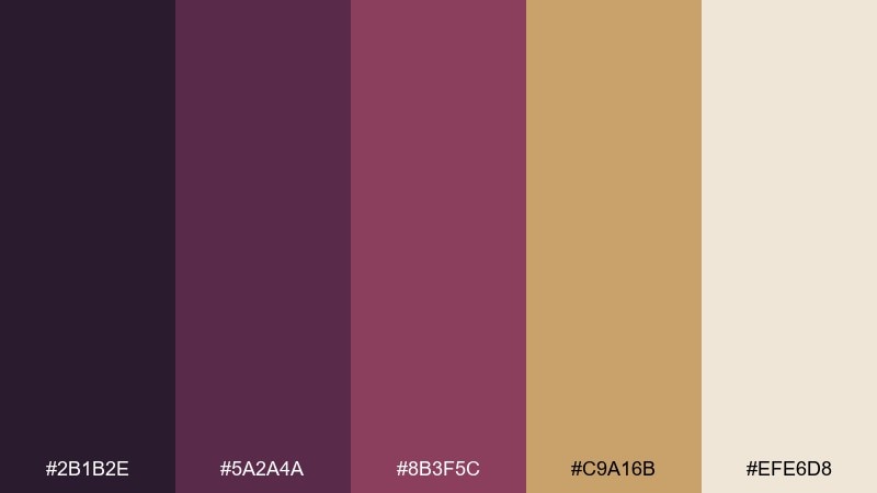
HEX: #2b1b2e #5a2a4a #8b3f5c #c9a16b #efe6d8
Mood: moody, warm, refined
Best for: wine label packaging
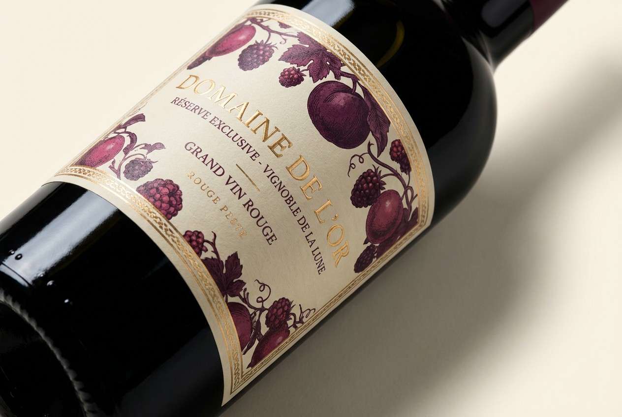
Moody and candlelit, it evokes oak barrels, dried roses, and late tastings after sunset. The deep plum and mulled-berry tones feel premium, while the honeyed gold adds a crafted warmth. Use it on label systems, foil accents, and hero typography where contrast matters. Pair the cream as the primary background and reserve the gold for small details to keep it elegant.
Image example of barrel room dusk generated using media.io
Media.io is an online AI studio for creating and editing video, image, and audio in your browser.

2) Grape Harvest Morning
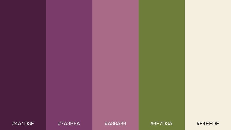
HEX: #4a1d3f #7a3b6a #a86a86 #6f7d3a #f4efdf
Mood: fresh, rustic, optimistic
Best for: farm-to-table restaurant branding
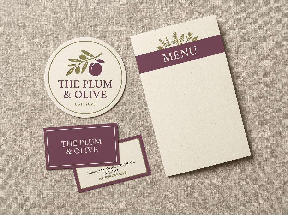
Fresh and rustic, it brings to mind grape crates, leafy canopies, and a bright morning breeze. The plum family keeps it rooted, while the olive green makes the pairing feel agricultural and honest. These vineyard color combinations work beautifully for logos, menus, and signage that need warmth without feeling heavy. Use the light cream for whitespace and keep the green as a secondary accent for stamps or icons.
Image example of grape harvest morning generated using media.io
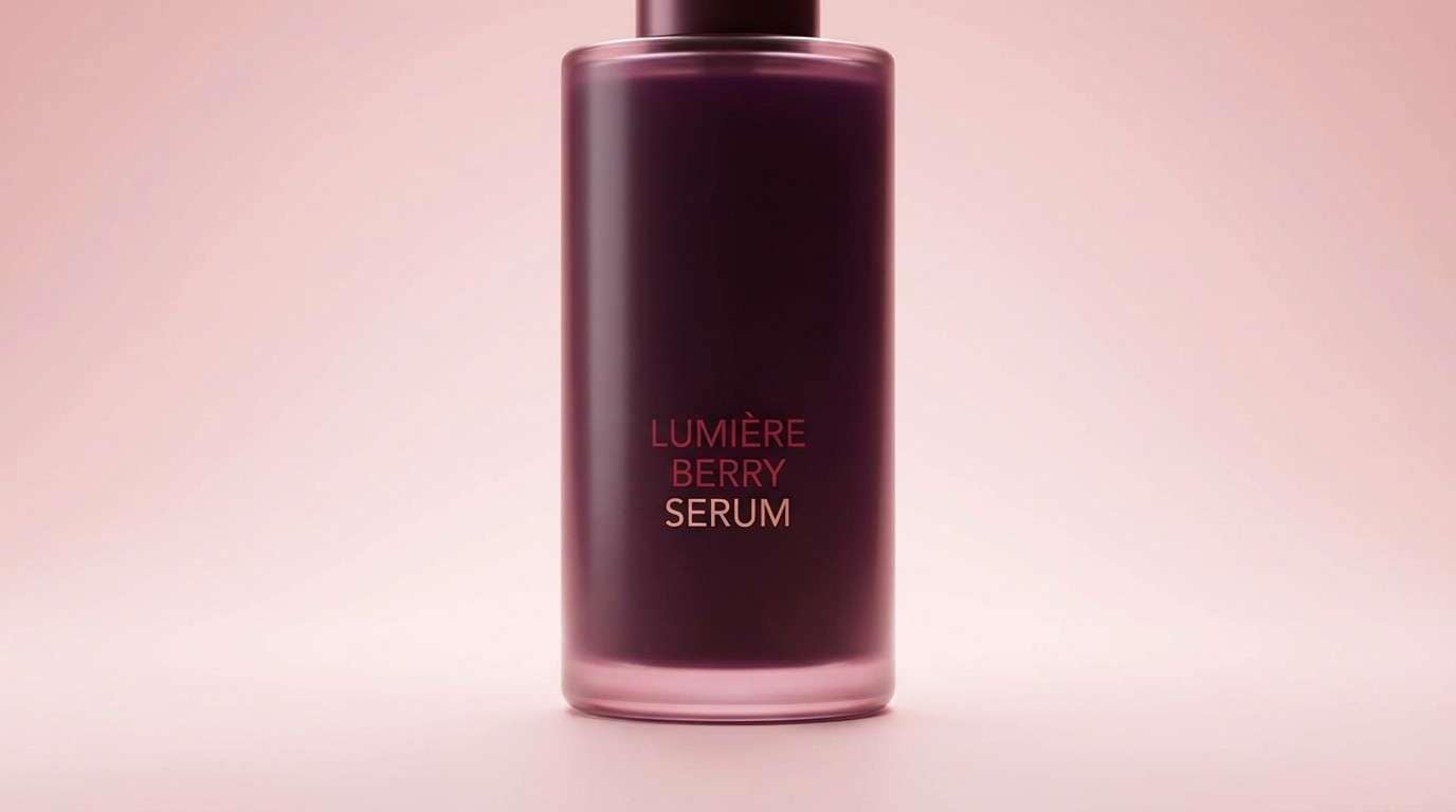
3) Crushed Berry Velvet
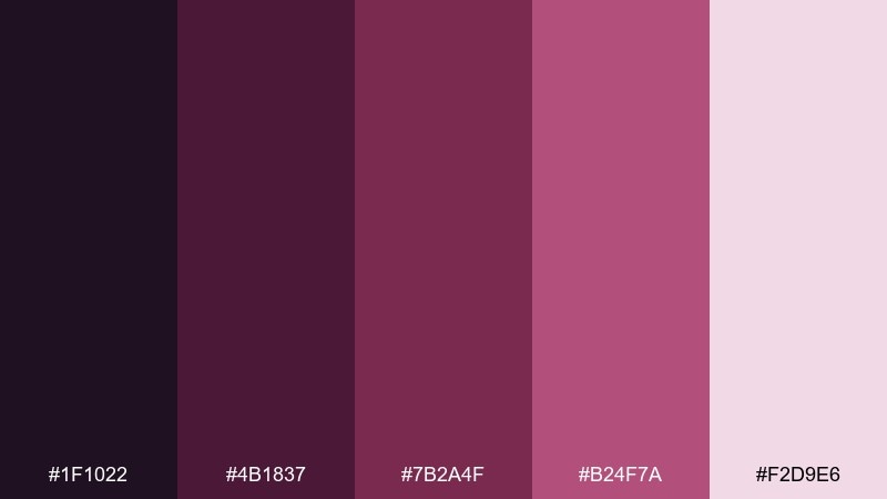
HEX: #1f1022 #4b1837 #7b2a4f #b24f7a #f2d9e6
Mood: luxurious, bold, romantic
Best for: beauty product ad creative
Luxurious and velvety, it feels like crushed berries and satin fabric under low light. The near-black plum gives depth, while the pink-rose lift keeps it modern and wearable. Use it for high-contrast headlines, gradient backgrounds, and glossy product callouts. A soft blush backdrop prevents the dark tones from overpowering small formats like social ads.
Image example of crushed berry velvet generated using media.io
4) Old Vine Stone
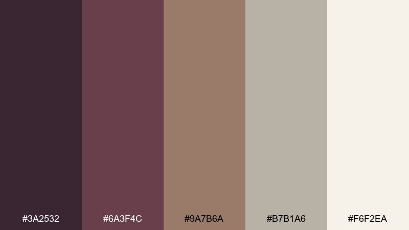
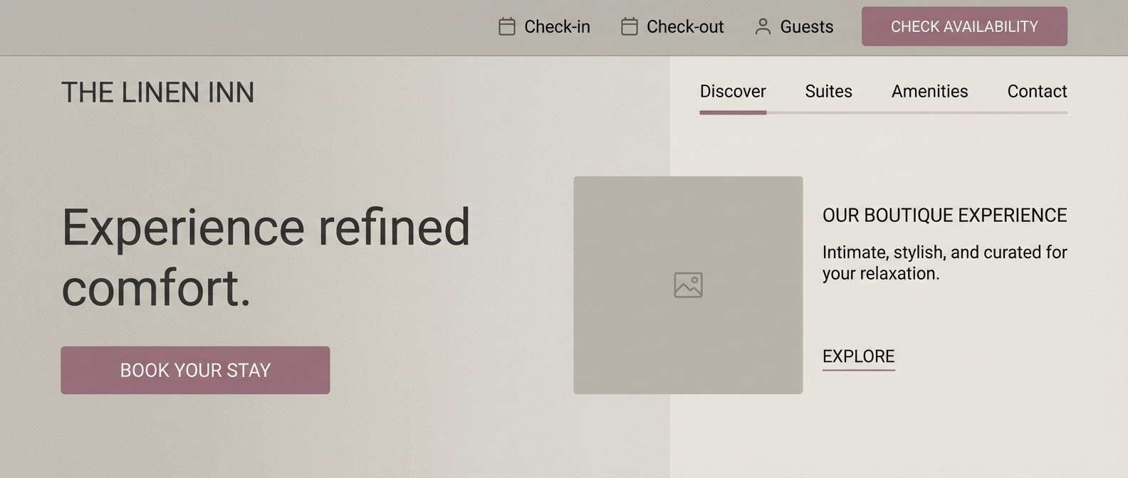
HEX: #3a2532 #6a3f4c #9a7b6a #b7b1a6 #f6f2ea
Mood: grounded, timeless, calm
Best for: boutique hotel website UI
Grounded and timeless, it recalls stone walls, weathered wood, and quiet tasting rooms. The muted mauves read sophisticated on screens, and the warm grays make layouts feel breathable. Apply it to a boutique UI with soft cards, subtle dividers, and understated buttons. Keep the darkest shade for type and use the pale linen tone for large backgrounds to maintain clarity.
Image example of old vine stone generated using media.io
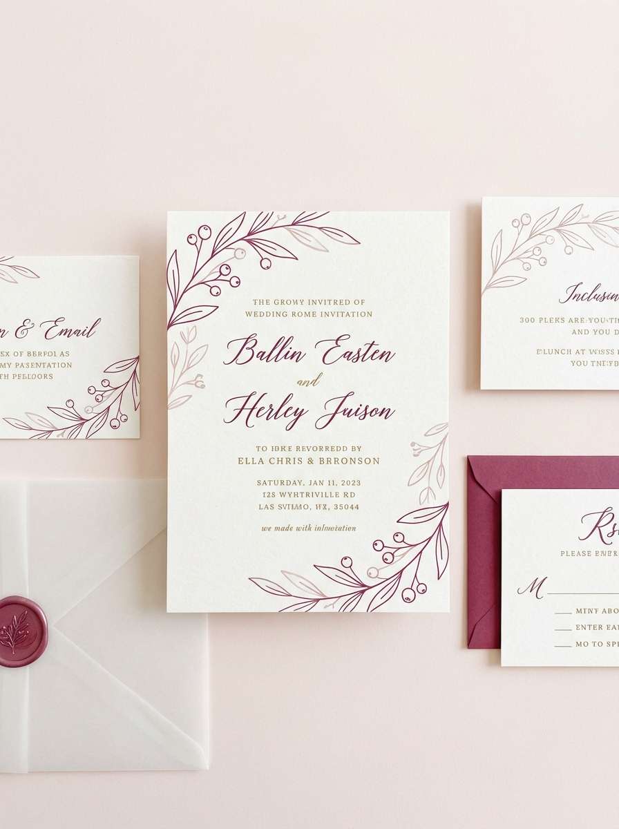
5) Rosy Tasting Notes
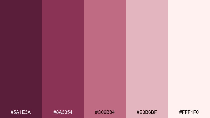
HEX: #5a1e3a #8a3354 #c06b84 #e3b6bf #fff1f0
Mood: soft, inviting, feminine
Best for: wedding invitation suite
Soft and inviting, it suggests rosé flights, handwritten notes, and petals scattered on linen. The berry core keeps the look mature, while the pale blushes bring airy romance. It suits invitations, RSVP cards, and monograms with a modern serif. For print, use the darkest shade for text and keep the lightest tint for the paper field to avoid muddy contrast.
Image example of rosy tasting notes generated using media.io
6) Leafy Trellis
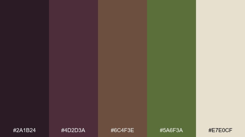
HEX: #2a1b24 #4d2d3a #6c4f3e #5a6f3a #e7e0cf
Mood: earthy, natural, cozy
Best for: kitchen interior mood board
Earthy and cozy, it feels like trellis shadows, clay pots, and a wooden table set for supper. The cocoa-brown midtone bridges the plum and the leaf green, making the mix easy to live with. Use it for mood boards, paint coordination, or cozy lifestyle content where natural materials shine. Tip: let the green appear in small repeats like textiles or foliage so the room stays warm, not forest-heavy.
Image example of leafy trellis generated using media.io
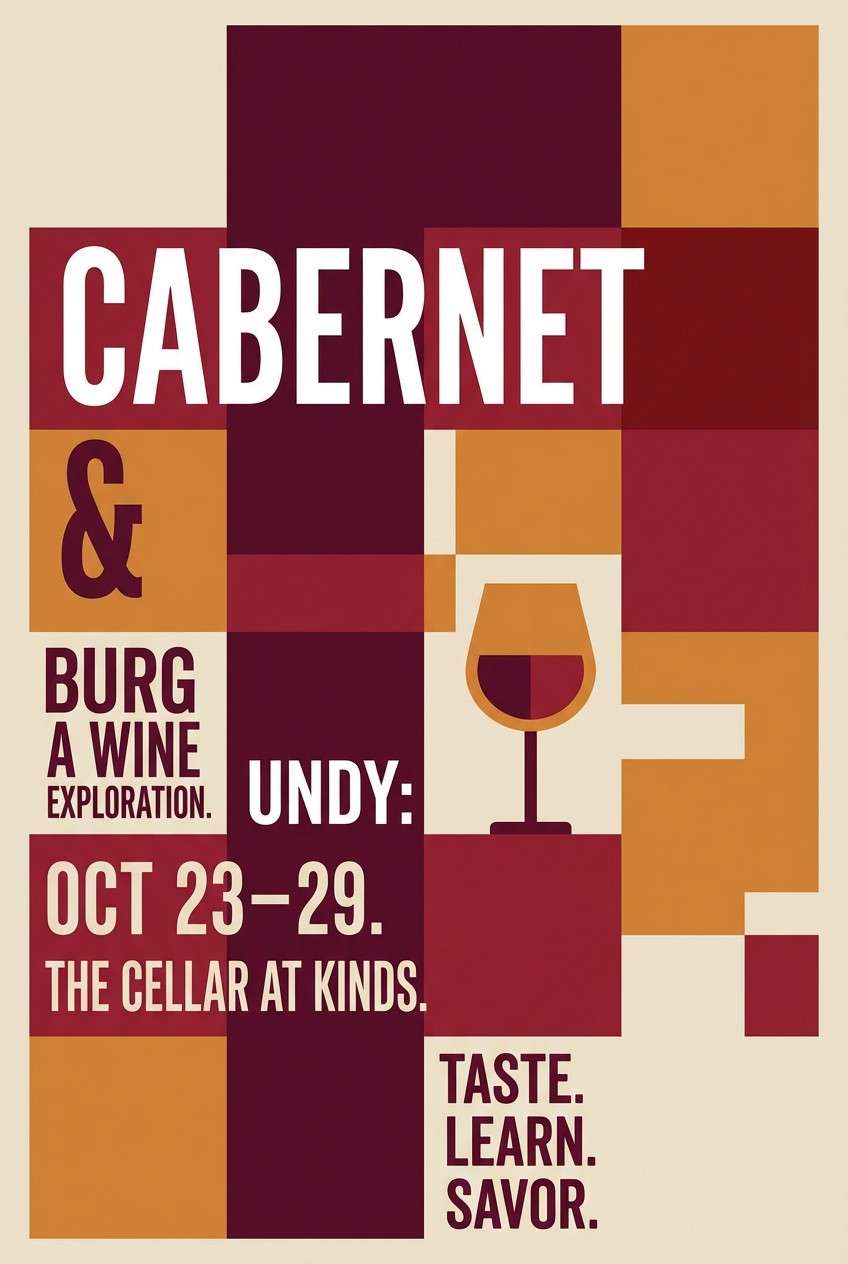
7) Cork and Cabernet
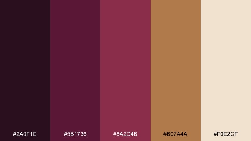
HEX: #2a0f1e #5b1736 #8a2d4b #b07a4a #f0e2cf
Mood: rich, classic, celebratory
Best for: event poster for wine night
Rich and classic, it brings cabernet stains, cork texture, and candlelight chatter to mind. The caramel tone adds a friendly, approachable warmth against the darker reds. Use it on posters and digital banners with bold type and simple icons. Keep the light beige as the background for readability, then punch in the darkest shade for titles and the caramel for date blocks.
Image example of cork and cabernet generated using media.io
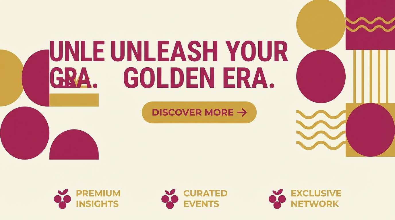
8) Sunlit Rows
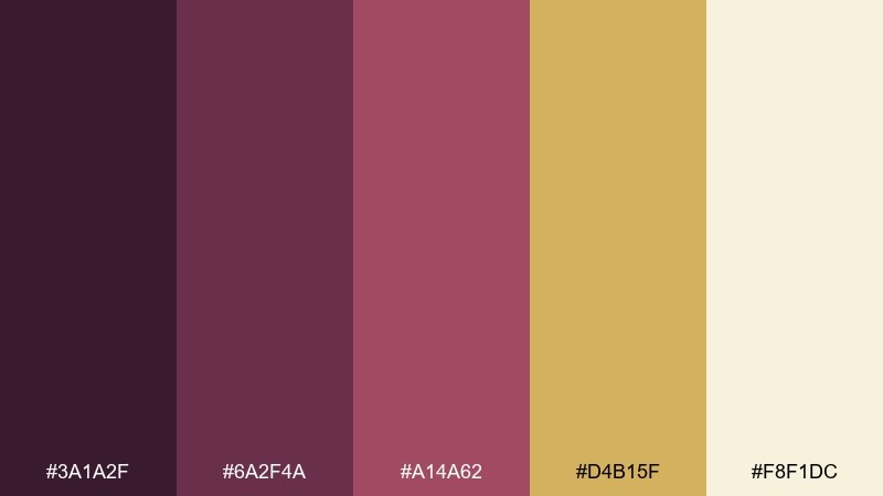
HEX: #3a1a2f #6a2f4a #a14a62 #d4b15f #f8f1dc
Mood: bright, golden, confident
Best for: brand landing page hero
Bright and golden, it evokes sun hitting vineyard rows and warm dust in the air. The berry-magenta notes stay energetic, while the gold reads optimistic and premium. It works best for landing page heroes, call-to-action areas, and feature highlights. Use the cream for generous space and limit the gold to one strong focal element so it feels like sunlight, not glitter.
Image example of sunlit rows generated using media.io
9) Pruned Branches
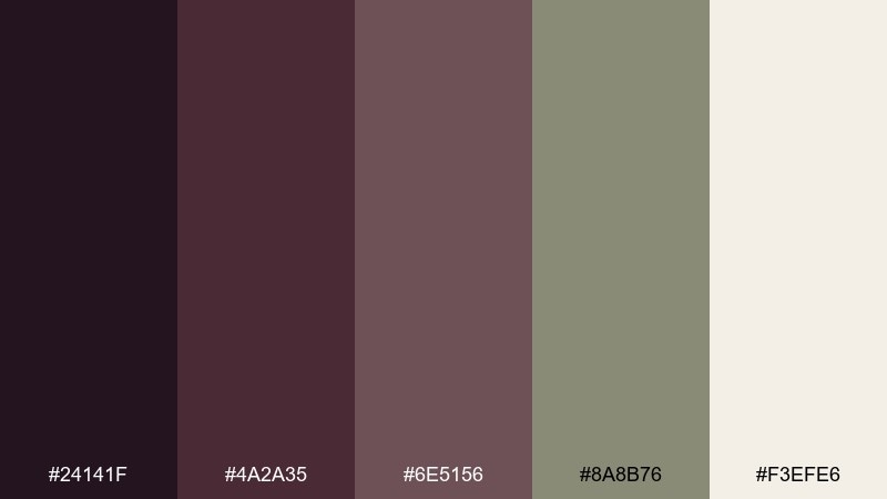
HEX: #24141f #4a2a35 #6e5156 #8a8b76 #f3efe6
Mood: quiet, mature, understated
Best for: editorial magazine layout
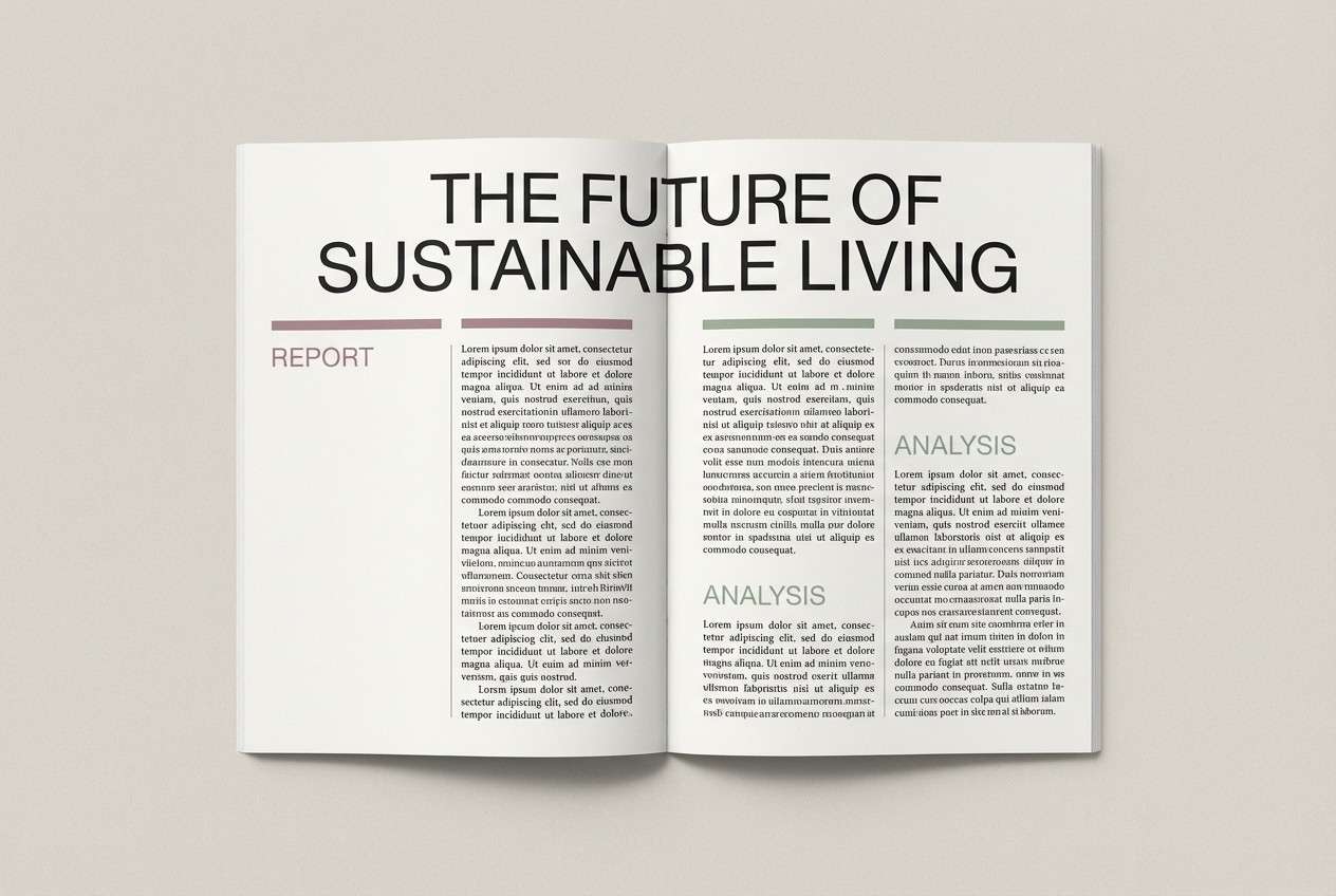
Quiet and mature, it suggests pruned branches, foggy mornings, and well-worn notebooks. The desaturated mauves and soft sage-gray feel editorial without looking cold. Use it for long reads, print features, and minimalist lookbooks where typography leads. Tip: keep body text in the darkest shade and use the sage tone for captions or pull-quote bars.
Image example of pruned branches generated using media.io
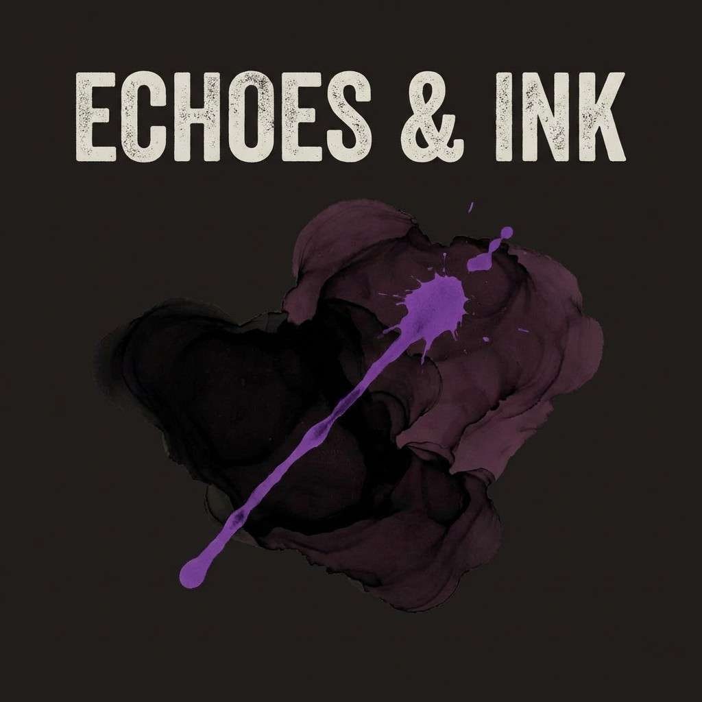
10) Black Grape Ink
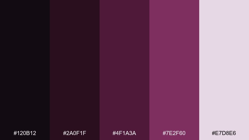
HEX: #120b12 #2a0f1f #4f1a3a #7e2f60 #e7d8e6
Mood: dramatic, sleek, modern
Best for: music album cover art
Dramatic and sleek, it feels like black grape ink spilling across paper under a spotlight. The electric plum highlight gives edge without turning neon, especially against the misty lavender. It suits album covers, nightlife promos, and bold creator branding. Keep the light lavender for negative space and use the brightest purple only for one focal element like the title.
Image example of black grape ink generated using media.io
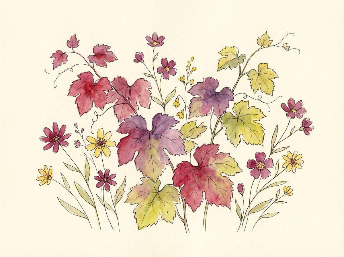
11) Wildflower at the Vines
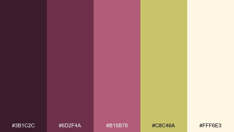
HEX: #3b1c2c #6d2f4a #b15b78 #c8c46a #fff6e3
Mood: playful, sunny, artistic
Best for: botanical watercolor illustration
Playful and sunny, it calls up wildflowers growing between vine rows and a sketchbook on a picnic blanket. The rosy berry tones feel friendly, and the yellow-green adds a springy lift. Use it for illustrated packaging, stationery, and botanical prints that need warmth without pastels. Tip: paint the cream as the paper base and layer the berry shades in translucent washes for depth.
Image example of wildflower at the vines generated using media.io
12) Cellar Door
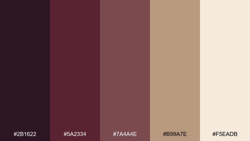
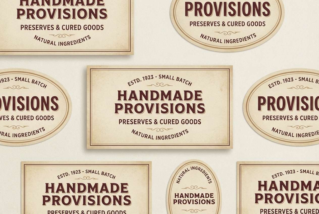
HEX: #2b1622 #5a2334 #7a4a4e #b99a7e #f5eadb
Mood: rustic, welcoming, heritage
Best for: artisan food packaging
Rustic and welcoming, it evokes a cellar door, aged wood, and the aroma of preserves. The dusty rose-brown midtones make the palette feel handcrafted, not overly polished. It is ideal for jam labels, olive oil bottles, or small-batch goods with a heritage story. Use the cream as the label base and keep the darkest shade for stamps, batch numbers, and barcodes.
Image example of cellar door generated using media.io
13) Pressed Merlot
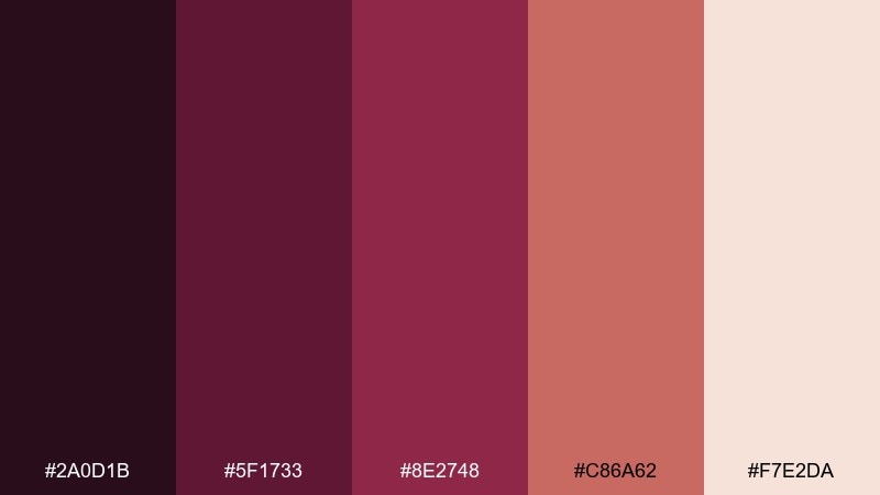
HEX: #2a0d1b #5f1733 #8e2748 #c86a62 #f7e2da
Mood: bold, passionate, energetic
Best for: social media promo templates
Bold and energetic, it feels like pressed merlot, ripe fruit, and fast-moving music at a launch. The coral-rose accent keeps the dark reds from getting too formal. Use these vineyard color combinations for punchy promo templates, reels covers, and sale announcements. Tip: set the background to blush and reserve the deepest shade for large text so it stays readable on mobile.
Image example of pressed merlot generated using media.io
14) Dusty Winery Road
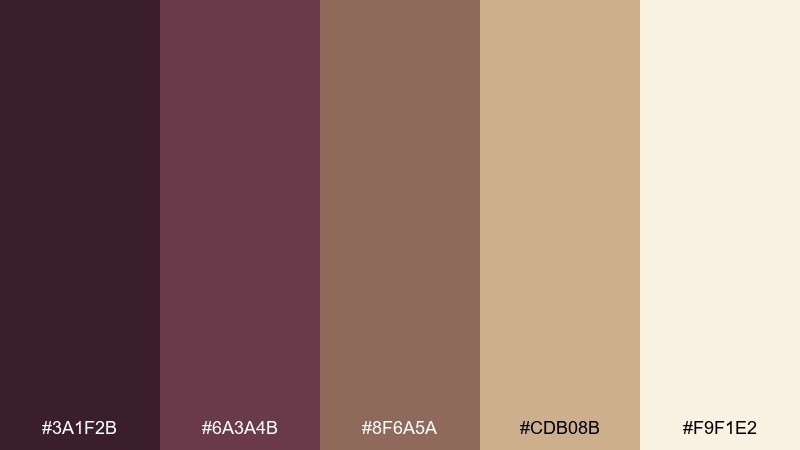
HEX: #3a1f2b #6a3a4b #8f6a5a #cdb08b #f9f1e2
Mood: soft, nostalgic, sunbaked
Best for: travel blog header design
Soft and nostalgic, it suggests a dusty road leading to a tasting stop at golden hour. The warm tan and sand tones keep things airy, while the muted mauve adds a romantic edge. Great for blog headers, cover images, and light brand systems that want a vintage feel. Tip: use the tan as a large color field and place the mauve only in headings or badges for a gentle contrast.
Image example of dusty winery road generated using media.io
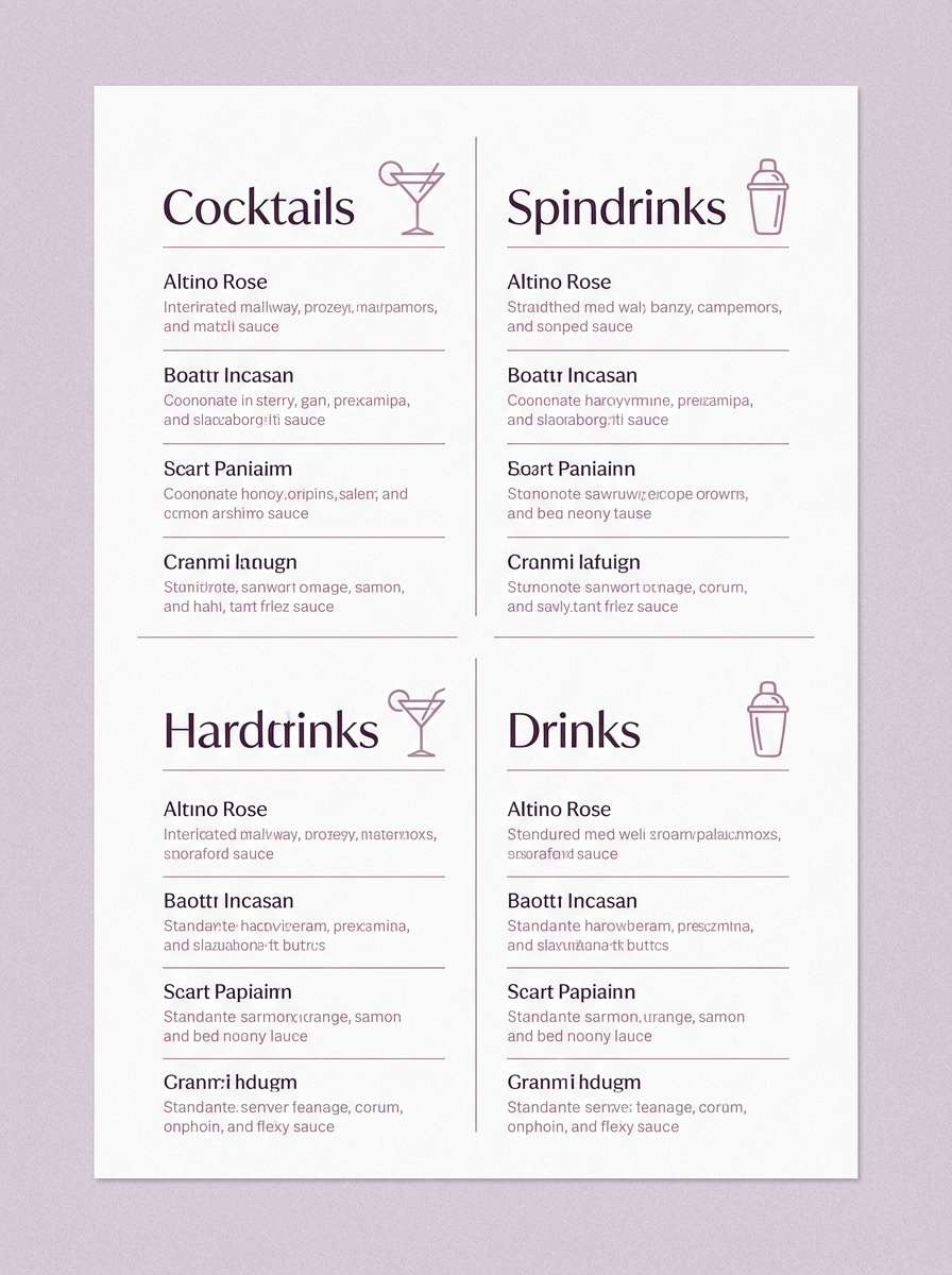
15) Evening Pergola
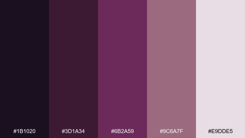
HEX: #1b1020 #3d1a34 #6b2a59 #9c6a7f #e9dde5
Mood: intimate, romantic, airy
Best for: cocktail menu design
Intimate and airy, it brings to mind a pergola at night with soft lantern glow. The layered purples create depth for menus and typography-heavy layouts. A vineyard color palette like this shines on cocktail lists, wine pairings, and small-format prints. Tip: use the palest tint for the paper area and keep body copy in the second-darkest tone to avoid harsh black.
Image example of evening pergola generated using media.io
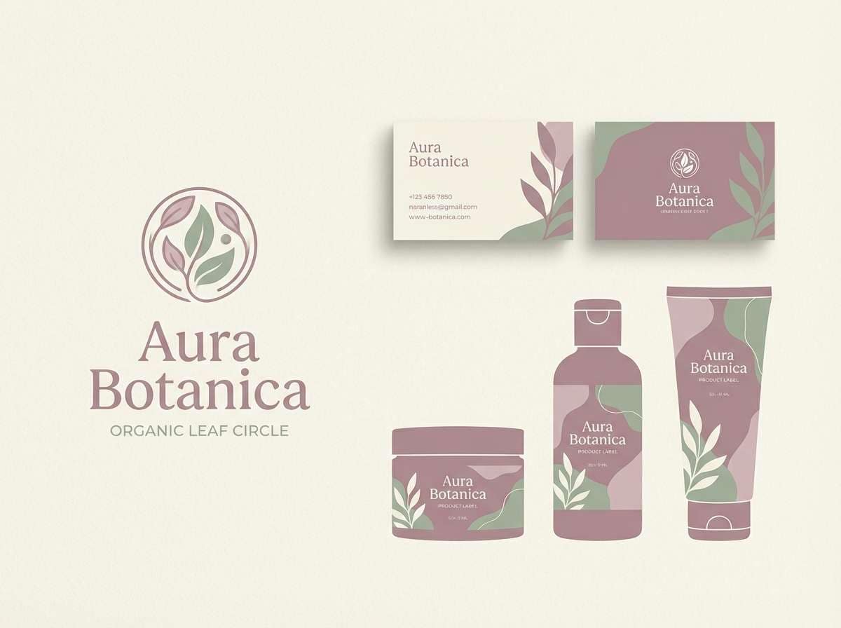
16) Ripe Fig and Sage
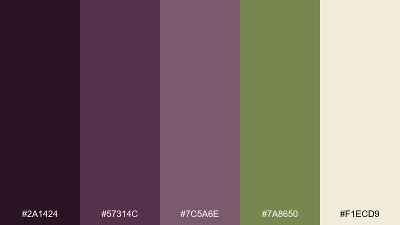
HEX: #2a1424 #57314c #7c5a6e #7a8650 #f1ecd9
Mood: balanced, botanical, calm
Best for: spa brand identity
Balanced and botanical, it feels like ripe figs, sage steam, and quiet rituals. The softened mauves keep it soothing, and the herb green adds a clean, natural cue. Use it for spa identities, wellness packaging, and calming web sections where trust matters. Tip: keep the green for small signifiers like icons and seals, and lean on the cream to maintain serenity.
Image example of ripe fig and sage generated using media.io
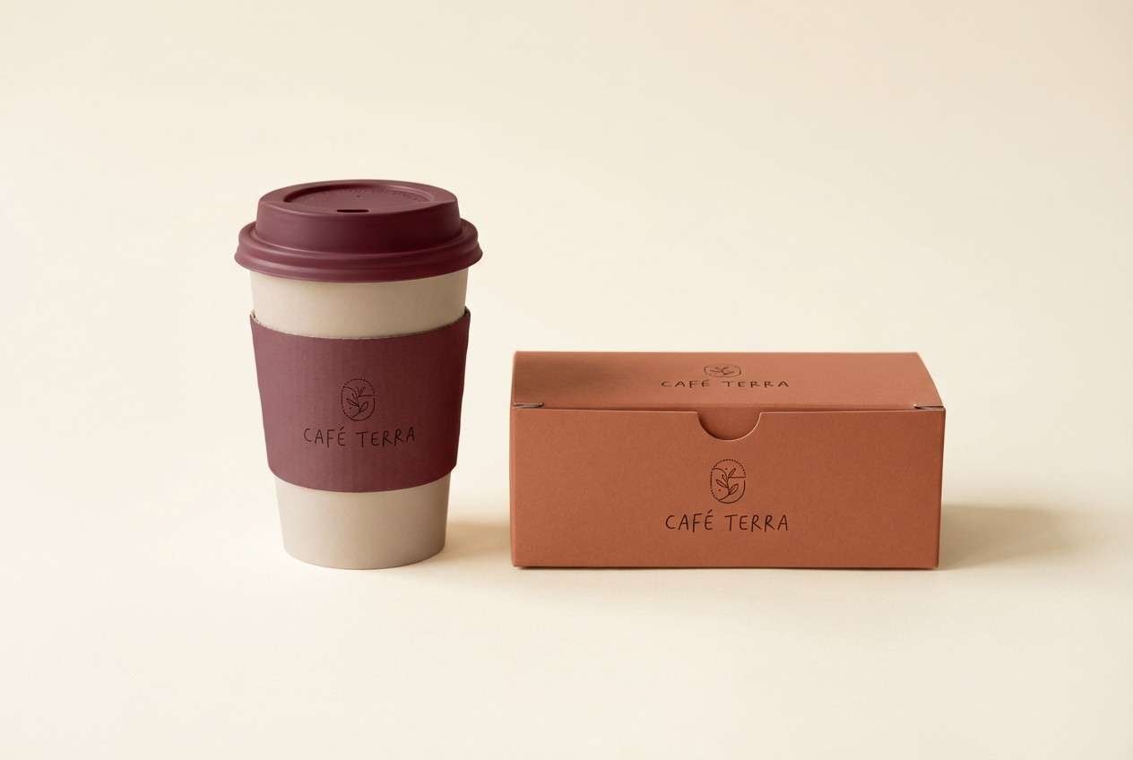
17) Terracotta Trellis
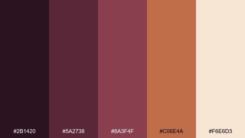
HEX: #2b1420 #5a2738 #8a3f4f #c06e4a #f6e6d3
Mood: warm, Mediterranean, friendly
Best for: cafe packaging and cups
Warm and friendly, it recalls terracotta pots, trellis vines, and a sunlit courtyard. The clay-orange accent makes the deeper wine tones feel approachable and social. It is a strong fit for cafe cups, pastry boxes, and takeaway stickers. Tip: print the terracotta on uncoated stock for a natural look, and keep the darkest shade for logos and QR codes.
Image example of terracotta trellis generated using media.io
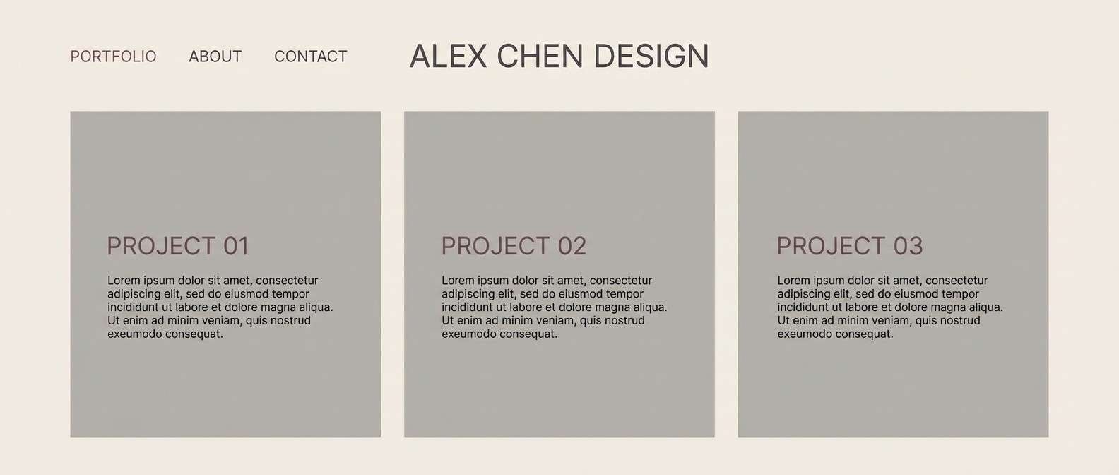
18) Mulch and Moonlight
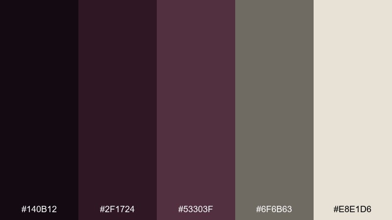
HEX: #140b12 #2f1724 #53303f #6f6b63 #e8e1d6
Mood: mysterious, grounded, minimalist
Best for: portfolio website UI
Mysterious and grounded, it feels like moonlight over dark soil and quiet rows of vines. The charcoal-rose tones create a refined neutral base that still feels distinctive. Use it for a portfolio UI, case study pages, and typography-forward layouts. Tip: keep the light neutral for backgrounds and use the mid rose-gray for cards so the interface stays calm and readable.
Image example of mulch and moonlight generated using media.io
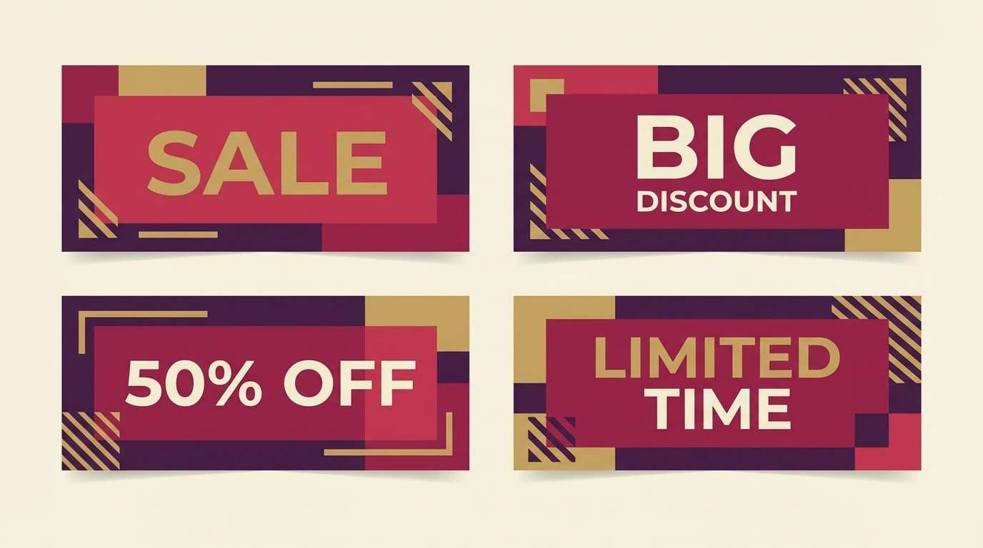
19) Autumn Crush
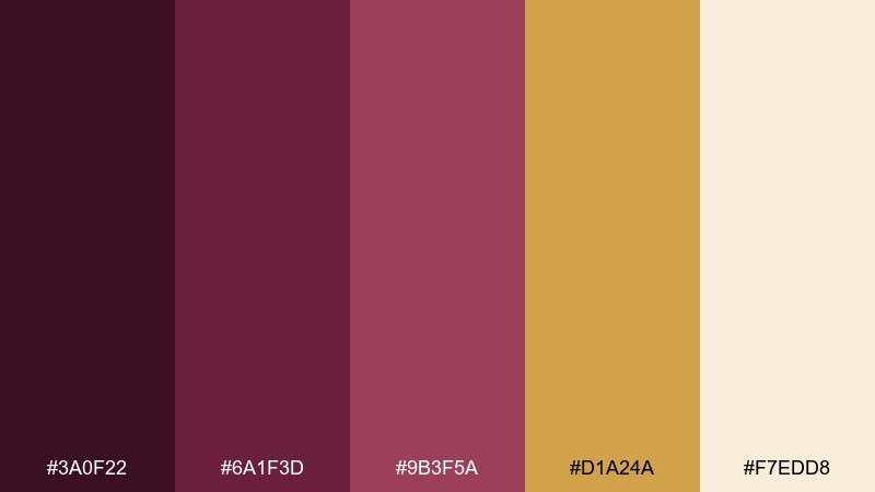
HEX: #3a0f22 #6a1f3d #9b3f5a #d1a24a #f7edd8
Mood: festive, seasonal, confident
Best for: fall sale banner set
Festive and seasonal, it looks like grape crush, golden leaves, and a hint of spice in the air. The warm gold turns the berry tones into a celebratory mix that reads instantly autumnal. Use these vineyard color combinations for fall sale banners, email headers, and storefront graphics. Tip: build two-tone blocks with berry and cream, then use the gold only for price tags or key calls to action.
Image example of autumn crush generated using media.io
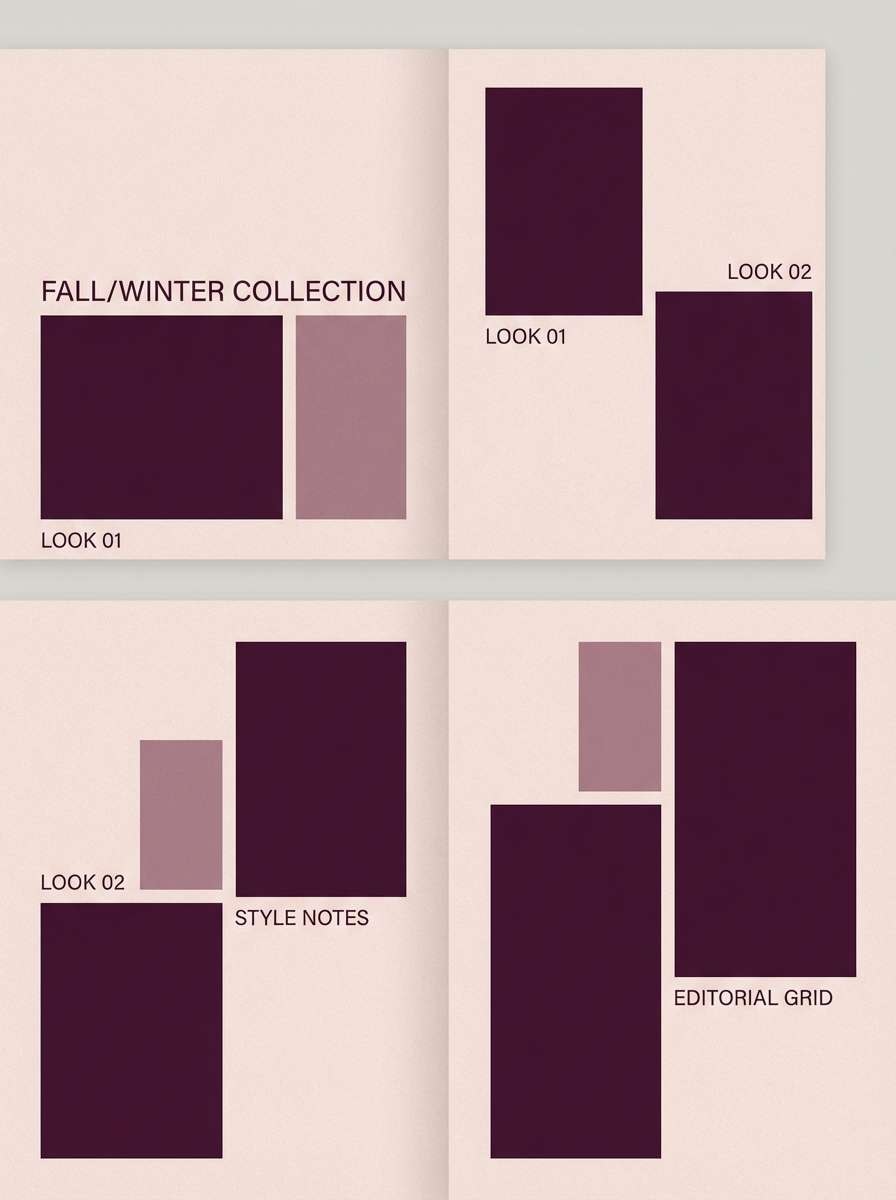
20) Silk Grenache
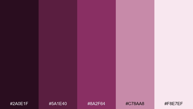
HEX: #2a0e1f #5a1e40 #8a2f64 #c78aa8 #f8e7ef
Mood: chic, modern, romantic
Best for: fashion lookbook layout
Chic and silky, it evokes grenache notes, soft scarves, and polished studio lighting. The brightened mauve-pink makes the deeper purples feel contemporary instead of heavy. It works for lookbooks, launch decks, and stylish social carousels. Tip: keep gradients subtle and let the palest tint carry most of the page so the accents feel intentional.
Image example of silk grenache generated using media.io
21) Crisp Chardonnay Pairing
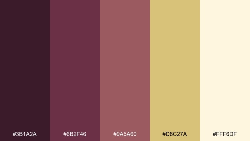
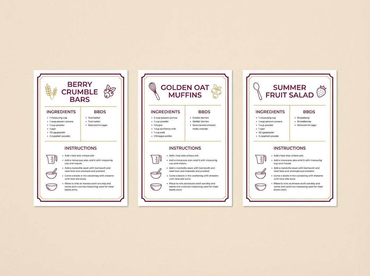
HEX: #3b1a2a #6b2f46 #9a5a60 #d8c27a #fff6df
Mood: bright, approachable, balanced
Best for: recipe card templates
Bright and approachable, it feels like a crisp pour alongside buttery light and fresh herbs. The pale cream and straw gold give plenty of whitespace, while the berry mids add personality. It is a flexible vineyard color combination for recipe cards, food bloggers, and printable kitchen guides. Tip: use the gold for section headers and keep body text in the darkest shade for clean readability.
Image example of crisp chardonnay pairing generated using media.io
What Colors Go Well with Vineyard?
Vineyard palettes pair best with warm neutrals (linen, cream, oat, sand) because they soften deep grape and wine hues while keeping designs readable. Gold and caramel accents also amplify the “barrel-aged” warmth without feeling too yellow.
For contrast, lean into near-black plum or espresso browns instead of pure black—this keeps the palette cohesive and more premium. If you want a botanical angle, use olive or sage green as a secondary accent rather than a dominant field.
For modern graphics, pale blush or misty lavender works as a light background that still feels related to berry tones, especially in ads, invitations, and editorial layouts.
How to Use a Vineyard Color Palette in Real Designs
Start with a neutral base (cream/linen) for backgrounds, then assign your darkest plum/merlot to text and key UI elements so contrast stays clean. Use mid berry tones for secondary headings, dividers, and subtle gradients.
Keep accent colors intentional: gold/caramel is strongest as a highlight for badges, pricing, foil-like details, or call-to-action emphasis. Greens work best as small repeats (icons, stamps, leaf motifs) to suggest “vineyard” without turning the design into a forest theme.
For print, test darker wine tones on uncoated stock—they can look richer but also darker than expected. If needed, shift body copy to a deep plum instead of the darkest near-black to avoid heavy blocks.
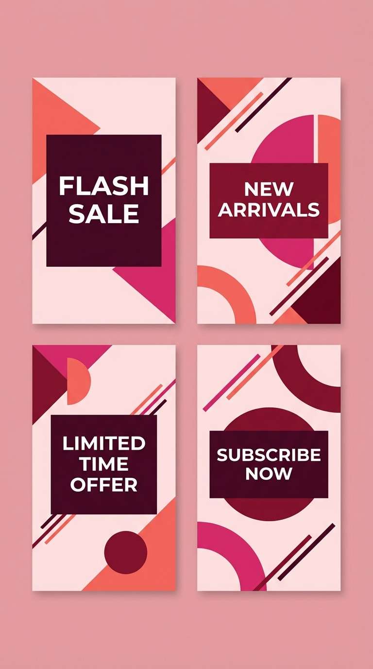
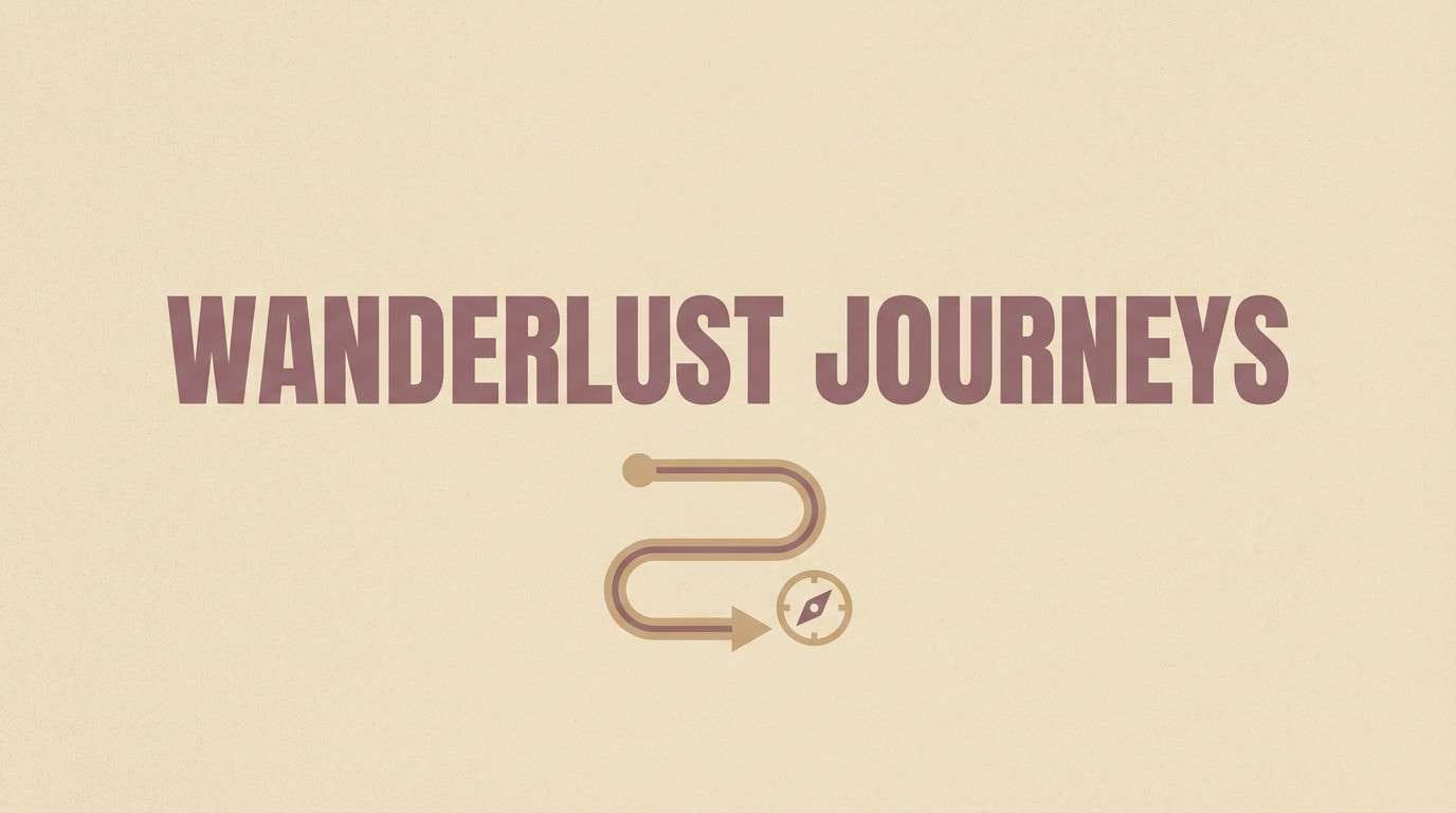
Create Vineyard Palette Visuals with AI
If you already have HEX codes, you can generate on-brand images by describing the scene (label mockup, menu, UI hero, invitation) and calling out the dominant tones like plum, berry, cream, olive, and gold. This keeps the output aligned with your palette instead of random color drift.
Use the prompts in the examples above as templates—swap the subject (poster, packaging, social template) while keeping the palette language consistent. Then refine with one clear focal point color (like gold) for a premium “sunlit vineyard” feel.
When you’re happy with the direction, create multiple aspect ratios (square, story, banner) so your vineyard palette stays consistent across platforms.
Vineyard Color Palette FAQs
-
What is a vineyard color palette?
A vineyard color palette is a set of colors inspired by vineyards and winemaking—typically grape purples, wine reds, leafy greens, and warm neutrals like cream, tan, and barrel-gold. -
Are vineyard colors warm or cool?
They’re usually warm-leaning overall because they include caramel, terracotta, and creamy neutrals, but many vineyard palettes balance that warmth with cool plums and mauves. -
What HEX codes feel most “wine-inspired”?
Deep plum and merlot tones (like #2b1b2e, #5b1736, #8a2d4b) read instantly wine-inspired, especially when paired with a soft cream background (like #efe6d8 or #f5eadb). -
What background color works best with vineyard tones?
Warm creams and linens are the easiest backgrounds for vineyard palettes because they preserve contrast and make dark berry typography feel refined instead of heavy. -
Can I use vineyard palettes for modern UI design?
Yes—choose a light neutral background, use deep plum for text, and keep berry/gold as small accents for buttons, tags, and highlights to maintain a clean, modern interface. -
What accent colors pair well with grape purple?
Straw gold, caramel, terracotta, sage, and olive are reliable accents. Use them sparingly so grape purple remains the hero color. -
How do I generate vineyard-themed visuals that match my palette?
Use an AI image generator and describe both the subject (label, menu, poster, UI) and the dominant colors (plum, berry, cream, olive, gold). Reuse a consistent prompt structure to keep outputs cohesive.
Next: Mulberry Color Palette


