

Mulberry sits in that sweet spot between berry purple and wine—rich enough to feel premium, but soft enough to stay wearable in UI, print, and interiors.
Below are mulberry color palette ideas with HEX codes, plus practical pairing notes so you can build a cohesive look (not just a pretty swatch strip).
In this article
- Why Mulberry Palettes Work So Well
-
- plum velvet
- berry smoke
- mulberry latte
- night orchid
- vintage wine
- rosewood linen
- midnight jam
- autumn mulberry
- mulberry sage
- gilded berry
- mulberry denim
- soft mauve sunrise
- mulberry sea glass
- plum and clay
- berry neon night
- mulberry monochrome
- cranberry cocoa
- orchid garden party
- dusty berry workspace
- mulberry copper glow
- berry stone minimal
- mulberry citrus twist
- What Colors Go Well with Mulberry?
- How to Use a Mulberry Color Palette in Real Designs
- Create Mulberry Palette Visuals with AI
Why Mulberry Palettes Work So Well
Mulberry is naturally high-contrast: it can anchor typography and UI components like a near-black, while still feeling more expressive and brandable than plain charcoal.
It also plays nicely with both warm and cool partners—think linen neutrals and cocoa browns on one side, or teals, denims, and cool grays on the other—so it adapts across industries.
Most importantly, mulberry reads “intentional.” Whether you’re building packaging, a dashboard, or a wedding suite, it adds depth and polish without overpowering the layout.
20+ Mulberry Color Palette Ideas (with HEX Codes)
1) Plum Velvet
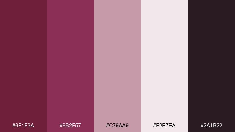
HEX: #6f1f3a #8b2f57 #c79aa9 #f2e7ea #2a1b22
Mood: luxurious, dramatic, polished
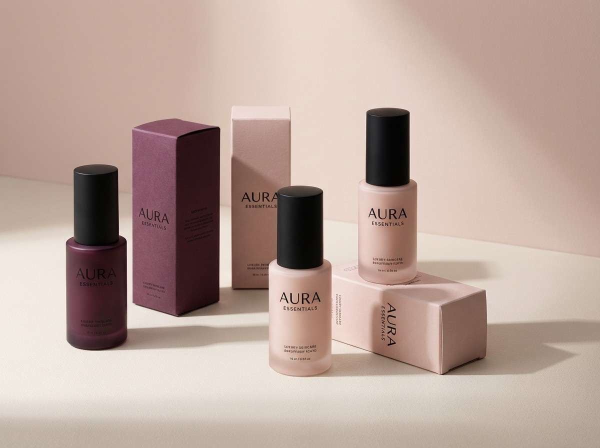
Best for: luxury skincare packaging
Luxurious and velvety like a plush theater curtain, these tones feel rich without turning loud. Use the deep plum for typography and hero blocks, then let blush and soft ivory carry negative space. It shines on premium packaging, boutique labels, and high-end social ads. Usage tip: add a thin near-black border to keep the pale tones crisp in print.
Image example of plum velvet generated using media.io
Media.io is an online AI studio for creating and editing video, image, and audio in your browser.

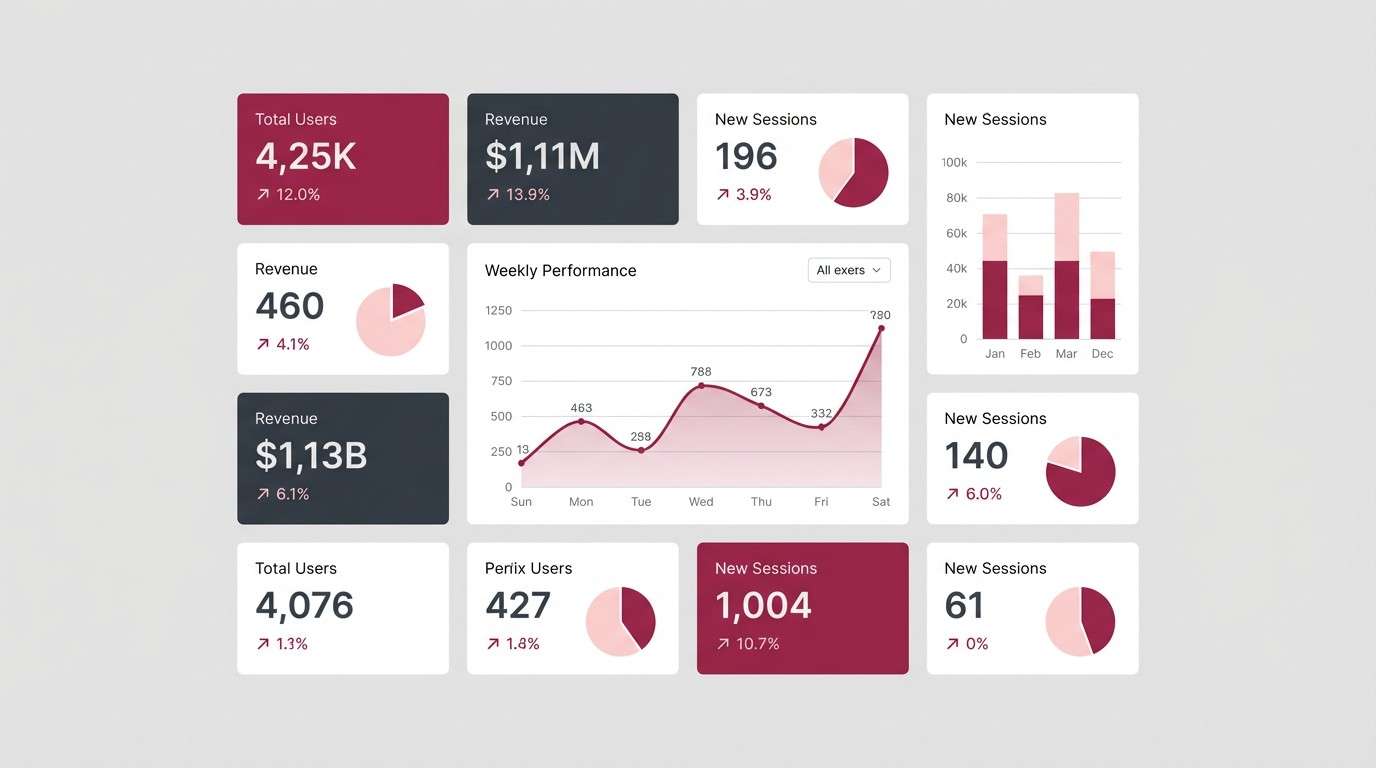
2) Berry Smoke
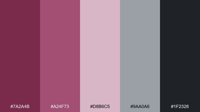
HEX: #7a2a4b #a24f73 #d8b6c5 #9aa0a6 #1f2328
Mood: modern, muted, techy
Best for: analytics dashboard UI
Smoky berry tones with cool gray feel sleek, focused, and quietly confident. These mulberry color combinations work especially well for dashboards where you need hierarchy without harsh contrast. Pair the charcoal for headers, the berry midtone for active states, and the pale blush for cards. Usage tip: reserve the strongest berry for one primary action to prevent visual noise.
Image example of berry smoke generated using media.io
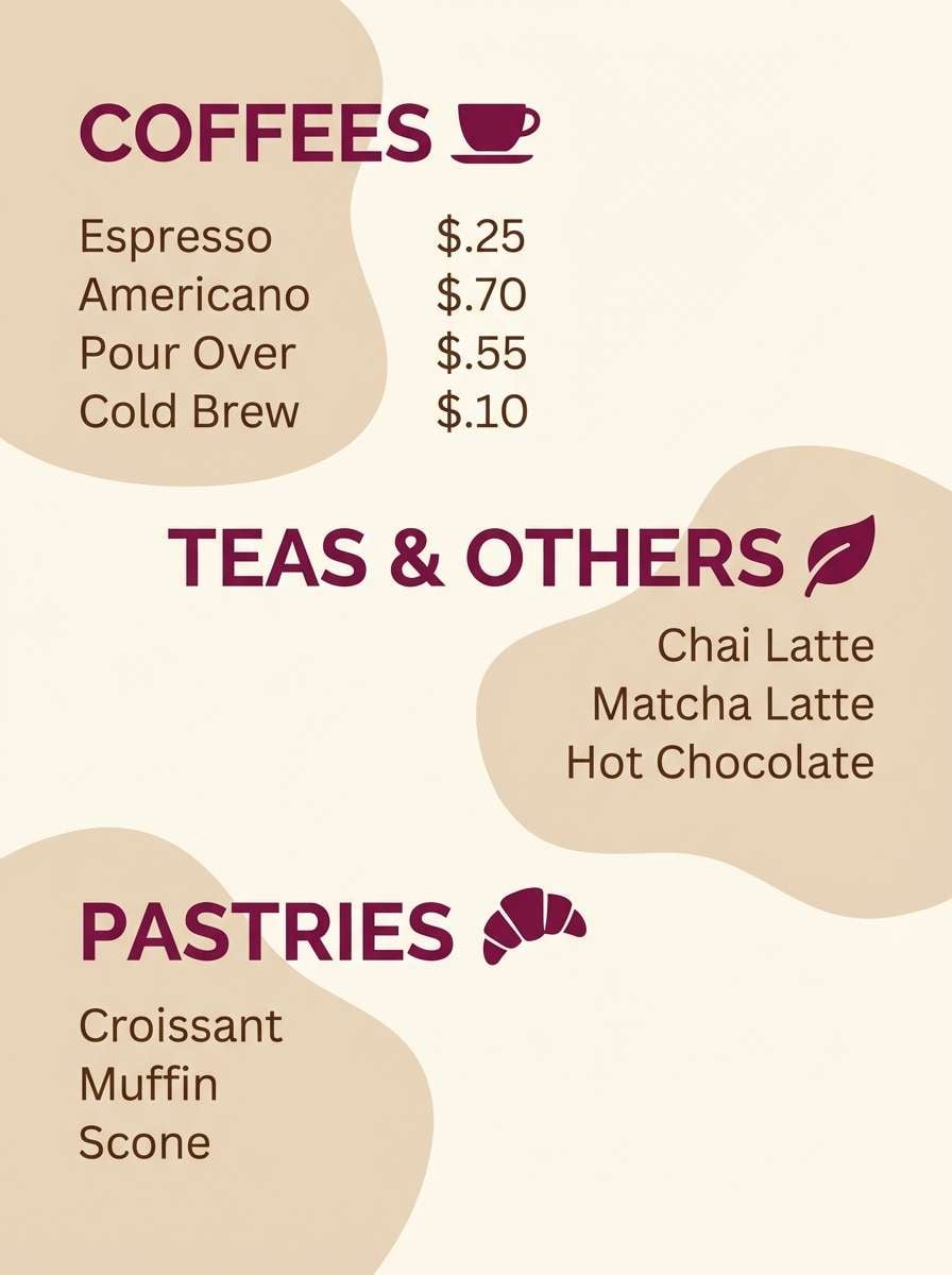
3) Mulberry Latte
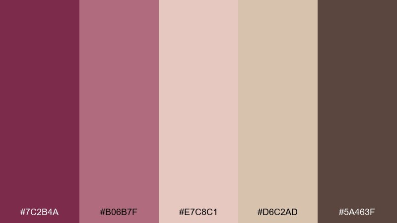
HEX: #7c2b4a #b06b7f #e7c8c1 #d6c2ad #5a463f
Mood: cozy, friendly, artisanal
Best for: coffee shop menu design
Warm and comforting like a latte with a berry swirl, this mix leans inviting and handcrafted. The creamy beige and toasted brown keep the pink-plum tones grounded for readable layouts. It works well for menus, loyalty cards, and small-batch product lists. Usage tip: print the background in the latte tones and use the deeper berry for section headers to guide scanning.
Image example of mulberry latte generated using media.io
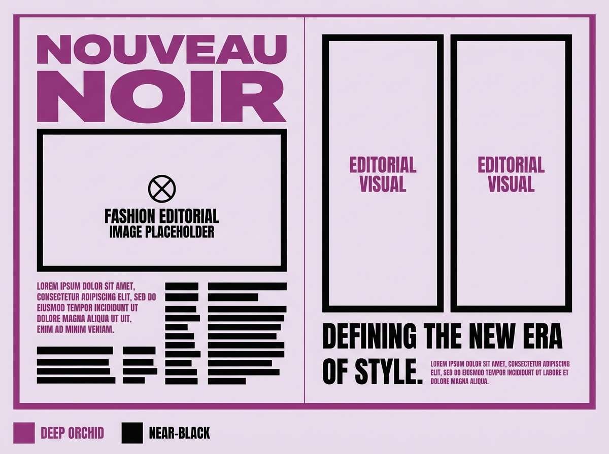
4) Night Orchid
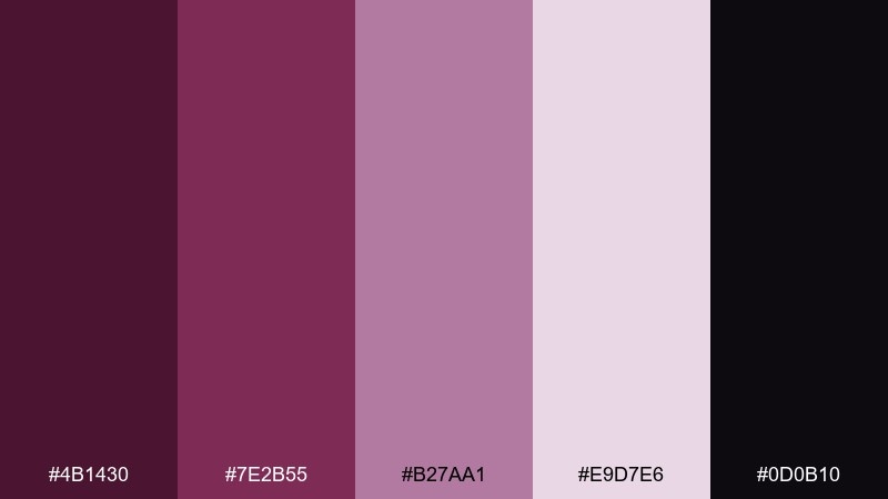
HEX: #4b1430 #7e2b55 #b27aa1 #e9d7e6 #0d0b10
Mood: moody, elegant, editorial
Best for: fashion editorial spread
Dark orchid and soft lilac create a late-night, gallery-like mood with plenty of finesse. Use the inky near-black for dramatic type and photo frames, then soften the page with pale lavender margins. It is strong for fashion, beauty, and culture features where contrast matters. Usage tip: keep accent purple limited to pull quotes and section markers to maintain that editorial calm.
Image example of night orchid generated using media.io
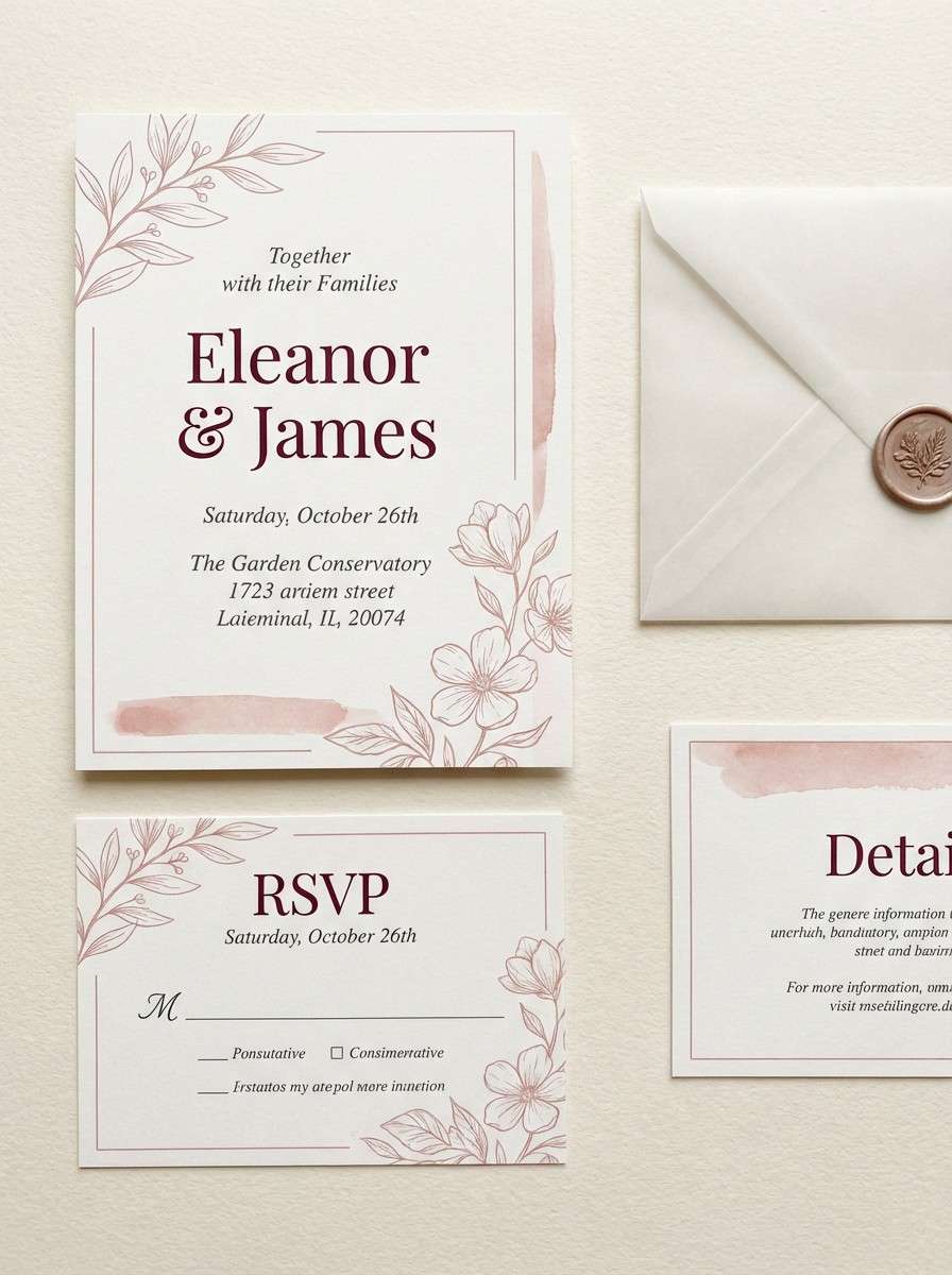
5) Vintage Wine
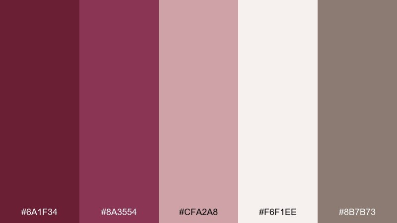
HEX: #6a1f34 #8a3554 #cfa2a8 #f6f1ee #8b7b73
Mood: romantic, classic, refined
Best for: wedding invitation suite
Romantic wine tones with powdery blush feel timeless, like aged paper and heirloom ribbons. A mulberry color scheme like this suits elegant invitations, vow books, and ceremony signage. Pair the deepest shade with warm off-white for legible type, then bring in the taupe as a quiet neutral. Usage tip: use blush as a background wash and keep the wine tone for names and key details.
Image example of vintage wine generated using media.io
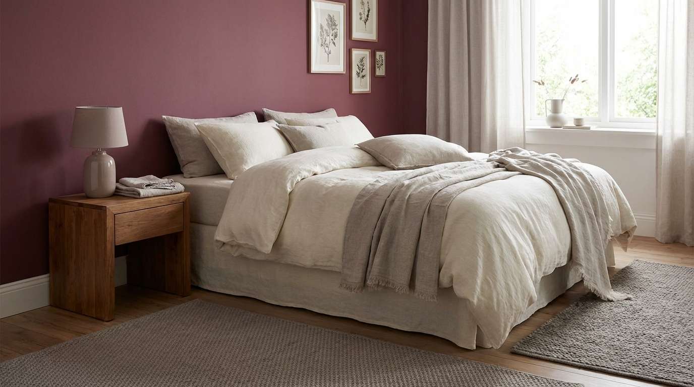
6) Rosewood Linen
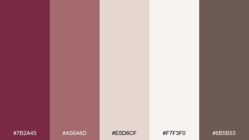
HEX: #7b2a45 #a56a6d #e5d6cf #f7f3f0 #6b5b53
Mood: calm, homey, sophisticated
Best for: cozy bedroom interior styling
Soft rosewood against linen neutrals feels calm and lived-in, like a boutique hotel room at dusk. The warm grays and creams keep the berry tone from overpowering the space. Use the deepest shade on a single accent wall or upholstered headboard, and repeat it in small textiles. Usage tip: choose matte finishes for paint and fabrics to keep the palette relaxed.
Image example of rosewood linen generated using media.io
7) Midnight Jam
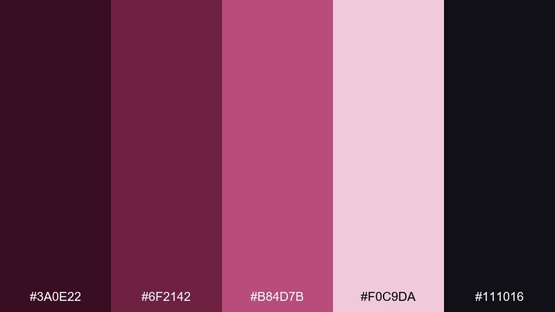
HEX: #3a0e22 #6f2142 #b84d7b #f0c9da #111016
Mood: bold, energetic, nocturnal
Best for: concert poster design
Deep jam tones and hot berry highlights feel like city lights and bass vibrations after dark. The contrast is perfect for posters that need to shout from a distance without using neon rainbow clutter. Keep the background nearly black, then layer the brighter magenta as a spotlight for the headline. Usage tip: add subtle grain in the darkest areas to avoid banding in large prints.
Image example of midnight jam generated using media.io
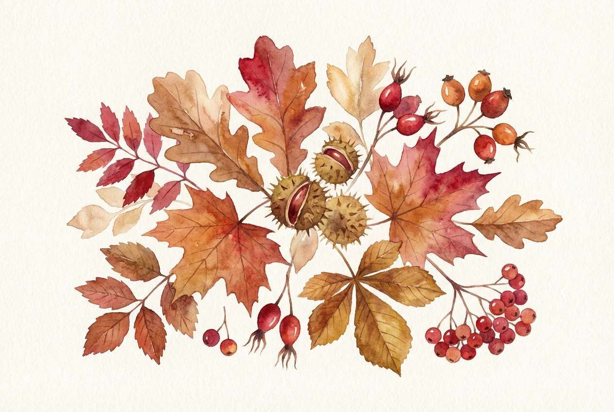
8) Autumn Mulberry
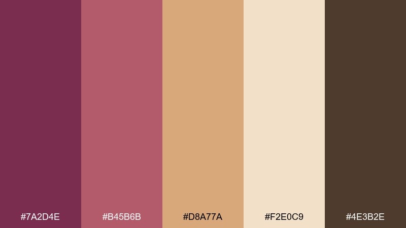
HEX: #7a2d4e #b45b6b #d8a77a #f2e0c9 #4e3b2e
Mood: earthy, seasonal, warm
Best for: autumn botanical illustration
Earthy berry and spiced caramel evoke falling leaves, dried petals, and cozy afternoons. The palette balances warmth with enough depth for outlines and shadows. Use it for seasonal headers, botanical prints, and packaging for autumn releases. Usage tip: paint the light cream as textured paper and layer the berry tones with watercolor edges for realism.
Image example of autumn mulberry generated using media.io
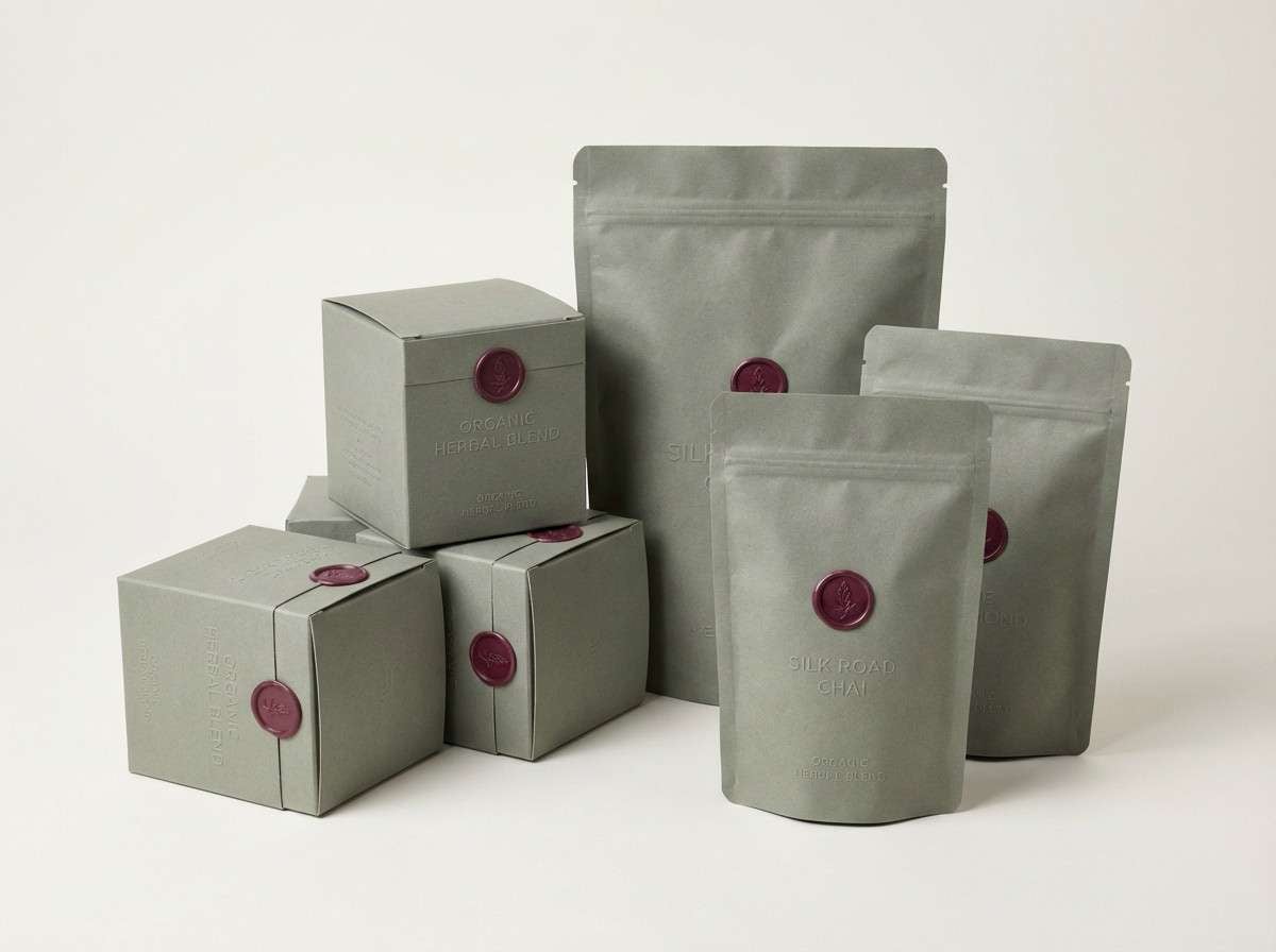
9) Mulberry Sage
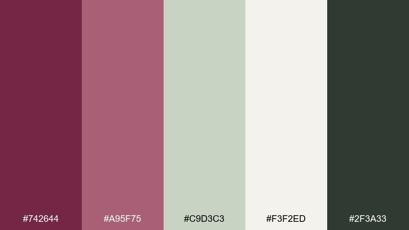
HEX: #742644 #a95f75 #c9d3c3 #f3f2ed #2f3a33
Mood: fresh, natural, balanced
Best for: organic tea packaging
Berry meets herbal sage for a clean, garden-forward feel that still reads premium. The green-gray tones make the berry accents feel intentional rather than sugary. It is a great fit for wellness brands, teas, and minimalist labels that need warmth. Usage tip: keep the sage as the main label field and use mulberry for stamps, seals, or flavor cues.
Image example of mulberry sage generated using media.io
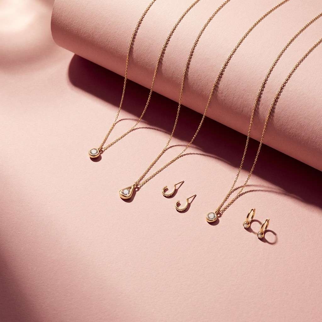
10) Gilded Berry
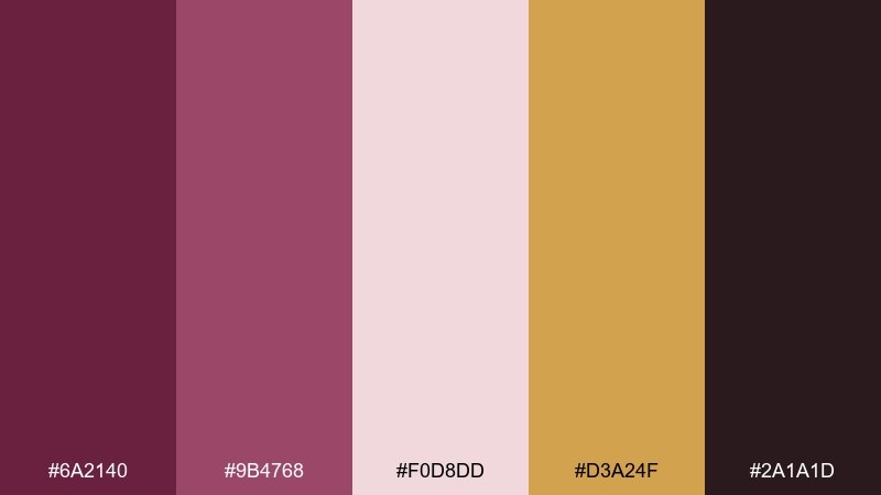
HEX: #6a2140 #9b4768 #f0d8dd #d3a24f #2a1a1d
Mood: glamorous, warm, celebratory
Best for: jewelry product ad
Gilded gold against berry tones feels celebratory, like candlelight on polished metal. The soft blush keeps the look airy while the dark base adds serious contrast. It works beautifully for jewelry, fragrance, and gift sets where you want a premium sparkle. Usage tip: use gold sparingly as a highlight line or small emblem so it stays special.
Image example of gilded berry generated using media.io
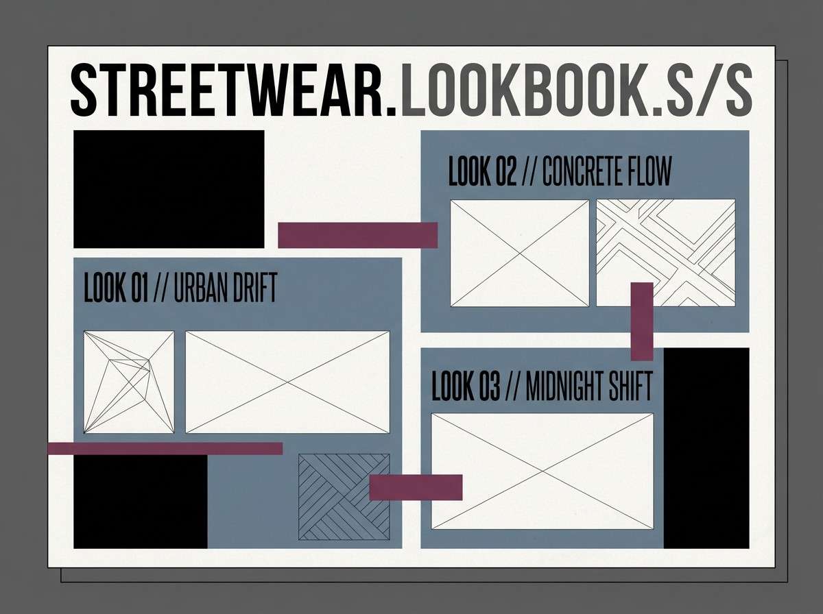
11) Mulberry Denim
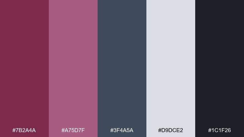
HEX: #7b2a4a #a75d7f #3f4a5a #d9dce2 #1c1f26
Mood: cool, urban, contemporary
Best for: streetwear lookbook layout
Berry tones with denim blue-gray read cool and modern, like a city twilight outfit. These mulberry color combinations are great for lookbooks and social carousels where you want attitude without going full neon. Use the dark ink for type, the dusty berry for callouts, and the light gray as breathing room. Usage tip: keep photos high-contrast and desaturated so the colors in the layout stay in control.
Image example of mulberry denim generated using media.io
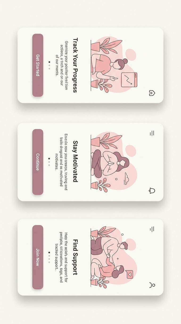
12) Soft Mauve Sunrise
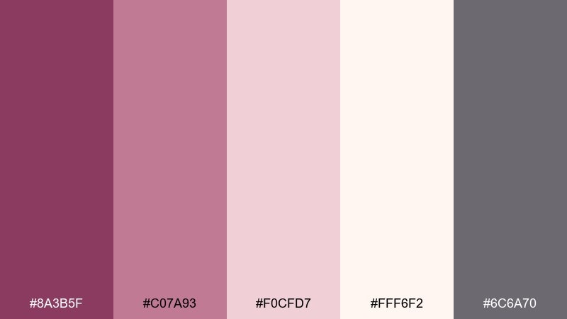
HEX: #8a3b5f #c07a93 #f0cfd7 #fff6f2 #6c6a70
Mood: gentle, optimistic, airy
Best for: app onboarding screens
Soft mauve and airy blush feel like a quiet sunrise, friendly and reassuring. The near-white background keeps onboarding steps readable while the mauve adds warmth to buttons and icons. It is ideal for wellness apps, journals, and personal finance tools that need a calm tone. Usage tip: use the gray only for secondary text so the pinks stay the emotional lead.
Image example of soft mauve sunrise generated using media.io
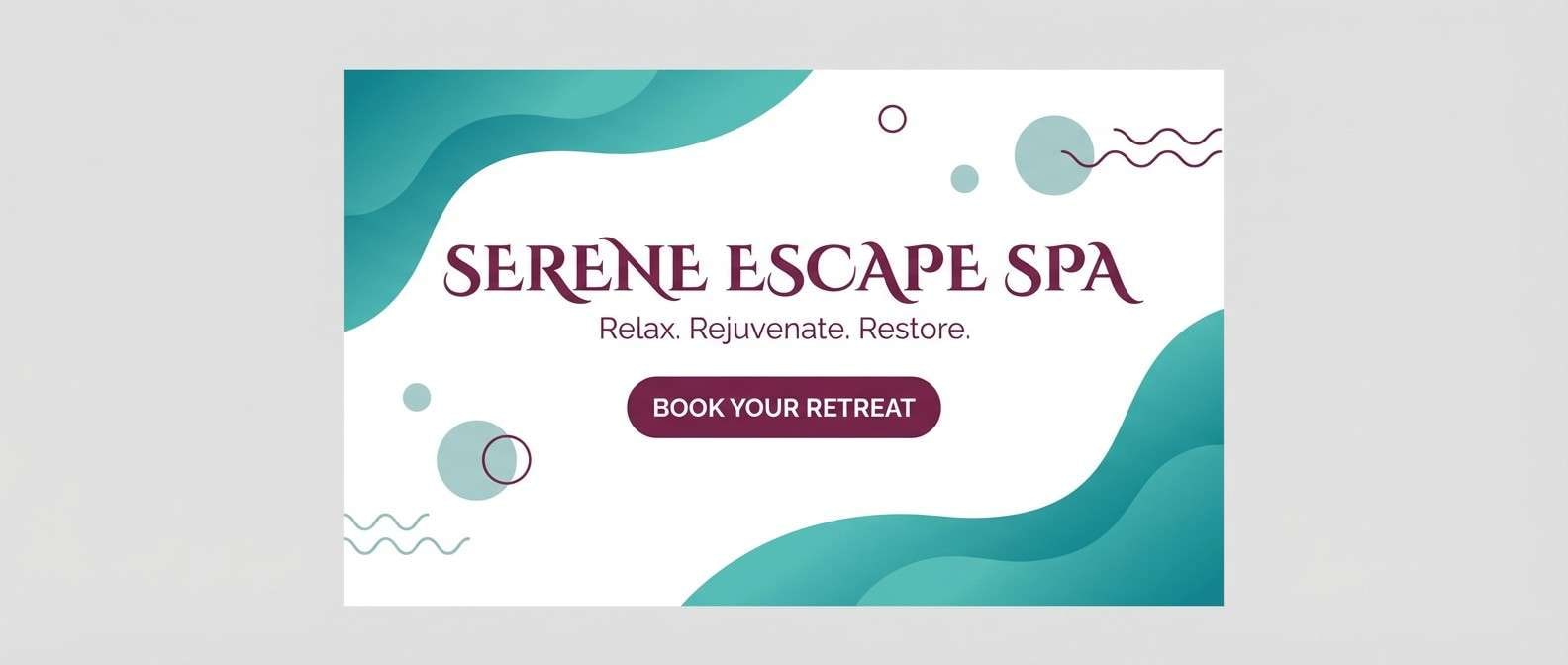
13) Mulberry Sea Glass
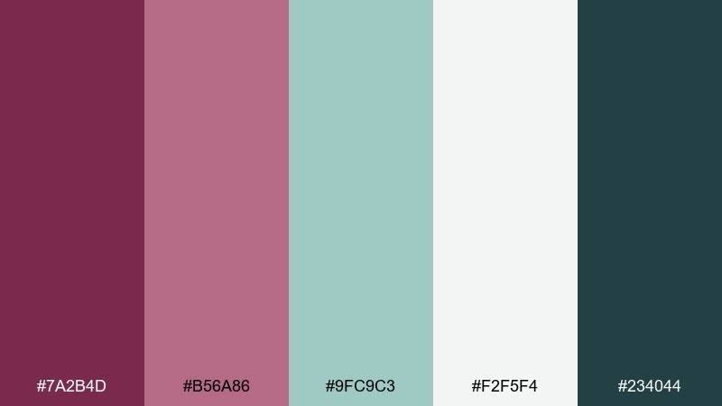
HEX: #7a2b4d #b56a86 #9fc9c3 #f2f5f4 #234044
Mood: refreshing, spa-like, modern
Best for: spa website hero section
Berry and sea-glass teal make a refreshing contrast that feels clean, modern, and restorative. The cool minty tones lighten the palette, while the deeper teal gives structure for navigation. Use it for spa websites, boutique hotels, and self-care campaigns. Usage tip: keep teal for large surfaces and use the berry as a small pop for links and key CTAs.
Image example of mulberry sea glass generated using media.io
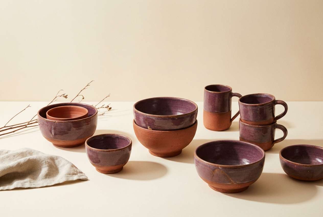
14) Plum and Clay
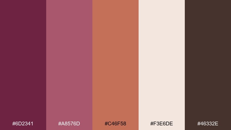
HEX: #6d2341 #a8576d #c46f58 #f3e6de #46332e
Mood: handmade, earthy, artistic
Best for: ceramic product photography
Plum paired with terracotta clay feels handmade and grounded, like a pottery studio shelf. The warm peachy tones keep the deep berry from feeling too formal. It is a strong fit for artisan goods, ceramics, and makers who want a natural warmth. Usage tip: shoot on a cream backdrop and let one clay item carry the midtone to bridge between dark and light.
Image example of plum and clay generated using media.io
15) Berry Neon Night
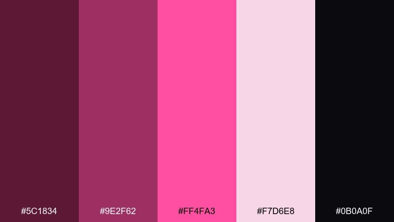
HEX: #5c1834 #9e2f62 #ff4fa3 #f7d6e8 #0b0a0f
Mood: electric, playful, nightlife
Best for: nightclub event flyer
Electric berry and hot pink feel like neon signage against a midnight street. The deep base color keeps the brighter accents readable and sharp for quick-glance promotion. It is ideal for nightlife flyers, DJ lineups, and late-night social stories. Usage tip: use the neon pink only for the headline and one icon so it does not overwhelm the layout.
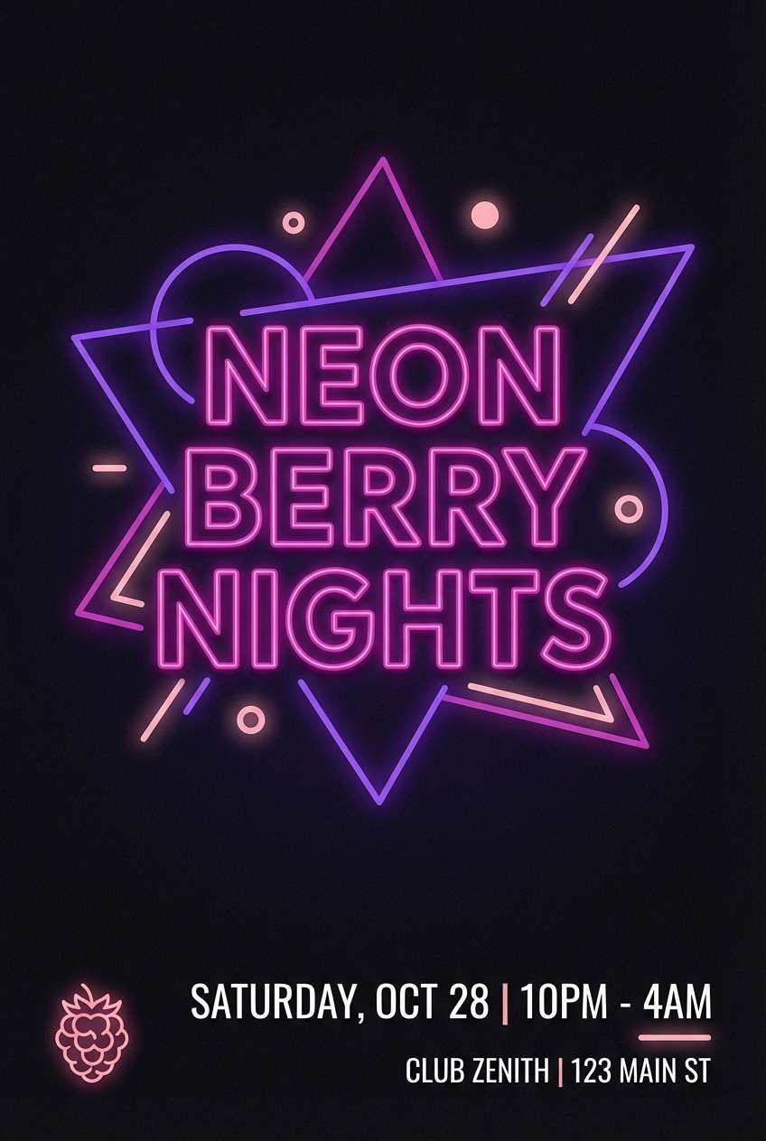
Image example of berry neon night generated using media.io
16) Mulberry Monochrome
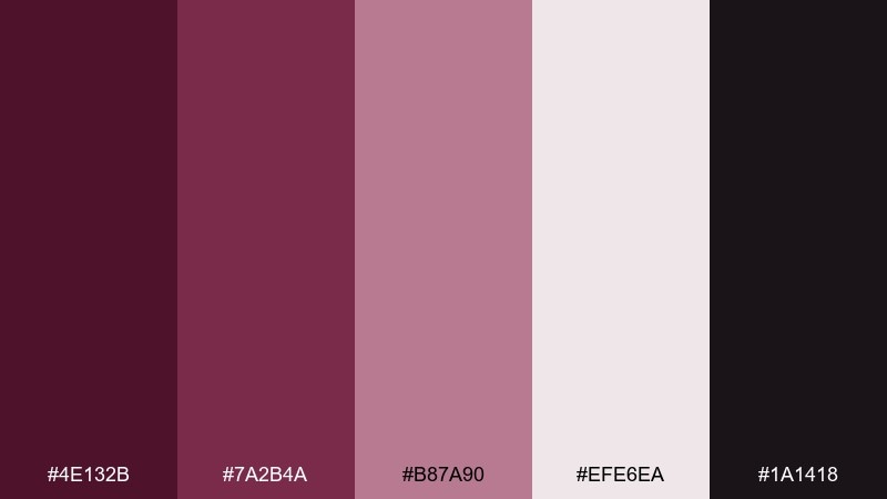
HEX: #4e132b #7a2b4a #b87a90 #efe6ea #1a1418
Mood: minimal, confident, upscale
Best for: logo and stationery system
A tight monochrome range feels confident and upscale, like ink on textured paper. The stepped tints make it easy to build hierarchy without adding extra colors. Use it for logos, letterheads, and brand guidelines that need consistency across print and digital. Usage tip: assign one shade per element type, such as headers, body text, dividers, and background, then stick to it.
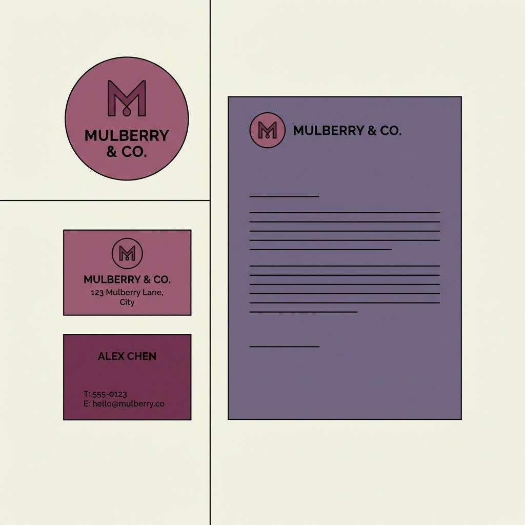
Image example of mulberry monochrome generated using media.io
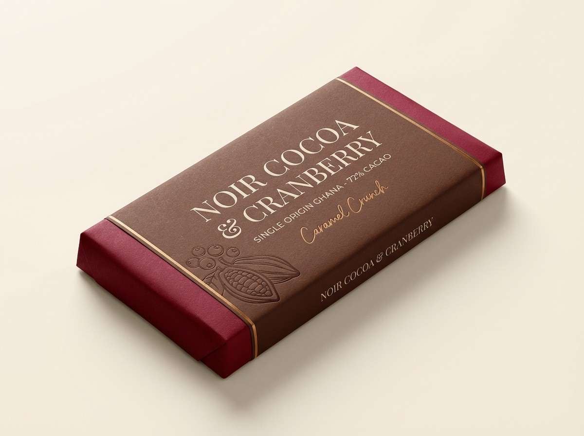
17) Cranberry Cocoa
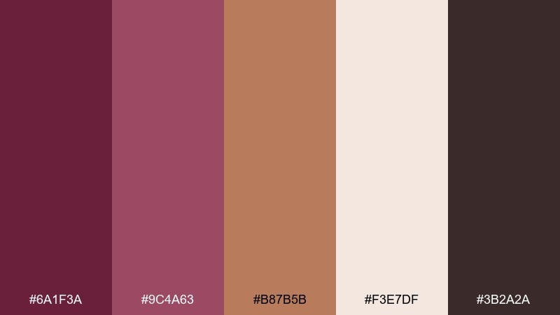
HEX: #6a1f3a #9c4a63 #b87b5b #f3e7df #3b2a2a
Mood: rich, cozy, appetizing
Best for: chocolate bar packaging
Cranberry and cocoa tones feel rich and appetizing, like dessert wrapped in velvet paper. The warm caramel note helps the berry read more gourmet than floral. Use it for chocolate bars, coffee beans, and seasonal gift boxes. Usage tip: set product names in the darkest cocoa shade and add a small berry stamp to signal flavor notes.
Image example of cranberry cocoa generated using media.io
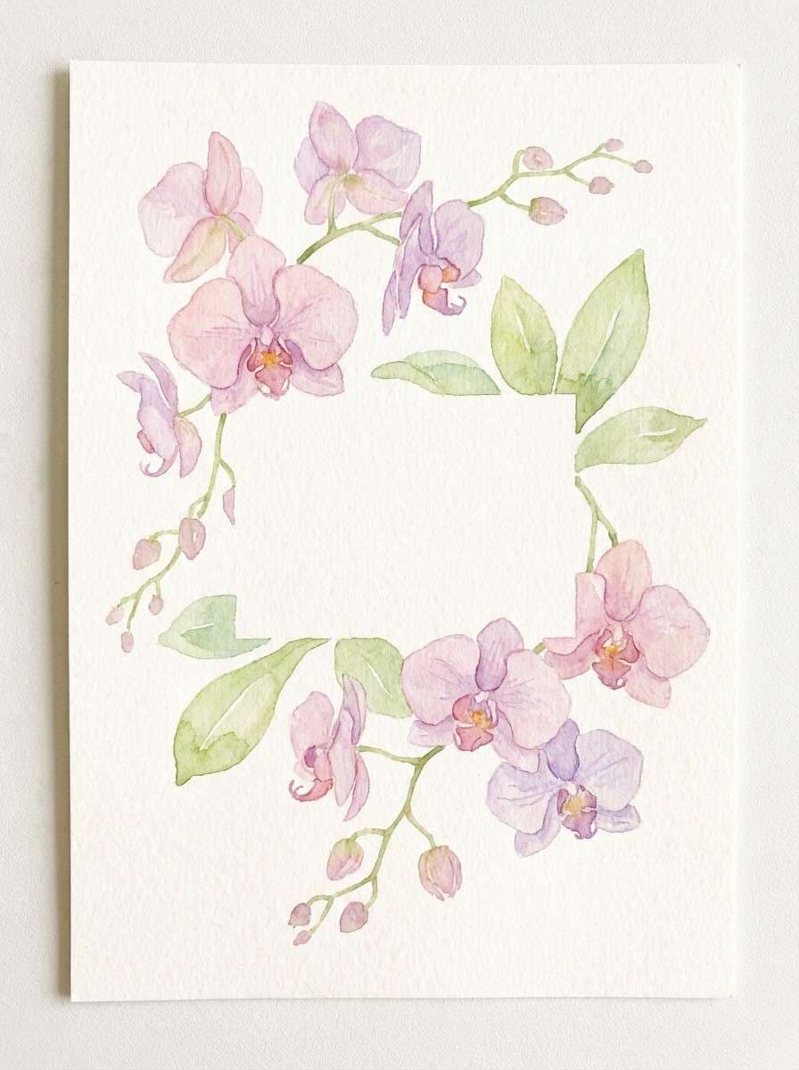
18) Orchid Garden Party
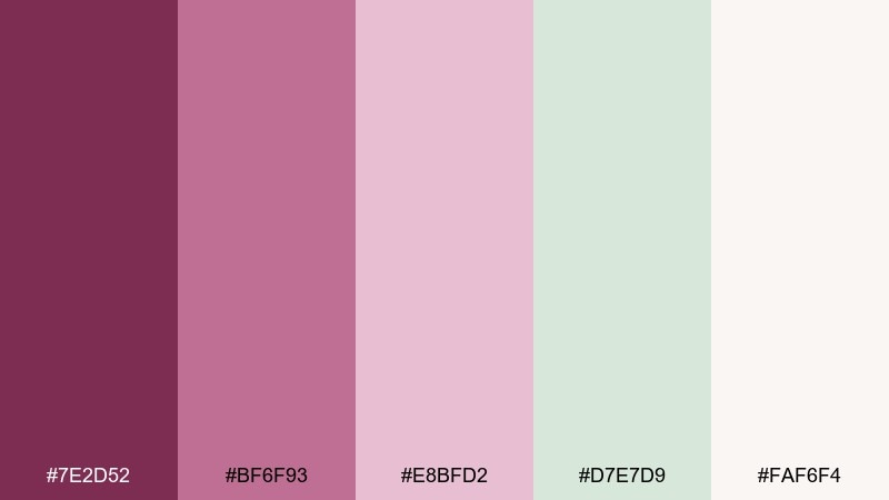
HEX: #7e2d52 #bf6f93 #e8bfd2 #d7e7d9 #faf6f4
Mood: flirty, light, springy
Best for: spring party invitation illustration
Orchid pinks with airy greens feel like a garden party invitation tucked into fresh blooms. The pale green adds lift and keeps the rosy tones from feeling too sweet. It is a great match for spring events, brunch invites, and feminine brand launches. Usage tip: keep the background near-white and paint the florals in transparent layers so the palette stays delicate.
Image example of orchid garden party generated using media.io
19) Dusty Berry Workspace
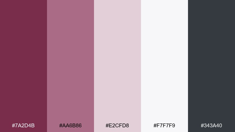
HEX: #7a2d4b #aa6b86 #e2cfd8 #f7f7f9 #343a40
Mood: focused, calm, professional
Best for: presentation slide template
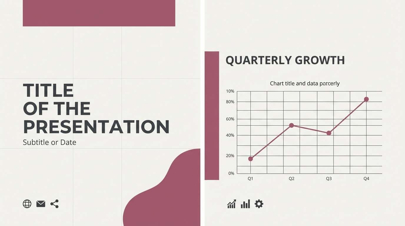
Dusty berry and clean neutrals feel focused and professional, like a well-organized workspace. The soft pink-lilac tints help charts and callouts stand out without looking childish. Use it for pitch decks, reports, and portfolio presentations. Usage tip: apply the darkest gray for text and use berry only for key numbers and section dividers.
Image example of dusty berry workspace generated using media.io
20) Mulberry Copper Glow
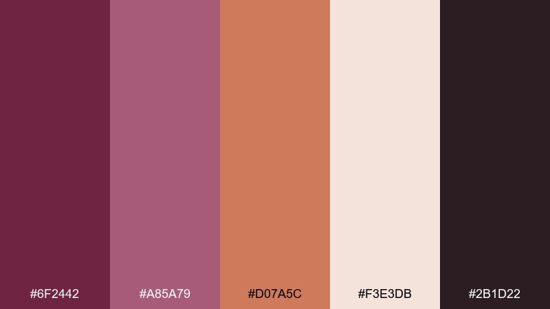
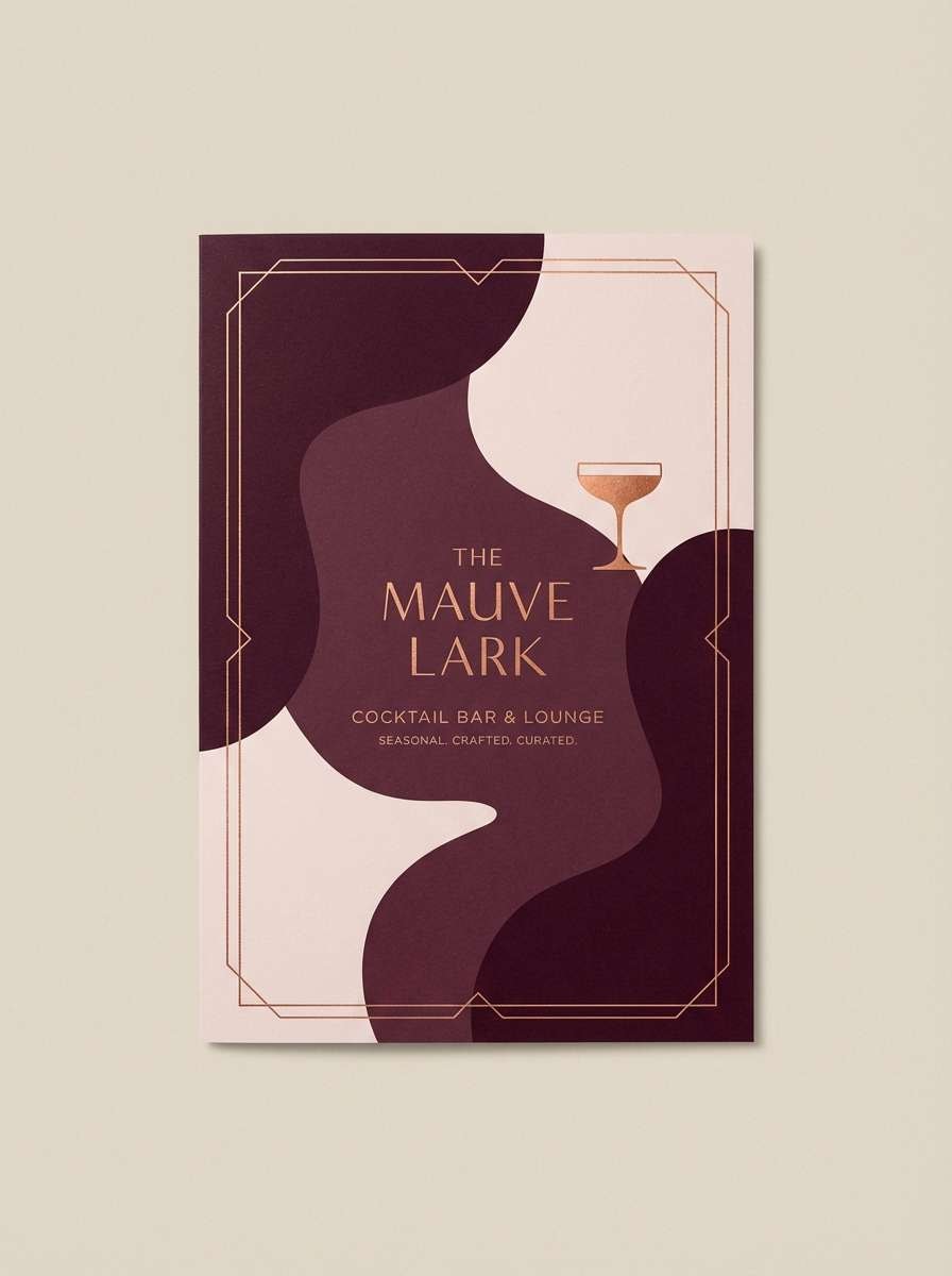
HEX: #6f2442 #a85a79 #d07a5c #f3e3db #2b1d22
Mood: warm, intimate, upscale
Best for: cocktail bar menu cover
Mulberry with copper warmth feels intimate, like low lighting and polished bar tools. The warm orange-brown adds energy while the pale blush keeps space for elegant type. It is ideal for bar menus, tasting cards, and restaurant branding that wants a modern vintage vibe. Usage tip: foil the copper accent on the logo and keep the rest of the cover matte for contrast.
Image example of mulberry copper glow generated using media.io
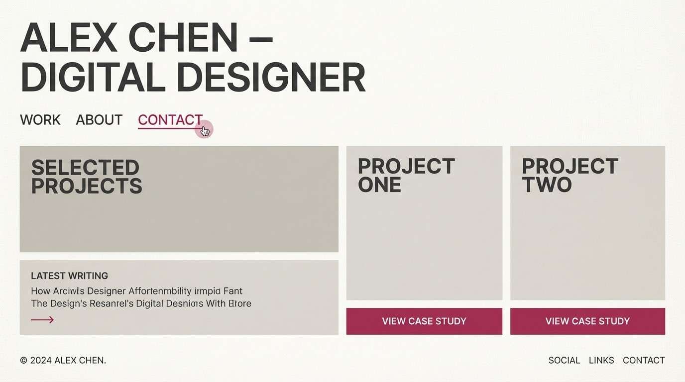
21) Berry Stone Minimal
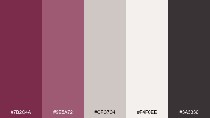
HEX: #7b2c4a #9e5a72 #cfc7c4 #f4f0ee #3a3336
Mood: clean, neutral, modern
Best for: portfolio website theme
Berry tones softened with stone neutrals feel modern, calm, and quietly stylish. The warm grays and off-whites give your work room to breathe while still providing a distinctive accent color. It fits portfolios, agency sites, and case study pages where clarity matters. Usage tip: set links and hover states in the berry midtone for subtle but consistent navigation cues.
Image example of berry stone minimal generated using media.io
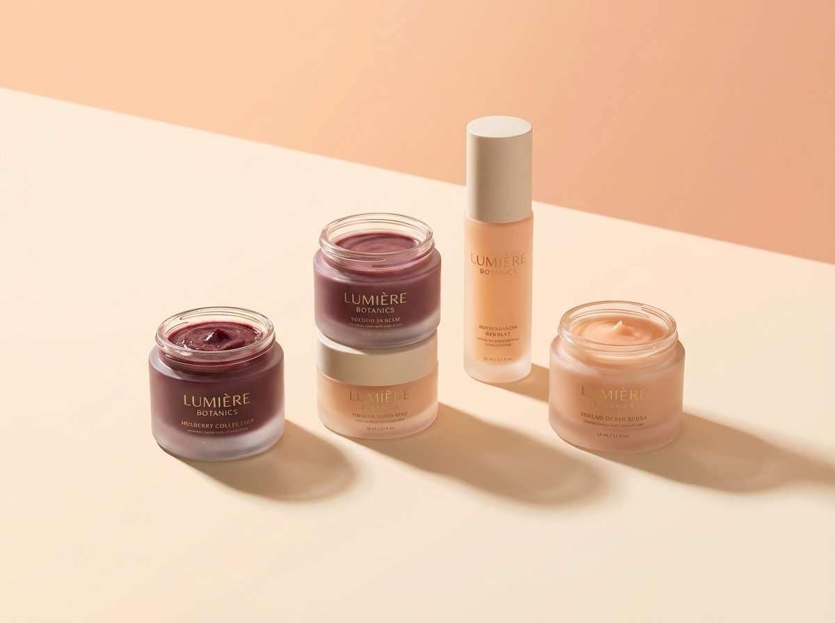
22) Mulberry Citrus Twist
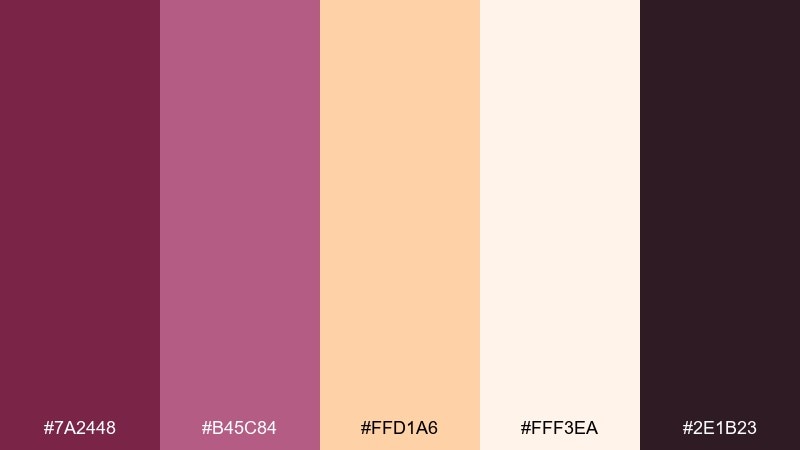
HEX: #7a2448 #b45c84 #ffd1a6 #fff3ea #2e1b23
Mood: bright, friendly, youthful
Best for: beauty social ad creative
Berry with a citrus-peach twist feels upbeat and youthful, like a fresh lip tint on warm skin. The peachy highlight makes the deeper tones feel playful rather than heavy. It is great for beauty ads, product drops, and scroll-stopping story frames. Usage tip: use the peach as a large background gradient and keep the dark shade for clear, high-contrast pricing and CTAs.
Image example of mulberry citrus twist generated using media.io
What Colors Go Well with Mulberry?
Mulberry pairs beautifully with soft neutrals like ivory, warm beige, linen, and stone gray—these keep layouts readable and let mulberry act as the “signature” accent.
For richer looks, combine mulberry with cocoa brown, copper, or muted gold to create a premium, warmly lit feel that works well in packaging and hospitality branding.
If you want a fresher contrast, try cool companions like sage green, sea-glass teal, denim blue-gray, or clean charcoal—these make mulberry feel modern rather than romantic.
How to Use a Mulberry Color Palette in Real Designs
Start by assigning roles: use the deepest mulberry/near-black for headers and key UI structure, a mid mulberry for highlights (links, badges, active states), and pale blush/ivory for backgrounds.
In print, keep large areas light and bring mulberry in for typography, borders, and emblem-style accents; this prevents the palette from going too heavy while still feeling upscale.
For brands, treat mulberry as a “hero color” and limit it to a few consistent touchpoints (CTA buttons, product stamps, section dividers) so the identity feels intentional across every channel.
Create Mulberry Palette Visuals with AI
If you already have HEX codes, the next step is seeing them in context—packaging, posters, UI screens, and interiors—so you can validate contrast and mood before committing.
With Media.io, you can generate on-brand examples from simple prompts, then iterate quickly by swapping materials, lighting, layouts, or accent colors while keeping mulberry as the anchor.
Mulberry Color Palette FAQs
-
What is the best neutral to pair with mulberry?
Warm off-white/ivory is the most versatile neutral with mulberry because it keeps type readable and makes the berry tone look richer (great for both UI and print). -
Is mulberry more purple or more red?
Mulberry sits between wine red and berry purple. Some versions lean red (cranberry/wine), while others lean purple (orchid/plum), so your supporting colors should follow that undertone. -
What colors complement mulberry for a modern UI?
Cool grays, charcoal, denim blue-gray, and sea-glass teal pair well for modern interfaces. Keep mulberry as the accent for primary actions and active states to avoid visual overload. -
Does mulberry work for luxury branding?
Yes. Deep mulberry reads premium and dramatic, especially when paired with near-black, blush, and small metallic accents like muted gold or copper. -
How do I keep a mulberry palette from feeling too dark?
Use light tints (blush, pale lavender, ivory) for background and spacing, and reserve the darkest mulberry for typography and small high-contrast elements like headers or borders. -
What’s a good contrasting accent color for mulberry?
Sage green or sea-glass teal creates a clean, refreshing contrast. For a warmer pop, copper or peach works well—just keep the accent limited so mulberry stays the lead. -
Can I use mulberry in print without color shifts?
Yes, but test proofs matter: dark berry tones can shift depending on paper and ink. Use a near-black outline/border for light areas and avoid ultra-smooth gradients that may band.


