

Verdigris sits in that sweet spot between green and blue, giving designs a fresh, coastal calm or a moody, oxidized-metal edge depending on what you pair it with.
Below are 20+ verdigris color palette ideas with HEX codes, plus practical ways to use patina-inspired teal-green across branding, UI, and interiors.
In this article
- Why Verdigris Palettes Work So Well
-
- patina harbor
- oxidized copper luxe
- botanical conservatory
- coastal fresco
- art deco patina
- minimal studio teal
- rainy courtyard
- vintage apothecary
- nordic lakehouse
- patina pop neon
- museum editorial
- ceramic glaze workshop
- tropical canopy
- industrial dock
- spa serenity
- autumn patina
- eucalyptus wedding
- deep space ui
- classroom chalkboard
- sunset on copper
- seaglass minimal
- heritage library
- modern marina brand
- What Colors Go Well with Verdigris?
- How to Use a Verdigris Color Palette in Real Designs
- Create Verdigris Palette Visuals with AI
Why Verdigris Palettes Work So Well
Verdigris is a naturally “designed” color—born from copper patina—so it feels authentic in both modern and vintage contexts. It can read coastal and airy with whites and pale aquas, or refined and dramatic with black, navy, and gold.
Because it sits between teal and green, verdigris bridges warm and cool palettes smoothly. That makes it reliable for building hierarchy: use verdigris for primary blocks and buttons, then control mood with the neutrals and accents around it.
It also plays nicely with texture cues (linen, stone, brushed metal, ceramic glaze). Even in flat digital layouts, pairing verdigris with paper-like creams or graphite grays creates instant depth.
20+ Verdigris Color Palette Ideas (with HEX Codes)
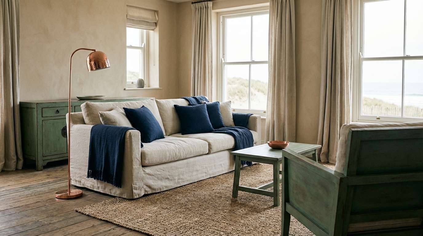
1) Patina Harbor

HEX: #2FA9A1 #AEE7DC #EADCC6 #18324B #B56A3A
Mood: coastal, calm, polished
Best for: coastal living room styling
Coastal calm with a weathered pier feel, like sea-glass on sand and copper fittings catching late light. Use the deep navy to anchor big surfaces and let verdigris and seafoam carry the airy midtones. Pair with sandy neutrals and a touch of warm copper for balance. Tip: keep metals brushed and fabrics textured so the palette feels natural, not glossy.
Image example of patina harbor generated using media.io
Media.io is an online AI studio for creating and editing video, image, and audio in your browser.

2) Oxidized Copper Luxe
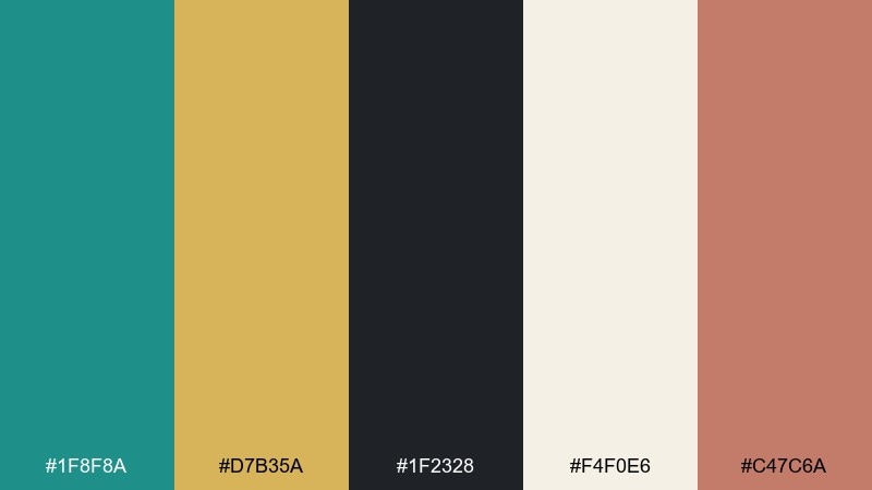
HEX: #1F8F8A #D7B35A #1F2328 #F4F0E6 #C47C6A
Mood: luxury, dramatic, modern
Best for: premium skincare packaging
Moody and upscale, like oxidized copper jewelry against dark velvet. The verdigris and charcoal create instant contrast, while champagne gold adds a refined glow. For standout layouts, keep the cream as breathing room and use rose-copper only as a small highlight. Tip: emboss the gold and keep typography minimal to let the tones do the work.
Image example of oxidized copper luxe generated using media.io
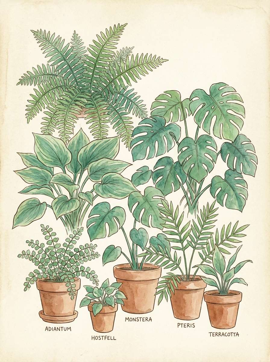
3) Botanical Conservatory
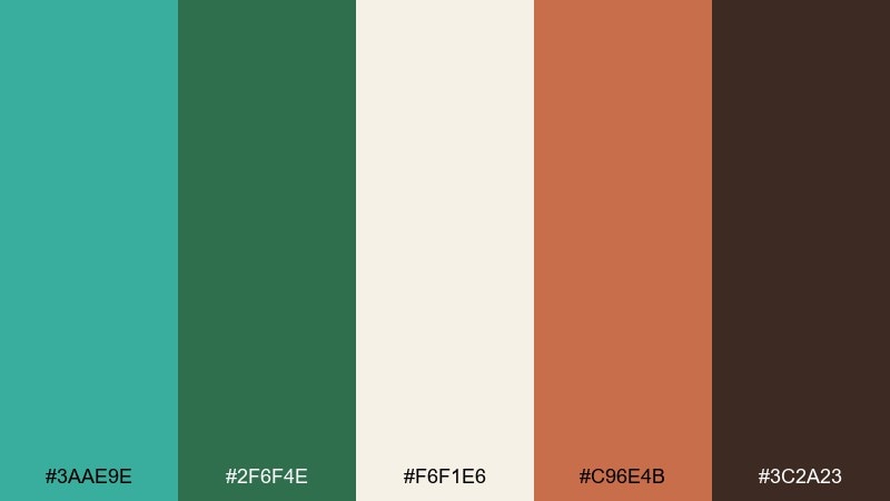
HEX: #3AAE9E #2F6F4E #F6F1E6 #C96E4B #3C2A23
Mood: earthy, fresh, sunlit
Best for: botanical poster illustration
Earthy and sunlit, like greenhouse leaves and terracotta pots after a warm misting. The greens feel layered and real, while the cream keeps the whole look breathable. Add terracotta for warmth and use the deep brown sparingly to outline or ground the composition. Tip: keep gradients subtle so the palette reads like natural pigments.
Image example of botanical conservatory generated using media.io
4) Coastal Fresco
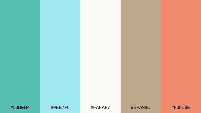
HEX: #58BEB4 #9EE7F0 #FAFAF7 #BFA98C #F08B6E
Mood: airy, playful, bright
Best for: summer event flyer
Airy and cheerful, like painted seaside tiles and sun-bleached boardwalks. Verdigris and aqua handle the fresh, cool base while white keeps everything crisp. Bring in driftwood beige for warmth and use coral as the attention-grabbing accent. Tip: set coral only on key calls-to-action so the design stays light.
Image example of coastal fresco generated using media.io

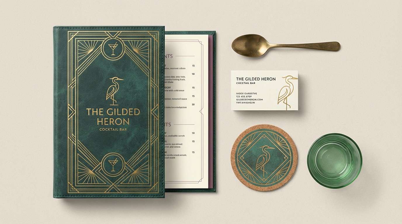
5) Art Deco Patina
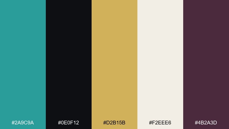
HEX: #2A9C9A #0E0F12 #D2B15B #F2EEE6 #4B2A3D
Mood: glam, geometric, vintage
Best for: cocktail bar branding
Glam and geometric, like a vintage lobby with patina metalwork and gold inlays. Black and verdigris make the structure feel sharp, while warm gold delivers that Art Deco sparkle. Use the ivory as a background to keep the mark readable, and add plum only for secondary details. Tip: lean on thin line patterns and symmetry for a true Deco finish.
Image example of art deco patina generated using media.io
6) Minimal Studio Teal
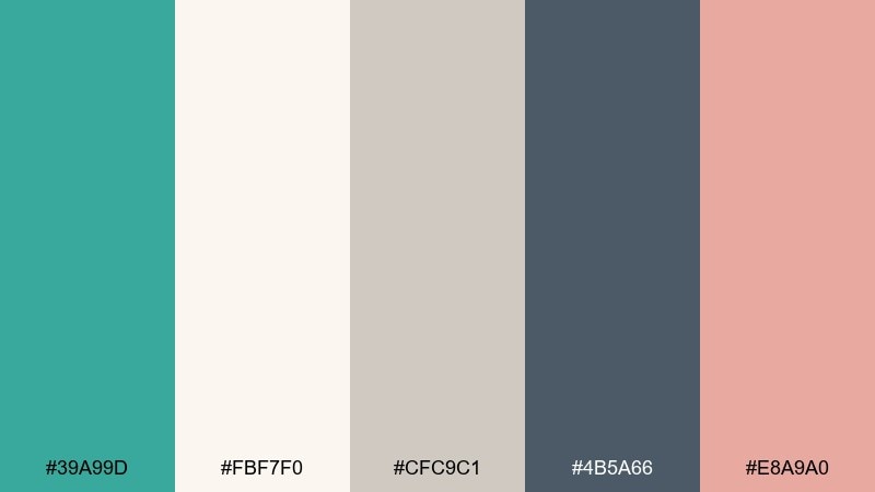
HEX: #39A99D #FBF7F0 #CFC9C1 #4B5A66 #E8A9A0
Mood: minimal, warm, contemporary
Best for: clean SaaS landing page UI
Clean and contemporary, like a quiet studio with soft daylight and one perfect teal chair. Verdigris becomes the hero color without shouting, supported by warm off-white and gentle grays. A blush accent adds friendliness for icons, tags, or tiny UI states. Tip: reserve the darkest slate for text and navigation so the interface stays readable.
Image example of minimal studio teal generated using media.io

7) Rainy Courtyard
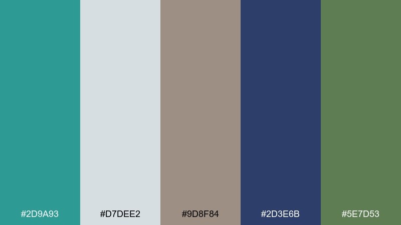
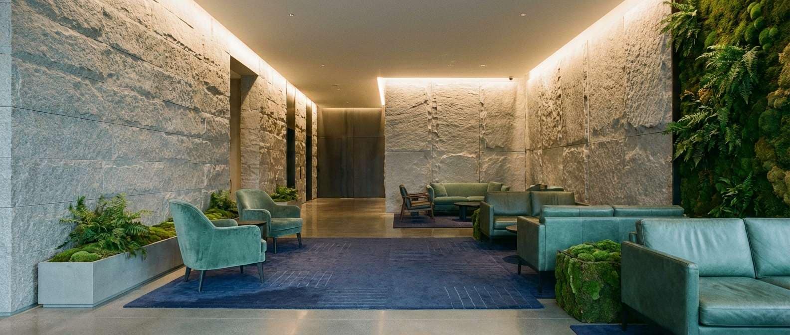
HEX: #2D9A93 #D7DEE2 #9D8F84 #2D3E6B #5E7D53
Mood: misty, grounded, quiet
Best for: hotel lobby interior concept
Misty and grounded, like stone paths in a courtyard after rain. Verdigris sits comfortably between cool gray and deep indigo, creating a calm, upscale atmosphere. Add the moss green as a natural bridge if you want plants or textiles to feel intentional. Tip: keep patterns low-contrast and let materials like stone and wool provide the interest.
Image example of rainy courtyard generated using media.io
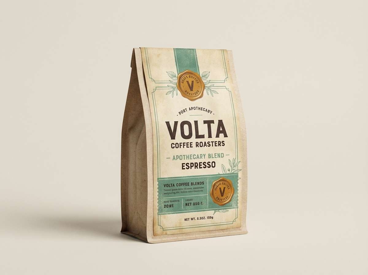
8) Vintage Apothecary
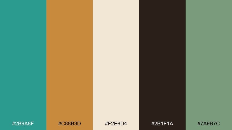
HEX: #2B9A8F #C88B3D #F2E6D4 #2B1F1A #7A9B7C
Mood: nostalgic, cozy, artisanal
Best for: coffee bag label design
Nostalgic and cozy, like amber glass bottles on wooden shelves. The verdigris brings a cool antique patina, while parchment and espresso brown make it feel handcrafted. Use the amber tone for badges or roast notes to draw the eye without looking loud. Tip: print on uncoated stock so the colors stay soft and authentic.
Image example of vintage apothecary generated using media.io
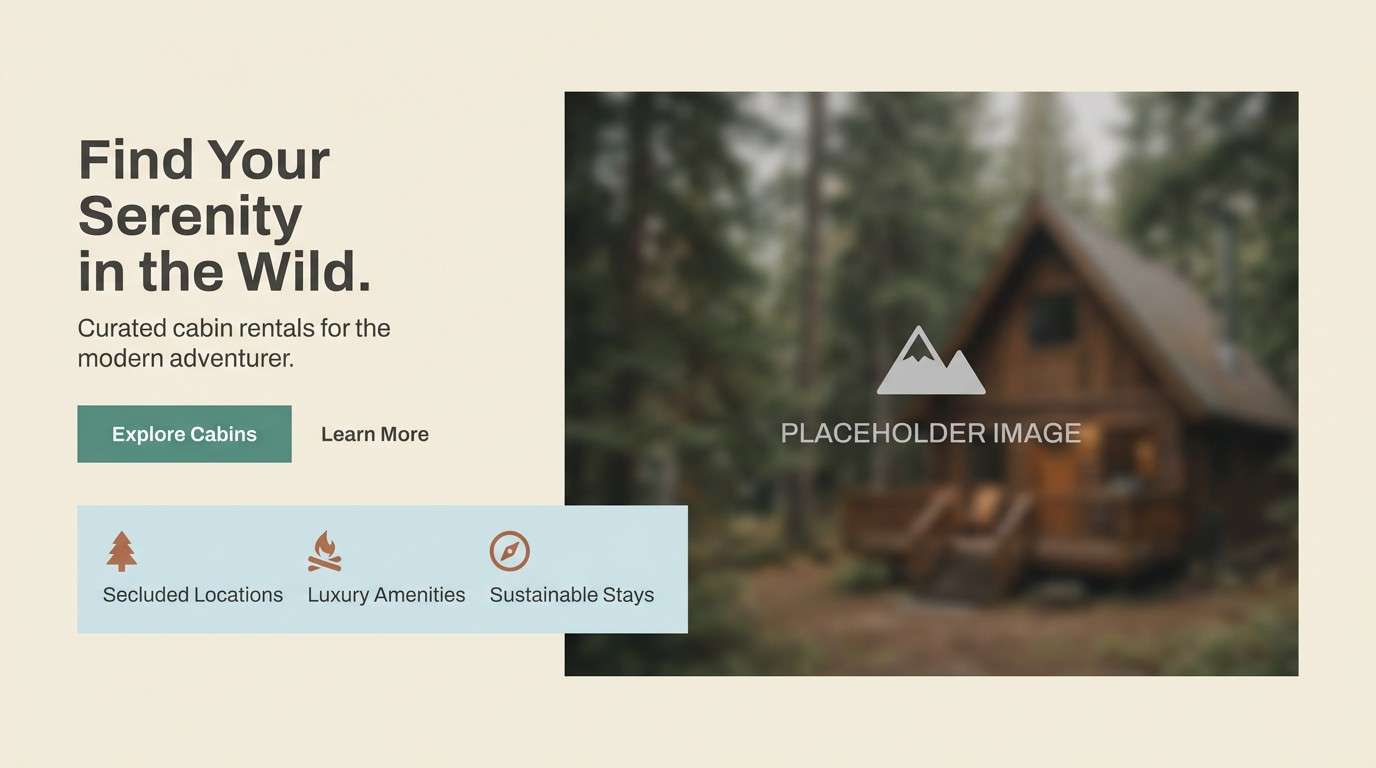
9) Nordic Lakehouse
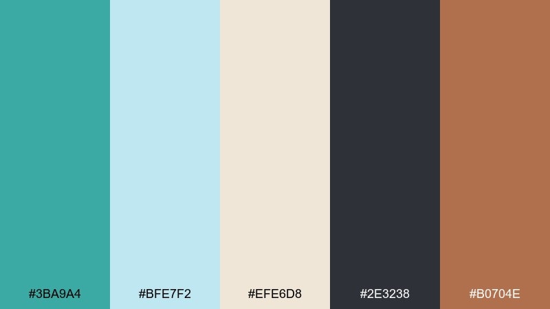
HEX: #3BA9A4 #BFE7F2 #EFE6D8 #2E3238 #B0704E
Mood: fresh, cozy, Scandinavian
Best for: cabin rental website hero
Fresh and cozy, like a lakeside cabin with pale wood and cold morning air. Verdigris and ice blue lean clean and modern, while birch cream keeps it inviting. Add graphite for type and structure, then use clay as a small warmth note in icons or highlights. Tip: keep photo overlays light so the cool tones stay crisp.
Image example of nordic lakehouse generated using media.io
10) Patina Pop Neon
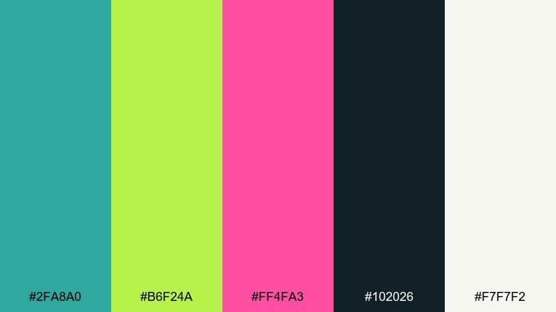
HEX: #2FA8A0 #B6F24A #FF4FA3 #102026 #F7F7F2
Mood: bold, energetic, edgy
Best for: music festival poster
Bold and electric, like neon signage reflected on wet metal. Verdigris plays the cool base while lime and magenta punch through for high-energy contrast. Keep near-black for typography and use off-white as a clean margin so it stays readable from a distance. Tip: limit gradients and use big shapes to preserve that poster impact.
Image example of patina pop neon generated using media.io

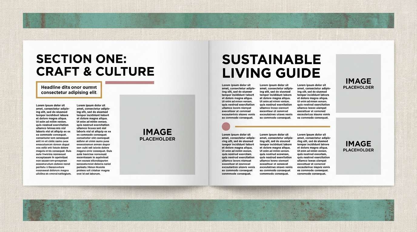
11) Museum Editorial
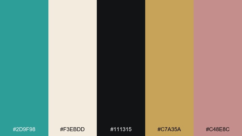
HEX: #2D9F98 #F3EBDD #111315 #C7A35A #C48E8C
Mood: curated, calm, sophisticated
Best for: magazine feature layout
Curated and quiet, like a gallery wall with warm spotlights and matte frames. Verdigris adds modern freshness to a linen base, while black keeps the layout sharp and editorial. Ochre and dusty rose work best as small section headers or pull-quote accents. Tip: use generous margins so the palette feels premium rather than busy.
Image example of museum editorial generated using media.io
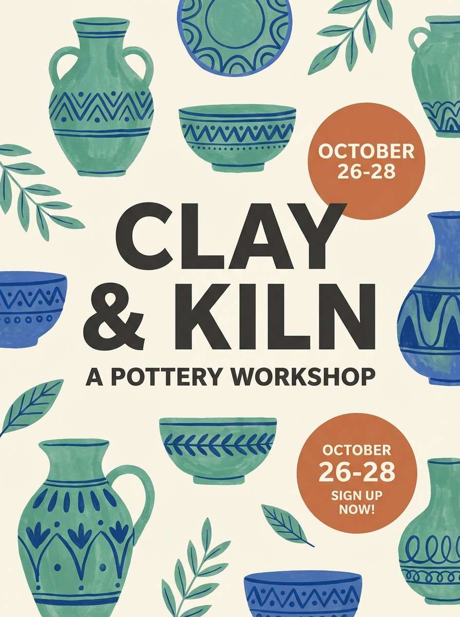
12) Ceramic Glaze Workshop
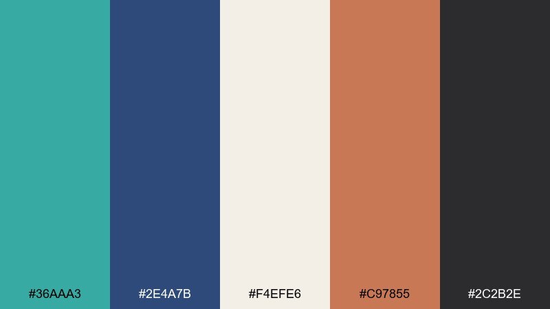
HEX: #36AAA3 #2E4A7B #F4EFE6 #C97855 #2C2B2E
Mood: crafted, artistic, tactile
Best for: pottery class promo poster
Crafted and tactile, like wet clay and glossy glaze cooling on a studio shelf. Verdigris pairs beautifully with deep cobalt and charcoal for a rich, artisanal contrast. Use cream as the paper base, then bring in clay orange for stamps, dates, and small illustrations. Tip: choose slightly imperfect hand-drawn icons to match the workshop vibe.
Image example of ceramic glaze workshop generated using media.io
13) Tropical Canopy
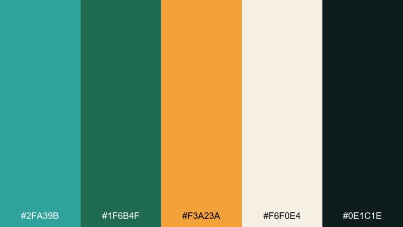
HEX: #2FA39B #1F6B4F #F3A23A #F6F0E4 #0E1C1E
Mood: lush, sunny, adventurous
Best for: travel brand social ad
Lush and sunny, like a canopy hike that opens to a bright fruit market. Verdigris and deep palm green create a dense, leafy base, then mango orange brings instant warmth and motion. Keep the cream for clean type zones and use the near-black only for strong contrast. Tip: let orange be the single call-to-action color so it feels intentional.
Image example of tropical canopy generated using media.io

14) Industrial Dock
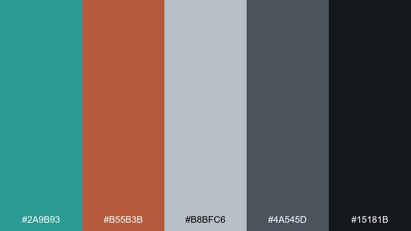
HEX: #2A9B93 #B55B3B #B8BFC6 #4A545D #15181B
Mood: rugged, utilitarian, modern
Best for: workwear product ad
Rugged and utilitarian, like painted steel, rope, and rusted bolts. Verdigris reads industrial rather than beachy when you stack it with concrete gray and oil-black. Add rust as the punchy accent for badges, prices, or stitching callouts. Tip: use gritty textures lightly so the design stays modern, not dirty.
Image example of industrial dock generated using media.io
15) Spa Serenity
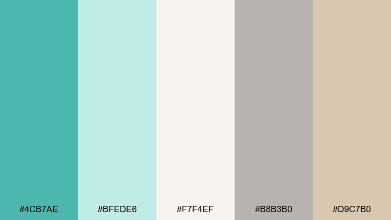
HEX: #4CB7AE #BFEDE6 #F7F4EF #B8B3B0 #D9C7B0
Mood: soothing, clean, gentle
Best for: wellness app onboarding UI
Soothing and clean, like warm steam, soft towels, and quiet water. Verdigris becomes a calming primary, supported by mint and creamy whites for an easy, breathable interface. Keep the grays for secondary text and use the warm beige on illustrations or subtle cards. Tip: choose plenty of spacing and rounded components to match the gentle mood.
Image example of spa serenity generated using media.io
16) Autumn Patina
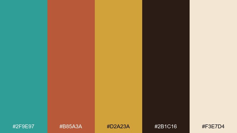
HEX: #2F9E97 #B85A3A #D2A23A #2B1C16 #F3E7D4
Mood: warm, nostalgic, seasonal
Best for: fall menu design
Warm and nostalgic, like fallen leaves against a cool patina gate. These verdigris color combinations shine when you let teal-green cool down the spicy oranges and mustard. Use the dark brown for headers and dividers, then keep the cream for readability and a paper-like feel. Tip: add small line icons in mustard to guide the eye without clutter.
Image example of autumn patina generated using media.io
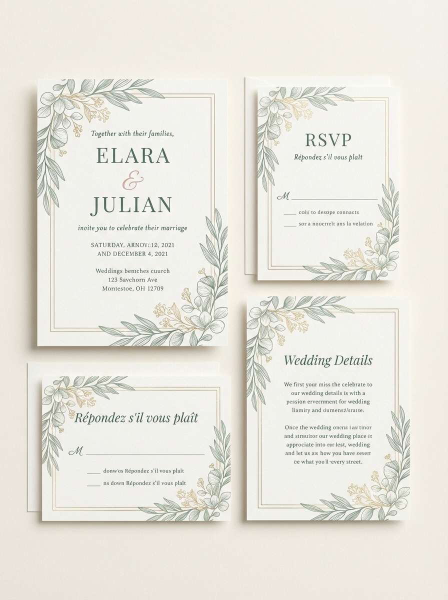
17) Eucalyptus Wedding
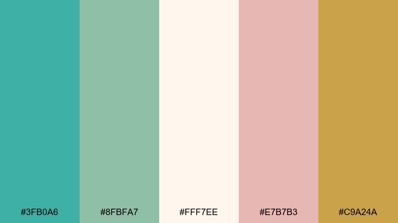
HEX: #3FB0A6 #8FBFA7 #FFF7EE #E7B7B3 #C9A24A
Mood: romantic, airy, elegant
Best for: wedding invitation suite
Romantic and airy, like eucalyptus sprigs on linen with soft candlelight. Verdigris and sage feel fresh and botanical without leaning too rustic. Use blush for names and flourishes, then bring in muted gold for tiny borders or monograms. Tip: print on warm ivory stock so the greens stay gentle and refined.
Image example of eucalyptus wedding generated using media.io
18) Deep Space UI
HEX: #27A39B #0B0F14 #3C4652 #79EFE7 #F5F7FA
Mood: sleek, futuristic, high-contrast
Best for: dark mode dashboard UI
Sleek and futuristic, like a control room with glowing status lights. Verdigris works as a confident primary in dark mode, while the cyan highlight adds clarity for active states and charts. Keep near-black as the main canvas and reserve off-white for key labels only. Tip: use the bright cyan sparingly so it stays special and readable.
Image example of deep space ui generated using media.io
19) Classroom Chalkboard
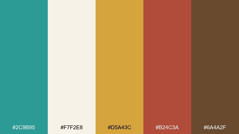
HEX: #2C9B95 #F7F2E8 #D5A43C #B24C3A #6A4A2F
Mood: friendly, smart, hands-on
Best for: education workshop poster
Friendly and hands-on, like a well-used chalkboard with warm wood desks nearby. Verdigris feels academic and calm, while mustard and brick red add lively emphasis for dates and key topics. Keep the cream as the main background so text reads easily at a distance. Tip: use simple badge shapes in mustard to organize sections.
Image example of classroom chalkboard generated using media.io

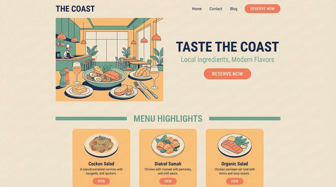
20) Sunset on Copper
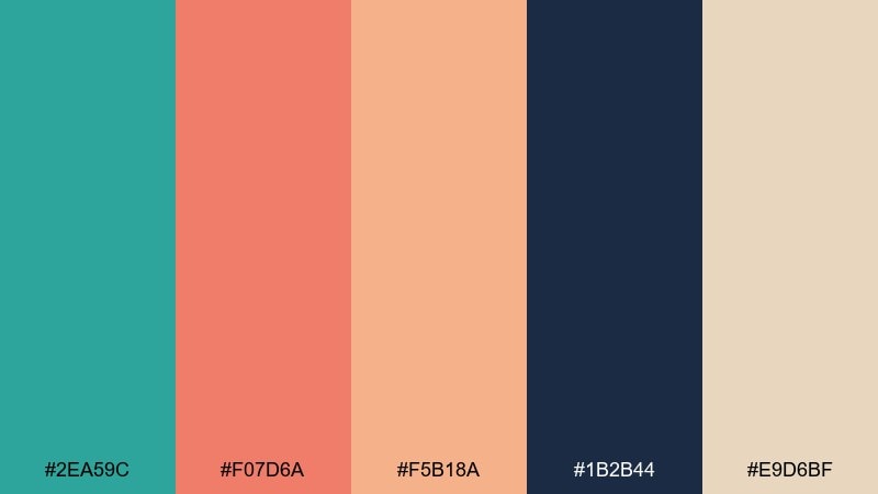
HEX: #2EA59C #F07D6A #F5B18A #1B2B44 #E9D6BF
Mood: warm, modern, inviting
Best for: restaurant landing page
Warm and inviting, like a copper rooftop catching sunset while the sea cools below. These verdigris color combinations feel modern when you let coral and apricot do the welcoming work. Use deep navy for typography and navigation, then keep sand beige as the soft background tone. Tip: set buttons in coral and save verdigris for section headers to avoid competing accents.
Image example of sunset on copper generated using media.io
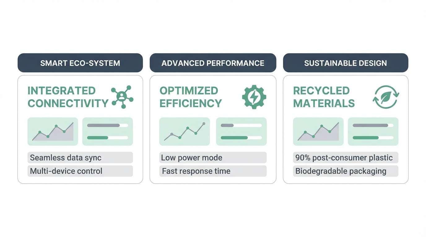
21) Seaglass Minimal
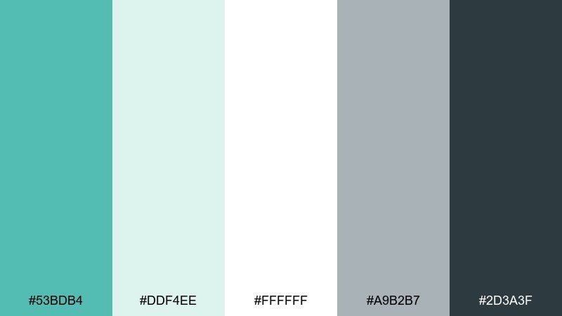
HEX: #53BDB4 #DDF4EE #FFFFFF #A9B2B7 #2D3A3F
Mood: clean, breezy, modern
Best for: product feature infographic
Clean and breezy, like seaglass scattered on a white shoreline. Verdigris carries the main message color, while pale mint and pure white keep the layout airy and modern. Use mid-gray for secondary labels and deep slate for headers to maintain hierarchy. Tip: stick to simple charts and thin lines so the palette stays crisp.
Image example of seaglass minimal generated using media.io
22) Heritage Library
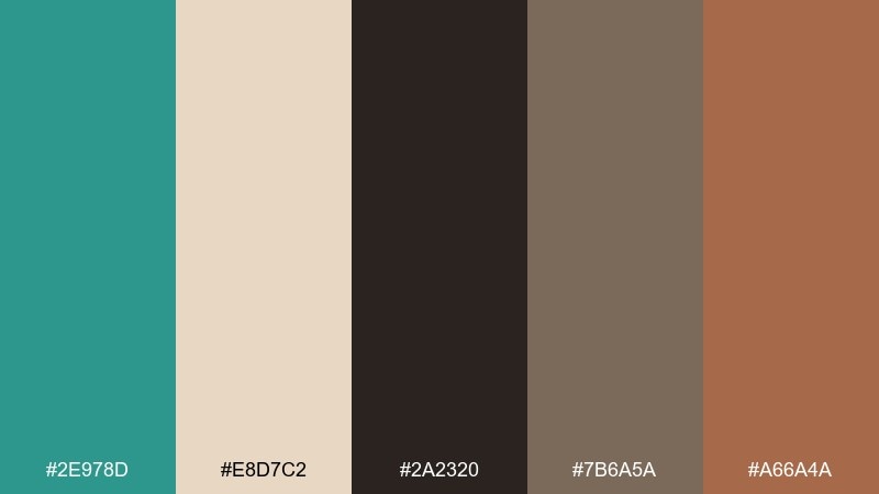
HEX: #2E978D #E8D7C2 #2A2320 #7B6A5A #A66A4A
Mood: classic, scholarly, warm
Best for: book cover design
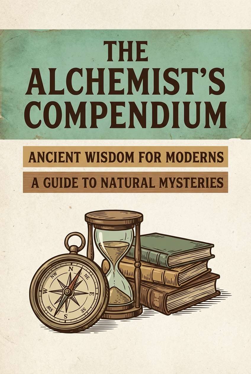
Classic and scholarly, like aged paper, leather spines, and a patina desk lamp. Verdigris adds a modern twist to heritage browns and parchment tones without breaking the timeless feel. Use the darkest brown for title type and the tan for subtitles or texture blocks. Tip: add subtle grain to the background so the cover looks tactile in print.
Image example of heritage library generated using media.io
23) Modern Marina Brand
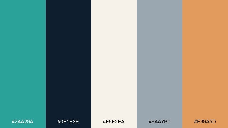
HEX: #2AA29A #0F1E2E #F6F2EA #9AA7B0 #E39A5D
Mood: confident, sporty, coastal-modern
Best for: outdoor gear branding kit
Confident and sporty, like clean marina lines and technical fabric. A strong teal-green core pairs with navy and cool gray for a brand system that feels reliable and modern. Add the warm orange only as a signal color for tags, zippers, or key UI states. Tip: keep the logo one-color for flexibility, then use orange as the limited accent in applications.
Image example of modern marina brand generated using media.io

What Colors Go Well with Verdigris?
Verdigris pairs beautifully with crisp whites, warm ivories, and linen neutrals to keep things bright and breathable. For structure and readability, anchor it with navy, charcoal, or near-black.
If you want contrast that feels intentional, use warm metals and earth tones: copper, terracotta, ochre, and sand. For a sharper, modern energy, add neon-lime or hot magenta in small doses.
Soft accents like blush, dusty rose, and warm beige can also “humanize” verdigris, making it ideal for wellness, lifestyle, and editorial design systems.
How to Use a Verdigris Color Palette in Real Designs
In branding, treat verdigris as your primary brand color, then choose one strong accent (coral, amber, or orange) for CTAs and highlights. Keep neutrals consistent across applications to maintain a cohesive system.
In UI design, reserve the darkest tone for text and navigation, and use verdigris for buttons, active states, and key section headers. A pale mint or cream background can reduce eye strain and make components feel more premium.
In interiors, verdigris works best when you balance it with natural textures—wood, stone, linen, brushed metal—so it reads like patina rather than plastic teal.
Create Verdigris Palette Visuals with AI
If you want to see these verdigris color combinations in real layouts, generate fast mockups from a text prompt—posters, packaging, landing pages, or room scenes—then iterate by swapping accents and backgrounds.
Start with a clear subject, lighting, and style (e.g., “studio product shot,” “flat 2D UI,” or “realistic interior render”), then specify which palette color should dominate and which should be the accent.
With Media.io, you can create consistent visuals for moodboards and concept exploration without setting up complex design files first.
Verdigris Color Palette FAQs
-
What color is verdigris?
Verdigris is a blue-green shade inspired by the patina that forms on copper and bronze. It often sits between teal and sea-green, ranging from muted oxidized tones to brighter aqua-leaning versions. -
Is verdigris more green or more blue?
It depends on the specific hex, but verdigris is typically a balanced blue-green. Pair it with navy and cool grays to emphasize the blue side, or with sage, olive, and warm neutrals to make it read greener. -
What are the best neutral colors to pair with verdigris?
Warm off-white, ivory, linen beige, and soft stone gray are the easiest neutrals with verdigris. For higher contrast and a more modern look, use charcoal or near-black. -
What accent colors make verdigris pop?
Copper, terracotta, coral, mustard/ochre, and warm orange create a strong complementary contrast. For bold modern graphics, neon-lime or magenta can also pop against verdigris when used sparingly. -
How do I use verdigris in a UI color palette?
Use verdigris for primary buttons, active states, and key highlights, then keep text in deep slate/charcoal for readability. Add a pale mint or cream background to keep the interface airy and reduce visual fatigue. -
Does verdigris work for luxury branding?
Yes—verdigris can feel premium when paired with black/charcoal and metallic gold or champagne accents. Keep typography minimal and give the palette space (more negative space, fewer competing colors) for a high-end finish. -
What’s the easiest way to preview a verdigris palette in real scenes?
Generate quick concept images with an AI text-to-image tool using a prompt that describes the scene, lighting, and where verdigris should appear (dominant vs. accent). This helps you validate contrast, mood, and material feel before committing to production.


