

Vanilla color palettes sit right in the sweet spot between warm and neutral—soft enough for backgrounds, but still rich enough to build a brand around.
Below are 20 ready-to-use vanilla palette ideas with HEX codes, plus practical pairing tips for web, print, packaging, and more.
In this article
- Why Vanilla Palettes Work So Well
-
- buttercream linen
- oat milk morning
- honeyed canvas
- almond sugar
- vanilla orchid mist
- citrus cream pop
- toasted coconut
- soft custard ui
- sandstone glaze
- pearl vanilla minimal
- maple cream branding
- golden waffle
- ivory sage pairing
- sunlit latte
- vintage parchment
- creamy clay rose
- biscuit and ink
- apricot drift
- mocha cream layers
- champagne almond glow
- What Colors Go Well with Vanilla?
- How to Use a Vanilla Color Palette in Real Designs
- Create Vanilla Palette Visuals with AI
Why Vanilla Palettes Work So Well
Vanilla tones—creams, buttery off-whites, mellow golds, and soft beiges—feel instantly approachable. They bring warmth without overpowering a layout, which makes them easy to live with across web, packaging, and print.
They’re also flexible: you can lean minimal and premium with an ink-dark accent, or make them cheerful by adding honey, apricot, or caramel shades. Because vanilla sits close to “paper” colors, it naturally supports typography and product imagery.
Most importantly, vanilla palettes create comfort and trust. That emotional cue works especially well for hospitality, wellness, food, lifestyle, and boutique brands that want a soft, welcoming presence.
20+ Vanilla Color Palette Ideas (with HEX Codes)
1) Buttercream Linen
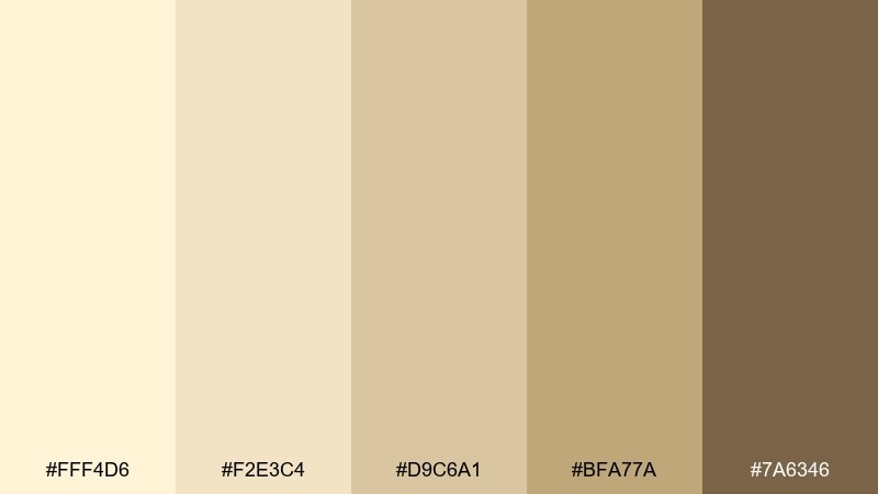
HEX: #FFF4D6 #F2E3C4 #D9C6A1 #BFA77A #7A6346
Mood: warm and welcoming
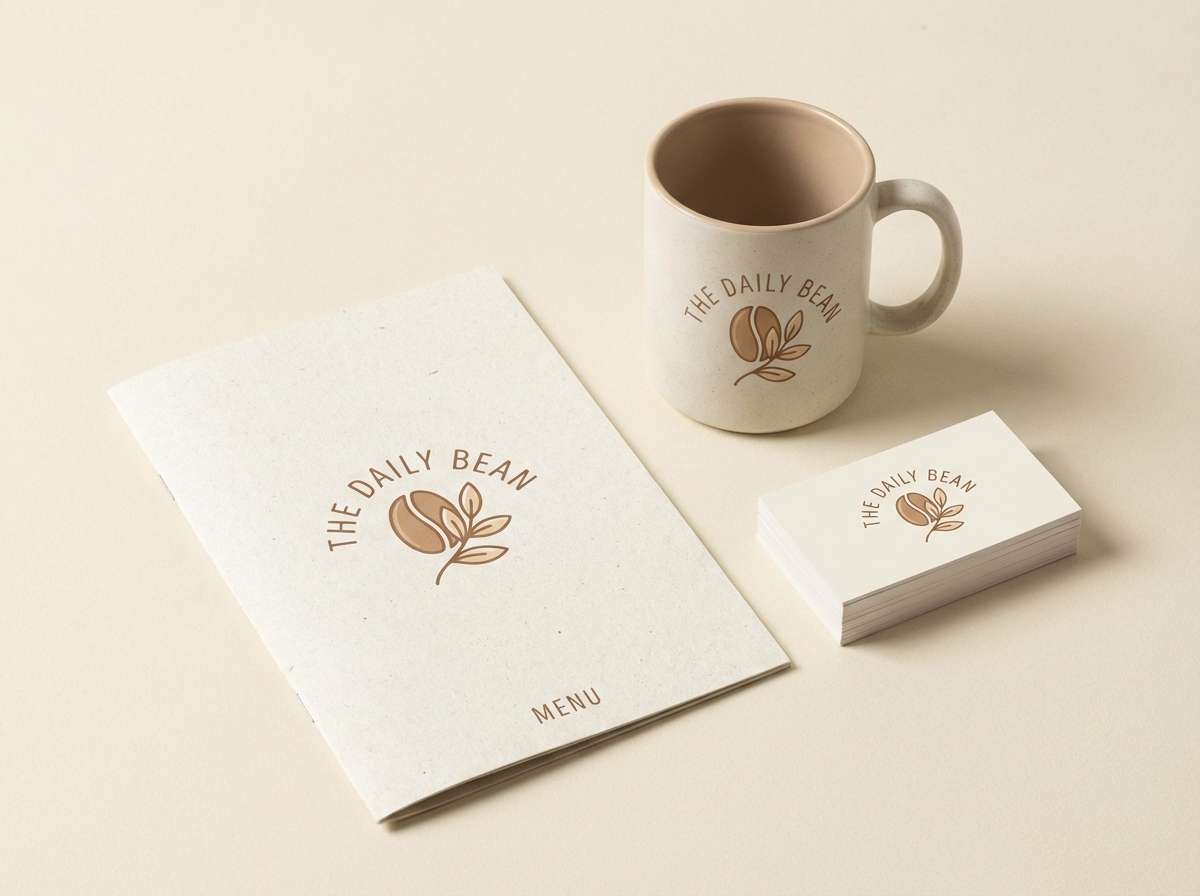
Best for: cozy cafe branding and menus
Buttery creams and woven-linen beiges feel like fresh pastries and sunlit counters. Use it for cafe logos, menu cards, and loyalty stamps where warmth matters more than contrast. Pair with kraft paper textures or a deep coffee brown for readable type. Tip: keep the darkest brown for headings only, and let the lighter creams do most of the background work.
Image example of buttercream linen generated using media.io
Media.io is an online AI studio for creating and editing video, image, and audio in your browser.

2) Oat Milk Morning
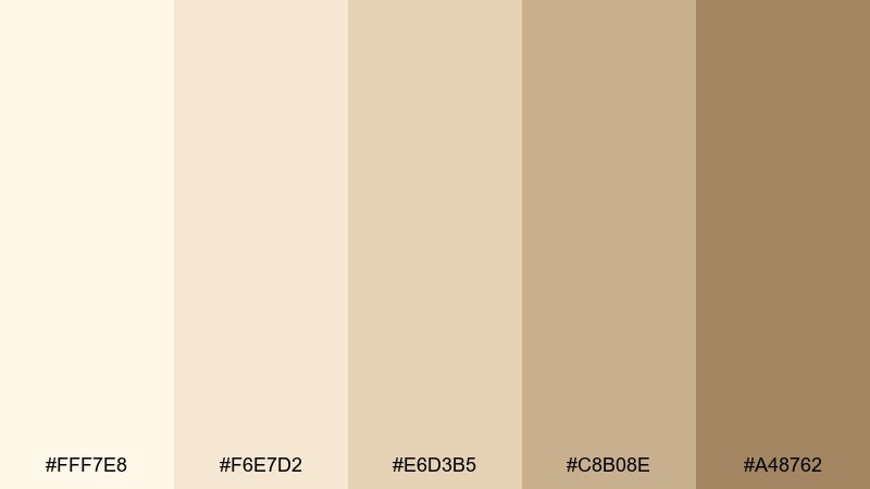
HEX: #FFF7E8 #F6E7D2 #E6D3B5 #C8B08E #A48762
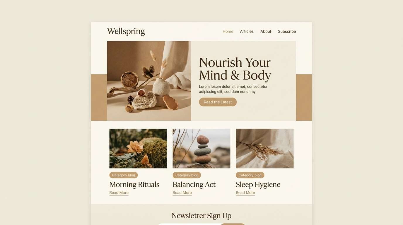
Mood: soft and calm
Best for: wellness blog 2d UI mockup
Creamy oat tones and gentle tans evoke quiet mornings and clean breathing space. They work beautifully in reading-heavy layouts where you want low strain and a friendly feel. Add a crisp white buffer and use the deeper tan for buttons and links. Tip: reserve the mid-beige for cards so sections stay separated without harsh borders.
Image example of oat milk morning generated using media.io
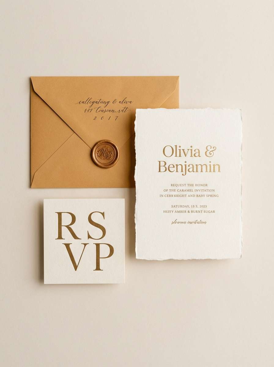
3) Honeyed Canvas
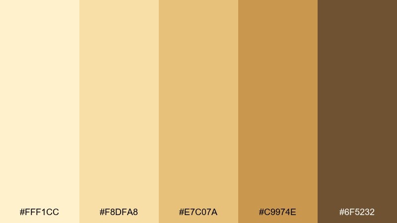
HEX: #FFF1CC #F8DFA8 #E7C07A #C9974E #6F5232
Mood: golden and artisanal
Best for: wedding invitation and day-of stationery
Sun-warmed honey and toasted caramel tones bring a handmade, romantic glow. This vanilla color palette shines on invitations, place cards, and wax-seal details where warmth feels personal. Pair it with soft ivory paper and a rich brown for elegant type. Tip: foil accents look best when limited to the lightest two tones so the suite stays refined.
Image example of honeyed canvas generated using media.io
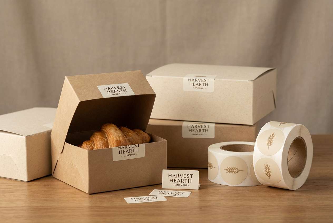
4) Almond Sugar
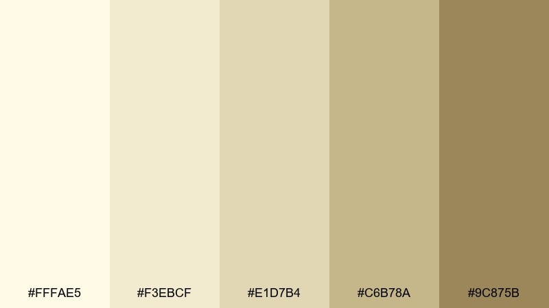
HEX: #FFFAE5 #F3EBCF #E1D7B4 #C6B78A #9C875B
Mood: light and comforting
Best for: rustic bakery packaging and labels
Powdery almond cream and muted wheat tones feel homemade and gently nostalgic. Use these shades on pastry boxes, ingredient labels, and stamp marks to keep everything approachable. Pair with a simple black or deep brown ink for sharp readability. Tip: print the lightest tone as uncoated stock and let the darker wheat serve as your brand accent.
Image example of almond sugar generated using media.io
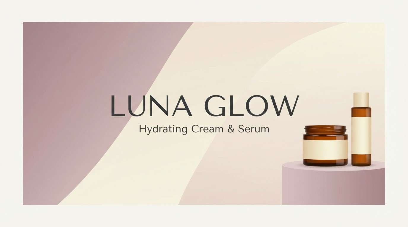
5) Vanilla Orchid Mist
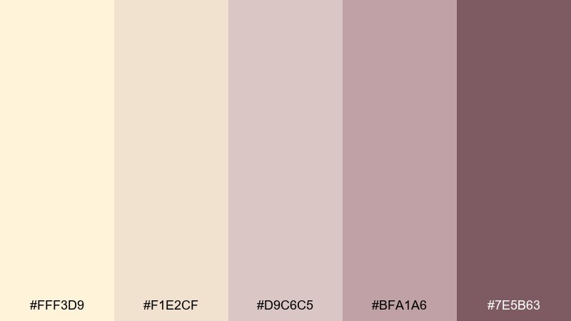
HEX: #FFF3D9 #F1E2CF #D9C6C5 #BFA1A6 #7E5B63
Mood: delicate and romantic
Best for: boutique cosmetics banner ad
Creamy neutrals with a soft mauve haze suggest satin ribbons and floral powder. They suit beauty ads, blush-forward product pages, and gentle lifestyle branding. Pair with thin typography and subtle gradients to keep the look airy. Tip: use the deepest plum only for small callouts so the overall feel stays light.
Image example of vanilla orchid mist generated using media.io
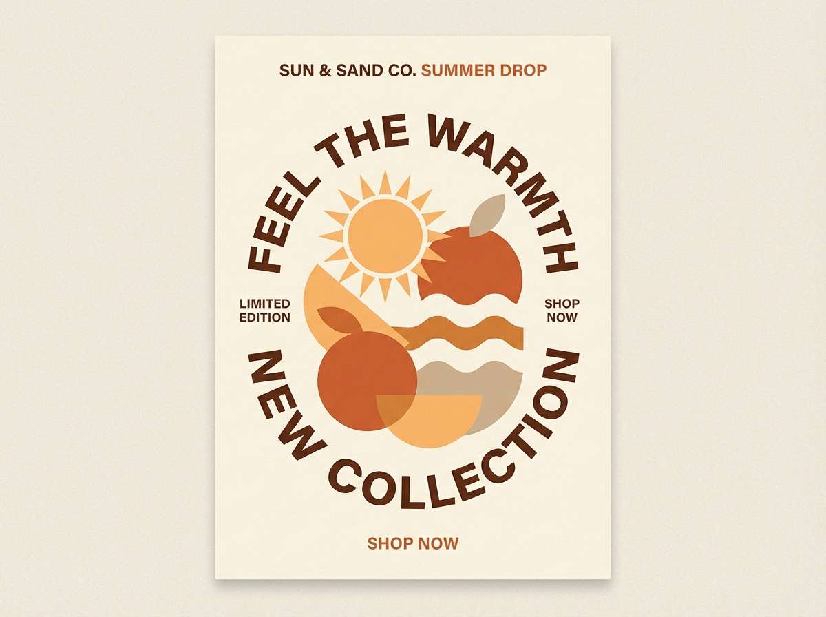
6) Citrus Cream Pop
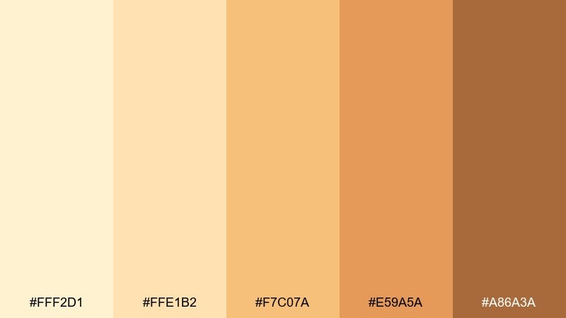
HEX: #FFF2D1 #FFE1B2 #F7C07A #E59A5A #A86A3A
Mood: bright and upbeat
Best for: summer product promo poster design
Zesty apricot and creamy custard hues feel like sparkling citrus and golden hour. These vanilla color combinations are great for seasonal promos, limited drops, and energetic social campaigns that still feel warm. Pair with chunky sans-serif type and plenty of white space to avoid visual heat. Tip: set your main CTA in the deeper orange-brown so it reads clearly on pale backgrounds.
Image example of citrus cream pop generated using media.io
7) Toasted Coconut
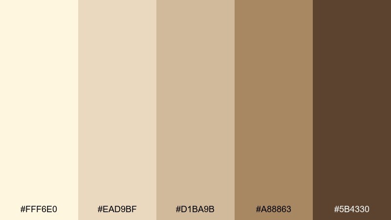
HEX: #FFF6E0 #EAD9BF #D1BA9B #A88863 #5B4330
Mood: earthy and cozy
Best for: living room interior mood board
Toasted cream and coconut husk browns evoke natural fibers and slow evenings at home. Use these tones for interior mood boards, furniture lookbooks, or decor store campaigns. Pair with warm wood textures and matte black accents for a grounded finish. Tip: keep large surfaces in the lightest cream and repeat the mid-tan as your unifying accent across items.
Image example of toasted coconut generated using media.io
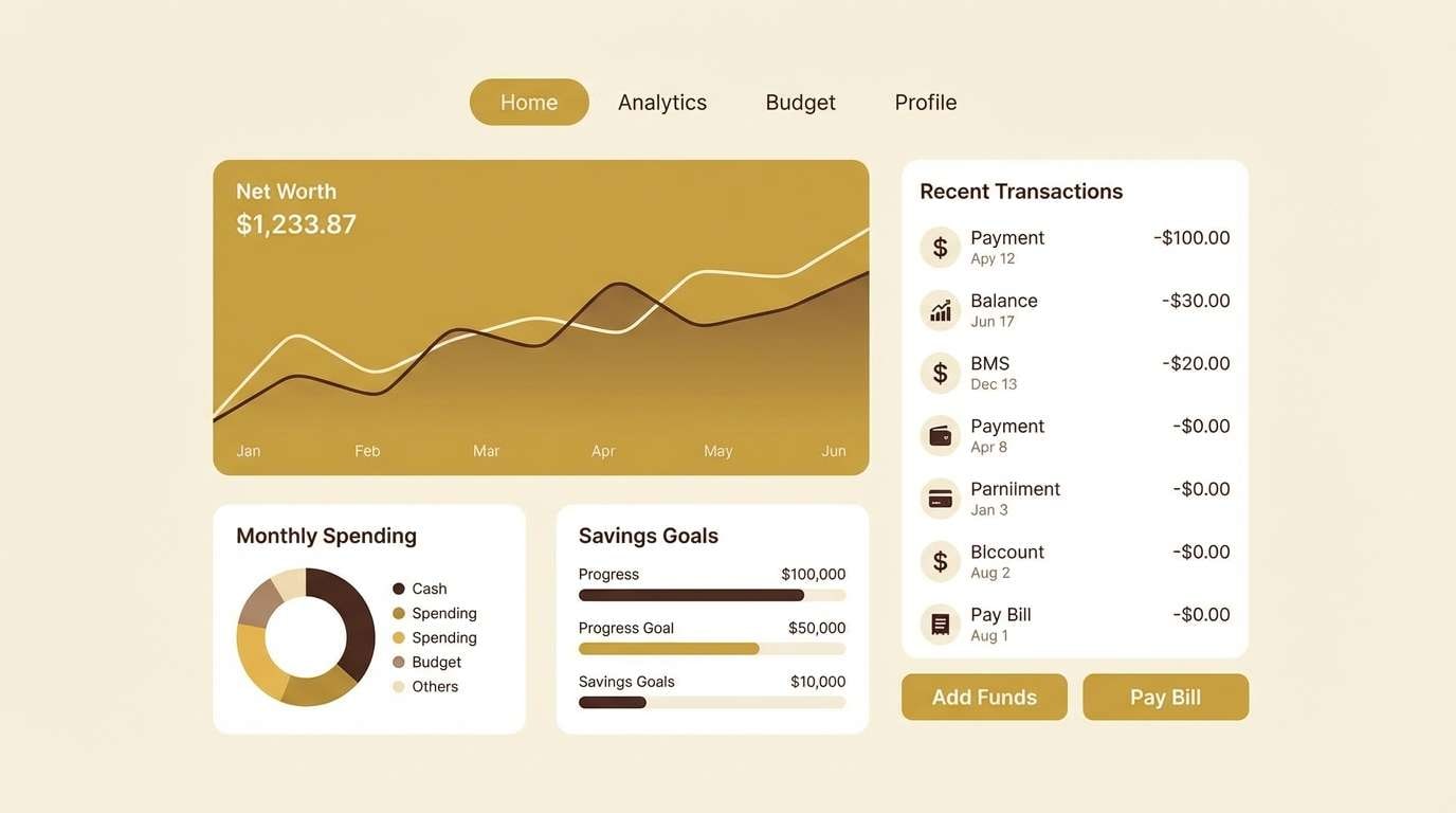
8) Soft Custard UI
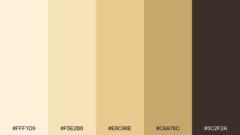
HEX: #FFF1D9 #F5E2B8 #E8C98E #C6A76C #3C2F2A
Mood: friendly and clear
Best for: finance app dashboard 2d UI mockup
Creamy custard tones with a grounded cocoa anchor feel approachable yet dependable. They fit dashboards that need warmth without losing structure or hierarchy. Pair the darkest shade with clean iconography and use the mid-gold for highlights like progress and badges. Tip: keep charts simple and limit them to two warm tones so the interface stays readable.
Image example of soft custard ui generated using media.io
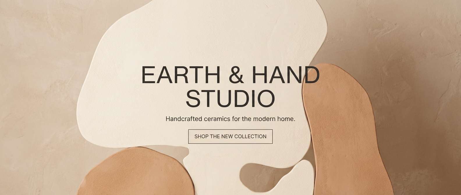
9) Sandstone Glaze
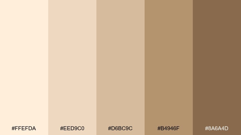
HEX: #FFEFDA #EED9C0 #D6BC9C #B4946F #8A6A4D
Mood: natural and grounded
Best for: ceramics studio product page hero
Sandstone creams and clay browns evoke glazed pottery and sun-baked earth. They work well for artisan product pages, handmade marketplaces, and story-driven branding. Pair with subtle grain, warm photography, and generous margins for a calm premium feel. Tip: use the mid-sand tone behind product shots to avoid stark contrast while keeping edges clean.
Image example of sandstone glaze generated using media.io
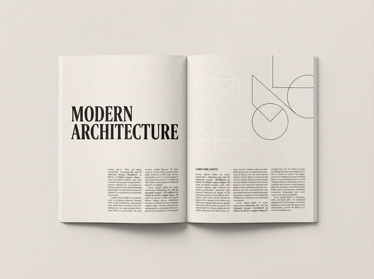
10) Pearl Vanilla Minimal
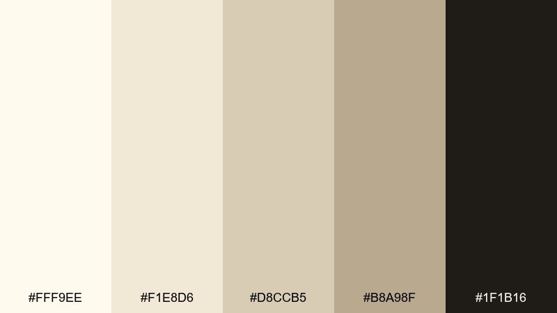
HEX: #FFF9EE #F1E8D6 #D8CCB5 #B8A98F #1F1B16
Mood: clean and premium
Best for: minimal editorial magazine layout
Pearly creams with a deep ink accent feel crisp, quiet, and expensive. Use them for editorials, portfolios, and brand guidelines where whitespace is part of the aesthetic. Pair with a single serif family and thin rules for a refined grid. Tip: keep body text in the darkest ink and use the pale pearl only for section breaks and margins.
Image example of pearl vanilla minimal generated using media.io
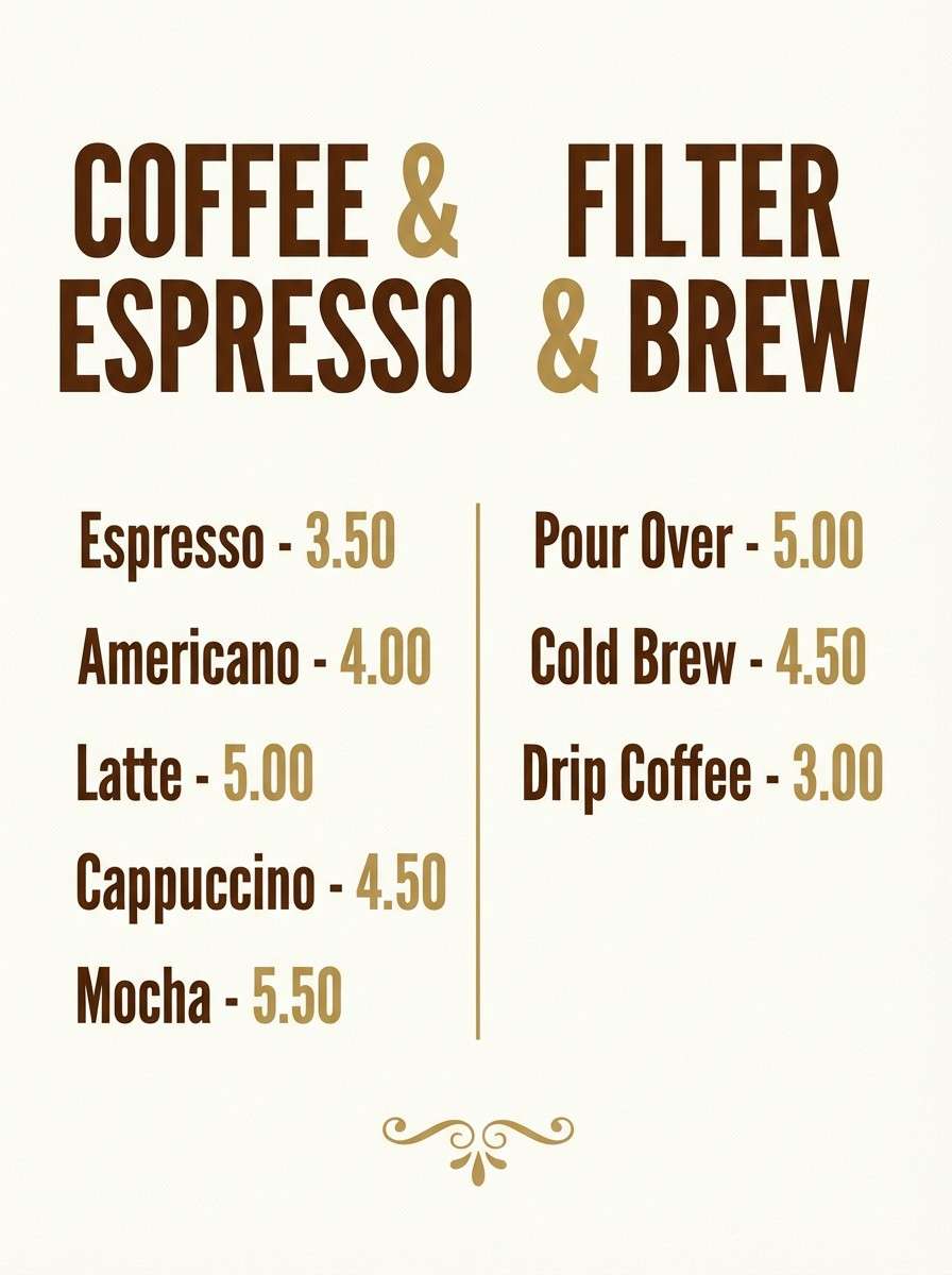
11) Maple Cream Branding
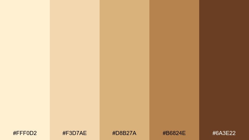
HEX: #FFF0D2 #F3D7AE #D8B27A #B6824E #6A3E22
Mood: rich and inviting
Best for: coffee shop menu poster
Maple sweetness and roasted brown tones feel like a warm cup in your hands. They suit menu posters, seasonal drink boards, and loyalty promos where appetite appeal matters. Pair with cream backgrounds and bold pricing blocks for easy scanning. Tip: keep the darkest brown for prices and key items so the hierarchy is instantly clear.
Image example of maple cream branding generated using media.io
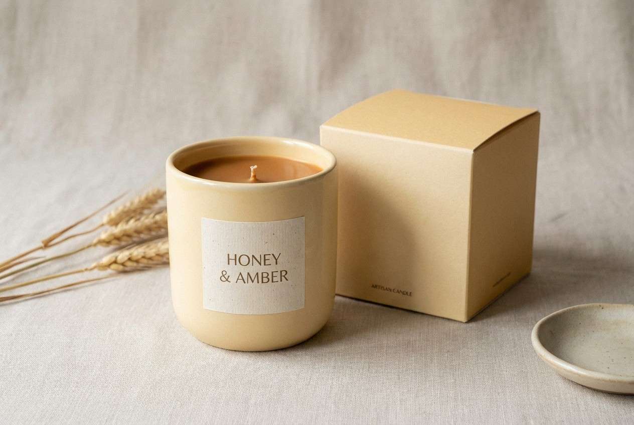
12) Golden Waffle
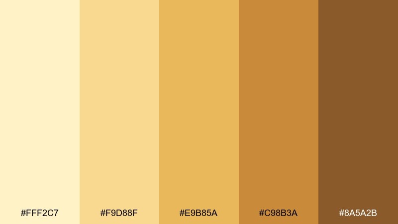
HEX: #FFF2C7 #F9D88F #E9B85A #C98B3A #8A5A2B
Mood: playful and sunny
Best for: artisan candle product hero image
Golden waffle yellows and caramel browns feel cheerful, nostalgic, and a little indulgent. This vanilla color palette works beautifully for candle launches, gift sets, and handmade marketplaces where warmth sells the scent story. Pair with simple props and a clean backdrop to keep the tones from feeling busy. Tip: light the scene softly and let the mid-gold drive the label color so the product stays readable.
Image example of golden waffle generated using media.io
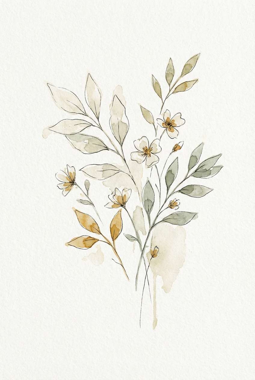
13) Ivory Sage Pairing
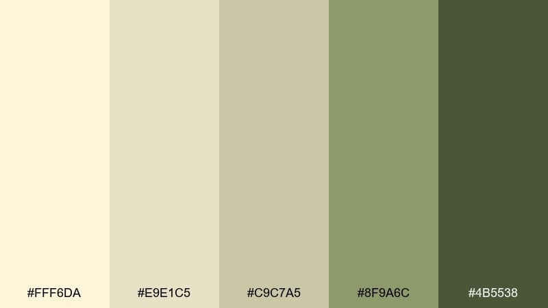
HEX: #FFF6DA #E9E1C5 #C9C7A5 #8F9A6C #4B5538
Mood: fresh and botanical
Best for: spring botanical watercolor illustration
Ivory cream with muted sage greens evokes pressed leaves and soft spring air. Use it for botanical prints, garden event materials, and nature-inspired packaging. Pair with watercolor paper textures and fine linework for an organic finish. Tip: let sage be the accent and keep backgrounds in ivory so the illustration stays light.
Image example of ivory sage pairing generated using media.io
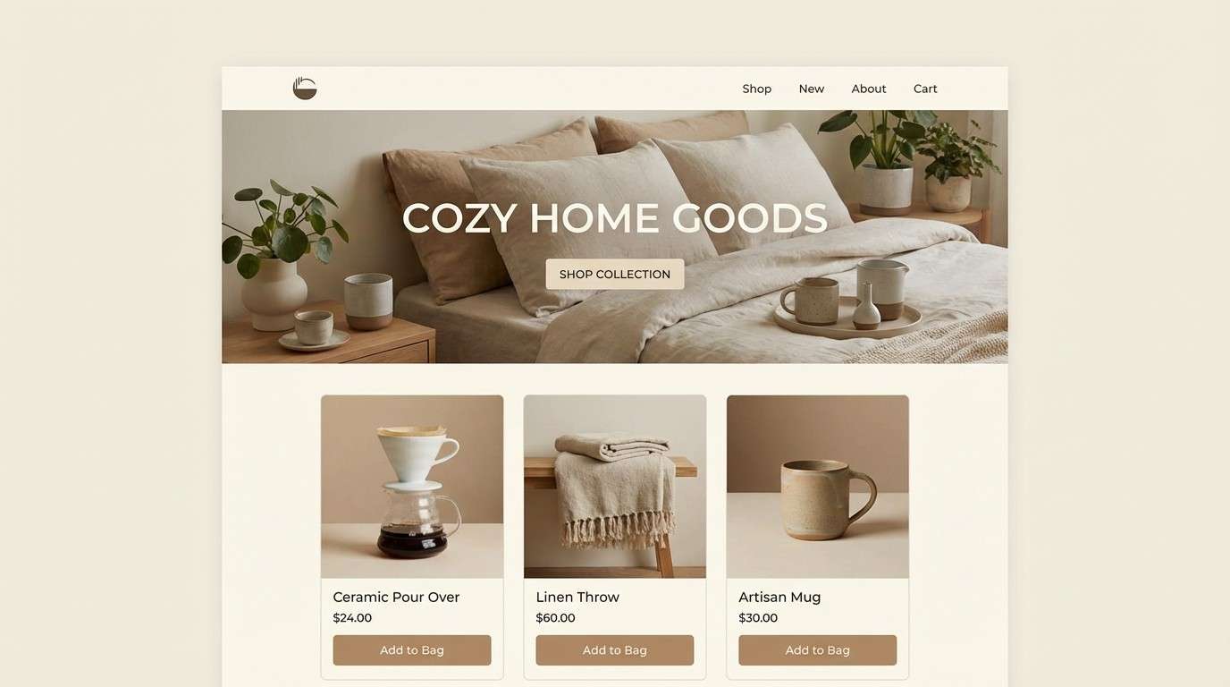
14) Sunlit Latte
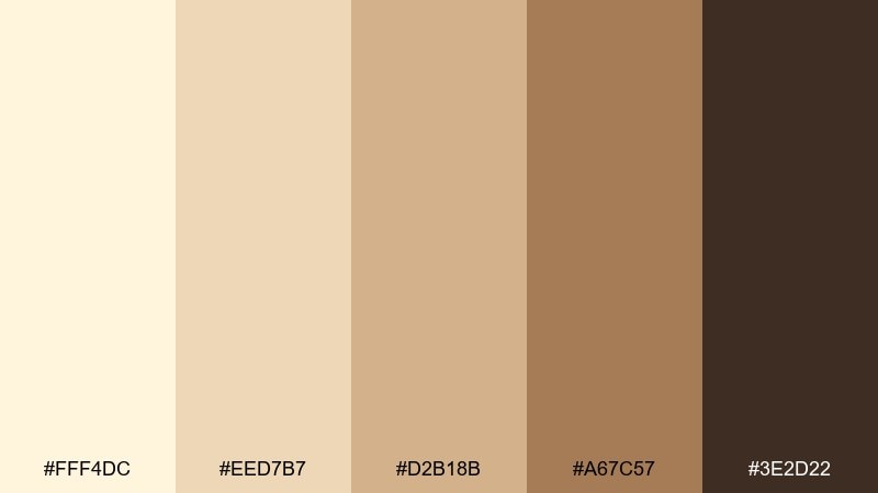
HEX: #FFF4DC #EED7B7 #D2B18B #A67C57 #3E2D22
Mood: cozy and modern
Best for: home goods ecommerce landing page UI
Sunlit cream and latte browns feel like warm textiles and calm weekend routines. They fit ecommerce landing pages that want comfort without looking dated. Pair with clean product photography and minimal icons for a modern storefront vibe. Tip: use the darkest shade for navigation and the lightest for large sections to keep scrolling effortless.
Image example of sunlit latte generated using media.io
15) Vintage Parchment
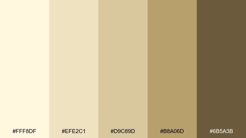
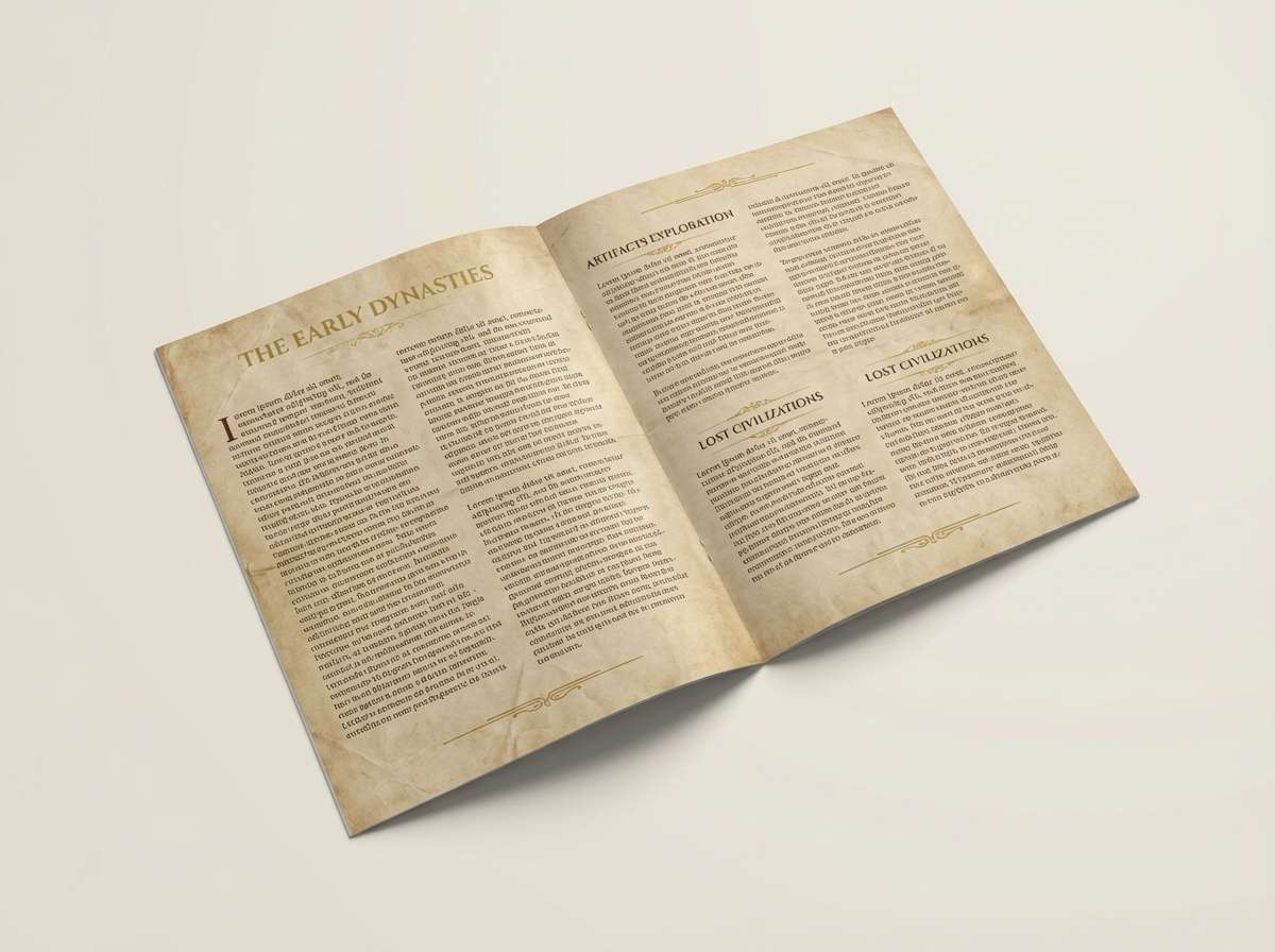
HEX: #FFF8DF #EFE2C1 #D9C89D #B8A06D #6B5A3B
Mood: classic and archival
Best for: museum exhibit brochure layout
Aged parchment creams and antique golds bring a thoughtful, historical tone. They work well for museum brochures, heritage brands, and long-form print pieces with lots of reading. Pair with serif typography and subtle divider lines for an academic feel. Tip: print on slightly textured stock to reinforce the vintage mood without adding extra graphics.
Image example of vintage parchment generated using media.io
16) Creamy Clay Rose
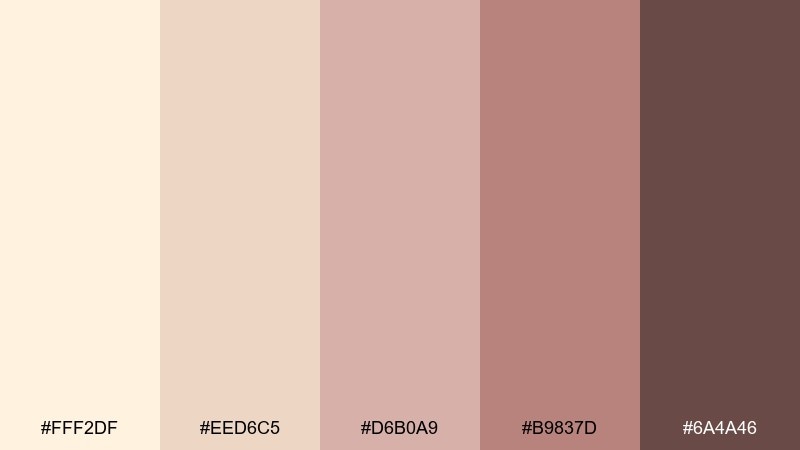
HEX: #FFF2DF #EED6C5 #D6B0A9 #B9837D #6A4A46
Mood: soft and romantic
Best for: bridal shower flyer design
Cream blush and clay rose tones feel tender, elegant, and celebratory. They suit bridal shower flyers, RSVP cards, and small event signage where you want warmth with a modern twist. Pair with delicate script accents and plenty of breathing room. Tip: use the deeper rose for names and dates, and keep body copy in a warm brown for legibility.
Image example of creamy clay rose generated using media.io

17) Biscuit and Ink
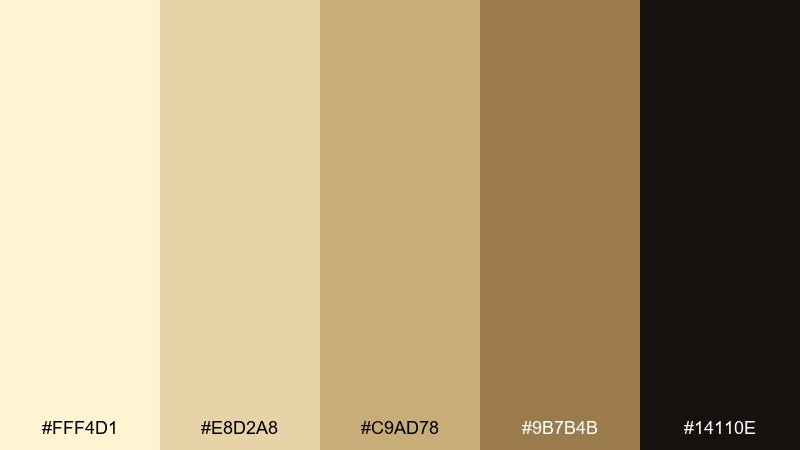
HEX: #FFF4D1 #E8D2A8 #C9AD78 #9B7B4B #14110E
Mood: bold and refined
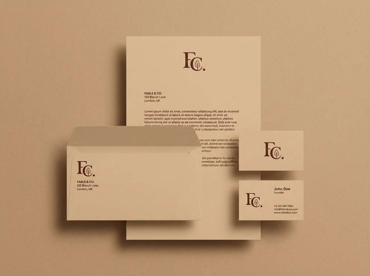
Best for: tech brand logo and stationery
Warm biscuit neutrals with a near-black ink create confident contrast without feeling cold. Use it for logos, letterheads, and pitch decks that need clarity and a premium edge. Pair with geometric shapes and sharp typography to lean modern. Tip: keep the ink shade for text and marks, and use the biscuit tones to soften large fields and slides.
Image example of biscuit and ink generated using media.io
18) Apricot Drift
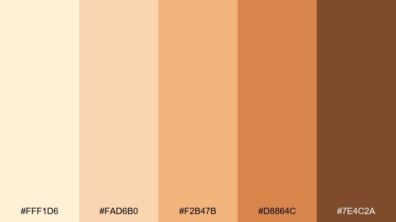
HEX: #FFF1D6 #FAD6B0 #F2B47B #D8864C #7E4C2A
Mood: cheerful and sun-kissed
Best for: seasonal social media poster
Apricot warmth and creamy highlights evoke ripe fruit and late-summer markets. This vanilla color combination works for quick-hit social posters where you want energy without neon. Pair with big type and a simple border to keep the design punchy. Tip: let the pale cream carry the background and use the deeper apricot for the main headline.
Image example of apricot drift generated using media.io
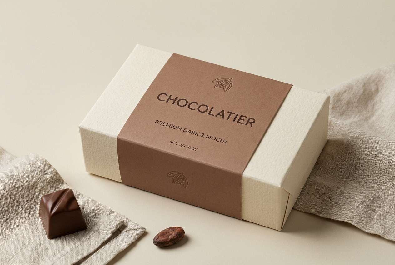
19) Mocha Cream Layers
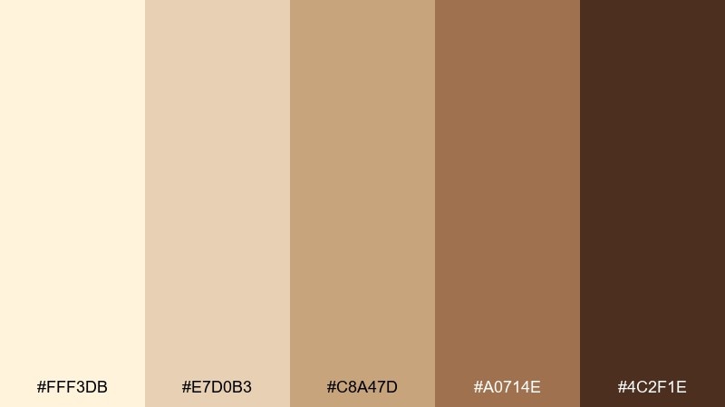
HEX: #FFF3DB #E7D0B3 #C8A47D #A0714E #4C2F1E
Mood: rich and comforting
Best for: chocolate dessert packaging
Cream-to-mocha layers feel like tiramisu, cocoa dust, and slow indulgence. Use these tones on dessert boxes, chocolate wraps, and product cards for a premium yet cozy vibe. Pair with minimal illustrations and a single accent stamp for craft appeal. Tip: keep the darkest mocha for small details and ingredient text so the package stays appetizing, not heavy.
Image example of mocha cream layers generated using media.io
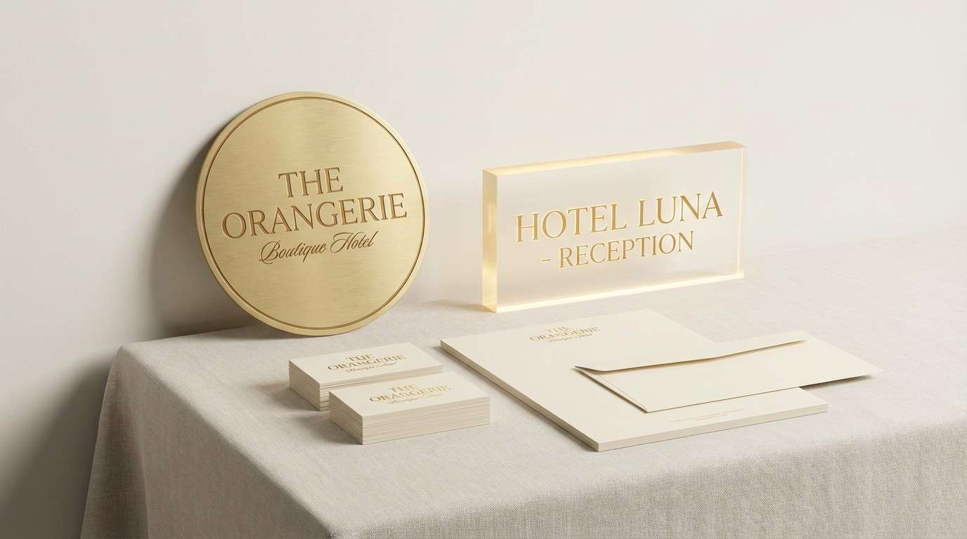
20) Champagne Almond Glow
HEX: #FFF6E6 #F1E0C5 #D9C2A0 #C3A072 #8A6B3E
Mood: luxurious and warm
Best for: boutique hotel branding and signage
Champagne cream and almond gold feel polished, calm, and quietly upscale. They suit hotel branding, wayfinding signage, and premium welcome materials. Pair with deep charcoal type and a touch of metallic finish for a refined look. Tip: use the mid-gold as the signature accent and keep the rest of the system soft to maintain a luxe mood.
Image example of champagne almond glow generated using media.io
What Colors Go Well with Vanilla?
Vanilla pairs naturally with deep browns, espresso, and near-black ink tones when you need contrast for typography or logos. This combination keeps designs warm while still feeling premium and readable.
For softer, more lifestyle-forward palettes, try dusty rose, mauve, peach, or muted terracotta—these hues keep the warmth but add personality. If you want a fresh twist, sage and olive greens work beautifully with creamy vanilla bases.
In modern UI and branding, vanilla also plays well with cool accents like slate, charcoal, or a muted teal. The key is to keep saturation controlled so vanilla stays the “comfort” color in the system.
How to Use a Vanilla Color Palette in Real Designs
Start by assigning vanilla to large surfaces: page backgrounds, packaging base stock, or hero sections. Then use a mid-tone beige or gold for cards, dividers, and secondary blocks so your layout gets structure without harsh lines.
Reserve the darkest shade for text, icons, and key CTAs. If everything is warm and light, contrast becomes your usability tool—headings, prices, and buttons should consistently use the deepest tone.
For print, vanilla palettes look best with subtle texture (uncoated paper, linen finishes, grain overlays). For web, add crisp whitespace and limit accents to one or two stronger warm hues to avoid a “washed-out” look.
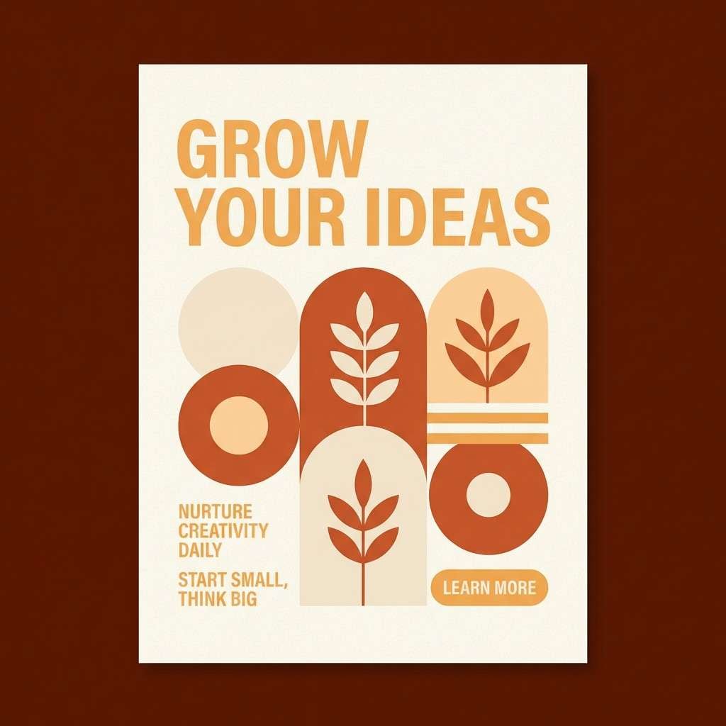
Create Vanilla Palette Visuals with AI
Want to see these vanilla tones in action before committing to a direction? Generate quick mockups—posters, brand boards, UI screens, packaging, and invitation suites—so you can compare mood and hierarchy instantly.
With Media.io Text to Image, you can paste a prompt, specify aspect ratio, and iterate fast until the lighting and material feel right for your brand. It’s a practical way to test warm neutrals without building full comps from scratch.
Use the included prompts above as a starting point, then swap keywords like “linen,” “foil,” “editorial,” or “minimal UI” to match your project.
Vanilla Color Palette FAQs
-
What is a vanilla color palette?
A vanilla color palette is a warm neutral scheme built around creamy off-whites, soft beiges, and mellow yellow-gold tones. It’s often used as a comforting base with darker browns or muted accents for contrast. -
Is vanilla closer to yellow or beige?
Vanilla sits between pale yellow and beige. Most “vanilla” shades have a light cream base with a subtle yellow warmth, making them softer than true yellow and warmer than many cool beiges. -
What text color works best on vanilla backgrounds?
Deep brown, espresso, charcoal, or near-black typically provides the best readability on vanilla backgrounds. Avoid light gray text, which can look low-contrast and reduce accessibility. -
What accent colors pair well with vanilla tones?
Great accents include sage/olive green, dusty rose/mauve, terracotta, and caramel. For a modern contrast, try slate, muted teal, or a dark cocoa tone. -
Do vanilla palettes work for UI design?
Yes—vanilla palettes can reduce glare and feel friendly for content-heavy screens. Use a strong dark anchor for text and interactive elements, and keep cards and separators in slightly deeper beige tones for clear hierarchy. -
How can I keep a vanilla color scheme from looking “flat”?
Add one dark anchor (for type and CTAs), use at least one mid-tone for structure, and introduce texture or subtle gradients. Small touches like thin rules, soft shadows, or grain can add depth without clutter. -
How do I generate vanilla palette mockups quickly?
Use an AI image generator like Media.io Text to Image. Start with a prompt (like the examples above), specify an aspect ratio, and iterate by adjusting materials (paper, linen, foil), lighting (soft diffused), and layout style (minimal, editorial, UI).


