

Blue, green, yellow, and orange is a high-energy palette family that still feels balanced because it mixes cool foundations with warm attention-grabbers.
Use these combinations for UI, branding, posters, packaging, and seasonal graphics when you want freshness (blue/green) plus instant visibility (yellow/orange).
In this article
- Why Blue Green Yellow Orange Palettes Work So Well
-
- sunlit harbor
- tropical boardwalk
- citrus lagoon
- desert oasis
- carnival morning
- coastal market
- retro surf shop
- fresh picnic
- botanical breeze
- modern playroom
- sunset kayak
- city park mural
- minimal tech pop
- artisan kitchen
- kids science fair
- summer poster print
- festival wayfinding
- clean ecommerce accent
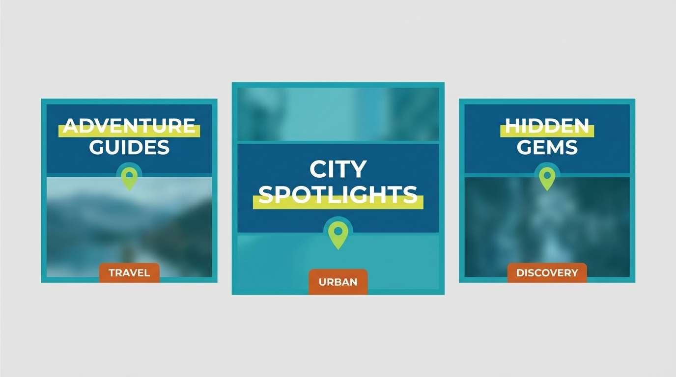
- travel blog header
- evening street food
- What Colors Go Well with Blue Green Yellow Orange?
- How to Use a Blue Green Yellow Orange Color Palette in Real Designs
- Create Blue Green Yellow Orange Palette Visuals with AI
Why Blue Green Yellow Orange Palettes Work So Well
Blue and green do most of the “heavy lifting” for trust and clarity: they read as stable, clean, and easy to scan in both print and digital layouts. That makes them great for backgrounds, navigation, and longer text areas.
Yellow and orange add the spark. They naturally pull attention (especially on screens), so they’re ideal for calls-to-action, key labels, price tags, dates, and small brand accents.
Put together, you get a palette that can feel coastal, tropical, playful, or modern—depending on saturation and how much warm color you use. The easiest win is to keep cool tones dominant and reserve the warm tones for highlights.
20+ Blue Green Yellow Orange Color Palette Ideas (with HEX Codes)
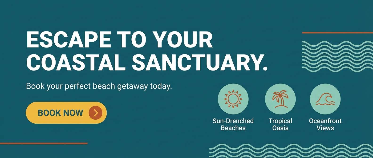
1) Sunlit Harbor
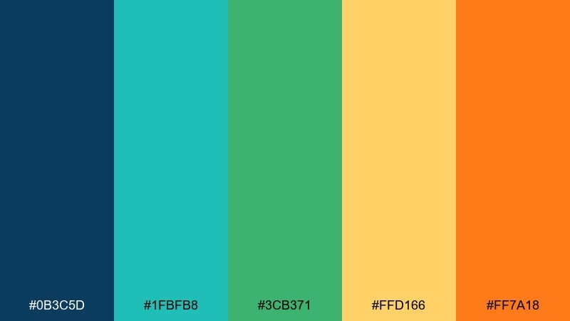
HEX: #0B3C5D #1FBFB8 #3CB371 #FFD166 #FF7A18
Mood: crisp, coastal, upbeat
Best for: brand style guide and hero banner
Crisp coastal light and sun-warmed docks come through with deep blue, seawater teal, and bright citrus accents. It works beautifully for travel brands, beach cafés, and outdoor services that want energy without looking noisy. Pair it with clean white space and a restrained sans-serif to keep the vibrancy controlled. Usage tip: let the navy handle headings, then reserve yellow and orange for buttons and highlights.
Image example of sunlit harbor generated using media.io
Media.io is an online AI studio for creating and editing video, image, and audio in your browser.

2) Tropical Boardwalk
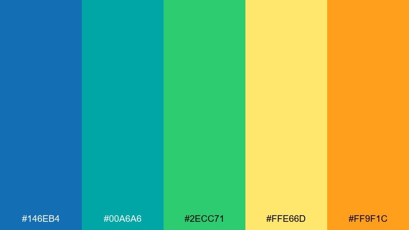
HEX: #146EB4 #00A6A6 #2ECC71 #FFE66D #FF9F1C
Mood: sunny, playful, tropical
Best for: summer event flyer
Sunny boardwalk vibes feel playful and welcoming, like painted kiosks and fruit stands by the water. The bright blue and aqua keep things fresh, while yellow and orange bring instant warmth to calls-to-action. Use it for summer concerts, food pop-ups, or community events where readability matters at a distance. Usage tip: set the background in pale yellow and use orange only for the date and ticket badge.
Image example of tropical boardwalk generated using media.io

3) Citrus Lagoon
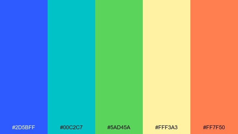
HEX: #2D5BFF #00C2C7 #5AD45A #FFF3A3 #FF7F50
Mood: fresh, juicy, high-contrast
Best for: app onboarding screens
Fresh lagoon water and juicy citrus slices set a punchy, optimistic tone with clean contrast. This blue green yellow orange color palette is ideal for onboarding flows where you want clarity plus a friendly spark. Keep illustrations simple and flat so the hues do the heavy lifting, and add plenty of white or very light cream for breathing room. Usage tip: choose coral orange for the primary button and let teal carry secondary UI states.
Image example of citrus lagoon generated using media.io
4) Desert Oasis
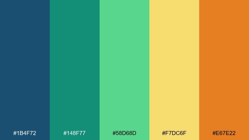
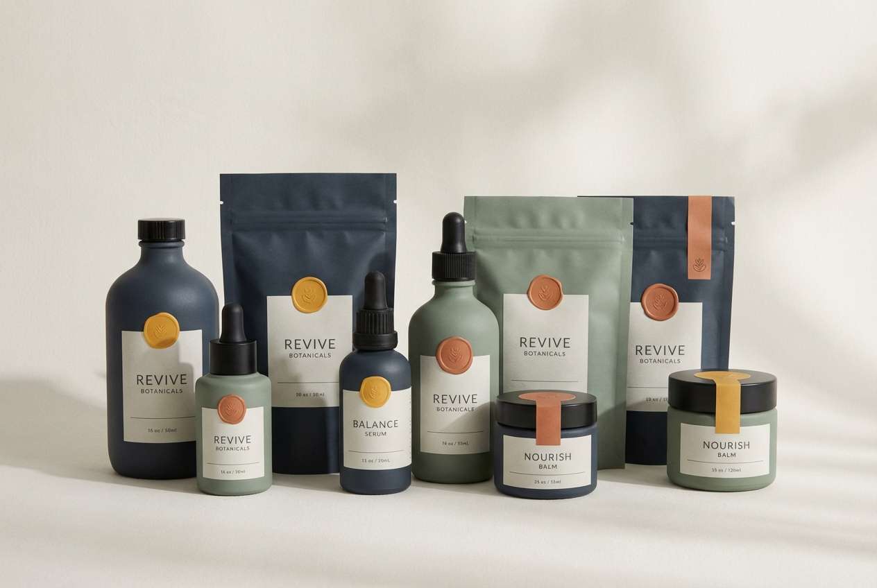
HEX: #1B4F72 #148F77 #58D68D #F7DC6F #E67E22
Mood: grounded, sunny, restorative
Best for: wellness product packaging
Grounded sun and cool shade meet like a small oasis tucked into desert stone. The darker blue anchors the look, while green and yellow feel restorative and organic against the warm orange. It suits wellness packaging, spa menus, and clean lifestyle brands that want color without looking childish. Usage tip: print the orange as a small seal or corner tab to keep the package premium.
Image example of desert oasis generated using media.io
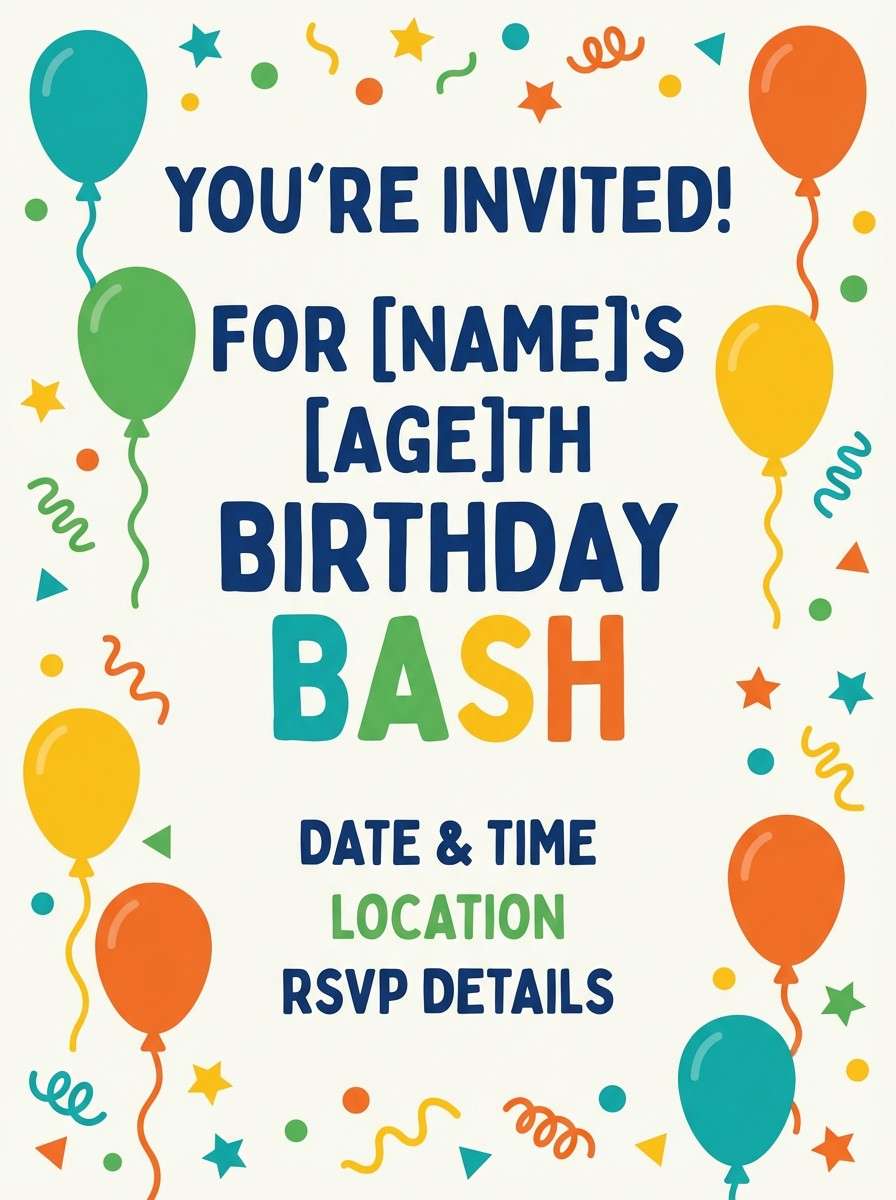
5) Carnival Morning
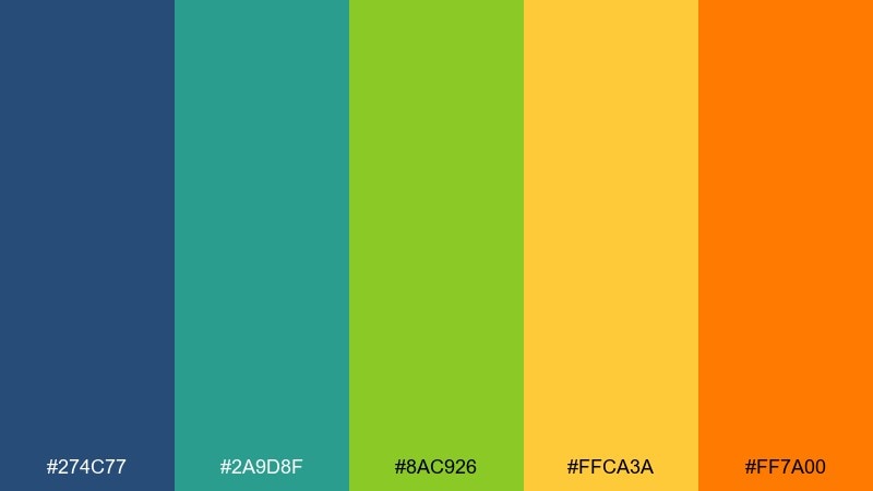
HEX: #274C77 #2A9D8F #8AC926 #FFCA3A #FF7A00
Mood: bright, festive, youthful
Best for: kids birthday invitation
Bright, festive energy feels like early rides, confetti, and a clear sky before the crowds. The mix balances a sturdy blue with cheerful greens, then pushes excitement with yellow and a punchy orange. Use it for kids invitations, school clubs, and family-friendly promos where you want instant smiles. Usage tip: keep body text in blue for legibility and use orange only for the name and RSVP line.
Image example of carnival morning generated using media.io
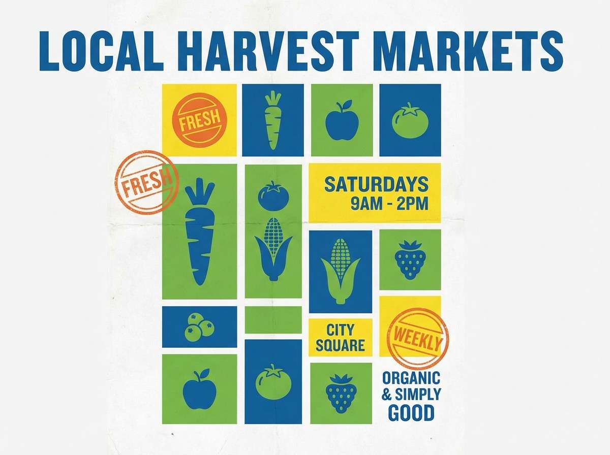
6) Coastal Market
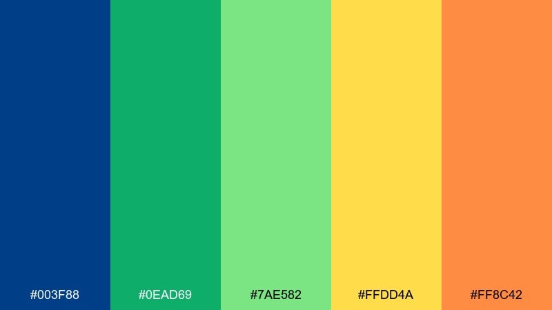
HEX: #003F88 #0EAD69 #7AE582 #FFDD4A #FF8C42
Mood: lively, friendly, market-fresh
Best for: farmers market poster
Lively market stalls and fresh produce pop with a confident blue base and bright greens. Yellow and orange feel like handwritten price tags and sunlit fruit, perfect for drawing attention fast. Try it for community posters, local newsletters, and storefront signage where the message must read in seconds. Usage tip: set the poster background in white, then use yellow blocks behind key details like time and location.
Image example of coastal market generated using media.io
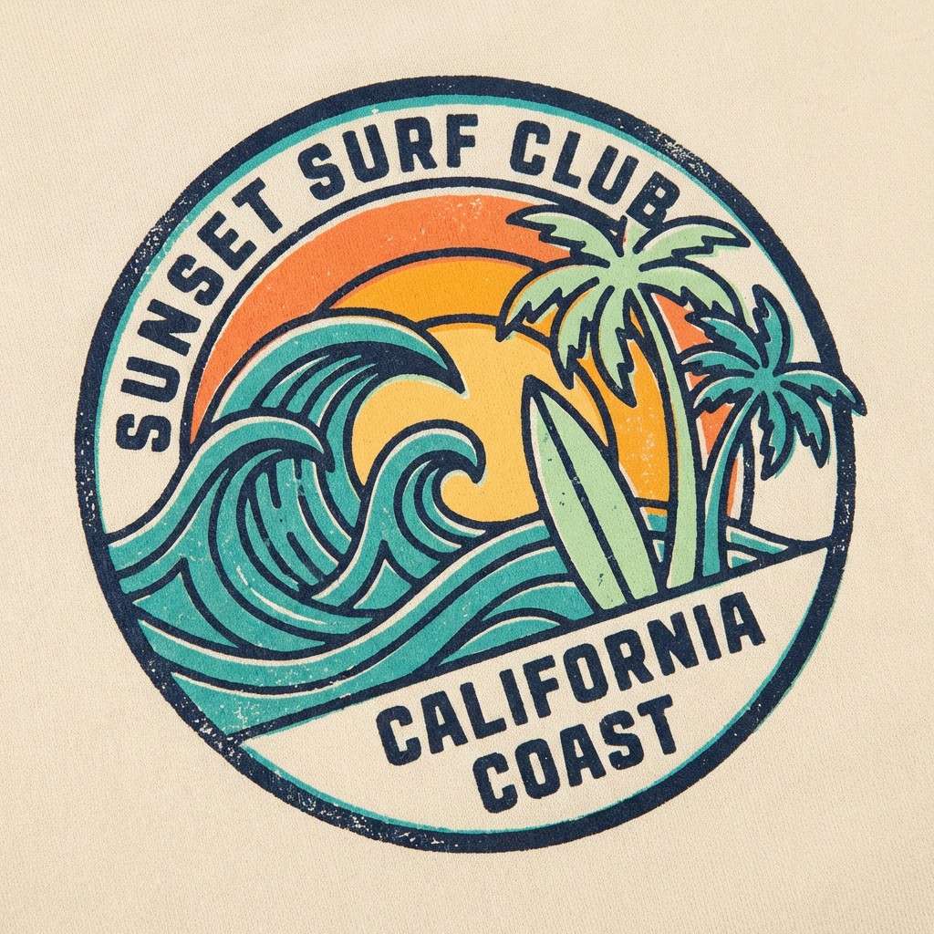
7) Retro Surf Shop
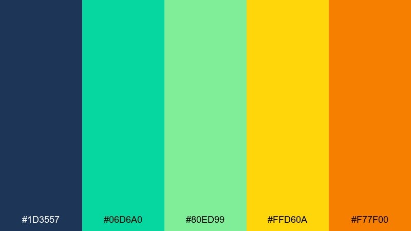
HEX: #1D3557 #06D6A0 #80ED99 #FFD60A #F77F00
Mood: retro, sporty, energetic
Best for: t-shirt graphic and merch tag
Retro surf energy hits like waxed boards and bright signage along the pier. These blue green yellow orange color combinations feel sporty and graphic, especially when you lean into bold shapes and thick outlines. Use it for merch, club tees, stickers, and simple icons that need instant punch. Usage tip: print the navy as the main ink and keep yellow as a small highlight so the design stays wearable.
Image example of retro surf shop generated using media.io
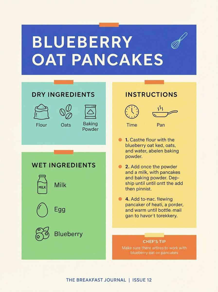
8) Fresh Picnic
HEX: #2B50AA #4DD4AC #6DDF6D #FFF07C #FF9B54
Mood: light, friendly, casual
Best for: recipe blog graphics
Light picnic charm feels like gingham blankets, lemonade, and fresh herbs in the sun. The softer yellow and orange keep it approachable while blue and green add a clean, appetizing freshness. It fits recipe cards, meal plan templates, and food blog highlight blocks without overwhelming photography. Usage tip: use the minty teal for labels and keep orange for ratings, saves, and small badges.
Image example of fresh picnic generated using media.io
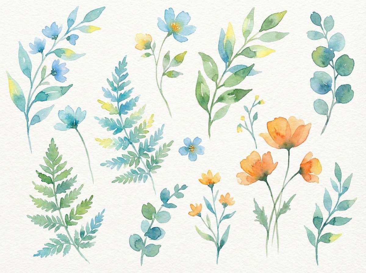
9) Botanical Breeze
HEX: #1C7ED6 #2EC4B6 #2F9E44 #FFE8A1 #FF922B
Mood: airy, natural, optimistic
Best for: watercolor botanical illustration set
Airy leaves and breezy sky tones make the whole set feel calm but bright. The greens read natural and healthy, while the yellow and orange add that sun-through-the-canopy glow. Use it for botanical prints, spring social posts, and gentle packaging where you want color that still feels organic. Usage tip: keep outlines light and let the teal sit in the shadows for extra depth.
Image example of botanical breeze generated using media.io
10) Modern Playroom
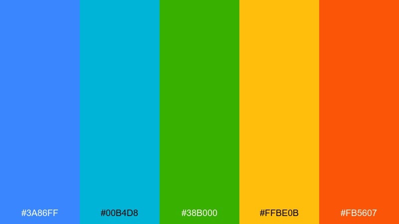
HEX: #3A86FF #00B4D8 #38B000 #FFBE0B #FB5607
Mood: bold, modern, playful
Best for: educational app UI
Bold primary energy feels like building blocks and bright classroom posters, but with a modern polish. The cooler blues keep screens feeling clean, while green, yellow, and orange provide friendly rewards and progress cues. It works especially well for educational apps, dashboards for parents, and gamified learning flows. Usage tip: use yellow for success states and orange only for urgent nudges to avoid fatigue.
Image example of modern playroom generated using media.io
11) Sunset Kayak
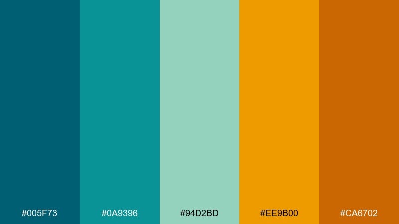
HEX: #005F73 #0A9396 #94D2BD #EE9B00 #CA6702
Mood: adventurous, calm, golden-hour
Best for: outdoor tour landing page
Adventurous calm shows up like teal water at dusk with a soft golden horizon. The deeper teal and blue carry trust, while the gold and burnt orange bring warmth that feels earned, not flashy. Use it for outdoor tours, eco travel, and activity bookings where you want excitement plus safety cues. Usage tip: keep CTAs in gold and use burnt orange for hover states to signal interaction clearly.
Image example of sunset kayak generated using media.io
12) City Park Mural
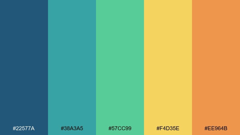
HEX: #22577A #38A3A5 #57CC99 #F4D35E #EE964B
Mood: community, cheerful, artistic
Best for: community newsletter layout
Community warmth feels like a painted mural beside a bright park path. The blue and teal keep the layout structured, while green, yellow, and orange add friendly emphasis for announcements and dates. It suits newsletters, municipal flyers, and nonprofit updates that need to be readable and optimistic. Usage tip: build a simple color hierarchy where blue is for headings, teal for dividers, and orange for key reminders.
Image example of city park mural generated using media.io
13) Minimal Tech Pop
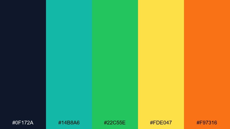
HEX: #0F172A #14B8A6 #22C55E #FDE047 #F97316
Mood: sleek, modern, high-clarity
Best for: SaaS dashboard UI
Sleek dark-mode clarity meets bright status lights, like a clean console with just the right pops. The near-black blue gives structure, while teal and green communicate active states and success. Yellow and orange work best as sparse highlights for notifications, tags, and key metrics. Usage tip: limit yellow to one component type, such as warnings, to keep the dashboard consistent.
Image example of minimal tech pop generated using media.io
14) Artisan Kitchen
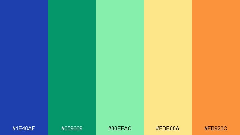
HEX: #1E40AF #059669 #86EFAC #FDE68A #FB923C
Mood: handmade, warm, inviting
Best for: cafe menu design
Handmade warmth comes across like glazed tiles, fresh herbs, and a sunlit counter. The bold blue keeps headings crisp, while the greens feel natural and the yellow-orange notes suggest baked goods and spice. It is a great fit for café menus, small-batch labels, and deli signage that needs a friendly premium look. Usage tip: use the pale green as a background block behind item categories to make scanning easy.
Image example of artisan kitchen generated using media.io
15) Kids Science Fair
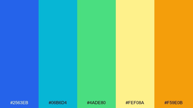
HEX: #2563EB #06B6D4 #4ADE80 #FEF08A #F59E0B
Mood: curious, bright, optimistic
Best for: school poster and badge set
Curious, bright energy feels like lab stickers, paper rockets, and tidy charts on a classroom wall. The blues read smart and trustworthy, while green, yellow, and amber-orange add excitement for awards and highlights. Use it for school posters, printable badges, and STEM worksheets that should feel fun but organized. Usage tip: keep icon outlines in blue and fill only the key badge elements with yellow or orange.
Image example of kids science fair generated using media.io
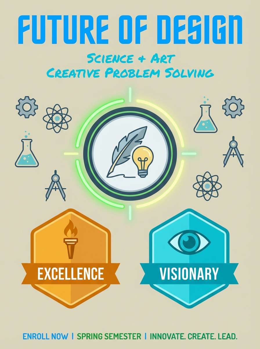
16) Summer Poster Print
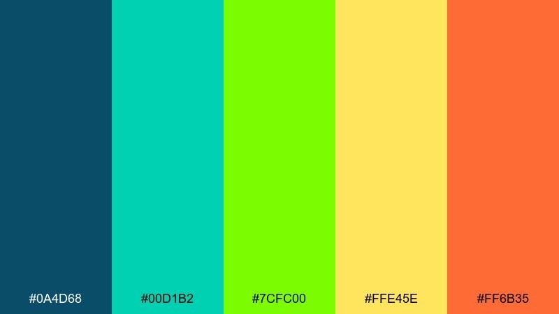
HEX: #0A4D68 #00D1B2 #7CFC00 #FFE45E #FF6B35
Mood: bold, sunny, high-energy
Best for: screenprint-style poster
Bold summer heat shows up like a screenprinted gig poster on a sun-faded wall. The deep blue-green base keeps contrast strong, while neon-leaning green and bright yellow make the layout feel electric. Orange adds the perfect finishing punch for titles, stamps, and limited-edition markers. Usage tip: use just two dominant inks and keep the others for small overlays so the print stays clean.
Image example of summer poster print generated using media.io
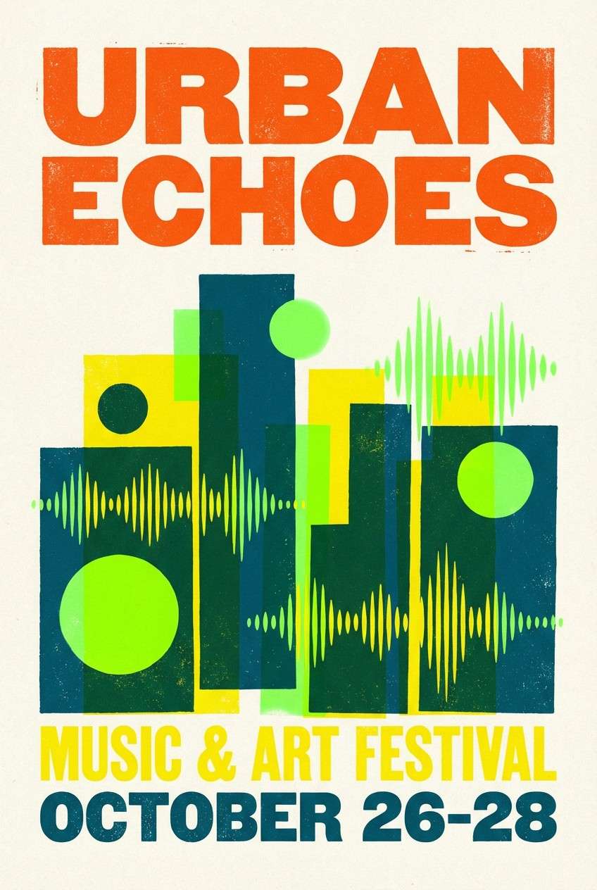
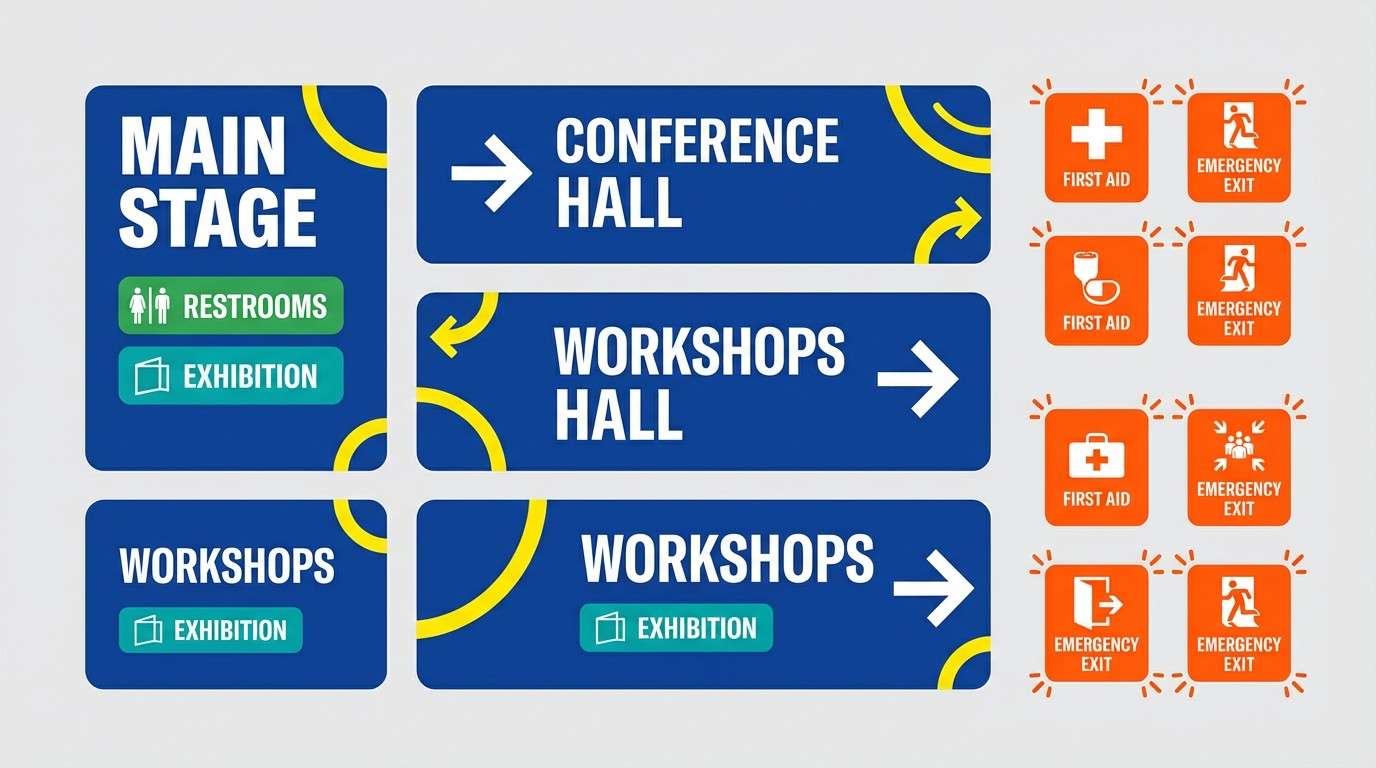
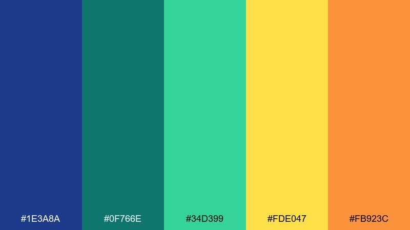
17) Festival Wayfinding
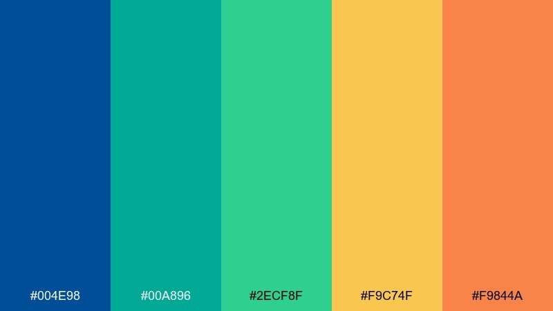
HEX: #004E98 #00A896 #2ECF8F #F9C74F #F9844A
Mood: bold, directional, energetic
Best for: event signage system
Bold directional color feels like clean arrows and high-visibility signs under open sky. These blue green yellow orange color combinations are made for wayfinding, where instant recognition matters more than subtlety. Use thick shapes, generous padding, and high contrast text to keep everything readable from afar. Usage tip: assign each area a dominant hue and keep orange reserved for urgent info like exits and first aid.
Image example of festival wayfinding generated using media.io
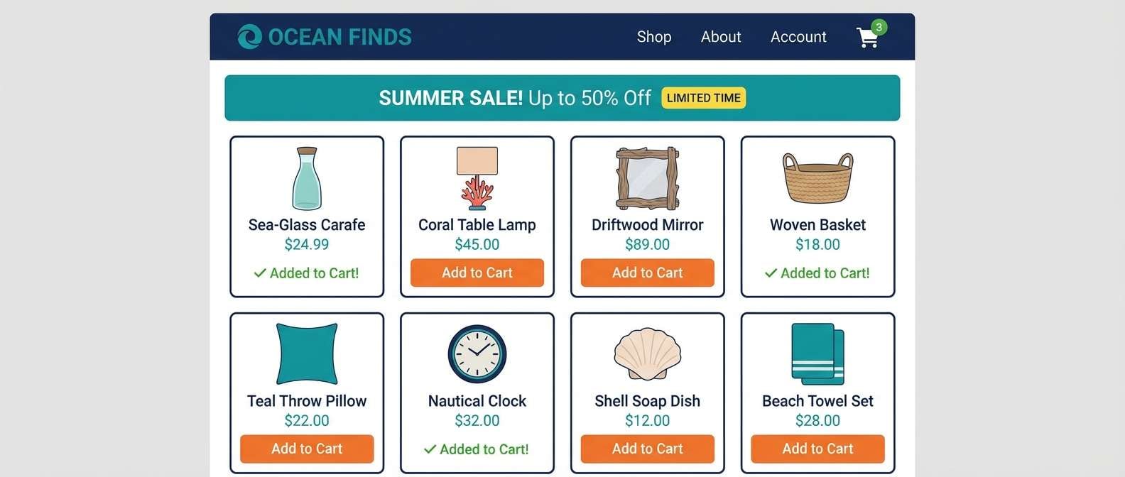
18) Clean Ecommerce Accent
HEX: #1E3A8A #0F766E #34D399 #FDE047 #FB923C
Mood: clean, trustworthy, conversion-focused
Best for: ecommerce homepage UI
Clean trust with bright accents feels like a tidy storefront with a few colorful tags guiding the eye. The strong blue sets a dependable foundation, while teal and green support navigation and success states. This blue green yellow orange color palette is especially effective for ecommerce when you need clear CTAs and scannable promos. Usage tip: keep product cards neutral and use yellow or orange only for limited-time badges.
Image example of clean ecommerce accent generated using media.io
19) Travel Blog Header
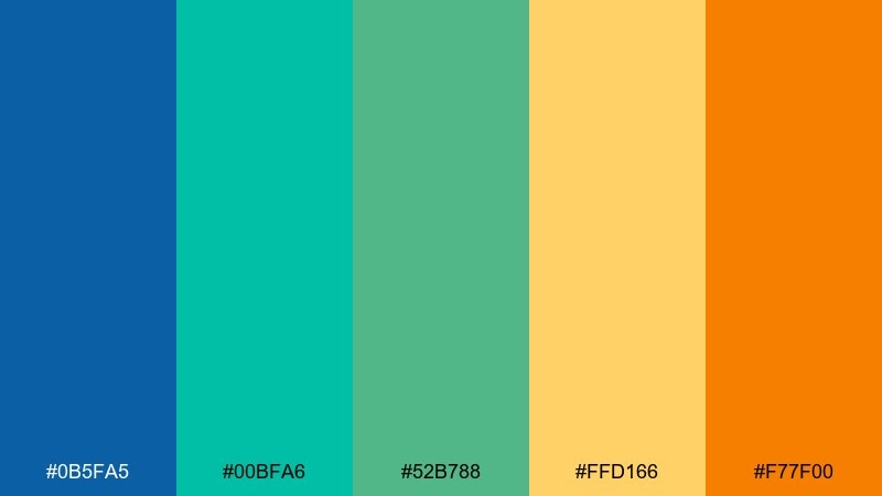
HEX: #0B5FA5 #00BFA6 #52B788 #FFD166 #F77F00
Mood: bright, airy, wanderlust
Best for: blog header and thumbnail system
Bright wanderlust comes through like a clean map, coastal water, and sunlit highlights. Blue and teal keep the header feeling open and digital-friendly, while green, yellow, and orange add warmth for categories and tags. It is ideal for blog thumbnails, travel guides, and social covers that need a consistent system. Usage tip: use orange as the category marker and keep the main title in blue for contrast.
Image example of travel blog header generated using media.io
20) Evening Street Food
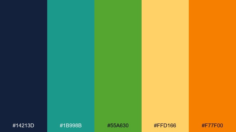
HEX: #14213D #1B998B #55A630 #FFD166 #F77F00
Mood: bold, savory, night-market
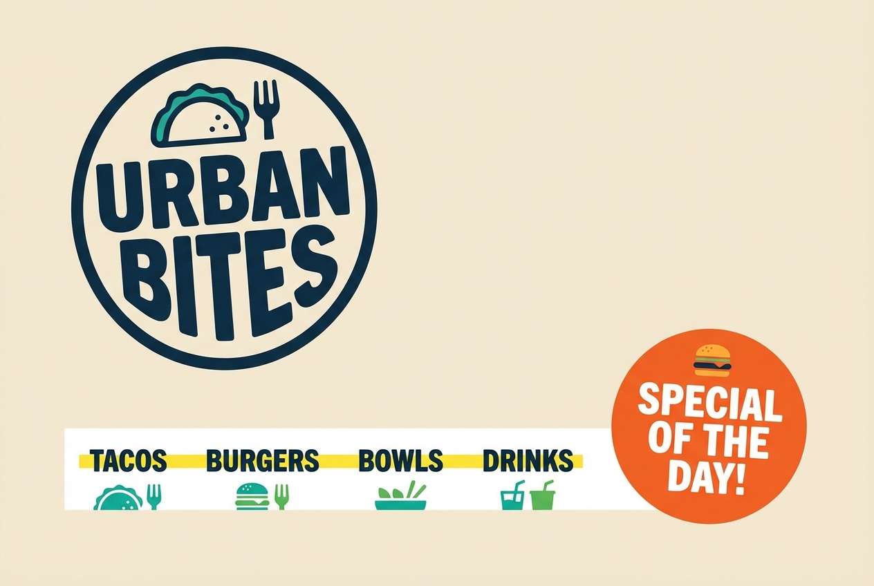
Best for: food truck logo and menu strip
Bold night-market flavor feels like sizzling pans under cool street lights with warm signage glowing nearby. The dark blue adds grit and contrast, while teal and green keep it fresh rather than heavy. Yellow and orange are perfect for pricing, specials, and logo marks that must be seen fast. Usage tip: place yellow behind the menu strip text and use orange sparingly for the signature dish callout.
Image example of evening street food generated using media.io
What Colors Go Well with Blue Green Yellow Orange?
Neutrals are the easiest partners: white, warm ivory, light gray, charcoal, and deep navy help the palette breathe and keep yellow/orange from overwhelming the design.
For a more premium or outdoorsy twist, try earthy companions like sand, clay, terracotta, or muted olive—these tones lower the intensity while keeping the sunny mood.
If you want extra contrast in UI, use near-black (for text) and a very pale cream (for surfaces), then let teal/green handle states and reserve yellow/orange for warnings and primary actions.
How to Use a Blue Green Yellow Orange Color Palette in Real Designs
Start with a clear hierarchy: use blue (or deep teal) for headings and core UI structure, then use green for supportive signals like success, confirmations, or secondary highlights.
Use yellow and orange intentionally. Yellow is great for highlight fills and badges, while orange works best as a CTA color, price marker, or “urgent but friendly” nudge—small areas go a long way.
To keep readability high, avoid placing yellow text on white, and be cautious with green-on-yellow. When in doubt, use dark blue text over light yellow backgrounds for clean contrast.
Create Blue Green Yellow Orange Palette Visuals with AI
If you already have HEX codes, you can quickly turn them into polished visuals—posters, UI mockups, packaging concepts, or brand style tiles—by describing the layout and where each color should appear.
In your prompt, specify the style (flat vector, watercolor, screenprint, dark-mode UI), the composition (grid, hero banner, card layout), and the aspect ratio to get consistent results across a series.
Use Media.io to generate multiple variations fast, then keep the best structure and swap accents (yellow vs. orange) to test which version reads clearer.
Blue Green Yellow Orange Color Palette FAQs
-
What does a blue green yellow orange palette communicate?
It combines trust and freshness (blue/green) with optimism and urgency (yellow/orange), making it ideal for friendly brands, clear UI states, and attention-grabbing promos. -
How do I keep yellow and orange from overpowering the design?
Make blue/teal your dominant base, keep warm colors to small accents (buttons, badges, icons), and add plenty of white/neutral space to reduce visual noise. -
Which color should I use for primary buttons: yellow or orange?
Orange typically performs better for primary CTAs because it stays visible on light backgrounds. Use yellow for highlights, tags, or success moments where you don’t need the strongest click pull. -
What neutrals pair best with these bright hues?
White, warm ivory, light gray, charcoal, and deep navy are the safest choices. They stabilize the palette and improve readability, especially next to yellow. -
Is this palette good for dark mode UI?
Yes—use a deep navy/near-black background, then apply teal/green for active and success states. Reserve yellow/orange for warnings, notifications, and key metrics. -
What’s a common accessibility mistake with these colors?
Low contrast combinations like yellow text on white or green text on yellow. For reliable contrast, use dark blue/navy for text and keep yellow as a background highlight. -
How can I generate on-brand graphics from these HEX codes quickly?
Use an AI generator with prompts that specify layout, style, and where each color should be used (e.g., navy headings, teal cards, orange CTA). Generate a few variations and keep the one with the clearest hierarchy.
Next: Topaz Color Palette


