

A vampire color palette is all about controlled drama: deep wine reds, near-black shadows, and smoky neutrals that feel romantic, dangerous, and cinematic.
Below you’ll find 20+ ready-to-use vampire color schemes with HEX codes—plus practical tips and AI prompts you can use to generate matching visuals fast.
In this article
- Why Vampire Palettes Work So Well
-
- blood velvet
- crypt noir
- moonlit cabernet
- antique lace and wine
- cathedral candlelight
- thorny rose
- dusky plum smoke
- silver stake
- midnight garnet
- coffin mahogany
- frosted marble
- witching hour violet
- raven feather
- vintage apothecary
- scarlet oxblood
- black cherry kiss
- pale fang
- gothic botanical
- velvet theater
- iron rosewood
- sanguine ink
- nocturne bouquet
- eclipse merlot
- What Colors Go Well with Vampire?
- How to Use a Vampire Color Palette in Real Designs
- Create Vampire Palette Visuals with AI
Why Vampire Palettes Work So Well
Vampire palettes work because they’re built on contrast: dark bases create instant mood, while warm reds and soft pale tints provide focal points that feel intentional and luxurious.
They also carry strong cultural signals—gothic romance, noir cinema, candlelight, and velvet textures—so a design can communicate a story before anyone reads a word.
Most importantly, these colors are flexible: you can push them toward modern minimal UI, vintage stationery, or theatrical posters by changing texture, typography, and how sparingly you use the brightest accent.
20+ Vampire Color Palette Ideas (with HEX Codes)
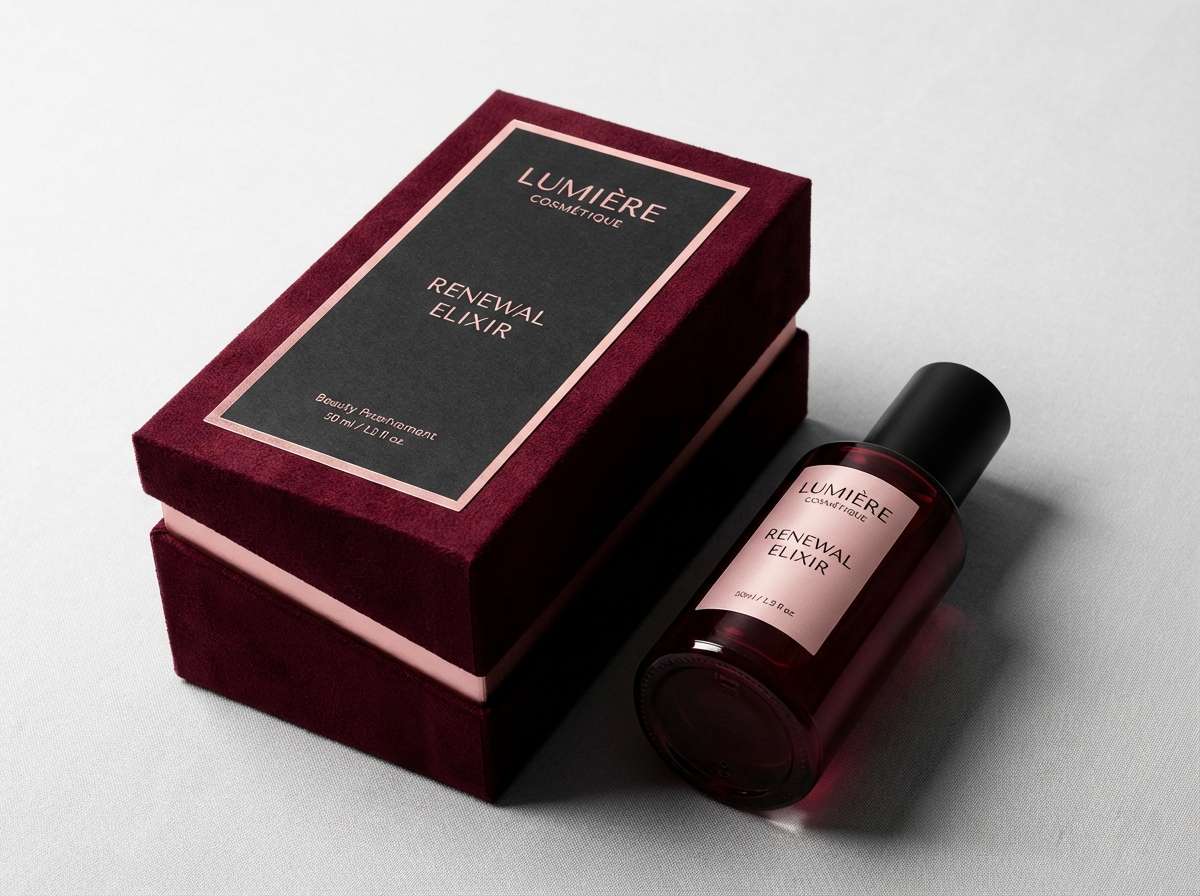
1) Blood Velvet

HEX: #4A0B13 #7A0F1C #B22A3A #1A0F12 #E8D6D2
Mood: lush, dramatic, romantic
Best for: luxury beauty ad packaging
Lush velvet reds and near-black shadows evoke candlelit glamour and a hint of danger. This vampire color scheme shines on premium cosmetics, fragrance, and boutique labels. Pair the deepest red with the charcoal tone for the main layout, then use the pale blush as breathing room for copy. Tip: reserve the brightest red for seals, price tags, or a single hero element so it feels intentional.
Image example of blood velvet generated using media.io
Media.io is an online AI studio for creating and editing video, image, and audio in your browser.

2) Crypt Noir
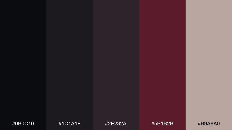
HEX: #0B0C10 #1C1A1F #2E232A #5B1B2B #B9A6A0
Mood: noir, secretive, modern
Best for: dark UI dashboard
Inky blacks and smoked plum feel like a midnight hallway with a single dim lamp. Built for interfaces where contrast and hierarchy matter, this set keeps panels calm while accents stay sharp. Use the near-black for backgrounds, the warm gray-beige for labels, and the wine tone for primary actions. Tip: add subtle 1px borders in the mid tone to separate cards without bright lines.
Image example of crypt noir generated using media.io
3) Moonlit Cabernet
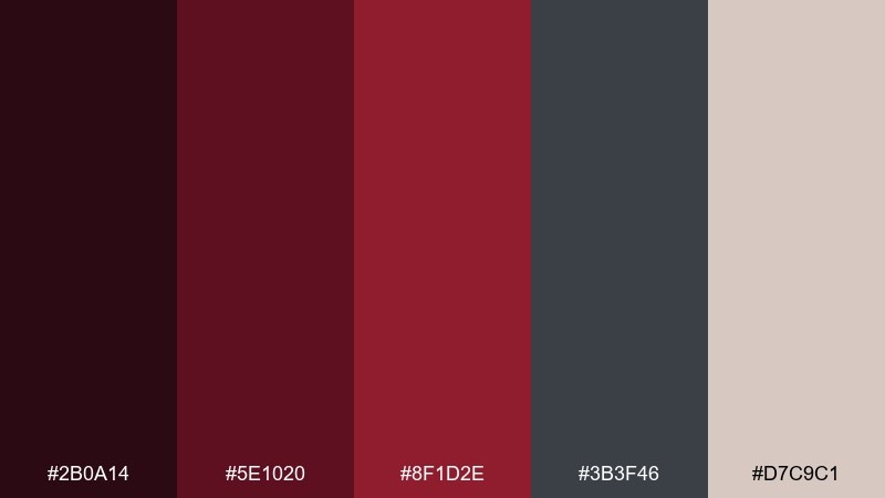
HEX: #2B0A14 #5E1020 #8F1D2E #3B3F46 #D7C9C1
Mood: sultry, elegant, cinematic
Best for: book cover design
Cinematic cabernet reds against cool slate gray suggest a slow-burn thriller under moonlight. The pairing works beautifully for fiction covers, film key art, or podcast thumbnails where mood does the selling. Let the slate gray carry title typography while the reds form a bold central shape. Tip: keep gradients subtle and lean on matte texture to maintain a premium feel.
Image example of moonlit cabernet generated using media.io
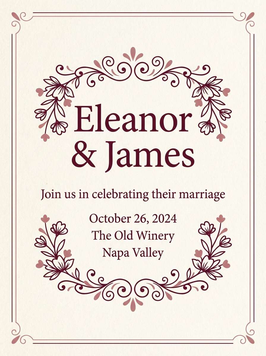
4) Antique Lace and Wine
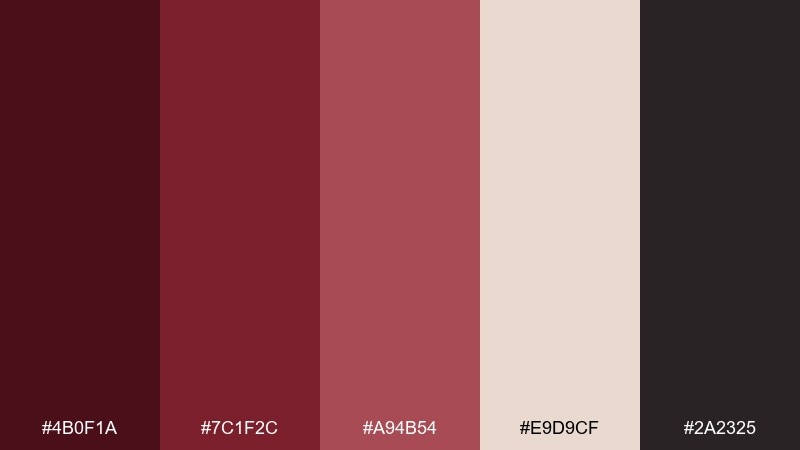
HEX: #4B0F1A #7C1F2C #A94B54 #E9D9CF #2A2325
Mood: vintage, romantic, refined
Best for: gothic wedding invitation
Soft antique lace tones set a romantic stage for deep wine and ink accents. It fits invitations, menus, and stationery when you want old-world elegance without going fully black. Use the lace as the paper base, the darkest tone for body text, and the rosy mid tone for flourishes. Tip: choose serif typography and thin linework to keep the look airy, not heavy.
Image example of antique lace and wine generated using media.io
5) Cathedral Candlelight
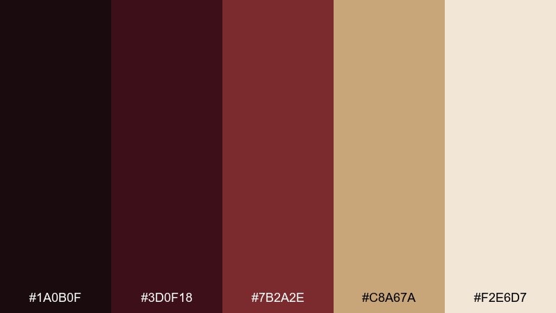
HEX: #1A0B0F #3D0F18 #7B2A2E #C8A67A #F2E6D7
Mood: sacred, warm, shadowy
Best for: event poster
Warm candle gold cutting through deep maroon shadows feels like stained glass at dusk. This vampire color palette works best for event posters, theater nights, and moody exhibition graphics where warmth matters. Keep the gold for headlines and key dates, and let the darkest tone carry the background. Tip: add a faint grain overlay so the light tones look like paper, not flat digital color.
Image example of cathedral candlelight generated using media.io
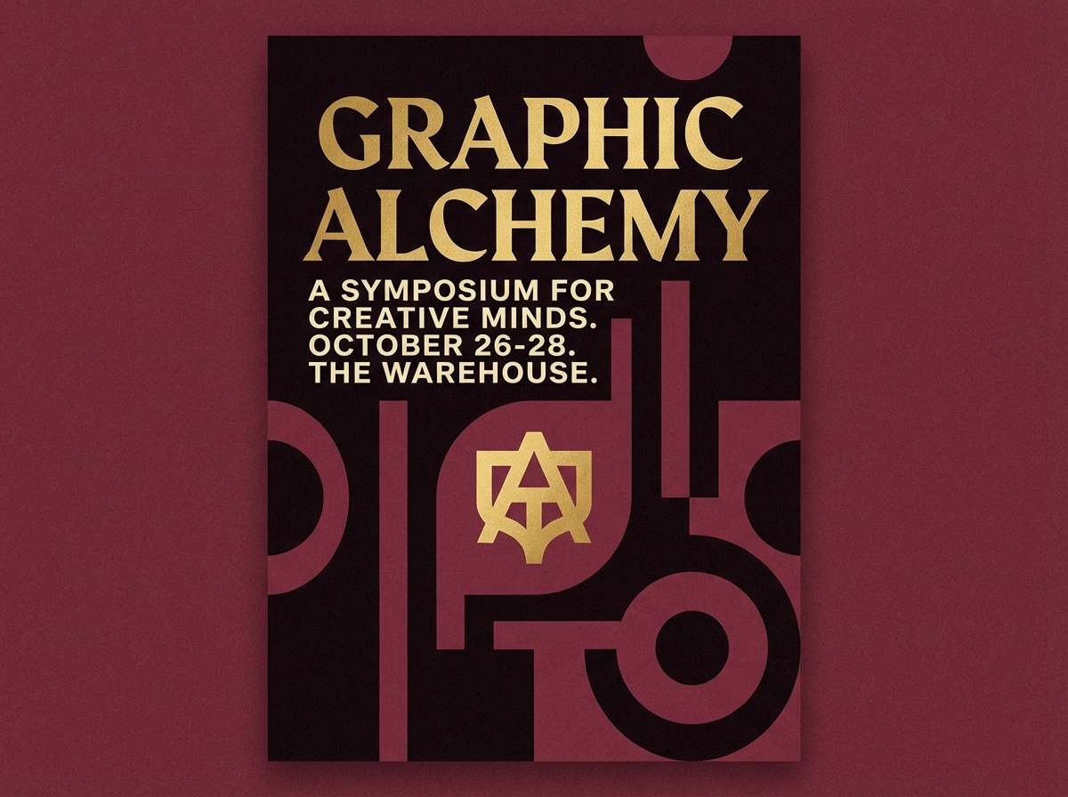
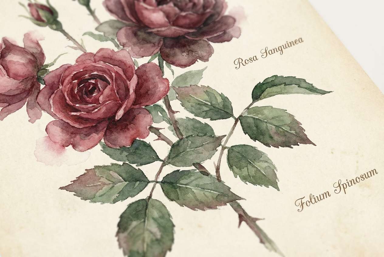
6) Thorny Rose
HEX: #2A0F14 #6B1022 #B12A3A #2F3A2F #E7D3C6
Mood: romantic, wild, dramatic
Best for: botanical illustration print
Wild rose reds paired with a muted thorn green evoke bouquets with hidden bite. The mix suits art prints, album inserts, and floral branding that wants to feel darker than sweet. Use the green sparingly as a grounding counterbalance, and keep the blush as negative space. Tip: limit the bright red to petals or focal points so the design stays sophisticated.
Image example of thorny rose generated using media.io
7) Dusky Plum Smoke
HEX: #1C0E18 #3B1930 #6A2B55 #8F7A86 #E5DDE3
Mood: dreamy, mysterious, soft
Best for: editorial magazine spread
Smoky plums and dusty mauves create a dreamy, late-night editorial vibe. It is ideal for fashion spreads, lookbooks, and long-form layouts where readability still matters. Keep body text on the pale tint, and use the deeper plum for pull quotes and section dividers. Tip: add generous margins so the palette feels intentional rather than gloomy.
Image example of dusky plum smoke generated using media.io
8) Silver Stake
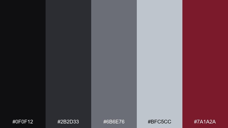
HEX: #0F0F12 #2B2D33 #6B6E76 #BFC5CC #7A1A2A
Mood: cold, sharp, high-contrast
Best for: tech brand landing hero
Cold silvers and gunmetal gray feel precise, like steel catching a hard light. The single deep crimson accent makes CTAs pop without turning the page into a horror poster. Use the light silver for large headings, then anchor sections with charcoal blocks. Tip: keep shadows crisp and minimal so the overall look stays clean and modern.
Image example of silver stake generated using media.io

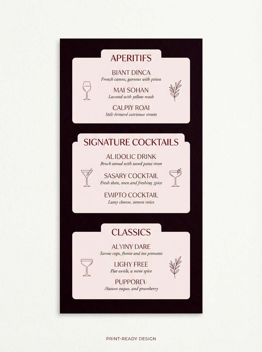
9) Midnight Garnet
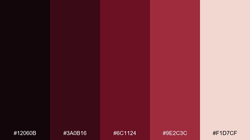
HEX: #12060B #3A0B16 #6C1124 #9E2C3C #F1D7CF
Mood: intense, luxurious, bold
Best for: cocktail menu design
Deep garnet reds with a pale blush highlight read like a late-night cocktail bar. The contrast helps menu sections stay clear while still feeling dramatic. Use the darkest tone for the menu background, the blush for text blocks, and the brighter red for category headers. Tip: add small separators and icons in the mid red to guide scanning without clutter.
Image example of midnight garnet generated using media.io
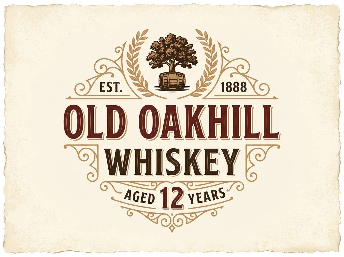
10) Coffin Mahogany
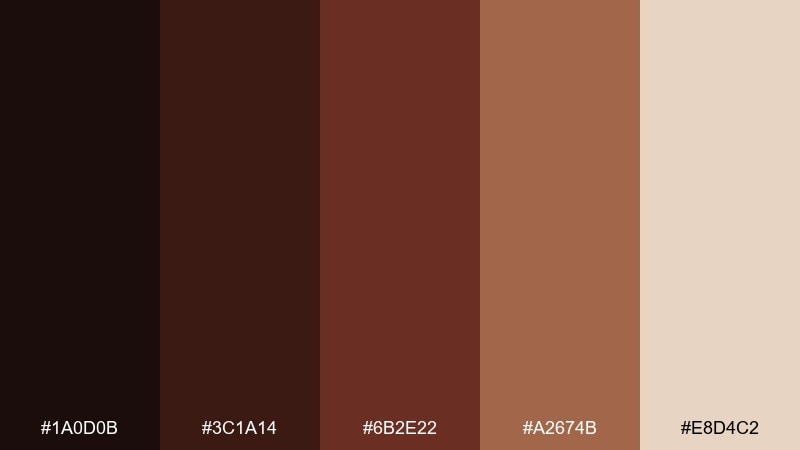
HEX: #1A0D0B #3C1A14 #6B2E22 #A2674B #E8D4C2
Mood: earthy, antique, grounded
Best for: whiskey label design
Mahogany browns and aged cream evoke carved wood, old libraries, and worn leather. This vampire color palette is a strong fit for spirits labels, heritage logos, and product storytelling that leans classic. Let the mid brown handle ornament lines and frames, then set typography in the near-black for clarity. Tip: use foil or emboss effects on the warm tan to make details feel tactile.
Image example of coffin mahogany generated using media.io
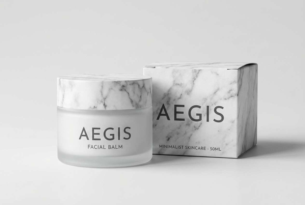
11) Frosted Marble
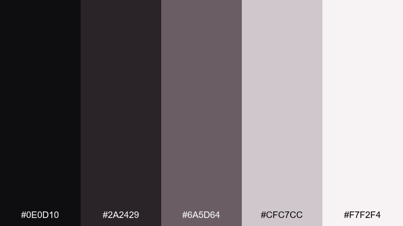
HEX: #0E0D10 #2A2429 #6A5D64 #CFC7CC #F7F2F4
Mood: quiet, luxe, minimalist
Best for: skincare product ad
Soft marble neutrals with a black base create a quiet, expensive mood. This set is perfect for skincare ads, minimalist branding, and packaging that relies on texture over loud color. Use the palest tone for the background, then layer type in charcoal for a refined contrast. Tip: introduce one accent only through typography weight changes, not extra colors.
Image example of frosted marble generated using media.io
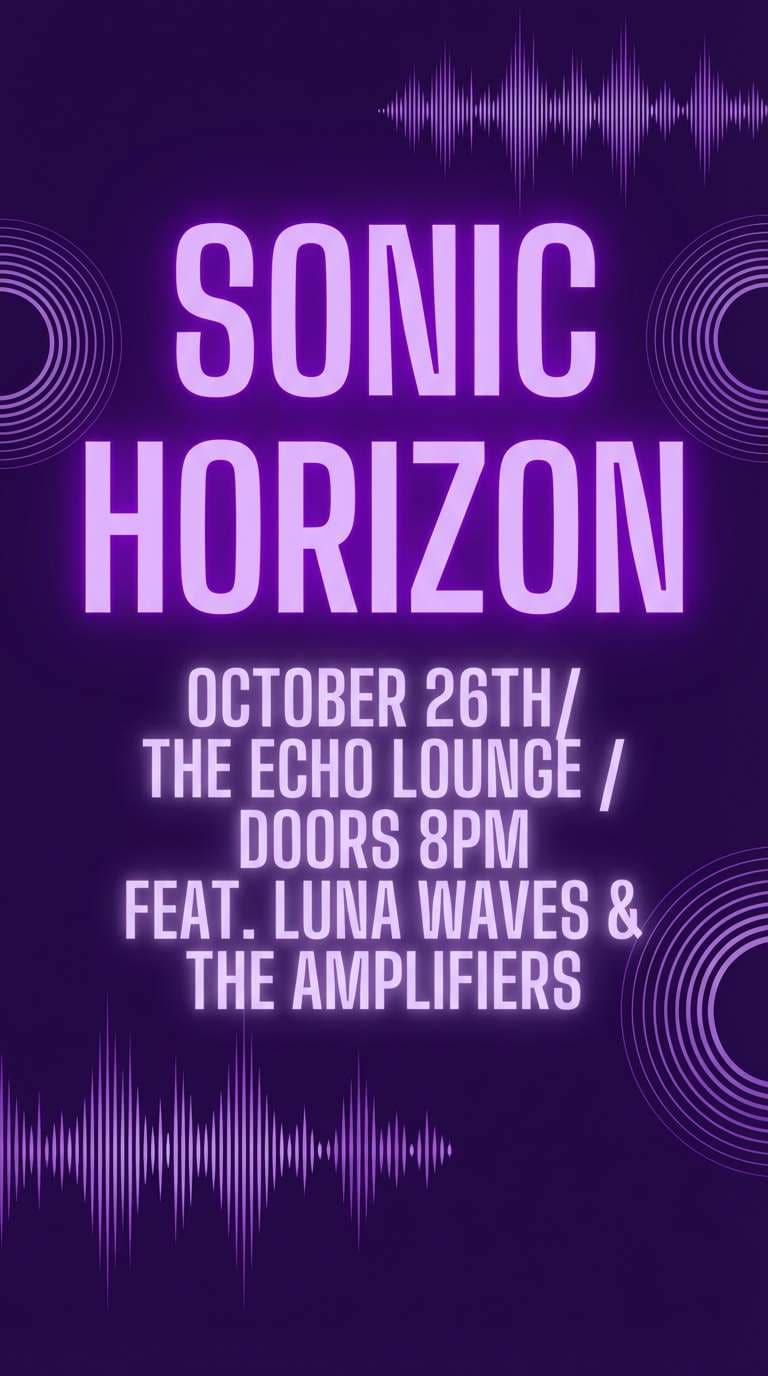
12) Witching Hour Violet
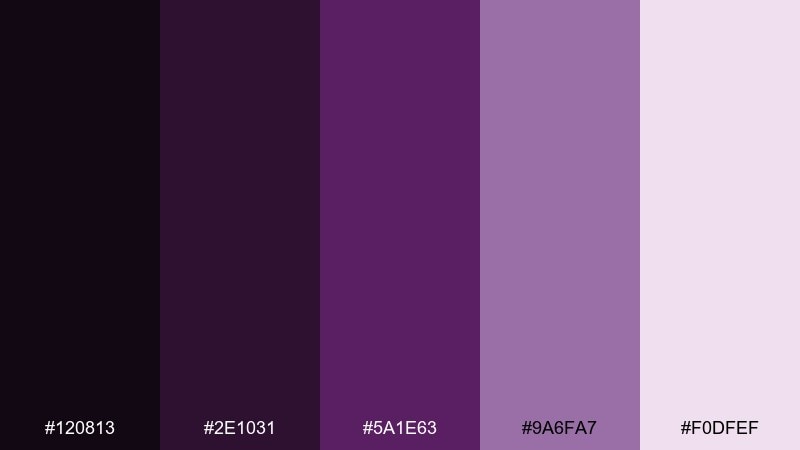
HEX: #120813 #2E1031 #5A1E63 #9A6FA7 #F0DFEF
Mood: mystical, electric, night-bloom
Best for: music poster
Violet shadows and bright orchid notes feel like neon spellwork on a rainy street. These vampire color combinations are great for music posters, club flyers, and digital covers where purple takes the lead. Keep the deepest shade for the background, and use the orchid mid tone for the main title to ensure instant readability. Tip: avoid extra hues and lean on glow effects using only lighter tints from the same set.
Image example of witching hour violet generated using media.io
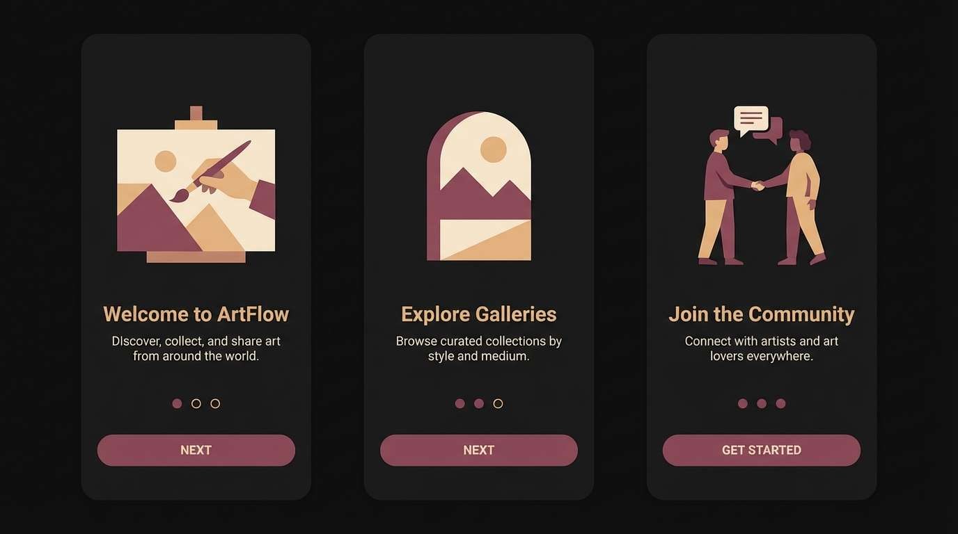
13) Raven Feather
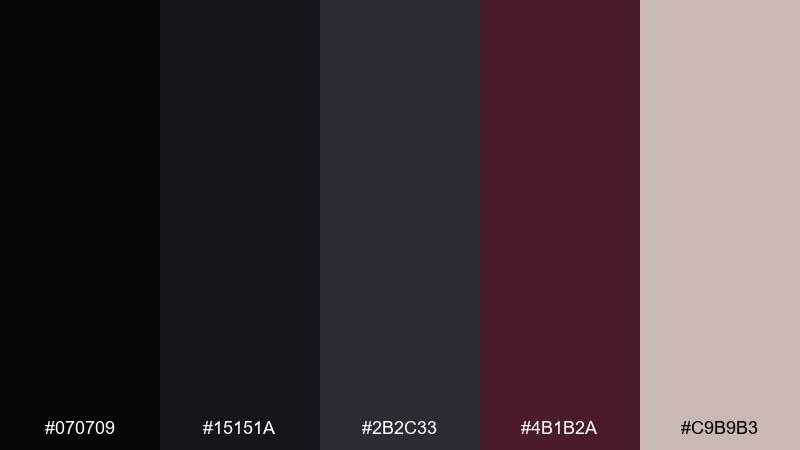
HEX: #070709 #15151A #2B2C33 #4B1B2A #C9B9B3
Mood: sleek, stealthy, refined
Best for: app onboarding screens
Glossy raven blacks with a muted wine accent feel sleek and confident. The vampire tones are perfect for onboarding, login flows, and premium app experiences that need depth without visual noise. Use the light beige for copy blocks, then keep the wine shade for progress indicators and highlights. Tip: maintain consistent spacing so the dark background reads as intentional, not heavy.
Image example of raven feather generated using media.io
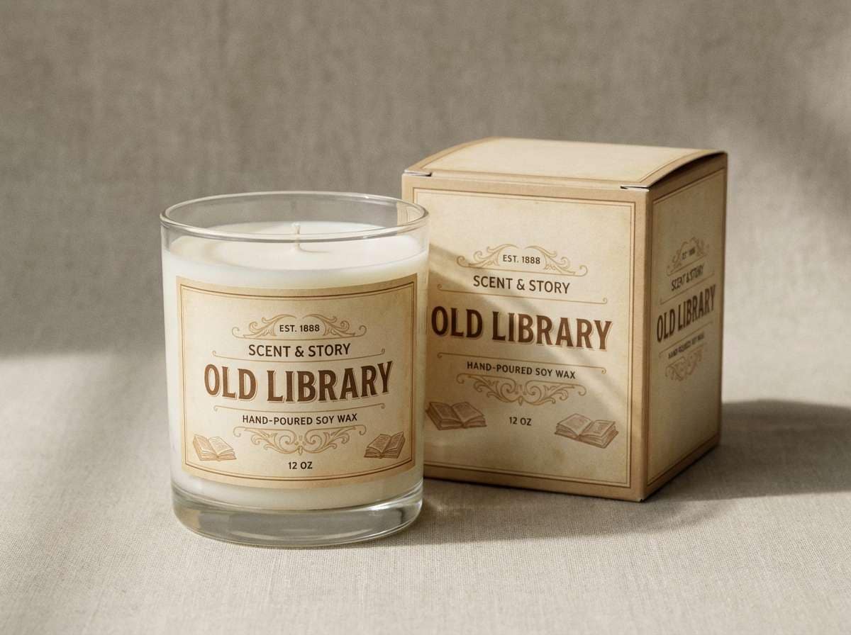
14) Vintage Apothecary
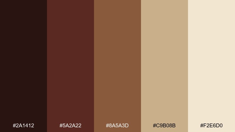
HEX: #2A1412 #5A2A22 #8A5A3D #C9B08B #F2E6D0
Mood: herbal, aged, atmospheric
Best for: candle label and box
Aged browns and parchment beige evoke apothecary jars, dried herbs, and old labels. This vampire color palette works especially well for candles, soaps, and artisan goods that want a nostalgic story. Use the parchment tone for the label base, then set type in the darkest brown for crisp legibility. Tip: add small botanical line drawings in the mid brown to reinforce the handmade feel.
Image example of vintage apothecary generated using media.io
15) Scarlet Oxblood
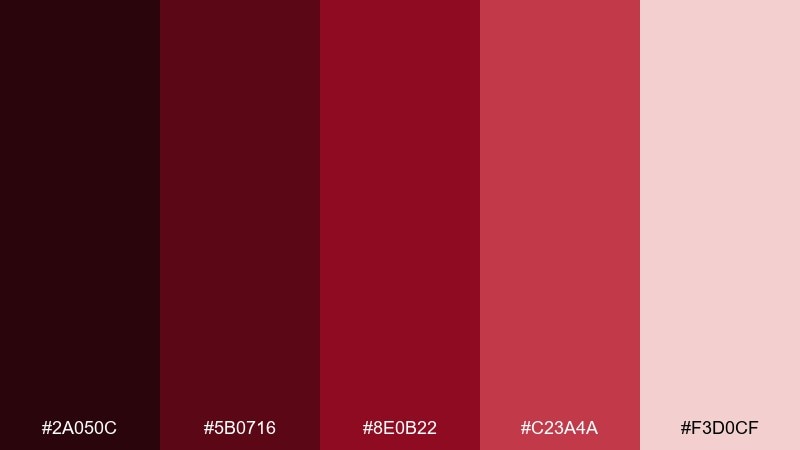
HEX: #2A050C #5B0716 #8E0B22 #C23A4A #F3D0CF
Mood: fiery, commanding, theatrical
Best for: brand identity palette
Hot scarlet stepping into oxblood shadows feels bold, theatrical, and unapologetic. Use it for identity systems that need a strong signature color across social, print, and web. Balance the intense reds with the pale tint for backgrounds and roomy margins. Tip: build a two-red hierarchy, one for primary marks and one for supporting highlights, to keep consistency.
Image example of scarlet oxblood generated using media.io
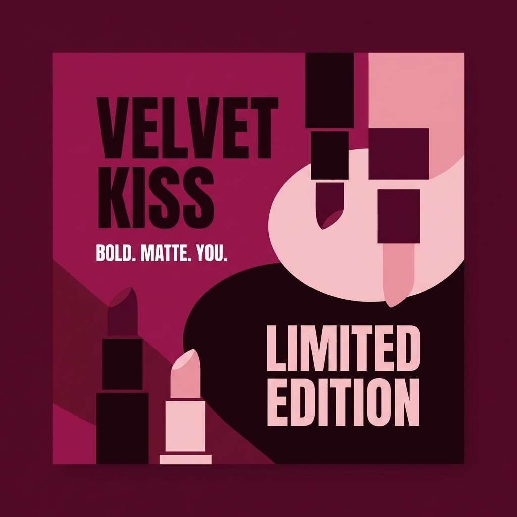
16) Black Cherry Kiss
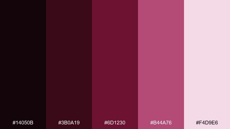
HEX: #14050B #3B0A19 #6D1230 #B44A76 #F4D9E6
Mood: playful, seductive, glossy
Best for: lipstick social post
Black cherry depths with candy-rose highlights feel flirty but still grown-up. This vampire color scheme is a great fit for beauty socials, product drops, and glossy editorial promos. Use the darkest tones as a backdrop for the product shot area, then pull the bright pink forward for callouts and stickers. Tip: keep text white or very pale pink to avoid muddy contrast on the cherry base.
Image example of black cherry kiss generated using media.io
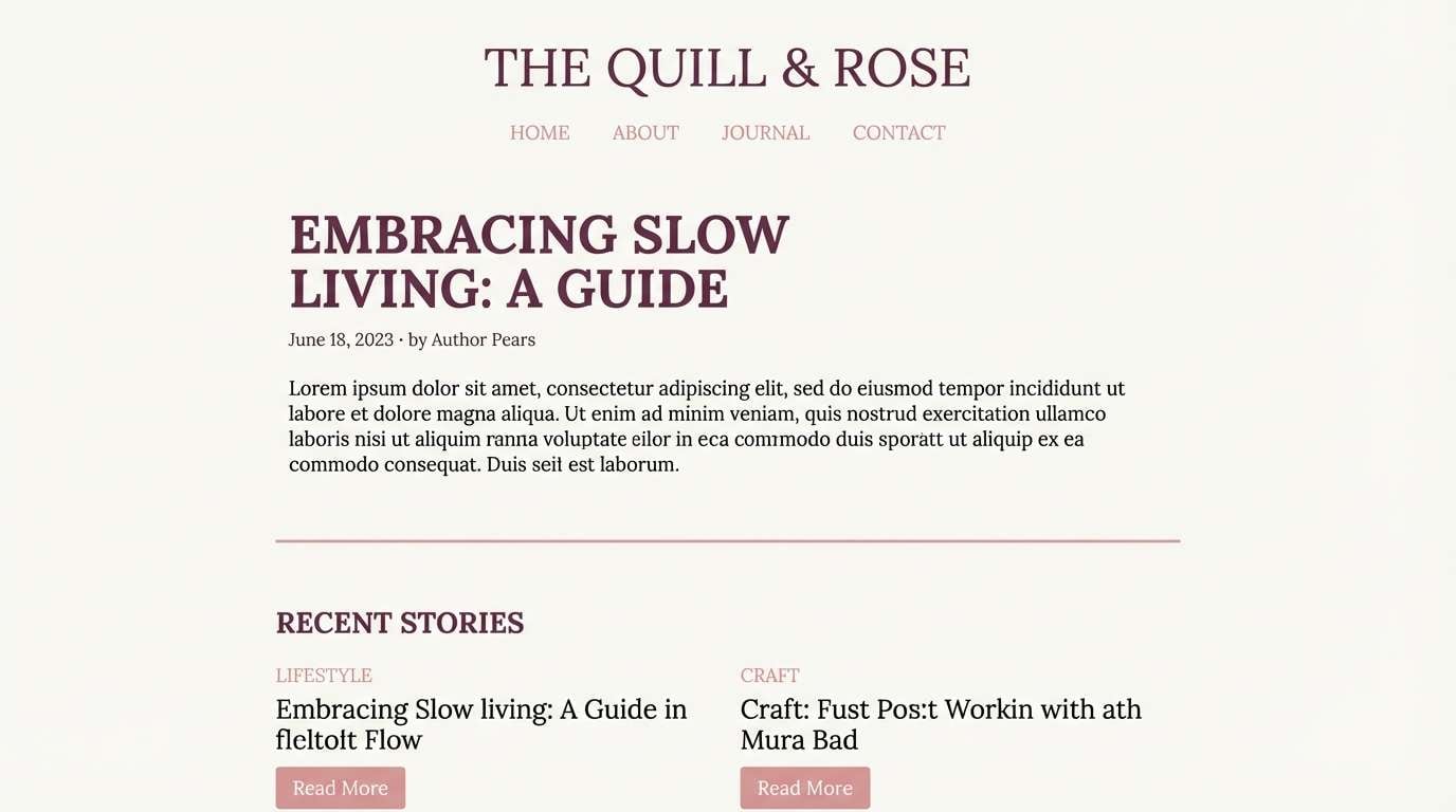
17) Pale Fang
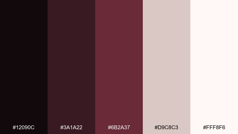
HEX: #12090C #3A1A22 #6B2A37 #D9C8C3 #FFF8F6
Mood: soft, eerie, elegant
Best for: minimal blog theme
Pale porcelain whites against dried-rose shadows feel quiet, eerie, and refined. It suits blogs, portfolios, and reading-heavy pages that want atmosphere without sacrificing comfort. Use the off-white for the main canvas, then keep the darkest tone for headings and navigation. Tip: add hover states in the mid rose so interactions feel gentle, not aggressive.
Image example of pale fang generated using media.io
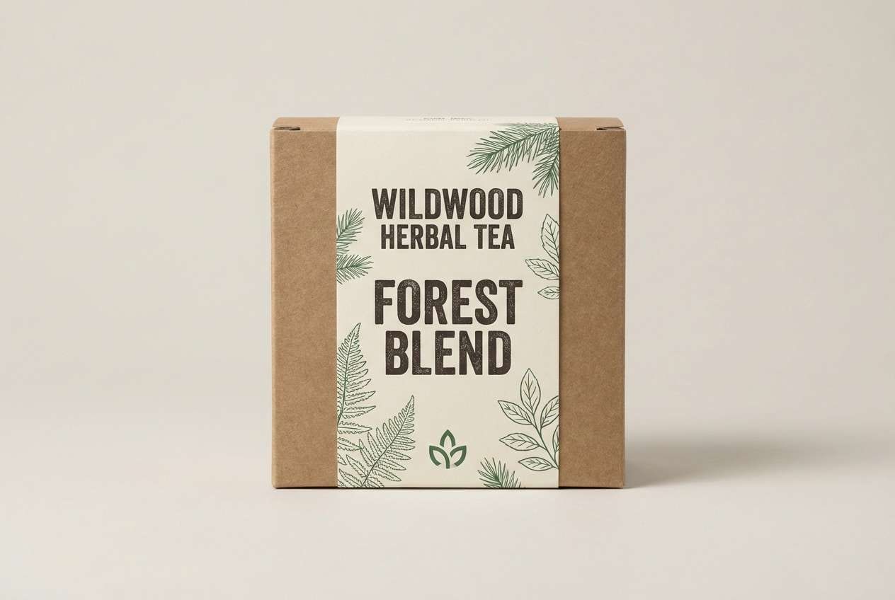
18) Gothic Botanical
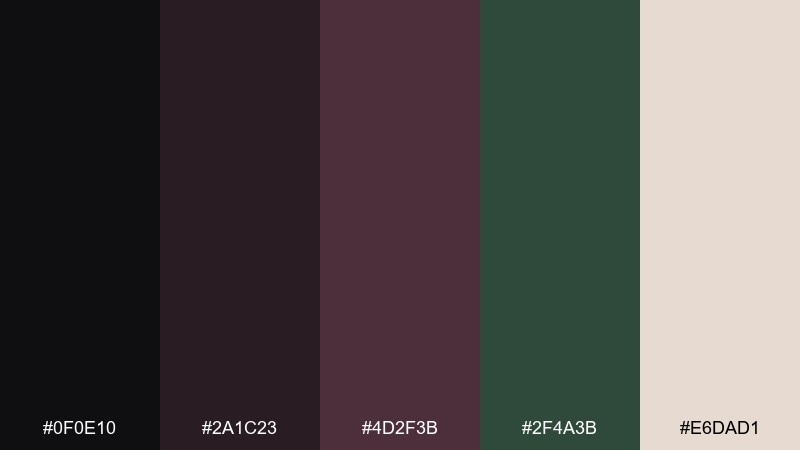
HEX: #0F0E10 #2A1C23 #4D2F3B #2F4A3B #E6DAD1
Mood: woodsy, moody, organic
Best for: herbal tea packaging
Dark bark tones and muted forest green feel like a twilight garden. These vampire tones are perfect for herbal tea, natural skincare, or eco brands that want to lean mysterious rather than bright. Use the cream tone for the main label background so ingredients stay readable, and keep the green as a calm secondary accent. Tip: choose thin botanical line art and let negative space do most of the work.
Image example of gothic botanical generated using media.io
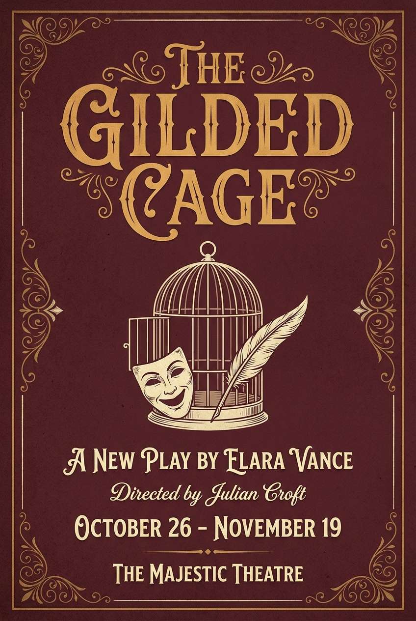
19) Velvet Theater
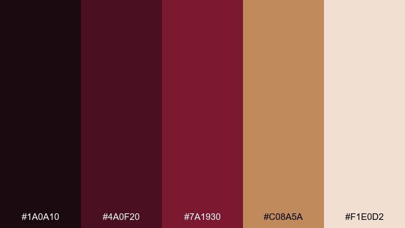
HEX: #1A0A10 #4A0F20 #7A1930 #C08A5A #F1E0D2
Mood: dramatic, warm, ornate
Best for: theater playbill cover
Warm stage-gold highlights over velvet maroon feel like curtains parting at showtime. This vampire color palette is ideal for playbills, festival programs, and cultural events that need a classic, ornate vibe. Use the gold-tan for titles and key names, then anchor the background in the deep maroon. Tip: keep ornamentation to corners and borders so the center stays readable from a distance.
Image example of velvet theater generated using media.io
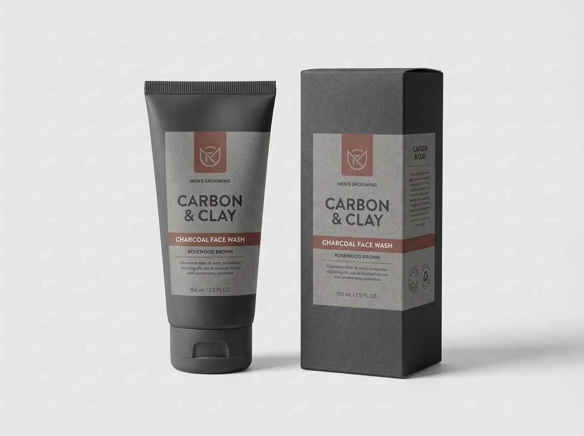
20) Iron Rosewood
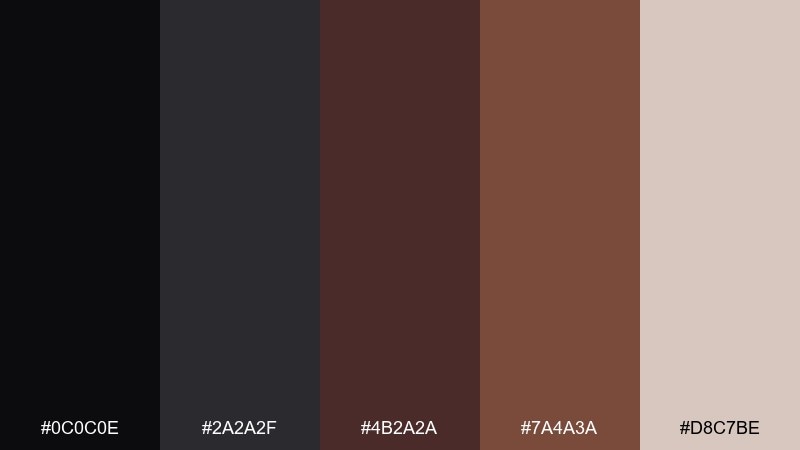
HEX: #0C0C0E #2A2A2F #4B2A2A #7A4A3A #D8C7BE
Mood: industrial, mature, understated
Best for: mens grooming product ad
Industrial charcoal paired with rosewood browns feels mature and understated, like metal tools on a wooden counter. It is strong for grooming, leather goods, and premium basics where you want warmth without sweetness. Use charcoal for the backdrop, then bring in rosewood for product names and badges. Tip: keep photography minimal and let typography carry most of the message.
Image example of iron rosewood generated using media.io
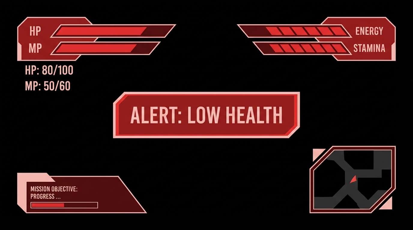
21) Sanguine Ink
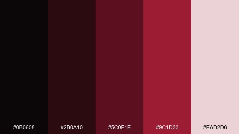
HEX: #0B0608 #2B0A10 #5C0F1E #9C1D33 #EAD2D6
Mood: intense, moody, precise
Best for: gaming HUD UI
Sanguine reds cut through ink-black like a warning light in a dark corridor. The contrast is built for HUD elements, skill indicators, and status bars that must read fast. Use the pale tint for secondary labels, and keep the brightest red for critical states only. Tip: avoid big red backgrounds and instead use red as edge highlights to reduce eye fatigue.
Image example of sanguine ink generated using media.io
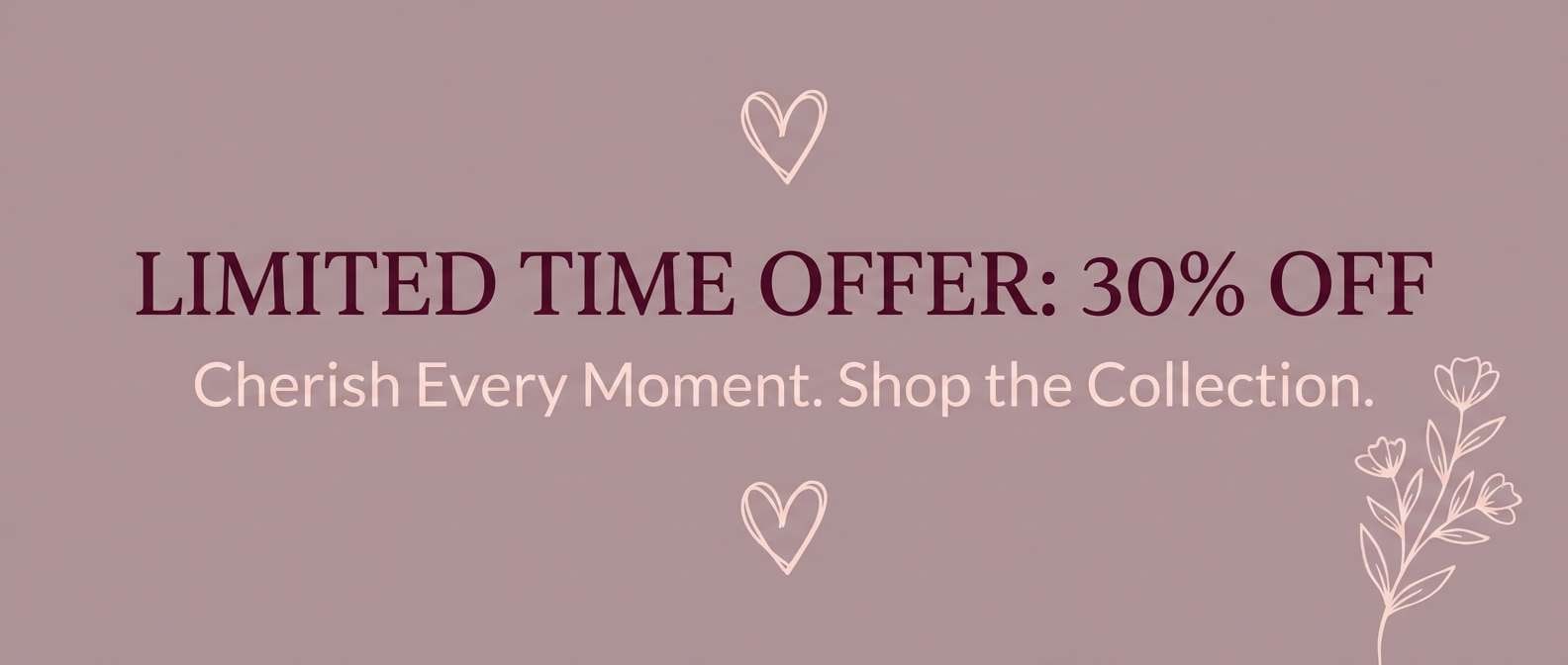
22) Nocturne Bouquet
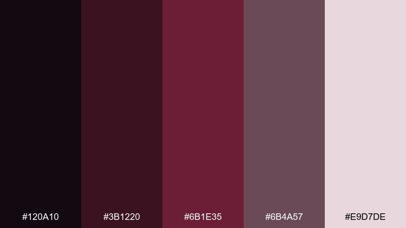
HEX: #120A10 #3B1220 #6B1E35 #6B4A57 #E9D7DE
Mood: romantic, soft, nocturnal
Best for: valentine campaign banner
Nocturnal roses and mauve shadows give romance a darker edge without going harsh. It is great for seasonal banners, email headers, and campaign creative that needs warmth with sophistication. Build the background with the dusty mauve, then layer the deeper wine for headlines and buttons. Tip: keep icons and small text on the pale tint so the banner stays accessible.
Image example of nocturne bouquet generated using media.io
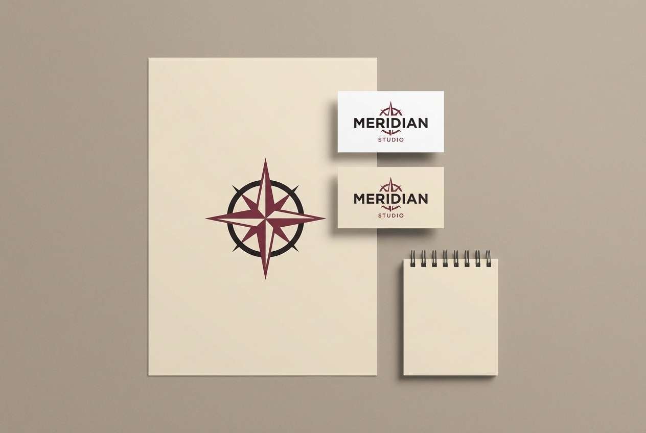
23) Eclipse Merlot
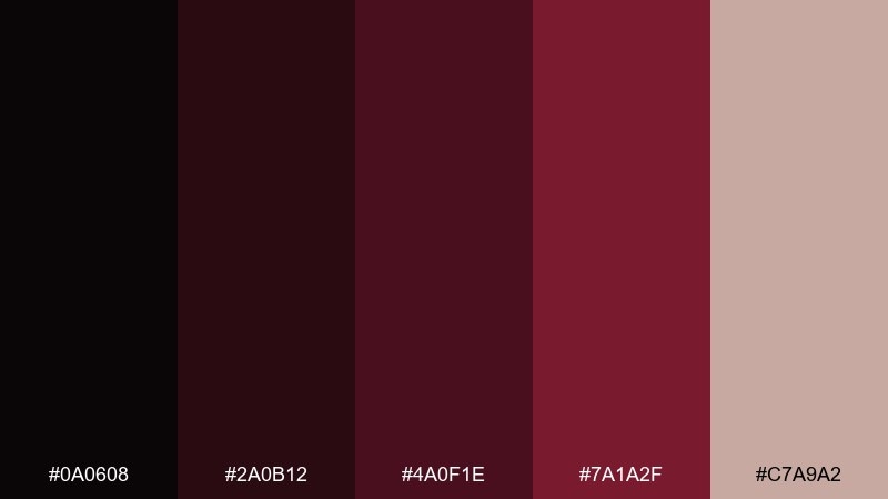
HEX: #0A0608 #2A0B12 #4A0F1E #7A1A2F #C7A9A2
Mood: brooding, refined, timeless
Best for: logo and business card set
Brooding merlot tones with soft warm neutrals feel timeless and quietly expensive. As a vampire color scheme, it is especially strong for monograms, wordmarks, and minimal business card systems. Use the near-black for the primary mark, then introduce merlot as a secondary ink on the reverse side. Tip: consider uncoated paper so the dark tones look rich rather than glossy.
Image example of eclipse merlot generated using media.io
What Colors Go Well with Vampire?
Vampire colors pair best with desaturated neutrals that keep the mood grounded: charcoal, gunmetal gray, parchment beige, and soft blush whites. These tones give you space for typography and UI components without losing the gothic atmosphere.
For contrast and hierarchy, warm metallics (candle gold, antique brass) work especially well with oxblood and near-black. If you want a more botanical twist, muted forest greens can act as a secondary accent without turning the palette bright.
How to Use a Vampire Color Palette in Real Designs
Start with a dark base (near-black, deep plum, or merlot) and treat reds as accents rather than backgrounds. This keeps the design readable and prevents the page from feeling overly aggressive or “Halloween-only.”
Use a pale tint (blush, parchment, off-white) for text panels, captions, or negative space—this is what makes vampire color schemes feel premium instead of muddy. Texture matters too: grain, matte paper, and subtle glow can add depth without adding new hues.
Create Vampire Palette Visuals with AI
If you already have HEX codes, you can turn them into matching poster concepts, packaging mockups, UI screens, or brand boards in minutes. The key is to describe lighting, material, and layout (e.g., “matte finish,” “minimal grid,” “candle-gold headline”) so the mood stays consistent.
Use the prompts above as templates, then swap the subject (menu, invitation, dashboard) while keeping the same palette language. This helps you generate a cohesive set of visuals for campaigns, pitch decks, and social posts.
Vampire Color Palette FAQs
-
What is a vampire color palette?
A vampire color palette is a dark, moody set of colors typically built from deep reds (wine, oxblood, garnet), near-blacks, and smoky neutrals like blush, parchment, or cool gray to create a dramatic gothic feel. -
What HEX codes are common in vampire color schemes?
Common vampire HEX families include near-black tones (e.g., #0B0C10), deep maroon/merlot (#4A0B13, #5B1B2B), garnet accents (#9E2C3C), and pale blush neutrals (#E8D6D2, #FFF8F6). -
What colors go well with oxblood and black?
Oxblood and black pair well with warm neutrals (cream, parchment), muted metallics (gold/tan), and cool structural grays (slate, gunmetal). These additions improve readability while keeping the mood refined. -
How do I keep a vampire palette from looking too dark?
Use a light neutral as negative space (off-white or blush), reserve the brightest red for small highlights, and maintain strong type hierarchy. Subtle texture (grain, paper) can add depth without deepening the overall darkness. -
Is a vampire palette good for UI design?
Yes—vampire palettes can work well in dashboards, onboarding, and gaming HUDs when you use near-black backgrounds, warm neutrals for text, and a single red tone for primary actions or critical states. -
When should I use gold with vampire colors?
Use gold when you want warmth and “candlelight” luxury—great for posters, event graphics, and editorial concepts. Keep it for headlines, dividers, and key details so it reads as an intentional highlight. -
Can I generate vampire palette visuals with AI?
Yes. With Media.io’s text-to-image, you can generate posters, packaging, brand boards, and UI mockups by describing the subject, materials, and lighting while referencing the palette’s mood (e.g., “deep merlot,” “near-black,” “blush accents,” “matte texture”).


