

Urban color palettes capture the feel of modern city life: grounded neutrals, crisp shadows, and warm accents that look great on screens and in print.
Below are 20+ urban color palette ideas with HEX codes, plus ready-to-use AI prompts you can copy into Media.io to generate matching visuals fast.
In this article
- Why Urban Palettes Work So Well
-
- sidewalk latte
- steel and citrus
- neon alley dusk
- rooftop garden
- metro concrete
- brick and fog
- crosswalk minimal
- streetcar teal
- warehouse rust
- gallery greige
- asphalt bloom
- night train
- side street pastels
- corner bakery signage
- skyline bluehour
- tram ticket
- pavement peach
- rainy plaza
- district night market
- modern loft
- underpass ink
- What Colors Go Well with Urban?
- How to Use a Urban Color Palette in Real Designs
- Create Urban Palette Visuals with AI
Why Urban Palettes Work So Well
Urban palettes feel “real” because they’re built on the colors cities naturally provide: concrete grays, asphalt charcoals, foggy blues, brick reds, and warm indoor light.
They’re also incredibly practical. Muted neutrals make typography, icons, and product photography easier to place, while a single accent color creates clear hierarchy for CTAs, labels, and highlights.
Most importantly, urban color schemes scale well across brand systems—working consistently from UI components to posters, packaging, and social templates without looking too trendy.
20+ Urban Color Palette Ideas (with HEX Codes)
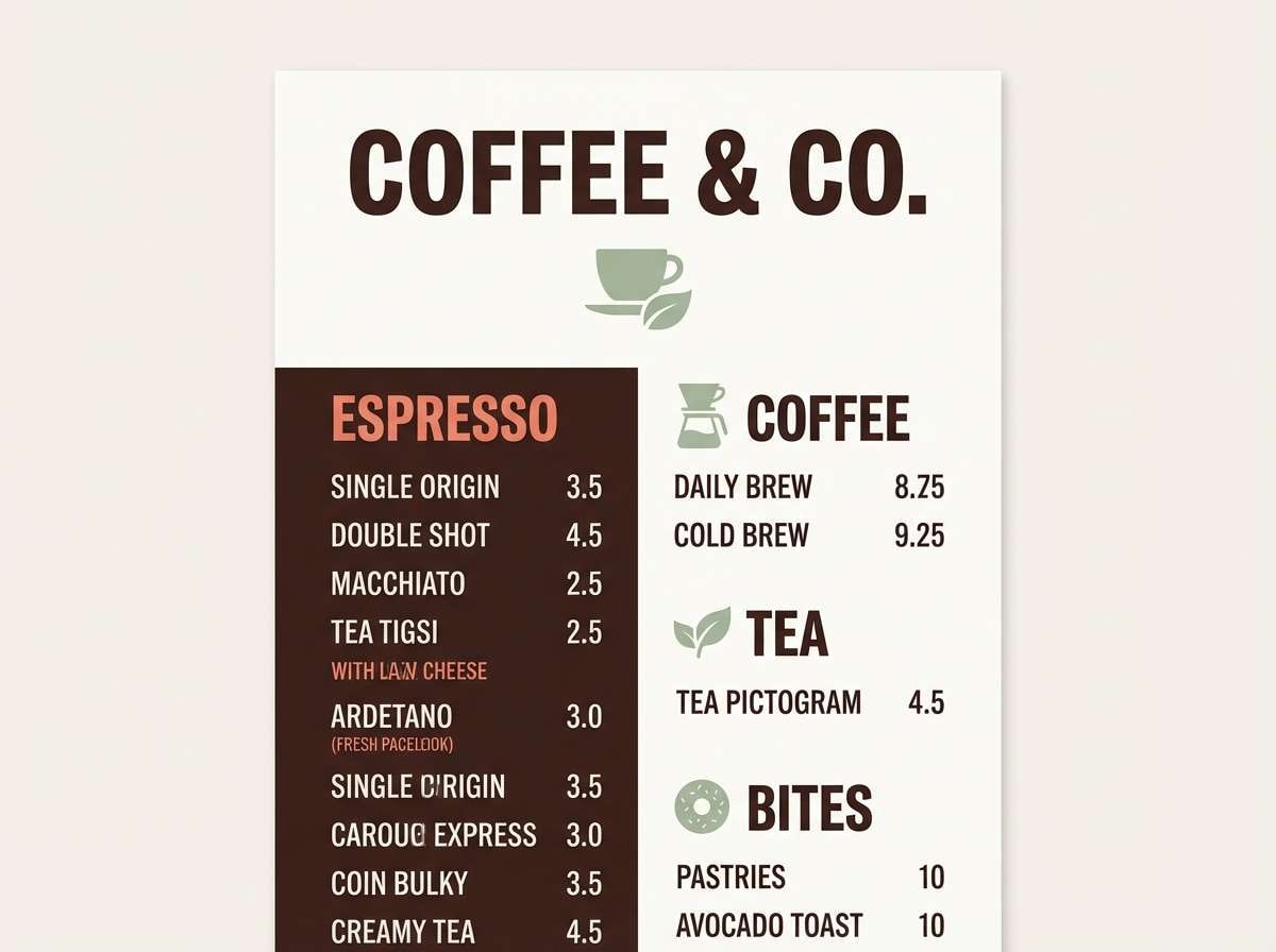
1) Sidewalk Latte
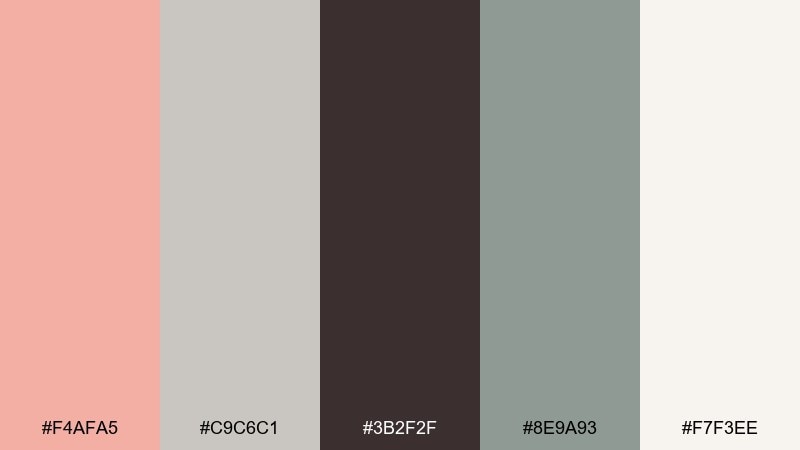
HEX: #F4AFA5 #C9C6C1 #3B2F2F #8E9A93 #F7F3EE
Mood: cozy, grounded, modern
Best for: coffee shop branding and menu design
Cozy and city-warm, these tones feel like a latte in hand on a cool sidewalk morning. It is a friendly urban color palette for menus, loyalty cards, and small packaging where warmth matters. Pair the salmon accent with espresso text for contrast, then keep the background airy with off-white. Usage tip: use the sage gray for secondary headings so your layout stays calm, not cute.
Image example of sidewalk latte generated using media.io
Media.io is an online AI studio for creating and editing video, image, and audio in your browser.

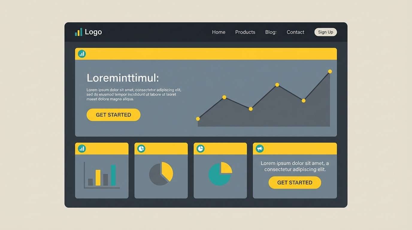
2) Steel and Citrus
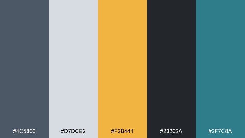
HEX: #4C5866 #D7DCE2 #F2B441 #23262A #2F7C8A
Mood: crisp, energetic, confident
Best for: tech startup landing page UI mockup
Crisp steel grays with a citrus hit evoke glass towers and fast commutes. The pairing works well for dashboards and hero sections where you need clarity plus a strong call-to-action. Keep charcoal for navigation and use citrus only for buttons, badges, and key metrics. Usage tip: limit the teal to charts or links so the accent hierarchy stays readable.
Image example of steel and citrus generated using media.io
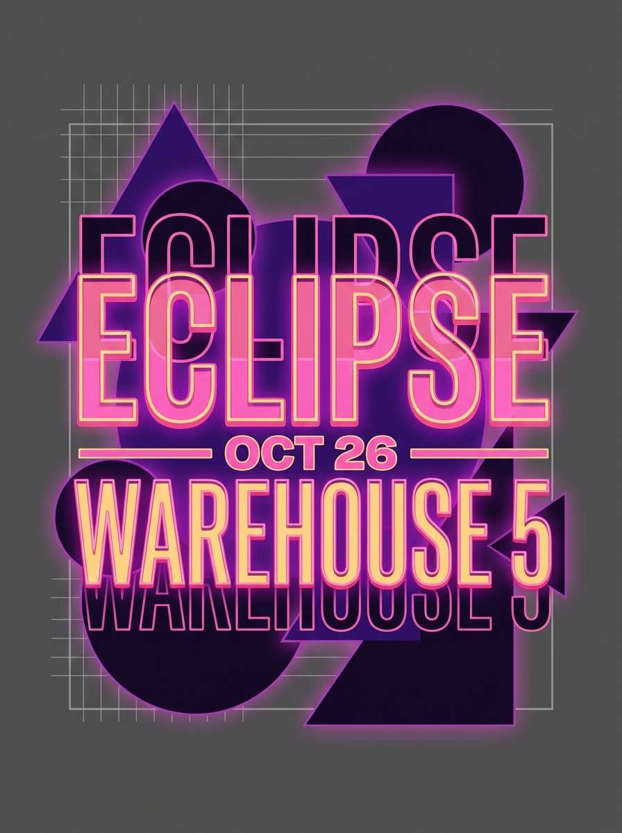
3) Neon Alley Dusk
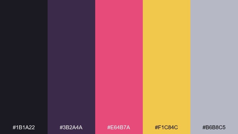
HEX: #1B1A22 #3B2A4A #E64B7A #F1C84C #B6B8C5
Mood: bold, electric, nightlife
Best for: nightlife event poster design
Electric pink and golden light against deep shadows feel like neon bouncing off wet pavement. Use the dark base for large type blocks and let the hot accents punctuate dates, DJs, or ticket tiers. Pair with simple geometric shapes to avoid visual noise, and keep the pale gray for spacing and legibility. Usage tip: try a gradient from violet to near-black behind the headline for instant depth.
Image example of neon alley dusk generated using media.io
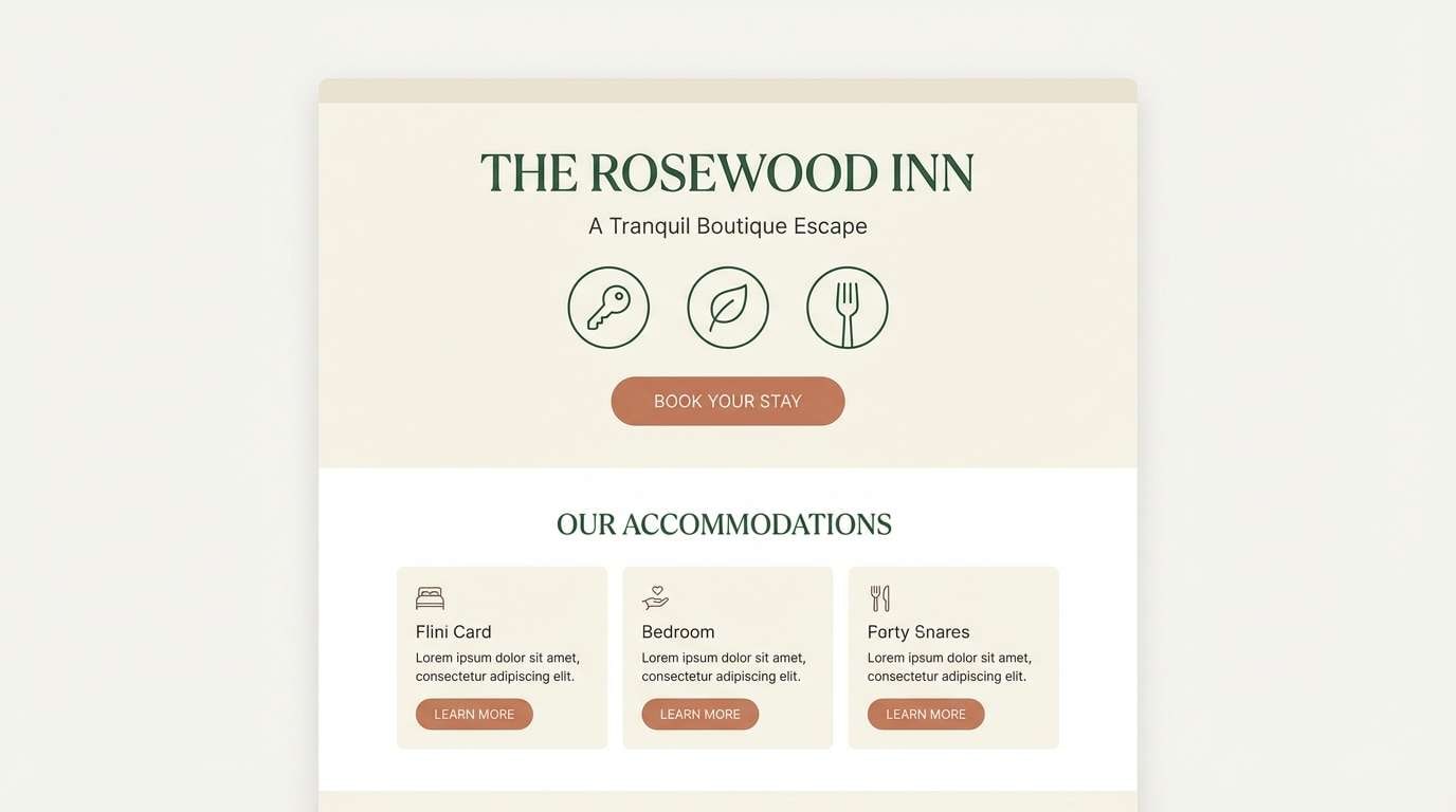
4) Rooftop Garden
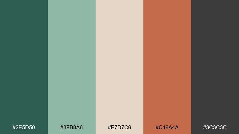
HEX: #2E5D50 #8FB8A6 #E7D7C6 #C46A4A #3C3C3C
Mood: fresh, boutique, relaxed
Best for: boutique hotel website visuals
Fresh greens and warm clay evoke rooftop planters, terracotta pots, and quiet lounge corners. These tones shine on hospitality pages, especially for amenities, booking sections, and photo captions. Pair the soft cream with the deep green for calm contrast, then reserve clay for buttons or highlights. Usage tip: use charcoal for body text to keep the look premium and easy to scan.
Image example of rooftop garden generated using media.io
5) Metro Concrete
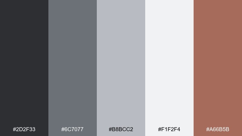
HEX: #2D2F33 #6C7077 #B8BCC2 #F1F2F4 #A66B5B
Mood: professional, architectural, restrained
Best for: real estate brochure and listing sheets
Smooth concrete grays with a muted copper note feel like a new-build lobby at rush hour. This urban color scheme is ideal for real estate layouts that need trust, structure, and a subtle warmth. Pair the copper accent with strong photography, and use the light gray as a clean canvas for floor plans and specs. Usage tip: set headings in near-black and keep body text on the pale gray for print-friendly clarity.
Image example of metro concrete generated using media.io
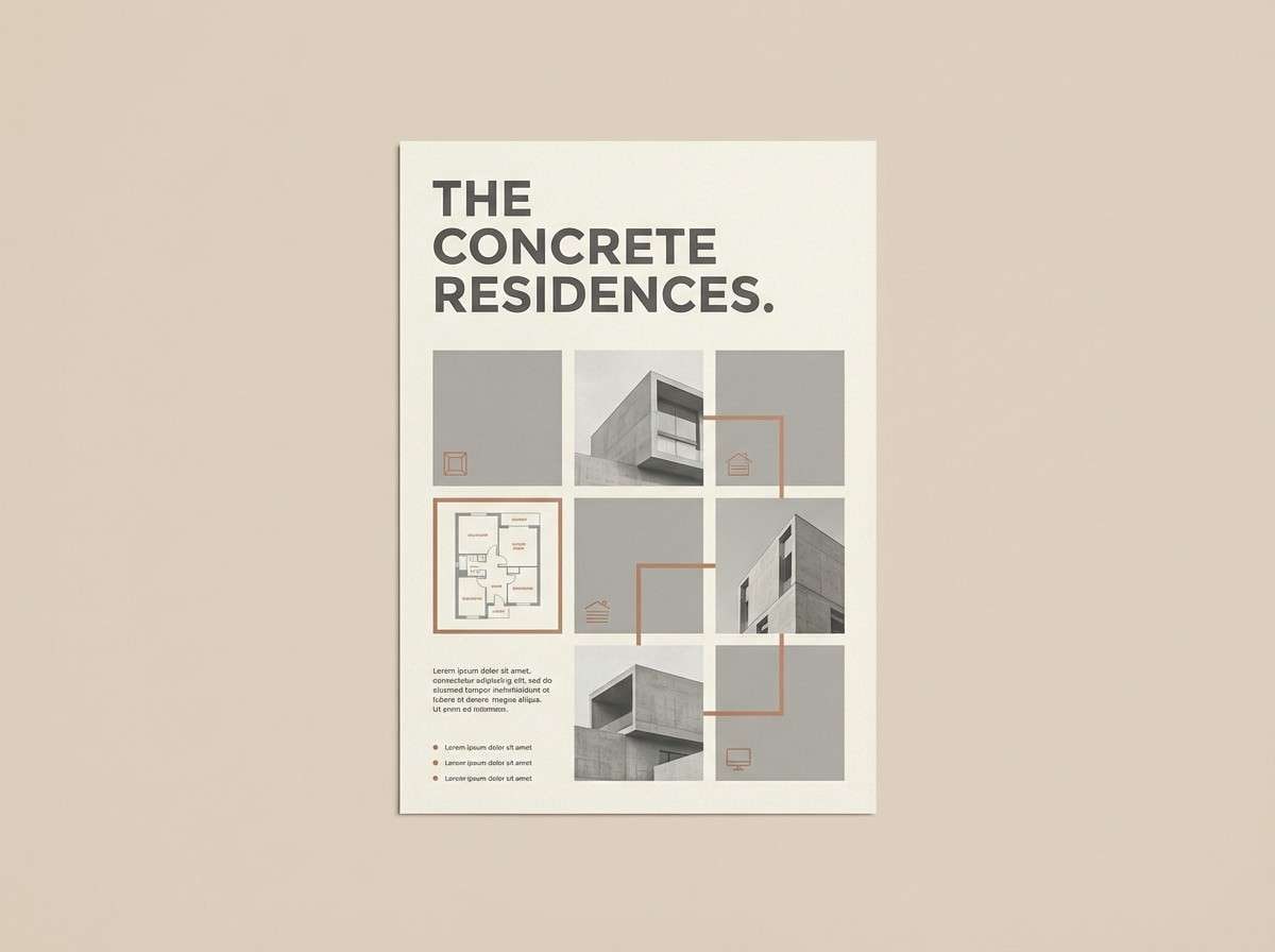
6) Brick and Fog
HEX: #B55A4A #E6E0D8 #6E7B83 #2C2A28 #F3B48B
Mood: heritage, calm, studio-ready
Best for: architecture portfolio website
Brick warmth and cool foggy gray suggest old facades under overcast skies. Use the light neutral for project pages and let brick and peach highlight key details like location, year, or awards. Pair with lots of whitespace and thin rules so the work stays the hero. Usage tip: keep charcoal for captions and measurements to maintain a disciplined, architectural feel.
Image example of brick and fog generated using media.io
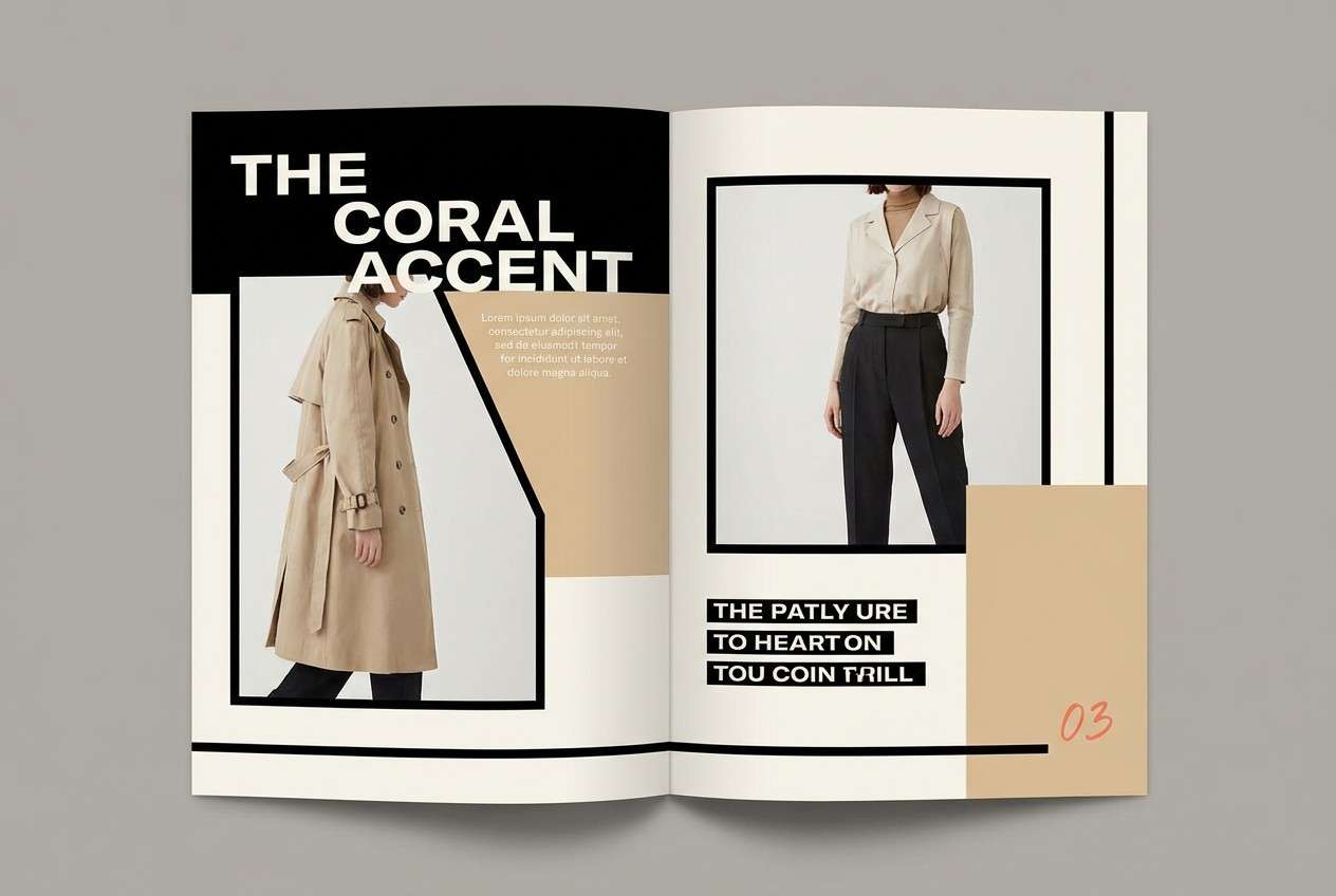
7) Crosswalk Minimal
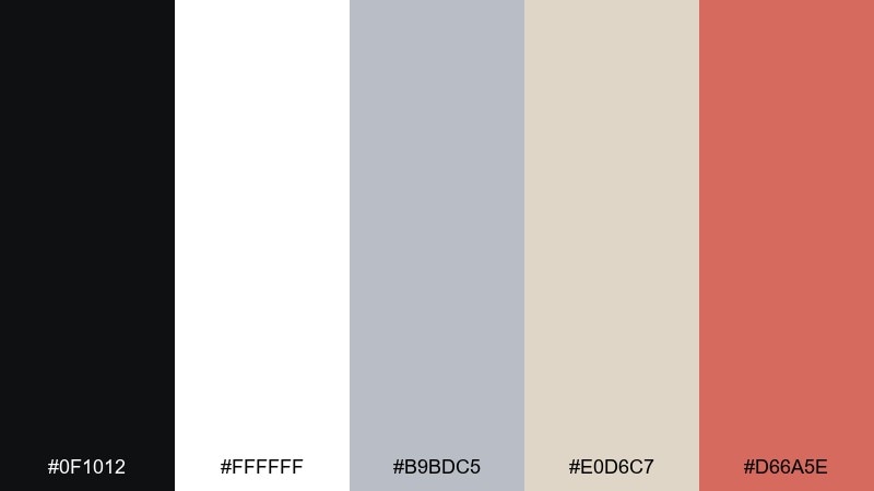
HEX: #0F1012 #FFFFFF #B9BDC5 #E0D6C7 #D66A5E
Mood: minimal, editorial, high-contrast
Best for: fashion lookbook editorial layout
High-contrast black and white with soft warm neutrals feels like clean crosswalk stripes and polished storefronts. It works beautifully for lookbooks, typography-led covers, and image captions that need space to breathe. Pair the salmon-coral accent with section dividers or page numbers rather than large blocks. Usage tip: keep photos slightly desaturated so the warm neutral paper tone stands out.
Image example of crosswalk minimal generated using media.io
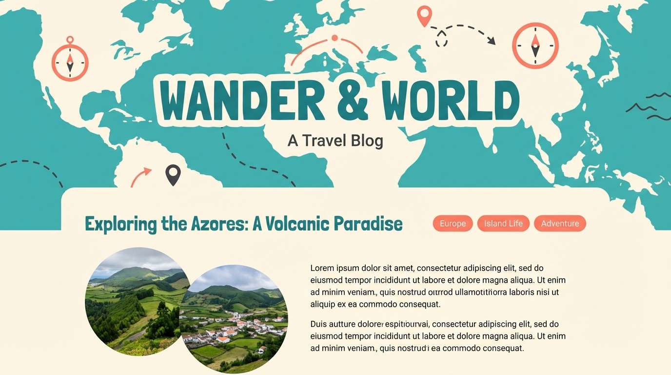
8) Streetcar Teal
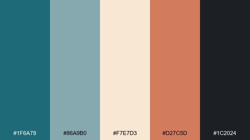
HEX: #1F6A78 #86A9B0 #F7E7D3 #D27C5D #1C2024
Mood: breezy, coastal-city, inviting
Best for: travel blog header graphics
Teal and soft sand evoke a streetcar ride toward the water with sun-warmed buildings passing by. Use teal for title bars and navigation, then let the cream tone keep long reads comfortable. Pair coral with small badges, map pins, or category tags to guide scanning. Usage tip: keep body text in near-charcoal for readability without the harshness of pure black.
Image example of streetcar teal generated using media.io
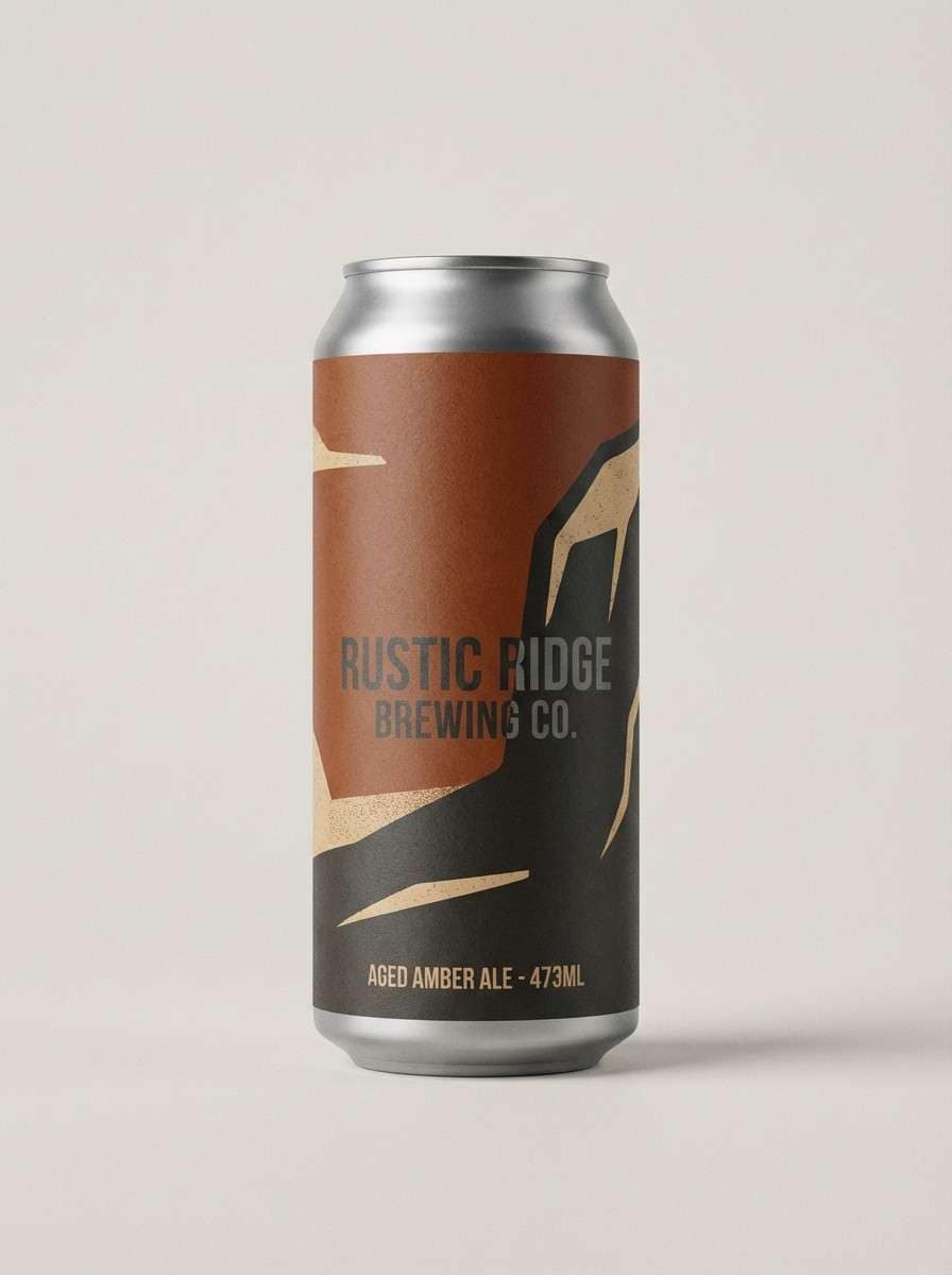
9) Warehouse Rust
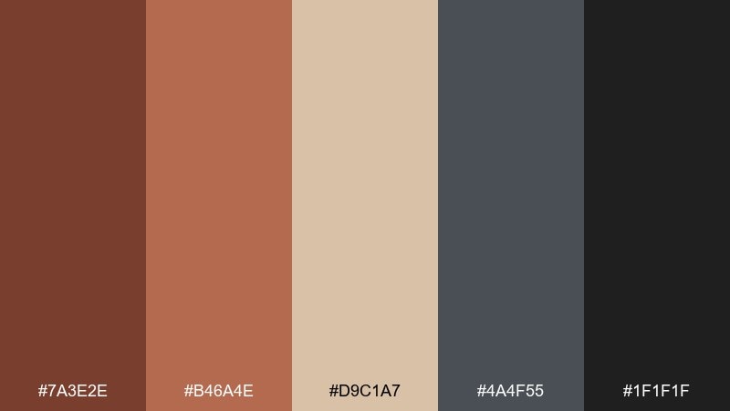
HEX: #7A3E2E #B46A4E #D9C1A7 #4A4F55 #1F1F1F
Mood: rugged, craft, industrial
Best for: craft beer can packaging
Rusty browns and gritty darks feel like reclaimed timber, steel beams, and a small-batch taproom. These tones suit packaging where texture and authenticity matter, especially with bold type and simple stamps. Pair the sandy beige with illustrated hops or grain to keep the label from getting too heavy. Usage tip: use the medium gray for legal text so it stays visible without stealing attention.
Image example of warehouse rust generated using media.io
10) Gallery Greige
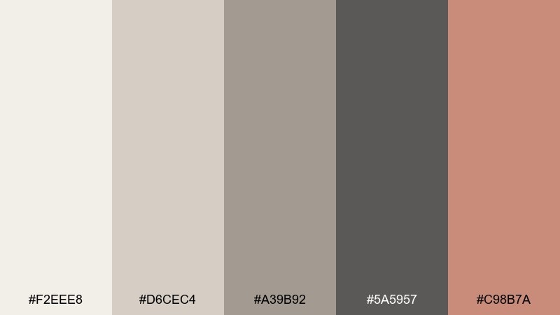
HEX: #F2EEE8 #D6CEC4 #A39B92 #5A5957 #C98B7A
Mood: calm, curated, modern
Best for: minimalist interior design brand kit
Soft greige layers feel like a quiet gallery wall with warm spotlights and matte frames. This urban color palette is a strong fit for brand guides, slide decks, and portfolio covers that need understated polish. Pair the deep gray with clean sans-serif typography, then use the muted terracotta for highlights and signatures. Usage tip: keep backgrounds in the lightest tone and save darker shades for structure and hierarchy.
Image example of gallery greige generated using media.io
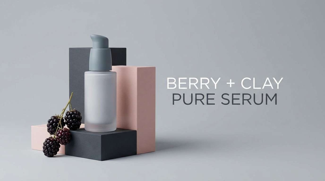
11) Asphalt Bloom
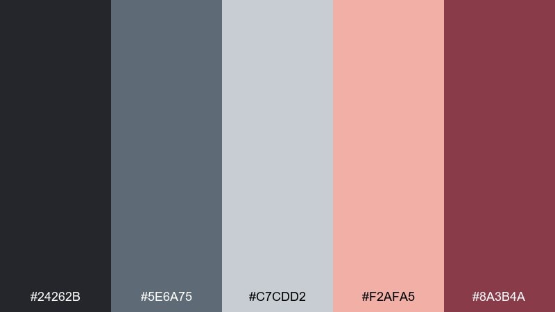
HEX: #24262B #5E6A75 #C7CDD2 #F2AFA5 #8A3B4A
Mood: sleek, romantic, city-night
Best for: skincare product ad creative
Dark asphalt tones with blush and berry feel like flowers against a night skyline. Use this mix for beauty ads where you want elegance without going overly pastel. Pair blush with clean product copy, and keep berry for tiny callouts like percentages or benefits. Usage tip: choose a cool gray background so the blush reads fresh instead of sugary.
Image example of asphalt bloom generated using media.io
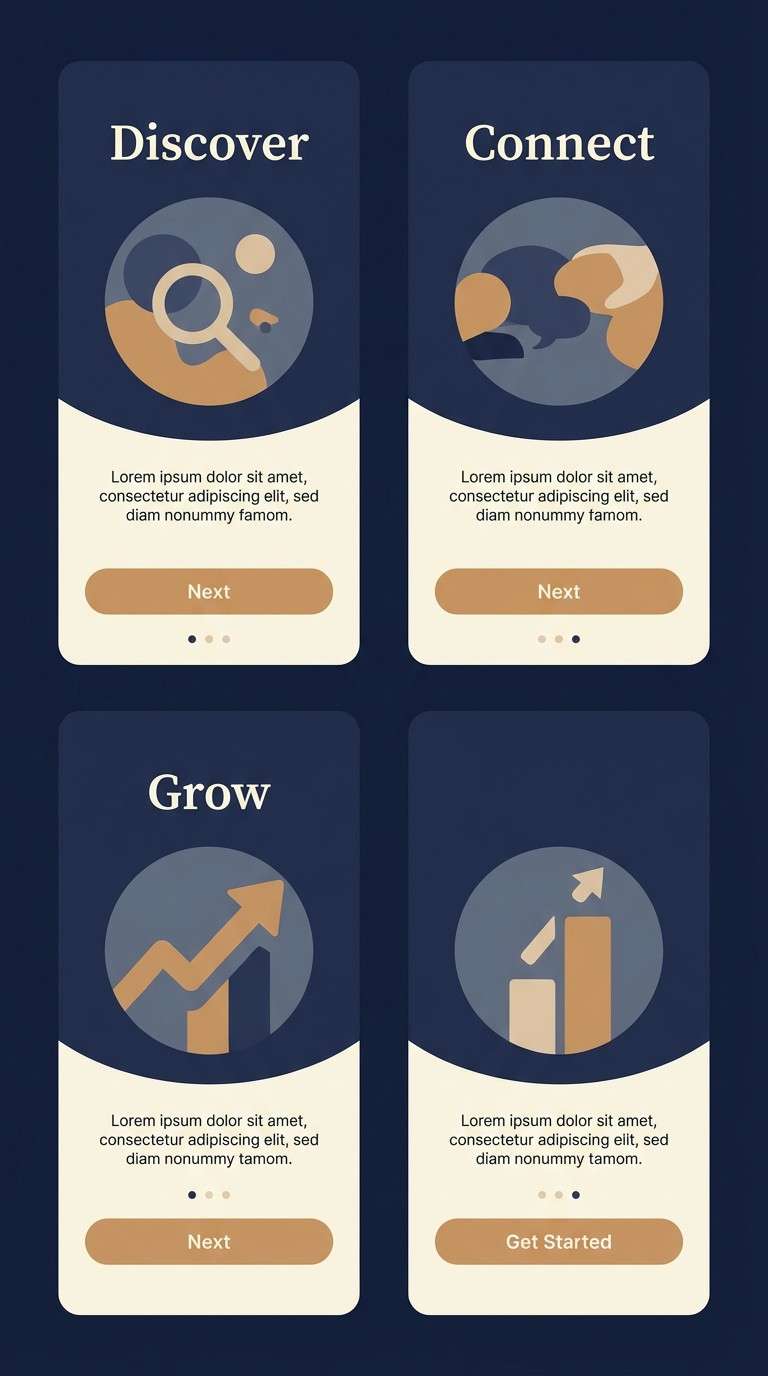
12) Night Train
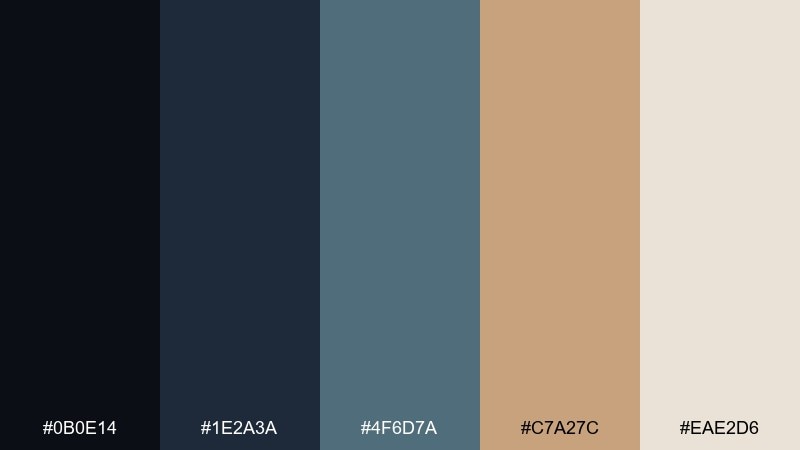
HEX: #0B0E14 #1E2A3A #4F6D7A #C7A27C #EAE2D6
Mood: moody, dependable, cinematic
Best for: app onboarding UI screens
Deep navy and slate feel like looking out a train window as the city lights blur past. The warm tan adds a premium touch that works well for fintech, travel, or membership apps. Pair the cream with large headings and keep buttons in tan for a clear visual path. Usage tip: use slate for secondary text so the dark background stays comfortable, not harsh.
Image example of night train generated using media.io
13) Side Street Pastels
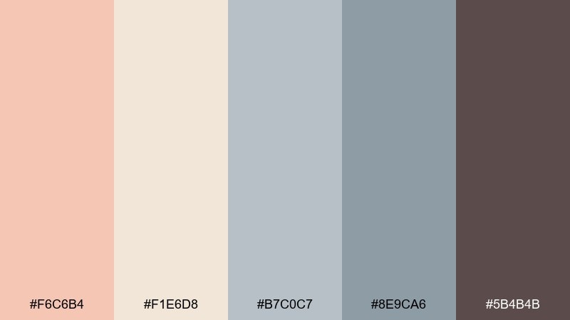
HEX: #F6C6B4 #F1E6D8 #B7C0C7 #8E9CA6 #5B4B4B
Mood: soft, intimate, modern-classic
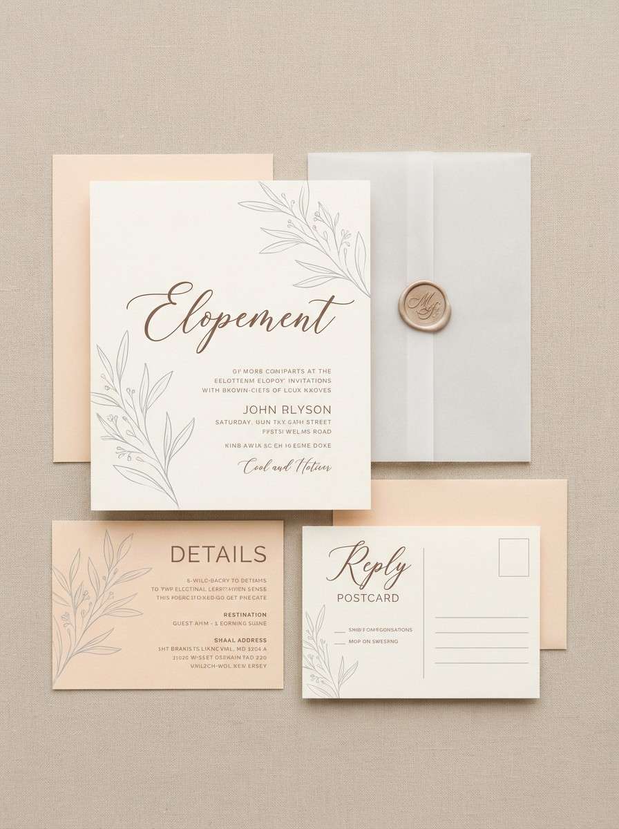
Best for: city elopement invitation set
Soft peach and paper cream feel like a quiet side street at golden hour. These tones are perfect for invitations that want romance with a contemporary edge. Pair the cool grays with clean serif typography, and use the deep cocoa for names and key details. Usage tip: add thin gray linework to keep the layout structured without losing the airy vibe.
Image example of side street pastels generated using media.io
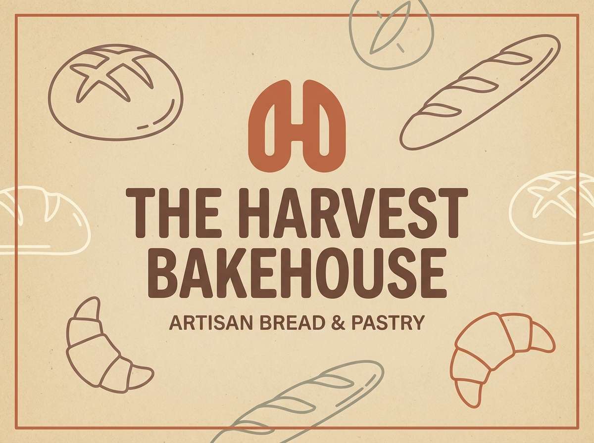
14) Corner Bakery Signage
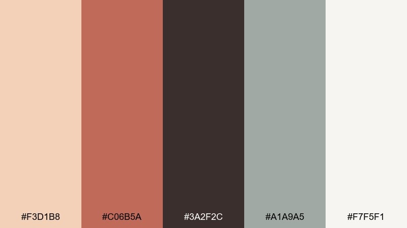
HEX: #F3D1B8 #C06B5A #3A2F2C #A1A9A5 #F7F5F1
Mood: welcoming, artisanal, neighborhood
Best for: storefront signage and poster graphics
Warm pastry tones and cocoa brown evoke hand-lettered boards outside a neighborhood bakery. Use the cream base for clean readability and let the terracotta-red carry the brand mark. Pair the muted gray-green with ingredient callouts or secondary labels to keep the palette from leaning too sweet. Usage tip: print the dark brown as the main text color for a softer look than pure black.
Image example of corner bakery signage generated using media.io
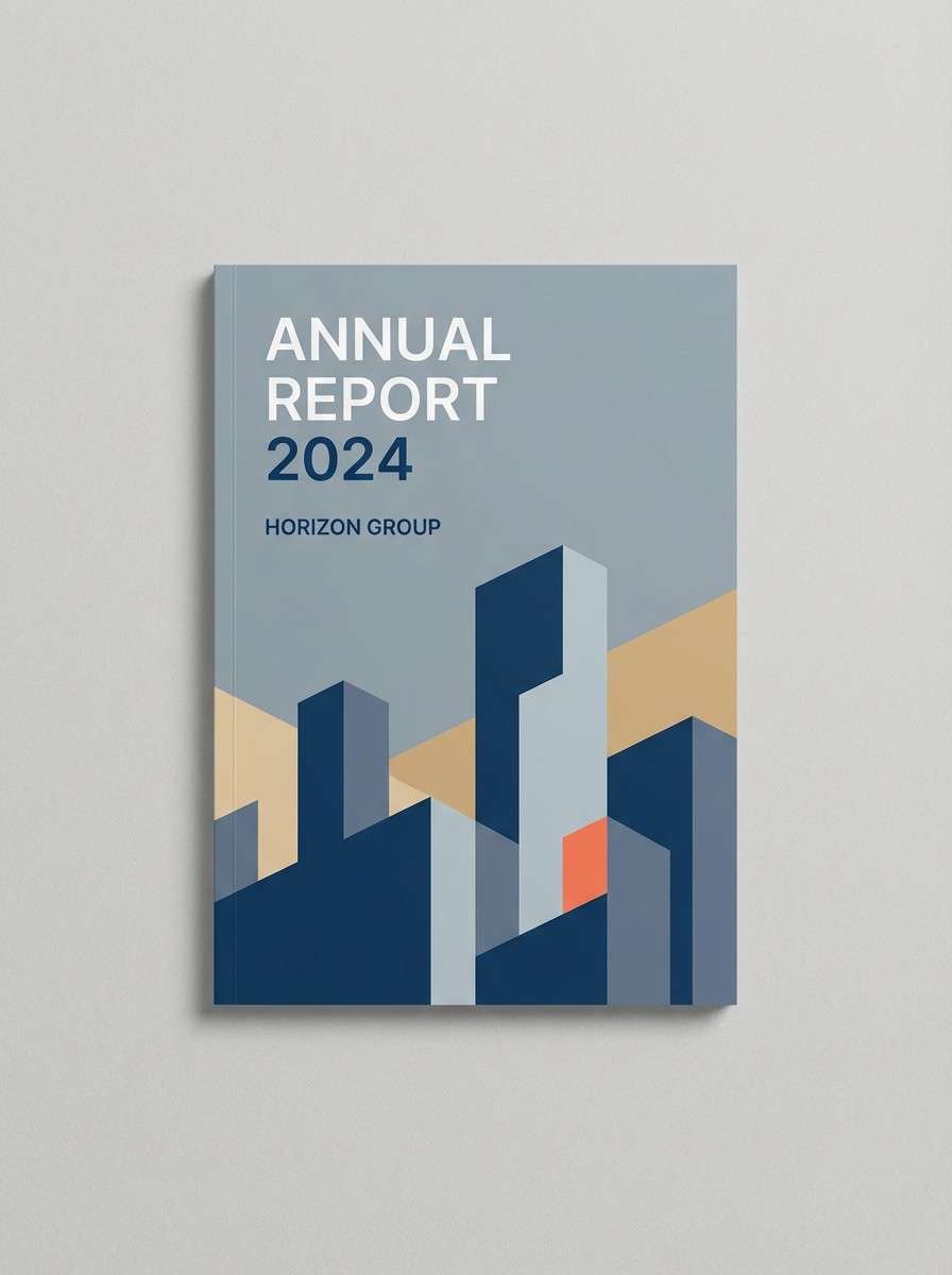
15) Skyline Bluehour
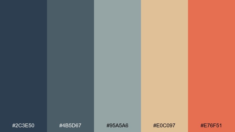
HEX: #2C3E50 #4B5D67 #95A5A6 #E0C097 #E76F51
Mood: corporate, polished, forward
Best for: annual report cover design
Blue-hour tones with warm highlights feel like the skyline just before the lights fully come on. It fits corporate reports and pitch decks that need authority without looking cold. Pair slate-blue sections with sand-colored charts, then use the coral accent for key wins and callouts. Usage tip: keep icon fills in the light gray-blue to maintain a cohesive, professional rhythm.
Image example of skyline bluehour generated using media.io
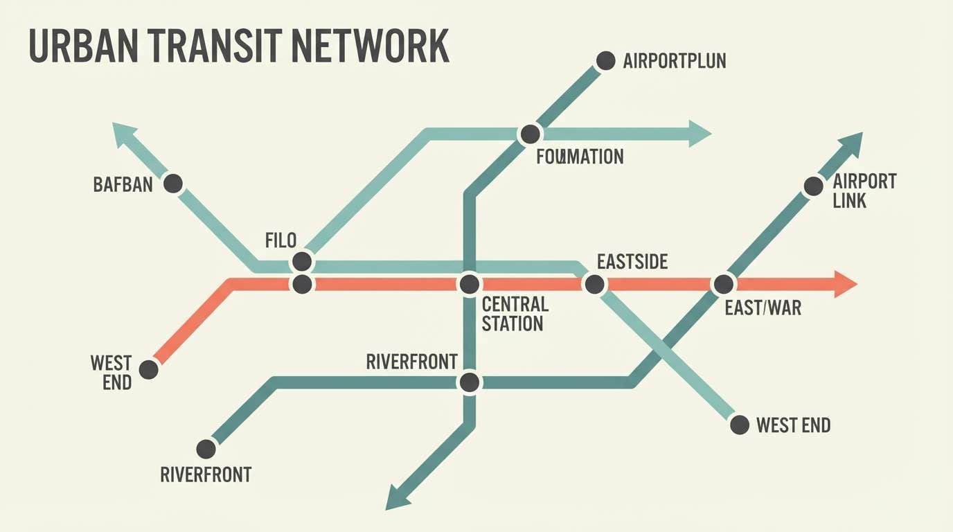
16) Tram Ticket
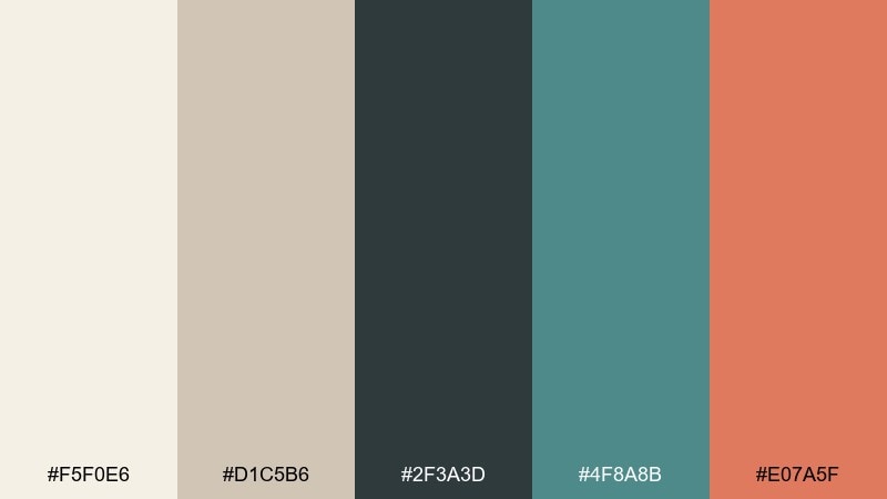
HEX: #F5F0E6 #D1C5B6 #2F3A3D #4F8A8B #E07A5F
Mood: organized, retro-modern, clear
Best for: subway map infographic design
Cream paper and inky charcoal bring back the feel of a stamped tram ticket, clean and collectible. This urban color combination works great for maps, schedules, and infographics where clarity matters more than decoration. Pair teal with route lines and reserve the coral for one standout line or important transfer points. Usage tip: keep labels in charcoal and avoid overly thin strokes so everything stays readable at small sizes.
Image example of tram ticket generated using media.io
17) Pavement Peach
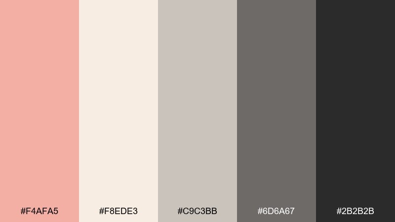
HEX: #F4AFA5 #F8EDE3 #C9C3BB #6D6A67 #2B2B2B
Mood: friendly, modern, social-first
Best for: social media carousel templates
Soft peach over warm neutrals feels like sunlit pavement and minimal storefronts. Use the light cream for most slides, then bring in peach for headers, stickers, or price tags. Pair dark charcoal with generous line spacing so captions stay easy to read on mobile. Usage tip: keep shadows subtle and stick to simple shapes for a clean, scroll-stopping look.
Image example of pavement peach generated using media.io
18) Rainy Plaza
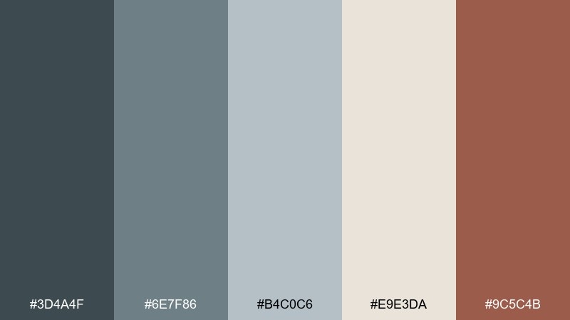
HEX: #3D4A4F #6E7F86 #B4C0C6 #E9E3DA #9C5C4B
Mood: cool, steady, outdoorsy
Best for: outdoor gear catalog spread
Cool grays and misty blues feel like a rainy plaza with umbrellas moving in slow rhythm. These tones are great for catalog spreads where product photos need a grounded, practical frame. Pair the clay accent with price tags or feature callouts, and keep the light neutral as a clean paper base. Usage tip: use the mid-gray-blue for dividers and tables so the layout stays organized without looking busy.
Image example of rainy plaza generated using media.io
19) District Night Market
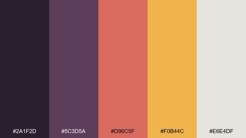
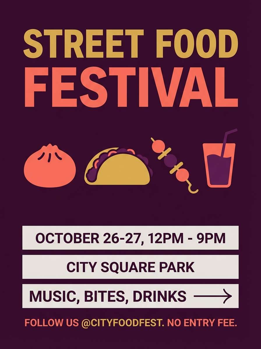
HEX: #2A1F2D #5C3D5A #D96C5F #F0B44C #E6E4DF
Mood: lively, spicy, night-scene
Best for: street food festival flyer
Plum shadows with spicy coral and golden light feel like lanterns over a crowded night market. Use the deep tones for background blocks and let warm accents guide the eye to the lineup, location, and time. Pair the pale neutral with small text areas so details stay readable even with bold color. Usage tip: keep the typeface simple and heavy so it holds up against the saturated accents.
Image example of district night market generated using media.io
20) Modern Loft
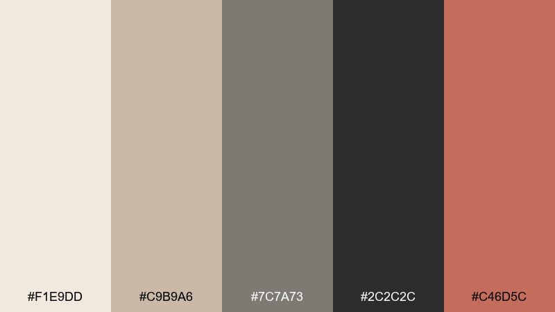
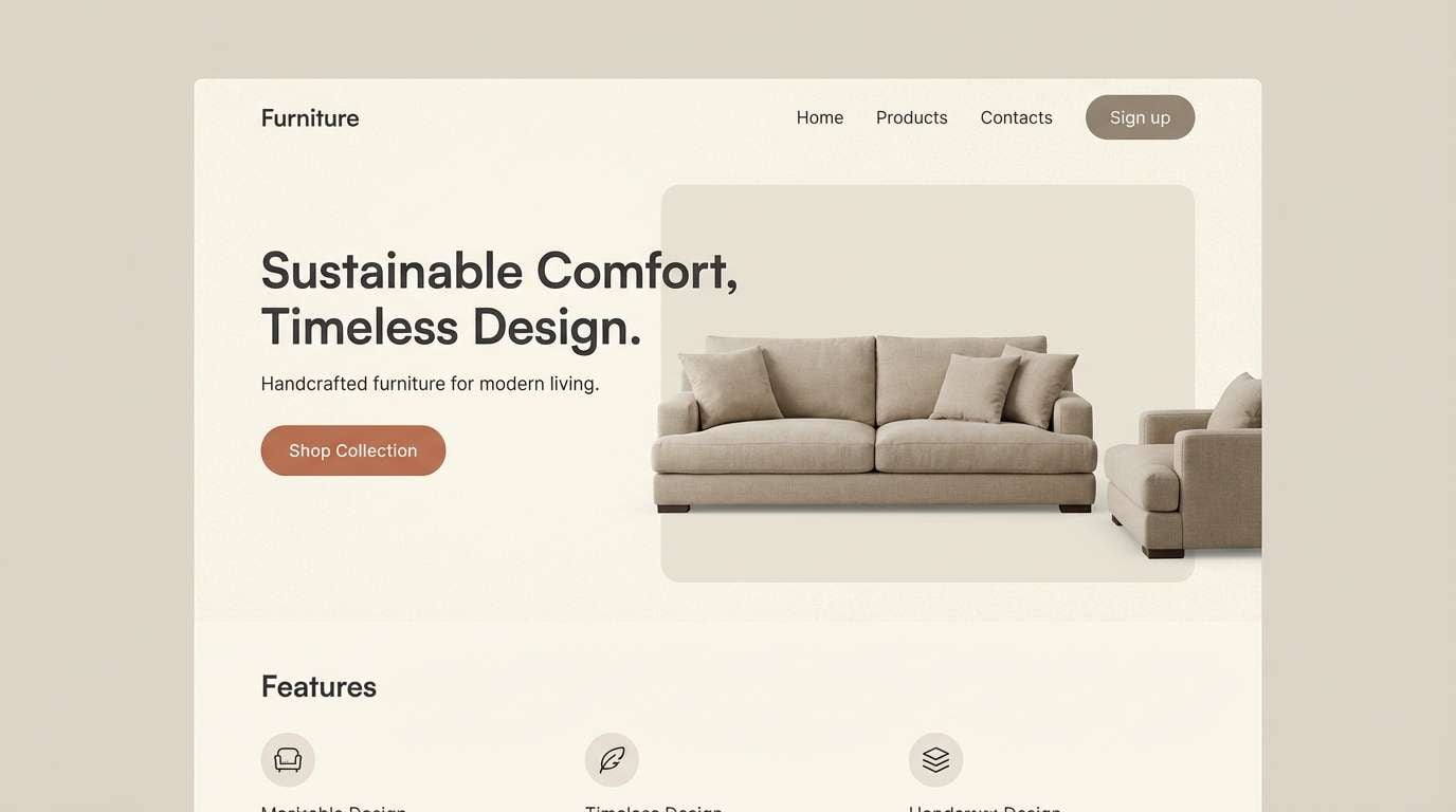
HEX: #F1E9DD #C9B9A6 #7C7A73 #2C2C2C #C46D5C
Mood: warm, elevated, contemporary
Best for: furniture product landing page hero
Warm plaster neutrals with a clay accent evoke a quiet loft with clean lines and soft afternoon light. Use the cream tone as your main canvas, then anchor layouts with charcoal headings and structured grids. Pair the clay accent with buttons or product labels to add warmth without overpowering photography. Usage tip: keep secondary panels in taupe so the page feels layered and premium.
Image example of modern loft generated using media.io
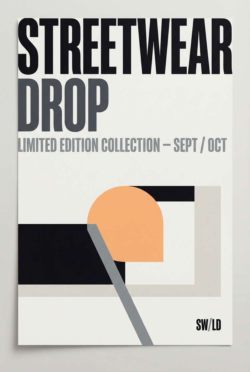
21) Underpass Ink
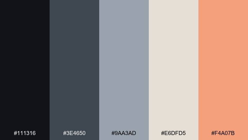
HEX: #111316 #3E4650 #9AA3AD #E6DFD5 #F4A07B
Mood: gritty, sharp, modern
Best for: streetwear drop poster graphic
Inky blacks and cool grays feel like an underpass wall, while the apricot pop reads like a sticker slapped on fresh paint. Use the dark base for bold type and high-impact photography treatments. Pair the light neutral with product info blocks, and reserve apricot for one loud element like the date or price. Usage tip: add generous margins so the heavy tones still feel premium, not cramped.
Image example of underpass ink generated using media.io
What Colors Go Well with Urban?
Urban palettes pair best with structured neutrals: charcoal, concrete gray, off-white, and slate blue. These shades keep layouts readable and help photos feel cohesive.
For accents, choose one warm color (salmon, clay, copper, citrus) or one cool highlight (teal, steel blue) to guide attention. The “one loud accent” approach is what makes city-toned design look modern instead of messy.
If you need more range, add a second accent at a smaller scale—think links, chart lines, or tags—while keeping backgrounds and text anchored in neutral tones.
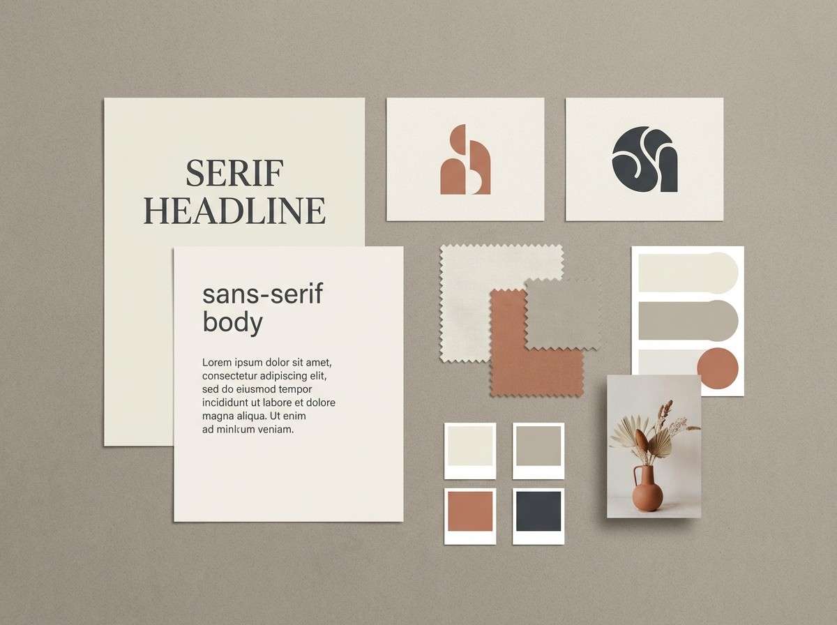
How to Use a Urban Color Palette in Real Designs
Start with a neutral base (off-white or light gray) for backgrounds, then reserve the darkest shade for typography and UI structure. This creates the crisp contrast urban design is known for.
Next, assign your accent color to one job only—CTA buttons, price tags, event dates, or key metrics. When every highlight is the same hue, your design feels intentional and “city-clean.”
Finally, keep saturation balanced. Urban palettes look strongest when photos are slightly desaturated and the interface colors stay muted, letting the accent do the talking.
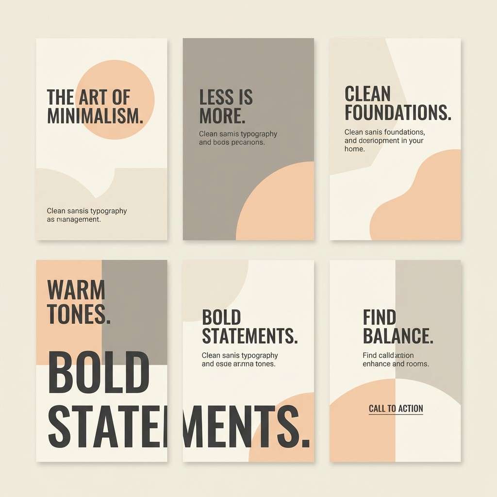
Create Urban Palette Visuals with AI
Want matching mockups, posters, and UI concepts for any urban color scheme above? Copy the prompt under a palette and generate a consistent visual style in minutes.
Media.io makes it easy to iterate: try different aspect ratios, swap subjects (poster to landing page), and keep the same palette mood for brand consistency.
Once you have an image you like, you can refine it for campaigns, thumbnails, or presentation slides—without leaving your browser.
Urban Color Palette FAQs
-
What is an urban color palette?
An urban color palette is a set of city-inspired colors—usually concrete grays, asphalt charcoals, foggy blues, warm bricks, and a modern accent—used to create a contemporary, structured look in branding and design. -
Are urban color schemes good for UI design?
Yes. Urban color schemes tend to be neutral-first, which supports readability, strong hierarchy, and accessible contrast—especially when you reserve one accent color for CTAs and key states. -
How many accent colors should an urban palette use?
Typically one main accent is enough (like coral, clay, or citrus). If you add a second accent (like teal), keep it subtle and assign it a specific role such as links or chart lines. -
What’s the best background color for an urban design?
Off-white, warm cream, or light gray backgrounds work best because they mimic paper and concrete surfaces while keeping layouts clean and print-friendly. -
Can I use urban palettes for posters and event flyers?
Absolutely. Dark bases (near-black, navy, deep plum) with a neon or warm highlight can deliver strong impact for posters—just keep typography bold and spacing generous. -
How do I keep an urban palette from looking dull?
Increase contrast with a deeper text color, add one warm accent, and introduce texture through photography or subtle gradients. The key is controlled energy, not more colors. -
How can I generate urban palette images quickly?
Use Media.io’s text-to-image tool: paste a palette’s prompt, keep the same mood keywords, and iterate on layout (UI, poster, packaging) while maintaining your chosen HEX direction.


