

Light salmon is a soft coral-peach that adds warmth without feeling loud. It’s an easy “hero” color for modern branding, UI highlights, and romantic event styling.
Below are 20 light salmon color palette ideas with HEX codes, plus practical pairing tips and AI prompts you can use to generate matching visuals fast.
In this article
- Why Light Salmon Palettes Work So Well
-
- coastal blush
- apricot linen
- sunset gelato
- rosewater clay
- peach pop contrast
- sandstone bouquet
- warm minimal ui
- boutique orchid
- spring botanica
- vintage postcard
- coral sorbet poster
- bakery box
- nursery daydream
- tropical sherbet
- bridal powder
- terracotta spa
- soft sportswear
- editorial beauty
- cafe sage
- autumn peach dusk
- What Colors Go Well with Light Salmon?
- How to Use a Light Salmon Color Palette in Real Designs
- Create Light Salmon Palette Visuals with AI
Why Light Salmon Palettes Work So Well
Light salmon sits in the sweet spot between coral and peach, so it reads friendly and human without skewing too “cute.” That makes it a strong accent for brands that want warmth and approachability.
It also pairs cleanly with modern neutrals (off-white, warm beige, slate) and can be cooled down with greens and blues for balance. With the right dark anchor color, light salmon stays polished and legible.
In digital design, it’s especially useful for highlighting CTAs, tags, and progress states because it attracts attention while still feeling soft on the eyes.
20+ Light Salmon Color Palette Ideas (with HEX Codes)
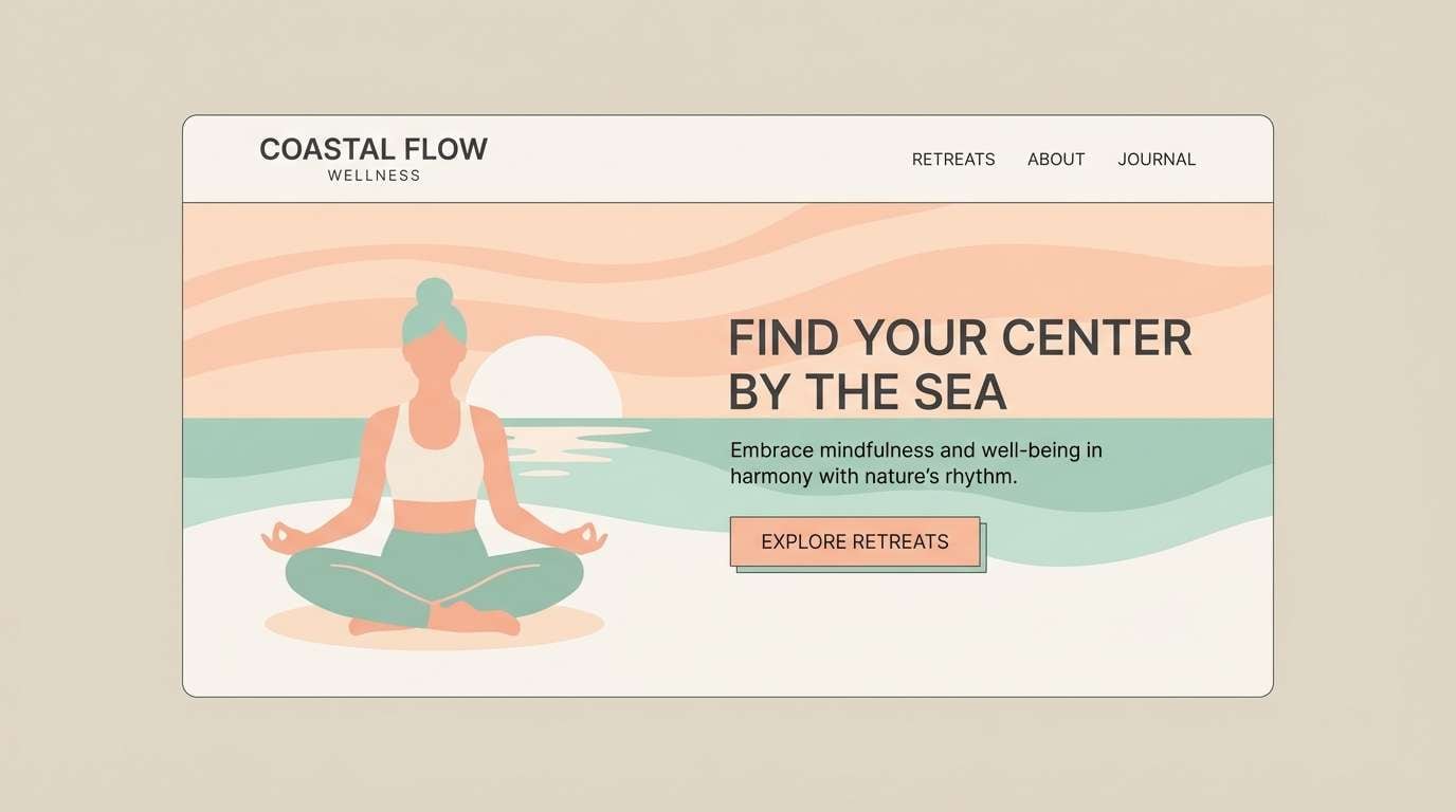
1) Coastal Blush
HEX: #FFA07A #FFD1C1 #F6F1E8 #8EC9C3 #2F3A3F
Mood: breezy, clean, and calming
Best for: wellness branding and coastal lifestyle websites
Breezy and sunlit, this mix feels like salt air, pale sand, and coral shells. The light salmon color palette shines as a warm hero color alongside creamy neutrals and a seafoam accent. Pair the charcoal tone for crisp type and icons so the pastels stay sophisticated, not sugary. Tip: keep salmon for highlights and CTAs, and let the off-white carry most backgrounds for an airy layout.
Image example of coastal blush generated using media.io
Media.io is an online AI studio for creating and editing video, image, and audio in your browser.

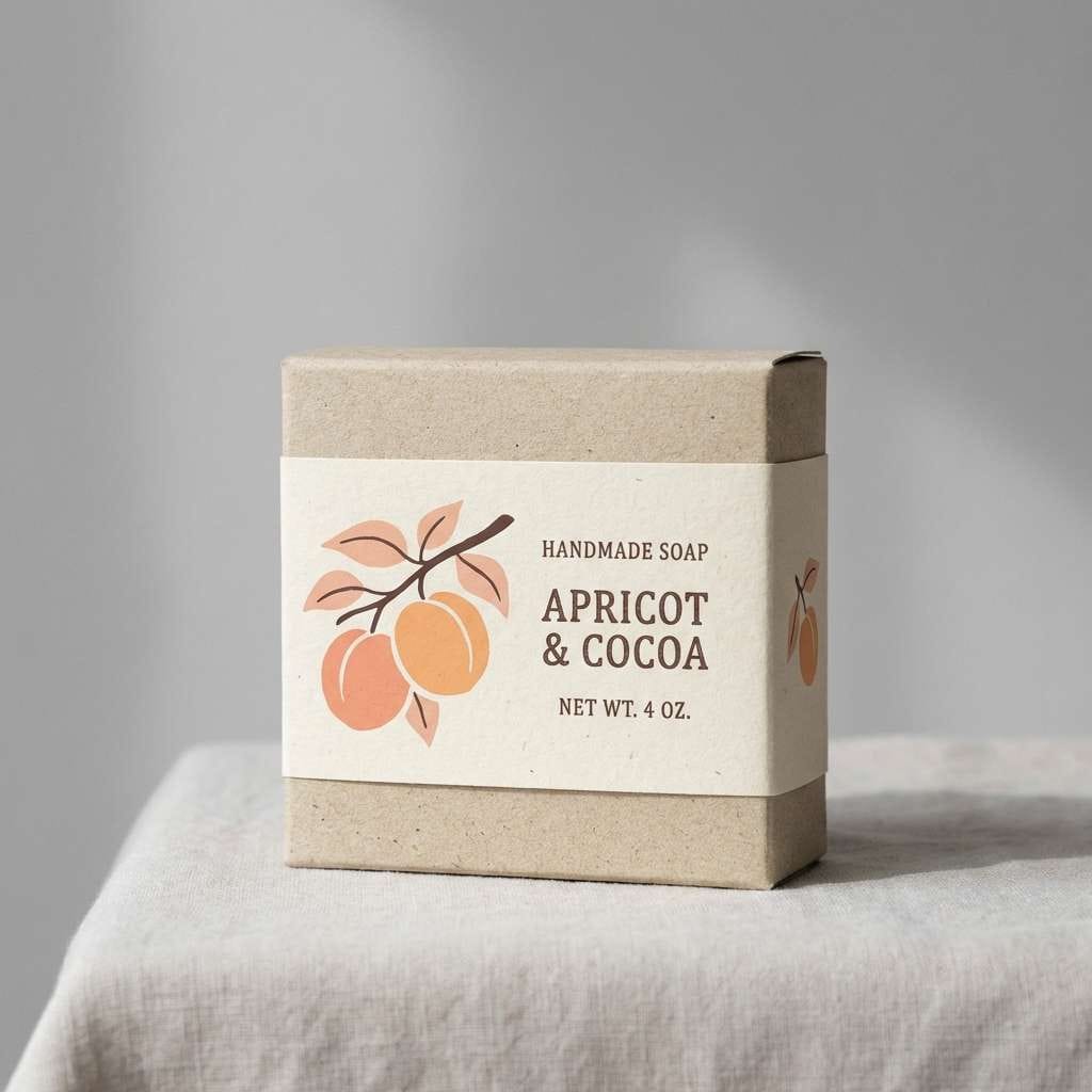
2) Apricot Linen
HEX: #FFB199 #FFA07A #FDE6D8 #C7B29B #3D2F2A
Mood: soft, natural, and grounded
Best for: boutique packaging and handmade goods labels
Soft and natural, these tones evoke washed linen, apricot jam, and warm wood. The creamy peach and tan make a friendly base for packaging, while the deep cocoa adds premium contrast. Use the mid beige for texture-like blocks and the salmon for the product name or seal. Tip: print with a matte finish to keep the palette feeling organic and tactile.
Image example of apricot linen generated using media.io
3) Sunset Gelato
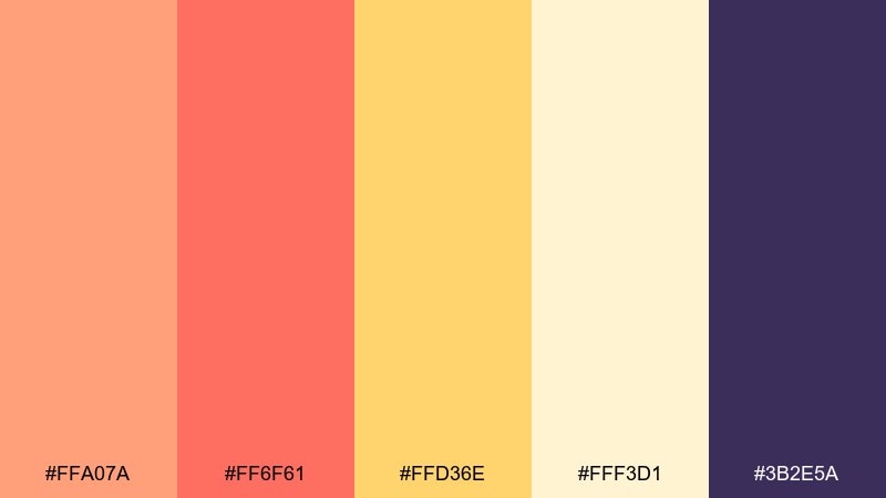
HEX: #FFA07A #FF6F61 #FFD36E #FFF3D1 #3B2E5A
Mood: playful, warm, and optimistic
Best for: summer campaign graphics and social ads
Playful and warm, this set feels like gelato scoops at golden hour. The coral-red and sunny yellow bring energy, while the pale vanilla keeps it light and readable. Anchor the whole look with the deep violet for headlines and badges to avoid a washed-out finish. Tip: use big, rounded shapes and generous spacing to match the cheerful vibe.
Image example of sunset gelato generated using media.io

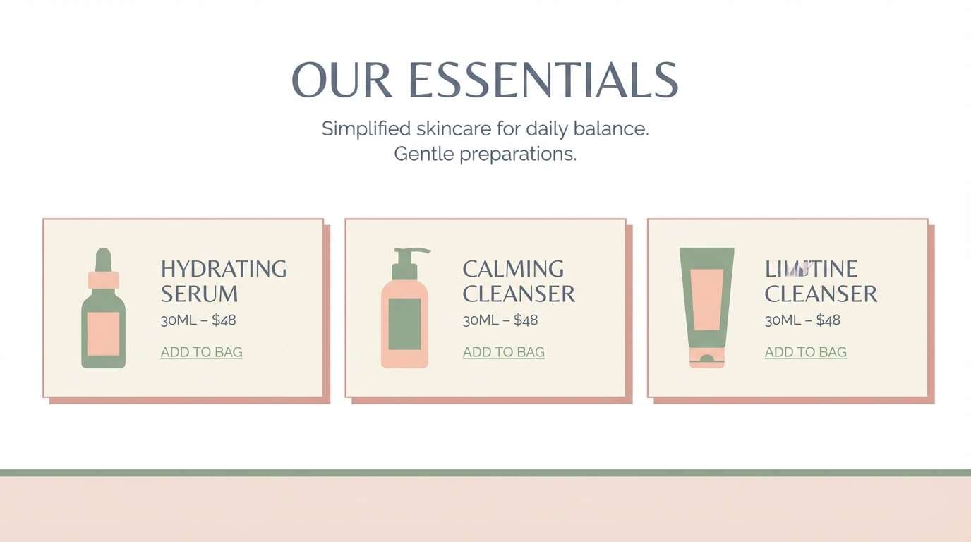
4) Rosewater Clay
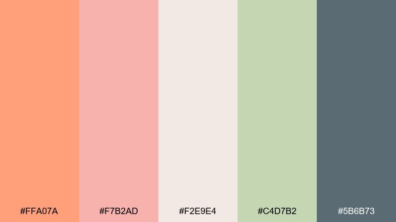
HEX: #FFA07A #F7B2AD #F2E9E4 #C4D7B2 #5B6B73
Mood: gentle, spa-like, and balanced
Best for: skincare product pages and blog design
Gentle and spa-like, these hues suggest rosewater mist, soft clay, and fresh herbs. The cool sage brings balance to the warm salmon and blush so pages feel calm rather than overly sweet. Use the muted slate for body text and navigation to keep accessibility strong. Tip: add subtle gradients between blush and cream for a clean, modern glow.
Image example of rosewater clay generated using media.io
5) Peach Pop Contrast
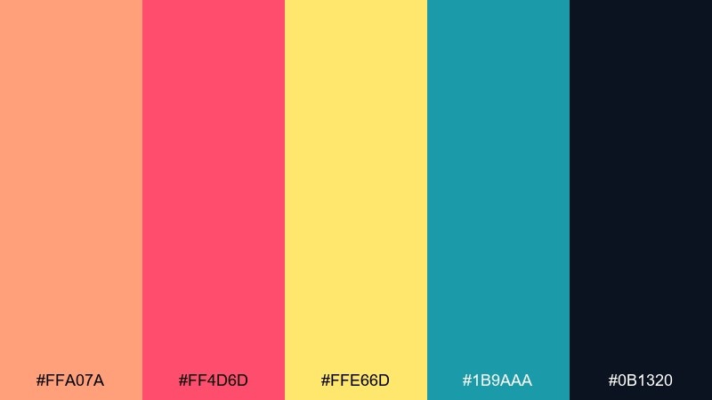
HEX: #FFA07A #FF4D6D #FFE66D #1B9AAA #0B1320
Mood: bold, youthful, and high-energy
Best for: event posters and upbeat product launches
Bold and youthful, this mix reads like neon signage softened by a peachy glow. For high-impact light salmon color combinations, the hot pink and teal create instant contrast while the dark navy locks everything into place. Keep yellow as a small highlight for pricing, stickers, or icons so it stays punchy. Tip: pair with a heavy sans-serif and strong grid to keep the energy controlled.
Image example of peach pop contrast generated using media.io
6) Sandstone Bouquet
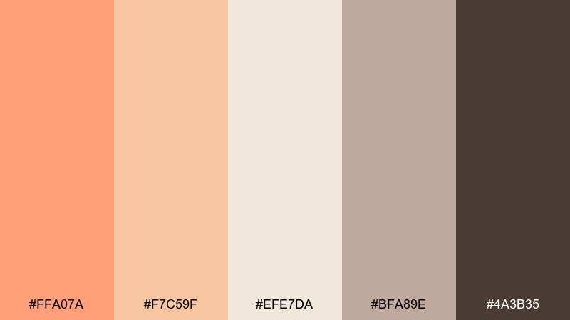
HEX: #FFA07A #F7C59F #EFE7DA #BFA89E #4A3B35
Mood: rustic, romantic, and warm
Best for: wedding stationery and floral shops
Rustic and romantic, these tones feel like dried flowers, sandstone, and soft candlelight. The creamy neutrals keep the palette elegant, while cocoa adds a luxe ink-like finish for names and details. Use the two peachy shades as watercolor washes or envelope liners for a gentle pop. Tip: emboss the darkest color sparingly for a tactile, premium look.
Image example of sandstone bouquet generated using media.io
7) Warm Minimal UI
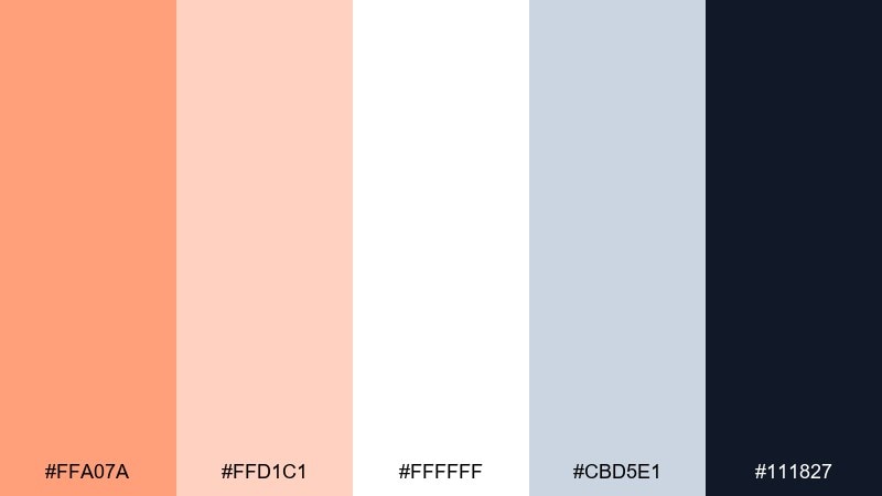
HEX: #FFA07A #FFD1C1 #FFFFFF #CBD5E1 #111827
Mood: modern, friendly, and clear
Best for: dashboard UI, onboarding, and fintech apps
Modern and friendly, this set feels like soft daylight on a clean desk. The salmon and blush work well for highlights, while white and cool gray keep screens uncluttered. Use near-black for text to maintain contrast and make the warmth feel intentional rather than hazy. Tip: reserve salmon for one primary action per screen to keep attention focused.
Image example of warm minimal ui generated using media.io

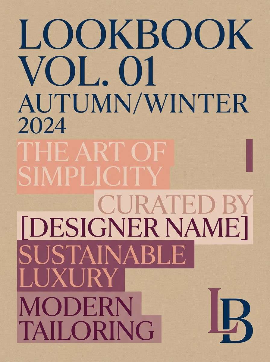
8) Boutique Orchid
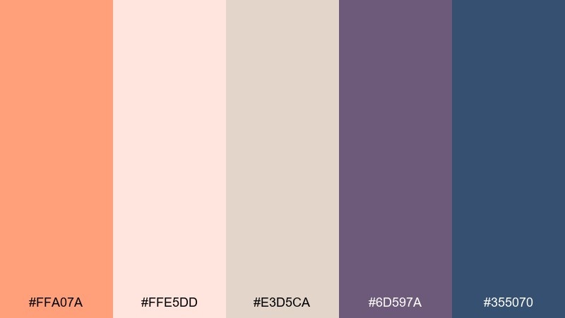
HEX: #FFA07A #FFE5DD #E3D5CA #6D597A #355070
Mood: chic, artistic, and confident
Best for: boutique branding and lookbooks
Chic and artistic, these shades evoke silk scarves, lipstick, and gallery walls. As a light salmon color scheme, it feels elevated when paired with plum and deep blue for logos and headings. Keep the warm neutrals for backgrounds and product grids so the dark tones can do the heavy lifting. Tip: use plum as the primary brand color and salmon as the approachable accent.
Image example of boutique orchid generated using media.io
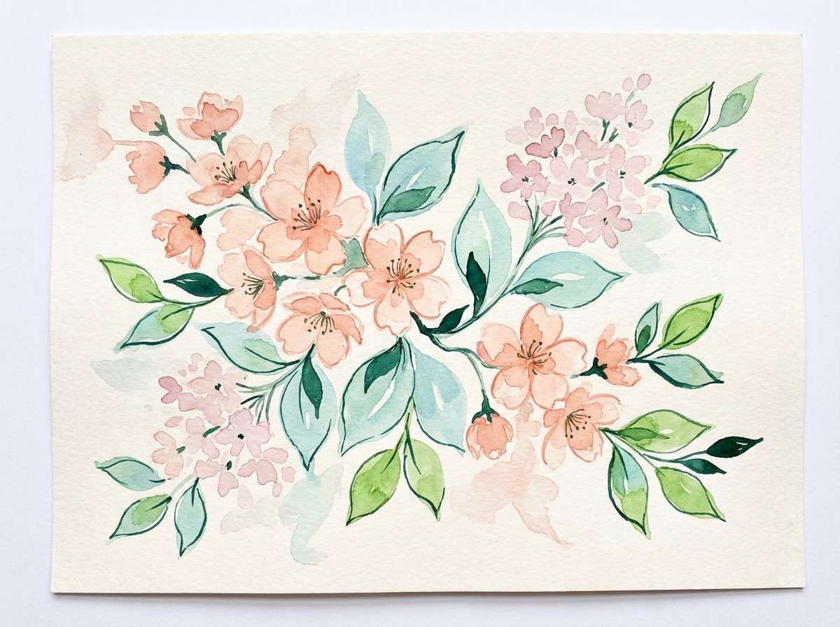
9) Spring Botanica
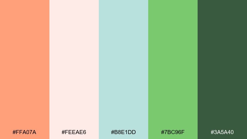
HEX: #FFA07A #FEEAE6 #B8E1DD #7BC96F #3A5A40
Mood: fresh, garden-inspired, and lively
Best for: seasonal illustrations and eco campaigns
Fresh and garden-inspired, this palette feels like blossoms opening over minty leaves. The soft pink-cream keeps the greens approachable, while the deep forest adds depth for outlines and typography. Use salmon for petals, labels, and callouts so the composition stays warm. Tip: in illustrations, keep backgrounds pale and let the darker green define focal points.
Image example of spring botanica generated using media.io
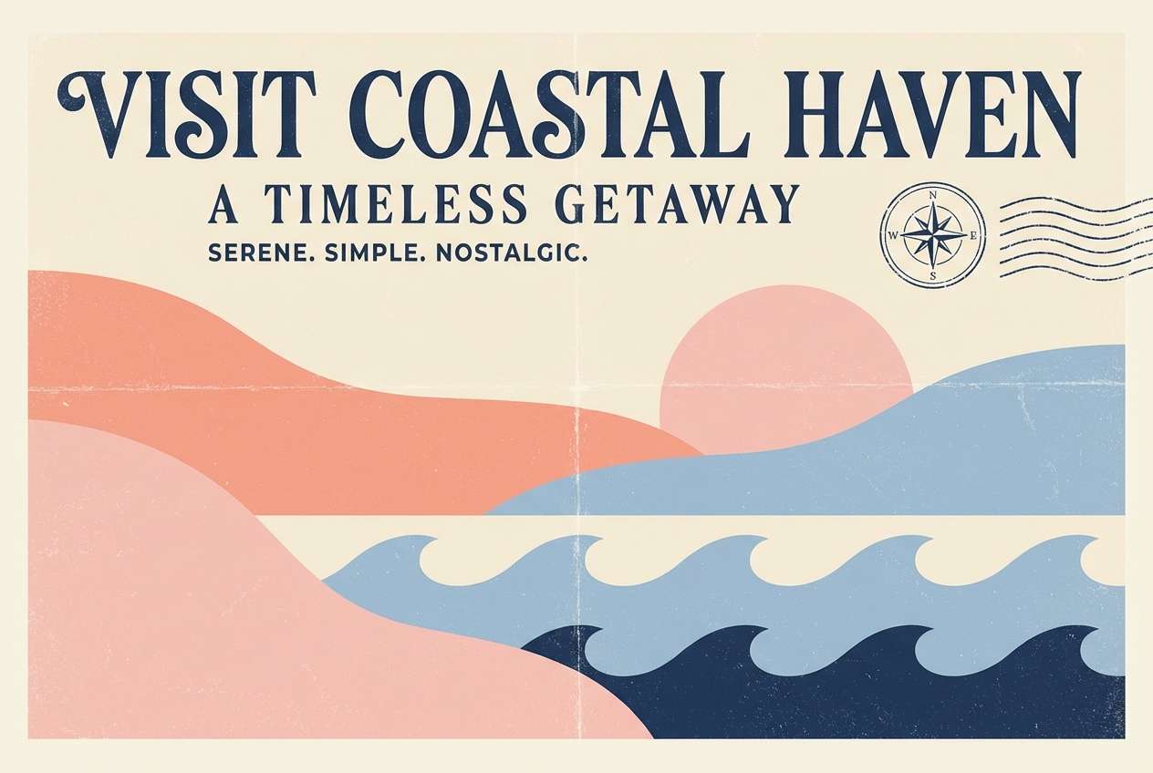
10) Vintage Postcard
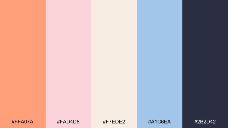
HEX: #FFA07A #FAD4D8 #F7EDE2 #A1C6EA #2B2D42
Mood: nostalgic, soft, and travel-ready
Best for: retro posters and lifestyle blogs
Nostalgic and soft, these colors recall faded postcards and seaside mornings. Powder blue cools the warm peach tones, while the inky navy gives you strong type contrast. Use the cream as a paper-like base to sell the vintage feel. Tip: add subtle grain or halftone textures to make the palette look intentionally retro.
Image example of vintage postcard generated using media.io
11) Coral Sorbet Poster
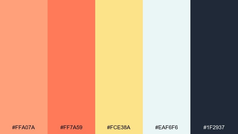
HEX: #FFA07A #FF7A59 #FCE38A #EAF6F6 #1F2937
Mood: bright, clean, and upbeat
Best for: storefront posters and announcements
Bright and clean, this set feels like sorbet, citrus zest, and cool glass. The warm corals grab attention quickly, while the icy tint keeps layouts from feeling heavy. Use the dark slate for clear messaging and barcodes so the poster remains readable from a distance. Tip: limit the two strongest warms to large shapes and keep text mostly in slate.
Image example of coral sorbet poster generated using media.io

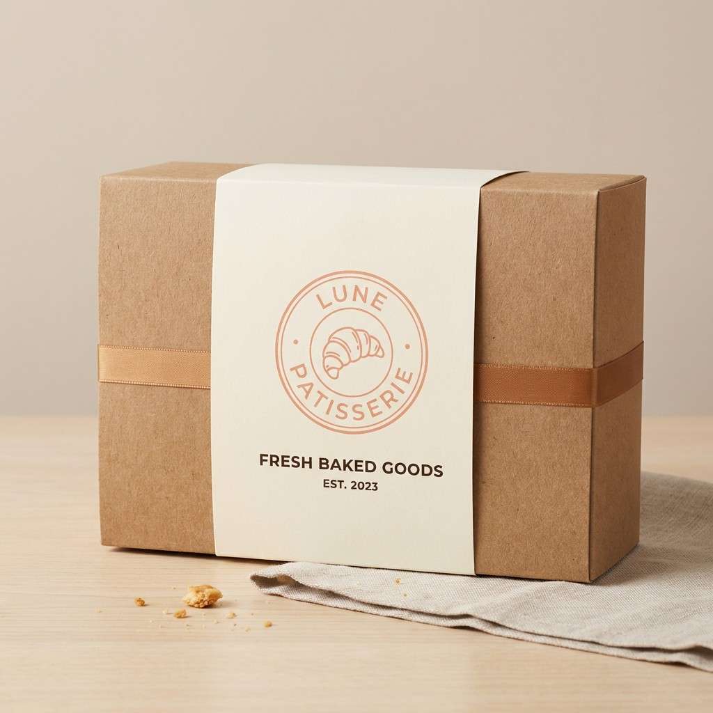
12) Bakery Box
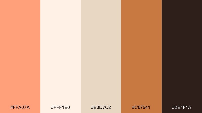
HEX: #FFA07A #FFF1E6 #E8D7C2 #C87941 #2E1F1A
Mood: cozy, sweet, and artisanal
Best for: bakery packaging and cafe menus
Cozy and sweet, these hues bring to mind croissants, brown sugar, and warm paper bags. The caramel and espresso shades make the salmon feel more grown-up, perfect for labels and menu accents. Use the cream as a clean base so product photos and pricing stand out. Tip: choose kraft-like textures to match the warm, artisanal mood.
Image example of bakery box generated using media.io
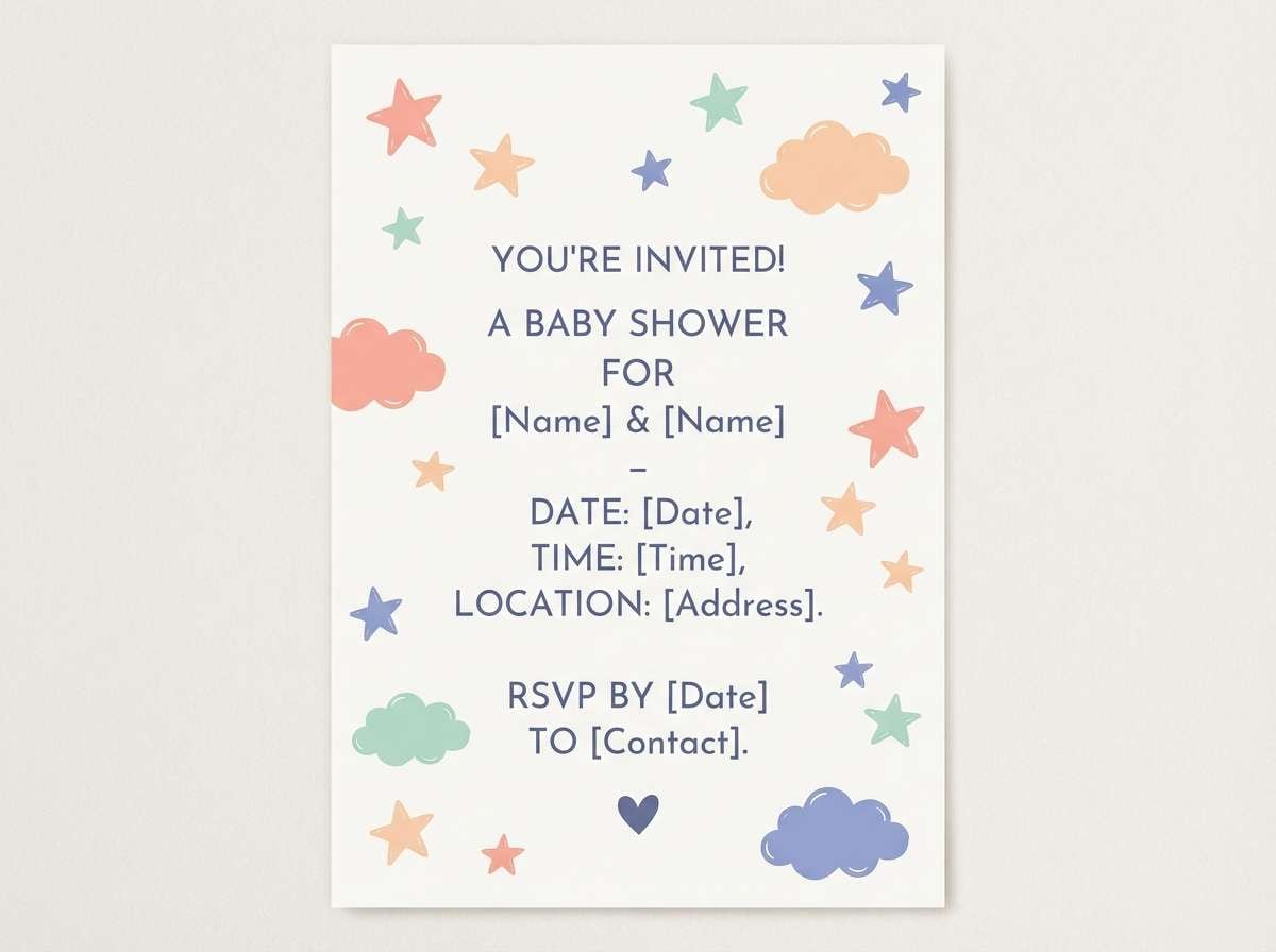
13) Nursery Daydream
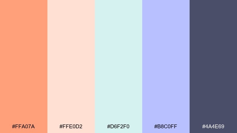
HEX: #FFA07A #FFE0D2 #D6F2F0 #B8C0FF #4A4E69
Mood: gentle, whimsical, and soothing
Best for: baby shower invites and nursery decor
Gentle and whimsical, this mix feels like bedtime stories and soft plush toys. The cool mint and periwinkle calm the warmth, while the muted indigo helps with readable headings. Use salmon as a small accent on stars, icons, or name highlights to keep it sweet but not overwhelming. Tip: favor lots of breathing room and rounded illustrations for a soothing finish.
Image example of nursery daydream generated using media.io
14) Tropical Sherbet
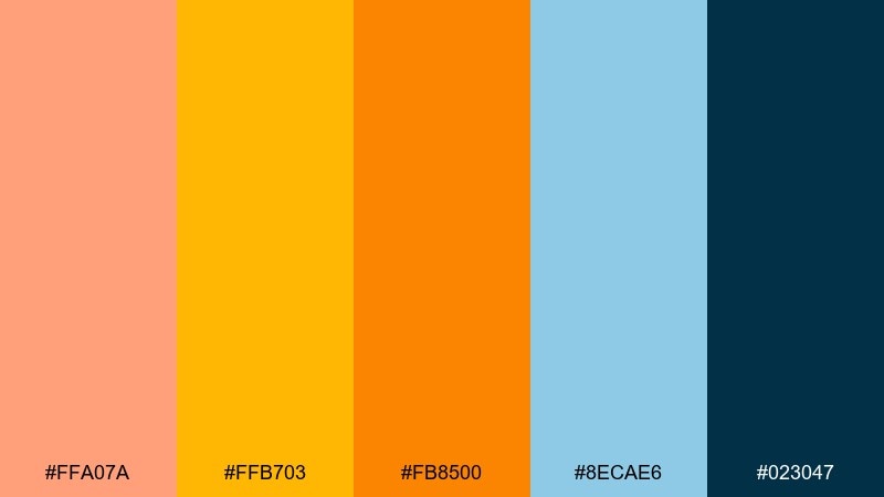
HEX: #FFA07A #FFB703 #FB8500 #8ECAE6 #023047
Mood: sunny, bold, and vacation-ready
Best for: travel ads and summer product promos
Sunny and bold, these shades feel like beach umbrellas, mango slices, and a clear sky. Light salmon color combinations pop here when you balance the warm oranges with airy aqua and deep navy. Keep navy for type and logos so the bright tones can stay playful without sacrificing legibility. Tip: use large color blocks and simple icons to keep the design crisp.
Image example of tropical sherbet generated using media.io

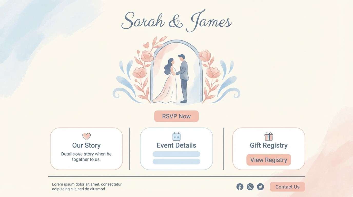
15) Bridal Powder
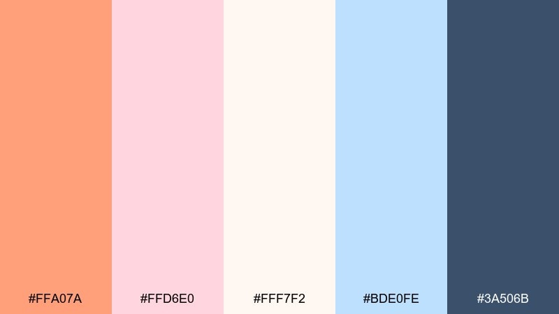
HEX: #FFA07A #FFD6E0 #FFF7F2 #BDE0FE #3A506B
Mood: romantic, airy, and polished
Best for: bridal brands and wedding websites
Romantic and airy, this set brings to mind chiffon, blush petals, and handwritten vows. Powder blue cools the warmth for a balanced, modern wedding look, while slate blue keeps text sharp. Use the near-white as a generous backdrop so the accent colors feel delicate, not busy. Tip: combine salmon with minimal line art for icons and section dividers.
Image example of bridal powder generated using media.io
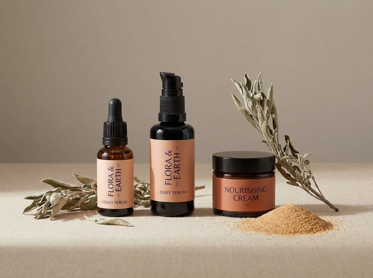
16) Terracotta Spa
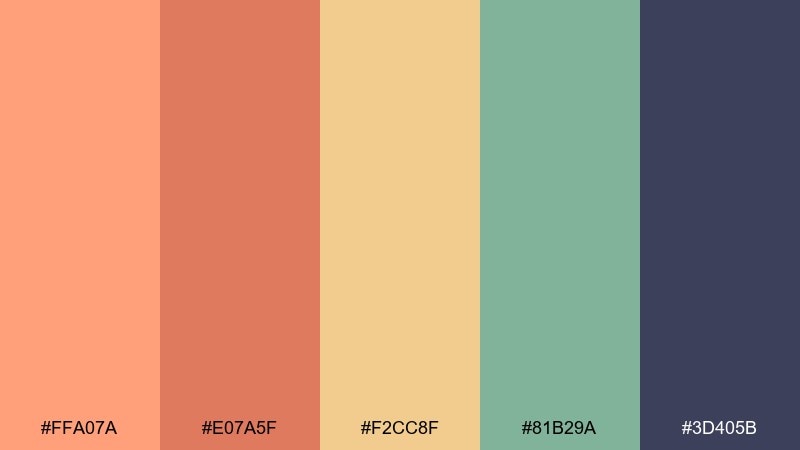
HEX: #FFA07A #E07A5F #F2CC8F #81B29A #3D405B
Mood: earthy, restorative, and premium
Best for: spa interiors and natural skincare campaigns
Earthy and restorative, these hues feel like sun-warmed clay and herbal steam. The terracotta and gold tones amplify warmth, while sage adds calm balance for a wellness-forward look. Use the deep indigo for signage, headers, and fine print to keep contrast high. Tip: add natural materials in visuals, like stone and linen, to reinforce the grounded mood.
Image example of terracotta spa generated using media.io
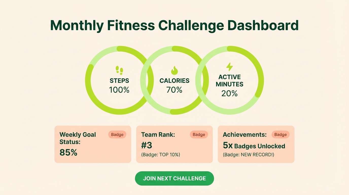
17) Soft Sportswear
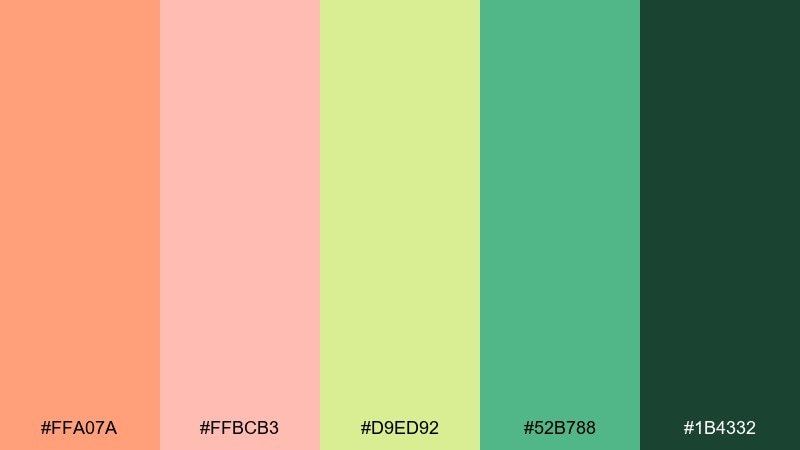
HEX: #FFA07A #FFBCB3 #D9ED92 #52B788 #1B4332
Mood: fresh, sporty, and uplifting
Best for: activewear promos and fitness challenges
Fresh and sporty, this palette feels like a sunrise run and crisp air. The greens add energy and health cues, while the softer peaches keep the look friendly and inclusive. Use the deep green for titles and key stats so designs stay readable even with bright accents. Tip: keep salmon for badges and progress indicators to make achievements feel warm and rewarding.
Image example of soft sportswear generated using media.io
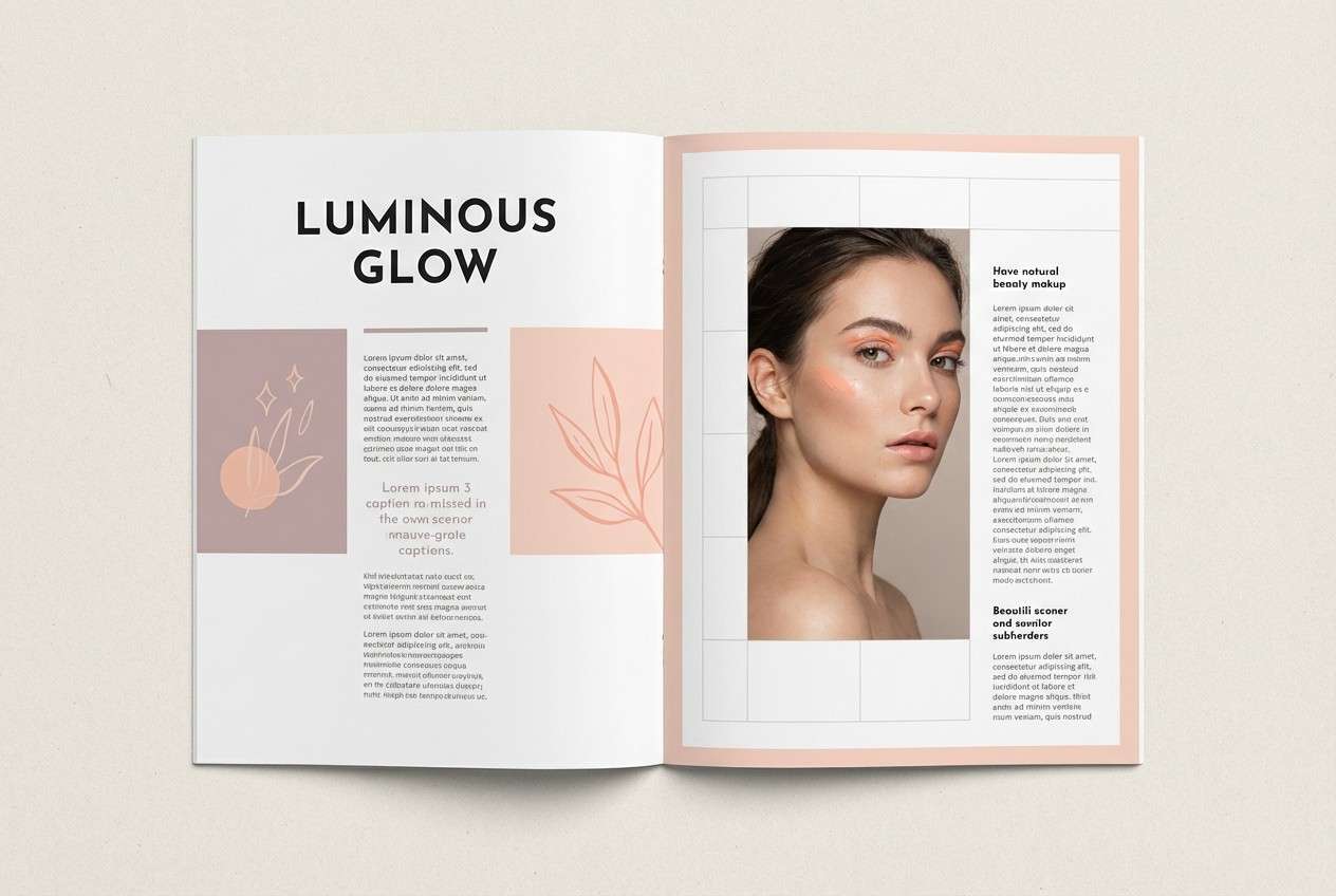
18) Editorial Beauty
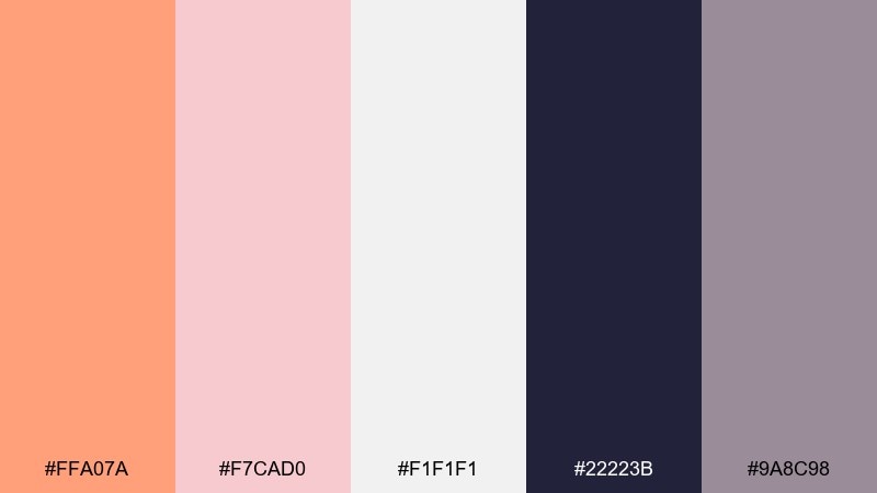
HEX: #FFA07A #F7CAD0 #F1F1F1 #22223B #9A8C98
Mood: editorial, elegant, and modern
Best for: magazine layouts and beauty editorials
Editorial and elegant, these tones suggest soft studio lighting and modern beauty spreads. The near-black and mauve-gray make the warm pinks feel refined instead of overly cute. Use salmon for pull quotes and section tags, and let light gray do the heavy work as a clean canvas. Tip: pair with high-contrast serif headlines for a polished, magazine-ready look.
Image example of editorial beauty generated using media.io
19) Cafe Sage
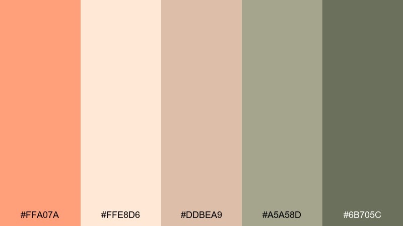
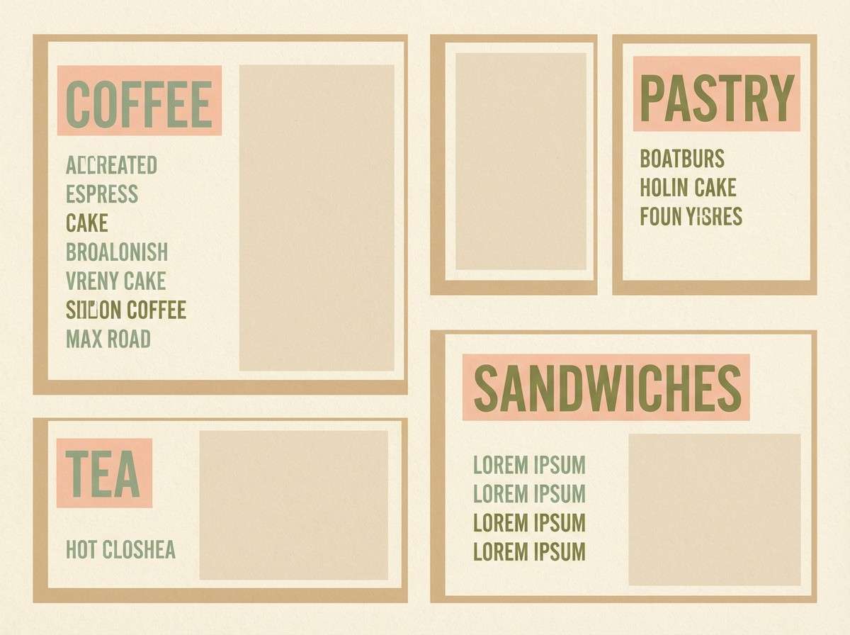
HEX: #FFA07A #FFE8D6 #DDBEA9 #A5A58D #6B705C
Mood: cozy, mellow, and inviting
Best for: cafe interiors and menu design
Cozy and mellow, these colors feel like a quiet café with warm pastries and leafy plants. The sage and olive tones temper the sweetness of salmon and cream for an inviting, lived-in look. Use the darker green for menu categories and signage, and keep salmon for highlights like specials. Tip: combine with simple line icons and plenty of white space for a modern rustic feel.
Image example of cafe sage generated using media.io
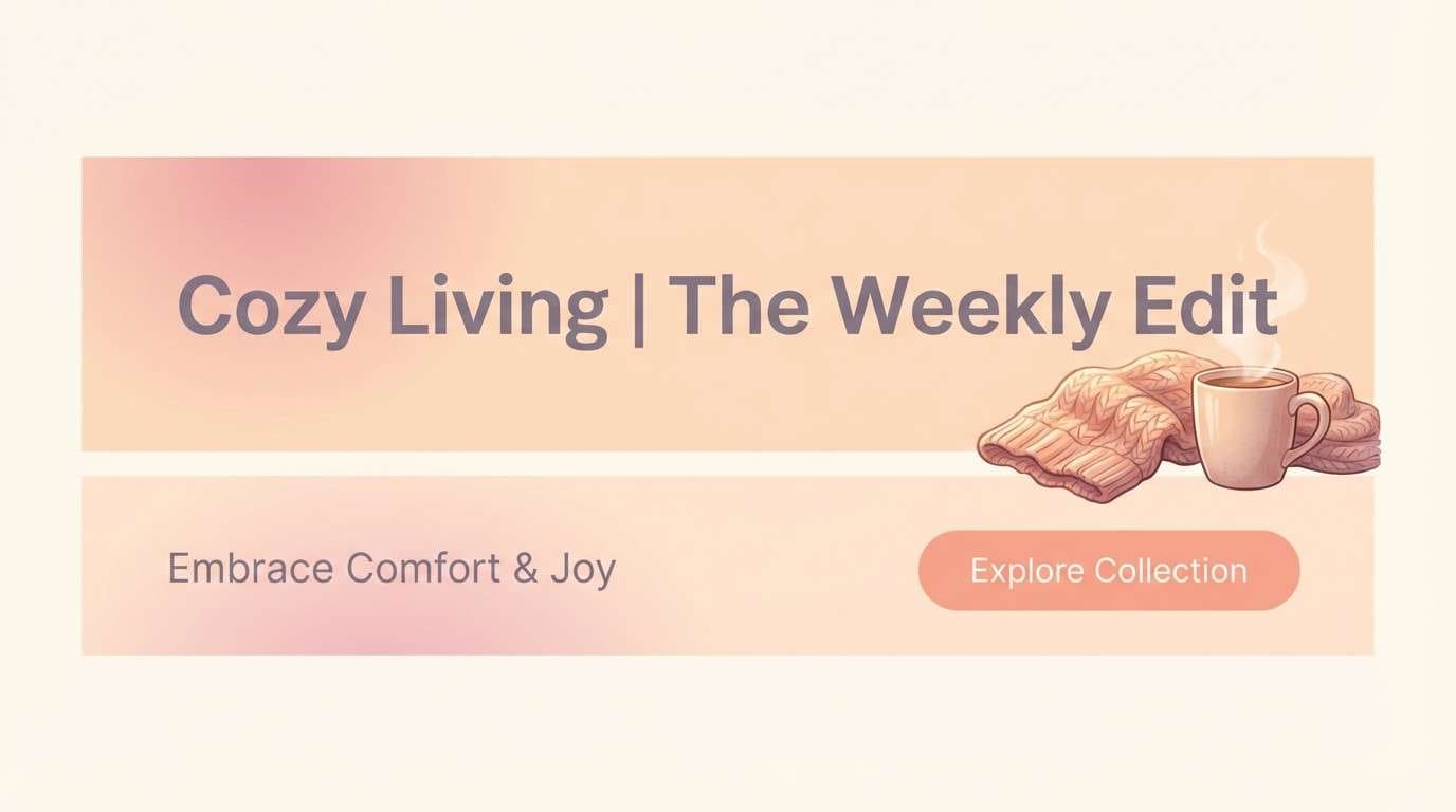
20) Autumn Peach Dusk
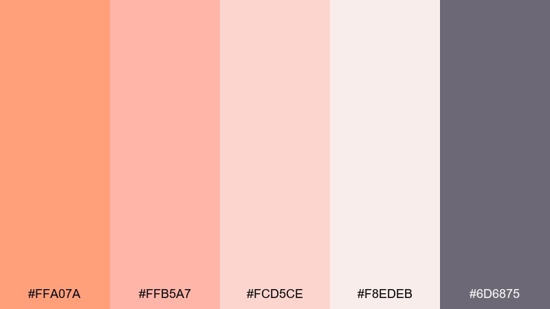
HEX: #FFA07A #FFB5A7 #FCD5CE #F8EDEB #6D6875
Mood: soft, cozy, and romantic
Best for: seasonal branding and lifestyle newsletters
Soft and cozy, these shades look like peach dusk, knit blankets, and candlelit evenings. The dusty violet-gray adds depth that keeps the blushy tones from feeling too pastel. Use the palest cream-pink for backgrounds, and bring in salmon for buttons, stickers, or small headings. Tip: add subtle shadows and rounded cards to make layouts feel warm and touchable.
Image example of autumn peach dusk generated using media.io
What Colors Go Well with Light Salmon?
Light salmon works beautifully with creamy neutrals (off-white, ivory, warm beige) because they keep it airy and sophisticated. Add a deep anchor like charcoal, slate, or navy when you need strong readability for text and icons.
For contrast, pair light salmon with cool accents such as seafoam, sage, aqua, powder blue, or periwinkle. This warm-cool balance prevents the palette from feeling overly pink and helps layouts look fresh.
If you want a louder, more youthful look, combine it with high-energy brights like teal, hot pink, or sunny yellow—then control the palette with one dark base color.
How to Use a Light Salmon Color Palette in Real Designs
In branding, treat light salmon as an accent color: logo detail, packaging seal, social highlight, or CTA background. Keeping it secondary helps your identity feel warm without sacrificing flexibility across products and seasons.
In UI, reserve salmon for one primary action per screen (primary button, active tab, key badge). Support it with neutral surfaces (white/gray) and a near-black text color to maintain accessibility and reduce “haze.”
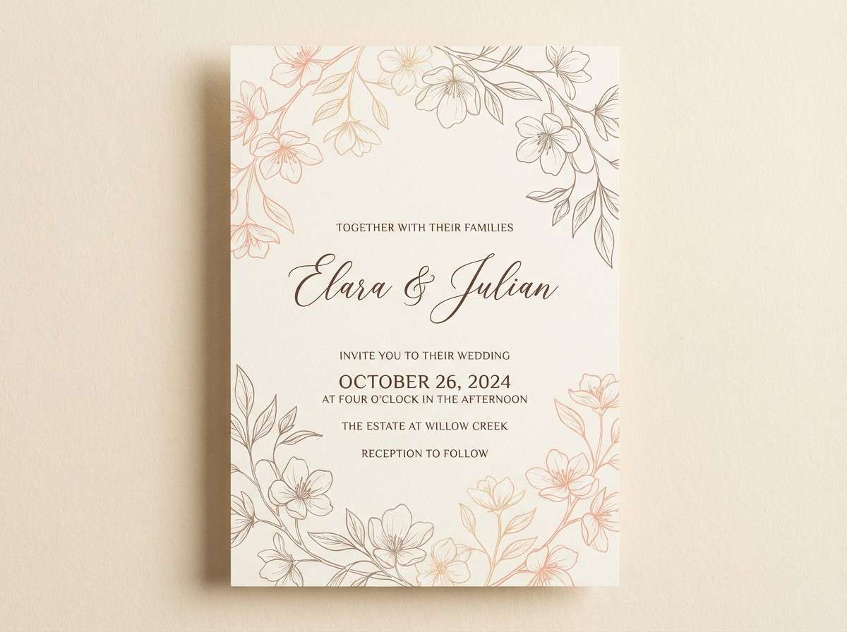
For weddings and events, use salmon in paper goods, florals, and small décor details while leaning on creams and taupes for the base. A single dark ink tone (cocoa, slate, or navy) makes names and schedules look premium.
Create Light Salmon Palette Visuals with AI
If you already have HEX codes, you can turn them into on-brand mockups quickly with AI. Start with one use case (website hero, label, poster, invite), then describe the style (minimal, editorial, rustic, playful) and your key colors.
For consistent results, keep your prompt specific about layout, lighting, and “no photos/no device frame” when needed. Reuse the same phrasing across variations, only swapping palette names and accent colors.
Light Salmon Color Palette FAQs
-
What is the HEX code for light salmon?
A commonly used light salmon HEX is #FFA07A. It’s a warm peach-coral that works well as a soft accent in both print and UI. -
Is light salmon more pink or more orange?
Light salmon leans orange-peach with a rosy tint. It typically reads warmer than blush pink but softer than strong coral or orange. -
What neutral colors match a light salmon palette?
Off-white, ivory, warm beige, light gray, and taupe all pair well with light salmon. Add charcoal or near-black for crisp typography and contrast. -
What are the best contrasting colors for light salmon?
Cool tones like teal, seafoam, aqua, sage, and powder blue create clean contrast. Deep anchors like navy or slate keep the palette grounded and readable. -
How do I use light salmon in a UI color palette without hurting accessibility?
Use light salmon for accents (primary button, highlights) and keep text in near-black or deep slate. Avoid placing white text on light salmon unless you’ve verified contrast ratios with an accessibility checker. -
Does light salmon work for wedding palettes?
Yes—light salmon is popular for romantic, airy wedding looks. Pair it with cream backgrounds and add a cool counterbalance (powder blue or sage) plus a dark ink tone for typography. -
Can I generate matching designs from these palettes with AI?
Yes. Use the included prompts as templates, then refine the subject (website, packaging, poster) and specify your palette colors and style cues for more consistent outputs.


