

Ultramarine blue is a deep, vivid blue that instantly signals confidence, craft, and modern polish. It can feel regal and dramatic, or clean and minimal, depending on the accents you pair with it.
Below are 20 ready-to-use ultramarine blue color palette ideas with HEX codes, plus practical tips for using them in branding, UI, and print.
In this article
- Why Ultramarine Blue Palettes Work So Well
-
- ultramarine nightfall
- oceanic slate
- porcelain and ultramarine
- neon arcade blue
- coastal museum
- citrus pop contrast
- ink and parchment
- winter sky minimal
- botanical indigo bloom
- tech conference pulse
- indigo denim days
- ceramic tile kitchen
- deep space onboarding
- maritime flagship
- royal velvet cosmetics
- finance clarity
- sunset afterstorm
- playroom primary mix
- architectural blueprint
- soft lavender dusk
- What Colors Go Well with Ultramarine Blue?
- How to Use a Ultramarine Blue Color Palette in Real Designs
- Create Ultramarine Blue Palette Visuals with AI
Why Ultramarine Blue Palettes Work So Well
Ultramarine blue sits in the sweet spot between classic and contemporary: it’s saturated enough to feel premium, but still clean enough for modern interfaces. That makes it a reliable anchor color for everything from hero sections to packaging.
It pairs naturally with both warm and cool accents. Add gold, cream, and terracotta to make it feel luxe and human, or combine it with icy whites, slate grays, and cyan to create a crisp, tech-forward mood.
Most importantly, ultramarine holds contrast well. When you balance it with off-whites and dark neutrals, you get strong hierarchy and readability without needing harsh black everywhere.
20+ Ultramarine Blue Color Palette Ideas (with HEX Codes)
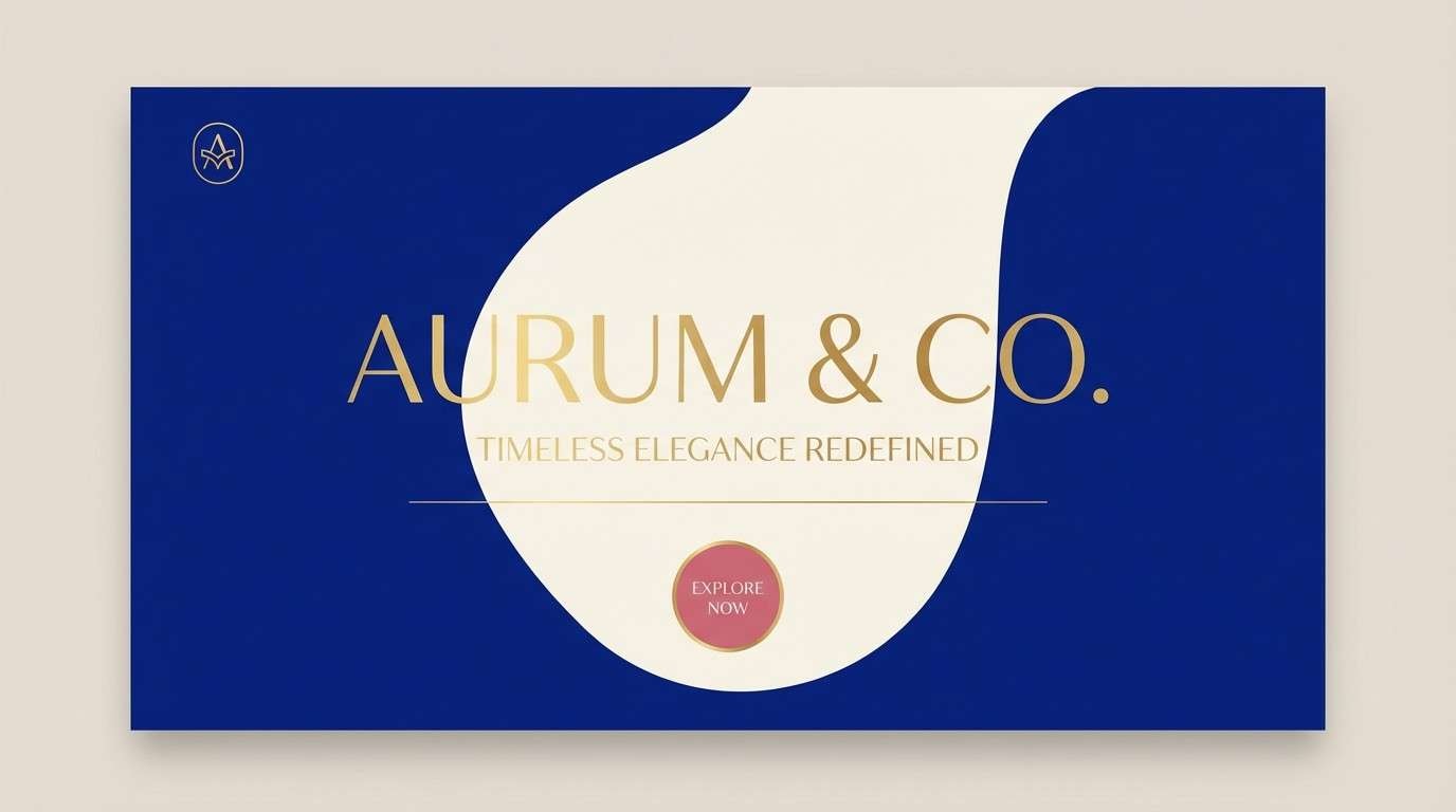
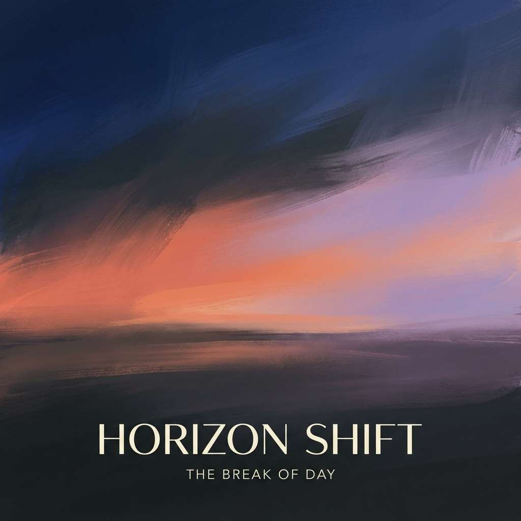
1) Ultramarine Nightfall
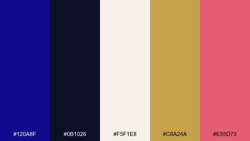
HEX: #120A8F #0B1026 #F5F1E8 #C8A24A #E55D73
Mood: dramatic and luxe
Best for: luxury branding hero section
Dramatic and luxe, it feels like velvet curtains, gold trim, and a night sky with a hint of blush. Use the deep blue as your anchor, then add cream for breathing room and gold for premium cues. It shines on high-end landing pages, fragrance branding, or boutique hotel visuals. Tip: keep the pink as a small accent for calls-to-action so the look stays refined.
Image example of ultramarine nightfall generated using media.io
Media.io is an online AI studio for creating and editing video, image, and audio in your browser.

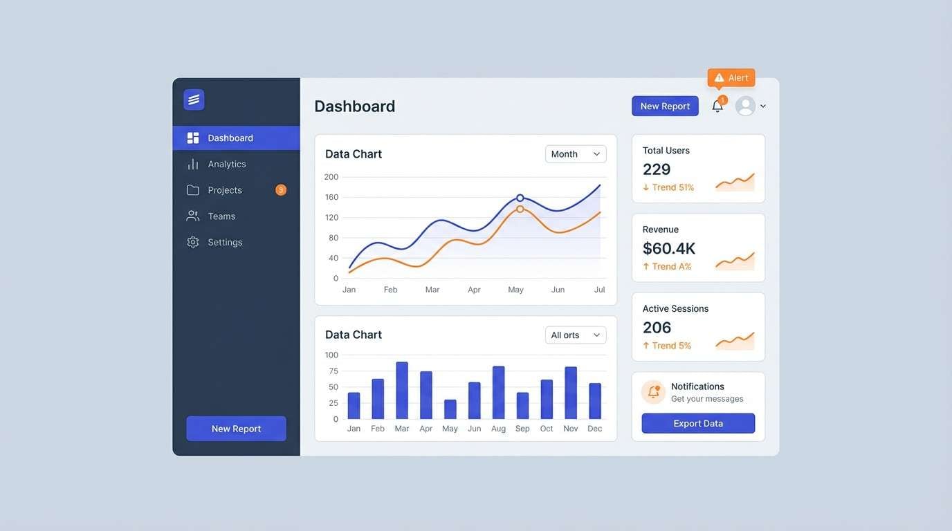
2) Oceanic Slate
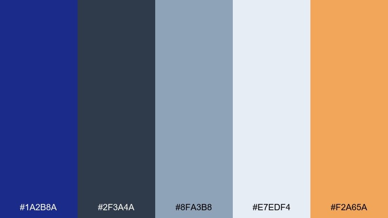
HEX: #1A2B8A #2F3A4A #8FA3B8 #E7EDF4 #F2A65A
Mood: calm and professional
Best for: saas dashboard ui
Calm and professional, it reads like open water under a cloudy sky with a warm buoy of orange. Pair slate and ultramarine for navigation and primary buttons, then lean on pale gray-blue for backgrounds. It works especially well for analytics, admin tools, and B2B products that need clarity without looking cold. Tip: reserve the orange for alerts or key metrics so it stays meaningful.
Image example of oceanic slate generated using media.io
3) Porcelain and Ultramarine
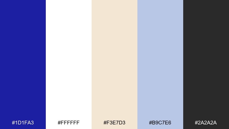
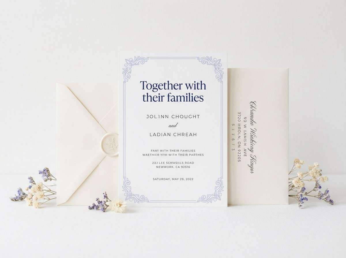
HEX: #1D1FA3 #FFFFFF #F3E7D3 #B9C7E6 #2A2A2A
Mood: romantic and crisp
Best for: wedding invitation suite
Romantic and crisp, it evokes painted porcelain, handwritten vows, and soft candlelight on linen. The ultramarine blue color palette feels timeless on invitations when you balance the bold blue with plenty of white and a touch of warm cream. Use the charcoal for legible type and the pale periwinkle as a delicate border or monogram fill. Tip: choose uncoated paper textures to keep the blue from feeling too glossy.
Image example of porcelain and ultramarine generated using media.io
4) Neon Arcade Blue
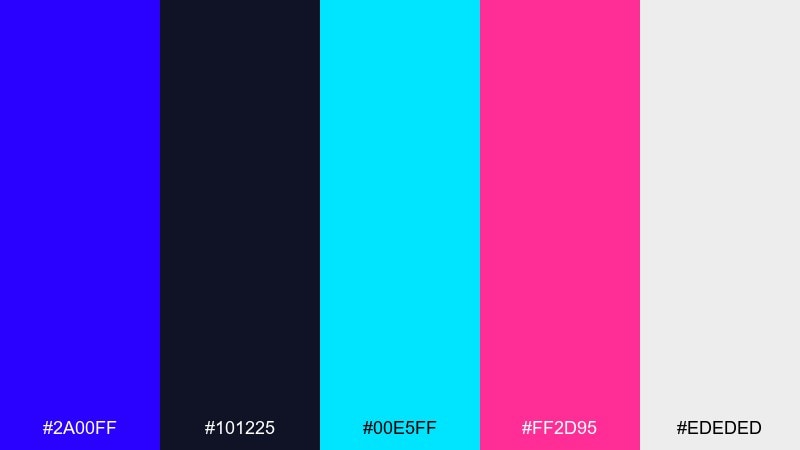
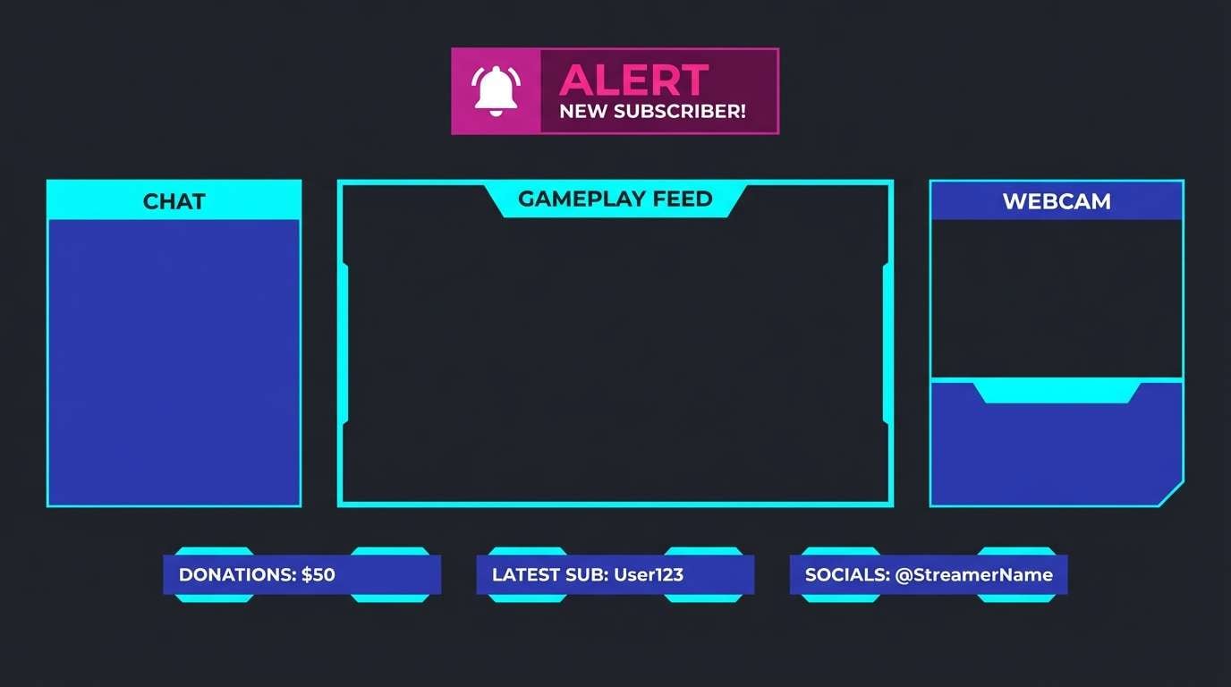
HEX: #2A00FF #101225 #00E5FF #FF2D95 #EDEDED
Mood: bold and futuristic
Best for: gaming stream overlay
Bold and futuristic, it feels like arcade glow, synth beats, and reflections on dark glass. Keep the background nearly black, then layer ultramarine and cyan for panels, frames, and status badges. Magenta works best as a pulse accent for alerts, new followers, or live indicators. Tip: use the light gray for small labels so readability stays high without washing out the neon vibe.
Image example of neon arcade blue generated using media.io
5) Coastal Museum
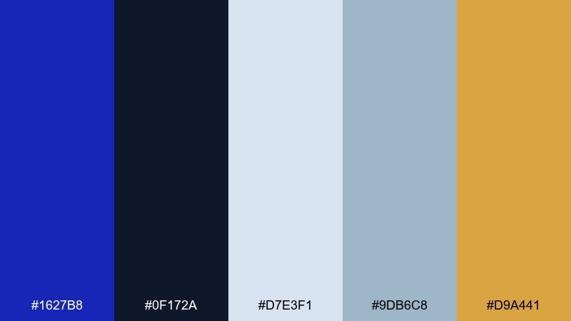
HEX: #1627B8 #0F172A #D7E3F1 #9DB6C8 #D9A441
Mood: cultured and nautical
Best for: museum exhibit signage
Cultured and nautical, it recalls maritime maps, polished brass, and quiet gallery lighting. Ultramarine and near-black make strong wayfinding headers, while misty blues keep panels readable. The brass-gold is perfect for section markers or exhibit numbers without feeling flashy. Tip: keep body text on the pale background and avoid large gold blocks to maintain a museum-like restraint.
Image example of coastal museum generated using media.io
6) Citrus Pop Contrast
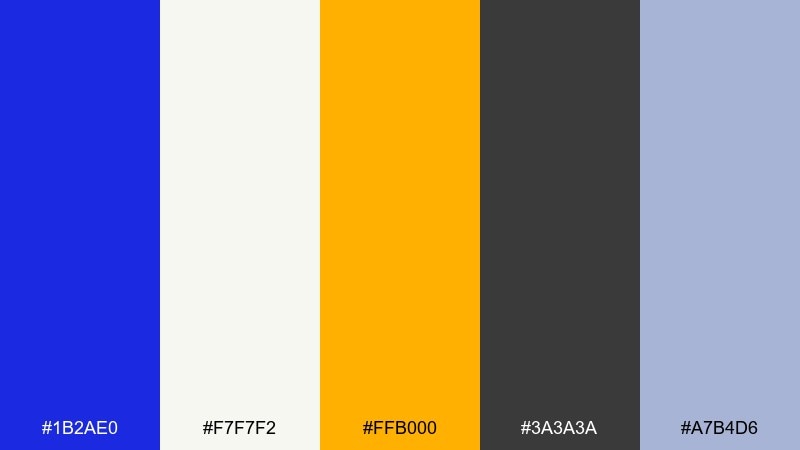
HEX: #1B2AE0 #F7F7F2 #FFB000 #3A3A3A #A7B4D6
Mood: energetic and clean
Best for: social media promo templates
Energetic and clean, it looks like fresh citrus on a crisp white countertop with a sharp blue edge. These ultramarine blue color combinations are great when you want instant attention without using loud reds. Use ultramarine for headlines and frames, then let orange drive the primary CTA. Tip: keep the mid-gray for supporting text so the layout stays tidy and modern.
Image example of citrus pop contrast generated using media.io

7) Ink and Parchment
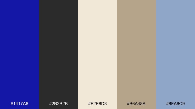
HEX: #1417A6 #2B2B2B #F2E8D8 #B6A48A #8FA6C9
Mood: classic and editorial
Best for: magazine feature spread
Classic and editorial, it feels like ink on textured paper with a faint antique warmth. Ultramarine makes striking pull quotes and section dividers, while parchment and tan keep layouts approachable. It suits longform articles, portfolios, and lookbooks that need sophistication without feeling rigid. Tip: use the soft blue for small rules and captions to guide the eye quietly.
Image example of ink and parchment generated using media.io
8) Winter Sky Minimal
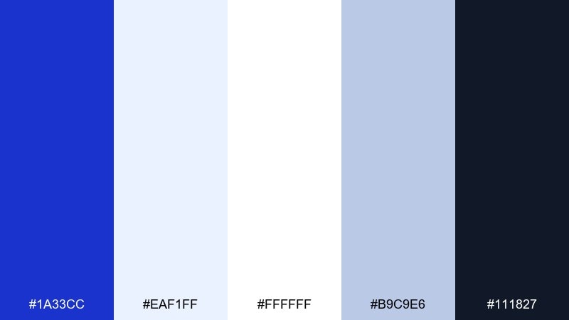
HEX: #1A33CC #EAF1FF #FFFFFF #B9C9E6 #111827
Mood: minimal and airy
Best for: minimalist logo and brand kit
Minimal and airy, it suggests cold sunlight, clean snow, and sharp shadows on ice. Use ultramarine for a single strong mark or icon, then keep most surfaces bright with white and pale blue. The near-black is ideal for typography and brand guidelines that need a crisp contrast. Tip: limit gradients and let flat shapes do the work for a truly modern feel.
Image example of winter sky minimal generated using media.io
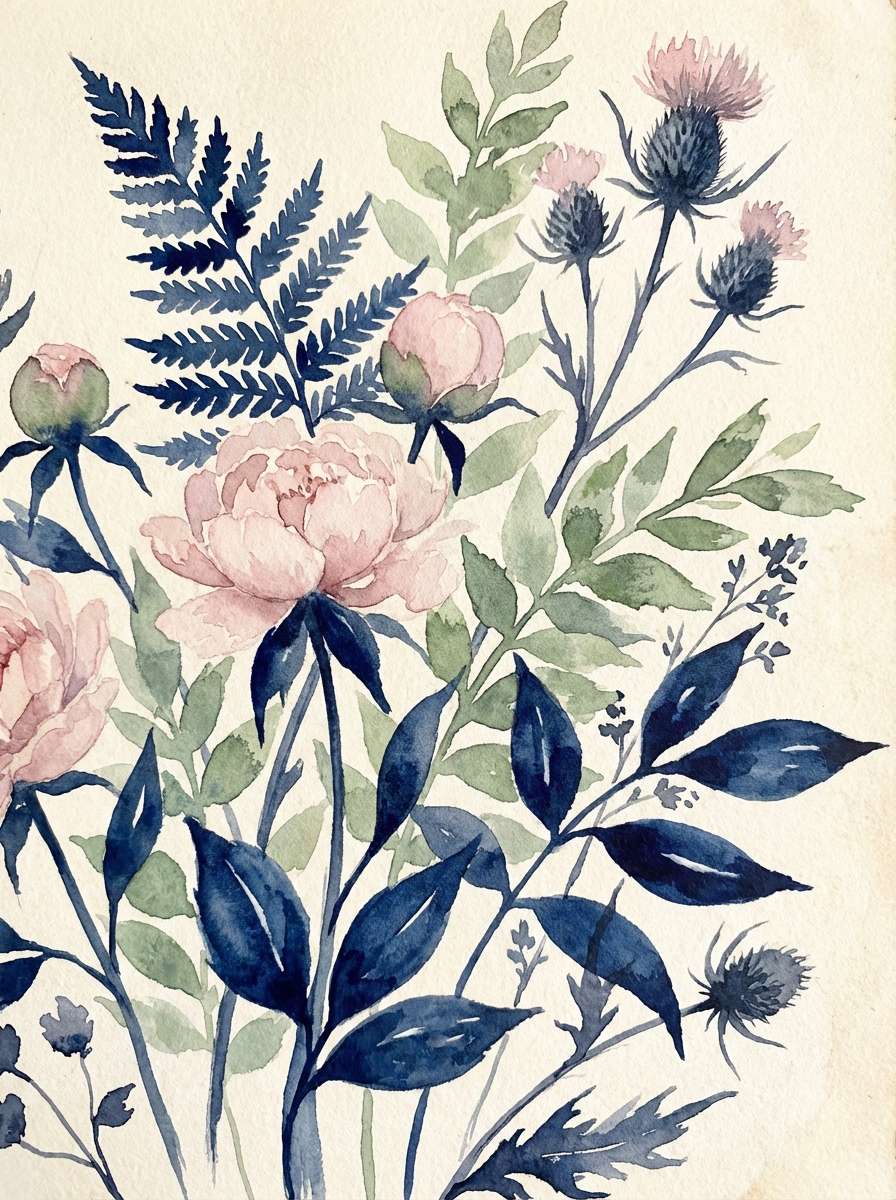
9) Botanical Indigo Bloom
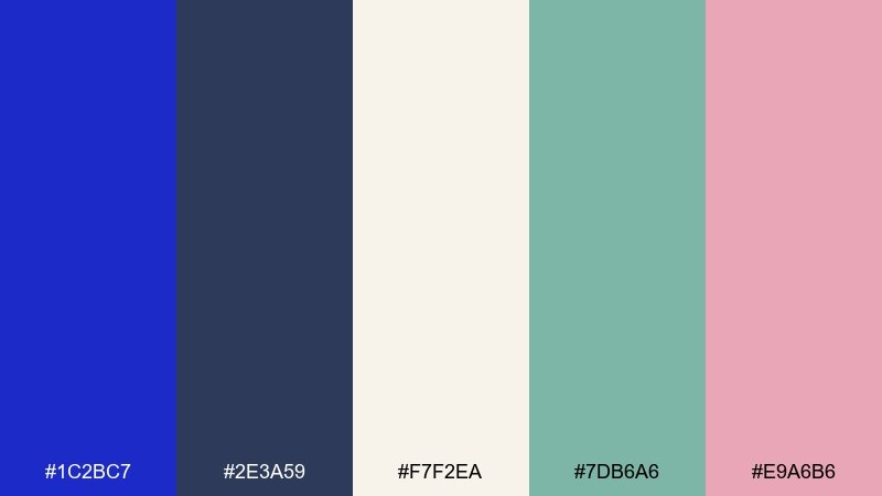
HEX: #1C2BC7 #2E3A59 #F7F2EA #7DB6A6 #E9A6B6
Mood: soft and botanical
Best for: watercolor floral illustration
Soft and botanical, it brings to mind pressed petals, indigo dye, and a calm greenhouse morning. Use the deep blue for stems, outlines, or shadows, then balance it with cream paper tones. Sage and blush add a gentle, modern twist that feels handmade rather than vintage. Tip: keep color transitions watery and imperfect to preserve the watercolor charm.
Image example of botanical indigo bloom generated using media.io
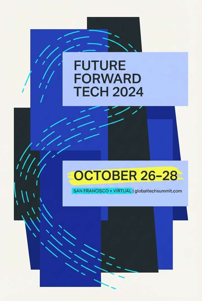
10) Tech Conference Pulse
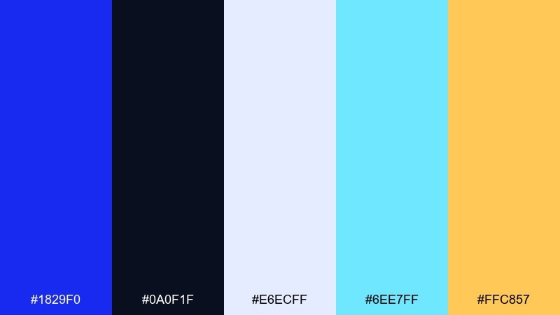
HEX: #1829F0 #0A0F1F #E6ECFF #6EE7FF #FFC857
Mood: confident and high-energy
Best for: conference poster and flyer
Confident and high-energy, it feels like keynote spotlights and fast-moving data streams. Build the base with near-black and ultramarine, then add cyan for motion lines and UI-like details. The warm yellow works best for date, venue, or ticket buttons so critical info pops. Tip: keep type large and aligned to a grid to avoid visual noise.
Image example of tech conference pulse generated using media.io
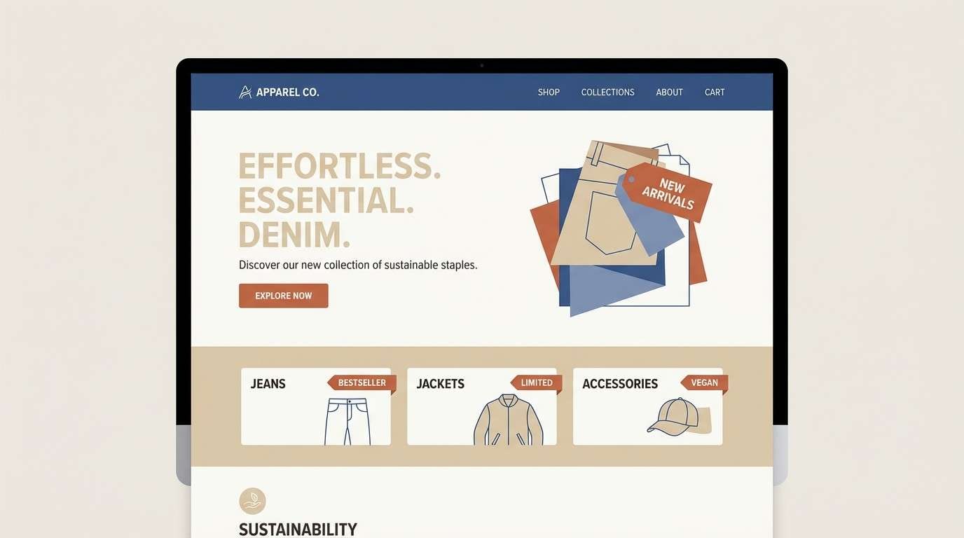
11) Indigo Denim Days
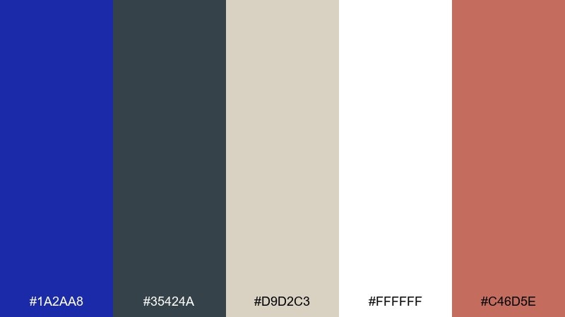
HEX: #1A2AA8 #35424A #D9D2C3 #FFFFFF #C46D5E
Mood: casual and grounded
Best for: apparel brand landing page
Casual and grounded, it reads like worn denim, canvas tote bags, and warm terracotta details. The ultramarine blue color palette works well for lifestyle brands when you want blue to feel approachable instead of corporate. Pair the blue with off-white and sand for backgrounds, then use terracotta for badges or sale tags. Tip: use lots of whitespace and candid typography to keep the denim vibe relaxed.
Image example of indigo denim days generated using media.io
12) Ceramic Tile Kitchen
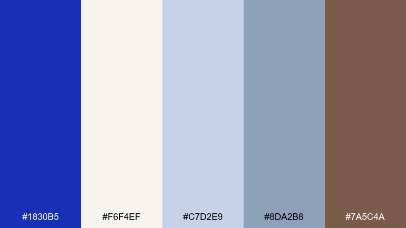
HEX: #1830B5 #F6F4EF #C7D2E9 #8DA2B8 #7A5C4A
Mood: homey and polished
Best for: interior design moodboard
Homey and polished, it feels like glossy ceramic tiles, warm wood, and soft daylight. Use ultramarine as a statement swatch, then layer creams and cool grays to keep the space feeling open. The brown grounds the palette and works nicely for furniture notes or material labels. Tip: treat the blue as a feature wall or backsplash accent, not an all-over paint.
Image example of ceramic tile kitchen generated using media.io
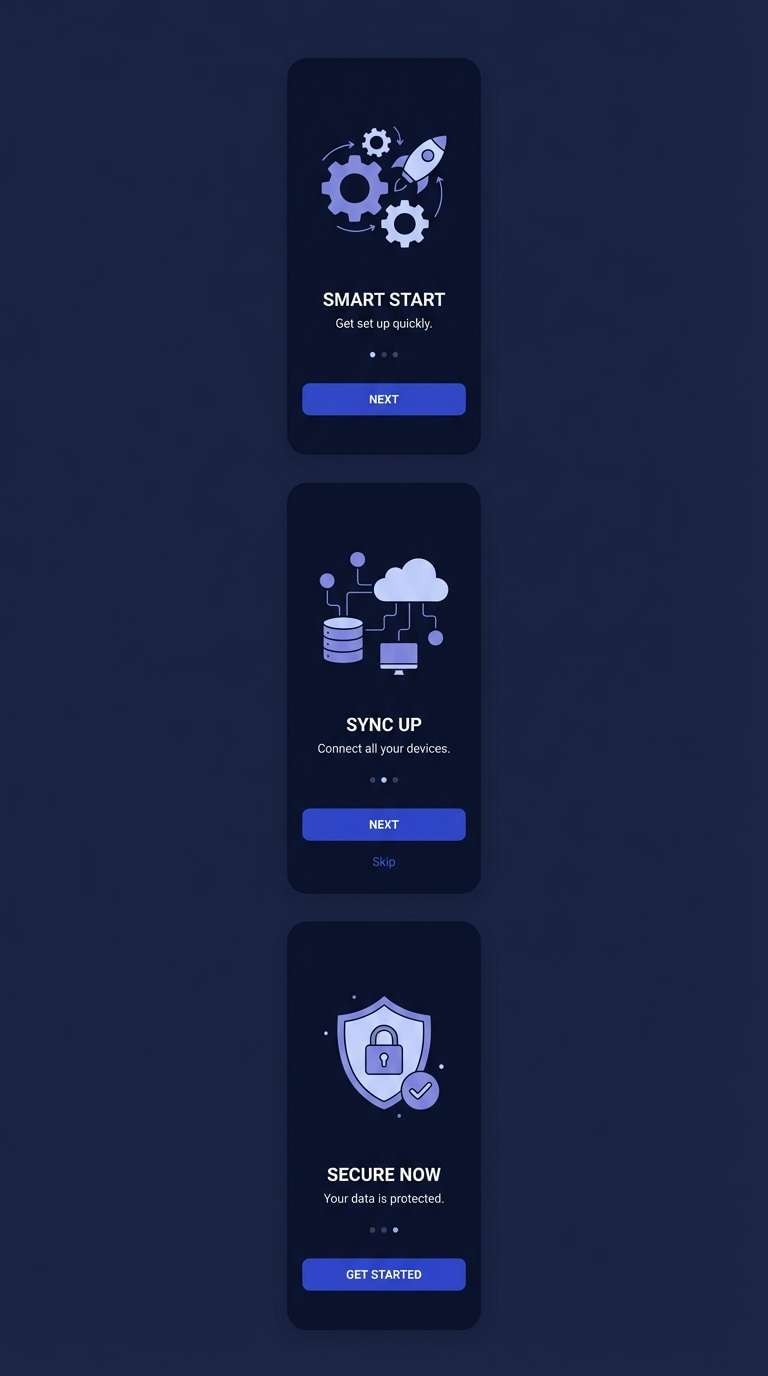
13) Deep Space Onboarding
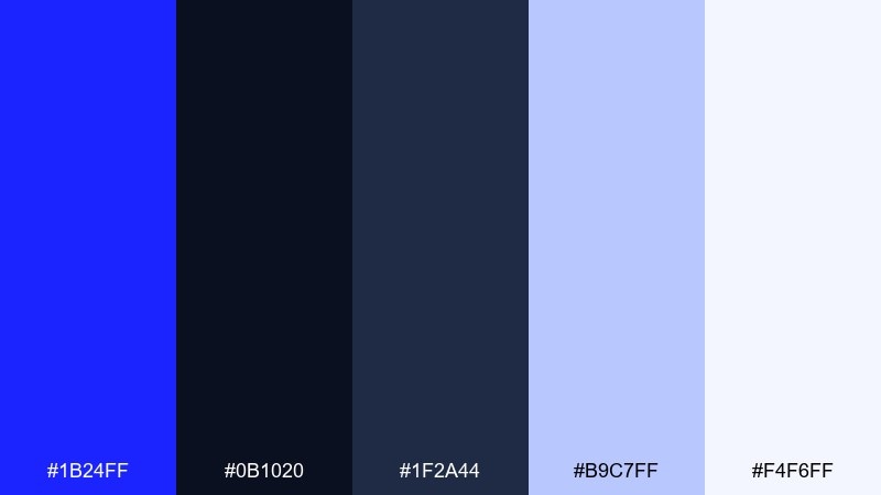
HEX: #1B24FF #0B1020 #1F2A44 #B9C7FF #F4F6FF
Mood: sleek and immersive
Best for: dark mode app onboarding screens
Sleek and immersive, it suggests a starship interface with soft glows against deep shadow. Use the bright ultramarine for primary actions and progress indicators, while navy and charcoal handle the background layers. Pale periwinkle and near-white keep copy readable without breaking the dark mood. Tip: add subtle gradients only in small highlights to avoid banding on OLED screens.
Image example of deep space onboarding generated using media.io
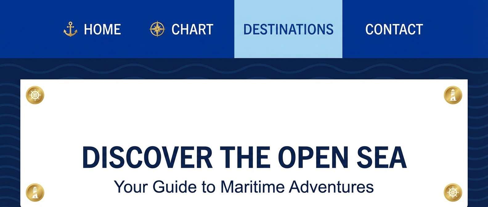
14) Maritime Flagship
HEX: #1227D5 #0E1A2B #FFFFFF #BFD2EA #E0B44C
Mood: crisp and seaworthy
Best for: nautical website header
Crisp and seaworthy, it brings to mind signal flags, polished metal, and clear horizon lines. Ultramarine and navy create a strong header and navigation, while white keeps the design breezy. A small gold touch adds heritage without turning the look too formal. Tip: use the pale blue for hover states and subtle separators to keep everything feeling light.
Image example of maritime flagship generated using media.io
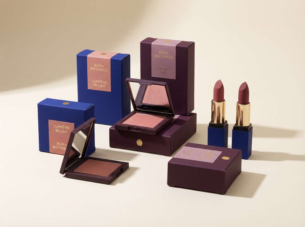
15) Royal Velvet Cosmetics
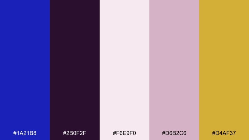
HEX: #1A21B8 #2B0F2F #F6E9F0 #D6B2C6 #D4AF37
Mood: glam and opulent
Best for: cosmetics product ad
Glam and opulent, it feels like velvet packaging, perfume notes, and a soft powder finish. Let ultramarine and plum set a rich backdrop, then use blush and mauve for delicate typography and highlights. The gold reads as premium when applied sparingly to caps, seals, or small lines. Tip: keep lighting soft and directional so the dark colors look luxurious rather than flat.
Image example of royal velvet cosmetics generated using media.io
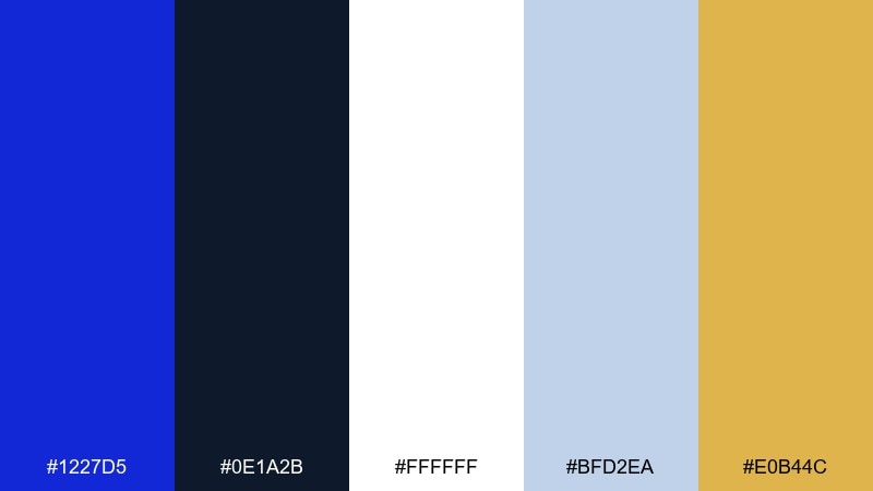
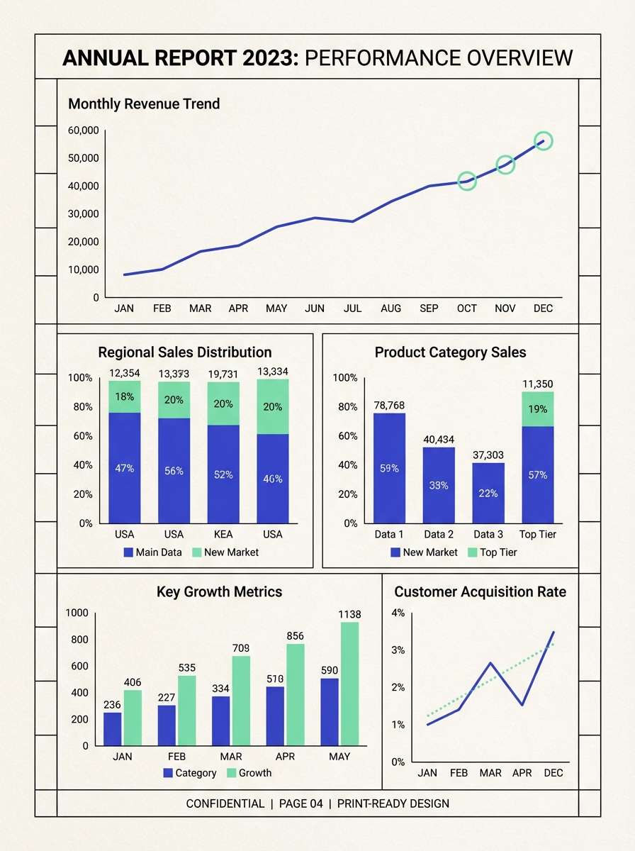
16) Finance Clarity
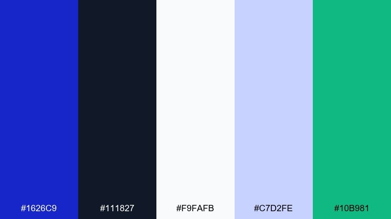
HEX: #1626C9 #111827 #F9FAFB #C7D2FE #10B981
Mood: trustworthy and clear
Best for: annual report charts
Trustworthy and clear, it feels like tidy spreadsheets, crisp printouts, and calm decision-making. Use ultramarine for primary series in charts, then add the mint green for positive growth markers or key KPIs. The near-black and off-white keep tables readable and professional. Tip: keep gridlines light and let the blue do the heavy lifting for hierarchy.
Image example of finance clarity generated using media.io
17) Sunset Afterstorm
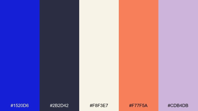
HEX: #1520D6 #2B2D42 #F8F3E7 #F77F5A #CDB4DB
Mood: cinematic and moody
Best for: album cover artwork
Cinematic and moody, it looks like a storm clearing as warm light hits the horizon. These ultramarine blue color combinations feel especially good for music branding because the orange adds emotion without overpowering the blue. Use cream for artist name and tracklist details, then let lavender soften transitions between dark and warm areas. Tip: keep the type simple and centered so the color story stays the hero.
Image example of sunset afterstorm generated using media.io
18) Playroom Primary Mix
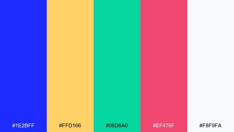
HEX: #1E2BFF #FFD166 #06D6A0 #EF476F #F8F9FA
Mood: playful and bright
Best for: kids book cover illustration
Playful and bright, it feels like building blocks, craft paper, and after-school energy. Use ultramarine as the main title color, then rotate yellow, green, and pink for characters or simple shapes. It works well for education materials and kids brands that need instant friendliness. Tip: keep outlines minimal and rely on flat color fills for a clean, modern look.
Image example of playroom primary mix generated using media.io
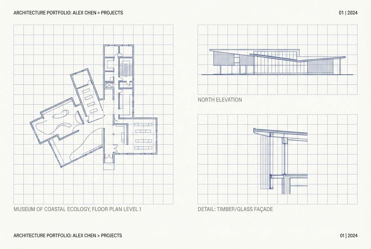
19) Architectural Blueprint
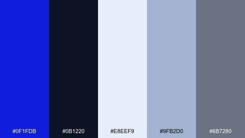
HEX: #0F1FDB #0B1220 #E8EEF9 #9FB2D0 #6B7280
Mood: precise and modern
Best for: architecture portfolio layout
Precise and modern, it evokes blueprint lines, clean measurements, and crisp presentation boards. Ultramarine works beautifully for section titles and diagram strokes, while pale cool tones keep pages light. Add gray for captions and metadata so the layout feels technical but still polished. Tip: keep line weights consistent and use the brightest blue only for key callouts.
Image example of architectural blueprint generated using media.io
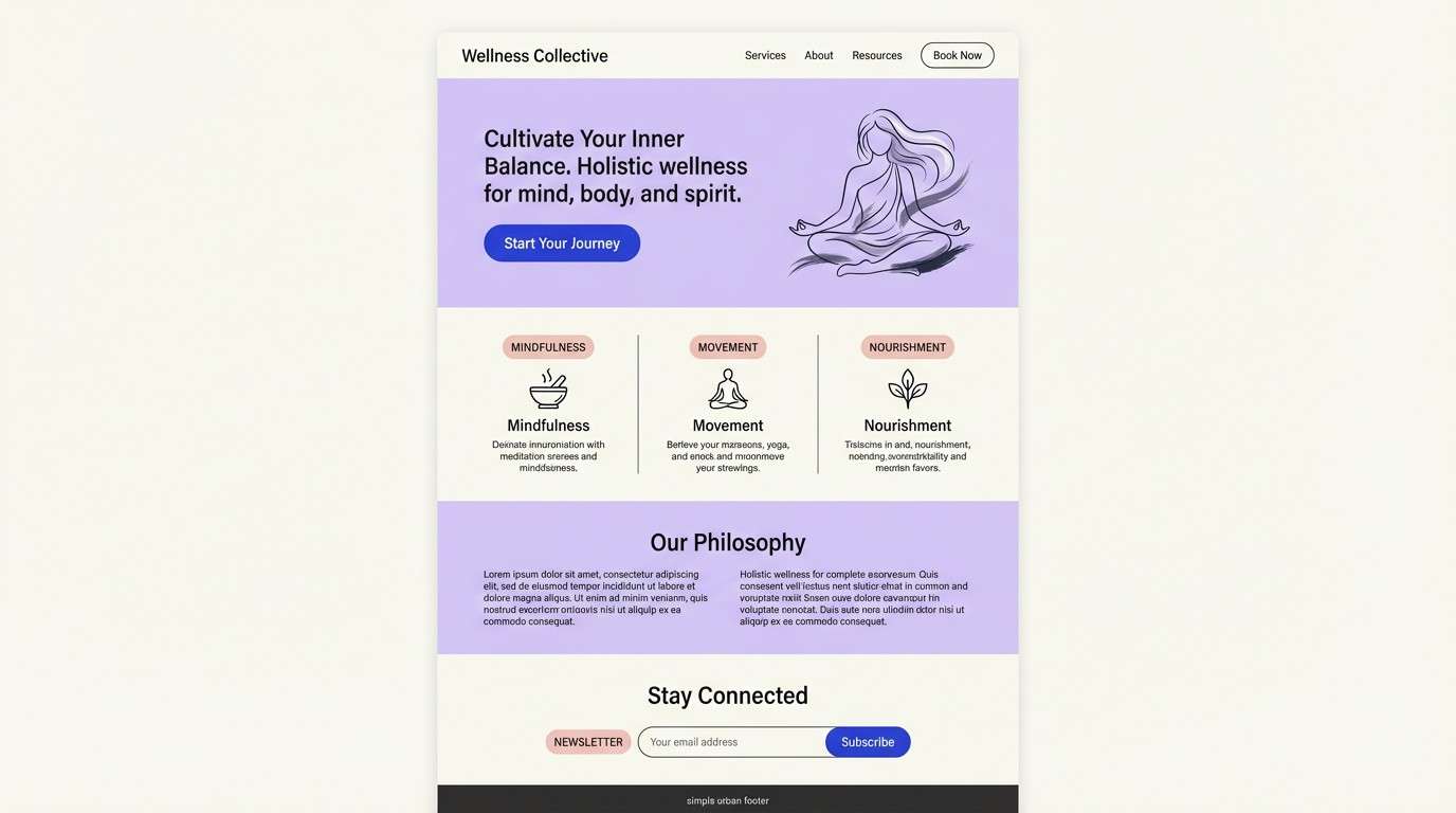
20) Soft Lavender Dusk
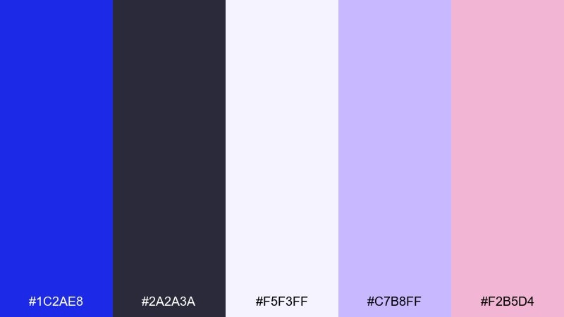
HEX: #1C2AE8 #2A2A3A #F5F3FF #C7B8FF #F2B5D4
Mood: gentle and dreamy
Best for: wellness landing page
Gentle and dreamy, it feels like twilight skies and a soft calming routine. Use ultramarine for key buttons and section headers, then let lavender and blush create a soothing emotional layer. The off-white background keeps everything breathable, especially for long scrolling pages. Tip: pair with rounded UI elements and generous spacing to reinforce the relaxed tone.
Image example of soft lavender dusk generated using media.io
What Colors Go Well with Ultramarine Blue?
Warm neutrals (cream, parchment, sand) make ultramarine feel more tactile and premium, which is ideal for editorial design and packaging. Metallic-like tones such as brass or gold also amplify its regal character when used in small doses.
For digital design, ultramarine pairs especially well with cool grays and near-black, creating strong structure without feeling harsh. Add cyan or periwinkle to push a futuristic, “interface” vibe while keeping the palette cohesive.
If you want emotional contrast, try coral, terracotta, blush, or soft lavender. These warm-to-pastel accents keep ultramarine bold, but make the overall look friendlier and more expressive.
How to Use a Ultramarine Blue Color Palette in Real Designs
Start by deciding whether ultramarine is your background color or your accent. As a background, keep typography light (off-white or pale periwinkle) and limit saturated accents to one “signal” color for CTAs.
In UI, assign ultramarine to primary actions and key navigation, then use grays and soft tints for surfaces, cards, and separators. This preserves hierarchy and avoids the “everything is shouting” problem that saturated blues can cause.
For print, test on the intended stock: uncoated paper can soften ultramarine beautifully, while glossy finishes can intensify it. Keep mid-tone grays or charcoal available for readable body text and fine details.
Create Ultramarine Blue Palette Visuals with AI
If you already have HEX codes, the fastest way to explore real layouts is to generate mockups: posters, landing pages, packaging, or social templates. Seeing ultramarine applied at scale helps you confirm contrast, mood, and balance in minutes.
With Media.io’s text-to-image tool, you can paste a prompt like “ultramarine hero section with cream negative space and gold accents” and iterate quickly until the palette feels right for your brand.
Once you like the direction, keep variations: a dark mode version, a light mode version, and one high-contrast campaign version. That gives you consistent flexibility across web, app, and print.
Ultramarine Blue Color Palette FAQs
-
What is the HEX code for ultramarine blue?
A classic ultramarine blue commonly appears as #120A8F, though many modern palettes use close variants like #1A33CC or #1B24FF depending on brightness and use case. -
Is ultramarine closer to cobalt or indigo?
Ultramarine usually sits between cobalt and indigo: deeper than many cobalt blues, but less purple-leaning than indigo. In digital palettes, small shifts in saturation can make it read more cobalt (brighter) or more indigo (moodier). -
What colors pair best with ultramarine blue for branding?
For premium branding, pair ultramarine with cream and gold; for modern minimal brands, use white and near-black; for friendly lifestyle brands, add terracotta, blush, or warm sand to soften the blue. -
How do I keep ultramarine from overwhelming a design?
Use it as an anchor rather than everywhere: reserve ultramarine for headers, primary buttons, or key blocks, then rely on off-whites and cool grays for most surfaces. Keep one accent color for highlights so the hierarchy stays clear. -
Does ultramarine work well for dark mode UI?
Yes—ultramarine is excellent for dark mode because it stays vivid against near-black backgrounds. Use lighter tints (periwinkle/near-white) for text and secondary UI to maintain readability and reduce eye strain. -
What’s a good complementary accent color for ultramarine blue?
Warm yellow-gold accents are a classic complement, while coral/orange adds energetic contrast. If you prefer a softer look, lavender and blush can create a dreamy, calming pairing without fighting the blue. -
Can I generate ultramarine palette mockups without designing from scratch?
Yes. You can use an AI generator to create posters, landing pages, UI screens, or packaging concepts from a prompt, then iterate quickly until the ultramarine-to-neutral balance feels right.
Next: Dark Gray Color Palette


