

Dark gray is a modern neutral that can feel sleek, calm, or dramatic depending on what you pair it with. It’s a go-to for UI, branding, and interiors because it adds structure without the harshness of pure black.
Below are 20 curated dark gray color palette ideas with HEX codes, plus practical guidance on choosing accents, balancing contrast, and generating palette visuals with AI.
In this article
- Why Dark Gray Palettes Work So Well
-
- graphite and linen
- charcoal sage
- steel blue night
- ash rosewood
- slate citrus pop
- ink and sandstone
- midnight plum smoke
- concrete and copper
- stormy teal
- smoked lavender
- granite mint studio
- urban cherry
- fog and mustard
- pewter ocean
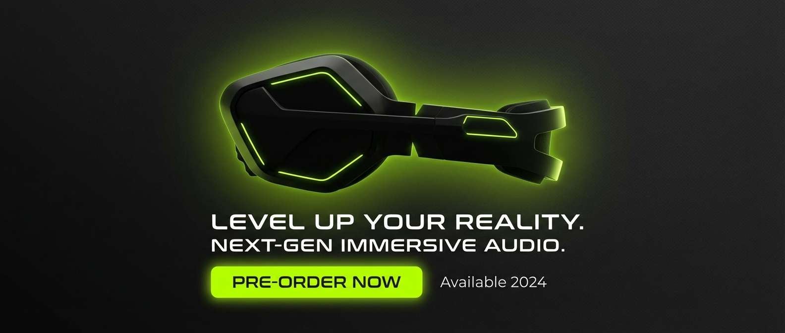
- carbon neon lime
- museum taupe
- monochrome drift
- espresso olive
- rainy day pastels
- noir gold accent
- What Colors Go Well with Dark Gray?
- How to Use a Dark Gray Color Palette in Real Designs
- Create Dark Gray Palette Visuals with AI
Why Dark Gray Palettes Work So Well
Dark gray sits in the “sweet spot” between black and mid-tone neutrals: it provides depth, contrast, and hierarchy, but it’s softer on the eyes. That makes it especially effective for interface design, editorial layouts, and premium brand systems.
Because dark gray is inherently versatile, it can swing warm (taupe, espresso, rosewood) or cool (steel, slate, blue-black). With the right accent, the same neutral base can feel wellness-forward, corporate, playful, or luxurious.
It also pairs well with texture—paper grain, subtle noise, matte finishes, and soft shadows—helping designs feel dimensional and less “flat” even when you keep the palette minimal.
20+ Dark Gray Color Palette Ideas (with HEX Codes)
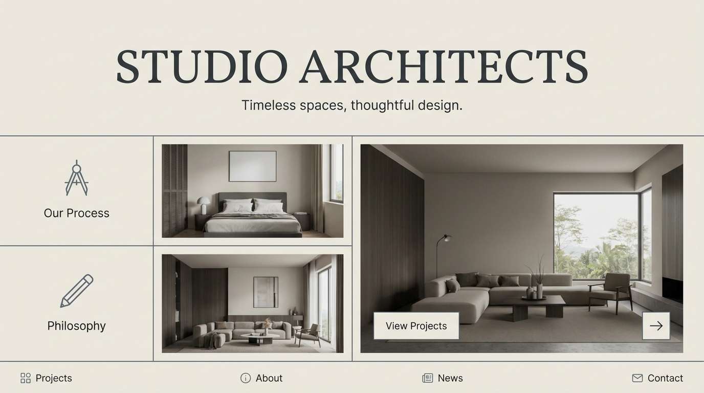
1) Graphite and Linen
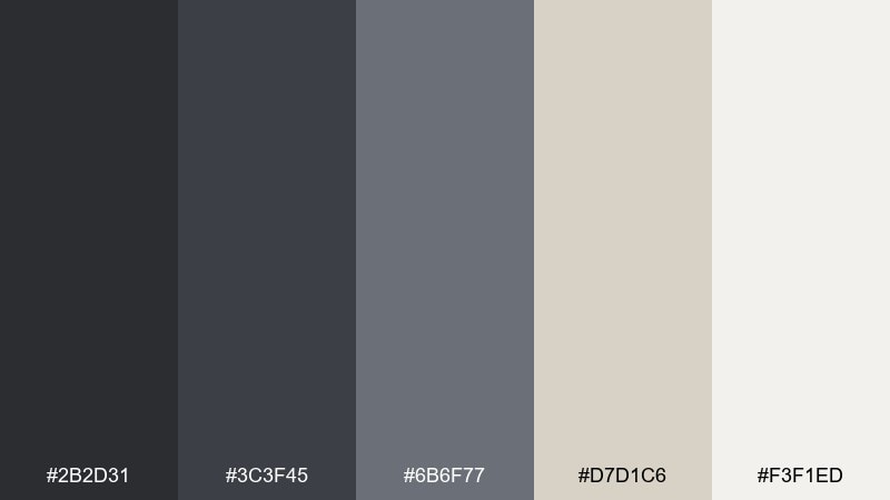
HEX: #2b2d31 #3c3f45 #6b6f77 #d7d1c6 #f3f1ed
Mood: calm, architectural, refined
Best for: architecture studio website hero
Calm and architectural, these graphite tones against linen neutrals feel like concrete, paper, and soft daylight. Use it for studio websites, portfolios, and premium service brands that need quiet confidence. Pair with warm off-whites and subtle texture (paper grain or light noise) to avoid a flat look. Tip: keep the light linen as the main background and reserve deep graphite for headings and primary buttons.
Image example of graphite and linen generated using media.io
Media.io is an online AI studio for creating and editing video, image, and audio in your browser.

2) Charcoal Sage
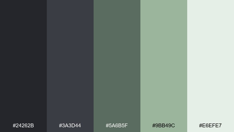
HEX: #24262b #3a3d44 #5a6b5f #9bb49c #e6efe7
Mood: grounded, botanical, modern
Best for: wellness brand identity kit
Grounded and botanical, charcoal reads like stone while sage adds a fresh, herbal lift. These dark gray color combinations work beautifully for wellness branding, apothecary labels, and calm lifestyle packaging. Pair with matte textures and understated line art for a modern, nature-led feel. Tip: use the pale mint as negative space so the darker tones never feel heavy.
Image example of charcoal sage generated using media.io
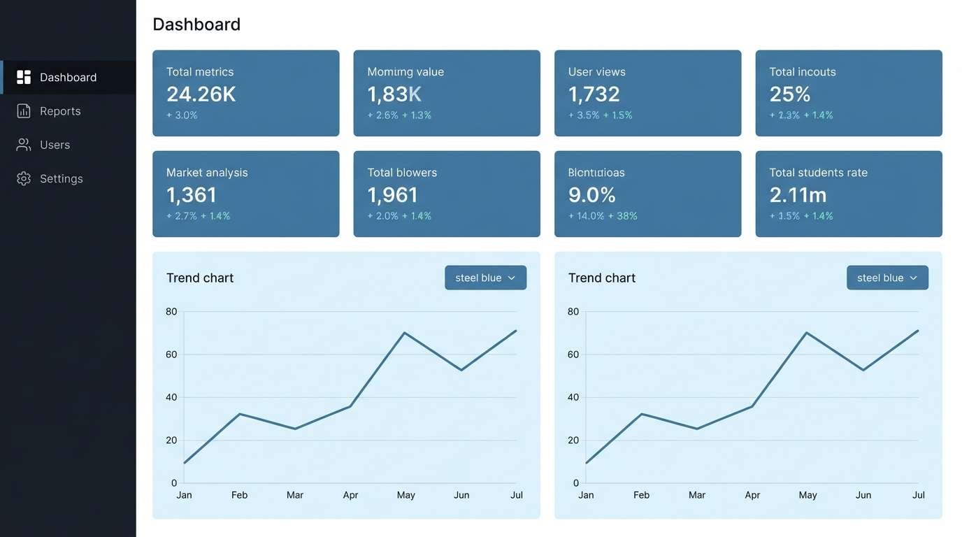
3) Steel Blue Night
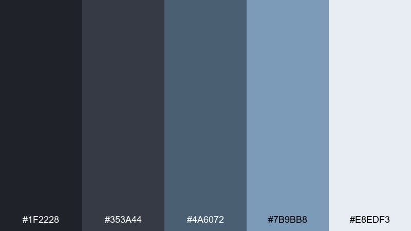
HEX: #1f2228 #353a44 #4a6072 #7b9bb8 #e8edf3
Mood: cool, technical, trustworthy
Best for: saas dashboard ui
Cool and technical, steel blue layered over near-black feels like night mode with a clean, confident glow. It fits SaaS dashboards, analytics tools, and enterprise UI where clarity matters. Pair with thin dividers and a light icy background for data tables and secondary panels. Tip: reserve the lightest tone for key metrics to create instant hierarchy without adding extra colors.
Image example of steel blue night generated using media.io
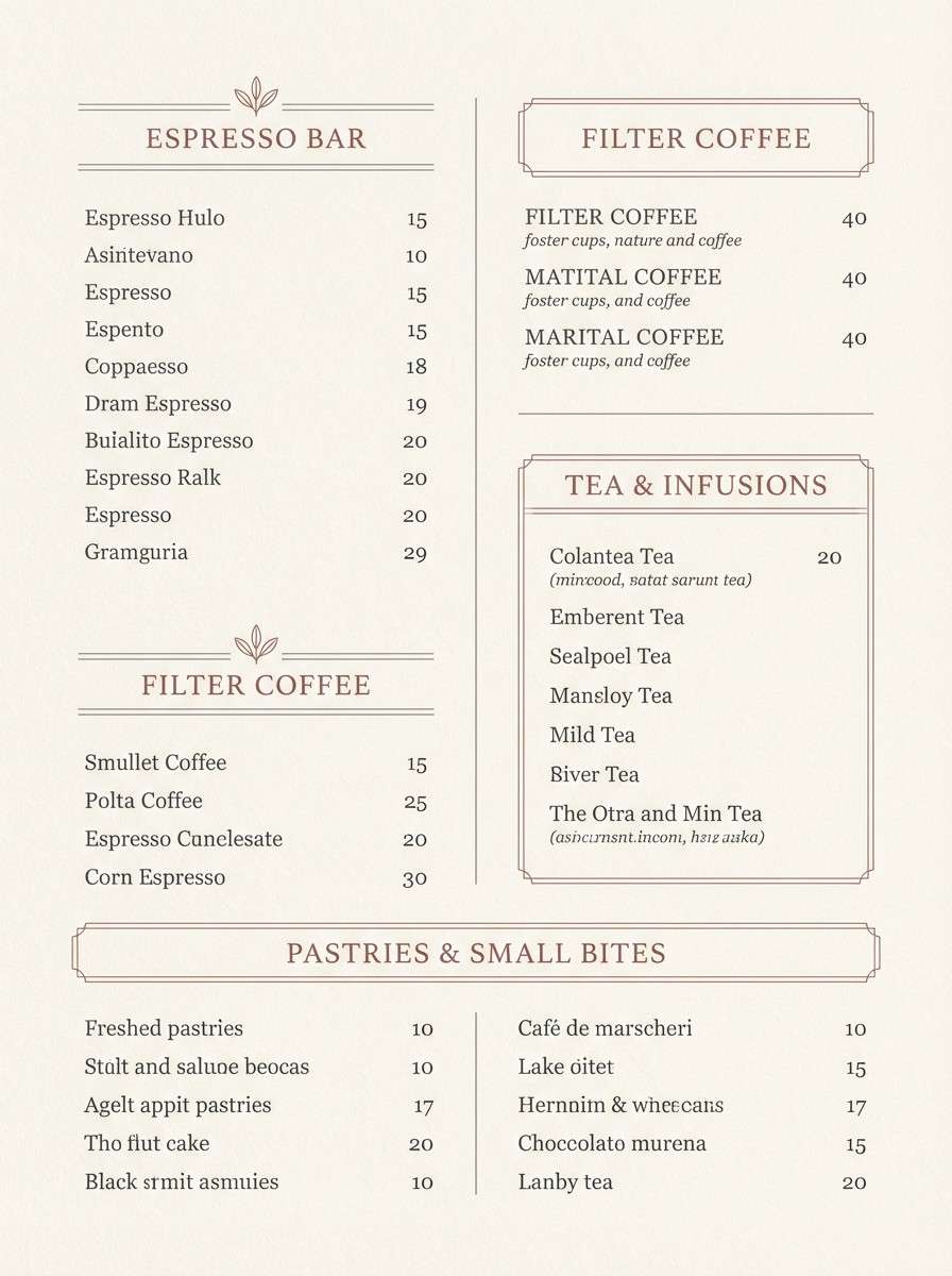
4) Ash Rosewood
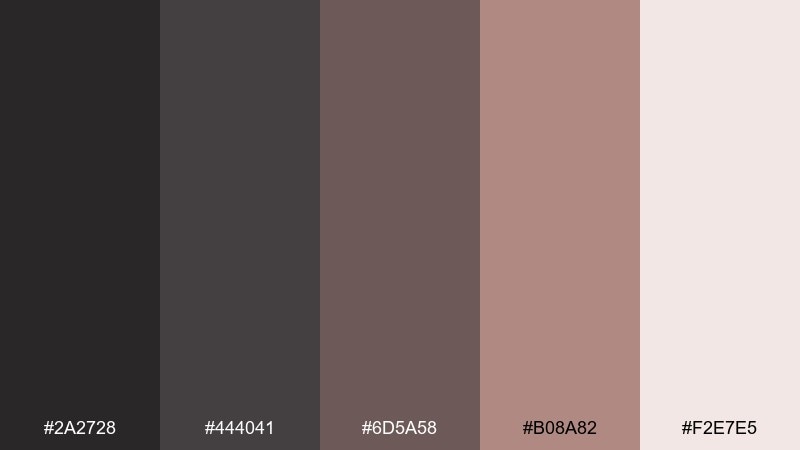
HEX: #2a2728 #444041 #6d5a58 #b08a82 #f2e7e5
Mood: warm, intimate, vintage-leaning
Best for: coffee shop menu design
Warm and intimate, ash gray with rosewood undertones evokes leather notebooks and a quiet cafe corner. It works well for menus, boutique hospitality, and artisanal product lists where you want cozy sophistication. Pair with creamy paper backgrounds and muted blush highlights for section headers. Tip: keep body text in the mid gray and use the deep tone only for pricing and key labels.
Image example of ash rosewood generated using media.io
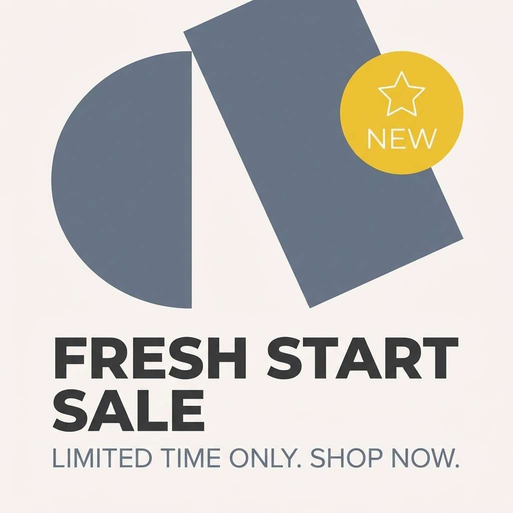
5) Slate Citrus Pop
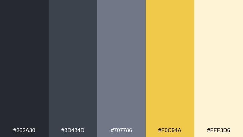
HEX: #262a30 #3d434d #707786 #f0c94a #fff3d6
Mood: bold, upbeat, editorial
Best for: social media ad creative
Bold and upbeat, slate grays set the stage while citrus yellow punches through like a headline highlight. It is a strong choice for social ads, promo banners, and announcements that need contrast without going neon. Pair with big typography and simple geometric shapes to keep the energy clean. Tip: cap the yellow to one focal element (button, price tag, or badge) for maximum impact.
Image example of slate citrus pop generated using media.io
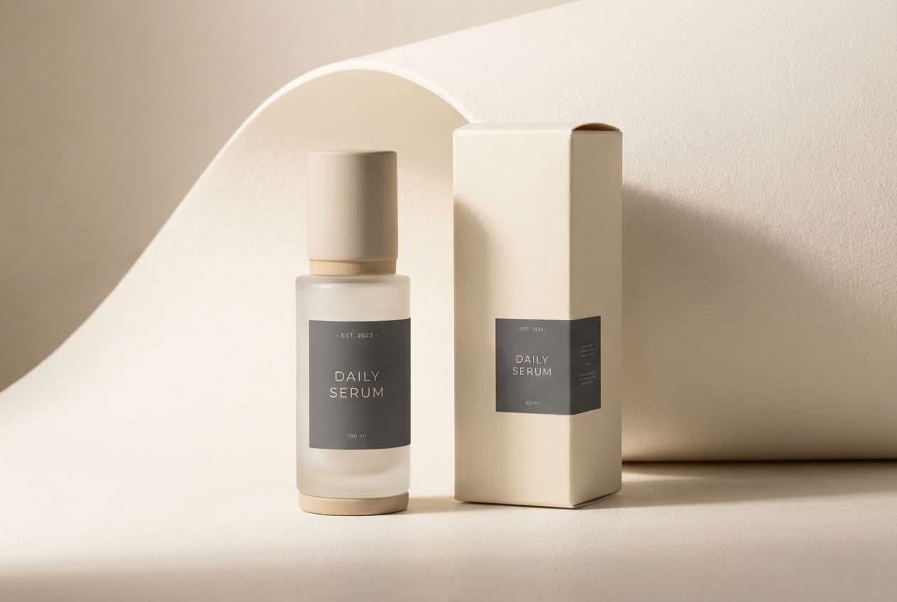
6) Ink and Sandstone
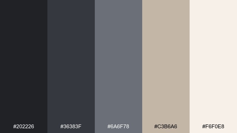
HEX: #202226 #36383f #6a6f78 #c3b6a6 #f6f0e8
Mood: minimal, premium, timeless
Best for: luxury skincare packaging
Minimal and premium, inky grays against sandstone neutrals feel like stoneware, linen, and quiet luxury. This dark gray color palette suits skincare packaging, boutique candles, and elevated DTC brands that want restraint. Pair with embossed finishes and warm neutrals to keep it inviting rather than cold. Tip: use sandstone for the label field and let ink tones carry the logo and ingredient hierarchy.
Image example of ink and sandstone generated using media.io
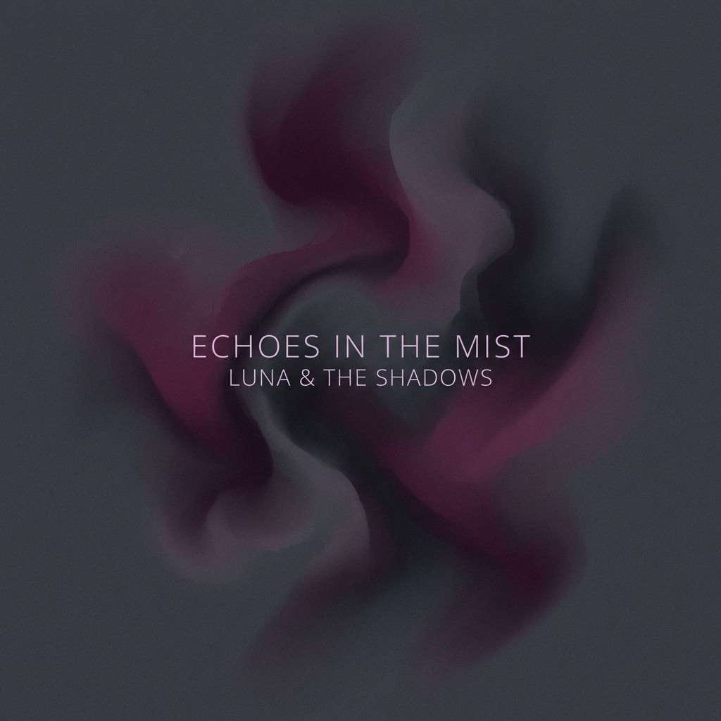
7) Midnight Plum Smoke
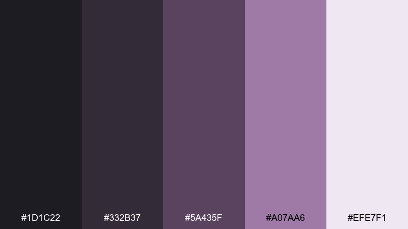
HEX: #1d1c22 #332b37 #5a435f #a07aa6 #efe7f1
Mood: mysterious, creative, nocturnal
Best for: indie album cover artwork
Mysterious and creative, midnight gray with plum smoke feels like a late-night studio session under soft purple light. It is ideal for album covers, event posters, and artsy campaigns that lean atmospheric. Pair with high-contrast type in the pale lilac and keep imagery abstract to amplify the mood. Tip: add grain and a gentle vignette using the darkest tone for depth without extra colors.
Image example of midnight plum smoke generated using media.io
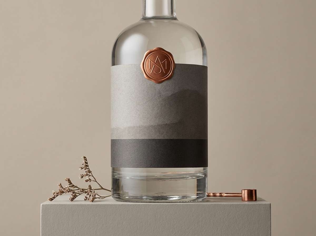
8) Concrete and Copper
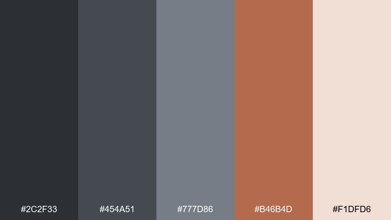
HEX: #2c2f33 #454a51 #777d86 #b46b4d #f1dfd6
Mood: industrial, confident, warm-metal
Best for: craft spirits label design
Industrial but inviting, concrete grays meet copper like brushed metal against urban stone. It works for craft spirits, premium coffee, and product labels that want grit with warmth. Pair with condensed typography and copper-foil style accents for a tactile, shelf-ready look. Tip: place copper only on small badges or borders so the neutral base stays in control.
Image example of concrete and copper generated using media.io
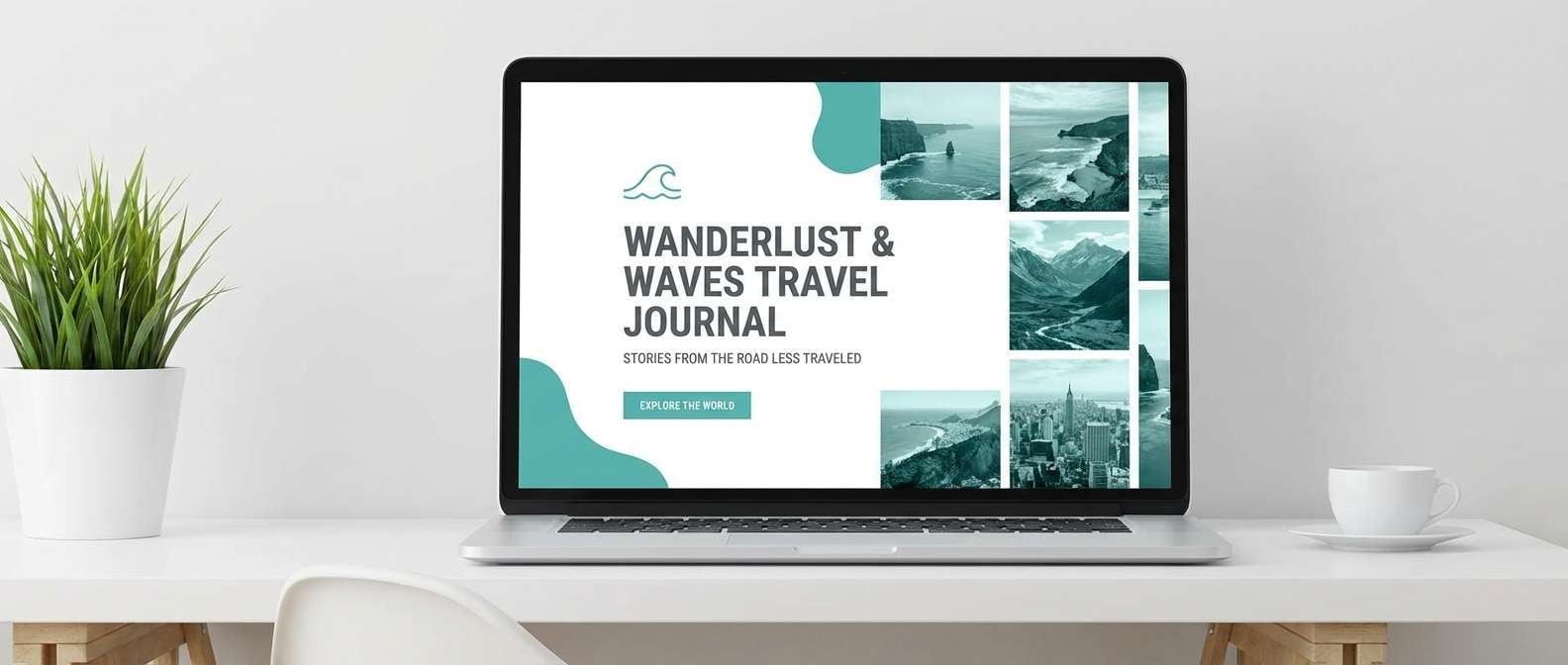
9) Stormy Teal
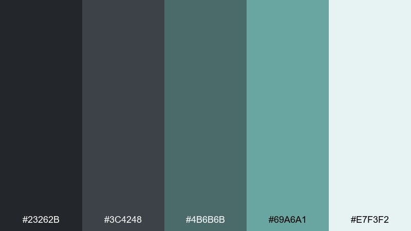
HEX: #23262b #3c4248 #4b6b6b #69a6a1 #e7f3f2
Mood: fresh, coastal, modern
Best for: travel blog header design
Fresh and coastal, stormy gray with teal feels like sea glass under an overcast sky. It suits travel headers, lifestyle blogs, and airy brands that want color without losing a neutral backbone. Pair with plenty of white space and teal highlights for links and callouts. Tip: keep imagery cool-toned so the teal reads intentional, not accidental.
Image example of stormy teal generated using media.io
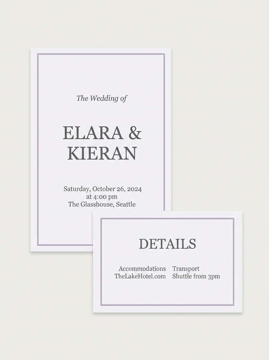
10) Smoked Lavender
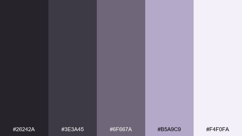
HEX: #26242a #3e3a45 #6f667a #b5a9c9 #f4f0fa
Mood: soft, dreamy, contemporary
Best for: wedding invitation set
Soft and dreamy, smoked grays blended with lavender read like dusk haze and pressed flowers. It is a lovely fit for modern weddings, elegant invites, and stationery that aims for romance without bright pastels. Pair with delicate serif type and lots of breathing room on the pale background. Tip: use the mid lavender for borders and small icons rather than full blocks of color.
Image example of smoked lavender generated using media.io
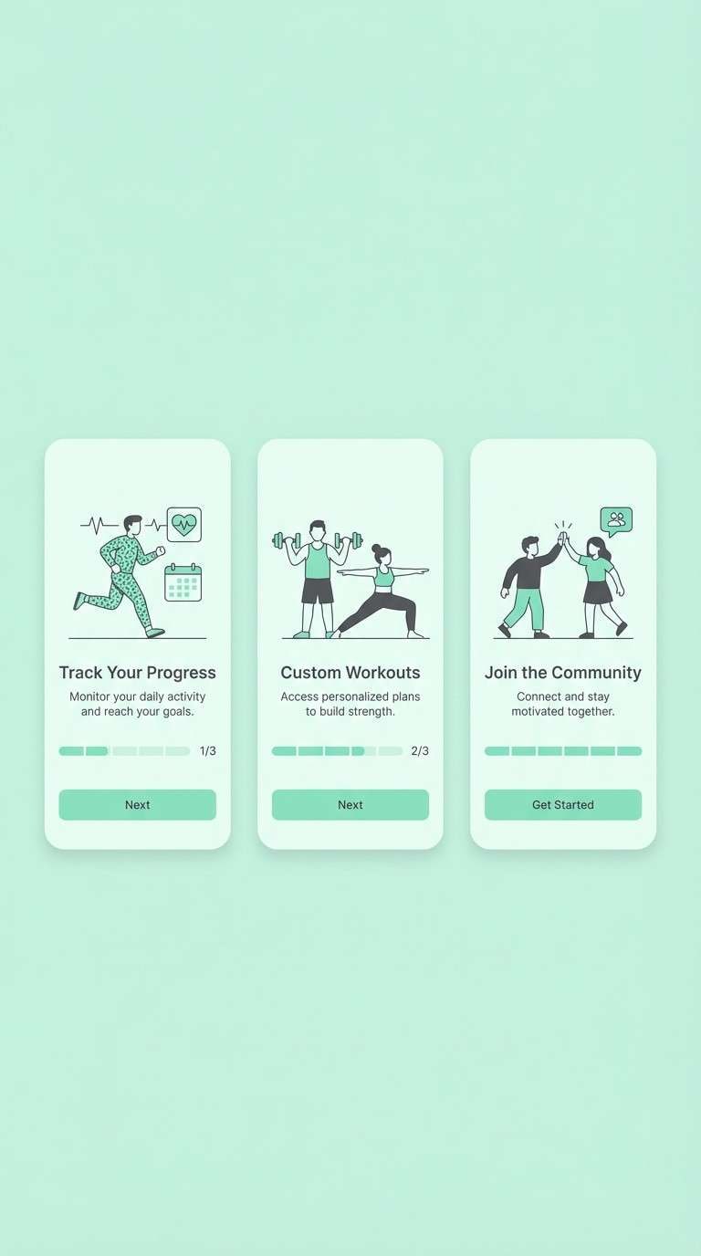
11) Granite Mint Studio
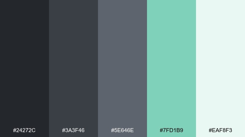
HEX: #24272c #3a3f46 #5e646e #7fd1b9 #eaf8f3
Mood: clean, energetic, tech-friendly
Best for: fitness app onboarding screens
Clean and energetic, granite gray keeps things sharp while mint adds a modern burst of freshness. It is great for fitness apps, habit trackers, and product onboarding where clarity and motivation matter. Pair with bold progress indicators and simple illustrations to avoid clutter. Tip: use mint for success states and key actions, and keep secondary buttons in the mid gray.
Image example of granite mint studio generated using media.io
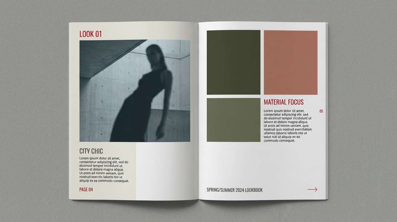
12) Urban Cherry
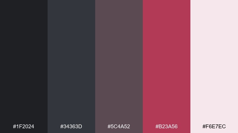
HEX: #1f2024 #34363d #5c4a52 #b23a56 #f6e7ec
Mood: bold, stylish, nightlife
Best for: fashion lookbook layout
Bold and stylish, urban gray with cherry red feels like city lights reflecting off polished stone. Use it for fashion lookbooks, nightlife flyers, and statement branding that needs attitude without chaos. Pair with large photo blocks and cherry as a tight accent for section titles or page numbers. Tip: keep the deepest tone for backgrounds and let the blush tint soften negative space around text.
Image example of urban cherry generated using media.io
13) Fog and Mustard
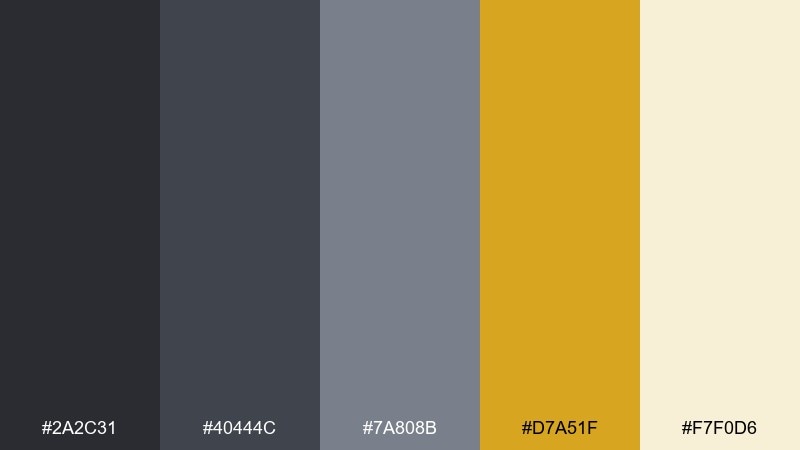
HEX: #2a2c31 #40444c #7a808b #d7a51f #f7f0d6
Mood: confident, retro-modern, punchy
Best for: event poster design
Confident and slightly retro, foggy grays make mustard feel like a spotlight on a rainy street. These dark gray color combinations are perfect for event posters, conference graphics, and punchy announcements. Pair with chunky sans-serif type and simple shapes for a clean, high-contrast look. Tip: let mustard carry the date and call-to-action while grays handle everything else.
Image example of fog and mustard generated using media.io

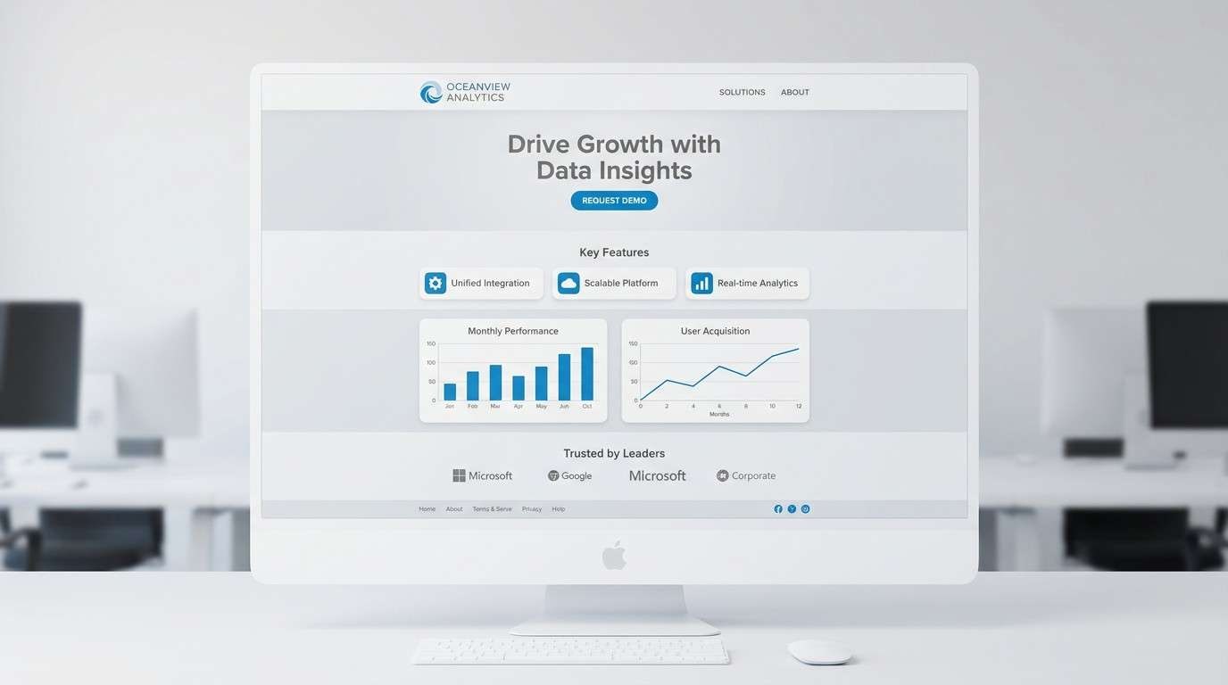
14) Pewter Ocean
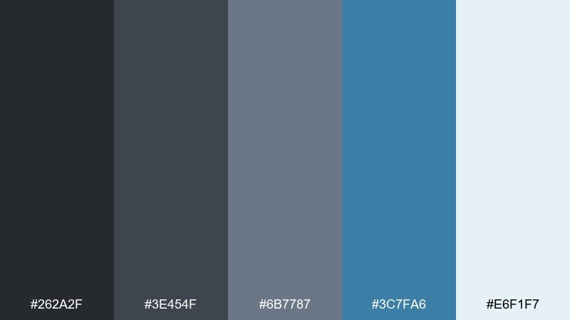
HEX: #262a2f #3e454f #6b7787 #3c7fa6 #e6f1f7
Mood: crisp, reliable, corporate-calm
Best for: b2b landing page design
Crisp and reliable, pewter grays with ocean blue feel like polished steel and open water. It is a strong fit for B2B landing pages, fintech, and consulting brands that need calm authority. Pair with clear iconography and light backgrounds to keep the blue feeling professional rather than playful. Tip: use ocean blue for links and section markers, not for large background fills.
Image example of pewter ocean generated using media.io
15) Carbon Neon Lime
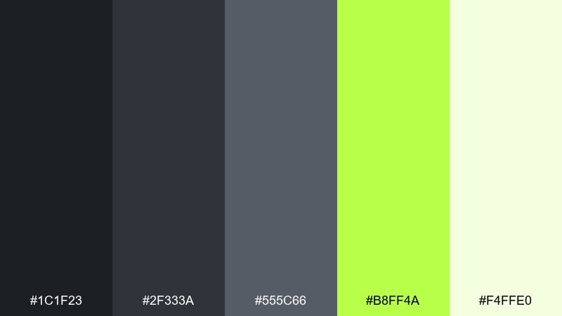
HEX: #1c1f23 #2f333a #555c66 #b8ff4a #f4ffe0
Mood: edgy, high-contrast, futuristic
Best for: gaming product ad banner
Edgy and futuristic, carbon grays make neon lime feel like a HUD highlight in a dark room. It is ideal for gaming ads, tech drops, and punchy banners where you want instant visibility. Pair with sharp shapes and a single lime glow effect to keep it sleek, not chaotic. Tip: confine lime to one primary button and one small detail line for a controlled, premium vibe.
Image example of carbon neon lime generated using media.io
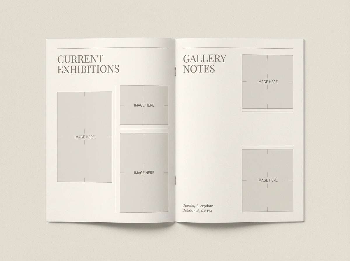
16) Museum Taupe
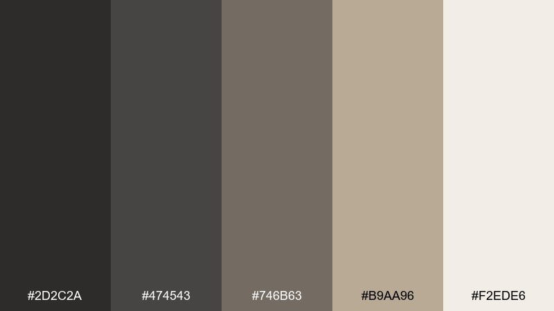
HEX: #2d2c2a #474543 #746b63 #b9aa96 #f2ede6
Mood: classic, curated, understated
Best for: art gallery brochure layout
Classic and curated, taupe-leaning grays evoke museum walls, framed prints, and soft track lighting. It works for gallery brochures, cultural event programs, and refined print pieces. Pair with generous margins and subtle rules to let content breathe. Tip: use the light cream for page backgrounds and keep the deepest tone for captions and navigation elements.
Image example of museum taupe generated using media.io
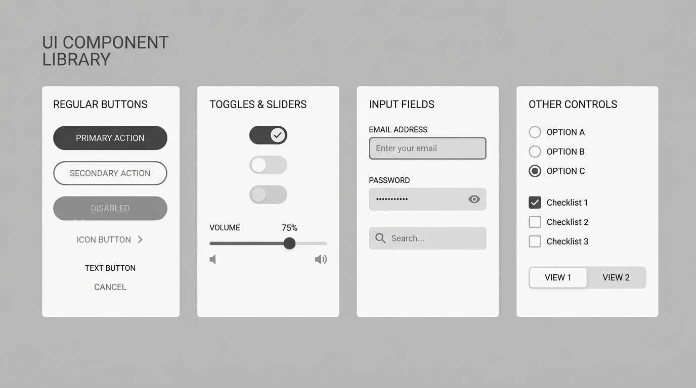
17) Monochrome Drift
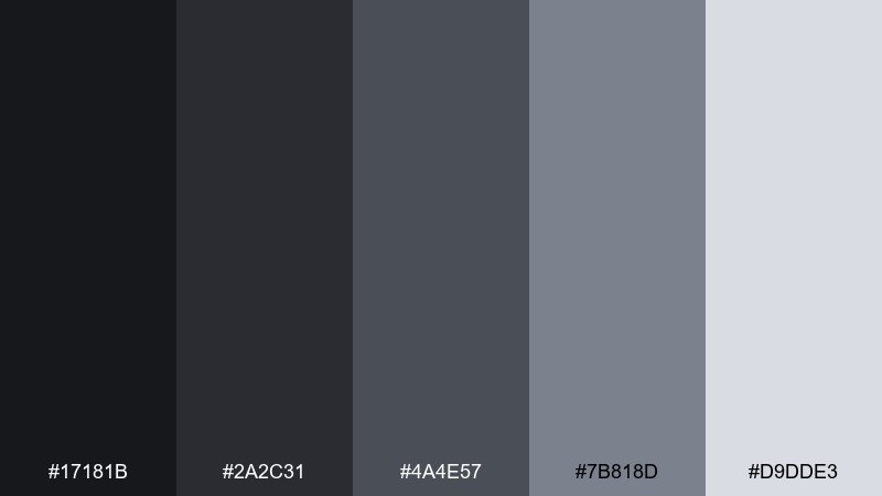
HEX: #17181b #2a2c31 #4a4e57 #7b818d #d9dde3
Mood: minimal, neutral, ultra-modern
Best for: mobile ui component library
Minimal and ultra-modern, these drifting grays feel like fog, chrome, and clean typography. A dark gray color palette like this is perfect for component libraries, design systems, and UI kits that need maximum flexibility. Pair with a single brand accent elsewhere in your product, and let these neutrals do the heavy lifting for structure. Tip: ensure accessibility by using the lightest gray behind small text and saving near-black for key labels.
Image example of monochrome drift generated using media.io
18) Espresso Olive
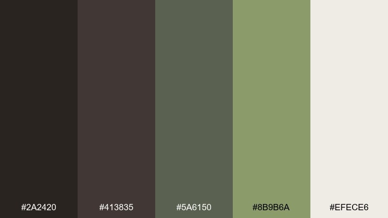
HEX: #2a2420 #413835 #5a6150 #8b9b6a #efece6
Mood: earthy, rustic-modern, comforting
Best for: restaurant branding and menu
Earthy and comforting, espresso brown-gray with olive green evokes wood tables, ceramic plates, and herbs on a cutting board. It is well suited to restaurant branding, farm-to-table menus, and culinary packaging. Pair with natural paper textures and simple illustrations for a grounded feel. Tip: use olive for category markers and highlights, keeping the darkest espresso tone for headlines and logo marks.
Image example of espresso olive generated using media.io
19) Rainy Day Pastels
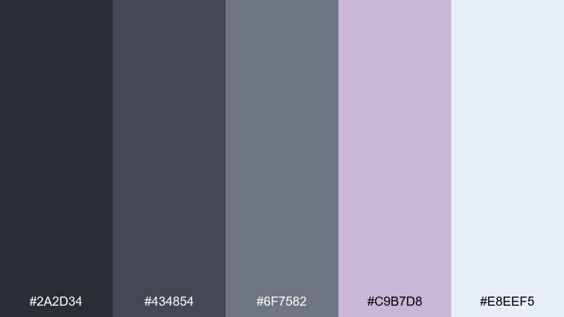
HEX: #2a2d34 #434854 #6f7582 #c9b7d8 #e8eef5
Mood: soft, friendly, tech-lite
Best for: student planner template
Soft and friendly, rainy grays mixed with gentle lilac feels like notebooks, overcast afternoons, and calm focus. It is great for planner templates, study dashboards, and printable organizers that should feel supportive. Pair with rounded shapes and subtle section fills using the pale blue-gray. Tip: limit lilac to headers and checkmarks so the layout stays readable when printed.
Image example of rainy day pastels generated using media.io
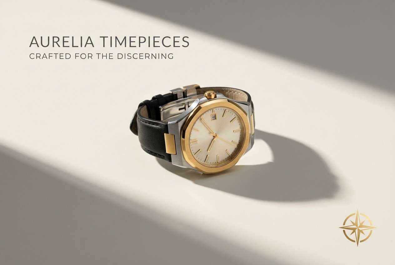
20) Noir Gold Accent
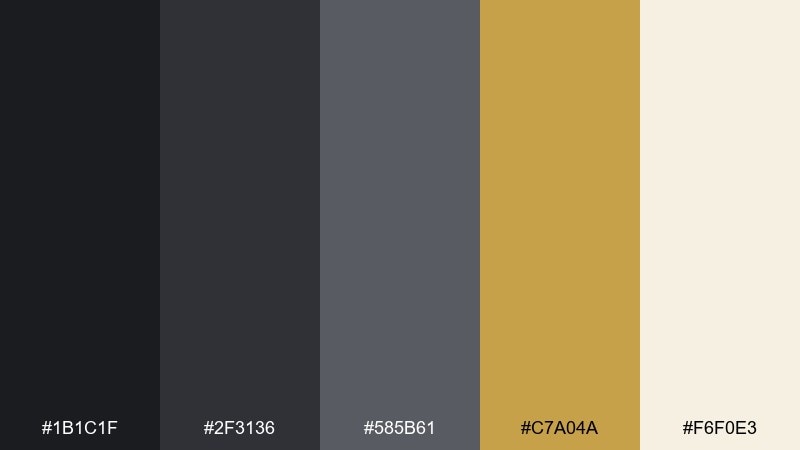
HEX: #1b1c1f #2f3136 #585b61 #c7a04a #f6f0e3
Mood: luxury, dramatic, high-contrast
Best for: premium watch product ad
Luxury and dramatic, noir grays with warm gold feel like a dim boutique and a spotlight on polished metal. Use it for premium product ads, high-end landing pages, and elegant announcements. Pair with minimal copy, strong contrast, and a cream backdrop so the gold looks rich rather than brassy. Tip: treat gold as a micro-accent for logos and small rules, not as a full block color.
Image example of noir gold accent generated using media.io
What Colors Go Well with Dark Gray?
Warm neutrals like cream, linen, beige, and sandstone make dark gray feel more inviting and premium. This is a reliable pairing for packaging, editorial layouts, and interior-style branding where you want “quiet luxury” instead of stark contrast.
Cool accents—steel blue, teal, and ocean tones—push dark gray into a technical, trustworthy direction. These combinations are especially effective for SaaS UI, dashboards, and corporate landing pages because they maintain clarity and hierarchy.
For higher energy, use dark gray as the base and add a single punchy accent (mustard, citrus yellow, cherry, neon lime, or gold). The key is restraint: one accent role (CTA, badge, or highlight) keeps the design sharp and controlled.
How to Use a Dark Gray Color Palette in Real Designs
Start by assigning roles: one dark tone for headings/primary UI, one mid gray for body text and borders, and one light neutral for backgrounds. This avoids “muddy gray-on-gray” layouts and keeps typography readable.
Use accents intentionally for interaction and emphasis—buttons, links, active states, dates, price tags, or small brand marks. If you need more depth without adding colors, lean on subtle gradients, shadows, and texture using the existing grays.
For accessibility, check contrast (especially for small text) and reserve your lightest shade as the text background. In UI, dark grays often work best when the background isn’t fully black, reducing eye strain while preserving a premium feel.
Create Dark Gray Palette Visuals with AI
If you want to see how a dark gray palette looks in a real layout, generate quick mockups with AI: hero sections, posters, packaging, and UI screens. Using a consistent set of HEX colors helps you evaluate hierarchy, contrast, and “vibe” before you commit.
With Media.io Text to Image, you can paste a prompt like the examples above, keep your palette consistent, and iterate fast—great for moodboards, pitch decks, and early brand exploration.
Dark Gray Color Palette FAQs
-
What is the best accent color for a dark gray palette?
It depends on the mood: mustard or citrus for bold contrast, teal or ocean blue for a calm tech feel, and gold or copper for luxury. Keep the accent to one or two small roles (CTA, badge, link) so dark gray stays the foundation. -
Is dark gray better than black for UI design?
Often, yes. Dark gray reduces harsh contrast and can feel easier on the eyes while still providing strong hierarchy. Many “dark mode” interfaces use near-black grays instead of pure black to improve readability and reduce glare. -
How do I keep dark gray designs from looking flat?
Add subtle texture (grain/noise), use a warm off-white background, and separate surfaces with small tonal steps (multiple grays). A single accent color also helps create focal points without adding clutter. -
What warm colors pair well with dark gray?
Beige, cream, linen, sandstone, taupe, copper, and muted rose tones all warm up dark gray. These pairings are common in premium packaging, hospitality menus, and editorial branding. -
What cool colors pair well with dark gray?
Steel blue, slate blue, teal, and icy blue-grays complement dark gray and feel modern and technical. They’re especially popular for dashboards, B2B sites, and product UI. -
How many colors should a dark gray palette include?
A practical set is 3 neutrals (dark/mid/light) plus 1 accent and 1 background tint. That gives you enough flexibility for hierarchy while keeping the design clean and consistent. -
Can I generate dark gray palette mockups with AI using HEX codes?
Yes. The simplest approach is to include your palette colors in the prompt (or reference them consistently) and describe where each color should appear (background, typography, buttons, accents). Tools like Media.io can help you iterate quickly across multiple layouts.
Next: Skin Color Palette


