

Turquoise lime green palettes are a fast way to make designs feel modern, energetic, and clean—without leaning into harsh neon or heavy earth tones.
Below are 20+ turquoise and lime green color combinations with HEX codes, plus practical tips for contrast, accents, and readability across web, branding, and print.
In this article
- Why Turquoise Lime Green Palettes Work So Well
-
- lagoon lime splash
- seafoam citrus clean
- neon reef pop
- mint mojito pastels
- tidepool neon contrast
- aqua lime studio
- citrus shore neutrals
- palm leaf brights
- electric garden mix
- limewave gradient
- cool sprout balance
- tropical chalkboard
- citrus clay earth
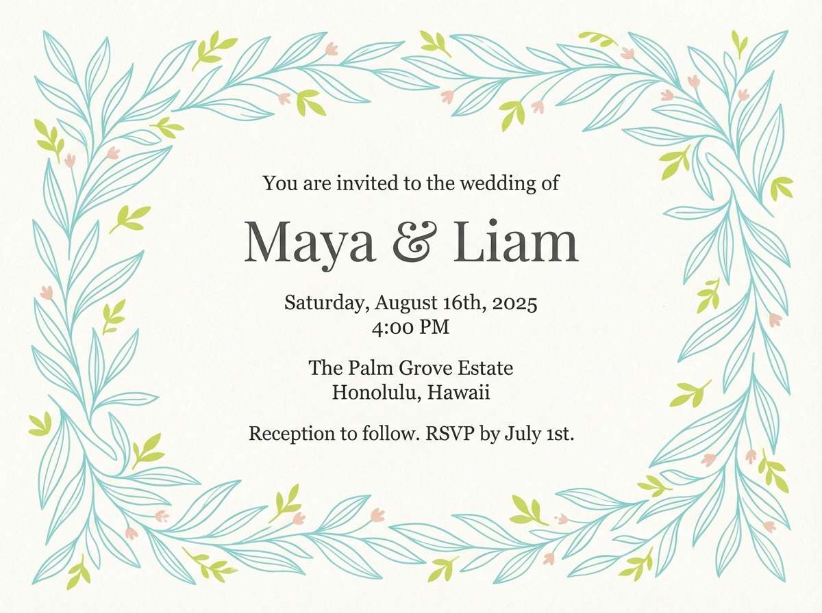
- aqua lime wedding
- fresh circuit
- botanical pop watercolor
- spa serenity
- lime turquoise classroom
- coastal market
- green flash contrast
- citrus lagoon interior
- zen garden refresh
- What Colors Go Well with Turquoise Lime Green?
- How to Use a Turquoise Lime Green Color Palette in Real Designs
- Create Turquoise Lime Green Palette Visuals with AI
Why Turquoise Lime Green Palettes Work So Well
Turquoise brings a cool, watery clarity that feels trustworthy and contemporary, while lime green injects instant “fresh energy.” Together, they balance calm and motion—ideal for brands that want to look clean but not boring.
This duo also performs well across digital products because turquoise can handle larger UI surfaces, and lime can act as a precise attention magnet for CTAs, progress, and key metrics. That division of labor helps keep screens readable.
Finally, turquoise and lime pair naturally with strong neutrals (near-black, slate, off-white), making it easier to control contrast for accessibility and print consistency.
20+ Turquoise Lime Green Color Palette Ideas (with HEX Codes)
1) Lagoon Lime Splash
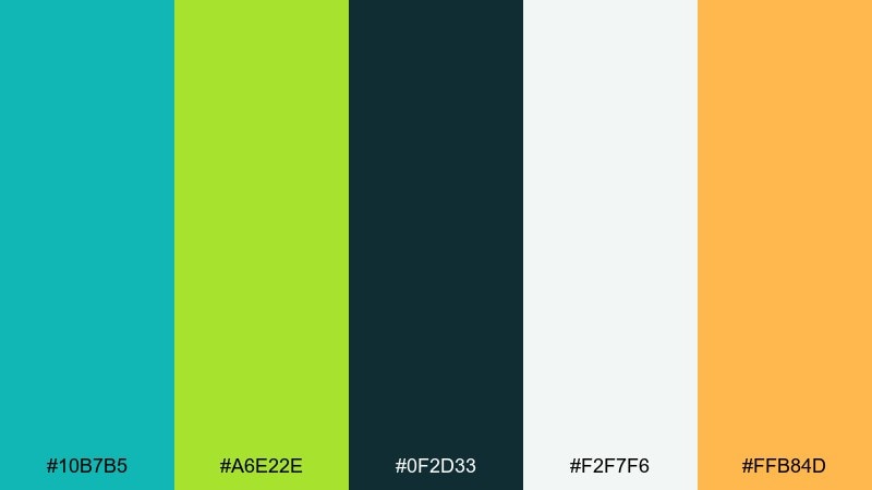
HEX: #10b7b5 #a6e22e #0f2d33 #f2f7f6 #ffb84d
Mood: energizing and tropical
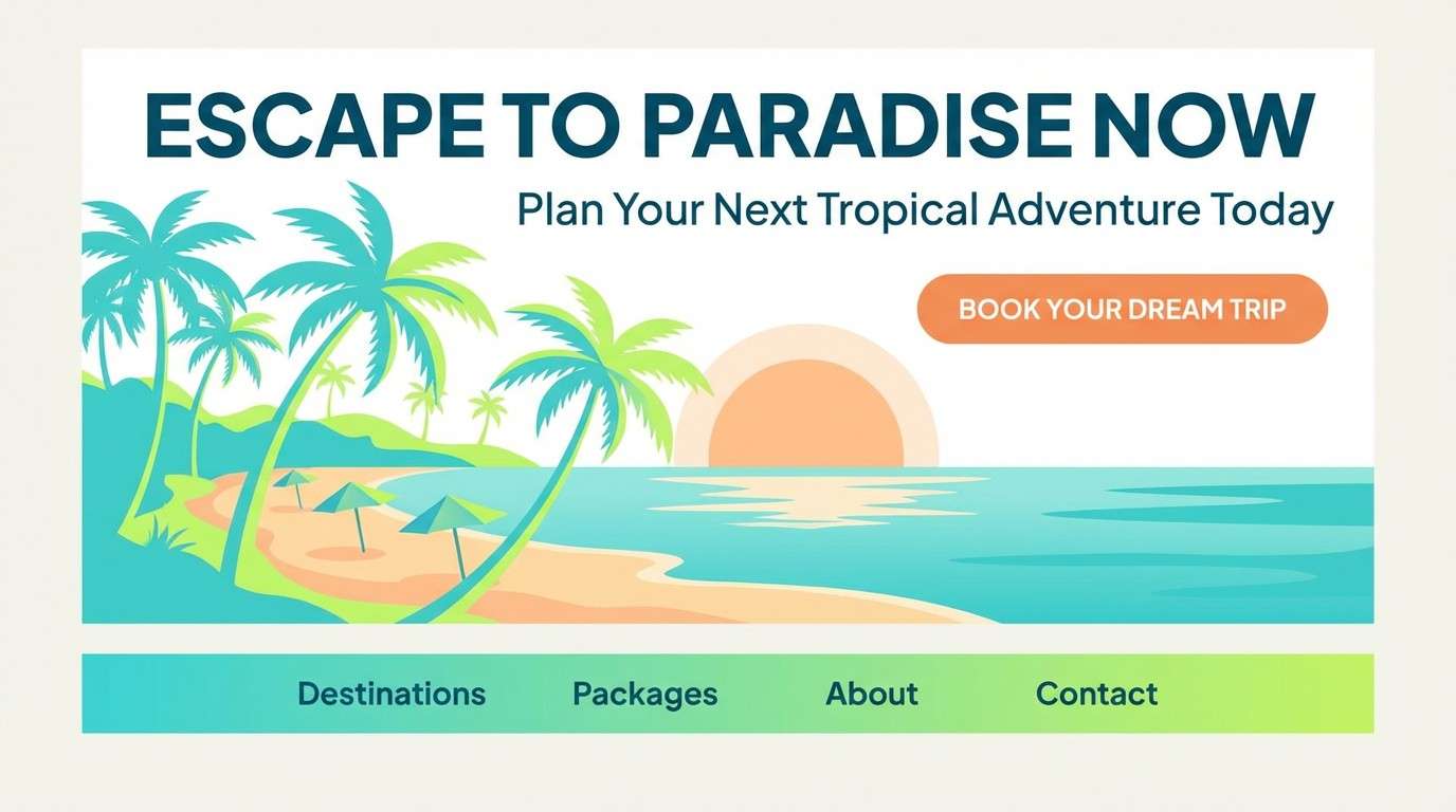
Best for: travel landing page hero
Energizing and tropical, it feels like sunlit water with a zing of citrus. Use the deep teal for headings and navigation, then let the lime handle key buttons and highlights. The off-white keeps layouts airy while the warm mango accent adds a friendly callout color. Tip: reserve lime for one primary action per screen to avoid visual noise.
Image example of lagoon lime splash generated using media.io
Media.io is an online AI studio for creating and editing video, image, and audio in your browser.

2) Seafoam Citrus Clean
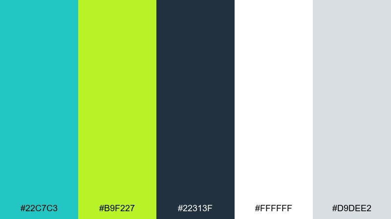
HEX: #22c7c3 #b9f227 #22313f #ffffff #d9dee2
Mood: fresh and minimal
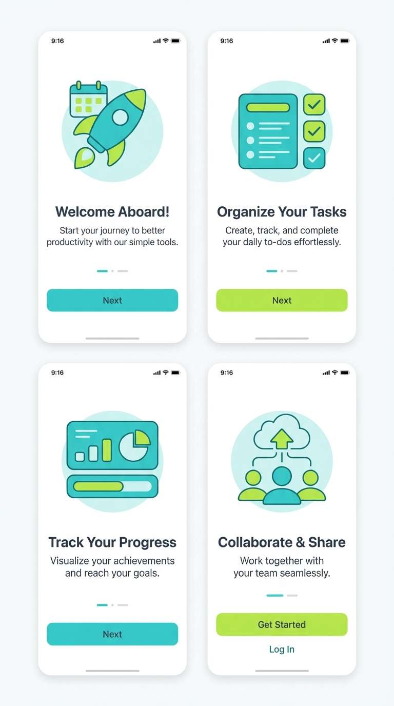
Best for: mobile app onboarding UI
Fresh and minimal, it reads like a cool breeze with a bright citrus kick. Pair the crisp white and soft gray as your main canvas, then use turquoise for surfaces and icons. Keep lime for progress indicators and one standout CTA to guide the eye. Tip: ensure body text stays on the dark slate for accessibility.
Image example of seafoam citrus clean generated using media.io
3) Neon Reef Pop
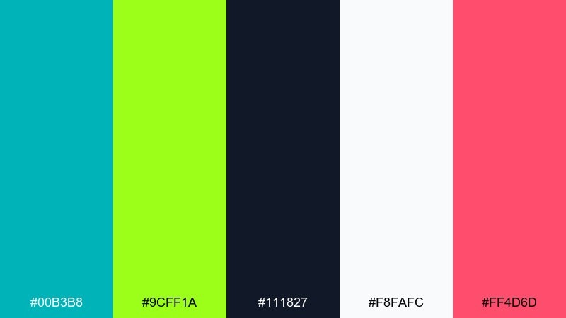
HEX: #00b3b8 #9cff1a #111827 #f8fafc #ff4d6d
Mood: bold and playful
Best for: music festival poster
Bold and playful, it gives neon reef vibes with a punchy candy accent. This turquoise lime green color palette shines on dark backgrounds where the lime can glow without washing out. Use the pink sparingly for artist names or date callouts, and keep body details in near-black for clarity. Tip: try a thick sans serif and generous spacing to avoid over-stimulation.
Image example of neon reef pop generated using media.io

4) Mint Mojito Pastels
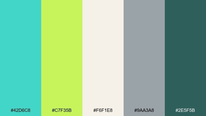
HEX: #42d6c8 #c7f35b #f6f1e8 #9aa3a8 #2e5f5b
Mood: soft and breezy
Best for: wellness blog editorial layout
Soft and breezy, it feels like a chilled drink on a bright patio. The warm cream sets a calm reading surface while turquoise and lime add gentle emphasis for pull quotes and section headers. Use the muted gray for rules and captions, and keep the deep green-teal for body text. Tip: reduce lime saturation in large blocks and save it for highlights.
Image example of mint mojito pastels generated using media.io
5) Tidepool Neon Contrast
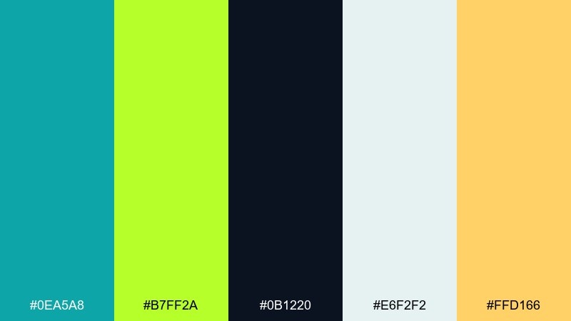
HEX: #0ea5a8 #b7ff2a #0b1220 #e6f2f2 #ffd166
Mood: high-contrast and sporty
Best for: sports team branding kit
High-contrast and sporty, it suggests fast movement and clean water energy. Let the near-black anchor logos and typography, then layer turquoise for core identity shapes. Lime works best as an accent stripe, number outline, or social highlight, while the warm gold is a secondary accent for merch variety. Tip: test the lime on fabric mockups to avoid overly fluorescent printing.
Image example of tidepool neon contrast generated using media.io
6) Aqua Lime Studio
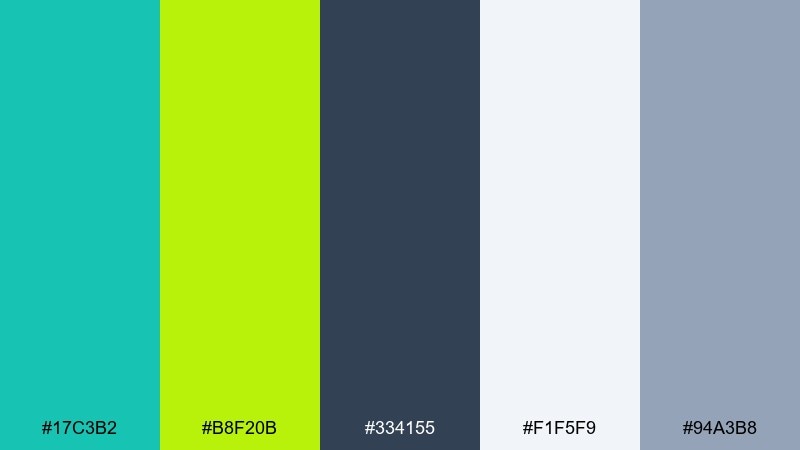
HEX: #17c3b2 #b8f20b #334155 #f1f5f9 #94a3b8
Mood: clean and professional
Best for: SaaS dashboard UI theme
Clean and professional, it feels like a modern workspace with a lively pop of energy. This turquoise lime green color scheme works best when the slate and cool grays handle most surfaces and text. Use turquoise for selected states and charts, then reserve lime for one key metric or alert tier. Tip: keep lime off large backgrounds to maintain a premium look.
Image example of aqua lime studio generated using media.io
7) Citrus Shore Neutrals
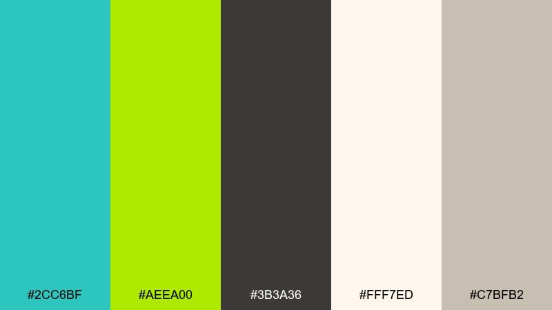
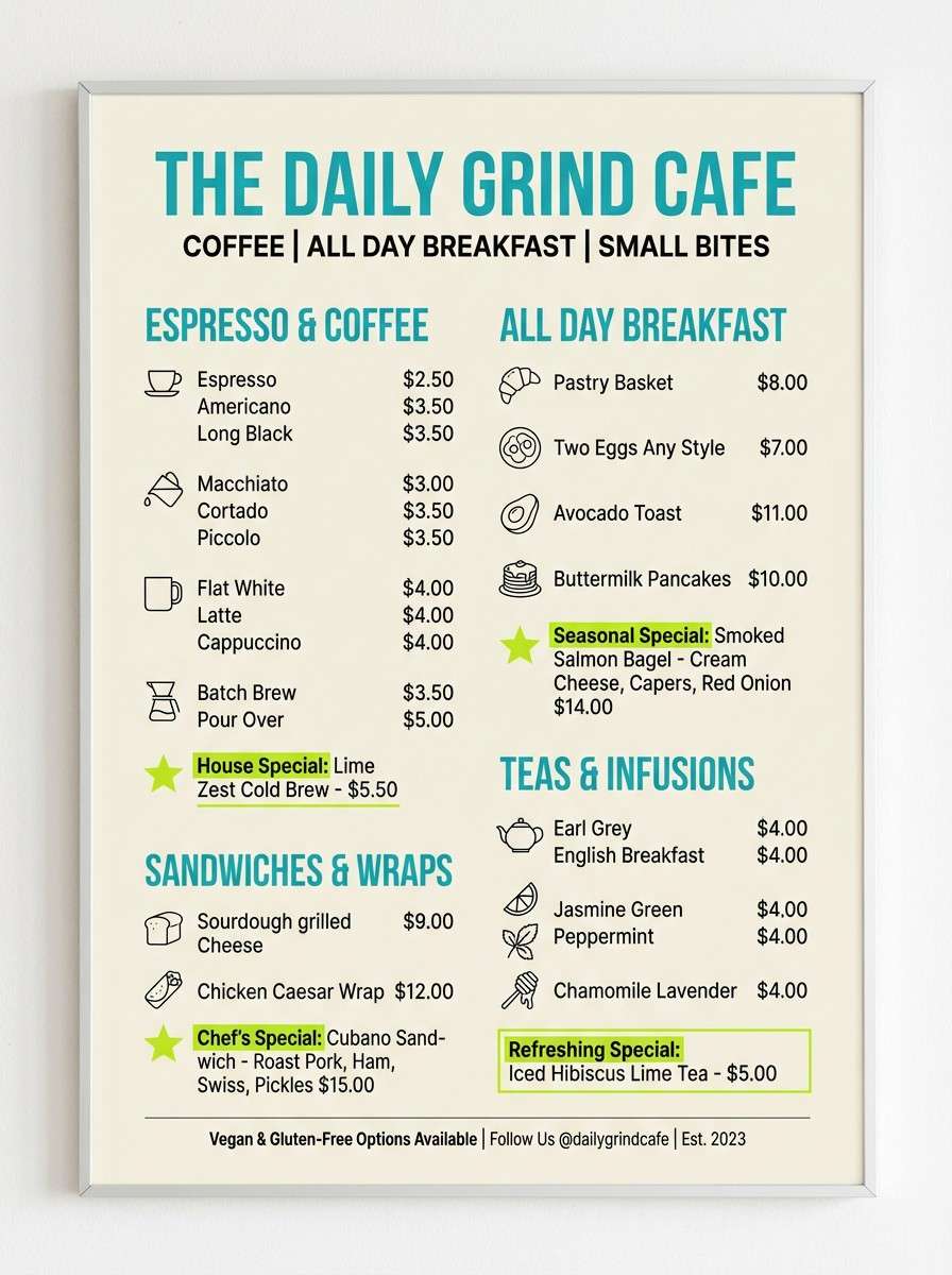
HEX: #2cc6bf #aeea00 #3b3a36 #fff7ed #c7bfb2
Mood: sun-warmed and grounded
Best for: cafe menu design
Sun-warmed and grounded, it blends beachy water tones with cozy cafe neutrals. Use cream as the menu base, charcoal for type, and turquoise for section headers or icons. Lime works beautifully for price highlights and seasonal badges without screaming. Tip: add subtle line art in taupe to keep the layout textured but calm.
Image example of citrus shore neutrals generated using media.io
8) Palm Leaf Brights
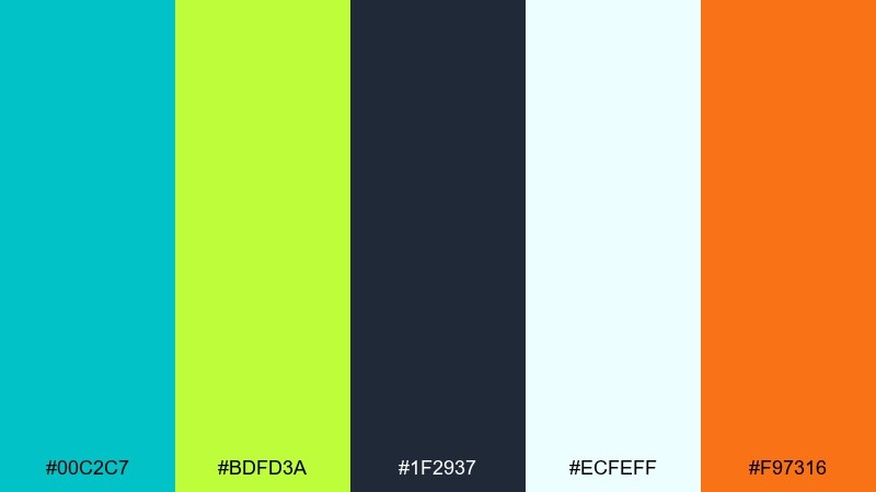
HEX: #00c2c7 #bdfd3a #1f2937 #ecfeff #f97316
Mood: vacation-bright and friendly
Best for: beach resort brochure cover
Vacation-bright and friendly, it evokes palm shade, clear water, and a splash of sunset. Use the pale aqua as a light background, then set bold turquoise blocks for headlines and imagery frames. Lime is perfect for booking stickers or amenity icons, while the orange adds a warm secondary accent. Tip: keep orange to small badges so the palette stays ocean-first.
Image example of palm leaf brights generated using media.io
9) Electric Garden Mix
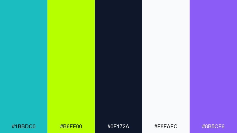
HEX: #1bbdc0 #b6ff00 #0f172a #f8fafc #8b5cf6
Mood: creative and techy
Best for: social media quote template
Creative and techy, it feels like glowing leaves under city lights. The turquoise and lime read as the main duo, while violet can be a rare highlight for hashtags or brand marks. If you want turquoise lime green color combinations that still feel modern, keep the background near-white and set most type in deep navy. Tip: choose either lime or violet per post so the feed stays consistent.
Image example of electric garden mix generated using media.io

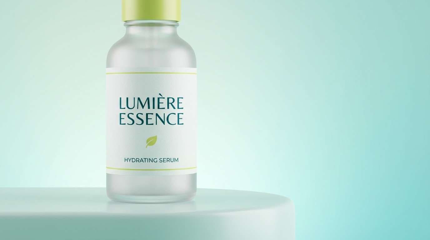
10) Limewave Gradient
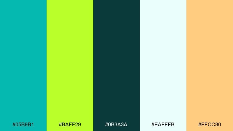
HEX: #05b9b1 #baff29 #0b3a3a #eafffb #ffcc80
Mood: smooth and optimistic
Best for: beauty product ad banner
Smooth and optimistic, it suggests a glossy gradient over clean, hydrated skin. Use turquoise as the main field color and let lime appear in small, sharp highlights for a modern punch. The deep teal anchors typography and the pale mint keeps the overall ad light and breathable. Tip: use a subtle gradient from mint to turquoise to avoid harsh transitions.
Image example of limewave gradient generated using media.io
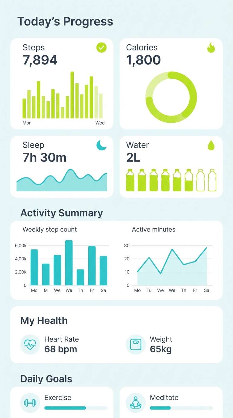
11) Cool Sprout Balance
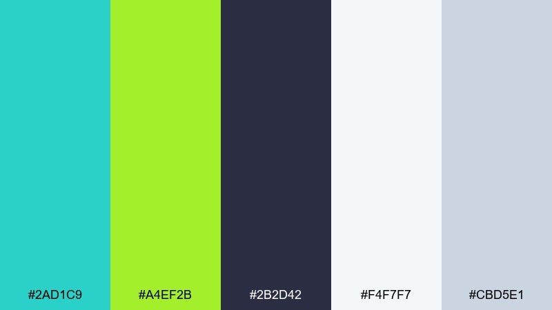
HEX: #2ad1c9 #a4ef2b #2b2d42 #f4f7f7 #cbd5e1
Mood: calm and balanced
Best for: health app dashboard UI
Calm and balanced, it brings to mind clear water and fresh sprouts. The near-white and soft steel gray keep the interface breathable, while turquoise creates trustworthy emphasis for charts. Lime is best used for positive status states like goals met or streaks, not general decoration. Tip: keep icons monochrome in the dark slate and color only the data points.
Image example of cool sprout balance generated using media.io
12) Tropical Chalkboard
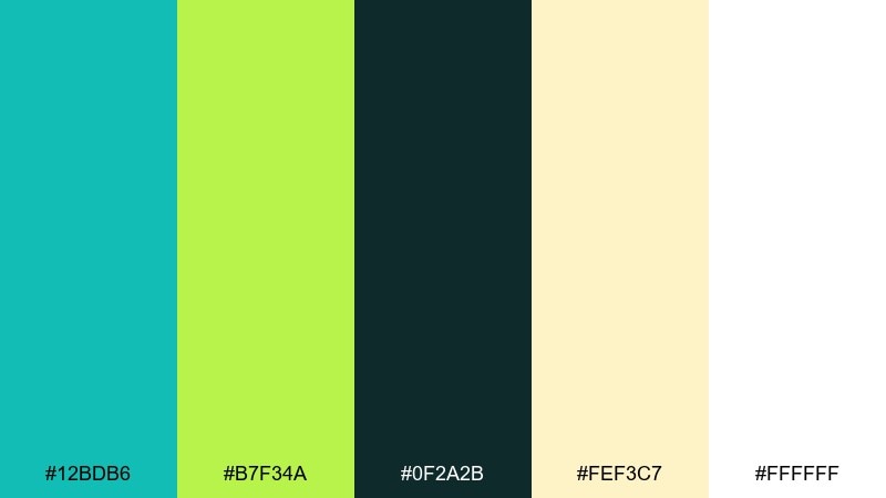
HEX: #12bdb6 #b7f34a #0f2a2b #fef3c7 #ffffff
Mood: fun and handcrafted
Best for: summer event flyer
Fun and handcrafted, it feels like bright paint on a chalkboard sign by the beach. Use the dark green-black as the main field so turquoise and lime can pop with crisp readability. The soft butter tone warms up secondary info blocks, while white keeps text sharp. Tip: keep the layout simple with two typefaces to maintain that handmade charm.
Image example of tropical chalkboard generated using media.io

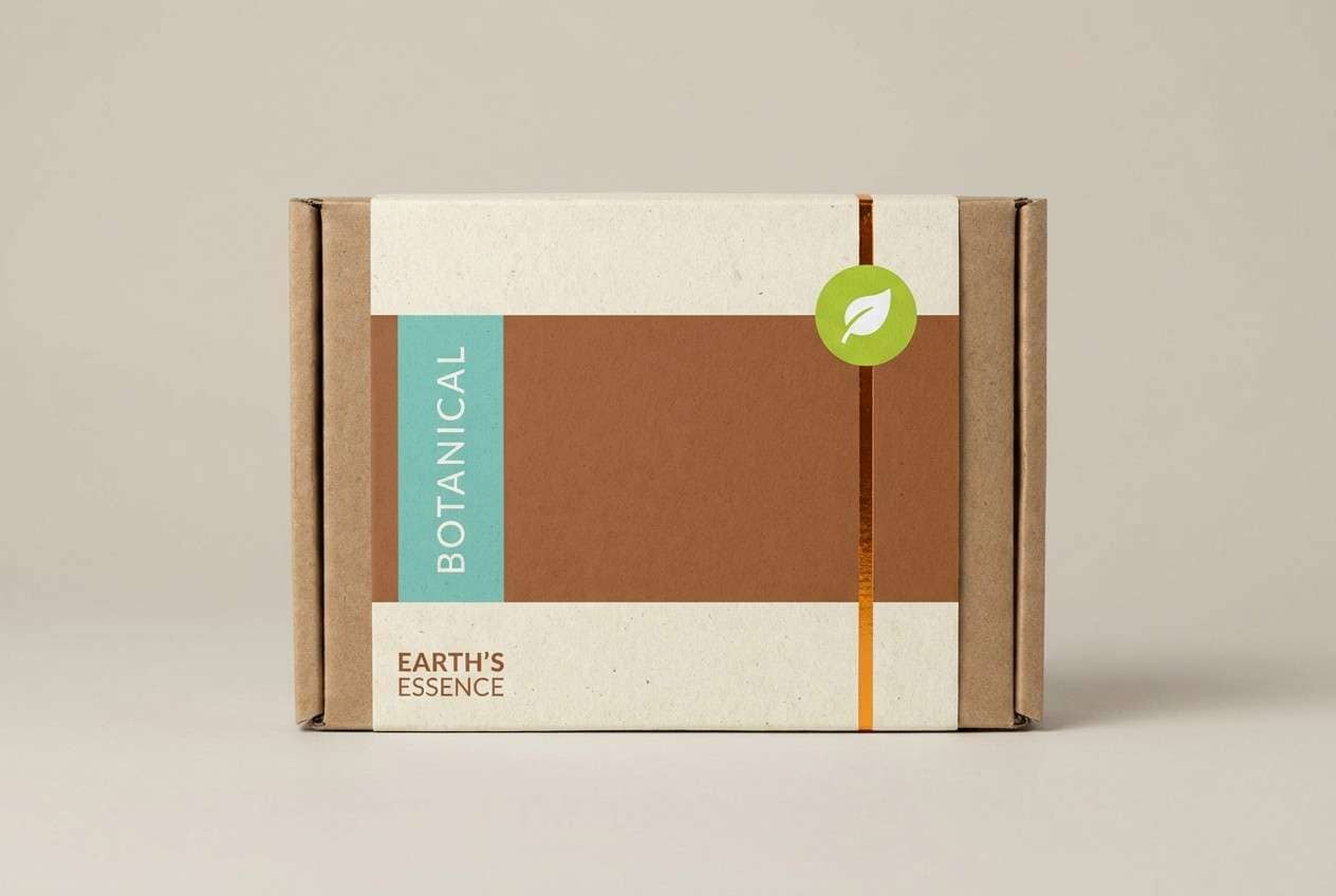
13) Citrus Clay Earth
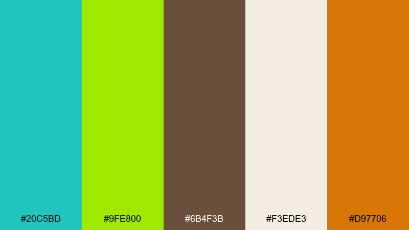
HEX: #20c5bd #9fe800 #6b4f3b #f3ede3 #d97706
Mood: earthy with a bright twist
Best for: eco-friendly packaging label
Earthy with a bright twist, it pairs natural clay warmth with clean aquatic freshness. Cream and brown create a sustainable, tactile base, while turquoise adds trust and modernity. Lime works best as a small certification badge or flavor marker, and amber can highlight key benefits. Tip: print on uncoated stock to keep the eco feel authentic.
Image example of citrus clay earth generated using media.io
14) Aqua Lime Wedding
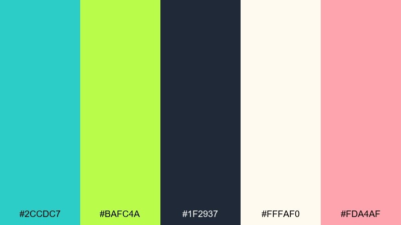
HEX: #2ccdc7 #bafc4a #1f2937 #fffaf0 #fda4af
Mood: romantic and modern
Best for: tropical wedding invitation
Romantic and modern, it reads like ocean glass with fresh greenery and a blush detail. Use the warm ivory as the invitation base, then set typography in deep charcoal for elegance. Turquoise can frame monograms or borders, while lime becomes a subtle leaf motif or RSVP accent. Tip: keep blush limited to tiny florals so it stays airy, not candy-like.
Image example of aqua lime wedding generated using media.io
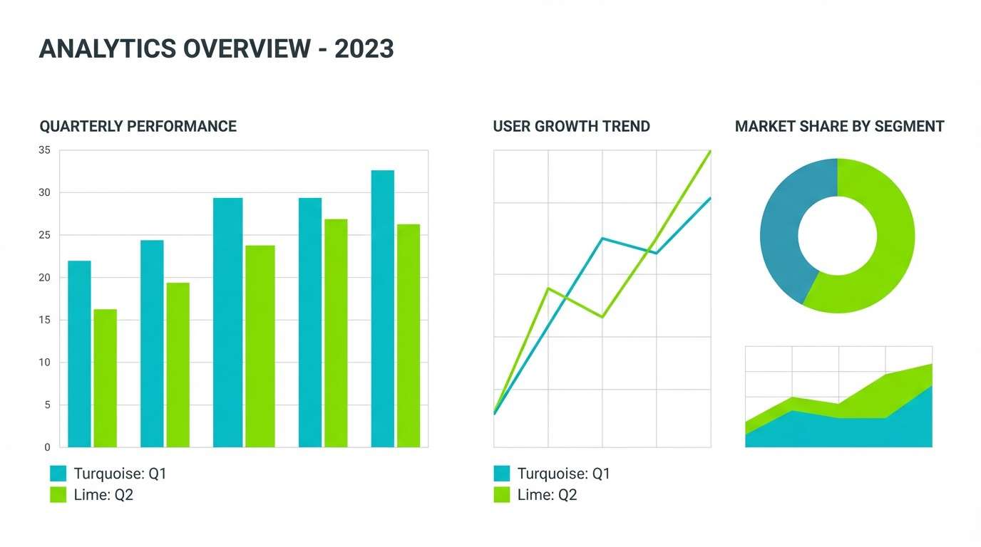
15) Fresh Circuit
HEX: #00c4bf #b2ff3b #0a0f1c #e2e8f0 #22c55e
Mood: crisp and futuristic
Best for: data visualization theme
Crisp and futuristic, it resembles glowing indicators on a clean control panel. This turquoise lime green color palette is ideal for charts where you need two standout series plus a clear baseline. Use near-black for axes and labels, light gray for gridlines, and bring in the extra green only for secondary success states. Tip: avoid using lime for negative values so meaning stays intuitive.
Image example of fresh circuit generated using media.io
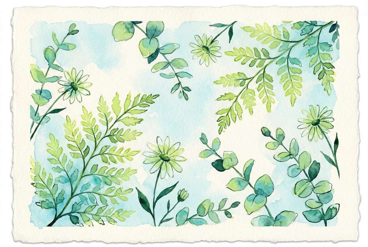
16) Botanical Pop Watercolor
HEX: #2ac7c2 #bdfb5a #14532d #f7f3ea #7dd3fc
Mood: lush and artistic
Best for: botanical illustration set
Lush and artistic, it feels like watercolor leaves and cool pond reflections. Use the cream paper tone as your background, then build foliage layers with lime and deep green. Turquoise adds watery shadows and modern contrast, while the pale sky blue can be a soft wash behind plants. Tip: keep edges slightly imperfect to preserve the hand-painted look.
Image example of botanical pop watercolor generated using media.io
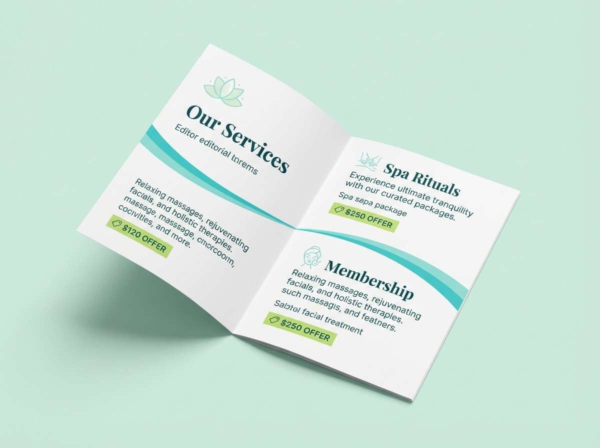
17) Spa Serenity
HEX: #34d1cc #a7f02a #0f3d3e #f0fdfa #d1d5db
Mood: soothing and restorative
Best for: spa brochure inside pages
Soothing and restorative, it evokes eucalyptus steam and fresh, clean towels. Use the pale mint as the main page background and set text in deep teal for a relaxed premium feel. Turquoise can underline section titles, while lime works best for small offer tags or appointment highlights. Tip: keep plenty of whitespace so the colors feel like accents, not noise.
Image example of spa serenity generated using media.io
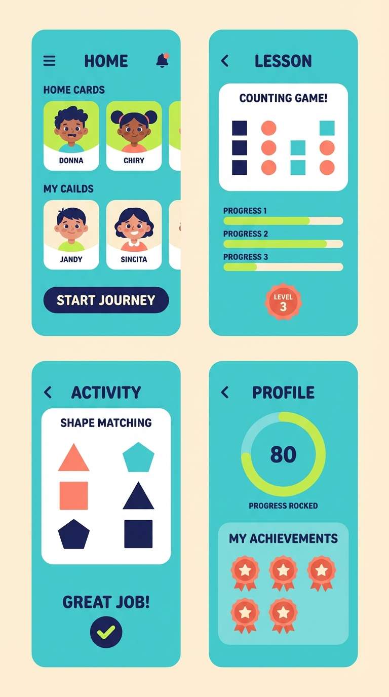
18) Lime Turquoise Classroom
HEX: #19c2bc #b9ff4d #1e293b #fff7ed #fb7185
Mood: cheerful and approachable
Best for: kids learning app UI
Cheerful and approachable, it feels like bright markers on a clean worksheet. Use the warm cream as the base so the turquoise panels feel friendly, not cold. Lime is great for correct states and progress rewards, while the coral pink can highlight characters or badges. Tip: keep text in deep navy to stay readable for younger users.
Image example of lime turquoise classroom generated using media.io
19) Coastal Market
HEX: #00bfc0 #a8ef15 #3f3f46 #fafafa #f59e0b
Mood: bright and commercial
Best for: product promo poster
Bright and commercial, it looks like coastal signage with a sunny sale tag. Turquoise can hold big product blocks, while lime makes a sharp discount callout that is hard to miss. Use dark gray for pricing and details, and keep the background near-white for a clean retail vibe. Tip: pair lime with the amber only in small areas to prevent competing highlights.
Image example of coastal market generated using media.io

20) Green Flash Contrast
HEX: #24c7c0 #b2ff2e #111827 #f9fafb #06b6d4
Mood: sharp and modern
Best for: startup pitch deck slides
Sharp and modern, it feels like a clean spotlight with a quick electric flash. Use white for most slide space, then build consistent headers in near-black and turquoise. If you need a turquoise lime green color combination that reads instantly on projectors, keep lime to one highlight per slide such as growth numbers. Tip: avoid thin lines in lime and use solid shapes for better visibility.
Image example of green flash contrast generated using media.io

21) Citrus Lagoon Interior
HEX: #27cfc9 #b6f23d #2d3748 #f5f5f4 #a3a3a3
Mood: airy and contemporary
Best for: interior design mood board
Airy and contemporary, it suggests light-filled rooms with a playful plant accent. Use the soft off-white as the main board paper, then place turquoise as the statement tile or upholstery swatch. Lime works best as a small botanical accent, balanced by the cool grays and slate for structure. Tip: keep lime in textures like fabric or foliage, not large painted walls.
Image example of citrus lagoon interior generated using media.io
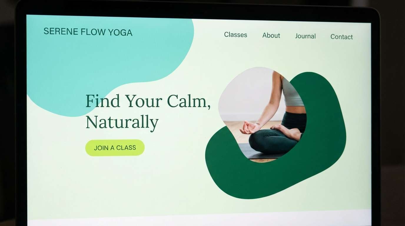
22) Zen Garden Refresh
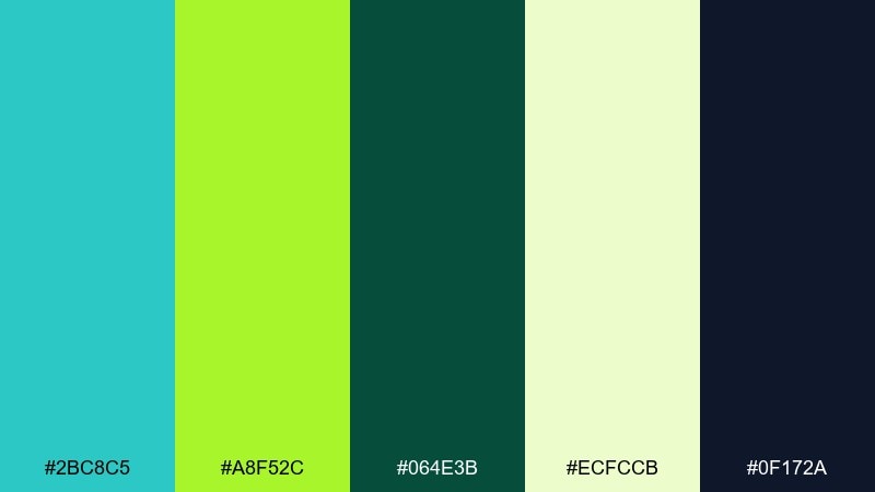
HEX: #2bc8c5 #a8f52c #064e3b #ecfccb #0f172a
Mood: calm and revitalizing
Best for: yoga studio website header
Calm and revitalizing, it feels like a quiet garden after rain with new growth. Turquoise and deep green create a grounded, wellness-forward base, while lime adds a fresh lift for buttons or class highlights. The light herbal tint can soften sections without turning them gray. Tip: use lime only on interactive elements so the page stays meditative.
Image example of zen garden refresh generated using media.io
What Colors Go Well with Turquoise Lime Green?
Neutrals are the easiest partners: near-black, charcoal, slate, and cool grays keep turquoise and lime from feeling too loud while improving readability for UI and editorial layouts. Off-whites and warm ivories soften the palette for lifestyle brands.
For accents, warm hues like mango, amber, and soft coral add friendliness and help separate “highlight” from “action.” If you want a techy edge, try a tiny amount of violet or electric blue—but keep it minimal so lime remains the primary attention color.
For nature-forward branding, deep greens and earthy browns ground the brightness and translate well to packaging and print stocks.
How to Use a Turquoise Lime Green Color Palette in Real Designs
Assign roles: use turquoise for primary brand surfaces (headers, cards, shapes), and keep lime as a functional accent (CTA, badges, success states). This prevents lime from overpowering and makes layouts easier to scan.
Prioritize contrast and accessibility by placing body text on dark slate/near-black or on light backgrounds, and testing lime-on-white carefully (it often needs a darker outline or larger type). In print, do a proof for lime-heavy elements to avoid unexpected fluorescence shifts.
In branding systems, build a simple hierarchy: 1 primary (turquoise), 1 action highlight (lime), 1 text neutral (charcoal), 1 background (off-white), and 1 optional accent (warm orange/coral) for campaigns.
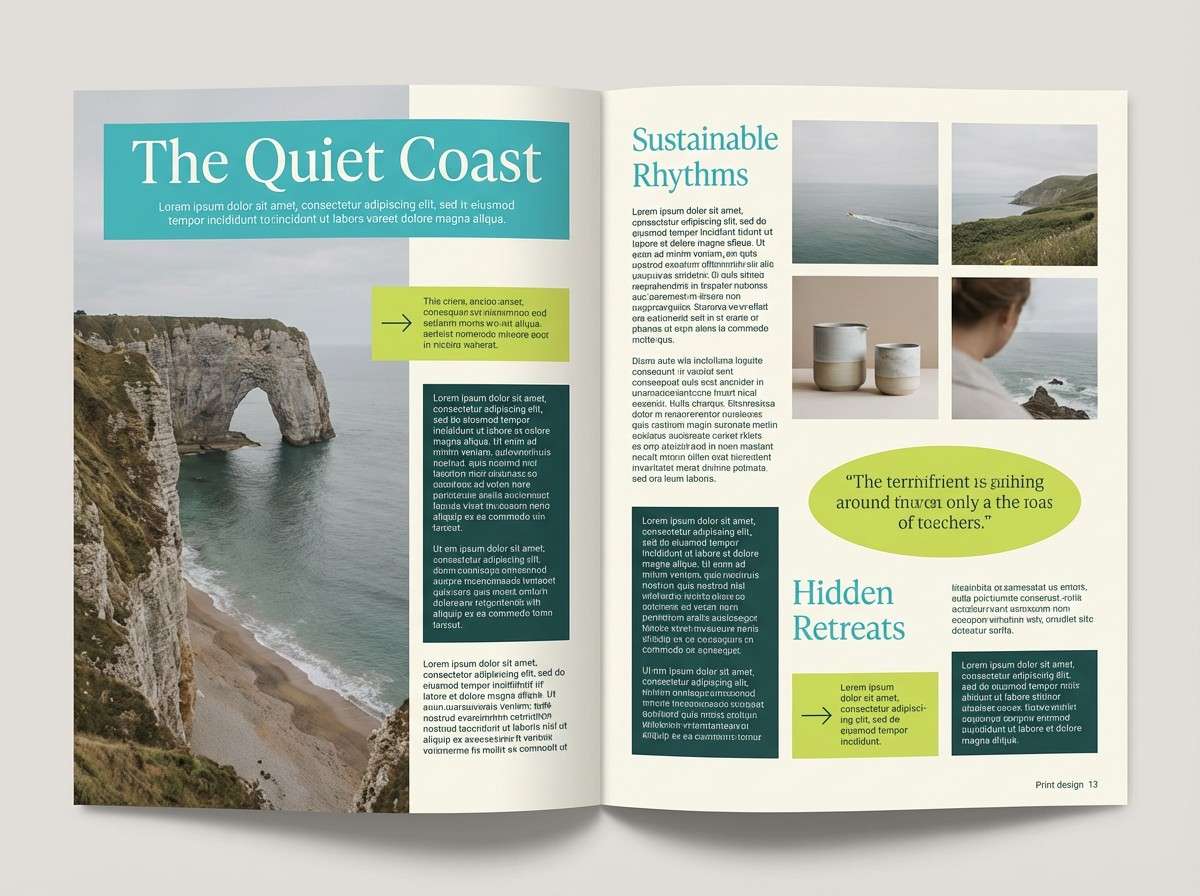
Create Turquoise Lime Green Palette Visuals with AI
If you already have HEX codes, you can quickly generate matching visuals (posters, UI mockups, ads, and packaging scenes) by describing the layout and specifying turquoise and lime as the dominant colors.
For consistent results, mention your style (flat vector, editorial print, realistic studio shot), add contrast guidance (dark slate text, off-white background), and keep lime limited to the focal element.
Use Media.io to turn palette ideas into ready-to-share design examples in minutes.
Turquoise Lime Green Color Palette FAQs
-
What vibe does a turquoise lime green color palette create?
It typically feels fresh, energetic, and modern—like clean water paired with bright new growth. Depending on your neutrals, it can skew sporty (dark backgrounds) or minimal/spa-like (soft whites and mints). -
Is turquoise and lime green a good combination for branding?
Yes, especially for wellness, travel, tech, and eco-forward brands. Use turquoise as the core brand color and lime as a controlled accent for CTAs, labels, or signature highlights. -
What text color works best on turquoise and lime backgrounds?
For readability, use near-black/charcoal on light backgrounds and white or off-white on darker turquoise/teal fields. Avoid long paragraphs set directly on lime; reserve lime for short labels or buttons. -
How do I keep lime green from looking too neon?
Limit lime to small areas (one primary action per screen or one callout per poster) and balance it with calm neutrals like slate, cool gray, and off-white. In print, test proofs because lime can shift brighter than expected. -
What accent colors pair well with turquoise lime green?
Warm accents like mango, amber, or soft coral add friendly contrast. For a more futuristic look, a tiny amount of violet or electric blue can work—just keep it secondary so the palette doesn’t compete for attention. -
Can I use turquoise lime green palettes for UI design?
Absolutely. Turquoise is great for surfaces, icons, and selected states, while lime works well for progress, success, and primary CTAs. Pair with a dark slate text color to maintain accessibility. -
How can I generate turquoise lime green design mockups quickly?
Use an AI image generator and describe your layout (e.g., dashboard UI, poster, packaging), then specify turquoise and lime as dominant colors and include your HEX codes when possible for consistency.


