

Dodger Blue (#1e90ff) is a high-energy, high-clarity blue that reads as modern, sporty, and digital-first. It’s bold enough to lead a brand color system, yet flexible enough to play well with neutrals, pastels, and deep navies.
Below are curated dodger blue color palette ideas with HEX codes, plus practical pairing tips and AI-ready prompts you can use to generate matching visuals fast.
In this article
- Why Dodger Blue Palettes Work So Well
-
- coastal dodgers
- city neon night
- citrus pop
- minimal ui calm
- powder sky pastels
- ink and ice
- retro court
- tech gradient
- ocean slate
- spring botanical wash
- luxury navy gold
- sunset boardwalk
- monochrome blues
- corporate clean
- kids learning brights
- arctic adventure
- streetwear contrast
- wedding something blue
- gaming hud
- calm interior accent
- What Colors Go Well with Dodger Blue?
- How to Use a Dodger Blue Color Palette in Real Designs
- Create Dodger Blue Palette Visuals with AI
Why Dodger Blue Palettes Work So Well
Dodger Blue is naturally attention-grabbing, which makes it ideal for UI highlights, sports graphics, and branding accents where you need instant visibility. It stays legible on both light and dark backgrounds when paired with the right supporting tones.
It also scales across moods: combine it with charcoal and midnight navy for a sleek, high-contrast look, or soften it with powder pastels and warm off-whites for friendly lifestyle designs.
Because it sits in a familiar “trust” zone of blues, it’s easy to use in professional contexts—while still feeling fresher and more energetic than standard corporate navy.
20+ Dodger Blue Color Palette Ideas (with HEX Codes)
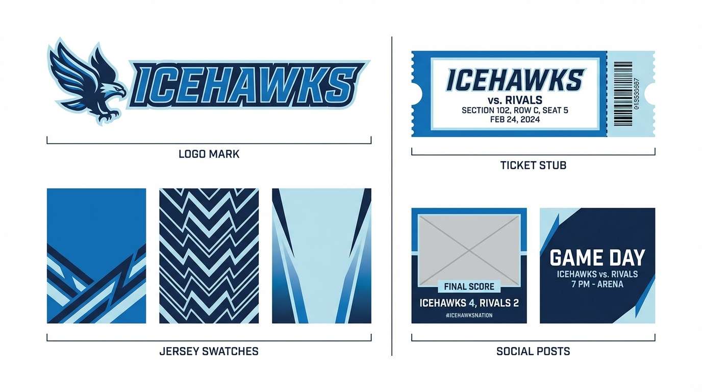
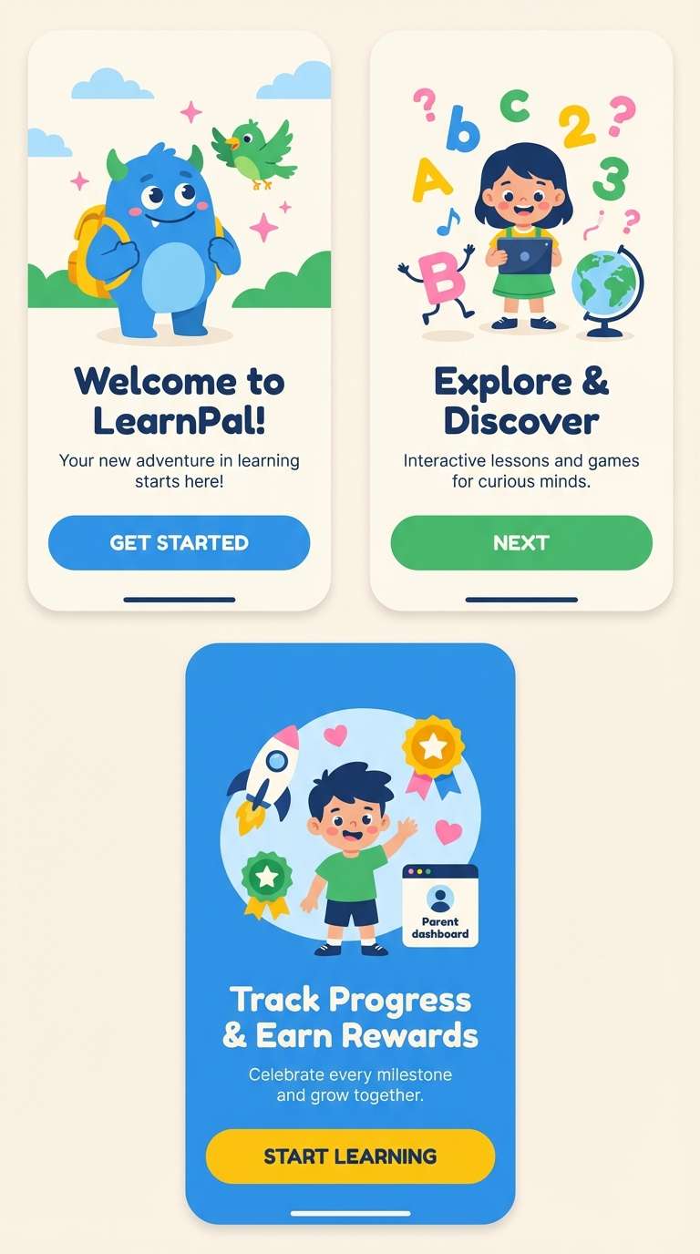
1) Coastal Dodgers
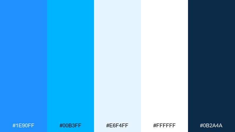
HEX: #1e90ff #00b3ff #e6f4ff #ffffff #0b2a4a
Mood: breezy, sporty, confident
Best for: sports team branding board and social templates
Breezy stadium energy meets crisp ocean air in this punchy mix of blue and deep navy. It works beautifully for a dodger blue color palette built for jerseys, matchday posters, and social headers. Pair the bright blues with plenty of white space to keep it clean, then anchor everything with the dark navy for readability. Tip: use the light ice-blue as a background tint for stats cards and schedules.
Image example of coastal dodgers generated using media.io
Media.io is an online AI studio for creating and editing video, image, and audio in your browser.

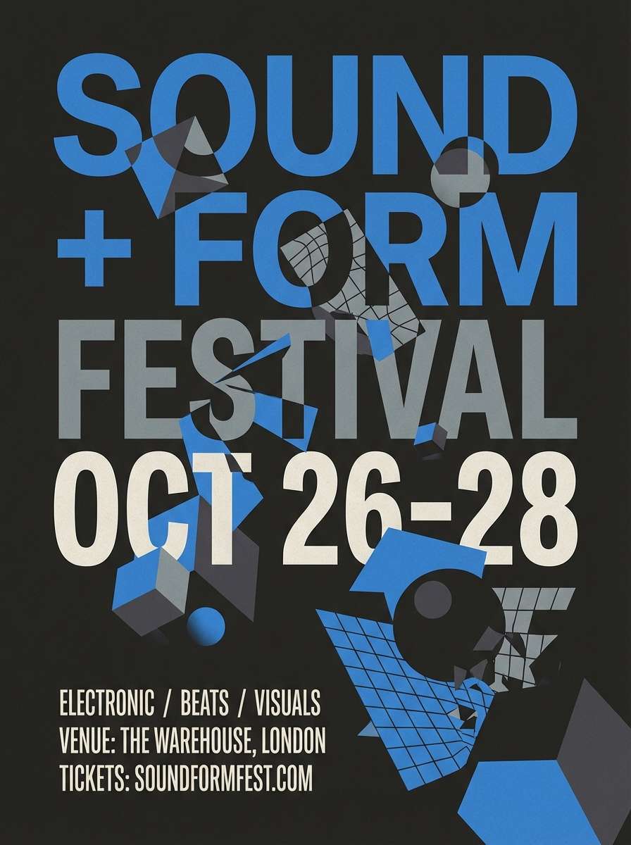
2) City Neon Night
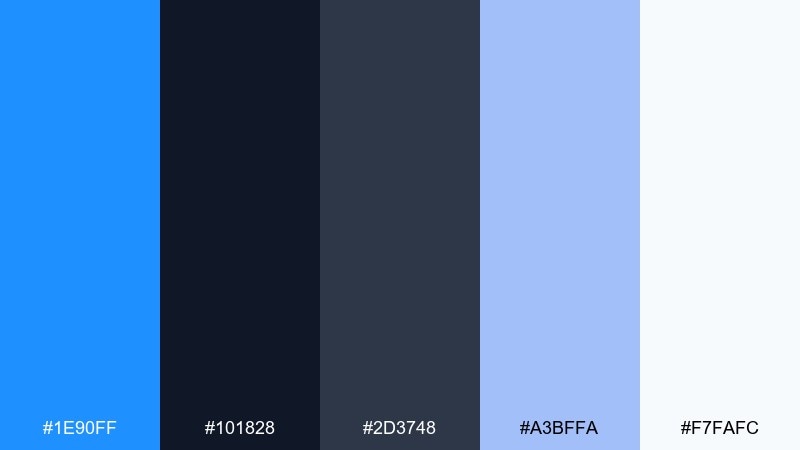
HEX: #1e90ff #101828 #2d3748 #a3bffa #f7fafc
Mood: urban, sleek, electric
Best for: music event poster on a plain background
Electric nightlife vibes come through with bright blue against inky charcoal and steel gray. The palette feels modern and sharp, ideal for bold headlines and high-contrast layouts. Keep the background dark for drama, then let the blue and periwinkle carry the spotlight elements. Tip: reserve the off-white for small text blocks so the design stays readable without losing the night mood.
Image example of city neon night generated using media.io
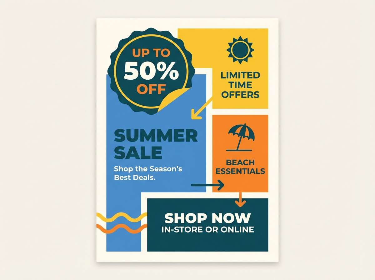
3) Citrus Pop
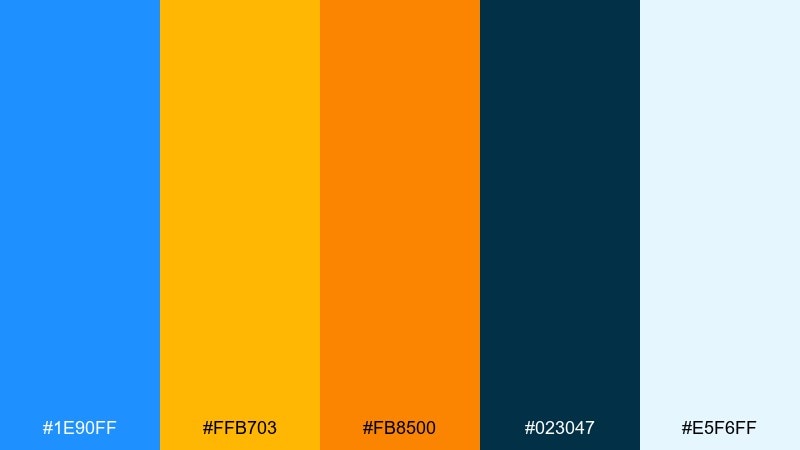
HEX: #1e90ff #ffb703 #fb8500 #023047 #e5f6ff
Mood: sunny, energetic, playful
Best for: product promo flyer for a summer sale
Sunny and punchy like a beachside snack bar, these tones feel instantly upbeat. The dodger blue color combinations with citrus gold and orange are perfect for promos that need urgency without looking harsh. Use the deep teal-navy for headings, then alternate blue and orange for buttons, badges, and price tags. Tip: keep the pale sky tint behind copy so the warm accents do not overpower the message.
Image example of citrus pop generated using media.io
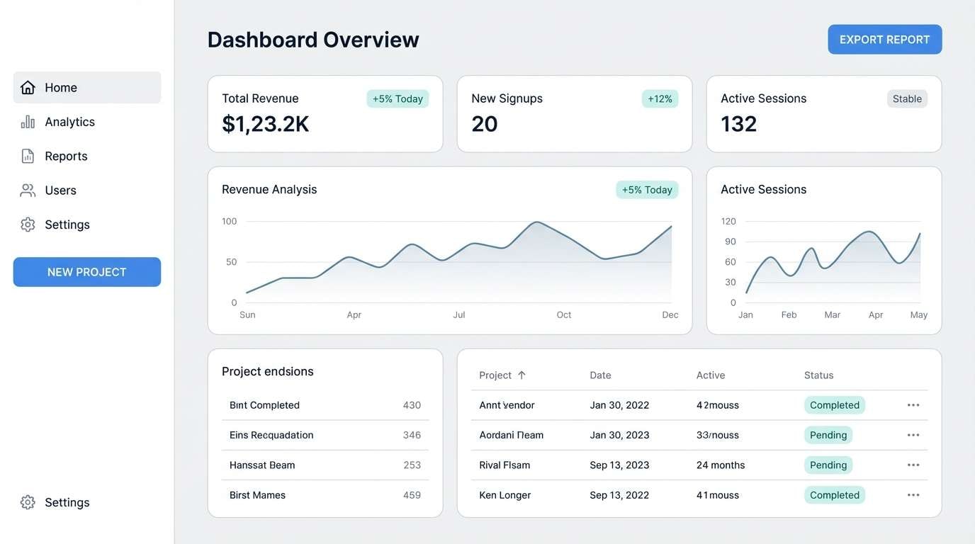
4) Minimal UI Calm
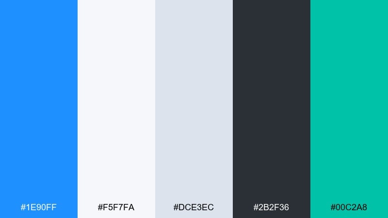
HEX: #1e90ff #f5f7fa #dce3ec #2b2f36 #00c2a8
Mood: clean, quiet, trustworthy
Best for: 2d SaaS dashboard UI mockup
Quiet clarity like a well-lit workspace gives this set a polished, dependable feel. As a dodger blue color scheme, it shines in dashboards where hierarchy and contrast matter more than decoration. Pair the blue for primary actions with soft grays for surfaces, and use the teal sparingly as a status highlight. Tip: keep charts mostly monochrome and use blue only for the key metric to avoid visual noise.
Image example of minimal ui calm generated using media.io
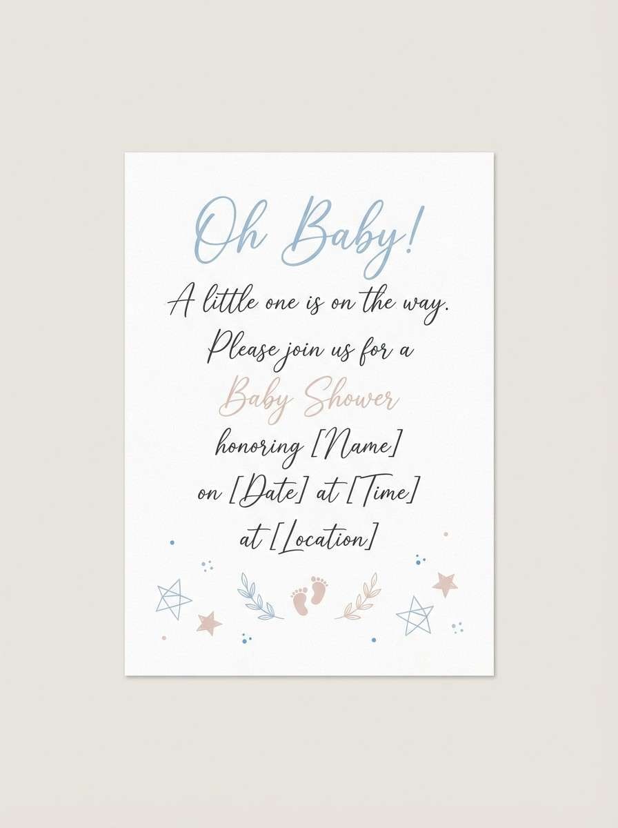
5) Powder Sky Pastels
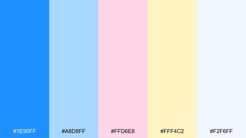
HEX: #1e90ff #a8d8ff #ffd6e8 #fff4c2 #f2f6ff
Mood: soft, dreamy, uplifting
Best for: baby shower invitation card
Soft and airy like a pastel sky after rain, this mix feels gentle without losing brightness. It is ideal for invitations, stationery, and sweet lifestyle branding where the mood should stay light. Balance the saturated blue with powder tones so the composition remains calm and friendly. Tip: use the buttery yellow for small dividers or icons to keep the layout warm and cohesive.
Image example of powder sky pastels generated using media.io
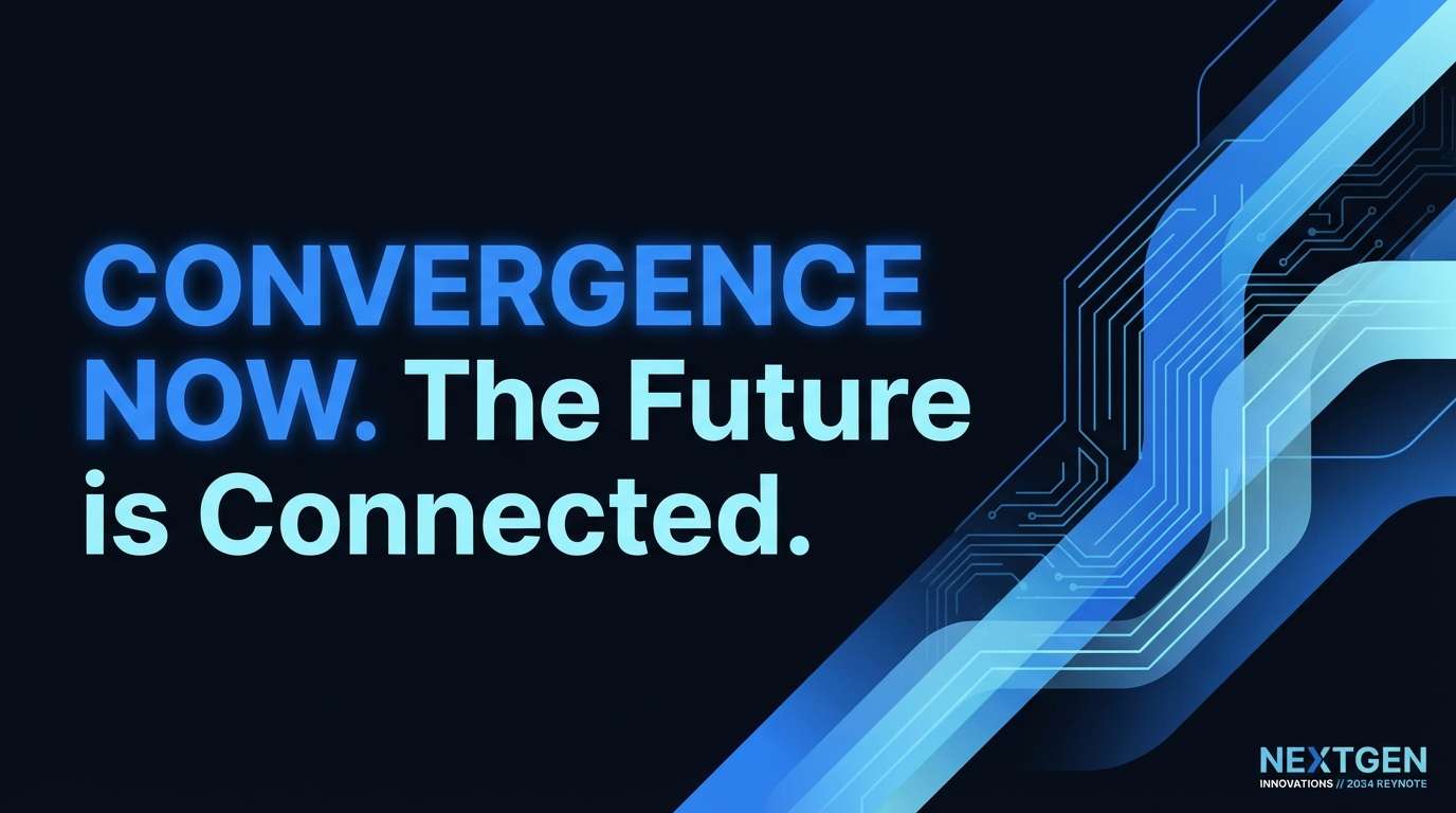
6) Ink and Ice
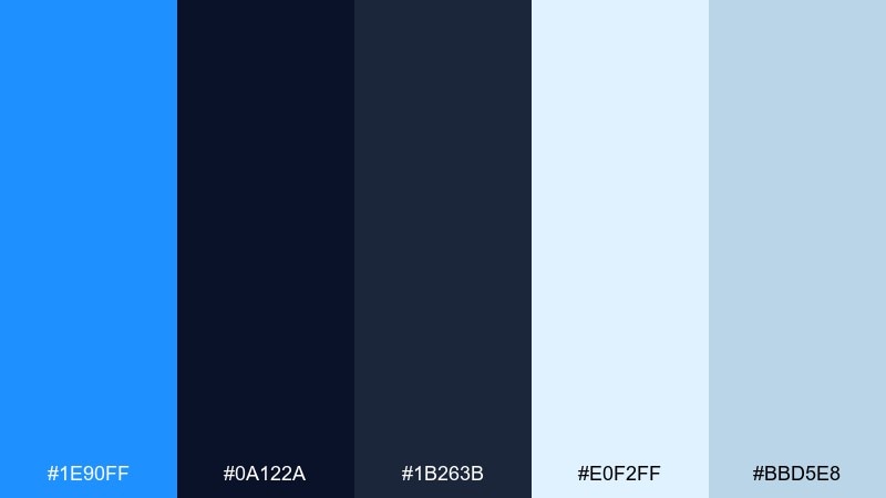
HEX: #1e90ff #0a122a #1b263b #e0f2ff #bbd5e8
Mood: bold, crisp, dramatic
Best for: tech keynote slide deck cover
Crisp winter air and dark ink shadows give this set a confident, high-end edge. The contrast makes it a strong dodger blue color palette for presentations, pitch decks, and product announcements. Pair the bright blue with the near-black navy for striking titles, and let the icy tints soften secondary sections. Tip: keep gradients subtle and use the ice blue as a spotlight behind key numbers.
Image example of ink and ice generated using media.io
7) Retro Court
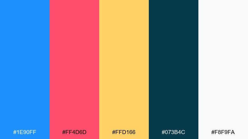
HEX: #1e90ff #ff4d6d #ffd166 #073b4c #f8f9fa
Mood: retro, fun, high-impact
Best for: streetwear t-shirt graphic design
Retro court vibes with candy-bright accents make this mix feel energetic and nostalgic. These dodger blue color combinations pop on apparel, stickers, and bold social graphics, especially when you keep shapes chunky and simple. Pair the hot pink and warm yellow as small hits against the deeper teal for balance. Tip: print the blue as the main block color and use the off-white only for outlines and type.
Image example of retro court generated using media.io
8) Tech Gradient
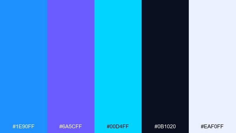
HEX: #1e90ff #6a5cff #00d4ff #0b1020 #eaf0ff
Mood: futuristic, glossy, fast
Best for: landing page hero UI mockup
Futuristic glow and smooth transitions give these blues a sleek, high-tech feel. It is a great choice for startup websites and app launches that need speed and clarity. Use the indigo and cyan for controlled gradients, then ground the layout with the deep midnight background. Tip: keep CTAs in solid dodger blue so they do not get lost inside the gradient effects.
Image example of tech gradient generated using media.io
9) Ocean Slate
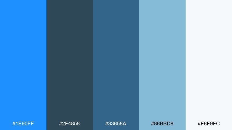
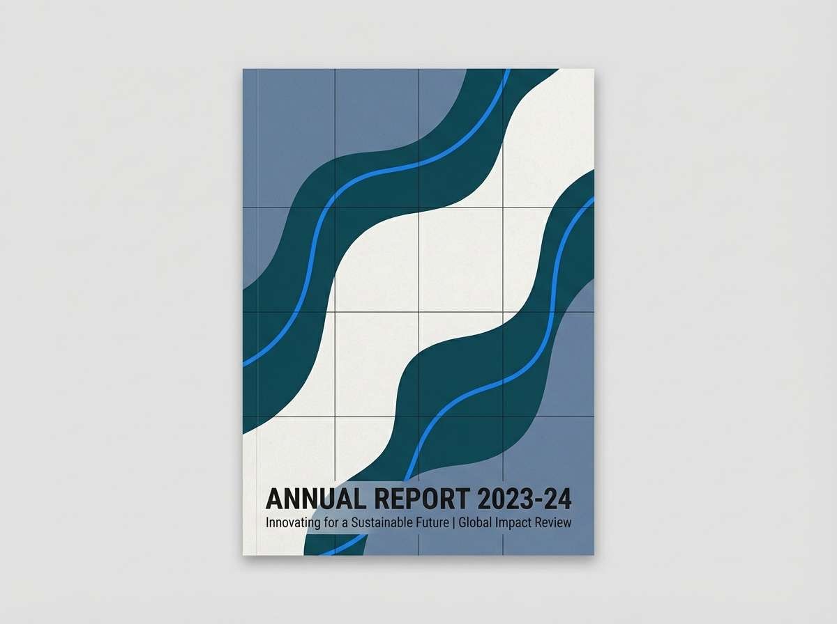
HEX: #1e90ff #2f4858 #33658a #86bbd8 #f6f9fc
Mood: steady, nautical, professional
Best for: annual report editorial cover layout
Steady and nautical like deep water over slate rocks, this palette feels reliable and mature. It suits corporate reports, consulting decks, and finance branding where you want blue without the toy-like brightness. Combine the slate tones for structure, then use the bright blue to guide attention to key callouts. Tip: keep imagery or charts desaturated so the blue accents remain the focal point.
Image example of ocean slate generated using media.io
10) Spring Botanical Wash
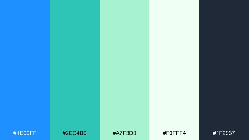
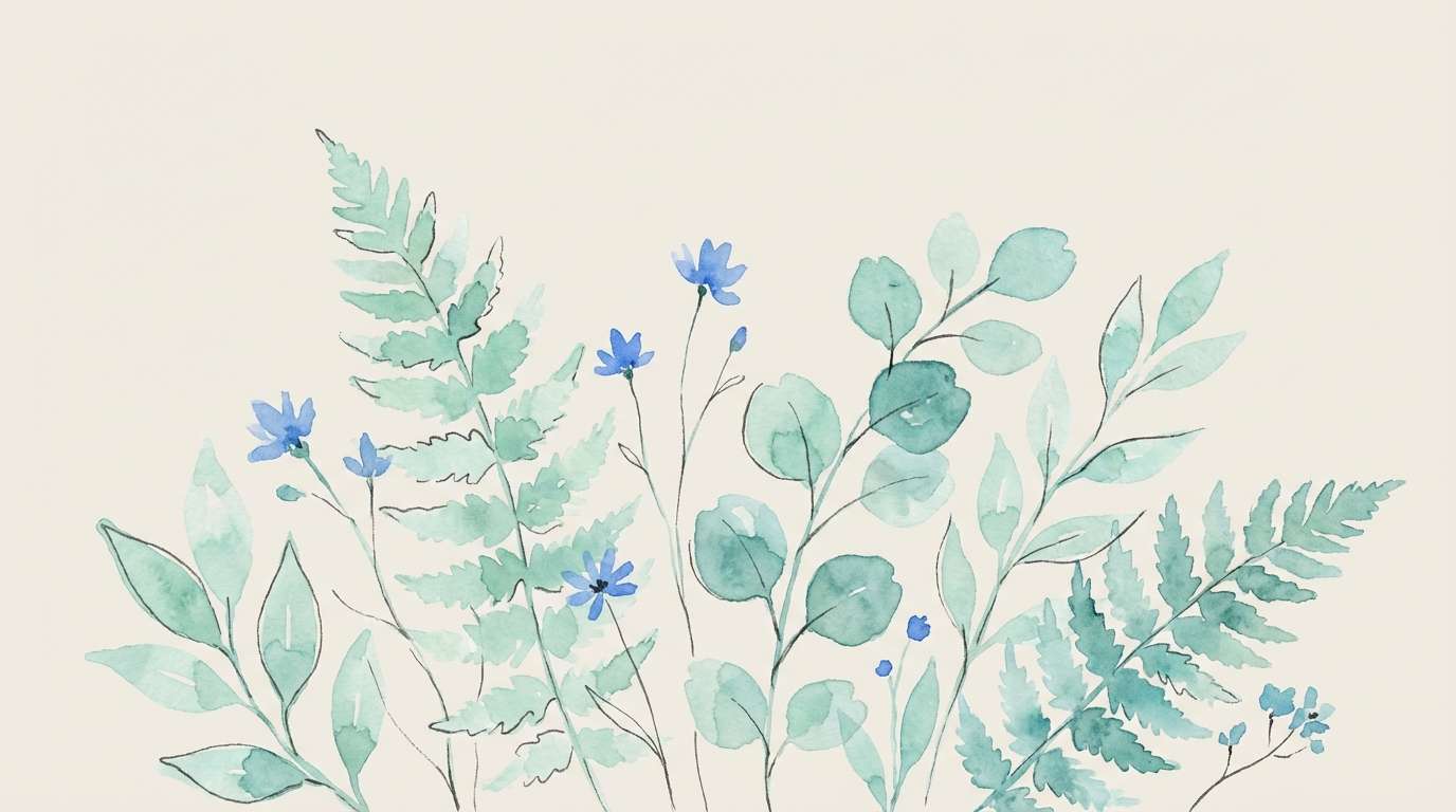
HEX: #1e90ff #2ec4b6 #a7f3d0 #f0fff4 #1f2937
Mood: fresh, clean, nature-forward
Best for: watercolor botanical illustration for a blog header
Fresh garden air and cool water tones make this mix feel healthy and inviting. It is ideal for wellness blogs, eco-friendly brands, and spring campaigns where you want a clean, modern vibe. Pair the minty greens with dodger blue for highlights, and keep charcoal text minimal for contrast. Tip: use the pale green-white as paper texture so the illustration stays soft and breathable.
Image example of spring botanical wash generated using media.io
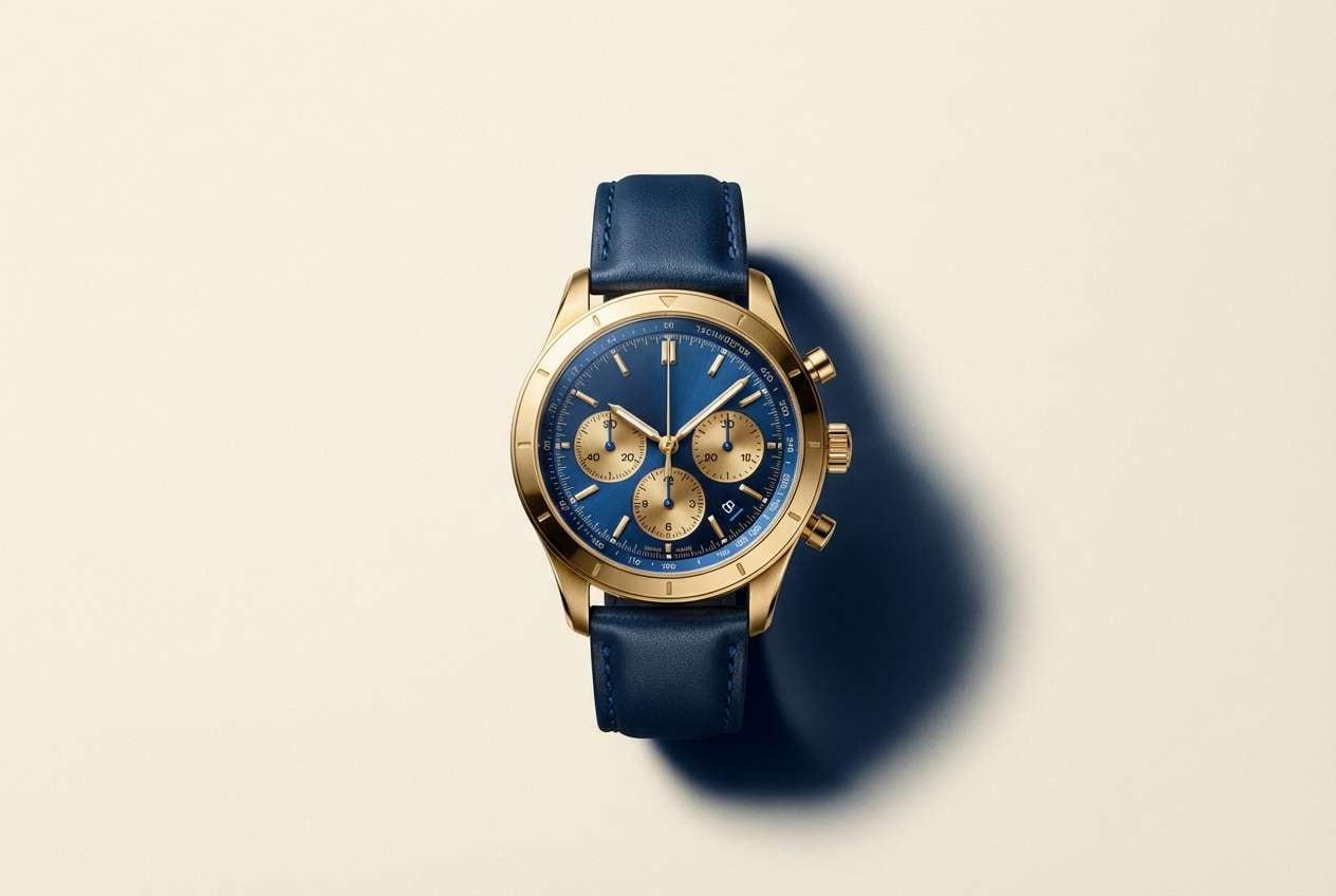
11) Luxury Navy Gold
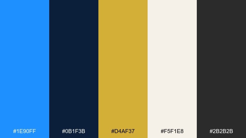
HEX: #1e90ff #0b1f3b #d4af37 #f5f1e8 #2b2b2b
Mood: premium, classic, confident
Best for: luxury watch product ad studio shot
Premium contrast like velvet navy with warm metallic shine gives this set a refined edge. It works best for luxury goods, formal invitations, and upscale branding that needs authority. Pair gold sparingly with the bright blue so the design stays elegant rather than flashy. Tip: use the cream tone as the main background to make both blue and gold feel intentional and expensive.
Image example of luxury navy gold generated using media.io
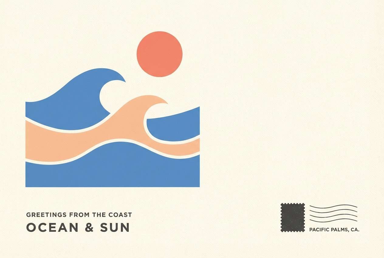
12) Sunset Boardwalk
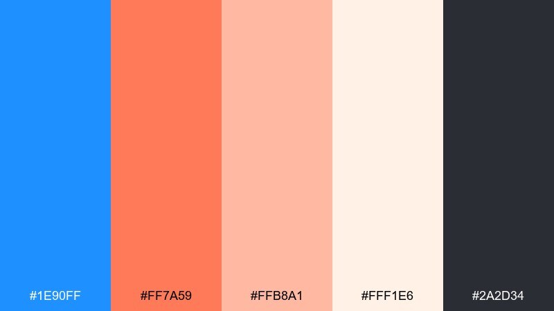
HEX: #1e90ff #ff7a59 #ffb8a1 #fff1e6 #2a2d34
Mood: warm, friendly, travel-ready
Best for: travel postcard graphic design
Warm sunset air meets cool seaside blue for a friendly, welcoming vibe. It is great for travel creatives, cafes, and seasonal promos where you want both energy and comfort. Pair the coral tones with the bright blue for focal shapes and keep the charcoal for crisp type. Tip: use the peachy tint as a soft overlay behind photos or illustrations to unify the layout.
Image example of sunset boardwalk generated using media.io
13) Monochrome Blues
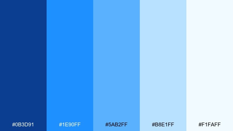
HEX: #0b3d91 #1e90ff #5ab2ff #b8e1ff #f1faff
Mood: focused, serene, cohesive
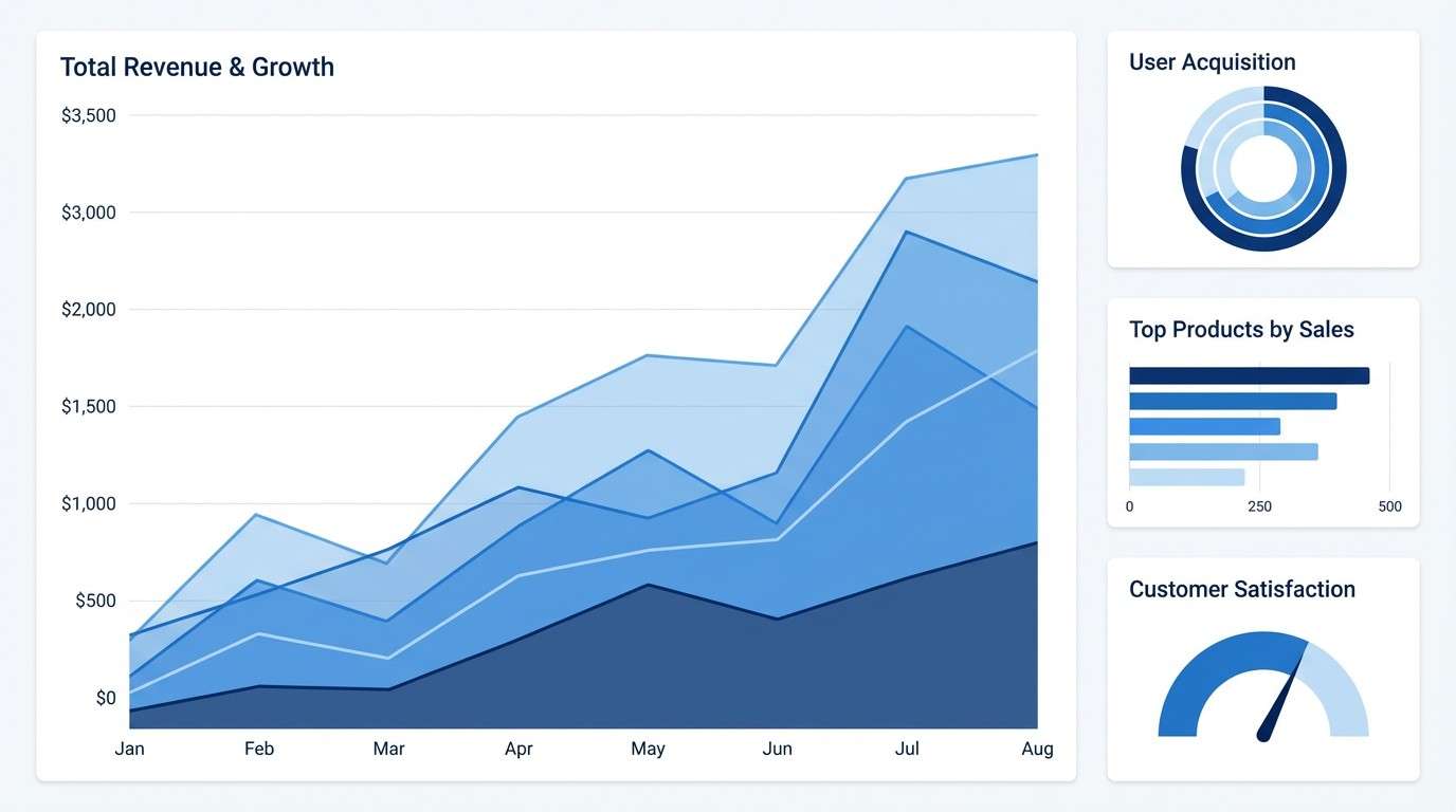
Best for: data visualization dashboard UI
Serene and cohesive like layered sky gradients, these blues keep designs calm and unified. It is perfect for analytics, dashboards, and infographics where you need multiple values without switching hues. Use the darkest blue for axes and labels, then step lighter for series and fills. Tip: reserve the brightest dodger tone for the single most important metric so it always stands out.
Image example of monochrome blues generated using media.io
14) Corporate Clean
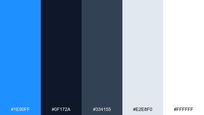
HEX: #1e90ff #0f172a #334155 #e2e8f0 #ffffff
Mood: professional, clear, confident
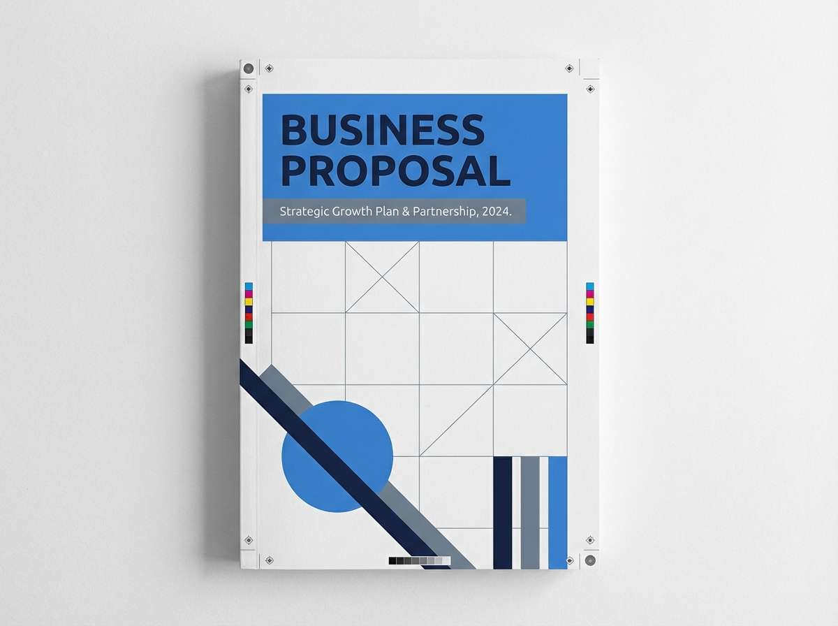
Best for: business proposal document cover
Clear and confident like a crisp suit, this set leans into high readability and structure. It fits proposals, B2B websites, and corporate identity systems that need a modern but safe blue. Pair the bright accent with slate grays for section headers and dividers, then let white carry the breathing room. Tip: keep the blue limited to navigation, icons, and key links to maintain a premium feel.
Image example of corporate clean generated using media.io
15) Kids Learning Brights
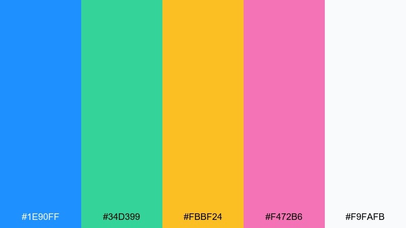
HEX: #1e90ff #34d399 #fbbf24 #f472b6 #f9fafb
Mood: cheerful, friendly, approachable
Best for: educational app onboarding screens
Cheerful and friendly like classroom stickers, these brights feel welcoming and upbeat. They work well for kids learning apps, playful brands, and simple illustration systems. Pair the blue with green for primary actions, then use yellow and pink as reward moments or badges. Tip: keep backgrounds very light so the bright accents do not overwhelm small screens.
Image example of kids learning brights generated using media.io
16) Arctic Adventure
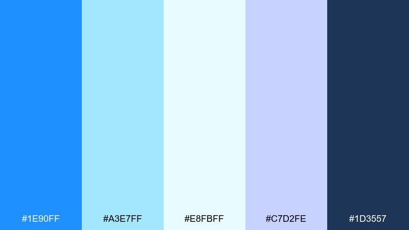
HEX: #1e90ff #a3e7ff #e8fbff #c7d2fe #1d3557
Mood: icy, adventurous, airy
Best for: outdoor gear website banner
Icy, open-air tones evoke glaciers and bright winter skies. It is a strong fit for outdoor brands, travel banners, and adventure storytelling that wants freshness over heaviness. Pair the deep navy with the bright blue for contrast, then let the pale tints create space and light. Tip: add subtle grain or paper texture in the lightest tone to avoid a flat, sterile look.
Image example of arctic adventure generated using media.io

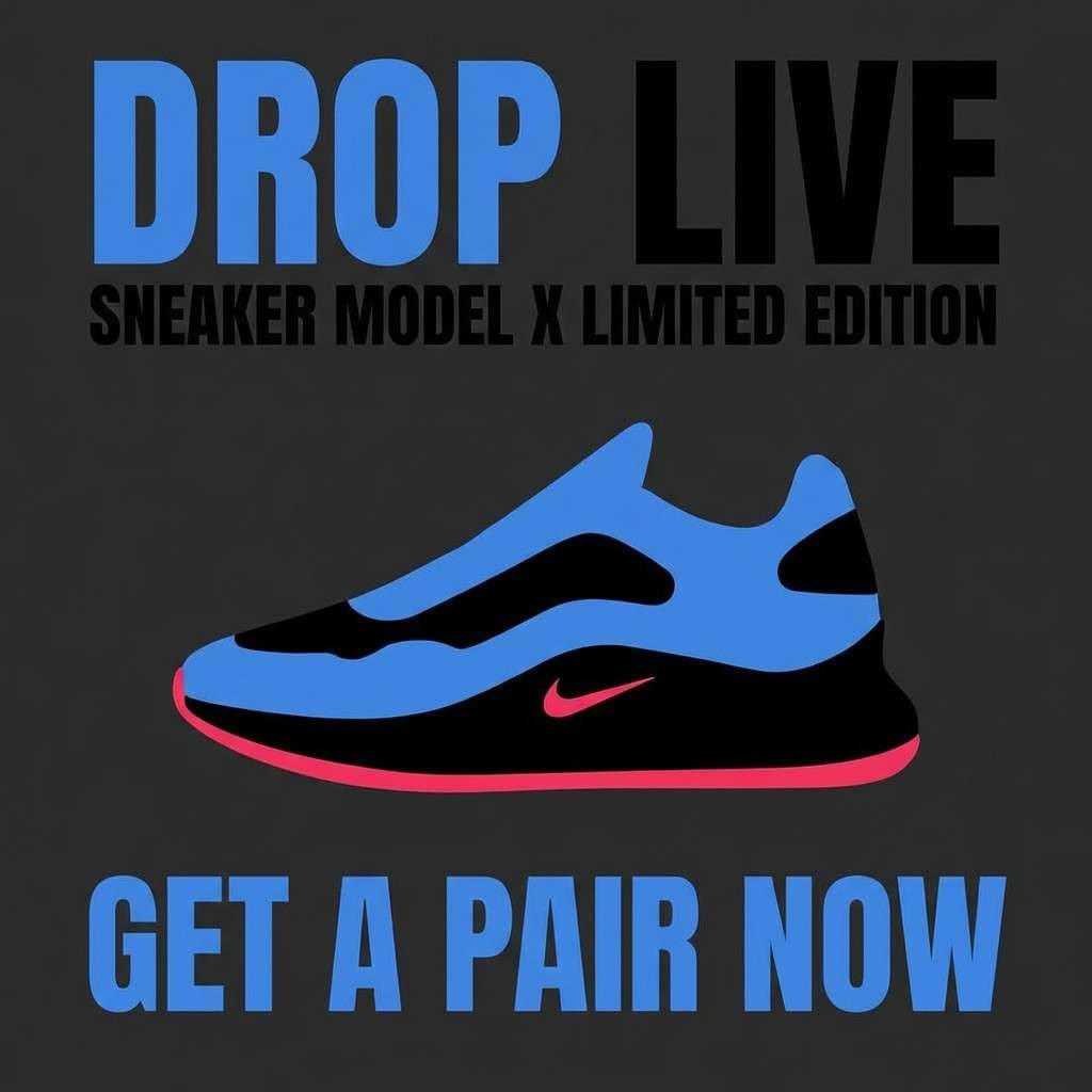
17) Streetwear Contrast
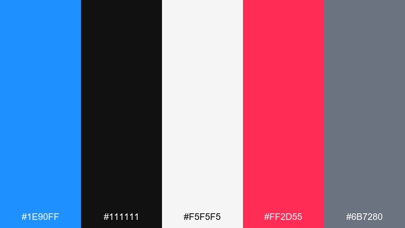
HEX: #1e90ff #111111 #f5f5f5 #ff2d55 #6b7280
Mood: edgy, modern, high-contrast
Best for: sneaker drop social ad
Edgy contrast like street lights on asphalt makes this palette feel bold and current. It is ideal for sneaker drops, streetwear promos, and punchy social ads that need instant impact. Pair the bright blue with black for structure, then use the hot accent as a limited callout color. Tip: keep text mostly off-white and use blue only for key words or arrows to guide the eye.
Image example of streetwear contrast generated using media.io
18) Wedding Something Blue
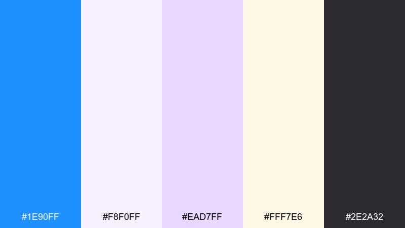
HEX: #1e90ff #f8f0ff #ead7ff #fff7e6 #2e2a32
Mood: romantic, soft, elegant
Best for: wedding invitation suite
Romantic and gentle like silk ribbons and lavender dusk, this mix feels elegant without being overly formal. It suits wedding suites, event stationery, and refined lifestyle branding. Pair the bright blue as a tiny accent for monograms or seals, while lilac and cream handle the larger areas. Tip: print the dark plum-gray for typography to keep everything readable while staying soft.
Image example of wedding something blue generated using media.io
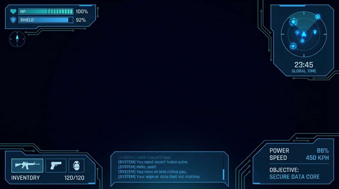
19) Gaming HUD
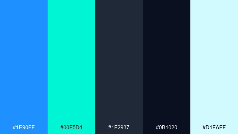
HEX: #1e90ff #00f5d4 #1f2937 #0b1020 #d1faff
Mood: immersive, sharp, futuristic
Best for: game UI HUD overlay mockup
Immersive and sharp like a sci-fi heads-up display, these tones feel technical and fast. They work well for game UI, streaming overlays, and esports graphics where contrast is everything. Pair deep midnight panels with bright blue and teal for interactive states and indicators. Tip: keep glow effects subtle and consistent so the interface stays readable during motion.
Image example of gaming hud generated using media.io
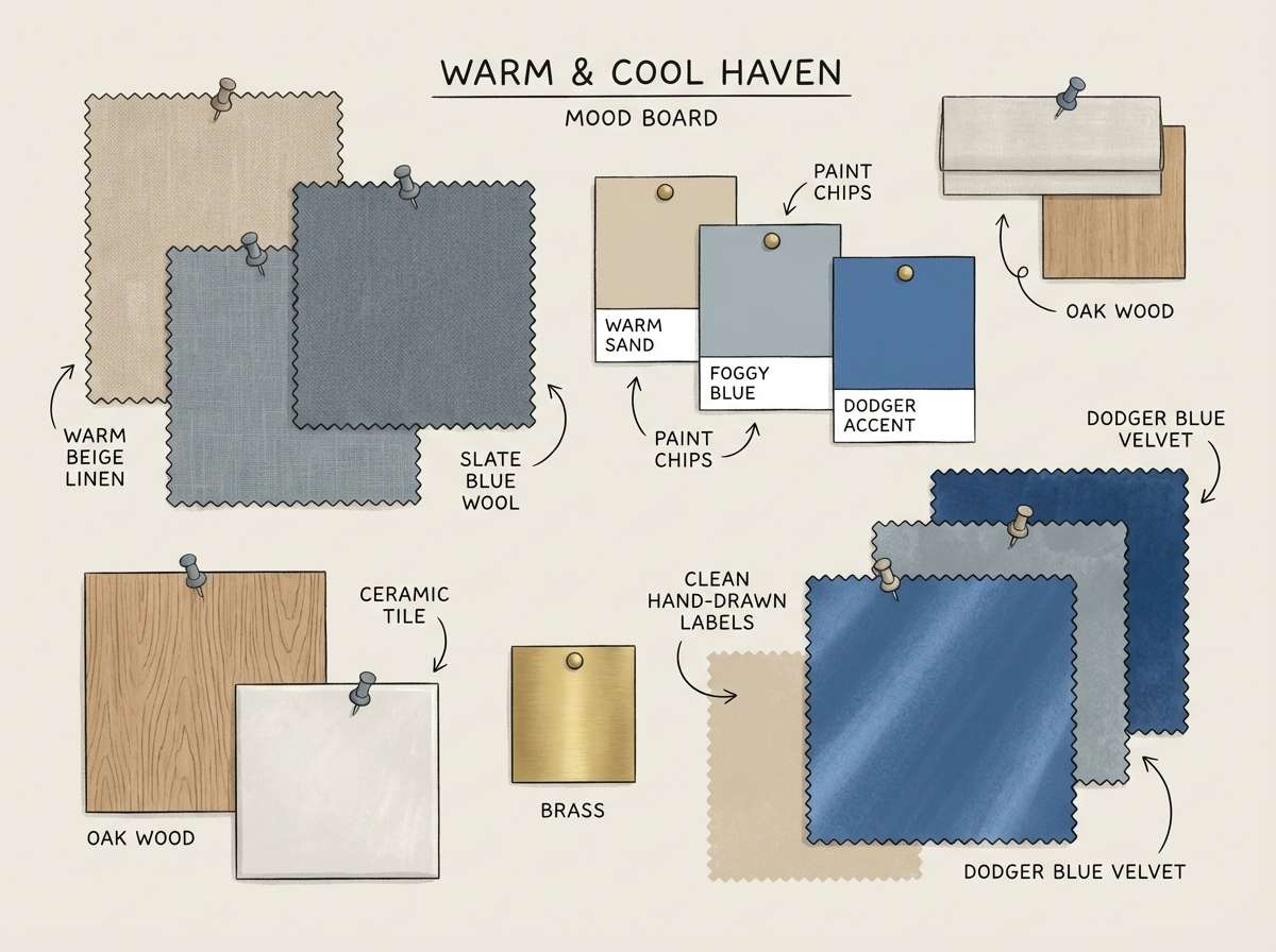
20) Calm Interior Accent
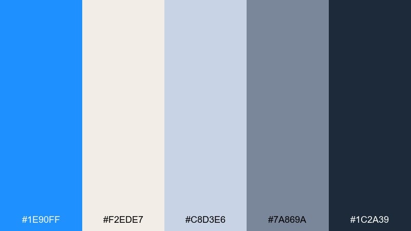
HEX: #1e90ff #f2ede7 #c8d3e6 #7a869a #1c2a39
Mood: calm, airy, homey
Best for: living room color mood board
Calm, airy neutrals with a clean blue accent evoke a bright living room with curated decor. It is ideal for interior mood boards, paint planning, and home brands that want a soft modern feel. Pair the warm beige and misty gray-blue as the base, then use dodger blue in small objects like cushions or art prints. Tip: repeat the accent color in two or three places only to keep the room balanced.
Image example of calm interior accent generated using media.io
What Colors Go Well with Dodger Blue?
Dodger Blue pairs naturally with crisp neutrals like white, off-white, and cool grays, which helps it feel clean and readable in UI and editorial layouts. For a more dramatic direction, match it with charcoal or deep navy to create strong contrast.
Warm complements—gold, orange, coral, and peach—add energy and make calls-to-action feel more urgent without becoming aggressive. If you want a softer, lifestyle look, pastel lilac, blush, and butter yellow keep the palette light while letting #1e90ff remain the signature accent.
For modern “tech” styling, combine dodger blue with cyan, indigo, and midnight backgrounds, then limit gradients to controlled hero areas so typography stays sharp.
How to Use a Dodger Blue Color Palette in Real Designs
Start with role-based color usage: make dodger blue your primary action/brand color, then assign darker tones for text and structure, and lighter tints for surfaces. This prevents #1e90ff from overpowering the composition.
In branding and marketing, treat dodger blue as the attention driver—logos, buttons, price tags, or key numbers—while letting neutrals carry most of the layout. This keeps the design modern and premium instead of overly saturated.
In dashboards and data visuals, use blue tints as a scale (dark-to-light), and reserve the brightest dodger tone for the single most important series or KPI so users instantly understand hierarchy.
Create Dodger Blue Palette Visuals with AI
If you already have HEX codes, you can generate matching posters, UI mockups, mood boards, or branding boards in minutes by describing the layout and specifying dodger blue as the dominant color. The prompts above are designed to be copy-paste friendly.
For the best results, keep the style consistent (vector, flat UI, editorial, watercolor), limit the number of accent colors used at once, and mention background tone (white, cream, midnight) so contrast is controlled.
Use Media.io to turn palette ideas into on-brand visuals quickly—then iterate by swapping one accent color at a time to explore variations without redesigning from scratch.
Dodger Blue Color Palette FAQs
-
What is the HEX code for Dodger Blue?
Dodger Blue is commonly represented as #1e90ff. It’s a bright, highly saturated blue that works well for accents, buttons, and standout branding elements. -
Is Dodger Blue good for UI and app design?
Yes. Dodger Blue is excellent for primary actions and interactive states because it’s vivid and easy to spot. Pair it with neutral surfaces (white/light gray) and use dark text for accessibility. -
What colors complement Dodger Blue?
Warm complements like gold, orange, and coral create energetic contrast, while navy and charcoal create a sleek, high-contrast look. Pastels (lilac, blush, butter yellow) soften the palette for lifestyle designs. -
How do I make Dodger Blue feel more “luxury”?
Use it sparingly with deep navy, cream, and metallic gold accents. Keep layouts minimal, rely on whitespace, and let textures/typography do more of the work than additional colors. -
How do I use Dodger Blue in data visualization?
Build a monochrome scale from deep navy to pale sky tints. Use the brightest dodger tone only for the key metric or highlighted series to maintain clear visual hierarchy. -
Can Dodger Blue work for interiors and home decor?
Yes—best as an accent rather than a wall-dominant color. Combine it with warm beige, misty gray-blue, and deep slate/navy details, and repeat the accent a few times for balance. -
How can I generate Dodger Blue palette images quickly?
Use an AI image generator and describe the design type (poster, dashboard, mood board), the background (white/cream/dark), and specify dodger blue as the dominant color with your supporting HEX codes.
Next: Pale Gold Color Palette


