

Topaz sits right in the sweet spot between blue and green, giving you that clean ocean energy without feeling cold. It’s modern, flexible, and easy to pair with both warm accents and neutral foundations.
Below are curated topaz color palette ideas (with HEX codes) you can use for branding, UI, posters, packaging, and print—plus AI prompts to generate matching visuals fast.
In this article
- Why Topaz Palettes Work So Well
-
- coastal topaz drift
- sunlit gemstone
- deep sea topaz
- desert oasis
- vintage cyanotype
- topaz and terracotta
- arctic glass
- tropical lagoon
- minimal topaz ui
- botanical topaz spring
- midnight aquarium
- retro poolside
- stormy harbor
- champagne topaz
- coral reef accent
- smoky quartz mix
- neon sign topaz
- scandinavian spa
- editorial ink and topaz
- wedding seafoam
- What Colors Go Well with Topaz?
- How to Use a Topaz Color Palette in Real Designs
- Create Topaz Palette Visuals with AI
Why Topaz Palettes Work So Well
Topaz tones combine the calm trust of blue with the freshness of green, which makes them feel both reliable and energizing. That balance is why topaz works across industries—from wellness and travel to SaaS and editorial design.
They also scale beautifully: pale aquas create airy space, mid teals carry the brand identity, and deep navies provide contrast for readable type. With a warm accent (gold, terracotta, peach), topaz becomes instantly more premium and human.
Most importantly, topaz is “gradient-friendly.” If you need modern depth (UI headers, hero sections, posters), topaz transitions look natural and clean rather than muddy.
20+ Topaz Color Palette Ideas (with HEX Codes)
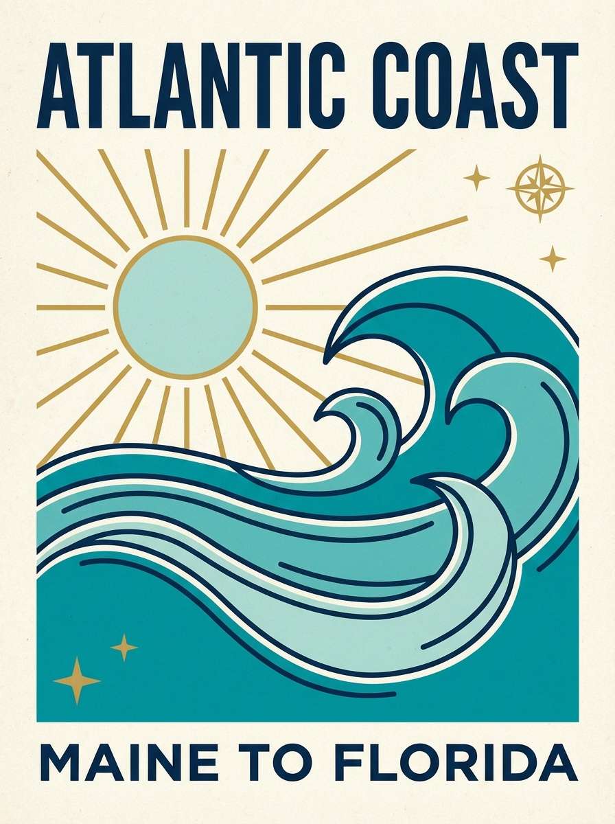
1) Coastal Topaz Drift
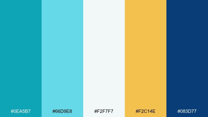
HEX: #0ea5b7 #66d9e8 #f2f7f7 #f2c14e #083d77
Mood: breezy, optimistic, seaside
Best for: travel poster design
Breezy seaside energy comes through like sun on clear water and a deep navy horizon. The bright topaz and airy aqua feel clean, while the golden accent adds a warm, postcard glow. Use it on travel posters, tourism campaigns, or summer-themed announcements with plenty of white space. Pair the navy with the warm gold for headlines, and keep the aqua for gradients. Tip: use the gold sparingly as a focal highlight so the palette stays fresh, not noisy.
Image example of coastal topaz drift generated using media.io
Media.io is an online AI studio for creating and editing video, image, and audio in your browser.

2) Sunlit Gemstone
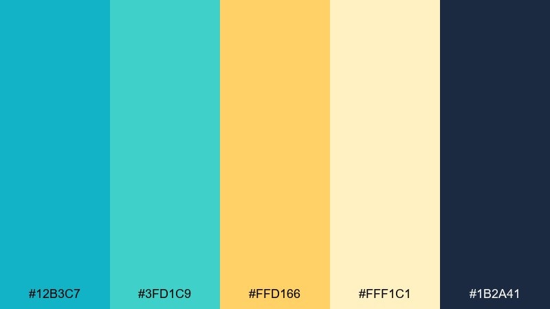
HEX: #12b3c7 #3fd1c9 #ffd166 #fff1c1 #1b2a41
Mood: bright, polished, premium
Best for: skincare product packaging
Bright and polished like light catching a cut gem, these tones feel clean yet indulgent. The soft cream and warm yellow make the teal read more luxurious than sporty. This topaz color palette works especially well for skincare packaging, wellness kits, and minimalist labels. Pair the deep ink shade with cream for readable ingredient lists, then use the yellow for small seals or callouts. Tip: use matte creams as the base and reserve teal for brand marks to keep it high-end.
Image example of sunlit gemstone generated using media.io
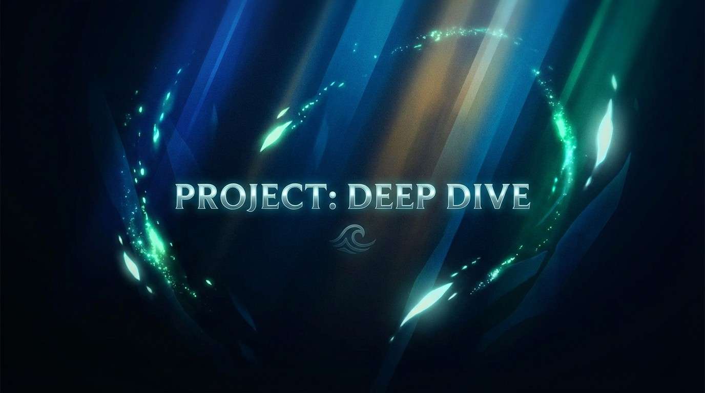
3) Deep Sea Topaz
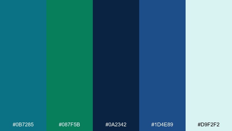
HEX: #0b7285 #087f5b #0a2342 #1d4e89 #d9f2f2
Mood: moody, immersive, cinematic
Best for: gaming splash screen
Moody and immersive, it evokes a deep dive where teal light fades into midnight blues. The sea-glass tint keeps the darker shades from feeling heavy, so it stays readable on screens. Use it for gaming splash screens, sci-fi promos, or cinematic headers where contrast matters. Pair the navy with the pale aqua for UI overlays and reserve the green-teal as an action color. Tip: add subtle grain or vignette so the light aqua feels like a glow rather than flat white.
Image example of deep sea topaz generated using media.io
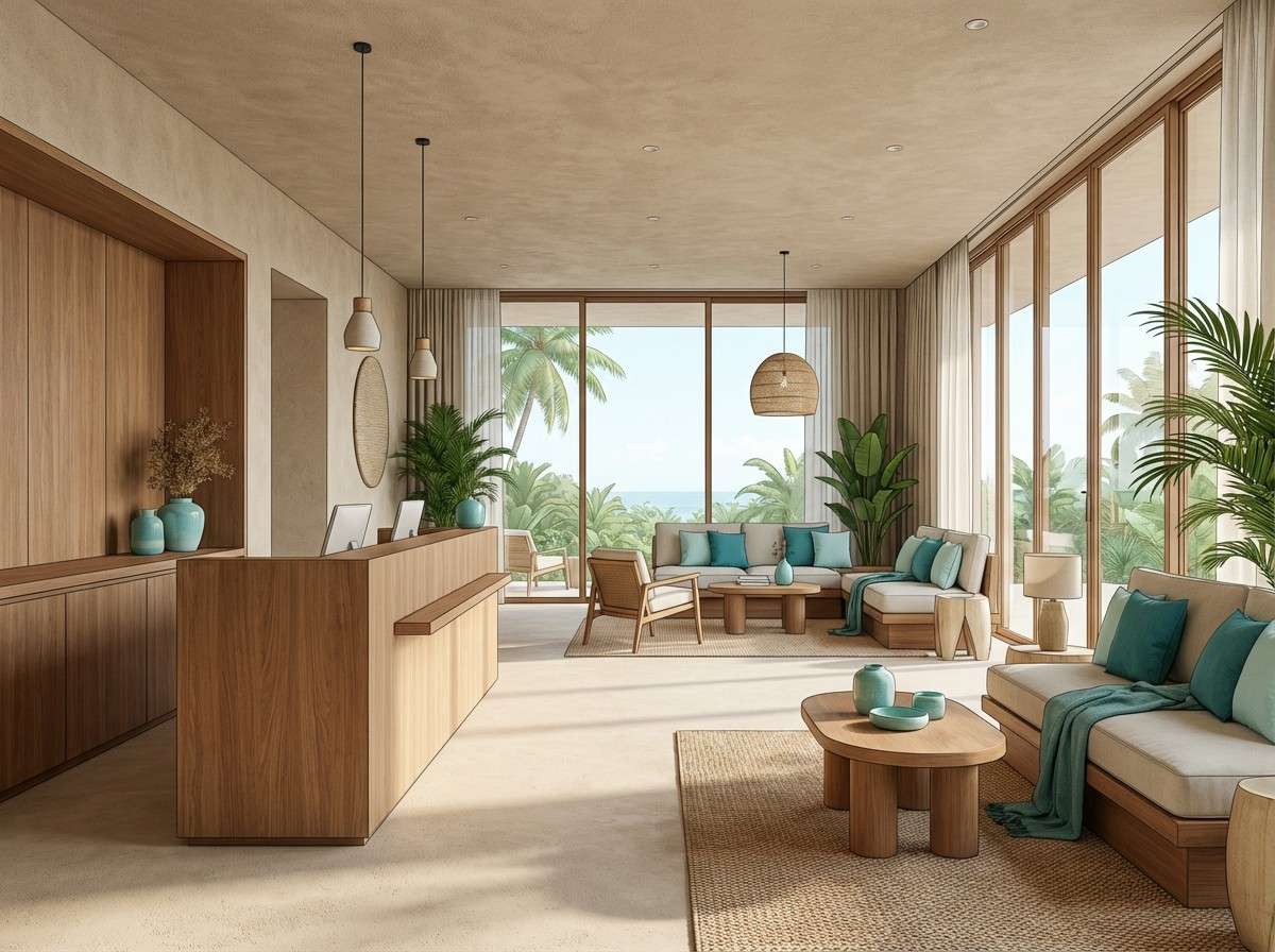
4) Desert Oasis
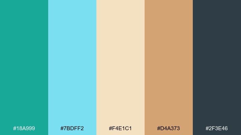
HEX: #18a999 #7bdff2 #f4e1c1 #d4a373 #2f3e46
Mood: relaxed, sun-warmed, inviting
Best for: resort lobby interior concept
Relaxed and sun-warmed, it feels like cool pool water against sandy stone. The cream and clay-brown tones ground the aqua so it reads more resort than tech. Use it for hospitality interiors, resort branding, or lifestyle lookbooks that need calm warmth. Pair the darker slate as a framing neutral and let the topaz tones show up in textiles or accent walls. Tip: repeat the sand tone in large areas to make the aqua feel like an intentional oasis accent.
Image example of desert oasis generated using media.io
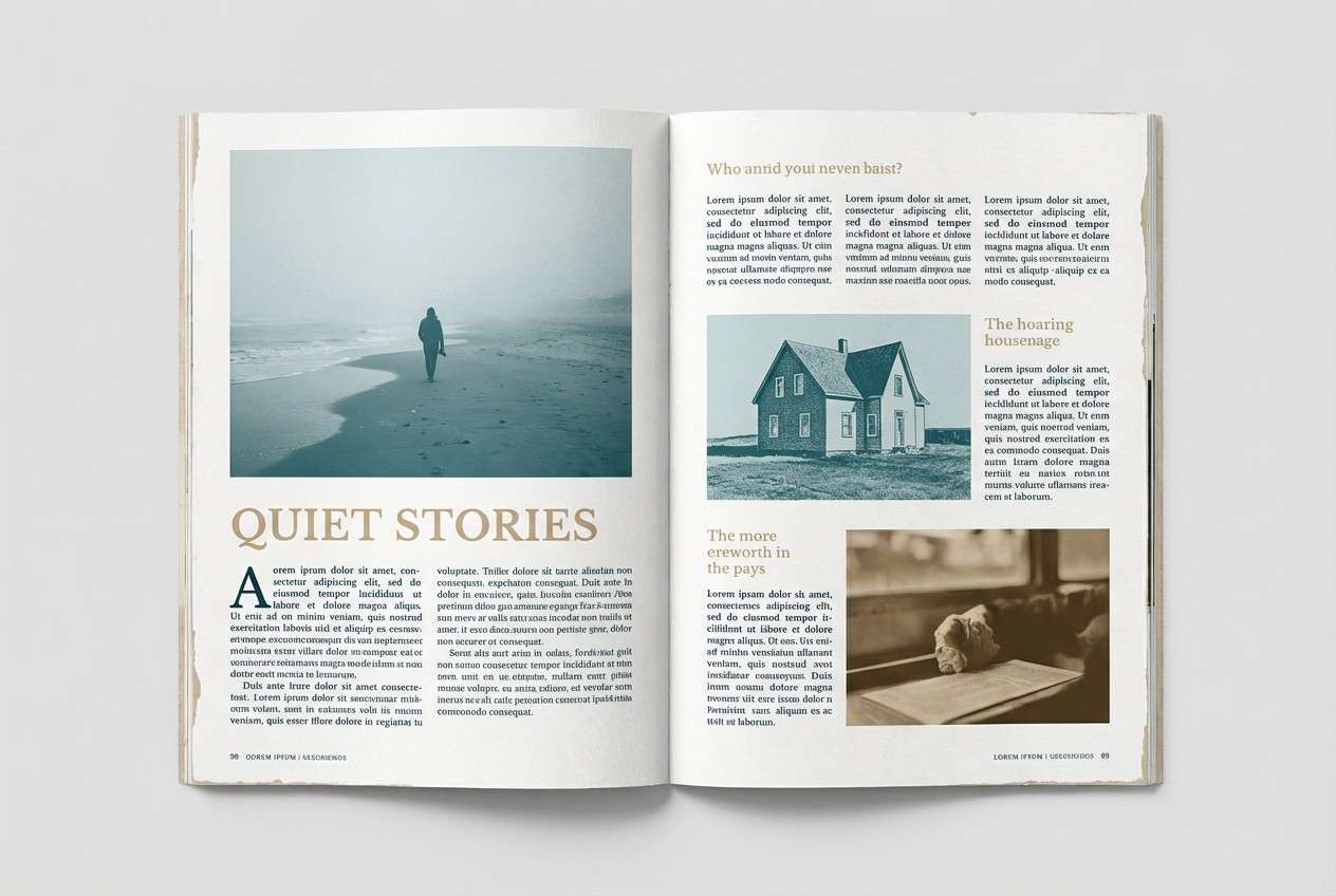
5) Vintage Cyanotype
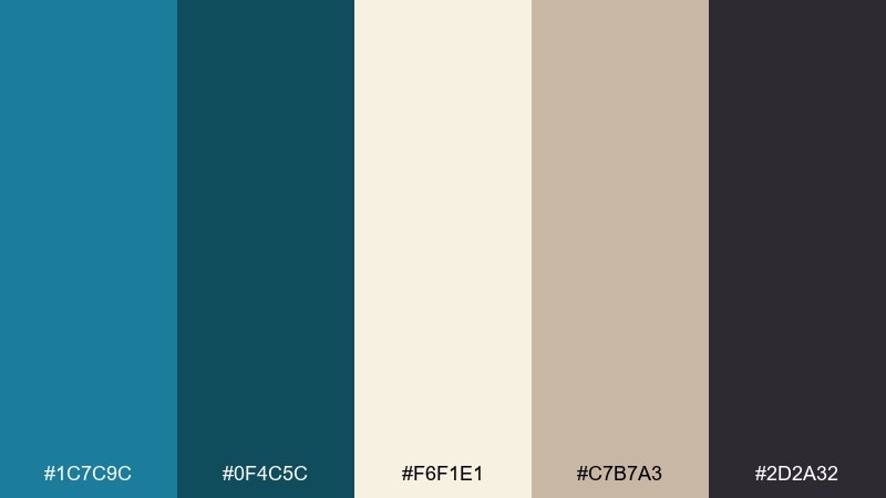
HEX: #1c7c9c #0f4c5c #f6f1e1 #c7b7a3 #2d2a32
Mood: nostalgic, artsy, editorial
Best for: magazine feature layout
Nostalgic and artsy, it hints at cyanotype prints, old paper, and inked captions. The muted teal feels sophisticated, while the warm neutrals add a tactile, printed finish. Use it for magazine features, book covers, or portfolio layouts that need calm personality. Pair the darkest ink tone for body text and keep the creamy paper color as the main field. Tip: use thin rules and small icons in muted teal to reinforce the vintage print vibe.
Image example of vintage cyanotype generated using media.io
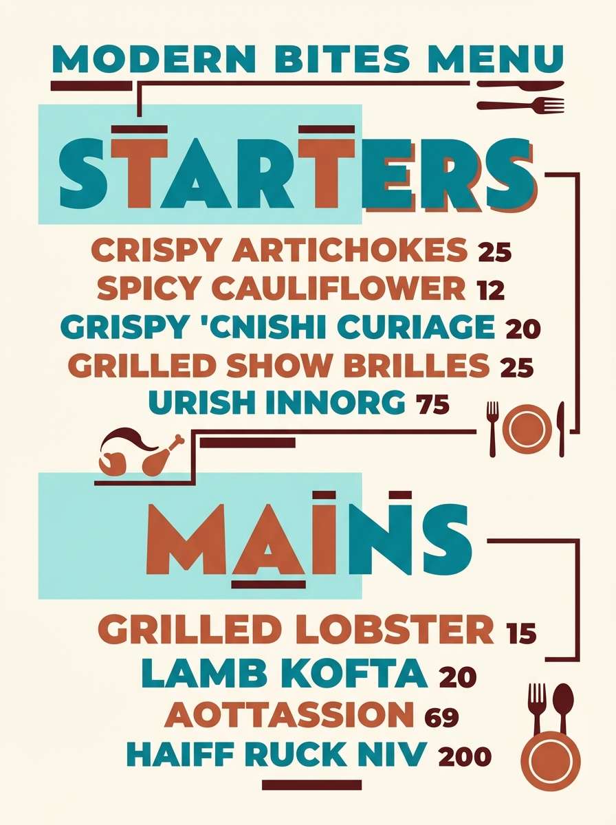
6) Topaz and Terracotta
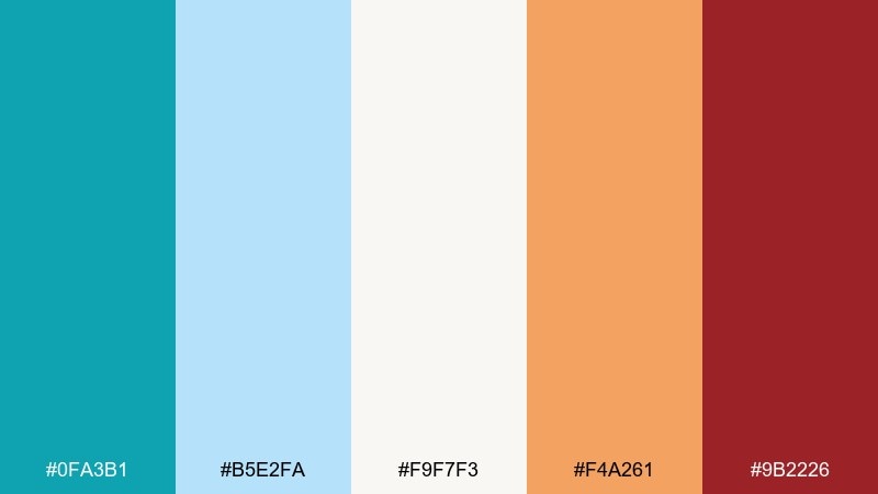
HEX: #0fa3b1 #b5e2fa #f9f7f3 #f4a261 #9b2226
Mood: vibrant, handcrafted, modern boho
Best for: restaurant menu flyer
Vibrant and handcrafted, it feels like glazed ceramics and sunlit markets. The cool teals keep the terracotta from getting too heavy, creating topaz color combinations that pop without turning loud. Use it for restaurant menus, café flyers, or artisan food branding where warmth matters. Pair the deep red-brown for section headers and let the light aqua hold negative space around photos. Tip: use terracotta for price tags or badges so the menu stays readable at a glance.
Image example of topaz and terracotta generated using media.io
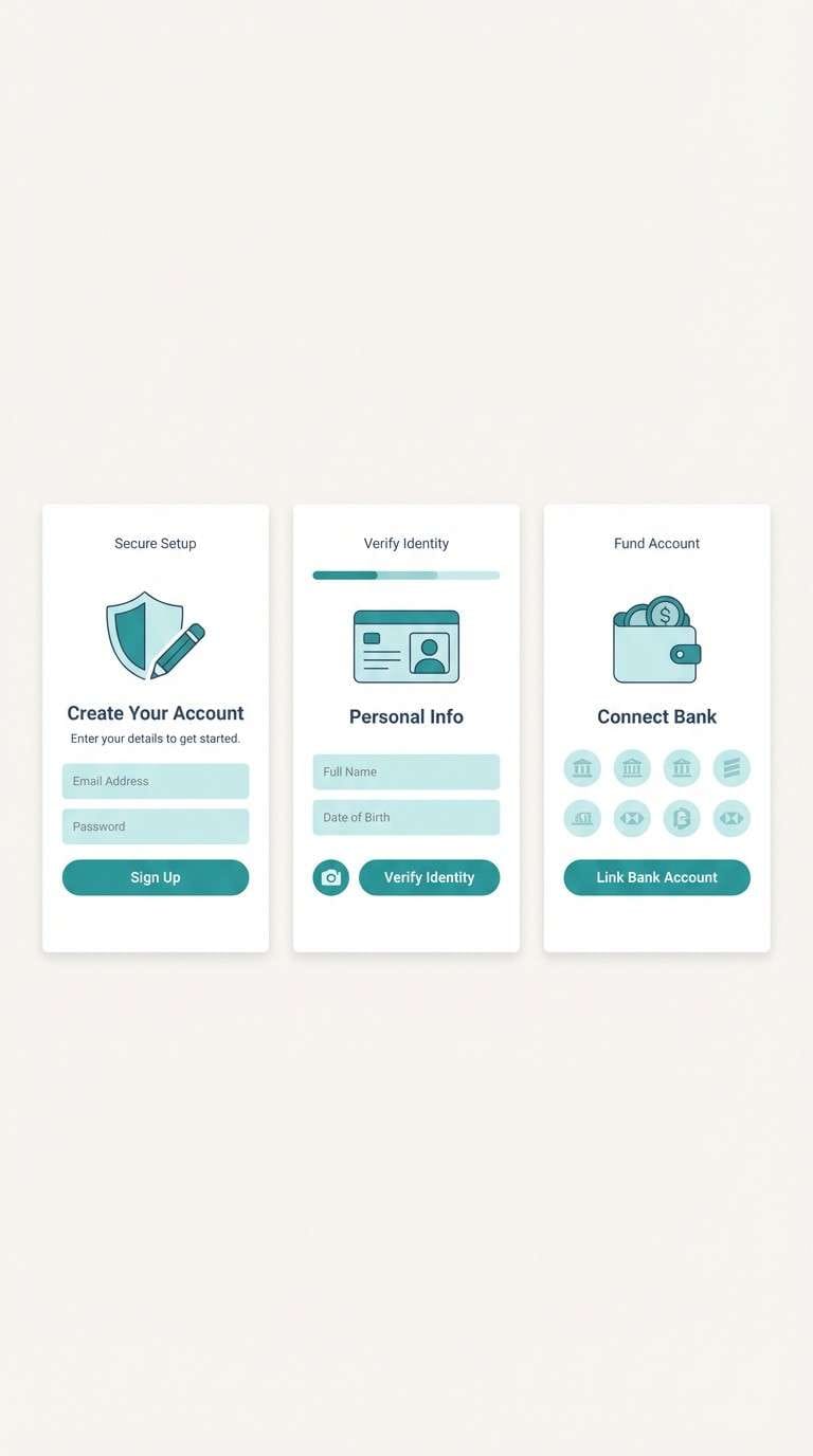
7) Arctic Glass
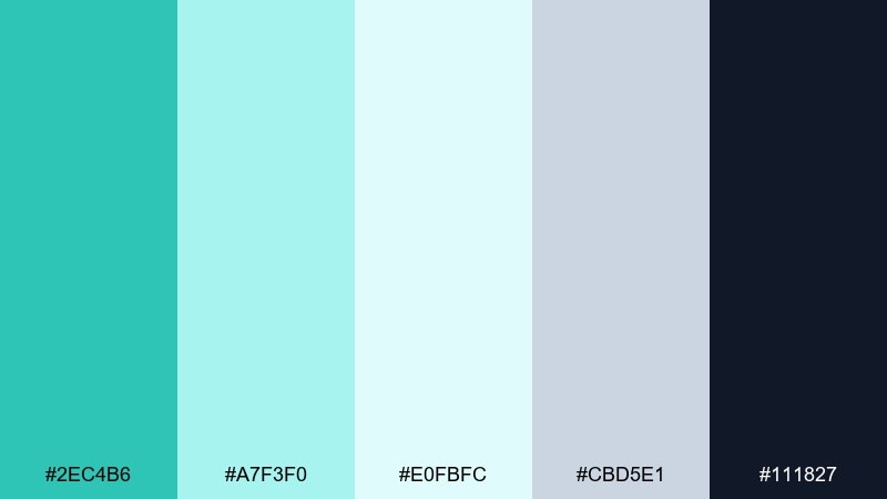
HEX: #2ec4b6 #a7f3f0 #e0fbfc #cbd5e1 #111827
Mood: crisp, minimal, refreshing
Best for: fintech onboarding screens
Crisp and minimal, it evokes frosted glass and clean winter air. The near-white aqua tones create breathing room, while the dark slate gives strong structure. Use it for fintech onboarding, productivity apps, or any interface that needs trust and clarity. Pair the darkest shade for primary text and keep teal for key buttons or progress states. Tip: stick to large, simple shapes so the subtle tints do not get lost on mobile.
Image example of arctic glass generated using media.io
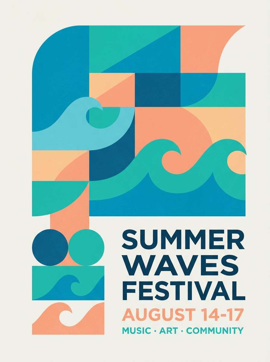
8) Tropical Lagoon
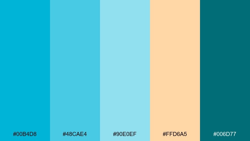
HEX: #00b4d8 #48cae4 #90e0ef #ffd6a5 #006d77
Mood: playful, summery, energetic
Best for: summer festival poster
Playful and summery, it feels like a lagoon at noon with warm sand nearby. The peachy accent keeps the cool blues from feeling sterile, adding a friendly, social glow. Use it for summer festival posters, beach events, or upbeat social campaigns. Pair the deep teal for typography and let the light blues carry big shapes and gradients. Tip: keep the peach confined to one or two elements, like date badges, for instant hierarchy.
Image example of tropical lagoon generated using media.io
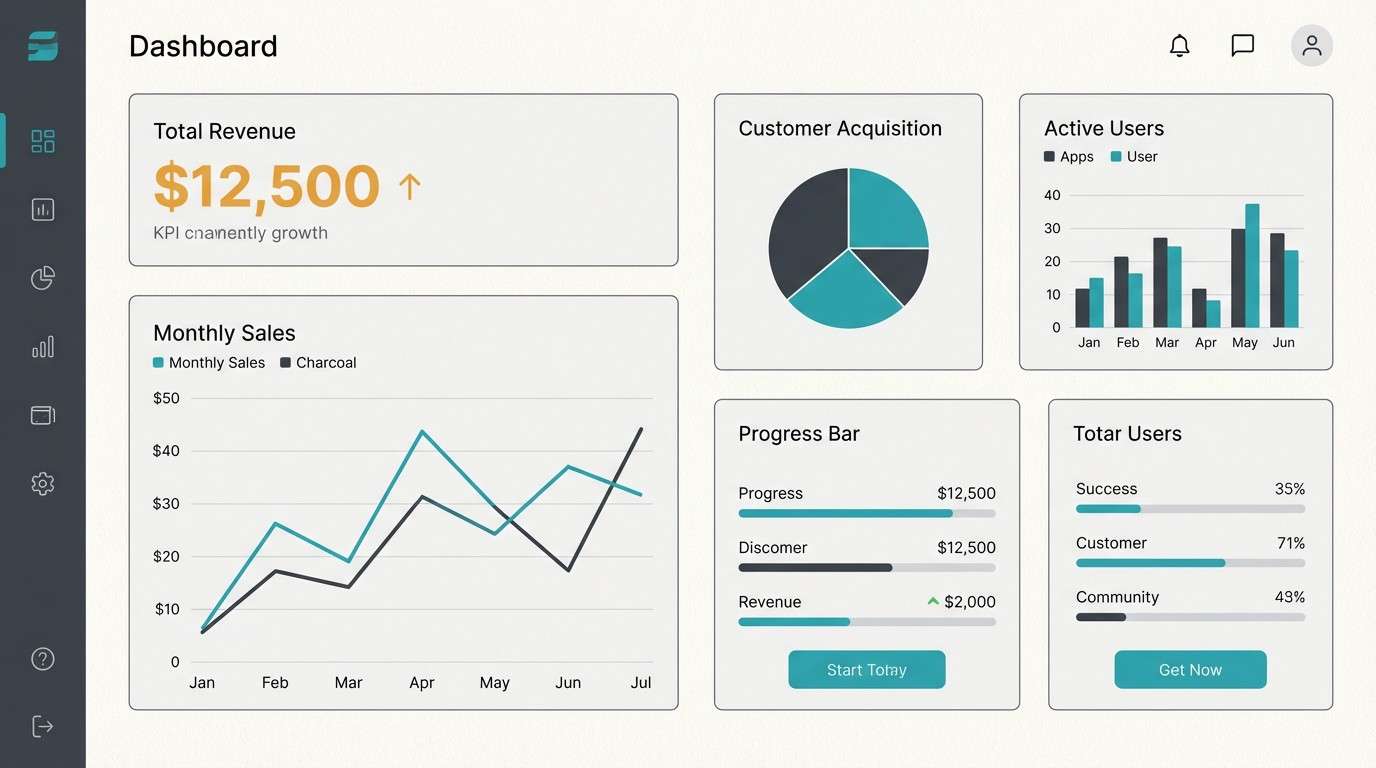
9) Minimal Topaz UI
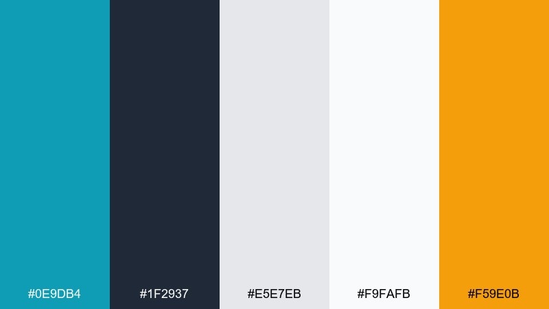
HEX: #0e9db4 #1f2937 #e5e7eb #f9fafb #f59e0b
Mood: clean, modern, product-led
Best for: dashboard UI kit
Clean and product-led, it suggests clear data, polished surfaces, and calm focus. Cool teal and soft grays do the heavy lifting, while the amber accent adds a confident point of attention. This topaz color palette is ideal for dashboards, SaaS landing pages, and UI kits that need accessible contrast. Pair the charcoal with off-white for structure and use amber only for alerts or key metrics. Tip: keep teal as the primary action color and reserve amber for one priority state to avoid visual competition.
Image example of minimal topaz ui generated using media.io
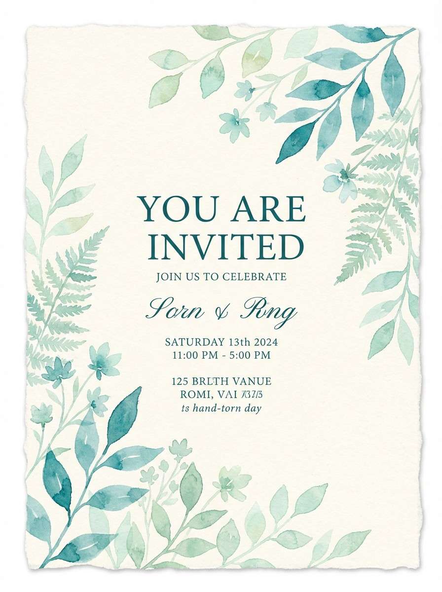
10) Botanical Topaz Spring
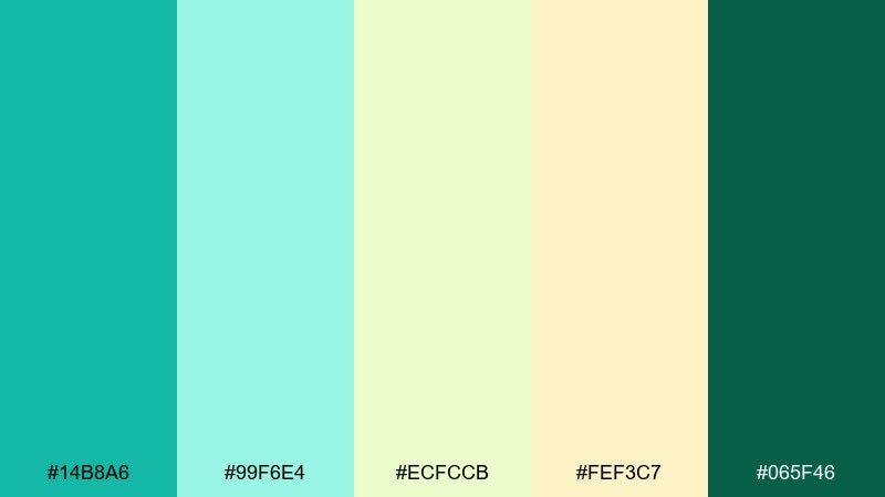
HEX: #14b8a6 #99f6e4 #ecfccb #fef3c7 #065f46
Mood: fresh, gentle, nature-forward
Best for: watercolor botanical invitation
Fresh and gentle, it feels like new leaves, cool mint water, and soft morning light. The pale greens and creams keep the teal feeling organic rather than corporate. Use it for spring invitations, eco-friendly stationery, or garden event graphics. Pair the deep green for names and headings, and let the light mint wash fill the background. Tip: add watercolor texture to the lighter tones so the palette reads naturally layered, not flat.
Image example of botanical topaz spring generated using media.io
11) Midnight Aquarium
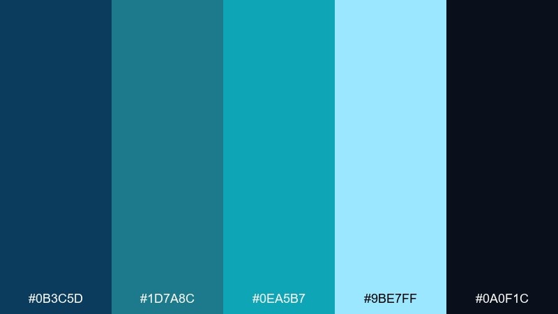
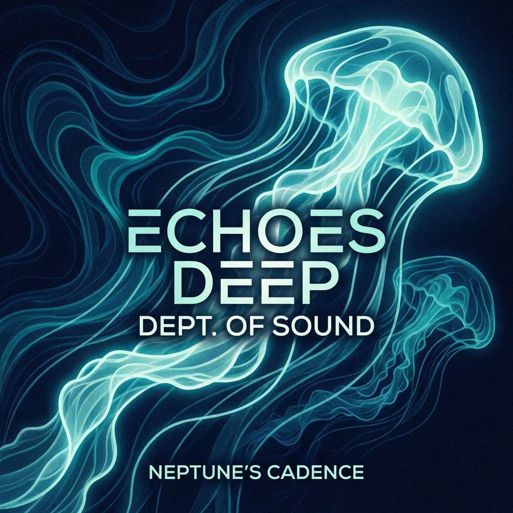
HEX: #0b3c5d #1d7a8c #0ea5b7 #9be7ff #0a0f1c
Mood: dramatic, sleek, night-lit
Best for: album cover artwork
Dramatic and sleek, it looks like an aquarium at night with neon waterlight moving across glass. The nearly-black base makes the topaz tones glow, perfect for high-contrast design. Use it for album covers, stream overlays, or event artwork where you want a modern nocturnal feel. Pair the pale aqua as a highlight and keep the brightest teal for titles or a single icon. Tip: add a subtle gradient from navy to black to amplify the underwater depth.
Image example of midnight aquarium generated using media.io
12) Retro Poolside
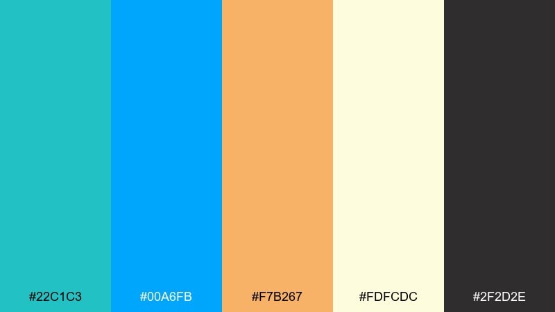
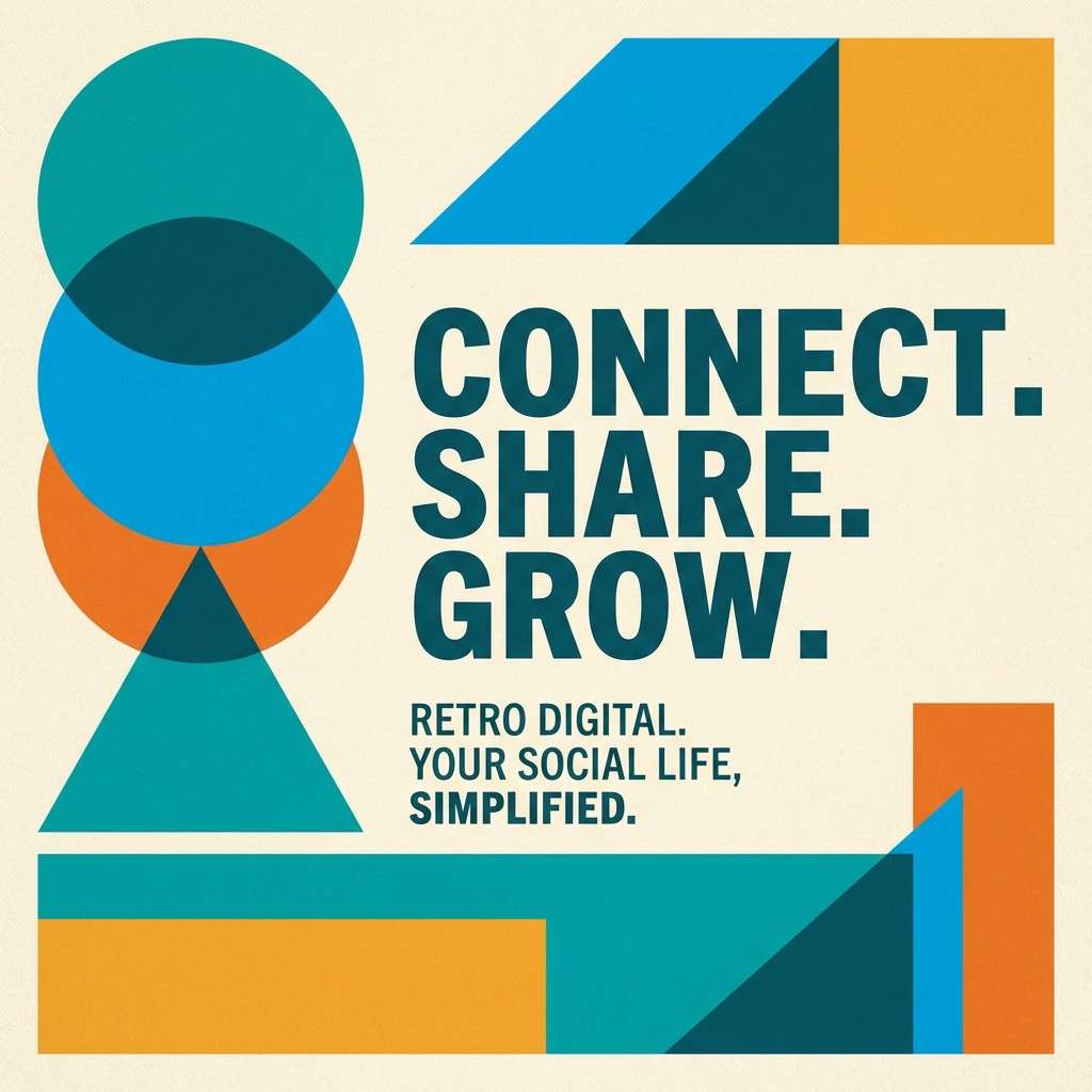
HEX: #22c1c3 #00a6fb #f7b267 #fdfcdc #2f2d2e
Mood: cheerful, nostalgic, pop
Best for: retro social media ad
Cheerful and nostalgic, it recalls pool tiles, summer snacks, and vintage signage. The warm orange balances the cool blues so the whole set feels playful and friendly. Use this topaz color combination for retro social ads, lifestyle promos, or café specials that need quick energy. Pair the charcoal for punchy text and keep the cream as the main canvas for legibility. Tip: lean on chunky shapes and simple icons to match the retro rhythm of the colors.
Image example of retro poolside generated using media.io
13) Stormy Harbor
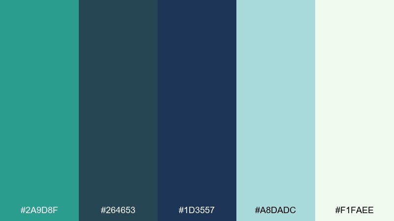
HEX: #2a9d8f #264653 #1d3557 #a8dadc #f1faee
Mood: calm, rugged, outdoorsy
Best for: outdoor brand website hero
Calm and rugged, it feels like a harbor right before the rain clears. The cool, subdued tones read trustworthy and outdoorsy without going dull. Use it for outdoor brands, sustainability messaging, or long-form web headers where you want steady confidence. Pair the deep blues for navigation and headings, then use the soft mint as a breathable background. Tip: add a single high-contrast call-to-action in teal so it stands out against the stormy base.
Image example of stormy harbor generated using media.io

14) Champagne Topaz
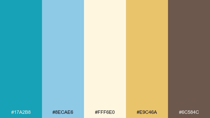
HEX: #17a2b8 #8ecae6 #fff6e0 #e9c46a #6c584c
Mood: elegant, celebratory, soft luxe
Best for: jewelry product ad
Elegant and celebratory, it evokes champagne bubbles, polished metal, and a cool gemstone shimmer. The creamy base keeps everything refined, while the gold adds instant luxury cues. Use it for jewelry ads, beauty launches, or premium gifting pages. Pair the cocoa brown for copy and use topaz tones as backdrops or reflections around the product. Tip: keep gradients subtle so the gold reads metallic rather than flat yellow.
Image example of champagne topaz generated using media.io
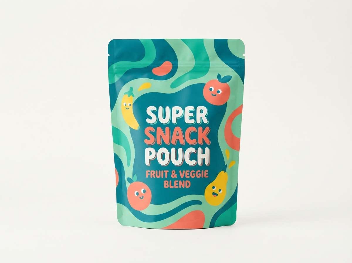
15) Coral Reef Accent
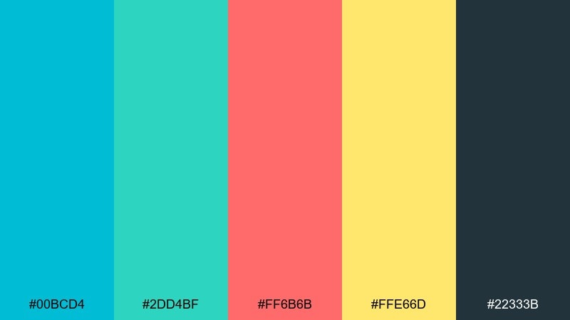
HEX: #00bcd4 #2dd4bf #ff6b6b #ffe66d #22333b
Mood: bold, sunny, playful contrast
Best for: kids snack packaging
Bold and sunny, it feels like coral, seafoam, and bright tropical light. The warm coral and yellow create topaz color combinations that are instantly shelf-friendly and fun. Use it for kids snack packaging, summer product drops, or playful brand refreshes. Pair the deep slate for outlines and nutrition text so the bright colors stay clean and readable. Tip: choose either coral or yellow as the main accent on pack fronts, and let the other support icons and bursts.
Image example of coral reef accent generated using media.io
16) Smoky Quartz Mix
HEX: #2fb7c6 #8d99ae #edf2f4 #6c757d #212529
Mood: professional, calm, understated
Best for: corporate slide template
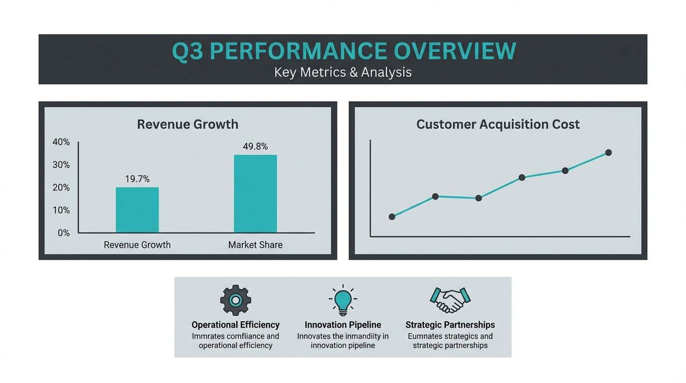
Professional and understated, it feels like cool glass over graphite and paper. The grays add structure so the teal reads confident rather than flashy. Use it for corporate slide decks, annual reports, or consulting one-pagers. Pair the darkest tone for titles and use the light gray as a steady canvas for charts. Tip: keep teal limited to key data points so your visuals stay clear for large-room projection.
Image example of smoky quartz mix generated using media.io
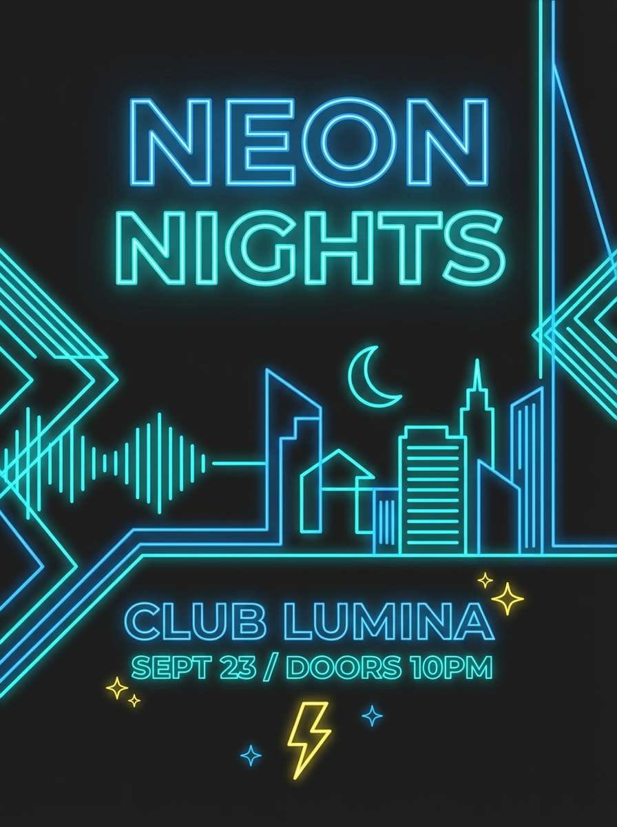
17) Neon Sign Topaz
HEX: #00e5ff #00b3ff #111827 #f8fafc #ffdd00
Mood: electric, nightlife, high-contrast
Best for: nightclub event poster
Electric and nightlife-ready, it evokes neon tubing against a dark city wall. The bright cyan and blue feel kinetic, while the yellow adds a sharp hit of energy. Use it for club posters, DJ promos, or streaming thumbnails where you need instant attention. Pair the near-black with white for clean type, then let the neon tones carry shapes and strokes. Tip: add a subtle glow effect only on key elements so the design stays legible from a distance.
Image example of neon sign topaz generated using media.io
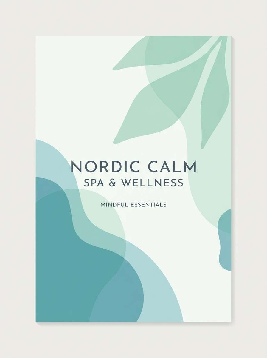
18) Scandinavian Spa
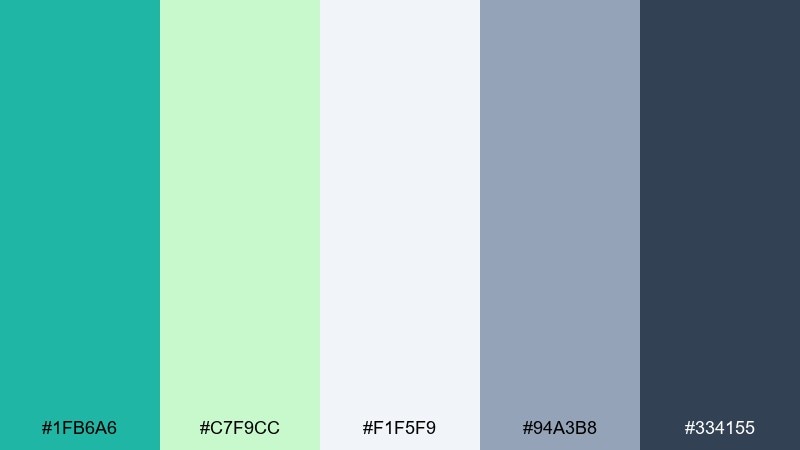
HEX: #1fb6a6 #c7f9cc #f1f5f9 #94a3b8 #334155
Mood: quiet, airy, restorative
Best for: spa brochure cover
Quiet and restorative, it feels like steam, pale stone, and a cool herbal rinse. The gentle greens soften the teal, keeping the whole mix calm and breathable. Use it for spa brochures, yoga studios, or self-care newsletters. Pair the slate tones for typography and use the pale background to let photography or illustrations sit comfortably. Tip: keep margins generous and use thin lines so the palette stays light and premium.
Image example of scandinavian spa generated using media.io
19) Editorial Ink and Topaz
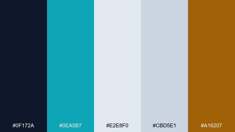
HEX: #0f172a #0ea5b7 #e2e8f0 #cbd5e1 #a16207
Mood: smart, modern, newsroom-clean
Best for: newspaper-style editorial layout
Smart and newsroom-clean, it suggests ink, crisp columns, and a modern highlight pen. The dark navy anchors the page, while the topaz accent feels contemporary and precise. Use it for long-read editorial layouts, reports, or portfolio case studies. Pair the warm brown as a secondary accent for pull quotes or section markers to avoid a cold, tech-only feel. Tip: keep the topaz to navigational cues and data callouts so the reading experience stays calm.
Image example of editorial ink and topaz generated using media.io
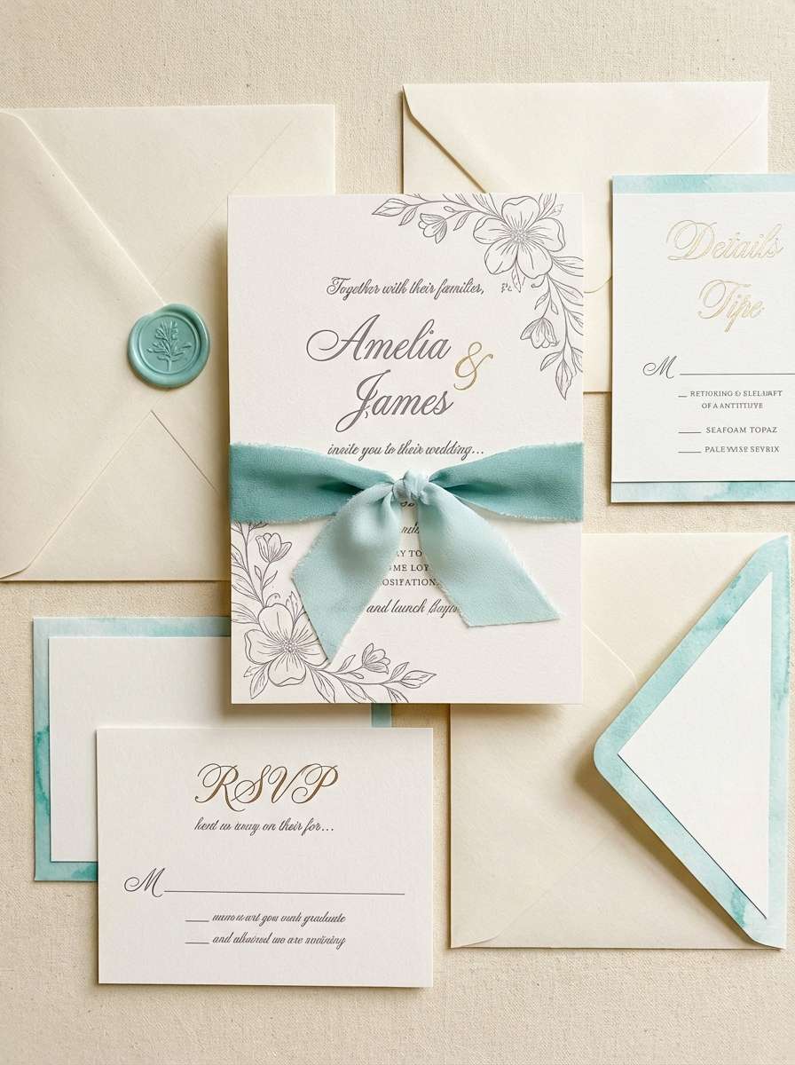
20) Wedding Seafoam
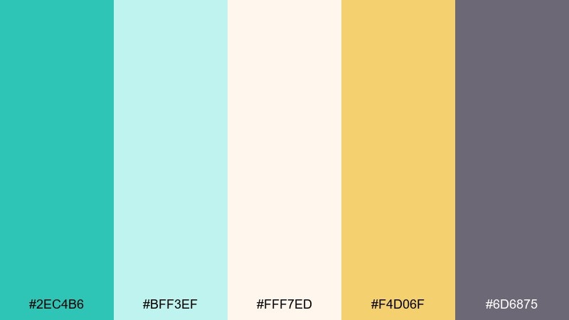
HEX: #2ec4b6 #bff3ef #fff7ed #f4d06f #6d6875
Mood: romantic, light, coastal elegant
Best for: wedding invitation suite
Romantic and light, it feels like seafoam, soft linen, and a warm sunset glint. The creamy base keeps the teal delicate, while the muted violet adds a gentle, modern twist. Use it for wedding invitations, save-the-dates, or coastal event suites with a refined tone. Pair the violet-gray for names and small details, and let the gold act as a minimal foil-like accent. Tip: print the teal slightly lighter than screen to maintain the airy, elegant feel.
Image example of wedding seafoam generated using media.io
What Colors Go Well with Topaz?
Topaz pairs naturally with crisp whites, cool grays, and deep navies—these give you clean contrast for UI, slides, and brand systems. If you want a more coastal feel, blend topaz with pale aquas and seafoam tints.
For warmth, add gold, amber, terracotta, peach, or warm cream. These complementary accents keep topaz from feeling too “techy” and help it read more premium and human in packaging, hospitality, and lifestyle design.
For a bolder look, use near-black or charcoal plus one bright accent (like neon cyan or lemon yellow). This keeps the palette high-contrast and legible while still letting topaz glow.
How to Use a Topaz Color Palette in Real Designs
Start with a clear role system: use lighter aquas for backgrounds, mid topaz for primary brand/UI actions, and deep navy/charcoal for text and structure. This makes your designs feel intentional and improves readability across screens.
In print, topaz looks best when you control saturation: keep large areas slightly softened and reserve the most vivid teal for logos, titles, or small graphic elements. Warm accents (gold/terracotta) work best as highlights, not full-page fills.
If you’re using gradients, keep the hue shift tight (aqua → topaz → deep teal) to avoid muddiness. Add subtle texture or grain in dark, cinematic palettes so highlights feel luminous instead of flat.
Create Topaz Palette Visuals with AI
If you already have HEX codes, you can turn them into consistent posters, packaging mockups, UI screens, and cover art by prompting an AI image generator with clear color direction. The fastest workflow is: pick a palette, choose a design type, then iterate composition while keeping colors stable.
Media.io Text-to-Image makes this easy in-browser—great for quick concepting, mood boards, and client-ready visuals. Use the prompts above as templates and swap the scene (poster, UI, packaging) to match your project.
Topaz Color Palette FAQs
-
What is the HEX code for topaz in this article?
The featured modern topaz tone is #0ea5b7, a blue-green teal that works well as a primary accent or brand color. -
Is topaz more blue or green?
Topaz sits between blue and green. Depending on the pairing, it can read more ocean-blue (with navy/blue) or more mint/teal (with greens and warm creams). -
What neutral colors go best with topaz?
Clean whites, soft cool grays, charcoal, and deep navy are the easiest neutrals with topaz. They keep layouts modern and make teal accents feel sharper. -
What accent colors make topaz look more premium?
Gold/amber, warm cream, cocoa brown, and muted brass tones elevate topaz quickly. Use accents sparingly (badges, icons, callouts) so the palette stays refined. -
How do I keep topaz UI designs accessible?
Use dark text colors (navy/charcoal) on light aqua backgrounds, and reserve saturated topaz for buttons. Always verify contrast ratios for text and key UI states. -
Does topaz print accurately?
Topaz can shift in print if saturation is too high. Test proofs, consider slightly lightening the teal for large fills, and use coated stock if you want a cleaner, brighter look. -
Can I generate matching topaz-themed images with AI?
Yes—use the included prompts as a base, specify your subject (poster/UI/packaging), and keep the palette consistent by referencing “dominant topaz teal and light aqua” plus your chosen accent.
Next: Graffiti Color Palette


