

Graffiti color palettes are built for impact: bold hues, sharp contrast, and accents that feel like fresh paint on a wall.
Below are 20 graffiti-inspired color scheme ideas with HEX codes you can use for posters, branding, UI, merch, and social graphics.
In this article
Why Graffiti Palettes Work So Well
Graffiti palettes are designed to be seen fast—often at a distance, on moving streets, and across busy textures like brick, tile, or metal. That’s why they lean on high contrast and saturated spray-paint tones that stay readable even when layered.
They also balance loud color with practical structure. Deep blacks, charcoals, and cool navies act like “ink” for outlines and typography, while neon or candy accents create the signature punch that makes street art feel alive.
Because the style is naturally expressive, graffiti color schemes translate well to modern design work—especially posters, brand drops, thumbnails, and social graphics where attention is the currency.
20+ Graffiti Color Palette Ideas (with HEX Codes)
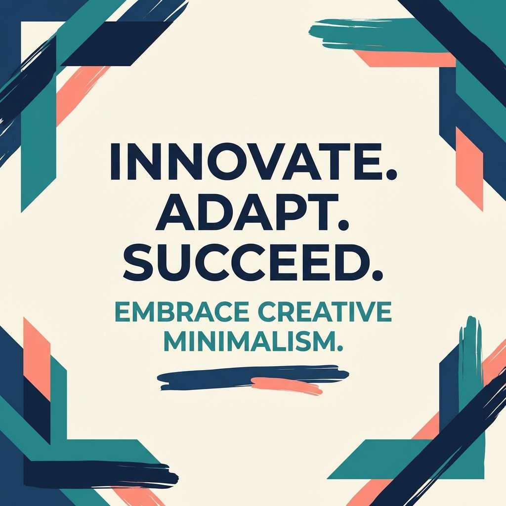
1) Subway Punch
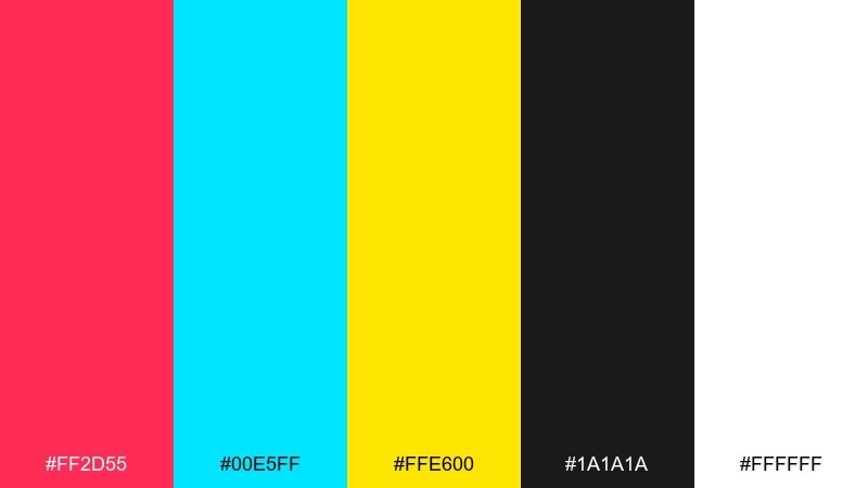
HEX: #ff2d55 #00e5ff #ffe600 #1a1a1a #ffffff
Mood: electric, loud, street-ready
Best for: street poster headlines and event promos
Electric and punchy, this set feels like fresh paint hitting a tiled subway wall under harsh lights. It excels on posters where you need instant readability from a distance. For a strong graffiti color combinations look, keep black as the base and let the pink and cyan fight for attention. Usage tip: reserve the yellow for small highlights and icons so it stays sharp, not noisy.
Image example of subway punch generated using media.io
Media.io is an online AI studio for creating and editing video, image, and audio in your browser.

2) Concrete Pastels
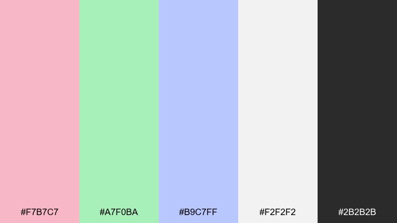
HEX: #f7b7c7 #a7f0ba #b9c7ff #f2f2f2 #2b2b2b
Mood: soft, playful, modern
Best for: app onboarding screens and lifestyle UI
Soft pastels over a concrete base evoke chalky tags on a bright morning wall. The gentle contrast works beautifully for UI where clarity matters more than shock value. Pair the gray-white background with one pastel as a primary and keep the others for micro-interactions. Usage tip: use the charcoal only for body text and navigation to prevent the screen from feeling heavy.
Image example of concrete pastels generated using media.io
3) Rust and Teal Tag
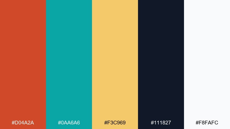
HEX: #d04a2a #0aa6a6 #f3c969 #111827 #f8fafc
Mood: gritty, warm-cool contrast
Best for: brand identities for coffee shops and studios
Gritty rust and crisp teal bring to mind weathered metal doors covered in layered tags. The warm-cool contrast gives logos energy without going fully neon. Keep the navy as your anchor, then use teal for primary buttons and rust for calls to action. Usage tip: print tests matter here, because rust can darken quickly on uncoated paper.
Image example of rust and teal tag generated using media.io
4) Night Alley Glow
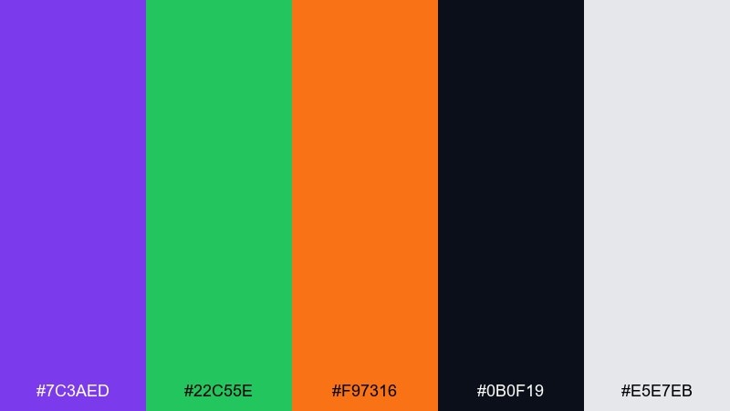
HEX: #7c3aed #22c55e #f97316 #0b0f19 #e5e7eb
Mood: moody, luminous, nocturnal
Best for: album covers and nightlife announcements
Moody and luminous, it reads like a dark alley lit by a neon sign and a fresh orange throw-up. It is ideal for covers and posters where you want glow without losing depth. This graffiti color palette works best when violet leads and green is kept as a punchy accent. Usage tip: add a subtle gradient from near-black to violet to amplify the night-time feel.
Image example of night alley glow generated using media.io
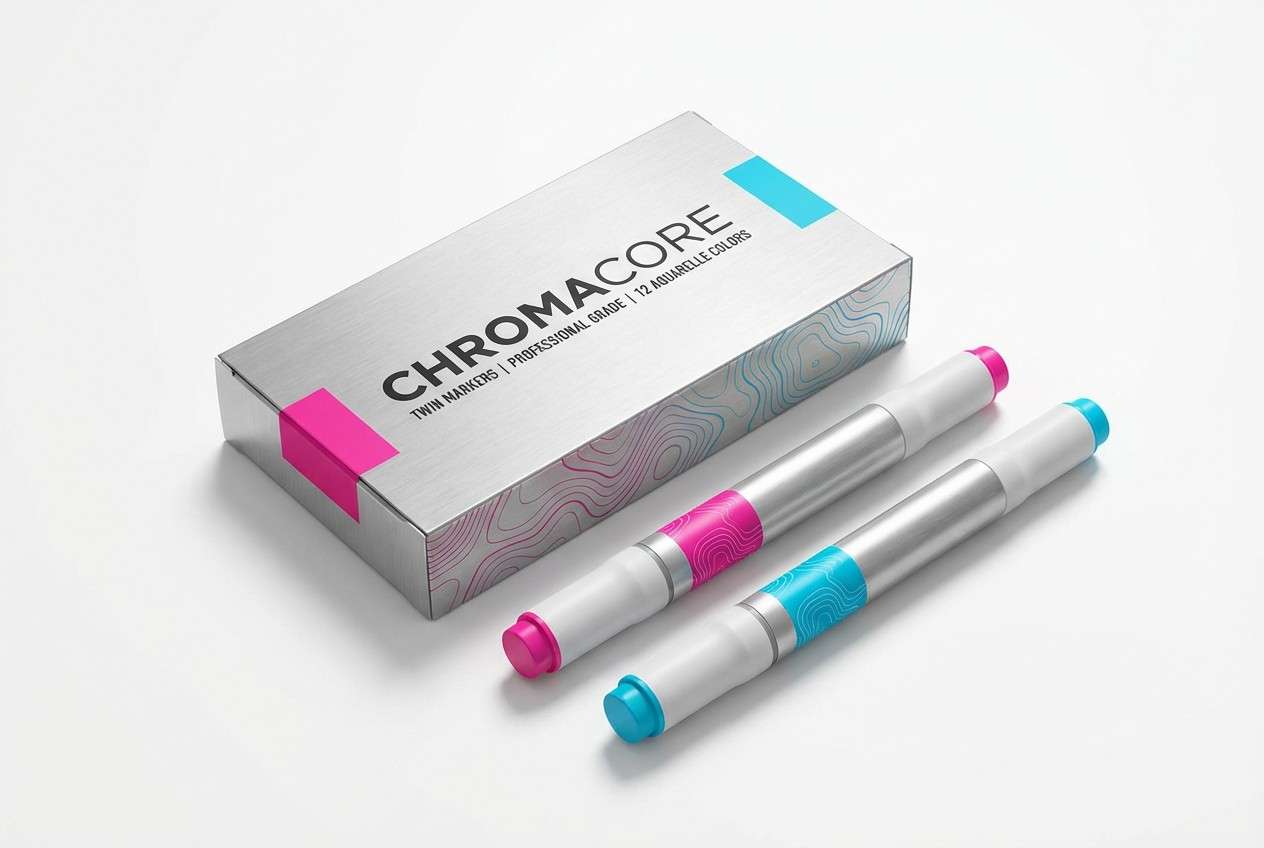
5) Chrome Marker
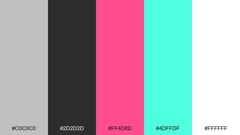
HEX: #c0c0c0 #2d2d2d #ff4d8d #4dffdf #ffffff
Mood: slick, shiny, high-contrast
Best for: marker packaging and product ads
Slick chrome tones with candy accents evoke metallic marker ink catching light on a glossy panel. The mix feels premium, making it great for product ads and packaging. Let silver and white handle most surfaces, then pop the pink or aqua on labels and key claims. Usage tip: keep gradients subtle so the chrome effect does not compete with your headline.
Image example of chrome marker generated using media.io
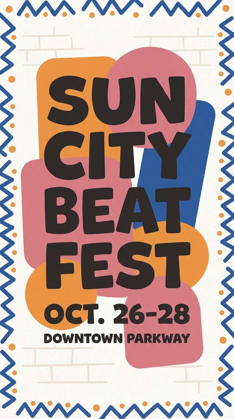
6) Brickwall Sunset
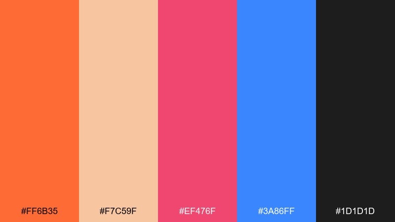
HEX: #ff6b35 #f7c59f #ef476f #3a86ff #1d1d1d
Mood: warm, expressive, energetic
Best for: festival flyers and community events
Warm and expressive, it feels like sunset hitting a brick wall while fresh paint still shines. The orange and rose tones bring friendliness, while blue adds the cool counterpoint that keeps it modern. Use charcoal for type and outlines to keep the flyer legible in busy layouts. Usage tip: pick one warm as the hero and use the other as a shadow or secondary block color.
Image example of brickwall sunset generated using media.io
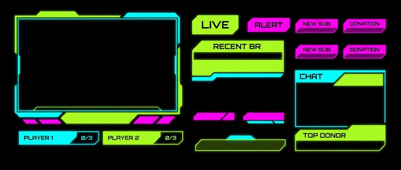
7) Lime Static
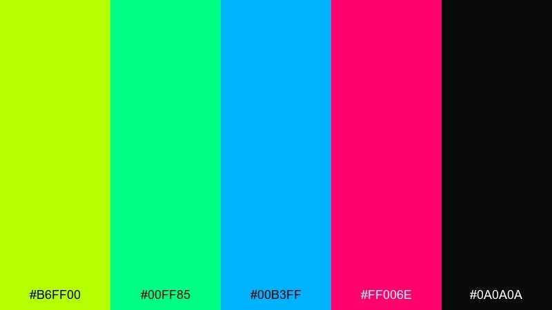
HEX: #b6ff00 #00ff85 #00b3ff #ff006e #0a0a0a
Mood: hyper, futuristic, high-impact
Best for: esports overlays and stream graphics
Hyper and futuristic, these tones look like glitchy tags under a strobe with static in the air. The black base keeps the brights clean, perfect for overlays and fast-moving content. Limit yourself to two dominant accents, then use the others for alerts and state changes. Usage tip: add generous spacing around bright text so it does not vibrate against the dark background.
Image example of lime static generated using media.io
8) Misted Metro
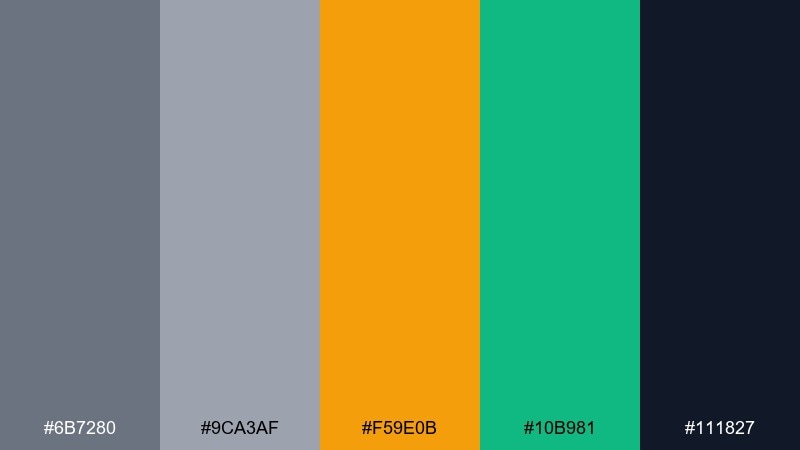
HEX: #6b7280 #9ca3af #f59e0b #10b981 #111827
Mood: muted, urban, editorial
Best for: magazine spreads and blog headers
Muted and urban, it suggests a misty platform with paint details peeking through. The grays set an editorial tone, while amber and green add controlled personality. Use the navy for typography and grid lines, and reserve amber for section headers or pull quotes. Usage tip: keep backgrounds light gray to prevent the palette from feeling overly cold.
Image example of misted metro generated using media.io
9) Candy Drip
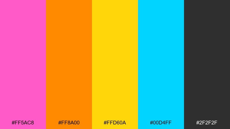
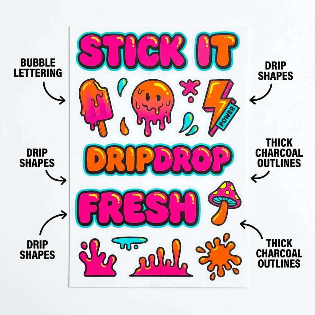
HEX: #ff5ac8 #ff8a00 #ffd60a #00d4ff #2f2f2f
Mood: sweet, bold, pop-art
Best for: sticker packs and social promos
Sweet and bold, it looks like glossy drips running down a freshly painted piece. The bright mix is perfect for stickers and social promos where the vibe should feel playful, not serious. These graffiti color combinations land best when you pick one warm lead and let cyan handle contrast. Usage tip: outline key shapes with charcoal to keep the candy tones from blending together.
Image example of candy drip generated using media.io
10) Stencil Neutral Pop
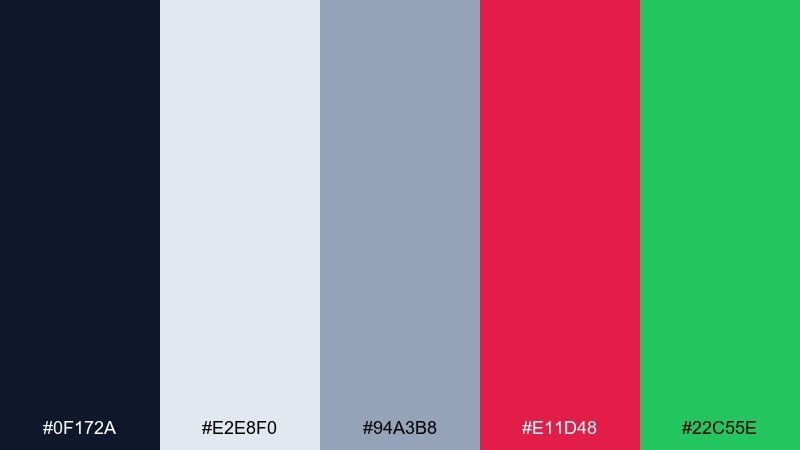
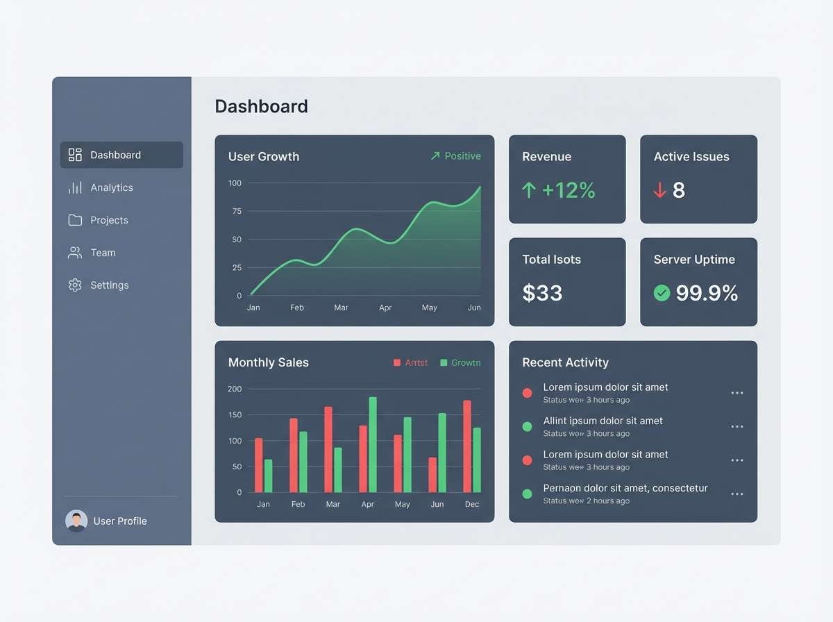
HEX: #0f172a #e2e8f0 #94a3b8 #e11d48 #22c55e
Mood: clean, punchy, organized
Best for: product UI and dashboard components
Clean neutrals with sharp pops evoke crisp stencil work on a smooth wall. It is a reliable pairing for dashboards that need both clarity and attitude. Use the slate range for structure, then deploy red for destructive actions and green for success states. Usage tip: keep the accent colors at small percentages so the interface stays calm while still feeling energetic.
Image example of stencil neutral pop generated using media.io
11) Harbor Ink
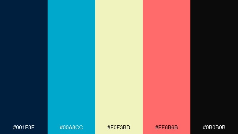
HEX: #001f3f #00a8cc #f0f3bd #ff6b6b #0b0b0b
Mood: deep, coastal, dramatic
Best for: music cover art and merch drops
Deep ink blues with coral highlights feel like waterfront walls tagged near shipping lights. The palette is dramatic without going harsh, making it great for cover art and merch graphics. Let navy dominate and use cyan for secondary shapes, then bring coral in for the focal mark. Usage tip: keep the pale yellow for negative space blocks to avoid overly bright backgrounds.
Image example of harbor ink generated using media.io
12) Desert Spray
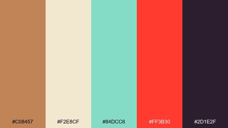
HEX: #c08457 #f2e8cf #84dcc6 #ff3b30 #2d1e2f
Mood: sunbaked, artsy, eclectic
Best for: streetwear lookbooks and campaign banners
Sunbaked neutrals with a cool aqua hit evoke murals painted on stucco under dry heat. The off-white keeps layouts breathable, while red adds instant urgency. Use plum as your type color and let aqua be the modern accent that breaks up the warm tones. Usage tip: set photos or illustrations on the cream background so the palette reads intentional, not dusty.
Image example of desert spray generated using media.io

13) Frosted Tags
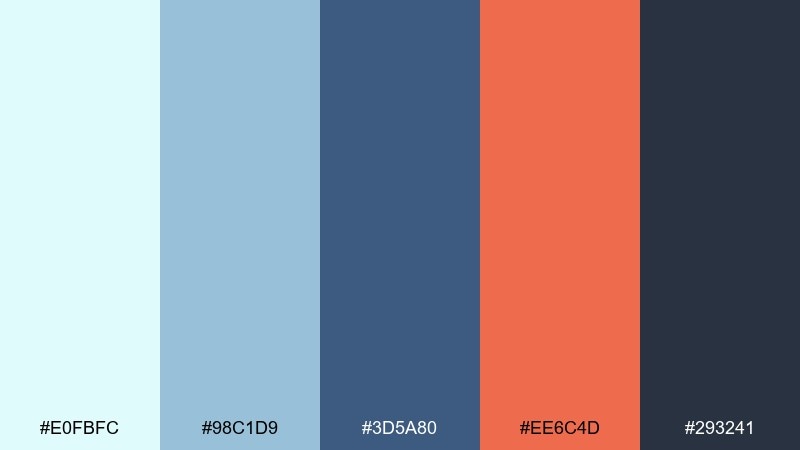
HEX: #e0fbfc #98c1d9 #3d5a80 #ee6c4d #293241
Mood: cool, crisp, approachable
Best for: slide decks and workshop materials
Cool and crisp, it feels like winter air over painted steel with a warm coral tag on top. The blues create trust and structure, while coral keeps the tone friendly. Use the pale ice as the main background, then build hierarchy with navy and slate. Usage tip: keep coral for section titles and key numbers so your deck stays cohesive.
Image example of frosted tags generated using media.io
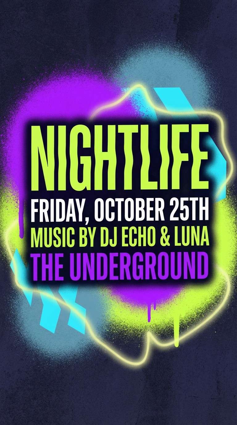
14) Toxic Orchid
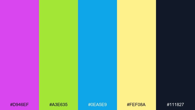
HEX: #d946ef #a3e635 #0ea5e9 #fef08a #111827
Mood: wild, neon-lit, rebellious
Best for: nightclub posters and DJ flyers
Wild and neon-lit, this mix looks like an orchid-purple tag buzzing under club lighting. It is built for nightlife posters where you want immediate impact and a slightly dangerous edge. Let purple and navy carry the layout, then spike it with lime for key details like date and venue. Usage tip: use the pale yellow as a subtle glow behind small text to improve legibility.
Image example of toxic orchid generated using media.io
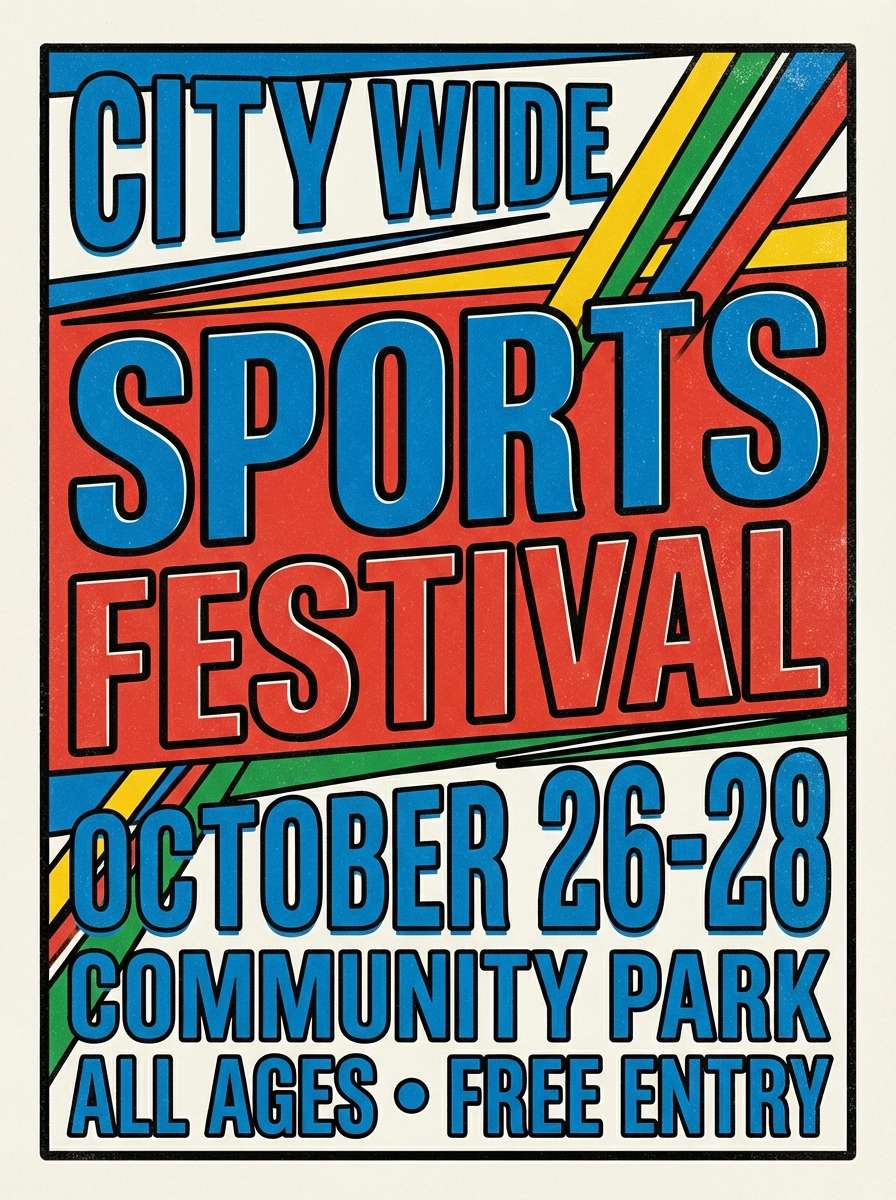
15) Old School Primary
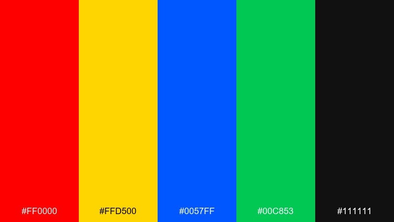
HEX: #ff0000 #ffd500 #0057ff #00c853 #111111
Mood: classic, bold, high-contrast
Best for: sports posters and youth programs
Classic primaries with deep black feel like throwback pieces and blocky letterforms on a playground wall. The colors are instantly readable, making them great for sports posters and youth programs. This graffiti color palette works best when you choose one primary as the headline and keep the others for icons and stripes. Usage tip: avoid using all three bright primaries at equal weight, or the design can feel chaotic.
Image example of old school primary generated using media.io
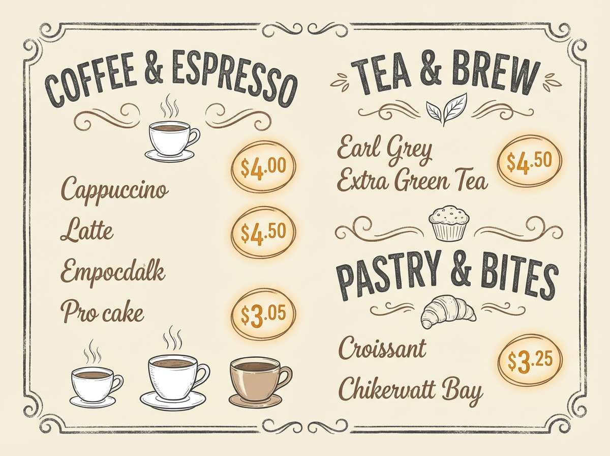
16) Sepia Wallwash
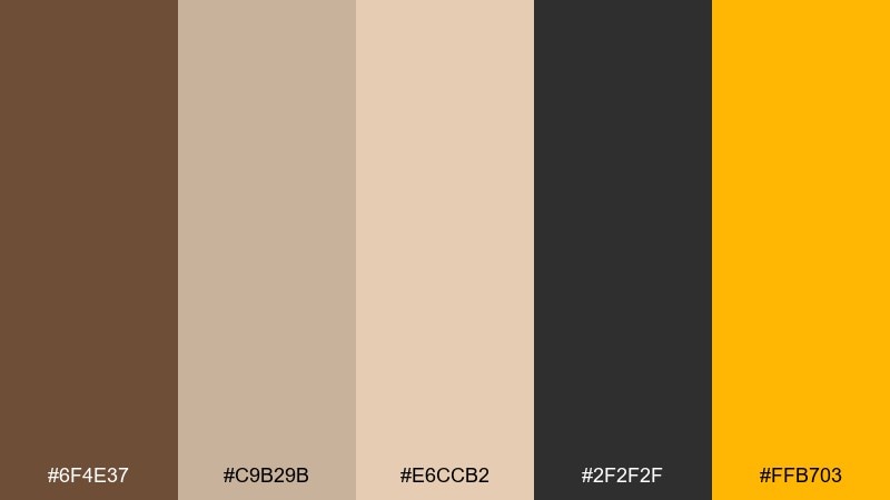
HEX: #6f4e37 #c9b29b #e6ccb2 #2f2f2f #ffb703
Mood: warm, handcrafted, grounded
Best for: cafe menus and chalkboard-style prints
Warm and grounded, these sepia tones evoke a sun-washed wall with hand-lettered notes. It is perfect for cafe menus and prints that should feel crafted rather than polished. Use the creams for background and the browns for type, then add amber as the one cheerful accent. Usage tip: a subtle paper grain texture helps the palette feel authentic and less flat.
Image example of sepia wallwash generated using media.io
17) Cyanotype Pop
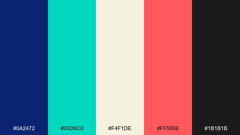
HEX: #0a2472 #00d9c0 #f4f1de #ff595e #1b1b1b
Mood: fresh, graphic, punchy
Best for: social quote cards and announcement posts
Fresh and graphic, it feels like cyanotype ink with a sharp coral stamp. The contrast is clean enough for text-heavy social posts, but still has a street edge. Use cream for breathing room, then pick either teal or coral as the main callout color. Usage tip: keep body text in near-black and save navy for large blocks to avoid heavy pages.
Image example of cyanotype pop generated using media.io
18) Asphalt Mint
HEX: #0b1320 #1f2937 #2dd4bf #a7f3d0 #f9fafb
Mood: cool, minimal, techy
Best for: SaaS landing pages and clean banners
Cool and minimal, it brings to mind wet asphalt with mint spray mist drifting across it. The restrained range makes layouts feel techy and premium, not messy. This graffiti color scheme shines when you keep the dark grays for structure and use mint only for buttons and links. Usage tip: add soft mint gradients behind CTAs to create depth without adding new colors.
Image example of asphalt mint generated using media.io
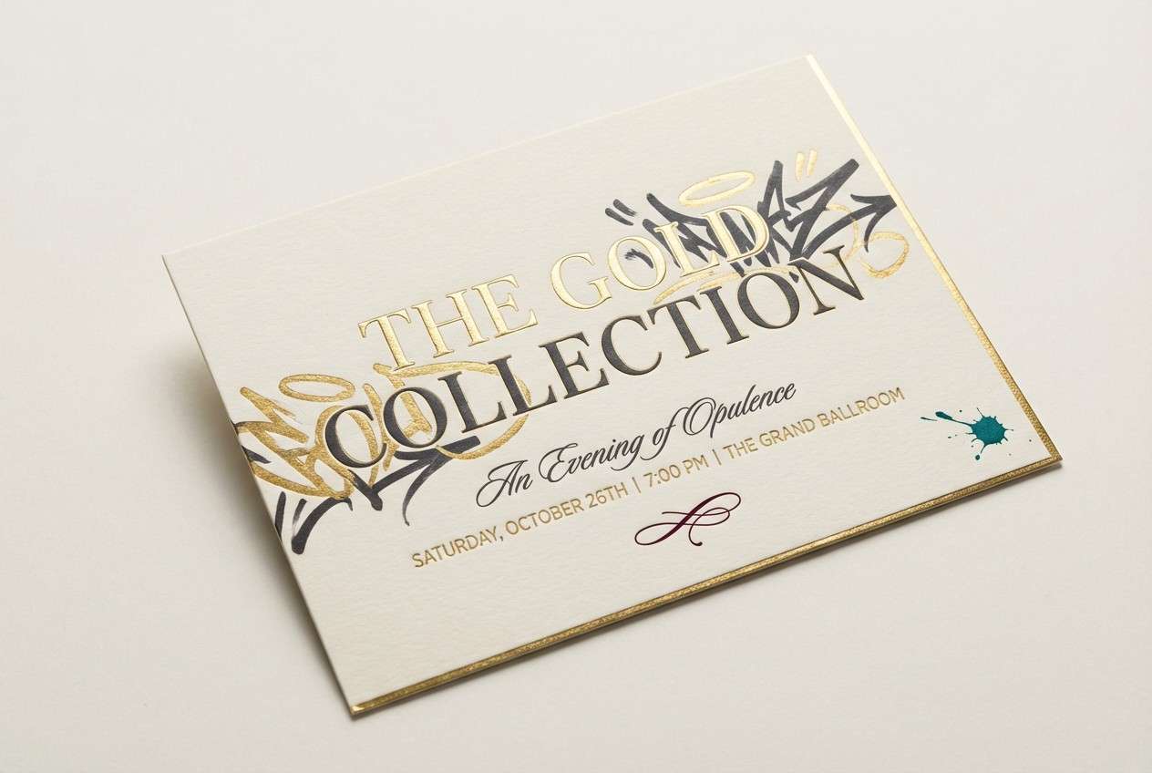
19) Gold Leaf Tag
HEX: #d4af37 #2a2a2a #7f1d1d #f5f5f5 #0ea5e9
Mood: bold, premium, dramatic
Best for: luxury event invitations and VIP passes
Bold and premium, it feels like a gold tag catching light on a dark wall. The mix balances luxury with edge, especially when the teal is used sparingly. It works well for invitations, VIP passes, and any layout that needs high contrast without looking generic. Usage tip: use gold for borders and small stamps, not full backgrounds, so it reads like foil.
Image example of gold leaf tag generated using media.io
20) Violet Heat
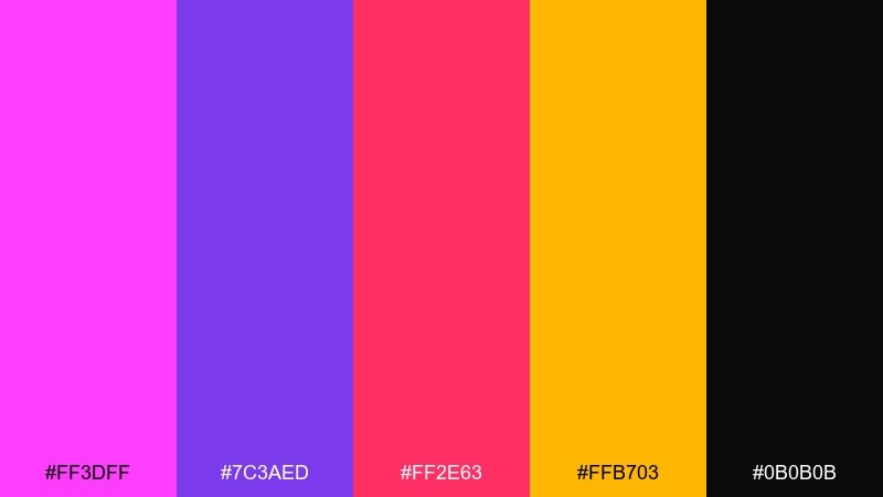
HEX: #ff3dff #7c3aed #ff2e63 #ffb703 #0b0b0b
Mood: hot, playful, high-energy
Best for: YouTube thumbnails and creator banners
Hot and playful, it looks like a high-voltage piece with violet haze and candy-pink bursts. The high contrast makes it perfect for thumbnails that must read at tiny sizes. Build the background with black and violet, then use pink for the face-grab and amber for a single highlight. Usage tip: keep text in white or amber with a thick black stroke for maximum clarity.
Image example of violet heat generated using media.io
What Colors Go Well with Graffiti?
Graffiti-friendly color pairings usually start with a strong base: black, near-black navy, charcoal, or a clean white. These neutrals give spray-paint brights a crisp edge and help typography stay readable.
Neon accents (lime, cyan, magenta, electric violet) naturally match graffiti aesthetics because they mimic high-pressure pigment and nighttime signage. Pair one neon with a warmer highlight (orange or yellow) to create depth and movement.
If you want a more modern “street editorial” look, combine muted grays with a single loud accent like coral, amber, or teal. This keeps the vibe urban without turning the whole design into visual noise.
How to Use a Graffiti Color Palette in Real Designs
Start by assigning roles: one dominant background, one main headline/accent color, and one highlight color for tiny elements like dates, icons, or price points. Graffiti palettes feel best when the contrast is intentional, not evenly distributed.
For print (flyers, posters, merch), test how your loudest tones reproduce—hot pinks and rusts can shift depending on paper and ink. Add outlines or strokes (usually black or charcoal) to keep letters sharp over textured shapes.
For digital (thumbnails, socials, overlays), avoid placing saturated colors at equal intensity side-by-side. Use spacing, shadows, and subtle gradients so brights don’t “vibrate,” especially on dark backgrounds.
Create Graffiti Palette Visuals with AI
If you already have HEX codes, you can turn them into real design directions by generating posters, sticker sheets, brand boards, or UI mockups that match the palette’s mood. This helps you validate contrast, hierarchy, and readability before you commit.
With Media.io Text-to-Image, you can describe the layout (flyer, album cover, dashboard, etc.), specify the vibe (street-ready, neon-lit, editorial), and iterate quickly until the palette feels right for your project.
Use your prompt to control where each color appears—e.g., “black base, cyan primary shapes, magenta headline, yellow highlights”—so the output stays consistent with your intended graffiti color scheme.
Graffiti Color Palette FAQs
-
What is a graffiti color palette?
A graffiti color palette is a set of high-contrast, street-art-inspired colors—often bold brights plus dark neutrals—chosen to keep lettering, outlines, and accents readable and energetic. -
What are the best base colors for graffiti designs?
Black, charcoal, deep navy, and white are the most reliable bases. They act like “ink” or “wall space,” making neon and saturated spray paint tones pop while keeping type legible. -
How many colors should I use in a graffiti-style design?
Usually 3 core colors (base + primary + accent) are enough. You can add 1–2 supporting shades for highlights, but too many equal-weight brights can make the layout feel chaotic. -
Do neon colors always fit a graffiti color scheme?
Neons are a natural match because they mimic signage glow and high-pigment paint, but they work best when balanced with neutrals. Use neon as accents or focal points rather than full-page backgrounds. -
How do I keep graffiti colors readable for text?
Use strong contrast (dark-on-light or light-on-dark) and add outlines/strokes around letters. Also reserve the brightest colors for short headlines or small highlights instead of long body text. -
Which graffiti palettes work best for branding?
Palettes with a stable neutral structure (like Rust and Teal Tag, Stencil Neutral Pop, or Asphalt Mint) are easier to scale across logos, packaging, and UI while still feeling street-inspired. -
Can I generate graffiti palette visuals with AI?
Yes. With Media.io Text-to-Image, you can generate posters, flyers, album covers, merch graphics, or UI concepts by describing the design style and specifying how your palette colors should be used.
Next: Neon Color Palette


