

Teal rust palettes balance cool coastal depth with warm earthy energy—an easy way to make designs feel modern, grounded, and memorable.
Below are 20 curated teal-and-rust combinations with HEX codes, plus practical tips for accents, neutrals, and real-world use across branding, UI, interiors, and print.
In this article
Why Teal Rust Palettes Work So Well
Teal and rust sit on opposite sides of the warm–cool spectrum, so they create instant contrast without feeling harsh. Teal brings calm, trust, and clarity; rust adds warmth, appetite appeal, and a handcrafted edge.
This pairing also feels “natural” because it echoes real-world materials—sea glass, patina metal, terracotta clay, brick, and weathered wood. That material association makes the palette versatile for both digital interfaces and tactile print.
With the right neutral (cream, sand, stone, or charcoal), teal rust schemes stay balanced: modern enough for UI and branding, yet earthy enough for interiors and packaging.
20+ Teal Rust Color Palette Ideas (with HEX Codes)
1) Harbor Patina
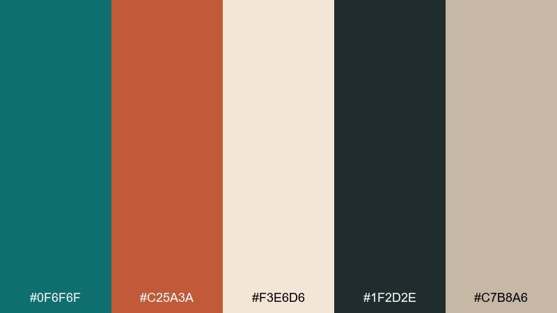
HEX: #0f6f6f #c25a3a #f3e6d6 #1f2d2e #c7b8a6
Mood: calm, maritime, grounded
Best for: brand moodboards and identity systems
Calm and maritime, this mix feels like weathered docks, sea glass, and sun-baked rope. Use the teal as the anchor, then let rust play the hero on buttons, headings, or packaging marks. Cream keeps layouts breathable while deep charcoal adds contrast for type. Tip: reserve the darkest tone for small text and icons so the palette stays airy, not heavy.
Image example of harbor patina generated using media.io
Media.io is an online AI studio for creating and editing video, image, and audio in your browser.

2) Desert Dock
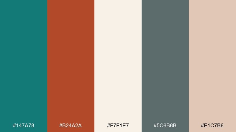
HEX: #147a78 #b24a2a #f7f1e7 #5c6b6b #e1c7b6
Mood: sun-warmed, relaxed, approachable
Best for: southwest-inspired living rooms and decor
Sun-warmed and relaxed, it reads like desert air meeting a cool shoreline breeze. In a teal rust color palette like this, keep walls or large textiles in the soft off-white and bring in teal through rugs or cabinetry. Rust is perfect for pottery, throw pillows, or a single statement chair. Tip: repeat rust in two small accents across the room to make it feel intentional rather than random.
Image example of desert dock generated using media.io
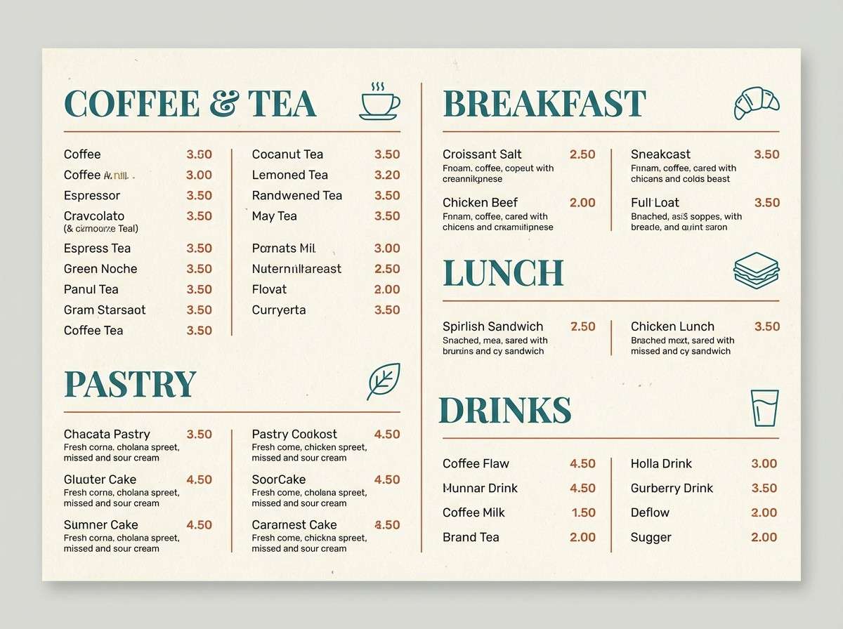
3) Verdigris Lodge
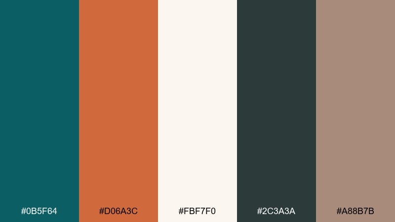
HEX: #0b5f64 #d06a3c #fbf7f0 #2c3a3a #a88b7b
Mood: heritage, cozy, slightly rugged
Best for: boutique cafe menus and signage
Heritage and cozy, it evokes copper kettles, tiled stoves, and a dim lodge bar. Use the pale cream as the menu background so the typography stays crisp, then set section headers in teal for structure. Rust works beautifully for callouts like specials, prices, or stamp-like badges. Tip: keep body copy in the deep gray-green to avoid the harshness of pure black.
Image example of verdigris lodge generated using media.io
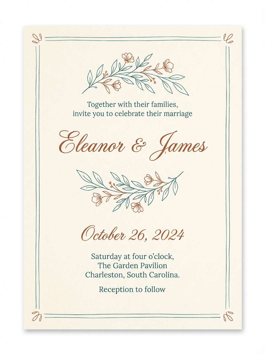
4) Clay and Tide
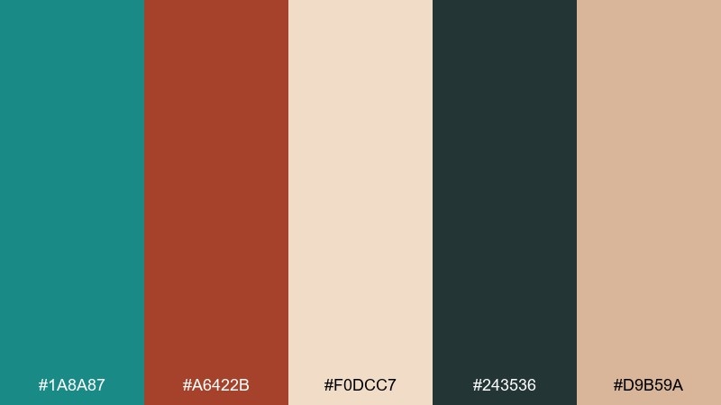
HEX: #1a8a87 #a6422b #f0dcc7 #243536 #d9b59a
Mood: romantic, artisanal, warm
Best for: wedding invitations and stationery
Romantic and artisanal, it feels like hand-thrown clay paired with coastal glass. Let the warm cream take the paper role, then add teal for monograms or border rules to keep everything refined. Rust is best saved for names, dates, or small florals to add warmth without overpowering. Tip: use the deep slate for tiny details like RSVP lines for better legibility.
Image example of clay and tide generated using media.io
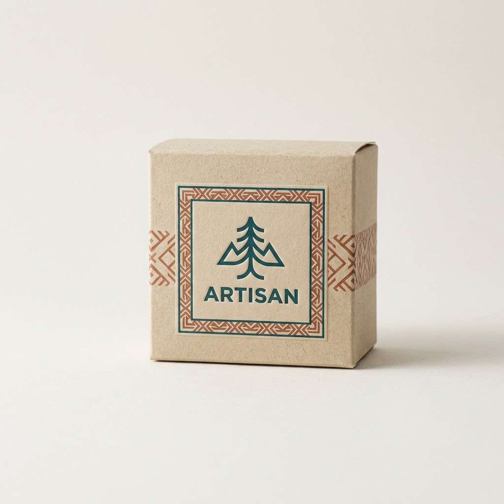
5) Vintage Workshop
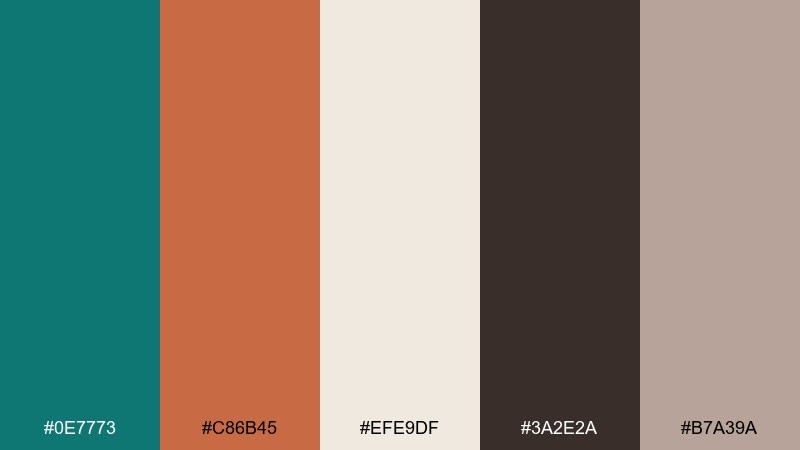
HEX: #0e7773 #c86b45 #efe9df #3a2e2a #b7a39a
Mood: crafty, nostalgic, tactile
Best for: artisan product packaging and labels
Crafty and nostalgic, it brings to mind wooden workbenches, oxidized tools, and wrapped parcels. These teal rust color combinations shine on kraft-style labels when you keep teal for the brand mark and rust for small patterning or seals. The off-white works as negative space so the design does not look busy. Tip: print the darkest tone sparingly to avoid muddy results on textured paper.
Image example of vintage workshop generated using media.io
6) Coastal Terracotta
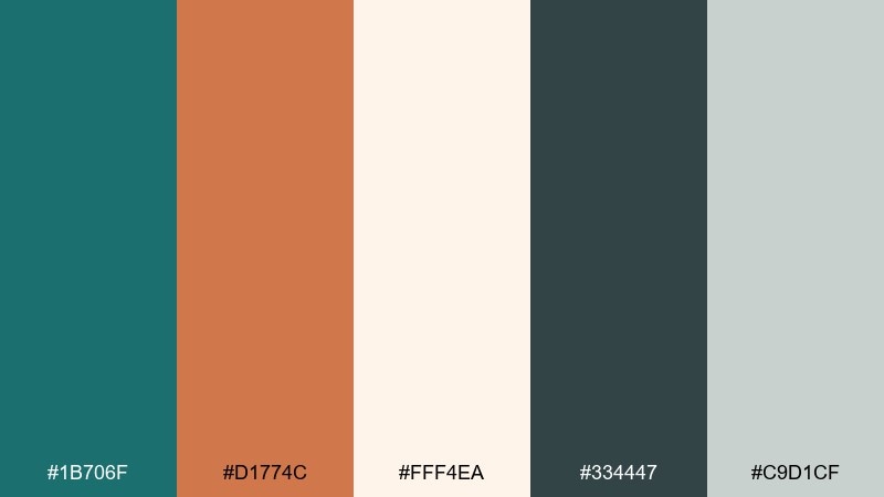
HEX: #1b706f #d1774c #fff4ea #334447 #c9d1cf
Mood: fresh, breezy, sunlit
Best for: bathroom refresh and spa branding
Fresh and breezy, it feels like sunlit stucco next to cool water. Use the bright cream as your base for tiles, towels, or a website background, then layer teal into cabinetry, labels, or navigation. Terracotta brings warmth in small hits like soap packaging, planters, or accent stripes. Tip: keep the cool gray-green for secondary text so the whole look stays calm.
Image example of coastal terracotta generated using media.io
7) Museum Modern
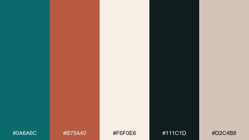
HEX: #0a6a6c #b75a40 #f6f0e6 #111c1d #d2c4b8
Mood: gallery-clean, confident, premium
Best for: portfolio sites and minimalist landing pages
Gallery-clean and premium, it reads like curated ceramics under soft spotlights. Build pages with the warm off-white as the canvas, then use teal for navigation states and key links. Rust is a strong accent for CTAs when you want warmth without going loud. Tip: choose the near-black for headlines and keep line weights thin to preserve the modern feel.
Image example of museum modern generated using media.io
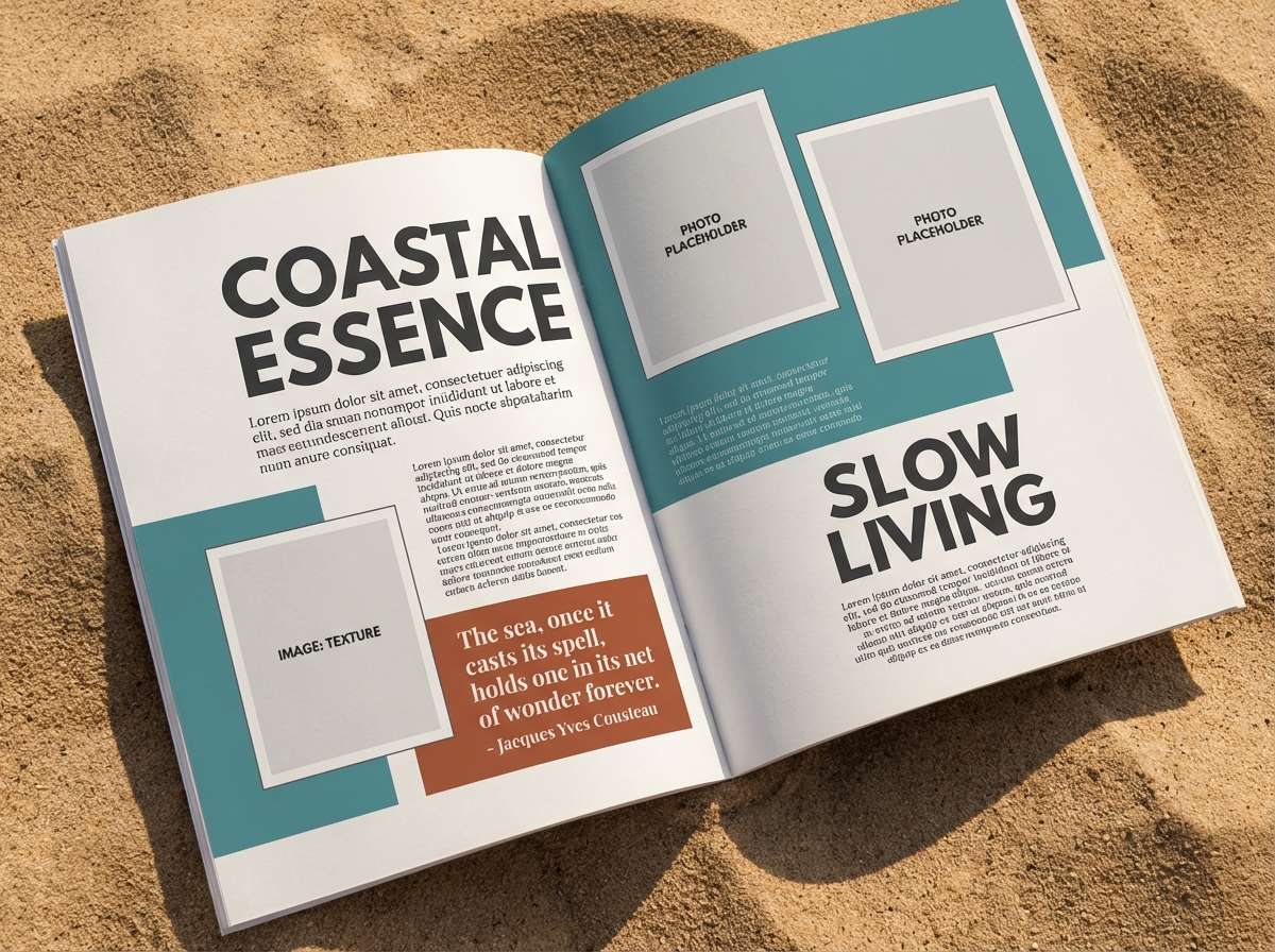
8) Autumn Marina
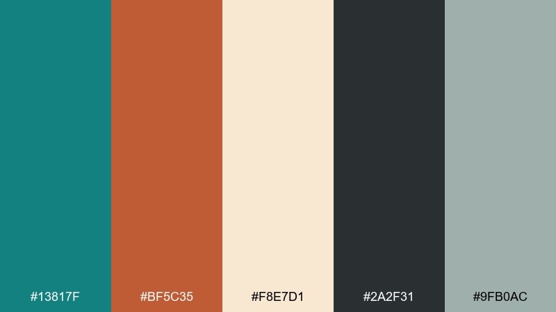
HEX: #13817f #bf5c35 #f8e7d1 #2a2f31 #9fb0ac
Mood: moody, outdoorsy, modern
Best for: magazine layouts and editorial spreads
Moody and outdoorsy, it suggests rainy harbors and copper leaves on pavement. As a teal rust color scheme, it works best when teal carries large blocks like sidebars while rust marks pull quotes or section dividers. The light sand tone keeps columns readable and softens the contrast. Tip: let the muted gray-green handle captions so the accent colors stay special.
Image example of autumn marina generated using media.io
9) Copper Kelp
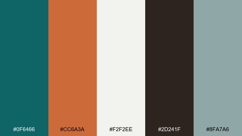
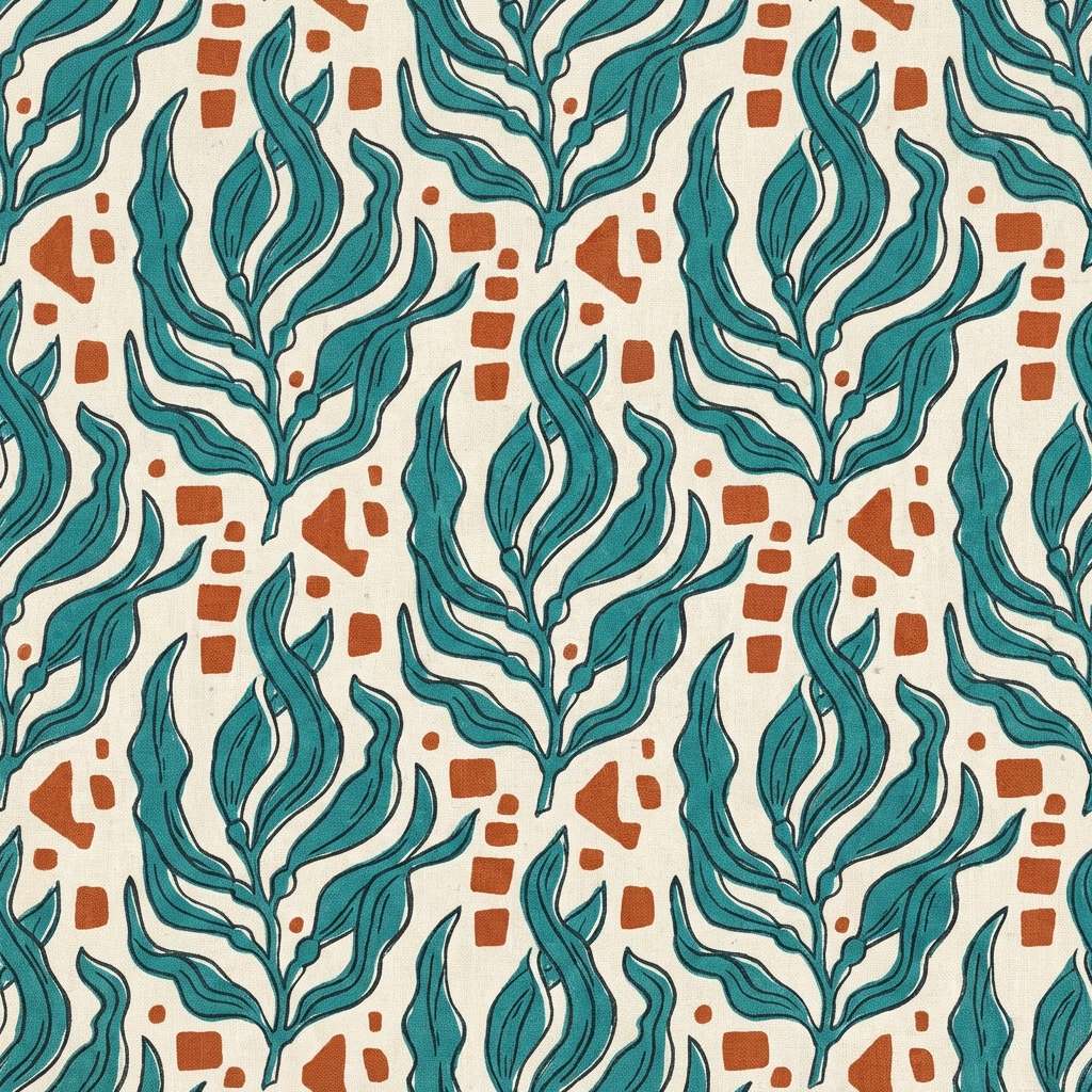
HEX: #0f6466 #cc6a3a #f2f2ee #2d241f #8fa7a6
Mood: earthy, oceanic, natural
Best for: seamless patterns and textile prints
Earthy and oceanic, it feels like kelp forests with a flash of oxidized copper. Use teal and off-white for the main repeat so the pattern stays wearable, then drop rust in as small motifs for energy. The deep brown-black is ideal for outlines or stitch-like details. Tip: keep rust shapes smaller than teal to prevent the print from looking heavy.
Image example of copper kelp generated using media.io
10) Smoked Adobe
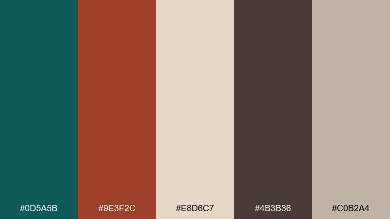
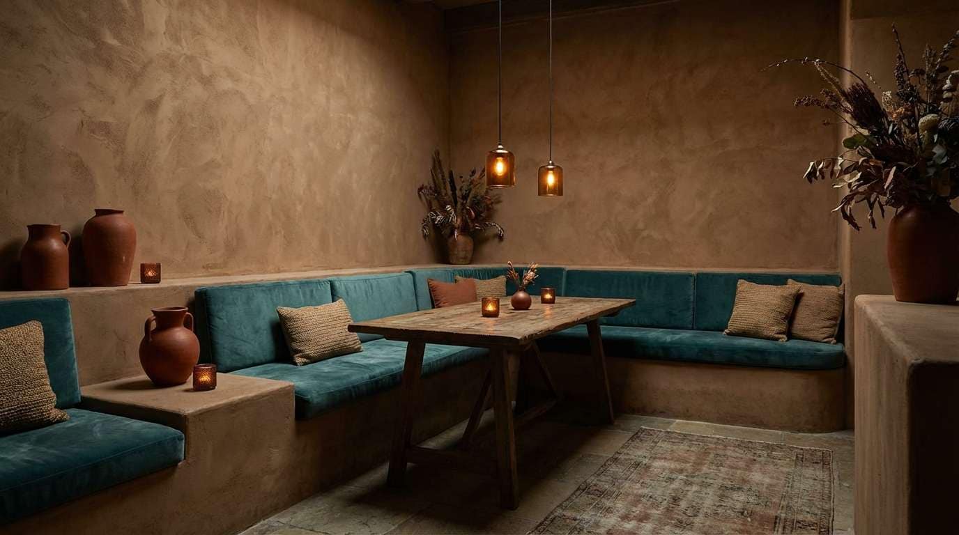
HEX: #0d5a5b #9e3f2c #e8d6c7 #4b3b36 #c0b2a4
Mood: smoky, intimate, sophisticated
Best for: restaurant interiors and mood lighting concepts
Smoky and intimate, it evokes adobe walls after dusk with a cool teal shadow. Use the soft clay tones for large surfaces and upholstery, then bring teal into banquettes or painted trim for a modern twist. Rust reads best in warm lighting, so use it on small decor, menus, or pendant shades. Tip: add matte textures so the deeper shades do not feel too glossy or harsh.
Image example of smoked adobe generated using media.io
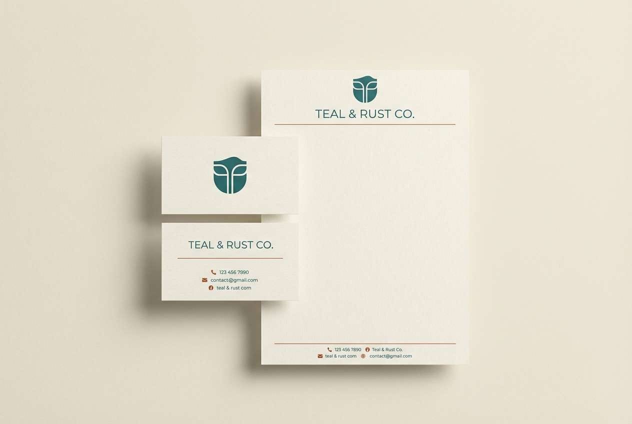
11) Tea House Tile
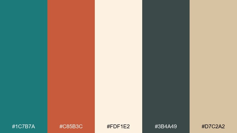
HEX: #1c7b7a #c85b3c #fdf1e2 #3b4a49 #d7c2a2
Mood: welcoming, clean, handmade
Best for: hospitality branding and stationery sets
Welcoming and handmade, it recalls glazed tiles, steamed pastries, and a tidy counter. A teal rust color palette like this is easiest to balance when teal handles logos and headers while rust stays on stamps, icons, or a thin underline. The creamy background makes it feel friendly instead of corporate. Tip: keep the darkest shade for small type only, so the stationery prints crisp on uncoated paper.
Image example of tea house tile generated using media.io
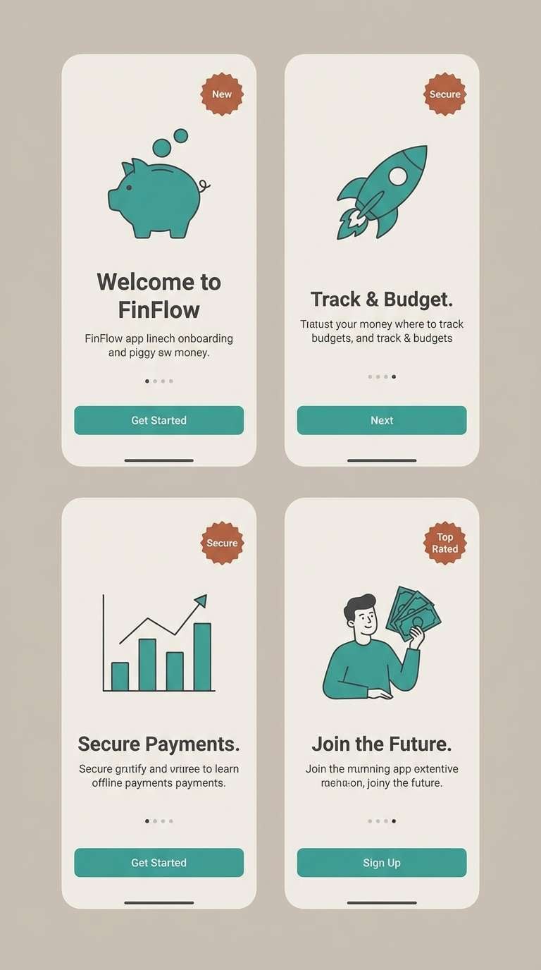
12) Industrial Seafoam
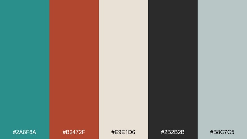
HEX: #2a8f8a #b2472f #e9e1d6 #2b2b2b #b8c7c5
Mood: urban, clean, high-contrast
Best for: fintech app onboarding screens
Urban and clean, it feels like painted steel, seafoam glass, and warm brick. Use teal for progress states and interactive elements so the UX feels steady and trustworthy. Rust works well for warnings, badges, or one standout CTA when you want warmth without using red. Tip: keep backgrounds in the light neutrals and limit dark blocks to headers for readability.
Image example of industrial seafoam generated using media.io
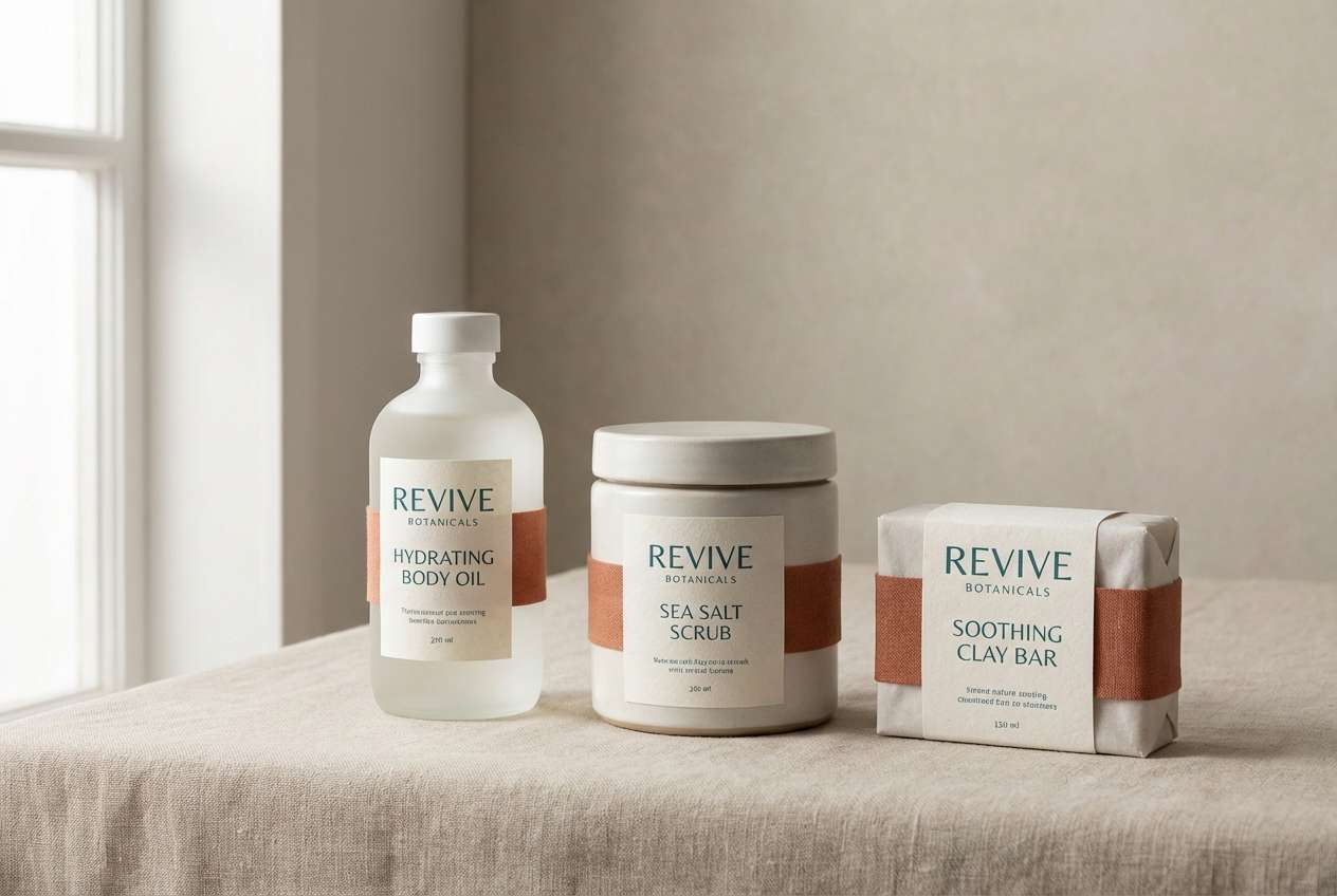
13) Rustic Boutique
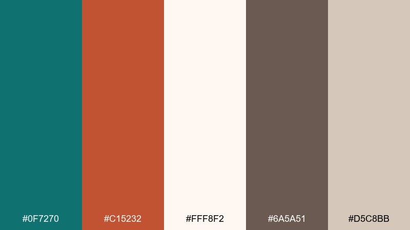
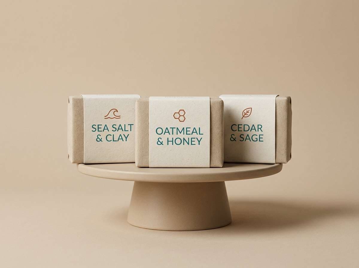
HEX: #0f7270 #c15232 #fff8f2 #6a5a51 #d5c8bb
Mood: soft, boutique, curated
Best for: handmade soap labels and skincare tags
Soft and curated, it suggests linen shelves, ceramic trays, and a hint of spice. Use the near-white as the label base, then set the product name in teal for a calm, premium read. Rust can mark scent notes or small icons to add warmth and personality. Tip: keep the taupe for ingredient lists so everything stays legible at small sizes.
Image example of rustic boutique generated using media.io
14) Misted Canyon
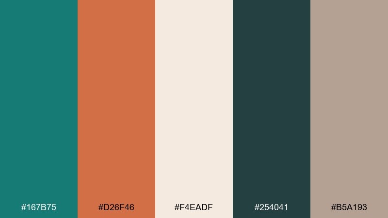
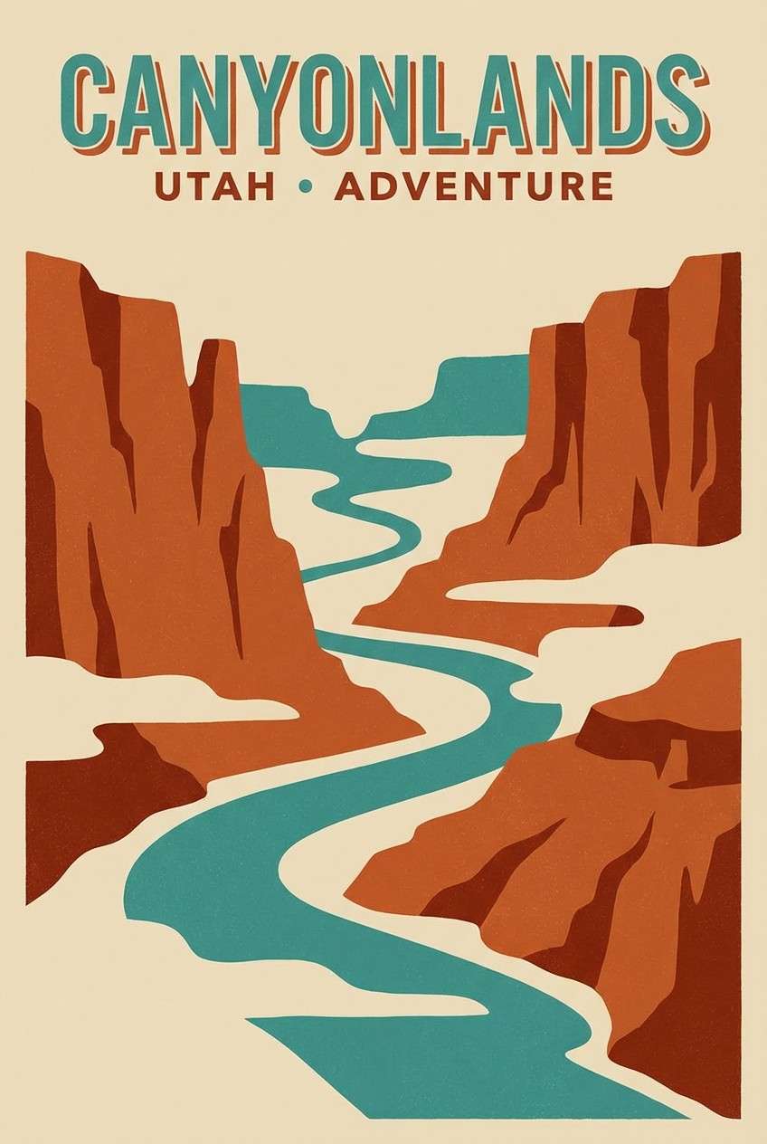
HEX: #167b75 #d26f46 #f4eadf #254041 #b5a193
Mood: adventurous, cinematic, balanced
Best for: travel posters and destination branding
Adventurous and cinematic, it looks like canyon rock cutting through morning fog. Put teal in large sky or water shapes to set the atmosphere, then use rust for cliffs, routes, or a bold title block. The pale sand keeps the poster bright and helps details pop. Tip: add the deep teal-gray to outline landmarks so the design reads from a distance.
Image example of misted canyon generated using media.io
15) Studio Loft
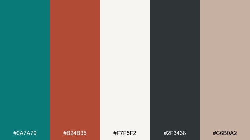
HEX: #0a7a79 #b24b35 #f7f5f2 #2f3436 #c6b0a2
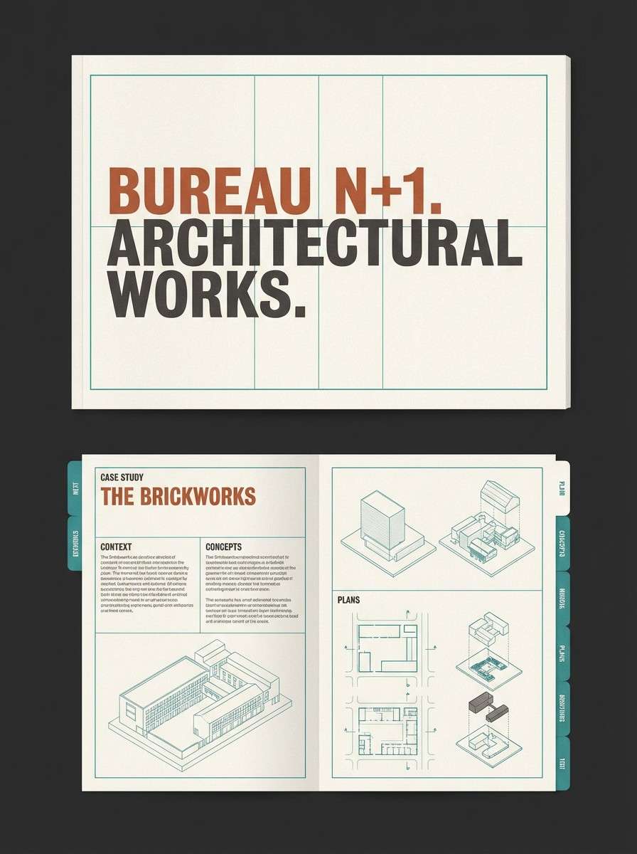
Mood: contemporary, calm, design-forward
Best for: architecture portfolios and case studies
Contemporary and calm, it feels like a clean loft with warm brick peeking through. Use the soft off-white as the page background and let teal structure the layout with section markers and diagrams. Rust works best as a small highlight for project titles or data points. Tip: keep most text in the charcoal to maintain a professional, high-contrast read.
Image example of studio loft generated using media.io
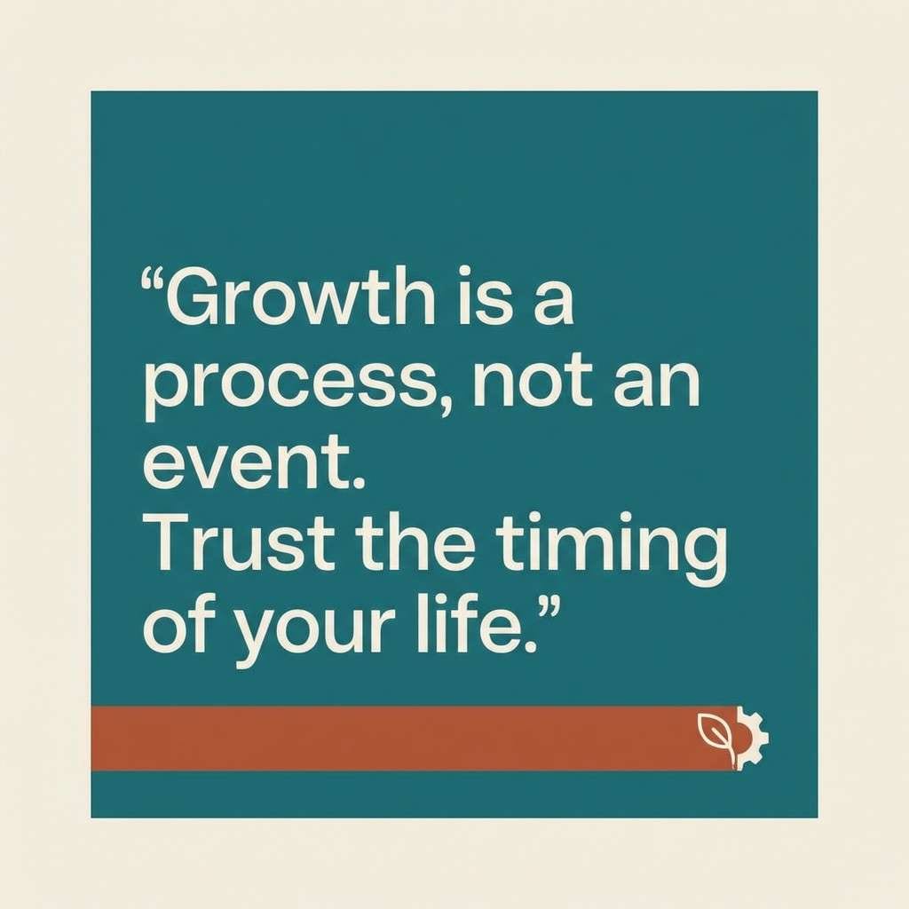
16) Ocean Brick
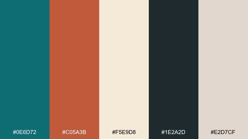
HEX: #0e6d72 #c05a3b #f5e9d8 #1e2a2d #e2d7cf
Mood: bold, classic, slightly nautical
Best for: social media templates and quote cards
Bold and classic, it pairs salty ocean depth with the warmth of old brick. These teal rust color combinations work well when you pick one dominant field color, then place the quote in the light cream for clarity. Use rust as a framing bar, icon, or small stamp to add punch. Tip: keep the dark navy-charcoal for author names and small UI elements so the layout stays crisp.
Image example of ocean brick generated using media.io
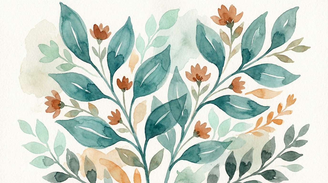
17) Botanical Forge
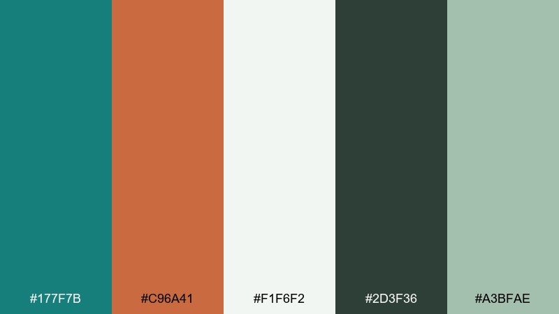
HEX: #177f7b #c96a41 #f1f6f2 #2d3f36 #a3bfae
Mood: fresh, botanical, craft-focused
Best for: spring illustrations and botanical prints
Fresh and botanical, it feels like greenhouse leaves beside a warm kiln. Use teal for broad leaf washes and let the soft minty neutrals create breathing room around the illustration. Rust is ideal for flower centers, stems, or a small title ribbon to keep it lively. Tip: limit rust to a few focal points so the print stays airy and spring-forward.
Image example of botanical forge generated using media.io
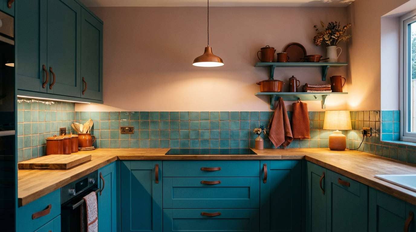
18) Evening Kiln
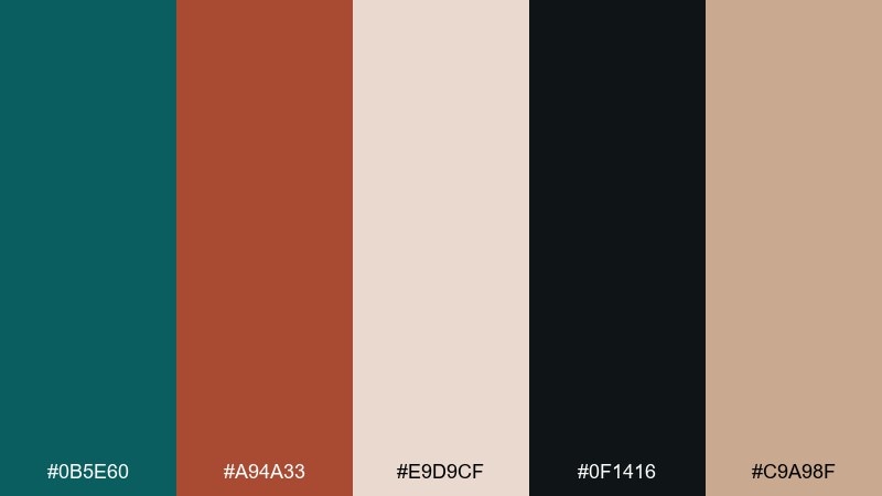
HEX: #0b5e60 #a94a33 #e9d9cf #0f1416 #c9a98f
Mood: dramatic, cozy, intimate
Best for: kitchen backsplash concepts and cabinetry
Dramatic and cozy, it looks like a kiln glow against deep evening shadows. Use teal on lower cabinets or tile accents, then bring rust in through hardware, grout lines, or warm wood pieces. The rosy neutral keeps the room from feeling too dark and works well with brass. Tip: add layered lighting so the darker tones read rich, not flat.
Image example of evening kiln generated using media.io
19) Sunlit Foundry
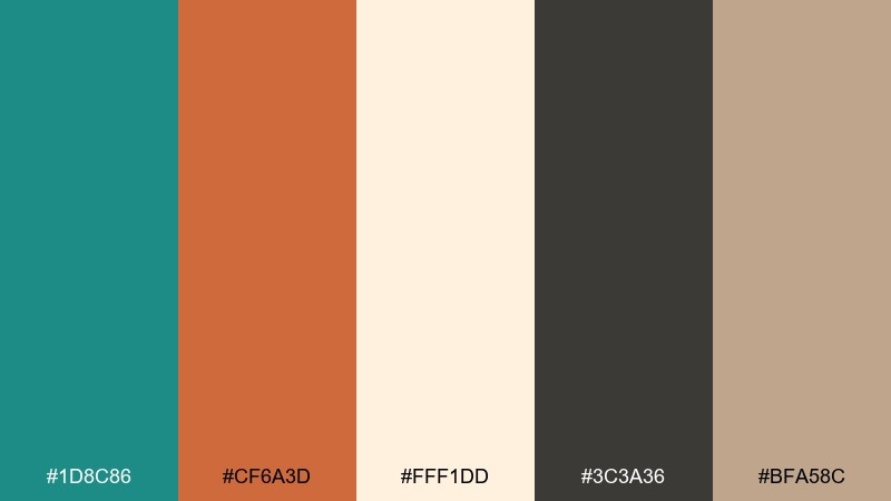
HEX: #1d8c86 #cf6a3d #fff1dd #3c3a36 #bfa58c
Mood: energetic, optimistic, modern
Best for: craft beer can designs and merch
Energetic and optimistic, it feels like a bright workshop with sunlight hitting warm metal. Use teal as the main can field for shelf impact, then let rust drive bold illustration shapes or a badge-style label. Cream keeps typography readable and helps the darker gray stay refined. Tip: pair with matte finishes so the warm accent looks rich rather than shiny orange.
Image example of sunlit foundry generated using media.io
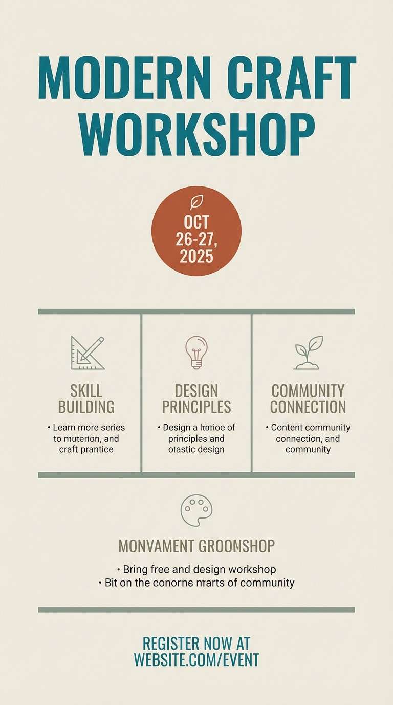
20) Quiet Expedition
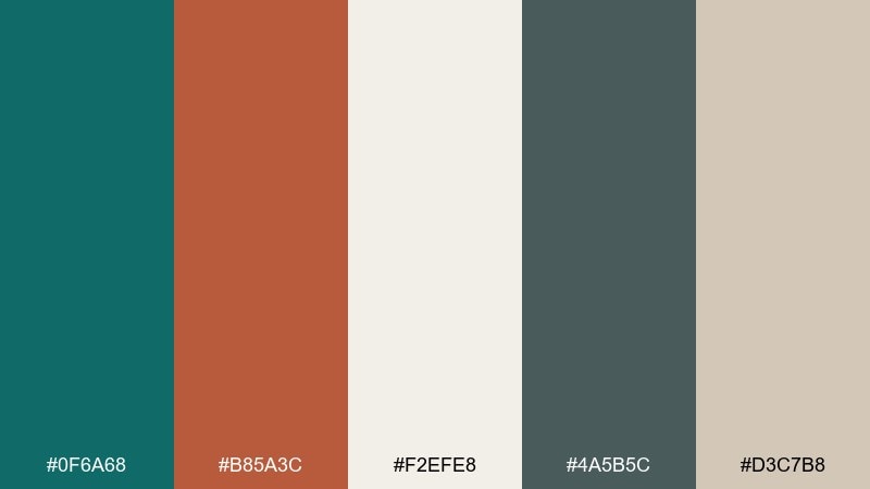
HEX: #0f6a68 #b85a3c #f2efe8 #4a5b5c #d3c7b8
Mood: calm, organized, understated
Best for: event flyers and workshop posters
Calm and organized, it suggests a well-packed bag and a clear trail map. Keep the background light so details stay readable, then use teal for the main header and section blocks. Rust is a great accent for dates, ticket info, or a small icon set. Tip: repeat the muted gray-green for dividers and bullet points to make the layout feel structured.
Image example of quiet expedition generated using media.io
What Colors Go Well with Teal Rust?
Neutrals are the easiest match: warm creams, sand, and putty soften the contrast, while charcoal and near-black make teal and rust look sharper and more premium. For a lighter, airy feel, choose off-white backgrounds and keep dark tones for type only.
For extra harmony, pull in muted companions like sage, seafoam, dusty blue, or warm taupe—these extend the coastal/earthy story without competing with the main duo. If you want a bolder pop, a touch of brass/gold or a soft blush can add polish.
When in doubt, follow a simple ratio: let teal do the “structure,” rust do the “spark,” and let neutrals carry the “space.”
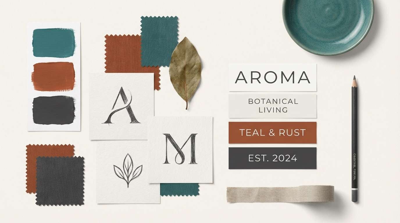
How to Use a Teal Rust Color Palette in Real Designs
In branding, treat teal as your primary brand color (logos, headers, navigation) and use rust as the accent for CTAs, badges, or key highlights. This keeps the system consistent while still feeling energetic.
In UI, prioritize accessibility: place text on off-white/cream, reserve rust for one main action per screen, and use teal for interactive states (links, toggles, progress). Pair with charcoal typography to avoid the harshness of pure black.
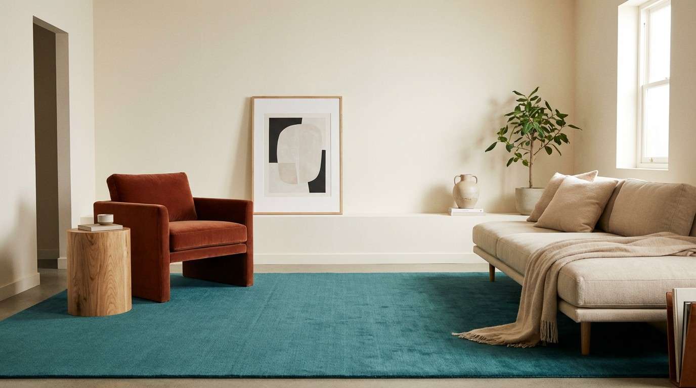
In interiors and print, scale matters: apply neutrals on large surfaces, teal on medium blocks (cabinetry, rugs, section panels), and rust in smaller décor or spot graphics so the palette feels curated rather than overwhelming.
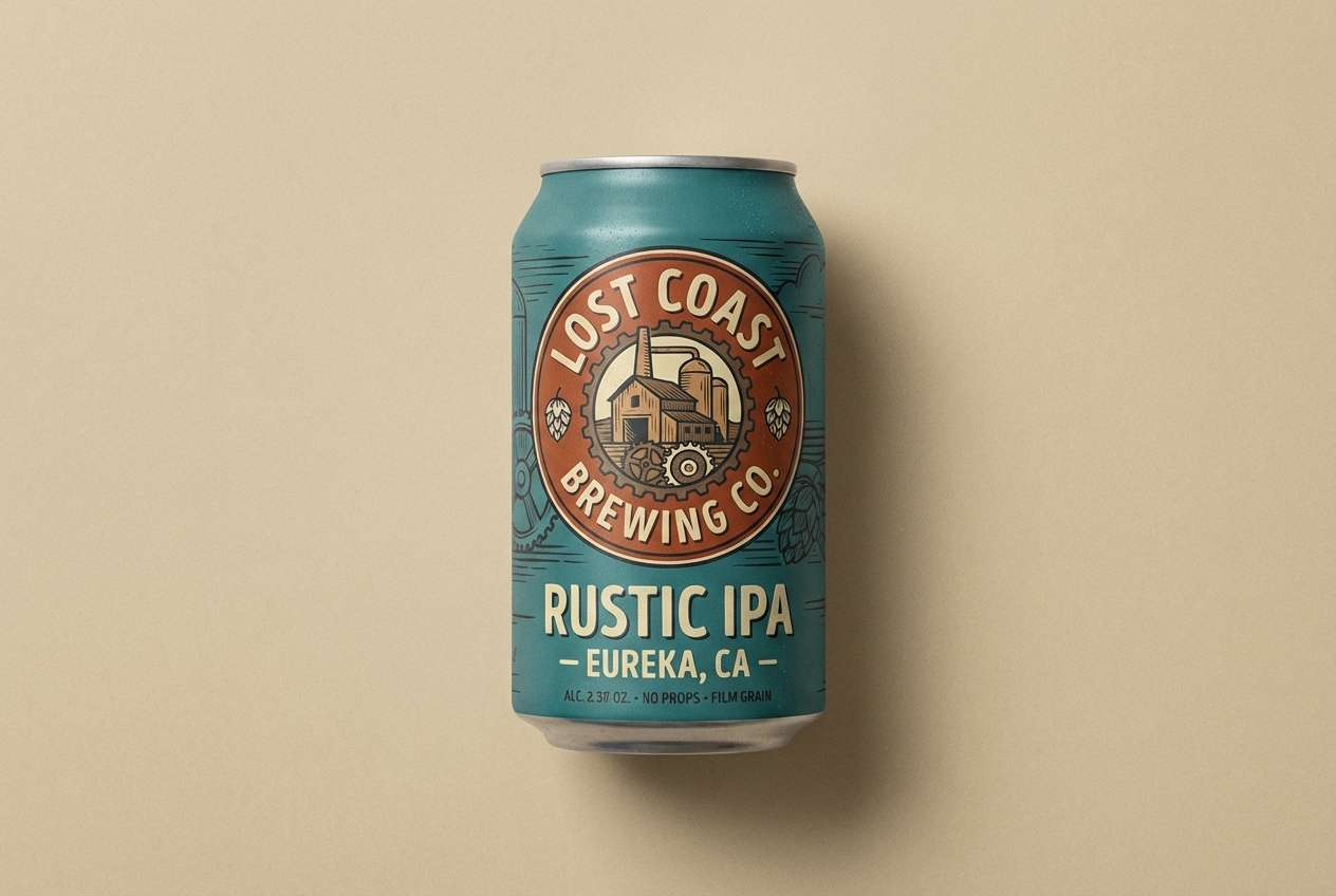
Create Teal Rust Palette Visuals with AI
Want to see how teal rust tones look in a real layout, label, poster, or room concept? Generate quick mockups from a text prompt and iterate until the balance feels right.
Media.io makes it simple to explore variations—swap neutrals, test stronger or softer rust accents, and preview multiple compositions before committing to a final direction.
Teal Rust Color Palette FAQs
-
What is a teal rust color palette?
A teal rust palette combines a blue-green (teal) with a warm orange-brown (rust/terracotta), supported by neutrals like cream, sand, taupe, and charcoal for balance and readability. -
Why do teal and rust look good together?
They create a warm–cool contrast that feels energetic but still natural. Teal adds calm and trust, while rust brings warmth and a handcrafted, earthy vibe. -
What neutral works best with teal rust?
Warm off-white or cream is the most versatile. For a more dramatic look, add charcoal/near-black; for a softer, lifestyle feel, use sand, putty, or warm gray. -
Is rust too close to red for UI warnings?
Rust can work as a “warm alert” accent, but don’t rely on color alone for meaning. Pair it with icons, labels, and sufficient contrast, and reserve pure red for critical errors if your system uses standard conventions. -
How do I keep a teal rust palette from feeling too heavy?
Increase light neutrals, reduce the darkest shade to small text/icons, and use rust in smaller accents than teal. Large rust blocks can feel dense if not balanced with space. -
What are good accent colors beyond teal and rust?
Muted sage, seafoam, dusty blue, brass/gold, and soft blush all pair well. Choose one extra accent at most to keep the palette focused. -
Can I use teal rust palettes for professional branding?
Yes—especially for design studios, cafes, travel brands, sustainable products, and modern lifestyle companies. Keep typography in charcoal, use cream backgrounds, and apply rust as a controlled highlight for a premium result.
Next: Ruby Color Palette


