

Ruby is a bold, gem-red family that instantly adds drama, warmth, and premium energy to a layout. It can read romantic and soft in blush tints, or cinematic and powerful when paired with near-black.
Below are ruby color palette ideas with HEX codes you can use for branding, UI, print, and packaging—each with practical notes and an AI prompt you can remix in Media.io.
In this article
- Why Ruby Palettes Work So Well
-
- velvet garnet
- rosewood latte
- cherry blossom night
- ruby & sage balance
- antique velvet
- modern monochrome gem
- cabernet neutrals
- sparkling jewelbox
- cranberry cocoa
- deep wine minimal
- sunset ruby gradient
- berry & brass
- raspberry linen
- opera house
- pomegranate & ink
- dusty ruby clay
- winter berry frost
- ruby orchard
- minimal ruby type
- ruby noir contrast
- What Colors Go Well with Ruby?
- How to Use a Ruby Color Palette in Real Designs
- Create Ruby Palette Visuals with AI
Why Ruby Palettes Work So Well
Ruby sits in the deep-red range where people instinctively read meaning: passion, confidence, celebration, and appetite appeal. That makes it a strong “signal” color for CTAs, hero headlines, and product accents.
It’s also unusually flexible across styles. Add blush and warm paper neutrals for romance and softness, or pair ruby with charcoal/near-black for cinematic contrast and modern luxury.
Because ruby can feel intense at full saturation, the best ruby palettes balance it with airy tints, textured neutrals, or a cool counter-color (like ink navy or icy gray) to keep designs readable and intentional.
20+ Ruby Color Palette Ideas (with HEX Codes)
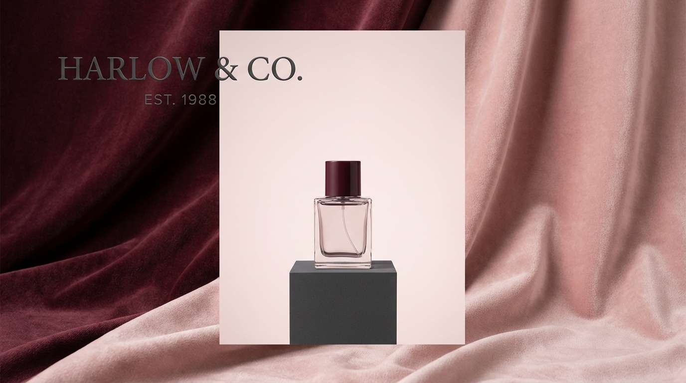
1) Velvet Garnet
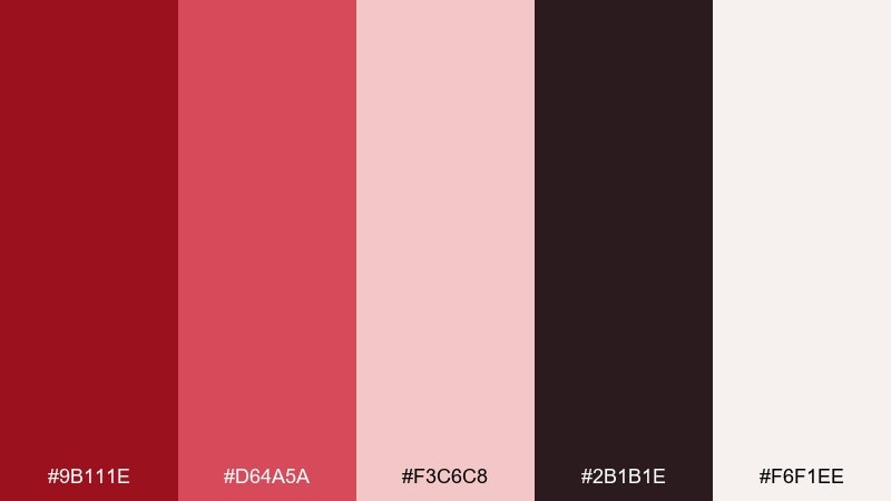
HEX: #9B111E #D64A5A #F3C6C8 #2B1B1E #F6F1EE
Mood: dramatic, luxe, cinematic
Best for: luxury branding and hero banners
Dramatic and plush, this mix feels like velvet drapes, candlelight, and a glass of wine after dark. Use the deep red as your primary and let the pale blush do the heavy lifting for breathing room. Pair it with matte charcoal for modern contrast and a warm off-white for crisp type. Tip: keep gradients subtle and lean on texture (paper grain or fabric) for a premium finish.
Image example of velvet garnet generated using media.io
Media.io is an online AI studio for creating and editing video, image, and audio in your browser.

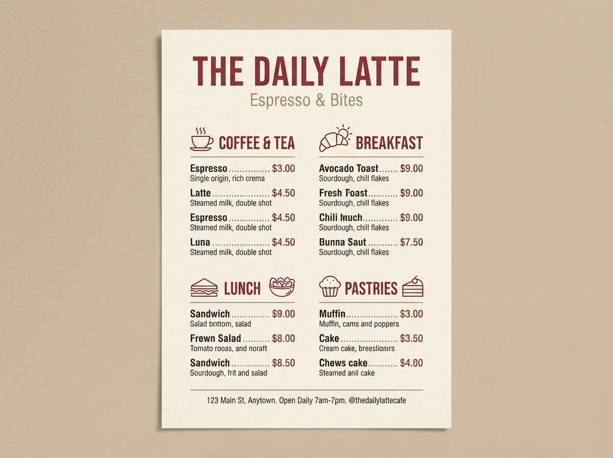
2) Rosewood Latte
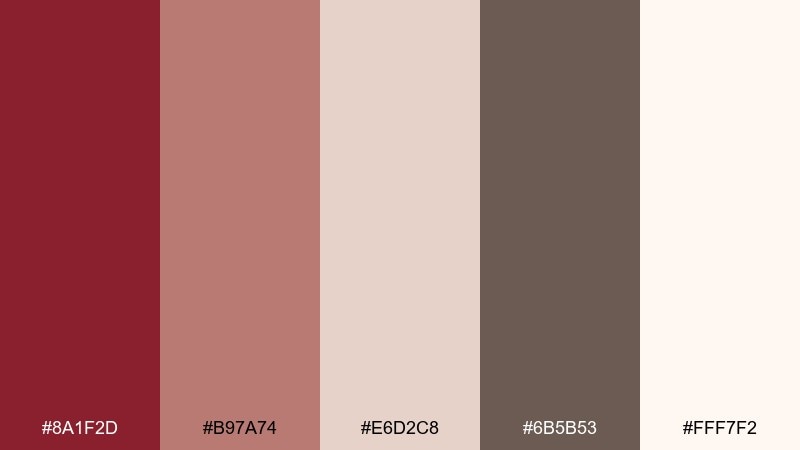
HEX: #8A1F2D #B97A74 #E6D2C8 #6B5B53 #FFF7F2
Mood: cozy, grounded, welcoming
Best for: cafe menu design
Cozy and conversational, these tones evoke rosewood tables, steamed milk, and warm afternoon light. The dusty midtones are ideal for sections and dividers, while the deep red anchors headings without feeling loud. Add the soft cream as the main canvas to keep everything readable. Tip: use the dark cocoa shade for body text to avoid harsh black on warm paper.
Image example of rosewood latte generated using media.io
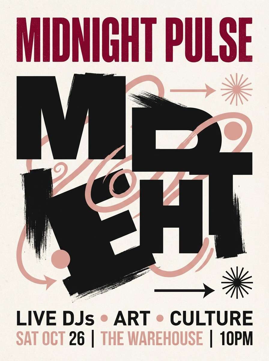
3) Cherry Blossom Night
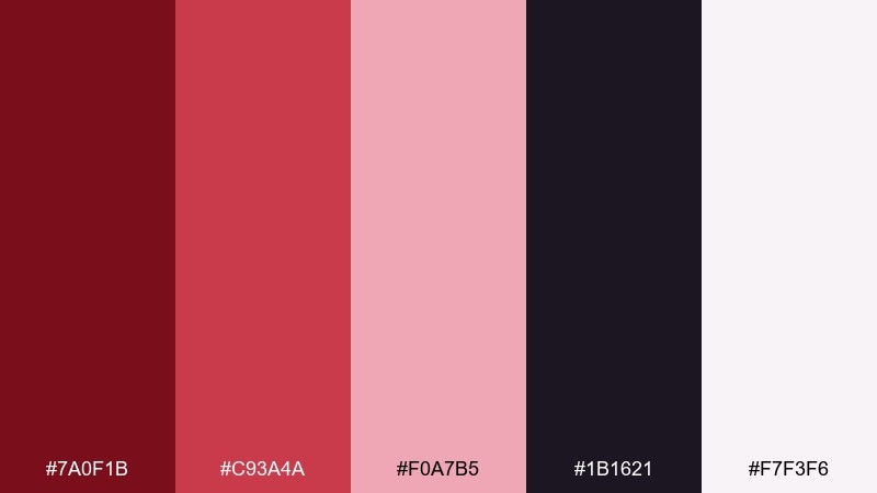
HEX: #7A0F1B #C93A4A #F0A7B5 #1B1621 #F7F3F6
Mood: romantic, nocturnal, bold
Best for: nightlife event poster
Romantic but nocturnal, it feels like neon glow filtered through soft petals and midnight air. Use the near-black base for dramatic framing and let the brighter red handle the headline. Blush pinks keep the composition playful and readable from a distance. Tip: stick to big type and simple shapes so the contrast does the work.
Image example of cherry blossom night generated using media.io
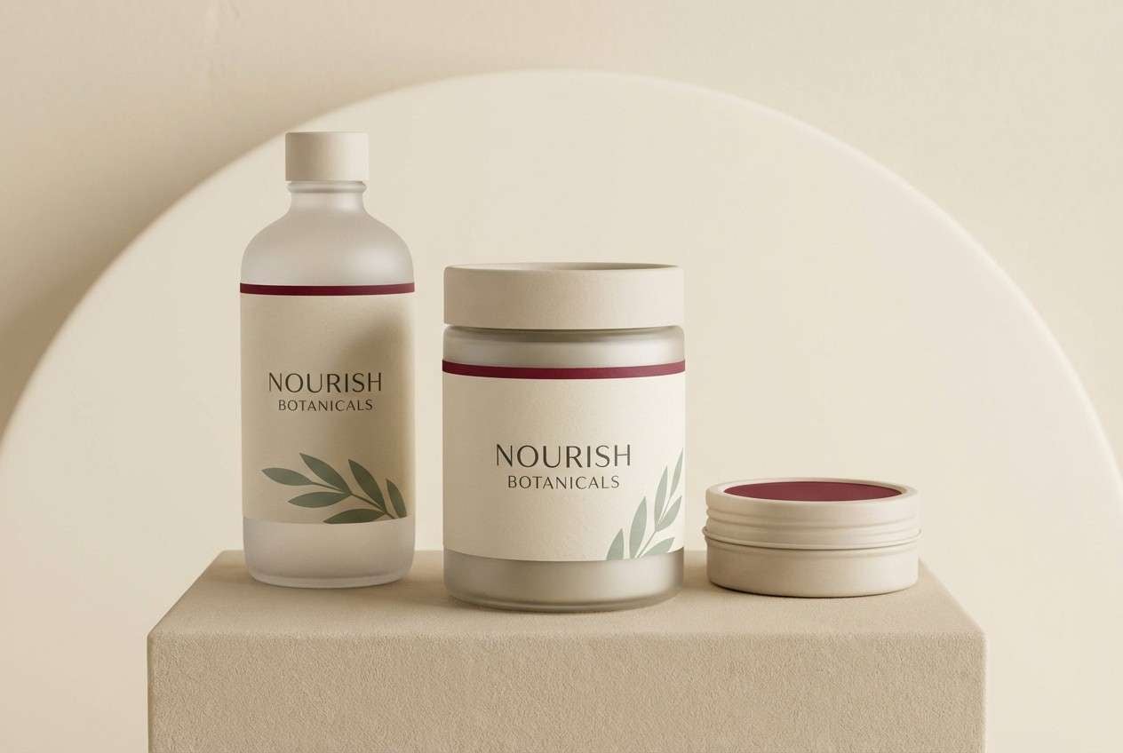
4) Ruby & Sage Balance
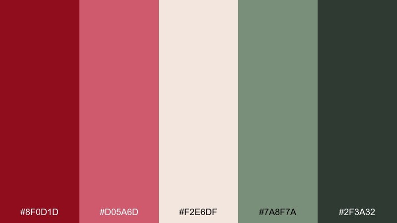
HEX: #8F0D1D #D05A6D #F2E6DF #7A8F7A #2F3A32
Mood: fresh, calm, modern organic
Best for: wellness brand packaging
Fresh and steady, this pairing suggests botanical calm with a confident, heart-forward accent. These ruby color combinations work best when the green plays supporting role, keeping the deep red from feeling too heavy. Use the warm neutral as the label base and reserve the darkest shade for ingredients and fine print. Tip: choose soft-touch packaging so the colors feel as soothing as they look.
Image example of ruby & sage balance generated using media.io
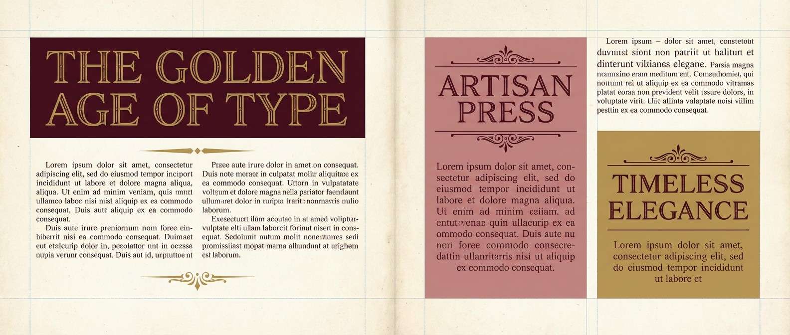
5) Antique Velvet
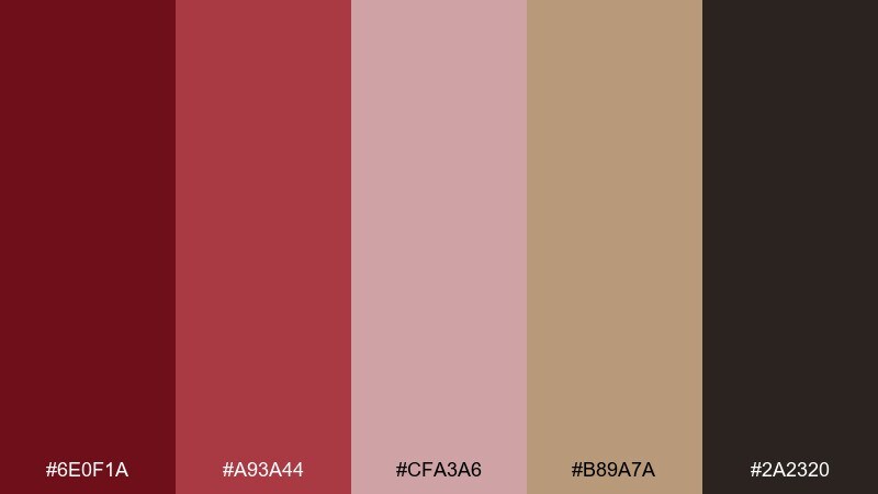
HEX: #6E0F1A #A93A44 #CFA3A6 #B89A7A #2A2320
Mood: vintage, moody, refined
Best for: vintage editorial spread
Vintage and refined, it brings to mind heirloom textiles, aged paper, and museum lighting. The muted gold-brown adds warmth that keeps the reds from reading too modern. Let the dusty pink handle pull quotes and sidebars for a softer rhythm across the page. Tip: use thin rules and classic serif typography to reinforce the antique mood.
Image example of antique velvet generated using media.io
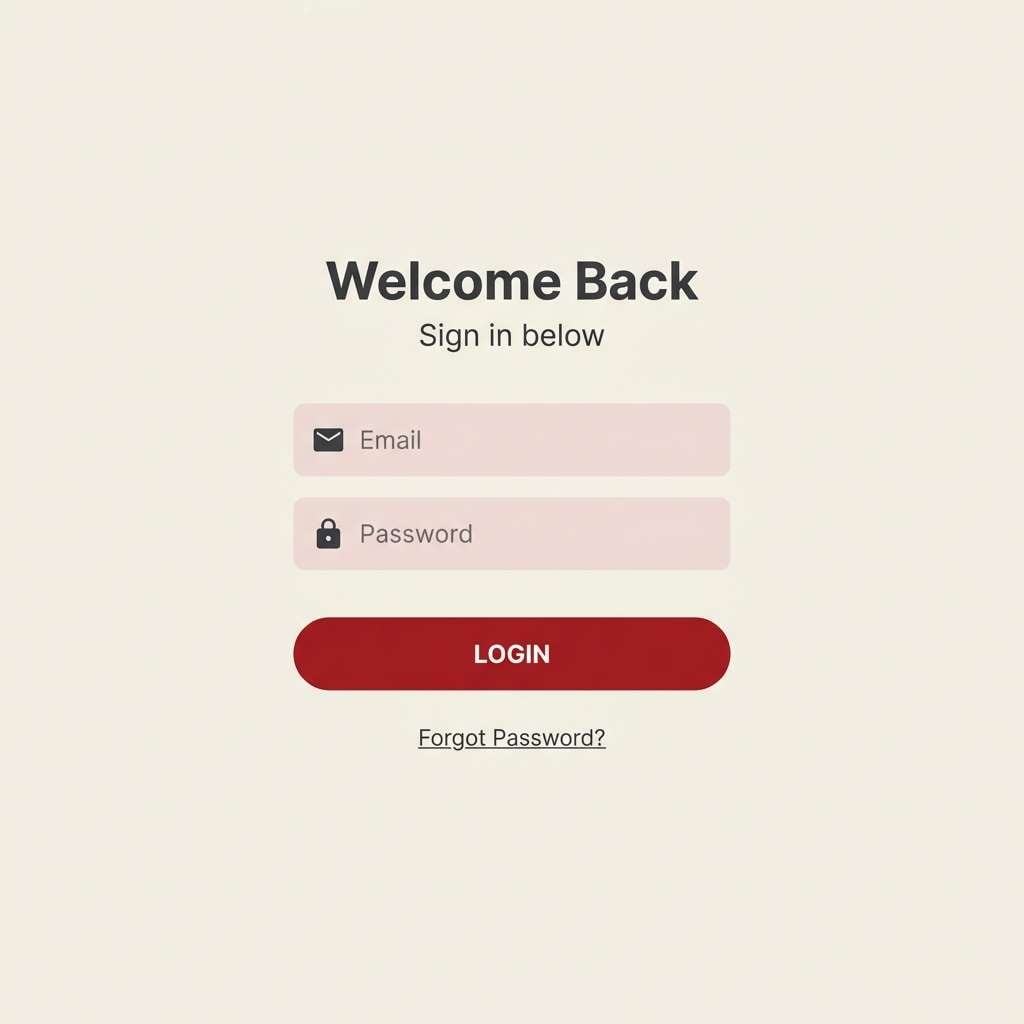
6) Modern Monochrome Gem
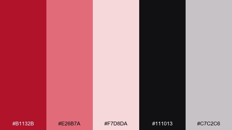
HEX: #B1132B #E26B7A #F7D8DA #111013 #C7C2C6
Mood: sleek, minimal, high-contrast
Best for: 2d app ui login screen
Sleek and minimal, these tones feel like polished glass, clean typography, and confident micro-interactions. As a ruby color scheme, it shines when the darkest shade is used sparingly for structure and the lighter pinks carry surfaces and cards. Keep buttons in the saturated red so CTAs are unmistakable. Tip: add subtle shadows instead of extra colors to preserve the monochrome feel.
Image example of modern monochrome gem generated using media.io
7) Cabernet Neutrals
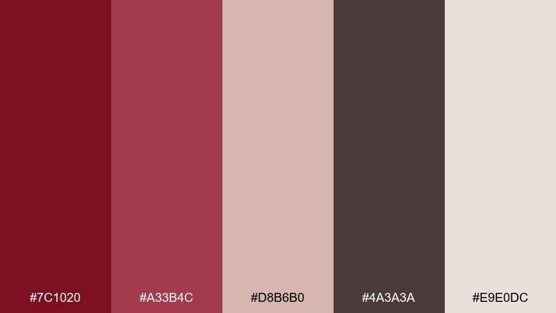
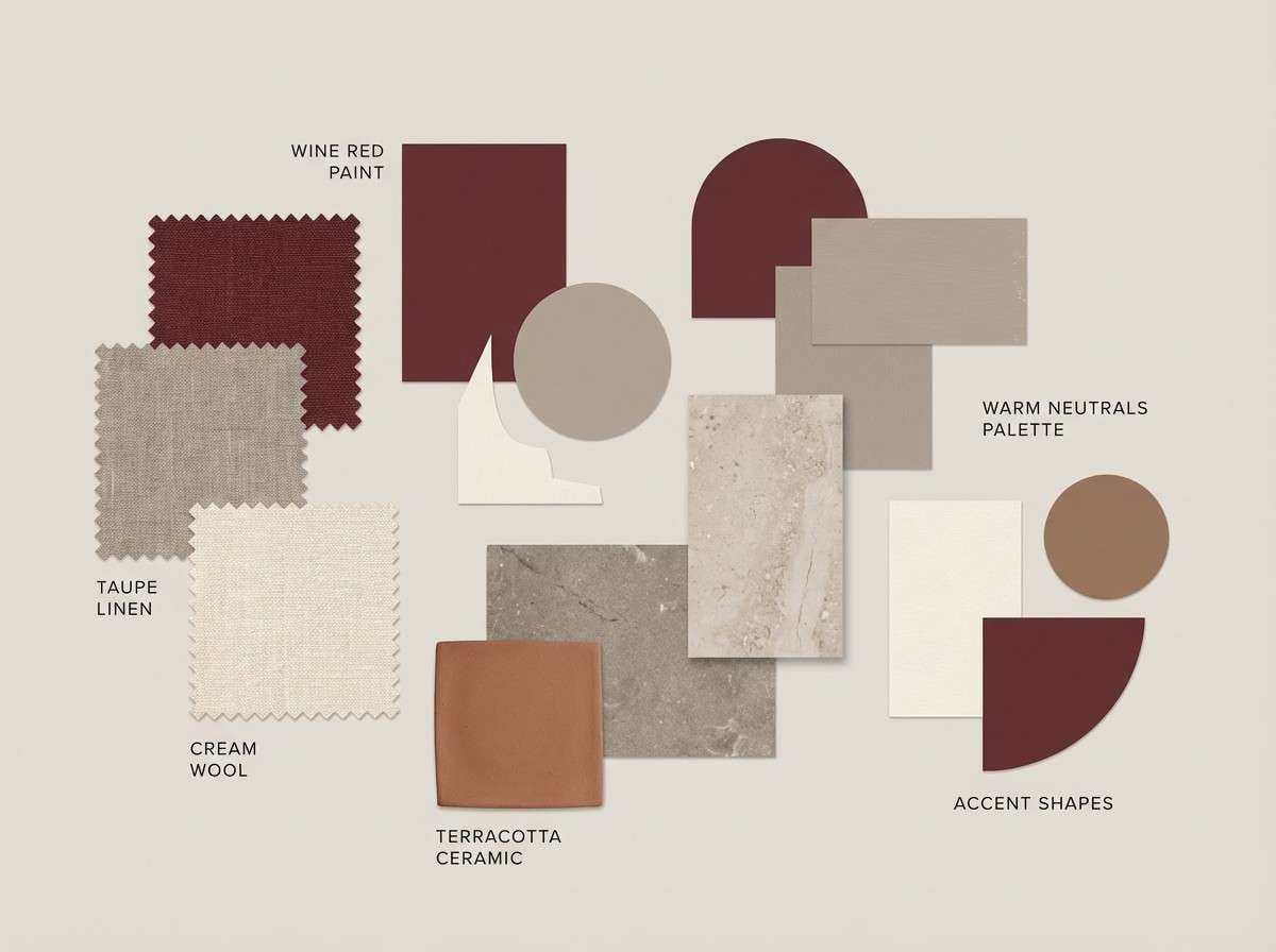
HEX: #7C1020 #A33B4C #D8B6B0 #4A3A3A #E9E0DC
Mood: warm, intimate, timeless
Best for: interior design moodboard
Warm and intimate, it resembles candlelit rooms, leather-bound books, and soft woven throws. Use the beige and cream tones to keep large areas calm, then layer the wine reds in art, pillows, or accent walls. The smoky brown supports wood textures without muddying the palette. Tip: repeat the mid red at least twice in a room plan to make the accents feel intentional.
Image example of cabernet neutrals generated using media.io
8) Sparkling Jewelbox
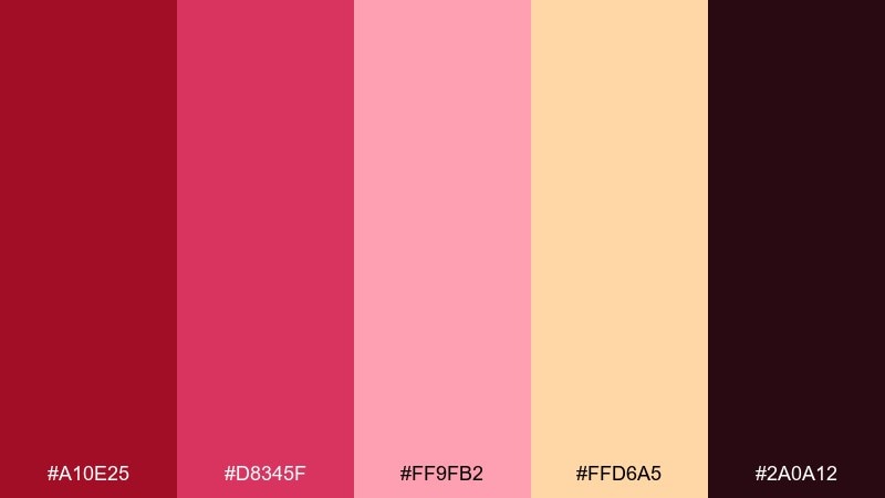
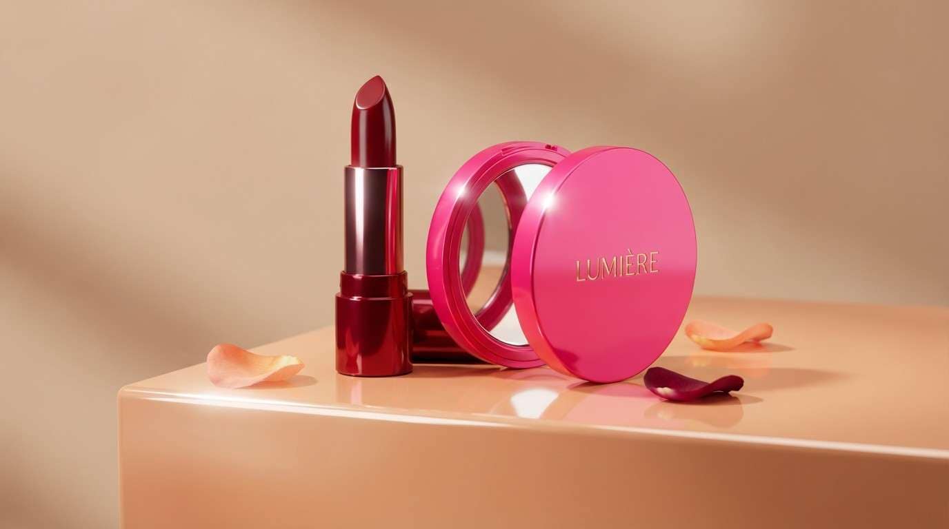
HEX: #A10E25 #D8345F #FF9FB2 #FFD6A5 #2A0A12
Mood: glam, playful, high-energy
Best for: cosmetics product ad
Glam and playful, it evokes glossy lipstick, warm spotlights, and a pop of champagne. The coral-pink and peach bring brightness that keeps the dark tones from feeling too heavy. Use the deepest shade only for logo and tiny details to maintain a sparkling, airy look. Tip: choose one hero product color and mirror it in the headline for instant cohesion.
Image example of sparkling jewelbox generated using media.io
9) Cranberry Cocoa
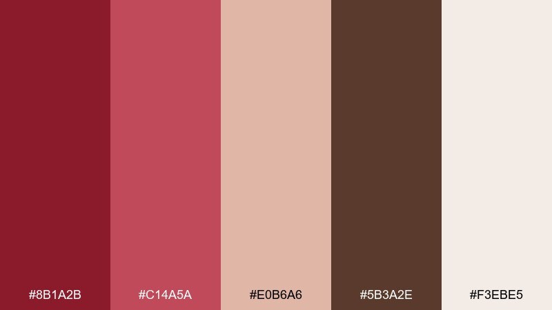
HEX: #8B1A2B #C14A5A #E0B6A6 #5B3A2E #F3EBE5
Mood: festive, warm, approachable
Best for: holiday social media templates
Festive and warm, these shades feel like cranberry desserts, cocoa, and soft winter lights. The creamy base keeps posts bright, while the brown adds a handmade, craft-like touch. Use the mid red for badges, prices, or stickers so calls-to-action stand out without shouting. Tip: keep typography chunky and simple for easy readability on small screens.
Image example of cranberry cocoa generated using media.io

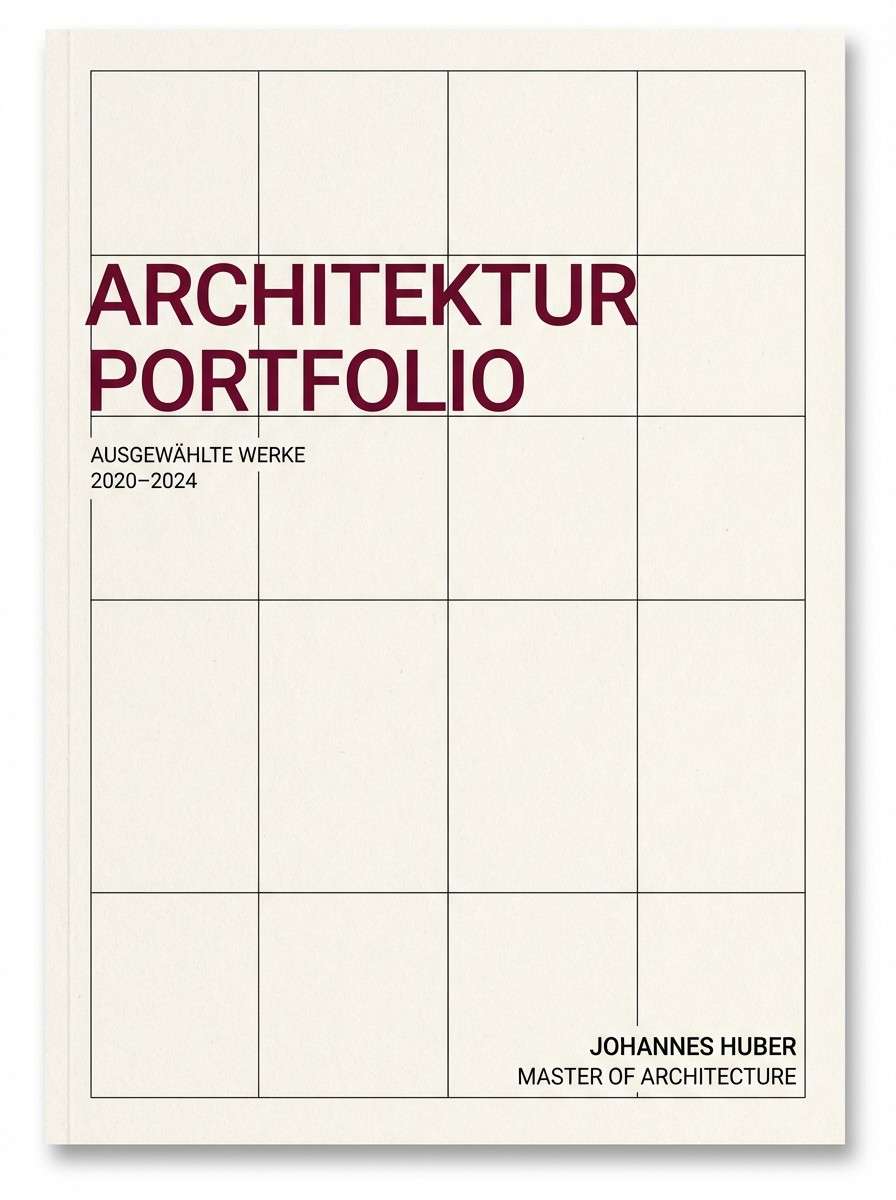
10) Deep Wine Minimal
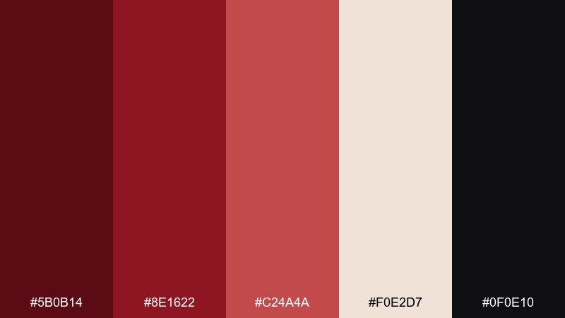
HEX: #5B0B14 #8E1622 #C24A4A #F0E2D7 #0F0E10
Mood: serious, minimalist, confident
Best for: architecture portfolio cover
Serious and minimal, it reads like a sharp suit, clean lines, and quiet confidence. The near-black and deep wine create strong hierarchy for titles and section breaks. Use the warm paper tone as your main field so the reds stay sophisticated rather than aggressive. Tip: limit accent red to one or two elements per page to keep the cover feeling curated.
Image example of deep wine minimal generated using media.io
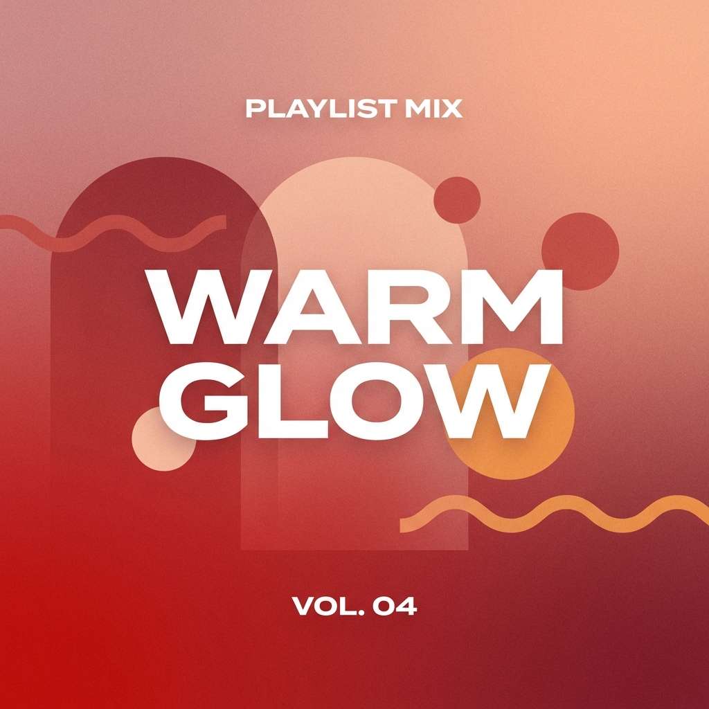
11) Sunset Ruby Gradient
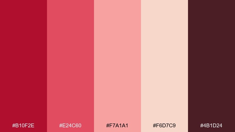
HEX: #B10F2E #E24C60 #F7A1A1 #F6D7C9 #4B1D24
Mood: dreamy, upbeat, romantic
Best for: music playlist cover art
Dreamy and upbeat, it feels like a late-summer sunset fading into a warm evening. This ruby color combination is ideal for soft gradients, where the mid reds blend into blush and peach for a smooth glow. Keep the darkest shade for artist names or a small logo so the cover stays airy. Tip: add subtle grain to the gradient to avoid banding on screens.
Image example of sunset ruby gradient generated using media.io
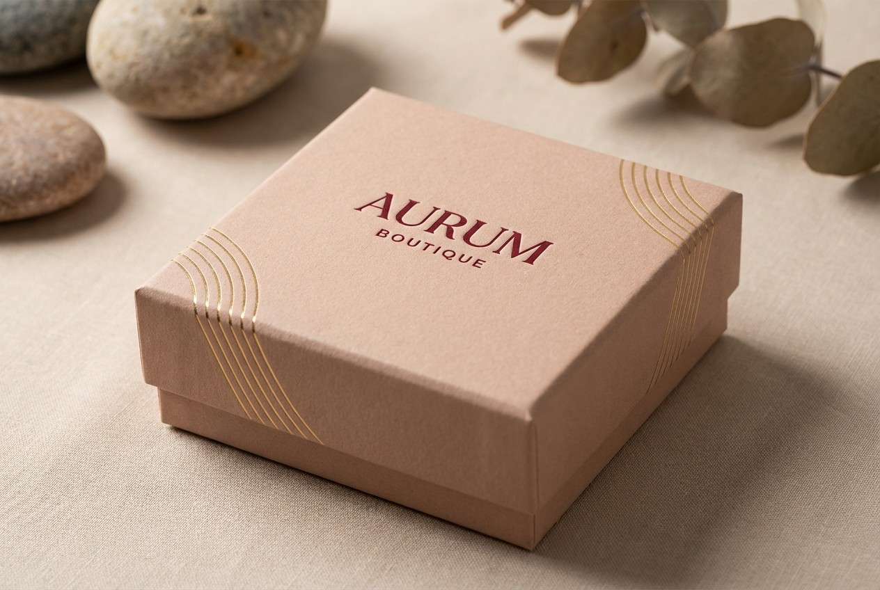
12) Berry & Brass
HEX: #921023 #C44A57 #F2C9B6 #B08D57 #2B1D16
Mood: opulent, artisanal, warm
Best for: jewelry product packaging
Opulent and artisanal, it suggests brushed metal, velvet boxes, and warm boutique lighting. The brass tone adds a refined highlight without needing bright yellow. Use the pale blush as the packaging base and reserve the deep shades for foil stamping and small marks. Tip: keep the gold accent consistent in thickness so it reads as intentional hardware.
Image example of berry & brass generated using media.io
13) Raspberry Linen
HEX: #A11A2E #D75A6B #F6E8E1 #D8C3B7 #3A2A2B
Mood: soft, romantic, airy
Best for: wedding invitation suite
Soft and romantic, it recalls pressed flowers on linen paper and a warm, intimate ceremony. A ruby color palette like this works beautifully for invitations when the cream and linen tones dominate and the deeper red is reserved for monograms or RSVP highlights. Pair it with charcoal typography for legibility and a more modern feel. Tip: print the mid pink as a translucent wash to keep the suite light.
Image example of raspberry linen generated using media.io
14) Opera House
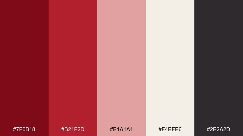
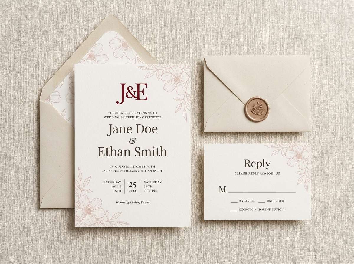
HEX: #7F0B18 #B21F2D #E1A1A1 #F4EFE6 #2E2A2D
Mood: dramatic, classic, theatrical
Best for: theater poster and tickets
Dramatic and classic, it brings the feel of velvet seats, spotlight glow, and elegant programs. Use the deep tones for large blocks and borders, then let the pale paper shade hold the details like dates and cast lists. The soft pink is perfect for secondary emphasis without breaking the theatrical mood. Tip: add one oversized typographic element to make the design feel truly stage-worthy.
Image example of opera house generated using media.io
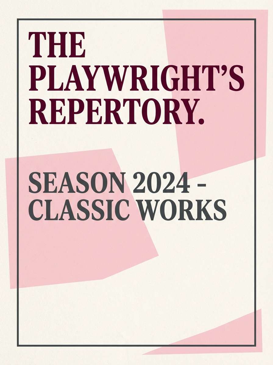
15) Pomegranate & Ink
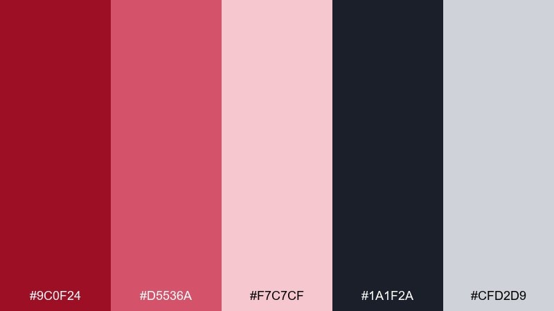
HEX: #9C0F24 #D5536A #F7C7CF #1A1F2A #CFD2D9
Mood: clean, techy, confident
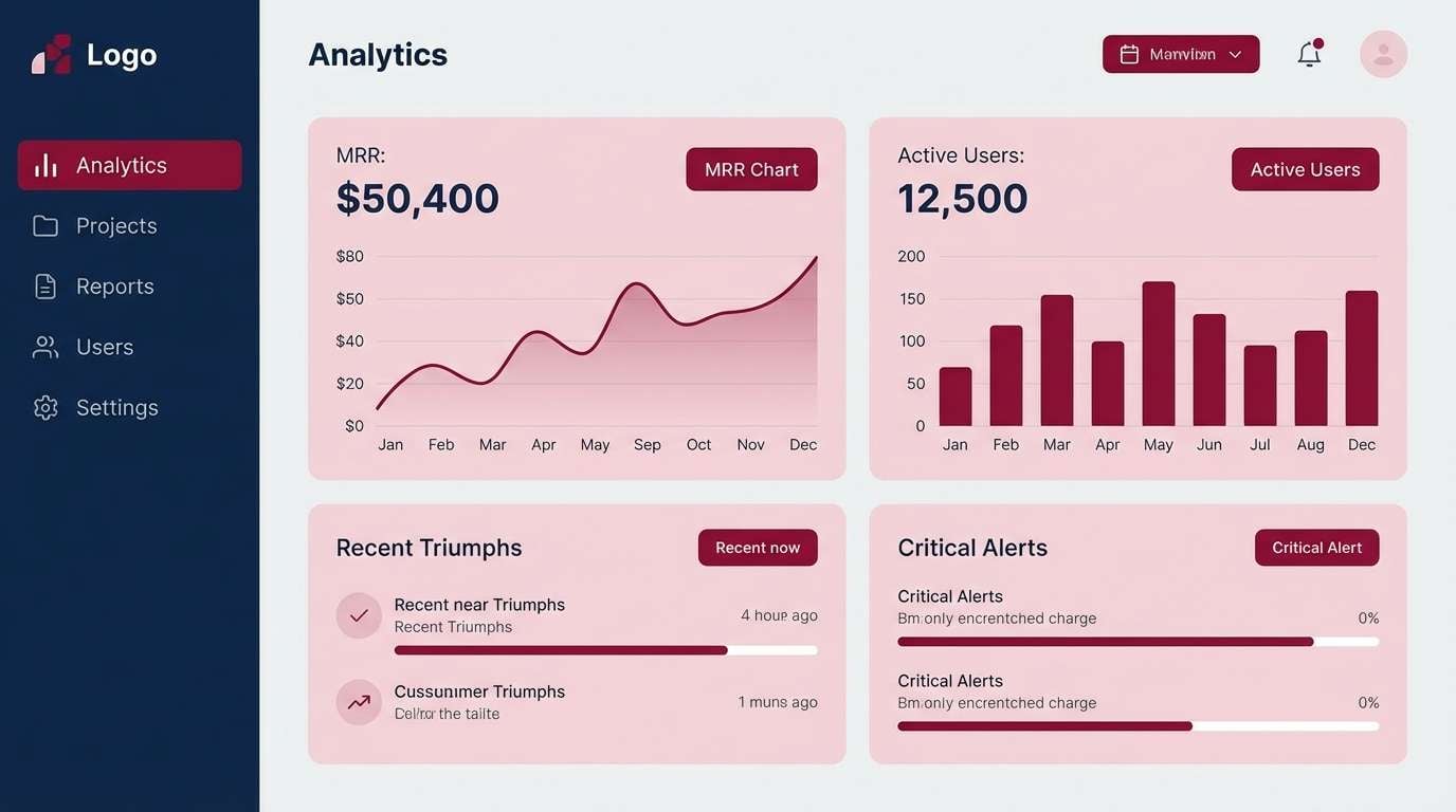
Best for: saas dashboard accents
Clean and techy, this mix feels like crisp data visuals with a confident, energetic accent. Use the ink navy for navigation and structure, while the lighter pinks keep cards and empty states friendly. The saturated red works best as a focused highlight for alerts, active states, or key metrics. Tip: keep accent usage under 10 percent so the interface stays calm and readable.
Image example of pomegranate & ink generated using media.io
16) Dusty Ruby Clay
HEX: #8D1726 #B8575D #D9B4A0 #A97D6A #F5EFE9
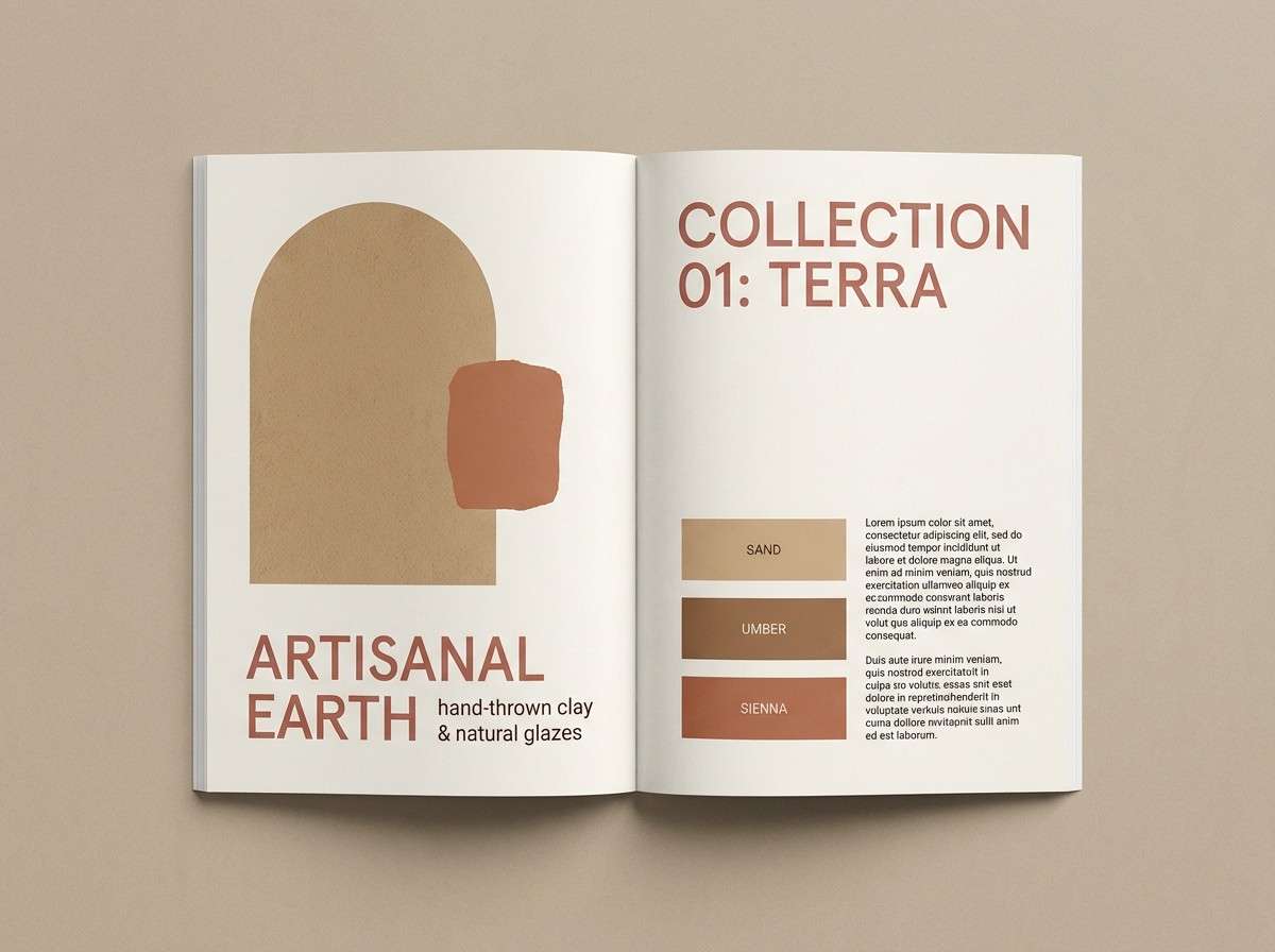
Mood: earthy, handmade, modern rustic
Best for: ceramics brand lookbook
Earthy and handmade, it suggests clay studios, sun-warmed terracotta, and soft natural fabrics. The dusty reds feel mature and work well with large blocks of warm neutral space. Use the tan shades for backgrounds and the deeper tones for section titles and small stamps. Tip: combine with uncoated paper or matte finishes to keep the rustic mood believable.
Image example of dusty ruby clay generated using media.io
17) Winter Berry Frost
HEX: #8A0E1F #C74056 #F3B7C2 #E8F0F4 #2A1B23
Mood: crisp, bright, wintery
Best for: skincare packaging flat lay
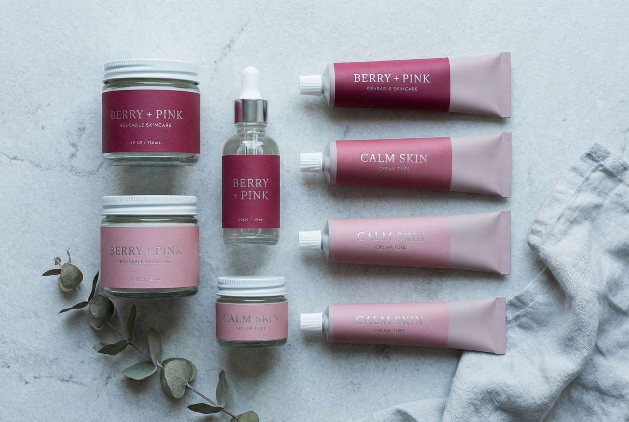
Crisp and bright, it feels like berry tea on a cold morning with a hint of icy air. The cool, pale blue-gray gives the reds a fresher edge that suits clean beauty or derm-style products. Use the lightest tones as the main surface and keep the deep shade for brand marks and ingredient emphasis. Tip: choose matte bottles to avoid color shifts from reflections.
Image example of winter berry frost generated using media.io
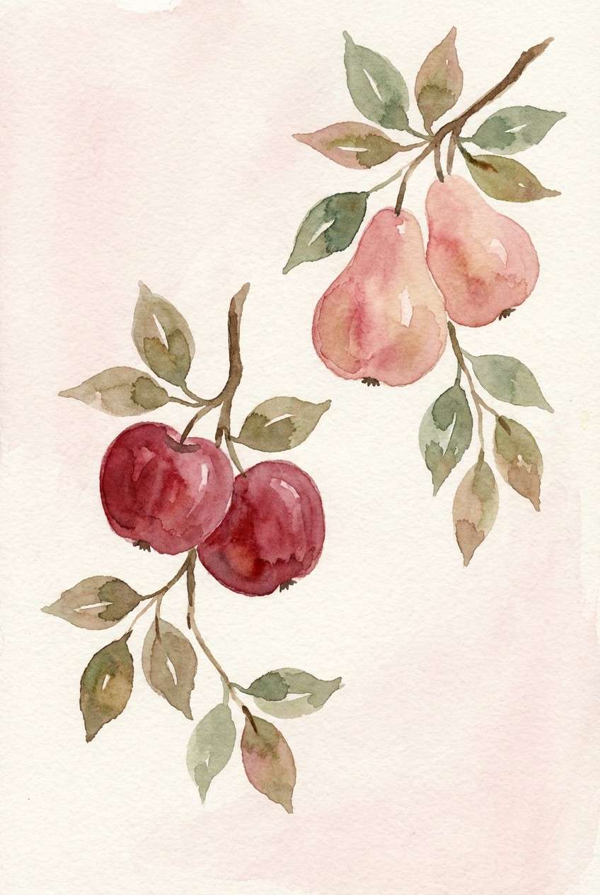
18) Ruby Orchard
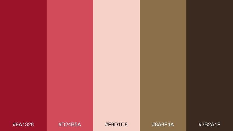
HEX: #9A1328 #D24B5A #F6D1C8 #8A6F4A #3B2A1F
Mood: ripe, natural, wholesome
Best for: botanical watercolor print
Ripe and natural, these colors evoke orchard fruit, sun-dried leaves, and earthy stems. The browns help ground the sweeter reds so the artwork stays organic rather than candy-bright. Use the pale blush as negative space and let the mid red carry petals or fruit flesh. Tip: keep edges soft and slightly textured to mimic real watercolor bleed.
Image example of ruby orchard generated using media.io
19) Minimal Ruby Type
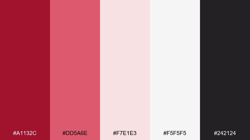
HEX: #A1132C #DD5A6E #F7E1E3 #F5F5F5 #242124
Mood: modern, punchy, clean
Best for: typography poster series
Modern and punchy, it feels like bold editorial type on clean paper with a confident accent. A ruby color palette like this is ideal when you want one strong hue to carry the message and the rest to stay quietly supportive. Use the near-white for background, charcoal for small text, and reserve the saturated red for the main word or number. Tip: keep alignment strict and spacing generous so the color can breathe.
Image example of minimal ruby type generated using media.io
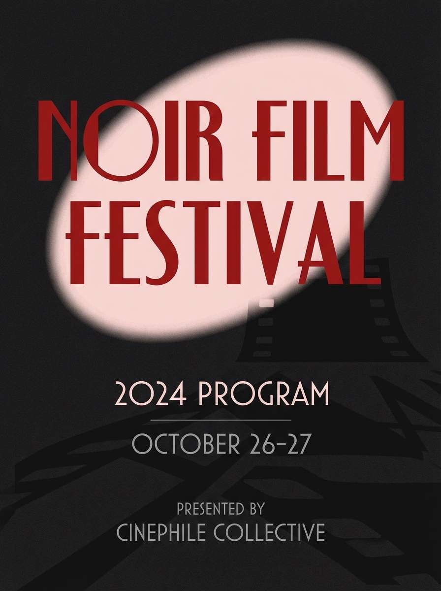
20) Ruby Noir Contrast
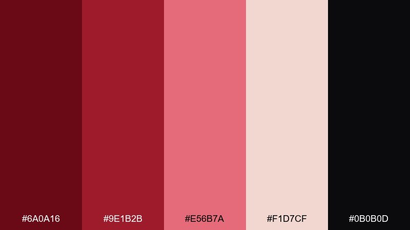
HEX: #6A0A16 #9E1B2B #E56B7A #F1D7CF #0B0B0D
Mood: noir, bold, sophisticated
Best for: film festival program cover
Noir and sophisticated, it suggests velvet darkness with a sharp, romantic highlight. The near-black makes the reds look richer and more intentional, especially for cinematic themes. Use the pale blush as a soft spotlight area for dates and credits, while the mid red carries the main title. Tip: add a single geometric shape or frame to give the cover a strong focal point.
Image example of ruby noir contrast generated using media.io
What Colors Go Well with Ruby?
Ruby pairs beautifully with warm neutrals like cream, linen, taupe, and cocoa—these soften the intensity and make ruby feel more premium and editorial. Charcoal and near-black deepen ruby into a cinematic, luxury mood.
For fresher contrast, try cool companions like ink navy or icy blue-gray, which make ruby look cleaner and more modern (great for UI and skincare aesthetics). Muted greens (sage, olive) add a natural balance that keeps ruby from feeling too formal.
If you want a metallic vibe, brass and antique gold accents complement ruby’s richness without turning the palette into holiday red-and-green territory.
How to Use a Ruby Color Palette in Real Designs
Use ruby as a hierarchy tool: one saturated ruby for primary actions (CTA buttons, key labels), lighter blush tones for surfaces, and deep near-black/charcoal for structure. This keeps contrast high without relying on extra colors.
In print and packaging, ruby looks best with texture—uncoated paper, soft-touch matte, or subtle grain. Keep large ruby fills slightly muted (dusty wine) and reserve the brightest ruby for logos, seals, or a single focal element.
For digital products, watch accessibility: pair ruby CTAs with off-white text only when contrast is sufficient, and use neutrals for body text so the interface doesn’t feel “shouty.”
Create Ruby Palette Visuals with AI
Want to see how a ruby palette actually looks on a poster, UI screen, or product mockup? Generate quick concept visuals using the prompts above, then iterate by swapping “ruby” for “garnet,” “wine,” or “pomegranate” to fine-tune the vibe.
In Media.io, you can create multiple variations fast—try changing the aspect ratio, adding “matte texture,” or specifying “no photography” to keep results clean and design-forward.
Once you like a direction, keep the HEX set consistent and only adjust lighting/texture prompts so your visual system stays cohesive.
Ruby Color Palette FAQs
-
What is a ruby color palette?
A ruby color palette is a set of reds centered around a rich gem-like ruby hue, usually supported by tints (blush/pink), deep shades (wine/near-black), and neutrals (cream, taupe, gray) to control contrast and readability. -
Is ruby more like red or burgundy?
Ruby typically sits between true red and deep wine tones. It can lean brighter (more red) or darker (more garnet/burgundy) depending on saturation and the neutrals paired with it. -
What colors go best with ruby for branding?
For premium branding, pair ruby with cream, warm off-white, charcoal, and brass/gold accents. For modern brands, combine ruby with ink navy or cool light grays for a cleaner, tech-forward contrast. -
How do I keep ruby from overpowering a design?
Limit saturated ruby to accents (often under ~10–20% of the layout), use blush/cream for large surfaces, and rely on dark neutrals for typography and structure instead of adding extra bright colors. -
What is a good ruby palette for UI design?
Use a monochrome ruby set with charcoal/near-black for navigation, light blush for cards/inputs, and one saturated ruby for the main CTA. This keeps the interface consistent and reduces visual noise. -
Does ruby print well in CMYK?
Deep reds can shift in print, especially on uncoated stock. Choose slightly muted wine/ruby values for large fills, request proofs when possible, and consider adding texture or a warm neutral background to reduce visible banding or blotchiness. -
How can I generate ruby palette mockups quickly?
Use Media.io’s text-to-image tool with a clear layout prompt (poster, packaging, UI), specify your ruby mood (noir, romantic, minimal), and iterate by changing only one variable at a time (lighting, texture, aspect ratio) while keeping your HEX palette consistent.
Next: Rosy Brown Color Palette


