

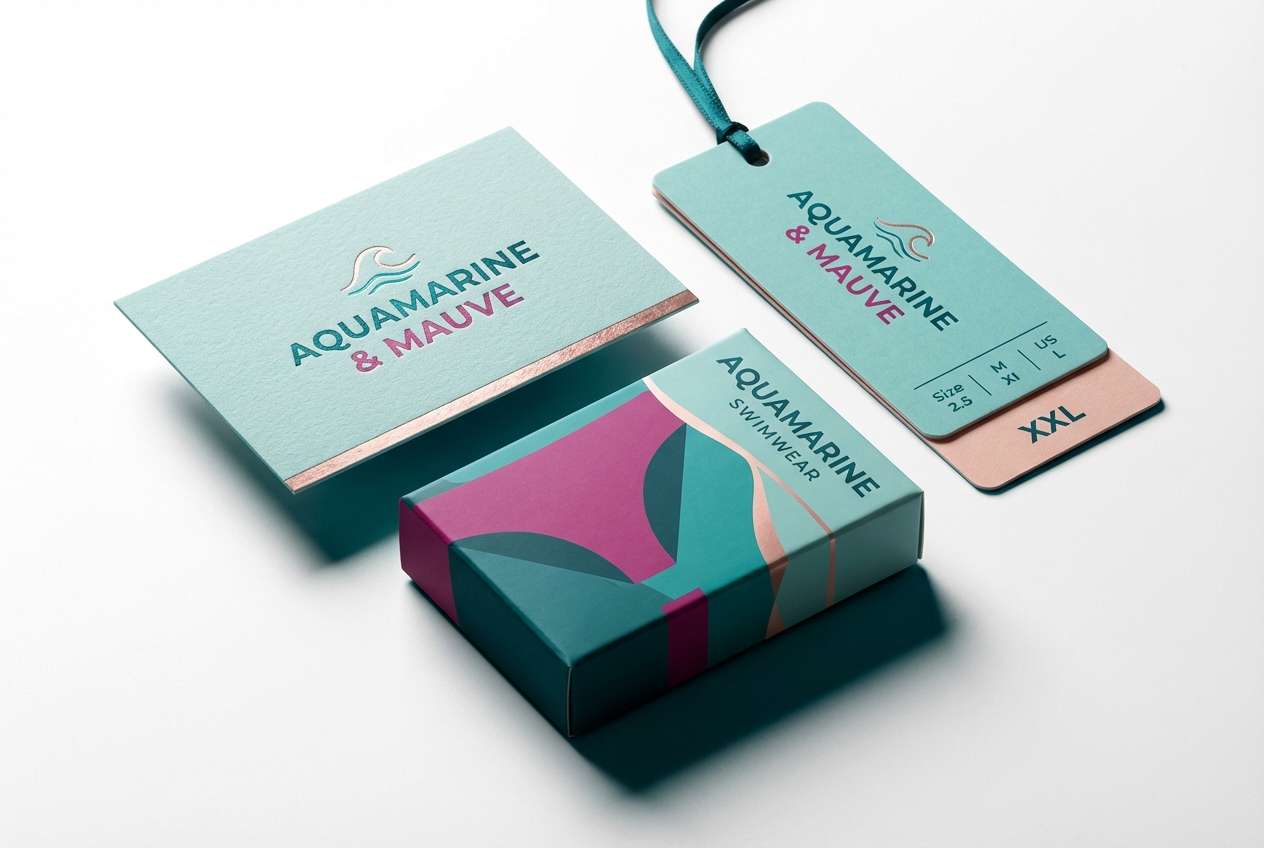
Teal and magenta is a high-impact color pairing that feels both fresh and intentional, balancing cool calm with bold energy. It’s a go-to combo for modern branding, UI accents, and print pieces that need contrast without looking chaotic.
Below are 20 teal magenta color palette ideas with HEX codes, plus quick usage tips and AI prompts you can reuse to generate matching visuals.
In this article
- Why Teal Magenta Palettes Work So Well
-
- lagoon fuchsia pop
- retro miami night
- botanical neon bloom
- soft spa orchid
- cyberpunk aquarium
- minimal teal ink
- sunset bazaar
- velvet teal rose
- arctic berry clean
- playful candy studio
- deep sea peony
- modern art deco wave
- cozy knit berry
- fresh market signage
- futuristic ui pulse
- wedding floral splash
- editorial contrast lines
- kids app bubblegum
- luxury cosmetics teal
- studio podcast cover
- What Colors Go Well with Teal Magenta?
- How to Use a Teal Magenta Color Palette in Real Designs
- Create Teal Magenta Palette Visuals with AI
Why Teal Magenta Palettes Work So Well
Teal sits in the cool spectrum, often associated with clarity, water, and technology, while magenta brings warmth, personality, and a fashion-forward punch. Put together, they create a complementary-style tension that’s instantly readable and memorable.
This pairing also performs well across mediums: teal can carry structure (backgrounds, navigation, panels), while magenta acts as the “signal” color for headlines, badges, and calls to action. The result is high contrast that still feels curated.
Because both colors can be intense, the best teal magenta color combinations typically include a strong neutral (off-white, charcoal, deep navy) to control the visual volume and keep layouts looking premium.
20+ Teal Magenta Color Palette Ideas (with HEX Codes)
1) Lagoon Fuchsia Pop
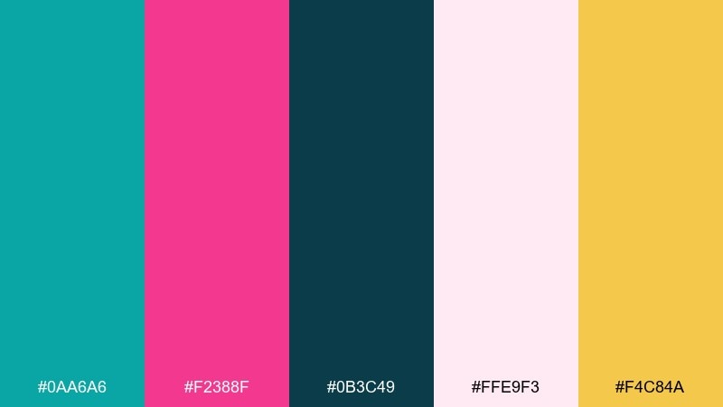
HEX: #0AA6A6 #F2388F #0B3C49 #FFE9F3 #F4C84A
Mood: bright, coastal, energetic
Best for: brand identity for beauty or swimwear
Bright lagoon energy meets a fuchsia pop, like sunlight hitting tropical water and neon flowers. Use the dark blue-teal as your anchor, then let magenta carry headlines or key shapes. Pair it with soft blush for breathing room and a warm yellow for tiny highlight moments. Tip: keep magenta to one strong focal area per layout to avoid visual noise.
Image example of lagoon fuchsia pop generated using media.io
Media.io is an online AI studio for creating and editing video, image, and audio in your browser.

2) Retro Miami Night
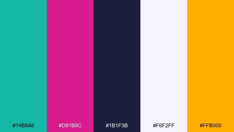
HEX: #14B8A6 #D81B8C #1B1F3B #F6F2FF #FFB000
Mood: retro, nightlife, punchy
Best for: event poster and social promos
Neon signage vibes glow against a midnight base, with teal and magenta acting like competing spotlights. This teal magenta color palette is ideal when you want high contrast without going full rainbow. Let the deep indigo handle backgrounds, then bring teal into grids and magenta into titles for quick readability. Tip: add the warm amber as a tiny accent for dates or CTA buttons to guide the eye.
Image example of retro miami night generated using media.io
3) Botanical Neon Bloom
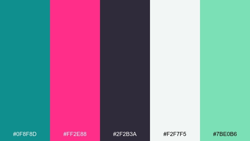
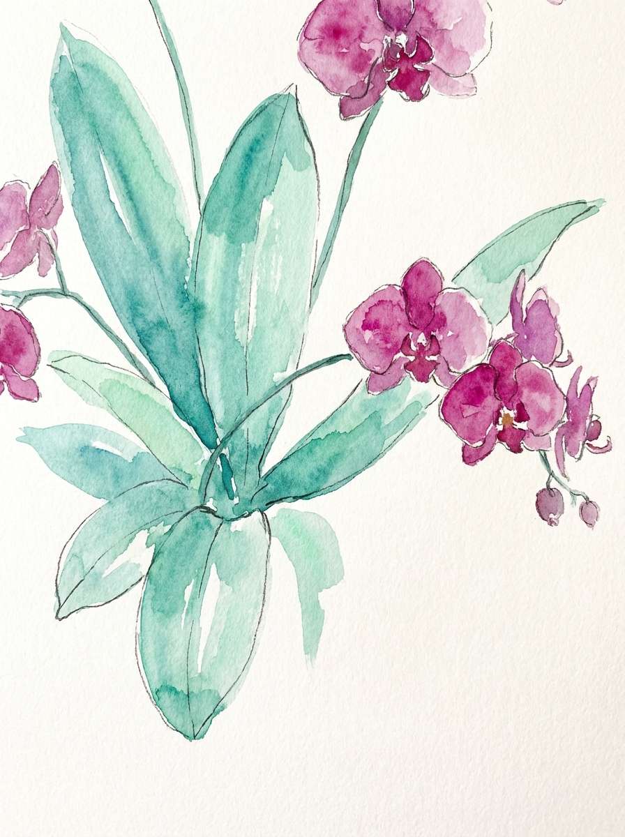
HEX: #0F8F8D #FF2E88 #2F2B3A #F2F7F5 #7BE0B6
Mood: fresh, floral, modern
Best for: watercolor botanical illustration set
Fresh greenhouse calm gets a neon bloom, like orchids lit by a cool aquarium glow. The teal reads clean and botanical, while the hot pink brings a modern edge to petals and accents. Use charcoal sparingly for outlines and keep the off-white paper tone dominant to maintain softness. Tip: repeat the mint as a secondary leaf color to bridge teal and pink naturally.
Image example of botanical neon bloom generated using media.io
4) Soft Spa Orchid
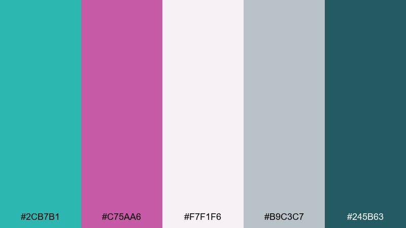
HEX: #2CB7B1 #C75AA6 #F7F1F6 #B9C3C7 #245B63
Mood: soft, soothing, polished
Best for: skincare packaging and labels
Soothing spa air and orchid petals come through in these muted, friendly tones. Keep the off-white and cool gray as the main field colors, then use teal for structure and magenta for a gentle brand signature. The deep teal is perfect for ingredient text without looking harsh. Tip: choose matte finishes so the palette stays calm and premium, not glossy and loud.
Image example of soft spa orchid generated using media.io
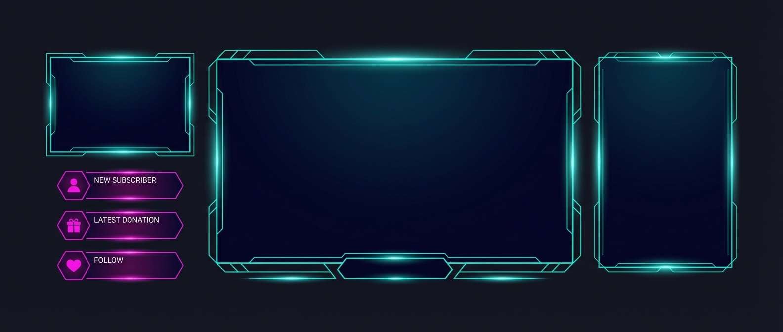
5) Cyberpunk Aquarium
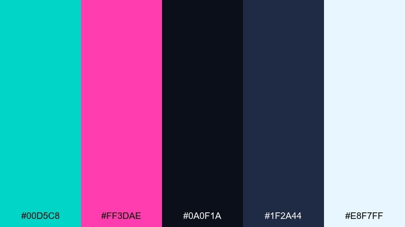
HEX: #00D5C8 #FF3DAE #0A0F1A #1F2A44 #E8F7FF
Mood: futuristic, electric, high-contrast
Best for: gaming banner and stream overlays
Electric aquarium glow and cyberpunk signage collide in a sharp, high-contrast mix. Let near-black run the background so teal can light up UI frames and magenta can mark alerts or featured items. The pale ice tone works best as a soft glow or small text highlight, not as a full background. Tip: add subtle gradients from teal to deep navy to keep the neon feeling immersive.
Image example of cyberpunk aquarium generated using media.io
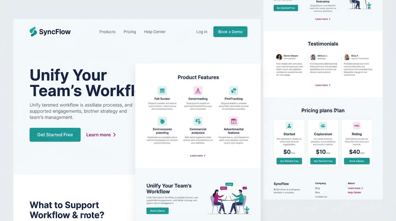
6) Minimal Teal Ink
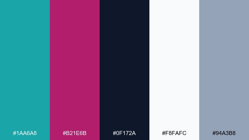
HEX: #1AA6A8 #B21E6B #0F172A #F8FAFC #94A3B8
Mood: minimal, editorial, confident
Best for: SaaS landing page UI mockup
Crisp teal ink and a magenta underline feel like a clean magazine margin note. Use white as the dominant canvas, then apply teal for primary buttons and navigation. Magenta works best as a micro-accent for links, badges, and active states, while slate grays carry supporting text. Tip: keep contrast accessible by pairing magenta with white and reserving navy for large headings.
Image example of minimal teal ink generated using media.io
7) Sunset Bazaar
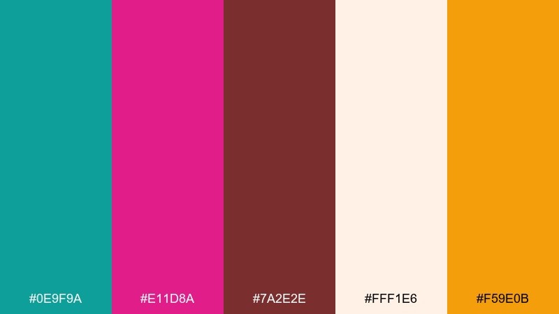
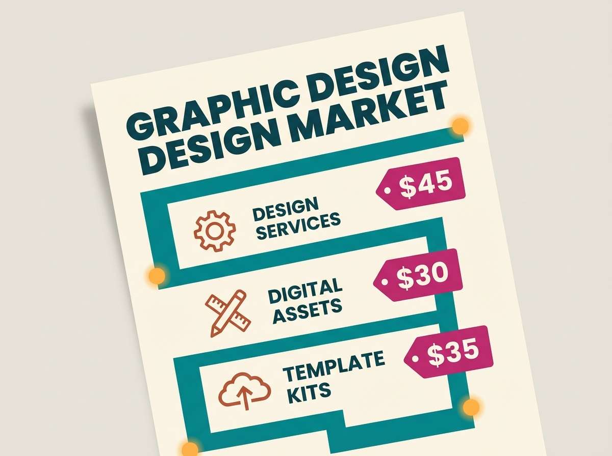
HEX: #0E9F9A #E11D8A #7A2E2E #FFF1E6 #F59E0B
Mood: warm, festive, artisan
Best for: market flyer and storefront signage
Warm bazaar energy mixes with cool teal, like lanterns glowing beside painted tiles. These teal magenta color combinations shine on flyers when you need both charm and punch. Use cream as the background, teal for big blocks and borders, and magenta for pricing or key callouts, with amber to add a welcoming spark. Tip: keep the brick tone in small doses for depth, like icons or dividers.
Image example of sunset bazaar generated using media.io
8) Velvet Teal Rose
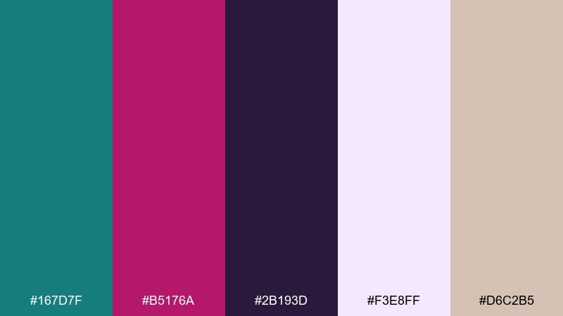
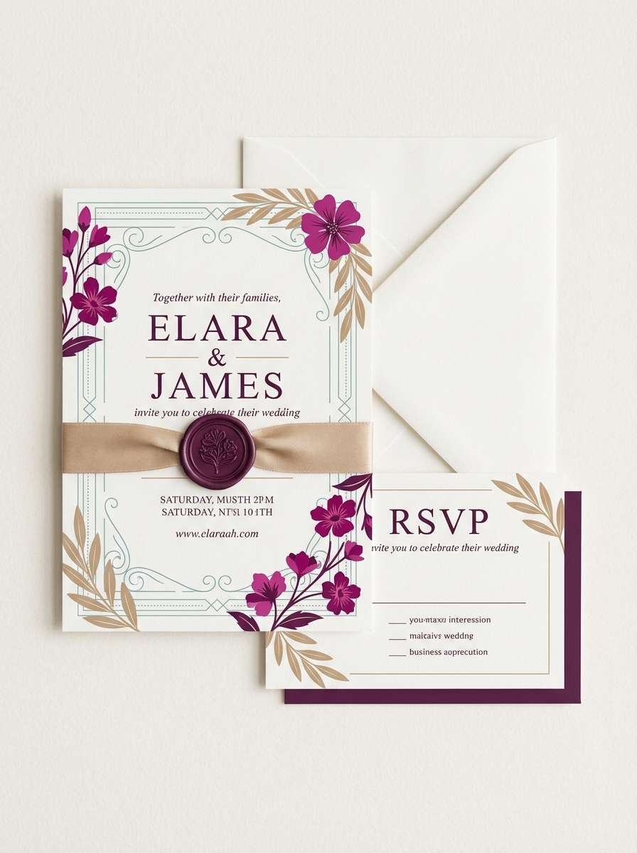
HEX: #167D7F #B5176A #2B193D #F3E8FF #D6C2B5
Mood: romantic, velvety, luxe
Best for: wedding invitation suite
Velvet evening tones and rose petals create a romantic, candlelit feel. Use lavender-white for paper space, then introduce teal in monograms or border patterns and magenta in floral accents or RSVP highlights. The deep plum is perfect for typography when you want elegance without pure black. Tip: choose one foil effect only, and let the colors do the rest.
Image example of velvet teal rose generated using media.io
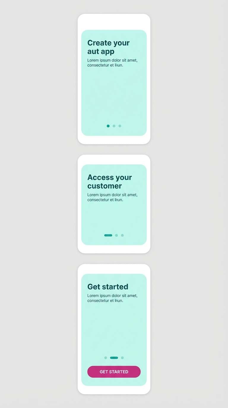
9) Arctic Berry Clean
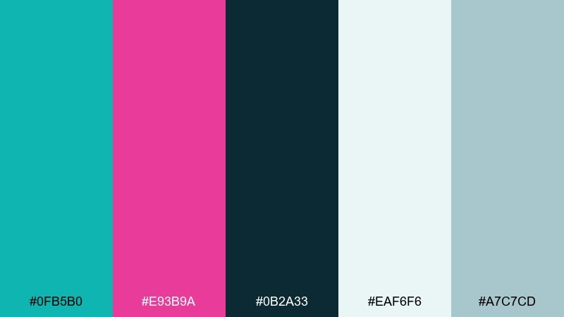
HEX: #0FB5B0 #E93B9A #0B2A33 #EAF6F6 #A7C7CD
Mood: clean, cool, refreshing
Best for: health app onboarding screens
Icy freshness and berry brightness feel crisp, like cold air with a hint of fruit. Let the pale aqua carry most screens, then use teal for progress, toggles, and charts. Magenta works best as a single standout for key milestones or confirmation states, while the dark teal supports titles. Tip: keep gradients subtle so the UI stays clinical and calm.
Image example of arctic berry clean generated using media.io
10) Playful Candy Studio
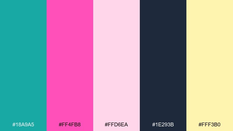
HEX: #18A9A5 #FF4FB8 #FFD6EA #1E293B #FFF3B0
Mood: playful, sweet, upbeat
Best for: kids brand sticker pack and icons
Candy-bright and cheerful, like bubblegum wrappers on a sunny desk. Use the blush pink as a friendly base and keep teal for chunky icon fills and outlines. Magenta is your punch color for character cheeks, badges, and big sticker titles, while the soft butter yellow adds warmth. Tip: keep dark navy only for tiny text so the set stays lighthearted.
Image example of playful candy studio generated using media.io
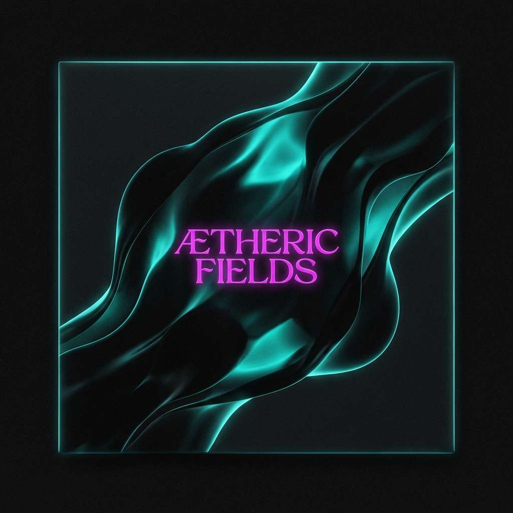
11) Deep Sea Peony
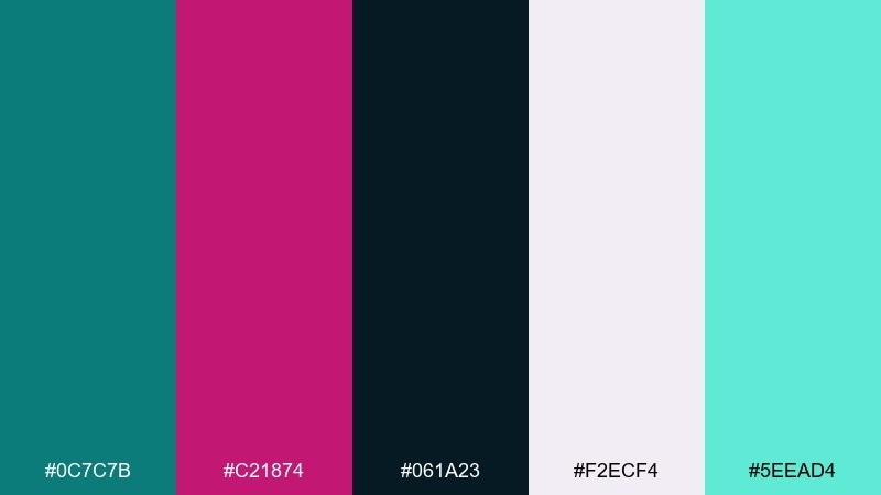
HEX: #0C7C7B #C21874 #061A23 #F2ECF4 #5EEAD4
Mood: moody, elegant, dramatic
Best for: album cover art
Deep-sea shadow with peony magenta feels dramatic and slightly mysterious. This teal magenta color palette works beautifully for cover art where you want mood first and detail second. Use near-black as the field, then bring teal in through subtle glow shapes and reserve magenta for the title or one central graphic element. Tip: add the light aqua only as rim light to keep the darkness rich.
Image example of deep sea peony generated using media.io
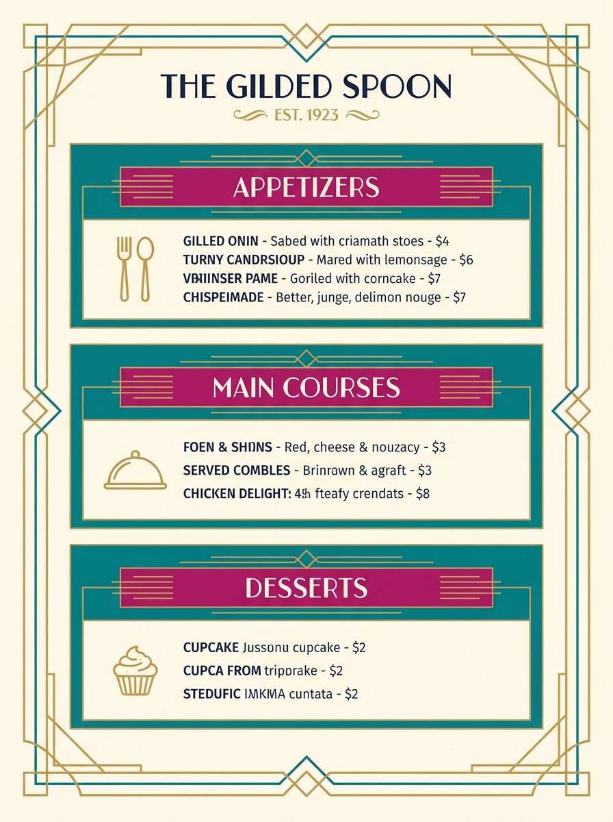
12) Modern Art Deco Wave
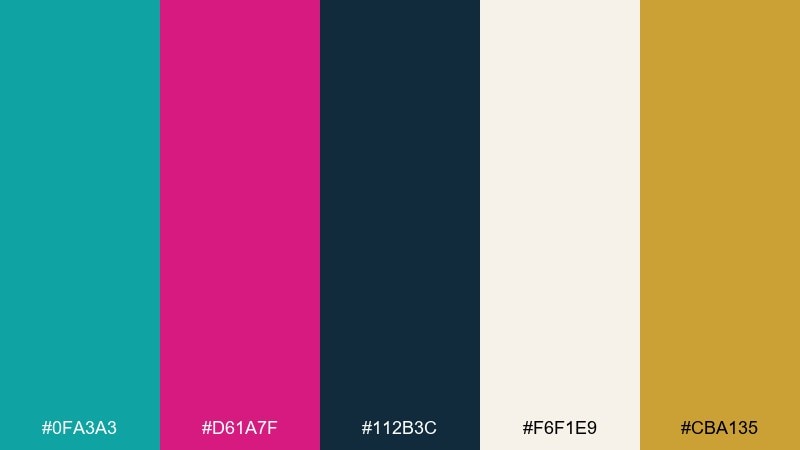
HEX: #0FA3A3 #D61A7F #112B3C #F6F1E9 #CBA135
Mood: glam, structured, modern
Best for: restaurant menu design
Art deco structure with modern pop feels like a jazz club updated for today. Use the cream tone for the menu base, then build teal panels and lines for hierarchy. Magenta can mark section titles or signature dishes, while the gold reads best as thin rules and small icons. Tip: keep line weights consistent to maintain that deco precision.
Image example of modern art deco wave generated using media.io
13) Cozy Knit Berry
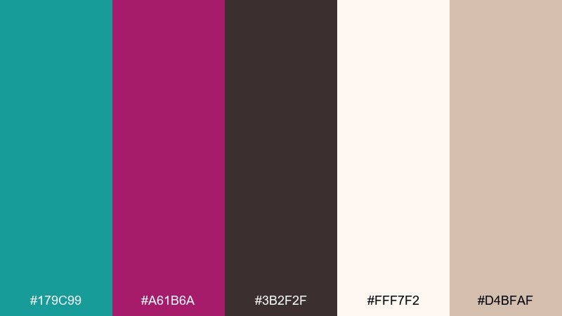
HEX: #179C99 #A61B6A #3B2F2F #FFF7F2 #D4BFAF
Mood: cozy, handcrafted, earthy
Best for: craft shop logo and packaging
Cozy knit warmth meets a berry punch, like handmade goods with a modern tag. Use cream and warm beige as your packaging base, then add teal for logos and patterns that feel artisanal but clean. Keep magenta as a small stamp color for labels, seals, or limited edition notes, and lean on cocoa brown for typography. Tip: textured paper stock makes the colors feel softer and more natural.
Image example of cozy knit berry generated using media.io
14) Fresh Market Signage
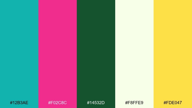
HEX: #12B3AE #F02C8C #14532D #F8FFE9 #FDE047
Mood: fresh, sunny, approachable
Best for: grocery promo poster
Fresh produce energy comes through fast, like bright signs above crisp greens and berries. Use the pale lime-white as the main background to keep everything light and readable. Teal works well for banners and price panels, while magenta draws attention to deals and featured items, with sunny yellow as a friendly accent. Tip: avoid using the forest green everywhere, and keep it to small supporting icons so teal stays the hero.
Image example of fresh market signage generated using media.io
15) Futuristic UI Pulse
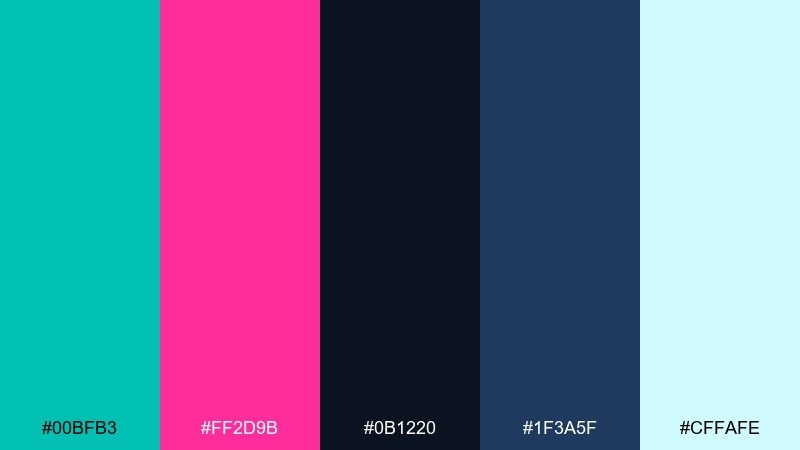
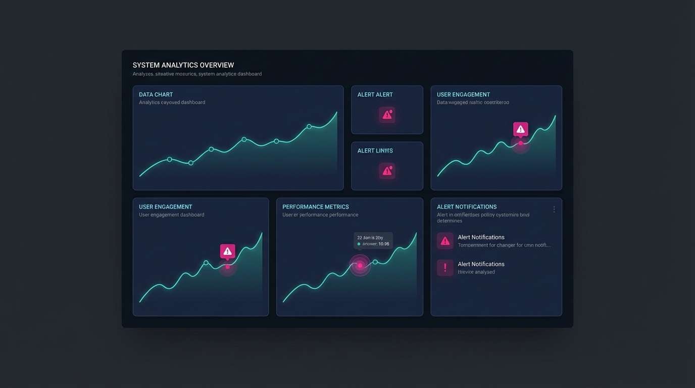
HEX: #00BFB3 #FF2D9B #0B1220 #1F3A5F #CFFAFE
Mood: techy, sharp, energetic
Best for: analytics dashboard UI mockup
Fast pulse lights and dark panels create a confident, tech-forward feel. A teal magenta color scheme like this is great for dashboards where teal can represent positive metrics and magenta can flag anomalies. Keep the background near-black, use blue-navy for cards, and reserve the pale cyan for labels and subtle gridlines. Tip: limit simultaneous teal and magenta on charts to one highlight series at a time.
Image example of futuristic ui pulse generated using media.io
16) Wedding Floral Splash
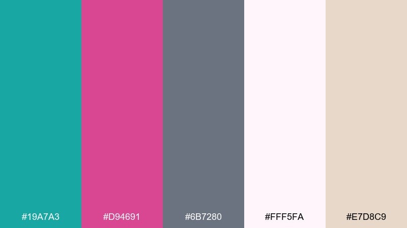
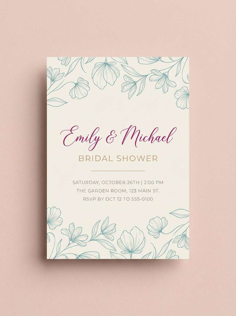
HEX: #19A7A3 #D94691 #6B7280 #FFF5FA #E7D8C9
Mood: joyful, romantic, airy
Best for: bridal shower invitation
Airy florals with a cheerful splash feel celebratory without getting overly loud. Use soft blush as the paper base, then bring teal into botanical line art and magenta into the main names or date line. Warm beige helps the palette feel more tactile, while neutral gray keeps secondary details calm. Tip: keep plenty of margins so the bright accents read elegant, not busy.
Image example of wedding floral splash generated using media.io
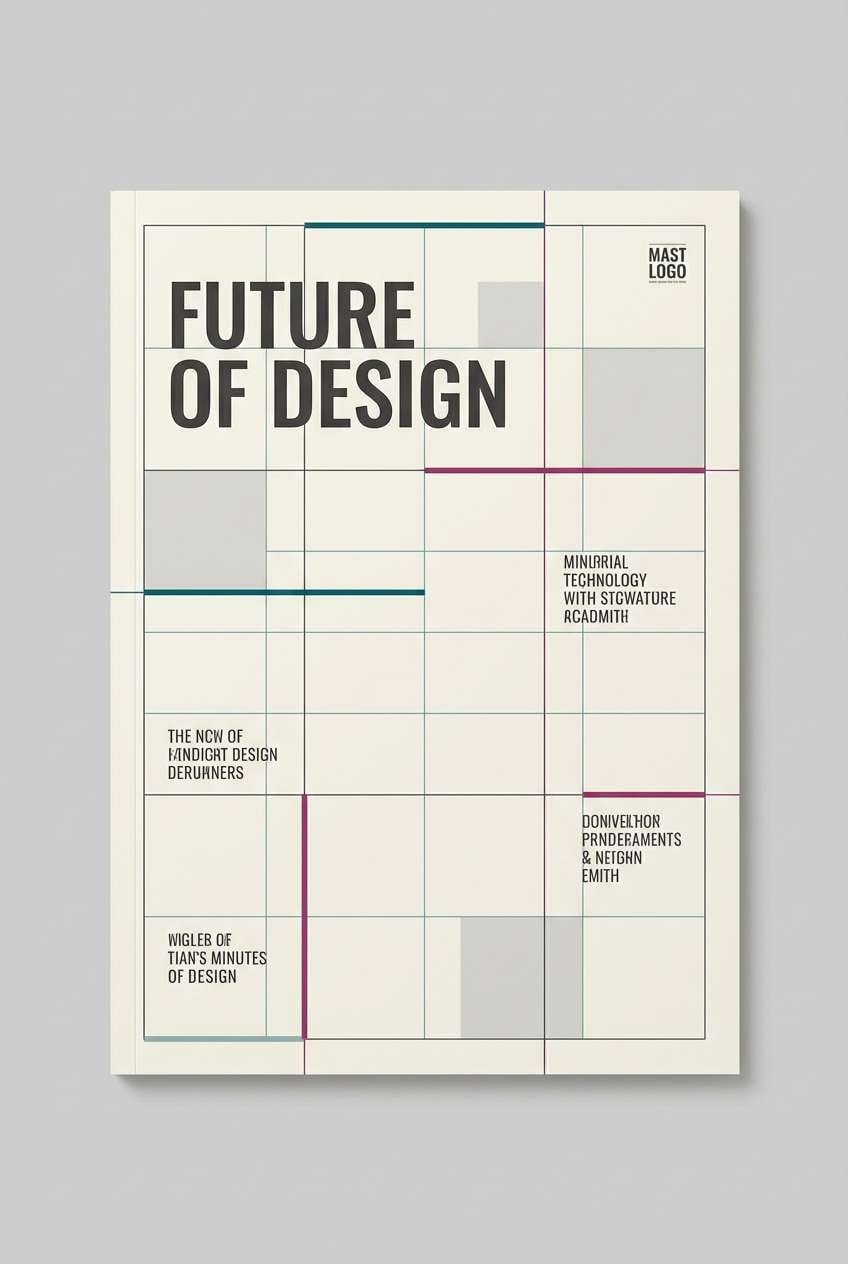
17) Editorial Contrast Lines
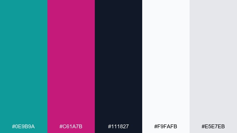
HEX: #0E9B9A #C61A7B #111827 #F9FAFB #E5E7EB
Mood: bold, editorial, graphic
Best for: magazine cover layout
Bold editorial contrast feels like clean ink lines with a fashion-forward pop. This teal magenta color palette is especially strong when you want sharp typography and disciplined spacing. Use white and light gray for columns, keep charcoal for body text, and let teal and magenta split the accent roles between rules, labels, and one featured headline. Tip: stick to one accent per section so the layout stays premium and readable.
Image example of editorial contrast lines generated using media.io
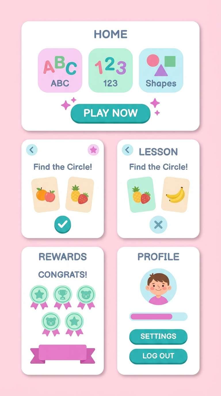
18) Kids App Bubblegum
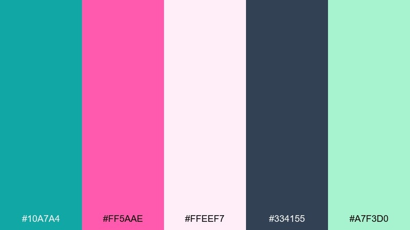
HEX: #10A7A4 #FF5AAE #FFEEF7 #334155 #A7F3D0
Mood: friendly, bubbly, fun
Best for: kids learning app UI screens
Bubblegum fun and clean teal feel friendly, safe, and easy to navigate. Use the pale pink as the main background for a soft, welcoming look. Teal works best for primary buttons and progress, while the mint can highlight achievements and rewards, with slate reserved for readable text. Tip: round your UI shapes and keep shadows minimal so the colors stay the star.
Image example of kids app bubblegum generated using media.io
19) Luxury Cosmetics Teal
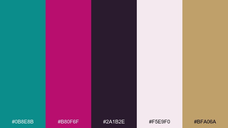
HEX: #0B8E8B #B80F6F #2A1B2E #F5E9F0 #BFA06A
Mood: luxury, intimate, glamorous
Best for: lipstick product ad and packaging
Glamorous and intimate, like velvet makeup cases under soft studio lights. Use blush as the supporting field, then set teal for brand marks and magenta for the hero product color story. The deep plum-black is ideal for premium typography, and the muted gold reads best as a small foil line or cap detail. Tip: keep backgrounds simple so the magenta product stays unmistakably focal.
Image example of luxury cosmetics teal generated using media.io
20) Studio Podcast Cover
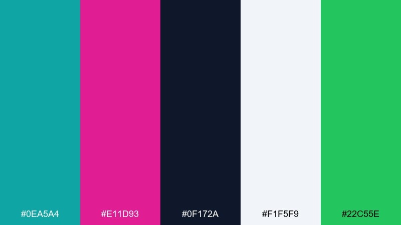
HEX: #0EA5A4 #E11D93 #0F172A #F1F5F9 #22C55E
Mood: modern, punchy, confident
Best for: podcast cover art
Modern studio energy feels crisp and confident, like a clean mic setup and bold topic hooks. Use the light slate as your base, then set teal as the main graphic shape color and magenta for the show title emphasis. Deep navy keeps type legible at small sizes, and the green works best as a tiny status dot or season tag. Tip: test the design at thumbnail size and keep the magenta area large enough to read instantly.
Image example of studio podcast cover generated using media.io

What Colors Go Well with Teal Magenta?
Neutrals are the easiest way to stabilize teal and magenta: off-white, soft gray, charcoal, and deep navy keep the palette readable and prevent the accents from competing. For print, warm creams can make the combo feel more tactile and less “neon.”
For extra dimension, add a warm accent like amber, gold, or butter yellow to guide attention (dates, icons, micro-CTAs). If you want a cooler, more clinical look, pale aqua or icy cyan can extend teal without diluting contrast.
For moodier designs, pair teal-magenta with near-black or deep plum to create a cinematic base. This keeps magenta as the hero highlight while teal provides structured glow and framing.
How to Use a Teal Magenta Color Palette in Real Designs
Assign roles before you design: let teal handle structure (headers, panels, borders, navigation) and let magenta handle emphasis (titles, badges, alerts). This “base + signal” split makes layouts feel intentional and easier to scan.
Control saturation with whitespace and neutrals. A large off-white or deep navy background gives both colors room to breathe, and it’s often the difference between a premium look and a loud one.
For accessibility and clarity, test contrast early—especially magenta on teal (often fails for small text). A safe pattern is magenta on white for small labels, teal on white for buttons, and dark navy/charcoal for body text.
Create Teal Magenta Palette Visuals with AI
If you already have HEX codes, you can turn them into consistent brand scenes, posters, packaging mockups, and UI concepts by describing the subject and lighting while keeping teal and magenta as the dominant colors. Reusing a single prompt style across variations helps you build a cohesive set fast.
Start with one palette from above, generate 3–5 variations (different compositions, same colors), then pick one hero image and refine details like typography space, contrast, and background neutrality. This approach keeps your teal magenta color scheme consistent across assets.
Use Media.io to generate image examples, iterate quickly, and export visuals for web, social, or print layouts.
Teal Magenta Color Palette FAQs
-
What does a teal and magenta color palette communicate?
Teal often signals clarity, freshness, and modernity, while magenta adds bold creativity and energy. Together, they create a confident, contemporary look that’s great for brands and interfaces that need to stand out. -
Is teal magenta a good color scheme for UI design?
Yes—especially when you use teal for structure (navigation, components) and magenta for emphasis (active states, badges, CTAs). Add neutral backgrounds (white, slate, near-black) and check contrast to keep text accessible. -
How do I keep teal and magenta from looking too loud?
Use a dominant neutral (off-white, deep navy, charcoal) and treat magenta as a controlled accent instead of a large background. Limiting magenta to one focal zone per section also reduces visual noise. -
What are safe background colors for teal magenta designs?
Off-white, pale blush, cool light gray, deep navy, and near-black are reliable choices. They help teal and magenta stay readable and prevent the palette from feeling over-saturated. -
Can I use teal and magenta for print projects?
Yes—menus, invitations, posters, and packaging work well with this pairing. For a premium print feel, lean on cream or soft blush paper tones and consider matte finishes to avoid overly glossy, high-saturation results. -
What accent colors work best with teal magenta palettes?
Warm accents like amber, gold, and butter yellow add friendly direction for small highlights. Cooler accents like pale aqua or icy cyan extend teal without introducing a new competing hue. -
How can I generate teal magenta visuals that match my HEX codes?
Use an AI generator and specify your subject (UI, packaging, poster), lighting, and “dominant teal and magenta” in the prompt, then iterate variations. Media.io’s text-to-image workflow makes it easy to test multiple compositions while keeping the same palette.
Next: Night Color Palette


